Category Archives: Uncategorized

A Little Love Letter to Meadham Kirchhoff SS14

A brand born out of Central Saint Martins in 2006, with Edward Meadham and Benjamin Kirchhoff at the helm, Meadham Kirchhoff had a short-but-oh-so-sweet 9 year run full of awards, Fashion Week shows, and their Topshop collaborations.

Distinctly kitsch, cutesy and a little bit edgy, it is no surprise that Meadham Kirchhoff rose to fame during the ‘twee’ era of the 2010s, and as the trend’s revival is now upon us, it makes sense to take a closer look at one of my favourite Meadham Kirchhoff shows, SS14. 

Conceptualisation

Edward Meadham described his mood boards as containing ‘a random mix of Jacobean and Elizabethan portraiture and lots and lots of Bowie’. This eclectic mix hints that the very fabric of the show is made from opulence, excess, ruffles and lace, the subversion of gender, and an interesting mix of bold black and white, dotted with pastel shades.

MK1
Edward Meadham’s mood board featuring lace and ruffles. Photograph by Eleanor Hardwick.
MK2
Edward Meadham’s mood board featuring David Bowie, drapery, and portraiture. Photograph by Eleanor Hardwick.
MK3
Edward Meadham’s mood board featuring hints of red. Photograph by Eleanor Hardwick.
MK4
Edward Meadham’s mood board featuring pastels, vintage beauty images, and ceramics. Photograph by Eleanor Hardwick.
MK5
Edward Meadham’s mood board featuring an elvish illustration, ruffles, and sunglasses. Photograph by Eleanor Hardwick.

The collection was called ‘Ante Dominai [sic]’ meaning ‘anti-society, anti-mainstream culture. Do what you want, create your own alternative, your own narrative, and your own set of codes and morals.’

The Show

The show itself ran smoothly, despite a few technical issues such as the wrong music being played. It is immediately clear how Meadham Kirchhoff took their inspiration pictures and reworked, reinvented and re-inspired them into this eccentric show which somehow marries images of Seventeenth-century witches, Eighteenth-century royals, and kitsch pastel kittens.

Here are a few of my favourite images from the show, taken by Eleanor Hardwick, which might inspire your spring wardrobe now that the Northern Hemisphere is warming up a teeny, tiny, little bit.

MK6
The model line-up for the show. Photograph by Eleanor Hardwick.
MK7
A model getting her make-up done backstage. Photograph by Eleanor Hardwick.
MK8
A backstage shot of a model from behind, showing the criss-cross detail of the dress, the long bright curls, and the snakeskin ribbon adorning the hat. Photograph by Eleanor Hardwick.
MK9
Another image showing the long orange curls, very similar to the elvish illustration on Meadham’s mood board. Photograph by Eleanor Hardwick.
MK10
A model backstage, dressed in white, long pale curls, complete with minimal eye make-up and a bold red lip. Photograph by Eleanor Hardwick.
MK11
The models walk onto the catwalk. Photograph by Eleanor Hardwick.
MK12
One of the darker looks from the collection featuring snakeskin, sunglasses, red hair bows and a red lip. Photograph by Eleanor Hardwick.
MK13
A model looking like the picture of an Edwardian woman in the city. Photograph by Eleanor Hardwick.
MK14
Three models stood waiting to walk. Photograph by Eleanor Hardwick.
MK15
Three models backstage, adorned in orange curls. Photograph by Eleanor Hardwick.

I hope you’ve loved this show as much as I do. It feels opulent, rebellious, and youthful. I also think it’s quite clear where my love for Simone Rocha’s ruffles and pearls was born from…

By Rosie Dyer

Bibliography:

https://www.gettyimages.co.uk/photos/meadham-kirchhoff-runway-london-fashion-week-ss14

https://www.rookiemag.com/2013/10/meadham-kirchhoff-visit-5/

https://mashable.com/article/twee-tiktok-trend

Zooming In On Margaret Bourke-White

A little while back, I stumbled across Margaret Bourke-White whilst looking up 20th Century female photographers, discovering her work among others such as Germaine Krull and Grete Stern. It goes without saying that each of these women were respectively brilliant at working behind the lens, and each are deserving of a writeup, but I was especially drawn to Bourke-White’s photographs of Marina Semyonova (fig. 1).


Ballet
Figure One: Marina Semyonova by Margaret Bourke-White. Photo: MOMA


Taken at the Bolshoi Theatre in Moscow, this photo shows Semyonova – the first Soviet-trained prima ballerina – preparing herself ahead of a ballet performance. Semyonova’s body is folded into itself, revealing the physical contortions and movement required of her in order to reach and tie her ballet shoes. Her posture is considered, and the chair acts as a prop to help elongate her body and better display her ballet shoe all the while creating a tension between her body and the billowing tutu which surrounds her and presses upon the back of the chair. Semyonova is artfully staged, and her pose emulates the exaggerated stillness of the photographic form, reinforcing the expectation for ballerinas to always appear elegant, not just during a performance. Her left leg is deliberately aligned in a nod to her profession, recreating one half of the en pointe position and her outstretched arms provide an extension of the en pointe motif. This creates a clear shot for which Bourke-White could effectively capture Semyonova, allowing Bourke-White to play with light to illuminate Semyonova’s body and project a shadow onto the far wall.

With that said, what I found most appealing about this photo, is despite this photo having an editorial-like feel, the loose threads on Semyonova’s ballet shoes offer a reminder of the countless hours of practice required to become a ballerina, displaying the real-life implications of such a profession. This suggest that whilst Semyonova displays poise and elegance, these attributes have been mastered over time. However, the loose threads could also be linked to the USSR in relation to its second five-year plan which sought to prioritise agricultural and self-sufficiency ahead of consumer goods and frivolity, and the loose threads thereby reveal the unravelling of previous political and cultural practices.

Through considering such a beautiful photo, I wanted to discover more about Bourke-White’s work, particularly as this photo was taken during the political unease of the Soviet Union. My research revealed that Bourke-White excelled as a photographer and whose accomplishments were plentiful. Born in 1904, Margaret Bourke-White would go on to set up her own photography studio in 1928 in Ohio, but her work would soon take her abroad, namely to the likes of Russia, South Korea, India and Pakistan where she was commissioned to document moments of political divide, wars and social unrest.

To name but a few of her impressive feats, Bourke-White was the first US photographer to enter the Soviet Union, the first US accredited female war photographer during WWII and responsible for the first cover for LIFE Magazine (fig. 2).


Life
Figure Two: Cover of ‘LIFE’ Magazine (23 November 1936). Photo: ‘LIFE’ Magazine Archives via Google Books.


This cover highlights Bourke-White’s unique ability to take an imposing architectural structure and create a striking and an arresting image. She was commissioned to photograph this multi-million-dollar project of the Columbia River Basin and the construction of its impressive dam. The angle at which Bourke-White captured this photo and its emphasis on the symmetry of each of the concrete structures makes them appear – at least in my mind – as gigantic chess pieces bearing a similarity in shape to the ‘Rook’, with the two individuals symbolically positioned as pawns within this almighty chess board. The vibrant orange of the cover contrasts with the black and white image, at once cropping and framing the two individuals stood at the foot of the structure. The shot appears to reinforce the idea that these structures are in fact man made, with the two individuals attesting to the labour required to build such structures, and yet conveys the structures as colossal, unnatural, and otherworldly. Indeed, the editors notes that in commissioning Bourke-White they unexpectedly received, ‘a human document of American frontier life which, to them at least, was a revelation.’ This very observation highlights the talents of Bourke-White, and her ability to capture life within an otherwise intimidating concrete structure. This style of photography also calls to mind El Lissitzy and his photomontages for the SSSR na stroike (trans: USSR in construction) in 1932, with the overall global emphasis on self-sufficiency, driven by its workforce, who become the centre of El Lissitzy’s photomontage (fig. 3). This theme is echoed in Bourke-White’s photography, and the two share similar aims in trying to establish the strength of their respective cities and nations. To this effect, Bourke-White’s photography could be considered an artistic response to Constructivist periodical layouts and El Lissitzy’s earlier work.


USSR
Figure Three: Photomontage of SSSR na stroike (trans: USSR in contruction) by El Lissitzky. Issue 10 (1932). Photo: Bookvica.


The final photograph I would like to discuss is a self-portrait, rumoured to be Bourke-White’s favourite self-portrait, made with the U.S. 8th Air Force in 1943 (fig. 4).


Self-Portrait
Figure Four: Margaret Bourke-White’s self-portrait made with the U.S. 8th Air Force in 1943. Photo: The LIFE Picture Collection/Shutterstock.


In a similar vein to Bourke-White’s cover for LIFE Magazine, this photo marries machinery and industrial elements with humanity. While the airplane’s jets have been switched off, this photo conveys the necessity to be on constant standby, responding to any changes quickly and efficiently. Bourke-White has a tight hold of the large camera, figuratively and literally held down by the camera, and carries her flying helmet and goggles in her other hand with comparative ease. To this effect, this photo is suggestive of the precarity of the war and the need to be on constant alert as well as Bourke-White’s role to document the events. This is further reinforced by the inclusion of the plane in the frame – its proximity reinforces the fact that it is only a matter of time before this unit needs to reembark the plane.

At the same time, Bourke-White’s stance is relaxed yet upright, smiling as the wind blows through her hair. The tongues of her shoes are flopped over, giving the impression of a rare moment of respite, reinforced by the fact that their surroundings appear bare and uninhabited, suggesting a minimised threat or danger. The aviator jacket is fit with shearling trimmings, and complete with matching trousers, also lined with shearling, featuring leg-long zips and stained with a white powder residue. The crease patterns, particularly on the trousers, suggest the cramped conditions of the plane and it would appear as though Bourke-White has barely stepped off the plane. While her stance is relaxed, and she is surrounded by an expansive empty landscape, the trousers act as her ‘second skin’ and become a reminder that she did not have the luxury of space a few moments ago, and the trousers have not yet and will not likely get the chance to mould to their new surroundings, complete with the luxury of space, or Bourke-White’s standing pose.

Sadly, Margaret Bourke-White contracted Parkinson’s disease in 1953 and completed her last assignment for LIFE in 1957. With that said, she displayed great determination in trying to overcome the symptoms of her Parkinson’s, undergoing risky surgeries, and in true documentary photographer style, publicised and documented her fight against the disease, cementing her status as a formidable character and individual (fig. 5). She sadly passed away in 1971 but while her career was cut short by Parkinson’s, Bourke-White was rightly recognised in her lifetime as a true pioneer in documentary photography, particularly as a female photographer for her ability to uniquely capture people and places in and amongst periods of great change, showcasing their struggles and strengths.


Bourke-White
Figure Five: A nurse aiding photographer Margaret Bourke-White during a therapy session by Alfred Eisenstaedt. Photo: The LIFE Picture Collection/Shutterstock.


By Georgina Johnston-Watt

Sources:

https://books.google.co.uk/books?id=N0EEAAAAMBAJ&printsec=frontcover&hl=fr&source=gbs_ge_summary_r&cad=0#v=onepage&q=margaret&f=false

https://www.bookvica.com/pages/books/1291/el-lissitzky-and-his-photomontages-sssr-na-stroike-i-e-ussr-in-construction-10-for-1932

https://www.life.com/history/great-lady-with-a-camera-margaret-bourke-white-american-original/

https://www.life.com/lifestyle/parkinsons-disease-life-magazine/

Three Beautiful Films: A 50s, 60s and 70s Film You Must Watch Purely for the Visual Pleasure:

** This blog post contains spoilers for Mad About Men (1954), La Piscine (1969) and Mahogany (1975) **

Sometimes I want to watch a film, not really for the plot, but for either the fashion, the cinematography, the set design or even just the general aesthetic. So, just in case anyone else has the same penchant for beautiful films, I’ve comprised a short list of three recommendations from the 50s, 60s and 70s respectively.

Mad About Men (1954):

MAM
Mad About Men Movie Poster, IMDB.

Mad About Men is the charming sequel to the 1948 comedy film Miranda in which a lonely mermaid captures a young man and only offers to release him on the basis that he will take her to London. In Mad About Men, set in Cornwall, Miranda Trewella (Glynis Johns) returns and convinces her distant relative and doppelgänger Caroline Trewella (Glynis Johns) to let her take her place whilst Caroline goes on a biking excursion with a friend. In order to do this, Caroline fakes an accident which leaves her wheelchair bound, explaining Miranda’s inability to walk and need to keep her ‘legs’ covered with warm blankets. The pair also hire Nurse Carey (Margaret Rutherford), who knows Miranda is a mermaid and helped her in the first film too. However, even though Caroline is engaged back in London to the dull but stable Ronald Baker (Peter Martyn), Miranda playing as Caroline cannot help herself when she meets some of the town’s most handsome men, and she flirts, dates and kisses both Jeff Saunders (Donald Sinden) and Colonel Barclay Sutton (Nicholas Phipps). When Ronald comes to visit ‘Caroline’ in Cornwall, Miranda takes an immediate dislike to him and ends up pouring cold fish soup over his head. The Colonel’s wife is suspicious of ‘Caroline’ and ends up discovering her secret, so, in a plot to expose her, she agrees to let ‘Caroline’ sing at a charity concert and plans to reveal her mermaid tail on stage. However, Caroline gets back from her trip and takes Miranda’s place on stage whilst the Nurse feeds the microphone down to the cove where Miranda lives so her siren-esque singing voice can still be heard. The film ends with the real Caroline and Jeff Saunders sharing a kiss whilst Miranda is safely back in the Cornish Sea.

Despite mentioning earlier that plot isn’t important when watching for purely aesthetic reasons, this film is so fun and light-hearted it is difficult not to enjoy the story and fall in love with Miranda whilst you watch it.  However, where this film really shines is in highlighting the wistful and whimsical beauty of Miranda and the more prim and proper styling of Caroline.  Joan Ellacott’s costuming and Glynis Johns’ acting allows for viewers to differentiate easily between the Trewella girls. Here are some of the best style/aesthetic moments…

MAM
Caroline Trewella on the train from London to Cornwall. Still from Mad About Men (1954).
MAM
Caroline and Miranda’s first meeting. Still from Mad About Men (1954).
MAM
Caroline’s charity concert dress. Still from Mad About Men (1954).
MAM
A full length view of Caroline’s concert dress. Still from Mad About Men (1954).

La Piscine (1969):

LP
La Piscine Movie Poster, IMDB.

If you’re craving some warmth, you must watch 1969’s La Piscine, a film where the Southern French sunshine seems to seep through the screen. This film is the epitome of ‘embodied viewing’ where you can feel the sun and water on your skin, and you can smell the heat in the air. La Piscine is set in a villa on the French Riviera where a couple, Marianne (Romy Schneider) and Jean-Paul (Alain Delon) are enjoying the summer. After finding out Marianne and Jean-Paul are nearby, the couple’s old friend Harry (Maurice Ronet) and his daughter Penelope (Jane Birkin) come and stay. Whilst this initially consists of old friends catching up and new memories being made through extravagant parties, tensions soon begin to rise when Jean-Paul realises that Marianne and Harry were once lovers. The situation further complicates itself when Jean-Paul decides to seduce Harry’s 18-year-old daughter Penelope. The two men, whilst drunk, end up getting into a fight which culminates with Harry falling into the swimming pool. From here, instead of helping him out, Jean-Paul proceeds to drown him and then stages the scene to look like an accident. Marianne eventually finds out what Jean-Paul did but both continue to lie to the police and eventually the case is closed with Harry’s death being marked as an accident. The film ends with Penelope returning to her mother and Jean-Paul seemingly forcing Marianne to stay with him at the villa.

This film is beautiful all-round. The French Riviera location, the impressive villa, the cast and, perhaps most importantly the dressing and undressing of bodies. The theme of the body is central throughout this film, with long, toned and sun-kissed limbs filling the poolside shots. Here are some of the most beautiful outfits, shots and scenes…

LP
Jane Birkin’s Penelope wearing the dreamiest gingham poolside cover-up. Still from La Piscine (1969).
LP
Penelope’s fabulously oversized sunglasses. Still from La Piscine (1969).
LP
Jean-Paul’s combo of an open shirt tucked into blue jeans is giving me lots of Spring/Summer inspo. Still from La Piscine (1969).
LP
Penelope wearing maybe the shortest dress ever worn to a funeral ever? Stylish though! Still from La Piscine (1969).
LP
The calm before the storm… Marianne and Jean-Paul enjoying the swimming pool. Still from La Piscine (1969).

Mahogany (1975):

Movie
Mahogany Movie Poster, IMDB.

First things first, the men in this movie are awful. Truly, every single one of them is just unbearable. But with that aside, Mahogany is firm favourite in every fashion lovers’ movie list. The film stars a post-Supremes Diana Ross as fashion student and department store secretary Tracy Chambers. Set in Chicago, the film shows Tracy living in the ‘slums’ of Chicago’s South whilst working at a high-end department store and harbouring dreams of becoming a high fashion designer. Tracy meets and begins dating Brian Walker, an activist fighting against the demolition of housing in primarily black neighbourhoods. Brian, whilst seemingly having a good heart and high ambitions for himself routinely brushes off Tracy’s goals as trivial and devoid of real meaning, insisting fashion is unimportant compared to his work within the neighbourhood. This means that when Tracy meets and befriends the renowned photographer Sean McAvoy who sees her as having real potential as a model, Tracy jumps at the chance to find an in to the industry which means so much to her. After a fight with Brian, Tracy moves to Rome to pursue modelling with Sean, who gives her the stage name Mahogany. A classic movie montage shows Mahogany’s modelling career take off and her charm and charisma capturing both the wider fashion world’s attention as well as Sean’s, who is interested in pursuing her romantically. Sean becomes increasingly possessive and struggles with Tracy’s free-spirited nature and inability to be controlled. Brian visits Tracy in Rome and gets into a fight with Sean involving a gun; Brian leaves Rome alone. At their next fashion shoot in which Tracy is posed inside a sports car, Sean is trying to ‘capture death’ and ends up getting into the car and begins driving erratically. Eventually, with Sean at the wheel, the car crashes leaving Tracy badly injured and Sean dead. In the aftermath of the accident, a wealthy count lets Tracy recover at his villa and sets up a design studio for her there. Instead of feeling fulfilled by finally reaching her dream career, she is left feeling frustrated, lonely, and unhappy despite the huge success of her first official collection. Tracy realises that success means nothing without Brian by her side and she returns to Chicago to be with him.

Despite Tracy’s life being littered with frustrating men who seem desperate to keep her potential hidden away, she does look incredible throughout the film. As a little sidenote, Diana Ross actually designed a lot of Tracy’s outfits as she trained in dressmaking before her career took off! Here are some of her best looks…

Movie
The outfit Tracy designed and wears for the first time she is photographed by Sean McAvoy.
Movie
Tracy looking incredibly chic in Rome whilst her Harper’s Bazaar cover hangs behind her.
Movie
Perhaps one of the most iconic looks from this film. Tracy’s purple ensemble which becomes a billboard advertising Revlon ‘Touch & Glow’.


By Rosie Dyer

Bibliography:

https://www.whowhatwear.co.uk/diana-ross-style

https://www.imdb.com/title/tt0047199/?ref_=ttfc_fc_tt

https://www.imdb.com/title/tt0064816/?ref_=ttmi_tt

https://www.alamy.com/mad-about-men-1954-nicolas-phipps-anne-crawford-donald-sinden-glynis-johns-ralph-thomas-dir-moviestore-collection-ltd-image243659713.html


2022: A year of #NoNewClothes

Truthfully, I’m rarely one for New Year’s resolutions and if I ever do commit to making a change, it’ll just so happen to be something which I’m already willing to reduce or eradicate in its entirety. This year, however, I’ve decided to truly revamp my attitude – and wardrobe! – by committing to only buying second-hand clothes.

For the last few years, I have made a concerted effort to buy a maximum of three garments which could be categorised under the term ‘fast-fashion’ a year and thus the goal seems attainable; however, this would invariably creep up to five or so items having fallen for the countless marketing ploys à la Black Friday and during other heavily advertised sale periods.

Fashion
Figure 1: Shields, Jody. ‘View: Everything Old is New again.’ Vogue (US) Apr 01 1989

ON TRENDS

During the first few months of our MA, we have studied how people are drawn to buying clothes, often not out of necessity, but rather due to numerous social factors. Individuals, quite willingly, can be seduced through the socially acceptable (and usually passive act) of following a trend and statements such as ‘because they’re in fashion’ may be offered as a legitimate explanation for adopting any one of more items of clothing. Indeed, the wearer themselves might not even claim to know why they are wearing any one garment beyond this very reason. Such attitudes can create a unique position whereby those who subscribe to blindly following trends also police others to see who is adhering to any specific trend, passing judgement based on what they see. Furthermore, it is largely accepted that clothing forms a large part of the first impression we make on others; indeed, as a cohort, we each expressed the heightened considerations regarding our outfits and additional pressure placed for the first day of our MA, offering as it did for the majority, the first time meeting one another in person.

Such considerations in fashion – at least for me – evoke the much-quoted and adored cerulean blue scene in The Devil Wears Prada where Miranda Priestly (played by Meryl Streep) quite literally gives Andrea (Andy) Sachs (played by Anne Hathaway) a dressing down after she shows her contempt for the fashion world, claiming to be ‘exempt’ from fashion (fig. 2). Priestly’s speech serves to suggest that Andy’s choice of jumper is the prime example of a trend being spotted at fashion shows and then trickling down to high-street retailers. In other words, people are unable to be removed from fashion and thus (sub)consciously make specific choices and associative statements with what they choose to wear. As philosopher Gilles Lipovetsky writes: ‘With fashion, human beings begin observing each other endlessly, appreciating each other’s looks, evaluating nuances of cut, colour, and pattern in dress.’ Moreover, it is this constant observation that has become all the more heightened through social media, and this is especially true of platforms that focus on the dissemination of images.

Fashion
Figure 2: Screenshot from ‘The Devil Wears Prada’ (2006). Photo: Screenshot from YouTube

Indeed, my resolution to buy ‘nothing new’ relates to this constant observation, and perhaps unsurprisingly as a student of History of Dress, my desire to stand out and communicate specific messages in what I wear. Therefore, for me, buying vintage and second-hand is about making considered purchases, often over a period of a few months or even a year. It presents a new opportunity to literally trawl through vintage shops in the hopes of finding something incredible with expectations that may crumble upon seeing the fifth moth-ridden jumper in a row but can instantly be restored as soon as I’ve spotted the perfect jacket (fig.3 aka the dream jacket). Buying second-hand and vintage can certainly be a frustrating process, too, such as when an item you’ve been eyeing up is no longer available; or, the gut-wrenching moment when someone outbids you on an eBay listing in that *last* second, coupled with the misplaced confidence in thinking you were the only one who was going to bid on the item.

Biba
Figure 3: 1970s Biba Lamé Jacket. Photo: V&A

Moreover, where possible, I love reaching out to the buyer to see if they can offer any anecdotal information surrounding the garment to construct a complete mental image and history, ‘revealing the wearer’s identity, character or physiognomy,’ as analysed by Kitty Hauser. Without a doubt, one of my favourite vintage purchases included a beautiful hand-written note from its previous owner which outlined how treasured it had been, but also how it ‘will have another chapter in its fashion life’ which I think perfectly sums up the special feeling one might have when buying something second-hand.

Recently, I’ve found that compliments relating to clothes between friends and strangers alike are more increasingly being met with the following explanations: ‘It’s vintage’; ‘I’ve had it for [insert length of time]’; and, ‘I got it from a charity shop for a fiver’. Each of these explanations suggests a new way of justifying past and present purchases as individuals are becoming abundantly aware of the environmental implications of their purchases and want to alleviate guilt or the notion of being ‘part of the problem’. However, it also creates an issue that goes against the very origins of the second-hand clothes market, dating back to the 1700s, which was set up to help people purchase clothes at more affordable prices, something that Barbra Streisand’s Second Hand Rose notes as rendering it less desirable, an attitude which has greatly changed in recent years (fig. 4). Today’s appetite for vintage pieces can see prices skyrocket as specific eras and garments are (re)interpreted as trendy, once again creating the issue of affordability which has long defined – and plagued – the fashion industry.

Fashion
Figure 4: Screenshot from Barbra Streisand’s ‘Second Hand Rose’ (1965) for the ‘My Name is Barbra’ TV Special. Photo: Screenshot from YouTube

THE NEED TO ACT

Recent conferences such as COP26 have put pressure on the need to truly change our consumer habits, particularly as statistics show that the fashion industry emits about the same quantity of greenhouse gases a year as the entire economies of France, Germany and the United Kingdom combined. This was reported in a recent McKinsey and Co report which found that the fashion industry alone had emitted a mind-blowing 2.1 billion tonnes of greenhouse gases in 2018.

Moreover, people in the United Kingdom buy more clothes per person than any other country in Europe. In sum, the amount of clothes that many people in the UK own is nothing near a ‘normal’ amount as fewer people buy to last, the expectation that an item of clothing’s lifespan is limited to a mere few months, or a singular outing is a bleak state of affairs indeed. This is partly driven by the fact that 69% of new clothes are produced from synthetic fibres and plastics, set to reach an alarming 75% by 2030.

The statistics are alarming, and our desire to consume fashion leads to some of the worst working conditions, only exacerbated by fast-fashion retailers such as Pretty Little Thing introducing a mind-blowing 100% off during last year’s Black Friday in a bid to get rid of excess stock and drum up publicity and excitement with its consumers (fig. 5).

In order to help track the individual impact of reducing our clothes consumption, initiatives such as the Count Us In ‘Wear Clothes to Last’ pledge work to calculate the estimated reduction in an individual’s carbon pollution throughout the year. At the time of writing, 1,709 people have signed the pledge.

PLT
Figure 5: Screenshot of the @OfficialPLT tweet advertising 100% off discounts. Photo: Screenshot from Twitter


Let us now turn our attention now to some of the solutions which have helped reduce my desire to buy new clothes.

HOW TO RESIST THE TEMPTATION

  • Unfollow brands and individuals who promote a fast-fashion lifestyle, especially if they are being sponsored by fast-fashion conglomerates to do so.
  • Tailor your cookies or use ad-blockers to help reduce the number of pop-up adverts you receive.
  • Unsubscribe from unnecessary marketing emails from fast-fashion brands
  • Actively search for sustainable alternatives.

HOW TO SHOP

Buy to last (and take care of your clothes!)

Donate/repurpose/sell unwanted clothes

Second hand, both online and in person

  • Vintage Shops and kilo Sales (details often found on Facebook)
  • Local Charity Shops
  • eBay; Etsy; Depop (@5thSeasonVintage is a personal favourite)
  • Vestiaire Collective; HEWI – premium brands

By making my pledge public, I am hoping to be held accountable by friends and family for any purchases I make throughout the year.

By Georgina Johnston-Watt

Sources:

Hauser, Kitty, 2005, ‘The Fingerprint of the Second Skin,’ in Christopher Breward and Caroline Evans, eds., Fashion and Modernity, pp. 153-170

Lipovetsky, Gilles, 1994, ‘The Enchantment of Appearances,’ in The Empire of Fashion: Dressing Modern Democracy pp. 18-54

http://changingmarkets.org/wp-content/uploads/2021/07/SyntheticsAnonymous_FinalWeb.pdf

https://collections.vam.ac.uk/item/O120586/jacket-biba/

https://www.dazeddigital.com/fashion/article/54904/1/pretty-little-thing-fast-fashion-plt-black-friday-sale-free-clothes

https://www.greenpeace.org.uk/news/the-uks-fast-fashion-habit-is-getting-worse-and-its-destroying-the-planet/

https://www.mckinsey.com/industries/retail/our-insights/fashion-on-climate

https://www.proquest.com/magazines/view-everything-old-is-new-again/docview/879279559/se-2?accountid=10277

https://twitter.com/OfficialPLT/status/1465440440409378822?s=20&t=4AJWD-GfG51zDgfKVbhXjw

https://www.youtube.com/watch?v=CaPmNly54gA&ab_channel=WestHwood

https://www.youtube.com/watch?v=Ja2fgquYTCg&ab_channel=Movieclips

Looking Through the Lens of Madame Yevonde

I recently found myself sifting through self-portraits by women photographers in a not very coherent bout of research on the National Portrait Gallery website. I didn’t find exactly what I had been looking for, but I did find something much better – this photo of Madame Yevonde (fig.1).

Madame Y
Fig. 1. Madame Yevonde by Madame Yevonde (1967). https://www.npg.org.uk/collections/search/portrait/mw58111/Madame-Yevonde?sort=dateDesc&LinkID=mp06547&role=art&displayStyle=thumb&displayNo=60&rNo=40


This photo caught my eye, and made me smile, when I had been otherwise stuck in a trance of endless scrolling. Her smart chequered suit, upright pose, and jaunty hat scream pride in herself, her work, and a humorous relationship between photography and portraiture. Editing of the image has rendered her miniature besides her huge vintage camera, an ode to her earlier portrait studio and a recognition of the many decades she had spent in the industry.

After seeing such a joyful, humorous, and enigmatic portrait, I had to look into Madame Yevonde’s work further. I want to share some of the wonderful images I have found, and generally indulge in Madame Yevonde’s personality-filled work for a while longer.

Born in 1893, Yevonde Philone Middleton was a photographer, primarily taking studio portraits, for an impressive portion of the twentieth century. Known professionally as Madame Yevonde, she opened her first photography studio in 1914 at the age of 21 and continued to work until a few months before her death in 1975.

There always seems to be something eye-catching or dramatic about Madame Yevonde’s photography. Her main mastery was in the VIVEX colour process, which allowed her to produce vibrant and lustrous colour shots. Her portrait of Vivien Leigh (fig.2) demonstrates this perfectly. The punchy red of the background emboldens Leigh, her red lip and scarf connecting her to the red reflections of the light, and her green top bringing her strongly into the foreground. Her face is lit from one side, drawing attention to the outline of her face, and contours of her nose and cheeks. It’s the sort of photo that makes you stop and look twice.


Madame Y 2
Fig. 2. Vivien Leigh by Madame Yevonde (1936). https://www.npg.org.uk/collections/search/portrait/mw11846/Vivien-Leigh?LinkID=mp06547&role=art&displayStyle=thumb&displayNo=60&rNo=2


The next photo that jumped out to me was the portrait of the Hon. Mrs James Beck as Daphne (fig.3), a part of Madame Yevonde’s Goddesses series. Inspired by a society charity ball with an Olympian theme, Madame Yevonde made a series of portraits of society women dressed as goddesses in 1935. The abundance of leaves represent Daphne’s transformation into a Laurel tree in Greek mythology. The leaves cast a distinctive shadow across Mrs James Beck’s face, as if they are reaching across her and we are seeing Daphne mid-transformation. The shadows are tinted green in a way that the real leaf shadows would not be (they are not translucent), reminding us that this is a manufactured portrait, a piece of art.


Madame Y 3
Fig. 3. The Hon. Mrs James Beck as Daphne by Madame Yevonde (1935). http://www.users.waitrose.com/~felice/image4.htm


The solarised portrait of Dame Dorothy Tutin (fig.4) shows another style Madame Yevonde was adept at. The solarised image brings far more texture to the portrait, particularly allowing Tutin’s ruffled hair to stand out. The darkness of her plucked eyebrows draws our attention to her serene facial expression. The contrast across the wide collar of her top gives her a regal presence. I think this portrait is one of the most characterful that Madame Yevonde produced. The solarised effect gives insight into the formality, poise, and elegance that Tutin is able to project, whilst also highlighting the relaxed side that is hinted at by her haircut.


Madame Y 4
Fig. 4. Dame Dorothy Tutin by Madame Yevonde (1955). https://www.npg.org.uk/collections/search/portrait/mw144366/Dame-Dorothy-Tutin?LinkID=mp05851&role=sit&rNo=2


I hope to have shown you a glimpse into the wonderful world of Madame Yevonde’s photography. Through skilful manipulation of colour, props, photographic effect, and lighting, Madame Yevonde is able to create bold images that are still able to catch my eye, even in today’s image-saturated world.

By Megan Stevenson

Feast Your Eyes on This: A Love and Lust for Food in Jûzô Itami’s ‘Tampopo’

Tampopo 1
‘Man in White Suit’, played by Kōji Yakusho and ‘Man in White Suit’s Mistress’, played by Fukumi Kuroda

“So you’re at the movies too huh? Watcha eating?”

Here begins Jûzô Itami’s Tampopo of 1985. A mobster and his mistress, both glamorously suited head-to-toe in white, saunter to the front row of a movie theatre and set up their champagne feast. Our unnamed ‘Man in White Suit’ wastes no time addressing us, confidently leaning into the other side of the screen to see what we have brought to snack on during the feature, so long as it is nothing involving “crinkle wrappers”. After hysterically threatening to kill a man in the audience who dared to rustle about his chip packet, the movie theatre fades into darkness. The movie starts.

Tampopo is a visually delicious tale of food and love. The movie has always been a firm favourite of mine as a self-proclaimed ‘foodie’: each scene highlighting the etiquette of eating, the art of selecting the perfect ingredients and, above all, the momentous pursuit of the perfect bowl of ramen. Steam wafts from the surface of the hot broth so that you, behind the screen, can almost smell it. Chopsticks plunge into the soupy pool and retrieve long golden bands of noodles, followed by the menma and vegetables, and then succulent pieces of meat. Finally, the broth is sipped until the bowl is empty. I have never sat down to watch Tampopo on an empty stomach. It would be agony.

The central plotline of the movie – a parody of the American ‘Western’ genre – follows the eponymous Tampopo as she works to rejuvenate her rather mediocre ramen shop into one beyond compare. After a chance encounter with Gorō, a mysterious man on the road with an unparalleled knowledge of the dish, the pair toil to refine Tampopo’s ramen recipe, with a little help along the way. Punctured by a series of vignettes which explore other characters’ unique relationship with food, whether it be haughty French cuisine or hearty Italian pasta, Tampopo makes us fall in love with food again.

Tampopo 2
Gorō, played by Tsutomu Yamazaki

While food really is the main focus of the movie, Itami’s use of costume plays into his shrewd satire of the traditional Western genre, while contributing to the overall indulgent and sensual appeal of this food epic. Perhaps the most pertinent and ironic costume in the film is Gorō’s cowboy-esque look. His character is always dressed in a well-worn shirt – often with a neckerchief poking through in true Indiana Jones style – tucked into a pair of sturdy jeans. The Western look is completed with his trusty Stetson, which Gorō refuses to remove even in a scene where we see him in a bathtub. At times conniving, like the Western cowboys his character mocks, he encourages Tampopo to spy on other ramen shops to steal elements of their recipes. Gorō thus emerges as a comical play with the hero of the American Western. Like them, he is an adventurer. But he is an adventurer in search of good ramen, and the
only showdowns he engages in are with those who stand in his and Tampopo’s way.

Tampopo 3
Tampopo, played by Nobuko Miyamoto

Throughout the movie, Tampopo herself undergoes a Cinderella type transformation both in her culinary skills and her fashion. When she begs Gorō to be his ramen-apprentice at the beginning of the feature, she wears a simple white uniform and a protective scarf to cover her hair. This white uniform appears rather fragile, wrapped in clouds of steam and cigarette smoke as Tampopo works relentlessly at her broth. When the ultimate recipe is near completion, Tampopo goes through a classic movie makeover, first showing off a new professional chef’s outfit and then sporting a stylish ensemble to accompany Gorō to dinner. Upon seeing her in this particularly fashionable outfit, Gorō moans that she now looks “hard to talk to”. Her red polka-dot dress, complemented by her matching red lipstick, gives Tampopo a renewed sense of conviction as she edges towards being crowned ramen chef par excellence.

Tampopo 5
Man in White Suit and his Mistress

One of the most famed vignettes of Tampopo is the undeniably erotic ‘egg yolk’ scene between our mobster and his mistress. The couple pass between their open mouths a raw egg yolk, never allowing their lips to meet in a kiss, until it bursts in a moment of suggestive ecstasy. The golden liquid drips from the mistress’s mouth onto her dress, and transfers to the mobster’s lapel. Similar to those worn by the likes of Al Pacino in American gangster movies, his white suit was once a sign of his untouchable status. The indelible stain of the egg yolk on the once-pristine costume, however, speaks to the corruptive power of lust. And yet, this not merely a lust between man and woman, but between man, woman and food.

Tampopo 6
The ‘Spaghetti Sensei’, played by Mariko Okada

Raunchy interactions with eggs aside, Itami also uses the relationship between costume and food as a shrewd social commentary. One of the funniest vignettes (in my opinion) occurs when an old white gentleman sits down to eat dinner in an Italian restaurant in Japan. After ordering, he eavesdrops on a ladies’ society upstairs, who are being instructed by their leader on the ‘proper’ way to eat pasta like an Italian. This leader of the group, with her neatly coiffed hair and prim gold suit jacket, orders the women to never audibly slurp their spaghetti as this “is absolutely taboo abroad”. Much to her disdain, however, her commands are interrupted by the old man who is scoffing his spaghetti, and making a great noise while doing so. After watching him devour his meal, the ladies’ society and their leader succumb to mimicking his way of eating. Not a napkin in sight to protect their obviously pricey ensembles and accessories, regard for dress is thus cast aside – enjoying the meal is of the utmost importance.

Throughout Tampopo, Itami sets up a subtle yet provoking interplay between Western dress and etiquette, and Japanese tradition. His characters sport largely Americanised dress following the tropes of classic Hollywood genres which, according to Emiko Ohnuki-Tierney, signifies the Japanese sense of the self in relation to other nations. The conservatively dressed ladies’ society, the Western look of Gorō, and the Americanised glamour or Tampopo at the end of the movie might, at first glance, point towards an overwhelming European and American influence on Japanese culture. However, this imitation of Western eating habits and dress is exaggerated by Itami to the point of parody. What prevails is the art of ramen. Our movie closes with a visit to Tampopo’s new professional kitchen, where she prepares a final meal for her fellow ramen enthusiasts. They devour every last morsel, drinking the broth one after the other before placing their bowls down for the last time. We leave Tampopo behind, and accompany Gorō as he climbs aboard his truck once more. Our ramen cowboy slinks into the distance as the credits roll, ready for another adventure full of flavour.

You can watch Tampopo here: https://www.youtube.com/watch?v=csyMHLaWuSA

By Erin-Atlanta Argun

Sources:

Ohnuki-Tierney, Emiko. ‘The Ambivalent Self of the Contemporary Japanese’. Cultural Anthropology 5, no. 2 (May 1990). https://www.jstor.org/stable/656456.

Zimmerman, Steve. ‘Food in Films: A Star Is Born’ 9, no. 2 (Spring 2009). https://www.jstor.org/stable/10.1525/gfc.2009.9.2.25.

https://www.eater.com/2016/11/4/13513292/tampopo-movie-ramen-review

http://www.thecinessential.com/tampopo-lessons-for-an-endangered-species

http://www.thecinessential.com/tampopo-cultural-guide

Film Review: ‘Passing’ directed by Rebecca Hall

This post contains spoilers from the film Passing.

Passing Photo One
Clare Bellew (Ruth Negga, on the left) and Irene Redfield (Tessa Thompson, on the right), Photo: Screencap from Netflix

Jazz, novelty, dynamism and the rebirth of Black culture… It was the 1920s and the Harlem Renaissance was in full swing. Mainly taking place in New York and spreading to the rest of the world, the era spanned from the 20s to 30s and beyond. However, behind the glitz and glamour was an era tainted by prohibition and racial tensions. An esteemed product of this age, which captured the psychology, and tensions of the era subtly yet brilliantly, was Nella Larsen’s novel Passing (1929), recently adapted to a Netflix movie in the same name, by Rebecca Hall as her directorial debut.

Larsen’s story is centred around the encounter of two childhood friends, light skinned, mixed race African-American women, Irene Redfield (played by Tessa Thompson) and Clare Bellew (played by Ruth Negga), in Harlem, as adults and the tensions that rise between them. The twist of the story is introduced when the two women run in to each other at a fancy tearoom at the Drayton Hotel in New York, mostly reserved for wealthy, white upper classes. As it is revealed that Clare is married to a racist, upper-class white man from Chicago, who is however oblivious to her race, it becomes clear that she is ‘passing’ as white because of her light skin tone.

Irene is a middle-class, responsible housewife and mother living in Harlem with her black, doctor husband Brian and two boys. She is fervently tied to her race and community, head of the ‘Negro Dance Committee’ and centres her life around trying to do ‘the right thing’. On the surface she is reserved and abides by morals and class boundaries. Clare on the other hand is reckless, selfish, and passionate, living her life on the edge. However, both characters are intricately complex, juggling with tensions within. Clare denies her roots, yet she also yearns for a sense of community, longs to go back to her own culture, and thus gradually seeps into Irene’s life. While Irene is angry at Clare for denying her race, for her insistence and success at getting what she wants no matter the cost and her relentless challenging of the status quo, she is drawn to Clare and her mystery. Her desire to adopt Clare’s ease and allure makes her unable to drive her out of her life.

Hall lifts Larsen’s words and creates a film that conveys her spirit, and feelings through incredible symbolism. She foreshadows events through objects, accentuates the characters’ distinctive personality traits through clothing, conveys the tension and drama between the figures through dramatic camera shots and music.

Passing Photo Two
Irene Redfield (Tessa Thompson, on the left) and Brian Redfield (André Holland,on the right) Photo: Screencap from Netflix


Larsen tells the story from the point of view of Irene, so events are mostly tinged by her feelings in the book. Irene’s internal angst which comprises the base of the novel, is poignantly picked up in the film through close-up shots that focus on her facial expressions. Her frustration is amplified through the black and white lens the film is shot in, the chiaroscuro effect that seems to sharpen when Irene is on screen, lighting one side of her face while casting the other side in stark darkness.

On the other hand, Clare, who is constantly described as a ‘vision’ or having a ‘glowing’ sense of beauty in the book, is bathed in a soft light, devoid of the shadows seen on Irene’s face, bringing the glow that surrounds her to Irene’s surroundings, which are often darkened.

At the beginning of the film when Clare and Irene first encounter one another, the close-up shots distinctly switch from one woman’s face to the other. This technique is repeated later when Clare comes to Irene’s house for the first time. Hall amplifies the fact that the two women are in fact mirrors but also complete one another.

Passing
Clare Bellew (Ruth Negga), Photo: Screencap from Netflix


Although the scene in the beginning where Clare is revealed to be married to a racist man and hiding her identity sets the tension of the film, the film is overall devoid of any overt scenes of violence related to racism. Instead, racial tensions that are boiling underneath, are conveyed through secondary sources. In one scene, Irene hears from Brian that one of her sons were called a ‘negro’ at school and in another Brian reads about a black man being lynched on the streets of New York, on the newspaper. Even Clare’s husband John’s prejudice is based on what he has read and heard about black people on the news rather than a personal experience, as it is revealed when Clare introduces him to Ruth at the very beginning of the film.

The film’s high symbolism translates to many elements being conveyed implicitly rather than blatantly. Irene who suspects Clare to be having an affair with her husband, sees them having an intimate conversation through the mirror in the living room in her house, however as she approaches them, the camera then pans right, revealing them to be standing further apart from one another, hence conveying Irene’s growing doubts and jealousy that also cloud her judgement through the symbol of the mirror.

The crack in Brian and Irene’s bedroom ceiling becomes a metaphor for the crack in their marriage which progressively grows as Irene’s suspicions regarding her husband and Clare having an affair deepens as the film progresses. The viewer is presented with individual shots of the couple gazing at that crack, mostly after they have a discordance, in different points of the film. The symbolism becomes more potent as Irene’s marriage becomes turbulent.

In another scene, just as Clare declares her longing to become part of the black community again, Irene drops her flowerpot out the window which symbolises her unease and reluctance in Clare’s sudden intrusion in her life.

The palpable tensions between the women are also conveyed through a jazz piece titled The Homeless Wanderer that is repeated constantly in the film. The piano piece is a fluctuating one, harbouring a sense of melancholy, mystery, and an uneasiness, conveying the feeling of 1920s New York poignantly. However, this melody also mostly fills the intervals, repeated each time when Irene is seen walking home carrying groceries, passing the same brownstone buildings, or after a scene when Clare and Irene have an impactful conversation. On one side it emphasizes the monotony of Irene’s life. On the other, the piece becomes a metaphor for the masks both characters are carrying, the tentative balancing act they perform in keeping secrets, hiding their true selves. It becomes the voice of both characters, speaking what is unsaid, conveying feelings unexpressed.

Passing
Clare Bellew (Ruth Negga, on the left) and Irene Redfield (Tessa Thompson, on the right), Photo: Screencap from Netflix

The drama created through this music, the acute camera angles, and the sharp chiaroscuro emanates a Hitchcockian vibe in the film. The tensions rise as Clare increasingly infiltrates Irene’s life. With each move, gesture and gaze, the drama created through the music, the acute camera angles and sharp chiaroscuro carefully calculated by Hall, each scene becomes a perfect composition that reminds one of the theatrical and dramatic nature of the films of the 1920s and 1930s as well as American film noir. The drama, compressed feelings and tensions become even more amplified in the boxed, 4:3 ratio frame the film is shot in. The usage of black and white cinematography, while on the on side evoking the film style of the era, it more importantly, draws attention to the idea of race and skin colour. The idea of ‘passing’ is very clearly visualised as it becomes difficult to distinguish the skin colour of the two women from white men. It is an ingenious technique, in which Hall stated that she employed to draw the attention to the concept of race and its construction by the powerful figures in society to serve their needs while the fact in the matter is, the complex nature of race cannot be simplified and boxed into a category. She says: “After all, black and white film is not black and white, it’s a thousand shades of gray, just like everything else.”

Passing 5
Ruth Negga, Rebecca Hall and Tessa Thompson, Behind the scenes of Passing, Photo:Indiewire.com


The film becomes a distinct character study. The one aspect sacrificed for the black and white lens is the incredibly vibrant and colourful dresses of characters that are drawn specific attention to in the book. Instead, the two women’s identities are constructed through their silhouettes, the style of their dresses and more specifically, by their hats.

Irene, from the very beginning of the film enters the scene with a brimmed hat that covers half of her face. Throughout the film, she rarely goes out without a brimmed hat. The hat indicates Irene’s closed off nature and her reserved manners. It becomes much like a shield that she hides behind to protect herself from the rest of the world and to hide her race. This is further accentuated by her slumped posture and her modest, conventional outfits that mostly cover her shoulders. Even when she wears an evening gown with straps that exposes her shoulders, she wears gloves that cover more than half of her arms, always shielded from contact with outside world. Contrastingly, Clare rarely wears a hat. The ones she wears occasionally, always reveal her face. Her upright, firm posture is accentuated through her outfits that always seem to have bold shoulders. Whether it’s an evening gown, a coat, or a day dress, they stand out distinctly either through their cutting, the pattern of the fabric or embellishment, emphasising her strong stance, her confidence despite her precarious position. Although Clare is the one at risk ‘passing’ as white, it’s Irene who hides behind her hat, concealing her identity. The clothes distinctly stand in for the characters themselves.

Passing 6
Irene Redfield (Tessa Thompson), Photo: Screencap from Netflix


Perhaps the film’s most striking scene comes towards the middle when Irene and Clare are out at the dance organised by the ‘Negro Dance Committee’. Irene makes a comment whilst observing Clare dancing, from the corner, saying: “We’re all of us passing for something or other. Aren’t we?” She condones Clare yet she undeniably envies her as she reminds her of her own inability to be reckless. Clare’s desperate, incessant, and fierce attempts to go back to her roots and immerse herself in her own culture, reminds us of the inevitability of the illusion of pretence fading, as the innate desire to be true to oneself surfaces which Clare quite unapologetically reflects. Both characters, on the surface, seem to belong to distinct categories. However, as both characters yearn for the position of the other, it is revealed that those categories are society’s circumstantially imposed labels. The story shows the consequences of living in a society were racism looms large, hiding one’s identity to ‘pass’ as something that is acceptable by the society.

Passing 7
Clare Bellew (Ruth Negga, on the right) and Irene Redfield (Tessa Thompson, on the left), Photo: Screencap from Netflix


The story struck a personal chord with Hall whose mixed-race grandfather had ‘passed’ as white in 30s. The making of the film became a cathartic experience for Hall as she described the process illuminating and clarifying regarding her own past and decent.

The film underlines Larsen’s idea, that the concept of ‘passing’ is not specific to an age or a race in its core but rather how people everywhere, at every age, at one point or another comply with society’s desires, rules, and beliefs to blend in, to ‘pass’. Yet it also shows the misery this creates and its unsustainable nature as it goes against human nature to be free.

Both Thompson and Negga give superb performances, breathing life to Larsen’s complex characters, conveying feelings of frustration, yearning and desire through mere glances. With nostalgic costumes, the jazz music that plays over shots of brownstone buildings of the city, the dramatic close-ups and the chiaroscuro effect, Hall captures the spirit of a bygone age, transporting us back to New York in the 20s.

Passing is streaming now on Netflix

By Ipek Birgul Kozanoglu

Sources

Larsen, Nella, Passing, Signet Classics, 1929

https://www.history.com/topics/roaring-twenties/harlem-renaissance

https://www.britannica.com/event/Harlem-Renaissance-American-literature-and-art

https://www.goldenglobes.com/articles/rebecca-hall-bows-passing

https://www.goldenglobes.com/vertical-gallery/passing-vibrant-shades-grey

https://www.theatlantic.com/culture/archive/2021/11/netflix-passing-rebecca-hall/620651/

https://www.digitalspy.com/movies/a38207513/passing-review-netflix-tessa-thompson-ruth-negga/

https://www.npr.org/2021/11/10/1054025599/passing-novel-nella-larsen-review?t=1638877170772&t=1639236484098

https://www.theguardian.com/film/2021/oct/27/rebecca-hall-race-regret-personal-history-any-family-legacy-of-passing-very-tricky

https://www.latimes.com/entertainment-arts/awards/story/2021-11-23/passing-ruth-negga-rebecca-hall        

https://www.indiewire.com/2021/10/passing-rebecca-hall-interview-1234674475/

Beautiful People: The Boutique in 1960s Counterculture

Beautiful People: The Boutique in 1960s Counterculture, exhibiting at the Fashion and Textile Museum in Bermondsey (until 13 March 2022), unites over one hundred garments, worn by stars belonging to the Beatles and the Rolling Stones and others which were sold at the likes of Biba and Granny Takes A Trip. The exhibition details this truly electrifying decade, one which was home to creativity, angst and rebellion alike.

To honour the occasion, I chose to wear a floor-length Biba coat, in a tiger-print no less, which I had initially ‘borrowed’ from my mother as part of a Cruella de Vil Halloween costume some years ago. A dramatic piece which isn’t exactly an everyday item, it felt like the perfect time to bring it out ahead of our much-anticipated MA Documenting Fashion outing.

While the first time at the exhibition for most, it marked the second visit for Susanna, Claudia and I who had each planned a respective visit almost as soon as it had opened in the beginning of October. Providing a fascinating combination of insights into the 60s, this exhibition explored the impact of cultural, social and economic change within the context of fashion and its design. Indeed, it could easily warrant a second or even third visit as there is a considerable amount of information to digest and, with such well-preserved garments, a desire to focus on each and every minute detail on any one jacket or dress.

Beautiful People
Author’s Own Image.

At the beginning of the exhibition, a timeline situates key moments within the 1960s, where bullet points were replaced with the flower power emblem of the sixties, serving as one of many examples of the care and consideration which went into curating this exhibition. Outlining dates and information relating to the opening of boutiques along the King’s Road and throughout London, it also hinted at the importance and impact of the introduction of oral contraception on the NHS (National Health Service), which played a part in cementing this decade as the ‘swinging sixties’.

Further highlights included a recreation of some of the most iconic boutiques, signposted with the company’s logo, including both menswear and womenswear that were relevant to the boutique. The upstairs part of the exhibition was home to yet more clothes, and a few of us took it in turns to pick out our favourite pieces and note the occasion we’d like to wear them to. Jazzy jackets and flared two-piece suits proved to be our top picks.


Beautiful People
Author’s Own Image.
Beautiful People
Author’s Own Image.

As we made our way to the photography gallery, I was drawn to the article ‘Qui sont les filles anglaises? [Who are the English girls?]’ and a quote from Jenny Boyd outlining ‘Elles me ressemblent [They look just like me]’ for the 1966 December issue of Mademoiselle Âge Tendre. To me, it highlighted the ongoing fascination, or perhaps more accurately obsession, with being seen as ‘fashionable’ both at home and across The Channel, which is an idea that is ever-present today.

Beautiful people.
Author’s Own Image.

From there, we were delighted to receive a presentation from Photography Curator and Instagram-enthusiast Terence Pepper and former MA Documenting Fashion student Grace Lee who individually boast a huge wealth of knowledge about all-things sixties. Terence ran us through each photo, advertisement and magazine in such detail that for a brief moment we too were transported to the photoshoot, soirée or city being discussed. What’s more, we had the unexpected pleasure of meeting Pattie Boyd, whose sister Jenny Boyd was mentioned above, and who had an incredibly successful modelling career, gracing countless covers of Vogue and inspiring many a Beatles song with her then-beau George Harrison.

Situated à deux pas from London Bridge Station and Borough Market, it makes for a wonderful mid-morning viewing before a spot of lunch at one of the many fabulous food stalls and restaurants nearby.

During the exhibition, be sure to activate the nifty QR-code which links to a virtual exhibition catalogue! Further details on opening hours and tickets to the exhibition can be found here: https://www.ftmlondon.org/ftm-exhibitions/beautiful-people-the-boutique-in-1960s-counterculture/

Beautiful People
Our MA Documenting Fashion Cohort (not pictured: Rosie) with Susanna Brown and Terence Pepper.

By Georgina Johnston-Watt

Shoe Fetish: The Glorification of Female Discomfort

Shoes
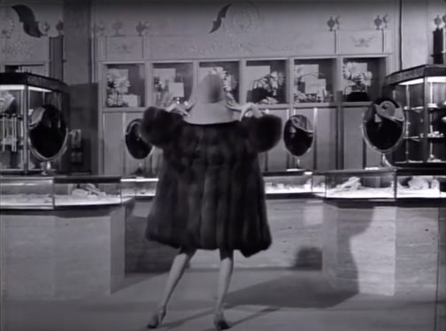
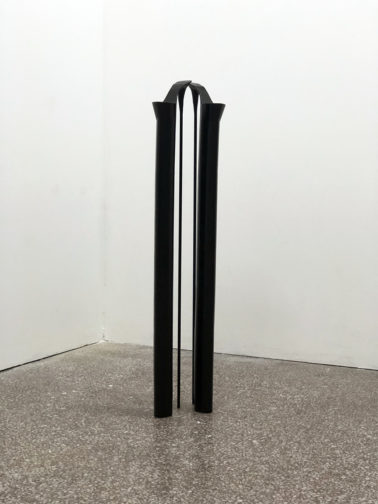
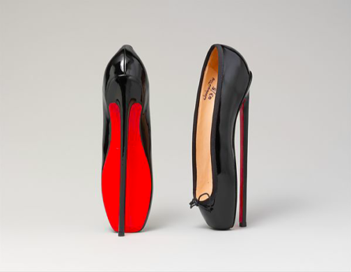
Maddy Plimmer, No Romance on the Pedestal, 2021, Goldsmiths MFA Degree Show, London


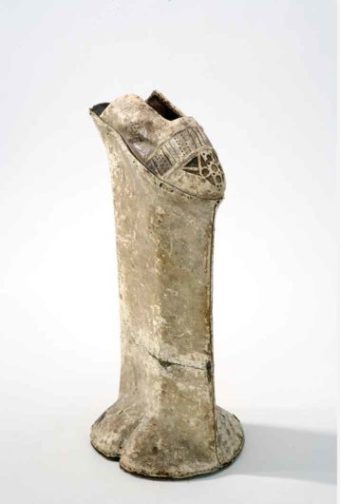
On a recent visit to the ‘London Grads Now’ exhibition at the Saatchi Gallery, showcasing the works of recent art school graduates, I was magnetised towards a towering pair of heels (above). Created by Goldsmiths graduate Maddy Plimmer, these heels, at a metre tall, are not for the faint-hearted or weak-ankled. Plimmer explains that the inspiration behind these art objects was a mobile game featuring a female avatar whose heels grow in height as she navigates a progressively challenging obstacle course. The precariousness of women’s existence through self-elevation, literal or metaphorical, is evidently a topic of fascination. I couldn’t help but imagine how painful the experience of standing, let alone attempting to walk, in these shoes would be.


The obsession with shoe-related female discomfort is by no means a new concept. Footbinding, a practice enforcing the beauty standard of delicately small feet, is a global phenomenon throughout dress history. Not only did binding stunt foot growth, it also debilitated women’s ability to stand, walk and exist. The historic desirability of women’s tiny feet and dainty little shoes makes the female foot an eroticised object that warrants regulation. For example in China during the Ming dynasty, if a woman revealed a barefoot in public, she would be committing an indecent assault. The air of secrecy that feet acquired through centuries of being hidden away is what made them so controversial. Shoes, hinting at what lies within, have thus become objects of Freudian fetish fascination.


Foot

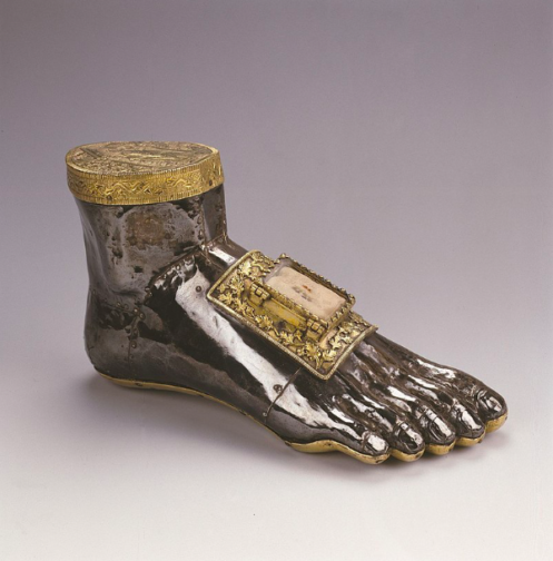
Foot reliquary of Saint Blaise, c. 1260, Musée provincial des Arts anciens, Belgium


In its purest form, ‘fetish’ defines objects that have religious or spiritual significance, such as reliquaries. Saint Blaise, a fourth-century physician and healer, was beheaded for refusing to renounce his Christian faith. The above reliquary, supposedly containing authentic relics of his foot bones, served a practical function of directing prayer, as well as embodying and inspiring fervent Christian dedication. Comprised of oak, stone and precious metals, each individually crafted toe hints at the holy bones contained within without revealing them. However, the hinged door detail implies that the reliquary could be opened to witness the relics.


From a dress historical point of view, the reliquary calls to mind Maison Margiela’s iconic Tabi boot (below). Like the medieval reliquary, the Tabi draws attention to the separation of the toes, connoting the foot within without directly showing it. The almost hoof-like appearance of the foot takes on a fetish significance, but not in religious terms. The statement shoe draws the eye down the length of the body to be affronted by a yonic slit in the usual place of a modestly covered foot. While heels are usually regarded as phallic objects to elongate and accentuate the sexualised female form, the Tabi boot subverts this, and is particularly potent when worn by a man.


Tabis

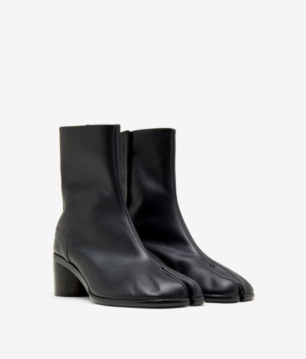
Maison Margiela, Mens Painted Calfskin Tabi Boots. maisonmargiela.com


Appropriated from Japanese tabi that date back to the fifteenth century, Margiela’s boot continues a long history of the regulation of women through their footwear. Tabi were originally leather shoes made from a single piece of animal skin, later evolving into split-toe socks to be worn with thong shoes, such as geta.


Tabi

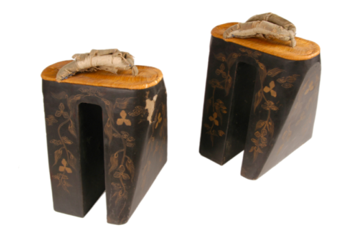
Koma geta, second half on 19th century / Edo period, Japan, Tokyo, Musée de Quai Branley, Paris


This pair of geta, nearly 30 centimetres high and weighing over 2.5 kilograms, belonged to a courtesan in the Yoshiwara pleasure district of Edo, modern-day Tokyo. The two wooden ‘teeth’ platforms are ornately decorated in guided floral motifs, whilst the straps are wrapped in now faded velvet. Both connote a degree of luxury, suggesting the status of the courtesan. The woodblock print below depicts a procession of richly-dressed courtesans, all in geta and ornate kimonos, accompanied by attendants. However, this is not an accurate depiction of the realities of the sex district. By physically elevating the female wearer, geta were utilised as a way of identifying courtesans within the district, especially to make sure they weren’t running away. Furthermore, some geta also bore the mark of the courtesan’s owner, revealing that these shoes were a way of binding courtesans to their life within the sex district, thus denying female empowerment or freedom.


Image 5

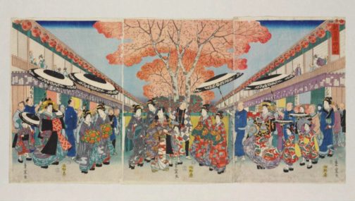
Utagawa Hiroshige II, Nakano Street in Yoshiawa district in Edo, 1857, woodblock print, Japan, V&A, London

Restrictive footwear, in every sense of the word, is also evidenced throughout Europe. For example, chopines were highly popular throughout Renaissance Europe, in particular Venice. These stilt-like shoes served the practical function of elevating the wearer above flooded streets to prevent their expensive garments from being dirtied. However the chopines below, at around a staggering 55 centimetres tall, offer an entirely impractical degree of elevation.


Image 6

Chopine, Italy, circa 1600. wood and leather. Royal Armoury, Stockholm

This suggests that chopines also served the symbolic function of displaying status, as they literally showcased women of higher standing. Additionally, chopines create a phallic image of the female form – transforming her into an erect column-like structure. According to Freud, it is not simply the fact that the shoe imitates the form of a phallus that justifies fetishists’ appreciation of footwear. It is also the positioning of the shoe in relation to the body, creating a link up to the leg towards the genitals. Freud argues that young boys, from their low vantage point, make this link in relation to their mother and their mother’s absent penis. The materials of heavy skirts that shield the female body from prying eyes add an erotic level of mystery to this.


Image 7

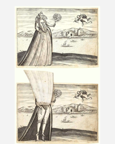
Ferrando Bertelli, Venetian Woman with Moveable Skirt (with flap lifted to reveal her chopines), 1563. Engraving, 14 x 18.9 cm. Metropolitan Museum of Art, New York


The above image depicts a respectable sixteenth-century woman who is reduced to ridicule as her skirt can be lifted up to expose her chopines as well as her breeches. At the time, breeches, a masculine undergarment, were often adopted by prostitutes. The hovering cupid, once her skirt is lifted, crudely points his arrow directly at her covered genitals. Her chopines are not as grand as other examples. She is neither elevated through her rank nor her footwear, making her lowered status as a prostitute a possibility.


Image 8

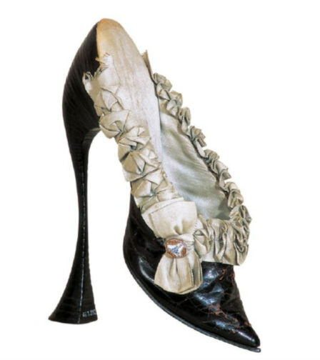
Mule, circa 1900, Vienna, Austria, International Shoe Museum, Romans.


Excessive heel height is not only about displaying women’s aspirational status but also about diminishing and controlling them through severe discomfort. The above fetish mule, made of black kidskin, represents female discomfort for male gratification. The severe point of the toes, combined with the flared and precariously narrow 20-centimetre heel, reveal that it would be impossible to stand in these delicate shoes. They could only be worn sitting or lying down. Yet these mules would have enhanced the curvature of the arch of the foot to an extreme degree, creating a graceful silhouette. The intricate ruffled detail and the bow adorned with a cabochon set in porcelain demonstrate that this is a valuable object. Hence, this shoe is not about diminishing a woman’s social standing, but about reducing her to an immobile, passive object of desire.


Image 9

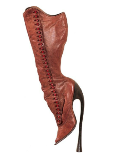
Fetish boots, c. 1900, Vienna, Austria, International Shoe Museum, Romans


Similarly, the 28-centimetre heel of the above fetish boot creates an unnatural curvature of the female foot. The point of the shoe and the heel sit at different heights, again showing that these boots were not made for walking. The length of the boot, extending up the entire calf, evokes the physical proximity of the leather to the female skin, which adds a layer of fetishism to the object. The thirty two intricate button fastenings up the length of the boot enhance this, creating a sense of longing for what the boot encapsulates but is unwilling to surrender. In this way, it is not entirely dissimilar to the foot reliquary.


Image 10

Christian Louboutin, Pumps, 2007, Metropolitan Museum of Art, New York

Louboutin’s 2007 ‘Fetish’ collection brings the themes of early twentieth-century fetishism into the present day. Louboutin takes the humble flat ballet pump, a staple of contemporary women’s wardrobes, and morphs it into something that looks like an instrument of torture. In the campaign shoot, photographer David Lynch stressed this element of eroticised female suffering.


Image 11

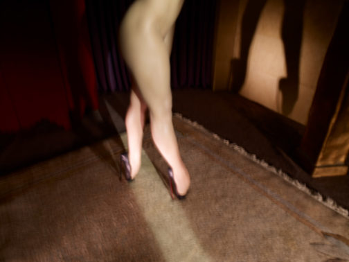
David Lynch, Fetish, 2007. Courtesy of Christian Louboutin


In keeping with the ballet pump, Lynch requested dancers instead of models for the shoot. This also tied in with Louboutin’s origins as a shoe designer for showgirls at the infamous Paris cabaret music hall, the Folies Bergère. Thus dance and movement (or a lack of movement) have always been taken into consideration in his designs. Moreover, Louboutin prioritises his imagination over technical elements and natural proportions, and this is certainly the case here. The strong, athletic legs of the dancer tower over her tiny delicate feet that are hardly visible in their contortion. The harsh light projects a shadow of the extreme, sensuous curvature of the dancer’s feet, teetering precariously en pointe. Lynch has created an atmosphere shrouded in secrecy through these chiaroscuro light effects, forcing the viewer into the role of the voyeur. The dancer’s naked body is fragmented as we can only see her bare legs. Her arms are out of shot and supposedly holding onto supports. The blurred image evokes a sense of panicked movement, as if she is in the process of falling. In this instance, it is the delicate vulnerability of a woman wearing such torturous shoes that renders her an object of spectacle and thus of erotic fascination.


There is something inherently powerful about employing footwear, something that was originally designed to root you to the ground and facilitate walking, as a means of self-elevation through tolerated agony. Yet if such an accessory is forced onto unwilling feet, it denies selfhood, and objectifies the wearer as a passive mannequin-like static form.


By Claudia Stanley


Sources:


Apter, Emily. Feminizing the Fetish: Psychoanalysis and Narrative Obsession in Turn-of-the Century France. Ithaca, NY: Cornell University Press, 2018.


Bossan, Marie-Josèphe. The Art of the Shoe. New York: Parkstone, 2004.


Croizat-Glazer, Yassana. Historical Shoe Trends, Sexual Contrasts and the Need to Take Up Space. 15th July 2021: https://awomensthing.org/blog/historical-shoe-trends-chopines-crakows/


Furiassi, Cristiano Gino. Chronicling a Global Fetish: A Linguistic Analysis of the Pseudo-Italian Internationalism Stiletto. ZoneModa Journal 9, no. 2, 2019. pp. 103–121.


Hamlyn, Anne, Freud, Fabric, Fetish, Textile: The Journal of Cloth and Culture, vol.1, no. 1, March 2003. pp. 8-26.


Jacobs, Fredrika H. Shoes. Res (Cambridge, Mass.) 71-72, no. 1, 2019. pp. 284–294.


Jacques M. Chevalier. “Foot and Shoe Fetishes: The Bright Side.” In Corpus and the Cortex, 109–. MQUP, 2002.


Stephens, Sonya. Sex and Spleen: Fetish in Baudelaire’s ‘les Bijoux.’ South Central review 29, no. 3, 2012. pp. 63–79.


V&A. Christian Louboutin interview, 2015: https://www.youtube.com/watch?v=WrH4JlyW5zo

Pampooties and Brogues: A Folkloric History

It was during my undergraduate degree when I first came across the word Pampootie in environs outside of my own home. It was discussed during a lesson centered around a study of Jack B. Yeats and his illustrations for William M. Synge’s book The Aran Islands. My professor began to describe the dress of The Aran Man (below) when she referred to his light leather shoes as Pampooties. Growing up my mother had always called our children’s shoes Pampooties, which lead me to think of it as nothing more than a made-up word which my family used. Clearly, I was wrong. This initial introduction to the Pampootie in the wider world typifies the myth and dynamism which animates the shoe’s history.

Figure 1: An Island Man, Jack B. Yeats, Sligo County Library and Museum

The pampootie is the traditional shoe of the Aran Islands off the coast of Galway in the west of Ireland. The shoe consists of a flat piece of cow hide punctured with holes around its edges which are laced with leather thong and tightly wrapped around the foot. This basic attempt towards the fashioning of a protective foot covering stands as the common ancestor to the modern brogue shoe, as a derivative of the Irish word Bróg (meaning shoe). Yet the humble pampootie style still exists as a more historically modern version of the shoe, as the brogue style can be traced back to prehistoric times. In 1967 a horde of exquisitely preserved brogues were discovered in a bog in County Mayo which were dated back to the year 1965BC. In many ways these shoes may be considered more artistically advanced than the pampootie, as the ornamental holes characteristic of the modern brogue can be identified. Thus, despite the pampootie’s modern use the silhouette of the classic brogue which one may recognize today is far older.

Figure 2: Peter Phatch Faherty lacing his Pampooties, 1952. Getty Images

Here the mythology of the pampootie and the brogue must be addressed. In 1992 artist Brad Legg wrote his “avowedly populist” The Stars and the Brogue: Ancient Astronomy and Footwear in Ireland in which he compares the hole designs of brogues to the star patterns of the spring equinox of 1800BC. Similarly, this explanation for the shoe design was widely popular throughout the Victorian era. It can be argued that the discovery of such a bountiful horde of ornamented brogues in 1967 drives home this assertion as they were possibly gathered as a sacred offering to the pagan gods.

Figure 3: A selection of Celtic and Viking Ornaments which Victorian Scholars compared to Brogue patterns.

However, other interpretations of the holes have become more widely accepted. Many believe that the brogue’s punctures serve an entirely functional purpose, as the holes provided drainage whilst walking along the often damp and waterlogged ground of rural Ireland. Others attest that the shoes were fitted to the wearer a size too big so they may be filled with straw to absorb the wet.

Additional speculation surrounds the name of the ‘pampootie’ and where it converges with the brogue.  No one is quite sure where the seemingly exotic sounding ‘pampootie’ finds its origins, yet some have hypothesized that it is perhaps an alteration of the Turkish word ‘papoosh’ or slipper. Irrespective of that correlation, it is most likely that the brogue and the pampootie later became united through the shortening of the word pampootie to the Irish word Bróg or shoe, as aforementioned.

Nonetheless, the necessity of function over form replaced the decorative and descriptive qualities of the early pampootie, and only remerged through the revival of the shoe in the twentieth century. No conclusion can ever be outrightly drawn from many of these notions, yet it is through the mysticism surrounding the design of the shoe which we may examine its modern interpretation as it finds a secure home in the contemporary wardrobe.

In the early twentieth century the brogue’s functional and formal characteristics finally harmoniously merged in the modern variation of the shoe. The dual inclusion of a sturdy leather construction alongside the ornamental hole patterns poised the brogue as a classic country walking shoe for the twentieth century gentleman. Advertisements emphasize the traditional nature of the shoe and use its historical precedent to sell ideas of reliability and comfort.

Figure 4: Abbot & Sons “Super Brogues” Advertisement, 1919. Shutterstock

Thus, throughout the twentieth century the brogue form underwent many iterations and alterations as the traditional holed pattern took on new silhouettes as the century progressed. As made clear by the Cosmopolitan article below, by the mid century the brogue had been translated to walk the pavements of the burgeoning cityscape.

Figure 5: Cosmopolitan Article “Shoe Talk”, 1968, ProQuest

Later brogues became an iconic symbol within artistic and cultural movements, as evidenced by the iconic image of Twiggy below. This photograph taken in 1972 features a pair of brogues made by renowned British shoemaker George Cleverley. Cleverley exclusively made shoes for men but was convinced to make an exception in this case for Twiggy.

Figure 6: Twiggy in George Cleverley Brogues, 1972, Getty Images

Thus, both the brogue and the pampootie occupy a fascinatingly ambiguous space within the lexicon of modern dress. The myriad of myths surrounding the footwear informs the modern understanding of the shoes as both contemporarily relevant and deeply historical.

By Victoria FitzGerald


Sources:

“Brogue – Word History”. Word-Origins .com. Last modified July 18, 2011. https://web.archive.org/web/20110718083106/http://www.word-origins.com/definition/brogue.html

Hall, Joseph Sparks. The Book of the Feet: A History of Boots and Shoes. Second Edition. London: Read Books, 2017.

Hall, Michael. “Brogues and the Stars: on an Archaeological Controversy.” Country Life 187, no. 13 (1993): 94. https://www.proquest.com/magazines/brogues-stars/docview/1521579963/se-2?accountid=10277.

“Pampootie”. Merriam-Webster.com. Last modified October 24 2021. https://www.merriam-webster.com/dictionary/pampootie

“Shoe Talk: A new Kind of Brogue.” Cosmopolitan 165, no. 5 (11, 1968): 54. https://www.proquest.com/magazines/shoe-talk-new-kind-brogue/docview/2007367987/se-2?accountid=10277.

“Twiggy in Cleverley”.  Iconic Images.net. Last modified 24 October 2021. https://iconicimages.net/photo/jdv-tw018-twiggy-in-cleverley/