Category Archives: From the Collections

We analyse fashion and dress in relation to works from The Courtauld Collections

Relaxed Royal Tailoring and Archaic Court Dress: Menswear of the Royal Ceremonial Dress Collection, 1932-1953

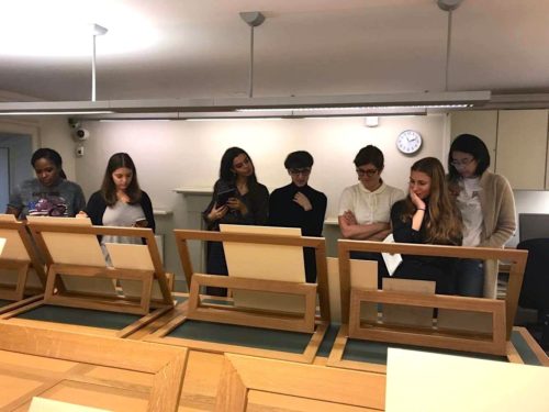
During last week’s study trips, we were lucky enough to snoop around Hampton Court Palace’s Royal Ceremonial Dress Collection. Items within their collection of 10,000 objects date from the late sixteenth century to the present day. They range from Queen Victoria’s monogrammed underwear to That Dress worn by Princess Diana when she danced with John Travolta at a White House dinner in 1985. All of Hampton Court’s archive storerooms are located in converted palace apartments and, rather fittingly, the dress collection is housed in an old laundry room. Curator Matthew Storey kindly showed us some highlights of the collection which sat neatly within the 1920-1960 timeframe of the Documenting Fashion course. From ambiguously-shaped white garment bags suspended ghoulishly from rails, he revealed two examples of menswear with royal significance.

Royal Image 1
Fredrick Scholte, tweed jacket made for the Duke of Windsor, 1932, Royal Ceremonial Dress Collection

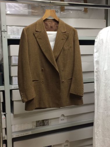
The first was a tweed suit belonging to the Duke of Windsor, previously titled the Prince of Wales and later King Edward VIII before his abdication in 1936 in order to marry American divorcée Wallis Simpson. Made by Savile Row tailor Fredrick Scholte in 1932, the jacket embodies the Duke’s philosophy of ‘dressing soft’. Prioritising comfort and movement, the Duke severed ties with social rituals of dress and became an icon of men’s style in Europe and America. His sense of ease helped loosen the stiff grip of conformity in relation to men’s tailoring. Most noticeable about the garment itself was its own movement. As it was handled delicately by gloved hands, the double-breasted jacket billowed of its own accord with an unusual fluidity for such stiff tweed. The movement of the garment itself catered to the dynamism of the wearer. Scholte’s expert tailoring, known as the English drape or London cut, included more material across the chest and back, enabling this ease of movement as well as creating a broad, masculine silhouette. In his own words, the Duke praised Scholte’s ‘rigid standards concerning the perfect balance of proportions between shoulders and waist in the cut of a coat to clothe the masculine torso’.

Royal Image 2
Governor of the Bahamas, Duke of Windsor Holding Asparagus Picked by Bahamian Labourers During World War Two

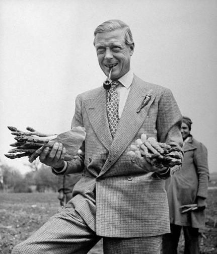
In this image, the Duke manages to look suave whilst posing with bunches of asparagus. Pipe clasped between teeth, he stands with one leg raised. The double-breasted cut, broad lapels, sloping shoulders and buttons on the cuffs are all similar, if not the same, to the tweed jacket held within the Royal Ceremonial Dress Collection (it’s surprisingly difficult to identify patterns of tweed by squinting at black and white heavily pixelated reproductions of houndstooth without inducing a hefty migraine). Despite pulling across his abdomen, the jacket holds its shape over his chest and shoulders, maintaining its neat, square silhouette. Curator Matthew Storey explained the difficulty of finding a mannequin to best display this garment, looking for images of the Duke in swimwear to get an understanding of the body held within the garment. Under the broadening silhouette of Scholte’s construction, the Duke’s frame is almost surprisingly slender but still athletic. Usually mannequins are built to fill a garment and offer bodily support. However, with Scholte’s English drape, the jacket is designed to hold its shape with minimum support even on a humble hanger. 

Royal Image 3
Duke of Windsor during a cruise of the Adriatic Sea, August 1936
© Kerry Taylor / BNPS

The matching trousers, made by Forster and Sons, are also cut in a quintessentially English way; they are high-waisted to elongate the leg, with loops for braces to be attached. They also feature a zip fly, a fairly recent innovation, instead of buttons, which further adds to the idea of ease and practicality promoted through the Duke’s clothing. His clothing was customised, such as the left pocket of his trousers being bigger to accommodate his cigarette case. However, the Duke stated ‘I disliked the cut of [English trousers]; they were made…to be worn with braces high above the waist. So preferring as I did to wear a belt rather than braces with trousers, in the American style, I invariably had them made by another tailor’. Following his abdication, his style was progressively Americanised as he severed ties with his regal roots. The Duke sent his fabric to H. Harris in New York, to be tailored in the low-waisted American style. The Duke ‘gave [H. Harris] a pair of my old London trousers, and he copied them admirably. Since then, I have had my trousers made in New York and my jackets in London, an international compromise which the Duchess aptly describes as “pants across the pond”.’

In 1924, Men’s Wear magazine stated ‘the average young man in America is more interested in the clothes of the Prince of Wales than in any other individual on earth’, revealing the global impact he had on the relaxation of men’s fashion. In his autobiography A Family Album, the Duke articulated that ‘I was in fact “produced” as a leader of fashion, with the clothiers as my showmen and the world as my audience. The middle-man in this process was the photographer, employed not only by the press but by the trade, whose task it was to photograph me on every possible occasion, public or private, with an especial eye for what I happened to be wearing.’ The Duke expressed how fashion is an ongoing, collaborative process and an ever-advancing expression of self-image.

Royal Image 4
Court coat, 1953, Royal Ceremonial Dress Collection

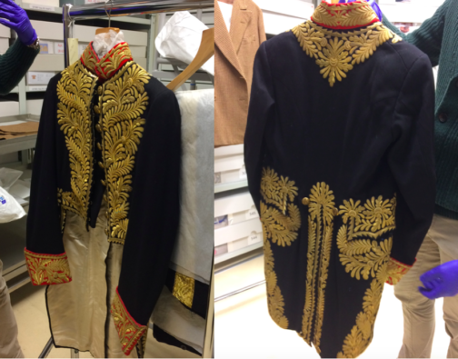
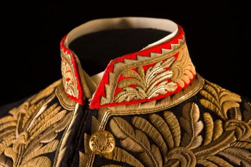
In total contrast to the Duke’s understated yet trail-blazing style, court dress, worn in the presence of a royal, remained stubbornly rooted in the past. It exists outside trends and time itself. From the collection, we were also shown a court coat worn to the coronation of Queen Elizabeth II in 1953. The rank and status of the wearer is communicated through the sheer splendour of the silver and gold gilt embroidery, adding a symbolic and literal weight to the garment. The embroidery stretches proudly across the chest, evoking the gold braiding that adorns military uniforms. In 1820, King George IV lessened the strict regulation of court dress, meaning that garments resembling military uniforms usurped men’s colourful court coats. Instead of evolving with the times, these garments remained cemented in the past, due to tradition and ceremony that are intrinsically woven into the formality of court dress. On first inspection, a court coat from 1885 created by Henry Poole & Sons on Savile Row for Lord Boston is almost identical to the 1953 garment in the opulence of its decoration (the triangular embroidery around the collar is slightly different).

Royal Image 5
Court coat by Henry Poole & Sons, wool & metal embroidery, 1885
© Historic Royal Palaces / Robin Forster / Bridgeman Images

This demonstrates that court dress exists outside of the magnetic field of fashion and resists the thrust towards modernity. In contemporary civilian dress, any peacocky ornamentation was regarded as subversive to traditional notions of masculinity. In 1930, C. Flügel’s The Psychology of Clothes explored the notion of ‘the great masculine renunciation’ of elaborate elegance. For men, fashion was inherently feminine, and to be too invested in your clothing was to deny your own masculinity. Yet the court coat is separate from this. It seems to embody male vanity, neatly interweaving tradition, militant male aggression, and the feminine flair of decorative embroidery.

Royal Image 6
Gered Mankowitz, Portrait of Jimi Hendrix in his Hussars military jacket, 1967, bromide fibre print, National Portrait Gallery
© Bowstir Ltd 2018

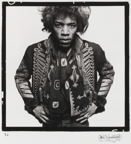
The masculine rejection of trivial fashion remained firmly in place until the 1960s, when androgyny and experimentation became the new mode. Almost ironically, youth subculture groups appropriated archaic military dress as a means of breaking away from traditional masculinity. The Portobello Road store I Was Lord Kitchener’s Valet sold on army surplus as well as vintage military jackets throughout the 1960s. Rockstars, such as Jimi Hendrix, flaunted their military gear, to protest against the Vietnam War or to sever themselves from the dull mundanity of conventional drab-toned suits. Or, like the court coat, perhaps military jackets served the purpose of self-promotion and performative male fortitude.

By Claudia Stanley

Sources:

J. C. Flügel, ‘The Psychology of Clothes’, in The Rise in Fashion: A Reader, ed. Daniel Leonhard Purdy (Minneapolis, 2004)

Maria Costantino, Men’s Fashion in the Twentieth Century: from frock coats to intelligent fibres (London, 1997)

The Duke of Windsor, A Family Album (London, 1960)

Looking Through the Lens of Madame Yevonde

I recently found myself sifting through self-portraits by women photographers in a not very coherent bout of research on the National Portrait Gallery website. I didn’t find exactly what I had been looking for, but I did find something much better – this photo of Madame Yevonde (fig.1).

Madame Y
Fig. 1. Madame Yevonde by Madame Yevonde (1967). https://www.npg.org.uk/collections/search/portrait/mw58111/Madame-Yevonde?sort=dateDesc&LinkID=mp06547&role=art&displayStyle=thumb&displayNo=60&rNo=40


This photo caught my eye, and made me smile, when I had been otherwise stuck in a trance of endless scrolling. Her smart chequered suit, upright pose, and jaunty hat scream pride in herself, her work, and a humorous relationship between photography and portraiture. Editing of the image has rendered her miniature besides her huge vintage camera, an ode to her earlier portrait studio and a recognition of the many decades she had spent in the industry.

After seeing such a joyful, humorous, and enigmatic portrait, I had to look into Madame Yevonde’s work further. I want to share some of the wonderful images I have found, and generally indulge in Madame Yevonde’s personality-filled work for a while longer.

Born in 1893, Yevonde Philone Middleton was a photographer, primarily taking studio portraits, for an impressive portion of the twentieth century. Known professionally as Madame Yevonde, she opened her first photography studio in 1914 at the age of 21 and continued to work until a few months before her death in 1975.

There always seems to be something eye-catching or dramatic about Madame Yevonde’s photography. Her main mastery was in the VIVEX colour process, which allowed her to produce vibrant and lustrous colour shots. Her portrait of Vivien Leigh (fig.2) demonstrates this perfectly. The punchy red of the background emboldens Leigh, her red lip and scarf connecting her to the red reflections of the light, and her green top bringing her strongly into the foreground. Her face is lit from one side, drawing attention to the outline of her face, and contours of her nose and cheeks. It’s the sort of photo that makes you stop and look twice.


Madame Y 2
Fig. 2. Vivien Leigh by Madame Yevonde (1936). https://www.npg.org.uk/collections/search/portrait/mw11846/Vivien-Leigh?LinkID=mp06547&role=art&displayStyle=thumb&displayNo=60&rNo=2


The next photo that jumped out to me was the portrait of the Hon. Mrs James Beck as Daphne (fig.3), a part of Madame Yevonde’s Goddesses series. Inspired by a society charity ball with an Olympian theme, Madame Yevonde made a series of portraits of society women dressed as goddesses in 1935. The abundance of leaves represent Daphne’s transformation into a Laurel tree in Greek mythology. The leaves cast a distinctive shadow across Mrs James Beck’s face, as if they are reaching across her and we are seeing Daphne mid-transformation. The shadows are tinted green in a way that the real leaf shadows would not be (they are not translucent), reminding us that this is a manufactured portrait, a piece of art.


Madame Y 3
Fig. 3. The Hon. Mrs James Beck as Daphne by Madame Yevonde (1935). http://www.users.waitrose.com/~felice/image4.htm


The solarised portrait of Dame Dorothy Tutin (fig.4) shows another style Madame Yevonde was adept at. The solarised image brings far more texture to the portrait, particularly allowing Tutin’s ruffled hair to stand out. The darkness of her plucked eyebrows draws our attention to her serene facial expression. The contrast across the wide collar of her top gives her a regal presence. I think this portrait is one of the most characterful that Madame Yevonde produced. The solarised effect gives insight into the formality, poise, and elegance that Tutin is able to project, whilst also highlighting the relaxed side that is hinted at by her haircut.


Madame Y 4
Fig. 4. Dame Dorothy Tutin by Madame Yevonde (1955). https://www.npg.org.uk/collections/search/portrait/mw144366/Dame-Dorothy-Tutin?LinkID=mp05851&role=sit&rNo=2


I hope to have shown you a glimpse into the wonderful world of Madame Yevonde’s photography. Through skilful manipulation of colour, props, photographic effect, and lighting, Madame Yevonde is able to create bold images that are still able to catch my eye, even in today’s image-saturated world.

By Megan Stevenson

Performing Gender Through Costume in the Takarazuka Revue

The Takarazuka Revue is an all-female performance troupe, formed in 1914. Now one of the biggest theatre companies in the world, the group is known for its spectacular performances with highly trained female actors playing male and female roles.

The leading actors of the Takarazuka Revue are celebrities. Today, they have a global fanbase and entire Wikipedia dedicated to documenting all past and current performances and trivia about the troupe (www.takawiki.com). Yet, before the internet and the increasingly connected world of the post-war era, fans had to find another outlet for their eager engagement with the Revue.

The British Museum has in its collection an incredible example of such engagement: an album of 200 postcard photographs, some signed, of the performers in the Takarazuka Revue, dating to the late 1930s.

Figure 1: Album of 200 postcard photographs of actresses in the Takarazuka revue, with covers in textile. Six of them signed. © The Trustees of the British Museum.
Figure 2: Album of 200 postcard photographs of actresses in the Takarazuka revue, with covers in textile. Six of them signed. © The Trustees of the British Museum.

In these photographs we see the range of characters, periods and styles used by the group. Costuming alone tells us that there were military figures from a range of historic periods, gentlemen, geisha, dancers, swooning young women and the epitome of a 1920s gangster.

This remnant of a bygone age gives us a beautiful insight to the world of Japanese theatre in the 1930s. The highly decorative costumes would have immediately expressed a character’s identity to a theatre audience. The jacket of the figure in the top right corner of the first image is so reflective is can barely be photographed, and the feathered headdress in the image below is so grand it is having to be held upright by its wearer.

These photographs also reveal the visual markers used to denote gender on stage. Beyond the outfits, the actors’ hair is modelled in short, slicked back styles for male characters. Eyebrows are also styled differently, the female characters have longer, thinner brows while their male counterparts style thicker and far straighter brows.

Photographs can tell us about what these actors wore, how they used their faces to convey their characters, and that they were revered enough to be immortalised in an album. However, there are things these photographs lack. Colour, for instance. Staging or the style of the performance too. That is where I bring in this ticket for comparison.

Figure 3: A ¥2 ticket to the Tokyo Takarazuka theater performance on July 17, 1937. www.oldtokyo.com.

This ticket, saved from a Takarazuka theatre performance in Tokyo on the 17th July, 1937, is a drawing. It can therefore can give us a completely different range of insights into the 1930s performances for the Takarazuka Revue.

I must firstly point out the similarity between the figure on this ticket and the actor in the top left corner of the second album page. The resemblance is uncanny and given the similar time period the ticket must either be a representation of that exact actor or at least of the character they were playing in a show at the time.

Gender is expressed in a greater variety of ways through the drawn figure on the ticket. We can see their masculine posture, laid back and confident, dominating the space they stand in with ease. But we also see now what we could not in the photograph, the makeup on their face. The pale skin, rouged cheeks and red lip remind us that this is a female actor playing a male role. There is a sense that, no matter how convincing of a performance the actor could give, the audience must always be reminded that it is not a man they are seeing, but a male-role played by a woman.

The performances of masculinity and femininity in the Takarazuka Revue are exaggerated. The Revue presents a heightened version of femininity and a particularly elegant version of masculinity. In this sense, the Revue exposes the constructed nature of gender but also remains rigidly within the confines of a binary gender system. You are either male or female. At no point does the performance wish to the leave audiences uncertain as to the gender they are seeing performed, or the true gender of the actor in the performance.

The images in this blog post reveal to us the ways that dress and embodied behaviour were used by the Takarazuka Revue to present a strong sense of gender whilst paradoxically also highlighting the fact that gender is indeed a performance.

By Megan Stevenson


Sources:

Stickland, Leonie R. 2008. Gender Gymnastics: performing and consuming Japan’s Takarazuka Revue. Melbourne: Trans Pacific Press.

Yamanashi, Makiko. 2012. A History of the Takarazuka Revue Since 1914: Modernity, Girls’ Culture, Japan Pop. Boston: Global Oriental.

“Album of 200 postcard photographs of actresses in the Takarazuka revue, with covers in textile. Six of them signed.” – https://www.britishmuseum.org/collection/object/A_2006-0113-0-1-1-200

“A ¥2 ticket to the Tokyo Takarazuka theater performance on July 17, 1937.” – http://www.oldtokyo.com/takarazuka-gekijo/

Runaway Brides: Tartan Wedding Dresses and Scottish Rebellion

Tartan is a fabric of rebellion, and it has long held appeal with those who consider themselves to be outsiders.

In 1745, the Scottish House of Stuart led the Jacobite Army in an unsuccessful attempt to seize the British throne from King George II. Following the uprising, a series of laws were enacted to subdue the fiercely independent Jacobites. The Dress Act of 1746, one of these laws, made tartan dress illegal in the United Kingdom. Anyone who wore tartan or other signifiers of traditional Scottish dress could face fines, imprisonment or exile.

However, The Dress Act of 1746 seemed only to strengthen the power of tartan. People across the United Kingdom began wearing full tartan outfits in defiance of the British government. Artists painted influential figures dressed in tartan but left their paintings unsigned, fearing that they would be punished for these public displays of dissent. Tartan became a signifier of anti-establishment attitudes, a very punk choice in the 18th century.

In 1974, Vivienne Westwood and Malcolm McLaren opened their boutique SEX to cater to the burgeoning Punk rock scene in London. Westwood stocked the shop with every type of plaid imaginable, and soon the Sex Pistols were singing out against the British government in full tartan suits, just like the Jacobites nearly two hundred years before them.

Vivienne Westwood, Wedding Ensemble, Anglomania, Autumn/Winter 1993, National Gallery of Australia, NGA 94.278.1-4.A-B.

This 1993 wedding dress by Vivienne Westwood is a vision of tartan excess, crafted from yards of plaid silk that cascade over a bloom of tulle in coordinating colours. Though the concept of a tartan wedding dress is unorthodox, it is not purely a whim of Westwood’s wild imagination and is rooted deeply in the history of Scottish fashion. The Isabella MacTavish Fraser Wedding Gown provides an example – a rare one, albeit – of a tartan wedding gown dating back to 1785. Though many details about the spectacular Isabella MacTavish Fraser Wedding Gown remain shrouded in mystery, the tartan of the dress can be identified as one woven between 1775 and 1784. This means that it was likely created while The Dress Act of 1746 was still in place, making this wedding dress an illegal creation.

Isabella MacTavish Fraser Wedding Gown, 1785, Inverness Museum and Art Gallery.

The headpiece that accompanies Westwood’s dress makes reference to a traditional piece of women’s Highland dress known as the earasaid. The earasaid is a length of pleated fabric that would be wrapped around the head like a veil and affixed at the waist. Although there is little information available on women’s dress in the Highlands before the turn of the 18th century, some historical evidence suggests that the wearing of the earasaid could date back to Pictish times. By the 1800s, written accounts and sketches of working-class women in earasaids were circulated across the United Kingdom, solidifying the trend as a hallmark of Scottish brides, even though the accuracy of these accounts remains contestable. Westwood recalls the earasaid with her veil’s gentle pleats and billowing volume but elevates its humble origins by pairing it with a regal gown of matching plaid.

A Victorian interpretation of how the earasaid may have looked. Robert Ronald McIan, plate from The Clans of the Scottish Highlands, 1845.

In a thoroughly contemporary interpretation of bridal traditions, Kate Moss first wore this gown down the runway at Westwood’s Autumn/Winter 1993 show with the bodice lowered to reveal one of her breasts. Preserving her modesty was a handful of flowers that once again harken back to tartan’s origins. Moss’s bouquet is studded with white roses, the symbol of the Jacobite army. Women participants in the Jacobite rebellion would often have their portraits painted with white roses tucked into the bodices of their dresses and their hair to signify their allegiance to the cause.

Vivienne Westwood, Wedding Ensemble, Anglomania, Autumn/Winter 1993. Runway photograph courtesy of Vogue Runway.

The bride who selects this dress to wear on her wedding day, likely one of the most publicly visible events of her life, chooses consciously not to perform the societal role expected of her. This wedding gown eschews the notion of brides dressing in virginal white, and it recalls a raucous national identity far more than a standard wifely one. With its earasaid and Jacobite references, this dress pays homage to the oft-overlooked women participants in the radical movements of Scottish history.

Westwood is one of the foundational contributors to tartan’s punk reputation, but she has also worked to ensure the medium’s longevity beyond the punk rock movement and, almost certainly conscious of her status as an Englishwoman, to emphasise its unique Scottish heritage. This dress is cut from MacAndreas tartan, a sett of tartan created by Westwood as a romantic tribute to her husband and collaborator Andreas Kronthaler. MacAndreas tartan is now officially listed in the Scottish Register of Tartans. Westwood has also created many of her tartan garments in accordance with the Harris Tweed Act, a 1993 Act of Parliament which seeks to protect and promote the traditional methods of woollen fabric weaving in Scotland.

From the Dress act of 1746 to the Harris Tweed Act of 1993, the lawmaking that surrounds tartan begs the question: why is tartan something institutions feel the need to control? Is it a dangerously influential pattern that incites revolt across centuries? Is it a precious national resource that must be protected at all costs? For the bride who dons a tartan wedding dress, one thing is certain. Tartan is a testament to fierce individuality and national history, suitable to dress herself in for one of the most sacred days of her life.

By Ruby Redstone

Sources:

Faiers, Jonathan. Tartan. London: Bloomsbury, 2008

Inverness Museum and Art Gallery online. ‘The Isabella Project’. Published February 2020.https://www.highlifehighland.com/inverness-museum-and-art-gallery/the-isabella-project/

MacDonald, Peter Eslea. ‘Musing on the Arisaid and Other Female Dress.’ Scottish Tartans online. Published 2016.https://www.scottishtartans.co.uk/Musings_on_the_arisaid_and_other_female_dress.pdf

Maspero, Ida. ‘Tartan Romance,’ National Museums Scotland online. Published 26 May 2019. https://blog.nms.ac.uk/2019/05/26/tartan-romance/

Scottish Tartans Authority. ‘Tartan and the Dress Act of 1746.’ Accessed 28 February 2021. http://www.tartansauthority.com/resources/archives/the-archives/scobie/tartan-and-the-dress-act-of-1746/

The Scottish Register of Tartans. ‘Westwood MacAndreas.’ Published 1 January 1993. https://www.tartanregister.gov.uk/tartanDetails?ref=5530

V&A online. ‘Vivienne Westwood: A taste for the past’. Last accessed 15 February 2021. https://www.vam.ac.uk/articles/vivienne-westwood-a-taste-for-the-past

Watt, Patrick and Rosie Waine. Wild and Majestic: Romantic Visions of Scotland. Edinburgh: National Museum of Scotland, 2019

The representation of fashion in ‘A Beatnik Community in St Agnes’ (1969)

During the wintery months of 1969, something unusual happened in the Cornish seaside village of St. Agnes. That is, a group of eccentric, unemployed, and, crucially, strangely dressed ‘beatniks’ arrived and began living in the off-season holiday cottages. This occurrence was notable enough to warrant coverage by local television station Westward Television. In this twelve-minute piece of black and white archival footage, Del Cooper interviews both the ‘suspicious’ local residents and the ‘unconventional’ beatniks, capturing a unique moment of fashion microhistory.

Before delving into analysis, it is important to first set this film in a temporal and geographic context. Alternative style was not necessarily new: indeed, by 1969, a variety of subcultural styles and countercultural thought existed in the UK. Since the mid-1950s, Jazz Fiends, Beatniks and West End Boys, stylistically spearheaded by West Indian immigrants, challenged the constrictive post-war aesthetic of adulthood. In the 1960s, Mods and Skinheads similarly used their dress to be socially disruptive. And while Beatniks are not as readily associated with 1960s subculture as Mods, in June 1965, beat poet Allen Ginsberg nevertheless drew a crowd of 7,000 to his four-hour-long poetry reading.Yet, while counterculture and alternative style was a real possibility in this era, visible street style was often limited to London and other cultural hubs. So, when a group of fashionably long-haired Beatniks arrived in a village at the extremity of southwestern England, they signified something new, and disrupted the social ‘norm’.

Analysing this film through the lens of dress and fashion, therefore, is extremely valuable. It is the Beatniks’ dress that is the main disturbance to St. Agnes. Their unusual and sometimes flamboyant style is a stark juxtaposition against the conservative villagers and the local television reporter. This non-fiction film is illustrative of an important representation of fashion on a micro-level, separate to the world of high fashion and London.

If, as fashion scholar Carlo Marco Belfanti argues, fashion is defined by ‘an increasing passion for change and an insatiable search for novelty’, there is nothing more novel than the juxtaposition of a trendy subcultural dress with an underpopulated tourist destination in winter. Accordingly, the film opens with a static shot of Del Cooper standing against a backdrop of usual activity in St. Agnes. He seems to embody the orthodox, respectable and masculine. His grey hair is cut short and only slightly windswept, and he is dressed conservatively in a monochrome polo-neck jumper and clean-cut wool jacket. Behind him, a woman in a headscarf exits Webb’s Store, and a Jacob’s van pulls up across the road to unload a delivery of cream crackers. This scene of total normalcy, however, is soon unsettled by subversive dress. As the camera pans right, the viewer’s eye is drawn to a group of women and men making their way through the village. They are wearing loose-fitting, layered garments, accessorised with patterned scarves and a random assortment of hats; all of them with genderbending long hair. At this moment, Cooper, addressing the camera, answers the unspoken question: ‘Well, of course, it all depends on what you mean by Beatniks. If you mean young people with long hair and rather unconventional clothes, then the Beatniks are here, in St. Agnes, right now.’ A group who have fashioned themselves so conspicuously, their desire for novelty and change is palpable.

It is important to note Del Cooper’s definition of ‘Beatnik’. There are only two elements of this definition: their novel clothing and their long hair. While their actual behaviour is mentioned in the film – sharing money and belongings, strict vegetarianism, and inclination to burn joss-sticks in the local pubs – it is their dress that makes them Beatniks, including their decision to grow their hair long, a body modification that clearly communicates to other human beings that they are unconventional.

Figure 1: Del Cooper addresses the camera as the Beatniks walk into shot
Figure 2: Overcoats, scarves, dark colours and an air of casualness defines these young people

As the camera follows the Beatniks through the village, a man and a woman lead the group, five or six paces ahead. The man wears dark, flared jeans, pointed heeled boots, and a sparsely buttoned-up patterned shirt over a ruffled scarf. A cropped fur coat shrouds this outfit, that he wears undone with his hands resting casually in the pockets. His hair is slightly longer than shoulder length, accessorised by an askew cowboy-style hat. The woman is casually dressed in all black: a loose-fitting dress that reaches her ankles and leather boots. Over this, she wears an oversized, lightweight jacket and a carelessly knotted scarf around her neck. Her long hair flows behind her as she walks.

Figure 3: The flamboyantly dressed leaders

Following behind them are six more long-haired members of the group. Another woman in all black pushes a pram while four men walk alongside her, all in flared trousers and casual shoes. Their winter coats are a trench coat with the belt hanging loose at the back, a hooded duffle, and two double-breasted peacoats, respectively. One man wears a beret, while another wears a Russian Cossack-style fur hat, and they have on a hodgepodge of scarves. Another woman brings up the rear, dressed in a more masculine style, with loose-fitting trousers, a shirt, and a chunky waistcoat. She does not wear her coat but drags it along in her left hand, with a lit cigarette in her right.

What about these people’s dress draws them together? They are undoubtedly a collective, with loose and layered flares, long hair, and patterned scarves. Crucially, these clothes must be thrown on their bodies carelessly, unbuttoned, with pockets to rest the hands. Casualness defines this style tribe. Yet their clothes incorporate a range of cuts, styles, and materials, from paisley cotton scarves to striped woollen scarves, from fur coats to duffel coats – a nod to the growing interest in second-hand clothing in the late 1960s. This exemplifies the paradox at the heart of fashion. As Sheila Cliffe has put it, ‘humans have a need to be both a member of a group, which provides security and also distinguish themselves from the group and assert their individuality’. This is highlighted through the community’s differences in dress and fashioning themselves – they accessorise with individual styles of hat, scarf, and sometimes coat.

This casual, loose, and layered style would not be nearly as striking if it were not juxtaposed with the relatively plain and certainly traditional style exhibited by the long-term residents of St. Agnes. Yet, as the film begins to interview the locals, it is clear that the exhibition of dress is of far less importance to the filmmaker. While the camera angles ensured to include plenty of full-body shots of the unusual Beatnik outfits, the shots of the interviewees are only static close-ups. And to a degree, this is understandable: if fashion is novel, in constant change, and both individual and group-based, the St. Agnes citizens are not particularly fashionable.

Figure 4: A fur-hatted local

Six different locals are interviewed, and either express distaste or indifference to the unorthodox new arrivals. In a few minutes, viewers meet a range of characters: a woman, without make-up, her white hair tucked into a dark fur pillbox hat, and a paisley scarf knotted around her neck; a middle-aged man in a wool coat and trilby hat; a young woman, bare-faced with a messy bob haircut; a woman with dark hair tied up in a loose bun, both make-up and accessory free; an old lady in a fur bonnet; a local councillor with neat curls and cats-eye spectacles; and a man in a stiff-collared coat, white shirt and tie. Dress, at its most fundamental, can signify ambivalences inherent in humans. Here, the functional and stylish – but not particularly trendy – fur hats help to signify a woman’s age. Likewise, the local councillor’s well-ordered spectacles and hair signify her – relatively – public-facing occupation. The man in a coat, shirt and tie suggests professionality. Most fundamentally, the men have short hair while the women have long. Therefore, while not everyone self-fashions to be novel, trendy, or individual, the interviews with the Cornish people signify that on some level, everyone self-fashions to reveal a subconscious element of themselves.

Figure 5: Traditionally masculine
Figure 6: A practical fur bonnet for winter
Figure 7: A stern pair of cats-eye spectacles

As the film moves to interview the Beatniks, however, deeper elements of the inner self are visually expressed. As Daniel Miller argues, dress can often be used ‘as an appropriate exploration of who one really is’.[1] The television reporter, Cooper, seems quite aware of this innate connection. While interviewing Toni, a single mother who wears a string of sparse beads wrapped around her neck twice, reminiscent of hippie love-beads, and a black button-down blouse with delicate embroidery and slightly puffed sleeves, he asks, ‘The people of St. Agnes are very suspicious of you because you’re very unconventional in your dress. Are you also unconventional in your morals?’.

Figure 8: Toni wears artistic beads and slightly puffed sleeves

Additionally, the non-fiction news segment shows snippets of the travelling artists undertaking their crafts and passions. We see people engraving slates, painting, forging jewellery, and playing music. And, in line with Miller’s theory, each person’s dress seems to reflect their own inner talent. The jewellery makers wear thick metal rings on nearly every finger, and the performer dresses the most flamboyantly, in a beret, with long hair and white-rimmed sunglasses – impractically worn indoors. Not only do these accessories help these artists with their self-expression, but they also embody a further definition of fashion. That is, prioritising form over function. It is certainly not practical to wear so many rings, nor are sunglasses fulfilling a practical function when worn indoors. These Beatniks are using dress and accessories purely to portray themselves how they desire.

Figure 9: Layered handmade silver rings adorn this jewellery maker’s hands
Figure 10: Sunglasses indoors

And as the short film comes to a close, an atmospheric shot pans out of shabbily, artistically dressed Beatniks, listening to a poem being read aloud against the crashing waves of Cornwall. Miller’s concluding argument seems apt: a study of clothing should evoke feelings, both tactile and emotional. Perhaps, then, in the bitter winter air, their layered outfits, hats and scarves are keeping them warm in the wintery air. Or perhaps a breeze blows right through the loose-fitting dresses. Perhaps their chunky, hand-knitted woollen jumpers are itchy. Perhaps they enjoy feeling the sea breeze in their long hair.

The film ends, panning in on the waves after Del Cooper makes his closing statement:

What bothers the 4,000 odd residents of this charming, attractive and rather conventional seaside village is that the community with unconventional clothes and rather unorthodox ways will, as they put it, give the village a bad name and drive away the holiday visitors.  They want them to go. But whether you call them free-thinking artists, Beatniks, or the vanguard of a new movement to make England great again, they’re here to stay. And St. Agnes will never ever be quite the same again.

Here, the importance of fashion and dress is notable: this strangely dressed yet fashionable community has altered the microhistory of St. Agnes.

Figures 11 and 12: The closing scene of the film, the Beatniks set against the backdrop of the cold, wintery ocean

By Kathryn Reed

Bibliography

A Beatnik Community in St Agnes. Presented by Del Cooper. BFI (South West Film & Television Archive), 1969. https://player.bfi.org.uk/free/film/watch-a-beatnik-community-in-st-agnes-1969-online

Arnold, Rebecca, Fashion: A Very Short Introduction (Oxford, 2009)

Belfanti, Carlo Marco, ‘Was Fashion a European Invention?’ in Journal of Global History 3 (2008)

Cliffe, Sheila, ‘Think Fashion or Tradition?’, The Social Life of Kimono: Japanese Fashion Past and Present. (London, 2018)

Davis, Fred, Fashion, Culture and Identity (Chicago: Chicago University Press, 1995)

Donnelly, Mark, ‘Wholly Communion: Truths, Histories, and the Albert Hall Poetry Reading’, Journal of Cinema and Media 52 1 (2011), pp. 128-140

Eicher, Joanne B., and Roach-Higgins, Mary Ellen, ‘Definition and Classification of Dress,’ in Ruth Barnes and Joanne B. Eicher, Dress and Gender: Making and Meaning in Cultural Contexts (Oxford, 1993)

Miller, Daniel, ‘Why Clothing Is Not Superficial,’ in Stuff (Cambridge: Polity, 2010)

Tulloch, Carol, ‘Rebel Without a Pause: Black Street Style & Black Designers’ in Juliet Ash and Elizabeth Wilson (eds.) Chic Thrills:  A Fashion Reader (Berkeley, 1993)

Welters, Linda, ‘The Beat Generation Subcultural Style’, in Linda Welters and Patricia A. Cunningham (eds.) Twentieth Century American Fashion (London, 2005)

MA Documenting Fashion visits the Courtauld’s Prints and Drawings Collection

Our Documenting Fashion MA class recently visited the Courtauld’s Prints and Drawings study room. Our class theme that day was ‘Modernity,’ and we were focusing on texts by Charles Baudelaire to explain the shift towards modernism, and how it impacted both art and the representation of dress. The Courtauld’s Prints and Drawings room houses approximately 7000 drawings and watercolours, and 26000 prints ranging from the Middle Ages up to the twentieth century. The prints, drawings and paintings we were studying on this visit were mostly from the late nineteenth century, around the same time that Baudelaire was writing about modernism.

It was interesting to view the shift in that period in respect to the representation of women, class and their dress, but most notably the techniques of depiction. Whereas earlier paintings which we viewed strived to be more realistic in both colour and shape, the later drawings seemed to be more relaxed, with free flowing lines and unaltered black ink. In ‘The Modern Public and Photography,’ Baudelaire discusses dreams and reality in relation to both photography and painting, and is against taking either at face value as real life: “The painter is becoming more and more inclined to paint, not what he dreams, but what he sees. And yet it is a happiness to dream, and it used to be an honour to express what one dreamed.” In the study room, a portrait of Lady Adelaide Stanhope by Alfred Edward Chalon was on display next to Paul Cézanne’s sketch of Hortense Fiquet. Completed circa 1880, Cézanne’s graphite drawing was done a few decades later than Chalon’s and it certainly shows a difference in their techniques. Lady Adelaide’s portrait is in colour and is extremely detailed – her hair and the textures of her dress are what some would call ‘realistic,’ whereas Madame Cézanne is compositionally incomplete, with many large blank spaces and ‘unfinished’ shading. In this example, it is the viewer who dreams and fills in the missing elements of the picture.

[Left] Lady Adelaide Stanhope by Alfred Edward Chalon
[Right} Madame Cézanne by Paul Cézanne, 1880.

Another example we viewed of these new techniques in depicting reality was Edouard Manet’s 1871 La queue devant La Boucherie. The etching effectively shows people queuing for food in Paris, whilst remaining open in shape and form. The umbrellas highlight the shapes in the image, whilst simultaneously forming the outline of the unified yet fleeting crowd. As Baudelaire notes about one of his subjects in ‘The Painter of Modern Life,’ “he is the painter of the passing moment and of all the suggestions of eternity that it contains.” For Baudelaire, modernity is ephemeral and contingent on the times. It is up to the painter, the drawer or the photographer to capture these moments, in order for us to observe them and their many differences, as we did in the Prints and Drawings study room.

By Grace Lee

To book a visit to the Courtauld Prints and Drawings study room, visit http://courtauld.ac.uk/gallery/collection/drawings-prints/prints-and-drawings-study-room

Bibliography

Baudelaire, Charles, The Painter of Modern Life and Other Essays, (London: Phaidon, 1964)

Baudelaire, Charles, ‘The Modern Public and Photography’, in Alan Trachtenberg, ed., Classis Essays on Photography, (New Haven: Leete’s Island Books, 1980), pp. 83-89

Introduction to the Courtauld History of Dress Journals Archive

The conference Reading Fashion Magazines may be over, but our display of 9 items from the collection is still available to be viewed outside the Courtauld Library vitrines. Please come and visit, before it closes in August. In order to tempt you, you can read the introduction to the display, and our conference, below, available for you to download in a pdf.

Introduction to the Courtauld History of Dress Journals Archive

Some of the earliest fashion magazines in the Courtauld History of Dress Journals Archive are on show in the exhibition. Here, Gazette du Bon Ton, Für die Dame and Pinpoints are displayed.
A view of the 1940s section of the exhibition featuring Harper’s Bazaar and Femina.
Elizabeth and three MA Documenting Fashion students after the completion of the exhibition instal.

Vanessa Bell, Patti Smith and Creative Living at Dulwich Picture Gallery

Vanessa Bell at Durbins, 1911, Unknown. Presented by Angelica Garnett, 1981 and 1988-92. Part of the Vanessa Bell Collection. ©Tate Archive, London 2016.

There is a beautiful coupling of portraits in one of the central rooms of Dulwich Picture Gallery’s Vanessa Bell exhibition, which places together two images of Molly MacCarthy, one a painting from 1912, the other a papier collé of 1914-15, linked by a small, everyday gesture that frequently goes unremarked. Each holds her hands in a distinct gesture, fingers pyramided together as they sew. Enhanced by Bell’s abstracted style, MacCarthy sits absorbed in solitary handwork, fabric hanging from the point of the triangle her fingers form as she mends or makes, eyes cast down to inspect each detail. In each she is encased in an armchair, a domestic interior, which, at first glance reinforces her feminine work and links them to traditional ideals of women kept within the confines of the home.

Collage of two Vanessa Bell portraits of Molly MacCarthy
Vanessa Bell, Self–Portrait, c. 1915, Oil on canvas laid on panel, 63.8 x 45.9 cm, Yale Center for British Art, Paul Mellon Fund. 5050 – B1982.16.2 © The Estate of Vanessa Bell, courtesy of Henrietta Garnett

Yet seen together, as creations by a woman, empathetic to her toil, and placed within the context of this exhibition, the images become a statement about life and creativity. As you move from room to room the argument that art and craft, home and work are inextricably linked becomes sharper and clearer. From the opening display of portraits of family and friends, through cases of Omega workshop textiles, Hogarth Press book jackets, and on to still lifes, landscapes and interiors, it is clear that reductive notions of femininity and the role of creativity are challenged repeatedly and successfully.

Vanessa Bell 1879–1961, Design for Omega Workshops Fabric, 1913, Watercolor, gouache, and graphite on paper, Image: 53.3 × 40.7 cm, Yale Center for British Art, Paul Mellon Fund. 3353 – B1992.14.2 © The Estate of Vanessa Bell, courtesy of Henrietta Garnett
Vanessa Bell, Virginia Woolf, c. 1912, oil on board, 40 x 34 cm, National Portrait Gallery, London, NPG 5933. © National Portrait Gallery, London

Bell was a woman born in Victorian times, with all that era implies, but who was turned towards the future, exploring and taking part in the creation of modernity, modernism and modern womanhood.

Vanessa Bell, The Other Room, late 1930s, 161 x 174 cm, Private Collection, © The Estate of Vanessa Bell, courtesy of Henrietta Garnett. Photo credit: Photography by Matthew Hollow

Bell’s work, with its intimacy, warm, off-toned hues and experimentation with multiple mediums provides an insight into women’s evolving role in the early 20th century, and the need to recognize all forms of ‘feminine’ creativity as art.

Photograph of Vanessa Bell photo album

In the accompanying Legacy exhibition, Patti Smith’s poignant photographs of Bloomsbury icons, including Woolf’s walking cane and the pond at Charleston, set amongst Bell’s photograph albums, further this thesis. Art is shown as part of living, life as an act of continuous artistic challenge and invention, and femininity as a mutable expression of self within modernism and its continued influence.

Patti Smith photograph from the Legacy exhibition

Vanessa Bell and Legacy: Photographs by Patti Smith and Vanessa Bell are at Dulwich Picture Gallery until 4 June 2017

Sources:

Sarah Milroy & Ian A. C. Dejardin, eds., Vanessa Bell (Dulwich Picture Gallery, 2017)

Highlights from the Courtauld’s History of Dress Journals Archive: Elle UK

Our conference Reading Fashion Magazines: Celebrating The Courtauld’s History of Dress Journals Archive is this Saturday! Book your ticket here for a day of amazing speakers and beautiful objects, including those from the exhibition we have previewed the last few weeks, ‘Addressing the Courtauld’s Fashion Magazines.’ We look forward to seeing you there!


‘French Fashions’ photographed by Chris Dawes. Elle UK, March 1986. History of Dress Collections, Courtauld Institute of Art.

The 1980s were turbulent years in Britain. From extreme hardships and upheaval to pop culture and newfound affluence, the decade had a lasting influence on modern-day life. In this explosive climate, some relief came with the birth of iconic magazines such as i-D, The Face, Arena and, in November 1985, the British version of Elle Magazine, the originally French style bible. Aimed at young career women, Elle combined carefree fashion with serious articles, or ‘style with content,’ as Dylan Jones, the Editor-in-Chief of GQ put it. Today, Elle holds the title of the largest fashion magazine, boasting 43 international editions published in 60 countries worldwide.

With Sally Brampton as its first Editor-in-Chief, Elle became the to-go magazine for the well off, modern 18-30 year old, who was uninterested in the world of luxuries, haute couture and pampering offered by Vogue. Instead, the magazine published frank and provocative features about love, sex, dating and health alongside interviews with the likes of Harrison Ford, Mickey Rourke, Jasper Conran or Paula Yates. The glossy fashion pages, graced by Naomi Campbell, Claudia Shiffer, Linda Evangelista, Carla Bruni and Yasmin Le Bon, were daring, powerful and unrestrained, full of spirit and joy. The articles were relatable and fascinating while the fashion photographs by Mario Testino, Eamonn J. McCabe or Neil Kirk shot in exotic locations provided a much-needed element of fantasy and aspiration. With such ingredients, Elle was set to become the cult publication of a generation.

This spread here, entitled ‘French Fashion’ and photographed by Chris Dawes for the March 1986 issue of Elle, showcases why the magazine was so groundbreaking in its first few years. Tapping into a younger, yet still style-conscious audience, guides on how to achieve a look which appears to be taken straight from the catwalk were a common fixture in the magazine. Chanel, a favourite of the modern working woman, plays a main role on this double page. The classic skirt suit of Coco, trimmed in black with gold details, complete white gloves and a black quilted bag with a chain strap, could be yours for a mere fraction of the original price. In style, however, it packs the same punch. French-chic without the price tag!

The sleek, glossy page hints at the opulence one experiences when wearing such an outfit. Framed as a Kodak contact sheet, the idea of a luxurious lifestyle is further alluded to by positioning the wearer of this ‘Chanel’ look as someone worth photographing. Yet, the girl is not simply a society lady going between luncheons and afternoon teas. She is in movement, her bag flying behind her. Perhaps she is on her way to a business meeting, or rushing to work in the morning. She appeals to the career woman of the 80s and inspires younger readers to embrace a working life – you can still look incredibly à la mode in office attire. Magazines should create a fantasy, but they should also be rooted in reality – Elle masters it!

Highlights from the Courtauld’s History of Dress Journal Archive: Vogue Paris

We are just one week away from our conference Reading Fashion Magazines: Celebrating The Courtauld’s History of Dress Journals Archive! Upcoming blog posts will offer a sneak peek into ‘Addressing the Courtauld’s Fashion Magazines,’ an exhibition held in conjunction with the conference. Be sure to book a ticket here to see amazing speakers and beautiful magazines. Remember: Digital images are nice, but nothing beats seeing the real thing!


Double page spread photographed by Guy Bourdin, Vogue Paris, April 1976. History of Dress Collections, Courtauld Institute of Art.

This double page spread is part of a nine page fashion story by the photographer Guy Bourdin, displaying the new ‘sporty and young’ swimwear and summer fashions for 1976. The first fashion story in Vogue Paris’ ‘spring special’, it follows advertisements for Missoni, Versace, Etro, Yves Saint Laurent, Celine, Charles Jourdan, Bally and Jacques Heim. It precedes another, shot by David Bailey, and editorials on how to confront the beauty-depressing effects of winter, 10 new methods to re-discover joie de vivre as well as an extensive story on Greece, in celebration of the country’s new membership of the European Common market.

Five girls in bikinis lay outside to catch the sun’s rays in an unusual setting – usual that is, for the pages of luxury magazine Vogue. Far from an idealised, exotic location, five girls stretch out across a cracked and dusty pavement as a bus passes by, in barely-there bikinis, ‘so small that they may be held in the palm of the hand’. Sunglasses discarded, each holds a light-reflecting silver board up to their face in order to achieve a faster, stronger tan. In a further spread, models climb a fence in search of a sunnier spot past a shaded avenue palm trees, and in another, recline on a narrow strip of grass between a tarmac highway and Sears warehouse, their languor contrasting with the fully clothed figure rushing past. Breaking up the location’s horizontal lines – the bus’ branding, wall and pavement’s edge – the models are made individual by the bold colours of their bikinis and different hairstyles. They are conceivably a group of normal girls, taking advantage of the first signs of summer in the city where they live.

Cover of Vogue Paris, April 1976. History of Dress Collections, Courtauld Institute of Art.

Vogue Paris’ editor-in-chief, Francine Crescent, gave her photographers a great deal of creative freedom. With Bourdin, this enabled him to exploit the features of the magazine as a material object. He was the first photographer to bear in mind the potential of the double-page spread when taking his images; all but one of the images that make up this story extend past the gutter and bleed to the very edges of the magazine. Bourdin is mindful of the way a magazine falls open, laid on a table, or across a reader’s thighs. His models are carefully spaced in order not to distort their figures at the centre of the spread where the pages naturally curve inwards to their binding. A wall or fence is often at the centre of the image, setting up a contrast between the two halves of the image. The effect is fully immersive; the picture being larger, more of the scene may be seen in greater detail, more figures included, more of a narrative told. The glossy-light reflecting paper the images are printed on adds to Bourdin’s emphasis on sunlight and shade. Viewed in April, together with features on post-winter revival, Bourdin directly addresses the reader’s desire to shed heavy coats and insulating layers with bare flesh and warm colours. As the reader holds Vogue in their hands, they are within their grasp.