Author Archives: meganstevenson

Feast Your Eyes on This: A Love and Lust for Food in Jûzô Itami’s ‘Tampopo’

Tampopo 1
‘Man in White Suit’, played by Kōji Yakusho and ‘Man in White Suit’s Mistress’, played by Fukumi Kuroda

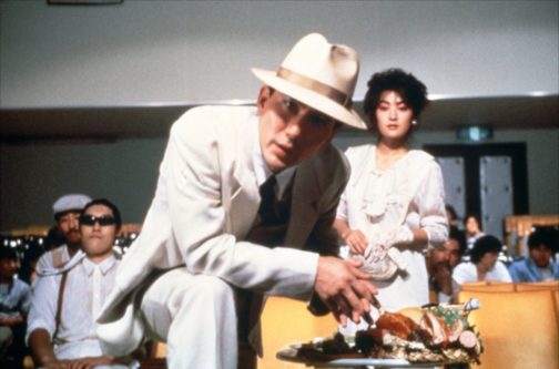
“So you’re at the movies too huh? Watcha eating?”

Here begins Jûzô Itami’s Tampopo of 1985. A mobster and his mistress, both glamorously suited head-to-toe in white, saunter to the front row of a movie theatre and set up their champagne feast. Our unnamed ‘Man in White Suit’ wastes no time addressing us, confidently leaning into the other side of the screen to see what we have brought to snack on during the feature, so long as it is nothing involving “crinkle wrappers”. After hysterically threatening to kill a man in the audience who dared to rustle about his chip packet, the movie theatre fades into darkness. The movie starts.

Tampopo is a visually delicious tale of food and love. The movie has always been a firm favourite of mine as a self-proclaimed ‘foodie’: each scene highlighting the etiquette of eating, the art of selecting the perfect ingredients and, above all, the momentous pursuit of the perfect bowl of ramen. Steam wafts from the surface of the hot broth so that you, behind the screen, can almost smell it. Chopsticks plunge into the soupy pool and retrieve long golden bands of noodles, followed by the menma and vegetables, and then succulent pieces of meat. Finally, the broth is sipped until the bowl is empty. I have never sat down to watch Tampopo on an empty stomach. It would be agony.

The central plotline of the movie – a parody of the American ‘Western’ genre – follows the eponymous Tampopo as she works to rejuvenate her rather mediocre ramen shop into one beyond compare. After a chance encounter with Gorō, a mysterious man on the road with an unparalleled knowledge of the dish, the pair toil to refine Tampopo’s ramen recipe, with a little help along the way. Punctured by a series of vignettes which explore other characters’ unique relationship with food, whether it be haughty French cuisine or hearty Italian pasta, Tampopo makes us fall in love with food again.

Tampopo 2
Gorō, played by Tsutomu Yamazaki

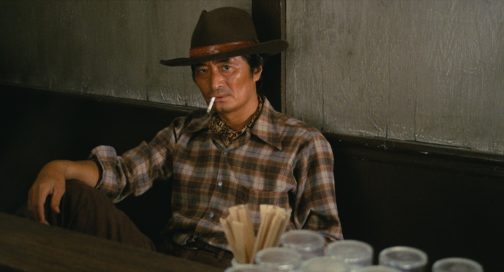
While food really is the main focus of the movie, Itami’s use of costume plays into his shrewd satire of the traditional Western genre, while contributing to the overall indulgent and sensual appeal of this food epic. Perhaps the most pertinent and ironic costume in the film is Gorō’s cowboy-esque look. His character is always dressed in a well-worn shirt – often with a neckerchief poking through in true Indiana Jones style – tucked into a pair of sturdy jeans. The Western look is completed with his trusty Stetson, which Gorō refuses to remove even in a scene where we see him in a bathtub. At times conniving, like the Western cowboys his character mocks, he encourages Tampopo to spy on other ramen shops to steal elements of their recipes. Gorō thus emerges as a comical play with the hero of the American Western. Like them, he is an adventurer. But he is an adventurer in search of good ramen, and the
only showdowns he engages in are with those who stand in his and Tampopo’s way.

Tampopo 3
Tampopo, played by Nobuko Miyamoto

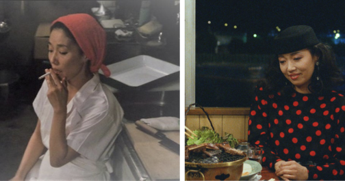
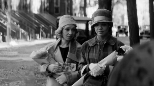
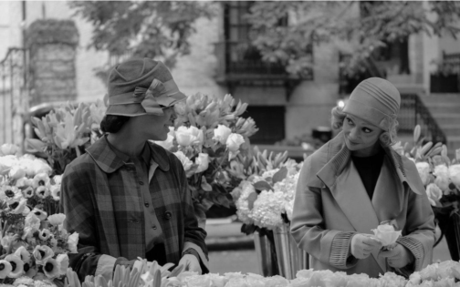
Throughout the movie, Tampopo herself undergoes a Cinderella type transformation both in her culinary skills and her fashion. When she begs Gorō to be his ramen-apprentice at the beginning of the feature, she wears a simple white uniform and a protective scarf to cover her hair. This white uniform appears rather fragile, wrapped in clouds of steam and cigarette smoke as Tampopo works relentlessly at her broth. When the ultimate recipe is near completion, Tampopo goes through a classic movie makeover, first showing off a new professional chef’s outfit and then sporting a stylish ensemble to accompany Gorō to dinner. Upon seeing her in this particularly fashionable outfit, Gorō moans that she now looks “hard to talk to”. Her red polka-dot dress, complemented by her matching red lipstick, gives Tampopo a renewed sense of conviction as she edges towards being crowned ramen chef par excellence.

Tampopo 5
Man in White Suit and his Mistress

One of the most famed vignettes of Tampopo is the undeniably erotic ‘egg yolk’ scene between our mobster and his mistress. The couple pass between their open mouths a raw egg yolk, never allowing their lips to meet in a kiss, until it bursts in a moment of suggestive ecstasy. The golden liquid drips from the mistress’s mouth onto her dress, and transfers to the mobster’s lapel. Similar to those worn by the likes of Al Pacino in American gangster movies, his white suit was once a sign of his untouchable status. The indelible stain of the egg yolk on the once-pristine costume, however, speaks to the corruptive power of lust. And yet, this not merely a lust between man and woman, but between man, woman and food.

Tampopo 6
The ‘Spaghetti Sensei’, played by Mariko Okada

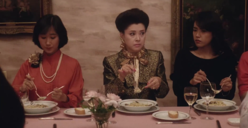
Raunchy interactions with eggs aside, Itami also uses the relationship between costume and food as a shrewd social commentary. One of the funniest vignettes (in my opinion) occurs when an old white gentleman sits down to eat dinner in an Italian restaurant in Japan. After ordering, he eavesdrops on a ladies’ society upstairs, who are being instructed by their leader on the ‘proper’ way to eat pasta like an Italian. This leader of the group, with her neatly coiffed hair and prim gold suit jacket, orders the women to never audibly slurp their spaghetti as this “is absolutely taboo abroad”. Much to her disdain, however, her commands are interrupted by the old man who is scoffing his spaghetti, and making a great noise while doing so. After watching him devour his meal, the ladies’ society and their leader succumb to mimicking his way of eating. Not a napkin in sight to protect their obviously pricey ensembles and accessories, regard for dress is thus cast aside – enjoying the meal is of the utmost importance.

Throughout Tampopo, Itami sets up a subtle yet provoking interplay between Western dress and etiquette, and Japanese tradition. His characters sport largely Americanised dress following the tropes of classic Hollywood genres which, according to Emiko Ohnuki-Tierney, signifies the Japanese sense of the self in relation to other nations. The conservatively dressed ladies’ society, the Western look of Gorō, and the Americanised glamour or Tampopo at the end of the movie might, at first glance, point towards an overwhelming European and American influence on Japanese culture. However, this imitation of Western eating habits and dress is exaggerated by Itami to the point of parody. What prevails is the art of ramen. Our movie closes with a visit to Tampopo’s new professional kitchen, where she prepares a final meal for her fellow ramen enthusiasts. They devour every last morsel, drinking the broth one after the other before placing their bowls down for the last time. We leave Tampopo behind, and accompany Gorō as he climbs aboard his truck once more. Our ramen cowboy slinks into the distance as the credits roll, ready for another adventure full of flavour.

You can watch Tampopo here: https://www.youtube.com/watch?v=csyMHLaWuSA

By Erin-Atlanta Argun

Sources:

Ohnuki-Tierney, Emiko. ‘The Ambivalent Self of the Contemporary Japanese’. Cultural Anthropology 5, no. 2 (May 1990). https://www.jstor.org/stable/656456.

Zimmerman, Steve. ‘Food in Films: A Star Is Born’ 9, no. 2 (Spring 2009). https://www.jstor.org/stable/10.1525/gfc.2009.9.2.25.

https://www.eater.com/2016/11/4/13513292/tampopo-movie-ramen-review

http://www.thecinessential.com/tampopo-lessons-for-an-endangered-species

http://www.thecinessential.com/tampopo-cultural-guide

Film Review: ‘Passing’ directed by Rebecca Hall

This post contains spoilers from the film Passing.

Passing Photo One
Clare Bellew (Ruth Negga, on the left) and Irene Redfield (Tessa Thompson, on the right), Photo: Screencap from Netflix

Jazz, novelty, dynamism and the rebirth of Black culture… It was the 1920s and the Harlem Renaissance was in full swing. Mainly taking place in New York and spreading to the rest of the world, the era spanned from the 20s to 30s and beyond. However, behind the glitz and glamour was an era tainted by prohibition and racial tensions. An esteemed product of this age, which captured the psychology, and tensions of the era subtly yet brilliantly, was Nella Larsen’s novel Passing (1929), recently adapted to a Netflix movie in the same name, by Rebecca Hall as her directorial debut.

Larsen’s story is centred around the encounter of two childhood friends, light skinned, mixed race African-American women, Irene Redfield (played by Tessa Thompson) and Clare Bellew (played by Ruth Negga), in Harlem, as adults and the tensions that rise between them. The twist of the story is introduced when the two women run in to each other at a fancy tearoom at the Drayton Hotel in New York, mostly reserved for wealthy, white upper classes. As it is revealed that Clare is married to a racist, upper-class white man from Chicago, who is however oblivious to her race, it becomes clear that she is ‘passing’ as white because of her light skin tone.

Irene is a middle-class, responsible housewife and mother living in Harlem with her black, doctor husband Brian and two boys. She is fervently tied to her race and community, head of the ‘Negro Dance Committee’ and centres her life around trying to do ‘the right thing’. On the surface she is reserved and abides by morals and class boundaries. Clare on the other hand is reckless, selfish, and passionate, living her life on the edge. However, both characters are intricately complex, juggling with tensions within. Clare denies her roots, yet she also yearns for a sense of community, longs to go back to her own culture, and thus gradually seeps into Irene’s life. While Irene is angry at Clare for denying her race, for her insistence and success at getting what she wants no matter the cost and her relentless challenging of the status quo, she is drawn to Clare and her mystery. Her desire to adopt Clare’s ease and allure makes her unable to drive her out of her life.

Hall lifts Larsen’s words and creates a film that conveys her spirit, and feelings through incredible symbolism. She foreshadows events through objects, accentuates the characters’ distinctive personality traits through clothing, conveys the tension and drama between the figures through dramatic camera shots and music.

Passing Photo Two
Irene Redfield (Tessa Thompson, on the left) and Brian Redfield (André Holland,on the right) Photo: Screencap from Netflix


Larsen tells the story from the point of view of Irene, so events are mostly tinged by her feelings in the book. Irene’s internal angst which comprises the base of the novel, is poignantly picked up in the film through close-up shots that focus on her facial expressions. Her frustration is amplified through the black and white lens the film is shot in, the chiaroscuro effect that seems to sharpen when Irene is on screen, lighting one side of her face while casting the other side in stark darkness.

On the other hand, Clare, who is constantly described as a ‘vision’ or having a ‘glowing’ sense of beauty in the book, is bathed in a soft light, devoid of the shadows seen on Irene’s face, bringing the glow that surrounds her to Irene’s surroundings, which are often darkened.

At the beginning of the film when Clare and Irene first encounter one another, the close-up shots distinctly switch from one woman’s face to the other. This technique is repeated later when Clare comes to Irene’s house for the first time. Hall amplifies the fact that the two women are in fact mirrors but also complete one another.

Passing
Clare Bellew (Ruth Negga), Photo: Screencap from Netflix


Although the scene in the beginning where Clare is revealed to be married to a racist man and hiding her identity sets the tension of the film, the film is overall devoid of any overt scenes of violence related to racism. Instead, racial tensions that are boiling underneath, are conveyed through secondary sources. In one scene, Irene hears from Brian that one of her sons were called a ‘negro’ at school and in another Brian reads about a black man being lynched on the streets of New York, on the newspaper. Even Clare’s husband John’s prejudice is based on what he has read and heard about black people on the news rather than a personal experience, as it is revealed when Clare introduces him to Ruth at the very beginning of the film.

The film’s high symbolism translates to many elements being conveyed implicitly rather than blatantly. Irene who suspects Clare to be having an affair with her husband, sees them having an intimate conversation through the mirror in the living room in her house, however as she approaches them, the camera then pans right, revealing them to be standing further apart from one another, hence conveying Irene’s growing doubts and jealousy that also cloud her judgement through the symbol of the mirror.

The crack in Brian and Irene’s bedroom ceiling becomes a metaphor for the crack in their marriage which progressively grows as Irene’s suspicions regarding her husband and Clare having an affair deepens as the film progresses. The viewer is presented with individual shots of the couple gazing at that crack, mostly after they have a discordance, in different points of the film. The symbolism becomes more potent as Irene’s marriage becomes turbulent.

In another scene, just as Clare declares her longing to become part of the black community again, Irene drops her flowerpot out the window which symbolises her unease and reluctance in Clare’s sudden intrusion in her life.

The palpable tensions between the women are also conveyed through a jazz piece titled The Homeless Wanderer that is repeated constantly in the film. The piano piece is a fluctuating one, harbouring a sense of melancholy, mystery, and an uneasiness, conveying the feeling of 1920s New York poignantly. However, this melody also mostly fills the intervals, repeated each time when Irene is seen walking home carrying groceries, passing the same brownstone buildings, or after a scene when Clare and Irene have an impactful conversation. On one side it emphasizes the monotony of Irene’s life. On the other, the piece becomes a metaphor for the masks both characters are carrying, the tentative balancing act they perform in keeping secrets, hiding their true selves. It becomes the voice of both characters, speaking what is unsaid, conveying feelings unexpressed.

Passing
Clare Bellew (Ruth Negga, on the left) and Irene Redfield (Tessa Thompson, on the right), Photo: Screencap from Netflix

The drama created through this music, the acute camera angles, and the sharp chiaroscuro emanates a Hitchcockian vibe in the film. The tensions rise as Clare increasingly infiltrates Irene’s life. With each move, gesture and gaze, the drama created through the music, the acute camera angles and sharp chiaroscuro carefully calculated by Hall, each scene becomes a perfect composition that reminds one of the theatrical and dramatic nature of the films of the 1920s and 1930s as well as American film noir. The drama, compressed feelings and tensions become even more amplified in the boxed, 4:3 ratio frame the film is shot in. The usage of black and white cinematography, while on the on side evoking the film style of the era, it more importantly, draws attention to the idea of race and skin colour. The idea of ‘passing’ is very clearly visualised as it becomes difficult to distinguish the skin colour of the two women from white men. It is an ingenious technique, in which Hall stated that she employed to draw the attention to the concept of race and its construction by the powerful figures in society to serve their needs while the fact in the matter is, the complex nature of race cannot be simplified and boxed into a category. She says: “After all, black and white film is not black and white, it’s a thousand shades of gray, just like everything else.”

Passing 5
Ruth Negga, Rebecca Hall and Tessa Thompson, Behind the scenes of Passing, Photo:Indiewire.com


The film becomes a distinct character study. The one aspect sacrificed for the black and white lens is the incredibly vibrant and colourful dresses of characters that are drawn specific attention to in the book. Instead, the two women’s identities are constructed through their silhouettes, the style of their dresses and more specifically, by their hats.

Irene, from the very beginning of the film enters the scene with a brimmed hat that covers half of her face. Throughout the film, she rarely goes out without a brimmed hat. The hat indicates Irene’s closed off nature and her reserved manners. It becomes much like a shield that she hides behind to protect herself from the rest of the world and to hide her race. This is further accentuated by her slumped posture and her modest, conventional outfits that mostly cover her shoulders. Even when she wears an evening gown with straps that exposes her shoulders, she wears gloves that cover more than half of her arms, always shielded from contact with outside world. Contrastingly, Clare rarely wears a hat. The ones she wears occasionally, always reveal her face. Her upright, firm posture is accentuated through her outfits that always seem to have bold shoulders. Whether it’s an evening gown, a coat, or a day dress, they stand out distinctly either through their cutting, the pattern of the fabric or embellishment, emphasising her strong stance, her confidence despite her precarious position. Although Clare is the one at risk ‘passing’ as white, it’s Irene who hides behind her hat, concealing her identity. The clothes distinctly stand in for the characters themselves.

Passing 6
Irene Redfield (Tessa Thompson), Photo: Screencap from Netflix


Perhaps the film’s most striking scene comes towards the middle when Irene and Clare are out at the dance organised by the ‘Negro Dance Committee’. Irene makes a comment whilst observing Clare dancing, from the corner, saying: “We’re all of us passing for something or other. Aren’t we?” She condones Clare yet she undeniably envies her as she reminds her of her own inability to be reckless. Clare’s desperate, incessant, and fierce attempts to go back to her roots and immerse herself in her own culture, reminds us of the inevitability of the illusion of pretence fading, as the innate desire to be true to oneself surfaces which Clare quite unapologetically reflects. Both characters, on the surface, seem to belong to distinct categories. However, as both characters yearn for the position of the other, it is revealed that those categories are society’s circumstantially imposed labels. The story shows the consequences of living in a society were racism looms large, hiding one’s identity to ‘pass’ as something that is acceptable by the society.

Passing 7
Clare Bellew (Ruth Negga, on the right) and Irene Redfield (Tessa Thompson, on the left), Photo: Screencap from Netflix


The story struck a personal chord with Hall whose mixed-race grandfather had ‘passed’ as white in 30s. The making of the film became a cathartic experience for Hall as she described the process illuminating and clarifying regarding her own past and decent.

The film underlines Larsen’s idea, that the concept of ‘passing’ is not specific to an age or a race in its core but rather how people everywhere, at every age, at one point or another comply with society’s desires, rules, and beliefs to blend in, to ‘pass’. Yet it also shows the misery this creates and its unsustainable nature as it goes against human nature to be free.

Both Thompson and Negga give superb performances, breathing life to Larsen’s complex characters, conveying feelings of frustration, yearning and desire through mere glances. With nostalgic costumes, the jazz music that plays over shots of brownstone buildings of the city, the dramatic close-ups and the chiaroscuro effect, Hall captures the spirit of a bygone age, transporting us back to New York in the 20s.

Passing is streaming now on Netflix

By Ipek Birgul Kozanoglu

Sources

Larsen, Nella, Passing, Signet Classics, 1929

https://www.history.com/topics/roaring-twenties/harlem-renaissance

https://www.britannica.com/event/Harlem-Renaissance-American-literature-and-art

https://www.goldenglobes.com/articles/rebecca-hall-bows-passing

https://www.goldenglobes.com/vertical-gallery/passing-vibrant-shades-grey

https://www.theatlantic.com/culture/archive/2021/11/netflix-passing-rebecca-hall/620651/

https://www.digitalspy.com/movies/a38207513/passing-review-netflix-tessa-thompson-ruth-negga/

https://www.npr.org/2021/11/10/1054025599/passing-novel-nella-larsen-review?t=1638877170772&t=1639236484098

https://www.theguardian.com/film/2021/oct/27/rebecca-hall-race-regret-personal-history-any-family-legacy-of-passing-very-tricky

https://www.latimes.com/entertainment-arts/awards/story/2021-11-23/passing-ruth-negga-rebecca-hall        

https://www.indiewire.com/2021/10/passing-rebecca-hall-interview-1234674475/

The Stylish Armour of 1940s New York Fashion

Helen Levitt’s (1913-2009) photography presents life on the streets of her native New York from the 1930s to 1990s. The current exhibition of her work at The Photographers’ Gallery in London gives insight on a world of charm and character often overlooked in a time and place associated with hardship.

What struck me about many of the photographs in the exhibition was the street style they showed, particularly of 1940s New York, and how this style seemed to embody the ease and coolness of residents whilst also creating a protective armour that shielded them from potential harm.

illustration
Figure 1. New York, c.1940. Silver Gelatin Print. Courtesy of Film Documents LLC and Galerie Thomas Zander, Cologne.

The first image I have featured exudes glamour (Fig. 1). The woman stands powerfully in the centre of the frame, her large hairdo and statement fur coat making her appear more a fashion model than everyday resident. She turns her head away from the camera, nonchalant despite her bold presence. The photograph might be a snapshot, but something in the woman’s pose implies a knowledge that she is being photographed. She wants to appear powerfully glamourous. Behind her, in a storefront window, is a sign for spaghetti being sold for 25 cents. The spaghetti sign grounds the image. The woman is in her local area, and Levitt chooses to show us those surroundings rather than strategically shooting a more glamourous background to suit the look of the woman.

In this image I see optimism for the beginning of a new decade that this woman seems determined to succeed in. However, the fur coat with its strong shoulder pads also suggests protection, as if the woman is cocooning herself in a thick wall of fur to defend herself from the harsh realities of the world she faces. We lose all sense of the woman’s proportions beneath the heavy coat. She is emboldened by the layers of clothing she has ensconced herself in.

illustration
Figure 2. New York, 1944. Silver Gelatin Print. Private collection. Courtesy of Film Documents LLC and Galerie Thomas Zander, Cologne.

The second photograph is as glamourous as the first (Fig. 2). A couple stand together, woman leaning on man, both impeccably dressed. Levitt has captured the woman mid-speech, and two more women are walking across the scene from the left-hand side. This all comes together to present a far more snapshot-like image than the first.

The man’s oversized zoot suit, paired with hat, sunglasses, and loosely held cigarette, all contribute to create an image of effortlessness but also serve as a kind of armour, similar to the fur coat of the woman in the first image. The shoulder pads and loose suit trousers conceal the shape of his body, and the sunglasses restrict the expression that can be gleaned from his facial features.

The woman’s casual pose leaning against the man at first suggests ease and comfort. However, a layer of defence can also be seen in the sharp angle of her elbow, pointed out towards the street on her exposed side.

illustration
Figure 3. New York, 1945. Silver Gelatin Print. Courtesy of Film Documents LLC and Galerie Thomas Zander, Cologne.

The final image I would like to discuss perhaps best highlights the way fashion served as protective armour in 1940s New York (Fig. 3). The man facing the camera stands in a striped suit, hands clasped in front of him, fedora casting a shadow across his forehead. What is most notable about the man’s outfit is its bold use of pattern. A striped suit is paired with a checked shirt and graphic tie. The clash of patterns reveals the man’s confidence styling himself, and his confidence asserting his place with striking visual presence.

Beside the man stands a far less extravagantly dressed individual. We only see his back, but can see he has removed his jacket and stands in a t-shirt, the shape of his shoulder blades showing through the fabric. This figure, next to the powerful stance of the suited man, becomes a figure of vulnerability. The composition almost gives the impression we are seeing two sides of the same man; the confident figure who faces the world, and the softer side of himself that cannot be fully revealed to the camera. A child in the window of the building looks down on the man who faces away from us, adding to the sense that this lack of layers of clothing is a childlike kind of vulnerability.

‘Helen Levitt: In The Street’ is on show at The Photographers’ Gallery until 13th Feb 2022.

By Megan Stevenson

Party frock or military uniform?: Mick Jagger performing gender at Hyde Park, London, 5th July 1969.

On a summer’s afternoon in 1969, Mick Jagger bounds onto the stage set up in Hyde Park with characteristic explosive energy. He swaggers across the stage, donning a white dress designed by Michael Fish, paired with white flared trousers and clutching a battered book of poetry. Bowing and blowing kisses to adoring fans, he oozes an aura of masculine self-assurance as his balloon sleeves and gathered skirt waft around him.

Figure 1: Mick Jagger reading an excerpt from Percy Bysshe Shelley’s elegy Adonais in memory of Brian Jones, 5th July 1969, Robert Hunt Library/Shutterstock

Their first performance in two years, what the Rolling Stones had intended as a free concert to give back to the fans they had somewhat abandoned during this time, as well as to introduce their new band member, Mick Taylor, as Brian Jones’ replacement, ended up as a more sombre affair. Jones had been dismissed from the band in June that year due to his struggle with addiction, resulting in the multifaceted musician and originally integral element to The Stones becoming a liability not only to the band’s recording sessions and success, but also to himself. Brian Jones was found dead at the bottom of his swimming pool on 2nd July, three days before the concert.

Jagger attempts to calm the crowd with the fragile authority of a substitute teacher struggling to tame a classroom of hormone-fuelled teenagers. But, because he’s Mick Jagger, he (just about) pulls it off.

‘OOOOWWRRIGHT! Okay now listen! Will you just cool it for just a minute because I really would like to say something for Brian.’ He resorts to ‘OKAY ARE YOU GOING TO BE QUIET OR NOT?’, which seemingly settles the gathered spectators. Jagger proceeds to recite a few verses from Shelley’s poem Adonais: An Elegy on the Death of John Keats. The touching words of Shelley honouring a fellow artist struck down in his youth feel hauntingly relevant. Despite Jagger’s slightly wooden recital, it is a moving and fitting tribute. Hundreds of white butterflies were then shaken out of cardboard boxes, fluttering above the stage and crowd in dizzy liberation. Yet what is most memorable about this iconic performance is that dress. Not many men could wield the same degree of authority over a crowd of 250,000 to 500,000 people whilst wearing a dress that was compared to a ‘little girl’s white party frock’ by the British press. Jagger, luckily, is one of them.

There is undeniable androgynous hybridity to Jagger’s ensemble. The white dress is ornately decorated with a ruffled collar and cuffs which mirror the pleated skirt, billowing full sleeves, and individual bow fastenings down the fitted bodice. All of these intricate details do evoke a young girl’s frock. The dress-making pattern image from the 1950s below exhibits the femininity and girlishness of puff sleeves, delicate collars and bows, and full skirts, which are arguably paralleled, or parodied, by Jagger’s garment.

Figure 2: Girl’s One-Piece Vintage Dress Sewing Pattern: Flower Girl, Party Dress, 1st Communion, 1950’s, Simplicity Pattern Co.

Designer Michael Fish was a pioneer of the ‘Peacock Revolution’. The evolution of menswear shifted drastically throughout the 1960s, prioritising rich fabrics, extravagant colours and more effeminate silhouettes over traditional tailoring. Mr Fish, a boutique in Mayfair, stocked and sold his flamboyant garments, from frilled silk shirts to men’s caftans, to the emerging demographic of the London dandy. Below, we see Michael Fish wearing one of his designs, with almost identical ornate details of ruffled collar and bow fastenings to Jagger’s dress. The context of the sexual revolution, triggered by the circulation of the contraceptive pill in Britain from 1963, brought in an era of sexual liberation, meaning that men could challenge traditional notions of masculinity and indulge in androgynous ways of dress.

Figure 3: Michael Fish and Barry Sainsbury, 1968, Courtesy of Mason & Sons

Jagger did not stop at dressing in a feminine manner. He went as far as adopting the female gender signifiers of long hair and makeup in a convincing performance of gender play. His eyes are shrouded in mysterious smokiness and his infamous pout is accentuated by lipstick as his hair sweeps down past his shoulders. Having said this, Jagger’s dress can also be read as a display of masculinity. The full, pleated skirt arguably evokes the fustanella – a skirt-like garment worn throughout South East Europe, but in particular by the Evzone elite ceremonial unit of the Greek Royal Guard (below, left).

Figure 4: The Archbishop Regent Damaskinos of Greece with an Evzone Guard at the Regency in Athens, 15 February 1945, Capt. Tanner War Office official photographer, Imperial War Museum

The dramatic flare of the Evzone Guard’s sleeve combined with the fullness of the kilt-like skirt both hint at the yards of fabric that have gone into the construction of this garment, whilst simultaneously providing a prototype for the defining features of Jagger’s frock. Origins on the fustanella date back to the nineteenth century, but the garment is also perhaps a continuation of men’s short tunics from Ancient Greece. Looking back to another time or another country became an increasingly important source of fashion influence throughout the 1960s.  Arguably Jagger was drawn to Michael Fish’s garment as it takes inspiration from then and there to challenge the gender divide of here and now.

Figure 5: Mick Jagger performing at Hyde Park in 1969, Ray Stevenson/Shutterstock

Later on in the performance, as the afternoon heat descends, Jagger removes his smock, untying each individual bow to release himself from his effeminate exterior. Beneath, he is wearing a simple vest which exposes his slender but undeniably masculine frame. Therefore in its fluid state, gender, like clothing, can be tried on, worn, taken off and worn again. Such was the case for Jagger. Not only was he rumoured to have worn this same dress to his financial adviser’s white-themed party two days before, but he also revisited this look forty four years later with a strikingly similar white smock garment during The Rolling Stones’ return to Hyde Park in 2013.

Figure 6: Mick Jagger performing at Hyde Park in 2013, Roger Tooth for the Guardian

 By Claudia Stanley


Sources:


The Rolling Stones – Tribute to Brian Jones / I’m Yours and I’m Hers (Hyde Park 1969)

https://www.youtube.com/watch?v=cQ5VhQMgjYw

Costantino, Maria. Men’s Fashion in the Twentieth Century: from frock coats to intelligent fibres. London: B. T. Batsford LTD, 1997.

Langkjær, Michael A. A case of misconstrued Rock Military Style: Mick Jagger and his Evzone “little girl’s party frock” fustanella, Hyde Park, July 5, 1969. Historical, sociological and methodological approaches. Conference Proceedings, Athens, 9-11 April 2010. Nafplion: Peloponnesian Folklore Foundation, 2012.

Langkjær, Michael A. ‘Then how can you explain Sgt. Pompous and the Fancy Pants Club Band?’ Utilization of Military Uniforms and Other Paraphernalia by Pop Groups and the Youth Counterculture in the 1960s and Subsequent Periods. Textile history, Vol. 41, no. 1. Published online 19 Jul 2013.

https://doi.org/10.1179/174329510X12646114289824

Lester, Richard. Boutique London, A History: King’s Road to Carnaby Street. Suffolk: ACC Editions, 2010.

Luther Hillman, Betty. Dressing for the Culture Wars: Style and the Politics of Self-Presentation in the 1960s and 1970s. Lincoln, Nebraska : University of Nebraska Press, 2015.

Morgen, Brett. Crossfire Hurricane: The Rise of the Stones. London: Milkwood Films, Los Angeles: Tremolo Productions, 18th October 2012.

Sims, Joshua. Rock Fashion, London and New York: Omnibus Press, 1999.

Performing Gender Through Costume in the Takarazuka Revue

The Takarazuka Revue is an all-female performance troupe, formed in 1914. Now one of the biggest theatre companies in the world, the group is known for its spectacular performances with highly trained female actors playing male and female roles.

The leading actors of the Takarazuka Revue are celebrities. Today, they have a global fanbase and entire Wikipedia dedicated to documenting all past and current performances and trivia about the troupe (www.takawiki.com). Yet, before the internet and the increasingly connected world of the post-war era, fans had to find another outlet for their eager engagement with the Revue.

The British Museum has in its collection an incredible example of such engagement: an album of 200 postcard photographs, some signed, of the performers in the Takarazuka Revue, dating to the late 1930s.

Figure 1: Album of 200 postcard photographs of actresses in the Takarazuka revue, with covers in textile. Six of them signed. © The Trustees of the British Museum.
Figure 2: Album of 200 postcard photographs of actresses in the Takarazuka revue, with covers in textile. Six of them signed. © The Trustees of the British Museum.

In these photographs we see the range of characters, periods and styles used by the group. Costuming alone tells us that there were military figures from a range of historic periods, gentlemen, geisha, dancers, swooning young women and the epitome of a 1920s gangster.

This remnant of a bygone age gives us a beautiful insight to the world of Japanese theatre in the 1930s. The highly decorative costumes would have immediately expressed a character’s identity to a theatre audience. The jacket of the figure in the top right corner of the first image is so reflective is can barely be photographed, and the feathered headdress in the image below is so grand it is having to be held upright by its wearer.

These photographs also reveal the visual markers used to denote gender on stage. Beyond the outfits, the actors’ hair is modelled in short, slicked back styles for male characters. Eyebrows are also styled differently, the female characters have longer, thinner brows while their male counterparts style thicker and far straighter brows.

Photographs can tell us about what these actors wore, how they used their faces to convey their characters, and that they were revered enough to be immortalised in an album. However, there are things these photographs lack. Colour, for instance. Staging or the style of the performance too. That is where I bring in this ticket for comparison.

Figure 3: A ¥2 ticket to the Tokyo Takarazuka theater performance on July 17, 1937. www.oldtokyo.com.

This ticket, saved from a Takarazuka theatre performance in Tokyo on the 17th July, 1937, is a drawing. It can therefore can give us a completely different range of insights into the 1930s performances for the Takarazuka Revue.

I must firstly point out the similarity between the figure on this ticket and the actor in the top left corner of the second album page. The resemblance is uncanny and given the similar time period the ticket must either be a representation of that exact actor or at least of the character they were playing in a show at the time.

Gender is expressed in a greater variety of ways through the drawn figure on the ticket. We can see their masculine posture, laid back and confident, dominating the space they stand in with ease. But we also see now what we could not in the photograph, the makeup on their face. The pale skin, rouged cheeks and red lip remind us that this is a female actor playing a male role. There is a sense that, no matter how convincing of a performance the actor could give, the audience must always be reminded that it is not a man they are seeing, but a male-role played by a woman.

The performances of masculinity and femininity in the Takarazuka Revue are exaggerated. The Revue presents a heightened version of femininity and a particularly elegant version of masculinity. In this sense, the Revue exposes the constructed nature of gender but also remains rigidly within the confines of a binary gender system. You are either male or female. At no point does the performance wish to the leave audiences uncertain as to the gender they are seeing performed, or the true gender of the actor in the performance.

The images in this blog post reveal to us the ways that dress and embodied behaviour were used by the Takarazuka Revue to present a strong sense of gender whilst paradoxically also highlighting the fact that gender is indeed a performance.

By Megan Stevenson


Sources:

Stickland, Leonie R. 2008. Gender Gymnastics: performing and consuming Japan’s Takarazuka Revue. Melbourne: Trans Pacific Press.

Yamanashi, Makiko. 2012. A History of the Takarazuka Revue Since 1914: Modernity, Girls’ Culture, Japan Pop. Boston: Global Oriental.

“Album of 200 postcard photographs of actresses in the Takarazuka revue, with covers in textile. Six of them signed.” – https://www.britishmuseum.org/collection/object/A_2006-0113-0-1-1-200

“A ¥2 ticket to the Tokyo Takarazuka theater performance on July 17, 1937.” – http://www.oldtokyo.com/takarazuka-gekijo/

Pampooties and Brogues: A Folkloric History

It was during my undergraduate degree when I first came across the word Pampootie in environs outside of my own home. It was discussed during a lesson centered around a study of Jack B. Yeats and his illustrations for William M. Synge’s book The Aran Islands. My professor began to describe the dress of The Aran Man (below) when she referred to his light leather shoes as Pampooties. Growing up my mother had always called our children’s shoes Pampooties, which lead me to think of it as nothing more than a made-up word which my family used. Clearly, I was wrong. This initial introduction to the Pampootie in the wider world typifies the myth and dynamism which animates the shoe’s history.

Figure 1: An Island Man, Jack B. Yeats, Sligo County Library and Museum

The pampootie is the traditional shoe of the Aran Islands off the coast of Galway in the west of Ireland. The shoe consists of a flat piece of cow hide punctured with holes around its edges which are laced with leather thong and tightly wrapped around the foot. This basic attempt towards the fashioning of a protective foot covering stands as the common ancestor to the modern brogue shoe, as a derivative of the Irish word Bróg (meaning shoe). Yet the humble pampootie style still exists as a more historically modern version of the shoe, as the brogue style can be traced back to prehistoric times. In 1967 a horde of exquisitely preserved brogues were discovered in a bog in County Mayo which were dated back to the year 1965BC. In many ways these shoes may be considered more artistically advanced than the pampootie, as the ornamental holes characteristic of the modern brogue can be identified. Thus, despite the pampootie’s modern use the silhouette of the classic brogue which one may recognize today is far older.

Figure 2: Peter Phatch Faherty lacing his Pampooties, 1952. Getty Images

Here the mythology of the pampootie and the brogue must be addressed. In 1992 artist Brad Legg wrote his “avowedly populist” The Stars and the Brogue: Ancient Astronomy and Footwear in Ireland in which he compares the hole designs of brogues to the star patterns of the spring equinox of 1800BC. Similarly, this explanation for the shoe design was widely popular throughout the Victorian era. It can be argued that the discovery of such a bountiful horde of ornamented brogues in 1967 drives home this assertion as they were possibly gathered as a sacred offering to the pagan gods.

Figure 3: A selection of Celtic and Viking Ornaments which Victorian Scholars compared to Brogue patterns.

However, other interpretations of the holes have become more widely accepted. Many believe that the brogue’s punctures serve an entirely functional purpose, as the holes provided drainage whilst walking along the often damp and waterlogged ground of rural Ireland. Others attest that the shoes were fitted to the wearer a size too big so they may be filled with straw to absorb the wet.

Additional speculation surrounds the name of the ‘pampootie’ and where it converges with the brogue.  No one is quite sure where the seemingly exotic sounding ‘pampootie’ finds its origins, yet some have hypothesized that it is perhaps an alteration of the Turkish word ‘papoosh’ or slipper. Irrespective of that correlation, it is most likely that the brogue and the pampootie later became united through the shortening of the word pampootie to the Irish word Bróg or shoe, as aforementioned.

Nonetheless, the necessity of function over form replaced the decorative and descriptive qualities of the early pampootie, and only remerged through the revival of the shoe in the twentieth century. No conclusion can ever be outrightly drawn from many of these notions, yet it is through the mysticism surrounding the design of the shoe which we may examine its modern interpretation as it finds a secure home in the contemporary wardrobe.

In the early twentieth century the brogue’s functional and formal characteristics finally harmoniously merged in the modern variation of the shoe. The dual inclusion of a sturdy leather construction alongside the ornamental hole patterns poised the brogue as a classic country walking shoe for the twentieth century gentleman. Advertisements emphasize the traditional nature of the shoe and use its historical precedent to sell ideas of reliability and comfort.

Figure 4: Abbot & Sons “Super Brogues” Advertisement, 1919. Shutterstock

Thus, throughout the twentieth century the brogue form underwent many iterations and alterations as the traditional holed pattern took on new silhouettes as the century progressed. As made clear by the Cosmopolitan article below, by the mid century the brogue had been translated to walk the pavements of the burgeoning cityscape.

Figure 5: Cosmopolitan Article “Shoe Talk”, 1968, ProQuest

Later brogues became an iconic symbol within artistic and cultural movements, as evidenced by the iconic image of Twiggy below. This photograph taken in 1972 features a pair of brogues made by renowned British shoemaker George Cleverley. Cleverley exclusively made shoes for men but was convinced to make an exception in this case for Twiggy.

Figure 6: Twiggy in George Cleverley Brogues, 1972, Getty Images

Thus, both the brogue and the pampootie occupy a fascinatingly ambiguous space within the lexicon of modern dress. The myriad of myths surrounding the footwear informs the modern understanding of the shoes as both contemporarily relevant and deeply historical.

By Victoria FitzGerald


Sources:

“Brogue – Word History”. Word-Origins .com. Last modified July 18, 2011. https://web.archive.org/web/20110718083106/http://www.word-origins.com/definition/brogue.html

Hall, Joseph Sparks. The Book of the Feet: A History of Boots and Shoes. Second Edition. London: Read Books, 2017.

Hall, Michael. “Brogues and the Stars: on an Archaeological Controversy.” Country Life 187, no. 13 (1993): 94. https://www.proquest.com/magazines/brogues-stars/docview/1521579963/se-2?accountid=10277.

“Pampootie”. Merriam-Webster.com. Last modified October 24 2021. https://www.merriam-webster.com/dictionary/pampootie

“Shoe Talk: A new Kind of Brogue.” Cosmopolitan 165, no. 5 (11, 1968): 54. https://www.proquest.com/magazines/shoe-talk-new-kind-brogue/docview/2007367987/se-2?accountid=10277.

“Twiggy in Cleverley”.  Iconic Images.net. Last modified 24 October 2021. https://iconicimages.net/photo/jdv-tw018-twiggy-in-cleverley/


2021/22 Introduction!

A new academic year and a new group of brilliant bloggers – welcome Rosie, Megan, Victoria, Ipek, Claudia, Erin and Georgina!

While Rebecca Arnold is working hard on her latest book, I’m teaching the Documenting Fashion course. I graduated from the Courtauld History of Art MA in 2005 and it’s a joy to be back! As well as lecturing, I write on fashion and photography and curate exhibitions – most recently Tim Walker: Wonderful Things at the V&A, London, and The Photographic Art of George Hoyningen-Huene at Grisebach, Berlin.

Term began just a few weeks ago and we’ve explored so much already. Highlights so far include a visit to James Barnor’s exhibition at the Serpentine Gallery, and a morning with the rare fashion sketches and magazines from the Courtauld Library’s special collections. There are lots of fantastic blog posts to come this term, so please stay tuned!

— Susanna Brown

Dissertation Discussion: Imogene

What is the working title of your dissertation?

The working title of my dissertation is ‘The 1980s Body Ideal: A Case Study of Azzedine Alaïa’.

What led you to choose this subject?

I have always been interested in the relationship between clothing and the body. Unsurprisingly, I was particularly fascinated by a class we had at the beginning of this term, in which we discussed the fashionable female ‘sports body’ of the 1930s and 1940s. At that time new ideas about health and exercise had begun to emerge, which had a direct influence on attitudes towards gender, sexuality and dress. Since I am personally more interested in contemporary dress, I wanted to apply the 1930s-40s analysis of the body as presented in class to the 1980s hyper-idealized female sports body. I was curious to see what lay behind our modern-day notions about dress, gender, and sexuality that had their beginning in the 80s. 

I thought that using the designer Azzedine Alaïa as a case study for my analysis of the 1980s body ideal would be fitting, not only because his clothes were instrumental in defining the decade’s feminine silhouette, but also because of how central the body was to his design philosophy. 

A couple of years ago, I discovered that there had been an exhibition of Alaïa’s designs at the Galliera Borghese in Rome called ‘Azzedine Alaïa: Couture/Sculpture’. I remember being instantly amazed by the photographs of the exhibition. As a student of art history with a particular interest in Classical and Renaissance art and an affinity for fashion, I was thrilled to see that this exhibition represented an ideal amalgamation of both worlds into one. Although I had known since high school that I want to study fashion and eventually work in the industry, seeing those photographs was a confirmation that I had made the right decision in choosing to major in art history in my undergrad. It made me realise that what I was learning about aesthetic analysis could be applied to fashion. Moreover, it validated my conviction that art and dress are inextricably linked. I am therefore delighted that my dissertation has taken me full circle and has given me the opportunity to research this exhibition, which is now the subject of my first chapter!

Azzedine Alaïa Couture/Sculpture at the Villa Borghese, 2015

Favourite book/article you’ve read for your dissertation so far and why?

My favourite book is a book that our tutor, Rebecca, let me borrow. L’Esprit Vionnet, by Jéromine Sauvignon, is about the early twentieth century couturier Madeleine Vionnet and the designers she influenced, including Alaïa himself. I love the parallels Sauvignon draws between Vionnet and Alaïa. She forges fascinating links between their design techniques and the ways in which they both conceptualised the body of the modern woman of their respective times. 

‘Azzedine Alaïa Collector. Adrian and Alaïa. The art of tailoring’ at the Association Azzedine Alaïa, 2019, Paris

Favourite image/object in your dissertation and why?

My favourite image that I analyse in my dissertation is from the ‘Couture/Sculpture’ exhibition. Seeing a timeless Alaïa gown next to a timeless work of art like Bernini’s Apollo and Daphne is quite ethereal. I was also fortunate to have the opportunity to travel to Paris briefly to see the current exhibition ‘Azzedine Alaïa Collector. Adrian and Alaïa. The art of tailoring’ at the Association Azzedine Alaïa. Suits by Adrian, the Hollywood costume designer turned couturier, were displayed alongside suits by Alaïa. Alaïa was an admirer and avid collector of Adrian’s work. It was a wonderful experience to be able to look at physical garments after having spent so much time reading and writing.

‘Azzedine Alaïa Collector. Adrian and Alaïa. The art of tailoring’ at the Association Azzedine Alaïa, 2019, Paris, photo taken by the author.

Favourite place to work?

I do not really have one particular place I like to work. I am definitely someone who likes to change it up. I can stay in the same environment for a couple of days, but then I need to relocate and find somewhere new to write and glean inspiration. It keeps things fresh. I will switch between coffee shops and various libraries around London. I do prefer the library though; I feel that I accomplish the most in a quiet space. 

The John Cole Fashion Photography Archive

As Andrew Bolton, Head Curator of the Metropolitan Museum of Art’s Costume Institute once said in a Vogue documentary, ‘Your memory of fashion is fashion photography.’

I love fashion photography. I have collected magazines ever since I was little, when my mother and I would spend hours looking at the pretty glossy pictures. It was my interest in fashion photography that led me to the Documenting Fashion course at The Courtauld. An entire course on fashion imagery? I knew immediately that this course was for me. Reflecting upon my year at The Courtauld as it is coming to a close, I believe that one of the most important things I have learned is to appreciate the depth of fashion photography, as a fashion photograph can be much more than a visually pleasing image. I have learned that fashion photography has the potential to shape our attitudes towards our identity, our society and our culture. But fashion photographs are not only expressions of our visual culture: they are first and foremost expressions of our desires. We can come to see the world through the knowing eye of the fashion photographer, who instinctively captures seminal moments and has the ability to immortalise certain fashion designs.

I was convinced until this year that Google Images and my stack of old magazines were my best bet when it came to looking at old fashion photographs. I have since discovered the existence of a plethora of rich fashion photography archives, many of which have greatly helped me with my research throughout the year. The most recent archive that I have discovered is that of fashion photographer John Cole (1923-1995).

John Cole at work at Studio Five.*

John Cole began his career as a fashion photographer in the 1940s and opened his first studio in Mayfair in 1956. The studio, called ‘Studio Five’, attracted photographers who would rise to great prominence in the fashion industry—one such photographer, David Bailey, would eventually work for British Vogue. 

John started taking fashion photographs in the early 1940s when working for Gee & Watson and Hugh White Studios. He took many photographs for the original Tatler & Bystander magazine which was owned by the Illustrated London News; he also took photographs for Britannia & Eve magazine.

John was a very prolific photographer whose photographs were used for many adverts in a wide range of publications. At Studio Five, he took photographs for Hairdressers Journal, Flair Magazine, The Sunday Times, Daily Mail, The SUN, the Daily Express, Evening News, Evening Standard and The Guardian. Throughout the 1970s, Country Life ran a fashion section for which John was the main photographer. 

John’s many years of experience, both in the darkroom and on set watching other photographers at work, would eventually allow him to master his own techniques—such as lighting. As stated in an article from 1962, John was ‘someone at the top but always willing to learn.’ If he wasn’t using tungsten lighting, he was working with the natural daylight that poured in through the two roof windows at Studio Five.

This photograph was taken for Chemstrand tights, April 1966.* 

John asserted his creative agency in the original way he captured the cut and shape of the clothes in his images, demonstrating an utmost confidence in his own instincts. He seemed interested in capturing clothing from unexpected viewpoints. In shooting from quirky angles, his photographs change the way a particular garment is seen. They provide a fresh perspective on relatively standard items of dress that would make any woman want to purchase them. 

John Cole had a knack for showing the clothes off from unexpected angles.*

The pictures that have been collected and made available in his archive accessible via a website and an Instagram account give us a glimpse of the times in which he worked, particularly the 1960s—an era full of glamour and youthful fun. Included in this collection of stunning photographs are images of model-turned-editor Grace Coddington, along with some behind the scenes photographs that provide us with a flavour of the energetic ambiance of Studio Five. 

There was always music being played at the studio. Well, it was the 60s!*

John had a distinct ability to capture the energy of his subject. While there is a light and whimsical overtone to his photographs, the model in the picture always seems to be deeply engaged and present. We can see that each model is prepared to give everything she has, with the knowledge that John would capture her at the perfect moment. Each one of John’s models emanates a liveliness that reflects her desire to fully invest in playing her role for the camera. As John himself asserted, ‘There has to be complete affinity between photographer and model to take a really good picture.’

This image of Twiggy was taken for fashion brand Slimma in 1966. The clothes were designed by David Bond, whose trouser suit was the Bath Fashion Museum Dress of the Year in 1967, chosen by Felicity Green at the Daily Mirror.*

The John Cole website provides everything from bibliographic information, to video clips of him on set with 1960s icon Twiggy, to personal accounts written by individuals who worked alongside Cole at Studio Five. 

An archive such as this puts into question the ephemeral nature of fashion photography. It challenges common notions of fashion photography as images that we mindlessly flip through in a waiting room or on our morning commute: images that are quickly discarded, never to be looked at again once the next month’s issue is published. A fashion photography archive emphasises the commonly overlooked notion that fashion photography has the potential to capture the collective consciousness of a particular time, frozen in one glossy beautiful image. For those of us who cannot afford to wear the glamorous clothes featured in most fashion photographs, we can take solace in the thought that fashion photography nevertheless allows us to partake in this dream world. 

* All images taken from the John Cole Archive and subject to copyright.


References:

http://www.johncolestudiofive.co.uk/home/4570078226

‘Photography in Advertising: A self-contained service in an unusual backwater,’ John Heron, February, 1955

‘“The Only Way to Succeed…” Robert Sowter interviews top photographer John Cole,’ Robert Sowter, Time & Tide, November, 1962

Athleisure in NY

At the end of February, Documenting Fashion’s MA class took a study trip to New York. Homecoming for some and the first time in America for others, these few days were outstanding, and we are excited to share our highlights with you. 

I have been living in London since September, but I am from Canada. So when our class travelled to New York for our study trip last week, for me, it was sort of like going home. I was excited to once again see familiar stores and restaurant chains, as they are part of my native landscape of home comforts. However, now that I think back on our trip, it turns out, surprisingly, that it wasn’t these North American landmarks that made me feel right at home: it was how people dressed. (Maybe not that surprising, come to think of it, for a student of fashion history.) Seeing the way people in New York dress – head-to-toe black athleisure – meant I was back!

 For those of you who are not familiar with the term, athleisure is a style of dress characterised by body-con, athletic-inspired clothing. It became increasingly popular beginning around 2000 as advancements in athletic-wear fabrics stimulated the creation of new light-weight, flexible, high performance and fashion-forward sports garments. Brands like Lululemon are credited for having sparked the trend that has been considered the most important fashion trend of the twentieth century. According to Forbes, the American athleisure industry is worth $44 billion.[1]

All images taken from the official Instagram account of Michi New York (a women’s athletic wear brand)

The question that begs to be asked is: is athleisure really is just a trend? Did the American appeal for versatility and practicality really spawn from athletic-wear brands that launched in the late 90s?

The visits we made to the Parsons, Fashion Institute of Technology and Brooklyn Museum archives would lead me to argue that, in fact, a preference for practical clothing attests to a distinctive American pragmatic attitude to dress that goes back to the first half of the twentieth century. We got to see sketches from various American designers, and it was interesting to see that underpinning their aesthetic were definite links to this established American taste for understated practical clothing. In fact, during the 1930s, Claire McCardell – one of the most influential American designers of the time – was already designing functional sportswear for women.

When I moved to London, it hit me that my ‘go-to’ North American uniform of Lululemon leggings and hoodies, which at home made me blend in with every other college student on my campus, actually made me look extremely underdressed and out of place on the chic streets of London. I was on an entirely different register from the sophisticated, tailored, colourful London look.

Therefore, interestingly, New York made me realize that while personal style may be specific to each person, it is definitely influenced to a certain extent by the surrounding fashion culture.

References: Wilson, Chip. ‘Why the Word “Athleisure” is Completely Misunderstood.” Forbes. April 18, 2018. https://www.forbes.com/sites/chipwilson/2018/04/18/why-the-word-athleisure-is-completely-misunderstood/#1c5aa6564697.