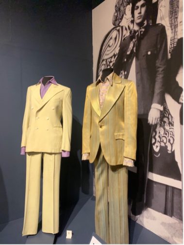
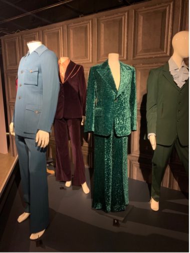
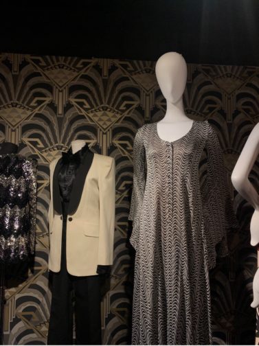
Beautiful People: The Boutique in 1960s Counterculture, exhibiting at the Fashion and Textile Museum in Bermondsey (until 13 March 2022), unites over one hundred garments, worn by stars belonging to the Beatles and the Rolling Stones and others which were sold at the likes of Biba and Granny Takes A Trip. The exhibition details this truly electrifying decade, one which was home to creativity, angst and rebellion alike.
To honour the occasion, I chose to wear a floor-length Biba coat, in a tiger-print no less, which I had initially ‘borrowed’ from my mother as part of a Cruella de Vil Halloween costume some years ago. A dramatic piece which isn’t exactly an everyday item, it felt like the perfect time to bring it out ahead of our much-anticipated MA Documenting Fashion outing.
While the first time at the exhibition for most, it marked the second visit for Susanna, Claudia and I who had each planned a respective visit almost as soon as it had opened in the beginning of October. Providing a fascinating combination of insights into the 60s, this exhibition explored the impact of cultural, social and economic change within the context of fashion and its design. Indeed, it could easily warrant a second or even third visit as there is a considerable amount of information to digest and, with such well-preserved garments, a desire to focus on each and every minute detail on any one jacket or dress.
Author’s Own Image.
At the beginning of the exhibition, a timeline situates key moments within the 1960s, where bullet points were replaced with the flower power emblem of the sixties, serving as one of many examples of the care and consideration which went into curating this exhibition. Outlining dates and information relating to the opening of boutiques along the King’s Road and throughout London, it also hinted at the importance and impact of the introduction of oral contraception on the NHS (National Health Service), which played a part in cementing this decade as the ‘swinging sixties’.
Further highlights included a recreation of some of the most iconic boutiques, signposted with the company’s logo, including both menswear and womenswear that were relevant to the boutique. The upstairs part of the exhibition was home to yet more clothes, and a few of us took it in turns to pick out our favourite pieces and note the occasion we’d like to wear them to. Jazzy jackets and flared two-piece suits proved to be our top picks.
Author’s Own Image.Author’s Own Image.
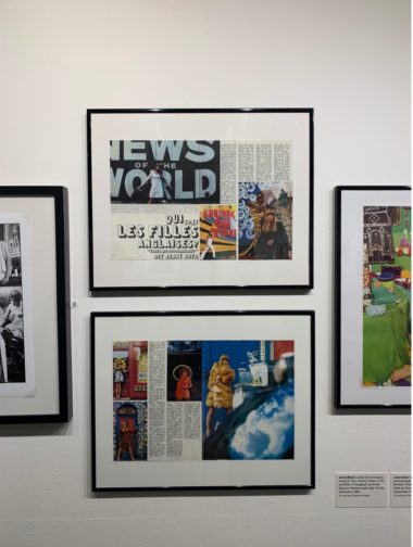
As we made our way to the photography gallery, I was drawn to the article ‘Qui sont les filles anglaises? [Who are the English girls?]’ and a quote from Jenny Boyd outlining ‘Elles me ressemblent [They look just like me]’ for the 1966 December issue of Mademoiselle Âge Tendre. To me, it highlighted the ongoing fascination, or perhaps more accurately obsession, with being seen as ‘fashionable’ both at home and across The Channel, which is an idea that is ever-present today.
Author’s Own Image.
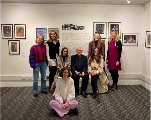
From there, we were delighted to receive a presentation from Photography Curator and Instagram-enthusiast Terence Pepper and former MA Documenting Fashion student Grace Lee who individually boast a huge wealth of knowledge about all-things sixties. Terence ran us through each photo, advertisement and magazine in such detail that for a brief moment we too were transported to the photoshoot, soirée or city being discussed. What’s more, we had the unexpected pleasure of meeting Pattie Boyd, whose sister Jenny Boyd was mentioned above, and who had an incredibly successful modelling career, gracing countless covers of Vogue and inspiring many a Beatles song with her then-beau George Harrison.
Situated à deux pas from London Bridge Station and Borough Market, it makes for a wonderful mid-morning viewing before a spot of lunch at one of the many fabulous food stalls and restaurants nearby.
Helen Levitt’s (1913-2009) photography presents life on the streets of her native New York from the 1930s to 1990s. The current exhibition of her work at The Photographers’ Gallery in London gives insight on a world of charm and character often overlooked in a time and place associated with hardship.
What struck me about many of the photographs in the exhibition was the street style they showed, particularly of 1940s New York, and how this style seemed to embody the ease and coolness of residents whilst also creating a protective armour that shielded them from potential harm.
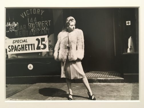
Figure 1. New York, c.1940. Silver Gelatin Print. Courtesy of Film Documents LLC and Galerie Thomas Zander, Cologne.
The first image I have featured exudes glamour (Fig. 1). The woman stands powerfully in the centre of the frame, her large hairdo and statement fur coat making her appear more a fashion model than everyday resident. She turns her head away from the camera, nonchalant despite her bold presence. The photograph might be a snapshot, but something in the woman’s pose implies a knowledge that she is being photographed. She wants to appear powerfully glamourous. Behind her, in a storefront window, is a sign for spaghetti being sold for 25 cents. The spaghetti sign grounds the image. The woman is in her local area, and Levitt chooses to show us those surroundings rather than strategically shooting a more glamourous background to suit the look of the woman.
In this image I see optimism for the beginning of a new decade that this woman seems determined to succeed in. However, the fur coat with its strong shoulder pads also suggests protection, as if the woman is cocooning herself in a thick wall of fur to defend herself from the harsh realities of the world she faces. We lose all sense of the woman’s proportions beneath the heavy coat. She is emboldened by the layers of clothing she has ensconced herself in.
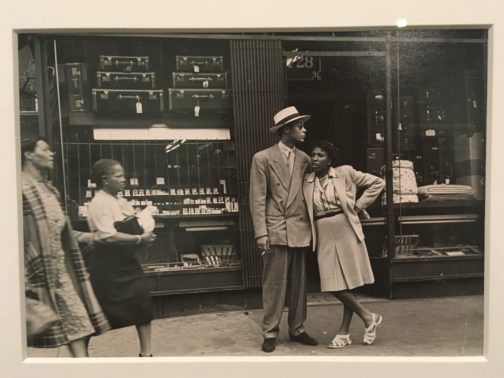
Figure 2. New York, 1944. Silver Gelatin Print. Private collection. Courtesy of Film Documents LLC and Galerie Thomas Zander, Cologne.
The second photograph is as glamourous as the first (Fig. 2). A couple stand together, woman leaning on man, both impeccably dressed. Levitt has captured the woman mid-speech, and two more women are walking across the scene from the left-hand side. This all comes together to present a far more snapshot-like image than the first.
The man’s oversized zoot suit, paired with hat, sunglasses, and loosely held cigarette, all contribute to create an image of effortlessness but also serve as a kind of armour, similar to the fur coat of the woman in the first image. The shoulder pads and loose suit trousers conceal the shape of his body, and the sunglasses restrict the expression that can be gleaned from his facial features.
The woman’s casual pose leaning against the man at first suggests ease and comfort. However, a layer of defence can also be seen in the sharp angle of her elbow, pointed out towards the street on her exposed side.
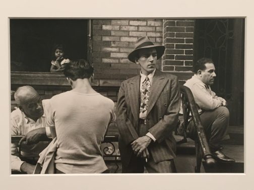
Figure 3. New York, 1945. Silver Gelatin Print. Courtesy of Film Documents LLC and Galerie Thomas Zander, Cologne.
The final image I would like to discuss perhaps best highlights the way fashion served as protective armour in 1940s New York (Fig. 3). The man facing the camera stands in a striped suit, hands clasped in front of him, fedora casting a shadow across his forehead. What is most notable about the man’s outfit is its bold use of pattern. A striped suit is paired with a checked shirt and graphic tie. The clash of patterns reveals the man’s confidence styling himself, and his confidence asserting his place with striking visual presence.
Beside the man stands a far less extravagantly dressed individual. We only see his back, but can see he has removed his jacket and stands in a t-shirt, the shape of his shoulder blades showing through the fabric. This figure, next to the powerful stance of the suited man, becomes a figure of vulnerability. The composition almost gives the impression we are seeing two sides of the same man; the confident figure who faces the world, and the softer side of himself that cannot be fully revealed to the camera. A child in the window of the building looks down on the man who faces away from us, adding to the sense that this lack of layers of clothing is a childlike kind of vulnerability.
‘Helen Levitt: In The Street’ is on show at The Photographers’ Gallery until 13th Feb 2022.
After being shut for months due to lockdown, galleries in the UK have finally reopened their doors to visitors. Amongst a plethora of ‘must-see’ shows, the Serpentine Gallery’s highly anticipated James Barnor retrospective is opening to the public this Thursday. Exhibiting a selection of iconic images taken by the Ghanaian photographer during his six-decade career, it aims to highlight his role as a pioneering figure within modern photography.
Now ninety-two and living in the UK, Barnor recalls how he crossed continents and genres to further his knowledge of photography. As a studio photographer and photojournalist, he captured Ghana on the cusp of independence in the 1950s. He later introduced colour photography to the nation in the 1970s. In between these two pivotal chapters of his career, he moved to London, where he documented the city’s transformation into a multicultural metropolis in the post-war era. Working as a documentary and fashion photographer, he harnessed the power of photography to illuminate the multidimensionality of Black experience in Britain in the 1960s.
In order to comprehend the power of Barnor’s images and his skill as a photographer, it is important to first understand the complex time he was living in. During the 1950s and 1960s, Britain was experiencing a wave of post-war migration as a result of the 1948 British Nationality Act, which granted people in the Commonwealth full rights to British Citizenship. Whilst this marked a watershed moment in the formation of Black Britain, it was also a dark chapter in the nation’s history with racism inherent in the media, politics and society-at-large. This racial intolerance culminated in the Notting Hill Riots of 1958, during which Black people were targeted in violent attacks by white mobs. In the political sphere, various acts were introduced throughout the 1960s which aimed to limit citizenship rights. It was against this backdrop that Barnor worked as a photographer, producing images which were not overtly politically or racially charged in nature, yet prove incredibly impactful given the socio-political landscape of the period.
Commissioned by Drum, the South African Anti-Apartheid journal, he photographed Black models engaging with the latest fashions in the streets of London. These were circulated internationally and have come to be known as pioneering images of Black beauty. Presenting a multi-national cohort of Black women against iconic British backdrops such as post boxes, telephone boxes and Underground signs, he visually manifested the merging of different cultures in post-war Britain. Whether he was photographing Erlin Ibreck leaning against a Jaguar in Kilburn, Marie Hallowi feeding birds in Trafalgar Square, or Mike Eghan leaping off the fountain at Piccadilly Circus, Barnor aimed to capture his subject’s essence and individuality at a time when Black Britain was triumphantly coming into being against a challenging socio-political backdrop.
Guests at the Baptism Ceremony of James Vanderpuije, London, early 1960s / Portrait of the sister of a friend of James Barnor, London, c. 1960 @james_barnor_archives
Barnor also photographed his friend’s weddings, christenings and parties. Taken for family albums, these documentary images were intended not for public consumption nor to make a political statement about racism or marginality, but rather to capture key milestones within the multicultural communities which were emerging in Britain at this time. Style was a tool of social and cultural transformation for Barnor’s subjects. Inspired by various factors such as Western culture, urban dress, group identity, African style and gender ideals, they harnessed the communicative power of clothing to visually manifest their own perspective of what constituted being Black and British at that time. Meticulously dressed, they exude a sense of joy and self-assurance as they become part of the social fabric of multicultural Britain.
Friends, Accra, late 1970s / Back to school, Accra, 1970s or 1980s @james_barnor_archives
Barnor’s images of London make up the second of three sections at the Serpentine exhibition. The first section is dedicated to portraits he took in his studio, EverYoung, in Accra during the 1950s, as well as his journalistic photographs of Ghanaian independence. The third and final section is made up of colour photographs taken in post-colonial Ghana on his return from Britain in the 1970s. What unites these three sections is a sense of joy and community. Barnor saw photography as a collaborative venture between the photographer and subject, which created a sense of intimacy. His images of both Ghana and Britain are powerful visual testaments of societies in transition during the latter half of the twentieth century.
By Violet Caldecott
References:
Campt, Tina M., Image Matters, Archive, Photography, and the African Diaspora in Europe (Duke University Press: Durham and London), 2012
Hall, Stuart, ‘Cultural Identity and Diaspora’, 1990, in Paul Gilroy and Ruth Wilson Gilmore, Selected Writings on Race and Difference, Stuart Hall (Duke University Press: Durham and London), 2021
Olusoga, David, Black and British, A Forgotten History (Pan Macmillian London), 2017
Ed. Mussai, Renée, James Barnor, Ever Young (Autograph ABP: London) 2015
Park, Rianna Jade, How James Barnor’s Photographs Became Symbols of Black Glamour, Aperture, issue 242, New York, March 2021 (Aperture Foundation Inc: London) 2021
Figure 1: Rashid Johnson, Untitled (daybed 1), 2012, branded red oak, zebra skin, black soap, wax, rug, courtesy of the artist and @hauserwirth, photo by the author
It is a rare occasion in London – dashing to an exhibition viewing on a Friday morning, knowing full well the minute it finishes you will have to jog (Edina Monsoon, c.1992 style) across Hyde Park and back to your desk before the lunchtime window ends – when a meditative silence mutes the mounting traffic, perpetual hum of voices and underground announcements, and clattering cacophony of horns surging to a swell just metres away.
It is unnerving, and the precious nature of such transportation is achieved through Grace Wales Bonner’s thoughtful reimagining of the Serpentine Sackler Gallery’s familiar space. Here, an open portal is carved out through which the visitor can travel to #atimefornewdreams.
Wales Bonner is most predominantly recognised as an innovative British Menswear Designer. A Central St. Martins graduate, her inaugural Autumn/Winter ’15 collection at Fashion East, ‘Ebonics’, received resounding praise and was featured in the V&A’s Fashion in Motion programme. In 2016, she received the LVMH Young Designer Prize and was recently awarded the British Land London Design Medal (2018) – I’m not being fan-girly-gushy when I say that Wales Bonner is a remarkable woman.
Laraaji, Transformation, 2019, personal objects, ephemera, sound, courtesy of the musician, photo by the author
A Time for New Dreams is a bringing together of multiple interdisciplinary creative practices: music, fashion, art and design. The exhibition effectively functions as an assemblage of works that explore Wales Bonner’s given themes of mysticism and ritual, accompanied by a fascinating constellation of events and happenings. These range from meditation workshops led by musician Laraaji to a live reading by South London composer, playwright and artist Klein. The vast array of objects, artworks, photographs, memorabilia, books and ephemeral flowerpieces collectively provide a rich blend of multisensory stimuli. As you move through the exhibition, you feel the weight of important and varied histories being carefully layered and interwoven in the creation of a shared narrative.
Left: Grace Wales Bonner at the exhibition’s press view Right: Kapwani Kiwanga, several works from the series Flowers for Africa, 2014/5, signed protocol by artist including iconographic documents, photos by the author
I have this sense of freedom, some acknowledgement of my ancestors and a history that’s come before. It’s an open space for me to be able to feel quite free in the way that I reference histories or I enter different territories and worlds. I’m always interested in the idea of fluidity and the mixing of references … I always think about is rhythmicality. —Grace Wales Bonner in conversation with Ishmael Reed
There is gloriously complex and nuanced storytelling present in the curation of A Time for New Dreams—the accompanying publication alone is the stuff of dreams! The contribution of each work to The exhibition’s wider composition prompts contemplation of Wales Bonner’s exploration of the use of shrines and improvisations throughout black histories—the exhibition’s driving force. Two of the artist’s shrines are featured: ‘the exhibition focuses on the shrine as a symbolic pathway for imagining different worlds and possibilities’ (Claude Adjil and Joseph Constable, A Time for New Dreams exhibition catalogue, 5).
Grace Wales Bonner, Shrine I & II 2019, Altar objects, courtesy of the artist, collection of photos by the author
Wales Bonner’s Shrine I is a direct portal to her intellectual and ancestral lineage. The material included traces certain ideas of brotherhood that have impacted her identity and creative process: the Museu de Arte Contemporânea de Serralves’ exhibition catalogue for Theaster Gates’ 2014 The Black Monastic exhibition, a looped video installation that includes footage of Ishmael Reed playing Tadd Dameron’s ‘If You Could See Me Now’ (2008), a copy of Nigerian poet Ben Okri’s introductory An African Elegy (1992), a treasure trove of Wales Bonner-specific paraphernalia. It is as though Wales Bonner’s Shrine I were a miniature of the wider exhibition, a prototypical maquette that alludes to the exhibition’s portal-like structure: a gallery that has been transformed into a vessel to carry London’s weary to a space-time of alternate worlds and different possibilities.
Eric N. Mack, Capital Heights (via stretch), 2019, assorted cloth, Spandex, cotton, silk, polyester, rope and straight pins, courtesy of the artist and @simonleegallery, (right) Wales Bonner discussing aesthetic practices during the exhibition’s press view (18 Jan 2019), both photos by the author
The runaway success Frida Kahlo: Making Her Self Up, co-curated by Circe Henestrosa and Claire Wilcox at the V&A Museum, will end on 18th November, two weeks longer than its originally intended run. I spoke to Circe to find out more about the exhibition’s message about the link between dress and disability, the enduring image and spirit of the artist, and the value of fashion curation.
As curator of Appearances Can Be Deceiving: The Dresses of Frida Kahlo at the Frida Kahlo Museum in Mexico in 2012, and co-curator of Frida Kahlo: Making Her Self Up at the V&A Museum, could you talk about how the latter exhibition developed from the former? What did you want to keep and what changed?
Frida Kahlo: Making Her Self Up had its genesis in Appearances Can Be Deceiving: The Dresses of Frida Kahlo. Both exhibitions are based on the discovery of her wardrobe back in 2004. My first exhibition looked specifically at Frida’s construction of identity through disability and ethnicity.
In London, I wanted to expand the materials and we had to adapt the text for a UK audience. For example, when you go to the exhibition in Mexico you go to the Blue House, you learn the context of Kahlo’s life, of the place where she was born, where she lived and where she died.
After you understand the context of her life, then you see the wardrobe exhibition. In London, we had to contextualise her historical and cultural environment mainly through her personal photographic archive and other photographers who captured Kahlo at her house. We also included her paintings. My original research included the paintings, but in Mexico we could only get one painting, so it was very nice to be able to pair the paintings and the wardrobe together for the exhibition in London.
In Mexico, I was fortunate enough to work with exhibition maker Judith Clark who designed the show in Mexico. In London, the exhibition design transports us to Frida Kahlo’s universe, through the work of Tom Scutt, lead designer, as well as Patrick Berning and Matt Thornley, the architects.
What were the biggest challenges and rewards in executing the exhibition at the V&A?
Appearances Can Be Deceiving was a roaring success, and the positive response inspired me to see if there was a possibility for a Kahlo exhibition in London. In 2014 I met with Exhibitions Director at the V&A, Linda Lloyd Jones, who gave the idea the thumbs up. I was very lucky to find someone like Linda, who has always been a visionary.
The next years Linda and I spent trying to obtain as many of Kahlo’s self-portraits as possible from Mexico, other museums and private collections around the world. This was the most challenging part. Anything to do with Kahlo’s paintings is complex and you need to start planning well in advance. It took us four years to plan the whole show at the V&A. Several of the paintings and items currently on display at the V&A, including all the objects discovered in the Blue House in 2004, have never been seen in the United Kingdom before.
The layout and narrative of the exhibition evolved in discussion between the two co-curators. The idea was to start with her early childhood, move to the Blue House, explain her accident and how she managed her life-long injuries and end with her wardrobe, showing how she transcended pain to become one of the most celebrated women in Mexico. To illustrate all this we included a number of self-portraits, numerous photographs, film and sound, and provided context about the political and artistic circles that Frida and Diego Rivera were at the centre of in post-Revolutionary Mexico.
Which item of dress belonging to Frida that is on display in the exhibition do you find most compelling and why?
I think Kahlo’s powerful style is as integral to her myth as her paintings. It is her construction of identity through her ethnicity, her disability, her political beliefs and her art that makes her such a compelling and relevant icon today. Her resplendent Tehuana dresses, striking headpieces, hand-painted corsets and prosthetics masterfully masked her physical impairments but were also a form of self-expression and an extension of her art.
I love all the pieces, but her prosthetic leg is probably my favourite object in the entire archive. I think it is so contemporary. This is one of the most intricate objects in Kahlo’s collection. Frida Kahlo had her leg amputated in 1953. To support her leg, she had these amazing boots made of luxurious red leather decorated with bows and pieces of silk embroidered with Chinese dragon motifs and decorative little bells. She turned her prosthetic leg into an avant-garde object, an accessory that she adopted as an extension of her body. She did this 45 years before Alexander McQueen had Aimee Mullins walking the runway in those amazing wooden carved prosthetic legs in 1998.
The exhibition’s run has been extended and is sold out. The image of Frida is also ubiquitous in contemporary popular culture. What do you think it is about Frida that has struck a chord with the public?
I think Frida Kahlo was ahead of her time. She is the very model of the bohemian artist: unique, rebellious and contradictory, and a cult figure that has been appropriated by feminists, artists, fashion designers and popular culture. But I mainly think Kahlo’s image endures because she was able to break a lot of taboos about women’s experiences, about the challenges to overcome illness and physical injury, both exposing them and working through this trauma in creative ways. This resilience, her fighting attitude and determination to enjoy life despite the difficulties she encountered make her a powerful symbol as she continues to speak to many different groups. Her iconic image communicates strength and the possibility for change. This is the message I wanted to convey in this exhibition.
The conference Frida: Inside and Outside gathered academic experts on Frida Kahlo. What stood out most for you at this meeting of minds? And did you discover something about Frida and/or the link between fashion and disability?
I enjoyed the conference greatly. We had the participation of some of the most prominent Kahlo scholars in London. Academics such as Prof. Dawn Ades, Prof Oriana Baddeley, Prof. Gannit Ankori, Prof Martha Turok, and a great mix of younger scholars and contemporary designers and artists as well. The session of Re-Configuring the Body was my favourite during the second day was by far my favourite one. I was so happy to secure the participation of Celeste Dandeker, Founder of Dance Company Candoco and Sophie the Oliveira, an amazing prosthetics designer in the UK for this session. The session was moving, it was powerful and I think we managed to open the disability debate in a very strong manner. The audiences commented on how inspiring this session was.
As Head of School of Fashion at LASALLE College of the Artsin Singapore, how has your role as an educator informed your curatorial practice and vice versa?
I hope to be able to inspire our students and the team through my work and curatorial practice. We do a lot of curatorial projects across our fashion programmes, we teach it from a theoretical perspective and from a practice-based perspective. I think that if the students acquire the ability to observe, analyse and evaluate objects in their material culture through different lenses, whether they are historical, contextual or structural, they will be able to interpret these objects with coherent narratives that will communicate with different audiences. They need to understand that fashion is about dealing with people, culture, and society, as well as garments and objects. Fashion curation is a very powerful tool to contextualise and communicate fashion.
What advice do you have for students who want to follow in your footsteps to curate fashion exhibitions?
I think they should go for it! We need more young people working in this field.
Are there plans for the exhibition to travel? Any details you could share would be great!
We have many museums that have expressed interest in this exhibition around the world, and at the moment we are exploring the different possibilities.
May 2017 will stand out in designer Anna Sui’s memory as a month full of successes and landmarks. As well as receiving an honorary degree from Parsons School of Design, the designer and her influential career became the subject of London’s Fashion and Textile Museum’s latest exhibition. Entitled ‘The World of Anna Sui,’ the show takes visitors on a journey through the Chinese-American designer’s inspirations, obsessions and most iconic moments, which formed her style and established her as one of the key figures of 90s American look, alongside names such as Marc Jacobs and Isaac Mizrahi.
A view of the entrance to the exhibition space.
The title of the exhibition could not be more accurate – as soon as one steps into the first gallery, Sui’s vision becomes unmistakable and overwhelming. Her voice beams out of the speakers as she describes how she came to be interested in fashion, proclaims her love for Elizabeth Taylor and Jackie Kennedy, and explains how her own style developed in her teenage years, despite strange looks from her peers. As the visitors listen to Sui’s narrative, archive videos of The Beatles, celebrity culture, markets at Portobello and Carnaby, and scenes of boho youths frolicking in the park bring into forefront the environments and mentalities within which Sui grew up, capturing her imagination, and eventually manifesting themselves in her designs. With the understanding of her background, Anna Sui’s exhilarating universe is ready to be explored.
A photograph of Anna Sui’s first boutique at 113 Greene Street in Soho, New York, which opened in 1992.
The main gallery space almost teleports the visitor into one of Sui’s boutiques, a photograph of which is featured in the corridor between the different rooms. Entering through a grand, black lacquered door, groups of mannequins clad in Sui’s extraordinary garments, arranged according to their clique (nomads, punks, mods, surfers, rockstars and schoolgirls all make an appearance), lure the spectator deeper into the space, in an almost hypnotic state. The colours, patterns, textiles and surfaces are otherworldly, creating a kaleidoscope of all the characters one can become in Sui’s fashions. With vitrines in which shoes, make-up, sunglasses, hats and other Sui paraphernalia are showcased, the gallery space is almost a treasure chest in which anyone and everyone can find something to lust over. Completing and complementing the exhibits are purple walls, red platforms and Sui’s signature pattern with which the space is decorated. The curator Dennis Nothdruft and exhibitions designer Beth Ojari transformed the relatively small space of the Fashion and Textile Museum, with great success, into an enchanting and intriguing environment.
A view of the ‘Fairytale’ section.Installation of the ‘Punk’ garments.The ‘Rockstar and Hippie’ group with Sui’s signature patterned wallpaper.
‘The World of Anna Sui’ is unlike any other recent fashion exhibitions. While the space is limited and a lot is packed in, it is never to the detriment of the clothes on show. There is something reminiscent of Diana Vreeland’s multi-sensory exhibitions at The Met’s Costume Institute in the London show. Unsurprisingly, the designer loved Vreeland’s stories for Vogue and The Met. Consequently, Sui’s perfume is pumped into the rooms of the Fashion and Textile Museum, corresponding to the message the garments are relaying. As such, ‘Sui Dreams,’ a perfume described as “inspired by independent women who follow their hearts and exceed their own expectations” provides the scent for the first gallery, that of Sui’s influences and childhood dreams. The main space, where the iconic Anna Sui garments are on show, fills one’s nose with ‘Fairy Dance,’ offering “an escape into a mystical garden where fantasy lives. A happy, whimsical place filled with sunlight and the enchantment of the fairy world.” Not much can be more appropriate for Sui’s story-filled collections. Elsewhere, Nirvana cries out from the speakers, while visitors can study Sui’s design process through the installed mood boards, or find out about the figures she collaborates with on her shows, such as make-up artist Pat McGrath, milliner James Caviello and photographer Steven Meisel. The exhibition is all encompassing, rich, informative, joyful and optimistic. An absolute must-see this summer! And don’t forget to visit the gift shop – you can take a bit of Anna Sui away with you in the form of her fabulous make-up, a scarf, or Tim Blanks’ new coffee-table book on the designer published in conjunction with the exhibition, also titled The World of Anna Sui. And one last tip – leave yourself a lot of time to peruse the exhibition, you will not want to leave!
A cabinet filled with an array of sunglasses and other accessorues from Sui’s shows through the years.An example of Sui’s research board for a collection – here, Hawaii is on her mind.
‘The World of Anna Sui’ runs at the Fashion and Textile Museum until October 1, 2017.
The conference Reading Fashion Magazines may be over, but our display of 9 items from the collection is still available to be viewed outside the Courtauld Library vitrines. Please come and visit, before it closes in August. In order to tempt you, you can read the introduction to the display, and our conference, below, available for you to download in a pdf.
Some of the earliest fashion magazines in the Courtauld History of Dress Journals Archive are on show in the exhibition. Here, Gazette du Bon Ton, Für die Dame and Pinpoints are displayed.A view of the 1940s section of the exhibition featuring Harper’s Bazaar and Femina.Elizabeth and three MA Documenting Fashion students after the completion of the exhibition instal.
‘French Fashions’ photographed by Chris Dawes. Elle UK, March 1986. History of Dress Collections, Courtauld Institute of Art.
The 1980s were turbulent years in Britain. From extreme hardships and upheaval to pop culture and newfound affluence, the decade had a lasting influence on modern-day life. In this explosive climate, some relief came with the birth of iconic magazines such as i-D, The Face, Arena and, in November 1985, the British version of Elle Magazine, the originally French style bible. Aimed at young career women, Elle combined carefree fashion with serious articles, or ‘style with content,’ as Dylan Jones, the Editor-in-Chief of GQ put it. Today, Elle holds the title of the largest fashion magazine, boasting 43 international editions published in 60 countries worldwide.
With Sally Brampton as its first Editor-in-Chief, Elle became the to-go magazine for the well off, modern 18-30 year old, who was uninterested in the world of luxuries, haute couture and pampering offered by Vogue. Instead, the magazine published frank and provocative features about love, sex, dating and health alongside interviews with the likes of Harrison Ford, Mickey Rourke, Jasper Conran or Paula Yates. The glossy fashion pages, graced by Naomi Campbell, Claudia Shiffer, Linda Evangelista, Carla Bruni and Yasmin Le Bon, were daring, powerful and unrestrained, full of spirit and joy. The articles were relatable and fascinating while the fashion photographs by Mario Testino, Eamonn J. McCabe or Neil Kirk shot in exotic locations provided a much-needed element of fantasy and aspiration. With such ingredients, Elle was set to become the cult publication of a generation.
This spread here, entitled ‘French Fashion’ and photographed by Chris Dawes for the March 1986 issue of Elle, showcases why the magazine was so groundbreaking in its first few years. Tapping into a younger, yet still style-conscious audience, guides on how to achieve a look which appears to be taken straight from the catwalk were a common fixture in the magazine. Chanel, a favourite of the modern working woman, plays a main role on this double page. The classic skirt suit of Coco, trimmed in black with gold details, complete white gloves and a black quilted bag with a chain strap, could be yours for a mere fraction of the original price. In style, however, it packs the same punch. French-chic without the price tag!
The sleek, glossy page hints at the opulence one experiences when wearing such an outfit. Framed as a Kodak contact sheet, the idea of a luxurious lifestyle is further alluded to by positioning the wearer of this ‘Chanel’ look as someone worth photographing. Yet, the girl is not simply a society lady going between luncheons and afternoon teas. She is in movement, her bag flying behind her. Perhaps she is on her way to a business meeting, or rushing to work in the morning. She appeals to the career woman of the 80s and inspires younger readers to embrace a working life – you can still look incredibly à la mode in office attire. Magazines should create a fantasy, but they should also be rooted in reality – Elle masters it!
We are just one week away from our conference Reading Fashion Magazines: Celebrating The Courtauld’s History of Dress Journals Archive! Upcoming blog posts will offer a sneak peek into ‘Addressing the Courtauld’s Fashion Magazines,’ an exhibition held in conjunction with the conference. Be sure to book a ticket here to see amazing speakers and beautiful magazines. Remember: Digital images are nice, but nothing beats seeing the real thing!
Double page spread photographed by Guy Bourdin, Vogue Paris, April 1976. History of Dress Collections, Courtauld Institute of Art.
This double page spread is part of a nine page fashion story by the photographer Guy Bourdin, displaying the new ‘sporty and young’ swimwear and summer fashions for 1976. The first fashion story in Vogue Paris’ ‘spring special’, it follows advertisements for Missoni, Versace, Etro, Yves Saint Laurent, Celine, Charles Jourdan, Bally and Jacques Heim. It precedes another, shot by David Bailey, and editorials on how to confront the beauty-depressing effects of winter, 10 new methods to re-discover joie de vivre as well as an extensive story on Greece, in celebration of the country’s new membership of the European Common market.
Five girls in bikinis lay outside to catch the sun’s rays in an unusual setting – usual that is, for the pages of luxury magazine Vogue. Far from an idealised, exotic location, five girls stretch out across a cracked and dusty pavement as a bus passes by, in barely-there bikinis, ‘so small that they may be held in the palm of the hand’. Sunglasses discarded, each holds a light-reflecting silver board up to their face in order to achieve a faster, stronger tan. In a further spread, models climb a fence in search of a sunnier spot past a shaded avenue palm trees, and in another, recline on a narrow strip of grass between a tarmac highway and Sears warehouse, their languor contrasting with the fully clothed figure rushing past. Breaking up the location’s horizontal lines – the bus’ branding, wall and pavement’s edge – the models are made individual by the bold colours of their bikinis and different hairstyles. They are conceivably a group of normal girls, taking advantage of the first signs of summer in the city where they live.
Cover of Vogue Paris, April 1976. History of Dress Collections, Courtauld Institute of Art.
Vogue Paris’ editor-in-chief, Francine Crescent, gave her photographers a great deal of creative freedom. With Bourdin, this enabled him to exploit the features of the magazine as a material object. He was the first photographer to bear in mind the potential of the double-page spread when taking his images; all but one of the images that make up this story extend past the gutter and bleed to the very edges of the magazine. Bourdin is mindful of the way a magazine falls open, laid on a table, or across a reader’s thighs. His models are carefully spaced in order not to distort their figures at the centre of the spread where the pages naturally curve inwards to their binding. A wall or fence is often at the centre of the image, setting up a contrast between the two halves of the image. The effect is fully immersive; the picture being larger, more of the scene may be seen in greater detail, more figures included, more of a narrative told. The glossy-light reflecting paper the images are printed on adds to Bourdin’s emphasis on sunlight and shade. Viewed in April, together with features on post-winter revival, Bourdin directly addresses the reader’s desire to shed heavy coats and insulating layers with bare flesh and warm colours. As the reader holds Vogue in their hands, they are within their grasp.
We are less than two weeks away from our conference Reading Fashion Magazines: Celebrating The Courtauld’s History of Dress Journals Archive! Upcoming blog posts will offer a sneak peek into ‘Addressing the Courtauld’s Fashion Magazines,’ an exhibition held in conjunction with the conference. Be sure to book a ticket here to see amazing speakers and beautiful magazines. Remember: Digital images are nice, but nothing beats seeing the real thing!
Cover of Femina, October 1951. History of Dress Collections, Courtauld Institute of Art.
Femina was a French fashion magazine active from the early twentieth century. It is a great documentary source for the history of French couture as shown by these images. During the war, Parisian couture was necessarily scaled back in its production due to a lack of material resources as well as customers. Fashion, however, was often a way for the women of Paris to resist the occupation of their city by asserting nationalistic pride through the cultural tradition of high fashion. After the war, Christian Dior asserted a return to luxuriant and grand femininity with his “New Look” collection of 1947 featuring narrow sloped shoulders, hand-span waists, and voluminous longer skirts. Although some people were shocked and even dismayed at what seemed an excessive use of fabric, the silhouette was largely embraced by women happy to have a change that expressed beauty and luxury.
Illustration of a Christian Dior gown. History of Dress Collections, Courtauld Institute of Art.
By 1951, as these illustrations attest to, the New Look silhouette was an integral part of fashion. Dior’s gown features a blue back panel with bow that is reminiscent of the earlier nineteenth century bustle emphasizing the back of the skirt. This silhouette was very consciously a return to the history of dress from the eighteenth and nineteenth centuries which Dior felt celebrated femininity in a way that resonated in the post-war period.
Illustration of a Nina Ricci gown. History of Dress Collections, Courtauld Institute of Art.
Nina Ricci was one of many female couturiers before the war who opened her house in 1932. Though she isn’t as well remembered today as Dior, she was a great success in the thirties and after the war, designing until 1954 when her son took over the business. The gown illustrated here exemplifies Ricci’s aesthetic of a highly refined femininity infused with romantic details. The caption refers to the Second Empire period in mid-nineteenth century France which the gown seems to revivify in its sweeping trained skirt and oversized bow emphasizing the hips. By contrast, the waist appears even smaller. The matching long evening gloves also continue a fashion tradition in eveningwear. The model’s coiffure, however, is a modern post-war style which reminds us that fashion is always a blend of past and present.
What I love so much about these illustrations is the way they capture a sense of drama from the dress itself. Photographs often rely upon the model and settings to create a fuller scenario but illustrations really focus on the silhouette and textures of the garment. The shading on the Dior gown conveys the stiffness of the material and the sheen of a silk. That I can “feel” the surface and shape of the dress is what draws me in. In a sense, the drawing convinces me that the gown is real, that fashion is real, because it connects to what I already know in part – the textures, colors, and shape, but offers the possibility of even more – the actual dress.
The mark of the artist’s hand speaks to the agency of my own hands and the knowledge they quite literally hold. The architectural quality of the gown can be felt with just a few lines in the right place. By contrast, the more fluid, softer drape of Nina Ricci’s gown seems to telegraph the movements of the woman’s body. I can imagine the train swaying in echo of her hips as she glides across the ballroom. The illustrations heighten the sensuality of the gowns. The differences in aesthetic qualities reflect the type of woman imagined as the wearer and express the designer’s vision of her desires.