Tag Archives: documenting fashion

5 Minutes With…Megan Stevenson

We’ve been busy working on our dissertations, so we’re taking the opportunity to get to know the current MA Documenting Fashion students. Here, Megan discusses David Bowie, Paris is Burning, and her early fashion influences.

What is your dissertation about? What prompted you to choose this subject?

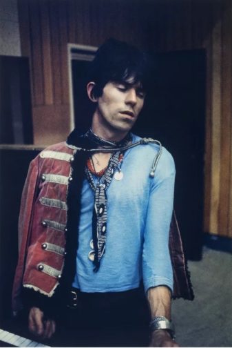
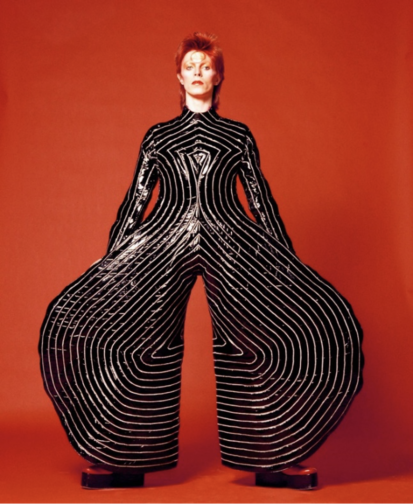
My dissertation is about David Bowie… kind of. I’m looking at the personae of Ziggy Stardust and Aladdin Sane, focusing on three sources: Brian Duffy’s photoshoot in January 1973, Masayoshi Sukita’s photoshoot in February 1973, and D. A. Pennebaker’s documentary Ziggy Stardust and the Spiders from Mars (filmed July 1973).

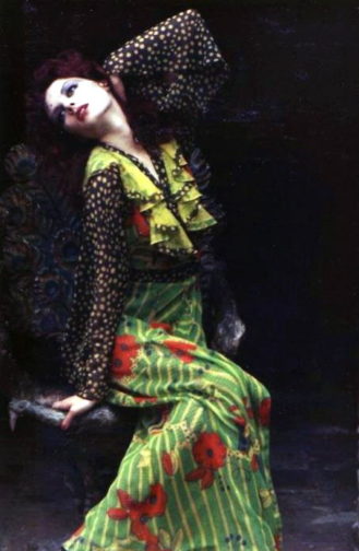
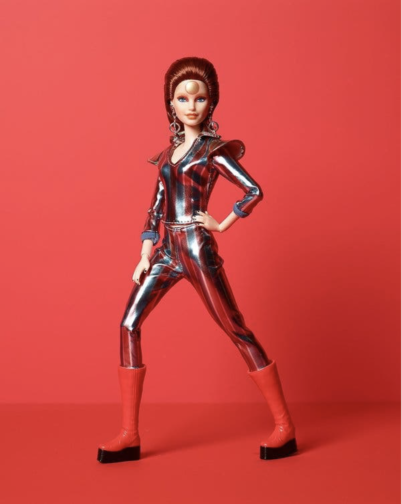
I was initially inspired to research this area after learning about the close connection between Bowie and Japan, which made me wonder about the various influences that collaboratively produced his iconic personae. The incredible glam rock fashion of his Ziggy Stardust and Aladdin Sane period made the choice of which area to focus on pretty easy. I’m really enjoying the research, as it’s allowing me to dig under the surface of visual media and find a whole network beneath. Along with Duffy, Sukita, and Pennebaker, I’ve been researching fashion designers Kansai Yamamoto and Freddie Burretti, make-up artist Pierre La Roche and mime artist Lindsay Kemp. My main realisation has been that there is an infinite list of contributors, collaborators, and influences that came together to produce the Ziggy Stardust and Aladdin Sane imagery that we know so well. Even a rice cooker gets a mention for being relevant! It’s also been really interesting to trace the sources and their uses in various forms – my favourite of which being the Barbie doll dressed and marketed to recreate an image from the Sukita shoot.

Fig 1: ‘Watch That Man III’ by Masayoshi Sukita, 1973. (Snap Galleries)
Fig 2: Barbie as David Bowie, 2019. (Mattel)

What is your favourite thing you’ve written/worked on/researched this year?

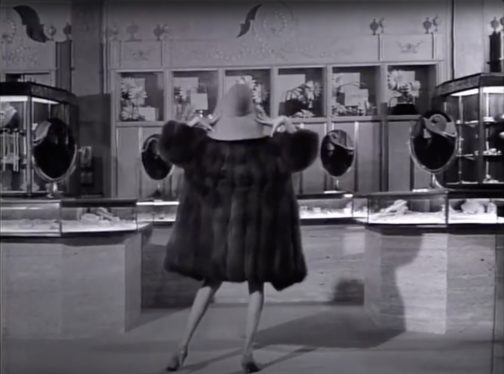
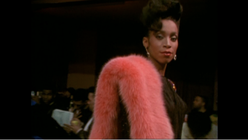
My favourite thing would have to be my first essay, which was about the wearing of fur in Jennie Livingstone’s Paris is Burning, a documentary filmed in the late 1980s about the New York ballroom scene. I researched the history of fur as a material in fashion, and the social and cultural reasons fur may be worn in different contexts. Paris is Burning was a particularly interesting lens to view this through, as tensions between fur as a marker of distinction and anti-fur campaigns were dramatically rising. Not only that, but I could bring in a lot on gender and fashion – my favourite topic!

Fig 3: Still of Octavia St. Laurent in the film ‘Paris is Burning’ at 06:17, 1990. (Academy Entertainment / Off White Productions)

What are you wearing today?

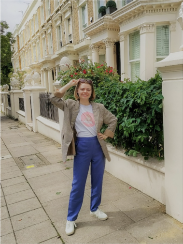
Today I am wearing periwinkle blue trousers, a white t-shirt and a brown check jacket. The trousers are the most recent thing I’ve bought, I found them on Depop and am loving them. The t-shirt was given to me as merchandise when I worked on an event a few years ago, and it’s become a staple of my wardrobe. The jacket is originally from Motel, but I got it from a charity shop in Angel for £7. On my feet are a pair of Flamingos’ Life trainers, bought second-hand on Ebay. I’d really recommend Flamingos’ Life – they are plant-based, comfy, and don’t slip off the backs of my feet as I walk along.

As you probably noticed from that description, most of my clothing these days comes from some kind of second-hand source. I started trying to avoid fast fashion about 5 years ago and am really happy with the eclectic wardrobe I have built since. I’ve dabbled with making my own clothes, and the new series of Sewing Bee is inspiring me to dedicate more time to that this summer! I have been desperate for a brightly coloured co-ord suit that fits my body (Zara seems to think I need an extra 6 inches of torso?), so that’s what I’ll be aiming to perfect first.

This MA has really solidified my belief that clothes aren’t everything, but they’re a heck of a lot more than ‘just’ clothes. They are a way for us to customise this character we have been given, to make our day more comfortable, to support our lifestyle and to surround ourselves with softness and colour (at least, these are my main priorities).

Fig 4: Megan strutting her stuff on the streets of London

Do you have an early fashion memory to share?

A glowstick exploding all over my favourite lilac crushed-velvet tank top, age 6! I never fully recovered, and today I own a turquoise crushed-velvet strappy crop top… I actually had forgotten all about the glowstick incident until I thought about how to answer this question, and hadn’t made the connection between that top of 17 years ago and the crop top I now own and wear on nights out. Oh dear.

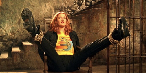
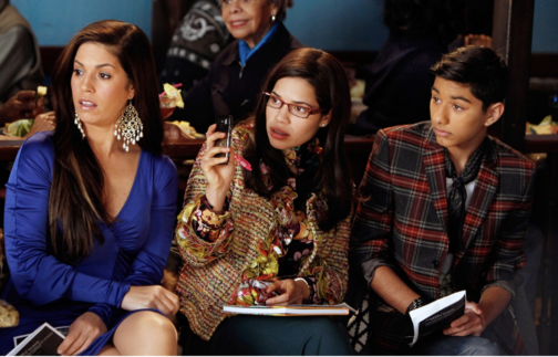
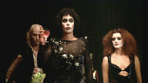
In terms of fashion media, I have strong memories of media which I think must have come from my big sister, because I was almost certainly too young to follow these when I first watched them. Charlie’s Angels (2000) has Drew Barrymore playing Dylan, and her blue-eyeshadowed rock-chic look definitely inspired me for better or worse. Ugly Betty (2006-2010) and The Rocky Horror Picture Show (1975) also felt like defining moments where I became aware of fashion. They were also both, in their own ways, trailblazing forms of media. I’m glad I could see their comedy, drama, and representation from an early age. (Special shout-out to Pierre La Roche, mentioned earlier, who also did the make-up for Rocky Horror and has been a feature of many of my interests without my realising for all these years. More people should know about him!)

Fig 5: Dylan in ‘Charlie’s Angels’, about to beat up many baddies. (Colombia Pictures Industries, Inc.)
Fig. 6: Hilda, Betty, and Justin Suarez in ‘Ugly Betty’. (ABC / Getty)

If I’ve got my timings right, then this is my final post for this blog! I’ve really enjoyed my time writing here and reading the wonderful words of my course mates. If you want to see more of what I’m getting up to then my Instagram is @megangalleria – I mostly post about museum, gallery, fashion and photography related things.

All the best!

Fig 7: Frank N. Furter gives a toast, ‘The Rocky Horror Picture Show’. (20th Century Fox)


By Megan Stevenson

Images:

https://www.snapgaleries.com/portfolio-items/david-bowie-by-masayoshi-sukita

https://www.hamleys.com/barbie-david-bowie-doll

Livingstone, Jennie. Paris is Burning, cinematographer Paul Gibson (1990; New York: Second Sight Films Ltd, 2009), DVD

https://screenrant.com/charlies-angels-every-angel-ranked/

https://people.com/tv/mark-indelicato-didnt-know-what-playing-a-gay-character-on-ugly-betty-would-mean-to-so-many-people/

https://greenbelttheatre.org/blog-post/the-strange-journey-of-rocky-horror-from-box-office-flop-to-cult-classic/

https://rockyhorrorpictureshowpics.tumblr.com/image/1246180119


5 Minutes With…Claudia Stanley

We’ve been busy working on our dissertations, so we’re taking the opportunity to get to know the current MA Documenting Fashion students. Here, Claudia discusses Ossie Clark, military peacocks, and what artists wear.

What is your dissertation about?

My dissertation centres around how temporality and nostalgia manifested in the designs of Ossie Clark and textile designer Celia Birtwell during the retro-mania of the late 1960s and early 1970s. From his seductive, transparent garments (often worn without underwear) to his hyper-feminine bias cut dresses, Clark was able to reflect contemporary notions of progressive female sexuality whilst simultaneously referencing past art movements and designers. Ranging from the Pre-Raphaelites to 1940s fashion, Clark and Birtwell’s past influences also translated into the fashion photography of their collaborative creations.

Celia Birtwell, Gala Mitchell in an Ossie Clark Dress with Celia Birtwell’s Acapulco Gold print, 1969

My virtual exhibition also focused on Ossie Clark, where one section, ‘Modern Retro’, sought to display the influence of history on Clark and Birtwell in an era of self-conscious modernity. I based my exhibition in Chelsea Town Hall, where Clark held some of his theatrical and often shambolic fashion shows. By the end of the project, I could really visualise the space and how the exhibits (and my imaginary visitors) would interact with each other.

Ossie Clark fashion show, Chelsea Town Hall, 1970

I wanted to convey the impression of an immersive, multi-sensory experience, where people could flow freely through the space. My visitors would be given headphones which would react to each display, playing music to coordinate with each exhibit. I hoped to create a solo, silent Ossie rave to help transport visitors to Swinging London. Having scratched the surface in my virtual exhibition, it’s been really interesting delving deeper into themes of history and continuity in my dissertation research.

What is your favourite dress history photograph?

To save this from turning into an Ossie Clark rant, I’ll opt for one of Horst P. Horst’s neoclassical images, featured in Vogue from September 1937. The model, adorned in a silvery gown by Madeleine Vionnet, seems to simultaneously embody a classical goddess and a modern woman. Posed to statuesque perfection, her bejewelled wrists, held above her modestly lowered head, are clasped together like the fastening of a necklace, metamorphosing her iridescent body into a precious pendant. Alternatively, the vertical pleats of her dress could also transform her into a Corinthian column. The outline of her thigh shimmers under the studio lights, hinting at the sensual body beneath. I love how tactile this image is. Just from looking at it, we get a sense of exactly what it would feel like to wear this dress and to have each delicate pleat ripple across the body.

Horst P. Horst, Sonia wearing a Vionnet dress, Vogue, 15 September 1937, Condé Nast

What is your favourite thing that youve written/worked on/researched this year?

I really enjoyed my essay on how military uniform was appropriated by The Rolling Stones and The Beatles in 1966 and 1967. The fact that such archaic and hyper-masculine garments were incorporated into progressively androgynous, peacocking menswear reveals an interesting point of tension in regards to modernising masculinity. The Beatles and The Stones arguably brought this counterculture style of dress to the forefront of contemporary consciousness, asserting their flamboyant individuality, which, ironically, created an impression of uniformity within, and between, both bands.

Gered Mankowitz, Keith Richards, Wasted, 1967, Gered Mankowitz Collection

What is your favourite thing youve read this year?

Charlie Porter’s What Artists Wear is something that I keep coming back to (mainly just to flick through the pictures). Porter highlights how the physical intimacy of clothing offers a more personal perspective on world famous artists, from Louise Bourgeois wearing her own latex sculptures, to Frida Kahlo’s politically-charged adoption of, and self-documentation in, men’s suits. I enjoyed how Porter centres debates around female artists’ bodies, which have been historically restricted by clothing. Dress has the destructive potential to limit bodily autonomy and, by extension, creative output. Yet, at the same time, dress becomes a canvas on which artists express themselves, a means to connect with viewers of their work, as well as autobiographical evidence of their life. It really makes you question what you choose to wear.

Frida Kahlo, Self-Portrait with Cropped Hair, 1940, MoMA, New York

What are you wearing today?

I wish I was wearing my Anna Sui charity shop find (it’s either a short dress or long top, the jury is still out). Sui is an admirer of Ossie Clark’s work, and the clashing purple floral patterns could have been inspired by Celia Birtwell’s prints, and the flowy sleeves and handkerchief hem are quite Ossie-esque. It’s been fun wearing this to get into character to write my dissertation. I would have worn it over mauve flares, also from a charity shop, and my pistachio-green cowboy boots, you guessed it, from Shein. I jest. They’re from Oxfam.

What I’m actually wearing is an old Breton-striped top of my mum’s which is literally falling apart at the seams, old baggy shorts, and a straw cowboy hat. I look like a distressed, marooned gondolier. For context, I’ve been hacking away at my dissertation in the garden, not that that excuses my dishevelled appearance. Oh, and I’m also sporting some men’s clogs that have become communal gardening shoes. My tortoise is affectionately head-butting one clog as the opening act of his mating ritual. Aside from that, he’s been a very devoted research assistant. He’s wearing his custom-made tortoise-shell print shell suit which I’ve never actually seen him take off…

By Claudia Stanley

5 Minutes With…Georgina Johnston-Watt

We’ve been busy working on our dissertations, so we’re taking the opportunity to get to know the current MA Documenting Fashion students. Here, Georgina discusses Vogue, her scented virtual exhibition and fairy wings.

What is your dissertation about? What prompted you to choose this subject?

My dissertation is on Audrey Withers OBE, who was the editor of British Vogue between 1940 and 1960, having first joined the magazine as a sub-editor in 1931. I was introduced to Audrey Withers’ work through Julie Summers’ book and online talk on Dressed For War in late 2020. During the talk, hosted by Somerville College,  I learnt that Audrey Withers and I had shared the same undergraduate college, and, yet I had never heard of her name despite her many achievements and my pre-existing interest in fashion (with a keen interest in fashion magazines). I immediately became fascinated by her life and work, wanting to learn more about the tensions between her public and private personas – Audrey Withers was as a notoriously private character – and it was this which ultimately inspired me to apply for the Documenting Fashion MA at the Courtauld. Through my dissertation, I’m enjoying playing the part of detective, trying to uncover more information about Audrey Withers through her private correspondence, workplace memos and newspaper cuttings, as well as undo the misconceptions surrounding her, such as she herself became ‘interested in Vogue magazine when an undergraduate at Somerville College, Oxford,’ as written in a Norwood News article of 1951. In fact, Audrey Withers was largely uninterested in fashion and instead ‘achieved her results by sheer intelligence’ in the words of Harry Yoxall, the chairman of Condé Nast. My dissertation will focus on her private and public lives and how they were designed to remain entirely separate, but that Audrey Withers’ role at Vogue required them to overlap at points, with family friends such as Paul Nash writing articles on all manner of things.

Additionally, I was fascinated to learn how Audrey Withers and Cecil Beaton destroyed the entire paper and photographic archive of British Vogue for 1942’s March issue (below) in response to the Paper Salvage effort and in the face of unimaginable hardship. I believe the coupled nobility and arrogance in this action – which reacted to contemporary uncertainty at the expense of future study – serves as an example of the undeniable tension behind justifying perceived ‘frivolities’ in an era of necessity as well as securing Audrey Withers’ status as a largely anonymous and unknown figure.

Vogue
British Vogue, March 1942

What is your favourite thing that you’ve written/worked on/researched this year?

I’m loving my dissertation – especially as it is something I’ve been mulling over since last summer – but I really enjoyed working on my virtual exhibition, which explored the power of perfume. Perfume is capable of so much: it has the power to evoke forgotten moments; perfume acts as a designer’s signature – yet invisible – autograph, the list could go on… What I’ve loved about this project was its focus on creating a visual argument. Unlike an academic essay where you might presume certain knowledge and expertise on behalf of the reader, I had to consider how to pitch each element to a wide variety of visitors in order to give them the best experience possible. For instance, I used text panels to introduce each section and broader themes, whereas the sample exhibition catalogue entry allowed for a more in-depth analysis.

I wanted to situate perfume within a retail space, reinforcing perfume’s relationship to commercial practices, and chose to set it in the historic Liberty Department Store in London. In keeping with the idea of it as a fantasy exhibition, I kept on imagining I was in ‘The Sims’ world each time I was working on my floor plan, visualising how a Sim character would walk through the exhibition space. I wanted to create an immersive, multi-sensory experience, and decided on a commissioned and interactive sensory wall, serving baked goods (and cocktails!) to create three ‘miniverses’ to reflect the perfumes and designers on display: Elsa Schiaparelli’s Shocking, Yves Saint Laurent’s Opium and Tom Ford’s Tuscan Leather. I found considering perfume’s position as simultaneously immaterial and material particularly fascinating and incorporated that into my layout.

What are you wearing today?

Recently, I’ve found that I’m wearing a ‘uniform’, which normally consists of jeans, a simple top, a fun statement blazer or coat and a bright red lip. Today, I’m wearing a pair of denim blue Levi’s, an M&S black thermal top (not so chic, but I FEEL the cold), my cherished checked old Celine blazer from Vestiaire Collective and a pair of slightly battered Axel Arigato trainers, plus my go-to vintage Mulberry laptop bag, which I nabbed from my mother. And, of course, my signature red lip. I’m also having a bit of a jewellery moment, so have layered it with a couple of Alighieri necklaces (including the ‘Invisible Compass’ as I’m always getting lost!), a gorgeous Katie Mullally Irish Coin Charm featuring an Irish hare (I’m born Year of the Rabbit which I feel is close enough) and an amber necklace bought in Edinburgh by two of my dearest friends for my birthday last year. I’m also wearing a pair of Motley X Alice Cicolini earrings and my usual rings, including one from my mother and a Gracie J prototype tear ring. It’s been a research day, which started with an exciting trip to Vogue House to meet with Julie Summers, where we talked about our love for Audrey Withers, and I was lucky enough to take a quick peek at some of the Vogue archives from the 1940s and 1950s. I then had lunch with a friend and have since been busy in the London College of Fashion Library looking at more Vogue archives where I bumped into fellow MA student, Megan, before heading home for a relaxed evening!

Do you have an early fashion memory to share?

When I was a child, there was a time where all I would wear was a dress with a tutu skirt, fairy wings, and green wellington boots. And jeans underneath if it was cold. Occasionally, if I was feeling very daring, I might try to pinch my mother’s clip on earrings to complete the look… From an early age, my mother had been quite happy for me to choose my own outfits, barring the occasional family event, and so I’d turn up to nursery dressed as a fairy. Complete with a little handbag with everything a fairy might need for the day, namely bubbles and a glitter pen.

As I would wear this outfit day in and day out, I must’ve worn it on the day we had an art lesson as my mother ended up receiving a call from the school. Initially assuming it was about one of my brothers who was constantly misbehaving, it was a surprise to hear that it was about how I had refused to take off my fairy wings when asked. Though the teacher was seemingly only concerned they’d get mucky during the arts and crafts activities, I continued to refuse to take them off and they were unable to put my painting overalls on. While neither my mother or I can remember the precise outcome, or whether I agreed to take my fairy wings off – even momentarily to put the apron on – I’d like to think that a compromise was eventually made, and I succumbed to reason. But knowing how stubborn children can be, there’s certainly a chance that I refused to cooperate.

In the photo below, it’s funny how the core of many of my outfits remains the same, even nearly two decades on. I often wear a white t-shirt and jeans, and the tutu dress and fairy wings have simply been replaced with a statement jacket. It would seem that there’s a part of me that still wants to be a fairy.

Wearing a tutu, fairy wings and wellington boots, circa 2003

Zooming In On Margaret Bourke-White

A little while back, I stumbled across Margaret Bourke-White whilst looking up 20th Century female photographers, discovering her work among others such as Germaine Krull and Grete Stern. It goes without saying that each of these women were respectively brilliant at working behind the lens, and each are deserving of a writeup, but I was especially drawn to Bourke-White’s photographs of Marina Semyonova (fig. 1).


Ballet
Figure One: Marina Semyonova by Margaret Bourke-White. Photo: MOMA


Taken at the Bolshoi Theatre in Moscow, this photo shows Semyonova – the first Soviet-trained prima ballerina – preparing herself ahead of a ballet performance. Semyonova’s body is folded into itself, revealing the physical contortions and movement required of her in order to reach and tie her ballet shoes. Her posture is considered, and the chair acts as a prop to help elongate her body and better display her ballet shoe all the while creating a tension between her body and the billowing tutu which surrounds her and presses upon the back of the chair. Semyonova is artfully staged, and her pose emulates the exaggerated stillness of the photographic form, reinforcing the expectation for ballerinas to always appear elegant, not just during a performance. Her left leg is deliberately aligned in a nod to her profession, recreating one half of the en pointe position and her outstretched arms provide an extension of the en pointe motif. This creates a clear shot for which Bourke-White could effectively capture Semyonova, allowing Bourke-White to play with light to illuminate Semyonova’s body and project a shadow onto the far wall.

With that said, what I found most appealing about this photo, is despite this photo having an editorial-like feel, the loose threads on Semyonova’s ballet shoes offer a reminder of the countless hours of practice required to become a ballerina, displaying the real-life implications of such a profession. This suggest that whilst Semyonova displays poise and elegance, these attributes have been mastered over time. However, the loose threads could also be linked to the USSR in relation to its second five-year plan which sought to prioritise agricultural and self-sufficiency ahead of consumer goods and frivolity, and the loose threads thereby reveal the unravelling of previous political and cultural practices.

Through considering such a beautiful photo, I wanted to discover more about Bourke-White’s work, particularly as this photo was taken during the political unease of the Soviet Union. My research revealed that Bourke-White excelled as a photographer and whose accomplishments were plentiful. Born in 1904, Margaret Bourke-White would go on to set up her own photography studio in 1928 in Ohio, but her work would soon take her abroad, namely to the likes of Russia, South Korea, India and Pakistan where she was commissioned to document moments of political divide, wars and social unrest.

To name but a few of her impressive feats, Bourke-White was the first US photographer to enter the Soviet Union, the first US accredited female war photographer during WWII and responsible for the first cover for LIFE Magazine (fig. 2).


Life
Figure Two: Cover of ‘LIFE’ Magazine (23 November 1936). Photo: ‘LIFE’ Magazine Archives via Google Books.


This cover highlights Bourke-White’s unique ability to take an imposing architectural structure and create a striking and an arresting image. She was commissioned to photograph this multi-million-dollar project of the Columbia River Basin and the construction of its impressive dam. The angle at which Bourke-White captured this photo and its emphasis on the symmetry of each of the concrete structures makes them appear – at least in my mind – as gigantic chess pieces bearing a similarity in shape to the ‘Rook’, with the two individuals symbolically positioned as pawns within this almighty chess board. The vibrant orange of the cover contrasts with the black and white image, at once cropping and framing the two individuals stood at the foot of the structure. The shot appears to reinforce the idea that these structures are in fact man made, with the two individuals attesting to the labour required to build such structures, and yet conveys the structures as colossal, unnatural, and otherworldly. Indeed, the editors notes that in commissioning Bourke-White they unexpectedly received, ‘a human document of American frontier life which, to them at least, was a revelation.’ This very observation highlights the talents of Bourke-White, and her ability to capture life within an otherwise intimidating concrete structure. This style of photography also calls to mind El Lissitzy and his photomontages for the SSSR na stroike (trans: USSR in construction) in 1932, with the overall global emphasis on self-sufficiency, driven by its workforce, who become the centre of El Lissitzy’s photomontage (fig. 3). This theme is echoed in Bourke-White’s photography, and the two share similar aims in trying to establish the strength of their respective cities and nations. To this effect, Bourke-White’s photography could be considered an artistic response to Constructivist periodical layouts and El Lissitzy’s earlier work.


USSR
Figure Three: Photomontage of SSSR na stroike (trans: USSR in contruction) by El Lissitzky. Issue 10 (1932). Photo: Bookvica.


The final photograph I would like to discuss is a self-portrait, rumoured to be Bourke-White’s favourite self-portrait, made with the U.S. 8th Air Force in 1943 (fig. 4).


Self-Portrait
Figure Four: Margaret Bourke-White’s self-portrait made with the U.S. 8th Air Force in 1943. Photo: The LIFE Picture Collection/Shutterstock.


In a similar vein to Bourke-White’s cover for LIFE Magazine, this photo marries machinery and industrial elements with humanity. While the airplane’s jets have been switched off, this photo conveys the necessity to be on constant standby, responding to any changes quickly and efficiently. Bourke-White has a tight hold of the large camera, figuratively and literally held down by the camera, and carries her flying helmet and goggles in her other hand with comparative ease. To this effect, this photo is suggestive of the precarity of the war and the need to be on constant alert as well as Bourke-White’s role to document the events. This is further reinforced by the inclusion of the plane in the frame – its proximity reinforces the fact that it is only a matter of time before this unit needs to reembark the plane.

At the same time, Bourke-White’s stance is relaxed yet upright, smiling as the wind blows through her hair. The tongues of her shoes are flopped over, giving the impression of a rare moment of respite, reinforced by the fact that their surroundings appear bare and uninhabited, suggesting a minimised threat or danger. The aviator jacket is fit with shearling trimmings, and complete with matching trousers, also lined with shearling, featuring leg-long zips and stained with a white powder residue. The crease patterns, particularly on the trousers, suggest the cramped conditions of the plane and it would appear as though Bourke-White has barely stepped off the plane. While her stance is relaxed, and she is surrounded by an expansive empty landscape, the trousers act as her ‘second skin’ and become a reminder that she did not have the luxury of space a few moments ago, and the trousers have not yet and will not likely get the chance to mould to their new surroundings, complete with the luxury of space, or Bourke-White’s standing pose.

Sadly, Margaret Bourke-White contracted Parkinson’s disease in 1953 and completed her last assignment for LIFE in 1957. With that said, she displayed great determination in trying to overcome the symptoms of her Parkinson’s, undergoing risky surgeries, and in true documentary photographer style, publicised and documented her fight against the disease, cementing her status as a formidable character and individual (fig. 5). She sadly passed away in 1971 but while her career was cut short by Parkinson’s, Bourke-White was rightly recognised in her lifetime as a true pioneer in documentary photography, particularly as a female photographer for her ability to uniquely capture people and places in and amongst periods of great change, showcasing their struggles and strengths.


Bourke-White
Figure Five: A nurse aiding photographer Margaret Bourke-White during a therapy session by Alfred Eisenstaedt. Photo: The LIFE Picture Collection/Shutterstock.


By Georgina Johnston-Watt

Sources:

https://books.google.co.uk/books?id=N0EEAAAAMBAJ&printsec=frontcover&hl=fr&source=gbs_ge_summary_r&cad=0#v=onepage&q=margaret&f=false

https://www.bookvica.com/pages/books/1291/el-lissitzky-and-his-photomontages-sssr-na-stroike-i-e-ussr-in-construction-10-for-1932

https://www.life.com/history/great-lady-with-a-camera-margaret-bourke-white-american-original/

https://www.life.com/lifestyle/parkinsons-disease-life-magazine/

2022: A year of #NoNewClothes

Truthfully, I’m rarely one for New Year’s resolutions and if I ever do commit to making a change, it’ll just so happen to be something which I’m already willing to reduce or eradicate in its entirety. This year, however, I’ve decided to truly revamp my attitude – and wardrobe! – by committing to only buying second-hand clothes.

For the last few years, I have made a concerted effort to buy a maximum of three garments which could be categorised under the term ‘fast-fashion’ a year and thus the goal seems attainable; however, this would invariably creep up to five or so items having fallen for the countless marketing ploys à la Black Friday and during other heavily advertised sale periods.

Fashion
Figure 1: Shields, Jody. ‘View: Everything Old is New again.’ Vogue (US) Apr 01 1989

ON TRENDS

During the first few months of our MA, we have studied how people are drawn to buying clothes, often not out of necessity, but rather due to numerous social factors. Individuals, quite willingly, can be seduced through the socially acceptable (and usually passive act) of following a trend and statements such as ‘because they’re in fashion’ may be offered as a legitimate explanation for adopting any one of more items of clothing. Indeed, the wearer themselves might not even claim to know why they are wearing any one garment beyond this very reason. Such attitudes can create a unique position whereby those who subscribe to blindly following trends also police others to see who is adhering to any specific trend, passing judgement based on what they see. Furthermore, it is largely accepted that clothing forms a large part of the first impression we make on others; indeed, as a cohort, we each expressed the heightened considerations regarding our outfits and additional pressure placed for the first day of our MA, offering as it did for the majority, the first time meeting one another in person.

Such considerations in fashion – at least for me – evoke the much-quoted and adored cerulean blue scene in The Devil Wears Prada where Miranda Priestly (played by Meryl Streep) quite literally gives Andrea (Andy) Sachs (played by Anne Hathaway) a dressing down after she shows her contempt for the fashion world, claiming to be ‘exempt’ from fashion (fig. 2). Priestly’s speech serves to suggest that Andy’s choice of jumper is the prime example of a trend being spotted at fashion shows and then trickling down to high-street retailers. In other words, people are unable to be removed from fashion and thus (sub)consciously make specific choices and associative statements with what they choose to wear. As philosopher Gilles Lipovetsky writes: ‘With fashion, human beings begin observing each other endlessly, appreciating each other’s looks, evaluating nuances of cut, colour, and pattern in dress.’ Moreover, it is this constant observation that has become all the more heightened through social media, and this is especially true of platforms that focus on the dissemination of images.

Fashion
Figure 2: Screenshot from ‘The Devil Wears Prada’ (2006). Photo: Screenshot from YouTube

Indeed, my resolution to buy ‘nothing new’ relates to this constant observation, and perhaps unsurprisingly as a student of History of Dress, my desire to stand out and communicate specific messages in what I wear. Therefore, for me, buying vintage and second-hand is about making considered purchases, often over a period of a few months or even a year. It presents a new opportunity to literally trawl through vintage shops in the hopes of finding something incredible with expectations that may crumble upon seeing the fifth moth-ridden jumper in a row but can instantly be restored as soon as I’ve spotted the perfect jacket (fig.3 aka the dream jacket). Buying second-hand and vintage can certainly be a frustrating process, too, such as when an item you’ve been eyeing up is no longer available; or, the gut-wrenching moment when someone outbids you on an eBay listing in that *last* second, coupled with the misplaced confidence in thinking you were the only one who was going to bid on the item.

Biba
Figure 3: 1970s Biba Lamé Jacket. Photo: V&A

Moreover, where possible, I love reaching out to the buyer to see if they can offer any anecdotal information surrounding the garment to construct a complete mental image and history, ‘revealing the wearer’s identity, character or physiognomy,’ as analysed by Kitty Hauser. Without a doubt, one of my favourite vintage purchases included a beautiful hand-written note from its previous owner which outlined how treasured it had been, but also how it ‘will have another chapter in its fashion life’ which I think perfectly sums up the special feeling one might have when buying something second-hand.

Recently, I’ve found that compliments relating to clothes between friends and strangers alike are more increasingly being met with the following explanations: ‘It’s vintage’; ‘I’ve had it for [insert length of time]’; and, ‘I got it from a charity shop for a fiver’. Each of these explanations suggests a new way of justifying past and present purchases as individuals are becoming abundantly aware of the environmental implications of their purchases and want to alleviate guilt or the notion of being ‘part of the problem’. However, it also creates an issue that goes against the very origins of the second-hand clothes market, dating back to the 1700s, which was set up to help people purchase clothes at more affordable prices, something that Barbra Streisand’s Second Hand Rose notes as rendering it less desirable, an attitude which has greatly changed in recent years (fig. 4). Today’s appetite for vintage pieces can see prices skyrocket as specific eras and garments are (re)interpreted as trendy, once again creating the issue of affordability which has long defined – and plagued – the fashion industry.

Fashion
Figure 4: Screenshot from Barbra Streisand’s ‘Second Hand Rose’ (1965) for the ‘My Name is Barbra’ TV Special. Photo: Screenshot from YouTube

THE NEED TO ACT

Recent conferences such as COP26 have put pressure on the need to truly change our consumer habits, particularly as statistics show that the fashion industry emits about the same quantity of greenhouse gases a year as the entire economies of France, Germany and the United Kingdom combined. This was reported in a recent McKinsey and Co report which found that the fashion industry alone had emitted a mind-blowing 2.1 billion tonnes of greenhouse gases in 2018.

Moreover, people in the United Kingdom buy more clothes per person than any other country in Europe. In sum, the amount of clothes that many people in the UK own is nothing near a ‘normal’ amount as fewer people buy to last, the expectation that an item of clothing’s lifespan is limited to a mere few months, or a singular outing is a bleak state of affairs indeed. This is partly driven by the fact that 69% of new clothes are produced from synthetic fibres and plastics, set to reach an alarming 75% by 2030.

The statistics are alarming, and our desire to consume fashion leads to some of the worst working conditions, only exacerbated by fast-fashion retailers such as Pretty Little Thing introducing a mind-blowing 100% off during last year’s Black Friday in a bid to get rid of excess stock and drum up publicity and excitement with its consumers (fig. 5).

In order to help track the individual impact of reducing our clothes consumption, initiatives such as the Count Us In ‘Wear Clothes to Last’ pledge work to calculate the estimated reduction in an individual’s carbon pollution throughout the year. At the time of writing, 1,709 people have signed the pledge.

PLT
Figure 5: Screenshot of the @OfficialPLT tweet advertising 100% off discounts. Photo: Screenshot from Twitter


Let us now turn our attention now to some of the solutions which have helped reduce my desire to buy new clothes.

HOW TO RESIST THE TEMPTATION

  • Unfollow brands and individuals who promote a fast-fashion lifestyle, especially if they are being sponsored by fast-fashion conglomerates to do so.
  • Tailor your cookies or use ad-blockers to help reduce the number of pop-up adverts you receive.
  • Unsubscribe from unnecessary marketing emails from fast-fashion brands
  • Actively search for sustainable alternatives.

HOW TO SHOP

Buy to last (and take care of your clothes!)

Donate/repurpose/sell unwanted clothes

Second hand, both online and in person

  • Vintage Shops and kilo Sales (details often found on Facebook)
  • Local Charity Shops
  • eBay; Etsy; Depop (@5thSeasonVintage is a personal favourite)
  • Vestiaire Collective; HEWI – premium brands

By making my pledge public, I am hoping to be held accountable by friends and family for any purchases I make throughout the year.

By Georgina Johnston-Watt

Sources:

Hauser, Kitty, 2005, ‘The Fingerprint of the Second Skin,’ in Christopher Breward and Caroline Evans, eds., Fashion and Modernity, pp. 153-170

Lipovetsky, Gilles, 1994, ‘The Enchantment of Appearances,’ in The Empire of Fashion: Dressing Modern Democracy pp. 18-54

http://changingmarkets.org/wp-content/uploads/2021/07/SyntheticsAnonymous_FinalWeb.pdf

https://collections.vam.ac.uk/item/O120586/jacket-biba/

https://www.dazeddigital.com/fashion/article/54904/1/pretty-little-thing-fast-fashion-plt-black-friday-sale-free-clothes

https://www.greenpeace.org.uk/news/the-uks-fast-fashion-habit-is-getting-worse-and-its-destroying-the-planet/

https://www.mckinsey.com/industries/retail/our-insights/fashion-on-climate

https://www.proquest.com/magazines/view-everything-old-is-new-again/docview/879279559/se-2?accountid=10277

https://twitter.com/OfficialPLT/status/1465440440409378822?s=20&t=4AJWD-GfG51zDgfKVbhXjw

https://www.youtube.com/watch?v=CaPmNly54gA&ab_channel=WestHwood

https://www.youtube.com/watch?v=Ja2fgquYTCg&ab_channel=Movieclips

MA 16/17 Year-in-Review, Part 2

It’s difficult to capture a such a busy year as ours in a few lines or even a few paragraphs. Instead, I asked each of the MAs to sum up our time in Documenting Fashion with a song. Some noted the quick pace of the course, others selected songs from their studies, and a few chose personal favorites for the year. Take a look (with accompanying videos!) below:

Barbora: A few songs popped into my head. “Virtual Insanity” by Jamiroquai is one. Quite self-explanatory, I think. Parts of the year, especially when writing my dissertation, felt like that. Also “Faith” by George Michael felt appropriate, I definitely needed a reminder to believe in myself quite a few times. But most of the time, the year was more like “Don’t Stop Me Now” by Queen. “Don’t stop me now, I’m having such a good time, I’m having a ball!”


Jamie: I’m tempted to say “I’m So Tired” by the Beatles (for very obvious reasons) or pick something Astaire/Rogers, per my second essay (“I’m Putting All My Eggs in One Basket” from Follow the Fleet), but I have to give the song that I started each week with its due: “Manic Monday” by The Bangles. The weekends never seemed long enough to finish the laundry list of tasks from the week before–it was work, work, work the whole nine months!


Yona: The song that best represents my year is a live City Medley sung by Tony Bennett and Andy Williams from March 1, 1965. The clip, which includes songs such as “Gypsy in My Soul,” “My Kind of Town,” and “San Francisco,” served as one of the inspirations for my exhibition proposal and I have been obsessed with the casual style of the performance.


Harriet: Max Richter’s music has been the soundtrack to long library days – especially his music for Woolf Works, the ballet inspired by the writer Virginia Woolf, and his recomposition of Vivaldi’s Four Seasons.


Dana: Although I don’t have a favourite for this year, as I usually I listen to playlists of jazz, 50s-60s R&B, Latin, soul or popcorn, my song pick is “Johnny Lee” by Faye Adams. Or anything by Aretha Franklin. Although the lyrics don’t really relate to my year, the rhythm and music feel like my year’s pace (if that makes any sense). I’d encourage you to have a look as it’s a fantastic song.


Sophie: “We Don’t Eat” by James Vincent McMorrow. It came up on a random Spotify playlist at the beginning of the year and then it became one of my go-to songs on my morning commute to Somerset House. So it’s very much my Courtauld song.

MA 16/17 Year-in-Review, Part 1

Just as quickly as our time at the Courtauld began, so too did it end. During these nine months of intensive schoolwork, we’ve grown as scholars and people, forming close friendships over shared stress and joy. Here are some reflections about our time in MA Documenting Fashion:

What surprised you the most about the course?

Barbora: I knew I would absolutely love my year at The Courtauld. The lessons were stimulating, fun, thought provoking and always the highlights of my week, as sad as that may sound. What surprised me the most, however, was how close-knit our Documenting Fashion group became. With limited contact hours and only a year together, I was skeptical when people said we would all become great friends. But somehow, that really did happen. The support network we created was invaluable at times of assignment crises, of which there were a few, and the girls, as well as our fabulous professors, Rebecca and Liz, made the year the best it could have possibly been.

Harriet, Sophie, Jamie, and Barbora celebrating with champagne after the graduation ceremony

Dana: First, I’d have to say the location of the Courtauld, and the insight and knowledge that Rebecca shared with us. Second, I have to mention some of the trips to archives; for example, the trip to the Museum of London helped us better understand the histories behind London’s inhabitants.

Which assignment did you enjoy the most?

Yona: The exhibition proposal, which we were required to write as part of the course, was by far my favourite assignment. The task involved not just writing the proposal itself, but also the development of sample panels and exhibit labels. As I enjoyed developing a full exhibition, I even included an illustration of the exhibition design and submitted a playlist that visitors could listen to while walking through the galleries. The playlist consisted of 1940s songs that were declaration of love of American cities and I still find myself singing the songs.

Jamie: Though I may just be a glutton for punishment, the dissertation was my favorite assignment. It certainly took a lot of time and effort (not to mention self-motivation), but my absolute adoration of the topic made it all worth while. The development of my argument, slowly building something from months of research, was immensely satisfying. And the quirky stories I found as I researched late-19th century newspapers helped lighten the mood even in the most stressful of times. In short, I enjoyed every milestone, month, and minute of the dissertation process.

Favorite trip?

Harriet: New York, New York! Just before Christmas – surely the best time to visit, with all the spectacular store windows and Christmas trees for sale on every corner – the MA Documenting Fashion class crossed the pond to visit the FIT, Parsons and Brooklyn Museum’s archives. We also met the brilliant Pat Kirkham at the Bard Graduate Centre and visited the Masterworks exhibition at the MET (and took the opportunity to indulge in dumplings in Chinatown, skate in Central Park and catch some jazz too).

MA Documenting Fashion students in the archives at the Brooklyn Museum, December 2016

Sophie: Oh there were too many! The trip to the Museum of London to see fashion curator Timothy Long especially stands out. Not only did he show us some fabulous objects, including Anna Pavlova’s dying swan costume, but his enthusiasm and blatantly obvious love for his job was so striking and incredible to see. He gave us some great and honest insights into his career that are very valuable as we all try to find our own feet in the art and museum world.

Check back next week for a very special summary of the year by each MA student!

Dissertation Discussion: Sophie

Photographs of Parkinson’s Wife, Wanda Rogerson in Robin Muir, ‘Norman Parkinson: Portraits in Fashion’ (London, National Portrait Gallery 2004)

What is your title?

The title of my dissertation will probably still change. However at the moment I am going with How very British: National Identity in Norman Parkinson’s fashion photography for Vogue, 1950-1952. Parkinson produced some stunning images for different spreads, many of which lend themselves really well to a study of British national identity. Delving a little deeper into these specific images, Parkinson’s biography and the history of 1950s Britain has been great fun.

What prompted you to choose this subject?

The topic stemmed from a mixture of previous interests and pure chance. I had no pre-conceived idea of what I wanted to look at for this dissertation. However, I always studied World War II and the Cold War when I had the chance as an undergraduate, so I knew I wanted to stick within that time frame. Couple this with my love of 1950s fashion and elegance, and the random selection of a beautiful book on Norman Parkinson whilst browsing the stacks at the Courtauld and – ta dah! – the dissertation title was born. I had also wanted to be practical about my choice and choose a topic that would enable me to make the most of London based archives. Norman Parkinson has his own in south London (big shout out to the lovely and wonderful people that work there!), so it all came together beautifully.

Norman Parkinson Archive

Most interesting research find thus far?

I believe I read in Parkinson’s book that Irving Penn babysat Parkinson’s son. As you do. No big deal. On a more serious note, I am still continually blown away by how clever his images are. They seem so simple at first glance, and then, the more you look, the more you realise just how good he was in expressing a certain image, feel or identity to a wide range of readers. This was especially interesting with regards to the way in which his photographs for a 1951 South Africa spread differed, or were used in a different way, from the May edition in British Vogue to the July edition in American Vogue. On a side note I have become obsessed with an image that I’m not even using in my essay. It is just too stunning. Everyone- google “Carmen’s Armpit” and you will understand! Or not, in which case it is just my inner dress history nerd coming to the fore…

Favourite place to work?

I would love to say that it is The National Arts Library in the V&A. It surely wins the award for most aesthetically pleasing place to study- but I tend to be freezing cold in there, so sadly it loses out. I rather fluctuate between the Courtauld Book Library and my home. This arrangement provides the perfect balance between the comfort of home (sneaking a couple of biscuits and copious amounts of tea) and the beautiful comradeship between all Courtauld students during dissertation time in the library. We all really share the stress and joys of the process and that is unbelievably valuable as you are working. *Insert cheesy violin music here!*

Courtauld Library

Highlights from the Courtauld’s History of Dress Journals Archive: Elle UK

Our conference Reading Fashion Magazines: Celebrating The Courtauld’s History of Dress Journals Archive is this Saturday! Book your ticket here for a day of amazing speakers and beautiful objects, including those from the exhibition we have previewed the last few weeks, ‘Addressing the Courtauld’s Fashion Magazines.’ We look forward to seeing you there!


‘French Fashions’ photographed by Chris Dawes. Elle UK, March 1986. History of Dress Collections, Courtauld Institute of Art.

The 1980s were turbulent years in Britain. From extreme hardships and upheaval to pop culture and newfound affluence, the decade had a lasting influence on modern-day life. In this explosive climate, some relief came with the birth of iconic magazines such as i-D, The Face, Arena and, in November 1985, the British version of Elle Magazine, the originally French style bible. Aimed at young career women, Elle combined carefree fashion with serious articles, or ‘style with content,’ as Dylan Jones, the Editor-in-Chief of GQ put it. Today, Elle holds the title of the largest fashion magazine, boasting 43 international editions published in 60 countries worldwide.

With Sally Brampton as its first Editor-in-Chief, Elle became the to-go magazine for the well off, modern 18-30 year old, who was uninterested in the world of luxuries, haute couture and pampering offered by Vogue. Instead, the magazine published frank and provocative features about love, sex, dating and health alongside interviews with the likes of Harrison Ford, Mickey Rourke, Jasper Conran or Paula Yates. The glossy fashion pages, graced by Naomi Campbell, Claudia Shiffer, Linda Evangelista, Carla Bruni and Yasmin Le Bon, were daring, powerful and unrestrained, full of spirit and joy. The articles were relatable and fascinating while the fashion photographs by Mario Testino, Eamonn J. McCabe or Neil Kirk shot in exotic locations provided a much-needed element of fantasy and aspiration. With such ingredients, Elle was set to become the cult publication of a generation.

This spread here, entitled ‘French Fashion’ and photographed by Chris Dawes for the March 1986 issue of Elle, showcases why the magazine was so groundbreaking in its first few years. Tapping into a younger, yet still style-conscious audience, guides on how to achieve a look which appears to be taken straight from the catwalk were a common fixture in the magazine. Chanel, a favourite of the modern working woman, plays a main role on this double page. The classic skirt suit of Coco, trimmed in black with gold details, complete white gloves and a black quilted bag with a chain strap, could be yours for a mere fraction of the original price. In style, however, it packs the same punch. French-chic without the price tag!

The sleek, glossy page hints at the opulence one experiences when wearing such an outfit. Framed as a Kodak contact sheet, the idea of a luxurious lifestyle is further alluded to by positioning the wearer of this ‘Chanel’ look as someone worth photographing. Yet, the girl is not simply a society lady going between luncheons and afternoon teas. She is in movement, her bag flying behind her. Perhaps she is on her way to a business meeting, or rushing to work in the morning. She appeals to the career woman of the 80s and inspires younger readers to embrace a working life – you can still look incredibly à la mode in office attire. Magazines should create a fantasy, but they should also be rooted in reality – Elle masters it!

Highlights from the Courtauld’s History of Dress Journal Archive: Vogue Paris

We are just one week away from our conference Reading Fashion Magazines: Celebrating The Courtauld’s History of Dress Journals Archive! Upcoming blog posts will offer a sneak peek into ‘Addressing the Courtauld’s Fashion Magazines,’ an exhibition held in conjunction with the conference. Be sure to book a ticket here to see amazing speakers and beautiful magazines. Remember: Digital images are nice, but nothing beats seeing the real thing!


Double page spread photographed by Guy Bourdin, Vogue Paris, April 1976. History of Dress Collections, Courtauld Institute of Art.

This double page spread is part of a nine page fashion story by the photographer Guy Bourdin, displaying the new ‘sporty and young’ swimwear and summer fashions for 1976. The first fashion story in Vogue Paris’ ‘spring special’, it follows advertisements for Missoni, Versace, Etro, Yves Saint Laurent, Celine, Charles Jourdan, Bally and Jacques Heim. It precedes another, shot by David Bailey, and editorials on how to confront the beauty-depressing effects of winter, 10 new methods to re-discover joie de vivre as well as an extensive story on Greece, in celebration of the country’s new membership of the European Common market.

Five girls in bikinis lay outside to catch the sun’s rays in an unusual setting – usual that is, for the pages of luxury magazine Vogue. Far from an idealised, exotic location, five girls stretch out across a cracked and dusty pavement as a bus passes by, in barely-there bikinis, ‘so small that they may be held in the palm of the hand’. Sunglasses discarded, each holds a light-reflecting silver board up to their face in order to achieve a faster, stronger tan. In a further spread, models climb a fence in search of a sunnier spot past a shaded avenue palm trees, and in another, recline on a narrow strip of grass between a tarmac highway and Sears warehouse, their languor contrasting with the fully clothed figure rushing past. Breaking up the location’s horizontal lines – the bus’ branding, wall and pavement’s edge – the models are made individual by the bold colours of their bikinis and different hairstyles. They are conceivably a group of normal girls, taking advantage of the first signs of summer in the city where they live.

Cover of Vogue Paris, April 1976. History of Dress Collections, Courtauld Institute of Art.

Vogue Paris’ editor-in-chief, Francine Crescent, gave her photographers a great deal of creative freedom. With Bourdin, this enabled him to exploit the features of the magazine as a material object. He was the first photographer to bear in mind the potential of the double-page spread when taking his images; all but one of the images that make up this story extend past the gutter and bleed to the very edges of the magazine. Bourdin is mindful of the way a magazine falls open, laid on a table, or across a reader’s thighs. His models are carefully spaced in order not to distort their figures at the centre of the spread where the pages naturally curve inwards to their binding. A wall or fence is often at the centre of the image, setting up a contrast between the two halves of the image. The effect is fully immersive; the picture being larger, more of the scene may be seen in greater detail, more figures included, more of a narrative told. The glossy-light reflecting paper the images are printed on adds to Bourdin’s emphasis on sunlight and shade. Viewed in April, together with features on post-winter revival, Bourdin directly addresses the reader’s desire to shed heavy coats and insulating layers with bare flesh and warm colours. As the reader holds Vogue in their hands, they are within their grasp.