Norman Parkinson’s fashion photographs are imbued with contradictions. His ‘action realist’ images juxtapose narratives of fantasy. He pioneered dynamic depictions of women in motion yet excelled in his arrangements of the female body in quiet moments of poised and pensive stillness. Despite Parkinson’s seven-decade career, his contemporary Cecil Beaton credited his ability to reinvent his photographic style ‘according to the necessities of the day.’ However, Parkinson was a self-proclaimed nostalgic photographer, admitting ‘nostalgia is for me one of the great emotions, I have to edit this tendency a bit’. Nostalgia permeates Parkinson’s fashion photography, hidden within his characteristically colourful and energetic compositions, which distinguished him from his contemporaries.
Norman Parkinson, Nicky Samuel, British Vogue, December 1972, chromogenic print, 76.2 x 76.2 cm (1st Dibs)
A flame-haired figure with a lily-white complexion, seemingly floating on an ocean of textiles, stretches her limbs as if in a fairy-tale slumber. Nicky Samuel, a socialite and wife to the owner of Granny Takes a Trip boutique, drapes herself across her richly furnished interior space. Parkinson scatters visual clues throughout the composition to create a sense of unease; a corkscrew and two empty glasses perhaps hint to hedonistic over-indulgence whilst also revealing that she is not alone. A discarded copy of Hollywood Babylon (a controversial exposé of Hollywood’s sordid underbelly of sex scandals and mysterious murders) transforms her dishevelled slumber into something more sinister. The lilies that tower over her, inevitably staining her porcelain face with sickly pollen, symbolise both purity and death.
In the late 60s and early 70s, the misty medievalism and mythology of the Pre-Raphaelite Brotherhood, the Victorian art movement, wafted into contemporary consciousness. This nostalgic influence was evidently not lost on Parkinson. The impression of submersion, the floral motifs, Samuel’s Pre-Raphaelite characteristics and the morbid undertones of the composition all call to mind John Everett Millais’s Ophelia. However, featured in British Vogue in December 1972, Parkinson’s image indicates how casually Pre-Raphaelite iconography seeped into fashion contexts from the late 1960s onwards. The similarities between Parkinson’s image of Samuel and Millais’ Ophelia are potentially non-coincidental. Although Pre-Raphaelite art had remained largely unpopular up until its revival in the 1960s, a 1967 exhibition of Millais’s work at the Royal Academy would have brought him, and Ophelia, to the forefront of contemporary artistic culture.
John Everett Millais, Ophelia, 1851-52, oil on canvas, 76.2 × 11.18 cm, Tate Britain, London (Tate Britain)
Direct comparisons can be drawn between Samuel and Ophelia. Both are seemingly floating atop a surface punctuated by flowers. While Ophelia’s saturated gown drags her into the watery abyss of death, Samuel’s heavily patterned chiffon dress, designed by Ossie Clark and Celia Birtwell, drowns her body in bold tulips and pulls her deeper into the ripples of patterns. Like the Pre-Raphaelite Brotherhood’s ‘truth to nature’ philosophy, Parkinson was ‘not interested in anything that nature hasn’t smiled upon’, and he was reluctant to retouch his prints. Parkinson’s ability to capture the wider nostalgic resurgence of Pre-Raphaelite art in the 60s and 70s infuses his composition with a desire to return to a realm far removed from the synthetic modernity of post-war Britain. Yet, despite the arguably sinister undertones of Parkinson’s composition, there is something comforting in Samuel’s doll-like appearance and the ease of her lethargic pose.
Parkinson’s childhood memories of time spent in the countryside, espying ‘girls with loose dresses and a minimum of underclothes…lying around the lawn with languorous ease’ potentially informed his depiction of Nicky Samuel. Parkinson himself attests to this, stating that, throughout his career, ‘I photographed the memory of those well-observed weekend girls that I had seen through the fence’. This indicates that Parkinson’s photography is consciously informed by his nostalgic, and perhaps voyeuristic, tendencies.
Robin Muir argues that Parkinson ‘effortlessly transferred the spirit of neo-romantic pastoralism into a resolutely urban environment’. This is perhaps applicable to his depiction of Samuel, given that she is situated within her Chelsea home. Parkinson’s ability to bring the outdoors into the domestic realm conveys a suspension of reality. Parkinson himself claimed that ‘if you are going to be an artist – even a photographer – I think you have to major in fantasy.’
Norman Parkinson, Floating with Flowers, British Vogue, 1956, chromogenic print, 66 x 66 cm (Sotheby’s)
Furthermore, Parkinson’s portrayal of Samuel also mirrors his image from a 1956 location shoot in India for British Vogue. Like Samuel and Ophelia, model Barbara Mullen lies atop a watery expanse, in this case Dal Lake in Kashmir, laced with tulips, lilies and other exotic flowers. The dappled sunlight on the otherwise pristine surface of the lake reflects the clouded pattern of her dress. Yet, like Millais’ Ophelia, there are morbid undertones to this image. Mullen’s indifferent gaze into the middle distance and her partial submersion render her body totally passive. The boat on which she lies is obscured by, and overflowing with, flowers, which perhaps calls to mind a funeral boat. However, this image epitomises Parkinson’s excessively glamorous overseas fashion shoots in a time when long-haul travel was still fledgling.
Parkinson’s saturated use of colour is also notable. It wasn’t until the mid 1970s that he was working almost exclusively in colour, and this vibrant image from 1956 would have been situated among the largely black and white pages of British Vogue. Parkinson himself stated ‘I’m sure all the best photographers use black and white, but… I dream in colour…for me colour has always held more magic,’ which further hints to the degree of fantasy that underlined much of his work.
In his depiction of Nicky Samuel, Parkinson’s composition not only embodies the nostalgic fascination with the Pre-Raphaelites that resurged during the late 1960s, but also his nostalgic twinge for his idyllic childhood and his own photographic oeuvre.
By Claudia Stanley
Sources:
Anon., ‘Precious Original: Augustus John’s Chelsea Studio Regenerated by Nicola Weymouth’, British Vogue, No. 15, Vol. 129 (London, December 1972), pp. 128-129
Louise Baring, Norman Parkinson: A Very British Glamour (New York, 2009)
Robin Muir, Norman Parkinson: Portraits in Fashion (London, 2004)
We’ve been busy working on our dissertations, so we’re taking the opportunity to get to know the current MA Documenting Fashion students. Here Victoria discusses Celtic Revival craftsmanship, the humble sundress and her fondest fashion memories.
What is your Dissertation about?
My dissertation centres around a study of the Celtic Revival period in Ireland. Through a close analysis of two defining cultural leaders of the era- The Dun Emer Guild of craftswomen and the Anglo-Irish patroness Lady Aberdeen, I’m looking to place in context the ethnic fashions of an emerging nation which must first come to terms with its troubled past.
I first learned about the Dun Emer Guild during my undergraduate degree in Dublin. As an Irish woman fascinated by fashion and textile history I was shocked to have never been introduced to the story of this revolutionary institution before, and knew that I couldn’t be the only one missing out. From there an obsession took root, which eventually inspired my dissertation topic.
Figure 1: The Embroidery Room at Dun Emer Industries 1902 (Photograph), National Gallery of Ireland, Dublin.
This subject area feeds into my particular interest in artisanship and the handmade. Truly, as much as I adore leafing through old editions of Vogue and Harper’s Bazaar, it has been an indescribable pleasure to dive head-first into a pseudo-archaeological study of fashion history. I have had the opportunity to physically explore and examine some of the most exquisite creations from this period in history, and have had the chance to understand them as lived creations. One of my favourite encounters I have had on this research journey has been with a watercolour sketch of a Celtic Revival outfit by craftswoman Katherine ‘Kitty’ McCormack of the Dun Emer Guild (figure two). The juxtaposition of an overtly 1920’s drop waist silhouette alongside an attempt to reproduce key garments of the traditional Celtic wardrobe such as the léine (tunic), brat (sash) and ceannbheart (headdress) delighted me no end upon first discovery. This fusion of heritage and Modernity encapsulates the spirit of the Celtic Revival which I am attempting to address in my dissertation, and is epitomized by this sketch.
Figure 2: Dun Emer Guild, illustration of Kitty McCormack’s design for Clare Kennedy’s Celtic Revival Costume, c. 1927. Watercolour on paper, 34 x 21 cm. Dublin: National Museum of Ireland.
Which outfit from dress history do you wish you could wear?
As of late, I cannot stop thinking about Marilyn Monroe’s blue polka-dot sundress from 1957. Ever the pragmatist, I couldn’t justify naming a fanciful suit of armour or extravagant ballgown as my answer for this question, as I am inferring (or rather deciding) that I get to keep whichever garment I choose. Yet, I know if I could ever lay my hands on this dress I am certain I would probably never take it off.
Figure 3: Marilyn Monroe and Arthur Miller, 1957.
This outfit epitomizes exactly how I aspire to dress in the summer. Maybe it’s just the idyllic outdoor scene created in this photograph, but Marilyn in this dress looks the image of peace, comfort and class. I love the timelessness of its design, and the serene subtlety of the baby blue fabric against her wispy blonde hair. As a blonde myself, the discovery of this photograph a number of years ago began a painstaking search for a similar outfit. Resultingly, I fell down a rabbit hole of light blue 50’s style dresses which led me to the discovery of Kate Moss’ “Breakfast at Dior” shoot for Glamour France in 1992.
Figure 4: “Breakfast at Dior”, Kate Moss for Glamour France by Lace Staedler at the Beverly Hills Hotel on Sunset Boulevard, April 1992.
In this Gianni Versace taffeta ensemble Moss embodies the mid-century American Barbie in an almost Stepford Wife-esque eeriness. Whilst obviously dissimilar to Marilyn’s sundress, both outfits take their inspiration from the classic 1950’s swing dress silhouette. The simple twinning of this design with the baby blue colour activates a ravenous part of my brain which deems it a necessity for me to have one of these outfits. Or preferably both.
What are you wearing today?
Shockingly, the onset of summer has meant that London has gotten very warm all of a sudden. With that in mind, today I am wearing a vintage pink cotton sundress which I picked up from a young woman on eBay who was looking to find loving homes for her grandmothers clothes from the 1940’s, 50’s and 60’s. The dress is very clearly handmade and was fitted to the exact specifications of the wearer. Luckily enough for me they seem to be my precise measurements too, as this dress feels like a second skin when worn. On my feet I’m wearing a pair of beige espadrilles with rope lace ties to my ankles. I swear they look less odd than they sound. Finally, in my handbag I have a cream cable knit cashmere cardigan which may or may not be donned in this humidity. I have owned this cardigan for as long as I can remember, an thusly cannot recall where I picked it up.
Figure 5: Close up of the 1950’s Dress Pattern.
Practically, the summer season is probably my least favourite to dress for. If you have ever met me you will understand the remarkable paleness of my unmistakably Celtic skin. To be frank, I am translucent. Thus, I must always factor in the copious amounts of sun cream I have to wear in order to reveal any skin during these months. Simple sundresses like the one I’m wearing today allow me to navigate this tricky balancing act as easily as possible, and enable me to somewhat mitigate the amount of time I have to spend vampirically skulking indoors. Being permanently alabaster in a climate which regularly has the gall to rise above 22 degrees is far from ideal, yet I find classic pieces such as this dress incredibly effective at minimising the hassle of the season.
Do you have an early fashion memory to share?
Whilst considering this question I have recalled a number of memorable fashion moments from my childhood, yet one common denominator prevails amongst all of them. I think it is only right that I answer this question by way of lauding my greatest fashion inspiration, teacher and supporter – my mother Paula.
Some of my earliest memories of experiencing fashion with my mother involved her teaching me to touch textiles before I even considered their aesthetic appeal. Learning the difference between your cottons and linens, your synthetics and your organics and your tweeds from your tartans formed the basis of my early relationship to clothing, and is responsible for my passion of exploring skilled textile craftsmanship. To this day I cannot sleep on a polycotton bedsheet, and can’t stand the sticky cling of a synthetic sports jersey. I have all of these little textile quirks to thank my mother for.
Probably the most singularly influential moment in my early relationship to fashion are my memories of the creation of my Communion dress. As to be expected with Paula FitzGerald, an off-the-rack white dress would not do for her daughter, so she enlisted the services of the same seamstress who created her wedding dress to construct my special outfit. At just eight years old I vividly remember going to dress fittings with my mother who had a detailed design for the whole ensemble. Day trips were spent going to Dublin haberdasheries, where ribbons and lace were studied and deliberated by my mammy. The finished white cotton dress was her most beautiful brainchild, and was gracefully unique and understated. Through that experience I began to understand clothing as something inherently tied to the human experience, and not simply as an inconsequential consumer item.
As I am answering this question I have come to realise that I probably have another dissertation’s worth of memories that I could recount regarding myself, my mother and fashion. The experiences I have shared with her throughout my life have been the single most influential force on my studies of fashion at the Courtauld, and continue to guide my relationship to clothing every day.
We’ve been busy working on our dissertations, so we’re taking the opportunity to get to know the current MA Documenting Fashion students. Here, Megan discusses David Bowie, Paris is Burning, and her early fashion influences.
What is your dissertation about? What prompted you to choose this subject?
My dissertation is about David Bowie… kind of. I’m looking at the personae of Ziggy Stardust and Aladdin Sane, focusing on three sources: Brian Duffy’s photoshoot in January 1973, Masayoshi Sukita’s photoshoot in February 1973, and D. A. Pennebaker’s documentary Ziggy Stardust and the Spiders from Mars (filmed July 1973).
I was initially inspired to research this area after learning about the close connection between Bowie and Japan, which made me wonder about the various influences that collaboratively produced his iconic personae. The incredible glam rock fashion of his Ziggy Stardust and Aladdin Sane period made the choice of which area to focus on pretty easy. I’m really enjoying the research, as it’s allowing me to dig under the surface of visual media and find a whole network beneath. Along with Duffy, Sukita, and Pennebaker, I’ve been researching fashion designers Kansai Yamamoto and Freddie Burretti, make-up artist Pierre La Roche and mime artist Lindsay Kemp. My main realisation has been that there is an infinite list of contributors, collaborators, and influences that came together to produce the Ziggy Stardust and Aladdin Sane imagery that we know so well. Even a rice cooker gets a mention for being relevant! It’s also been really interesting to trace the sources and their uses in various forms – my favourite of which being the Barbie doll dressed and marketed to recreate an image from the Sukita shoot.
Fig 1: ‘Watch That Man III’ by Masayoshi Sukita, 1973. (Snap Galleries)Fig 2: Barbie as David Bowie, 2019. (Mattel)
What is your favourite thing you’ve written/worked on/researched this year?
My favourite thing would have to be my first essay, which was about the wearing of fur in Jennie Livingstone’s Paris is Burning, a documentary filmed in the late 1980s about the New York ballroom scene. I researched the history of fur as a material in fashion, and the social and cultural reasons fur may be worn in different contexts. Paris is Burning was a particularly interesting lens to view this through, as tensions between fur as a marker of distinction and anti-fur campaigns were dramatically rising. Not only that, but I could bring in a lot on gender and fashion – my favourite topic!
Fig 3: Still of Octavia St. Laurent in the film ‘Paris is Burning’ at 06:17, 1990. (Academy Entertainment / Off White Productions)
What are you wearing today?
Today I am wearing periwinkle blue trousers, a white t-shirt and a brown check jacket. The trousers are the most recent thing I’ve bought, I found them on Depop and am loving them. The t-shirt was given to me as merchandise when I worked on an event a few years ago, and it’s become a staple of my wardrobe. The jacket is originally from Motel, but I got it from a charity shop in Angel for £7. On my feet are a pair of Flamingos’ Life trainers, bought second-hand on Ebay. I’d really recommend Flamingos’ Life – they are plant-based, comfy, and don’t slip off the backs of my feet as I walk along.
As you probably noticed from that description, most of my clothing these days comes from some kind of second-hand source. I started trying to avoid fast fashion about 5 years ago and am really happy with the eclectic wardrobe I have built since. I’ve dabbled with making my own clothes, and the new series of Sewing Bee is inspiring me to dedicate more time to that this summer! I have been desperate for a brightly coloured co-ord suit that fits my body (Zara seems to think I need an extra 6 inches of torso?), so that’s what I’ll be aiming to perfect first.
This MA has really solidified my belief that clothes aren’t everything, but they’re a heck of a lot more than ‘just’ clothes. They are a way for us to customise this character we have been given, to make our day more comfortable, to support our lifestyle and to surround ourselves with softness and colour (at least, these are my main priorities).
Fig 4: Megan strutting her stuff on the streets of London
Do you have an early fashion memory to share?
A glowstick exploding all over my favourite lilac crushed-velvet tank top, age 6! I never fully recovered, and today I own a turquoise crushed-velvet strappy crop top… I actually had forgotten all about the glowstick incident until I thought about how to answer this question, and hadn’t made the connection between that top of 17 years ago and the crop top I now own and wear on nights out. Oh dear.
In terms of fashion media, I have strong memories of media which I think must have come from my big sister, because I was almost certainly too young to follow these when I first watched them. Charlie’s Angels (2000) has Drew Barrymore playing Dylan, and her blue-eyeshadowed rock-chic look definitely inspired me for better or worse. Ugly Betty (2006-2010) and The Rocky Horror Picture Show (1975) also felt like defining moments where I became aware of fashion. They were also both, in their own ways, trailblazing forms of media. I’m glad I could see their comedy, drama, and representation from an early age. (Special shout-out to Pierre La Roche, mentioned earlier, who also did the make-up for Rocky Horror and has been a feature of many of my interests without my realising for all these years. More people should know about him!)
Fig 5: Dylan in ‘Charlie’s Angels’, about to beat up many baddies. (Colombia Pictures Industries, Inc.)Fig. 6: Hilda, Betty, and Justin Suarez in ‘Ugly Betty’. (ABC / Getty)
If I’ve got my timings right, then this is my final post for this blog! I’ve really enjoyed my time writing here and reading the wonderful words of my course mates. If you want to see more of what I’m getting up to then my Instagram is @megangalleria – I mostly post about museum, gallery, fashion and photography related things.
All the best!
Fig 7: Frank N. Furter gives a toast, ‘The Rocky Horror Picture Show’. (20th Century Fox)
We’ve been busy working on our dissertations, so we’re taking the opportunity to get to know the current MA Documenting Fashion students. Here, Claudia discusses Ossie Clark, military peacocks, and what artists wear.
What is your dissertation about?
My dissertation centres around how temporality and nostalgia manifested in the designs of Ossie Clark and textile designer Celia Birtwell during the retro-mania of the late 1960s and early 1970s. From his seductive, transparent garments (often worn without underwear) to his hyper-feminine bias cut dresses, Clark was able to reflect contemporary notions of progressive female sexuality whilst simultaneously referencing past art movements and designers. Ranging from the Pre-Raphaelites to 1940s fashion, Clark and Birtwell’s past influences also translated into the fashion photography of their collaborative creations.
Celia Birtwell, Gala Mitchell in an Ossie Clark Dress with Celia Birtwell’s Acapulco Gold print, 1969
My virtual exhibition also focused on Ossie Clark, where one section, ‘Modern Retro’, sought to display the influence of history on Clark and Birtwell in an era of self-conscious modernity. I based my exhibition in Chelsea Town Hall, where Clark held some of his theatrical and often shambolic fashion shows. By the end of the project, I could really visualise the space and how the exhibits (and my imaginary visitors) would interact with each other.
Ossie Clark fashion show, Chelsea Town Hall, 1970
I wanted to convey the impression of an immersive, multi-sensory experience, where people could flow freely through the space. My visitors would be given headphones which would react to each display, playing music to coordinate with each exhibit. I hoped to create a solo, silent Ossie rave to help transport visitors to Swinging London. Having scratched the surface in my virtual exhibition, it’s been really interesting delving deeper into themes of history and continuity in my dissertation research.
What is your favourite dress history photograph?
To save this from turning into an Ossie Clark rant, I’ll opt for one of Horst P. Horst’s neoclassical images, featured in Vogue from September 1937. The model, adorned in a silvery gown by Madeleine Vionnet, seems to simultaneously embody a classical goddess and a modern woman. Posed to statuesque perfection, her bejewelled wrists, held above her modestly lowered head, are clasped together like the fastening of a necklace, metamorphosing her iridescent body into a precious pendant. Alternatively, the vertical pleats of her dress could also transform her into a Corinthian column. The outline of her thigh shimmers under the studio lights, hinting at the sensual body beneath. I love how tactile this image is. Just from looking at it, we get a sense of exactly what it would feel like to wear this dress and to have each delicate pleat ripple across the body.
Horst P. Horst, Sonia wearing a Vionnet dress, Vogue, 15 September 1937, Condé Nast
What is your favourite thing that you’ve written/worked on/researched this year?
I really enjoyed my essay on how military uniform was appropriated by The Rolling Stones and The Beatles in 1966 and 1967. The fact that such archaic and hyper-masculine garments were incorporated into progressively androgynous, peacocking menswear reveals an interesting point of tension in regards to modernising masculinity. The Beatles and The Stones arguably brought this counterculture style of dress to the forefront of contemporary consciousness, asserting their flamboyant individuality, which, ironically, created an impression of uniformity within, and between, both bands.
Gered Mankowitz, Keith Richards, Wasted, 1967, Gered Mankowitz Collection
What is your favourite thing you’ve read this year?
Charlie Porter’s What Artists Wear is something that I keep coming back to (mainly just to flick through the pictures). Porter highlights how the physical intimacy of clothing offers a more personal perspective on world famous artists, from Louise Bourgeois wearing her own latex sculptures, to Frida Kahlo’s politically-charged adoption of, and self-documentation in, men’s suits. I enjoyed how Porter centres debates around female artists’ bodies, which have been historically restricted by clothing. Dress has the destructive potential to limit bodily autonomy and, by extension, creative output. Yet, at the same time, dress becomes a canvas on which artists express themselves, a means to connect with viewers of their work, as well as autobiographical evidence of their life. It really makes you question what you choose to wear.
Frida Kahlo, Self-Portrait with Cropped Hair, 1940, MoMA, New York
What are you wearing today?
I wish I was wearing my Anna Sui charity shop find (it’s either a short dress or long top, the jury is still out). Sui is an admirer of Ossie Clark’s work, and the clashing purple floral patterns could have been inspired by Celia Birtwell’s prints, and the flowy sleeves and handkerchief hem are quite Ossie-esque. It’s been fun wearing this to get into character to write my dissertation. I would have worn it over mauve flares, also from a charity shop, and my pistachio-green cowboy boots, you guessed it, from Shein. I jest. They’re from Oxfam.
What I’m actually wearing is an old Breton-striped top of my mum’s which is literally falling apart at the seams, old baggy shorts, and a straw cowboy hat. I look like a distressed, marooned gondolier. For context, I’ve been hacking away at my dissertation in the garden, not that that excuses my dishevelled appearance. Oh, and I’m also sporting some men’s clogs that have become communal gardening shoes. My tortoise is affectionately head-butting one clog as the opening act of his mating ritual. Aside from that, he’s been a very devoted research assistant. He’s wearing his custom-made tortoise-shell print shell suit which I’ve never actually seen him take off…
1930s fashion has always appealed to me. Whether the beautiful flowing drapery of Madeleine Vionnet or the sharp suits worn by Marlene Dietrich, much of the fashion of the decade developed the freedom in dress that we come to appreciate now – both in terms of gender fluid dress, and comfort.
The art deco movement was a key influence on fashion of the time, encouraging a celebration of technological developments and an optimism for the future in its luxurious style. Here and now, as we emerge from the covid-19 pandemic with a sense of relief, but a variety of sources for future anxieties ever-present, it is time for a reinvigoration of that same hope in human ingenuity, celebration of technological developments and optimism for the future. We need comfort, strength and vibrancy, and I think we should be looking to 1930s fashion for inspiration.
A range of comfortable ensembles are documented in the early 1930s. Anna May Wong wears an elegant, loosely fitted dress and leans against a doorway to convey her relaxed manner. Similarly, the model of Falkenstein in the August 1934 issue of Vogue leans against the wall. A rare appearance of trousers in early 1930s Vogue, the image shows a woman comfortable yet glamourous, wearing a tunic which resembles very stylish and eveningwear appropriate dressing-gown.
Blues Musicians, Geeshie Wiley and L.V. ‘Slack’ Thomas wearing Beach Pajamas, 1930-31
Moving from comfortable formalwear to comfortable daywear, the beach pyjamas worn by Geeshie Wiley and L. V. ‘Slack’ Thomas are outfits not only that would still be incredible on any beach, but likely will be reflected by many at the Courtauld’s graduation ceremony this summer. Wide-legged trousers and a fitted waist have been in style already for the past few years, but I’d like to see the style with more bright colours and comfortable cotton fabrics.
Été 1933, Madeline Wallis, V&A
And what should we wear when there is work to be done? An oversized cardigan with deep pockets in a stunning sage green, of course. An increase in sportswear and ready-to-wear in the 1930s led to a much higher interest in collegiate fashions, such as the varsity jacket and cardigans. The flip side of increased ready-to-wear was a rise in cheaper, lower quality garments. Today, with fast fashion booming and brands like Shein churning out an endless array of garments, it is more important than ever to find clothing that we love and will wear for many years, rather than single use pieces so cheaply made that they will inevitably end up on landfill. Clothing that can be styled in multiple ways, worn in many contexts and brings us joy is vital to us having a more sustainable relationship with our wardrobe. A deep pocketed cardigan perfectly fits the bill for me.
Marlene Dietrich in Paris, 1933
Uncertainty and anxiety have prevailed in recent years. As we move past what has been a difficult period for many, it seems only right that we do so feeling empowered and true to ourselves. Whether or not this means buying your own power suit – you decide. But Marlene Dietrich provides inspiration not only in her incredible suit-wearing, but also in her certainty that what she wanted to wear, what she felt good in, was for her to decide. For all my advocation of a need to revive 1930s fashion, I would like to conclude by moving away from the styles that dominated that period, and rather draw attention to the underlying themes of self-assurance, comfort, and joy. It is these that we should carry with us and cultivate through our wardrobe.
By Megan Stevenson
Bibliography
Arnold, Rebecca. The American Look: Fashion, Sportswear and the Image of Women in 1930s and 1940s America (2009, London)
Wilson, Elizabeth. Adorned in Dream: Fashion and Modernity (2003, London)
When one speaks of Stanley Kubrick, what comes to mind is often the world-renowned director’s timeless oeuvres as A Clockwork Orange (1971), Barry Lyndon (1975), The Shining (1980) and Eyes Wide Shut (1999). And yet, Kubrick’s brilliance was evident even in his often overlooked teen years, when he was just starting out in his career behind the lens, with photographs taken in the streets of New York.
At the mere age of 17, a young teen from the Bronx, Kubrick traded in life as a student after graduating from high school, when he was discovered by Look magazine and hired as staff photographer in 1946. Thus began his brief yet fruitful career as a photojournalist which in many ways paved the way to his stepping into Hollywood and becoming of a filmmaker.
1940s was the time of photo narratives/stories which had surged in popularity with Life magazine. A rival of Life,Look magazine’s aesthetic was focused on the everyday rather than the events of the globe. It aimed to convey the intimacy, eccentricity, and ordinariness of life in New York City. The city’s dynamism, chaos and its multiculturalism made it the perfect location to base the photographs and stories for which it was a source of endless entertainment. Kubrick’s photographs taken for Look between 1945 and 1950 are a reflection of the golden age of post-war America and boom of capitalism. The palpable energy of the city is very clearly translated to the viewer while the style of Kubrick in capturing everyday life reminds one of film noir, a genre he favoured in his films as well.
Kubrick’s career in Look, which ended in 1950 when he decided to leave the magazine behind to focus on making feature films, encompass over a thousand photographs by the famous director. They were often named as being proto-cinematic that signalled to his talent with the camera and unsurprisingly, interest in filmmaking. Although this talent was strongly nurtured during his time in Look that gave Kubrick the opportunity to focus on human interactions and how it could be reflected through the camera it is evident that he was already a naturally gifted storyteller. His genius in conveying the psychological depth and emotion of his subjects through the lens clearly shows through his adeptness at handling the camera, setting and framing scenes to push his narratives, which all formed the strong foundation for his filmmaking career.
‘Everyday’ in New York City that Kubrick captured with his camera encapsulated ordinary people in parks, subways and stores to TV and Hollywood celebrities going about their lives. Kubrick’s ability to turn the ‘everyday’ and ‘ordinary’ into a visual story, and a compelling one at that, was evident early on. Although many of these photographs were spontaneous instances from everyday life, many of them were staged, which also perhaps nodded to Kubrick’s passion for storytelling and interest in film. Kubrick was given assignments, shooting scripts to construct and align his photographs/photo-essays accordingly. He also presented his own themes which were often accepted by the magazine. The given narratives strengthened the filmic quality of Kubrick’s photographs.
Stanley Kubrick, Bronx Street Scene: The Camera Catches an Offguard Episode over a Hairdo (1946), Museum of the City of New York. The Look Collection
One of the main themes of Kubrick’s photographs was genuine human interactions embedded in daily life. His series for the 1946 November issue of Look feature photographic sequences from the street titled Bronx Street Scene: The Camera Catches an Off-guard Episode over a Hairdo. In a series of photos shot consecutively, two women are first seen chatting in front of a shop which is then followed by another shot that show the entrance of a passer-by, another woman into the frame and the two women fixing her hair and having a laugh over the matter. A different strip shows a couple smoking and chatting on the street in front of a store. The naturalness of the gestures and facial expressions coolly emanate from the frame, mesmerising us and insinuating that we have caught glimpses, instances from life with these people and watching from afar in a discreet manner. The consecutive shots and usage of the same vantage point here that reveal the continuation of these two different events very clearly refer to filmic techniques.
Stanley Kubrick, People Conversing on the Street (1946), Museum of the City of New York. The Look Collection
Kubrick caught spontaneous scenes from the street. Some he turned into scenes with consecutive shots as seen here. Others instead, were single shots that entailed an overarching theme, such as Park benches: Love is Everywhere series created in 1946 for May 1st issue which was a love series where Kubrick captured young couples on benches, fire escapes and street corners, embracing. Kubrick’s usage of infrared film and flash intensified the candidness of the scenes. The couples were often seemingly caught in unexpected moments, especially at night-time, similar to paparazzi shots which highlighted the voyeuristic tones that Kubrick’s photographs often carried, resembling the technique that was frequently used by famous tabloid photographer Weegee.
Stanley Kubrick, A Couple Embracing on a Fire Escape, (1946), Museum of the City of New York
A Couple Embracing on a Fire Escape is one of the most unique shots in the series that seems to have a sinister undertone. With not only the oblique angle, the awkward positioning of the couple on the fire escape but also the overpowering flash that has overly whitened the eyes and skin of the couple, transforming them into ghostly figures, reminiscent of deer caught in headlights, which speaks to Kubrick’s genius with the play of light.
Stanley Kubrick, Park Benches: Love is Everywhere, (1946)
Stanley Kubrick, Life and Love on the New York Subway, (1947), MCNY
The New York subway offered a microcosm of the city. Spending time at the subway for almost two weeks, Kubrick shot discreet photos of people riding the subway with a hidden camera for another assignment titled Life and Love on the New York Subway in 1947 that fit the everyday life of New Yorkers narrative. Placed amongst the candid photographs in the subway spread, some of the photographs such as this one that show a couple, in fact Kubrick’s friends Alexander Singer and Toba Metz, sleeping, were argued to be staged. While the low vantage point, the dramatic contrast between black and white made scenes as the photograph with the couple embracing cinematic, it also put forward the harsh realities of big city, with the homeless man sleeping in the background, somewhat taking the focus away from the romance in the shot.
Stanley Kubrick, Life and Love on the New York Subway, (1947), Museum of the City of New York. The Look Collection
The shots that focus on individuals and their facial expressions show a study of psychological depth that also belongs to the cinematic verse. Glorifying the normalcy of everyday life of ordinary people in the big city stretched from photographing people waiting in line to do laundry, waiting in the subway and shopping in the city. What all of them shared in common was the focus on large crowds to highlight the act of looking. We see people watching other people and then we realise we are also watching these people through Kubrick’s lens.
Frank Bauman, Stanley Kubrick, Tom Weber, Advertising Sign Painters at Work, (1947), Museum of the City of New York. The Look Collection
This theme was made central in a series that Kubrick had created, capturing in separate ‘reaction shots’, the confused and surprised expressions of people watching a publicity stunt with a model triumphantly posing next to a group of sign painters in front of a billboard for a Peter Pan bra advertisement high up on a building on the corner of Fifth Avenue and 42nd Street (September 3, 1947). In this collaborative work with Frank Bauman and Tom Weber, Kubrick’s interest in film became more poignant, whilst also showing that entertainment and spectacle were always around the corner in an ordinary day in New York City, embedded in the spirit of the city.
In another series for Look, Kubrick started to focus on individual profiles. In this spread he celebrated the balancing act of a young shoeshine boy named Mickey, documenting a day in his life. Son of Irish immigrants, Mickey made a living by shining shoes to support his family. Taking around 250 photos for his first long photo-essay assignment, Kubrick presented the young boy’s life, showing him playing and conversing with friends in one shot, working, doing laundry, or contemplating life in a mature manner on a rooftop of a New York building in the next shot. Showing Mickey’s difficult life stuck between trying to provide for his family whilst simultaneously trying to enjoy his young years, Kubrick poignantly captured the difficulties faced by lower classes in attempting to survive in a thriving, chaotic city. The fact that this series was not published shows that gruesome realities of a big city were mostly glossed over in Look compared to Life. This photo series that contrast shots of Mickey with friends and ones where he is wandering the city alone poignantly intensify the difficult double life he leads, both, juggling adult responsibilities.
Stanley Kubrick, Shoeshine Boy, (1947), Museum of the City of New York. The Look Collection
Edging closer to his interest and career in film, Kubrick’s photographs after 1948 started to focus on well-known faces from TV and Hollywood. Kubrick offered the most psychologically complex portraits from these people’s lives. One series that showed the disparity between public persona and private, backstage reality, was another ‘unpublished’ photo narrative series from March 1949, where Kubrick captured a day in life of a showgirl named Rosemary Williams. Williams was a young girl that had come to New York City dreaming of becoming an actress.
Stanley Kubrick, Rosemary Williams-Showgirl, (1949), Museum of the City of New York. The Look Collection
However, struggling to make ends meet as an ingénue in the big city, Williams became a showgirl by night to attempt to make it as actress by day. It was evidently a far less graceful lifestyle compared to that of an actress, as Williams often performed in revealing clothes for the pleasure of men. Captured walking in the streets of New York, having coffee, reading in the privacy of her home to posing in front of the camera and in the backstage getting ready to go on stage, Williams’ life is documented in around 700 images, amounting to one of Kubrick’s longest narratives.
Her professional life is shown through shots of her either conversing or dancing with men or posing in front of the camera. These photographs that show her with company, emphasize the overpowering male gaze that is directed on Williams that signal to her profession and the tool that allows her to sustain her dreams in the big city. Kubrick captured Williams’ despair resulting from the hardships she faces perfectly in her demure expressions and often contemplative manner, from moments of leisure when she alone appears within the frame, much like the aforementioned Mickey. Perhaps the most intriguing photograph of Williams is the in-between public and private realms, where she is getting ready in the backstage in front of a mirror before her performance. Yet, Kubrick haunts this scene with a menacing stare and manner, with a camera in hand which is strategically lowered as he looms large behind Williams as she carries on preparing for the stage, seemingly unaware. Insinuating the voyeurism of the male spectator and the life of a showgirl – which is one that is under constant scrutiny of the male gaze due to the exhibitionist nature of the profession – is perfectly reflected here not only with Kubrick’s sinister placement at the back, intensely staring at Williams getting ready, but also with the mirror and the camera that appears to be subtly filming her below vantage point. Undeniably eerie, the genius of Kubrick lies in the blurring of the concept of the gaze. Perhaps a reference to Velazquez’s Las Meninas the subject of the photograph also becomes the viewer. The viewer is caught in the act of watching Williams in a private moment. Williams is caught between a crossfire of gazes as the camera directed to the viewer reminds us that we are also active voyeurs. The widened frame and the surrounding sense of mystery contributes to the filmic elements of this scene. It becomes evident that the running theme of the ‘unpublished’ spreads were harsh and forsaken reality of the city that Kubrick attempted to unearth and present to the wider public in the manner of Life magazine yet one that was often hindered by Look. This perhaps became a further push for Kubrick in the direction of cinema where he could tell his stories freely.
Stanley Kubrick, Rosemary Williams, Show Girl, 1949, Museum of the City of New York. The Look CollectionStanley Kubrick, Rosemary Williams, Show Girl, 1949, Museum of the City of New York. The Look Collection
Look magazine also differed from Life in the sense that it aimed to show the ‘real’ lives of Hollywood and TV figures to instil the sense of normalcy around famous people, showing them both on and off camera. Yet, Kubrick still offered heavily staged photographs. Williams’ story was most likely swapped for a high-profile celebrity spotlight issue on Faye Emerson titled, Faye Emerson: Young Lady in a Hurry. Emerson was considered as picture of elegance, grace and intelligence. TV was on the rise and was slowly becoming a rival to radio and print. A Hollywood actress recently turned in to TV presenter, Emerson was regarded as ‘First Lady of TV’ and listed under ‘Top Female Discovery of 1949’ list, which, alongside her career switch, made her worthy of a cover story according to Look magazine. Emerson in this photographic series created by Kubrick for the August 1950 issue, is presented as joyful, both behind and in front of the camera: whether she is distributing autographs for eager fans, interviewed near the Plaza hotel, captured having a laugh with the society columnist Eleanor Harris, casually sitting for a portrait with a phone in hand making calls whilst also getting her hair done.
Stanley Kubrick, Faye Emerson: Young Lady in a Hurry, (1950), Museum of the City of New York. The Look CollectionStanley Kubrick, Stanley Kubrick with Faye Emerson from “Faye Emerson: Young Lady in a Hurry”, 1950s, SK Film Archives/ Museum of the City of New York
Emerson never ceases to smile in the photos despite her evidently busy schedule, forming part of Kubrick’s constructed story surrounding Emerson, promoting the busy yet elegant and content lady to aspire to, which the title clearly insinuates. In one photograph, Emerson is captured whilst getting ready in her dressing room. Kubrick uses the same style and framing with the mirror he used in the unpublished photograph of Williams backstage, placing himself behind Emerson with a camera, watching her whilst she’s getting ready. Yet the difference here is that Emerson is aware of being photographed by Kubrick and almost poses for him whilst getting ready to be on screen. Usage of a mirror cleverly conveys the duplicity of TV personas, and their elaborate yet fabricated self-creation for TV.
Very similar to Emerson’s profile was one created for Betsy Von Furstenberg. Furstenberg was the daughter of a German aristocrat and was also as an actress in New York. Another, ‘Day in the Life of’ piece, her everyday life was represented in a cinematographic and theatrical way in these photograph series by Kubrick. She is shown engaging in a variety of ‘serious’ and normal activities such as preparing for a role in her home, socialising with friends as well as silly moments from peeling a banana in a fancy restaurant to sleeping on the steps of the Plaza hotel next to John Hamlin. These pictures were featured in Look magazine’s spread from July 18, 1950 with the title The Debutante Who Went to Work. Photographs represent the juggling of day-to-day life with a highly glamorised one with comedic effect, evident from the awkward moments, humorous gestures, and facial expressions of Furstenberg. Whilst a more psychologically in-depth narrative was worked on for the earlier photographs of Williams was ultimately shelved, favouring a feature that was created around a lady that worked despite her aristocratic background. This shows the elegant façade that sought to represent life in New York City, with the gruesome realities of hardship were kept very deliberately hidden. A debutante that balanced life and work was one to be aspired to while a showgirl trying to make ends meet was one that was far too real and far less glamourous. Von Furstenberg’s story was about elegance, and, on the surface a light-hearted, innocent story of how to make it as an actress in the big city, despite being further removed from reality. The theatricality of the mimics and gestures of Von Furstenberg is in high contrast with that of Williams which almost insinuates the fabricated nature of this narrative and lifestyle.
Looking back at his brief time as a photojournalist in 1972, the director himself commented: ‘By the time I was 21 I had four years of seeing how things worked in the world. I think if I had gone to college I would never have been a director.’ Photographs such as these taken in the streets of New York put forward the theatricality of the city which Kubrick presented in his characters, personas and well-known faces that made up the city, delving into private lives of public figures, producing intimate and psychological portraits. Whether watching these figures from afar, standing in the crowd beside them or even in their private quarters, Kubrick always placed the viewer in the intimate world of his subjects. The photographs offered a genuine image of New York City, shining light on different lifestyles of those from a variety of backgrounds, showcasing moments that revealed the everyday routines of people from different classes, with everyone united in their common goal of attaining ‘The American Dream’.
The director’s final film Eyes Wide Shut (1999), set in New York, caused quite a stir in its exploration of the mysterious and dangerous sides of the vibrant city of New York, focusing on an elite cult. This suggests that the famous director was perhaps making a nostalgic tribute to his time as a young photojournalist in the midst of this chaotic city he found himself in, and the vibrant scenes he caught glimpses of with his camera as a teenage boy. Today, Kubrick is better known for his 12 feature films yet his strength in visual storytelling was implanted in his little-known early career as a photojournalist. It is evident that for Kubrick these early photographs, as Sean Corcoran (the Photography Curator at the Museum of the City of New York) stated, allowed him to master the art of framing the composition and opened his eye in different ways of seeing. Kubrick himself said: ‘Generally speaking, you can make almost any action or situation into an interesting shot, if it’s composed well and lit well.’ Kubrick’s genius seeps from his œuvre produced in his short time as a photojournalist, right on the brink of his career as a director.
By Ipek Birgul Kozanoglu
Bibliography
Albrecht, Donald; Corcoran, Sean. Through a Different Lens: Stanley Kubrick Photographs, (Köln & New York: Taschen, Museum of the City of New York, 2018)
Mather, Philippe D. Stanley Kubrick at Look Magazine Authorship and Genre in Photojournalism and Film. (Bristol:Intellect, 2013)
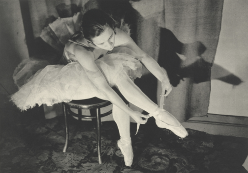
A little while back, I stumbled across Margaret Bourke-White whilst looking up 20th Century female photographers, discovering her work among others such as Germaine Krull and Grete Stern. It goes without saying that each of these women were respectively brilliant at working behind the lens, and each are deserving of a writeup, but I was especially drawn to Bourke-White’s photographs of Marina Semyonova (fig. 1).
Figure One: Marina Semyonova by Margaret Bourke-White. Photo: MOMA
Taken at the Bolshoi Theatre in Moscow, this photo shows Semyonova – the first Soviet-trained prima ballerina – preparing herself ahead of a ballet performance. Semyonova’s body is folded into itself, revealing the physical contortions and movement required of her in order to reach and tie her ballet shoes. Her posture is considered, and the chair acts as a prop to help elongate her body and better display her ballet shoe all the while creating a tension between her body and the billowing tutu which surrounds her and presses upon the back of the chair. Semyonova is artfully staged, and her pose emulates the exaggerated stillness of the photographic form, reinforcing the expectation for ballerinas to always appear elegant, not just during a performance. Her left leg is deliberately aligned in a nod to her profession, recreating one half of the en pointe position and her outstretched arms provide an extension of the en pointe motif. This creates a clear shot for which Bourke-White could effectively capture Semyonova, allowing Bourke-White to play with light to illuminate Semyonova’s body and project a shadow onto the far wall.
With that said, what I found most appealing about this photo, is despite this photo having an editorial-like feel, the loose threads on Semyonova’s ballet shoes offer a reminder of the countless hours of practice required to become a ballerina, displaying the real-life implications of such a profession. This suggest that whilst Semyonova displays poise and elegance, these attributes have been mastered over time. However, the loose threads could also be linked to the USSR in relation to its second five-year plan which sought to prioritise agricultural and self-sufficiency ahead of consumer goods and frivolity, and the loose threads thereby reveal the unravelling of previous political and cultural practices.
Through considering such a beautiful photo, I wanted to discover more about Bourke-White’s work, particularly as this photo was taken during the political unease of the Soviet Union. My research revealed that Bourke-White excelled as a photographer and whose accomplishments were plentiful. Born in 1904, Margaret Bourke-White would go on to set up her own photography studio in 1928 in Ohio, but her work would soon take her abroad, namely to the likes of Russia, South Korea, India and Pakistan where she was commissioned to document moments of political divide, wars and social unrest.
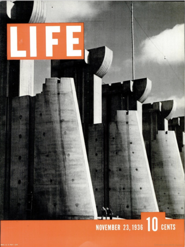
To name but a few of her impressive feats, Bourke-White was the first US photographer to enter the Soviet Union, the first US accredited female war photographer during WWII and responsible for the first cover for LIFE Magazine (fig. 2).
Figure Two: Cover of ‘LIFE’ Magazine (23 November 1936). Photo: ‘LIFE’ Magazine Archives via Google Books.
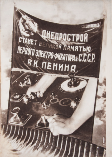
This cover highlights Bourke-White’s unique ability to take an imposing architectural structure and create a striking and an arresting image. She was commissioned to photograph this multi-million-dollar project of the Columbia River Basin and the construction of its impressive dam. The angle at which Bourke-White captured this photo and its emphasis on the symmetry of each of the concrete structures makes them appear – at least in my mind – as gigantic chess pieces bearing a similarity in shape to the ‘Rook’, with the two individuals symbolically positioned as pawns within this almighty chess board. The vibrant orange of the cover contrasts with the black and white image, at once cropping and framing the two individuals stood at the foot of the structure. The shot appears to reinforce the idea that these structures are in fact man made, with the two individuals attesting to the labour required to build such structures, and yet conveys the structures as colossal, unnatural, and otherworldly. Indeed, the editors notes that in commissioning Bourke-White they unexpectedly received, ‘a human document of American frontier life which, to them at least, was a revelation.’ This very observation highlights the talents of Bourke-White, and her ability to capture life within an otherwise intimidating concrete structure. This style of photography also calls to mind El Lissitzy and his photomontages for the SSSR na stroike (trans: USSR in construction) in 1932, with the overall global emphasis on self-sufficiency, driven by its workforce, who become the centre of El Lissitzy’s photomontage (fig. 3). This theme is echoed in Bourke-White’s photography, and the two share similar aims in trying to establish the strength of their respective cities and nations. To this effect, Bourke-White’s photography could be considered an artistic response to Constructivist periodical layouts and El Lissitzy’s earlier work.
Figure Three: Photomontage of SSSR na stroike (trans: USSR in contruction) by El Lissitzky. Issue 10 (1932). Photo: Bookvica.
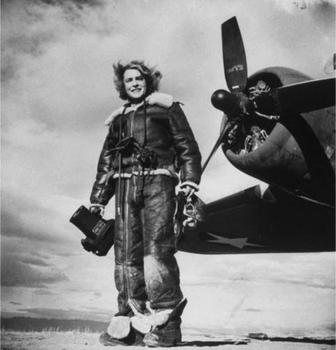
The final photograph I would like to discuss is a self-portrait, rumoured to be Bourke-White’s favourite self-portrait, made with the U.S. 8th Air Force in 1943 (fig. 4).
Figure Four: Margaret Bourke-White’s self-portrait made with the U.S. 8th Air Force in 1943. Photo: The LIFE Picture Collection/Shutterstock.
In a similar vein to Bourke-White’s cover for LIFE Magazine, this photo marries machinery and industrial elements with humanity. While the airplane’s jets have been switched off, this photo conveys the necessity to be on constant standby, responding to any changes quickly and efficiently. Bourke-White has a tight hold of the large camera, figuratively and literally held down by the camera, and carries her flying helmet and goggles in her other hand with comparative ease. To this effect, this photo is suggestive of the precarity of the war and the need to be on constant alert as well as Bourke-White’s role to document the events. This is further reinforced by the inclusion of the plane in the frame – its proximity reinforces the fact that it is only a matter of time before this unit needs to reembark the plane.
At the same time, Bourke-White’s stance is relaxed yet upright, smiling as the wind blows through her hair. The tongues of her shoes are flopped over, giving the impression of a rare moment of respite, reinforced by the fact that their surroundings appear bare and uninhabited, suggesting a minimised threat or danger. The aviator jacket is fit with shearling trimmings, and complete with matching trousers, also lined with shearling, featuring leg-long zips and stained with a white powder residue. The crease patterns, particularly on the trousers, suggest the cramped conditions of the plane and it would appear as though Bourke-White has barely stepped off the plane. While her stance is relaxed, and she is surrounded by an expansive empty landscape, the trousers act as her ‘second skin’ and become a reminder that she did not have the luxury of space a few moments ago, and the trousers have not yet and will not likely get the chance to mould to their new surroundings, complete with the luxury of space, or Bourke-White’s standing pose.
Sadly, Margaret Bourke-White contracted Parkinson’s disease in 1953 and completed her last assignment for LIFE in 1957. With that said, she displayed great determination in trying to overcome the symptoms of her Parkinson’s, undergoing risky surgeries, and in true documentary photographer style, publicised and documented her fight against the disease, cementing her status as a formidable character and individual (fig. 5). She sadly passed away in 1971 but while her career was cut short by Parkinson’s, Bourke-White was rightly recognised in her lifetime as a true pioneer in documentary photography, particularly as a female photographer for her ability to uniquely capture people and places in and amongst periods of great change, showcasing their struggles and strengths.
Figure Five: A nurse aiding photographer Margaret Bourke-White during a therapy session by Alfred Eisenstaedt. Photo: The LIFE Picture Collection/Shutterstock.
** This blog post contains spoilers for Mad About Men (1954), La Piscine (1969) and Mahogany (1975) **
Sometimes I want to watch a film, not really for the plot, but for either the fashion, the cinematography, the set design or even just the general aesthetic. So, just in case anyone else has the same penchant for beautiful films, I’ve comprised a short list of three recommendations from the 50s, 60s and 70s respectively.
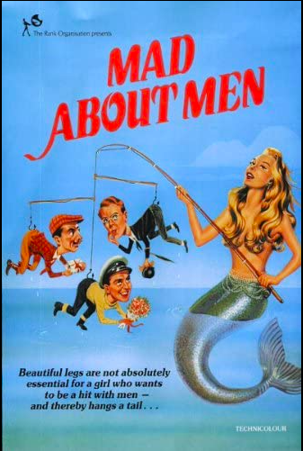
Mad About Men (1954):
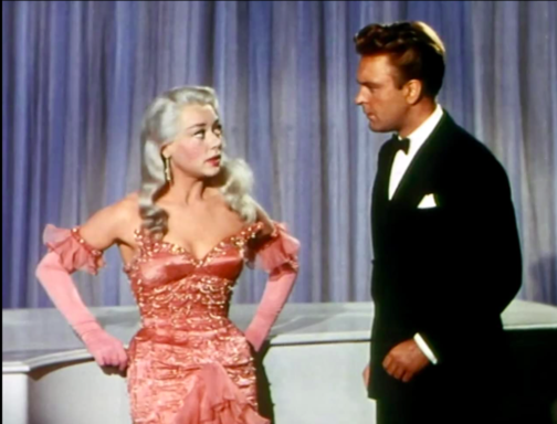
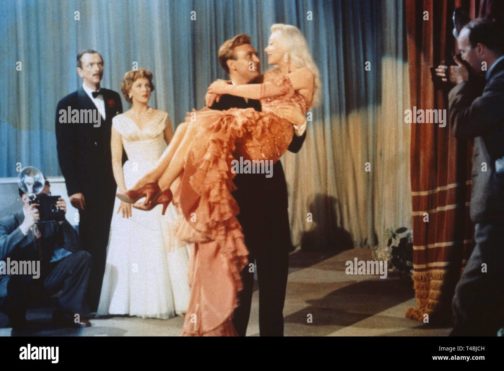
Mad About Men Movie Poster, IMDB.
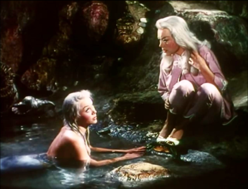
Mad About Men is the charming sequel to the 1948 comedy film Miranda in which a lonely mermaid captures a young man and only offers to release him on the basis that he will take her to London. In Mad About Men, set in Cornwall, Miranda Trewella (Glynis Johns) returns and convinces her distant relative and doppelgänger Caroline Trewella (Glynis Johns) to let her take her place whilst Caroline goes on a biking excursion with a friend. In order to do this, Caroline fakes an accident which leaves her wheelchair bound, explaining Miranda’s inability to walk and need to keep her ‘legs’ covered with warm blankets. The pair also hire Nurse Carey (Margaret Rutherford), who knows Miranda is a mermaid and helped her in the first film too. However, even though Caroline is engaged back in London to the dull but stable Ronald Baker (Peter Martyn), Miranda playing as Caroline cannot help herself when she meets some of the town’s most handsome men, and she flirts, dates and kisses both Jeff Saunders (Donald Sinden) and Colonel Barclay Sutton (Nicholas Phipps). When Ronald comes to visit ‘Caroline’ in Cornwall, Miranda takes an immediate dislike to him and ends up pouring cold fish soup over his head. The Colonel’s wife is suspicious of ‘Caroline’ and ends up discovering her secret, so, in a plot to expose her, she agrees to let ‘Caroline’ sing at a charity concert and plans to reveal her mermaid tail on stage. However, Caroline gets back from her trip and takes Miranda’s place on stage whilst the Nurse feeds the microphone down to the cove where Miranda lives so her siren-esque singing voice can still be heard. The film ends with the real Caroline and Jeff Saunders sharing a kiss whilst Miranda is safely back in the Cornish Sea.
Despite mentioning earlier that plot isn’t important when watching for purely aesthetic reasons, this film is so fun and light-hearted it is difficult not to enjoy the story and fall in love with Miranda whilst you watch it. However, where this film really shines is in highlighting the wistful and whimsical beauty of Miranda and the more prim and proper styling of Caroline. Joan Ellacott’s costuming and Glynis Johns’ acting allows for viewers to differentiate easily between the Trewella girls. Here are some of the best style/aesthetic moments…
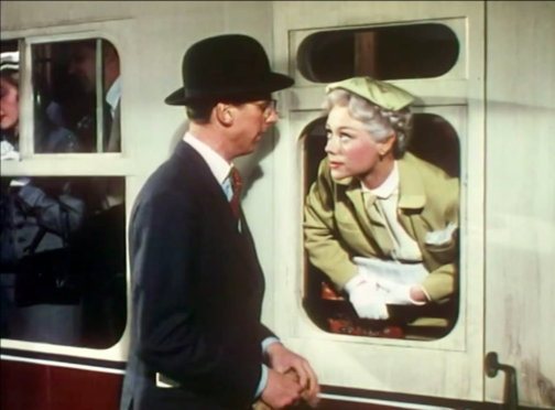
Caroline Trewella on the train from London to Cornwall. Still from Mad About Men (1954).Caroline and Miranda’s first meeting. Still from Mad About Men (1954).Caroline’s charity concert dress. Still from Mad About Men (1954).A full length view of Caroline’s concert dress. Still from Mad About Men (1954).
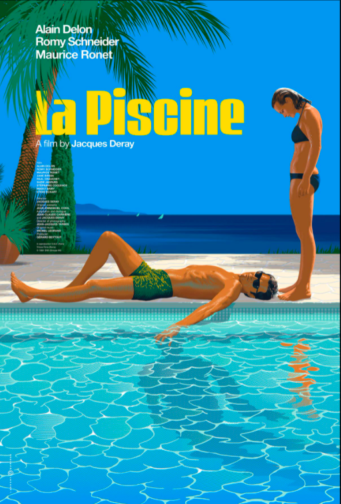
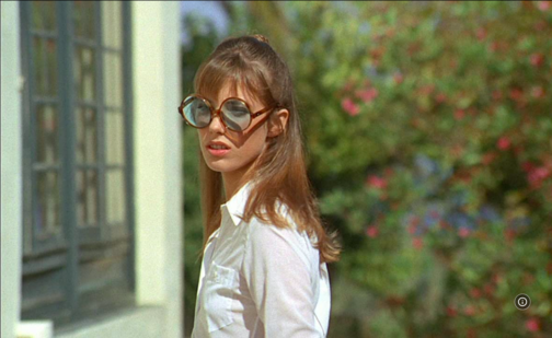
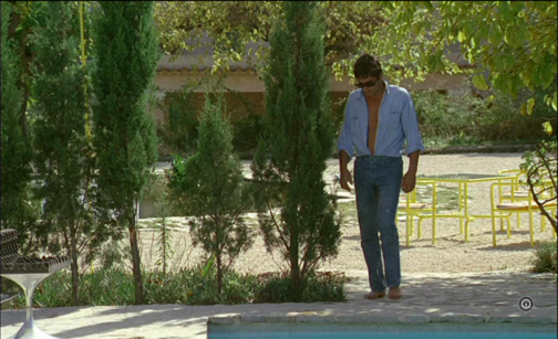
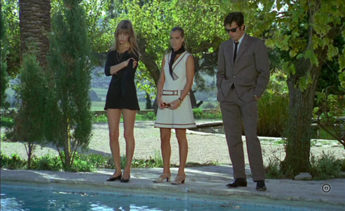
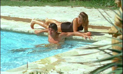
La Piscine(1969):
La Piscine Movie Poster, IMDB.
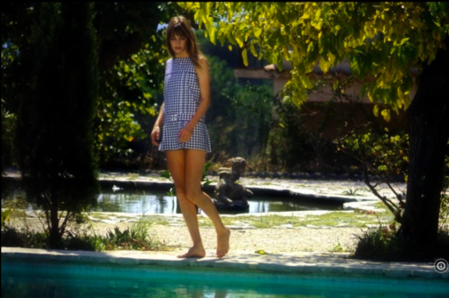
If you’re craving some warmth, you must watch 1969’s La Piscine, a film where the Southern French sunshine seems to seep through the screen. This film is the epitome of ‘embodied viewing’ where you can feel the sun and water on your skin, and you can smell the heat in the air. La Piscine is set in a villa on the French Riviera where a couple, Marianne (Romy Schneider) and Jean-Paul (Alain Delon) are enjoying the summer. After finding out Marianne and Jean-Paul are nearby, the couple’s old friend Harry (Maurice Ronet) and his daughter Penelope (Jane Birkin) come and stay. Whilst this initially consists of old friends catching up and new memories being made through extravagant parties, tensions soon begin to rise when Jean-Paul realises that Marianne and Harry were once lovers. The situation further complicates itself when Jean-Paul decides to seduce Harry’s 18-year-old daughter Penelope. The two men, whilst drunk, end up getting into a fight which culminates with Harry falling into the swimming pool. From here, instead of helping him out, Jean-Paul proceeds to drown him and then stages the scene to look like an accident. Marianne eventually finds out what Jean-Paul did but both continue to lie to the police and eventually the case is closed with Harry’s death being marked as an accident. The film ends with Penelope returning to her mother and Jean-Paul seemingly forcing Marianne to stay with him at the villa.
This film is beautiful all-round. The French Riviera location, the impressive villa, the cast and, perhaps most importantly the dressing and undressing of bodies. The theme of the body is central throughout this film, with long, toned and sun-kissed limbs filling the poolside shots. Here are some of the most beautiful outfits, shots and scenes…
Jane Birkin’s Penelope wearing the dreamiest gingham poolside cover-up. Still from La Piscine (1969).Penelope’s fabulously oversized sunglasses. Still from La Piscine (1969).Jean-Paul’s combo of an open shirt tucked into blue jeans is giving me lots of Spring/Summer inspo. Still from La Piscine (1969).Penelope wearing maybe the shortest dress ever worn to a funeral ever? Stylish though! Still from La Piscine (1969).The calm before the storm… Marianne and Jean-Paul enjoying the swimming pool. Still from La Piscine (1969).
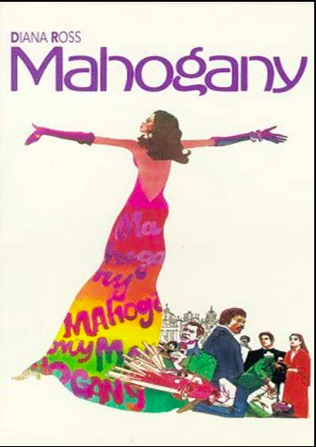
Mahogany(1975):
Mahogany Movie Poster, IMDB.
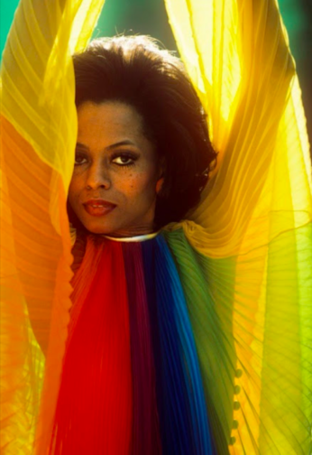
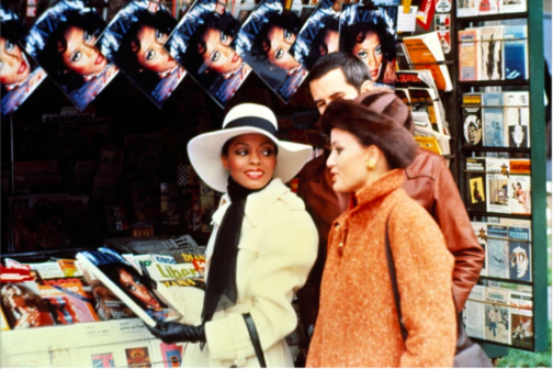
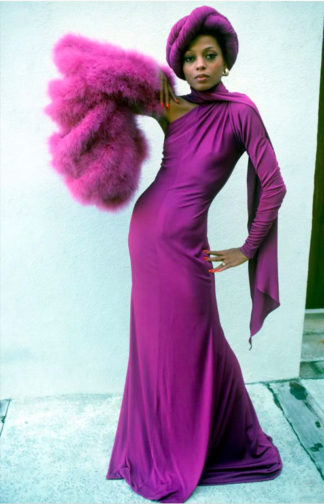
First things first, the men in this movie are awful. Truly, every single one of them is just unbearable. But with that aside, Mahogany is firm favourite in every fashion lovers’ movie list. The film stars a post-Supremes Diana Ross as fashion student and department store secretary Tracy Chambers. Set in Chicago, the film shows Tracy living in the ‘slums’ of Chicago’s South whilst working at a high-end department store and harbouring dreams of becoming a high fashion designer. Tracy meets and begins dating Brian Walker, an activist fighting against the demolition of housing in primarily black neighbourhoods. Brian, whilst seemingly having a good heart and high ambitions for himself routinely brushes off Tracy’s goals as trivial and devoid of real meaning, insisting fashion is unimportant compared to his work within the neighbourhood. This means that when Tracy meets and befriends the renowned photographer Sean McAvoy who sees her as having real potential as a model, Tracy jumps at the chance to find an in to the industry which means so much to her. After a fight with Brian, Tracy moves to Rome to pursue modelling with Sean, who gives her the stage name Mahogany. A classic movie montage shows Mahogany’s modelling career take off and her charm and charisma capturing both the wider fashion world’s attention as well as Sean’s, who is interested in pursuing her romantically. Sean becomes increasingly possessive and struggles with Tracy’s free-spirited nature and inability to be controlled. Brian visits Tracy in Rome and gets into a fight with Sean involving a gun; Brian leaves Rome alone. At their next fashion shoot in which Tracy is posed inside a sports car, Sean is trying to ‘capture death’ and ends up getting into the car and begins driving erratically. Eventually, with Sean at the wheel, the car crashes leaving Tracy badly injured and Sean dead. In the aftermath of the accident, a wealthy count lets Tracy recover at his villa and sets up a design studio for her there. Instead of feeling fulfilled by finally reaching her dream career, she is left feeling frustrated, lonely, and unhappy despite the huge success of her first official collection. Tracy realises that success means nothing without Brian by her side and she returns to Chicago to be with him.
Despite Tracy’s life being littered with frustrating men who seem desperate to keep her potential hidden away, she does look incredible throughout the film. As a little sidenote, Diana Ross actually designed a lot of Tracy’s outfits as she trained in dressmaking before her career took off! Here are some of her best looks…
The outfit Tracy designed and wears for the first time she is photographed by Sean McAvoy.Tracy looking incredibly chic in Rome whilst her Harper’s Bazaar cover hangs behind her.Perhaps one of the most iconic looks from this film. Tracy’s purple ensemble which becomes a billboard advertising Revlon ‘Touch & Glow’.
I recently found myself sifting through self-portraits by women photographers in a not very coherent bout of research on the National Portrait Gallery website. I didn’t find exactly what I had been looking for, but I did find something much better – this photo of Madame Yevonde (fig.1).
Fig. 1. Madame Yevonde by Madame Yevonde (1967). https://www.npg.org.uk/collections/search/portrait/mw58111/Madame-Yevonde?sort=dateDesc&LinkID=mp06547&role=art&displayStyle=thumb&displayNo=60&rNo=40
This photo caught my eye, and made me smile, when I had been otherwise stuck in a trance of endless scrolling. Her smart chequered suit, upright pose, and jaunty hat scream pride in herself, her work, and a humorous relationship between photography and portraiture. Editing of the image has rendered her miniature besides her huge vintage camera, an ode to her earlier portrait studio and a recognition of the many decades she had spent in the industry.
After seeing such a joyful, humorous, and enigmatic portrait, I had to look into Madame Yevonde’s work further. I want to share some of the wonderful images I have found, and generally indulge in Madame Yevonde’s personality-filled work for a while longer.
Born in 1893, Yevonde Philone Middleton was a photographer, primarily taking studio portraits, for an impressive portion of the twentieth century. Known professionally as Madame Yevonde, she opened her first photography studio in 1914 at the age of 21 and continued to work until a few months before her death in 1975.
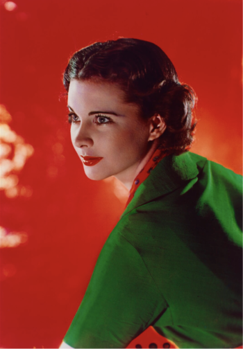
There always seems to be something eye-catching or dramatic about Madame Yevonde’s photography. Her main mastery was in the VIVEX colour process, which allowed her to produce vibrant and lustrous colour shots. Her portrait of Vivien Leigh (fig.2) demonstrates this perfectly. The punchy red of the background emboldens Leigh, her red lip and scarf connecting her to the red reflections of the light, and her green top bringing her strongly into the foreground. Her face is lit from one side, drawing attention to the outline of her face, and contours of her nose and cheeks. It’s the sort of photo that makes you stop and look twice.
Fig. 2. Vivien Leigh by Madame Yevonde (1936). https://www.npg.org.uk/collections/search/portrait/mw11846/Vivien-Leigh?LinkID=mp06547&role=art&displayStyle=thumb&displayNo=60&rNo=2
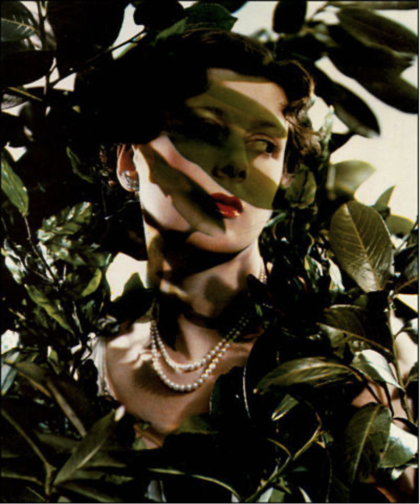
The next photo that jumped out to me was the portrait of the Hon. Mrs James Beck as Daphne (fig.3), a part of Madame Yevonde’s Goddesses series. Inspired by a society charity ball with an Olympian theme, Madame Yevonde made a series of portraits of society women dressed as goddesses in 1935. The abundance of leaves represent Daphne’s transformation into a Laurel tree in Greek mythology. The leaves cast a distinctive shadow across Mrs James Beck’s face, as if they are reaching across her and we are seeing Daphne mid-transformation. The shadows are tinted green in a way that the real leaf shadows would not be (they are not translucent), reminding us that this is a manufactured portrait, a piece of art.
Fig. 3. The Hon. Mrs James Beck as Daphne by Madame Yevonde (1935). http://www.users.waitrose.com/~felice/image4.htm
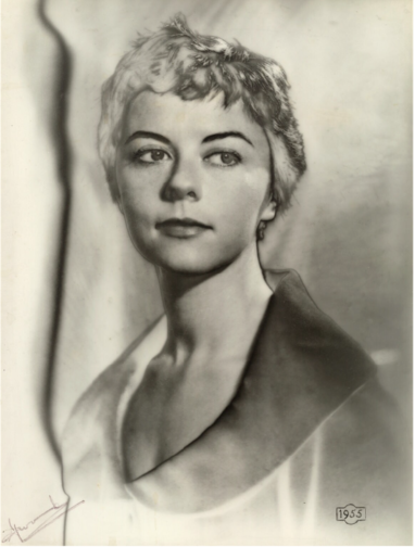
The solarised portrait of Dame Dorothy Tutin (fig.4) shows another style Madame Yevonde was adept at. The solarised image brings far more texture to the portrait, particularly allowing Tutin’s ruffled hair to stand out. The darkness of her plucked eyebrows draws our attention to her serene facial expression. The contrast across the wide collar of her top gives her a regal presence. I think this portrait is one of the most characterful that Madame Yevonde produced. The solarised effect gives insight into the formality, poise, and elegance that Tutin is able to project, whilst also highlighting the relaxed side that is hinted at by her haircut.
Fig. 4. Dame Dorothy Tutin by Madame Yevonde (1955). https://www.npg.org.uk/collections/search/portrait/mw144366/Dame-Dorothy-Tutin?LinkID=mp05851&role=sit&rNo=2
I hope to have shown you a glimpse into the wonderful world of Madame Yevonde’s photography. Through skilful manipulation of colour, props, photographic effect, and lighting, Madame Yevonde is able to create bold images that are still able to catch my eye, even in today’s image-saturated world.
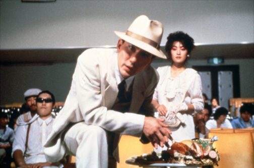
‘Man in White Suit’, played by Kōji Yakusho and ‘Man in White Suit’s Mistress’, played by Fukumi Kuroda
“So you’re at the movies too huh? Watcha eating?”
Here begins Jûzô Itami’s Tampopo of 1985. A mobster and his mistress, both glamorously suited head-to-toe in white, saunter to the front row of a movie theatre and set up their champagne feast. Our unnamed ‘Man in White Suit’ wastes no time addressing us, confidently leaning into the other side of the screen to see what we have brought to snack on during the feature, so long as it is nothing involving “crinkle wrappers”. After hysterically threatening to kill a man in the audience who dared to rustle about his chip packet, the movie theatre fades into darkness. The movie starts.
Tampopo is a visually delicious tale of food and love. The movie has always been a firm favourite of mine as a self-proclaimed ‘foodie’: each scene highlighting the etiquette of eating, the art of selecting the perfect ingredients and, above all, the momentous pursuit of the perfect bowl of ramen. Steam wafts from the surface of the hot broth so that you, behind the screen, can almost smell it. Chopsticks plunge into the soupy pool and retrieve long golden bands of noodles, followed by the menma and vegetables, and then succulent pieces of meat. Finally, the broth is sipped until the bowl is empty. I have never sat down to watch Tampopo on an empty stomach. It would be agony.
The central plotline of the movie – a parody of the American ‘Western’ genre – follows the eponymous Tampopo as she works to rejuvenate her rather mediocre ramen shop into one beyond compare. After a chance encounter with Gorō, a mysterious man on the road with an unparalleled knowledge of the dish, the pair toil to refine Tampopo’s ramen recipe, with a little help along the way. Punctured by a series of vignettes which explore other characters’ unique relationship with food, whether it be haughty French cuisine or hearty Italian pasta, Tampopo makes us fall in love with food again.
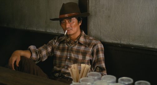
Gorō, played by Tsutomu Yamazaki
While food really is the main focus of the movie, Itami’s use of costume plays into his shrewd satire of the traditional Western genre, while contributing to the overall indulgent and sensual appeal of this food epic. Perhaps the most pertinent and ironic costume in the film is Gorō’s cowboy-esque look. His character is always dressed in a well-worn shirt – often with a neckerchief poking through in true Indiana Jones style – tucked into a pair of sturdy jeans. The Western look is completed with his trusty Stetson, which Gorō refuses to remove even in a scene where we see him in a bathtub. At times conniving, like the Western cowboys his character mocks, he encourages Tampopo to spy on other ramen shops to steal elements of their recipes. Gorō thus emerges as a comical play with the hero of the American Western. Like them, he is an adventurer. But he is an adventurer in search of good ramen, and the
only showdowns he engages in are with those who stand in his and Tampopo’s way.
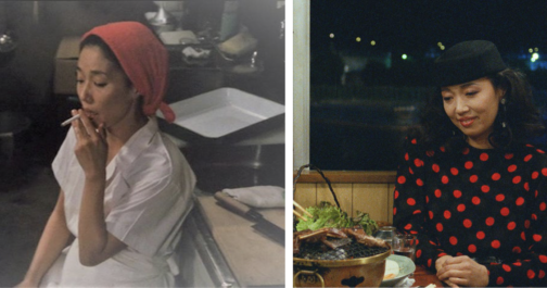
Tampopo, played by Nobuko Miyamoto
Throughout the movie, Tampopo herself undergoes a Cinderella type transformation both in her culinary skills and her fashion. When she begs Gorō to be his ramen-apprentice at the beginning of the feature, she wears a simple white uniform and a protective scarf to cover her hair. This white uniform appears rather fragile, wrapped in clouds of steam and cigarette smoke as Tampopo works relentlessly at her broth. When the ultimate recipe is near completion, Tampopo goes through a classic movie makeover, first showing off a new professional chef’s outfit and then sporting a stylish ensemble to accompany Gorō to dinner. Upon seeing her in this particularly fashionable outfit, Gorō moans that she now looks “hard to talk to”. Her red polka-dot dress, complemented by her matching red lipstick, gives Tampopo a renewed sense of conviction as she edges towards being crowned ramen chef par excellence.
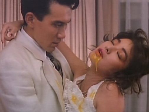
Man in White Suit and his Mistress
One of the most famed vignettes of Tampopo is the undeniably erotic ‘egg yolk’ scene between our mobster and his mistress. The couple pass between their open mouths a raw egg yolk, never allowing their lips to meet in a kiss, until it bursts in a moment of suggestive ecstasy. The golden liquid drips from the mistress’s mouth onto her dress, and transfers to the mobster’s lapel. Similar to those worn by the likes of Al Pacino in American gangster movies, his white suit was once a sign of his untouchable status. The indelible stain of the egg yolk on the once-pristine costume, however, speaks to the corruptive power of lust. And yet, this not merely a lust between man and woman, but between man, woman and food.
The ‘Spaghetti Sensei’, played by Mariko Okada
Raunchy interactions with eggs aside, Itami also uses the relationship between costume and food as a shrewd social commentary. One of the funniest vignettes (in my opinion) occurs when an old white gentleman sits down to eat dinner in an Italian restaurant in Japan. After ordering, he eavesdrops on a ladies’ society upstairs, who are being instructed by their leader on the ‘proper’ way to eat pasta like an Italian. This leader of the group, with her neatly coiffed hair and prim gold suit jacket, orders the women to never audibly slurp their spaghetti as this “is absolutely taboo abroad”. Much to her disdain, however, her commands are interrupted by the old man who is scoffing his spaghetti, and making a great noise while doing so. After watching him devour his meal, the ladies’ society and their leader succumb to mimicking his way of eating. Not a napkin in sight to protect their obviously pricey ensembles and accessories, regard for dress is thus cast aside – enjoying the meal is of the utmost importance.
Throughout Tampopo, Itami sets up a subtle yet provoking interplay between Western dress and etiquette, and Japanese tradition. His characters sport largely Americanised dress following the tropes of classic Hollywood genres which, according to Emiko Ohnuki-Tierney, signifies the Japanese sense of the self in relation to other nations. The conservatively dressed ladies’ society, the Western look of Gorō, and the Americanised glamour or Tampopo at the end of the movie might, at first glance, point towards an overwhelming European and American influence on Japanese culture. However, this imitation of Western eating habits and dress is exaggerated by Itami to the point of parody. What prevails is the art of ramen. Our movie closes with a visit to Tampopo’s new professional kitchen, where she prepares a final meal for her fellow ramen enthusiasts. They devour every last morsel, drinking the broth one after the other before placing their bowls down for the last time. We leave Tampopo behind, and accompany Gorō as he climbs aboard his truck once more. Our ramen cowboy slinks into the distance as the credits roll, ready for another adventure full of flavour.
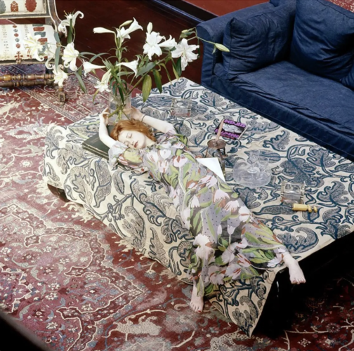
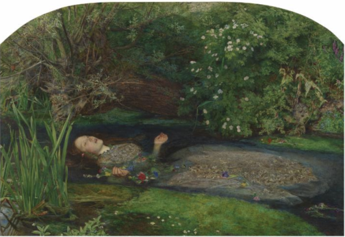
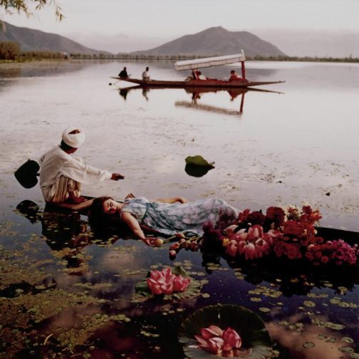
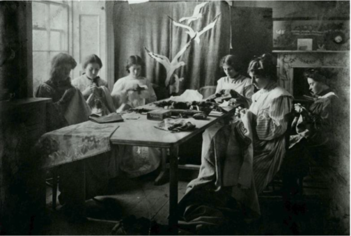
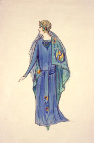
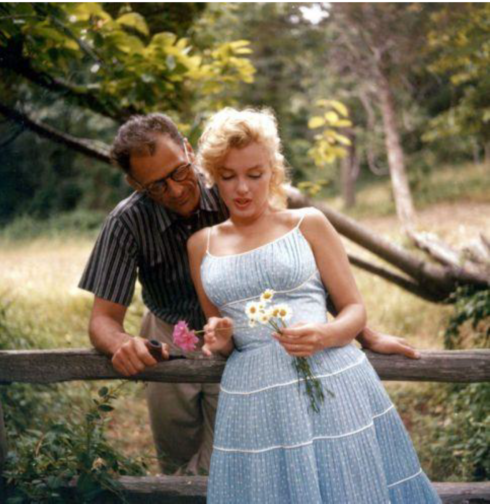
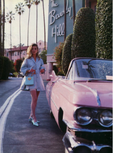
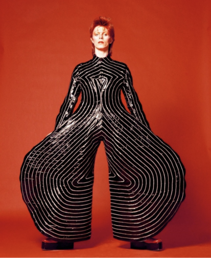
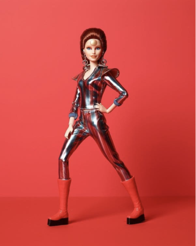
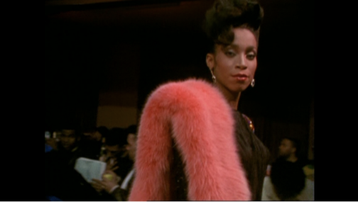
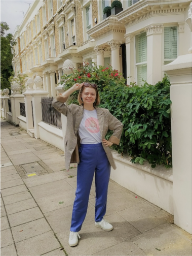
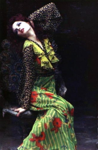
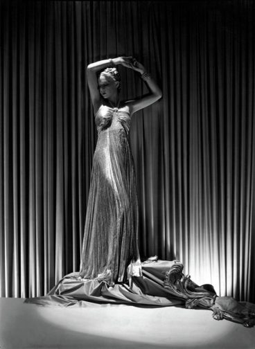
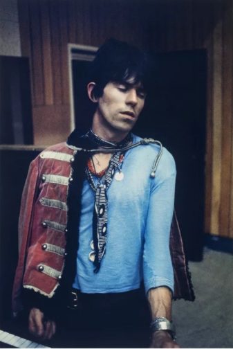

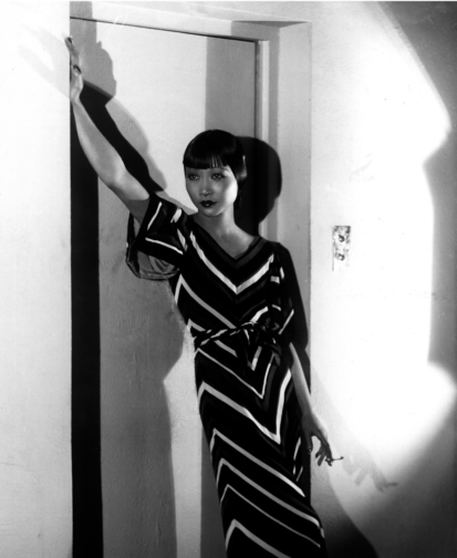
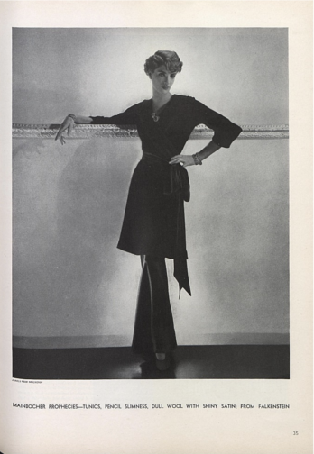
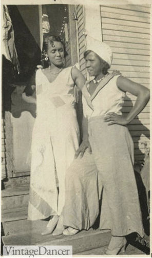
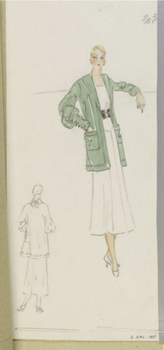
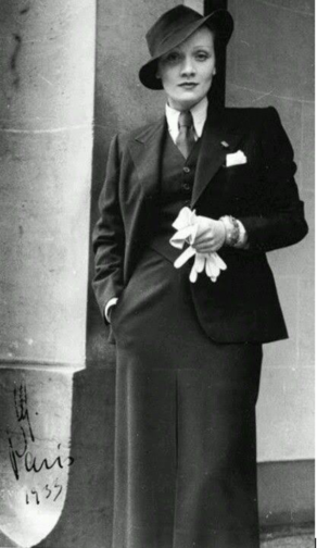
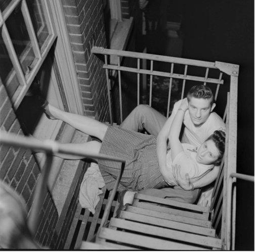
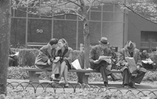
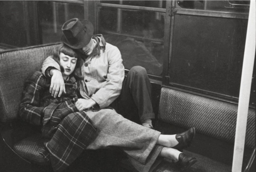
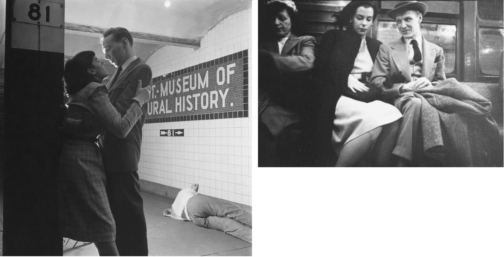
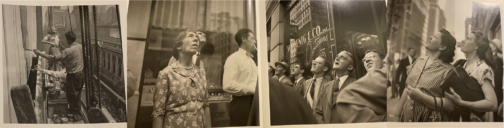
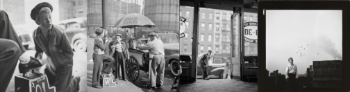
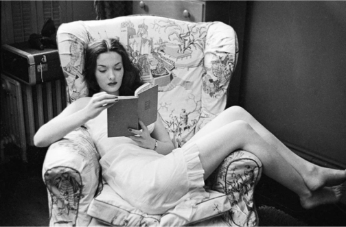
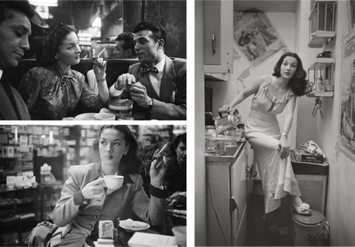
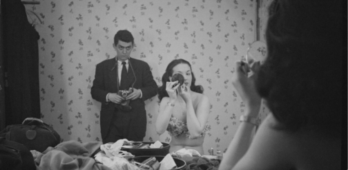
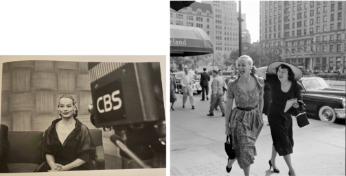
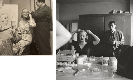
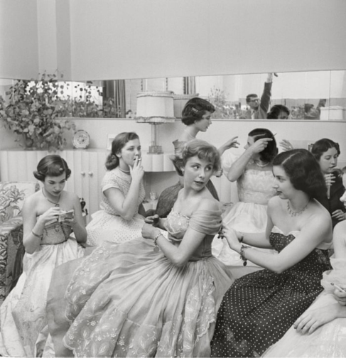 Very similar to Emerson’s profile was one created for Betsy Von Furstenberg. Furstenberg was the daughter of a German aristocrat and was also as an actress in New York. Another, ‘Day in the Life of’ piece, her everyday life was represented in a cinematographic and theatrical way in these photograph series by Kubrick. She is shown engaging in a variety of ‘serious’ and normal activities such as preparing for a role in her home, socialising with friends as well as silly moments from peeling a banana in a fancy restaurant to sleeping on the steps of the Plaza hotel next to John Hamlin. These pictures were featured in Look magazine’s spread from July 18, 1950 with the title The Debutante Who Went to Work. Photographs represent the juggling of day-to-day life with a highly glamorised one with comedic effect, evident from the awkward moments, humorous gestures, and facial expressions of Furstenberg. Whilst a more psychologically in-depth narrative was worked on for the earlier photographs of Williams was ultimately shelved, favouring a feature that was created around a lady that worked despite her aristocratic background.
 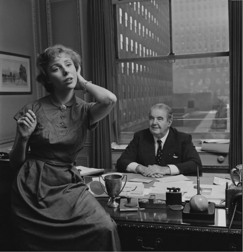 This shows the elegant façade that sought to represent life in New York City, with the gruesome realities of hardship were kept very deliberately hidden. A debutante that balanced life and work was one to be aspired to while a showgirl trying to make ends meet was one that was far too real and far less glamourous. Von Furstenberg’s story was about elegance, and, on the surface a light-hearted, innocent story of how to make it as an actress in the big city, despite being further removed from reality. The theatricality of the mimics and gestures of Von Furstenberg is in high contrast with that of Williams which almost insinuates the fabricated nature of this narrative and lifestyle.
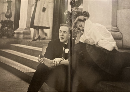
 The director’s final film Eyes Wide Shut (1999), set in New York, caused quite a stir in its exploration of the mysterious and dangerous sides of the vibrant city of New York, focusing on an elite cult. This suggests that the famous director was perhaps making a nostalgic tribute to his time as a young photojournalist in the midst of this chaotic city he found himself in, and the vibrant scenes he caught glimpses of with his camera as a teenage boy. Today, Kubrick is better known for his 12 feature films yet his strength in visual storytelling was implanted in his little-known early career as a photojournalist. It is evident that for Kubrick these early photographs, as Sean Corcoran (the Photography Curator at the Museum of the City of New York) stated, allowed him to master the art of framing the composition and opened his eye in different ways of seeing. Kubrick himself said: ‘Generally speaking, you can make almost any action or situation into an interesting shot, if it’s composed well and lit well.’ Kubrick’s genius seeps from his œuvre produced in his short time as a photojournalist, right on the brink of his career as a director.