Tag Archives: 20th century fashion

Film Review: ‘Passing’ directed by Rebecca Hall

This post contains spoilers from the film Passing.

Passing Photo One
Clare Bellew (Ruth Negga, on the left) and Irene Redfield (Tessa Thompson, on the right), Photo: Screencap from Netflix

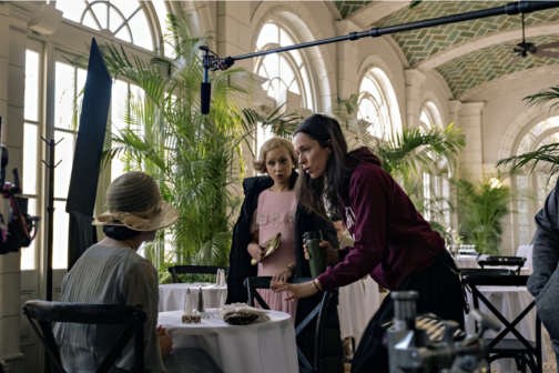
Jazz, novelty, dynamism and the rebirth of Black culture… It was the 1920s and the Harlem Renaissance was in full swing. Mainly taking place in New York and spreading to the rest of the world, the era spanned from the 20s to 30s and beyond. However, behind the glitz and glamour was an era tainted by prohibition and racial tensions. An esteemed product of this age, which captured the psychology, and tensions of the era subtly yet brilliantly, was Nella Larsen’s novel Passing (1929), recently adapted to a Netflix movie in the same name, by Rebecca Hall as her directorial debut.

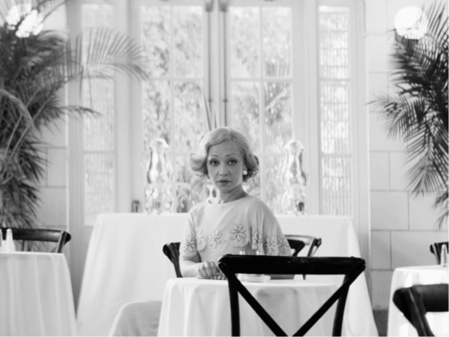
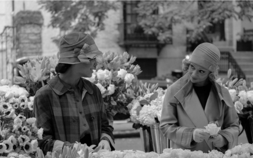
Larsen’s story is centred around the encounter of two childhood friends, light skinned, mixed race African-American women, Irene Redfield (played by Tessa Thompson) and Clare Bellew (played by Ruth Negga), in Harlem, as adults and the tensions that rise between them. The twist of the story is introduced when the two women run in to each other at a fancy tearoom at the Drayton Hotel in New York, mostly reserved for wealthy, white upper classes. As it is revealed that Clare is married to a racist, upper-class white man from Chicago, who is however oblivious to her race, it becomes clear that she is ‘passing’ as white because of her light skin tone.

Irene is a middle-class, responsible housewife and mother living in Harlem with her black, doctor husband Brian and two boys. She is fervently tied to her race and community, head of the ‘Negro Dance Committee’ and centres her life around trying to do ‘the right thing’. On the surface she is reserved and abides by morals and class boundaries. Clare on the other hand is reckless, selfish, and passionate, living her life on the edge. However, both characters are intricately complex, juggling with tensions within. Clare denies her roots, yet she also yearns for a sense of community, longs to go back to her own culture, and thus gradually seeps into Irene’s life. While Irene is angry at Clare for denying her race, for her insistence and success at getting what she wants no matter the cost and her relentless challenging of the status quo, she is drawn to Clare and her mystery. Her desire to adopt Clare’s ease and allure makes her unable to drive her out of her life.

Hall lifts Larsen’s words and creates a film that conveys her spirit, and feelings through incredible symbolism. She foreshadows events through objects, accentuates the characters’ distinctive personality traits through clothing, conveys the tension and drama between the figures through dramatic camera shots and music.

Passing Photo Two
Irene Redfield (Tessa Thompson, on the left) and Brian Redfield (André Holland,on the right) Photo: Screencap from Netflix


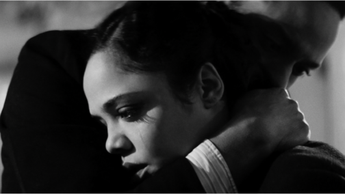
Larsen tells the story from the point of view of Irene, so events are mostly tinged by her feelings in the book. Irene’s internal angst which comprises the base of the novel, is poignantly picked up in the film through close-up shots that focus on her facial expressions. Her frustration is amplified through the black and white lens the film is shot in, the chiaroscuro effect that seems to sharpen when Irene is on screen, lighting one side of her face while casting the other side in stark darkness.

On the other hand, Clare, who is constantly described as a ‘vision’ or having a ‘glowing’ sense of beauty in the book, is bathed in a soft light, devoid of the shadows seen on Irene’s face, bringing the glow that surrounds her to Irene’s surroundings, which are often darkened.

At the beginning of the film when Clare and Irene first encounter one another, the close-up shots distinctly switch from one woman’s face to the other. This technique is repeated later when Clare comes to Irene’s house for the first time. Hall amplifies the fact that the two women are in fact mirrors but also complete one another.

Passing
Clare Bellew (Ruth Negga), Photo: Screencap from Netflix


Although the scene in the beginning where Clare is revealed to be married to a racist man and hiding her identity sets the tension of the film, the film is overall devoid of any overt scenes of violence related to racism. Instead, racial tensions that are boiling underneath, are conveyed through secondary sources. In one scene, Irene hears from Brian that one of her sons were called a ‘negro’ at school and in another Brian reads about a black man being lynched on the streets of New York, on the newspaper. Even Clare’s husband John’s prejudice is based on what he has read and heard about black people on the news rather than a personal experience, as it is revealed when Clare introduces him to Ruth at the very beginning of the film.

The film’s high symbolism translates to many elements being conveyed implicitly rather than blatantly. Irene who suspects Clare to be having an affair with her husband, sees them having an intimate conversation through the mirror in the living room in her house, however as she approaches them, the camera then pans right, revealing them to be standing further apart from one another, hence conveying Irene’s growing doubts and jealousy that also cloud her judgement through the symbol of the mirror.

The crack in Brian and Irene’s bedroom ceiling becomes a metaphor for the crack in their marriage which progressively grows as Irene’s suspicions regarding her husband and Clare having an affair deepens as the film progresses. The viewer is presented with individual shots of the couple gazing at that crack, mostly after they have a discordance, in different points of the film. The symbolism becomes more potent as Irene’s marriage becomes turbulent.

In another scene, just as Clare declares her longing to become part of the black community again, Irene drops her flowerpot out the window which symbolises her unease and reluctance in Clare’s sudden intrusion in her life.

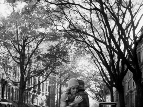
The palpable tensions between the women are also conveyed through a jazz piece titled The Homeless Wanderer that is repeated constantly in the film. The piano piece is a fluctuating one, harbouring a sense of melancholy, mystery, and an uneasiness, conveying the feeling of 1920s New York poignantly. However, this melody also mostly fills the intervals, repeated each time when Irene is seen walking home carrying groceries, passing the same brownstone buildings, or after a scene when Clare and Irene have an impactful conversation. On one side it emphasizes the monotony of Irene’s life. On the other, the piece becomes a metaphor for the masks both characters are carrying, the tentative balancing act they perform in keeping secrets, hiding their true selves. It becomes the voice of both characters, speaking what is unsaid, conveying feelings unexpressed.

Passing
Clare Bellew (Ruth Negga, on the left) and Irene Redfield (Tessa Thompson, on the right), Photo: Screencap from Netflix

The drama created through this music, the acute camera angles, and the sharp chiaroscuro emanates a Hitchcockian vibe in the film. The tensions rise as Clare increasingly infiltrates Irene’s life. With each move, gesture and gaze, the drama created through the music, the acute camera angles and sharp chiaroscuro carefully calculated by Hall, each scene becomes a perfect composition that reminds one of the theatrical and dramatic nature of the films of the 1920s and 1930s as well as American film noir. The drama, compressed feelings and tensions become even more amplified in the boxed, 4:3 ratio frame the film is shot in. The usage of black and white cinematography, while on the on side evoking the film style of the era, it more importantly, draws attention to the idea of race and skin colour. The idea of ‘passing’ is very clearly visualised as it becomes difficult to distinguish the skin colour of the two women from white men. It is an ingenious technique, in which Hall stated that she employed to draw the attention to the concept of race and its construction by the powerful figures in society to serve their needs while the fact in the matter is, the complex nature of race cannot be simplified and boxed into a category. She says: “After all, black and white film is not black and white, it’s a thousand shades of gray, just like everything else.”

Passing 5
Ruth Negga, Rebecca Hall and Tessa Thompson, Behind the scenes of Passing, Photo:Indiewire.com


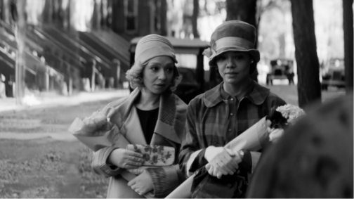
The film becomes a distinct character study. The one aspect sacrificed for the black and white lens is the incredibly vibrant and colourful dresses of characters that are drawn specific attention to in the book. Instead, the two women’s identities are constructed through their silhouettes, the style of their dresses and more specifically, by their hats.

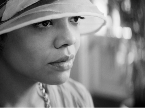
Irene, from the very beginning of the film enters the scene with a brimmed hat that covers half of her face. Throughout the film, she rarely goes out without a brimmed hat. The hat indicates Irene’s closed off nature and her reserved manners. It becomes much like a shield that she hides behind to protect herself from the rest of the world and to hide her race. This is further accentuated by her slumped posture and her modest, conventional outfits that mostly cover her shoulders. Even when she wears an evening gown with straps that exposes her shoulders, she wears gloves that cover more than half of her arms, always shielded from contact with outside world. Contrastingly, Clare rarely wears a hat. The ones she wears occasionally, always reveal her face. Her upright, firm posture is accentuated through her outfits that always seem to have bold shoulders. Whether it’s an evening gown, a coat, or a day dress, they stand out distinctly either through their cutting, the pattern of the fabric or embellishment, emphasising her strong stance, her confidence despite her precarious position. Although Clare is the one at risk ‘passing’ as white, it’s Irene who hides behind her hat, concealing her identity. The clothes distinctly stand in for the characters themselves.

Passing 6
Irene Redfield (Tessa Thompson), Photo: Screencap from Netflix


Perhaps the film’s most striking scene comes towards the middle when Irene and Clare are out at the dance organised by the ‘Negro Dance Committee’. Irene makes a comment whilst observing Clare dancing, from the corner, saying: “We’re all of us passing for something or other. Aren’t we?” She condones Clare yet she undeniably envies her as she reminds her of her own inability to be reckless. Clare’s desperate, incessant, and fierce attempts to go back to her roots and immerse herself in her own culture, reminds us of the inevitability of the illusion of pretence fading, as the innate desire to be true to oneself surfaces which Clare quite unapologetically reflects. Both characters, on the surface, seem to belong to distinct categories. However, as both characters yearn for the position of the other, it is revealed that those categories are society’s circumstantially imposed labels. The story shows the consequences of living in a society were racism looms large, hiding one’s identity to ‘pass’ as something that is acceptable by the society.

Passing 7
Clare Bellew (Ruth Negga, on the right) and Irene Redfield (Tessa Thompson, on the left), Photo: Screencap from Netflix


The story struck a personal chord with Hall whose mixed-race grandfather had ‘passed’ as white in 30s. The making of the film became a cathartic experience for Hall as she described the process illuminating and clarifying regarding her own past and decent.

The film underlines Larsen’s idea, that the concept of ‘passing’ is not specific to an age or a race in its core but rather how people everywhere, at every age, at one point or another comply with society’s desires, rules, and beliefs to blend in, to ‘pass’. Yet it also shows the misery this creates and its unsustainable nature as it goes against human nature to be free.

Both Thompson and Negga give superb performances, breathing life to Larsen’s complex characters, conveying feelings of frustration, yearning and desire through mere glances. With nostalgic costumes, the jazz music that plays over shots of brownstone buildings of the city, the dramatic close-ups and the chiaroscuro effect, Hall captures the spirit of a bygone age, transporting us back to New York in the 20s.

Passing is streaming now on Netflix

By Ipek Birgul Kozanoglu

Sources

Larsen, Nella, Passing, Signet Classics, 1929

https://www.history.com/topics/roaring-twenties/harlem-renaissance

https://www.britannica.com/event/Harlem-Renaissance-American-literature-and-art

https://www.goldenglobes.com/articles/rebecca-hall-bows-passing

https://www.goldenglobes.com/vertical-gallery/passing-vibrant-shades-grey

https://www.theatlantic.com/culture/archive/2021/11/netflix-passing-rebecca-hall/620651/

https://www.digitalspy.com/movies/a38207513/passing-review-netflix-tessa-thompson-ruth-negga/

https://www.npr.org/2021/11/10/1054025599/passing-novel-nella-larsen-review?t=1638877170772&t=1639236484098

https://www.theguardian.com/film/2021/oct/27/rebecca-hall-race-regret-personal-history-any-family-legacy-of-passing-very-tricky

https://www.latimes.com/entertainment-arts/awards/story/2021-11-23/passing-ruth-negga-rebecca-hall        

https://www.indiewire.com/2021/10/passing-rebecca-hall-interview-1234674475/

5 Minutes With… Violet Caldecott

As it nears the end of term, we’re spending some time getting to know the current MA Documenting Fashion students. Violet discusses James Barnor, the Swinging Sixties, and photography as a means of resistance.

What is your dissertation about?

I wrote my dissertation on British-Ghanaian photographer James Barnor and his capturing of Black Britain in the 1960s. I first came across his work in February when I saw his image Wedding Guests (below) on Pinterest. I was struck by the innate poise of the two female subjects, who in their meticulous attire and polished appearance, are the epitome of 1960s cosmopolitan glamour. I love the quietly revolutionary quality of his images. Whilst they are not politically or racially charged on the surface, in their depiction of everyday people, posing amongst the streets of London, they would have proved extremely powerful in both contemporary and post-colonial contexts. There is a retrospective of his work on at the Serpentine Gallery at the moment. Very fortuitously, it opened two weeks before my dissertation was due. It was incredibly exciting to see his images in the flesh. The show has been really beautifully curated, illuminating the multi-dimensionality of Barnor’s work through a diverse range of images from his six-decade career.

James Barnor, Wedding Guests, London, 1960, Photograph © Autograph ABP 

Who is your favourite designer?

Ossie Clark. I love the elegant cut, drape and flow of his pieces. Born in Liverpool in 1942, Clark quickly became known as a pioneer of London’s Swinging Sixties cultural revolution.  His designs offered a more romantic alternative to Mary Quant’s short hemlines, block colours and geometric prints. I came across a silk co-ord designed by him in a vintage boutique on the Portobello Road a couple of weeks ago. Consisting of a pair of billowing high-waisted trousers and a short-sleeved Peter Pan collar top, cinched in by a silk sash at the waist, it is my dream ensemble. The cut and fit are far superior to any item of clothing that I have ever worn. Perfectly proportioned and meticulously tailored around the waist and shoulders, I feel as if it was made for me. Clark really understood the female form. My dream is to become a collector of his pieces.

Ossie Clark with Gala Mitchell c. 1960s, Ossie Clark with Judy Guy Johnson and Patti Boyd c. 1960s, accessed via AnOther Magazine

Favourite dress history photograph?

This is a tough question as I have so many. But with regard to dress, the image which I find myself coming back to is the photograph Neil Kenlock took of Olive Morris in 1973. Morris was a political activist and community leader, known for the part she played in the Squatters Movement and her founding of the Brixton Black Women’s Group in 1973. Very sadly, she died aged 27, but in her short life, she achieved an incredible amount. In this image, there is a real sense of her presence as an individual. In faux jacket, worn jeans and assortment of bangles, she appears confident and at ease. It possesses a snapshot quality with the viewer a voyeur looking in at an intimate moment in this remarkable woman’s life. She smokes a cigarette as she huddles by the electric radiator to keep warm. It seems like there is an interaction between her and Kenlock as she beams leaning slightly towards the camera. I love the idea of photography being a collaborative venture between the subject and photographer, with the viewer is privy to the intimacy of their relationship.

Neil Kenlock, Olive Morris, London, 1973, Photograph © National Portrait Gallery, London 

What is your favourite thing that you’ve written/worked on/researched this year?

In the first semester, I was introduced to the concept of photography as a means of resistance, and within this, the role clothing has played as a means to self-fashioning identities for oppressed groups within society. This fuelled an interest in Stuart Hall’s ‘politics of representation’ which I have applied to different periods and in varying contexts throughout the year. My first essay was on Harlem Renaissance portraiture and how the representational power of the genre was harnessed by various artists of the period to illuminate the complexity and multi-dimensionality of being African American at this time. I was particularly drawn to James VanDerZee’s studio portraits of glamorous young Harmelites. Posing in elegant 1920s clothing against elaborate backdrops, they drew together the different fragments of their diasporic identity in one visual narrative. I’m fascinated by the concept of the tiniest sartorial details having the most significant meaning to the individual and how this can translate to the outside eye.

James VanDerZee, Couple, Harlem, 1932 © Museum of Modern Art, New York
 
Sources
Carol Tulloch, The Birth of Cool (London: Bloomsbury) 2016


Evocative Dress in ‘Noël Coward: Art & Style’

On Wednesday, we went on our long-anticipated Documenting Fashion excursion to Guildhall Art Gallery’s new exhibition, Noël Coward: Art & Style. The exhibition, that opened on June 14 and will run until late December, offers a behind-the-curtain view into the glamorous world of prolific British playwright and ‘Renaissance man’ Noël Coward.

As a gay man from a working-class background, he was an outsider to his environment in many ways, and as a result constructed his image meticulously. In both his personal life and on stage, he strove for a luxurious kind of ‘playful glamour’ and Guildhall Art Gallery thus curates a striking display of Coward’s rich visual realm.

Structured loosely chronologically, we are taken on an intimate journey through Noël Coward’s life. The exhibition greets us with the playwright’s famous fashion trademark: the silk dressing gown. Tied unusually – as he always did – to the side, the mannequin poses nonchalantly with hand-in-pocket. The other respectably gloved hand holds a long cigarette holder. This exhibit presents such an evocative quality of Coward: the man who was ‘determined to travel through life first class’.

Noel Coward with Marlene Dietrich. Accessed via https://www.anothermag.com/art-photography/2203/noel-coward

We are invited to examine an array of Coward’s pristinely preserved makeup tools and behind-the-scenes sketches of the costume design for iconic stage songs such as ‘Dance Little Lady’ from This Year of Grace (1928). Another section of the exhibition showcases black and white photographs of Coward with stars like Marlene Dietrich and Lauren Bacall, emblems of Hollywood glamour during his time in America.

Costume by Edward Henry Molyneux for Gertrude Lawrence in Private Lives, 1930 (modern reconstruction). White satin bias-cut evening dress with white silk belt and gardenias. Dress reconstruction by Henry Wilkinson. Researched and supervised by Timothy Morgan-Owen. Photo by Kathryn Reed

A particularly striking element of the exhibition was the exhibition’s evocative display of clothing. On a raised semi-circular platform a white satin bias-cut evening dress with a white silk belt is displayed, that drapes gracefully to the floor. The neckline is decorated with a delicate artificial gardenia. This is a modern reconstruction of the dress that Gertrude Lawrence wore in Act I of Private Lives (1930) originally designed by British couturier Edward Henry Molyneux. The backdrop is a deep, midnight blue backlit art deco-style panel; the colour and lighting seems to accentuate the cool, bewitching, and glamorous aura of the dress. With the mannequin being physically raised on the platform, it evokes a sense of grandeur and celebrity.

Another experimental display of dress is a dark red chiffon dress with taffeta ruffles designed by Sir Norman Bishop Hartnell, a designer who worked often for Noël Coward.  On a seventeenth-century Queen Anne chaise longue in a dusky pink velvet, the dress is draped, as if it still holds the memory of being worn on a reclining, celebrity body.

Chiffon and taffeta dress on Coward’s chaise longue by Sir Norman Bishop Hartnell. Photo by Kathryn Reed.

His luxury image translated into all aspects of his life, and Art & Style shows a section of the ostentatious antique furniture that adorned his homes. In his later life he moved to Jamaica, a country he felt great love towards, and began to paint landscapes of the country – a hobby into which the exhibition provides a personal peek.

A final section of the exhibition displays contemporary dress designs inspired by Coward and his world, by American designer Anna Sui. It bids us farewell with a final room that play videos of his performances, and even personal home videos of him and his friends.

Noël Coward: Art & Style presents us with the opulent chicness of the inter-war years of celebrity glamour, as well as a never-seen-before glimpse into the visual artefacts of his personal life.

Entry to the exhibition is free.

By Kathryn Reed

Sources:

Noel Coward, Another Magazine, https://www.anothermag.com/art-photography/2203/noel-coward


Anonymity and self-fashioning: Sunil Gupta’s photography

On 17 May, galleries reopened in the UK. I took the opportunity to visit From Here to Eternity: Sunil Gupta. A Retrospective at The Photographers’ Gallery for the exhibition’s limited reopening from 17 May – 31 May. A retrospective illumination of UK-based photographer Sunil Gupta’s (b. 1953, New Delhi, India) body of work so far, from 1976 to the present day, the showcase focusses on themes of race, identity, transition and family. Telling the story of what it is to be a gay Indian man, Gupta’s work is both personal and political, ordinary and melodramatic, and, crucially, challenges Eurocentric visualisations of bodies and desire.

Sunil Gupta, from the series ‘Exiles’, 1986-1987, accessed via https://www.sunilgupta.net/exiles.html

I was particularly struck by the way that pose and self-styling affect the atmosphere of the photographs. In an interview in 2019, Gupta said, ‘[in] India … one of the major stumbling blocks to stepping into [a gay] identity was not having a place. Every time I met somebody the primary question was “Do you have place?”’. This notion was especially prevalent in three of Gupta’s photographic series on display at the Photographer’s Gallery: Towards an Indian Gay Image (1983), Exiles (1986-1987) and Mr Malhotra’s Party (2006-ongoing). The lack of place emphasises the importance of self-fashioning and the subjects’ poses and styling highlight senses of both displacement and belonging.

Sunil Gupta, from the series ‘Towards an Indian Gay Image’, 1982, accessed via https://www.halesgallery.com/artists/91-sunil-gupta/works/

In 1983, Gupta created a black and white series, Towards an Indian Gay Image, that photographed Indian men who identified as gay. They agreed to be photographed but wanted to remain anonymous, which resulted in subjects posing with their back to the camera without their heads in the shot. Gupta explains:

It was the first time I had returned to India as an adult and I found gay men living in plain sight but completely hidden from mainstream society. The last thing they wanted me to do was to make photographs of them and publish them somewhere. It created a big dilemma for me as I was still in college and hoping to document social justice using photo-journalism and my subjects were invisible.

In these photographs, Gupta highlights the vulnerability of the gay community in India and the obstacles that arise from the desire to be recognised but the need to be hidden. He encourages us to consider how someone may dress and pose when they want to be both seen and unseen.

Sunil Gupta, from the series ‘Exiles’, 1986-1987, accessed via https://www.sunilgupta.net/exiles.html

This duality is continued in colour in the later series Exiles (1986-1987), where Gupta returned again to Delhi to illuminate the lives of gay men in India before the decriminalisation of homosexuality. In 2020, Gupta told The Face, ‘I became aware through art school that this whole thing called art history is our context and my story is not in it.’ Exiles begins to tell this story, where clothing and pose are crucial in expressing Gupta’s subjects’ identity.

Sunil Gupta, from the series ‘Mr Malhotra’s Party’, 2006-ongoing, accessed via https://www.sunilgupta.net/mr-malhotras-party.html

For a much later series, Mr Malhotra’s Party (2006-ongoing), Gupta photographs queer-identifying people in India, but this time they are keener to identify themselves. They pose confidently and look straight into the camera. The way they dress, too, is bold, cool, and assertive.

Sunil Gupta, from the series ‘Mr Malhotra’s Party’, 2006-ongoing, accessed via https://www.sunilgupta.net/mr-malhotras-party.html

Across these images, a transition is clear: from invisibility to visibility. By putting physical photographs next to each other in time, the exhibition emphasised the role of self-styling and posing in displaying identities, and in telling crucial stories that are at once personal and political. Through these photographs, Sunil Gupta created visibility for those who were hidden and began to answer the question: ‘what does it mean to be an Indian queer man?’ As the photographer himself has said, ‘It’s our everyday stories that are important.’

By Kathryn Reed


Sources used

Artist’s own website, <https://www.sunilgupta.net/> [Accessed 19 May 2021]

From Here to Eternity – an original film with photographer Sunil Gupta, dir. Louise Stevens, 2020, <https://www.youtube.com/watch?v=-N2AtpQEtzs> [Accessed 19 May 2021]

The Photographer’s Gallery exhibition press release, ‘From Here to Eternity: Sunil Gupta A Retrospective, 9 Oct 2020 – 24 January 2021’, (4 August, 2020) <https://thephotographersgallery.org.uk/whats-on/exhibition/here-eternity-sunil-gupta-retrospective> [Accessed 19 May 2021]

Cochrane, Laura. ‘Sunil Gupta: photographing India’s queer scene over 50 years’, The Face (8 October 2020) <https://theface.com/culture/sunil-gupta-art-the-photographers-gallery-from-here-to-eternity-exhibition> [Accessed 19 May 2021]

Dunster, Flora. ‘Do You Have Place? A Conversation with Sunil Gupta’, Imagining Queer Europe Then and Now 35 No. 1 (20 January 2021)

DreckMag, ‘Interview with Sunil Gupta’, DreckMag (1 January 2017), <https://dreck-mag.com/2017/01/01/sunil-gupta/> [Accessed 19 May 2021]


Yva and Helmut Newton: Haptic Seeing

Last week, I watched Helmut Newton: The Bad and The Beautiful. This candid biopic explores Newton’s complex legacy as a photographer through a series of his most provocative images and interviews with the women who featured in them. Amongst Newton’s iconic shots of Claudia Schiffer, Charlotte Rampling and Marianne Faithful, I found myself struck by a grainy black and white photograph hanging on the wall of his New York apartment. A cropped shot of a woman’s legs in stockings, dramatically illuminated against a dark background, it is an evocative rendering of the female form. Whilst it possesses the same sensual quality as Newton’s photographs, it is not his work. It was taken by Else Neulander Neuman, otherwise known as Yva, the Weimar photographer who had mentored Newton in the early days of his career.

From Gero von Boehm’s Helmut Newton: The Bad and The Beautiful, 2020

Yva was a leading photographer in Berlin in the 1920s and 1930s. Inspired by the creative atmosphere of the Bauhaus, Objectivism and German Expressionism movements, she used theatrical lighting and clean geometric lines, to create a sophisticated and refined image of glamour. In the male-dominated sphere of fashion photography which often propagated a sexualised model of femininity, her elegant and allusive photographs of women provided a refreshing outlook on female beauty.

Woman in Dress, 1933, Accessed via: Instagram: @noirmelanie
Two women in Coats, 1935, Accessed via: Instagram @documenting_fashion

Yva’s most iconic images were her stocking advertisements. Using close-cropped shots and theatrical lighting, she put the focus on the texture of the garment and immersed the female viewer in an act of ‘haptic seeing’. The photograph which Newton had hung on his wall was from an advertisement she shot for UHU in 1929 titled Schöne Beine in schönen Strümpfen (Beautiful Legs in Beautiful Stockings). The dramatic lighting of the woman’s legs against the nebulous dark background serves not only to highlight the form of the woman’s knees, shins and ankles, but also to emphasise the contrast between the grainy texture of the mass-produced stockings and the soft satin of her shoes. In its rich and sensuous depiction of the different textures, it encourages the women to imagine themselves wearing the stockings, with the visual focus not solely on the leg, nor solely on the stocking, but rather on the relationship between the item of clothing and the body. Yva’s photographs for magazines such as Die Dame and Elegante Welt provided a feminine perspective of products, engaging with female consumers’ sense of sight as well as touch.

Schöne Beine in schönen Strümpfen’, Yva, for UHU Magazine, 1929 Accessed via: Instagram @documenting_fashion
Shoe, Monte Carlo, 1983, Helmut Newton, Accessed via: Instagram @noirmelanie

Looking at Yva’s work, I have come to understand Newton’s photography in a different way. As shown by the stocking advertisement he had hung in his flat, he drew inspiration from her use of ‘haptic seeing’ to immerse the women in a multi-sensory experience of the latest fashions. Although he was not a woman, having understood the world through Yva’s eyes and indeed lens, he created photographs which spoke directly to the female consumer and her needs and desires.

By Violet Caldecott


Sources:

Belting, Hans, ‘The Transparency of the Medium: The Photographic Image,’ in An Anthropology of Images: Picture, Medium, Body (New Jersey: Princeton University Press, 2011)

Hatton, Hayley, Yva: shattered vision, The tragic hidden legacy of one of history’s most visionary photographers, Dazed and Confused, July 2008

https://www.dazeddigital.com/artsandculture/article/20704/1/yva-shattered-vision

Ganeva, Mila, Fashion Photography and Women’s Modernity in Weimar Germany: The Case of Yva, NWSA Journal, 2003-10-01, Vol.15 (3) (Baltimore: Indiana University Press: 2003)

Van Deren Coke, Avant Garde Photography in Germany, 1918-1939 (Pantheon Books: New York, 1982)

Oswald Birley’s “Miss Muriel Gore in a Fortuny Gown”: dress in focus

Oswald Birley, Miss Muriel Gore in a Fortuny gown, 1919, oil on canvas, 101.5 x 76 cm. Private collection. Image taken from Power & Beauty: The Art of Sir Oswald Birley. London: Philip Mould Ltd, 2017.

Oswald Birley was a prolific British portrait artist active between 1919 and 1951. He was one of the most beloved portraitists of the British monarchy, political leaders and other powerful men. He completed the portrait of the young British debutante Miss Muriel Gore in 1919, however the information available on this work and its subject is extremely scarce. Miss Muriel Gore in a Fortuny Gown was completed at a time of significant social change for women, started in the final years of the nineteenth century and becoming more prominent with the end of the First World War. This change was translated in fashion and was echoed in the success the designs of Spanish designer Mariano Fortuny y Madrazo found in this historical time.

The scarcity of information available on Miss Gore’s life allows only for a partial understanding of her figure. It is likely that she was Scottish and belonged to the aristocratic upper class, as she was related in some way to Lady Mabell Gore, Countess of Airlie, wife to the 11th Earl of Airlie. It is plausible to say that, at the time the portrait was completed, Miss Gore was still nubile and probably making her debut in society. A few elements of this portrait, such as her title (Miss rather than Mrs.), the absence of a wedding ring, and her youthful appearance support this idea. After careful analysis, the only element revealing her social status remains the expensive Fortuny gown. Known as the Delphos gown, and existing in a variety of versions, this design stands out as the most typical of the Fortuny style.

Mariano Fortuny y Madrazo. Pale grey Delphos gown. 1920. Palazzo Fortuny, Venezia. http://www.archiviodellacomunicazione.it/Sicap/OpereArte/338940/?WEB=MuseiVE

A pleated tunic inspired by a robe seen on male and female Greek statues from the sixth and fifth centuries BCE, as well as figures painted on vases, the Delphos was named after the antique sculpture known as ‘Charioteer of Delphi,’ adorned with a long chiton held in place at the shoulders by simple bronze clasps. Mariano Fortuny y Madrazo (1871-1949), a Venice-based Spanish artist and designer, patented the dress in 1909. The creation of a single sleeveless Delphos was a highly intricate production that reportedly took eight hours in total. The fabric was a luxurious silk imported from Japan, and the characteristic pleating, usually consisting of between 430 and 450 pleats per fabric width, was achieved by a process of evaporation. The wet and folded silk was laid on heated porcelain tubes, also patented in 1909, which permanently fixed such tight pleats in the material so that the dress looked carved or pressed. This time-consuming and complicated manufacturing process, along with the precious fabric used, made the price of this gown stratospheric, and it was only affordable for women of conspicuous means, such as Muriel Gore. The Fortuny pleat, which did not wrinkle nor lose its shape, expanded slightly over the natural feminine curves, remaining compact in other areas, thus creating alluring zones of light and shadow. Fortuny was particularly interested in enhancing the brilliance of the silk, and he found in albumin, an extract of egg whites, the perfect substance to do so. With the help of a brush, albumin was applied on the humified fabric, functioning on the pleats as a fixing agent, increasing the brilliance, and adding flexibility and softness to the fabric. Birley masterfully translated the characteristic traits of the Delphos gown on his canvas, in particular the malleable quality of the fabric when touched by light and the resulting effects of chiaroscuro, which was also highly important for the designer.

Mariano Fortuny y Madrazo. Pale grey Delphos gown completed with belt (detail). From the catalogue of the exhibition “Mariano Fortuny: un Espagnol à Venise” (2017).

Fortuny’s vision of fashion stemmed from his travels to Greece in 1906, where he found antique printed textiles and admired the beauty of the archaic Korai and Delphi’s Charioteer. His intention was never that of becoming a couturier like Worth; he did not present an annual collection, nor show separate summer and winter designs. His aim was to find his own version of a timeless ideal form, detached from the fleeting trends of fashion, and with his Delphos gown he successfully transformed the past into an eternal present.

The Delphos gown quickly became a must-have garment for the most cultured and liberated women of the time. Eccentrics, divas, intellectuals and aristocrats flocked to buy Fortuny’s dress, which spoke of refined extravagance while exalting the personality of the wearer. The association with such timeless beauty attracted those women who could perceive the uniqueness of the dress, and Miss Gore may be seen as one of them, as she decided to be portrayed wearing a Delphos. With this gesture, she also implicitly showed her support to the movement that had started in the years just before World War I, freeing women from corsets and rigidly constructed gowns. Dancers like Isadora Duncan, Ruth St. Denis and Loïe Fuller made the liberation of women’s dress a cause, and they did so by performing their pioneering choreographies enveloped in mermaid-like Delphos. Their choreography sought to express a mix of asceticism and sensuality associated with the Minoan women who had inspired Fortuny’s creations.

The controversial nature of the Delphos stemmed precisely from the sensuality presented by the gown, in particular the ‘clinging fashion’ with which it enveloped the female body to reveal its shape and rendered lingerie impossible to wear. In a society that had not totally abandoned the use of tight bustiers and stays, this feature understandably caused quite a scandal, and the gown was initially considered more suited to be worn in the privacy of one’s home, or complemented by a shawl, coat or robe when in public, often designed by Fortuny himself. Likely aware of such tensions, Miss Gore chose to be portrayed wearing an embroidered shawl over her Delphos, which she gently falls down to her elbows to uncover another beautiful detail of Fortuny’s design: the drawstrings used to tighten and change the height of the short arum-lily sleeves.

Roger Viollet. Isadora Duncan and her husband Sergei Essenin with one of her adoptive daughters, Irma Duncan, wearing Delphos gowns. Photograph. Harlingue-Viollet collection, Paris. From the catalogue of the exhibition “Mariano Fortuny: un Espagnol à Venise” (2017).

During his life, Birley was considered one of the most gifted portraitists both in Britain and overseas for his ability to combine physical likeness with psychological realism. The portrait of Miss Muriel Gore, dated 1919, shows the image of a wealthy debutant, nonetheless controversial for her clothing choice. The expensive Fortuny gown Miss Gore decided to be depicted with carries meaning reflecting not only her social status but also her character and personality Ultimately, Miss Muriel Gore in a Fortuny Gown emblematically illustrates how eloquent the depiction of a dress can be in the context of a portrait, as it becomes the only key to unlock the mystery surrounding the sitter’s identity.


By Simona Mezzina


Sources:

Black, Jonathan. ‘The Life and Portraiture of Sir Oswald Birley MC’. In Power & Beauty: The Art of Sir Oswald Birley. London: Philip Mould Ltd, 2017.

Deschodt, Anne-Marie and Davanzo Poli, Doretta. Fortuny. New York: Harry N. Abrams, 2001.

Desveaux, Delphine. Fortuny. London: Thames and Hudson, 1998.

Mariano Fortuny. Edited by Maurizio Barberis, Claudio Franzini, Silvio Fuso, Marco Tosa. Venezia: Marsilio, 1999.

Mariano Fortuny: un Espagnol à Venise. Edited by Sophie Grossiord. Paris: Palais Galliera, Paris Musées, 2017.

Dissertation Discussion: Olivia


What is the working title of your dissertation?


My current working title is ‘Hats, Jackets, and Two Bloody Shirts: Costumes, Masculinity, and Genre Subversion in Brokeback Mountain’ but that will probably change by the time I’m finished.

What led you to choose this subject?


I’ve really always been fascinated by film and costumes, and as the course progressed I found myself gravitating more and more towards that topic. For my second essay and my virtual exhibition I focused on costume design in Hollywood’s Golden Age. In my research for those projects I became more interested in costumes that you don’t particularly notice, but definitely have an impact on your understanding of the characters, their emotions, and their situations.  Brokeback Mountain is one of those films to me where you may not necessarily notice the costumes (and that’s a good thing!), but you feel them and they contribute enormously to our understanding of the characters. From there I began to think about it in terms of other Western films and how it compares and contrasts, and my topic really developed from that comparison.

Favorite book/article you’ve read for your dissertation so far and why?


I love Deborah Nadoolman Landis’s catalogue from the Hollywood Costume exhibit at the Victoria and Albert Museum. It was such a fantastic exhibition and the catalogue is beautiful. I always end up getting sidetracked from what I’m meant to be reading when I use it because it’s all so fun to look at! I’ve also really enjoyed reading David Greven’s book Manhood in Hollywood from Bush to Bush, just a fascinating read with a great discussion of evolving ideas of masculinity in film in the late 20th and early 21st century.


Favorite image/object in your dissertation and why?


I love them all, but I think my favorite has to be one of the most iconic/memorable images from Brokeback Mountain of our two heroes Jack Twist and Ennis del Mar on the titular Brokeback Mountain, where Jack is standing up and he playfully lassoes Ennis. It’s a beautiful shot in the film that really contrasts the grandeur of their setting with the intimacy of their relationship. It encapsulates a lot of what I’m trying to say in my dissertation about the contrast between iconic images of cowboy mythology and a more modern, emotional ideal of masculinity.


Favorite place to work?


My favorite place to work is probably the Reuben Library at the British Film Institute, it has a lot of the books I need and is a really nice, quiet, small work environment. I also love working at the café at Foyle’s bookstore.

An Everyday Machine: The Zipper, Technology and Fashion Change

An Everyday Machine: The Zipper, Technology and Fashion Change

We all know that catastrophic moment when the slider of our zipper derails and ends up on one side of the track, or worse: in our hands. It is equally frustrating when a piece of fabric from another garment or from the surrounding seam gets caught in the zipper’s teeth. In his book Zipper: An Exploration of Novelty, Robert Friedel describes the zipper as a machine – a carefully fitted piece of “metal and plastic that must move in close coordination under our control to exert forces to accomplish a simple but nevertheless sometimes vital task.” As Friedel argues, zippers are perhaps the first machines we all learn to master as a child. We tend to forget about our zippers until they malfunction. This illustrates that the zipper is an invisible but inescapable part of our daily life, and therefore this blogpost is dedicated to that everyday machine.

Invention and Development of the Zipper

To begin from the start: the zipper (also: ‘zip,’ ‘zip fastener,’ or ‘slide fastener’) is a fastening device used in garments as an alternative to other types of fastenings such as buttons, hooks and eyes, or snap fasteners. The first ‘primitive’ zipper was invented in the United States in the early 1890s by the traveling salesman Whitcomb Judson, who tried to patent his idea for a ‘Clasp Locker or Unlocker’ for shoes in 1891. His patent claimed that shoe fastenings were “equally applicable for fastening gloves, mail-bags and generally, wherever it is desired to detachably connect a pair of adjacent flexible parts.” In 1893, this patent was granted, and the Universal Fastener Company was established in Chicago, Illinois.

Whitcomb Judson’s patent for a Shoe Fastening’ (1893)

Judson further developed his idea of an ‘automatic hook-and-eye,’ and renamed the company’s name to the Automatic Hook and Eye Company. One of the zippers that was developed, the ‘C-curity’ fastener (1902), had hooks on one side that were opposed by eyes on the other. It was promoted as a novelty, with advertisements that assured: “A pull and it’s done. No more open skirts… Your skirt is always securely and neatly fastened.” But this zipper did not function as well as promised and had to be perfected.

The ‘modern’ zipper was invented in 1913 by the Swedish-American electrical engineer Gideon Sundback, who concluded that the hook-and-eye model was not suitable for any kind of automatic fastener. Sundback introduced his ‘Hookless Fastener’ – which resembles the metal zipper we know today – and the Universal Fastener Company subsequently changed its name into the Hookless Fastener Company. The first zippers were mostly used in smaller items or garments, such as gloves or handbags. However, zippers did not enjoy a wide popularity at first, as both designers and makers of garments found them difficult to work with, and the zippers were relatively expensive in comparison to the other types of fasteners they had to replace.

Zipper Fashion

It was only in the 1930s that the zipper was gradually accepted as an element of both men’s and women’s clothing. This was stimulated by developments in the manufacturing of lighter metal and plastic zippers. Full acceptance of the zipper however depended upon its appearance in women’s high fashion collections. The Anglo-American couturier Charles James was among the first fashion designers to adopt and convert the zipper into a design feature. His Taxi dress (ca. 1932) featured a long zipper covered with an obvious placket that spiralled around the body.

Charles James, Taxi, ca. 1932, The Metropolitan Museum of Art, New York.

Always eager to experiment with new materials and technologies, Parisian designer Elsa Schiaparelli extensively used zippers not merely as closures but as colourful ornaments, for instance in her Winter 1935-36 collection. In her autobiography Shocking Life, ‘Schiap’ boasted that what had upset the “poor, breathless reporters” the most that season, was her daring, and as she herself claimed ‘first’ use of the zipper: “Not only did [zippers] appear for the first time but in the most unexpected places, even on evening clothes. The whole collection was full of them. Astounded buyers bought and bought. They had come prepared for every kind of strange button. But they were not prepared for zips.”

Zippered Up Tight: The Magic of the Zipper

Zippers began to appear widely in high fashion collections in 1937 along with the narrower silhouette that was fashionable that year. The Hookless Fastener Company, which had changed its name to Talon Inc. in early 1937, advertised in Vogue’s June 1937 issue: “Sleekness is the thing for summer – Talon fastener is the thing for sleekness”.

And in its 8 November 1937 issue, LIFE reported that “Now Everything’s Zippers.” The magazine commented that in connection to that year’s fashionable narrow silhouettes, fashion writers had invented a new “mumbo jumbo”, as terms such as “pencil-slim,” “molded silhouette” and “poured-in look” had become stock phrases. “Behind them all was the suggestion that by the magic of the zipper, plumpish women could attain a svelte figure”. The article featured a photograph of New York socialite Nancy White wearing a dressy, fox-trimmed ‘Zipper Coat.’ The winter coat was a Lord & Taylor copy of a design by Edward Molyneux, shown in Paris in early August 1937, that was claimed to have started a vogue for full-length zippers on coats and dresses. Therefore, by the late 1930s, the fashion world seemed to be finally ready for the ‘magic of the zipper.’

By Nelleke Honcoop

Sources and further reading:

“Advertisement: Hookless Fastener Co. (Hookless Fastener Co.)”, Vogue 89, no. 11 (01 June 1937): 12-13. ProQuest: The Vogue Archive.

Friedel, Robert. Zipper: An Exploration in Novelty. London and New York: W.W. Norton, 1994.

James, Charles. Taxi, ca. 1932, wool and synthetic, The Metropolitan Museum of Art, New York. (Photograph © The Metropolitan Museum of Art, New York). Accessed 17 February 2018. https://www.metmuseum.org/art/collection/search/171965.

Judson, Whitcomb. Patent for Shoe Fastening (Patent No. 504,037).Patented 29 August 1893 US504037A. United States Patent Office.

“Now Everything’s Zippers: Style Demand Outruns the Supply”, LIFE 3, no. 19 (8 November 1937): 54-56.

Schiaparelli, Elsa. Shocking Life: The Autobiography of Elsa Schiaparelli. [J.M. Dent & Sons Ltd, 1954]. London: V&A Publications, 2007, pp. 87-88.

Tortora, Phyllis G. Dress, Fashion and Technology:  From Prehistory to the Present. Dress, Body, Culture. London: Bloomsbury Academic, 2015.

Dressing for the Metropolis – Simmel in the City

How does your environment affect the way you dress? Of course, there’s the weather to be taken into consideration.  But what about the type of place that you live? For example, are we shaped – literally and figuratively – by urban dwelling?  Does the city impact not just the type of clothes we choose, but also how we feel when we wear them? Living amongst huge numbers of people, coping with the speed of street-life, the fleeting encounters with our fellow citizens … surely this impacts our psychology, our way of being, and therefore our way of dressing?

These are not new questions, German sociologist Georg Simmel published an essay in 1903 and updated in 1950 entitled, ‘The Metropolis and Mental Life,’ which tackled just such concerns.  At the core he argues, is the constant tension between individuality, and being part of society.  What is at stake is the ways we adapt (or don’t) to these twin desires/pressures.  Of course, Simmel was writing at the start of the 20th century, but many of his ideas remain relevant, and suggest the subconscious issues brought to bear on our daily outfit choices.

Or as Simmel puts it in relation to the ‘psychology of metropolitan individuality’ – which is founded upon: ‘the intensification of emotional life due to the swift and continuous shift of external and internal stimuli.’ Even crossing the road means experiencing multiple sights, sounds, and encounters with people and machines.

And this must be considered in relation to our brief interactions with other humans in much of daily city life, as well as the money economy that distances consumer from producer.  This means that the counter impulses to be hyper-individual and to assert your sense of self, versus the desire for a protective shield of conformity and anonymity are likely to influence how we dress.  It makes you think again about the ubiquitous male suit – is it in part saving city workers from the ‘violent stimuli’ Simmel identifies as part of urban life? Does it reinforce his argument that city dwellers must react rationally, rather than emotionally – creating a protective sartorial barrier between themselves and the city?

What is produced, he says, is a blasé attitude that tempers the dissonance that surrounds us.  Simmel sees this as a rich site for mental development, despite its problems.  And clearly, the Metropolis is equally rich for the development of multiple fashions as well.  Just as the suit-clad banker assimilates, so designers and wearers can experiment and create in response to the city’s speed and excess of stimulation.

By Rebecca Arnold

You can read Simmel’s essay in full here


Balenciaga’s Fabrics


Upon a recent viewing of the Balenciaga: Shaping Fashion exhibition at the V&A, as well as the focus on shapes and forms, I was particularly interested in the mentioning of Balenciaga’s fascination with fabrics. In the exhibition there featured a couple of displays of fabric swatches and samples, including a huge book with fabric samples. One of the textile boards showed a multitude of fabric choices for a single collection — so many colours, patterns, and textures. The board was used as a marker for the models for the order of the show. Rather than representing fashion and dress predominantly through its shape and overall look like we usually do, Balenciaga associated his designs with their fabric, texture and colour. On the board he detailed where the fabric was made and the name of its wearer, providing almost a personality and identity to the fabric itself.

Rather than starting with a design or a sketch, Balenciaga began with the fabric. As he said, “It is the fabric that decides.” His knowledge and interest for different cloths led him to forge very close working relationships with many textile manufacturers worldwide. In order to create the magnificent shapes of his garments, fabric was the most important aspect. Because of this, stiff materials were often needed to hold the shapes of his designs. After his careful selection of fabrics, Balenciaga preferred to start making instead of dwelling on sketches and designs. Instead, a sketch artist would work on the drawings for him, and Balenciaga would attach a fabric sample to the sketch. In the exhibition, a huge book of fabric samples is displayed in a glass case, offering a tactile tease to us viewers — the beautifully coloured fabrics shone in the display light, away from our grasp. In selecting the fabric first, Balenciaga was choosing the viewer and the wearer of the garments, whose skin these designs would be in contact with. The exhibition also had a replica dress of Balenciaga’s that visitors of the exhibition could try on, all in order to recreate the feeling of enveloping oneself in one of his designs.

Balenciaga: Shaping Fashion is on at the V&A until February 18th, don’t miss it!

By Grace Lee