Tag Archives: Fashion

An Ode To Eurovision

Truthfully, Eurovision has always appealed more to my mother and one of my brothers than it has me. Although, I think this is perhaps partly to do with my mother’s near-obsessive determination to learn (or at least be able to mumble, sorry Mummy) each entry’s chorus before the *big* day, which was an annual occurrence in our household. Or was it the twenty-minute blind panic – yes really! – when the box filled with feather boas and sequin ensembles in red, blue, and white would go ‘missing’…despite being kept in the same spot in the same cupboard for over a decade.

In fact, Eurovision has held more of a significant place in our family than anyone’s birthday or Christmas for as long as I can remember. In reality this meant that for at least two months of every year, the Eurovision CD would be the only music which we’d listen to (forcefully or otherwise), and is undoubtedly the reason as to why we still have our trusty twenty-year-old Sony CD player, which continues to take pride of place in our kitchen at home in Edinburgh. And I suppose it also explains why I still have a soft spot for the United Kingdom’s 2007 entry ‘Flying The Flag’ by Scooch and can still remember at least 90% of the lyrics. No word of a lie.

Eurovision is also how my mother remembers my due date, as it coincided with the date of the Eurovision Song Contest back in 1999. Had I been born that day I’m certain of the fact that I would have at least ended up with the winner’s first name as a middle-name – Charlotte Nilsson who won on behalf of Sweden with ‘Take Me To Your Heaven’.

As such, I think it’s only right that we should be looking my top five favourite Eurovision fashion moments ahead of its 66th competition. Even if Eurovision isn’t for everyone, it’s a wonderful excuse to inject a bit of sparkle into any wardrobe and a time to be grateful for autotune (just kidding, or at least sort of).

FIVE: JACQUELINE BOYER (1960)
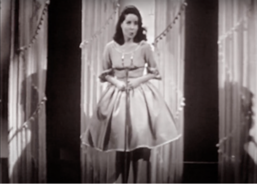
Jacqueline Boyer performing ‘Tom Pillibi’ at the 1960 Eurovision Song Contest, Credit: YouTube


This below-the-knee cowl-necked dress worn by Jacqueline Boyer is at once subtle and eye-catching. The billowing skirt, complete with four frontal pleats work to accentuate the waist and the tutu fabric hidden from view helps the skirt retain its shape. Although relatively simple in design, the piping featured at the bottom of the dress and at the neckline help offer a chic touch.

Last to perform on the evening, Boyer’s Tom Pillibi at the Eurovision Song Contest in 1960, marked the first time that the winning song had closed the competition. Quite the feat aged just eighteen! Moreover, her father Jacques Pills had performed at the Eurovision Song Contest in 1959, as Monaco’s first representative, but his performance didn’t fare so well, and he placed last, a rather less enviable position…

FOUR: LAURA VALENZUELA (1969)
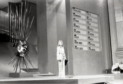
Spanish TV presenter Laura Valenzuela at the 1969 Eurovision Song Contest, Credit: Campúa


This next look was worn by Spanish TV presenter Laura Valenzuela for the 1969 Eurovision Song Contest. The high neck lace suit is chic as it is sophisticated, sexy yet understated. The high neck and long scalloped sleeves help ground the sheer fabric and the suit is tied together with a beige belt which looks to be made out of satin. The script and microphone for the evening form the host’s ‘accessories’ and a page is clearly earmarked for easy access. This lace jumpsuit recalls RTW S/S 20, specifically Look 19 at the Alexander McQueen show, which similarly features long frilled sleeves, a high neck and is tied together with a contrasting belt.

THREE: ABBA (1974)
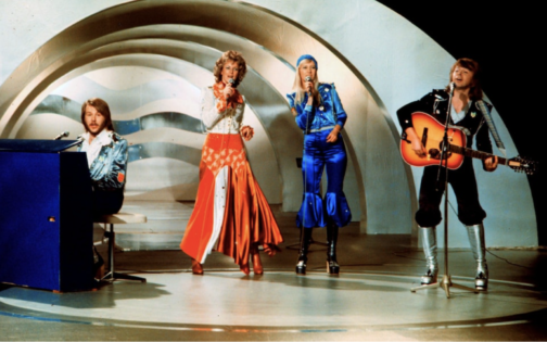
ABBA performing ‘Waterloo’ at the 1974 Eurovision Song Contest, Credit: AFP


Of course, it wouldn’t be a Eurovision round-up without featuring the sensation that is ABBA. They graced us with their Eurovision presence in 1974, with their now-classic, karaoke or silent disco must-have song Waterloo, claiming the first-place prize – rightfully – as their own, despite the United Kingdom offering the song a scathing nul points back in 1974.

With icons come iconic looks and these outfits scream seventies. Metallic knee-high platform boots (a win!) are paired with tops which look like they’ve been attacked with a glue gun and are covered in glittery stars and diamanté studs, making it an easy fancy dress outfit to recreate. Just don’t get me started on Agnetha Fältskog’s lapis blue beanie…

TWO: SCOOCH (2007)
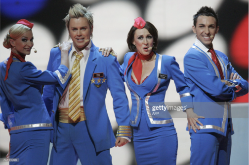
Scooch performing ‘Flying The Flag’ at the 2007 Eurovision Song Contest, Credit: AFP

Now for anyone who thought I was being harsh on ABBA’s look might think my review of Scooch’s 2007 outfits contradictory or hypocritical… Regardless, I will continue to fight for these airline outfits that look like they’ve come from a vacuum packed Smiffys costume set or a knock-off version of Britney Spear’s air hostess outfit from her ‘‘Toxic’ music video. Either way, my opinion is definitely influenced by nostalgia (and the aforementioned retention of the song’s lyrics), the hilariously noughties frosted tips and the tiny pink headpieces. It also serves as a reminder that at least half of the Eurovision Song Contest entries nowadays are less than serious. With that said, it was a bit of a rough landing for Scooch and they came 22nd out of 24 contestants.

ONE: DANA INTERNATIONAL (1998)
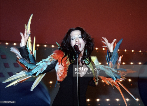
Dana International performing ‘Diva’ at the 1998 Eurovision Song Contest, Credit: Peter Bischoff

This outfit undoubtedly stole the show back in 1998, merging fashion with costume. It was worn by Dana International, representing Israel, for her winning performance of Diva and historical feat as the first transgender woman to win the competition. This dress is from the 1997 Jean Paul Gaultier Haute Couture collection, and the multi-coloured parrot feathered jacket featured as Look 70. The simple, refined black V-neck maxi dress clings beautifully to Dana’s body and the feathery jacket forms an extension of her body, exaggerating every movement.

Furthermore, Gaultier is ‘a self-confessed Eurovision obsessive,’ as quoted in an interview for The Cut and has dressed several other high-profile contestants over the years, including Dana during her 2011 performance.
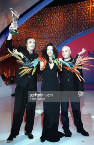
Dana International celebrating her victory at the 1998 Eurovision Song Contest, Credit: Peter Bischoff

While I appreciate Eurovision mightn’t be everyone’s cup of tea, seeing how much joy it brings my mother can’t help but make me feel warmly towards Eurovision. But perhaps that’s why they say absence makes the heart grow fonder…because I no longer have to put up with listen to the Eurovision CD on repeat for two months each year.

And let’s keep our fingers crossed that the United Kingdom isn’t destined for another – pitiful – nul points this Saturday at the 2022 Eurovision Song Contest.

By Georgina Johnston-Watt

Bibliography:

https://assets.vogue.com/photos/5d924ac6c210350009cb1540/master/w_960,c_limit/_ALE0191.jpg

https://campuafotografo.es/2014/05/11/el-festival-de-la-cancion-de-eurovision-de-1969-en-madrid-ante-la-camara-de-campua/19690329_festival-de-eurovision-en-el-teatro-real-de-madrid047_web/

https://www.youtube.com/watch?v=RYxRIujyKgg&ab_channel=huelezelf

https://www.gettyimages.co.uk/detail/news-photo/swedish-pop-group-abba-performs-during-the-the-eurovision-news-photo/103813082

https://www.gettyimages.co.uk/detail/news-photo/the-group-scooch-of-britain-perform-their-song-flying-the-news-photo/74133998?adppopup=true

https://media.gettyimages.com/photos/picture-taken-in-1974-in-stockholm-shows-the-swedish-pop-group-abba-picture-id951902272?s=2048×2048

https://www.gettyimages.co.uk/detail/news-photo/dana-international-teilnehmer-f%C3%BCr-israel-sieger-beim-43-news-photo/179727513?adppopup=true

https://www.gettyimages.co.uk/detail/news-photo/dana-international-representing-israel-in-the-eurovision-news-photo/179730040

https://www.thecut.com/2013/05/gaultier-explains-the-eurovision-song-contest.html

https://www.vogue.com/fashion-shows/spring-1997-couture/jean-paul-gaultier

https://www.vogue.com/fashion-shows/spring-2020-ready-to-wear/alexander-mcqueen/slideshow/collection#1

Margaret Morris and her Merry Mermaids

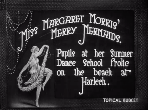
Miss Margaret Morris and her Merry Mermaids, BFI Newsreel.

As the 1920s and 1930s ushered in a new obsession with health, and the healthy body, women across the UK, the US, and beyond, began developing new techniques, regimes, and moves designed to create the elongated limbs and taut torso which was desired at the time. One of the most well-known groups to come out of this was the Women’s League of Health and Beauty, a group who encouraged movement as a way to achieve peace. The league held women-only classes, had uniforms and rules, and focused on synchronised, repetitive movement. This allowed the League to develop into something much more than just a weekly exercise class: it became central to friendships, romances, health, and for many women, life.

Another key player at the time was Margaret Morris Movement (MMM). Morris was born in London in 1891 and from a young age starred in plays and ballets. Through Raymond Duncan (Isadora Duncan’s brother), Morris learnt Classical Greek Dance, which through its focus on lyrical dance, she felt offered more freedom and movement than traditional ballet. In the early 1910s, Morris set up a hugely successful dance school, and her style of unbound movement was growing in popularity. By the mid 1920s, the school was opening branches in French, Scottish, and English cities.

Margaret Morris, video still from ‘Miss Margaret Morris and her Merry Mermaids’, BFI Newsreel.
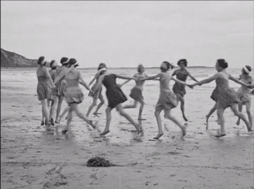
Women dancing on Harlech Beach, video still from Miss Margaret Morris and her Merry Mermaids, BFI Newsreel.

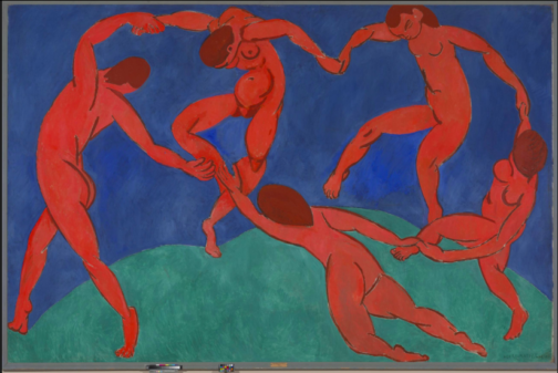
A 1923 newsreel courtesy of the British Film Institute shows a group of MMM students performing their dance moves on Harlech beach, in North Wales. Appearing under the title ‘Miss Margaret Morris’ Merry Mermaids’ the women and girls dance along the waters’ edge with fervent energy. The dancers simultaneously appear to be free, flowing, and natural in their movements whilst also clearly performing a choreographed and synchronised set of movements. The women then form a circle through their joint hands and run around in this formation on the damp sand. This frame feels familiar in the way that it is reminiscent of Henri Matisse’s 1910 painting, ‘The Dance’. Matisse’s painting depicts five figures holding hands and dancing in a circle on the grass, with a blue sky behind them.

Henri Matisse, The Dance, 1910, The Hermitage, St Petersburg.

I highly recommend watching the full clip on the BFI, it’s under three minutes long! BFI link: https://player.bfi.org.uk/free/film/watch-miss-margaret-morris-merry-mermaids-1923-online

By Rosie Dyer

Bibliography:

https://player.bfi.org.uk/free/film/watch-miss-margaret-morris-merry-mermaids-1923-online

https://www.margaretmorrismovement.com/about/margaret-morris

https://www.irenebrination.com/irenebrination_notes_on_a/2015/04/margaret-morris.html

https://sheroesofhistory.wordpress.com/2017/06/08/margaret-morris-pioneer-of-movement/

https://www.istd.org/dance/dance-genres/classical-greek/

https://www.henrimatisse.org/the-dance.jsp

Styling Our Future, Looking To The Past

1930s fashion has always appealed to me. Whether the beautiful flowing drapery of Madeleine Vionnet or the sharp suits worn by Marlene Dietrich, much of the fashion of the decade developed the freedom in dress that we come to appreciate now – both in terms of gender fluid dress, and comfort.

The art deco movement was a key influence on fashion of the time, encouraging a celebration of technological developments and an optimism for the future in its luxurious style. Here and now, as we emerge from the covid-19 pandemic with a sense of relief, but a variety of sources for future anxieties ever-present, it is time for a reinvigoration of that same hope in human ingenuity, celebration of technological developments and optimism for the future. We need comfort, strength and vibrancy, and I think we should be looking to 1930s fashion for inspiration.

AMW
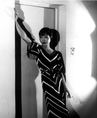
Anna May Wong in 1933, photographed by Paul Tanqueray
CN
“Fashion: Ladies’ Evening Shirts by Lanvin.” Vogue 84, no. 3 (Aug 01, 1934). Photo by Horst P. Horst. © 2012 Conde Nast

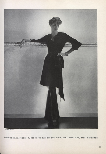
A range of comfortable ensembles are documented in the early 1930s. Anna May Wong wears an elegant, loosely fitted dress and leans against a doorway to convey her relaxed manner. Similarly, the model of Falkenstein in the August 1934 issue of Vogue leans against the wall. A rare appearance of trousers in early 1930s Vogue, the image shows a woman comfortable yet glamourous, wearing a tunic which resembles very stylish and eveningwear appropriate dressing-gown.

VD
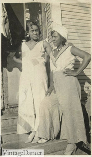
Blues Musicians, Geeshie Wiley and L.V. ‘Slack’ Thomas wearing Beach Pajamas, 1930-31

Moving from comfortable formalwear to comfortable daywear, the beach pyjamas worn by Geeshie Wiley and L. V. ‘Slack’ Thomas are outfits not only that would still be incredible on any beach, but likely will be reflected by many at the Courtauld’s graduation ceremony this summer. Wide-legged trousers and a fitted waist have been in style already for the past few years, but I’d like to see the style with more bright colours and comfortable cotton fabrics.

MW
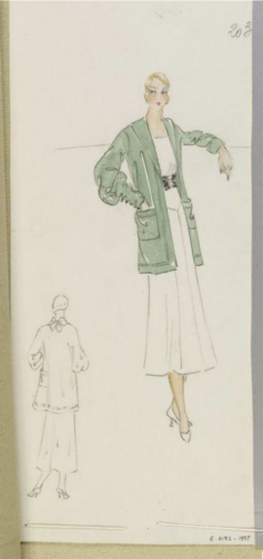
Été 1933, Madeline Wallis, V&A

And what should we wear when there is work to be done? An oversized cardigan with deep pockets in a stunning sage green, of course. An increase in sportswear and ready-to-wear in the 1930s led to a much higher interest in collegiate fashions, such as the varsity jacket and cardigans. The flip side of increased ready-to-wear was a rise in cheaper, lower quality garments. Today, with fast fashion booming and brands like Shein churning out an endless array of garments, it is more important than ever to find clothing that we love and will wear for many years, rather than single use pieces so cheaply made that they will inevitably end up on landfill. Clothing that can be styled in multiple ways, worn in many contexts and brings us joy is vital to us having a more sustainable relationship with our wardrobe. A deep pocketed cardigan perfectly fits the bill for me.

MD
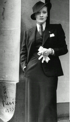
Marlene Dietrich in Paris, 1933

Uncertainty and anxiety have prevailed in recent years. As we move past what has been a difficult period for many, it seems only right that we do so feeling empowered and true to ourselves. Whether or not this means buying your own power suit – you decide. But Marlene Dietrich provides inspiration not only in her incredible suit-wearing, but also in her certainty that what she wanted to wear, what she felt good in, was for her to decide. For all my advocation of a need to revive 1930s fashion, I would like to conclude by moving away from the styles that dominated that period, and rather draw attention to the underlying themes of self-assurance, comfort, and joy. It is these that we should carry with us and cultivate through our wardrobe.

By Megan Stevenson

Bibliography

Arnold, Rebecca. The American Look: Fashion, Sportswear and the Image of Women in 1930s and 1940s America (2009, London)

Wilson, Elizabeth. Adorned in Dream: Fashion and Modernity (2003, London)

https://www.reddit.com/r/costumeporn/comments/k5blr1/marlene_dietrich_in_paris_1933/

https://www.vam.ac.uk/articles/art-deco-fashion

https://vintagedancer.com/1930s/1930s-black-fashion-african-american-clothing-photos/

https://collections.vam.ac.uk/item/O532676/%C3%A9t%C3%A9-1933-fashion-design-madeleine-wallis/

https://www.anothermag.com/fashion-beauty/gallery/9950/night-and-day-1930s-fashion-and-photographs/10


5 Minutes With…Georgina Johnston-Watt

We’ve been busy working on our dissertations, so we’re taking the opportunity to get to know the current MA Documenting Fashion students. Here, Georgina discusses Vogue, her scented virtual exhibition and fairy wings.

What is your dissertation about? What prompted you to choose this subject?

My dissertation is on Audrey Withers OBE, who was the editor of British Vogue between 1940 and 1960, having first joined the magazine as a sub-editor in 1931. I was introduced to Audrey Withers’ work through Julie Summers’ book and online talk on Dressed For War in late 2020. During the talk, hosted by Somerville College,  I learnt that Audrey Withers and I had shared the same undergraduate college, and, yet I had never heard of her name despite her many achievements and my pre-existing interest in fashion (with a keen interest in fashion magazines). I immediately became fascinated by her life and work, wanting to learn more about the tensions between her public and private personas – Audrey Withers was as a notoriously private character – and it was this which ultimately inspired me to apply for the Documenting Fashion MA at the Courtauld. Through my dissertation, I’m enjoying playing the part of detective, trying to uncover more information about Audrey Withers through her private correspondence, workplace memos and newspaper cuttings, as well as undo the misconceptions surrounding her, such as she herself became ‘interested in Vogue magazine when an undergraduate at Somerville College, Oxford,’ as written in a Norwood News article of 1951. In fact, Audrey Withers was largely uninterested in fashion and instead ‘achieved her results by sheer intelligence’ in the words of Harry Yoxall, the chairman of Condé Nast. My dissertation will focus on her private and public lives and how they were designed to remain entirely separate, but that Audrey Withers’ role at Vogue required them to overlap at points, with family friends such as Paul Nash writing articles on all manner of things.

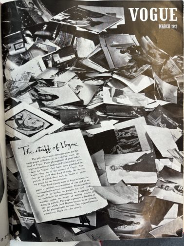
Additionally, I was fascinated to learn how Audrey Withers and Cecil Beaton destroyed the entire paper and photographic archive of British Vogue for 1942’s March issue (below) in response to the Paper Salvage effort and in the face of unimaginable hardship. I believe the coupled nobility and arrogance in this action – which reacted to contemporary uncertainty at the expense of future study – serves as an example of the undeniable tension behind justifying perceived ‘frivolities’ in an era of necessity as well as securing Audrey Withers’ status as a largely anonymous and unknown figure.

Vogue
British Vogue, March 1942

What is your favourite thing that you’ve written/worked on/researched this year?

I’m loving my dissertation – especially as it is something I’ve been mulling over since last summer – but I really enjoyed working on my virtual exhibition, which explored the power of perfume. Perfume is capable of so much: it has the power to evoke forgotten moments; perfume acts as a designer’s signature – yet invisible – autograph, the list could go on… What I’ve loved about this project was its focus on creating a visual argument. Unlike an academic essay where you might presume certain knowledge and expertise on behalf of the reader, I had to consider how to pitch each element to a wide variety of visitors in order to give them the best experience possible. For instance, I used text panels to introduce each section and broader themes, whereas the sample exhibition catalogue entry allowed for a more in-depth analysis.

I wanted to situate perfume within a retail space, reinforcing perfume’s relationship to commercial practices, and chose to set it in the historic Liberty Department Store in London. In keeping with the idea of it as a fantasy exhibition, I kept on imagining I was in ‘The Sims’ world each time I was working on my floor plan, visualising how a Sim character would walk through the exhibition space. I wanted to create an immersive, multi-sensory experience, and decided on a commissioned and interactive sensory wall, serving baked goods (and cocktails!) to create three ‘miniverses’ to reflect the perfumes and designers on display: Elsa Schiaparelli’s Shocking, Yves Saint Laurent’s Opium and Tom Ford’s Tuscan Leather. I found considering perfume’s position as simultaneously immaterial and material particularly fascinating and incorporated that into my layout.

What are you wearing today?

Recently, I’ve found that I’m wearing a ‘uniform’, which normally consists of jeans, a simple top, a fun statement blazer or coat and a bright red lip. Today, I’m wearing a pair of denim blue Levi’s, an M&S black thermal top (not so chic, but I FEEL the cold), my cherished checked old Celine blazer from Vestiaire Collective and a pair of slightly battered Axel Arigato trainers, plus my go-to vintage Mulberry laptop bag, which I nabbed from my mother. And, of course, my signature red lip. I’m also having a bit of a jewellery moment, so have layered it with a couple of Alighieri necklaces (including the ‘Invisible Compass’ as I’m always getting lost!), a gorgeous Katie Mullally Irish Coin Charm featuring an Irish hare (I’m born Year of the Rabbit which I feel is close enough) and an amber necklace bought in Edinburgh by two of my dearest friends for my birthday last year. I’m also wearing a pair of Motley X Alice Cicolini earrings and my usual rings, including one from my mother and a Gracie J prototype tear ring. It’s been a research day, which started with an exciting trip to Vogue House to meet with Julie Summers, where we talked about our love for Audrey Withers, and I was lucky enough to take a quick peek at some of the Vogue archives from the 1940s and 1950s. I then had lunch with a friend and have since been busy in the London College of Fashion Library looking at more Vogue archives where I bumped into fellow MA student, Megan, before heading home for a relaxed evening!

Do you have an early fashion memory to share?

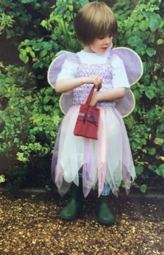
When I was a child, there was a time where all I would wear was a dress with a tutu skirt, fairy wings, and green wellington boots. And jeans underneath if it was cold. Occasionally, if I was feeling very daring, I might try to pinch my mother’s clip on earrings to complete the look… From an early age, my mother had been quite happy for me to choose my own outfits, barring the occasional family event, and so I’d turn up to nursery dressed as a fairy. Complete with a little handbag with everything a fairy might need for the day, namely bubbles and a glitter pen.

As I would wear this outfit day in and day out, I must’ve worn it on the day we had an art lesson as my mother ended up receiving a call from the school. Initially assuming it was about one of my brothers who was constantly misbehaving, it was a surprise to hear that it was about how I had refused to take off my fairy wings when asked. Though the teacher was seemingly only concerned they’d get mucky during the arts and crafts activities, I continued to refuse to take them off and they were unable to put my painting overalls on. While neither my mother or I can remember the precise outcome, or whether I agreed to take my fairy wings off – even momentarily to put the apron on – I’d like to think that a compromise was eventually made, and I succumbed to reason. But knowing how stubborn children can be, there’s certainly a chance that I refused to cooperate.

In the photo below, it’s funny how the core of many of my outfits remains the same, even nearly two decades on. I often wear a white t-shirt and jeans, and the tutu dress and fairy wings have simply been replaced with a statement jacket. It would seem that there’s a part of me that still wants to be a fairy.

Wearing a tutu, fairy wings and wellington boots, circa 2003

A Little Love Letter to Meadham Kirchhoff SS14

A brand born out of Central Saint Martins in 2006, with Edward Meadham and Benjamin Kirchhoff at the helm, Meadham Kirchhoff had a short-but-oh-so-sweet 9 year run full of awards, Fashion Week shows, and their Topshop collaborations.

Distinctly kitsch, cutesy and a little bit edgy, it is no surprise that Meadham Kirchhoff rose to fame during the ‘twee’ era of the 2010s, and as the trend’s revival is now upon us, it makes sense to take a closer look at one of my favourite Meadham Kirchhoff shows, SS14. 

Conceptualisation

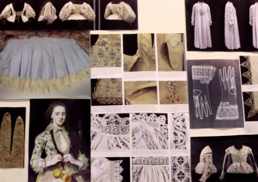
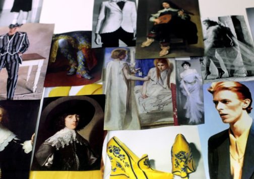
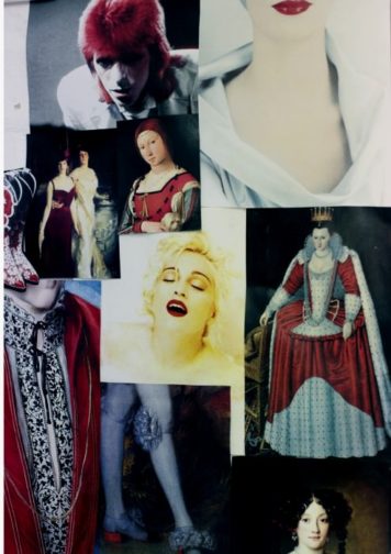
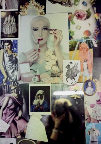
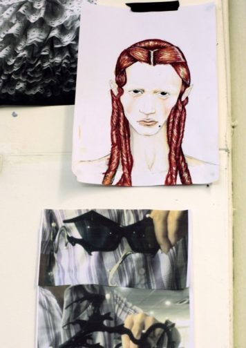
Edward Meadham described his mood boards as containing ‘a random mix of Jacobean and Elizabethan portraiture and lots and lots of Bowie’. This eclectic mix hints that the very fabric of the show is made from opulence, excess, ruffles and lace, the subversion of gender, and an interesting mix of bold black and white, dotted with pastel shades.

MK1
Edward Meadham’s mood board featuring lace and ruffles. Photograph by Eleanor Hardwick.
MK2
Edward Meadham’s mood board featuring David Bowie, drapery, and portraiture. Photograph by Eleanor Hardwick.
MK3
Edward Meadham’s mood board featuring hints of red. Photograph by Eleanor Hardwick.
MK4
Edward Meadham’s mood board featuring pastels, vintage beauty images, and ceramics. Photograph by Eleanor Hardwick.
MK5
Edward Meadham’s mood board featuring an elvish illustration, ruffles, and sunglasses. Photograph by Eleanor Hardwick.

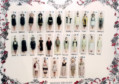
The collection was called ‘Ante Dominai [sic]’ meaning ‘anti-society, anti-mainstream culture. Do what you want, create your own alternative, your own narrative, and your own set of codes and morals.’

The Show

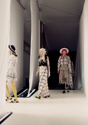
The show itself ran smoothly, despite a few technical issues such as the wrong music being played. It is immediately clear how Meadham Kirchhoff took their inspiration pictures and reworked, reinvented and re-inspired them into this eccentric show which somehow marries images of Seventeenth-century witches, Eighteenth-century royals, and kitsch pastel kittens.

Here are a few of my favourite images from the show, taken by Eleanor Hardwick, which might inspire your spring wardrobe now that the Northern Hemisphere is warming up a teeny, tiny, little bit.

MK6
The model line-up for the show. Photograph by Eleanor Hardwick.
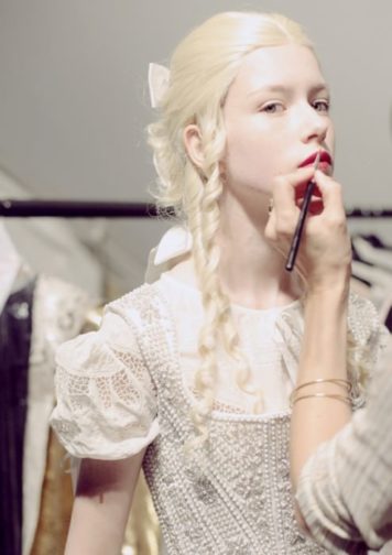
MK7
A model getting her make-up done backstage. Photograph by Eleanor Hardwick.
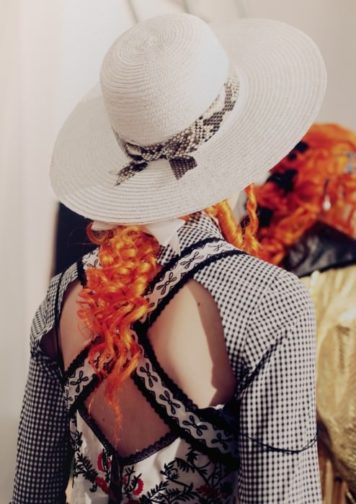
MK8
A backstage shot of a model from behind, showing the criss-cross detail of the dress, the long bright curls, and the snakeskin ribbon adorning the hat. Photograph by Eleanor Hardwick.
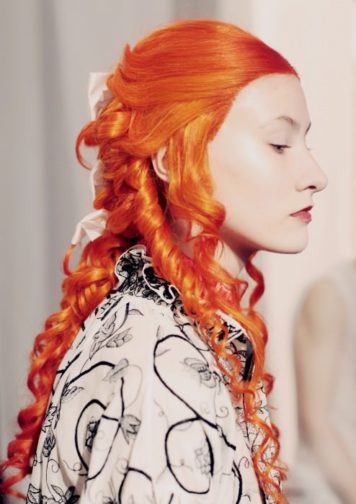
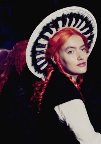
MK9
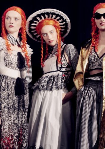
Another image showing the long orange curls, very similar to the elvish illustration on Meadham’s mood board. Photograph by Eleanor Hardwick.
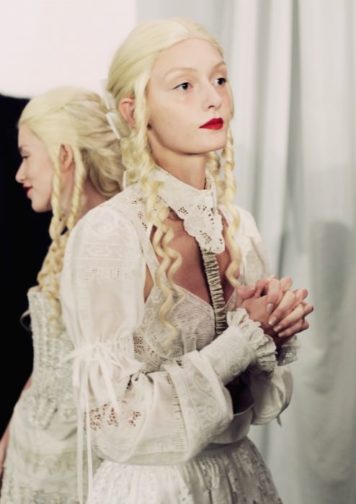
MK10
A model backstage, dressed in white, long pale curls, complete with minimal eye make-up and a bold red lip. Photograph by Eleanor Hardwick.
MK11
The models walk onto the catwalk. Photograph by Eleanor Hardwick.
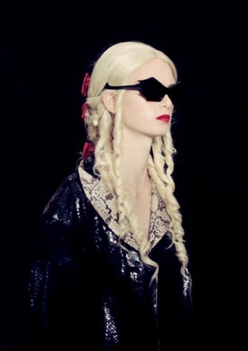
MK12
One of the darker looks from the collection featuring snakeskin, sunglasses, red hair bows and a red lip. Photograph by Eleanor Hardwick.
MK13
A model looking like the picture of an Edwardian woman in the city. Photograph by Eleanor Hardwick.
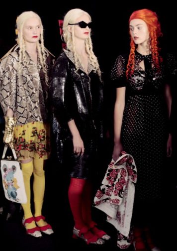
MK14
Three models stood waiting to walk. Photograph by Eleanor Hardwick.
MK15
Three models backstage, adorned in orange curls. Photograph by Eleanor Hardwick.

I hope you’ve loved this show as much as I do. It feels opulent, rebellious, and youthful. I also think it’s quite clear where my love for Simone Rocha’s ruffles and pearls was born from…

By Rosie Dyer

Bibliography:

https://www.gettyimages.co.uk/photos/meadham-kirchhoff-runway-london-fashion-week-ss14

https://www.rookiemag.com/2013/10/meadham-kirchhoff-visit-5/

https://mashable.com/article/twee-tiktok-trend

Zooming In On Margaret Bourke-White

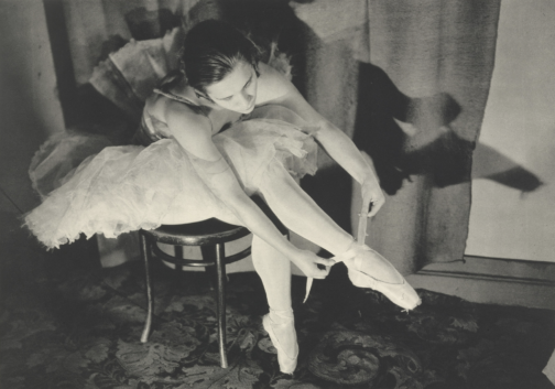
A little while back, I stumbled across Margaret Bourke-White whilst looking up 20th Century female photographers, discovering her work among others such as Germaine Krull and Grete Stern. It goes without saying that each of these women were respectively brilliant at working behind the lens, and each are deserving of a writeup, but I was especially drawn to Bourke-White’s photographs of Marina Semyonova (fig. 1).


Ballet
Figure One: Marina Semyonova by Margaret Bourke-White. Photo: MOMA


Taken at the Bolshoi Theatre in Moscow, this photo shows Semyonova – the first Soviet-trained prima ballerina – preparing herself ahead of a ballet performance. Semyonova’s body is folded into itself, revealing the physical contortions and movement required of her in order to reach and tie her ballet shoes. Her posture is considered, and the chair acts as a prop to help elongate her body and better display her ballet shoe all the while creating a tension between her body and the billowing tutu which surrounds her and presses upon the back of the chair. Semyonova is artfully staged, and her pose emulates the exaggerated stillness of the photographic form, reinforcing the expectation for ballerinas to always appear elegant, not just during a performance. Her left leg is deliberately aligned in a nod to her profession, recreating one half of the en pointe position and her outstretched arms provide an extension of the en pointe motif. This creates a clear shot for which Bourke-White could effectively capture Semyonova, allowing Bourke-White to play with light to illuminate Semyonova’s body and project a shadow onto the far wall.

With that said, what I found most appealing about this photo, is despite this photo having an editorial-like feel, the loose threads on Semyonova’s ballet shoes offer a reminder of the countless hours of practice required to become a ballerina, displaying the real-life implications of such a profession. This suggest that whilst Semyonova displays poise and elegance, these attributes have been mastered over time. However, the loose threads could also be linked to the USSR in relation to its second five-year plan which sought to prioritise agricultural and self-sufficiency ahead of consumer goods and frivolity, and the loose threads thereby reveal the unravelling of previous political and cultural practices.

Through considering such a beautiful photo, I wanted to discover more about Bourke-White’s work, particularly as this photo was taken during the political unease of the Soviet Union. My research revealed that Bourke-White excelled as a photographer and whose accomplishments were plentiful. Born in 1904, Margaret Bourke-White would go on to set up her own photography studio in 1928 in Ohio, but her work would soon take her abroad, namely to the likes of Russia, South Korea, India and Pakistan where she was commissioned to document moments of political divide, wars and social unrest.

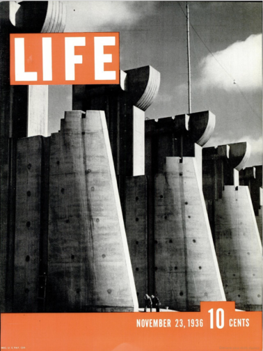
To name but a few of her impressive feats, Bourke-White was the first US photographer to enter the Soviet Union, the first US accredited female war photographer during WWII and responsible for the first cover for LIFE Magazine (fig. 2).


Life
Figure Two: Cover of ‘LIFE’ Magazine (23 November 1936). Photo: ‘LIFE’ Magazine Archives via Google Books.


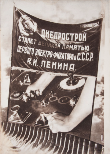
This cover highlights Bourke-White’s unique ability to take an imposing architectural structure and create a striking and an arresting image. She was commissioned to photograph this multi-million-dollar project of the Columbia River Basin and the construction of its impressive dam. The angle at which Bourke-White captured this photo and its emphasis on the symmetry of each of the concrete structures makes them appear – at least in my mind – as gigantic chess pieces bearing a similarity in shape to the ‘Rook’, with the two individuals symbolically positioned as pawns within this almighty chess board. The vibrant orange of the cover contrasts with the black and white image, at once cropping and framing the two individuals stood at the foot of the structure. The shot appears to reinforce the idea that these structures are in fact man made, with the two individuals attesting to the labour required to build such structures, and yet conveys the structures as colossal, unnatural, and otherworldly. Indeed, the editors notes that in commissioning Bourke-White they unexpectedly received, ‘a human document of American frontier life which, to them at least, was a revelation.’ This very observation highlights the talents of Bourke-White, and her ability to capture life within an otherwise intimidating concrete structure. This style of photography also calls to mind El Lissitzy and his photomontages for the SSSR na stroike (trans: USSR in construction) in 1932, with the overall global emphasis on self-sufficiency, driven by its workforce, who become the centre of El Lissitzy’s photomontage (fig. 3). This theme is echoed in Bourke-White’s photography, and the two share similar aims in trying to establish the strength of their respective cities and nations. To this effect, Bourke-White’s photography could be considered an artistic response to Constructivist periodical layouts and El Lissitzy’s earlier work.
 

USSR
Figure Three: Photomontage of SSSR na stroike (trans: USSR in contruction) by El Lissitzky. Issue 10 (1932). Photo: Bookvica.


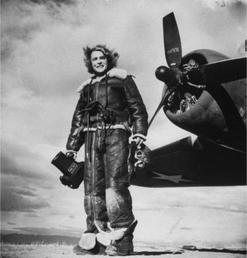
The final photograph I would like to discuss is a self-portrait, rumoured to be Bourke-White’s favourite self-portrait, made with the U.S. 8th Air Force in 1943 (fig. 4).


Self-Portrait
Figure Four: Margaret Bourke-White’s self-portrait made with the U.S. 8th Air Force in 1943. Photo: The LIFE Picture Collection/Shutterstock.


In a similar vein to Bourke-White’s cover for LIFE Magazine, this photo marries machinery and industrial elements with humanity. While the airplane’s jets have been switched off, this photo conveys the necessity to be on constant standby, responding to any changes quickly and efficiently. Bourke-White has a tight hold of the large camera, figuratively and literally held down by the camera, and carries her flying helmet and goggles in her other hand with comparative ease. To this effect, this photo is suggestive of the precarity of the war and the need to be on constant alert as well as Bourke-White’s role to document the events. This is further reinforced by the inclusion of the plane in the frame – its proximity reinforces the fact that it is only a matter of time before this unit needs to reembark the plane.

At the same time, Bourke-White’s stance is relaxed yet upright, smiling as the wind blows through her hair. The tongues of her shoes are flopped over, giving the impression of a rare moment of respite, reinforced by the fact that their surroundings appear bare and uninhabited, suggesting a minimised threat or danger. The aviator jacket is fit with shearling trimmings, and complete with matching trousers, also lined with shearling, featuring leg-long zips and stained with a white powder residue. The crease patterns, particularly on the trousers, suggest the cramped conditions of the plane and it would appear as though Bourke-White has barely stepped off the plane. While her stance is relaxed, and she is surrounded by an expansive empty landscape, the trousers act as her ‘second skin’ and become a reminder that she did not have the luxury of space a few moments ago, and the trousers have not yet and will not likely get the chance to mould to their new surroundings, complete with the luxury of space, or Bourke-White’s standing pose.

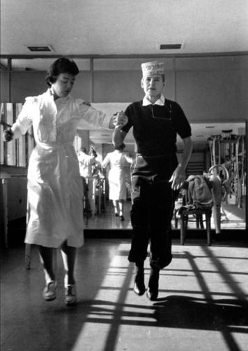
Sadly, Margaret Bourke-White contracted Parkinson’s disease in 1953 and completed her last assignment for LIFE in 1957. With that said, she displayed great determination in trying to overcome the symptoms of her Parkinson’s, undergoing risky surgeries, and in true documentary photographer style, publicised and documented her fight against the disease, cementing her status as a formidable character and individual (fig. 5). She sadly passed away in 1971 but while her career was cut short by Parkinson’s, Bourke-White was rightly recognised in her lifetime as a true pioneer in documentary photography, particularly as a female photographer for her ability to uniquely capture people and places in and amongst periods of great change, showcasing their struggles and strengths.


Bourke-White
Figure Five: A nurse aiding photographer Margaret Bourke-White during a therapy session by Alfred Eisenstaedt. Photo: The LIFE Picture Collection/Shutterstock.


By Georgina Johnston-Watt

Sources:

https://books.google.co.uk/books?id=N0EEAAAAMBAJ&printsec=frontcover&hl=fr&source=gbs_ge_summary_r&cad=0#v=onepage&q=margaret&f=false

https://www.bookvica.com/pages/books/1291/el-lissitzky-and-his-photomontages-sssr-na-stroike-i-e-ussr-in-construction-10-for-1932

https://www.life.com/history/great-lady-with-a-camera-margaret-bourke-white-american-original/

https://www.life.com/lifestyle/parkinsons-disease-life-magazine/

2022: A year of #NoNewClothes

Truthfully, I’m rarely one for New Year’s resolutions and if I ever do commit to making a change, it’ll just so happen to be something which I’m already willing to reduce or eradicate in its entirety. This year, however, I’ve decided to truly revamp my attitude – and wardrobe! – by committing to only buying second-hand clothes.

For the last few years, I have made a concerted effort to buy a maximum of three garments which could be categorised under the term ‘fast-fashion’ a year and thus the goal seems attainable; however, this would invariably creep up to five or so items having fallen for the countless marketing ploys à la Black Friday and during other heavily advertised sale periods.

Fashion
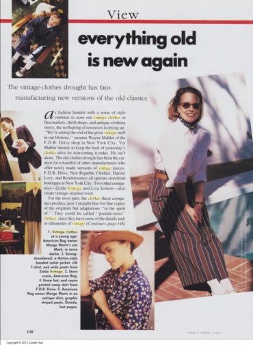
Figure 1: Shields, Jody. ‘View: Everything Old is New again.’ Vogue (US) Apr 01 1989

ON TRENDS

During the first few months of our MA, we have studied how people are drawn to buying clothes, often not out of necessity, but rather due to numerous social factors. Individuals, quite willingly, can be seduced through the socially acceptable (and usually passive act) of following a trend and statements such as ‘because they’re in fashion’ may be offered as a legitimate explanation for adopting any one of more items of clothing. Indeed, the wearer themselves might not even claim to know why they are wearing any one garment beyond this very reason. Such attitudes can create a unique position whereby those who subscribe to blindly following trends also police others to see who is adhering to any specific trend, passing judgement based on what they see. Furthermore, it is largely accepted that clothing forms a large part of the first impression we make on others; indeed, as a cohort, we each expressed the heightened considerations regarding our outfits and additional pressure placed for the first day of our MA, offering as it did for the majority, the first time meeting one another in person.

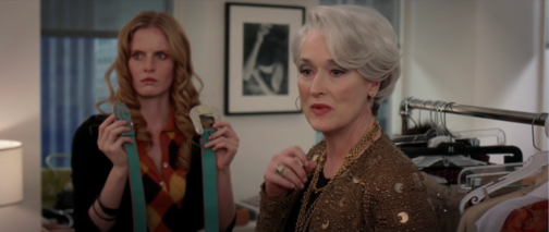
Such considerations in fashion – at least for me – evoke the much-quoted and adored cerulean blue scene in The Devil Wears Prada where Miranda Priestly (played by Meryl Streep) quite literally gives Andrea (Andy) Sachs (played by Anne Hathaway) a dressing down after she shows her contempt for the fashion world, claiming to be ‘exempt’ from fashion (fig. 2). Priestly’s speech serves to suggest that Andy’s choice of jumper is the prime example of a trend being spotted at fashion shows and then trickling down to high-street retailers. In other words, people are unable to be removed from fashion and thus (sub)consciously make specific choices and associative statements with what they choose to wear. As philosopher Gilles Lipovetsky writes: ‘With fashion, human beings begin observing each other endlessly, appreciating each other’s looks, evaluating nuances of cut, colour, and pattern in dress.’ Moreover, it is this constant observation that has become all the more heightened through social media, and this is especially true of platforms that focus on the dissemination of images.

Fashion
Figure 2: Screenshot from ‘The Devil Wears Prada’ (2006). Photo: Screenshot from YouTube

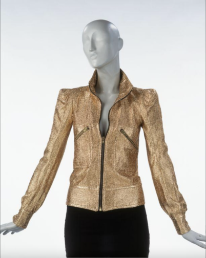
Indeed, my resolution to buy ‘nothing new’ relates to this constant observation, and perhaps unsurprisingly as a student of History of Dress, my desire to stand out and communicate specific messages in what I wear. Therefore, for me, buying vintage and second-hand is about making considered purchases, often over a period of a few months or even a year. It presents a new opportunity to literally trawl through vintage shops in the hopes of finding something incredible with expectations that may crumble upon seeing the fifth moth-ridden jumper in a row but can instantly be restored as soon as I’ve spotted the perfect jacket (fig.3 aka the dream jacket). Buying second-hand and vintage can certainly be a frustrating process, too, such as when an item you’ve been eyeing up is no longer available; or, the gut-wrenching moment when someone outbids you on an eBay listing in that *last* second, coupled with the misplaced confidence in thinking you were the only one who was going to bid on the item.

Biba
Figure 3: 1970s Biba Lamé Jacket. Photo: V&A

Moreover, where possible, I love reaching out to the buyer to see if they can offer any anecdotal information surrounding the garment to construct a complete mental image and history, ‘revealing the wearer’s identity, character or physiognomy,’ as analysed by Kitty Hauser. Without a doubt, one of my favourite vintage purchases included a beautiful hand-written note from its previous owner which outlined how treasured it had been, but also how it ‘will have another chapter in its fashion life’ which I think perfectly sums up the special feeling one might have when buying something second-hand.

Recently, I’ve found that compliments relating to clothes between friends and strangers alike are more increasingly being met with the following explanations: ‘It’s vintage’; ‘I’ve had it for [insert length of time]’; and, ‘I got it from a charity shop for a fiver’. Each of these explanations suggests a new way of justifying past and present purchases as individuals are becoming abundantly aware of the environmental implications of their purchases and want to alleviate guilt or the notion of being ‘part of the problem’. However, it also creates an issue that goes against the very origins of the second-hand clothes market, dating back to the 1700s, which was set up to help people purchase clothes at more affordable prices, something that Barbra Streisand’s Second Hand Rose notes as rendering it less desirable, an attitude which has greatly changed in recent years (fig. 4). Today’s appetite for vintage pieces can see prices skyrocket as specific eras and garments are (re)interpreted as trendy, once again creating the issue of affordability which has long defined – and plagued – the fashion industry.

Fashion
Figure 4: Screenshot from Barbra Streisand’s ‘Second Hand Rose’ (1965) for the ‘My Name is Barbra’ TV Special. Photo: Screenshot from YouTube

THE NEED TO ACT

Recent conferences such as COP26 have put pressure on the need to truly change our consumer habits, particularly as statistics show that the fashion industry emits about the same quantity of greenhouse gases a year as the entire economies of France, Germany and the United Kingdom combined. This was reported in a recent McKinsey and Co report which found that the fashion industry alone had emitted a mind-blowing 2.1 billion tonnes of greenhouse gases in 2018.

Moreover, people in the United Kingdom buy more clothes per person than any other country in Europe. In sum, the amount of clothes that many people in the UK own is nothing near a ‘normal’ amount as fewer people buy to last, the expectation that an item of clothing’s lifespan is limited to a mere few months, or a singular outing is a bleak state of affairs indeed. This is partly driven by the fact that 69% of new clothes are produced from synthetic fibres and plastics, set to reach an alarming 75% by 2030.

The statistics are alarming, and our desire to consume fashion leads to some of the worst working conditions, only exacerbated by fast-fashion retailers such as Pretty Little Thing introducing a mind-blowing 100% off during last year’s Black Friday in a bid to get rid of excess stock and drum up publicity and excitement with its consumers (fig. 5).

In order to help track the individual impact of reducing our clothes consumption, initiatives such as the Count Us In ‘Wear Clothes to Last’ pledge work to calculate the estimated reduction in an individual’s carbon pollution throughout the year. At the time of writing, 1,709 people have signed the pledge.

PLT
Figure 5: Screenshot of the @OfficialPLT tweet advertising 100% off discounts. Photo: Screenshot from Twitter


Let us now turn our attention now to some of the solutions which have helped reduce my desire to buy new clothes.

HOW TO RESIST THE TEMPTATION

  • Unfollow brands and individuals who promote a fast-fashion lifestyle, especially if they are being sponsored by fast-fashion conglomerates to do so.
  • Tailor your cookies or use ad-blockers to help reduce the number of pop-up adverts you receive.
  • Unsubscribe from unnecessary marketing emails from fast-fashion brands
  • Actively search for sustainable alternatives.

HOW TO SHOP

Buy to last (and take care of your clothes!)

Donate/repurpose/sell unwanted clothes

Second hand, both online and in person

  • Vintage Shops and kilo Sales (details often found on Facebook)
  • Local Charity Shops
  • eBay; Etsy; Depop (@5thSeasonVintage is a personal favourite)
  • Vestiaire Collective; HEWI – premium brands

By making my pledge public, I am hoping to be held accountable by friends and family for any purchases I make throughout the year.

By Georgina Johnston-Watt

Sources:

Hauser, Kitty, 2005, ‘The Fingerprint of the Second Skin,’ in Christopher Breward and Caroline Evans, eds., Fashion and Modernity, pp. 153-170

Lipovetsky, Gilles, 1994, ‘The Enchantment of Appearances,’ in The Empire of Fashion: Dressing Modern Democracy pp. 18-54

http://changingmarkets.org/wp-content/uploads/2021/07/SyntheticsAnonymous_FinalWeb.pdf

https://collections.vam.ac.uk/item/O120586/jacket-biba/

https://www.dazeddigital.com/fashion/article/54904/1/pretty-little-thing-fast-fashion-plt-black-friday-sale-free-clothes

https://www.greenpeace.org.uk/news/the-uks-fast-fashion-habit-is-getting-worse-and-its-destroying-the-planet/

https://www.mckinsey.com/industries/retail/our-insights/fashion-on-climate

https://www.proquest.com/magazines/view-everything-old-is-new-again/docview/879279559/se-2?accountid=10277

https://twitter.com/OfficialPLT/status/1465440440409378822?s=20&t=4AJWD-GfG51zDgfKVbhXjw

https://www.youtube.com/watch?v=CaPmNly54gA&ab_channel=WestHwood

https://www.youtube.com/watch?v=Ja2fgquYTCg&ab_channel=Movieclips

The Spectacle of Fashion

Complete with allure, sophistication and sparkle, jewellery has continued to captivate and spark people’s interest, be it in a tiara, a ring or as an uncut gem. It is perhaps of little surprise therefore that a pair of seventeenth-century Mughal spectacles, with diamonds and emeralds as their central lenses, originally conceived from substantial stones weighing at least 200 and 300 carats respectively, became the headline act for Sotheby’s Arts of the Islamic World and India auction held in London on the 27 October 2021. What may be of surprise, however, is that they remain unsold, having failed to reach their combined £3 million estimate, despite the fact that no other examples are believed to exist.


Seventeenth-century Mughal Glasses nicknamed Halo of Light. Courtesy of Sotheby’s.


In the run up to the event, these highly unusual and rare spectacles attracted international media attention, including writeups in news outlets such as BBC and CNN Style, hinting at a potential bidding war and expectation that these glasses were likely to exceed their £1.5-2.5m respective estimates. Comparisons were made to Kylie Jenner’s 2018 MET Gala outfit or Cartier’s diamond glasses as seen at the 2019 Billboard awards, highlighting how all things bling are forevermore in fashion.


Seventeenth-century Mughal Glasses nicknamed Gate of Paradise. Courtesy of Sotheby’s.


I’d also like to throw another comparison into the mix: that of the infamous Rothschild Surrealist Ball of 1972. It was an event which saw fancy dress and opulence operating at new extremes, with costumes designed by the likes of Salvador Dalí himself and well attended by the crème de la crème in society at that time. What’s more, these glasses were created to be worn not simply admired, an impressive and audacious feat in itself. As such and notwithstanding their original provenance, these spectacles once again seem to maintain a contemporary feel despite their seventeenth-century origins, suggesting a continued appetite for lavishness and all that *glitters*, supporting the theory that a diamond (or emerald!) continues to operate at the height of fashion.


Two attendees at the Rothschild Surrealist Ball, 1972.


This opens up the discussion towards the continued historical and academic research, in part, because the provenance of these glasses is still somewhat contested but also because of the absolute technical prowess they exhibit. Research has concluded that these glasses were conceived in the seventeenth century in India, with the frames developed at a later stage during the nineteenth century. The first pair presented by Sotheby’s is aptly named Emeralds for Paradise (or nicknamed Gate of Paradise) and its central gems can be traced back to the Muzo mines of Colombia; conversely, the diamond lenses forming Diamonds for Light (dubbed Halo of Light) likely came from the Golconda mines of Southern India, but this is still under review.


What can be ascertained, however, is that these glasses are exemplary in demonstrating the fusion between science with beauty and tradition, with each pair believed to possess unique healing properties – emeralds have been used as early as 1CE as a means of combating strained eyes but were also seen as a key aid in warding off evil. On the other hand, diamonds were considered to have illuminating properties, and the skilful cut of the flat-cut diamonds ensures that transparency is retained when the glasses are worn, thereby offering enlightenment to its wearer.


One of the rumoured owners of these extraordinary glasses is emperor Jahangir who was the fourth Mughal Emperor, ruling from 1605 to 1627. At a time where the monarchy set the standard (and boundaries, legal or otherwise) as definers of elegance and sophistication, it seems fitting that an emperor would have guaranteed – the implicit or explicit – exclusive ownership of such elaborate pieces. This can be partly determined by a willingness to sacrifice the majority of a 200-carat diamond to make two flat-cut diamonds, totalling a comparatively modest 25 carats for the Halo of Light spectacles, with the same process being repeated to provide the two flat-cut emeralds for the Gate of Paradise spectacles.


Painting of the Peacock Throne, commissioned by Emperor Shah Jahan in early 17th Century India.

Perhaps adding credibility to such a theory is the fact that Jahangir (in his twelfth year as ruler) gifted himself an article of clothing in the form of a sleeveless over-tunic (named the nadiri) that he alone could wear, only ever extending this to his inner circle. Indeed, one of the recipients was his son and successor Shah Jahan who ruled from 1628 to 1658. During his reign, Shah Jahan commissioned the famous and hugely opulent ‘Peacock Throne’, which featured the 186-carat diamond named Koh-i-Noor (now part of the British Crown Jewels). He too is rumoured to be the original owner of these glasses, with the central emeralds believed to have offered aid to soothe his eyes, following an extended period of mourning after the loss of his favourite wife, Mumtaz Mahal.


While there is plenty left to say about these extraordinary glasses, I shall conclude with this: should bling be your thing, and if you can afford to splash the cash, then I hope they’ll be back up for auction ASAP. But in the meantime, if you want to feel like royalty on a budget, then why not try this great alternative: https://www.ebay.com/itm/Princess-Glasses-1-Pc-Apparel-Accessories-1-Piece-/164141097819


By Georgina Johnston-Watt


Sources:


Belfanti, Carlo Marco, ‘Was Fashion a European Invention?’ in Journal of Global History, no. 3 (2008), pp. 419-43


https://www.sothebys.com/en/buy/auction/2021/arts-of-the-islamic-world-india-including-fine-rugs-and-carpets-2/a-pair-of-mughal-spectacles-set-with-emerald?locale=en


https://www.bbc.co.uk/news/world-asia-india-58825741


https://edition.cnn.com/style/article/diamond-glasses-emerald-mughal-auction/index.html


https://therake.com/stories/icons/party-animals-the-rothschild-surrealist-ball/

In Conversation with Dr. Rebecca Arnold…

*Due to teething problems with the new editing team, this post will be updated with images ASAP*

Current student Ipek Kozanoglu chats to MA Documenting Fashion’s very own Dr Rebecca Arnold about all things fashion and the @documenting_fashion Instagram account.

The emergence of Instagram eleven years ago has awoken a frenzied desire to share. Whether it’s the photos/videos of daily routines, favourite pastimes, interests or passions, the app has transformed whoever posts on the platform, into a curator.

It is undeniable that Instagram’s visual potency has breathed new life into the exhibition and dissemination of fashion and its imagery. Although a time before Instagram almost seems unimaginable ever since social media became deeply ingrained in our daily lives, exhibiting trends in fashion before was most common through magazines, fashion shows and films. Dr Rebecca Arnold’s @documenting_fashion Instagram account, with its array of photographs, drawings, magazine spreads and film extracts from a variety of periods, starting from the 1920s all the way to today, and cultures, spanning from the US to Europe and Asia, evokes this type of ‘documenting fashion’ before an age of social media. The account’s rich visual content is often accompanied by Dr Arnold’s brief yet captivating captions that not only inform the viewer about the history and meanings behind the images but also draw the viewers attention to details that often slip the gaze of the untrained eye. Presenting a broad view of styles that belong to different ages and cultures, the account becomes an outlet to compare similarities and differences in dress whilst highlighting the fact that many concerns, as well as fascinations in fashion, are universal.

In this interview, Dr Arnold delves deeper into her visual library and responds to questions about the creation and aim of the account, her interest in fashion and how it links to Instagram as well as criticism regarding fashion influencers today.


Could you elaborate on how you came up with this account, what was the inspiration and aim behind its creation? What drew you to Instagram as opposed to say other outlets such as Pinterest or Twitter for example?

I was only ever interested in Instagram – because it is image-based but with the potential for a little caption.  Originally, it was for my MA students and I, but I think they had enough to do with their studies and the blog, plus, followers started to recognise my caption writing style and so it gradually evolved to be my own account and the students focused on the blog.

Is there a specific period/era in fashion history that you favour amongst others and find yourself coming back to explore on your account?

One of the things that’s fun on Instagram is that I can jump around a lot – but I do love interwar fashion and mid-century photography so I return to these eras a lot. I also really like early 1970s fashion, especially its illustration, and I like looking at old WWD issues and posting the amazing drawings from there.

Your account features a rich variety of fashions, styles that belong to different cultures from North America, Asia to Europe. Could you elaborate on the elements that you take into consideration before you create a post? Is there a strategy that you tend to follow when you create posts or shape your content, such as geographical or periodical order/patterns?

I don’t prepare posts in advance or think about it too deeply – so it’s very much what I feel like in the moment I’m posting. I have enormous image files, I’m always looking at databases, archives, books, magazines. It’s funny when I look back a few posts and realise I was clearly attracted to a colour, pose, period or region without realising.

That said I think it is essential to reflect diverse peoples, representation matters.

With 7322 posts and counting, @documenting_fashion resembles a time capsule (staying very true to its name), garnering fashion imagery, photographs, magazine spreads, ranging from a variety of periods, starting from the 1910s all the way to the 70s and 80s. What draws you to the fashion imagery of the past? The quality of the material, the process of creation or the ‘lived-through experience, memories garments hold perhaps?

I’m a historian, I love evidence, I love finding something that tells us about the past, that enables us to understand, question, investigate a particular moment. I’ve been drawn to images all my life, and to dress – I love how it’s at once intimate, personal and about memory, but also about many other histories – from attitudes to the body to technology.

Your account has an impressive number of followers (113.000 to be exact) which includes highly esteemed faces from the fashion and art world such as Val Garland and Richard Haines. Did you have a target audience in mind when you first started the account and does this wide reach that the account now has affect the content that you post each day? Do you try to create content that aligns with what they’re looking for?

Not specifically. When the account was set up, it was really about my students and I, and entertaining ourselves. It’s amazing to me that it’s grown so much.  I’ve definitely come to understand Instagram not just as curated images, but as building and more importantly, being a part of a like-minded community. I love the way choice of images and responding to images others choose means you connect with people through shared visual taste, interests etc.  I am thrilled to have connected with and made friends with so many people this way.

I don’t tailor any of my content, I don’t really know how you’d do that, I don’t think that would be very interesting and would be a quick way to go crazy! – I post what interests me – and I respond to other people’s accounts where they also seem to be fascinated by the images they post.

Instagram has become a competitive social media outlet with the surge of ‘influencers’ over the past couple of years. Some influencers are often criticised for being tone-deaf regarding social matters and for glossing over them by posting glamourous photos on every occasion. Does your account, with the variety of mediums it offers from a broad period, also carry the aim of somehow informing/educating people regarding fashion history and issues surrounding it?

As I said above, I think you should post what interests you, but also remember that representation matters – and like everything you do, it should therefore reflect your politics and beliefs.  It’s unacceptable to represent only white people, it’s unacceptable to only think about supporting a particular cause once a year when there’s a special day or whatever.  Representation is an ongoing, political act, for all it is fun and entertaining etc.  So, I suppose what I’m saying is, if you truly believe in inclusivity, for example, it becomes part of everything you do, and not a performance that you have to think about.  I am not consciously aiming to educate, but since I have strong opinions, and have spent the past 25 plus years as a lecturer, education is fundamental to me, even when I’m “just” posting pictures on Instagram.

Another criticism that influencers face nowadays is that they conform to and perpetuate high beauty standards and wear clothes specifically for Instagram, to project a certain image of themselves and please their target audience. Your account has many photographs from magazines that go back to eras such as the 1960s and even all the way back to the 20s. As a dress historian and owner of quite an active Instagram account about fashion imagery, how do you view and respond to this criticism?

The best influencers wear and style themselves in a way that is authentic to them – whether to the way they actually live or their aesthetic aspirations. Those are the influencers I follow and that I’m interested in.  It’s easy to criticise influencers, but they aren’t all the same, and with all the people I follow, I’m responding to something they bring to the imagery – and by extension to the way they wear and style themselves.

Nowadays, it seems like everyone can become a fashion/beauty influencer with the right amount of popularity and number of followers. Do you think this concept existed before the time of social media, with icons such as Twiggy and Brigitte Bardot? If so, has it intensified over time as Instagram rose to prominence?

I actually don’t think anyone can – not as a sustained thing.  It only really works if it connects to you, and if you really are good at styling and projecting yourself in a way that connects to a particular audience.  There have always been women whose sense of style and ability to project themselves through clothes is admired. Now, they are more visible, and a wider range of people can be seen and therefore find their audience.

Aside from the @documenting_fashion account, you also have a podcast called Bande à Part where you discuss all things fashion and its different themes, periods, styles and mediums, with Beatrice Behlen, which airs every Sunday! Could you expand on how Bande à Part came about? Is it an audio companion to your Instagram account where you delve deeper into the fashion sphere?

Bande à part was not conceived of as connected to my Instagram account, it came from my friendship with Beatrice and thinking it would be fun to do something together and that’s what it has continued to be. My main creative and academic outlet has always been writing, so audio is closer to that really.

Finally, following up on your “If I was a fashion photograph/a painting…” game on your podcast and with Halloween approaching, I couldn’t resist asking you if there is a dress that you would like to wear from a museum and what would it be?

I actually don’t like dressing up in costume! But if there are any museums that would like to lend me a Vionnet dress, I’d be thrilled…

Special thanks to Dr Rebecca Arnold for taking time off from her book and responding to the questions for the blog.

Interview by Ipek Birgul Kozanoglu

The Pas de Deux of Fashion and Ballet

As a little girl, I watched prima ballerinas dress up in flowing tutus and sparkly leotards to perform seemingly impossible manoeuvres with only their bodies and a pair of pointe shoes. Slipping into my own tights, leotard, and shoes while pinning my hair into the tightest bun possible felt like a daily badge of honour. As a former ballerina, I can’t help but admire the intricate, graceful look of ballet costumes and how their designs highlight the elegance of a dancer’s body.

Ballet and fashion are inextricably intertwined, with each art form both inspiring and drawing inspiration from the other. Anna Pavlova, a world-renowned prima ballerina of the late nineteenth and early twentieth centuries, wore a particularly striking tutu in her 1905 performance of ‘The Dying Swan,’ a four-minute ballet choreographed by Mikhail Fokine. Pavlova performed the piece thousands of times over the course of her career, and her rendition influenced contemporary versions of Pyotr Ilyich Tchaikovsky’s Swan Lake. Her costume features a tight bodice with soft panels, reminiscent of a swan’s wings, on either side of her tutu and a feathered headpiece.

‘Cygne Noir,’ an evening gown designed by Christian Dior in the mid-twentieth century, reimagined elements of Pavlova’s timeless costume. The gown also incorporates a tight bodice and its skirt billows out in a waterfall of silk and velvet. Furthermore, the gown reconceives the silky panels of Pavlova’s tutu. If Pavlova’s costume embodies the demure fragility of the white swan, Dior’s gown radiates the mystery and seduction of the black swan.

Herman Mishkin, ‘Anna Pavlova, costumed as the dying swan,’ 1905. Jerome Robbins Dance Division, The New York Public Library. New York Public Library Digital Collections.
Christian Dior, Cygne Noir (Black Swan)
Evening Dress
1949-1950 (made)
Victoria and Albert Museum

The leotard, a fundamental component of ballet costumes and rehearsal wear, has been consistently reimagined and incorporated into fashion. In 1943, Harper’s Bazaar introduced ‘The Leotard Idea’ based on designs created by Mildred Orrick. With sportswear dominating wartime fashion, fashion editor Diana Vreeland hoped to introduce the styles to young women, particularly college girls. She worked with renowned sportswear designer Claire McCardell and Townley Sports to create ‘variations of the leotard theme,’ but the designs were ultimately too expensive to manufacture. However, twenty-first century bodysuits recycle this traditional piece of balletwear into contemporary streetwear.

‘The Leotard Idea,’ Harper’s Bazaar, 1943.
Stella McCartney, ‘Stella Wear Modern Open-Knit Bodysuit’ via https://www.neimanmarcus.com/p/stella-mccartney-stella-wear-modern-open-knit-bodysuit-prod234870329

Twentieth-century camp also seized upon the connection between ballet and fashion. Franco Moschino designed a strapless dress for his fall/winter collection of 1989, combining a bustier top with the ballet pink of a leotard. The dress is an optical illusion, depicting a pair of legs in pink tights and pointe shoes posing in passé, underneath a cropped, pink tulle tutu that protrudes from the black skirt. The ensemble comes alive as the wearer moves; a simple shift in direction sends the legs on the skirt spiralling into a pirouette.

Franco Moschino (Italian, 1950–1994) for House of Moschino (Italian, founded 1983). Dress, fall/winter 1989. Courtesy of Moschino. Photo © Johnny Dufort, 2018. The Metropolitan Museum of Art.

Ballet slippers and pointe shoes are another source of consistent inspiration in fashion. Ballet slippers were first introduced in the eighteenth century by Marie-Anne de Cupis de Camargo, a French dancer who preferred to perform in soft slippers as opposed to high-heeled shoes, breaking away from traditional dance footwear. A century later, Swedish ballerina Marie Taglioni pioneered the creation of the pointe shoe, which would be further advanced by Anna Pavlova. Pavlova also worked with Salvatore Capezio to create the world’s first international pointe shoe brand. Pointe shoes and ballet slippers were traditionally made for white female ballet dancers. Therefore, pale pink – perceived to be close to the colour of white skin – became the standardised colour for ballet tights and shoes.

Until as recently as 2018, dancers of colour were forced to dye their pointe shoes. As most ballerinas go through two to three pairs of point shoes per week, many dancers spent as much as eight-hundred dollars per year on dyes. However, ballet manufacturers like Gaynor Minden have finally recognised the need to accommodate ballerinas of colour, and ballet shoes are now available in a range of satin colours that represent a wider variety of skin tones.

‘Melle. Taglioni dans La sylphide,’ 1860. Jerome Robbins Dance Division, The New York Public Library. New York Public Library Digital Collections.
Gaynor Minden’s satin shades for pointe shoes via https://dancer.com/satin-colors/

Modern, prêt-à-porter ballet flats echo their onstage ancestors. They exploded in popularity after Rose Repetto designed flats for Brigitte Bardot in 1956, which Bardot later wore in her film …And God Created Woman. Today’s ballet flats come in a range of colours and styles from various designers, and often feature the dainty bow and soft leather that define the ballet slipper. Brands like Repetto and Chanel continuously revamp the classic silhouettes each season. However, some feature modern twists, such as Simone Rocha’s combination of a ballet flat and trainer. Even the design’s crisscross straps resemble pointe shoe ribbons.

Simone Rocha spring/summer 2021 shoes via https://www.vogue.co.uk/miss-vogue/article/simone-rocha-ss21-shoes

Ballet and fashion have also been linked in popular culture and advertising. Stuart Weitzman released a series of advertisements for the 2019 holiday season called ‘Step Inside,’ featuring Misty Copeland, one of the foremost prima ballerinas of the twenty-first century. In one variation, Copeland wears a black bralette and black tulle skirt, modernising the traditional tutu. Her shoes change colour as she chaînés across the room, aligning the artistry of ballet with the ephemerality of fashion.


Sarah Jessica Parker’s Carrie Bradshaw wore a pink sleeveless bodysuit and white tulle skirt in the opening sequence of Sex and the City (1998-2004). With love of fashion being one of the show’s central themes, Bradshaw’s ballerina-meets-urban-woman look kicked off every episode, embodying the timeless elegance of the relationship between fashion and ballet. Although I am no longer a ballerina, ballet flats, bodysuits, and the occasional tulle skirt are staples in my wardrobe, and I can’t wait to scoop up more reinvented pieces that put me onstage again.

By Genevieve Davis

Sources:

Arnold, Rebecca. “Sportswear and the New York Fashion Industry during the Second World War.” In the American Look: Fashion and the Image of Women in 1930’s and 1940’s New York. London: I.B. Tauris, 2009.

Daher, Nadine. “From Ballerina Flats to Tutus, Ballet Has Left Its Mark on Fashion.” Smithsonian Magazine. Accessed February 11, 2021. https://www.smithsonianmag.com/smart-news/ballerina-flats-tutus-ballet-has-left-its-mark-fashion-180974296/.

Marshall, Alex. “Brown Point Shoes Arrive, 200 Years After White Ones.” The New York Times, November 4, 2018, sec. Arts. https://www.nytimes.com/2018/11/04/arts/dance/brown-point-shoes-diversity-ballet.html.

Pike, Naomi. “It’s A Ballet Slipper, But Not as You Know It: Simone Rocha Has Created A Shoe We Never Knew We Needed.” British Vogue. Accessed February 11, 2021. https://www.vogue.co.uk/miss-vogue/article/simone-rocha-ss21-shoes.

Pointe. “1820s–1830s: Marie Taglioni and the Romantic Ballerinas,” August 5, 2020. https://www.pointemagazine.com/history-of-pointe-shoes-2646384074.html?rebelltitem=3#rebelltitem3?rebelltitem=3.

Staff, C. R. “The History of Ballet Flats.” CR Fashion Book, October 15, 2019. https://www.crfashionbook.com/fashion/a24663992/the-history-of-ballet-flats/.