Tag Archives: Fashion Photography

Quicksilver Brilliance: Adolph De Meyer Photographs at the Met

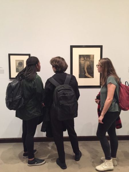
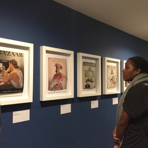
In our next installment of the MA Documenting Fashion NYC trip recap we take on the Metropolitan Museum of Art, specifically a small gallery tucked away by the nineteenth-century sculpture featuring the photographs of Baron Adolph de Meyer in Quicksilver Brilliance, a solo exhibition of his work. The exhibition utilizes the Met’s own holdings of de Meyer’s photographs to create an overview of de Meyer’s career.

As a pioneer of fashion photography, de Meyer’s distinctive Pictorialist approach helped define the genre during the interwar period at leading fashion magazines. Thus, the inclusion of one of de Meyer’s tuxedos is an appropriate addition to the exhibition. The presentation of a pristine 1930s black wool tuxedo which likely comes from Wolf Kahan, a tailor who catered to the artists of Vienna, sets a tone of elegance for the exhibition. De Meyer, a member of the “international set” that defined high society in fin-de-siècle Europe, was considered a beacon of style, writing columns for Harper’s Bazaar and Vogue instructing American women on the latest European fashions.

Adolph de Meyer, “The Silver Cap,” 1909. Gelatin silver print, 1912.

The first photograph in the exhibition that caught my attention was The Silver Cap which as its title suggests, highlights the headwear of de Meyer’s model. The 1909 photograph seems to glitter on its own like an early twentieth-century version of the Kira-Kira app. Indeed, de Meyer was a master of manipulating light, combining a soft focus and a dramatic use of electric light to create a “quicksilver brilliance.” Here, de Meyer’s manipulated lighting captures the texture and luminosity of the fabric to illustrate in the photograph the quality of the textile as if it were in motion.

Adolph de Meyer, “Rita de Acosta Lydig,” 1917. Platinum print.

My other favorite photograph in Quicksilver Brilliance is a 1917 portrait of Rita de Acosta Lydig where de Meyer captures the socialite and suffragette in striking simplicity. I adore the way in which de Meyer renders the subtle contours of his subject’s body and illuminates the confident character of Rita without showing much of her face. To me, the image, which appeared in Vogue, relates the sensual beauty of the female subject and represents a style of photography and posing that dominates fashion photography to this day.

Quicksilver Brilliance presents a charming selection of prints which epitomize de Meyer’s career and highlight the elegant origins of fashion photography. The exhibition is on at the Met until April 8th. 

By Abby Fogle

Lily Visits “Irving Penn: The Centennial” in Paris

The 2017 “Irving Penn: The Centennial” exhibition in Paris is a guaranteed highlight of the Grand Palais’ autumn season programme. Marking the centenary birth of Irving Penn (1917-2009), the Metropolitan Museum of Art, and the Réunion des musées nationaux– Grand Palais, in collaboration with The Irving Penn Foundation, organized one of the most comprehensive retrospective since Penn’s death, and the first of its kind in France.

Irving Penn is regarded as one of the most important photographers of the 20th century. To many, he is most well-known for his portraits of notable societal figures. However, as a ‘Documenting Fashion’ student, I see him as inseparable from 20th century fashion; his name alone conjures up some of the most iconic images in fashion studies. His celebrated fashion photos taken during his time at Vogue including Tobacco on Tongue (1951), Balenciaga Mantle Coat (1950), and The Twelve Most Photographed Models (1947), are all on display in this exhibition.

Lisa Fonssagrives-Penn wearing a Balenciaga Mantle Coat in Vogue, September 1950

This retrospective looks back over Penn’s seventy-year career “with more than 235 photographic prints all produced by the artist himself, as well as a selection of his drawings and paintings.” The exhibition is laid out on two levels, covering a range of genres and themes that were of great importance to Penn’s career. The ground floor starts with his still life and early street photographs taken using his first Rolleiflex in 1938, and spans the 40s to early 60s-era, including his early days at Vogue. The portfolios of Cuzco indigenous people, small trade series and classical ‘portraits of personalities’ are all covered in this period. The upper floor showcases his advertising and personal projects. These ranged from his series of nudes, to cigarette butts and four major series of other detritus, titled: Street Material, Archaeology, Vessels and Underfoot.

The exhibition is successful in showing all these facets of Penn’s career and his wide-ranging interest in subject matter. But truth be told, all these genres and themes can be split into two major categories: objects and humans. And in my opinion, his most interesting photos are still the ones he takes of people, whether it is of fashion models, celebrity portraits, or indigenous villagers. These photographs reveal his instinctive grasp of material, weight, pattern and the tactile quality of a garment. Paired with his knack for posing subjects, Penn’s photographs of people are both visually and psychologically more interesting for viewers.

The Irving Penn centennial exhibition was originally shown this year between April and July at the Metropolitan Museum in New York. Lucky for those in Europe, the same show will be exhibiting at the Grand Palais in Paris until the 29th of January, 2018, before heading to Germany and Brazil.

By Lily Mu

All photos authors own

Louise Dahl-Wolfe: A Style of Her Own at Fashion and Textile Museum

In our last MA Documenting Fashion class before the end of term we discussed ‘women imagining women’ and examined the photography of Toni Frissell and Louise Dahl-Wolfe. Fortunately for us, London’s Fashion and Textile Museum currently has an exhibition of Dahl-Wolfe’s photography. A couple of my fellow MA Documenting Fashion students and I excitedly visited the exhibition together. Louise Dahl-Wolfe: A Style of Her Own appropriately began with an informative wall-text chronicling Dahl-Wolfe’s trajectory from art student to fashion photographer. A small hallway leading into the main exhibition space featured several of Dahl-Wolfe’s Harper’s Bazaar covers from the 1940s and 50s. These were not just prints of Bazaar covers, but the original magazines themselves held in simple white frames. The imperfect state of the worn magazines gave Dahl-Wolfe’s photographs a tangible materiality and reminded me that although her photographs were now presented in a museum context, most images in the exhibition were originally intended for the pages of a fashion magazine.

The main exhibition space began with examples of Dahl-Wolfe’s early photography. Experimental nudes and still lifes reflected Dahl-Wolfe’s training as an artist at the San Francisco Art Institute. I enjoyed how these early works revealed her skill for manipulating light and shadow that would define her fashion photography. These skills are also highlighted in Dahl-Wolfe’s Depression-era documentary style photographs of the residents of Gatlinburg, Tennessee. Influenced by Edward Weston and Dorthea Lange, Dahl-Wolfe began her professional career in 1930. Her photographs of the impoverished community in Gatlinburg were later included in a group photography exhibition at the Museum of Modern Art in 1937.

Louise Dahl-Wolfe,
Halter dress by Brigance, 1954, Palm Beach

In 1936 Dahl-Wolfe became a staff photographer for Harper’s Bazaar where over the next 22 years she would produce 86 covers, 600 color pages, and thousands of black and white portraits.The exhibition featured numerous examples of Dahl-Wolfe’s fashion photography, making it impossible to choose a favorite. Among my favorites however, is the above photograph of a halter dress by Brigance taken in 1954 at Palm Beach. This image exemplifies Dahl-Wolfe expertise in light and shadow, capturing fashions in natural, outdoor settings, and rendering the subject as confident and at ease. As this image suggests, Dahl-Wolfe’s fashion photographs are shockingly modern and the influence of her dynamic images on contemporary fashion photography is astounding.

Arielle and Olivia looking at Dahl-Wolfe’s portraits

In addition to her success in fashion photography, Dahl-Wolfe continually produced portraits throughout her career. The exhibition showcased her portraits of Hollywood stars and cultural figures. Much like the subjects of her fashion images, Dahl-Wolfe’s portraits capture natural poses and the relaxed confidence of her sitters.

An unexpected yet delightful addition to the exhibition was a reproduced set of one of Dahl-Wolfe’s Harper’s Bazaar covers. Sitting on a stepped platform, a mannequin wears a bright yellow, striped 1950s play-suit and matching yellow accessories that stand out against an orange, blue, and green vinyl wall decal meant to replicate the original tiled backdrop of Dahl-Wolfe’s photograph. This scene brings the 1950s-magazine cover to life, once again adding to the materiality of the exhibition. Overall,   the Fashion and Textile Museum’s exhibition beautifully presented Dahl-Wolfe’s stunning photographs and successfully highlighted the photographer’s contribution to fashion photography.

Louise Dahl-Wolfe: A Style of Her Own is on at Fashion and Textile Museum until 21 January, 2018.


Abby Fogle

All photos author’s own

Introduction to the Courtauld History of Dress Journals Archive

The conference Reading Fashion Magazines may be over, but our display of 9 items from the collection is still available to be viewed outside the Courtauld Library vitrines. Please come and visit, before it closes in August. In order to tempt you, you can read the introduction to the display, and our conference, below, available for you to download in a pdf.

Introduction to the Courtauld History of Dress Journals Archive

Some of the earliest fashion magazines in the Courtauld History of Dress Journals Archive are on show in the exhibition. Here, Gazette du Bon Ton, Für die Dame and Pinpoints are displayed.
A view of the 1940s section of the exhibition featuring Harper’s Bazaar and Femina.
Elizabeth and three MA Documenting Fashion students after the completion of the exhibition instal.

Dissertation Discussion: Sophie

Photographs of Parkinson’s Wife, Wanda Rogerson in Robin Muir, ‘Norman Parkinson: Portraits in Fashion’ (London, National Portrait Gallery 2004)

What is your title?

The title of my dissertation will probably still change. However at the moment I am going with How very British: National Identity in Norman Parkinson’s fashion photography for Vogue, 1950-1952. Parkinson produced some stunning images for different spreads, many of which lend themselves really well to a study of British national identity. Delving a little deeper into these specific images, Parkinson’s biography and the history of 1950s Britain has been great fun.

What prompted you to choose this subject?

The topic stemmed from a mixture of previous interests and pure chance. I had no pre-conceived idea of what I wanted to look at for this dissertation. However, I always studied World War II and the Cold War when I had the chance as an undergraduate, so I knew I wanted to stick within that time frame. Couple this with my love of 1950s fashion and elegance, and the random selection of a beautiful book on Norman Parkinson whilst browsing the stacks at the Courtauld and – ta dah! – the dissertation title was born. I had also wanted to be practical about my choice and choose a topic that would enable me to make the most of London based archives. Norman Parkinson has his own in south London (big shout out to the lovely and wonderful people that work there!), so it all came together beautifully.

Norman Parkinson Archive

Most interesting research find thus far?

I believe I read in Parkinson’s book that Irving Penn babysat Parkinson’s son. As you do. No big deal. On a more serious note, I am still continually blown away by how clever his images are. They seem so simple at first glance, and then, the more you look, the more you realise just how good he was in expressing a certain image, feel or identity to a wide range of readers. This was especially interesting with regards to the way in which his photographs for a 1951 South Africa spread differed, or were used in a different way, from the May edition in British Vogue to the July edition in American Vogue. On a side note I have become obsessed with an image that I’m not even using in my essay. It is just too stunning. Everyone- google “Carmen’s Armpit” and you will understand! Or not, in which case it is just my inner dress history nerd coming to the fore…

Favourite place to work?

I would love to say that it is The National Arts Library in the V&A. It surely wins the award for most aesthetically pleasing place to study- but I tend to be freezing cold in there, so sadly it loses out. I rather fluctuate between the Courtauld Book Library and my home. This arrangement provides the perfect balance between the comfort of home (sneaking a couple of biscuits and copious amounts of tea) and the beautiful comradeship between all Courtauld students during dissertation time in the library. We all really share the stress and joys of the process and that is unbelievably valuable as you are working. *Insert cheesy violin music here!*

Courtauld Library

Dissertation Discussion: Harriet

Spot the illicit San Pellegrino

What is your title?

Something along the lines of  ‘Capturing Fashion at Work: Mark Shaw’s behind-the-scenes images of the Paris collections for LIFE magazine in the 1950s’

What prompted you to choose this subject?

Our tutor Dr Rebecca Arnold’s fondness for the work of American designer Claire McCardell (you may thank her for ballet flats, spaghetti straps, separates…) led me to a fine art and textile collaboration she worked on (Picasso prints!) which was photographed for LIFE in the mid-Fifties by Mark Shaw. The Mark Shaw Archive recently popped up on Instagram (@markshawofficial / @markshawlondonsydney), and scrolling through his work – snapshots of Audrey Hepburn, Jackie Kennedy amongst the images – I discovered and became mildly obsessed with his images of models prepping for fashion shows. Amazingly few people have studied backstage images – these days they’re a mainstay of Instagram and Vogue Runway reports during fashion week.

Looking up at the lilac tree

Most interesting research find thus far?

Speaking to Mark Shaw’s daughter in law Juliet across the pond in Vermont and meeting his grandson Hunter in London. Juliet kindly sent me scanned film and contact sheets to pore over – a game changer. Coming across a key quote by Baudelaire (who famously coined the slippery term ‘modernity’) one grey day in the British Library got me pretty excited (#nerdalert).

Favourite place to work?

The National Art Library at the Victoria & Albert Museum for its sheer opulence, or at home in my south London garden in the dappled light beneath the lilac tree. Most libraries don’t allow food or drink, and some days the need for constant cups of tea (and a visiting fellow art historian with a pair of puppies) wins out.

Puppy stress therapy

Highlights from the Courtauld’s History of Dress Journal Archive: Harper’s Bazaar

We are less than a month away from our conference Reading Fashion Magazines: Celebrating The Courtauld’s History of Dress Journals Archive! Upcoming blog posts will offer a sneak peek into ‘Addressing the Courtauld’s Fashion Magazines,’ an exhibition held in conjunction with the conference. Be sure to book a ticket here to see amazing speakers and beautiful magazines. Remember: Digital images are nice, but nothing beats seeing the real thing!


Harper’s Bazaar, October 1940. History of Dress Collections, Courtauld Institute of Art.

This magazine is an October edition of Harper’s Bazaar published nationwide in the year 1940, during the London Blitz. Despite the hardships of wartime, the magazine targeted the female upper classes, which were the only ones with enough purchasing power to afford it. With the costly price of 2 shillings 6 pence, it was a considerable expense that could feed an average family for one day. In contrast to DIY publications, Harper’s Bazaar relies on the desire to emulate the rich and powerful to disseminate latest fashions. With the upcoming winter, the issue centers around the season’s new fashions coming from the capital, presenting a wide array of greatcoats both furless and completely fur-lined, made mostly out of warm wools or commonly available types of fur like squirrel, mole, and rabbit. The effects of rationing clearly influence the choice of images which are plain in their style with scarcely any accessories and minimal display of jewelry, painting a picture of a simple, although fashionable, woman. The practicality of the inside contrasts sharply with the flamboyant cover which is aimed at defying the grim realities of wartime and giving people back the feeling of normality.

Looking closer at the front cover, we can examine it as a historical source from the era, a social history document that tells the historian part of the story of Britain in the 1940s, and more particularly its dress history. A closer inspection may reveal that the colours chosen in such a specific moment in history are not random. The predominant purple tones, which are one of the first elements that catch the viewer’s attention, are historically associated with opulence, richness, royalty and empire. The crispness and silky texture of the sleeve contrast with the other colours of the dress that look as if they are polluted with randomly distributed red dots. The grainy and wooly texture of the material creates an off-focus effect that contrasts with the smooth and well-shaded arm and the sharp colours of the jewellery that richly decorates it. Our gaze is naturally led towards the hand that holds the cigarette, a luxury item that was rationed and reserved mostly for the servicemen at the front. Smoking, at the time, was an activity reserved for the feminine elite, symbolic of the defiance and rebellion against the male culture and male-centred workplace. The model positions herself in a relaxed and mindful manner looking down upon the viewer in an almost spiteful way, suggesting her higher status. This projects an image of power and confidence, a new Britannia clothed in all the riches of the Empire, watchful and confident of her power to withstand the dangers that befell her.

Women Photographers: Spring Term Starts for MA Documenting Fashion

It’s the first class of my MA Documenting Fashion: Modernity, Films and Image in Europe & America, 1920-60 for the spring term on Friday – and we will discuss one of my favourite subjects – midcentury women photographers. Focusing on Louise Dahl-Wolfe and Toni Frissell we will look at the ways their work shaped ideals of femininity, and, importantly, how it connected to shifts within American design – of clothes and magazines.

Both photographers worked in a number of genres, which included documentary, portrait and fashion and it’s interesting to think about their approach to each. For Frissell, her love of natural gesture, and connections between bodies can be seen both in her photographs of college girls leaping with joy in their chic readymade fashions, and her intimate images of soldiers being briefed during the Second World War. For Dahl-Wolfe, a more painterly conception of the textures and space of a composition is always apparent, as well as a love of light and colour that permeates her oeuvre.

Another aspect of their work that I want to discuss with my students is the ways their photographs were used in high fashion magazines – thinking about firstly, the practicalities of fashion photography and secondly, thinking about the readers’ experience of their images. To do this, we will consider their collaborators, including Dahl-Wolfe’s work with Diana Vreeland and Carmel Snow, the costs and difficulties of location shots, and their rivalry – the latter evidenced in letters from Toni Frissell’s archive at the Library of Congress.

By looking at magazine design, we can then situate the images within their original context – how they relate to the text and pictures around them, the size and feel of the magazine and how they ‘spoke’ to readers.

As I said, this is a favourite area of mine, I love learning about the ways women worked, created and collaborated in this period, and I hope my students will also enjoy our seminar, rethinking fashion photography from a number of perspectives.

German Traditional Dress 2.0: Gregor Hohenberg’s Trachten

Cover of Gregor Hohenberg's Trachten
Cover of Gregor Hohenberg’s Trachten. Photo by blog post author.

Trachten (which will here be loosely translated as a term describing German traditional dress) today seemingly only move into the fashion spotlight once a year during the month of October. During this time, two events draw the world’s attention to them: the Oktoberfest (Wiesn) in Munich, where Dirndl and Lederhosen make an appearance all over the city, and Halloween, during which “German Beer Maid” costumes are suddenly advertised widely on the internet, readily available for purchase.

However, both events only highlight very limited facets of the rich variety of Trachten in Germany today- and at that only in a mediated form. The Halloween costumes remove any serious aspects of German traditional heritage, replacing it rather with an overt sexualisation of form by shortening of the skirt and addition of thigh high stockings. Similarly, Lederhosen and Dirndl, mostly associated with Bavaria, are not the only version of traditional dress and are also not as full of the age-old tradition as is widely assumed. Rather, this particular Tracht stemmed from the 19th Century, and is in fact linked to the savviness of Wittelsbacher noble family who used it as a type of branding or marketing strategy to further the feeling of a Bavarian identity.

Pages from Trachten. Photo by author.
Pages from Trachten. Photo by blog post author.

German fashion photographer Gregor Hohenberg has helped to change this rather one-sided representation of traditional dress by producing a marvellous photographic work. It is entitled simply Trachten in German and Traditional Couture in English. Indeed, the English title seems nearly more apt for the role the book takes on: it presents Trachten as high fashion or haute couture. Printed in a large coffee-table-book format, the photographs of the garments shown within the book are made to be coveted and admired; the visual effect of each dress stands in the foreground. Many shots are taken in front of a black background, highlighting the details of stitching, material and fabric. Were the clothes not contextualised in the book with descriptive texts, detailing the history and make-up of each Tracht, the photographs might as well be, to give just one example, of John Galliano’s 2004 Ready-to-Wear collection. The glossy pages and accessibility of the layout, which divides the books into regional chapters, make this book an aesthetically pleasing page-turner.

Page from Trachten. Photo by author.
Page from Trachten. Photo by blog post author.

Yet, vitally, it manages to strike the balance between that often contested dichotomy of traditional versus modern. For example, Hohenberg chose not to use professional models for the shoot. Rather, the actual owners of each dress wear it in the photographs. Some, are further shown in front of houses, farms or walking up mountain paths. This helps to situate the clothes on a more personal level and raises questions of (regional) identity and representation of the individual. Similarly, the inside of the front and the back cover is formed by a landscape shot. The dresses are therefore framed by nature and land itself, and associations with the rural and local still given. Hohenberg thus achieves a remarkable feat; he manages to present the Tracht as current and fashionable, while still maintaining its cultural values and meanings.

Further Reading

Hohenberg, Gregor, and Annett Hohenberg, Gestalten (eds.). Trachten. Berlin: Gestalten, 2015.

Dissertation Discussion: Aric

What is your title?

Madame Yevonde’s Goddess Protraits: Subverting the Surrealist Gaze

What prompted you to choose this subject?

When we visited the National Portrait Gallery in December and the archivist brought out a few of the original prints from the Goddess Series, I knew because of their stunning beauty they would be the topic of my dissertation.

Most inspiring research find so far?

I am really inspired by the depth of care Madame Yevonde took in her creative process. This ultimately resulted in her use of a cutting edge photographic techniques and color printing that created the powerful luminescence of the Goddess Series.

Favourite place to work?

I am not really a library or archive person at heart, so I spend a lot of time working coffee shops and on occasion in my flat.

Madame Yevonde, Self Portrait, 1925.