Tag Archives: Fashion Photography

Fantasy, Nostalgia and Norman Parkinson

Norman Parkinson’s fashion photographs are imbued with contradictions. His ‘action realist’ images juxtapose narratives of fantasy. He pioneered dynamic depictions of women in motion yet excelled in his arrangements of the female body in quiet moments of poised and pensive stillness. Despite Parkinson’s seven-decade career, his contemporary Cecil Beaton credited his ability to reinvent his photographic style ‘according to the necessities of the day.’ However, Parkinson was a self-proclaimed nostalgic photographer, admitting ‘nostalgia is for me one of the great emotions, I have to edit this tendency a bit’. Nostalgia permeates Parkinson’s fashion photography, hidden within his characteristically colourful and energetic compositions, which distinguished him from his contemporaries.

Norman Parkinson, Nicky Samuel, British Vogue, December 1972, chromogenic print, 76.2 x 76.2 cm (1st Dibs)

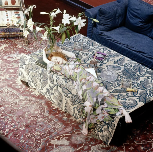
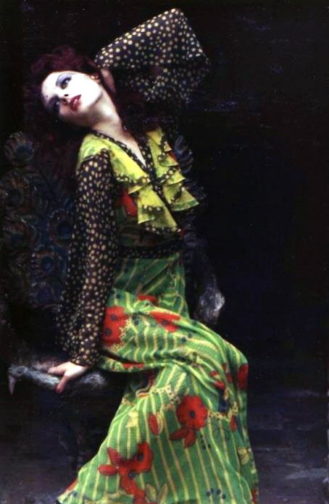
A flame-haired figure with a lily-white complexion, seemingly floating on an ocean of textiles, stretches her limbs as if in a fairy-tale slumber. Nicky Samuel, a socialite and wife to the owner of Granny Takes a Trip boutique, drapes herself across her richly furnished interior space. Parkinson scatters visual clues throughout the composition to create a sense of unease; a corkscrew and two empty glasses perhaps hint to hedonistic over-indulgence whilst also revealing that she is not alone. A discarded copy of Hollywood Babylon (a controversial exposé of Hollywood’s sordid underbelly of sex scandals and mysterious murders) transforms her dishevelled slumber into something more sinister. The lilies that tower over her, inevitably staining her porcelain face with sickly pollen, symbolise both purity and death.

In the late 60s and early 70s, the misty medievalism and mythology of the Pre-Raphaelite Brotherhood, the Victorian art movement, wafted into contemporary consciousness. This nostalgic influence was evidently not lost on Parkinson. The impression of submersion, the floral motifs, Samuel’s Pre-Raphaelite characteristics and the morbid undertones of the composition all call to mind John Everett Millais’s Ophelia. However, featured in British Vogue in December 1972, Parkinson’s image indicates how casually Pre-Raphaelite iconography seeped into fashion contexts from the late 1960s onwards. The similarities between Parkinson’s image of Samuel and Millais’ Ophelia are potentially non-coincidental. Although Pre-Raphaelite art had remained largely unpopular up until its revival in the 1960s, a 1967 exhibition of Millais’s work at the Royal Academy would have brought him, and Ophelia, to the forefront of contemporary artistic culture.

John Everett Millais, Ophelia, 1851-52, oil on canvas, 76.2 × 11.18 cm, Tate Britain, London (Tate Britain)

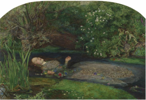
Direct comparisons can be drawn between Samuel and Ophelia. Both are seemingly floating atop a surface punctuated by flowers. While Ophelia’s saturated gown drags her into the watery abyss of death, Samuel’s heavily patterned chiffon dress, designed by Ossie Clark and Celia Birtwell, drowns her body in bold tulips and pulls her deeper into the ripples of patterns. Like the Pre-Raphaelite Brotherhood’s ‘truth to nature’ philosophy, Parkinson was ‘not interested in anything that nature hasn’t smiled upon’, and he was reluctant to retouch his prints. Parkinson’s ability to capture the wider nostalgic resurgence of Pre-Raphaelite art in the 60s and 70s infuses his composition with a desire to return to a realm far removed from the synthetic modernity of post-war Britain. Yet, despite the arguably sinister undertones of Parkinson’s composition, there is something comforting in Samuel’s doll-like appearance and the ease of her lethargic pose.

Parkinson’s childhood memories of time spent in the countryside, espying ‘girls with loose dresses and a minimum of underclothes…lying around the lawn with languorous ease’ potentially informed his depiction of Nicky Samuel. Parkinson himself attests to this, stating that, throughout his career, ‘I photographed the memory of those well-observed weekend girls that I had seen through the fence’. This indicates that Parkinson’s photography is consciously informed by his nostalgic, and perhaps voyeuristic, tendencies.

Robin Muir argues that Parkinson ‘effortlessly transferred the spirit of neo-romantic pastoralism into a resolutely urban environment’. This is perhaps applicable to his depiction of Samuel, given that she is situated within her Chelsea home. Parkinson’s ability to bring the outdoors into the domestic realm conveys a suspension of reality. Parkinson himself claimed that ‘if you are going to be an artist – even a photographer – I think you have to major in fantasy.’

Norman Parkinson, Floating with Flowers, British Vogue, 1956, chromogenic print, 66 x 66 cm (Sotheby’s)

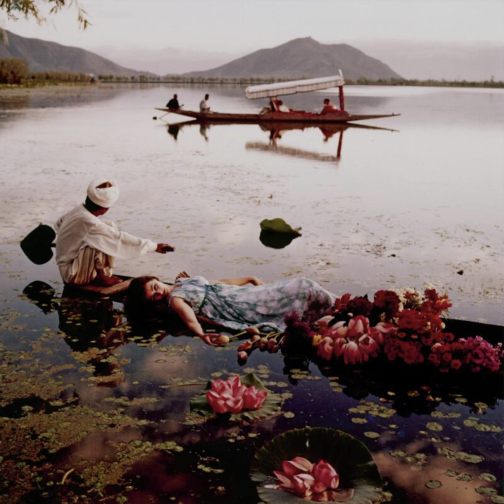
Furthermore, Parkinson’s portrayal of Samuel also mirrors his image from a 1956 location shoot in India for British Vogue. Like Samuel and Ophelia, model Barbara Mullen lies atop a watery expanse, in this case Dal Lake in Kashmir, laced with tulips, lilies and other exotic flowers. The dappled sunlight on the otherwise pristine surface of the lake reflects the clouded pattern of her dress. Yet, like Millais’ Ophelia, there are morbid undertones to this image. Mullen’s indifferent gaze into the middle distance and her partial submersion render her body totally passive. The boat on which she lies is obscured by, and overflowing with, flowers, which perhaps calls to mind a funeral boat. However, this image epitomises Parkinson’s excessively glamorous overseas fashion shoots in a time when long-haul travel was still fledgling.

Parkinson’s saturated use of colour is also notable. It wasn’t until the mid 1970s that he was working almost exclusively in colour, and this vibrant image from 1956 would have been situated among the largely black and white pages of British Vogue. Parkinson himself stated ‘I’m sure all the best photographers use black and white, but… I dream in colour…for me colour has always held more magic,’ which further hints to the degree of fantasy that underlined much of his work.

In his depiction of Nicky Samuel, Parkinson’s composition not only embodies the nostalgic fascination with the Pre-Raphaelites that resurged during the late 1960s, but also his nostalgic twinge for his idyllic childhood and his own photographic oeuvre.

By Claudia Stanley

Sources:

Anon., ‘Precious Original: Augustus John’s Chelsea Studio Regenerated by Nicola Weymouth’, British Vogue, No. 15, Vol. 129 (London, December 1972), pp. 128-129

Louise Baring, Norman Parkinson: A Very British Glamour (New York, 2009)

Robin Muir, Norman Parkinson: Portraits in Fashion (London, 2004)

Lucy Paquette, ‘James Tissot and the Revival of Victorian Art in the 1960s’. The Hammock (July 2004) https://thehammocknovel.wordpress.com/2014/07/31/james-tissot-and-the-revival-of-victorian-art-in-the-1960s/ accessed 29/03/22)

Norman Parkinson, Lifework (London, 1986)

5 Minutes With…Claudia Stanley

We’ve been busy working on our dissertations, so we’re taking the opportunity to get to know the current MA Documenting Fashion students. Here, Claudia discusses Ossie Clark, military peacocks, and what artists wear.

What is your dissertation about?

My dissertation centres around how temporality and nostalgia manifested in the designs of Ossie Clark and textile designer Celia Birtwell during the retro-mania of the late 1960s and early 1970s. From his seductive, transparent garments (often worn without underwear) to his hyper-feminine bias cut dresses, Clark was able to reflect contemporary notions of progressive female sexuality whilst simultaneously referencing past art movements and designers. Ranging from the Pre-Raphaelites to 1940s fashion, Clark and Birtwell’s past influences also translated into the fashion photography of their collaborative creations.

Celia Birtwell, Gala Mitchell in an Ossie Clark Dress with Celia Birtwell’s Acapulco Gold print, 1969

My virtual exhibition also focused on Ossie Clark, where one section, ‘Modern Retro’, sought to display the influence of history on Clark and Birtwell in an era of self-conscious modernity. I based my exhibition in Chelsea Town Hall, where Clark held some of his theatrical and often shambolic fashion shows. By the end of the project, I could really visualise the space and how the exhibits (and my imaginary visitors) would interact with each other.

Ossie Clark fashion show, Chelsea Town Hall, 1970

I wanted to convey the impression of an immersive, multi-sensory experience, where people could flow freely through the space. My visitors would be given headphones which would react to each display, playing music to coordinate with each exhibit. I hoped to create a solo, silent Ossie rave to help transport visitors to Swinging London. Having scratched the surface in my virtual exhibition, it’s been really interesting delving deeper into themes of history and continuity in my dissertation research.

What is your favourite dress history photograph?

To save this from turning into an Ossie Clark rant, I’ll opt for one of Horst P. Horst’s neoclassical images, featured in Vogue from September 1937. The model, adorned in a silvery gown by Madeleine Vionnet, seems to simultaneously embody a classical goddess and a modern woman. Posed to statuesque perfection, her bejewelled wrists, held above her modestly lowered head, are clasped together like the fastening of a necklace, metamorphosing her iridescent body into a precious pendant. Alternatively, the vertical pleats of her dress could also transform her into a Corinthian column. The outline of her thigh shimmers under the studio lights, hinting at the sensual body beneath. I love how tactile this image is. Just from looking at it, we get a sense of exactly what it would feel like to wear this dress and to have each delicate pleat ripple across the body.

Horst P. Horst, Sonia wearing a Vionnet dress, Vogue, 15 September 1937, Condé Nast

What is your favourite thing that youve written/worked on/researched this year?

I really enjoyed my essay on how military uniform was appropriated by The Rolling Stones and The Beatles in 1966 and 1967. The fact that such archaic and hyper-masculine garments were incorporated into progressively androgynous, peacocking menswear reveals an interesting point of tension in regards to modernising masculinity. The Beatles and The Stones arguably brought this counterculture style of dress to the forefront of contemporary consciousness, asserting their flamboyant individuality, which, ironically, created an impression of uniformity within, and between, both bands.

Gered Mankowitz, Keith Richards, Wasted, 1967, Gered Mankowitz Collection

What is your favourite thing youve read this year?

Charlie Porter’s What Artists Wear is something that I keep coming back to (mainly just to flick through the pictures). Porter highlights how the physical intimacy of clothing offers a more personal perspective on world famous artists, from Louise Bourgeois wearing her own latex sculptures, to Frida Kahlo’s politically-charged adoption of, and self-documentation in, men’s suits. I enjoyed how Porter centres debates around female artists’ bodies, which have been historically restricted by clothing. Dress has the destructive potential to limit bodily autonomy and, by extension, creative output. Yet, at the same time, dress becomes a canvas on which artists express themselves, a means to connect with viewers of their work, as well as autobiographical evidence of their life. It really makes you question what you choose to wear.

Frida Kahlo, Self-Portrait with Cropped Hair, 1940, MoMA, New York

What are you wearing today?

I wish I was wearing my Anna Sui charity shop find (it’s either a short dress or long top, the jury is still out). Sui is an admirer of Ossie Clark’s work, and the clashing purple floral patterns could have been inspired by Celia Birtwell’s prints, and the flowy sleeves and handkerchief hem are quite Ossie-esque. It’s been fun wearing this to get into character to write my dissertation. I would have worn it over mauve flares, also from a charity shop, and my pistachio-green cowboy boots, you guessed it, from Shein. I jest. They’re from Oxfam.

What I’m actually wearing is an old Breton-striped top of my mum’s which is literally falling apart at the seams, old baggy shorts, and a straw cowboy hat. I look like a distressed, marooned gondolier. For context, I’ve been hacking away at my dissertation in the garden, not that that excuses my dishevelled appearance. Oh, and I’m also sporting some men’s clogs that have become communal gardening shoes. My tortoise is affectionately head-butting one clog as the opening act of his mating ritual. Aside from that, he’s been a very devoted research assistant. He’s wearing his custom-made tortoise-shell print shell suit which I’ve never actually seen him take off…

By Claudia Stanley

Seeing in Technicolour: The (Un)dressed Body Brought to Life

IMAGE 1 Technicolour
Edward Steichen, Cover of Vogue. July 1, 1932. Courtesy Condé Nast. © 2014 The Estate of Edward Steichen/Artists Rights Society (ARS), New York

As coloured photography started to seep into the pages of Vogue during the 1930s, it shifted the ways in which fashion consumers and spectators appreciated the dressed body. Simultaneous to this technological progress of fashion magazines was the modernisation and arguable liberation of the body itself. The first in-colour Vogue cover by Edward Steichen in July 1932 attests to this. Playfully raising a beach ball above her head, the model is sporting red swimwear with a white belted detail to emphasise her lean frame, and a white cap. Mirroring the colours of her ball, her vibrant body juxtaposes the gradated blue sky that upwardly intensifies behind her. This is an image of colourful contrasts; red stubbornly clashes with blue, white breaks up the composition, and even her shoes are two-toned. The depth of the colours evoke a sense of warmth and humidity. We can only hope to be transported to where she is and to look as chic as she does in a swimming cap. Perhaps buying Vogue will help get us there…

Although shot indoors in the studio using a 108-inch plate camera that Condé Nast insisted his photographers work with, Steichen’s lighting techniques evoke summer evening sun. This convinces the viewer that the model has spent an entire day of leisure and sport at the beach. The connoted low sunlight highlights the contours of the model’s armpits, her toned arms, wrist tendons, sharp elbows, the dents on her knees and the overall sculptural quality of her tanned body. The white segment of the beachball that orbits her athletic frame evokes a waning crescent moon, perhaps signalling that dusk is approaching. Her shadowed face creates a canvas of anonymity onto which the Vogue reader can project themselves. We can see that she is smiling in unapologetic enjoyment. Her averted gaze suggests that she is unaware of being watched, or even being photographed in an inorganic, staged setting.

Aside from a hint of feathery eyelashes, her body is totally hairless, stressed by the cap that protects her hair from seawater and the unrelenting sun. This evokes the smooth, marble-like texture of her skin. The primary colours evoke a sense of childish playfulness; this is a woman unshackled by social convention or responsibility. She embodies care-free leisure as well as women’s progressively and fashionably active lifestyles. Having been exposed to this vibrant image, it is hard to imagine what her body, or the overall composition, would look like in black and white.

IMAGE 2 Technicolour
Harper’s Bazaar, June 1939, New York Vol. 72, Iss. 2724, pp. 60-61, Proquest

Harper’s Bazaar’s swimwear editorial from June 1939 stands in stark contrast to the highly saturated cover of their rival Vogue. Shot in black and white, the models’ skin takes on the luminosity of classical marble statues. Unlike the evocation of the setting sun in Vogue’s cover, here we get a sense of bright moonlight illuminating exposed flesh. In the image on the left, a woman stands with her back to us, reflecting the pose of the statue situated in the centre of a pool within a secluded wood. This mirror-image establishes a direct connection between woman and sculpture, as if the touch of moonbeams has metamorphosised her from antique marble into living, breathing flesh. Her closed-off body language could suggest that she senses she is being watched in this intimate moment of midnight bathing. The article reads ‘five bathers beside the moonlit pool, four of flesh and blood, one of stone’, which heightens the idea of mythical transformations.

The model’s striped swimsuit takes on a silvery quality and the low scooped back exposes the gentle curvature of her spine. The image on the right depicts three more models poised tentatively on the edge of the pool. They resemble mythological nymphs bathing out of view of mortal eyes. Their poses are fairly natural; their bodies have not been manipulated to cater to the male gaze, perhaps explained by the female photographer Louise Dahl-Wolfe and the predominantly female readership of Harper’s Bazaar. By presenting the female body at different angles, it offers a three-dimensional, sculptural appreciation of the body as well as a well-rounded impression of the swimwear. Their toned bodies highlight that these are active, modern women. There lingers a sense of seclusion and privacy through the implicit separation from the male gaze. Fashion magazines including Vogue and Harper’s Bazaar promoted exercise regimes linked to classical ideals of athleticism, which were often untaken in separation from men. This image potentially evokes this secure seclusion away from prying eyes. In this instance, even when women are depicted as active and exercising, they still retain a sculptural quality. Perhaps if this image had been captured in colour, it would imbue their statuesque bodies with vitality and thus reflect the cultural shift towards women’s more dynamic and active lives.

By Claudia Stanley

Sources:

Rebecca Arnold,Movement and Modernity: New York Sportswear, Dance, and Exercise in the 1930s and 1940s’, Fashion Theory, vol. 12, no. 3 (Oxfordshire, 2008), pp. 341–57, https://doi.org/10.2752/175174108X332323

Susanna Brown,Introduction: Inventing Elegance, Horst: Photographer of Style, exhibition catalogue, Victoria and Albert Museum (London, 2014), pp.11-21

Harper’s Bazaar, June 1939, New York Vol. 72, Iss. 2724

Zooming In On Margaret Bourke-White

A little while back, I stumbled across Margaret Bourke-White whilst looking up 20th Century female photographers, discovering her work among others such as Germaine Krull and Grete Stern. It goes without saying that each of these women were respectively brilliant at working behind the lens, and each are deserving of a writeup, but I was especially drawn to Bourke-White’s photographs of Marina Semyonova (fig. 1).


Ballet
Figure One: Marina Semyonova by Margaret Bourke-White. Photo: MOMA


Taken at the Bolshoi Theatre in Moscow, this photo shows Semyonova – the first Soviet-trained prima ballerina – preparing herself ahead of a ballet performance. Semyonova’s body is folded into itself, revealing the physical contortions and movement required of her in order to reach and tie her ballet shoes. Her posture is considered, and the chair acts as a prop to help elongate her body and better display her ballet shoe all the while creating a tension between her body and the billowing tutu which surrounds her and presses upon the back of the chair. Semyonova is artfully staged, and her pose emulates the exaggerated stillness of the photographic form, reinforcing the expectation for ballerinas to always appear elegant, not just during a performance. Her left leg is deliberately aligned in a nod to her profession, recreating one half of the en pointe position and her outstretched arms provide an extension of the en pointe motif. This creates a clear shot for which Bourke-White could effectively capture Semyonova, allowing Bourke-White to play with light to illuminate Semyonova’s body and project a shadow onto the far wall.

With that said, what I found most appealing about this photo, is despite this photo having an editorial-like feel, the loose threads on Semyonova’s ballet shoes offer a reminder of the countless hours of practice required to become a ballerina, displaying the real-life implications of such a profession. This suggest that whilst Semyonova displays poise and elegance, these attributes have been mastered over time. However, the loose threads could also be linked to the USSR in relation to its second five-year plan which sought to prioritise agricultural and self-sufficiency ahead of consumer goods and frivolity, and the loose threads thereby reveal the unravelling of previous political and cultural practices.

Through considering such a beautiful photo, I wanted to discover more about Bourke-White’s work, particularly as this photo was taken during the political unease of the Soviet Union. My research revealed that Bourke-White excelled as a photographer and whose accomplishments were plentiful. Born in 1904, Margaret Bourke-White would go on to set up her own photography studio in 1928 in Ohio, but her work would soon take her abroad, namely to the likes of Russia, South Korea, India and Pakistan where she was commissioned to document moments of political divide, wars and social unrest.

To name but a few of her impressive feats, Bourke-White was the first US photographer to enter the Soviet Union, the first US accredited female war photographer during WWII and responsible for the first cover for LIFE Magazine (fig. 2).


Life
Figure Two: Cover of ‘LIFE’ Magazine (23 November 1936). Photo: ‘LIFE’ Magazine Archives via Google Books.


This cover highlights Bourke-White’s unique ability to take an imposing architectural structure and create a striking and an arresting image. She was commissioned to photograph this multi-million-dollar project of the Columbia River Basin and the construction of its impressive dam. The angle at which Bourke-White captured this photo and its emphasis on the symmetry of each of the concrete structures makes them appear – at least in my mind – as gigantic chess pieces bearing a similarity in shape to the ‘Rook’, with the two individuals symbolically positioned as pawns within this almighty chess board. The vibrant orange of the cover contrasts with the black and white image, at once cropping and framing the two individuals stood at the foot of the structure. The shot appears to reinforce the idea that these structures are in fact man made, with the two individuals attesting to the labour required to build such structures, and yet conveys the structures as colossal, unnatural, and otherworldly. Indeed, the editors notes that in commissioning Bourke-White they unexpectedly received, ‘a human document of American frontier life which, to them at least, was a revelation.’ This very observation highlights the talents of Bourke-White, and her ability to capture life within an otherwise intimidating concrete structure. This style of photography also calls to mind El Lissitzy and his photomontages for the SSSR na stroike (trans: USSR in construction) in 1932, with the overall global emphasis on self-sufficiency, driven by its workforce, who become the centre of El Lissitzy’s photomontage (fig. 3). This theme is echoed in Bourke-White’s photography, and the two share similar aims in trying to establish the strength of their respective cities and nations. To this effect, Bourke-White’s photography could be considered an artistic response to Constructivist periodical layouts and El Lissitzy’s earlier work.


USSR
Figure Three: Photomontage of SSSR na stroike (trans: USSR in contruction) by El Lissitzky. Issue 10 (1932). Photo: Bookvica.


The final photograph I would like to discuss is a self-portrait, rumoured to be Bourke-White’s favourite self-portrait, made with the U.S. 8th Air Force in 1943 (fig. 4).


Self-Portrait
Figure Four: Margaret Bourke-White’s self-portrait made with the U.S. 8th Air Force in 1943. Photo: The LIFE Picture Collection/Shutterstock.


In a similar vein to Bourke-White’s cover for LIFE Magazine, this photo marries machinery and industrial elements with humanity. While the airplane’s jets have been switched off, this photo conveys the necessity to be on constant standby, responding to any changes quickly and efficiently. Bourke-White has a tight hold of the large camera, figuratively and literally held down by the camera, and carries her flying helmet and goggles in her other hand with comparative ease. To this effect, this photo is suggestive of the precarity of the war and the need to be on constant alert as well as Bourke-White’s role to document the events. This is further reinforced by the inclusion of the plane in the frame – its proximity reinforces the fact that it is only a matter of time before this unit needs to reembark the plane.

At the same time, Bourke-White’s stance is relaxed yet upright, smiling as the wind blows through her hair. The tongues of her shoes are flopped over, giving the impression of a rare moment of respite, reinforced by the fact that their surroundings appear bare and uninhabited, suggesting a minimised threat or danger. The aviator jacket is fit with shearling trimmings, and complete with matching trousers, also lined with shearling, featuring leg-long zips and stained with a white powder residue. The crease patterns, particularly on the trousers, suggest the cramped conditions of the plane and it would appear as though Bourke-White has barely stepped off the plane. While her stance is relaxed, and she is surrounded by an expansive empty landscape, the trousers act as her ‘second skin’ and become a reminder that she did not have the luxury of space a few moments ago, and the trousers have not yet and will not likely get the chance to mould to their new surroundings, complete with the luxury of space, or Bourke-White’s standing pose.

Sadly, Margaret Bourke-White contracted Parkinson’s disease in 1953 and completed her last assignment for LIFE in 1957. With that said, she displayed great determination in trying to overcome the symptoms of her Parkinson’s, undergoing risky surgeries, and in true documentary photographer style, publicised and documented her fight against the disease, cementing her status as a formidable character and individual (fig. 5). She sadly passed away in 1971 but while her career was cut short by Parkinson’s, Bourke-White was rightly recognised in her lifetime as a true pioneer in documentary photography, particularly as a female photographer for her ability to uniquely capture people and places in and amongst periods of great change, showcasing their struggles and strengths.


Bourke-White
Figure Five: A nurse aiding photographer Margaret Bourke-White during a therapy session by Alfred Eisenstaedt. Photo: The LIFE Picture Collection/Shutterstock.


By Georgina Johnston-Watt

Sources:

https://books.google.co.uk/books?id=N0EEAAAAMBAJ&printsec=frontcover&hl=fr&source=gbs_ge_summary_r&cad=0#v=onepage&q=margaret&f=false

https://www.bookvica.com/pages/books/1291/el-lissitzky-and-his-photomontages-sssr-na-stroike-i-e-ussr-in-construction-10-for-1932

https://www.life.com/history/great-lady-with-a-camera-margaret-bourke-white-american-original/

https://www.life.com/lifestyle/parkinsons-disease-life-magazine/

Looking Through the Lens of Madame Yevonde

I recently found myself sifting through self-portraits by women photographers in a not very coherent bout of research on the National Portrait Gallery website. I didn’t find exactly what I had been looking for, but I did find something much better – this photo of Madame Yevonde (fig.1).

Madame Y
Fig. 1. Madame Yevonde by Madame Yevonde (1967). https://www.npg.org.uk/collections/search/portrait/mw58111/Madame-Yevonde?sort=dateDesc&LinkID=mp06547&role=art&displayStyle=thumb&displayNo=60&rNo=40


This photo caught my eye, and made me smile, when I had been otherwise stuck in a trance of endless scrolling. Her smart chequered suit, upright pose, and jaunty hat scream pride in herself, her work, and a humorous relationship between photography and portraiture. Editing of the image has rendered her miniature besides her huge vintage camera, an ode to her earlier portrait studio and a recognition of the many decades she had spent in the industry.

After seeing such a joyful, humorous, and enigmatic portrait, I had to look into Madame Yevonde’s work further. I want to share some of the wonderful images I have found, and generally indulge in Madame Yevonde’s personality-filled work for a while longer.

Born in 1893, Yevonde Philone Middleton was a photographer, primarily taking studio portraits, for an impressive portion of the twentieth century. Known professionally as Madame Yevonde, she opened her first photography studio in 1914 at the age of 21 and continued to work until a few months before her death in 1975.

There always seems to be something eye-catching or dramatic about Madame Yevonde’s photography. Her main mastery was in the VIVEX colour process, which allowed her to produce vibrant and lustrous colour shots. Her portrait of Vivien Leigh (fig.2) demonstrates this perfectly. The punchy red of the background emboldens Leigh, her red lip and scarf connecting her to the red reflections of the light, and her green top bringing her strongly into the foreground. Her face is lit from one side, drawing attention to the outline of her face, and contours of her nose and cheeks. It’s the sort of photo that makes you stop and look twice.


Madame Y 2
Fig. 2. Vivien Leigh by Madame Yevonde (1936). https://www.npg.org.uk/collections/search/portrait/mw11846/Vivien-Leigh?LinkID=mp06547&role=art&displayStyle=thumb&displayNo=60&rNo=2


The next photo that jumped out to me was the portrait of the Hon. Mrs James Beck as Daphne (fig.3), a part of Madame Yevonde’s Goddesses series. Inspired by a society charity ball with an Olympian theme, Madame Yevonde made a series of portraits of society women dressed as goddesses in 1935. The abundance of leaves represent Daphne’s transformation into a Laurel tree in Greek mythology. The leaves cast a distinctive shadow across Mrs James Beck’s face, as if they are reaching across her and we are seeing Daphne mid-transformation. The shadows are tinted green in a way that the real leaf shadows would not be (they are not translucent), reminding us that this is a manufactured portrait, a piece of art.


Madame Y 3
Fig. 3. The Hon. Mrs James Beck as Daphne by Madame Yevonde (1935). http://www.users.waitrose.com/~felice/image4.htm


The solarised portrait of Dame Dorothy Tutin (fig.4) shows another style Madame Yevonde was adept at. The solarised image brings far more texture to the portrait, particularly allowing Tutin’s ruffled hair to stand out. The darkness of her plucked eyebrows draws our attention to her serene facial expression. The contrast across the wide collar of her top gives her a regal presence. I think this portrait is one of the most characterful that Madame Yevonde produced. The solarised effect gives insight into the formality, poise, and elegance that Tutin is able to project, whilst also highlighting the relaxed side that is hinted at by her haircut.


Madame Y 4
Fig. 4. Dame Dorothy Tutin by Madame Yevonde (1955). https://www.npg.org.uk/collections/search/portrait/mw144366/Dame-Dorothy-Tutin?LinkID=mp05851&role=sit&rNo=2


I hope to have shown you a glimpse into the wonderful world of Madame Yevonde’s photography. Through skilful manipulation of colour, props, photographic effect, and lighting, Madame Yevonde is able to create bold images that are still able to catch my eye, even in today’s image-saturated world.

By Megan Stevenson

5 Minutes With… Violet Caldecott

As it nears the end of term, we’re spending some time getting to know the current MA Documenting Fashion students. Violet discusses James Barnor, the Swinging Sixties, and photography as a means of resistance.

What is your dissertation about?

I wrote my dissertation on British-Ghanaian photographer James Barnor and his capturing of Black Britain in the 1960s. I first came across his work in February when I saw his image Wedding Guests (below) on Pinterest. I was struck by the innate poise of the two female subjects, who in their meticulous attire and polished appearance, are the epitome of 1960s cosmopolitan glamour. I love the quietly revolutionary quality of his images. Whilst they are not politically or racially charged on the surface, in their depiction of everyday people, posing amongst the streets of London, they would have proved extremely powerful in both contemporary and post-colonial contexts. There is a retrospective of his work on at the Serpentine Gallery at the moment. Very fortuitously, it opened two weeks before my dissertation was due. It was incredibly exciting to see his images in the flesh. The show has been really beautifully curated, illuminating the multi-dimensionality of Barnor’s work through a diverse range of images from his six-decade career.

James Barnor, Wedding Guests, London, 1960, Photograph © Autograph ABP 

Who is your favourite designer?

Ossie Clark. I love the elegant cut, drape and flow of his pieces. Born in Liverpool in 1942, Clark quickly became known as a pioneer of London’s Swinging Sixties cultural revolution.  His designs offered a more romantic alternative to Mary Quant’s short hemlines, block colours and geometric prints. I came across a silk co-ord designed by him in a vintage boutique on the Portobello Road a couple of weeks ago. Consisting of a pair of billowing high-waisted trousers and a short-sleeved Peter Pan collar top, cinched in by a silk sash at the waist, it is my dream ensemble. The cut and fit are far superior to any item of clothing that I have ever worn. Perfectly proportioned and meticulously tailored around the waist and shoulders, I feel as if it was made for me. Clark really understood the female form. My dream is to become a collector of his pieces.

Ossie Clark with Gala Mitchell c. 1960s, Ossie Clark with Judy Guy Johnson and Patti Boyd c. 1960s, accessed via AnOther Magazine

Favourite dress history photograph?

This is a tough question as I have so many. But with regard to dress, the image which I find myself coming back to is the photograph Neil Kenlock took of Olive Morris in 1973. Morris was a political activist and community leader, known for the part she played in the Squatters Movement and her founding of the Brixton Black Women’s Group in 1973. Very sadly, she died aged 27, but in her short life, she achieved an incredible amount. In this image, there is a real sense of her presence as an individual. In faux jacket, worn jeans and assortment of bangles, she appears confident and at ease. It possesses a snapshot quality with the viewer a voyeur looking in at an intimate moment in this remarkable woman’s life. She smokes a cigarette as she huddles by the electric radiator to keep warm. It seems like there is an interaction between her and Kenlock as she beams leaning slightly towards the camera. I love the idea of photography being a collaborative venture between the subject and photographer, with the viewer is privy to the intimacy of their relationship.

Neil Kenlock, Olive Morris, London, 1973, Photograph © National Portrait Gallery, London 

What is your favourite thing that you’ve written/worked on/researched this year?

In the first semester, I was introduced to the concept of photography as a means of resistance, and within this, the role clothing has played as a means to self-fashioning identities for oppressed groups within society. This fuelled an interest in Stuart Hall’s ‘politics of representation’ which I have applied to different periods and in varying contexts throughout the year. My first essay was on Harlem Renaissance portraiture and how the representational power of the genre was harnessed by various artists of the period to illuminate the complexity and multi-dimensionality of being African American at this time. I was particularly drawn to James VanDerZee’s studio portraits of glamorous young Harmelites. Posing in elegant 1920s clothing against elaborate backdrops, they drew together the different fragments of their diasporic identity in one visual narrative. I’m fascinated by the concept of the tiniest sartorial details having the most significant meaning to the individual and how this can translate to the outside eye.

James VanDerZee, Couple, Harlem, 1932 © Museum of Modern Art, New York
 
Sources
Carol Tulloch, The Birth of Cool (London: Bloomsbury) 2016


Yva and Helmut Newton: Haptic Seeing

Last week, I watched Helmut Newton: The Bad and The Beautiful. This candid biopic explores Newton’s complex legacy as a photographer through a series of his most provocative images and interviews with the women who featured in them. Amongst Newton’s iconic shots of Claudia Schiffer, Charlotte Rampling and Marianne Faithful, I found myself struck by a grainy black and white photograph hanging on the wall of his New York apartment. A cropped shot of a woman’s legs in stockings, dramatically illuminated against a dark background, it is an evocative rendering of the female form. Whilst it possesses the same sensual quality as Newton’s photographs, it is not his work. It was taken by Else Neulander Neuman, otherwise known as Yva, the Weimar photographer who had mentored Newton in the early days of his career.

From Gero von Boehm’s Helmut Newton: The Bad and The Beautiful, 2020

Yva was a leading photographer in Berlin in the 1920s and 1930s. Inspired by the creative atmosphere of the Bauhaus, Objectivism and German Expressionism movements, she used theatrical lighting and clean geometric lines, to create a sophisticated and refined image of glamour. In the male-dominated sphere of fashion photography which often propagated a sexualised model of femininity, her elegant and allusive photographs of women provided a refreshing outlook on female beauty.

Woman in Dress, 1933, Accessed via: Instagram: @noirmelanie
Two women in Coats, 1935, Accessed via: Instagram @documenting_fashion

Yva’s most iconic images were her stocking advertisements. Using close-cropped shots and theatrical lighting, she put the focus on the texture of the garment and immersed the female viewer in an act of ‘haptic seeing’. The photograph which Newton had hung on his wall was from an advertisement she shot for UHU in 1929 titled Schöne Beine in schönen Strümpfen (Beautiful Legs in Beautiful Stockings). The dramatic lighting of the woman’s legs against the nebulous dark background serves not only to highlight the form of the woman’s knees, shins and ankles, but also to emphasise the contrast between the grainy texture of the mass-produced stockings and the soft satin of her shoes. In its rich and sensuous depiction of the different textures, it encourages the women to imagine themselves wearing the stockings, with the visual focus not solely on the leg, nor solely on the stocking, but rather on the relationship between the item of clothing and the body. Yva’s photographs for magazines such as Die Dame and Elegante Welt provided a feminine perspective of products, engaging with female consumers’ sense of sight as well as touch.

Schöne Beine in schönen Strümpfen’, Yva, for UHU Magazine, 1929 Accessed via: Instagram @documenting_fashion
Shoe, Monte Carlo, 1983, Helmut Newton, Accessed via: Instagram @noirmelanie

Looking at Yva’s work, I have come to understand Newton’s photography in a different way. As shown by the stocking advertisement he had hung in his flat, he drew inspiration from her use of ‘haptic seeing’ to immerse the women in a multi-sensory experience of the latest fashions. Although he was not a woman, having understood the world through Yva’s eyes and indeed lens, he created photographs which spoke directly to the female consumer and her needs and desires.

By Violet Caldecott


Sources:

Belting, Hans, ‘The Transparency of the Medium: The Photographic Image,’ in An Anthropology of Images: Picture, Medium, Body (New Jersey: Princeton University Press, 2011)

Hatton, Hayley, Yva: shattered vision, The tragic hidden legacy of one of history’s most visionary photographers, Dazed and Confused, July 2008

https://www.dazeddigital.com/artsandculture/article/20704/1/yva-shattered-vision

Ganeva, Mila, Fashion Photography and Women’s Modernity in Weimar Germany: The Case of Yva, NWSA Journal, 2003-10-01, Vol.15 (3) (Baltimore: Indiana University Press: 2003)

Van Deren Coke, Avant Garde Photography in Germany, 1918-1939 (Pantheon Books: New York, 1982)

The John Cole Fashion Photography Archive

As Andrew Bolton, Head Curator of the Metropolitan Museum of Art’s Costume Institute once said in a Vogue documentary, ‘Your memory of fashion is fashion photography.’

I love fashion photography. I have collected magazines ever since I was little, when my mother and I would spend hours looking at the pretty glossy pictures. It was my interest in fashion photography that led me to the Documenting Fashion course at The Courtauld. An entire course on fashion imagery? I knew immediately that this course was for me. Reflecting upon my year at The Courtauld as it is coming to a close, I believe that one of the most important things I have learned is to appreciate the depth of fashion photography, as a fashion photograph can be much more than a visually pleasing image. I have learned that fashion photography has the potential to shape our attitudes towards our identity, our society and our culture. But fashion photographs are not only expressions of our visual culture: they are first and foremost expressions of our desires. We can come to see the world through the knowing eye of the fashion photographer, who instinctively captures seminal moments and has the ability to immortalise certain fashion designs.

I was convinced until this year that Google Images and my stack of old magazines were my best bet when it came to looking at old fashion photographs. I have since discovered the existence of a plethora of rich fashion photography archives, many of which have greatly helped me with my research throughout the year. The most recent archive that I have discovered is that of fashion photographer John Cole (1923-1995).

John Cole at work at Studio Five.*

John Cole began his career as a fashion photographer in the 1940s and opened his first studio in Mayfair in 1956. The studio, called ‘Studio Five’, attracted photographers who would rise to great prominence in the fashion industry—one such photographer, David Bailey, would eventually work for British Vogue. 

John started taking fashion photographs in the early 1940s when working for Gee & Watson and Hugh White Studios. He took many photographs for the original Tatler & Bystander magazine which was owned by the Illustrated London News; he also took photographs for Britannia & Eve magazine.

John was a very prolific photographer whose photographs were used for many adverts in a wide range of publications. At Studio Five, he took photographs for Hairdressers Journal, Flair Magazine, The Sunday Times, Daily Mail, The SUN, the Daily Express, Evening News, Evening Standard and The Guardian. Throughout the 1970s, Country Life ran a fashion section for which John was the main photographer. 

John’s many years of experience, both in the darkroom and on set watching other photographers at work, would eventually allow him to master his own techniques—such as lighting. As stated in an article from 1962, John was ‘someone at the top but always willing to learn.’ If he wasn’t using tungsten lighting, he was working with the natural daylight that poured in through the two roof windows at Studio Five.

This photograph was taken for Chemstrand tights, April 1966.* 

John asserted his creative agency in the original way he captured the cut and shape of the clothes in his images, demonstrating an utmost confidence in his own instincts. He seemed interested in capturing clothing from unexpected viewpoints. In shooting from quirky angles, his photographs change the way a particular garment is seen. They provide a fresh perspective on relatively standard items of dress that would make any woman want to purchase them. 

John Cole had a knack for showing the clothes off from unexpected angles.*

The pictures that have been collected and made available in his archive accessible via a website and an Instagram account give us a glimpse of the times in which he worked, particularly the 1960s—an era full of glamour and youthful fun. Included in this collection of stunning photographs are images of model-turned-editor Grace Coddington, along with some behind the scenes photographs that provide us with a flavour of the energetic ambiance of Studio Five. 

There was always music being played at the studio. Well, it was the 60s!*

John had a distinct ability to capture the energy of his subject. While there is a light and whimsical overtone to his photographs, the model in the picture always seems to be deeply engaged and present. We can see that each model is prepared to give everything she has, with the knowledge that John would capture her at the perfect moment. Each one of John’s models emanates a liveliness that reflects her desire to fully invest in playing her role for the camera. As John himself asserted, ‘There has to be complete affinity between photographer and model to take a really good picture.’

This image of Twiggy was taken for fashion brand Slimma in 1966. The clothes were designed by David Bond, whose trouser suit was the Bath Fashion Museum Dress of the Year in 1967, chosen by Felicity Green at the Daily Mirror.*

The John Cole website provides everything from bibliographic information, to video clips of him on set with 1960s icon Twiggy, to personal accounts written by individuals who worked alongside Cole at Studio Five. 

An archive such as this puts into question the ephemeral nature of fashion photography. It challenges common notions of fashion photography as images that we mindlessly flip through in a waiting room or on our morning commute: images that are quickly discarded, never to be looked at again once the next month’s issue is published. A fashion photography archive emphasises the commonly overlooked notion that fashion photography has the potential to capture the collective consciousness of a particular time, frozen in one glossy beautiful image. For those of us who cannot afford to wear the glamorous clothes featured in most fashion photographs, we can take solace in the thought that fashion photography nevertheless allows us to partake in this dream world. 

* All images taken from the John Cole Archive and subject to copyright.


References:

http://www.johncolestudiofive.co.uk/home/4570078226

‘Photography in Advertising: A self-contained service in an unusual backwater,’ John Heron, February, 1955

‘“The Only Way to Succeed…” Robert Sowter interviews top photographer John Cole,’ Robert Sowter, Time & Tide, November, 1962

Dissertation Discussion: Abby


What is the working title of your dissertation?

I’m trying to come up with something more creative but right now it is: “More Than a Backdrop: Fine Art in the Fashion Magazine 1930s-1950s”

What led you to choose this subject?

Well literally all of my academic research has investigated the intersection between art and fashion in some way so continuing to look at this relationship was a given. I wrote one of my previous MA essays on the fashion magazine as a designed object so I also wanted to build on that research. I love the way image, text and layout work together in fashion magazines to construct ideas of femininity as well as national identity for readers. I found art historians who had dismissed the use of art in fashion magazines, saying fashion simply used art as a backdrop to sell clothing. So, I wanted to assert that actually art and fashion work together to create significant aesthetics and messages.

I had always planned to write about classicism and couture in the 1930s because I have a low-key obsession with all things Greco-Roman and I’m fascinated by modern classicism. But about a month before we had to choose our topics I kept thinking about photographs by Cecil Beaton of models in eveningwear in front of Jackson Pollock paintings, and earlier this year I also came across photographs by Genevieve Naylor of models in Alexander Calder’s studio and then I was interested in modern art and fashion. I thought I had to choose between classicism or modern art but Rebecca (shout-out to Rebecca Arnold!!) helped me realize I was essentially looking at the same thing: art and fashion in magazine editorials. So, I didn’t have to choose and I really think it is the perfect topic for me.


Favorite book/article you’ve read for your dissertation so far and why?

In my quest to tie together art, fashion, and mid-century American politics I found a fantastic article by Alex Taylor about how Calder’s sculptures were used for both U.S. cultural propaganda and Latin American dissent during the Cold War.

Also, I got to re-visit the catalog from my favorite Met Costume Institute exhibition, 2003’s Goddess: The Classical Mode which spotlighted fashion designer’s affinity for the classical.


Favorite image/object in your dissertation and why?

A Vogue 1931 editorial “Bas Relief” featuring George Hoyningen-Huene’s photographs of Madeleine Vionnet evening pyjamas where the model is actually lying down against a dark background but it looks like she floats while her dress swirls around her. The meeting of timeless classical imagery and modern photography is breathtaking and Hoyningen-Huene is my favorite photographer AND Vionnet is the best – it just doesn’t get any better.


Favorite place to work?

I can only focus in my room or in the Courtauld library


Dissertation Discussion: Grace

What is the working title of your dissertation?


So far, it is ‘Movement in Metal: The Representation of Paco Rabanne’s 1960s Fashion Designs’

What led you to choose this subject?


My virtual exhibition was about late 1960s minimalist sculpture in relation to fashion. One of my exhibits was a metal ‘sound sculpture’ robe made by the Baschet Brothers for the 1966 film Who are You, Polly Maggoo? I became interested in how the models moved in this uncomfortable metal dress, which eventually drew me to Paco Rabanne and his metal dress creations from the late 1960s. In 1966, Rabanne presented a collection titled ‘Twelve Unwearable Dresses in Contemporary Materials’ at the Georges V Hotel in Paris, which I will discuss further in my dissertation.

Favorite book/article you’ve read for your dissertation so far and why?


I enjoyed reading Jane Pavitt’s Fear and Fashion In The Cold War (V&A, 2008). Pavitt discusses late 1960s avant-garde and space-age fashions, stating the reasons why designers and wearers chose to make such statements in what was a politically turbulent time. The book also features many entertaining photographs of strange space-age costumes.

Favorite image/object in your dissertation and why?


I found an advertisement in the January 1967 issue of British Vogue for Goddard’s ‘Long Term Silver Polish’. In the photograph, a model wears a Rabanne style metal disc dress, and the advert explains the polish’s use for the dress. It is interesting to see the connection between ‘traditional’ metal surfaces and Rabanne’s style of dresses, and also imagine the mixed attitudes towards them during this period.

Favorite place to work?


The National Art Library at the V&A is beautiful, and I like that it isn’t too overwhelmingly big.


By Grace Lee