Tag Archives: fashion magazines

5 Minutes With…Georgina Johnston-Watt

We’ve been busy working on our dissertations, so we’re taking the opportunity to get to know the current MA Documenting Fashion students. Here, Georgina discusses Vogue, her scented virtual exhibition and fairy wings.

What is your dissertation about? What prompted you to choose this subject?

My dissertation is on Audrey Withers OBE, who was the editor of British Vogue between 1940 and 1960, having first joined the magazine as a sub-editor in 1931. I was introduced to Audrey Withers’ work through Julie Summers’ book and online talk on Dressed For War in late 2020. During the talk, hosted by Somerville College,  I learnt that Audrey Withers and I had shared the same undergraduate college, and, yet I had never heard of her name despite her many achievements and my pre-existing interest in fashion (with a keen interest in fashion magazines). I immediately became fascinated by her life and work, wanting to learn more about the tensions between her public and private personas – Audrey Withers was as a notoriously private character – and it was this which ultimately inspired me to apply for the Documenting Fashion MA at the Courtauld. Through my dissertation, I’m enjoying playing the part of detective, trying to uncover more information about Audrey Withers through her private correspondence, workplace memos and newspaper cuttings, as well as undo the misconceptions surrounding her, such as she herself became ‘interested in Vogue magazine when an undergraduate at Somerville College, Oxford,’ as written in a Norwood News article of 1951. In fact, Audrey Withers was largely uninterested in fashion and instead ‘achieved her results by sheer intelligence’ in the words of Harry Yoxall, the chairman of Condé Nast. My dissertation will focus on her private and public lives and how they were designed to remain entirely separate, but that Audrey Withers’ role at Vogue required them to overlap at points, with family friends such as Paul Nash writing articles on all manner of things.

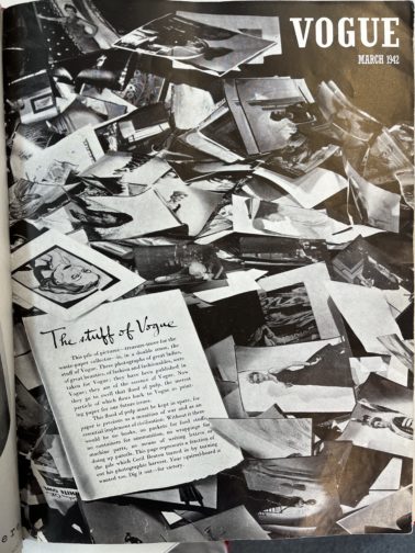
Additionally, I was fascinated to learn how Audrey Withers and Cecil Beaton destroyed the entire paper and photographic archive of British Vogue for 1942’s March issue (below) in response to the Paper Salvage effort and in the face of unimaginable hardship. I believe the coupled nobility and arrogance in this action – which reacted to contemporary uncertainty at the expense of future study – serves as an example of the undeniable tension behind justifying perceived ‘frivolities’ in an era of necessity as well as securing Audrey Withers’ status as a largely anonymous and unknown figure.

Vogue
British Vogue, March 1942

What is your favourite thing that you’ve written/worked on/researched this year?

I’m loving my dissertation – especially as it is something I’ve been mulling over since last summer – but I really enjoyed working on my virtual exhibition, which explored the power of perfume. Perfume is capable of so much: it has the power to evoke forgotten moments; perfume acts as a designer’s signature – yet invisible – autograph, the list could go on… What I’ve loved about this project was its focus on creating a visual argument. Unlike an academic essay where you might presume certain knowledge and expertise on behalf of the reader, I had to consider how to pitch each element to a wide variety of visitors in order to give them the best experience possible. For instance, I used text panels to introduce each section and broader themes, whereas the sample exhibition catalogue entry allowed for a more in-depth analysis.

I wanted to situate perfume within a retail space, reinforcing perfume’s relationship to commercial practices, and chose to set it in the historic Liberty Department Store in London. In keeping with the idea of it as a fantasy exhibition, I kept on imagining I was in ‘The Sims’ world each time I was working on my floor plan, visualising how a Sim character would walk through the exhibition space. I wanted to create an immersive, multi-sensory experience, and decided on a commissioned and interactive sensory wall, serving baked goods (and cocktails!) to create three ‘miniverses’ to reflect the perfumes and designers on display: Elsa Schiaparelli’s Shocking, Yves Saint Laurent’s Opium and Tom Ford’s Tuscan Leather. I found considering perfume’s position as simultaneously immaterial and material particularly fascinating and incorporated that into my layout.

What are you wearing today?

Recently, I’ve found that I’m wearing a ‘uniform’, which normally consists of jeans, a simple top, a fun statement blazer or coat and a bright red lip. Today, I’m wearing a pair of denim blue Levi’s, an M&S black thermal top (not so chic, but I FEEL the cold), my cherished checked old Celine blazer from Vestiaire Collective and a pair of slightly battered Axel Arigato trainers, plus my go-to vintage Mulberry laptop bag, which I nabbed from my mother. And, of course, my signature red lip. I’m also having a bit of a jewellery moment, so have layered it with a couple of Alighieri necklaces (including the ‘Invisible Compass’ as I’m always getting lost!), a gorgeous Katie Mullally Irish Coin Charm featuring an Irish hare (I’m born Year of the Rabbit which I feel is close enough) and an amber necklace bought in Edinburgh by two of my dearest friends for my birthday last year. I’m also wearing a pair of Motley X Alice Cicolini earrings and my usual rings, including one from my mother and a Gracie J prototype tear ring. It’s been a research day, which started with an exciting trip to Vogue House to meet with Julie Summers, where we talked about our love for Audrey Withers, and I was lucky enough to take a quick peek at some of the Vogue archives from the 1940s and 1950s. I then had lunch with a friend and have since been busy in the London College of Fashion Library looking at more Vogue archives where I bumped into fellow MA student, Megan, before heading home for a relaxed evening!

Do you have an early fashion memory to share?

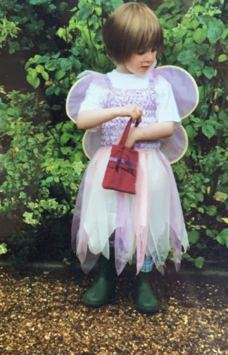
When I was a child, there was a time where all I would wear was a dress with a tutu skirt, fairy wings, and green wellington boots. And jeans underneath if it was cold. Occasionally, if I was feeling very daring, I might try to pinch my mother’s clip on earrings to complete the look… From an early age, my mother had been quite happy for me to choose my own outfits, barring the occasional family event, and so I’d turn up to nursery dressed as a fairy. Complete with a little handbag with everything a fairy might need for the day, namely bubbles and a glitter pen.

As I would wear this outfit day in and day out, I must’ve worn it on the day we had an art lesson as my mother ended up receiving a call from the school. Initially assuming it was about one of my brothers who was constantly misbehaving, it was a surprise to hear that it was about how I had refused to take off my fairy wings when asked. Though the teacher was seemingly only concerned they’d get mucky during the arts and crafts activities, I continued to refuse to take them off and they were unable to put my painting overalls on. While neither my mother or I can remember the precise outcome, or whether I agreed to take my fairy wings off – even momentarily to put the apron on – I’d like to think that a compromise was eventually made, and I succumbed to reason. But knowing how stubborn children can be, there’s certainly a chance that I refused to cooperate.

In the photo below, it’s funny how the core of many of my outfits remains the same, even nearly two decades on. I often wear a white t-shirt and jeans, and the tutu dress and fairy wings have simply been replaced with a statement jacket. It would seem that there’s a part of me that still wants to be a fairy.

Wearing a tutu, fairy wings and wellington boots, circa 2003

Dissertation Discussion: Abby


What is the working title of your dissertation?

I’m trying to come up with something more creative but right now it is: “More Than a Backdrop: Fine Art in the Fashion Magazine 1930s-1950s”

What led you to choose this subject?

Well literally all of my academic research has investigated the intersection between art and fashion in some way so continuing to look at this relationship was a given. I wrote one of my previous MA essays on the fashion magazine as a designed object so I also wanted to build on that research. I love the way image, text and layout work together in fashion magazines to construct ideas of femininity as well as national identity for readers. I found art historians who had dismissed the use of art in fashion magazines, saying fashion simply used art as a backdrop to sell clothing. So, I wanted to assert that actually art and fashion work together to create significant aesthetics and messages.

I had always planned to write about classicism and couture in the 1930s because I have a low-key obsession with all things Greco-Roman and I’m fascinated by modern classicism. But about a month before we had to choose our topics I kept thinking about photographs by Cecil Beaton of models in eveningwear in front of Jackson Pollock paintings, and earlier this year I also came across photographs by Genevieve Naylor of models in Alexander Calder’s studio and then I was interested in modern art and fashion. I thought I had to choose between classicism or modern art but Rebecca (shout-out to Rebecca Arnold!!) helped me realize I was essentially looking at the same thing: art and fashion in magazine editorials. So, I didn’t have to choose and I really think it is the perfect topic for me.


Favorite book/article you’ve read for your dissertation so far and why?

In my quest to tie together art, fashion, and mid-century American politics I found a fantastic article by Alex Taylor about how Calder’s sculptures were used for both U.S. cultural propaganda and Latin American dissent during the Cold War.

Also, I got to re-visit the catalog from my favorite Met Costume Institute exhibition, 2003’s Goddess: The Classical Mode which spotlighted fashion designer’s affinity for the classical.


Favorite image/object in your dissertation and why?

A Vogue 1931 editorial “Bas Relief” featuring George Hoyningen-Huene’s photographs of Madeleine Vionnet evening pyjamas where the model is actually lying down against a dark background but it looks like she floats while her dress swirls around her. The meeting of timeless classical imagery and modern photography is breathtaking and Hoyningen-Huene is my favorite photographer AND Vionnet is the best – it just doesn’t get any better.


Favorite place to work?

I can only focus in my room or in the Courtauld library


Are You Educated in Art?: Vogue and Taste

The other night my dissertation research had me searching through Vogue’s 1944 issues and while I didn’t find what I was looking for, I did come across an article that stopped me in my tracks. As an (aspiring?) art historian, the editorial titled “Are You Educated in Art?” in the January 1, 1944 edition of Vogue caught my attention. In this two-page spread art critic Frank Crowninshield instructs the reader about Western art history in the form of fourteen questions. Crowninshield provides answers to various questions ranging from the use of archaic Greek statuary to the influence of Picasso.

Although this questionnaire comes across as an art history pop-quiz, the text insists that it “has little more to do with your discernment and taste than with your study-book knowledge; for, in the appreciation of art, one may know all the facts and still be a Philistine.” The use of the word “taste” here is integral to the reader’s reception of this article. IAntje Krause-Wahl describes that in this period, “Vogue increasingly saw it as its responsibility to guide their readers in the principles of good taste. Jessica Daves, who in 1952 followed Edna Woolman Chase as editor-in-chief, explicitly formulated this when she described the magazine as a ‘vehicle to educate the public taste.’”

The use of art and the acquisition of art historical discernment played an integral role in Vogue’s discourse on how to obtain taste. Later, in July 1945 Vogue even devoted an entire issue to the Museum of Modern Art which featured Marcel Duchamp’s “The Large Glass” on the cover. Thus, the 1940s Vogue reader not only knows the latest fashions but she also acquires other skills crucial to being an ideal society lady such as knowledge of art history and an interest in modern art. Indeed, women’s magazines such as Vogue act as “instruction manuals” of femininity. This direct appeal to its reader to cultivate their taste and learn how to properly appreciate art, provides an excellent example of the way in which fashion magazines work to construct femininity and teach artistic literacy.

By Abby Fogle

Sources:

Craik, Jennifer. The Face of Fashion: Cultural Studies in Fashion. London: Routledge (1994), 47.

Crowninshield, Frank. “Features/Articles/People: Are You Educated in Art?” Vogue 103, no. 1 (1944): 48-49, https://search.proquest.com/docview/879229981?accountid=10277.

Krause-Wahl, Antje. “American Fashion and European Art—Alexander Liberman and the Politics of Taste in Vogue of the 1950s” in the Journal of Design History Vol. 28, No. 1. (2015).  doi:10.1093/jdh/epu041.

Documenting Regency Fashion with La Belle Assemblée

Today, 18 July 2017, marks the bicentenary of the death of Jane Austen, author of classic novels such as Pride and Prejudice, Sense and Sensibility, and Emma. Much of her work, and their subsequent adaptations, are set in the Regency era (broadly categorized as 1795-1820) and their fashions reflect that time. Jane herself was quite fond of fashionable dressing: letters from time spent living with her brother Henry in London mention visits to Grafton House for trimmings and hosiery, and to Bedford House for dress fabrics.

Fashion plate from La Belle Assemblée (published by John Bell), 1807. Hand-coloured etching. Los Angeles County Museum of Art: www.lacma.org. Accession number: M.86.266.84.

In order to keep abreast of the latest fashions, women of the Regency era consumed ladies’ magazines, among them the high quality La Belle Assemblée or Bell’s Court and Fashionable Magazine addressed particularly to the Ladies. John Bell first published Le Belle Assemblée in 1806 as a monthly source of prose, poetry, biographies, and fashion advice for leisured women. There is even reason to suspect that Jane Austen would have read La Belle Assemblée as one of her favourite nieces, Fanny Austen Knight, had an 1814 issue of that periodical among her possessions.

‘Bourbon Hat and Mantle’ plate from La Belle Assemblée (published by John Bell), May 1814. Hand-coloured etching. Victoria and Albert Museum. Accession number: E.1025-1959.

La Belle Assemblée’s price established it as a thoroughly affluent periodical. Its rival, the Lady’s Museum, cost 1s. in 1806, while La Belle Assemblée cost 2s. 6d. for black-and-white etchings and 3s. 6d. for hand-coloured illustrations. Though only two fashion plates were included with each issue, they were prepared by highly skilled illustrators, engravers, and painters. The 25cm x 16cm dimensions of this periodical further added to its luxury. Whether coloured or not, the sizable fashion plates are works of art in their own right, as their inclusion in museum collections around the world confirms.

‘Walking Dress’ plate from La Belle Assemblée, September 1822. Hand-coloured etching. Victoria and Albert Museum. Accession number: E.2818-1888.

John Bell’s wife Mrs. Bell was credited with the designs of many outfits seen in the plates of La Belle Assemblée. As a dressmaker in London known for extremely up-to-date fashion knowledge (she had foreign fashions imported for study twice each week), Mrs. Bell possessed a reputation for unbeatable fashion acumen. She was not just a dressmaker and designer however. Mrs. Bell, ever the visionary, invented the ‘Chapeau Bras,’ a foldable hood small enough to store in a bag, and a corset to reduce the appearance of pregnancy.

‘Dinner Party Dress’ plate from La Belle Assemblée (published by Whittaker & Co.), February 1827. Hand-coloured etching. Victoria and Albert Museum. Accession number: E.1972-1888.

Plates from La Belle Assemblée reflect both minute and radical changes in fashion during the first three decades of the nineteenth century. From 1800-1820, differences in fabric, colour, and accessories set old and new fashions apart. The 1820s saw a gradual widening of sleeves and skirts as the decade progressed, morphing the columnar silhouette of the beginning of the century into the exaggerated hourglass shape of the early 1830s. In 1832, La Belle Assemblée merged with the Lady’s Magazine; the new Court Magazine and Belle Assemblée continued to publish the latest advances in fashion throughout the 1830s.

Read, W., ’Full Dress, Ball Dress, Morning Dress’ plate from La Belle Assemblée (published by Whittaker & Co.), October 1830. Hand-coloured etching. Victoria and Albert Museum. Accession number: E.1972-1888.

Further Reading

Jane Ashelford, ‘Perfect Cut and Fit’ in The Art of Dress: Clothes Through History 1500-1914 (London: National Trust, 1996), pp. 167-210

Margaret Beetham, ‘The ‘Fair Sex’ and the Magazine: The Early Ladies’ Journals’ in A Magazine of Her Own? Domesticity and Desire in the Women’s Magazine, 1800-1914 (London: Routledge, 1996), pp. 17-34

Introduction to the Courtauld History of Dress Journals Archive

The conference Reading Fashion Magazines may be over, but our display of 9 items from the collection is still available to be viewed outside the Courtauld Library vitrines. Please come and visit, before it closes in August. In order to tempt you, you can read the introduction to the display, and our conference, below, available for you to download in a pdf.

Introduction to the Courtauld History of Dress Journals Archive

Some of the earliest fashion magazines in the Courtauld History of Dress Journals Archive are on show in the exhibition. Here, Gazette du Bon Ton, Für die Dame and Pinpoints are displayed.
A view of the 1940s section of the exhibition featuring Harper’s Bazaar and Femina.
Elizabeth and three MA Documenting Fashion students after the completion of the exhibition instal.

Dissertation Discussion: Barbora

My three bibles for the past few months: D.V. by Diana Vreeland, Allure by Diana Vreeland and Memos: The Vogue Years edited by Alexander Vreeland

What is your title?

“Fake It!” Examining the myths and realities in the life and work of Diana Vreeland.

What prompted you to choose this subject?

Ever since I’ve watched The Eye Has To Travel for the first time, I was fascinated by Diana Vreeland and the way she shaped the industry almost singlehandedly. Her stories, too, are quite something: Vreeland, her sister and nanny were the last people to see the Mona Lisa before it was stolen in 1911; Charles Lindbergh flew over her garden on his first trans-Atlantic flight; she almost took down the British monarchy when Wallis Simpson came to her lingerie store to order some special garments for her first weekend away with the Duke of Windsor, Prince Edward; and she attended Hitler’s birthday party in the early ’30s, sending a postcard to her son afterwards with the note “Watch this man.” Apparently so, anyway. I wanted to find out more about what prompted her to create such an extreme background for herself, the reason behind all the myth and fantasy which surrounded her, the obsession with “faking it” and everything else about her, really. Actually, I think I fancied the role of a detective for a few months, attempting to untangle what really went on in her head and her life.

‘Vogue’ December 1, 1965 Cover | Wilhelmina Cooper by Irving Penn | Diamond cage deisgned by Harry Winston (‘Memos: The Vogue Years’)
‘Vogue’ July 1, 1969 | Veruschka by Irving Penn (‘Memos: The Vogue Years’)

Most interesting research find thus far?

I was lucky enough to go to New York to visit the Diana Vreeland Papers Archive at the New York Public Library. Flicking through the original pages of her teenage diary, handling her passport and birth certificate (the date of her birth is no longer a mystery!) and finding out what she was up to on a day-to-day basis through the Smythson leather diaries she kept between 1950 and 1985 was quite amazing. There are some peculiar entries where Vreeland notes when she is due to start her pills – once green, then yellow, then pink. Very intriguing. Sadly, I only had two days in New York and so could only go through four boxes out of the sixty-something the library has. Might have to go on another trip soon! I think about a month should do it, mainly because Vreeland’s handwriting makes it quite a challenge to decode what she was actually trying to write down. Oh, and one more thing: the Harper’s Bazaar and Vogue online archives are very dangerous if you don’t have much time – they suck you in!

‘Vogue’ April 15, 1969 | Bert Stern (‘Memos: The Vogue Years’)

Favourite place to work?

I got into a very bad habit of working from my bed. So most of the time I can be found there, surrounded by mounds of paper, pastel-coloured highlighters and books. If I manage to persuade myself to face the outside world, I head to Starbucks (but only one that has comfortable armchairs or sofas!), and have a huge mug of soy matcha latte. I fear to look at my bank statement and find out how much I spent at Starbucks in the past couple of months. And there’s still time to go… Strangely, I find libraries quite distracting, but in Starbucks I get the work done.

Starbucks should probably have its mention in my acknowledgements as the place which provided constant fuel for all the writing.
What my bed looks like most of the time now. Also, pastel-coloured highlighters are a must, as is colour-coding!

Highlights from the Courtauld’s History of Dress Journals Archive: Elle UK

Our conference Reading Fashion Magazines: Celebrating The Courtauld’s History of Dress Journals Archive is this Saturday! Book your ticket here for a day of amazing speakers and beautiful objects, including those from the exhibition we have previewed the last few weeks, ‘Addressing the Courtauld’s Fashion Magazines.’ We look forward to seeing you there!


‘French Fashions’ photographed by Chris Dawes. Elle UK, March 1986. History of Dress Collections, Courtauld Institute of Art.

The 1980s were turbulent years in Britain. From extreme hardships and upheaval to pop culture and newfound affluence, the decade had a lasting influence on modern-day life. In this explosive climate, some relief came with the birth of iconic magazines such as i-D, The Face, Arena and, in November 1985, the British version of Elle Magazine, the originally French style bible. Aimed at young career women, Elle combined carefree fashion with serious articles, or ‘style with content,’ as Dylan Jones, the Editor-in-Chief of GQ put it. Today, Elle holds the title of the largest fashion magazine, boasting 43 international editions published in 60 countries worldwide.

With Sally Brampton as its first Editor-in-Chief, Elle became the to-go magazine for the well off, modern 18-30 year old, who was uninterested in the world of luxuries, haute couture and pampering offered by Vogue. Instead, the magazine published frank and provocative features about love, sex, dating and health alongside interviews with the likes of Harrison Ford, Mickey Rourke, Jasper Conran or Paula Yates. The glossy fashion pages, graced by Naomi Campbell, Claudia Shiffer, Linda Evangelista, Carla Bruni and Yasmin Le Bon, were daring, powerful and unrestrained, full of spirit and joy. The articles were relatable and fascinating while the fashion photographs by Mario Testino, Eamonn J. McCabe or Neil Kirk shot in exotic locations provided a much-needed element of fantasy and aspiration. With such ingredients, Elle was set to become the cult publication of a generation.

This spread here, entitled ‘French Fashion’ and photographed by Chris Dawes for the March 1986 issue of Elle, showcases why the magazine was so groundbreaking in its first few years. Tapping into a younger, yet still style-conscious audience, guides on how to achieve a look which appears to be taken straight from the catwalk were a common fixture in the magazine. Chanel, a favourite of the modern working woman, plays a main role on this double page. The classic skirt suit of Coco, trimmed in black with gold details, complete white gloves and a black quilted bag with a chain strap, could be yours for a mere fraction of the original price. In style, however, it packs the same punch. French-chic without the price tag!

The sleek, glossy page hints at the opulence one experiences when wearing such an outfit. Framed as a Kodak contact sheet, the idea of a luxurious lifestyle is further alluded to by positioning the wearer of this ‘Chanel’ look as someone worth photographing. Yet, the girl is not simply a society lady going between luncheons and afternoon teas. She is in movement, her bag flying behind her. Perhaps she is on her way to a business meeting, or rushing to work in the morning. She appeals to the career woman of the 80s and inspires younger readers to embrace a working life – you can still look incredibly à la mode in office attire. Magazines should create a fantasy, but they should also be rooted in reality – Elle masters it!

Highlights from the Courtauld’s History of Dress Journal Archive: Vogue Paris

We are just one week away from our conference Reading Fashion Magazines: Celebrating The Courtauld’s History of Dress Journals Archive! Upcoming blog posts will offer a sneak peek into ‘Addressing the Courtauld’s Fashion Magazines,’ an exhibition held in conjunction with the conference. Be sure to book a ticket here to see amazing speakers and beautiful magazines. Remember: Digital images are nice, but nothing beats seeing the real thing!


Double page spread photographed by Guy Bourdin, Vogue Paris, April 1976. History of Dress Collections, Courtauld Institute of Art.

This double page spread is part of a nine page fashion story by the photographer Guy Bourdin, displaying the new ‘sporty and young’ swimwear and summer fashions for 1976. The first fashion story in Vogue Paris’ ‘spring special’, it follows advertisements for Missoni, Versace, Etro, Yves Saint Laurent, Celine, Charles Jourdan, Bally and Jacques Heim. It precedes another, shot by David Bailey, and editorials on how to confront the beauty-depressing effects of winter, 10 new methods to re-discover joie de vivre as well as an extensive story on Greece, in celebration of the country’s new membership of the European Common market.

Five girls in bikinis lay outside to catch the sun’s rays in an unusual setting – usual that is, for the pages of luxury magazine Vogue. Far from an idealised, exotic location, five girls stretch out across a cracked and dusty pavement as a bus passes by, in barely-there bikinis, ‘so small that they may be held in the palm of the hand’. Sunglasses discarded, each holds a light-reflecting silver board up to their face in order to achieve a faster, stronger tan. In a further spread, models climb a fence in search of a sunnier spot past a shaded avenue palm trees, and in another, recline on a narrow strip of grass between a tarmac highway and Sears warehouse, their languor contrasting with the fully clothed figure rushing past. Breaking up the location’s horizontal lines – the bus’ branding, wall and pavement’s edge – the models are made individual by the bold colours of their bikinis and different hairstyles. They are conceivably a group of normal girls, taking advantage of the first signs of summer in the city where they live.

Cover of Vogue Paris, April 1976. History of Dress Collections, Courtauld Institute of Art.

Vogue Paris’ editor-in-chief, Francine Crescent, gave her photographers a great deal of creative freedom. With Bourdin, this enabled him to exploit the features of the magazine as a material object. He was the first photographer to bear in mind the potential of the double-page spread when taking his images; all but one of the images that make up this story extend past the gutter and bleed to the very edges of the magazine. Bourdin is mindful of the way a magazine falls open, laid on a table, or across a reader’s thighs. His models are carefully spaced in order not to distort their figures at the centre of the spread where the pages naturally curve inwards to their binding. A wall or fence is often at the centre of the image, setting up a contrast between the two halves of the image. The effect is fully immersive; the picture being larger, more of the scene may be seen in greater detail, more figures included, more of a narrative told. The glossy-light reflecting paper the images are printed on adds to Bourdin’s emphasis on sunlight and shade. Viewed in April, together with features on post-winter revival, Bourdin directly addresses the reader’s desire to shed heavy coats and insulating layers with bare flesh and warm colours. As the reader holds Vogue in their hands, they are within their grasp.

Highlights from the Courtauld’s History of Dress Journal Archive: Femina 1951

We are less than two weeks away from our conference Reading Fashion Magazines: Celebrating The Courtauld’s History of Dress Journals Archive! Upcoming blog posts will offer a sneak peek into ‘Addressing the Courtauld’s Fashion Magazines,’ an exhibition held in conjunction with the conference. Be sure to book a ticket here to see amazing speakers and beautiful magazines. Remember: Digital images are nice, but nothing beats seeing the real thing!


Cover of Femina, October 1951. History of Dress Collections, Courtauld Institute of Art.

Femina was a French fashion magazine active from the early twentieth century.  It is a great documentary source for the history of French couture as shown by these images.  During the war, Parisian couture was necessarily scaled back in its production due to a lack of material resources as well as customers.   Fashion, however, was often a way for the women of Paris to resist the occupation of their city by asserting nationalistic pride through the cultural tradition of high fashion.  After the war, Christian Dior asserted a return to luxuriant and grand femininity with his “New Look” collection of 1947 featuring narrow sloped shoulders, hand-span waists, and voluminous longer skirts.  Although some people were shocked and even dismayed at what seemed an excessive use of fabric, the silhouette was largely embraced by women happy to have a change that expressed beauty and luxury.

Illustration of a Christian Dior gown. History of Dress Collections, Courtauld Institute of Art.

By 1951, as these illustrations attest to, the New Look silhouette was an integral part of fashion.  Dior’s gown features a blue back panel with bow that is reminiscent of the earlier nineteenth century bustle emphasizing the back of the skirt.  This silhouette was very consciously a return to the history of dress from the eighteenth and nineteenth centuries which Dior felt celebrated femininity in a way that resonated in the post-war period.

Illustration of a Nina Ricci gown. History of Dress Collections, Courtauld Institute of Art.

Nina Ricci was one of many female couturiers before the war who opened her house in 1932. Though she isn’t as well remembered today as Dior, she was a great success in the thirties and after the war, designing until 1954 when her son took over the business.  The gown illustrated here exemplifies Ricci’s aesthetic of a highly refined femininity infused with romantic details.  The caption refers to the Second Empire period in mid-nineteenth century France which the gown seems to revivify in its sweeping trained skirt and oversized bow emphasizing the hips.  By contrast, the waist appears even smaller.  The matching long evening gloves also continue a fashion tradition in eveningwear.  The model’s coiffure, however, is a modern post-war style which reminds us that fashion is always a blend of past and present.

What I love so much about these illustrations is the way they capture a sense of drama from the dress itself.  Photographs often rely upon the model and settings to create a fuller scenario but illustrations really focus on the silhouette and textures of the garment.  The shading on the Dior gown conveys the stiffness of the material and the sheen of a silk.  That I can “feel” the surface and shape of the dress is what draws me in.  In a sense, the drawing convinces me that the gown is real, that fashion is real, because it connects to what I already know in part – the textures, colors, and shape, but offers the possibility of even more – the actual dress.

The mark of the artist’s hand speaks to the agency of my own hands and the knowledge they quite literally hold.  The architectural quality of the gown can be felt with just a few lines in the right place.  By contrast, the more fluid, softer drape of Nina Ricci’s gown seems to telegraph the movements of the woman’s body.   I can imagine the train swaying in echo of her hips as she glides across the ballroom.  The illustrations heighten the sensuality of the gowns.  The differences in aesthetic qualities reflect the type of woman imagined as the wearer and express the designer’s vision of her desires.

Highlights from the Courtauld’s History of Dress Journal Archive: Harper’s Bazaar

We are less than a month away from our conference Reading Fashion Magazines: Celebrating The Courtauld’s History of Dress Journals Archive! Upcoming blog posts will offer a sneak peek into ‘Addressing the Courtauld’s Fashion Magazines,’ an exhibition held in conjunction with the conference. Be sure to book a ticket here to see amazing speakers and beautiful magazines. Remember: Digital images are nice, but nothing beats seeing the real thing!


Harper’s Bazaar, October 1940. History of Dress Collections, Courtauld Institute of Art.

This magazine is an October edition of Harper’s Bazaar published nationwide in the year 1940, during the London Blitz. Despite the hardships of wartime, the magazine targeted the female upper classes, which were the only ones with enough purchasing power to afford it. With the costly price of 2 shillings 6 pence, it was a considerable expense that could feed an average family for one day. In contrast to DIY publications, Harper’s Bazaar relies on the desire to emulate the rich and powerful to disseminate latest fashions. With the upcoming winter, the issue centers around the season’s new fashions coming from the capital, presenting a wide array of greatcoats both furless and completely fur-lined, made mostly out of warm wools or commonly available types of fur like squirrel, mole, and rabbit. The effects of rationing clearly influence the choice of images which are plain in their style with scarcely any accessories and minimal display of jewelry, painting a picture of a simple, although fashionable, woman. The practicality of the inside contrasts sharply with the flamboyant cover which is aimed at defying the grim realities of wartime and giving people back the feeling of normality.

Looking closer at the front cover, we can examine it as a historical source from the era, a social history document that tells the historian part of the story of Britain in the 1940s, and more particularly its dress history. A closer inspection may reveal that the colours chosen in such a specific moment in history are not random. The predominant purple tones, which are one of the first elements that catch the viewer’s attention, are historically associated with opulence, richness, royalty and empire. The crispness and silky texture of the sleeve contrast with the other colours of the dress that look as if they are polluted with randomly distributed red dots. The grainy and wooly texture of the material creates an off-focus effect that contrasts with the smooth and well-shaded arm and the sharp colours of the jewellery that richly decorates it. Our gaze is naturally led towards the hand that holds the cigarette, a luxury item that was rationed and reserved mostly for the servicemen at the front. Smoking, at the time, was an activity reserved for the feminine elite, symbolic of the defiance and rebellion against the male culture and male-centred workplace. The model positions herself in a relaxed and mindful manner looking down upon the viewer in an almost spiteful way, suggesting her higher status. This projects an image of power and confidence, a new Britannia clothed in all the riches of the Empire, watchful and confident of her power to withstand the dangers that befell her.