Evening Essential: Grace’s family’s 1930s Minaudière


This past week, the Courtauld had its annual winter ball, a chance for students to dress up in their fanciest evening wear and celebrate the end of term. During the 1930s, minaudières became a staple of women’s evening wardrobes. Defined as jewellery, these were miniature oblong cases which acted as purses or bags for cosmetics and other items considered essential for a smart evening out. In 1934, Van Cleef and Arpels patented the design and created luxury metal versions, finished with beautiful stones or lacquer. Even though they were beautiful and highly decorative, these cases were also functional – aimed at optimising space whilst carrying necessary items. Studying these items as dress historians proves most interesting because they reveal what were considered the essentials for an evening out in the 1930s.

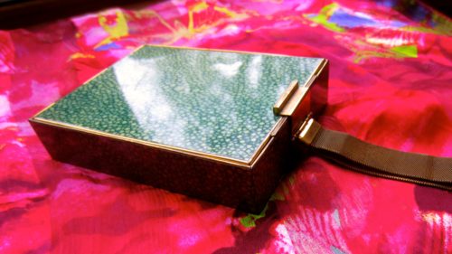
This minaudière, which has been passed down the line of women in my family, appears to be from the years following the 1930s. An inscription on one of the clasps shows it is made by L.S. Mayer for ‘Park Lane Deluxe.’ The exterior is in an art deco style faux shagreen, a beautiful pebble green colour with a speckled pattern, and a gold metal frame. It has a chain which would have been worn round the wearer’s wrist whilst dancing at the balls, also making it fulfil the role of a decorative bracelet. In the first section inside there features a very generously sized mirror which runs the entire length of the minaudière, and opposite that there are two compartments which include rouge and powder, complete with the puffs to apply them. There is a fold up tortoiseshell hair comb, and a section at the bottom for a bullet of lipstick or perhaps cigarettes. Each aspect of the design has been carefully thought through to make do with the small space and to maximise its functionality.

On the reverse of the minaudière, there is another mirror and a notepad and pen with a holder. There is also a hidden compartment below this which flaps up to reveal a long and narrow case, which could have contained alcohol or was a cigarette lighter. What makes this minaudière stand out from the rest is that it differs greatly from any usual accessory, because it features a notepad and pen. As my grandmother says, this could have been for women to write down the names of their partners to dance with at the ball. Either way, it asserts the active role women had at the time in terms of fashioning their own identity. The minaudière is also interesting when compared to modern day clutch bags used on nights out such as the Courtauld’s Winter Ball. Usually there is at the very most a tiny zip pocket in clutch bags, and the rest is an empty space. On the one hand, the 1930s minaudières were genius in that they planned out each and every thing that might be needed, and catered for it within the case. On the other hand, nowadays we have much more freedom in choosing which items we consider as essentials in our individual clutch bags, and therefore how our evenings will be defined.

By Grace Lee

All photos author’s own

MA Documenting Fashion Holiday Wish Lists


It’s December and Holiday goodies are on our mind. We decided to come up with a dress-themed holiday wishlist where each of us dreamed up a fantasy gift and a realistic gift to ask Santa for this year. Check out our answers below!

Dr. Rebecca Arnold

Fantasy: I would very much like a Madeleine Vionnet dress – I don’t mind which, but what a dream…

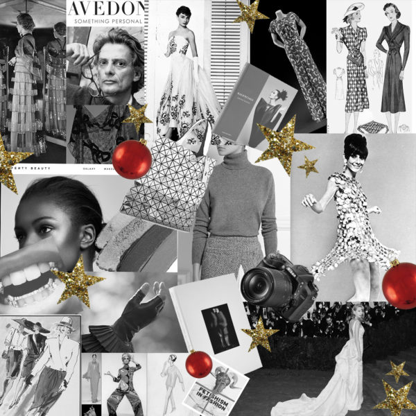
Realistic: I would like the new Richard Avedon biography – Avedon: Something Personal, by Norma Stevens & Steven M L Aronson. I love his work and would enjoy reading more about his life.

Niall Billings

Fantasy: Myrtle Snow’s leather pleated gloves by Gaspar Gloves but in black

Realistic: Fetishism in Fashion by Lidewij Edelkoort

Olivia Chuba

Fantasy: Audrey Hepburn’s Givenchy designed dress for the 1954 film Sabrina is my dream gift. This is the dress that made me fall in love with fashion, film, and of course Audrey Hepburn!

Reality: My more practical wish list gift is the exhibition catalogue from the V&A’s wonderful exhibition, Balenciaga: Shaping Fashion. It was a beautiful show and I would love to be able to have the catalogue to flip through whenever I want!

Abby Fogle

Fantasy: As the self-proclaimed biggest fan of the Met’s Costume Institute, I would want an invitation to this year’s Met Gala.

Reality: Keeping with my Met Gala theme, I am asking for last year’s exhibition catalog Rei Kawakubo/Commes des Garcons: Art of the In-between.

Destinee Forbes

Fantasy: Custom Gold Grillz. I have been looking to improve my dental bling aesthetic.

Reality: Match Stix Trio in Deep from Fenty Beauty by Rihanna. Ready to work on my #fentyface!

Grace Lee

Fantasy: A Paco Rabanne 1967 mini disc-dress, altered slightly to be long enough for my tall self to wear — perfect for New Year’s Eve!

Reality: A DSLR camera, so I can take better quality abstract pictures of my surroundings.

Lily Mu

Fantasy: Live as Princess Galitzine (fashion designer, model, and WW2 Codebreaker) for a week, preferably, when she created her famous palazzo pyjamas. Princess Irene Galitzine was a WW2 codebreaker, Terence Rattigan muse, Dior model, actress, M&S advisor, TV presenter, Russian princess, and fashion designer, whose most renowned creation was the “palazzo pyjama” suit. Because why not? Sounds exciting doesn’t it?

Reality: An original Kenneth Paul Block illustration, in monochrome framing. I Absolutely love his beautiful and gestural fashion illustrations that are energised and full of movement.

Arielle Murphy

Fantasy: Issey Miyake’s Bao Bao tote is on my dream Christmas wish list. The metallic prisms are attached to a mesh setting, making it is semi-structured—so playful and fun!

Reality: What I really need, though, are more sweaters. It has been a running joke throughout this term that I moved to London with only two jumpers. A cashmere turtleneck would be the perfect winter addition to my California wardrobe.

Nelleke Honcoop

Fantasy: For this year’s Christmas and New Year’s Eve festivities back in the Netherlands, I would love to wear this gorgeously green, printed silk evening dress made in 1938–1939 by Anglo-American couturier Charles James (1906–1978). Its fabric was designed by the artist and illustrator Jean Cocteau (1889–1963). The masks in the print are portraits of the artist and his love, the young actor Jean Marais. The dress is currently on display at the Victoria and Albert Museum, London (Fashion, Room 40). The colour and print of this dress are stunning, and I adore its construction, with the crossover bodice with keyhole in the front and the slight V-shaped back. A girl can dream, right?

Reality: While writing an essay on Simplicity’s paper patterns, I became obsessed with a sewing pattern designed by Elsa Schiaparelli, which was brought to the public by the American chewing gum company Wrigley to promote their ‘Double Mint Chewing Gum’. In an advertisement in the March 1938 issue of Harper’s Bazaar, Hollywood actress Anita Louise modelled the ‘Schiaparelli Double Mint Gum Dress’ made with Simplicity Pattern no. 2740, which could be purchased at the time for $0.15. I would absolutely love to have this pattern in size 16 to create my own Schiaparelli.

Louis Vuitton x Jeff Koons


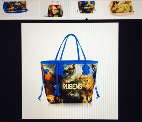
Every time a Louis Vuitton x Artist collaboration rolls out, I go through an emotional journey: from the initial shock that wears off to ambivalence to final acceptance, and maybe appreciation (except for the Chapman Brothers collaboration, which I loved from the start). Back in April, when I first saw the Jeff Koons x LV collaboration in Hong Kong, I was appalled. The collection was part of the large window display at the flagship LV store at Landmark, a shopping arcade in Central Hong Kong; it was an unavoidable, conspicuous and mandatory stop on my way to and from work. I felt visually assaulted every time I walked past it. I was startled by the way the designs came out, not because I wasn’t used to seeing paintings taken out of their standard museum settings and imprinted onto bags, (‘been there, done that’ with the museum totes) but by how inexpensive and kitsch they looked. So, as you can imagine how shocked I was when LV announced they were dropping more designs from the LV x Jeff Koons Master collection in October. Enough is enough!

In the initial launch of the collection in April 2017, Jeff Koons took famous works from five legendary painters—Vincent Van Gogh, Leonardo Da Vinci, Jean-Honoré Fragonard, Peter Paul Rubens, and Titian—and stretched them across some of Louis Vuitton’s most popular bags, like the Speedy, Neverfull, and Keepall. With a ‘subtle’ touch, Koons emblazoned the artist names in gold capital letters across the front, and matched the bag’s handles in a plastic acrylic colour palette to the paintings’ undertones. In this second instalment, Louis Vuitton x Koons added an additional six artists: François Boucher, Claude Monet, Paul Gaugin, Nicolas Poussin, Édouard Manet and J.M.W Turner.

But constantly relooking at the bags, (involuntarily), I have come to accept them, in a way. Kitschy as they might be, I must admit they are congruous and loyal to the Jeff Koons brand-name. Kitsch is characteristic of Koons’ work, and it is his way of appropriating mundane, ephemeral items and transforming them into ‘art’.

In an interview with The New York Times, Mr. Koons declares that he hopes people looks at this collaboration as his continued effort to “erase the hierarchy attached to fine art and old masters.” By removing everyday objects such as vacuum cleaners and shampoo polishers from the household and placing them into the museum setting, he has re-contextualized these dull objects into expensive ‘artwork.’

Now, collaborating with LV, Koons is turning his thesis into a two-way street. Instead of just transforming commonplace objects into artwork, he is taking the most irreversible, unchallengeable works of art, (i.e. old masters that have been consecrated by museum establishments), and commodifying them, thereby transforming these works of art into functional items that can be owned by anyone. Is he successful in breaking down the hierarchy attached to fine art and old masters? Hard to say, but at least this time round instead of converting commodity into art, he is rebranding art as commodity. After all, what comes around goes around.

It has all come full circle, and this justification is as far as my appreciation for the bags will go. One last note: be prepared for more bags to come from this collection, because Koon’s Gazing Ball Series reinterpreted as many as 40 old master paintings.

By Lily Mu

Looking at Dress in Contemporary Dance Performance in London


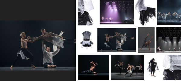
Last week I saw two contemporary dance performances: the world premiere of Wayne McGregor’s ‘Autobiography’ at Sadlers Wells and The Michael Clark Company’s ‘to a simple rock n roll…song’ at Barbican. Both McGregor and Clark collaborated with iconic fashion designers for their wardrobes: McGregor with Aitor Throup and Clark with Stevie Stewart.

Throup created adaptable costumes for McGregor’s ‘Autobiography’, a dance of 23 dance sections in response to the choreographer’s individual genome sequence. Each night the dancer’s performed a random sequence of these sections, and the lightweight mesh clothes designed by Throup equally contained this unpredictable and interchangeable energy. A monochrome wardrobe of – what is also historically what McGregor’s own aesthetic consists of – shirts and shorts with fastening ties worn in a multitude of ways by the dancers, such as shirts tied around the waist, or with ties being left to hang loose.


The Michael Clark Company worked with Stevie Stewart, one-half of the influential 80s fashion label BodyMap for the costumes for his triple bill ‘to a simple rock n roll…song’. Clark and Stewart have worked together on the costumes for his dances since 1984, and for this triple bill of music-focused pieces, Stewart responded in collaboration with Clark to create costumes that reflected the energies of each choreographed embodiment of the different musical influences. For the first dance, which was to a stark piano piece by Erik Satie, the dancers’ costumes reminded me of piano keys where full-bodied longsleeve unitards of white torsos and black legs were worn. The following dance was to Patti Smith’s ‘Land’ and the dancers wore patent black flared leggings and white tops, with the lead dancer wearing a net-patterned top. For the David Bowie section of the performance, the costumes consisted of shimmering silver high-necked unitards and later on peach and orange glittering ones. One dancer wore all black (wide leg linen trousers and a longsleeve top), and a black pleated cape to cover her face for some of the dance to Bowie’s ‘Blackstar’, and she then twisted the cape around her and over her arms while she danced.

In Clark and McGregor’s collaborations with designers to create the costumes for their dances, we experience different approaches to how dancers interact with what they wear when they perform in line with the different focuses of the choreography: ‘To a simple rock n roll…song’ on music, ‘Autobiography’ on variation and McGregor’s own self.

By Evie Ward

Lace Me Up Daddy: A Brief Glimpse Into Male Corsetry


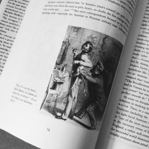
The hyper-feminised silhouette produced as a result of corsetry is not one often associated with the notion of a male wearer. The corset acted as a means to drastically cinch the waist, lift and enlarge the bust as well as operating as a means to contour the hip and natural curve of the female body. In exaggerating the typically idealised ‘hour-glass’ silhouette it becomes almost unfathomable to think of the male body in relation to these traditionally feminised proportions.

As Valerie Steele argues in her book Fetish: Fashion, Sex and Power however, corsetry and the male body have a long and interesting history. Steele first discusses a common theme amongst male corset-wearers: the underlying sense of masochistic pleasure derived from the restrictions of tight-lacing. She details how, historically, many men would borrow their wife of sister’s corset and thus ask to be laced into it. The desire to be submissive toward a dominant woman is certainly an interesting concept in relation to male corsetry however, it is much too limiting a view to take when considering the complexities of corset-wearing in the modern era.

Mr Pearl, a renowned tight-lacer, is quoted within Steele’s book in stating that he does not wear corsets in an attempt to be like a woman. For Pearl, corsetry is representative of control and the discipline one needs to wear such a garment. The corset dictates the way in which one behaves; movements are restricted and posture is refined. As the corset provides support for Mr Pearl’s spine it metamorphoses into and becomes his spine, thus providing the structure and discipline that he desires in everyday life. The corset becomes a second-skin for Pearl, acting as a marker for his identity.

These notions of structure, discipline and identity factor into Steele’s discussion of the use of corsets within military uniforms. She describes Austrian officers who tight-laced as a component of their military dress. In this sense it is clear to see how Mr Pearl’s association of tight-lacing and discipline manifests itself. The military is often seen as being affiliated with extreme restraint and regulation. It therefore seems appropriate that military men might find pleasure in wearing a garment that imposed rules and restraints upon the body to maintain orderliness and posture. Within this discussion of corsetry as a means of imposed discipline however, lies an interesting observation as to how the corset can actually promote a masculine silhouette. Although corsets have predominantly been used to maintain the ideally feminine ‘hour-glass’ shape, the corset can also bee seen as exaggerating inherent masculinity. When contoured to a male body, the corset cinches the waist, elongates the torso and broadens the shoulders; features often seen as being ideally masculine. While the corset may give the illusion of curves on a female body, it can actually produce harsh and angular lines within the male silhouette; a harshness that, I argue, exaggerates masculinity and the idealised male form. Whether male corset-wearers are expressing a masochistic desire for female domination or enacting a need for order and discipline, I believe there is no doubt that corsets act as a means to exaggerate the idealised masculine physique rather than transposing that of the feminine onto the male body.

By Niall Billings


Further Reading:

Valerie Steele, Fetish: Fashion, Sex and Power, 1996

Miwa Yanagi: Elevator Girl


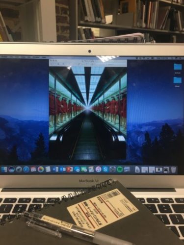
Miwa Yanagi’s 1990s photography series, Elevator Girl, presents a fascinating look at how fashion and photography can come together for a cultural critique. Yanagi studied textile design at the Kyoto City University of Arts, and incorporated this knowledge with a newfound interest in photography and performance art into one project. Beginning in the early 20th century, Japanese department stores hired beautiful, young women to operate the elevators in their buildings. She was made to dress up in the same outfit every day, and sit in a box repeating the same motions over and over again. The elevator girl was clearly a sexual object that represented the traditional patriarchal oppression of women in society, yet she was also a modern woman of the world that had a paying job and dressed in a contemporary, sophisticated manner. Yanagi’s photographs explore the traditional pressure and oppression that women still face in modern society. Take Elevator Girl House 1F, which shows rows of uniformed elevator girls displayed in a glass case.

They are dressed in identical red uniforms consisting of a skirt and double-breasted jacket, complete with a matching red hat and white pumps. They are each posed in a stiff, mannequin-like fashion within the glass display cases. The photograph invites the viewer onto the moving walkway to observe the models as if they are commodities to be bought and sold. Uniforms are powerful tools, in that they invite an immediate response of recognition. When you see someone in an army uniform, you automatically assume they must be a soldier of some kind. The red uniforms in Yanagi’s photograph give the viewer that sense of recognition to the elevator girls, but puts them in a different context. There is a simultaneous familiarity and alienation – the girls are recognizable in their uniforms and remain in a display context; however, they are now overtly the commodities in an endless row. There is also a sense of alienation in their similarity. The reflections of the lights above on the glass cases obscures their facial features. This coupled with their identical outfits makes them almost indistinguishable from one another.

Miwa Yanagi’s work in the Elevator Girl series investigates Japanese popular culture and consumer culture by appropriating their themes and satirizing them. Her series takes the patriarchal image of the elevator girl and uses it to shed light on the pressure and inequality Japanese women face. The photographs themselves resemble glossy fashion advertisements, thus criticizing both the way in which women are thought of as commodities and the consumer culture that gripped Japan as well. The ritualized performance of the elevator girl, the repetitive motions she makes everyday, the identical outfit she wore to other women, and the pressure put on her to appear alluring and youthful, is representative of the standardized roles women of any profession or status are expected to play. Her photographs increase the viewer’s feeling that there is something problematic about the elevator girls through a heightened sense of unreality that she achieves by placing the girls in eerily familiar, yet surreal settings. While her photographs in the Elevator Girl series are glossy, beautiful, and eye catching, they leave the viewer feeling unsettled, which is precisely their job.

By Olivia Chuba

Soutine’s Portraits: Cooks, Waiters & Bellboys


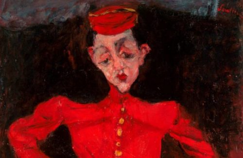
Paris is often romanticized as a dream-like vision; the bustling banks overflow with cafés as sophisticated Parisian dwellers enchant our imagination. Chaïm Soutine addresses this imagined ideal of the Parisian streets with his vivid portraiture in Soutine’s Portraits: Cooks, Waiters and Bellboys, which depicts the quotidian worker in Paris thus highlighting the mundane and unglamorous. Soutine personally related to these workers he depicted; after emerging as an acclaimed artist in 1922 after years of humble work, Soutine felt out of place in this new bourgeois realm. Through acute attention to his subjects’ uniforms, Soutine reveals a complex narrative of both the discomfort of the service men and women he depicts in their high-class workplace, and his own apprehension about his newfound fame. Both uncomfortable in their given uniforms, Soutine and his subjects feel like outsiders in a bourgeois society.

The pair of galleries on the top floor of the Courtauld Gallery guide the viewer on a rich visual journey through twenty-one of Soutine’s portraits organized primarily by his sitter’s occupation. Soutine’s thick application of velvety reds and dark blues dominate the majority of the portraits’ backgrounds and bring a richness and warmth to the space that feel secure and familiar. This visual ease juxtaposes with the discomfort of the subjects in the portraits.

Soutine’s sitters, primarily valets, bellboys, pastry cooks, waiters, or chambermaids, appear deeply uncomfortable. Their bodily proportions are distorted in an unsettling manner, their facial expressions are scornful, and their brows are furrowed—all projecting to the viewer the discomfort in their uniform both physically and emotionally. The subjects look tense in their dress, and their uniforms appear stiff and ill-fitting. This is particularly poignant in The Chambermaid and Valet.

The Chambermaid (La Femme de chambre) c. 1930

The Chambermaid’s hands are clasped tightly in front of her apron, her elbows stiffly pinned to her side. Her rigid stance draws attention to her pink dress and white apron, which, as a chambermaid, needed to be pristine at all times to tend to hotel duties. The woman’s face is tired, and her tense body language suggests a discomfort in her role.

Valet (Le Valet de chambre), also known as Hotel Boy c. 1927

The Valet’s white apron, blue coat, and red vest envelop his figure. The red fabric surrounding his torso bunches to his right side, and his blue coat sleeves billow around his elbows and upper arms. Soutine’s wide brush strokes convey the folds in the valet’s white apron and mirror the wide fit of his uniform as a whole. The Valet’s ill-fitting uniform and disdainful expression suggest a similar discomfort and unhappiness in his role.

While coexisting in the realm of the Parisian bourgeois, Soutine and his sitters were uncomfortable in their uniforms. This tension suggests Soutine felt awkward and tense stepping into a position of great wealth and privilege, and related to the unpresuming service workers, who also felt a sense of discomfort. Through focusing on the dress of Parisian service workers, Soutine was able to channel some of his anxieties about his new uniform just as his subjects’ were confronted with their own.

The Courtauld Gallery’s Soutine’s Portraits: Cooks, Waiters and Bellboys on view until 21 January 2018.

By Arielle Murphy

“Moon of my Life, My Sun and Stars”: A Self-Love Note to Moons and Junes

Not many people can say they have walked around New York City in lingerie while being photographed—but I am one of few who can say they have. The funny thing is that I did not expect to model for the Danish lingerie brand, Moons and Junes, but while supporting my friend behind the scenes at one of their photoshoots, Angete Bjerre-Madsen, founder of Moons and Junes, convinced me to give it a try.

Front view Audre Bra, Olive.

At first, I thought she was absolutely crazy. Then she handed me the Audre bra (fig. 1) (named after the one and only Audre Lorde) in a deep burnt orange, and I decided that the least I could do was try it on. It was light and sheer with a little peek-a-boo feature at the center of the bra for a playful cleavage reveal. At first, I was worried that the bra would not fit, or that it would not offer the support I needed—but I was immediately proven wrong. It fit like a glove while also providing great coverage. The Moons and Junes products run in three sizes: small, medium and large—yet fit a wide range of body sizes due to the stretchy and high-quality material of the products that mold to the wearer’s form without trying to change or enhance her body. Moons and Junes prides itself on being a lingerie brand that does not use underwire or hard cups. The brand’s goal is to disrupt the current lingerie industry by creating pieces that specifically cater to everybody without trying to modify it. There is no push-up, no padding, no unnecessary frill. The pieces act as a second skin meant to conform to the wearer, the models in the ad campaigns are familiar faces—they are family and friends of all ages, races, and sizes.

Shot from New York Moons and Junes Campaign by
photographer Nick Delieto.

“Lingerie” as a category of clothing given to undergarments, aims to make the body appear more alluring and attract attention from the viewer. The erotic or desire is closely tied to lingerie not only in its proximity to the naked body, but also in the theatricality of viewing the undergarments as well. The lingerie acts as the curtain covering the stage of the body, only making the flesh visible “in performance”. Roland Barthes writes in The Pleasure of the Text (1973) that the location of the erotic in clothing lies in its ability to evoke “intermittence,” or rather what he calls, “the intermittence of skin flashing between two articles of clothing…it is the flash itself which seduces, or rather: the staging of an appearance-as-disappearance.” Historically, the wearing and showing of one’s lingerie existed in a performance, a relation between the viewer and the wearer. However, a shift is occurring within the lingerie industry that focuses not the viewer’s reception and pleasure, but the solely the wearer’s.

Shot from New York Moons and Junes campaign by photographer Nick Delieto.

Moons and Junes, in a sense, redefines the relation of the erotic as dependent on the viewer’s response, and makes the erotic or the pleasurable more personal in the sense that the wearer’s pleasure comes from her comfort in the undergarments, her confidence in her skin, and also the beautiful and minimalist design of the pieces. Moons and Junes evokes desire, however a desire that is not meant for others, but rather one that is unabashedly for the self.

By Destinee Forbes

MA Documenting Fashion visits the Courtauld’s Prints and Drawings Collection

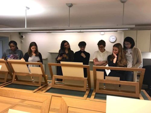
Our Documenting Fashion MA class recently visited the Courtauld’s Prints and Drawings study room. Our class theme that day was ‘Modernity,’ and we were focusing on texts by Charles Baudelaire to explain the shift towards modernism, and how it impacted both art and the representation of dress. The Courtauld’s Prints and Drawings room houses approximately 7000 drawings and watercolours, and 26000 prints ranging from the Middle Ages up to the twentieth century. The prints, drawings and paintings we were studying on this visit were mostly from the late nineteenth century, around the same time that Baudelaire was writing about modernism.

It was interesting to view the shift in that period in respect to the representation of women, class and their dress, but most notably the techniques of depiction. Whereas earlier paintings which we viewed strived to be more realistic in both colour and shape, the later drawings seemed to be more relaxed, with free flowing lines and unaltered black ink. In ‘The Modern Public and Photography,’ Baudelaire discusses dreams and reality in relation to both photography and painting, and is against taking either at face value as real life: “The painter is becoming more and more inclined to paint, not what he dreams, but what he sees. And yet it is a happiness to dream, and it used to be an honour to express what one dreamed.” In the study room, a portrait of Lady Adelaide Stanhope by Alfred Edward Chalon was on display next to Paul Cézanne’s sketch of Hortense Fiquet. Completed circa 1880, Cézanne’s graphite drawing was done a few decades later than Chalon’s and it certainly shows a difference in their techniques. Lady Adelaide’s portrait is in colour and is extremely detailed – her hair and the textures of her dress are what some would call ‘realistic,’ whereas Madame Cézanne is compositionally incomplete, with many large blank spaces and ‘unfinished’ shading. In this example, it is the viewer who dreams and fills in the missing elements of the picture.

[Left] Lady Adelaide Stanhope by Alfred Edward Chalon
[Right} Madame Cézanne by Paul Cézanne, 1880.

Another example we viewed of these new techniques in depicting reality was Edouard Manet’s 1871 La queue devant La Boucherie. The etching effectively shows people queuing for food in Paris, whilst remaining open in shape and form. The umbrellas highlight the shapes in the image, whilst simultaneously forming the outline of the unified yet fleeting crowd. As Baudelaire notes about one of his subjects in ‘The Painter of Modern Life,’ “he is the painter of the passing moment and of all the suggestions of eternity that it contains.” For Baudelaire, modernity is ephemeral and contingent on the times. It is up to the painter, the drawer or the photographer to capture these moments, in order for us to observe them and their many differences, as we did in the Prints and Drawings study room.

By Grace Lee

To book a visit to the Courtauld Prints and Drawings study room, visit http://courtauld.ac.uk/gallery/collection/drawings-prints/prints-and-drawings-study-room

Bibliography

Baudelaire, Charles, The Painter of Modern Life and Other Essays, (London: Phaidon, 1964)

Baudelaire, Charles, ‘The Modern Public and Photography’, in Alan Trachtenberg, ed., Classis Essays on Photography, (New Haven: Leete’s Island Books, 1980), pp. 83-89

Fashion in Motion: Phoebe English at the V&A


On Friday, 20 October, the V&A hosted a spectacular retrospective presentation by British designer Phoebe English as part of the museum’s Fashion in Motion series. The series features leading contemporary fashion designers and makes live fashion experiences available to the public.

Set within the V&A’s grand Raphael Gallery, the Fashion in Motion series typically features a runway show. English, however, broke with this tradition and presented her designs on raised, round platforms where four models donning a range of English’s womenswear designs stood next to marionettes wearing a scaled-down version of the original designs. This provocative presentation blurred the lines between performance art and fashion show when models, or, rather, performers dressed in plain white jumpsuits moved between the platforms to toy with the marionettes, puppeteering the movements of the fashion models. Indeed, the spectacle created by this inventive set design continues English’s practice of staging her collections within immersive environments. Combined with live music by a harpist, the sublime designs and the playful scale of the marionettes resulted in what felt like visual gluttony.

The individual, rounded platforms allowed the viewer to weave through the presentation and move closer to the designs in a way that would not be possible during a traditional runway show. Although this set design was much more engaging that a catwalk, the act of moving around the platforms and observing the models and their marionettes up close felt somewhat intrusive. The models made direct eye-contact with onlookers and members of the press, posing consciously for Snapchat stories and press photos. This directness coupled with the uncanny marionettes and the puppeteers’ manipulation of the models and their puppets created a haunting, powerful experience. The weight of the presentation was most palpable at the end of the show when the models slowly descended from the platforms and walked out of the gallery, leaving only the puppets. The dangling, lifeless marionettes dressed in their Phoebe English miniatures represented, for me, the eerie, indescribably strange and alienating space that fashion can occupy.

Aside from the memorable spectacle of the show, English’s luxury designs demonstrated an expertise in technique, materials, and construction. English, who aims to set her label apart from mass made fashion, creates striking silhouettes with unconventional textures to indicate balance between craft and design. The Phoebe English label, which is entirely made in England, is certainly one to watch.

By Abby Fogle

All photos authors own