Author Archives: Mollie

Colour Theory: Missoni Case File

The history of colour has been divided into many different areas of study, from aesthetic and cultural history, to dye and chemical research. I have been contemplating colour more recently, specifically in relation to fashion and design, to understand how wearing or looking at certain colour combinations can affect us emotionally. British artist and critical theorist, David Batchelor wrote that, ‘colour has been the object of extreme prejudice in Western culture’ (Chromophobia, 2000), evident from the nineteenth century onwards in which certain colour schemes held negative class associations. Josef Albers, a pioneer of Moderism, dedicated his practice to colour, and outlined in his 1963 Interaction of Colour handbook some key principles to his colour theory: 

  • Colours are in a continuous state of flux and can only be understood in relation to the colours surrounding them. 
  •  All colours have two key elements of ‘brightness’ and ‘lightness’. 
  •  How people see colour is subjective for everyone. 
  • Exploring and experimenting with colour is more important than the study of colour. 
Molli's colour text
Homage to the Square: Apparitition’, by Josef Albers, 1959, Oil on Masonite,120.6 x 120.6 cm, screenshot from the Guggenheim Collection online, https://www.guggenheim.org/artwork/173

This is of course, a highly simplified summery of Albers’ theory, but is enough to allow a closer examination into a singular fashion house, Missoni. In 1953, Ottavio and Rosita Missoni established their knitwear workshop in their basement, and by 1966 they had their first fashion in Milan. Ottavio and Rosita were inspired by avant-garde art of the twentieth century, with a focus on Futurism and rhythmic compositions of bold, ‘pure’ colours. 

Molli's colour text
Author’s own painting interpretation of a study by Ottavio Missoni

The Fashion and Textile Museum in London curated an exhibition titled, Missoni, Art, Colour’ in 2016, which explored in depth the interwoven threads between Missoni’s knitwear and modernist art. Ottavio was himself an artist, his interest in experimenting with colour as outlined by Albers was revealed in his own paintings and tapestry studies. His use of geometric forms and ‘pure’ colours resemble artworks from Albers’ series: ‘Study for Homage to the Square’, and ultimately come to fruition in his clothing designs. Missoni’s use of knitted threads allows colour to react in a state of flux to each different coloured thread surrounding it, exploring the effects of colours by contrasting their brightness’ and ‘lightness’.  

Molli's colour text
Author’s own photograph of ‘M 37’, by Wojciech Fangor, 1969, taken at the Guggenheim Museum, February 2020.

In February, I visited the Guggenheim museum in New York and found myself fully immersed in colour and its emotional capabilities while looking around the ‘The Fullness of Colour:1960’s Painting’ exhibition. I was particularly captivated by Wojciech Fangor’s, ‘M 37’ painting from 1969, and how it’s simple green circular form appeared to bleed out into a vivid sky-blue ring, which then faded into the surrounding canvas. The application and contrast of these simple colours and shapes seemed to transcend its form and resonated a feeling of peace and calmness inside of me. On return from New York, I visited my favourite vintage shop in London, and immediately noticed a long sleeved, Missoni knit top. The vertical stripes of the top weave bright green threads into thin lines of white, which are then subdued by a deep purple. Only to be contrasted yet again by a thick stripe of bright pink, which illuminates next to the vivid orange. There was something that the impact of the paintings at the Guggeneheim exhibition had on me, that I felt was reflected in the composition of colours in this Missoni piece. If I could feel certain emotions looking at a painting’s colour and form, then how would others perceive and react to the experimental use of colour in this Missoni top 

Molli's colour text
Author’s own photograph of Missoni top.

I continue to chase the effect of colour and patterns in clothes especially in Missoni pieces, which have provided me with a new theoretical perspective on the already established connection between art and fashion. Each piece now holds a deeper meaning to me, as I come to appreciate the delicate art of Missoni’s knitwear technique, and influence of colour theory, form, and art. Perhaps in these times, now more than ever, we should consider how something so seemingly insignificant, can have such a big impact on our emotions and well-being. Not only for ourselves, but for others who may find a fleeting moment of peace or joy when appreciating colour in clothing. 


References: 

  • Batchelor, David, Chromophobia, (Reaktion books, 2000) 
  • Blaszczyk, Regina Lee, ‘The Design World’s Passion for Colour’, Journal of Design History, (Oxford University Press on behalf of Design History Society, Vol. 27, No. 3, 2014), pp. 203-21 
  • Fashion and Textile Museum, ‘Missoni, Art, Colour’, exhibition, 2016 https://www.ftmlondon.org/ftm-exhibitions/missoni-art-colour/ 
  • Hoecherl, Marlies, ‘Theoretical Aspects of Colour’, Controlling Colours, (Archaeopress Archaeology, 2016) 

Alexander McQueen and The Welsh Dress 

It sparked my interest to see a link posted on the Twitter account of St. Fagans National History Museum in Wales, leading to an online Vogue article. The two worlds of Welsh history and Vogue Magazine seem so far apart, and yet here was an article, explaining how the Alexander McQueen FW2020 collection was inspired by Sarah Burton’s visit to St. Fagans Museum in South Wales. Burton was inspired predominately by the Wrexham Tailor’s Quilt, which was created over a decade from 1842-1852, during the leisure hours of James Williams, who was a military master tailor. Williams used recycled fabric; a technique often adopted by Welsh people when creating dress. These pieces of fabric are a variety of felted woolen cloths, possibly off-cuts of broadcloth from military uniforms. Motifs on the quilt include scenes from the bible, including Noah’s ark, Jonah and the Whale, and the Garden of Eden’s Adam. Woven amongst these biblical scenes are also pieces of Welsh architecture, and this inclusion of Welsh architectural feats amongst biblical scenes reveal the status of Welsh pride and craft standard 

Wrexham Quilt
The Wrexham Tailor’s Quilt, James R. Williams, 1842 – 1852, Wool and Silk, 23.4 x 20.10cm,
Source: https://museum.wales/articles/2020-03-02/The-Wrexham-Tailors-Quilt-1842-52/

The dominant colours of the quilt are blue and red, as typically seen in Welsh textiles from the 19th Century, and grey, black and brown. The background of the quilt is made up of geometrical patterns of diamonds, squares and chevrons, in alternating colours, sometimes symmetrical on both sides or varying slightly in colour. In total, the Wrexham Tailor’s Quilt is compiled by 4,525 separate pieces of cloth. These aesthetic details from the colour, patchwork method, and figures depicted are quite easily spotted on Burton’s McQueen collection.  

Vogue outfits
Source: screenshot from Vogue Runway (https://www.vogue.com/fashion-shows/fall-2020-ready-to-wear/alexander-mcqueen), Alexander McQueen, fall/winter 2020 collection (depicting the patterns/motifs of the Wrexham Tailor’s Quilt).

One suit appears as a ‘cool tone’ version of the quilt, decorated with the same panther motif. Another beautifully cut coat adopts the same geometric pattern and vivid colour palette as the quilt, while some dresses take a more subtle influence of drapery found in historic Welsh dress. The use of blankets used by Welsh women for protection and convenience of carrying babies are noted in the swathes of fabric used by Burton to adopt this past, cultural trend. The famed Welsh ‘love spoon’ can also be seen referenced in this collection, as Burton cuts the celtic decorative pattern into white lace love-hearts, as well as directly using the ‘wheel’ design in a red lace design, a symbol of support for a loved one. The earliest Welsh love spoon can be found at St Fagans, dated from 1667, although this was a tradition dating much further back from then. Welsh love spoons were given by suitors to their romantic interest, to demonstrate not only their love, but their skills in woodwork vital for providing a future income. 

Vogue runway welsh
Source: screenshot from Vogue Runway (https://www.vogue.com/fashion-shows/fall-2020-ready-to-wear/alexander-mcqueen), Alexander McQueen, fall/winter 2020 collection (showing similarity of drapery and use of blankets in historic Welsh dress, as well as pattern).

The Wrexham Tailor’s Quilt is a stunning representation of Welsh tailoring and recycling of fabrics to create beautifully patterned designs. The pride of Welsh heritage has often been expressed through nostalgia, this new collection by Burton encourages a modern and refreshed Welsh pride for the future, and a recognition of the inspired designs and skills of historic Welsh dress. Alexander McQueen’s inspiration highlights the beauty of Welsh textile patterns and recycling of fabric. It offers a new perspective on how Welsh traditional dress can be used in the present and distanced from the romanticised tourist perception often presented as ‘traditional’ Welsh lady costume. Sarah Burton commented, ‘We went to Wales and were inspired by the warmth of its artistic and poetic heritage, by its folklore and the soul of its craft. The woman is courageous, grounded, bold: heroic. There is a sense of protection in the clothes, of safety and comfort, evoked through quilting and blankets. The hearts are a symbol of togetherness, of being there for others.’ (Sarah Burton, 2020) Alexander McQueen’s 2020 collection captures the ethos of Welsh dress and design, transcending the heart of the Wrexham Tailor’s Quilt into high fashion. 

Vogue runway
Source: screenshot from Vogue Runway (https://www.vogue.com/fashion-shows/fall-2020-ready-to-wear/alexander-mcqueen), Alexander McQueen, fall/winter 2020 collection (reference of Welsh Love Spoons).


References: 

Phillips, Ellen, The Wrexham Tailors Quilt 1842-52, (National Museum Wales, 2 March 2020), https://museum.wales/articles/2020-03-02/The-Wrexham-Tailors-Quilt-1842-52 

Cluley, Richard, Patchwork Bedcover, (National Museum Wales, 13 November 2019), https://museum.wales/collections/online/object/4ce80b8d-182e-3822-8038-54080af6b0b8/Patchwork-bedcover/field0=string&value0=quilt&field1=with_images&value1=1&field2=subject&value2=Wrexham%20Quilt&index=0 

Burton, Sarah, Women’s Autumn/Winter 2020 Show, (Alexander McQueen Trading Limited, 2020) https://www.alexandermcqueen.com/experience/en/womens-autumn-winter-2020-show/ 

Bowles, Hamish, https://www.vogue.com/fashion-shows/fall-2020-ready-to-wear/alexander-mcqueen, (Paris, March 2, 2020) 

FKA Twigs at The Wallace Collection

Cello strings are heard vibrating through the Wallace Collection, as the camera descends into the golden billiard room. Singer, FKA Twigs, is partially revealed behind the grand piano in which she plays gentle chord progressions. She begins to perform her song ‘Cellophane’ as the camera glides around her, revealing her full outfit, carefully chosen for the occasion. Twigs is reclaiming the space of the Wallace Collection for herself, both complimenting and transforming the artwork into her own vision through the entirety of her dress.

FKA twigs inta
Image from Instagram @FKATwigs

The clothing worn by Twigs, her tights, corset, jacket, jewelry and headscarf are all from her own archive pieces of Vivienne Westwood’s ‘Portrait’ collection (fall 1990), which ultimately took direct influence from the artworks at the Wallace Collection. This cycle of influence from art to fashion to music is perfectly presented in this one performance, reflecting on the past while also re-situating it within the present. Westwood took François Boucher’s Shepherd Watching a Sleeping Shepherdess (1743) painting which hangs in the Wallace Collection, and printed it directly onto the corset bodices for her ‘Portrait’ collection. By doing this, Westwood takes the past and its existing artworks to be ‘plundered’ and reinterpreted, thus creating something entirely new and original.

Screenshot from FKA Twigs
(Screenshot from FKA Twigs performance of Cellophane, timestamp 0:17, from Youtube)

Twigs further ‘plunders’ these Westwood pieces to celebrate her own identity and style, one Westwood scarf decorated with 18th century artwork is wrapped around her hair to form a durag. She drapes another Westwood scarf, printed with Boucher’s Daphnis and Chloe (1743), around her left side, creating a cape-like garment while visually extending the look of the headwrap into something more elevated than a scarf or durag from the 1990’s. The golden flecked embroidery of her black velvet jacket glimmers against the gold fireplace as the camera continues to circle around her body, offering the viewer multiple angles of her Westwood ensemble. This jacket references the work of French cabinet maker, André Charles Boulle, who’s black and gold gilded furnishings can be found in the large drawing room of the Wallace Collection, just above where Twigs is performing and becoming almost a piece of the furniture herself.

FKTAwigs screenshot
(Screenshot from FKA Twigs performance of Cellophane, timestamp 2:50, from Youtube)

As her performance comes to an end, the camera closes in on her face, providing a closer look at her jewelry as she turns to gaze out at the viewer. In her ear she wears a Westwood pearl drop earring, symbolising the timelessness of this classic yet modern performance and location. The final frame of the video connotes to the imagery of Girl with a Pearl Earring(1665), by Johannes Vermeer, with the similar headscarf, pearl earrings and intense stares which will continue to permeate across time, fashion, music and art.

Twigs released this statement on her experience at the Wallace Collection: ‘This is my love letter to the artefacts and paintings held within its walls, and to one of my favourite designers Vivienne Westwood whose portrait collection was inspired by these pieces. It was an emotional experience to perform in that magical place, and to be wearing these beautiful clothes I’ve spent years collecting.’- FKA Twigs (May 2019, from Instagram @fkatwigs).

FKTAwigs screenshot
(Screenshot from FKA Twigs performance of Cellophane, timestamp 3:54, from Youtube)

Bibliography:

https://www.instagram.com/fkatwigs/?hl=en

https://www.nytimes.com/2018/05/14/style/durag-solange-met-gala.html

https://www.vam.ac.uk/articles/vivienne-westwood-a-taste-for-the-past?gclid=CjwKCAiA4Y7yBRB8EiwADV1haXq0xISVqFySuTddYEZBF6WsBKy9KzuXmHZZkVnr5EsIVFcVur7rVBoCHOMQAvD_BwE

https://www.vogue.com/vogueworld/article/fka-twigs-vivienne-westwood-corset-the-wallace-collection-cellophane-matthew-josephs-avant-garden-stylist

Street Art in Fashion

After graduating from the Courtauld in 2017, I began working in a “street art” gallery located down the heavily graffitied Brick Lane. The gallery is a hub for alternative sub-cultures that often engage with pop-culture so it seems natural that fashion designers would also clock on to the world of street art. My first exhibition was for Australian artist Ben Frost, just after this show, his commercial, satirical pop-art style was picked up by designer Jeremy Scott for Moschino’s autumn/winter 2018 capsule collection. His designs were printed onto handbags, dresses, hats and coats, the modern advert designs a notable contrast with 1960’s styling of the models. Ben Frost’s work subverts mainstream iconography from the worlds of advertising, entertainment and politics. Combining these elements with the ‘Jackie Kennedy’ styling of Moschino’s looks calls to mind Walter Benjamin’s idea of tigersprung. The show illustrated how the digital world can leap into the past, referencing the 1960’s right down to the pillbox hats.

insta of models
Screenshot from @benfrostisdead instagram, models Stella Maxwell and Bella Hadid in Moschino A/W, 2018 collection, Milan

Frost’s kitschy style seemed well suited to the ‘camp’ aesthetic of Jeremy Scott’s Moschino. Similarly, more traditional designers have collaborated with street artists to meet the continued demand for relaxed, sports-luxe fashions. The following year, I worked an exhibition with New York street artist Dan Witz. As we were setting up his large scale, photo-realistic paintings of mosh pits, I came to learn that he had also worked alongside a fashion brand the year before. Dior had incorporated his mosh pit paintings into their prints for Kris Van Assche’s Dior Homme, autumn/winter 2017 collection. Whilst initially wary about working with such an iconic house, Witz later agreed eventually agreed to collaborate once he understood the artistic vision behind the collection. His paintings explore the climatic tension of mosh pits and how they create ‘beautiful moments of chaos’. The prints then exploded over the runway, in suits, denim, capes and outfits worn by artists such as Liam Gallagher and ASAP Rocky. As popular culture and street-style becomes increasingly important to high fashion brands, street artists provide perhaps the most effortless intersection between ‘street’ and high style.

Moschino
Screenshot from @danwitzstreetart instagram, Asap Rocky in Dior Homme A/W, 2017 collection

While fashion brands have taken a significant interest in street artists within the past few years, – see Kaws’ involvement with Vogue and Comme Des Garçons or Shepard Fairey’s own clothing brand, Obey- this cross over between designer and artist is not new. Keith Harring’s art and activist designs has been a cosntant influence to designers and brands hoping to reach the masses. On display at Tate Modern’s ‘Keith Harring’ exhibition was a Vivienne Westwood and Malcolm McLaren knitted jumper and skirt ensemble originally designed by Haring for their ‘Witches’ winter 1983 collection. Fittingly, the outfit was lent from the personal collection of Dior’s Kim Jones. This further connects fashion to the influence of street art. From the past to the present, both worlds intersect, forming an interesting and refreshing relationship that is bound to continue.

Dress Moschino
Authors own image, Malcolm Mclaren and Vivienne Westwood, with a textile design by Keith Haring, ‘Witches’ collection, Winter 1983, photographed at Tate Modern Liverpool, August 2019


References:

Evans, Caroline, Fashion at the Edge (Cambridge, Mass: Yale University Press, 2003), p.34

https://www.stolenspace.com/ben-frost-x-moschino

Instagram – @benfrostisdead @danwitzstreetart

Chanel No.5 and Christmas

‘Christmas and Chanel Perfumes go Together’ reads the tag line of a Chanel No.5 advert in Harper’s Bazaar, 1937 New York, December issue. The world-renowned scent is perhaps the most recognizable perfume name of the 20th century, since its debut to select clients on May 5th, 1921. The release of the perfume of the fifth day of the fifth month was no coincidence, but rather an homage to Chanel’s favorite number- five. Her affiliation for the number five stemmed during her time spent at the care of nuns in Aubazine, where the pathways leading to the Cathedral were laid out in patterns of five extending into the abbey gardens. When sampling glass vials of scents numbered one to twenty for her first perfume, she of course chose the vial presented to her with the label ‘five’ on it, and thus the iconic name was born.

Chanel No.5 became a cult like fragrance, presented in a classic glass bottle, it disregarded any frivolity and fussiness of perfume bottles preceding it. The clean lines and invisible quality to the bottle design further highlights the simple, square label on the front reading ‘No.5, Chanel, Paris, Parfum’, as well as allowing focus to remain on the golden, honey coloured liquid inside. The popularity of the perfume continued decades later. In 1952 actress Marilyn Monroe claimed she wore nothing else to bed except ‘5 drops of Chanel No.5’, this statement further cemented the perfumes iconic scent status.

With such desire surrounding the perfume it is natural to see its correlation with Christmas, as a gift which is more than a perfume, but a lifestyle. Adverts in Harper’s Bazaar and Vogue from the 1920’s up until 2019 have continued to advertise Chanel No.5 as the perfect Christmas gift, emphasisng it’s timelessness, as well as revealing its modernity as the scent stands the test of time. The advert first mentioned from 1937 shows a model looking up towards the light with a flower crown on her head, evoking an aura of a Grecian Goddess, in her hands she casually holds a cigarette, placing her back into the modern world. The advert states, ‘It is only natural, then, that at Christmas, feminine thoughts turn to the perfumes of Chanel’. This idea is repeated in Harper’s Bazaar, 1985 New York, December issue, in an article titled ‘The Scents of Christmas’, illustrated with different gift boxes of Chanel No.5 containing bath oils, soaps and of course, the fragrance itself.

Harper’s Bazaar, 1937 London, December issue also featured a Chanel No.5 advert detailing the various other products you can buy to further layer your “Christmas” scent, including a cologne for men, the tag line reads ‘The Gift of Good Taste’, expressing how men and women can gift each other something synonymous with fashion. This idea is reflected in an advert from 1976 in which the various perfume products are detailed with the words, ‘You don’t have to ask for it. He knows what you want. Chanel No.5’, concluding how the fragrance has become intrinsic with gifting, lifestyle and status. Now, in 2019, the Chanel No.5 advert is the embodiment of Christmas, as snow falls around the bottle in a Chanel Christmas snow globe, complete with limited edition Christmas packaging. It is safe to say that for nearly a century now, Chanel No.5 and Christmas really has gone hand in hand.

The Power of the Brooch 

A few weeks ago, on a wet but crisp autumn day in Greenwich, I happened to catch a glance at a sparkling spider brooch through a shop window. Maybe it was Halloween being around the corner that made me take a closer look at the curious brooch, and maybe it was the novelty of something terrifying being presented as dazzling that made me buy it. Nevertheless, I was now the proud owner of a diamond spider, which I wore on my shoulder to class on Halloween.


Close up of diamond spider brooch pinned to black fabric
The brooch in question (author’s own image)

That evening, in the spirit of Halloween, I posted a picture of the spider accessory on Instagram for my friends to share in the novelty, and what I had believed to be uniqueness, of my new brooch. This act was soon to show me the power of social media, especially in spreading and creating trends in fashion. A friend sent me a message replying to the image I posted, ‘Lady Hale!’ he wrote, starting my search online to find the relation between Brenda Marjorie Hale, Baroness Hale of Richmond DBE, PC, and my new spider brooch.

On 24th September, Lady Hale declared Boris Johnson’s prorogation of parliament “void and of no effect”, while wearing a large, statement spider brooch fastened just below her shoulder on her black dress. The spider summons connotations of entrapment, a stealthy creeping of subtle dominance. Lady Hale was the black widow to Boris Johnson’s Brexit. Vogue described the brooch as ‘maximalist perfection’, and clearly the fashionably inclined public agreed, as web searches for brooches, particularly animal shapes, increased that day by 126%. Supporters of Lady Hale and her politics rallied behind her on social mediaputting a spider emoji in their bios online, spreading news not only of her power move, but also of the accessory worn during it.

Politics and fashion have been entwined since the beginning, with politicians using specific motifs to show power, and designers to allude to their beliefs. The brooch is a small yet imposing way to express an idea, quickly fastening onto anything in any placement at the wearer’s discretion. Lady Hale’s very public brooch approach displayed to the public how impactful such a novel accessory can be, giving her words added depth and connotations. 

British fashion brands like Alexander McQueen and Vivienne Westwood express their punk ethos through brooches, reminiscent of the 1980’s DIY safety pin aesthetic. Westwood’s recurring ‘penis’ motif dates to her 1970’s ‘SEX’ boutique, when t-shirts were printed with controversial, phallic designs referencing homosexuality. This motif has been reincarnated into a diamond brooch, for a modern wearer to also show support and place their beliefs in the narrative of the brand, constructed by Westwood.  

While we have yet to see Lady Hale fashioning a Westwood penis brooch, it is fascinating to watch the influence of how her spider spread on social media, inspiring a multitude of copies and t-shirts replicating this powerful moment. The web has been cast into the unstable Brexit climate, providing proof of the power behind a great accessory as well as social media. My impulsive spider brooch purchase will certainly not be my last, bring on brooch season!

Wilde Child: an homage to a key figure in defining queer aesthetics


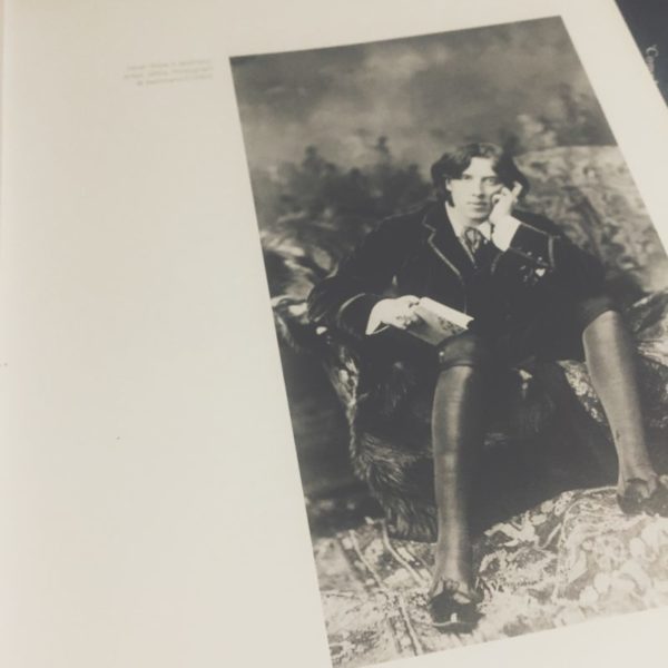
The trial of Oscar Wilde in 1895 led to, as historians have argued, a conceptualisation and increased awareness of homosexuality. Within previous centuries the biblical notion of ‘sodomy’ fuelled the belief that all sexuality was fluid and that every man was capable of committing the heinous crime of same-sex relations. As a result of the Wilde trials however, the newly defined legal and medical idea of the ‘homosexual’ allowed for sexual orientation to become a marker of identity. It is no surprise, therefore, that this new label of social categorisation infiltrated ways of dressing and enabled the notion of homosexual style to emerge.

Within the exhibition catalogue, Queer Style, Valerie Steele locates the inception of homosexual dress within the late nineteenth and early twentieth centuries in her discussion of Oscar Wilde. Wilde is often associated with two differing styles of masculine dress that are oft associated with the figure of the homosexual male: the ‘aesthete’ and the ‘dandy’. Steele defines the ‘aesthete’ as a flamboyantly dressed male whose outlandish sense of style became a marker of sexual deviance. For Wilde, his signature green carnation was adopted as a fashionable statement of such deviance amongst aesthetes.

While aesthetic modes of dress acted as a more visible form of locating the homosexual, dandyism revealed the sexual non-conformity of the individual through the hyper-conformity to male fashions. Steele observes how the dandy adhered to the male sartorial code to such an extent that he distinguished himself from his peers. When Wilde later transitioned to a dandyist approach to dress, he was thus able to signal his ‘deviance’ through conventional fashions. The dandy could protect himself within a heteronormative and homophobic society while also using his hyper-conformity as a means to present his homosexuality to those keen enough to observe it.

Wilde was a key figure in not only raising awareness of homosexual identity, but also in showing how this newly defined identity could be explored through dress. The impact of Wilde’s trial can be felt even now, as you see queer and homosexual aesthetics continually evolving and being redefined. Ultimately, the tragic downfall of Oscar Wilde allowed for the figure of the homosexual to be made visible within a heteronormative society, and it is this visibility that enabled the very notion of queer style to emerge.

Dissertation Discussion: Niall


What is the working title of your dissertation?

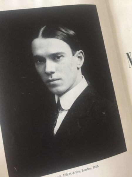
The Dancing Faun: Constructing the Queer Body in the Works of Vaslav Nijinsky

What led you to choose this subject?

I started reading Nijinsky’s diaries earlier in the year and absolutely fell in love with a man who truly was a victim of his time. You can feel the anxiety and unease surrounding his homosexuality through the page and this was something that I strongly identified with. I therefore thought it might be interesting to consider how his queerness was actualised within his performances and choreographic style.

Favorite book/article you’ve read for your dissertation so far and why?

Nijinksy’s diary.

Favorite image/object in your dissertation and why?

My favourite performance of Nijinsky was his work in L’Après Midi D’un Faune which he both performed and choreographed himself. As this work was his choreographic debut, it really showcased all of his ideas surrounding dance technique that was evidently distinct from the previous styles of the Ballet Russes.

Favorite place to work?

Where all the action happens: My bedroom 😉

Julliard’s Gourmet Colours


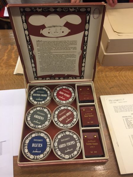
While in New York our class was fortunate enough to visit the archive of the Brooklyn Museum. One of the pieces that we were shown was a whimsical little catalogue of dyed fabrics called Julliard’s Gourmet Colours from autumn 1949. In truth, the word ‘catalogue’ is loosely used to describe what was, in actuality, a treasure trove of beautiful fabric swatches, whacky illustrations and a plethora of food-related puns. These curious little boxes were local to New Jersey, only produced once or twice a year and were made for the benefit of clothing designers and manufacturers who may have been interested in using their fabrics.

The ways in which the accompanying booklets described the look and feel of their textiles was truly a work of poetry; the gastronomical metaphors perfectly embodying the potential haptic visuality of fabrics and clothing. The booklet states: “Gourmet colours have subtlety and unique distinction of a great chef’s masterpiece… for, like a memorable dish, they are skilfully blended by experts and served up in the most attractive and tasteful guise.” With dye names such as ‘cranberry sauce, ‘black mint’ and ‘hot spice’, it becomes easier to see how one might begin to view an outfit as a perfectly crafted meal with high quality ingredients.

They go on further to write that the texture of certain fabrics may be “smooth as a mousse… or crisp as melba toast, or soft as soufflé… or as deliciously light as meringue.” Here, language is used as a means to suggest that there is a desire to devour when looking at something we deem to be aesthetically pleasing. They also write: “these Julliard fabrics have been designed and dyed in Gourmet colours to provide a gracious setting for milady.” In this sense, an interesting comparison can be drawn between the way in which the fabrics are being described and the way in which the gaze operates within society. In describing fabrics using food-related terminology and comparing women’s fashion as a ‘gracious’ table setting, we can see how fashion might be used as a means to be devoured and ingested by the look of others. This quirky and unique fabric catalogue epitomises the tactile and digestive nature of looking in a manner that almost satirises and parodies the devouring potentiality of the gaze.

By Niall Billings

Making A Pointe: A Short Discourse on Ballet and Sexuality


Sally Banes once wrote: “dance is often a metaphor for libidinous sexuality” in her book Dancing Women: Female Bodies on Stage. The relationship between the movement of the body for both artistic and sexual pleasure is one that has deep roots within history. Colleen Hill states that nineteenth century ballerinas often resorted to prostitution as a means to maintain financial stability at a time when dancers received minimal wages.

The association of dance and sexuality, however, extends far beyond the financial needs of the performers. The way in which a dancer moves their body has often been paralleled to the various corporeal rhythms performed during the sexual act. The similarities between these ‘dances’ is most keenly observed when considering a part of the body so often associated with fetishised —or even perverse —sexuality: the foot.

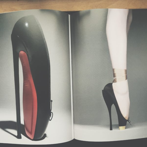
In a Vogue article from 1982, Alfred Kinsey is quoted as saying that during sexual activity “the whole foot may be extended [to] a position which is impossible in non-erotic situations for most persons who are not trained as ballet dancers.” Within this, it is possible to see how the motions of the foot are particularly susceptible to erotic pleasures. Kinsey’s assertion further demonstrates how the sexual act can make the foot mobile in ways previously deemed impossible without training in dance; almost as though eroticism can give someone the phalangeal flexibility needed to dance on pointe. In this sense, one can see how the ballerina on pointe might be viewed as in a continual state of erotic pleasure, her outstretched feet the very image of fulfilled desire.

The ballerina is a historical figure steeped with covert sensuality; her delicate feet becoming the desired object within male fantasy. Hill details a story of the discarded pointe shoes of Marie Taglioni. Within this tale, Taglioni’s worn-out shoes were cooked, garnished and eaten by a band of Russian admirers. If this story were more than mere fantasy, it would show the libidinous tendency to want to consume and digest the fetishised object of desire. Within this process, we may incorporate the object into our own psyche; a narcissistic gesture that enables our fetish to never part from our body.

The ways in which ballet has been long associated with sexuality is epitomised within the pointe shoe; an object reminiscent of the phallus in design, thus furthering is capacity to act as a fetishistic substitute for the male plagued by castrative anxieties. While the pointe shoe denotes an air of fragility it also, as Hill argues, represents the pain and discipline endured by the dancers. In this sense, the shoe becomes a paradoxical object of both pleasure and pain, desire and castration. The pointe shoe is ultimately an object imbued with sexuality and fetishised desire, a desire that extends to the very practise of ballet itself.

By Niall Billings


Further Reading:

Sally Banes, Dancing Women: Female Bodies on Stage, 1998

Colleen Hill, Ballet Shoes: Fashion, Function and Fetish from Dance and Fashion, 2014

Sherry Magnus, Feet, Sex and Power: The Last Erogenous Zone from Vogue, 1982