Author Archives: Mollie

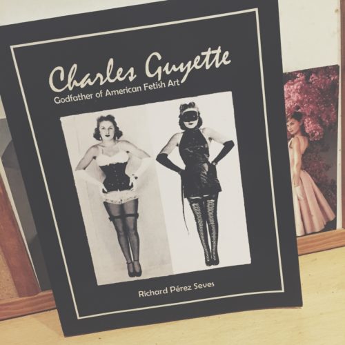
The G-String King: A book review of Charles Guyette The Godfather of American Fetish Art by Richard Pérez Seves

Charles Joseph Guyette was a fascinating, albeit over-looked, pioneer of fetishistic art practice within the 20th century. He was primarily a costumer who designed fetish-wear specifically for burlesque, strip-tease and circus performances. Working from the 30s to the 60s, Guyette is often considered to have formed the foundation for modern fetish-wear today. In fact, his designs were deemed so scandalous that he was arrested and sent to federal prison in 1935 only to be released a year later and continue to work under various aliases. Guyette was at one point branded the ‘G-String King’ due to the popularity of his garments amongst burlesque performers, as well as being known for his shoe designs that featured 7 inch heels; a height thought to be extreme in the 30s and 40s.

Within his book, Richard Pérez Seves does an excellent job in documenting the hidden life of an extremely important man who paved the way for many fetish-wear designers in the decades to come. The popularity of Gaultier, Mugler and Dita Von Teese ultimately has its roots in the work that Guyette did in uniting the realms of fetishism and fashion to create some truly beautiful images. The book features numerous photographs of Guyette’s designs that depict the artistry and femininity behind fetish-wear as well as the inherent beauty that resides within the female form. Guyette’s burlesque pieces were made with the intentions of strip-tease and undress; each layer ultimately revealing the natural body beneath. Fetishistic clothing, while often seen as a remedy against castration anxiety, can also be seen as a celebration of the nude female figure as it places her within a position of power over her own sexuality —a position she was often barred from. This book perfectly highlights the work of a fantastic designer who needs some much-earned credit.

By Niall Billings

Further Reading:

Richard Pérez Seves, Charles Guyette: Godfather of American Fetish Art, 2017

Lace Me Up Daddy: A Brief Glimpse Into Male Corsetry


The hyper-feminised silhouette produced as a result of corsetry is not one often associated with the notion of a male wearer. The corset acted as a means to drastically cinch the waist, lift and enlarge the bust as well as operating as a means to contour the hip and natural curve of the female body. In exaggerating the typically idealised ‘hour-glass’ silhouette it becomes almost unfathomable to think of the male body in relation to these traditionally feminised proportions.

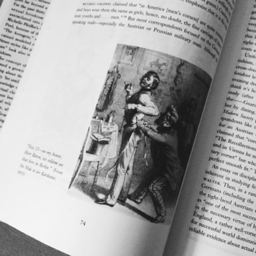
As Valerie Steele argues in her book Fetish: Fashion, Sex and Power however, corsetry and the male body have a long and interesting history. Steele first discusses a common theme amongst male corset-wearers: the underlying sense of masochistic pleasure derived from the restrictions of tight-lacing. She details how, historically, many men would borrow their wife of sister’s corset and thus ask to be laced into it. The desire to be submissive toward a dominant woman is certainly an interesting concept in relation to male corsetry however, it is much too limiting a view to take when considering the complexities of corset-wearing in the modern era.

Mr Pearl, a renowned tight-lacer, is quoted within Steele’s book in stating that he does not wear corsets in an attempt to be like a woman. For Pearl, corsetry is representative of control and the discipline one needs to wear such a garment. The corset dictates the way in which one behaves; movements are restricted and posture is refined. As the corset provides support for Mr Pearl’s spine it metamorphoses into and becomes his spine, thus providing the structure and discipline that he desires in everyday life. The corset becomes a second-skin for Pearl, acting as a marker for his identity.

These notions of structure, discipline and identity factor into Steele’s discussion of the use of corsets within military uniforms. She describes Austrian officers who tight-laced as a component of their military dress. In this sense it is clear to see how Mr Pearl’s association of tight-lacing and discipline manifests itself. The military is often seen as being affiliated with extreme restraint and regulation. It therefore seems appropriate that military men might find pleasure in wearing a garment that imposed rules and restraints upon the body to maintain orderliness and posture. Within this discussion of corsetry as a means of imposed discipline however, lies an interesting observation as to how the corset can actually promote a masculine silhouette. Although corsets have predominantly been used to maintain the ideally feminine ‘hour-glass’ shape, the corset can also bee seen as exaggerating inherent masculinity. When contoured to a male body, the corset cinches the waist, elongates the torso and broadens the shoulders; features often seen as being ideally masculine. While the corset may give the illusion of curves on a female body, it can actually produce harsh and angular lines within the male silhouette; a harshness that, I argue, exaggerates masculinity and the idealised male form. Whether male corset-wearers are expressing a masochistic desire for female domination or enacting a need for order and discipline, I believe there is no doubt that corsets act as a means to exaggerate the idealised masculine physique rather than transposing that of the feminine onto the male body.

By Niall Billings


Further Reading:

Valerie Steele, Fetish: Fashion, Sex and Power, 1996

An Attempt to Unravel Agnes Richter’s Jacket

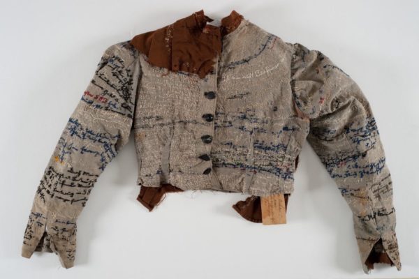
Within The Fashion System Roland Barthes puts forth the notion that meaning from fashion can only be obtained by its relationship to image and text. The illegibility of the garment itself however, does not imply that said garment does not have meaning; only that it is obscured. This notion is interesting to consider in relation to an embroidered straitjacket produced by the psychosis of Agnes Richter within the confines of the Hubertusberg Psychiatric Institution in 1895. Various words and incoherent sentences are maniacally stitched upon every available space while visible perspiration stains map the contours of the jacket. This sense of corporeality gives a ghostly impression of the artist’s body and hand; a hand that punctured and stitched the very garment that restricted her. For Richter, the needle became the phallus that she, as a woman, was deprived of within the patriarchal structures of the 19th century sanatorium. The needle-qua-phallus operates as an object that gave Richter a mode of expression, whilst the jacket itself — designed to restrict the arms thus inhibiting the ability to sew — can be seen as an object of castration. The puncturing of the jacket thus becomes an act of aggression that enabled Richter to conquer the object of castration while simultaneously embedding herself within it.

Within her book Agnes’ Jacket, Gail A. Hornstein closely analyses the textual content of the straitjacket and ultimately concludes that it remains illegible to the viewer. Written in German in a style called Deutsch Schrift, the jacket’s musings have never been discerned from the erratic stitchings that line the topography of the garment. What can be deduced however, lies within the abstract nature of the piece; such as the unravelling and withering threads that represent the decomposition of the artist’s mind during the jacket’s production. What Hornstein ultimately concludes is that the ghostly corporeality of the garment comes to embody Agnes and allows the viewer to revel in the obscurity of trying to ascertain who she was.

This obscurity and illegibility, in relation to Barthes’ statements on fashion, provides interesting insight into the gendering of language as well as Richter’s rejection of it. Whilst Barthes claims that language is one of the vessels through which fashion can convey meaning, language itself —as explored by Lacan — is a patriarchal structure that signifies a child’s entry into the Symbolic Order. It is therefore no surprise that Richter, alongside many of her contemporary female patients, rejected language and relied upon other means of expression. Charcot’s hysterics, for example, relied upon contortions of the body while Richter utilized the needle and thread as a means of communication. The similarity that lies between the words ‘text’ and ‘textile’ is one that becomes divided when considering the gendering of each. The written word was a privilege predominantly gifted to men while women were often delegated to crafts such as embroidery and weaving. In rejecting language Richter makes a return to the feminine art of embroidery that ultimately subverts and obscures meaning. Trying to unravel the threads of Richter’s jacket is a task that no one seems to be equipped for; and it is in this rejection of the symbolic that allows Richter to speak in a voice that no one understands but everyone wants to listen to.


Further reading:

Roland Barthes, The Fashion System

 Gail A. Hornstein, Agnes’ Jacket

Jacques Lacan, The Language of the Self


By Niall Billings

Louis Vuitton Series Three

Screen Shot 2015-10-08 at 14.38.14

Screen Shot 2015-10-08 at 14.39.38

Louis Vuitton’s enigmatically titled exhibition, ‘Series 3,’ has taken over 180 Strand, just a few doors down from the Courtauld. It documents Nicholas Ghesquiere’s inspirations for his fourth ready-to-wear show as the Artistic Director for women’s collections at Louis Vuitton.

Before going to the exhibition, I had absolutely no idea what to expect. There is very little information available on Louis Vuitton’s website, and I was only aware that it was even happening having walked past the venue. (I have since, however, been absolutely inundated with advertising for it, which is unsurprising). Upon arrival, I was met by an army of people, dressed identically in black suits with white shirts. Their crisp, stark appearance was, I soon realized, to be echoed throughout the exhibition space. The entrance, as well as all the hallways connecting the rooms were a bright, somewhat severe, white. The rooms housing the displays, however, were an immersive, loud, bright, highly sensory experience. The first room, entered via a white tunnel, displayed a trunk hanging from the ceiling. The round walls played a repeating montage of video clips, some of models talking about their experience of working for Louis Vuitton, others of the same models, marching down the catwalk, interspersed with alternating flashes of the famous LV print and white noise, which spun at an increasing speed around the walls. The whole thing was enough to make the visitor just dizzy and nauseous enough that they had to stagger into the next space. Bright lights, loud music and rapid moving images were employed again and again by the curators, in an attempt to make the experience as immersive, and subsequently memorable, as possible.

Screen Shot 2015-10-08 at 14.37.57

The aim of the whole exhibition, was, it quickly became apparent, to emphasize the genius of Ghesquiere, and elevate him to the status of a revered and respected artist. The exhibition guide described the show as a ‘stream of consciousness, dreams and self-reflexive journeys… The designer’s careful thoughts pair with a  delicate artisanal touch.’ This idea of the designer as a genius, and the exhibition as an insight into his inspiration and psyche is reiterated again and again, creating a ‘sensorial journey, venturing deep into the designer’s soul and an artisan’s heart.’ The curators were evidently far less concerned with conveying any information about Louis Vuitton or the new collection.

 The handmade quality of the objects in the collection was also a prominent theme of the exhibition. In one room, the viewer was encouraged to sit at a wooded table, and watch a real time video of the maker’s hands, carefully crafting a clutch bag. The description of this room tells the viewer that ‘each craftsman’s movement is that of an artist.’ Like Ghesquiere, the creators are heralded as artistic heroes, however, unlike the designer, whose name is the most prominent aspect of the exhibition, they remain completely anonymous. In this room, it is only their hands on show. In a later room, the visitor met the maker, head on. Two women were sat at desks, carefully crafting clutch bags. They were surrounded by an intricate system of lights and cameras, projecting videos of their hands onto screens behind them. The act of making a bag was turned into a performance, and the women a spectacle.

a video showing the hands of an anonymous maker

Screen Shot 2015-10-08 at 14.39.20

The visitors were first shown the collection about half way through the exhibition, in a large, bright room with mirrors lining every wall. Lifesize videos of models marched to the pumping beat on large free standing screens. The effect was clever, making the visitor feel as if they were actually at the show, however, again the clothes of secondary importance to the room itself. The information for this room was quick to reinforce Ghesquiere’s position at the top of the pyramid, stating ‘… 45 models, one designer- Ghesquiere.’

Floor to ceiling mirrors were employed in nearly every room, creating the effect of never ending, infinite space. However, they also caused the visitor to look at themselves too, alongside Ghesquiere’s collection. From a curatorial point of view, this forces the viewer to, perhaps subconsciously, compare themselves to the glamourous collection, or imagine themselves wearing it, giving the exhibition an aspiration quality. This was extremely apparent in the final room, in which the entire collection hung in open Perspex boxes. Visitors were not only allowed, but encouraged to touch things, pick them up and open them. The guide for this room read ‘clothes speak to the women to wishes to own them,’ and I overheard a tour guide dub the room ‘every woman’s dream come true- the walk in wardrobe.’ It was clear that, upon entering the room, the visitors were meant to covet the luxurious, fur coats and elaborate jewel encrusted skirts.

Screen Shot 2015-10-08 at 14.38.39

The mirrors also served another function: they made the rooms the perfect setting for the ultimate selfie. They had clearly been conceived of as the most instagrammable rooms ever (it suddenly became apparent why the wifi password had been displayed so prominently in the entrance!), which was a hugely clever PR technique from Louis Vuitton. Every visitor in the exhibition with me was lapping up the opportunity to take the artsiest selfie they could, which, presumably, they would soon share on social media, creating the desired buzz around Ghesquiere’s new collection during Fashion Week season. I couldn’t help thinking throughout that this was one of the most elaborate and immersive marketing strategies I had ever seen.

in selfie heaven
in selfie heaven

This was definitely not most informative fashion exhibition- I left feeling scarcely more knowledgeable about Louis Vuitton than when I arrived. In fact, I would scarcely call it an exhibition,  but rather the most lavish example of experiential marketing I have ever seen. It was an eye-opening foray into the techniques design houses use to promote their collections. In terms of marketing, the exhibition was enormously clever, because it created an experience that no visitor could resist photographing and sharing. It seemed to be an exhibition for exhibition’s sake. The actual collection was of secondary importance to the exhibition itself, and very little information was provided. However, where it succeeded was creating an unforgettable experience, and, even if the visitors can’t remember what one garment in the collection looks like, they will definitely remember that it was by Louis Vuitton.

Cactuses and Paper Dresses: Frida Kahlo at the New York Botanical Gardens

cactuses in the Enid A Haupt conservatory in the NY Botanical Gardens, inspired by Frida's collection of cactuses in the Casa Azul
cactuses in the Enid A Haupt conservatory in the NY Botanical Gardens, inspired by Frida’s collection of cactuses in the Casa Azul
a replica of Frida's desk, in the conservatory at the NY Botanical Gardens
a replica of Frida’s desk, in the conservatory at the NY Botanical Gardens
Humberto Spindola's sculpture, inspired by Frida Kahlo's The Two Fridas
Humberto Spindola’s sculpture, inspired by Frida Kahlo’s The Two Fridas

The New York Botanical Garden has been transformed into a Mexican, Frida Kahlo-esque paradise.  The Enid A Haupt conservatory, a huge Victorian greenhouse, is now full of cactuses, Frida’s great botanical love. The Casa Azul, the house in which Frida was born, and where she spent most of her adult life with her husband Diego Rivera, has been replicated within the conservatory. The strong blue colour that is so characteristic of the Casa Azul, and from which it derives its name, serves as a backdrop for the hundreds of prickly plants.

The garden is accompanied by a small collection of Kahlo’s paintings that exemplify her interest in and passion for plants and botanical drawings. The lifelike realism with which she rendered floral imagery in her paintings suggests that she was a keen and knowledgeable horticulturalist.

I studied Kahlo’s representation of dress in her paintings, and her own dress, extensively for my MA dissertation, so I was happy to make the trek out to New York’s Botanical Garden in the Bronx. The most interesting aspect of the exhibition was, in my opinion, Humberto Spindola’s lifesize recreation of the two figures in Kahlo’s famous painting The Two Fridas. The painting is a double self portrait; the two identical women sit side by side, holding hands. As in many of Kahlo’s self-portraits, dress is an important tool employed to depict a sense of strong Mexican national pride. The clothing worn by the figure on the right in The Two Fridas is very similar to other depictions of dress in her works, including My Dress Hangs There. The Mexican outfit, indigenous to the women of the Isthmus of Tehuantepec, comprised of woven huipil and floorlength skirt, was also worn by Kahlo herself in her day to day life. Frida adopted this style of dress during her early adult life, and continued to wear it until her death. To her, this style of clothing was deeply implicated in her socialist political views and a symbol of her strong feelings of national pride. Since her death, the Tehuantepec style of clothing has taken on connotations as a symbol of the artist herself, and is used by many, including Spindola, as a homage to Kahlo.

My Dress Hangs There, Frida Kahlo,
My Dress Hangs There, Frida Kahlo

Spindola’s work, which stood alone in a rotunda, is a powerful example of how Kahlo’s dress has been transformed into a symbol of her identity. Although recognizable as the scene from The Two Fridas, his sculpture depicts only the figures’ clothing. Their bodies are simple reed canes, woven to create the three-dimensional figures. From a distance, the frames almost disappear into the background, creating the illusion of the dresses floating in space. The clothes, despite their realistic appearance, are made from amate paper using a traditional Aztec technique, posing an interesting question about the role of dress in art and art in dress. Many of the clothes Kahlo depicted in her paintings were real garments that she owned and wore on a regular basis. After her death, Rivera demanded that Kahlo’s bathroom and dressing room remain locked for a minimum period of fifty years, and, in 2004, when the rooms were finally opened by the conservators and curators at the Casa Azul, many of the clothes discovered inside were in perfect condition thanks to the dark, cool environment. Many were very similar, or indeed identical, to those Kahlo rendered in paint. For her, the garments she painted were very personal, real life objects. Often, as in My Dress Hangs There, clothing stands in for a human figure, acting as a form of self-portrait. However, for the millions of people who have looked at Kahlo’s paintings since her death, the dresses she depicted are nothing more than two-dimensional images. Spindola has played on this paradox between clothing that, to Frida, was very real and everyday, but to an audience was nothing more than a potent painted symbol. In creating these dresses in a lifesize, three-dimensional format, Spindola places them back in the ‘real’ world. But, not quite. Especially when approaching them from a flight of stairs, as the curators of the exhibition enforce, they seem almost like real women, a likelike incarnation of Frida herself. But upon closer inspection, it becomes clear that they are made of paper on a reed frame, and are therefore entirely unwearable. These dresses that have lived purely in the cultural memory of the post-Frida generations have been taken off the canvas and into the three-dimensional world by Spindola, yet remain just as fragile and unwearable.

The Two Fridas
The Two Fridas

Sources

http://www.nybg.org/

Denise Rosenzweig and Magdelena Rosenzweig (eds), Self Portrait in a Velvet Dress: Frida’s Wardrobe, Fashion from the Museo Frida Kahlo, (San Francisco: Chronicle Books, 2007)

Sombreros and Sarapes, Good and Evil in Sergei Eisenstein’s 1930 film ¡Que Viva Mexico!

Screen Shot 2015-09-12 at 10.28.14

After the Mexican Revolution of 1910-1920, depictions of indigenous people and their dress began to be used by artists as an important tool for glorifying Mexican nationalism and the new Socialist politics of the country. Sergei Eisenstein, a Russian filmmaker who became disheartened with the Soviet Union’s treatment of both avant-garde art and antique religious artefacts, looked to Mexico as an example of perfect socialism. He traveled there in 1930, after meeting Diego Rivera in 1927 and became enthralled with the Mexican heritage that Rivera spoke so passionately about.  Eisenstein’s intention was shoot a film entitled ¡Que Viva Mexico! However, the project was never fully realized as he was forced to return to the USSR after losing his funding in 1932. What remains are the hundreds of metres of film he shot, which, in 1979 were turned into a film of the same name by director Grigori Aleksandrov. Aleksandrov remained faithful to the format that Eisenstein had intended for the film, breaking the footage up into four separate episodes: Sandunga, Fiesta, Maguey and Soldadera, as well as a prologue and epilogue.

The film opens with shots of the Mexican landscape and ancient ruins, depicted almost as snapshots. Each of the four episodes then depicts a different time period and location, but always exalting Mexican nationalism, culture and particularly the lower classes.

Maguey is the episode in which sympathy for and appreciation of the lower classes is most apparent, and the disparity between the dress of the workers and landowners most obvious. Set on a maguey plantation during the pre-Revolutionary capitalist regime, headed by leader Porfirio Diaz, it tells the story of Sebastian, a worker, and his lover Maria. When Maria is held captive and abused by the apparently evil landowner, Sebastian and his friends seek revenge, but are caught and executed. The episode is laced with visual references to Christianity, the immorality of the capitalist landowners and a clear allegiance to the workers.

workers in the courtyard

Dress is crucial in marking out the different characters, particularly for an English viewer, as the film is in Spanish with Russian subtitles. As well as making the plot slightly more difficult to follow, this has the effect of forcing the viewer to read the visual clues left by Eisenstein during his filming. The workers are depicted in traditional Mexican clothing: simple trousers, and woven sarapes, blanket-like capes. During the beginning of the episode, the viewer is introduced to the workers. They are shown lined up against a wall in a sun-drenched courtyard. The camera draws the viewer’s attention to their garments and sandal-like shoes. These shots of the sun-drenched wall and the sarape-clad men were clearly conceived as an image of quintessential indigenous Mexico. However it is not an idealised, peaceful lifestyle. These men are subject to the exploitation and poor treatment that Eisenstein feels is part of a capitalist society. In stark contrast to the workers, there is one solitary figure looming in the background that is a representation of authority on the plantation. Unlike the men, he wears more European style tight-fitting trousers, a jacket and a large hat. He is seen only in profile, a silhouette against the bright field behind, which makes the large gun he rests on his bent knee even more apparent and menacing. His European style dress is one of the most obvious symbols of his evil character.

the wealthy landowner in European attire

The workers’ dress is also radically different from the landowners themselves, who are shown as fat, lazy men getting drunk while the workers toil on the plantations. This episode is constructed as a microcosm of capitalism, in which the rich get ever richer, and subsequently fatter, from the labour of the poor. These men, who are cast as evil in the eyes of the viewer, are distinguishable by their lavish, European style of dress. They are depicted in tailored jackets, striped trousers and one even wears a bowtie, tying them definitively to Western capitalist societies.

Women’s dress is also contrasted to display the differences in social class. Maria is shown wearing a simple skirt, blouse and a scarf covering her head. In direct comparison, Sara, the daughter of the landowner, arrives wearing extravagant clothing; an elaborate ruffled blouse and skirt, white lace gloves, a large hat with lace train and bustle. She is an exaggerated image of vanity and her ostentatious costume is used to exhibit her decadence and cruelty.

the landowner's daughter, Sara

Eisenstein’s message is clear: Mexico under Spanish rule and Diaz’s westernised, capitalist regime was a cruel society, driven by greed and abuse of the indigenous people. What is perhaps most significant about the depictions of the different classes in Eisenstein’s film is that they are mediated through a nationalist lens – the wealthier, landowning classes, who are portrayed as evil and manipulative, are all closely aligned through their dress to European traditions. The lower, working classes, in their indigenous attire, are idealised and shown as the victims of a corrupt capitalist system, and therefore are the heroes of the film.

Sources:

Inga Karetnikova and Leon Steinmetz, Mexico According to Eisenstein, (Albuquerque: University of New Mexico Press, 1991)

Dress and Movement in the work of Sonia Delaunay

Cover SD

Somewhat embarrassingly, I only managed to make it to the Tate’s Sonia Delaunay exhibition in its last week, but I was so glad that I did. I went not knowing much about Delaunay prior to stepping through the door, and because it was held in the Tate Modern, I was expecting it to focus mainly on paintings. However, it was her textiles, fashion designs and illustrations that underpinned the whole exhibition. It was immediately apparent that textiles and dress were hugely important to her during her career.

The earliest example of her work in textiles appears in the second room – a cradle cover made in 1911 for her newborn son. Interestingly, the Tate labels it as her ‘first abstract work,’ highlighting the fact that they conflate her work in textile and paint. This is, to an extent, completely understandable as there are numerous similarities between the aesthetic she employs in both. The way blocks of colour are juxtaposed is identical in both mediums. However, to consider the cradle cover, and her later fashion and textile designs, purely as decorative art is to ignore the practical, and indeed emotional, role that these objects played.

Cradle SD

Movement is by far the most persistent theme underlying all the work in the exhibition. Delaunay was fascinated by dance, particularly tango, and many of her works reflect the rapid movement and blurring of shapes that one expects to see in a packed dance hall. In this way, her work bears some resemblance to that of the Italian futurists, who in their obsession with the speed of modern life, painted the rapid movement of cars and people through the city as swirling blocks of colour. In her scenes of dance, ‘light and movement are confounded, [and] the planes blurred’ (Delaunay, c 1913). However, there is also a sense that these colours represent the sound of music in the dances. Bodies, dress and music are all reduced to contrasting colours on the canvas.

Simultaneous Dresses (the Three Women), 1925

As in her paintings, movement is a central theme of her fashion designs. In 1918 she opened Casa Sonia in Madrid, a shop selling accessories, furniture and fabrics that bore her signature swirling lines and blocks of colour. In 1925 she set up her own fashion house, as well as designing costumes for ballets and cover illustrations for Vogue. In these, as in her paintings, the body is abstracted, leaving the viewer with the representation of dress in motion. The straight, 1920s silhouette lent itself well to her geometric, graphic designs and bright colours. However, it was not just her clothing that bore this aesthetic, she also designed furniture, and the interior of her Parisian home became something of a manifesto of her style, and a hub for artists and writers.

Two fashion models in Delaunay's bathing suits
Two fashion models in Delaunay’s bathing suits

Movement was also at the heart of her textile designs, so much so that, when she displayed her textiles at the 1924 Salon d’Autumne, they were presented on a ‘Vitrine Simultane.’ This vitrine, created by her husband Robert Delaunay, presented eight swaths of fabric continuously moving upwards on large rollers. Movement was quite literally injected into these otherwise static objects.

It would be easy to look at Delaunay’s textile and fashion designs as a by-product of her painting; the same circular shapes and bold colours that feature in her canvases also appear in the textiles. However, I would argue that her paintings are just as influenced by work in dress – her paintings of dance, convey the movement of dresses swirling in different directions, abstracting the body and giving the canvases their characteristic dynamism.

Ekocycle: Make Do and Mend for the 21st Century?

Screen Shot 2015-06-30 at 08.06.45

‘Will.i.am is building a whole new world, one recycled micron at a time.’ That is the claim made by the website of Ekocycle, the brand he founded in collaboration with the Coca-Cola Company to promote, design and sell clothing made from recycled materials. The company sells trendy, eco-conscious clothing created in conjunction with many different designers both online and in Harrods.

The whole thing is done in a very over-the-top, very will.i.am-ish way. However, it’s hard to forget that what they’re doing is actually a really good thing. Amidst the silliness – ‘until now recycling hasn’t been the stuff of legend- not the best selfie material’ – there is a hard-hitting and important message. The website states: ‘we see sustainability as “the” revolutionary social material of our time. Efforts to combat climate change and green initiatives are often sidelined by propaganda and political shuffling- but our goal is to help sow the seeds of change…’

Screen Shot 2015-06-30 at 08.06.57

Many of the garments are made from 100% recycled plastic or PET bottles and are produced using the most energy-efficient methods available. The aim is to encourage people to recycle by demonstrating how already used things can be turned into some new, completely different and exciting. The idea is to evolve from a clothing range into a whole movement, which encourages people to recycle and encourage others to follow suit.

Exploring the Ekocycle website, and snooping through their range in Harrods (perhaps the only retailer where a backpack can sell for £1,415), I am prompted to consider the role fashion has to play in the future of sustainable living. Fashion is, by its very nature, one of the least sustainable commodities. In today’s culture, where novelty and individuality are desired above all else, clothing is bought, worn and discarded on a near seasonal cycle. We are taught to value the new to such an extent that our clothing habits can become somewhat wasteful. We rush to buy cheap clothing that we can wear once and throwaway, to ensure that our look is constantly being updated. However, this is causing huge problems for our planet. An estimated 350,000 tonnes of clothing (worth 140m) is thrown away each year. Consumers today need to learn to change their shopping habits from bulk-buying cheap, disposable clothing to reusing, adapting and upcycling old garments. Ekocycle is attempting to pave the way for a new consumer who shops ethically. The problem with this plan is the cost. It is inconceivable for most shoppers today to spend the kind of money Ekocycle is demanding for its clothing. Until sustainable fashion is more budget friendly, it seems the inevitable truth is that people will continue to buy the cheapest clothing they can, and indulge their desire to constantly refresh their wardrobe.

Screen Shot 2015-07-07 at 06.56.00

However, this view of clothing as something disposable is very modern. During the Second World War, and in the years that followed it, clothing was rationed, and so it was seen as a precious commodity. Nothing was thrown away if it could be restored, and old things were constantly being adapted into new garments. Campaigns such as ‘Make Do and Mend’ encouraged the kind of resourcefulness that is lacking in today’s consciousness. People were expected to wear a garment until it no longer fit, or had lost all structural integrity, but then, instead of throwing it away, it was changed into something new by reusing the material.

Perhaps what Will.i.am and Ekocycle are doing isn’t so modern, despite the futuristic designs of their clothes. It seems, in fact, that they are merely resurrecting an old ideal of reusing and readapting to prolong the life of a material. Our Grannies- the kind of women who would repair continuously to avoid throwing something away- would recognise something of themselves in this brand. The old curtains and tablecloths that fill anecdotal evidence about wartime clothing have been replaced by plastic bottles, however the concept of turning something old into something new remains exactly the same.

Fashion and Art Collide in Yves Saint Laurent’s Love Cards

Garden

Anyone who knows anything about fashion has heard of Yves Saint Laurent. But what people may be less familiar with is his informal career as an artist.

Galerie-Love

Hidden away in the Jardin Marjorelle in Marrakech, which Saint Laurent bought in 1980 with Pierre Bergé, and where his ashes were buried after his death in 2008, is the ‘Love Gallery.’ I arrived at the Jardin Marjorelle seeking some refuge from the African sun, and instantly understood why Saint Laurent and Bergé were drawn there: it is a beautiful oasis full of blossoming foliage in a city that is predominantly dust and sand. The rather ambiguously named ‘Love Gallery,’ a tiny blue square on the garden map, caught my eye and I wondered what it could possibly hold. The tiny, one roomed building, tucked away on the edge of the garden, houses the entire collection of Saint Laurent’s ‘Love Cards.’ He created one every year from 1970 to 2000 to send to his family, friends and clients in order to welcome the New Year. The cards are boldly coloured and graphic, and the message could not be clearer; it is declared through the use of one, four letter word: ‘LOVE.’

Galerie-Love-2

The cards, often humorous and whimsical, allowed the recipient then and the viewer now a glimpse into the consciousness of the legendary fashion designer. They often include the things he held most dear, his bulldog Moujik, or the fountains of the Jardin Marjorelles. However, they also serve to reinforce his artistic abilities. They are clearly well thought out, aesthetic pieces of work, and highlight how talented he was in the visual arts, as well as in fashion design.

Love

They also show an appreciation of the history of art, and the influence of many famous, twentieth century artists is clearly visible. The 1991 card is an homage to Andy Warhol: it displays four images of Saint Laurent’s beloved Moujik, coloured in different hues on a bright yellow background. The caption definitively states Warhol’s influence, reading ‘this is Moujik, my dog, painted by Andy Warhol. Me, I am Yves Saint Laurent.’ However the curling French script juxtaposed with the imagery is reminiscent of Renee Magritte’s ‘Ceci n’est pas une pipe’. While the influence of these two artists is clear, Saint Laurent ensures that the viewer knows exactly who made it, and it is his talent as an artist that is important here. He is drawing on his knowledge of the history of art to create a piece that is unique to him and specific to the time and culture in which he was working.

Love-Sun

Henri Matisse’s influence is also evident in the cards, many of which employ the same collage technique with bright colours and bold, simple shapes that he turned to later in his career. The 1986 card is arguably the most basic in composition, yet also one of the most effective. It consists of a yellow background and cut out shapes in four different shades of blue which are used to create a scene of the Jardin Marjorelles itself. Despite the limited colour palette and simplicity of the shapes, Saint Laurent has captured the feel of the garden perfectly, and it would be instantly recognizable to anyone who had visited. The dark blue against the bright yellow background creates the effect of the oppressive sun and the cool shade offered by the trees.

IMG_8641_2

The cards created during the 1970s have a definite look that clearly identifies them as part of the same epoch. Graphically, they are more complex than the later compositions, more closely aligned with The Beatles’ Yellow Submarine imagery than the work of any particular artist. The 1977 example is particularly complex. It shows a woman wrapped in a long flowing piece of fabric that is decorated with rows of triangles and curving lines. She could be interpreted as a Muslim woman covered by her hijab, and thus a symbol of Algeria, Saint Laurent’s place of birth and childhood. However, he has given her a modern twist, updating the traditional religious garb for the 1970s by dressing her in a colourful, geometric pattern. It has a hypnotic quality, as if the viewer is seeing something that does not quite exist. The 1973 card is an erotic picture of a naked woman, coiled in what appear to be tentacles or snakes. Unlike the later cards, which tend to employ very simple compositions- some are simply large blocks of different colours- the cards of the 1970s are more figurative.

Hijab

These cards show a different side of Yves Saint Laurent. They highlight his enthusiasm to experiment in different media and test his design skills on a two-dimensional surface, as well as on the human body. However, they also depict him as playful, light hearted and, above all, deeply loving.

Luke Limner, Madre Natura versus the Moloch of Fashion (1847)

Cover

Madre

Summary

This ‘social essay’, published in 1874, documents the author’s views about the dangers of following fashion. The author, Luke Limner, starts by condemning the luxury and excess of fashion, and criticizing the wealthy classes’ taste when choosing to wear the latest styles.

Limner’s main concern is fashion’s utter disregard of, and attempt to better, nature. He comments that modern dress is becoming increasingly independent of climate or season, stating that ‘the English lady suffers in her corset and tight bottines in the tropical heat of Calcutta.’

Corset

The bulk of the essay charts his disapproval of modifications of the body. He comments that clothing, instead of fitting itself to the human form, demands that the body adapt itself to fit the garments. He feels that this ‘authority of fashion is a gross imposition on mankind,’ and specifically focuses on the corset. He believes that fashion is deforming natural bodies, with great health risks, that he outlines in detail. He is very knowledgeable about human anatomy, commenting on the impact of the corset on the lungs and liver, which serves to provide epistemological evidence and support to his claims, which may otherwise seem somewhat empty. He urges modern women to ‘aid Mother Nature to abolish that type of body bondage and cursed contrivance.’

Corset 2

Response

Limner’s concerns about the dangers of the excess of fashion, as well as attempts to modify the natural forms of the body are common themes in fashion writing. Particularly during this period, but even as late as the twentieth century, there is a concern about the frivolity of fashion and the impact, both physical and moral, that it has on women.  As is the case with a lot of fashion writing, there is a somewhat sexist tone to Limner’s essay. He expresses a concern that women’s heads are filled with ‘flounces and furbelows, ribbons and gauze’ and that female vanity is ultimately leading to the downfall of society. However, there also seems to be a genuine concern about the risks to women’s health as a result of following fashion too strictly, and he appears to blame the fashion industry more than the women themselves. He sympathises that fashion’s ever-changing demands make it increasingly difficult for women to adhere to trends. That is the main contradiction of this essay: Limner accepts that the fashion industry makes unrealistic demands of women’s bodies, but then also seems to blame female vanity for accepting these demands.

Spine

It is very telling of attitudes of the period that, despite the fact that women were generally accepted as the main consumers of fashion, it is men who are trusted to write about fashion in a critical way. There is much debate in dress history, about whether fashion is a liberating or enslaving force. When reading essays such as Limner’s, it is hard to imagine that it can be anything other than a subjugating, oppressive industry.  However, in the twentieth century, when women started to be respected as designers and later writers and curators, the tables turned and fashion became a means of female emancipation and expression of creativity.

Back