Lilly Wilcox: The Second Restoration of the Louvain Library

Box CON_B09765 is full of destruction. Perusing the photographs within, you encounter crumbling palaces, streets full of rubble, and churches that have become unrecognizable. This box contains part of the Macmillan Commission’s archive of formerly confidential photographs showing second world war bomb damage in Austria, Belgium, and the Netherlands. Each mounted photograph has a notice on the back that reads:

RESTRICTED.

The information given in this document is not to be communicated either directly or indirectly, to the Press or to any person not authorised to receive it.

This message, along with the fact that this box remains undigitised*, contributes to a sense of reverence one must feel for the photographs. It is privilege to help steward these images, which have been obscured from the public’s view for nearly eighty years, into public memory. The damage that the photographs show is nearly incomprehensible. Yet, inside this box one image stands out as a testament to hope.

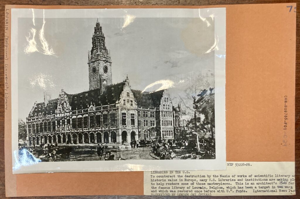
CON­_B09765_F001_029 is one of few images of intact buildings in this box, but its slight haziness differentiates it from the others. While the crisp uniforms of American G.I.s are in sharp focus in other photos in the Macmillan archive, the people milling about the foreground of this image are little more than smudges. You can tell that the structure in the image, which has three gables and a spire, is meant to be magnificently detailed, but the rows of what seem to be windows that dot the roof appear more like shadows. The photograph invites speculation in a box that is firmly rooted in a historical reality.

The caption reveals why this photograph, which is differentiated by its style and mood, is included in box CON_B09765:

Libraries in the U.S.

To counteract the destruction by the Nazis of works of scientific literary an

historic value in Europe, many U.S. Libraries and institutions are making pla

to help restore some of those masterpieces. This is an architect’s PLAN for

the famous library of Louvain, Belgium, which has been a target in two wars

and which was restored once before with U.S. funds. International News PLo

RESERVICED BY LONDON OWI (FILES)

An old black and white photo of the plans for the Louvain Library, a gothic style building that looks somewhat like a church. The photo is stuck on an orange card mount with some typewritten text.
Fig. 1 CON_B09765_F001_029. An image that shows a plan for the post-second world war restoration of the library of the Université catholique de Louvain.

Among the Macmillan archive, there are many photos of soldiers recovering artefacts from historical churches and architects assessing the damage in preparation for restoration, but this was the only image I could find in the Macmillan archive that showed that libraries were a priority for post-war repair.

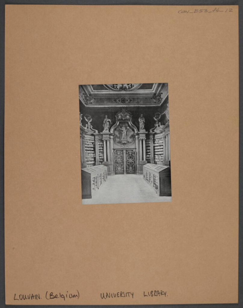
A black-and-white print that shows the interior view of the Université catholique de Louvain library with ornate ceiling, statues and reading stands with glass fronts. Contains wrought iron double door, wall bookshelves, with columns and a crown motif over the main entrance statue.
Fig. 3. CON_B00053_F004_012. Interior of the Université catholique de Louvain library prior to its destruction in the first world war.

Looking further into the history of the library of the Université catholique de Louvain reveals that it was victim to both the first and second world wars. In 1914, the library was burnt down by the German army, destroying most its collection of manuscripts and rare books and modern printed works. The destruction and rebuilding of the library was a significant moment in the British and American cultural imagination. The John Rylands Library in Manchester solicited donation of books from libraries across the UK and its former colonies. President Herbert Hoover, then U.S. Secretary of Commerce, was a champion of the project to rebuild the library. Money to support the restoration project was crowdfunded from American institutions and private citizens via the National Committee of the United States for the Restoration of the University of Louvain, as well as through German reparations as per the terms of the Treaty of Versailles.

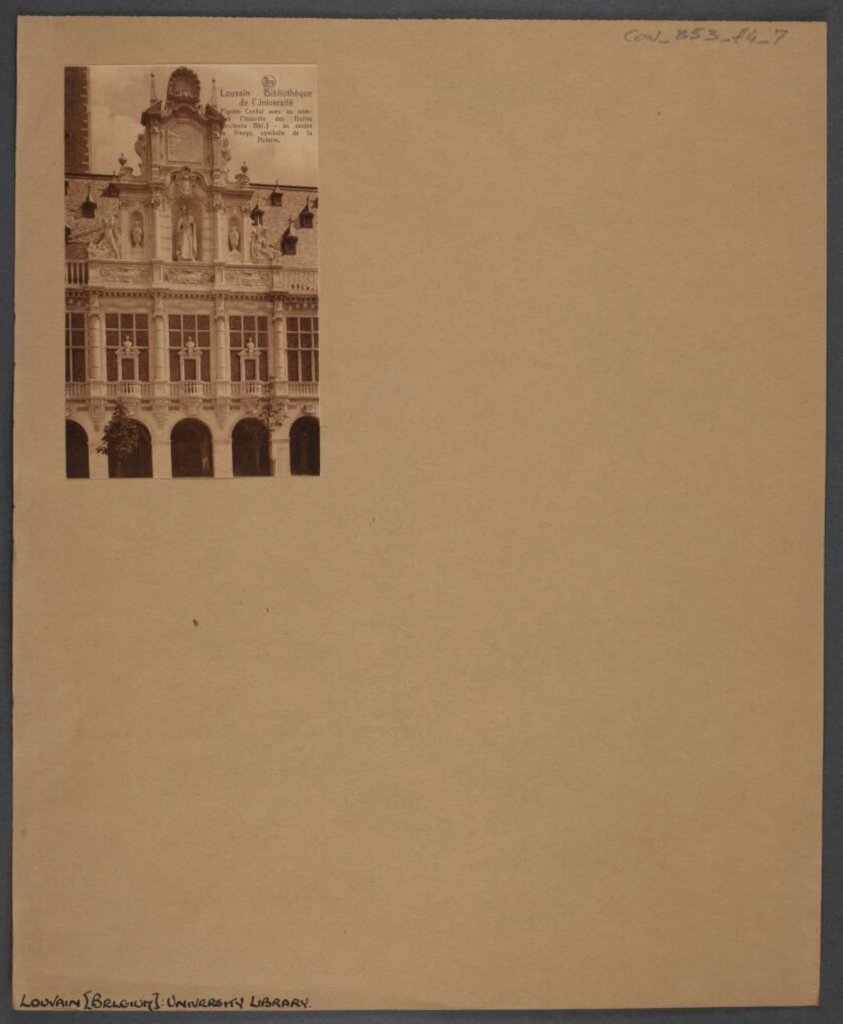
A sepia print that shows the central gable of the Université catholique de Louvain. The gable includes an image of the burning of the old library at the top and a representation of the Virgin Mary at the centre.
Fig. 3. CON_B00053_F004_007. Façade of the Université catholique de Louvain library prior to its destruction in the second world war.

American architect Whitney Warren designed the reconstruction, which started in 1921. He courted controversy, planning to inscribe the building with the Latin phrase: “Furore Teutonico Diruta, Dono Americano Restituta”, which translates to “Destroyed by German fury, rebuilt by American donations”. The plan for inscription was eventually scrapped, as it was seen as an unnecessary admonishment of post-war Germany, and the building was completed in 1928.

CON­_B09765_F001_029, the image of the plan for the library’s reconstruction in the Conway library, however, is dated from the second time the library was destroyed, according to the caption provided by the Macmillan archive. The library burned down again, probably caused by an exchange of artillery fire between Nazi and British forces, and most of its restored collection was lost.

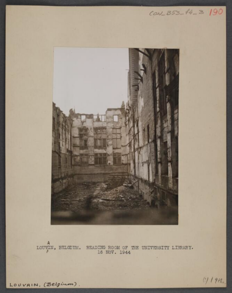
A sepia photograph that shows the reading room of the library of the Université catholique de Louvain after it was burnt down in the second world war.
Fig. 4. CON_B00053_F004_003. Reading room of the university library. 16 Nov. 1944 Belgium.

Curiously, secondary source histories of the library focus primarily on the first destruction and rebuilding process and provide relatively few details about the second, which took place from 1944–51.

It seems that the second restoration did not capture the public’s attention to nearly the same degree. A search of the British Library’s newspaper collection for articles about the second destruction of the Louvain library returns only reporting about the second destruction of the library and not its reconstruction. Admittedly, this archive ends in 1950 before the library was reopened. The Macmillan archive photos were not available to the British press, which could be a contributing factor to this. The same search in the Library of Congress’ Chronicling America archive, which extends beyond that date, provides more context about the second reconstruction but also focuses primarily on the destruction of the library.

Most American newspaper articles reporting on the destruction of the library in 1940 harken back to the role that prominent Americans, as well as the American populace, played in the original restoration. One opinion printed in the Washington Evening Star even abdicates the United States from the responsibility of restoring the library once more, and instead assigns that task to the Nazis: “The lovely Library of Louvain, rebuilt after the last war by contributions from American school children, has been destroyed again. Most of us can think of a group of highly skilled workmen to whom well might be assigned the postwar task of a second reconstruction. Terms of the arrangement would be long hours, good grub and no pay”.

In these two databases of English-language newspapers, as well as in the archives of the New York Times and the Washington Post, I wasn’t able to find conclusive information about who was responsible for financing the rebuilding of the Louvain library the second time. (Without speaking French or Flemish, I couldn’t look for additional information in contemporary Belgian newspapers.) Based on speculation from the New York Herald Tribune, it seems that the task fell to the Belgian government and the university itself.

Americans remained involved in helping to restore the library’s collections, though, as did the international community. The Louvain Book Fund was an American charity, again supported by President Herbert Hoover and others, that fundraised for the purchasing of a new collection. The Library of Congress and the American Library Association, along with other non-American governments, supported UNESCO in the development of the “CARE” programme, which sought to help refurnish libraries that lost their collections during the war. CARE funded their book buying, in part, through crowdfunding, again involving the American people. The Louvain library was the first library to receive books through this scheme, but CARE received applications from secondary and vocational school libraries in addition to university libraries and cultural heritage libraries.

The photograph CON­_B09765_F001_029 is part of the Louvain library’s greater story of grief, collaboration, and hope. CON­_B09765_F001_029 has reminded me that libraries are spaces for connections—both intellectual and personal—for sparking curiosity, and for fostering confidence. The Conway Library, where I was able to uncover this bit of library history, is no different. I feel grateful that the Conway exists to allow students, volunteers, and other researchers to uncover and tell stories. I also feel grateful that libraries have historically been recognized for their stewardship of knowledge and humanity, and I only hope that that trend continues.

Lilly Wilcox

Courtauld Connects Digitisation

University of Oxford

Micro-Internship Participant

* Editor’s note: the box has been digitised however it has not yet to be published on https://photocollections.courtauld.ac.uk/

Rosa Coomber: The Making of Suzon’s Clues

My name is Rosa Coomber, and I was lucky enough to work with the collection as the Digital Narratives and Storytelling Intern from August 2022 to the end of July 2023. I was excited to join this internship not only due to the opportunity to work with an incredible collection, but also due to the apparent commitment to creativity and freedom fostered by my colleagues. Digital narratives and storytelling are necessarily vague phrases; with a collection as vast as we have at the Conway, and a staff and volunteer body so broad and dedicated, there are more than enough stories to tell! After studying for a few years, I was keen to take a break from essay writing, and instead sought to ponder the question “how else can we tell the story of this collection?”

It turns out that there are almost infinite ways to do this, but the one that I spent most of my time on was Suzon’s Clues. My aim was to delve into the details of individual pieces in the collection and to document the physical experience of the library that we all know and love. A video game seemed to be the perfect medium for this, setting a mystery against the sights and sounds of the Conway.

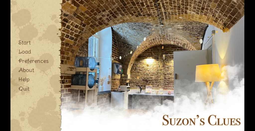
A screenshot of a title screen for a video game. On the left of the screen are the Start/Load menus, Preferences and Help Panes, and links to read more information about the game or quit the application. To the right, the title “Suzon’s Clues” is written in capitals. The background image is the tea room of the Conway Library with photoshopped smoke covering the bottom half.

[Image: Suzon’s Clues Title Screen. Background image: Tea Room, Conway Library, Courtauld Institute of Art, London, Jan. 2023. Photograph taken by the author. Sidebar graphics created using Procreate © for IOS]

“It’s your first day as a new volunteer in the Conway, and you’re greeted by a rather mysterious individual. Work together to explore the library and uncover clues, but beware, you may find more than you’re bargaining for…”


Gameplay

It’s time for your first shift at the Conway Library. You arrive at the Courtauld Institute of Art, collect your volunteer pass, and make your way downstairs. You can feel a presence following you, but you push the thought to the back of your mind; you’re in Somerset House after all, a building with hundreds of years of history, and there are bound to be things hanging around. You open the door to the Witt Library, where you are suddenly intercepted by a mysterious young woman who introduces herself as Suzon. She seems to have been expecting you, and can barely contain her excitement. Suzon explains that she needs someone to help her decode objects that are materialising in the library; they appear to be Conway photographs, but each of them is obscured somehow. It’s going to be more complicated than simply finding their box numbers and filing them away.

Through a series of multiple choice questions, the player explores the library to find clues, whether these are poems, newspaper clippings, or even witness testimony from yet more obscure characters. Once they are cleaned, translated, and stitched back together, they are returned to their rightful places in the library. The aim of the game is to learn more about the photographs in the collection and to integrate them into their historical and cultural context. The more clues the player finds, the clearer the picture becomes. This not only applies to the photographs, but also to the appearance of the elusive Suzon, who seems more familiar as the story progresses. There are four main chapters and one bonus problem, where the player has to opportunity to solve the mystery of Suzon herself. The game is intended not only as an educational exercise, but also as a kind of tribute to the library as a physical space and a centre of memory. This game is not recommended for children under 12, given occasional horror-related subject matter and descriptions of violence and death.


Inspirations

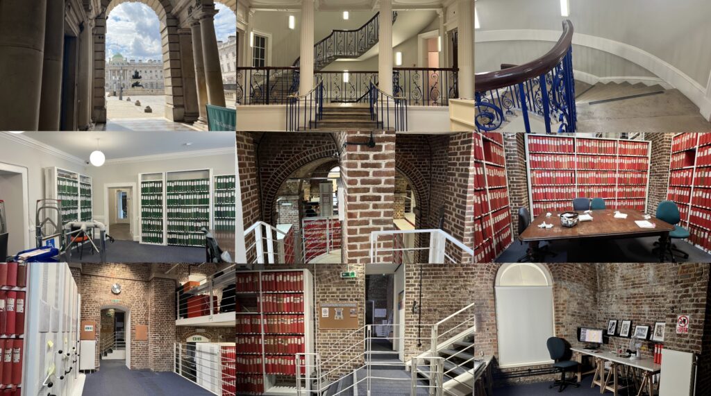
Before I settled on creating a video game, I was more focused on the “point of view” element of the project. I had come across an interesting photographic project from the Wellcome Collection’s volunteering department, which photographed the route from Euston Road, inside the main building, and eventually ending at the library itself. This project had practical purposes, of leading volunteers to their work space, but it also made me think about materiality, and what significance these seemingly innocuous and functional photographs would have in future years. Tom Bilson, Head of Digital Media at the Courtauld, had spoken to us often about the importance of documenting the collection and library “warts and all”: scuff marks on folders and torn labels on the red boxes. My initial plan was to create a kind of photographic project, documenting the volunteer experience from the volunteer’s point of view. Through compiling these images, I hoped that we might create a faithful visual representation of the Conway Library experience. It is interesting to note, between September 2022 and the time of writing in July 2023, the Wellcome Collection photographic route is nowhere to be found online, including via the Wayback Machine. This is perhaps testament to how fleeting these moments in time and space truly are, even with the seeming permanence of the internet.

A collage of nine different photographs. The images chart the walking route from outside the main entrance to Somerset House, through the reception area, and down into the Witt Library. From here, the route continues down into the Conway Library and ends in the photography vault.

A selection of images taken in and around the Conway Library, Courtauld Institute of Art, London. Photographs taken by the author, Oct. 2022-Feb. 2023.


It was only once I started actually compiling these images that I realised what a resemblance they bore to a typical video game route. I have always been interested in more immersive, interactive learning, and so finally I settled on creating a POV supernatural horror/mystery game. The Conway Library, and its setting underneath Somerset House, is the kind of environment which is naturally ripe for spooky goings on; indeed, I have heard many stories of ghosts clattering about the vaults or floating across the courtyard in the middle of the night. Given the importance of featuring the space in almost every scene in the game, it made sense to import some of its ghostly energy. I am a big fan of horror games, and horror in general, but I have seen very few educational games with a horror slant (most of these would be better known as horror games with an educational slant, see Baldi’s Basics, for example). The mystery genre plays into this as well, as my aim was not simply to unsettle or scare, but also to explore and investigate lesser known pieces in the collection through the lens of the supernatural.


Research

After settling on this genre, I began to explore the collection, choosing boxes almost at random, and trying to avoid anything I’d spent too much time on before. After a couple of days of this, I settled on ten sources, which I quickly realised I would have to whittle down to four, an experience I feel is not uncommon when exploring the collection. The sources are as follows:

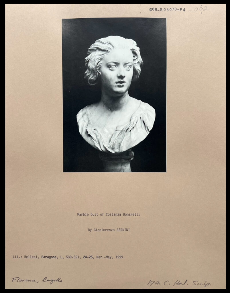
A black and white photograph mounted on card. The photograph depicts a bust of a woman, facing off to her left with her mouth slightly open. She is frowning slightly.

[CON_B06070_F004_002] – Marble Bust of Costanza Bonarelli by Gianlorenzo BERNINI, Lit.: Bellesi, Paragone, L, 589-591, 24-25, Mar.-May, 1999. ITALY: Florence, Bargello.

This source was the first I chose, and another piece that cemented the decision to focus on pieces in the collection with darker histories. On the surface of things, this is a simple bust of a woman named Costanza Bonarelli, sculpted by famed Italian sculptor Gianlorenzo Bernini. Once I had researched the image further, I discovered that Bonarelli eventually had an affair with Bernini’s brother, and in response Bernini hired someone to slash her face with a dagger. Immediately, this sculpted image of intimacy and adoration had taken on an air of obsession, possession, and violence.


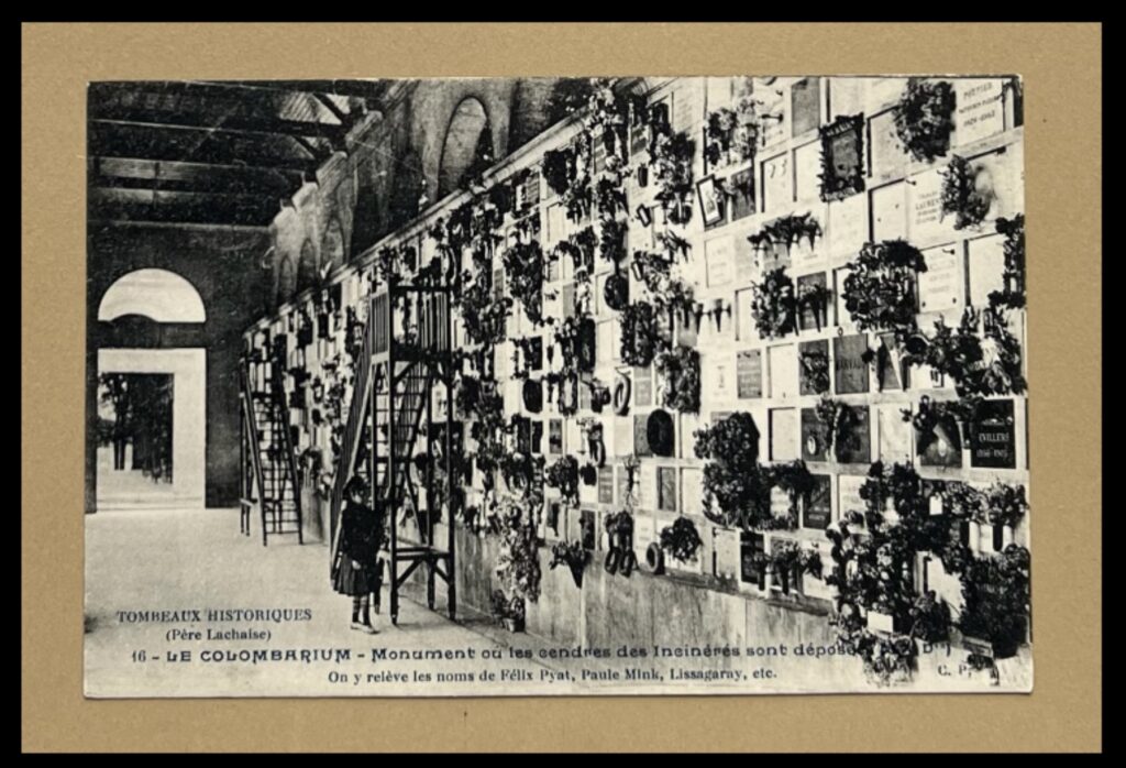
Black and white photograph mounted on card. Depicts a small child standing at the foot of a ladder against a wall that is covered in small memorial plaques and bunches of flowers.

Detail of [CON_B06922_F004_029] – TOMBEAUX HISTORIQUES (Père Lachaise), 16 – LE COLUMBARIUM – Monument ou les cendres des Incinérés sont déposees. On y releve les noms de Felix Pyat, Paule Mink, Lissagaray, etc., FRANCE: Paris, Père Lachaise.

This clue uses only the latter image of the two pictured here, of a little girl standing next to a wall covered in flowers. The secret of this image is more straightforward, as the little girl is standing in the colombarium of one of the most famous cemeteries in the world, the Cimitière du Père Lachaise in Paris. What at a first glance could be a photograph of a child in a flower shop takes on a deeper, more macabre significance.


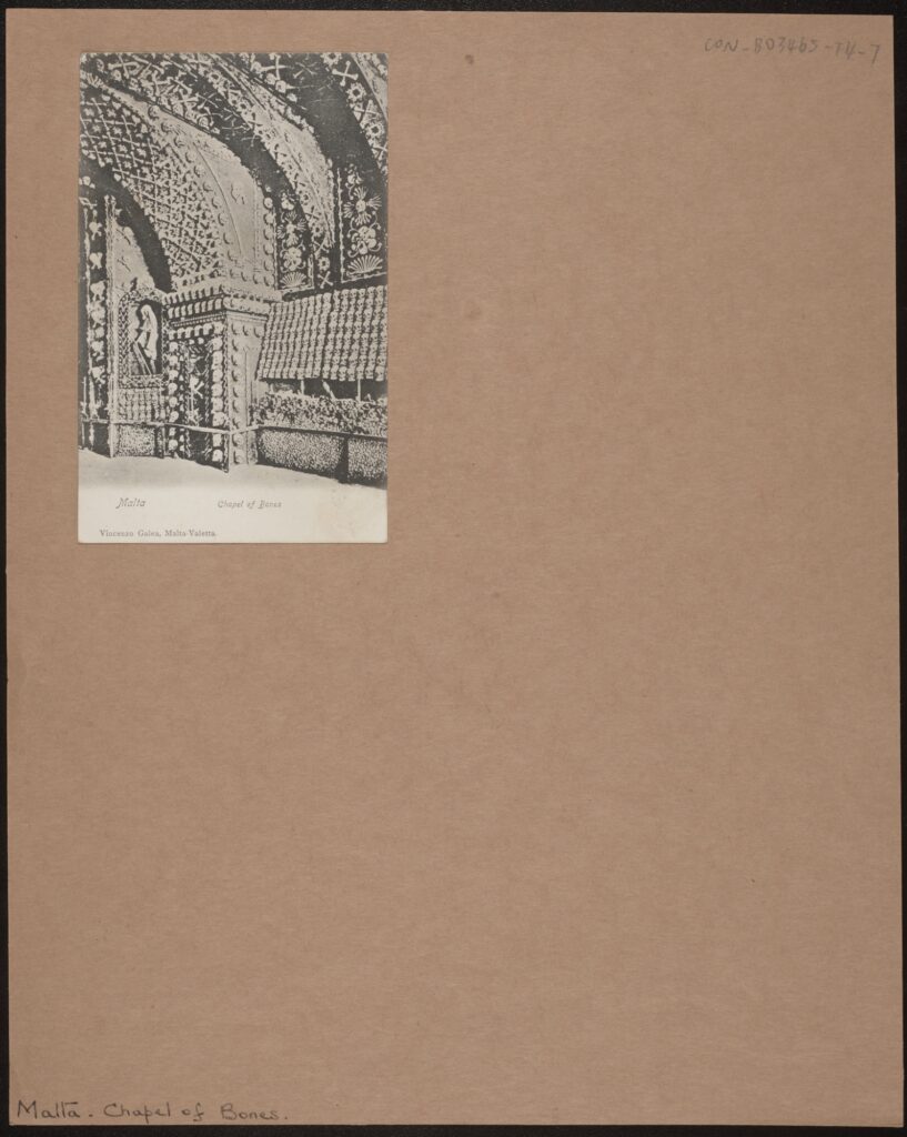
Black and white photograph mounted on card. A small, grainy photograph of a crypt wall and part of its ceiling. The wall is covered in hundreds of skulls and other bones arranged in patterns.

[CON_B03465_F004_007] – Malta, Chapel of Bones, Vincenzo Galea, Malta-Valletta.

I was first attracted to this photograph because of how unusual it was, in a folder full of church façades and street shots. A small, soft, black and white postcard with the simple inscription: “Chapel of Bones”. A crypt, the walls covered in skulls and bones, and one of the more gruesome photographs I’ve come across in the collection. Upon researching the site, I discovered that the chapel had been left to go to ruin, with much of its original structure lost. It is presently unknown whether the crypt still exists after years being trapped underground, and this was exactly the kind of mystery I was looking for.


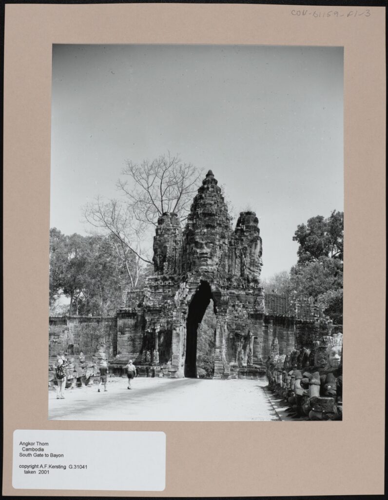
Black and white photograph mounted on card. The focus of the photograph is a large stone gate at the end of a wide, white path. At the centre of the gate is a carved stone face, underneath the face there is an archway flanked by two stone columns. Behind the gate there are many trees. There are several people walking towards the gate on the white path, which itself is flanked by rows of stone statues.

[CON_B01159_F001_003] – Angkor Thom, South Gate to Bayon. A.F. Kersting, G31041, taken 2001. CAMBODIA.

This is the final photograph that I chose, and is the most hopeful of the clues. I couldn’t not include a Kersting shot in this selection, and there was something about this one which captivated me. Taken in Angkor Thom, Cambodia, the last surviving and most enduring capital of the Khmer Empire, this photograph depicts the famous face of the city’s South Gate. What I found most mesmerising about this shot is how well the gate has survived, given that the city has been abandoned for at least 400 years. There was something quite poignant about the face of King Jayavarman VII, cast in stone, looking out over the overgrown city, and so I included this as the final clue, symbolising endurance through centuries of history.


Process

When I first started this project, although I had a pretty clear view of the finished product, the route to its completion was decidedly murkier. I had heard of several programs for creating visual novels and role-playing games, and so in the end I settled on using perhaps the most popular; a program called Ren’py. Ren’py is designed for users with minimal experience of coding, with much of the game development relying on inputting background images and props. The program works by providing a central interface for the script, and a number of folders for backgrounds, character sprites, and sound effects. A degree of knowledge of coding was required to write the script, but there were useful guides on Ren’py’s site and the wider internet. I definitely appreciated being given the time to learn some coding, as I had no prior experience.

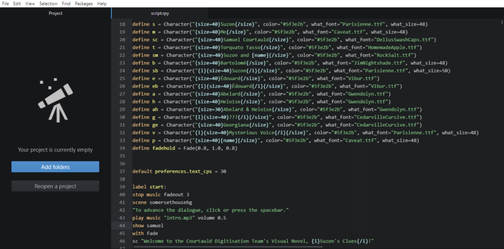
First of two screenshots from Atom, a scripting program on Windows. It depicts a list of video game character names, followed by details of how their characters appear in game, including text colour, font, and font size.

[Some examples of code used in the game: character names and specifications at the beginning of the game. Edited with Atom via Ren’py]

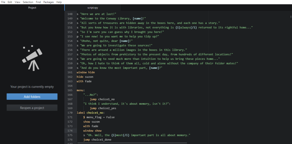
Second of two screenshots from Atom, a scripting program on Windows. It depicts some introductory dialogue welcoming the player to the game.

[Some examples of code used in the game: opening dialogue between Suzon and the player, as well as the first choice in-game. Edited with Atom via Ren’py]


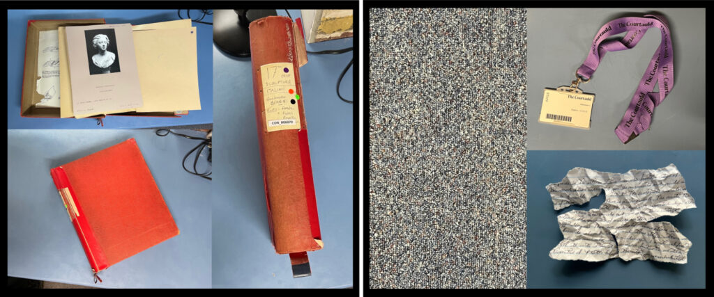
This approach suited my aim to immerse the game in the Conway’s architecture, as it allowed me to place emphasis on changing scenes, visual clues, and exploring the library. I didn’t want to overcomplicate the gameplay and end up creating a kind of decision-making labyrinth. Every standard background is an unedited shot of the Conway Library or Courtauld Institute, and many of the props were also photographed on site. For example, the original boxes belonging to each source were also photographed and used in the “Chapter Cleared!” screens at the end of each chapter.

Two collages. The first is comprised of three images of a red box. In the first, it is open, and displaying a lack and white photograph of the first source used in the video game. In the second, the box is closed. In the third, the spine of the box is visible, with the text reading “17th Century Sculpture – Italian – Gianlorenzo Bernini – Busts – Female, Popes, Royalty. CON_B06070. The second collage is comprised of three images: the first is a photograph of the carpet in the Conway Library. The second is a photograph of a volunteers pass on a purple Courtauld lanyard. The third is a torn and scrunched up piece of paper covered with illegible handwriting.

[A few examples of some “props”, including Bernini’s bust of Bonarelli in its box, a section of carpet, a volunteer pass, and a handwritten “clue”.]


In addition to this, most of the sound effects were also recorded in the library, for example the sound of the wind heard in the demo was recorded one chilly afternoon in Vault 3, and the sound that plays when a clue is discovered is the sound of a Kersting print being flipped over. I had learnt from attending a workshop with sound artist Robin the Fog that smartphone recording apps are often sufficient for capturing audio of a reasonable quality. This is what I used to create the sound effects used in the game.

A screenshot of the iPhone Voice Memos application. There are nine recordings in total, titled: Boxfall, clap, windwhistle, windchime, smallthud, thud, photo flap, box close, and box open. They are all between one and three seconds long.

[A screenshot of the sound effects compiled here.]

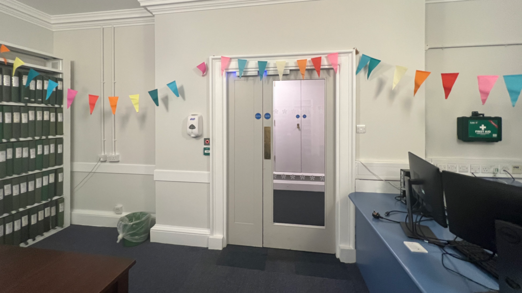
Through this approach, I hope that I have injected as much of the Conway into the project as possible, I wanted to imbue the whole thing with a kind of “library flavour”. There are some photographs of Conway milestones included as well, such as the before, during, and after of the process of photographing the red boxes, and the decorations put up in the Witt Library for the Witt and Conway Staff Reunion.


A collage of three photographs of the same area of the Conway Library. In the first photograph, there are piles of boxes covering the floor. In the second, the boxes re gone and have been replaced by photographic equipment and piles of red boxes. There is also a large table covered in black fabric visible. In the final photograph, all equipment and boxes has been cleared away, and the space is empty.

[Photograph of the approach to the vaults, taken before, during, and after the photographing of the red boxes, photographed by the author.]

The door to the Witt Library in the Courtauld Institute of Art. Above the door, multicoloured paper bunting has been draped across the walls.

[Photograph of the Witt Library, taken shortly after the Witt and Conway Staff Reunion, photographed by the author.]


Once the sources were selected, the next step was to obscure them. I wanted to create a kind of puzzle where the player would have to learn more about their item in order to locate its box, “bring it home”, and advance to the next chapter. So, after the research I compiled a selection of facts about each object. For example, with regards to our first problem, the bust of Costanza Bonarelli, its first clue relates to location and time; a map of 17th Century Siena. The bust was created in the 17th Century, and Costanza herself was originally from Siena. Next, a poem from well-known poet of the Italian Renaissance, Torquato Tasso, included for the line “not that I hope for anything from you, my sweet life, except misery”. This is a reference to the tumultuous affair between Bonarelli and sculptor Bernini. Next, after some exploration, a dagger is discovered in the vault, making an obvious reference to the dagger that was used to disfigure her. From here, almost at the end of the puzzle, Suzon and the player follow the sound of music, which gets louder and quieter depending on how far away the player is as they move through the Conway. The music is an aria from Handel’s cantata, “Apollo e Dafne”, which references Bernini’s most famous work, Apollo and Daphne. This is the final clue which connects Bonarelli and Bernini. From here, the player is given a choice of boxes and, when the correct option is chosen, the item is returned to its home, and in a sense is laid to rest.

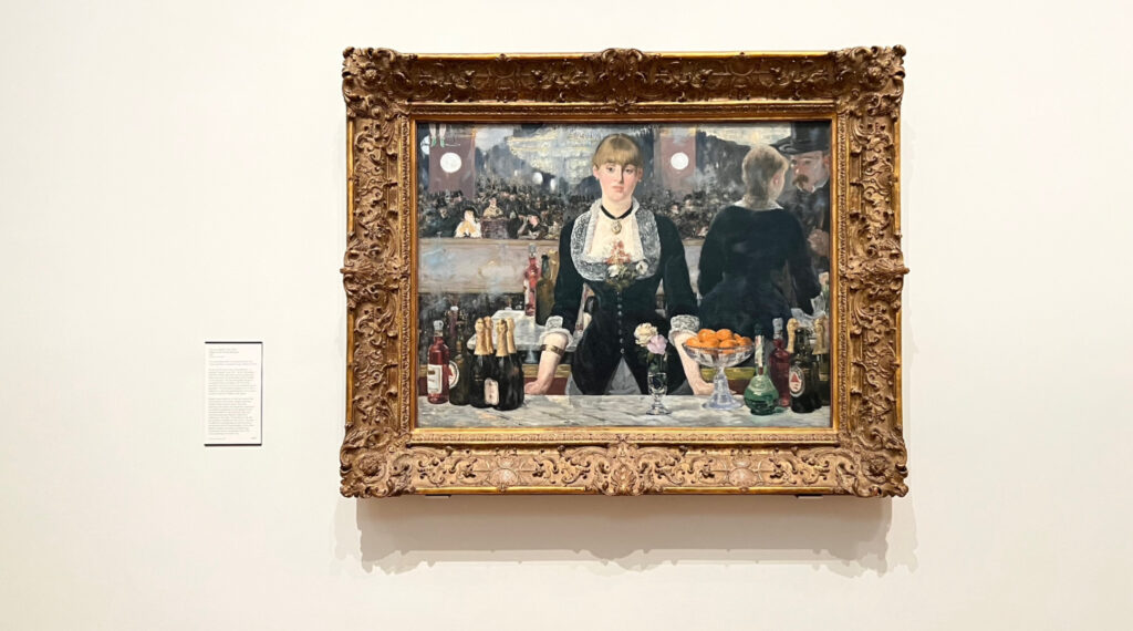
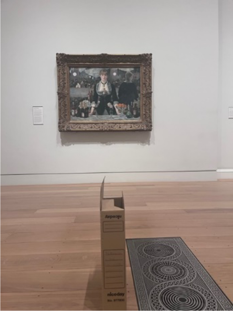
This formula is followed for the remaining sources, with some variations. I wanted to try to make the sleuthing process as varied as possible, taking advantage of different forms of media. It seemed like to do otherwise would be a waste when Ren’py allows for the integration of text, pictures, and audio. Another benefit of this approach is the inclusion of a number of characters to further enrich the experience: There is Suzon, of course, who many will recognise from the painting, “A Bar at the Folies-Bergère”, by Édouard Manet, who also makes an appearance. Torquato Tasso arrives to read his poetry, and the vaults are frequented by a ghost by the name of Georgiana. She is named after the Spritualist and artist, Georgiana Houghton, subject of an exhibition at the Courtauld Gallery entitled “Spirit Drawings” in the Summer of 2016. By including Georgiana, Suzon, Manet, and indeed a short cameo from Samuel Courtauld in the introduction, the Gallery, Institute and Library are all represented in the gameplay.

A photograph of the painting “A Bar at the Folies-Bergère”, by Édouard Manet. A young woman is looking out at the viewer, standing behind a bar and surrounded by bottles of alcohol, flowers, and a bowl of oranges. Behind her, the rest of the bar and its patrons are visible. The painting is framed by an ornate, carved wooden frame and hanging on a white wall.

[A photograph of Suzon in situ, photographed by the author in the Courtauld Gallery, Strand, London, December 2022.]


Testing and Launch

Once the chapters were written, the script, images, sound effects and music were all combined within the game directory provided by Ren’py. I had, perhaps naively, thought that the bulk of the work was finished, but as always when using unfamiliar technology, there are going to be a few hiccups. The music or sound effects come in too early, too late, too loud, or too quiet. One character sprite fills the entire screen, another doesn’t show up at all. After a couple of weeks and many hours of rewriting code, the game finally ran successfully. I must extend my gratitude to my fellow interns and staff in the Conway Library for playing through the demo and providing some much needed feedback: it’s always helpful to look at these things with as many sets of eyes as possible! It was also fun seeing everyone’s reactions to the experience of moving around the library in-game, and I’m happy that this was well-received.

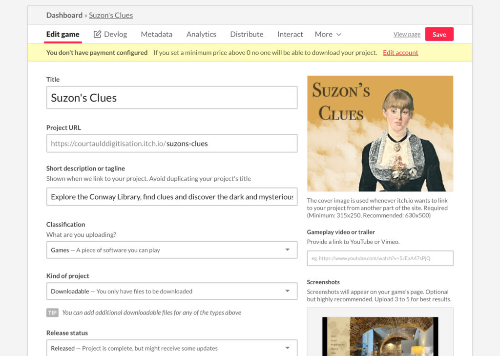
Once the testing was over and everything was tidied up, it was time to finally launch the game. Suzon’s Clues is hosted on the independent game developer site, itch.io: Suzon’s Clues on itch.io.

A screenshot of the developer’s page of an independent video game website. To the left, there are several descriptive boxes, including: Title, project URL, Game Description, and Classification. To the right, there is an image of the game cover, which depicts the character Suzon against a gold background, with the title “Suzon’s Clues” to the left.

[A screenshot from the developer’s page of “Suzon’s Clues” on itch.io, depicts title and cover art.]

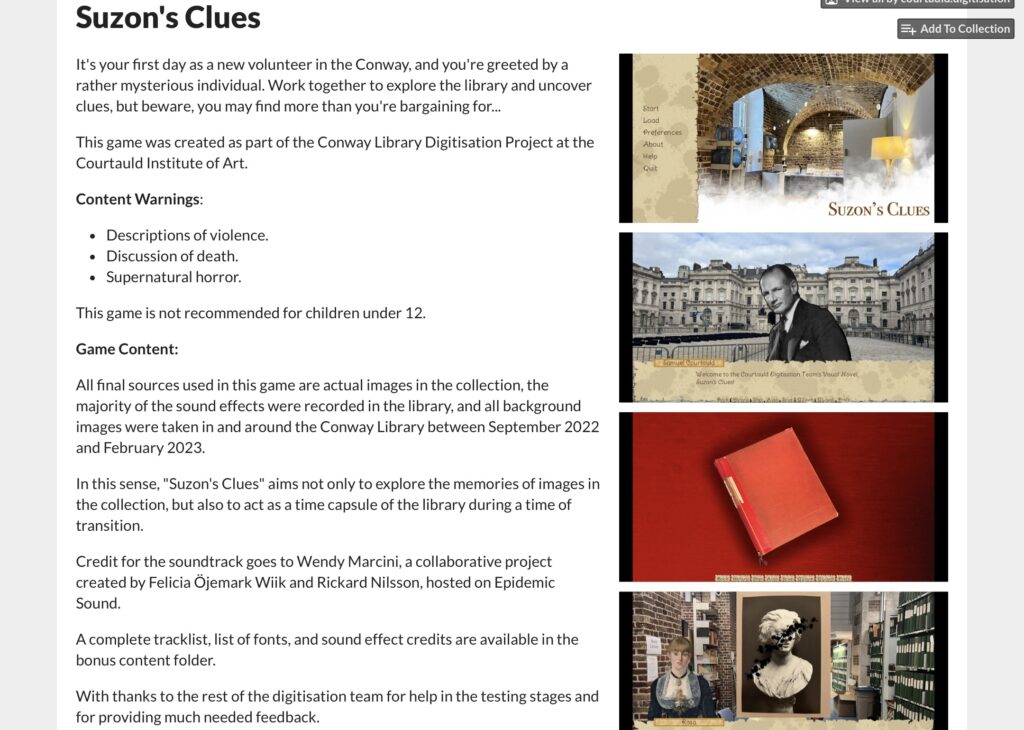
A screenshot of the developer’s page of an independent video game website. To the left, there are two uploads of the game files, titled “SuzonsClues-1.0-mac.zip” and “SuzonsClues-1.0-pc.zip”. To the right, there are several gameplay screenshots, including one from the opening to the game, and another of one of the video game characters.

[A screenshot from the developer’s page of “Suzon’s Clues” on itch.io, depicts the uploads of the game files.]


Once the content warnings, game description, installation instructions, and game file were uploaded, everything was done. It was strange to stop working on this project, at times it felt like it would never be finished! I felt that I would always be writing new mysteries for Suzon and whichever unwitting volunteer she had managed to capture, and certainly felt some sadness writing the final scenes.

Conclusion

The aim of Suzon’s Clues was, in part, to explore the ways in which we can interpret the pieces in the collection. Are they to be used to understand the processes and inspirations of sculptors, painters, architects, and photographers? Can we use these photographs to understand social, cultural, and political trends? What about making statements about which objects are preserved, and why? Are they a collection of pictures that are nice to look at? Of course, all of these are true.

The photographs in this collection are preserved with varying degrees of detail, and it would be a truly gargantuan feat to attempt to research the mysteries of every last piece. What I hoped to achieve with the tiny number of sources used was to demonstrate the sheer amount of information that is just waiting to be discovered within these boxes, and the intrigue and fun we can have if we attempt to unearth them. Further to this, Suzon’s Clues is something of a love letter to the Conway Library. So much more than just a building; it is a centre of memory and has been the home of the collection. More than that, the Conway has been the beloved workspace of hundreds of volunteers, staff, students, and visitors. I hope that I have been able to capture a sense of the experience of working on this project, and working in this space. Whether we are sorting through Kersting prints on the mezzanine, poring over masters at the table on the bottom floor, or digitising it all in the vaults.

When I first arrived in the Conway Library in Summer 2022 I was almost overwhelmed by the size of the collection and the methods of telling its story. We as interns have all been given so much freedom to run with our ideas, which has been both deeply rewarding and tremendous fun. Happily, I think we will all leave with new skills and very fond memories.

Rosa Coomber
Courtauld Connects
Digitisation Project
Digital Narratives and
Storytelling Intern

Pietro Bordi: Barbara Hepworth and Ben Nicholson’s Object Compositions, Photographed by Paul Laib (1933): A ‘Poetic’ Exhibition

Paul Laib (1869-1958) was a photographer who in the early decades of the 20th century captured the works of some of the most important contemporary artists working in Britain between 1890 and 1950. His large corpus of over 20,000 negatives were gifted to the Courtauld in 1974 by Patrick de Laszlo, son of Philip de Laszlo, the famous portraitist who for many years had been Laib’s client. In 1933, Laib visited the studio of Barbara Hepworth and Ben Nicholson at ‘No. 7 The Mall’ in Parkhill Road near Hampstead. His collection of photographic glass plate negatives depicting the works and compositions of assorted objects in Hepworth’s and Nicholson’s artistic residence remain some of the most puzzling and charming images in the Courtauld’s vast photographic library. By accompanying these images with vivid poetic descriptions containing excerpts from Hepworth’s own writings and memoirs, this virtual exhibition hopes to shed light on the aesthetic significance of these objects for the artists’ developing views on sculpture, painting, form and space.
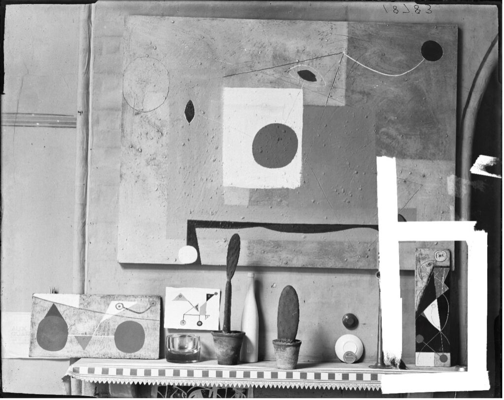
No. 7 The Mall studio, Hampstead, 1933. Photo by Paul Laib. The De Laszlo Collection of Paul Laib Negatives at The Courtauld, London.

At first glance, the compositions from Laib’s photographs appeared to me almost as deliberate, still-life shots. The artworks depicted are embellished by the objects which encircle them: could this be the work of a photographer who is showcasing the art in its studio environment? Precariously balanced crockery gives the illusion of momentary arrangement. A slender white bottle reappears in different assemblages. Small level inclinometers, like elegantly shaped pocket-watches, litter our field of view,  and are added and removed between each picture. The concept turned out to be as unlikely as it was originally alluring. Courtauld digitisation specialists suggested Laib would have been perhaps too shy and discreet in his operations to have meddled with the objects in a renowned artist’s home – as suggested by the darkness of his negatives, the Hungarian photographer was often hasty in providing his famed clients his service, leaving little time for his glass plates to be exposed by light through his camera. Upon closely reviewing Hepworth’s writings and meditations from her period with Nicholson, I increasingly came to understand the arrangements as compositional masterpieces, highly wrought visual works assembled by the artists and informed by their developing thoughts on the nature of form, abstraction, and space.
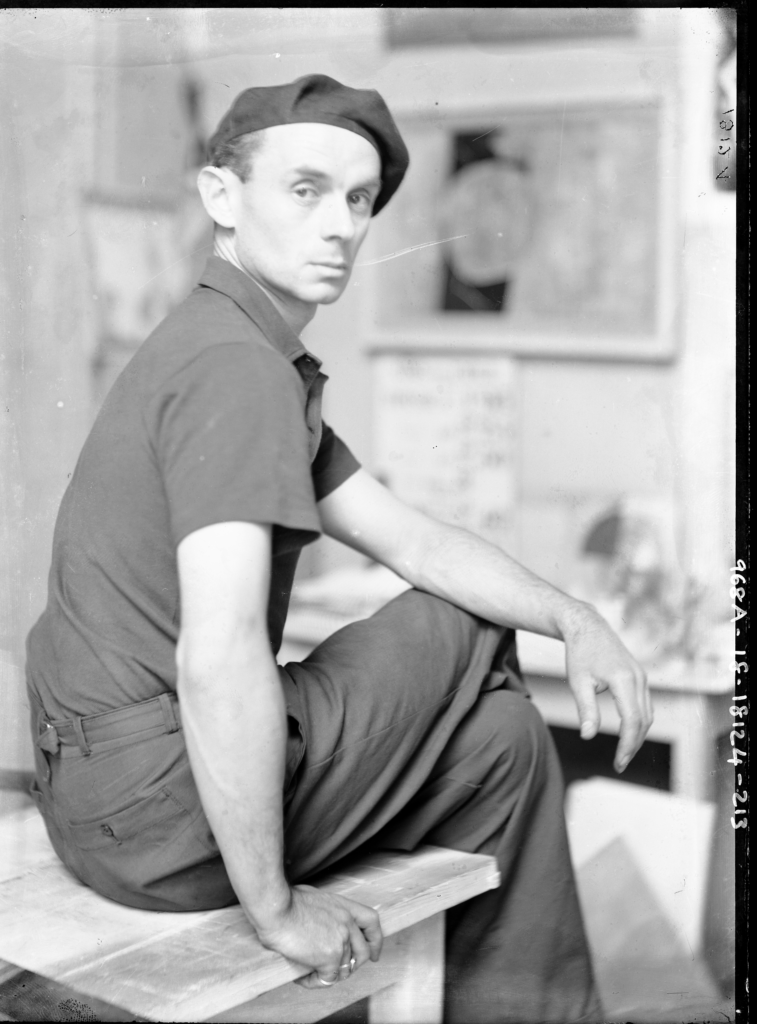
Portrait of Ben Nicholson, No. 7 The Mall studio, Hampstead, 1933. Photo by Paul Laib. The De Laszlo Collection of Paul Laib Negatives at The Courtauld, London.
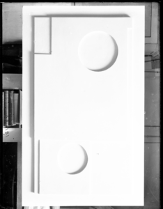
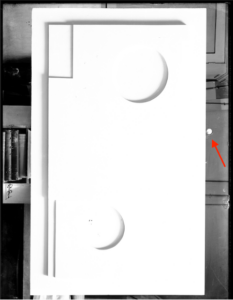


Inclinometers being placed and removed between photographs, No. 7 The Mall studio, Hampstead, 1933. Photo by Paul Laib. The De Laszlo Collection of Paul Laib Negatives at The Courtauld, London.

The images taken by Laib present groups of objects, trinkets, souvenirs, and other puzzling paraphernalia. Presented on different planes and contrasting positions, these objects assume a life of their own, responding to each other in both thematic and formal qualities. Desert cacti are combined with wine bottles and fishing floats. A hammer is juxtaposed to a fragile glass. At the same time, the ensemble of curves, triangles and squares inherent in the objects’ outlines resemble those simplified in Nicholson’s geometrical works. A small coffee plate might for instance mirror an abstract gesso dot. The outline of a plant is reminiscent of his linocut profiles, and a protruding shelf or bookcase might match the indentations in his white, sculptural reliefs. These correspondences also reflect Hepworth’s interest in sculptural groups, which, like the duo’s object compositions, conversed in what Hepworth called “a silent language of forms”.[1]
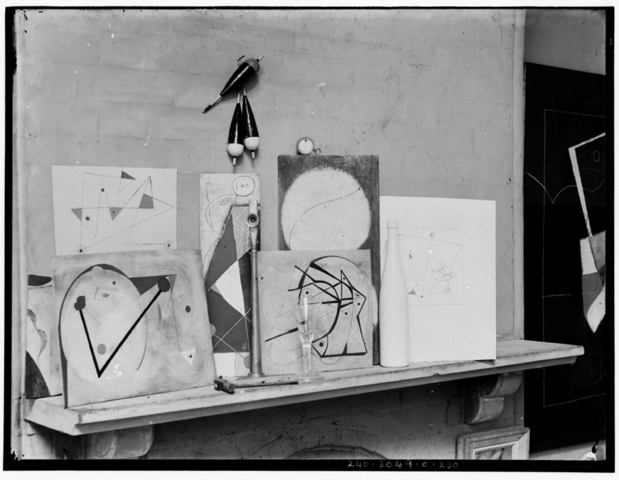
No. 7 The Mall studio, Hampstead, 1933. Photo by Paul Laib. The De Laszlo Collection of Paul Laib Negatives at The Courtauld, London.

Among the string of random articles assorted in careful balance, the artworks themselves feature as a reminder of their co-existence with these shapes. Some lie in the corners and borders of the composition. In other pictures, Nicholson’s linocuts provide a backdrop for the arrangement itself. Often, a sculpture or white relief might be the main photographed piece, but we gain access to the work’s close surroundings through the space left in the narrow margins of the picture. In some cases, the resemblance between the artwork and its formal environment is impossible to ignore. In Laib’s photographs of Hepworth’s studio, we witness the sculptures next to the shapes and objects which inspired them: “I like to have a lot of material lying about the studio for a long time – even for years – so that I feel intimate with each piece”(33). The artists wanted the works photographed in the context in which they were originally conceived, before they would be bought, framed, and displaced in the white-washed setting of a gallery or museum. In her writings, Hepworth explains that sculptures and other artistic creations are almost inseparable from its immediate surroundings, being conceived out of precise qualities found in nature or in one’s studio. Existing in a state of “harmony” with the other “individual forms which inspired it”, these are, as Hepworth claims, “for their own specific landscape”(134).
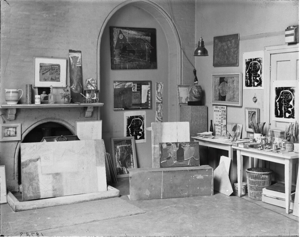
No. 7 The Mall studio, Hampstead, 1933. Photo by Paul Laib. The De Laszlo Collection of Paul Laib Negatives at The Courtauld, London.

While the significance of Nicholson’s collection of everyday objects has been the subject of discussion in recent years (a 2021 Pallant House Gallery exhibition described these as “a source of almost endless inspiration for the artist”), Barbara Hepworth’s own fascination with spatial arrangement and object composition has been left relatively unobserved.[1] This is especially surprising given the wealth of literature on the subject: in her own writings and conversations (1930-1970), the sculptor makes ample reference to the significance of grouping objects into what she called “rhythmical” composition, a musical idea she applied to forms in natural landscapes as well as to the domestic environment of her home or studio. The impact of Ben Nicholson’s work, on the other hand, opens up for her a “new and imaginative approach to the object in landscape, or group in space”(61). The specific nature of the arrangements photographed by Laib are themselves described at length in Hepworth’s memoirs, in which the artist recalls the provenance and significance of certain objects for the artistic duo – objects which we can directly retrace to Laib’s images. Exceptionally fluent in communicating her aesthetic ideas, Hepworth was also particularly conscious of the transmedial nature of the arts, and where a sculpture, a studio, or an artwork is described, language from poetry and music is employed to articulate its significance. “Carving is, perhaps, more similar to music”. Art is the “perfect realisation of rhythm, composition, order and harmony”. Sculpture, on the other hand, is “dictated only by my poetic demands from the material”(43-68). Like few artists of her generation, Hepworth was also acutely aware of the expressive potential of poetic language in conveying abstract ideas. During her travels in Greece, she resorted to free-verse compositions to conjure the appearance of a natural landscape littered by marble forms. Her artistic beliefs are often expressed with the use of imaginative vocabulary and rhapsodical prose, both of which are referenced and integrated in the poetic works below. Throughout her life, Hepworth composed countless verses, many of which can be today found in Tate’s archive of unpublished manuscripts.
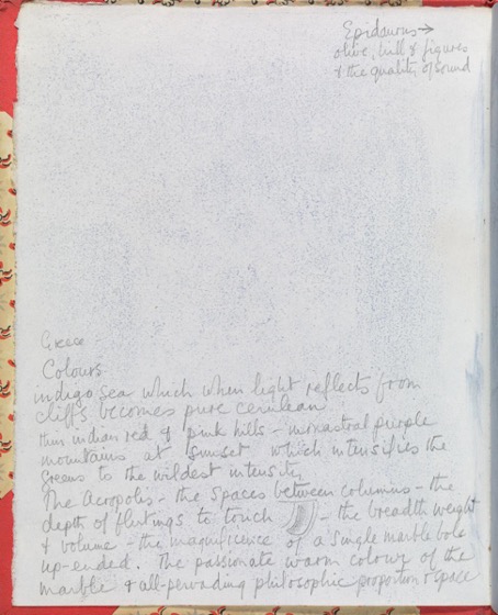
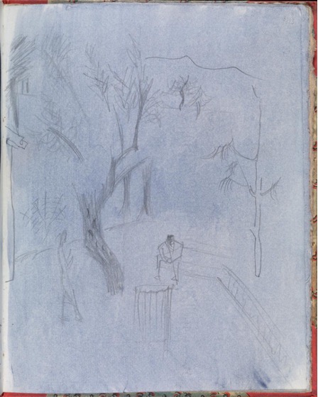
Epidaurus, 1954. Tate Archive. Dame Barbara Hepworth, Greek Sketchbook interleaved with pressed flowers and plants, Tate Britain.
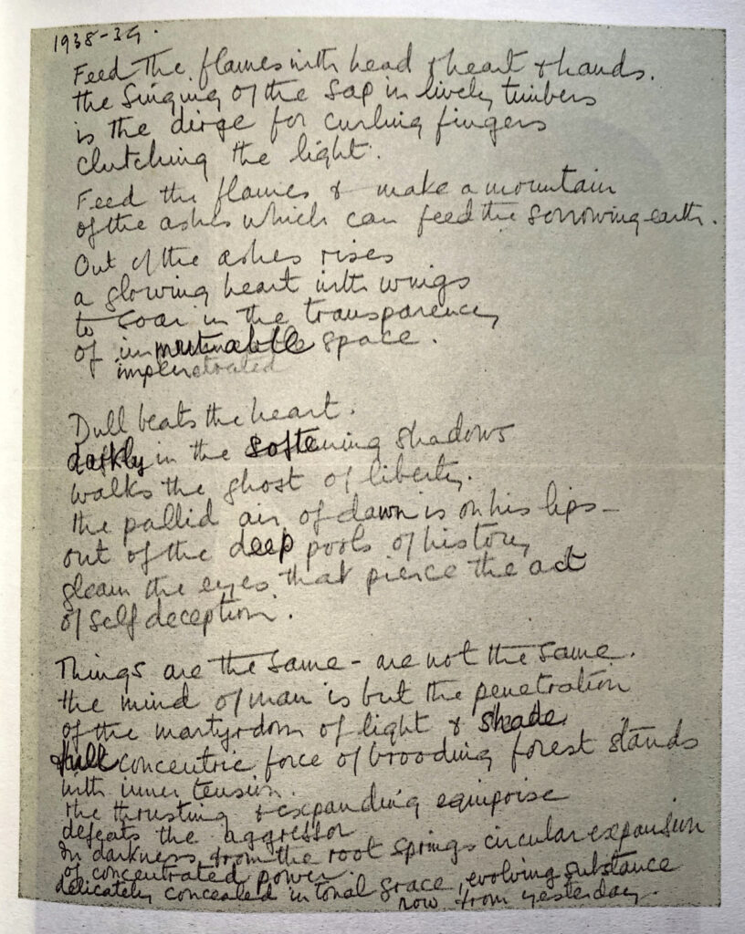
Feed the flame’, manuscript draft (earlier of two manuscripts), 1938-9. Tate Archive. Dame Barbara Hepworth, Handwritten notes by Barbara Hepworth, Tate Britain.

Honouring Hepworth’s fascination with poetry and its relationship to visual art, the following portfolio of ‘word-image’ compositions responds to Laib’s photographs through the creative use of poetic language, hoping to articulate the different forms of dialogue between the objects as well as the various interrelationships between the artworks and their immediate formal surroundings. A poem (by its broadest of definitions) can itself be understood as a thoughtful assemblage of single elements. Words, rhymes, assonances and line-breaks are all examples of single devices which amount to a larger, choral whole, giving a poem a sense of overall unity. Much like Hepworth and Nicholson’s own assemblages of selected objects, these participate in a greater “symphony”(56).

By incorporating direct allusions to Hepworth’s writings within the creative text, I hope to present the possibility of a ‘poetic exhibition’, whereby an informed, ekphrastic description (vivid, verbal account of a figurative work of art) is offered, as if to replace a museum caption or mere textual note. Inspired by a recent exhibition at the Courtauld which saw works by Peter Doig and poems by Saint Lucian writer Derek Walcott displayed side-by-side, this project hopes to demonstrate how a transmedial presentation of this kind could urge the viewer to establish a deeper connection with the inner themes and concepts underpinning a visual work of art. Without the constraints of prose syntax, I believe poetic language allows us to delve into the fluid and inarticulable concepts matured by the artists themselves in realising their compositions.

As one of the interns at the Courtauld, I was particularly drawn to the archive’s efforts to render the material qualities of the photographs perceptible in digital reproduction, the same way one would in attempting to digitise a Renaissance panel painting, or an Impressionist masterpiece. As a result, I have decided to accompany each of the poem titles with the original combination of numbers marked by Laib and previous archivists onto the negatives themselves, in an effort to highlight the material quality of the images as physical works of art.

I think every sculpture that’s made must have some relation to a place. I don’t think you can make it in a vacuum – at least, I can’t. It always has some kind of position in the landscape or in architecture, in one’s imagination.

— Barbara Hepworth in conversation with Reg Butler, Artists on Art, BBC Third Programme, Recorded in London, September 1951


And yet best critical account of a picture may well be that of a sonnet or of an elegy…

Charles Baudelaire, Salon de 1846


900-141-18124-874

A Large Rock

The whole great studio filled with soaring forms and still, quiet forms, all in a state of perfection in purpose and loving execution, whether they were in marble, brass, or wood… Everything I saw in the studio-workshop itself demonstrated this equilibrium between the works in progress and the finished sculptures round the walls, and also the humanism, which seemed intrinsic in all the forms.

                                                Barbara Hepworth on Constantin Brancusi’s Studio, The Poetry of a Figure in Landscape, London, 1931-34
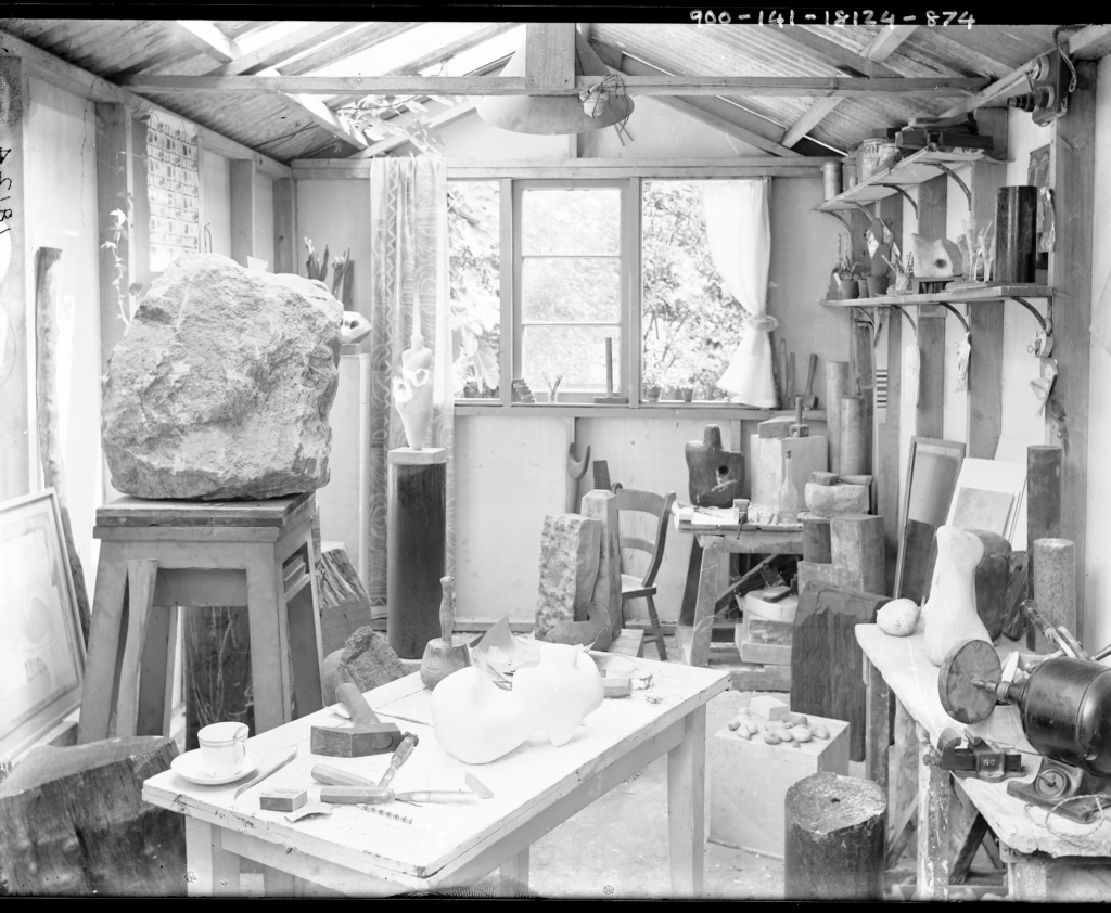
No. 7 The Mall studio, Hampstead, 1933. Photo by Paul Laib. The De Laszlo Collection of Paul Laib Negatives at The Courtauld, London.

It is a nest of infinitesimal detail

which confronts us,

a temple of unparalleled creation.

Unformed asteroids rest in the foreground.

Sculptures are hallowed by morning light.


Imagine hands that, whirring,

conquer elements, carving,

cast unwieldly designs.


They are like plants propagating in a small solarium:

a strange verticality dominates the scene.

It is as though we witnessed the growth of a number of cylinders.


Here we observe not the instruction of forms,

but the destruction of laws into bare essences.


Why might a stool, placed on a stool, give the illusion of upward growth?

And why might a window, harbinger of light,

be reflective of the source of all things present?

We do not know, until a jagged rock dominates the scene.


A large rock, like a statue,

may “give the sense of a new enjoyment”,

Hepworth says, “when placed in a small room”.

It is “a new aesthetic experience which cannot be got

through any other kind of art”.


It is as though our hearts were invested in the future of these silhouettes.

We entertain the notion of scale by watching a rock create obliteration.

It is the uncivilised shape that we abhor, which like some cruel intruder

is uncouth among smooth stones we may very well hold,

pebbles which could fit in our palms.


“There is a symbolism, of course, in stone”.[1]


[3] Barbara Hepworth: Writings and Conversations, pg.36, 80

900-142-18124-874

Works by a Window

As regards lighting and setting for my work, I like as much light as can be obtained, and I like a feeling of space. This does not mean actual physical area, but more the feeling that one gets near a window where the eye travels outwards…

                                    — B.H. in ­‘Approach to Sculpture’, Studio, London, 1946
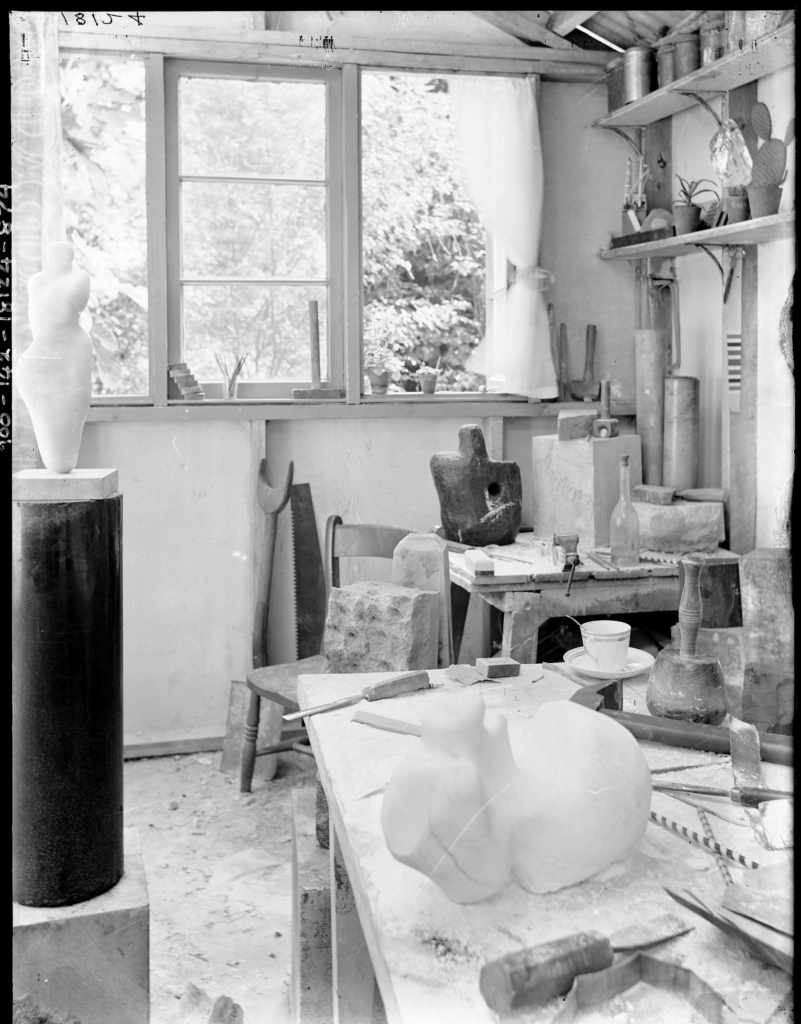
No. 7 The Mall studio, Hampstead, 1933. Photo by Paul Laib. The De Laszlo Collection of Paul Laib Negatives at The Courtauld, London.

I


These are the inhabitants which populate the corner.

We see them rearranged in newfangled order.


A festival of forms informs the surfaces in view,

and standing like some trilogy

of strange thematic symmetry,

three shapes among the objects make their central rendezvous.


II


The first, in opposition, lies reclined across a table,

surrounded by the tools which have enabled its creation.

An octagon of sorts imparts a rhythm of erosion,

a scalpel lies for indentations subtler than skin.

Beside a wedge a straw suggests the energy of suction –

a bell-like hammer sits behind, inverted, like a pin.


What is this creature, motionless and firm,

lying naked like the offspring of some bird?


Embryonic is the vein which cuts across the mineral

of a sculpture of full shape unknowable,

of scale unreconcilable.


It possesses the inevitable stumps of that which imitates humanity.

The marble remnants of a neck, the narrowing of abdomen –

its bowels could resemble both fertility and foetus.

A womb slackens laterally, conjoined, like a sack,

and lying on its back it rests on two bottom features.


“I find that it is possible to take

a pebble of fine and simple shape

and carve in addition successive planes

suggestive of the human form”.


Reclined across a table it retains its human form.


III


Our eyes observe a second shape of similar conception,

lit beneath the window, focused by the camera.


Dark and prehensile, volcanic and obsidian,

it was cast and preconceived with a meteoric cavity.


Obliquely it retains a kind of central torsion,

a motion, if you will,

akin to that of human shoulders,

of balanced contrapposto.


Around it are a number of identities,

illumined by the light which gives full play to its concavities.

A glass transparent bottle, shaped like a lute –

symphonic in its similar appearance to a torso.

Inverted hammers play an inane game of balance –

as do the saw and the crutch, which touch, amiably.


Marble slabs and rectangles surround it here and there,

some strewn across a table, a few erected by a chair.


What is the hole pierced into it

if not an exploration into “the special accord”

between the “inside and outside in every form”?

A “nut in its shell”, a “child inside its womb”,

the shape of “shells and crystals”

and “the architecture of human bones”?


“Every shadow, cast by the sun from an ever-varying angle

reveals the harmony of the inside to outside”,

gives the eyes their “tactile perception”,

reveals “the interplay between space and volume”.


Stark and dark and hollow

and with a hole pierced into it,

the figure faces us, illumined

on a far corner of the table.


IV


We need not search for the third sculpture,

as it stands so high above the others on a tower

of cylindric proportions – of diminishing dimensions.

From the bottom to the top,

cubes and blocks and cylinders

decline.


The figure at the top is stupefyingly streamlined, a body so round

its sound could be akin to that of a guitar, or of a globular cello –

its shape to Donatello’s David and the nudes in the Bargello.


“Growth, movement and balance.

All these things interlock,

and are principles which,

when expressed aesthetically,

do re-create a vitality…


There is life in stone and in wood”.[3]

968B-135-0-213

Cactus Compositions


Small things are found and kept for their lovely shape, their weight, their texture and intense pure colour. Objects that we place near to each other, in their different aspects and relationships create new experience. A scarlet circle on the wall, a slender white bottle on a shelf near it, a bright blue box and lovely-shaped fishing floats that rest in the hand like a bird, weighty pebbles, dull grey, some gleaming white all these move about the room and as they are placed, make the room gay or serious or bright as a frosty morning …

B.H. on the objects in the Mall Studio, Unit 1: The Modern Movement in British Architecture, Painting and Sculpture, London, 1934
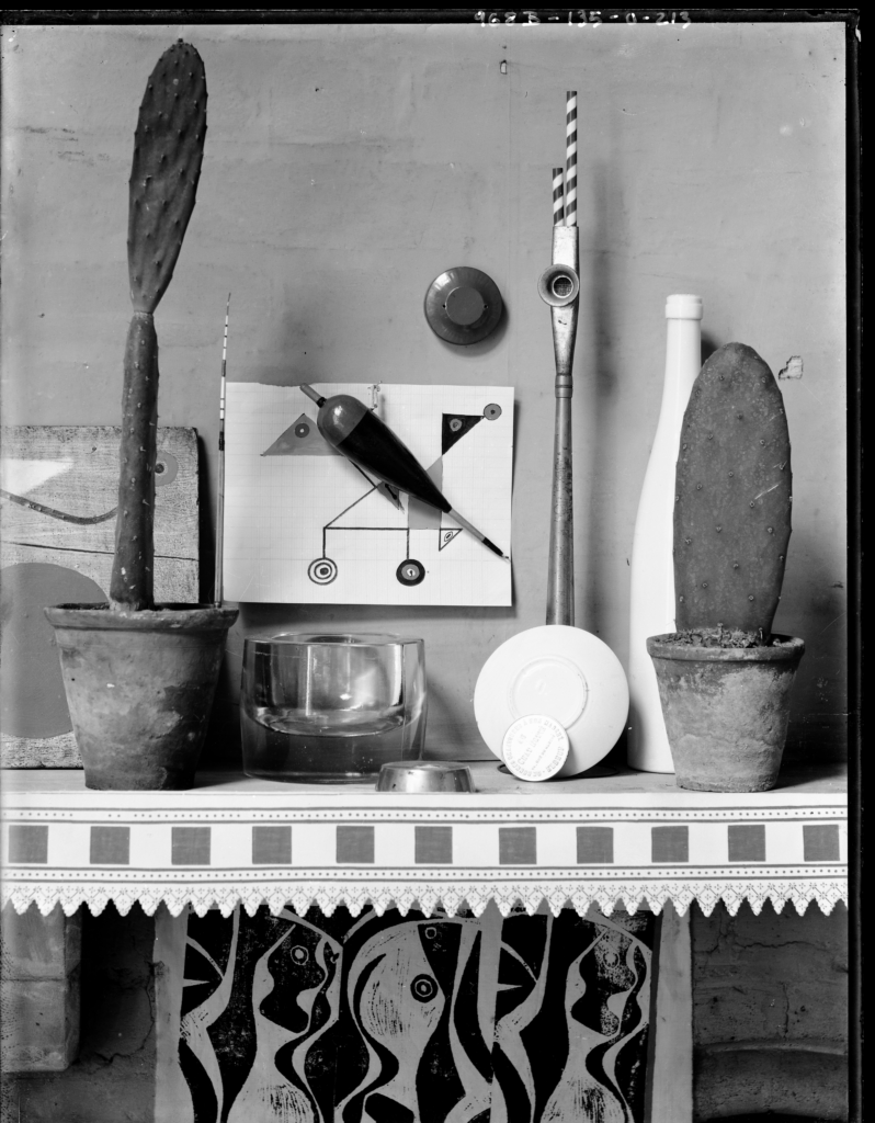
No. 7 The Mall studio, Hampstead, 1933. Photo by Paul Laib. The De Laszlo Collection of Paul Laib Negatives at The Courtauld, London.

This is perhaps the most exquisite of constructions:

a study of form and shape in its basic rudimentariness.


Geometries commingle making complex combinations.

The pattern on the table like a crossing in the street.


One questions if the artwork in the middle is the feat

or if the objects are abstractions in the artworks made concrete.


Plates and plants and flowerpots repeat the shapes on paper:

a shoe-polish, from CHAT BOTTÉ,

CHAUSSURES A BONNE MARCHÉ,

retells the forms and radii of small concentric circles.


A fishing rod, a line, a pipe with straws inside:

these mirror the strange nexus of connections drawn behind.


Correspondence is the visual key.


And veritably we find in these very same objects

an equal desire for growth and formal structure,

to grow, to breathe, to change and think – respire,

and for an upward momentum, comparable to sculpture.


Desert cacti are like flags, erect in planets of creation.

A bottleneck aspires to a higher order, something different:

organic, complete.

A strung-up fishing float (perched on a diagonal)

hovers in the foreground like some bird.


These are planes and patterns that intersect,

orbiting geometries and shapes

so close to one another they hold

a gravity and discover thus

their role in formal landscape:

“the balance of one form poised against another form”.[4]


240-3046-0-230

Lino Cut Inclinometer


I was fascinated by Miro’s unique way of picking up pebbles on the beach and arranging them swiftly so that his gesture revealed a Miro painting in movement.

                                                — B.H. on Miró, Constructive Forms and Poetic Structure, 1934-39
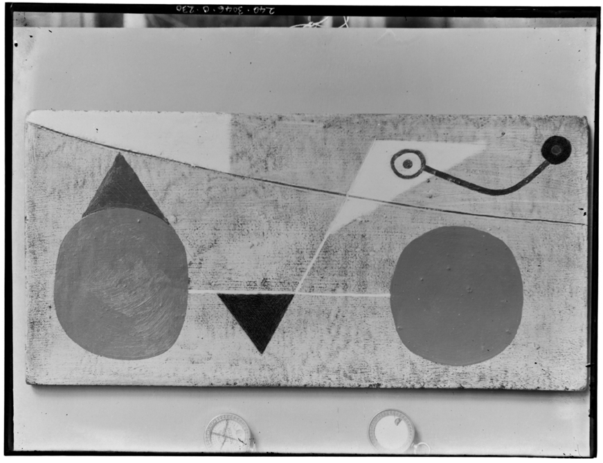
No. 7 The Mall studio, Hampstead, 1933. Photo by Paul Laib. The De Laszlo Collection of Paul Laib Negatives at The Courtauld, London.

This picture consists of impossible equivalence:

a strange delusion of the simpleness of shapes.


It is the image in geometric resolution,

a pun between the circle and triangle in space.


Across a wooden linocut,

lines project illusions of awkward equilibriums,

each barely managed, obdurately upheld.


They are the chair and the window conceptualised,

the tablecloth abstracted,

the bonnet reimagined.

It is as though two people enjoyed lunch

in a strange visual paradigm.


In a corner, two spheres, like eyes,

assess each other’s weight

through the value of a string.


And it is in this world of correspondences

two inclinometers appear, outside –

giving almost the impression of time,

or of time petrified.


And we relish in their form

and the rings bound to them,

repeating the reprise of the painted correspondences.


Objects, reduced to the simplest of essences,

Inflect their presence through proximity and incidence.


968B-137-0-213

Guitar


The impact of Ben Nicholson’s work had a deep effect on me, opening up a new and imaginative approach to the object in landscape, or group in space, and a free conception of colour and form.

B.H. on the objects in the Mall Studio, Unit 1: The Modern Movement in British Architecture, Painting and Sculpture, London, 1934
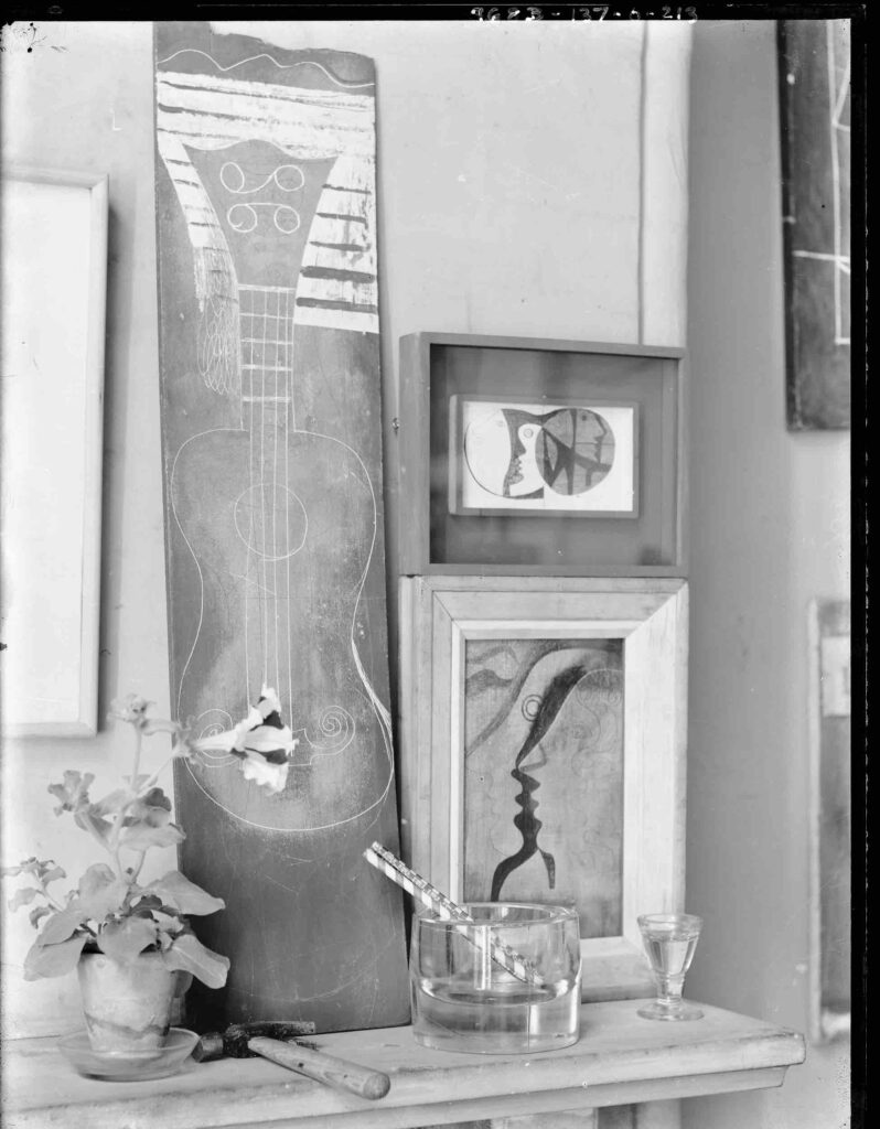
No. 7 The Mall studio, Hampstead, 1933. Photo by Paul Laib. The De Laszlo Collection of Paul Laib Negatives at The Courtauld, London.

This image is another of a series of assemblages,

a thoughtful merging of amusing situations.


Among a stray ashtray, a number of things remain.


A flower strokes the contents of a strung guitar,

like a plectrum reflective of what these things are,

or might in fact turn out to be.

Overlapping profiles are marked by a total blackness.

A guitar could entertain the serenading of a kiss.


Its shape is made on the basis of sweet

vacancies and rhythm,

absorbed into sensations

of leisure and delight.


Lyrical lines characterise

both linocuts and profiles,

the silhouettes and spheres

which meet the patterns on the instrument.


The sound between the pictures

is of poetic predilection:

like words and punctuation

they are marked by gradual intervals.


The sentence they assemble

is a visual figuration.


The wooden panel,

warped like an oar,

cut like a byzantine relic,

is alighted on a table,

where a glass of water meets an adjacent ashtray,

shimmering with similar reflections.


Half-full, half-empty, it produces new illusions.


968A-15-0-213

Profiles by a Flowerpot


A sculpture, as I conceive it, is for a specific landscape. My own awareness of the structure of the landscape, I mean the individual forms too that contribute towards its general quality, provides me with a kind of stimulus. This object, once I have created it as a sculpture, may harmonize with the landscape that inspired it, in that its form suggests those that I observed.

                                                — B.H. interviewed by Edouard Roditi, Dialogues on Art, London, 1960
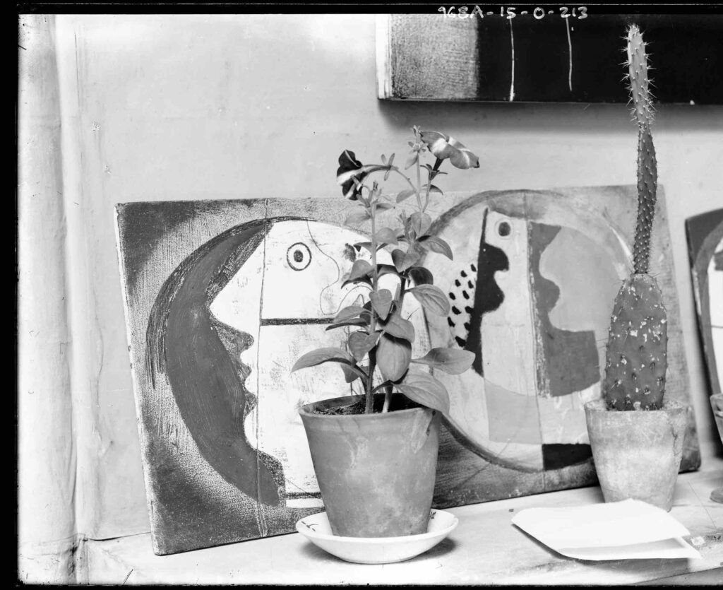
No. 7 The Mall studio, Hampstead, 1933. Photo by Paul Laib. The De Laszlo Collection of Paul Laib Negatives at The Courtauld, London.

How is it can we reconcile

a letter with these two profiles?

Or is it three or more we see,

circled almost rapturously,

and not a letter – but a sheet,

folder over, like a warranty?


And where is their resemblance with a cactus plant,

growing like a desert beansprout,

turning on its axis like a strange guitar,

dancing on its torsion like a flute?


It is, without a doubt, the flowerpot

which we decree as their inheritance,

its exultant silhouettes

casting so sweetly, so perfectly

upon the human shapes below.


Is it the ridges of the face

which fit the undulating leaves,

the chin, the nose, which in their still repose

transpose the essence of these shapes?


Or is it the shut, Hellenic mouth,

voluptuous by an eye which seems

aseptic, a pupil like a glass bead,

and perfect, and stolen from a fish?


We do not know – but relish in the slow relay of shapes

and formal aptitudes of plants, and in the way they all translate

the rise and fall of rims and crests of flowers.

We profit from their proximity, as they stand obliquely

so close to one another, exhibiting their brotherhood.


And of what colour we know not,

but black and white,

and not of spots but stripes

and transepts, bisected

like those cut into the canvases

and contours of the face.


It is the play between the silhouettes

and their inevitable backdrop

which produces numerous possibilities, interminable faces.


A flowerpot inspires all such delineations.

[1] Barbara Hepworth: Writings and Conversations, ed. by Sophie Bowness, (London: Tate, 2015), pg. 72

[2] Ben Nicholson: From the Studio (2021). [Exhibition]. Pallant House Gallery, Chichester, UK. 26 June – 24 October 2021.

[3] Barbara Hepworth: Writings and Conversations, pg.36, 80

[4] Barbara Hepworth: Writings and Conversations, pg.46-76


Pietro Bordi is a PhD student at the University of Oxford. His interests include the relationship between literature and the visual arts, particularly in the Renaissance and Modernist periods, and his doctoral thesis focuses on pictorial interpretations of the Divine Comedy in the twentieth century. Passionate about poetry, creative writing as well as ‘ekphrastic’ approaches to image and text, Pietro is College Representative for the Edgar Wind Society for the History of Art at Oxford, and at Balliol organises group visits to London’s National Gallery.

Oxford Micro-Internship

The Digital Media department at The Courtauld was awarded the 2023 Gold Standard Internship Host by Oxford this year.
Iris Campbell-Lange: A Conway Visual Song

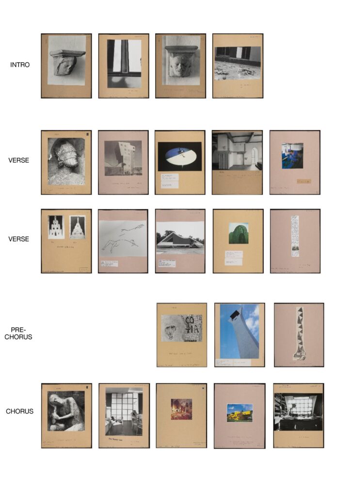
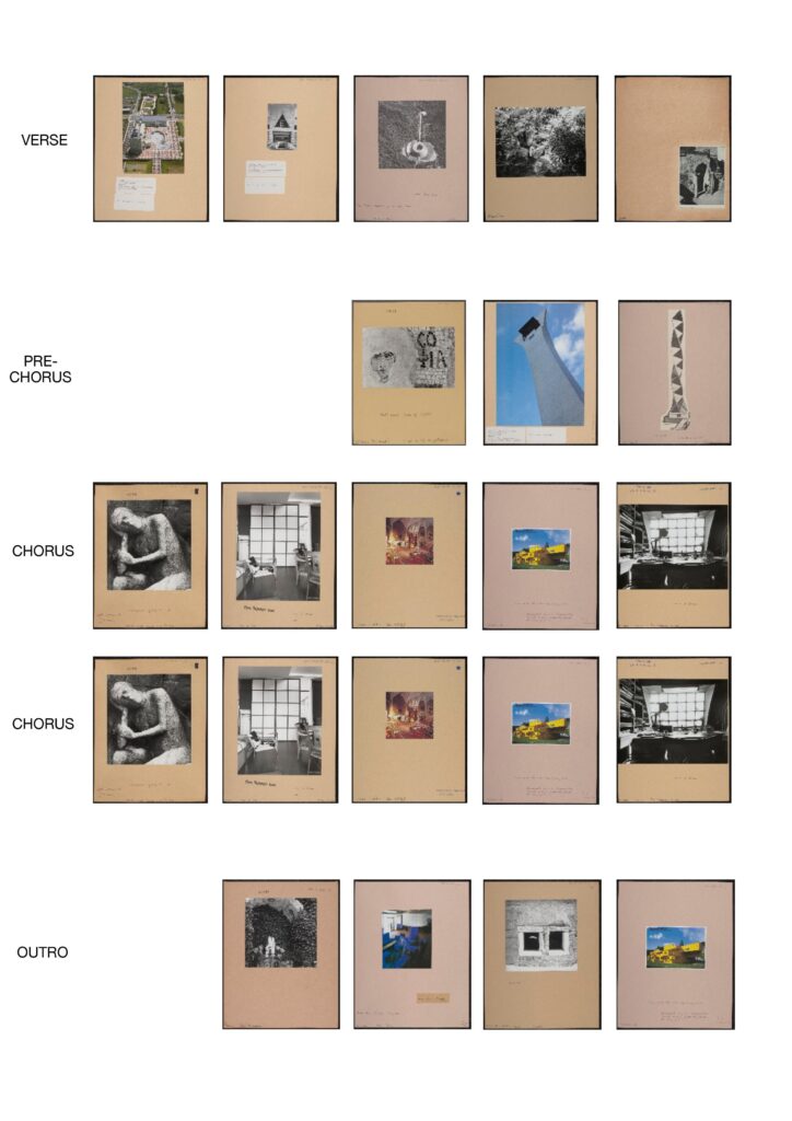
I have composed a visual song made of the images from the Conway archive. I like the idea that associations between images are what cause us to put them together – that there are certain ways that shapes interact which make us grasp them. Images have rhythms and tones, like a song. I have tried to incorporate the patterns of a song to reflect this, freely associating images from the archive – some from the same boxes – to create a whole piece which appears to randomly fit together. I have repeated some images and have tried to give the verses similar rhythms, and to give the chorus a rhythm of its own. I have tried to make these rhythms out of images.

When you are looking through the Conway archive, you are drawn to one box, then to another. They do not seem forcefully connected, but your mind draws mirrors between the images you have selected. Some of the images form a narrative, some do not. Images lead onto other images, and some appear more important than others and some do not feel worth noticing. The images feel as if they mean something together and against each other. I like the idea that making a visual song out of images is similar to the process of collecting and of taking images: it appears random but has a reason only you can fully recognise. And from this, images can become like phrases. And each phrase has a logic, just as each box in the archive has a logic which I cannot understand.

In my song, I have tried to order coloured and black and white images so that they relate to each other and create a kind of order. The intro has no colour images, until colours are slowly introduced in the verses and then repeated in the chorus. I repeated the motif of a grid in the chorus to reinforce the chorus structure. The last verse has an image which is situated at the bottom right corner of the archive page, as if finishing the progression of the verses and leading to the final choruses. The song finishes on a colour image, blue and yellow, of a small house – an image also used in the chorus. This is to mark the ending of the song and to refer to the slow progression to colour images at the beginning, which create the ending of the song.

The associations are free and tempting and indulgent – just like looking through an archive. You do not always notice the meanings or the history of images, but they show other opportunities.


Please click the link below to access a PDF file of the Visual Song.

A Conway Visual Song

The photographs used are listed below:


Intro

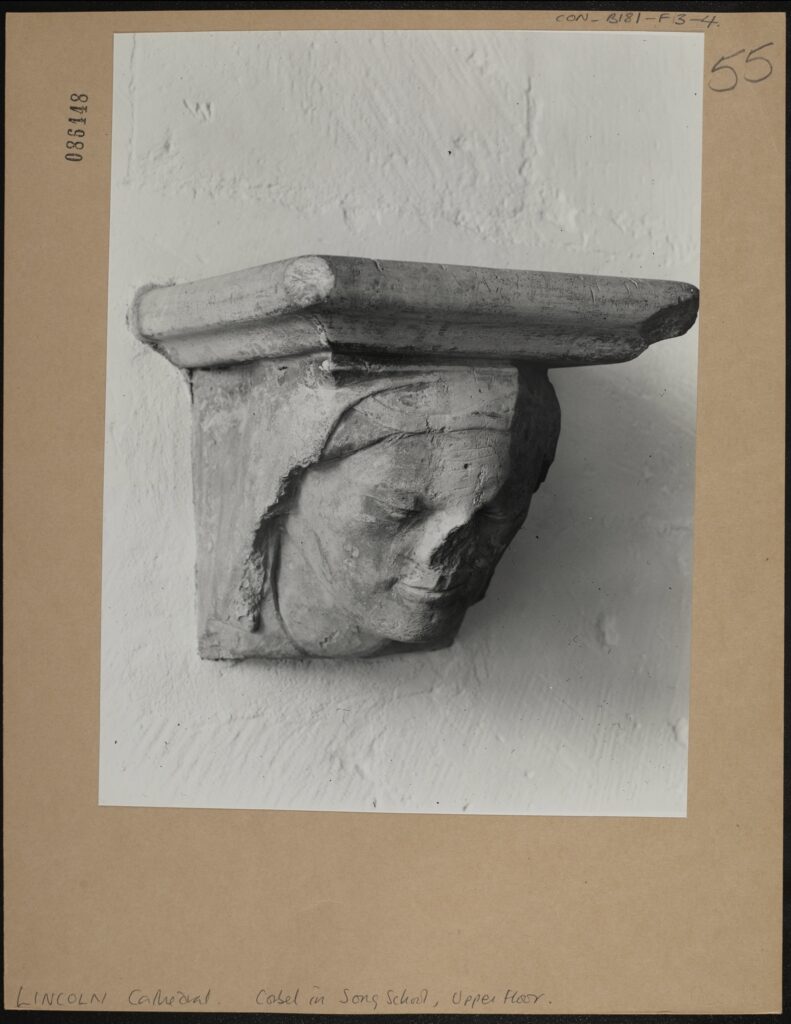
LINCOLN Cathedral. Corbel in Song School, Upper Floor. CON_B00181_F003_004, Conway Library, Courtauld Institute of Art, CC-BY-NC


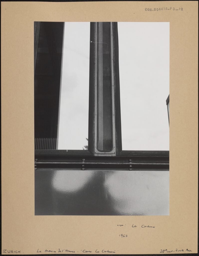
La Maison de l’Homme – ‘Centre Le Corbusier’, Architect: Le Corbusier, Zurich, 1963, CON_B04418_F003_012, Conway Library, Courtauld Institute of Art, CC-BY-NC


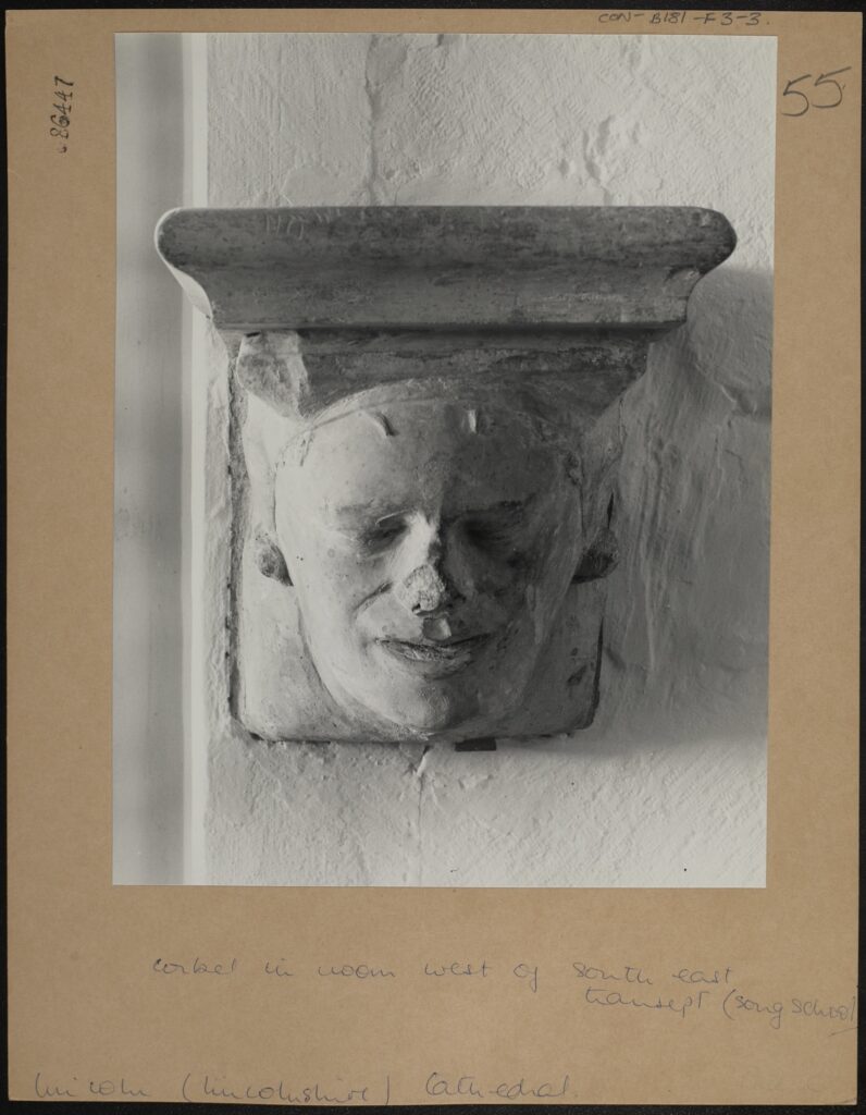
Corbel in room West of South East Transept (song school), CON_B00181_F003_003, Conway Library, Courtauld Institute of Art, CC-BY-NC


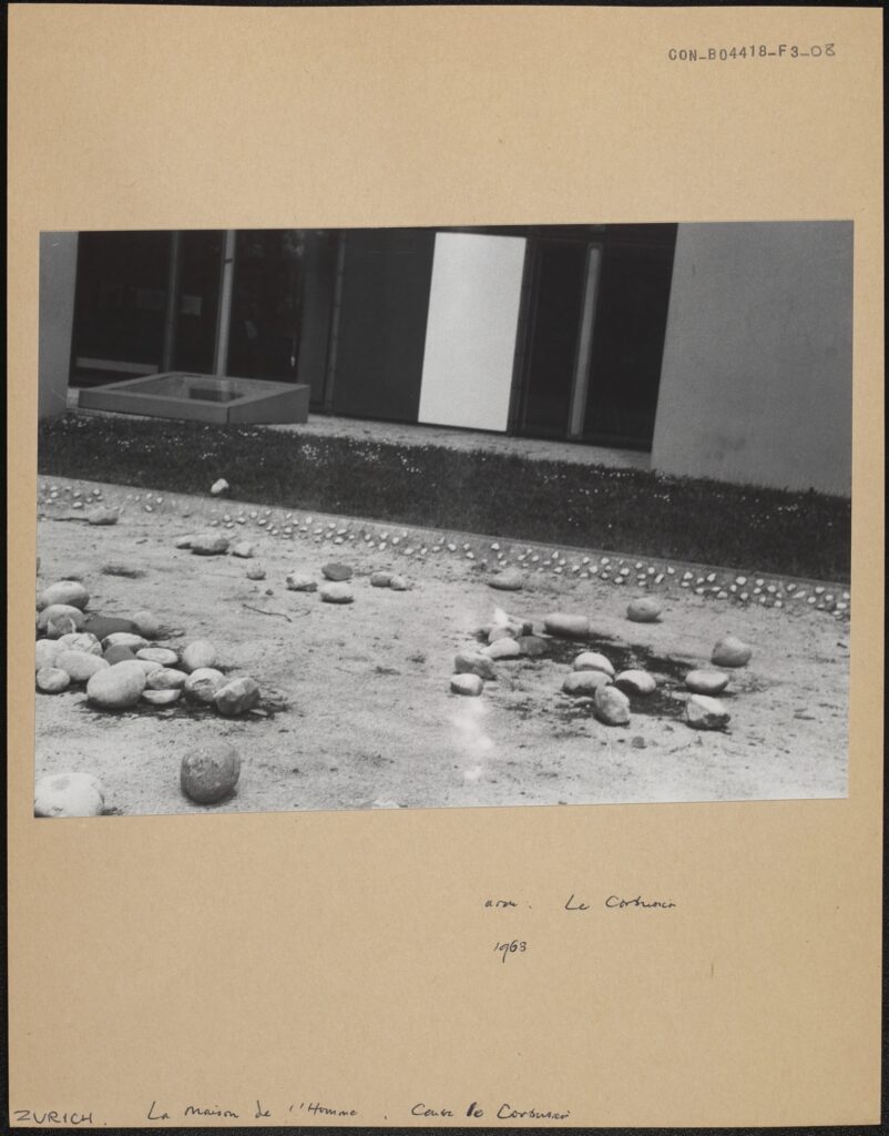
La Maison de l’Homme, le Corbusier, Centre le Corbusier, 1963, CON_B04418_F003_008, Conway Library, Courtauld Institute of Art, CC-BY-NC


Verse 1

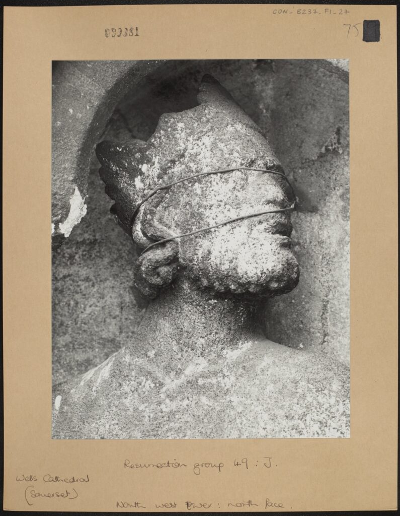
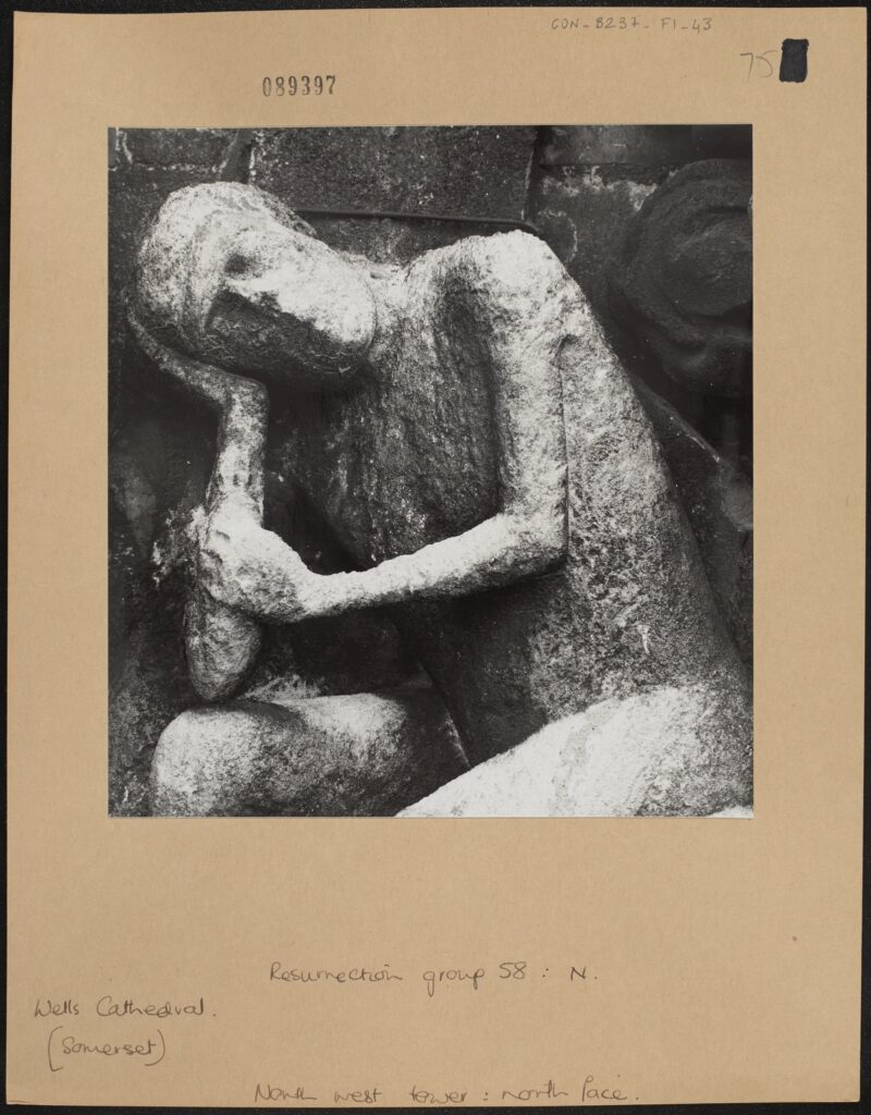
Resurrection group 49: J. North west Tower: north face. CON_B00237_F001_027, Conway Library, Courtauld Institute of Art, CC-BY-NC


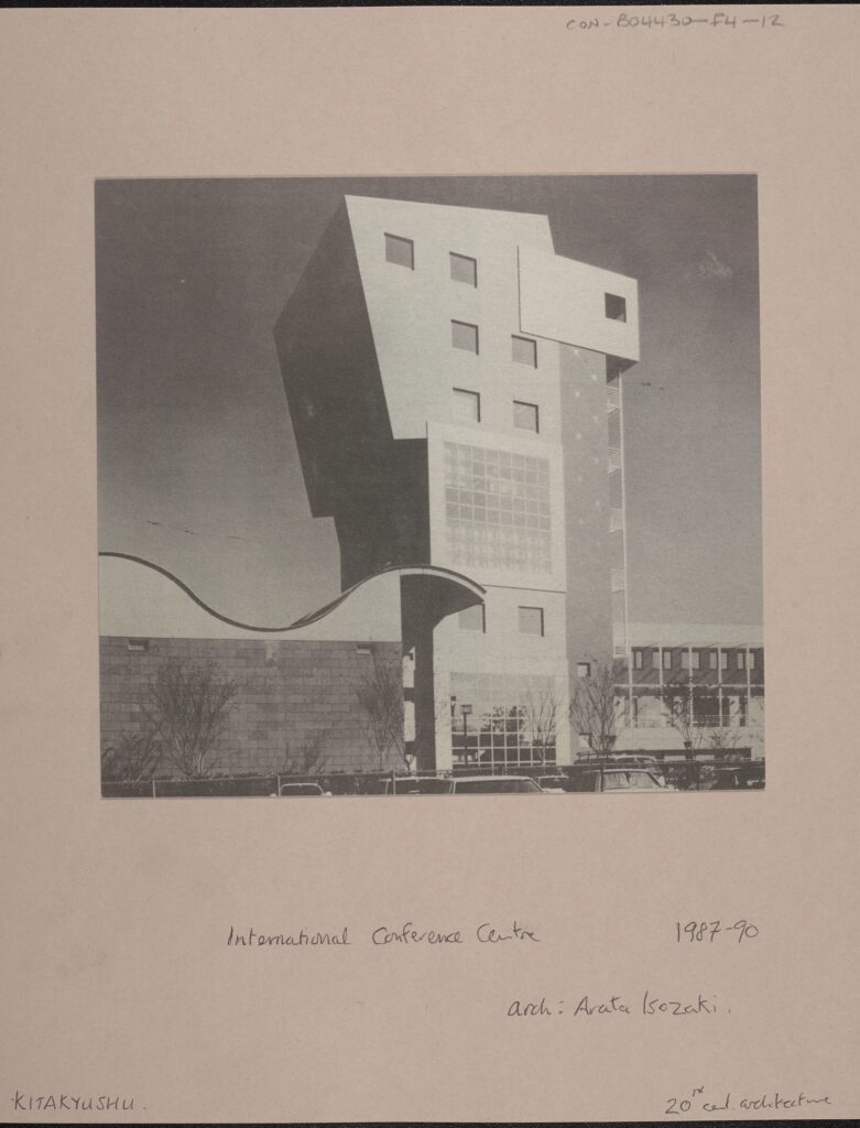
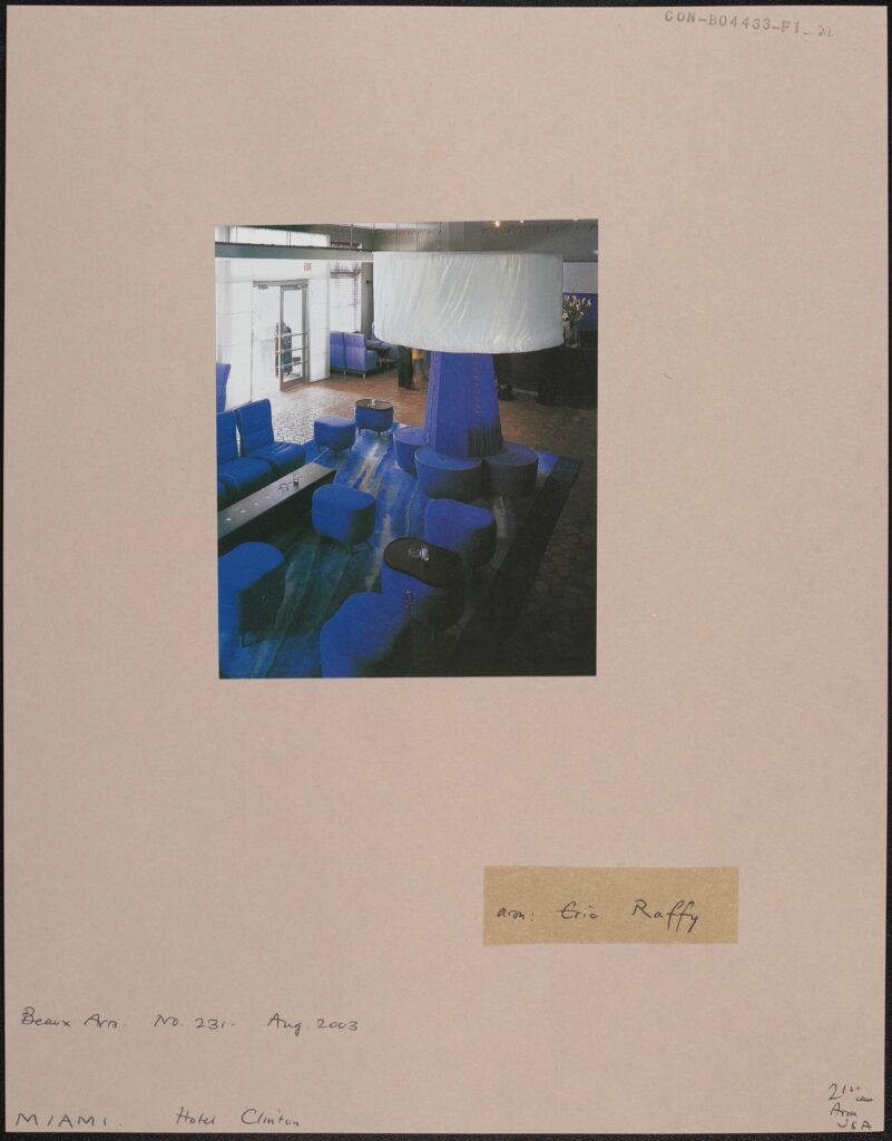
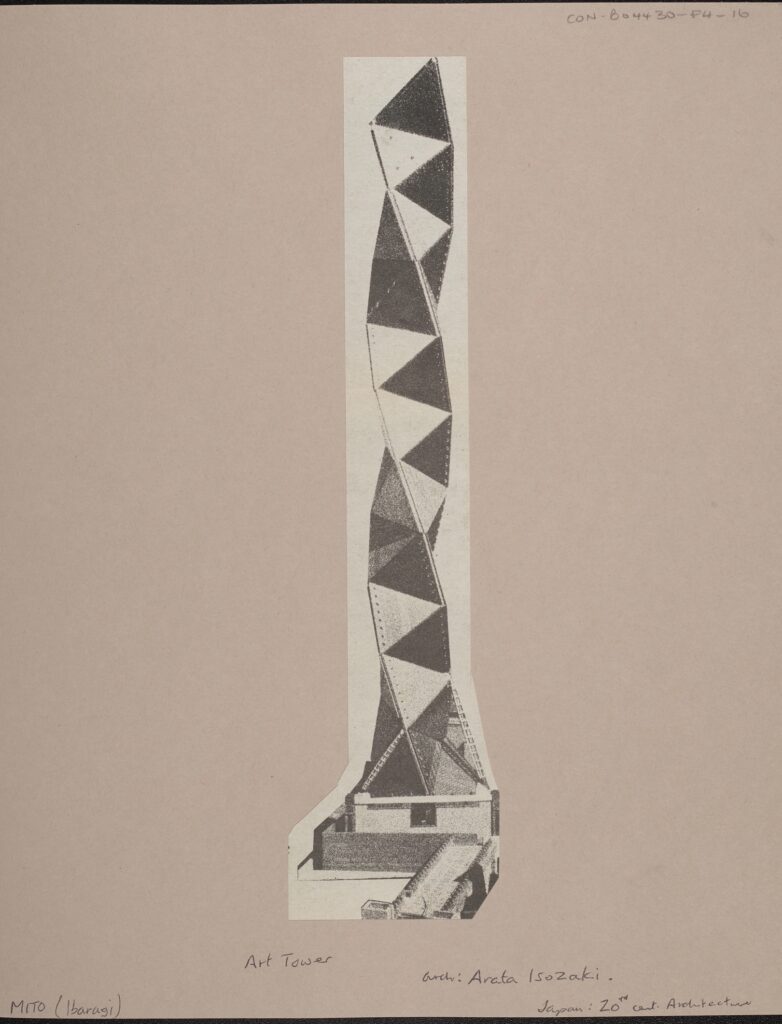
International Conference Centre, 1987-90, arch: Arata Isozaki, 20th Century Architecture, CON_B04430_F004_012, Conway Library, Courtauld Institute of Art, CC-BY-NC


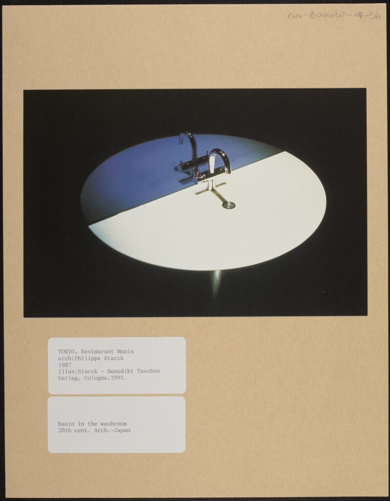
Basin in the Washroom Illustration: Starck – Benedikt Taschen, Verlag, Cologne 1991 20th Century Architecture, CON_B04430_F004_036, Conway Library, Courtauld Institute of Art, CC-BY-NC


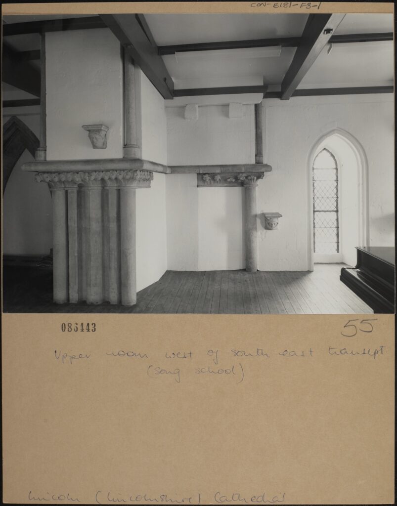
Upper room west of south east transept. (song school), Lincoln, Lincolnshire Cathedral, CON_B00181_F003_001, Courtauld Institute of Art, CC-BY-NC


Beaux Arts No. 231, Aug. 2003, Miami, Hotel Clinton, CON_B04433_F001_022, Courtauld Institute of Art, CC-BY-NC


Verse 2

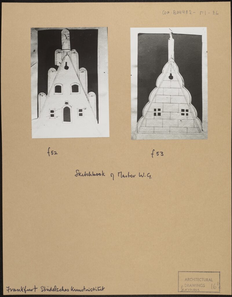
F52, f53, Sketchbook of Master W.G., Frankfurt Stadelsches Kunstinstitut, CON_B04492_F001_026, Courtauld Institute of Art, CC-BY-NC


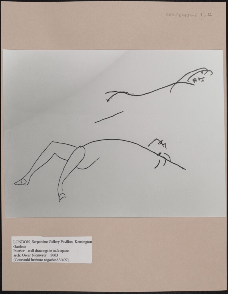
Interior – wall drawings in cafe space, London, Serpentine Gallery Pavilion, Architect: Oscar Niemeyer, 2003, CON_B04434_F001_066, Courtauld Institute of Art, CC-BY-NC


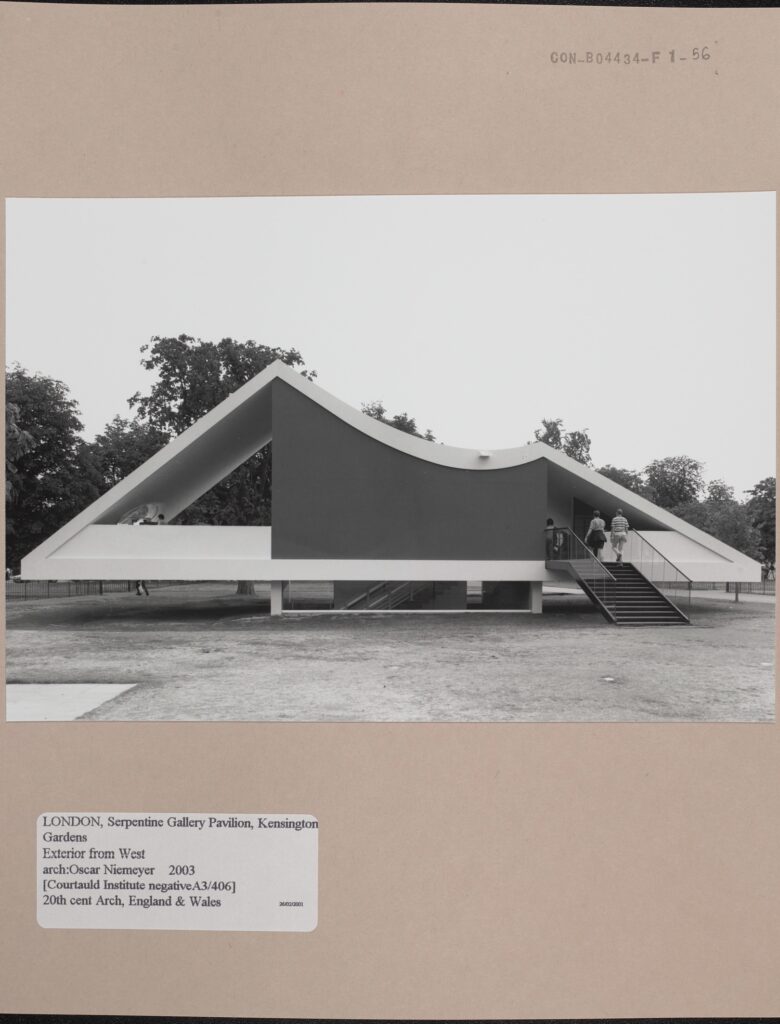
Exterior from west (Courtauld Institute Negative A3/406) 20th century Architecture, England and Wales, London Serpentine Gallery Pavilion, CON_B04434_F001_056, Courtauld Institute of Art, CC-BY-NC


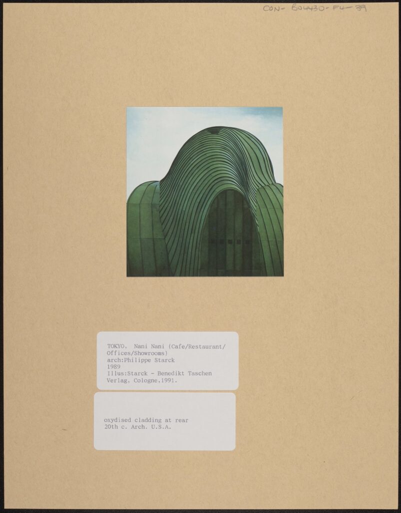
Oxydized cladding at rear. Illus: Starck -Benedikt Taschen Verlag, Cologne 1991, CON_B04430_F004_039, Courtauld Institute of Art, CC-BY-NC


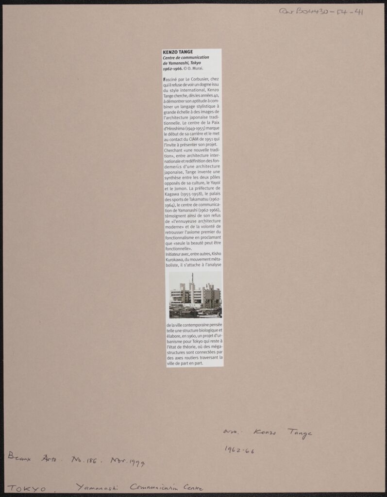
Beaux Arts No. 186, November 1999, Yamanashi Communication Centre, CON_B04430_F004_041, Courtauld Institute of Art, CC-BY-NC


Pre-Chorus

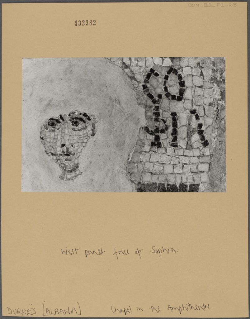
West panel – face of Sophia. Chapel in the Amphitheatre, Durres, Albania, CON_B00003_F001_023, Courtauld Institute of Art, CC-BY-NC


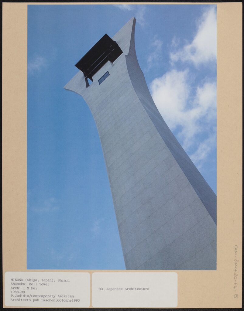
P. Jodidio/Contemporary American Architects, published Taschen, Cologne, 1993: 20th century Japanese Architecture. CON_B04430_F004_015, Courtauld Institute of Art, CC-BY-NC


Art Tower, arch: Arata Isozaki, Japan: 20th Century Architecture, CON_B04430_F004_016, Courtauld Institute of Art, CC-BY-NC


Chorus

North west tower: north face. Resurrection group 58: N., Wells Cathedral, Somerset, CON_B00237_F001_043, Courtauld Institute of Art, CC-BY-NC


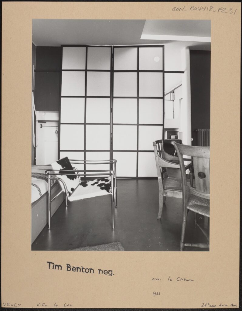
Tim Benton negative 20th Century Architecture, Vevey, Villa le Lac, CON_B04418_F002_031, Courtauld Institute of Art, CC-BY-NC


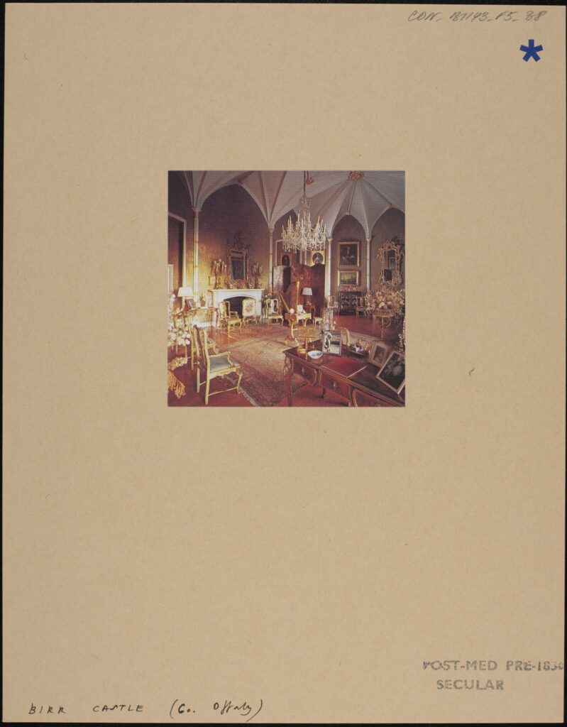
Birr Castle [colour interior: sitting room], CON_B01143_F005_038, Courtauld Institute of Art, CC-BY-NC


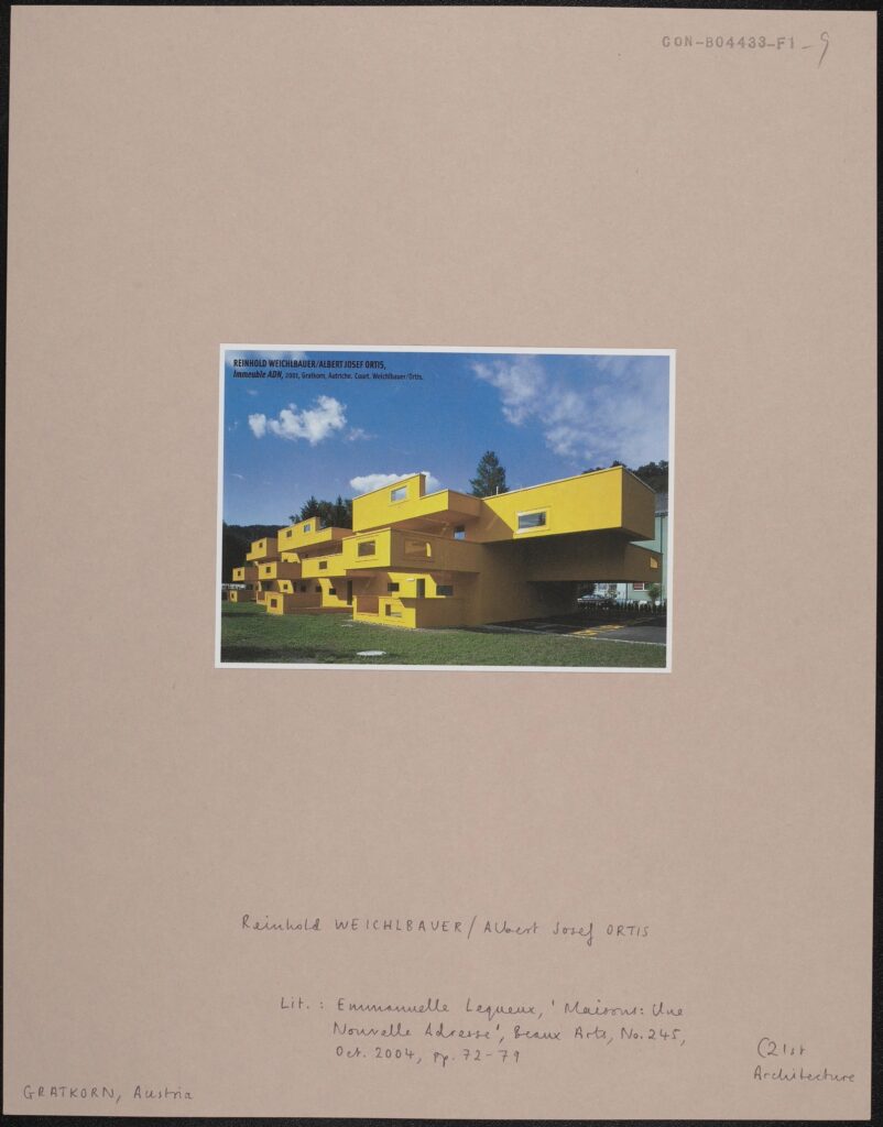
Literature: Emanuelle Lequeux, ‘Maisons: Une Nouvelle Adresse’, Beaux Arts, No.245, October 2004, pages 72-79. 21st century Architecture. CON_B04433_F001_009, Courtauld Institute of Art, CC-BY-NC


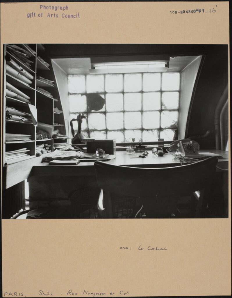
Le Corbusier, Paris, Studio Nungesser et Coli, CON_B04340_F001_016, Courtauld Institute of Art, CC-BY-NC


Verse 3

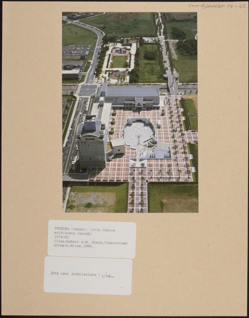
Overhead view of plaza and buildings Illustration: Robert A.M. Stern, Classicismo Attuale, Milan, 1990. 20th Century Architecture – Japan, CON_B04430_F004_042, Courtauld Institute of Art, CC-BY-NC


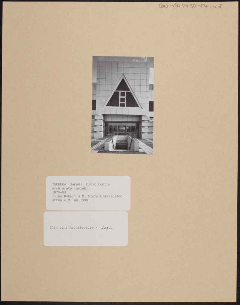
Tsukuba, Civic Centre, arch: Arata Isozaki, 1979-83, Illustration: Robert A.M. Stern, Classicismo Attuale, Milan, 1990, CON_B04430_F004_043, Courtauld Institute of Art, CC-BY-NC


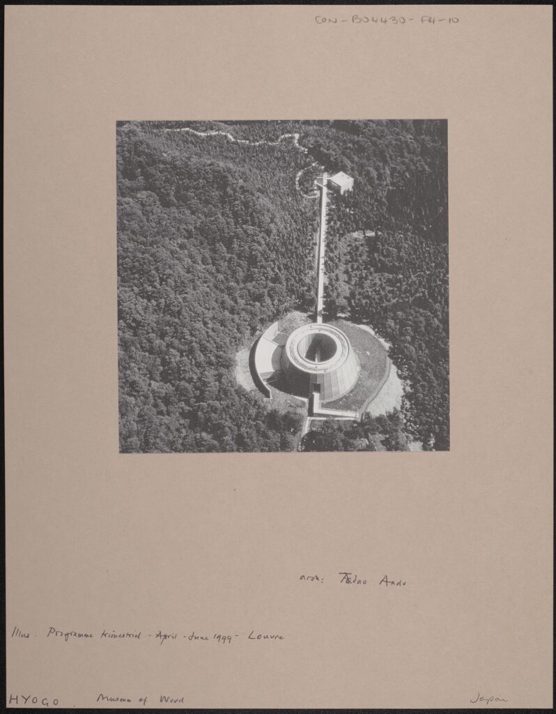
Illus. Programme trimestriel – April – June 1999 – Louvre, Hyogo, Museum of Wood, CON_B04430_F004_010, Courtauld Institute of Art, CC-BY-NC


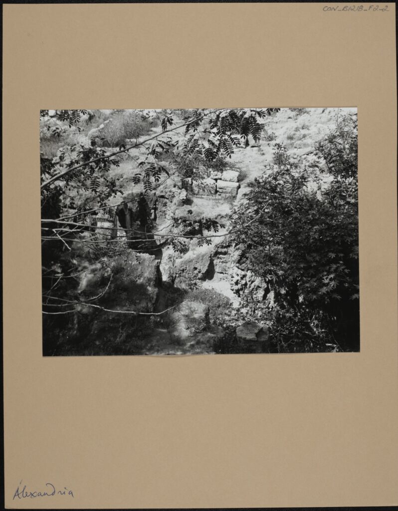
Alexandria, CON_B01218_F002_002, Courtauld Institute of Art, CC-BY-NC


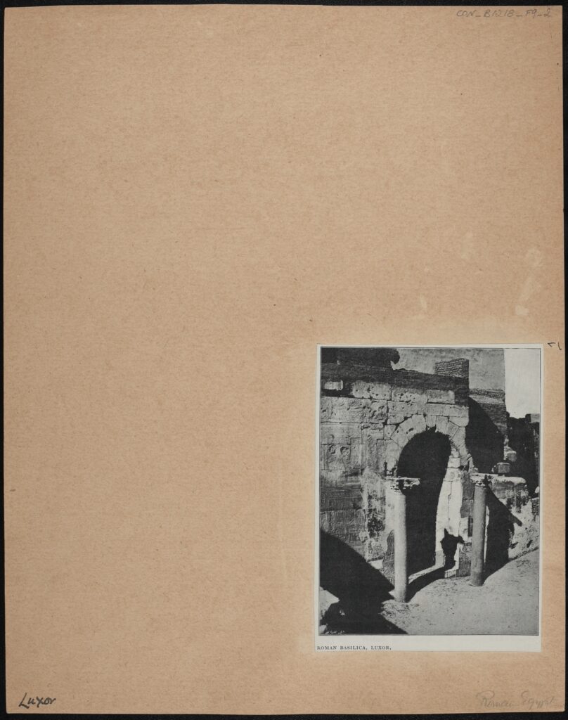
Roman Basilica, Luxor, CON_B01218_F009_002, Courtauld Institute of Art, CC-BY-NC


Outro

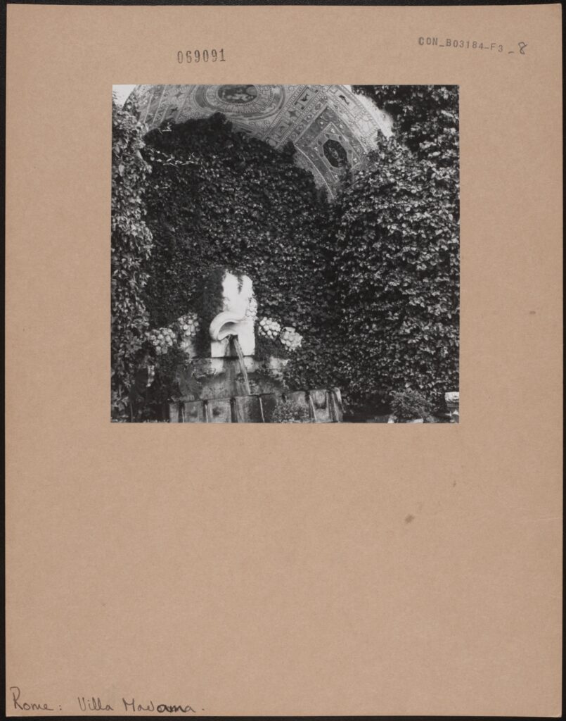
Rome, Villa Madama: Exterior: Gardens, CON_B03184_F003_008, Courtauld Institute of Art, CC-BY-NC


Hotel Clinton, Miami, Beaux Arts No. 231, Aug. 2003., CON_B04433_F001_022, Courtauld Institute of Art, CC-BY-NC


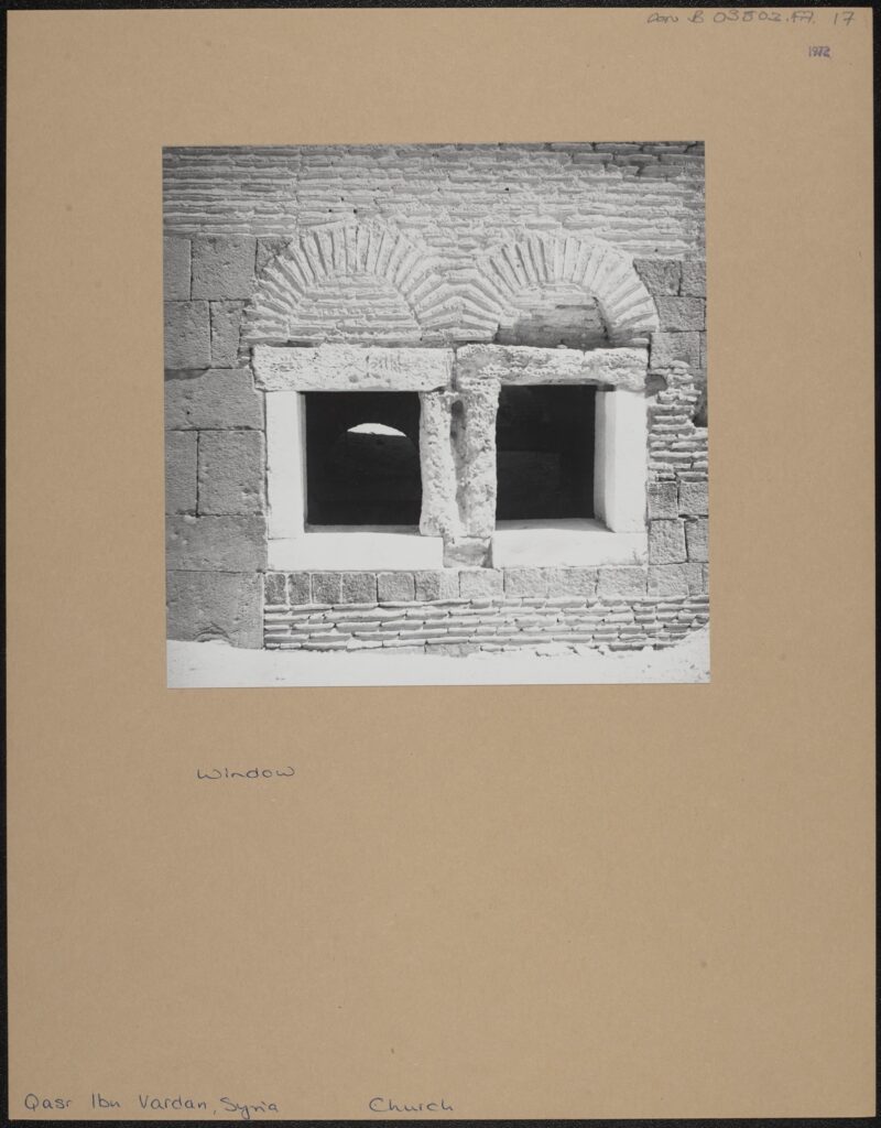
Window, taken in 1972, Qasr Ibn Vardan, Syria, Church, CON_B03803_F007_017, Courtauld Institute of Art, CC-BY-NC


Literature: Emanuelle Lequeux, ‘Maisons: Une Nouvelle Adresse’, Beaux Arts, No.245, October 2004, pages 72-79. 21st century Architecture., Gratkorn, Austria, CON_B04433_F001_009, Courtauld Institute of Art, CC-BY-NC


Iris Campbell-Lange
Courtauld Connects Digitisation

Oxford University
Micro-Internship Participant

John Hurst: When Modernism and Fascism Collide – Tracing the Lives of Five Art Historians in Germany and Austria in the 1930s

There are many different strands to the Digitisation Programme and I’ve been lucky to have researched and written a number of photographer’s biographies. Recently I came across a very interesting thread amongst a group of German/Austrian art historians and photographers linked by politics, persecution and war.

In the late 1920s and 30s the rise of the National Socialist German Workers Party (Nazis) brought about changes within German society that led to the persecution of many ethnic minorities and ultimately World War II.

Under the dictatorship of Adolf Hitler the term Entartete Kunst (Degenerate Art) was used to describe Modern Art – both German and international as it was viewed as being an insult to nationalistic German feelings. Anyone perceived as being responsible for the creation of such art and those who purchased and displayed it in museums and galleries across the nation were sanctioned and in many cases dismissed from their posts. These actions led to many so called ‘degenerate’ works of art being taken off display or placed in storage – some never to be seen again.
In September 1933 the Reichskulturkammer (Reichs Culture Chamber) was established under the control of Joseph Goebbels – Hitler’s Reichs Minister for Public Enlightenment and Propaganda. He decreed that only artists who were “racially pure”or supportive of the Party would be allowed to be involved in the cultural life of the ‘new” Germany. By 1935 the Reichs Culture Chamber had over 100,000 members.

Modern art styles were prohibited, with the Nazis promoting paintings and sculptures that were traditional in tone and which exhibited values of racial purity, militarism and obedience. These same restrictions were applied to films, plays and music – especially jazz which was seen to stem from black influences.

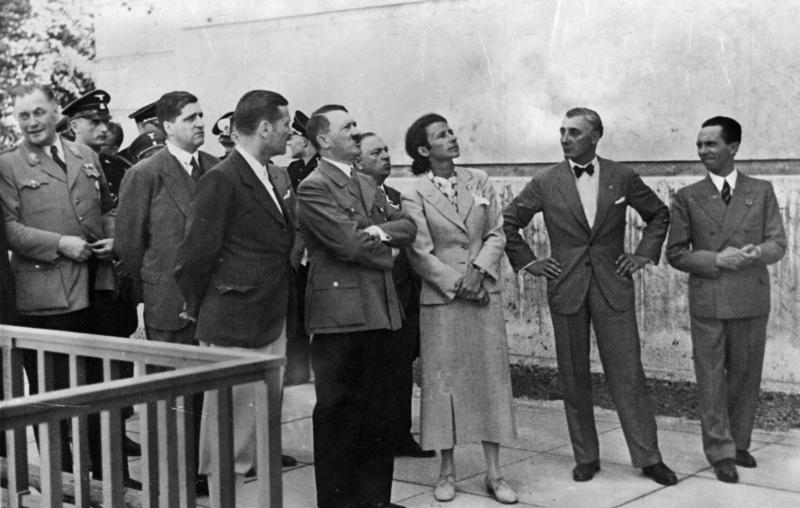
In 1937 Die Ausstellung “Entartete Kunst” (The Degenerate Art Exhibition) was organised by Hitler’s favourite artist  Adolf Ziegler a member of the Nazi Party since the 1920’s.

Besichtigung des Hauses der Deutschen Kunst durch Adolf Hitler. Daneben Frau Prof. Troost, Präsident der Akademie der Bildenden Künste Ziegler und Dr. Goebbels am 5.5.37. Hitler visits the House of German Art alongside Professor Troost, President of the Academy of Fine Arts. Ziegler is seen pictured wearing a bow tie and standing next to Goebbels. 5th May 1937. [Bundesarchiv, Bild, 183-1992-0410-546/CC-BY-Sa 3.0]
He became the foremost official painter of the Third Reich and had recently been appointed the President of the Prussian Academy of Arts.

Under the direction of Goebbels, Ziegler headed a five man commission that toured state collections in various German cities and seized over 5,200 art works deemed to be “degenerate”. The works were taken to Munich – the fervently pro-Nazi Bavarian capital to be installed at the Institute of Archaeology in the Hofgarten. This venue had been chosen especially for its rooms which were dark and narrow and provided the desired depressing atmosphere.

The Führer was the arbiter of what was considered “Modern” and on the eve of the exhibition opening, he had made a speech declaring “a merciless war” on cultural disintegration, describing the people who produced such art as “incompetents, madmen and cheats”

To further emphasise their distaste and disgust the organisers decided that many of the paintings were to be displayed without frames, hung at angles and partially covered or accompanied by derogatory slogans such as:

“An insult to German womanhood”

“Nature seen by sick minds”

“German farmers – a Yiddish view”

and as a reference to the museum and gallery directors loathed by the regime:

“Even museum bigwigs called this “the art of the German people”

The exhibition contained paintings, sculptures and prints by 112 primarily German artists and also works of art by Picasso, Chagall and Mondrian which had been confiscated by Ziegler and his cronies.

Some of the paintings had labels next to them detailing the amount of money a museum or gallery had spent to buy them. Prices were greatly exaggerated using costs based on the post WWI Weimar hyperinflation period where money had been devalued.  All of this was designed to promote the idea that “Modernism” was a conspiracy by people who hated German decency (without a hint of irony !) and that money would have been better spent providing citizens with food or essential services.

Die Ausstellung “Entartete Kunst” was timed to coincide with the “Grosse Deutsche Kunstausstellung” (Great German Art Exhibition) – a showcase of art by German artists approved by the Nazis. Over 2 million people had visited by the time it closed on 4th November 1937. By comparison “Grosse Deutsche Kunstausstellung” was viewed by half that number.

After Munich, it toured other cities such as Berlin, Leipzig, Düsseldorf,  Vienna and Salzburg where another 1 million people visited.

Children were denied entry to these exhibitions due to the perceived harmful and corruptive nature of the works of art.

After the exhibition had completed its tour of Germany and Austria, many of the paintings which had been seized were sold to foreign art dealers who were assured by the regime that the proceeds would be used to upgrade and replenish collections in Germany’s museums. This was not true and most of the money raised went to fund the massive increase of Germany’s armed forces and armaments. In 1939, the authorities burnt over 5,000 works of art that it could not sell.

Photographs contained in the Conway Library, and part of the Digitisation Programme are attributed to Drs Georg Swarenski, Alfred Scharf, Ernst Nathan, and Susanne Lang. They were all of Jewish faith or origin so at risk of dismissal from their jobs or worse.

Georg Swarzenski

Swarzenski had been appointed Director General of all the museums in the city of Frankfurt-am-Main in 1928 and was responsbile for purchasing works of art from many genres, some of which were seen as ‘degenerate’ when the Nazis came to power. In 1933 he was dismissed from his posts in public office but allowed to remain as a director of a private gallery. Five years later he was arrested by the Gestapo on the grounds that he had written an anti-authority article in a local newspaper.

He was set free without charge a short while later, but being Jewish, Swarzenski realised that he had become increasingly in danger and within a few weeks he and his family had emigrated to the U.S.A.  At the time of his death in 1957 he had been working as a Curator in the Medieval Arts department of Boston’s Fine Arts Museum.

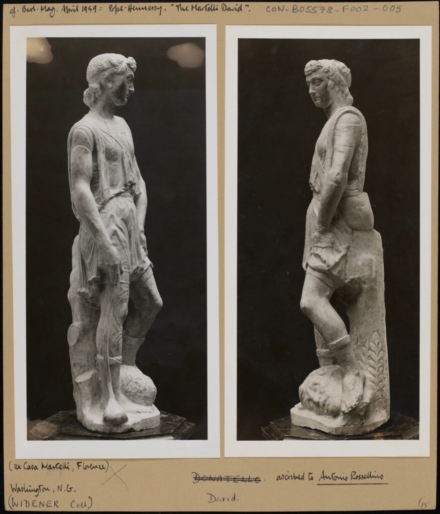
Two black and white photographs mounted on card, depicting two angles of “The Martelli David”. Burlington Magazine, April 1959. Pope Hennessy “The Martelli David” (ex Casa Martelli Florence). Washington N.G. (Widener Coll) David, ascribed to Antonio Rossellino. CON_B05578_F002_005, The Conway Library, The Courtauld Institute of Art, CC-BY-NC.

Alfred Scharf

Scharf was the son of the founder of the Goldring audio equipment company and studied art history and classical archaeology in Berlin before becoming a research assistant at the Kupferstichkabinett (Museum of Prints and Drawings) part of the Berlin State Museum. As a freelance writer of art history in the early 1930’s he had planned to write a dissertation on the Italian Renaissance painter Filipo Lippi at the University of Frankfurt, but his Jewish descent and the growing anti-Semitic attitudes in the country prevented him doing so. In May 1933, he emigrated to Britain where he worked as a freelance art expert.

He also lectured on 15th century Italian and 17th century Dutch/Flemish painting at the Courtauld and was a consultant at the Warburg Institute.

Due to his considerable reputation as an art historian, in 1940 the German authorities placed Scharf on Hitler’s Sonderfahndungsliste G.B. (Special Search List. Great Britain). In the event of a successful German occupation of Britain after the retreat of British forces from Dunkirk, he would be arrested and used as an advisor on which works of art and sculptures were worthy of looting and taking back to Germany to be added to the ever growing “collections” of Hermann Göring and other prominent Nazis. Scharf’s name was one of over 2,800 on the list.

He became a British citizen in 1946 and aspects of his life and work were featured in an episode of the BBC series “Fake or Fortune”.

Ernst Nathan

A black and white photograph of Ernest Nathan/Nash. Bildarchiv, “Ernest Nash”, Goethe Universität, Frankfurt-am-Main

Nathan was born in Potsdam Germany in 1898 to a Jewish family. He studied law and Roman history in Berlin and served in the German army during WWI, where he took up photography to relieve the boredom of being stationed on the Italian Front.

After the war he resumed his studies and by 1926 had set up his own legal practice in Berlin. In the mid 1930s, the rise of the Nazis started to make life difficult for Jews like Nathan and his membership of the Communist Party added to his problems. In 1936 he and his wife and children moved to Italy but by 1938 the rise of national socialism under Mussolini meant that they were unsafe in their adopted country so they moved again – this time to New York where he set up a photographic studio.
He decided to change his name to the less Germanic Ernest Nash and over the following years established a reputation as a portrait photographer taking pictures of amongst many others – jazz musician Benny Goodman and composer Benjamin Britten who had moved to the U.S.A. as a pacifist during WWII.

After the war, Ernest resumed his studies of Roman history and architecture, moved back to Italy and devoted his life to photographing and chronicling ancient Roman and Christian sites in Italy, North Africa and the Middle East. He died in Rome in 1974.

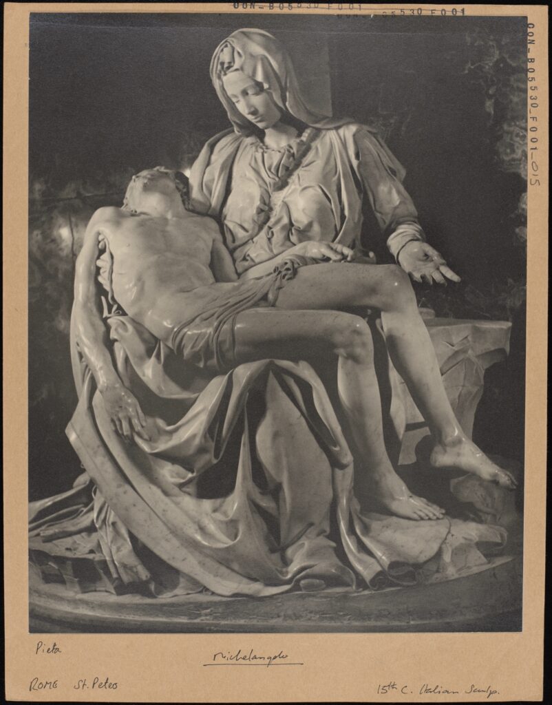
A black and white photograph mounted on card, depicting Michelangelo’s La Pietà. La Pietà. Michelangelo, Rome, St. Peters, 15th Century Italian Sculpture, CON_B05530_F001_015. The Courtauld Library, The Courtauld Institute of Art, CC-BY-CC.

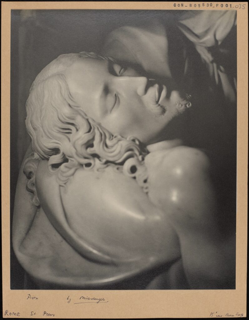
A black and white photograph mounted on card, depicting La Pietà, more specifically a detail of Jesus’ face. La Pietà Michelangelo Rome, St. Peters, 15th Century Italian Sculpture, CON_B05530_F001_035. The Courtauld Library, The Courtauld Institute of Art, CC-BY-CC.

Susanne Lang

Lang was born in Vienna in 1907 and studied art history and ethnology at the Kunsthistorisches Institut. She graduated in 1931 and published her dissertation titled: “ Voraussetzungen und Entwicklung des Mittelalterlichen Städtebaus in Deutschland” (Determinants and Development of Medieval Urban Planning in Germany).

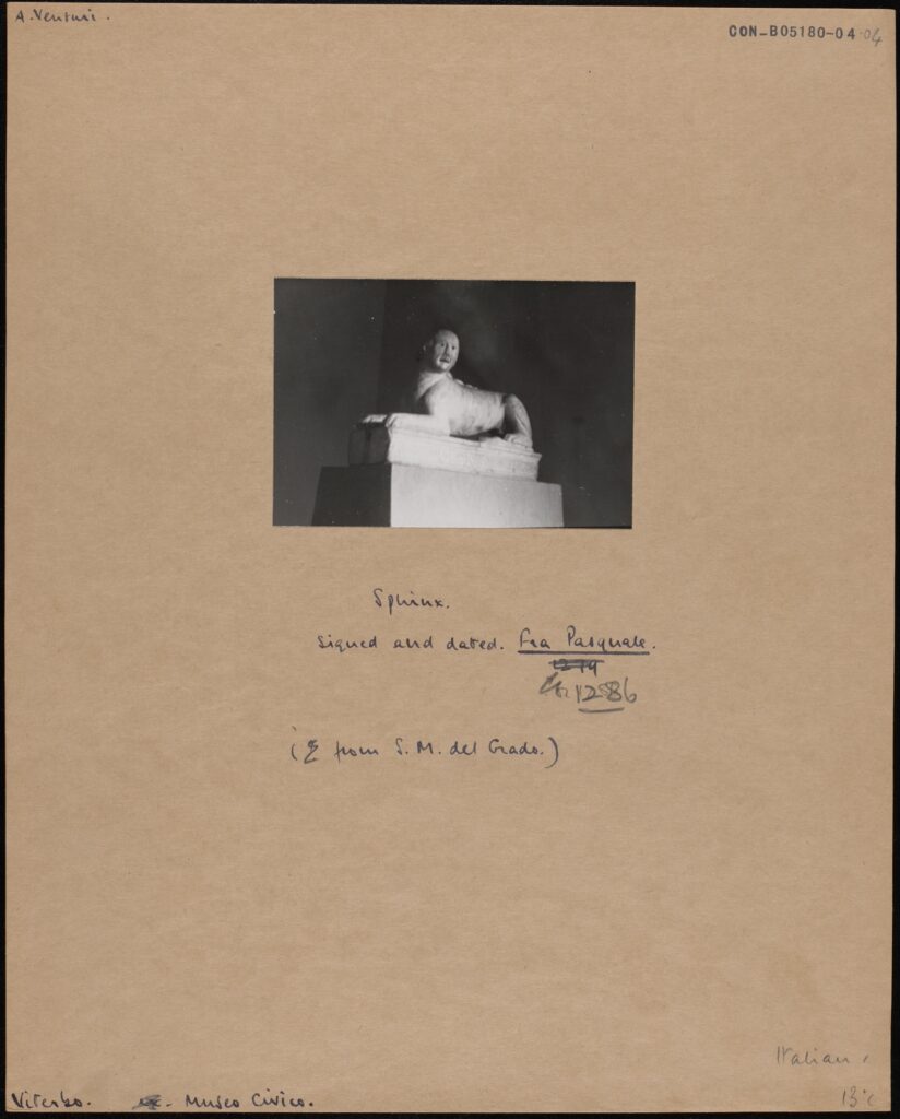
A black and white photograph mounted on card, depicting a stone sphinx. A. Neuturi. Sphinx signed and dated Fra. Pasquale 1286 (from S.M. del Grado) Museo Civico CON_B05180_004_004. The Conway Library, The Courtauld Institute of Art, CC-BY-NC

Lang was Jewish by birth and after the 1938 Anschluss when Nazi Germany annexed Austria she suffered persecution and exclusion because of her religion. She emigrated to England and formed a professional relationship with German art historian Nikolaus Pevsner. Although he had also been born Jewish, he had converted to Lutheranism at a young age, but had been forced to flee Germany due to the Nazi race laws.
They worked together on many books and during her time in London Susanne Lang worked closely with art historians and fellow academics at the Courtauld and Warburg Institutes. She retired to live in Israel and died in 1995.

So, four people whose photographs ended up in the Conway Library and whose lives were affected and changed forever by political upheaval beyond their control. There is however a twist in this story relating to another Dr whose photographs are also in the Conway Library.

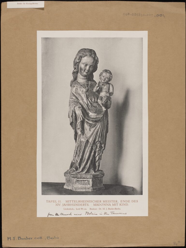
Dr. Moritz Julius Binder

Binder was born in Stuttgart in 1877. He studied music at the Vienna Conservatory and then art history in Berlin.

In 1912 he became an employee of the Berlin Arsenal a Baroque style building erected in the early 18th century and which served as an armoury for the Brandenburg-Prussian Army and later as a museum.

A black and white photograph mounted on card, depicting a wooden sculpture of the Madonna and Child. Tafel II MITTLERHEINISCHER-MEISTER. ENDE DES XIV JAHRHUNDERTS. MADONNA MIT KIND Lindenholz, hoch 99cm. Besitzer: Dr M.J. Binder – Berlin. from the Church near Ostein in the Taunus. MJ Binder coll, Berlin CON_B05284_F002_001 The Conway Library, The Courtauld Institute of Art, CC-BY-NC

He was appointed as the Director in 1913 – a post he held for twenty years until he was dismissed under the new Nazi law aimed at ‘restoring professional civil service’ It was essentially a means of getting rid of people of Jewish or other ethic origins or those whose political views and actions were at odds with those of the National Socialists. There is no evidence that Binder was Jewish but his museum policies were criticised by far right circles, most likely due his buying and displaying what was viewed as ‘Degenerate Art”.

Reichsmarshall Hermann Göring was one of the most powerful members of Hitler’s regime and the man who instigated the policy of eliminating Jews from German economic and social life. He was also an avid ‘amateur’ art collector who became a professional looter of art from countries invaded and conquered by the Nazis before and during WWII.

During his time as a museum director, Binder had become a close friend of influential German publisher Dr Helmut Küpper and his wife, the Russian artist Paraskewe “Baika” Bereskine. “Baika” had painted the portraits of Hermann Göring’s first wife Carin who died in 1934 and his second wife Emmy and had become a favourite of the Reichsmarschall whose patronage was very useful to her.

By coincidence, Binder advised a Berlin art dealer who sold paintings to Göring. It was through this dealer Johannes Hinrichen and “Baika” Bereskine that Binder was introduced to Göring around 1935 and he is thought to have acted as a Consultant on which pieces of art were worth buying or stealing from the properties of people who had fled Germany or suffered worse fates at the hands of the regime.

In 1938 he was dismissed by Göring following disagreements about the authenticity of certain works of art and replaced by Walter Andrea Hofer. who became Director of Göring’s art collections. Hofer did not have the breadth of knowledge that his predecessor had so he often asked him for advice on what to buy or “steal”. During the war Mauritz Binder left Berlin to avoid Allied bombing raids and moved to live in the countryside. He died in January 1947.

Swarenski, Scharf, Nathan and Lang may or may not have known each other but they are all linked by their religious and cultural beliefs which brought persecution and danger to their lives. Binder on the other hand, either through choice or as an act of self preservation actively assisted the main perpetrators of their persecution by identifying works of art, some of which would have been in the private collections of Jews or Communist sympathisers which were then ‘stolen’. Most of these artworks were either not recovered or returned to their owners or families so Binder and others bore a great deal of responsibility.

Five individuals connected by chance and coincidence and thanks to the Digitisation Programme we are able to preserve some (at least) of their work and legacy where it was once at risk of being erased.

John Hurst

Digitisation Volunteer,  July 2023

Amelie de Lara: All Roads Lead to Box CON_B03085

INTRODUCTION

I turned up on my first day at the Courtauld internship with a pretty clear idea of what I wanted to do: I was going to research and write an essay on the life and times of Etienne Parrocel, a French Painter from the 18th Century who had produced a series of architectural drawings based on his travels in Rome. Parrocel was an accomplished painter, and an interesting man, and I would certainly recommend a google search or scroll though the Courtauld’s digital archives of his works, neatly laid out in aesthetically pleasing vertical rows. I like academic research, have written (many) essays, and was looking forward to week which I expected would probably be not that unlike my last 2 years studying at University.

However, as I noisily (and rather embarrassingly) dragged my suitcase down the various steps into the Conway Library, I found myself transported into another world. Much of the Courtauld’s collection is arranged by location, making you feel as though you are in a miniaturised map of the world (or at least Europe). The first place greeting you, appropriately for my interests, is Italy. We all gathered around a small table with shelves of red spines encasing us on all four sides, which felt not unlike the Roman Forum I had been planning to include as part of my research. Front and centre of this display stood Box CON_B03085, its spine emblazoned with ‘Roman Forum: Printings and plans; Sculptural Drawings. Whilst perhaps smaller than the monuments which had once stood in Rome or the Forum, the perfectly accidental placement of this box as this first thing you see in the library, and the aged peeling spine filled me with an almost Romantic sense of awe (although don’t worry, no terrible poetry was penned!).

From this experience, as well as researching the various artists, travellers, and scholars who had made contributions to Box CON_B03085, I wanted to try to recreate for those who have never visited the Courtauld’s libraries – or any archives – what it feels like to make your way through a museum, wind your way round labyrinthine archives, and gradually dig through box. Although it might not normally be seen as a physically demanding activity, it’s not unlike travelling, or archaeological fieldwork itself. I also wanted to think about the ways this has changed from the period when gentlemanly ‘Grand Tours’ dominated how we research – particularly in my field of Classics and archaeology – to today, when people are making efforts through access initiatives and digitisation initiatives (like the Courtauld’s) to increase public engagement with art and museum collections, and diversify access to knowledge.

To help organise these thoughts, I decided to present my research and responses to the images of this box not just in a digital, blog format but by creating my own ‘box’. Usually whilst I am studying for my degree any reconstructions – historical or visual- have to be based strictly on close textual reading or archaeological data. Whilst of course this is necessary when we are trying to reconstruct an accurate view of the past, I found myself inspired by the early modern antiquarians, artists, and archaeologists I was researching during this week to take a more creative, imaginative and personal response to the past. Like the artistic and architectural neo-classical borrowings which inspired those I was researching, I took inspiration from Box CON_ but did not follow its models doggedly. I was also inspired by the Courtauld’s current exhibition on ‘fakes and forgeries’ which I went to visit on the first day, and seeing how in previous epochs the lines between copying and inspiration were more blurred, and not seen as negatively as today.


FOLDER ONE: PRINTS AND DRAWINGS

PRINTS AND DRAWINGS [Click link to open PDF]

The first folder I open in the box is an eclectic mix. It’s labelled ‘prints and drawings’ which hardly does justice to the wealth of material inside. From newspaper clippings, to cut-outs from text books, to various artistic reconstructions and prints of the Roman Forum, the contributors to this box come from a diverse amount of geographical and chronological periods. The order of the box doesn’t make much logical sense either, with different media and time periods all intermixed with each other. The same artists work often isn’t even kept together, with Maarten van Heemskerck’s name greeting me multiple times (probably not a bad thing, as it took me a few times to figure out how to spell). As you sift through this first folder, various sizes of paper drop through your hands, maps are unfolded, text book pages are opened. It’s a very different experience from simply pressing the ‘next’ key on your computer screen. By the end of it I feel as if I know the Roman Forum intimately despite never having been there, experiencing the various physical changes and interpretations it had undergone over 1000s of years through many different eyes.

I wanted to keep my own first folder equally a confusing but hopefully interesting mix of research, photographs, and other types of media. After researching the back ground of the Grand Tour, (a journey round Europe undertaken by many of the artists and photographers included in this box, not the Amazon Prime TV series!), I then researched some of these artists in more detail, their biographies and careers, and made small profiles on them and responses to the specific art works included in this folder. This included Maarten van Heemskerck (1498-1574); George Wightwick (1802-1872); Jean Baptiste Camille Corot (1765-1875); Charles Roach Smith (1807-1890); Charles Robert Cockerell (1788-1863); Israel Silvestre (1621-1691); Mary Beard (1955-); J Hoffbauer (1875-1957); and the Warburg Institute. Their interest in Roman art and architecture sparked art movements like the Renaissance which prized the aesthetic of Greco-Roman antiquities: this fascination continues to today, and is visible throughout London, the capital of another dismantled empire. The Courtauld’s galleries home in Somerset House is replete with neo-classical references, as is the rest of London, showing how to this day we remain inspired by ancient Rome.


FOLDER TWO: SCULPTURAL FRAGMENTS

SCULPTURAL FRAGMENTS [Click link to open PDF]

As an archaeology student, one of the first things you learn is that context is everything. For most of the population, looking at other people’s holiday snaps is universally agreed to be one of the most boring ways to spend time, but for students of archaeology it is one of the most valuable resources, a staple of most of my tutors and lecturers teaching material. That might explain why when I turned up at the Courtauld after 2 months stuck in Oxford looking at all the amazing places I had seen my lecturers go to I was feeling pretty restless. It’s probably unsurprising, then, that despite all the charms of the volunteer room at the Conway Library – unlimited biscuits and coffee, a student’s dream – I pretty quickly got fidgety, and wanted to explore both the wider archive and the beautiful surroundings of Somerset House to contextualise the work we were all doing. After some research, I learned Conway shared a similar passion – as well as being an art critic and collector, he was a passionate explorer and mountaineer, and wrote several books on his travels. Taking this as a sign of approval, I bravely set out beyond the libraries bounds.

 The pictures I took on this first afternoon and a few more I took over the next few days are the ones which make up the second half of my project, responding to the folder labelled ‘sculptural fragments’. Unlike the first box where I was researching and trying to understand other people’s responses to public architecture, these pictures reflect what caught my eye, and felt personally resonant or intellectually interesting. I’m no photographer or artist by any stretch of the imagination, and the pictures were taken on my iPhone rather than specialist technical equipment. I definitely took the opportunity to get lost in the archives and the museum and wander where I liked.

The ability to freely explore archives, museums, stately homes, and big cities one I don’t take lightly. In the last few images in this folder are images which show the accessibility – or inaccessibility – of many of the spaces in libraries and museums. Of course, we all experienced this as a collective for almost 2 years during the Covid-19 pandemic, but barriers to knowledge and art continue to exist for many due to financial, physical, or logistical difficulties, which I also tried to photograph.  I arranged my photos under themes which emerged from my research on the Grand Tour, and what I probably would have used as chapter headings had I written a normal essay. These themes were Geographical Mobility; New technologies; Accessibility and Inaccessibility; Inspiration and Reconstructions; Maps and Directions; Collection and Storage; and Roman influences back at home.

Inspired by Antonella Pelizzari’s article on the relationship of textuality with photographs, I annotated my print outs with why I took these pictures, and how this linked to my research on the Grand Tour. After doing this, I also decided to hand write my research for Folder One around the pictures I was discussing. Unlike normal essays, this means the mistakes and rewordings I made are recorded for posterity, just like some of the crossings out on the archive boxes. I felt this process made my writing more free and creative than a normal essay I would write, encouraging me to include my own thoughts and creative responses rather than facing the temptation of ‘control F-ing’ my notes, or leaving paragraphs unfinished and going back to them. It also took a lot longer than my normal speed typing, especially as I had to go over all my notes with pen when I got home as it didn’t show up on the scans!

However inconvenient it was, this painstaking process showed that research – whether more informal thoughts from trips abroad, or more ‘serious’ academic library work – is an active, ongoing, and above all human process, which cant be replaced by AI or digital programmes (or, hopefully for my current career plans, at least not yet!). Whilst digitisation is clearly an important move in both heritage and academia industries,  and has been beneficial in so many ways I think this experience has shown me that there are limits and things lost for researchers and the general public if we shift entire collections online at the expense of being able to experience the real thing.


CONCLUSION

On the very first page of his work ‘Mountain memories; a pilgrimage of romance’ Conway wrote ‘the landscapes of the past appear at this moment more real than the immediately visible world’. As someone who spends much time exploring places in their head which are far removed by time and place, this sentiment resonated with me. Even after a week of being intimately involved with this box, I’m still not sure why Conway or whoever put this box together chose these images, or put them in this particular order. I’m not even sure if they’d visited the Forum themselves, or – like me- had only experienced its ancient ruins and contemporary settings through a pastiche of other people’s perspectives.

As the final stage in this project, I wanted to bring my box out of the dusty shelves of the archive, into the gallery itself. Many digitisation projects pride themselves on their commitment to accessibility. One of my gripes with this is that outside academic worlds there is a lack of widespread public knowledge that projects and databases like this exist, and most of the public aren’t aware that vast swathes of our archives and objects are not on display, but publicly visible. The volunteer scheme at the Conway library has tried to combat this by bringing those not always familiar with the gallery into the Strand campus, and using platforms like social media also aim to increase public knowledge of these.

It felt silly, and the old box which looked at home in the chaos of the archives looked quite at odds with the sparse minimalistic design of the gallery which prided sleek cleanliness and scholarly contemplation of this gallery – I definitely got some dirty looks from the security guard. At the entrance to the Weston Library – the room at Somerset House containing some of the most famous paintings – is inscribed in untranslated Greek ‘let no stranger to the Muses enter’. A more apt summation of the inaccessibility of classics and many museums in general would be difficult for me to invent. A modern sign opposite translates these words, a signifier hopefully of changing attitudes.

The two main motivations of future heritage projects like the Courtauld’s digitisation project – preservation of memory and widening accessibility – are therefore aptly articulated in the story of the Grand Tour, the Roman Forum, the Courtauld and the Conway and Witt libraries and – hopefully- this box.


IMAGES OF THE BOX


BIBLIOGRAPHY

Antonella Pelizzari 2003, M., ‘Retracing the Outlines of Rome: Intertextuality and Imaginative Geographies in Nineteenth-Century Photographs’ in Picturing Place: photography and the geographical Imagination (eds. Schwartz J. and Ryan J.R.), Routledge, London.

Beard M., 2003, Picturing the Roman Triumph, Apollo vol 158.497.

Black J., 2003, The British Abroad; The Grand Tour in the 18th Century, Sutton, Gloucestershire.

Buzard J. 2002, The Grand Tour and After in The Cambridge Companion to Travel Writing, Cmabridge University press Cambridge, (eds Hulme, Peter, Youngs, Tim)

Chaney E., 2006, The Evolution of the Grand Tour: Anglo-Italian Cultural Relations since the Renaissance, Routledge, New York.

Conway W.M. 1920, Mountain memories; a pilgrimage of romance’, Funk and Wagnalls, New York.

Dyson S.L., Archaeology, ideology, and Urbanism in Rome from the Grand Tour to Berlusconi

Dyson S.L.,2020, The Grand Tour and After: Secular pilgrimage to Rome from the eighteenth to the twentieth centuries, Routledge. London.

Helsted D.,  1978 – Rome in Early photographs, History of Photography Vol 2.

Kelly J.M., Reading the Grand Tour at a Distance: Archives and Datasets in Digital History

Levine B. and Jensen K., Around the World: The Grand Tour in Photo Albums, Princeton Architectural Press, New York.

Nilsen M., Architecture in Nineteenth Century Photographs: Essays on Reading a Collection

Salmon F. 1995, ‘Storming the Campo Vaccino’: British Architects and the Antique Buildings of Rome after Waterloo, Architectural History vol 38

Szedgy-Maszak A., 1996, Forum Romanum/Campo Vaccino, History of Photography vol 20.


Amelie de Lara
Courtauld Connects Digitisation
Oxford University
Micro-Internship Participant

Billy Warren: Overlapping Forms – Shared Motifs in the Art of Barbara Hepworth and Denis Mitchell

Love it or hate it, abstract sculpture has become a fixture of the art scene in the UK and around the world. Barbara Hepworth (1903-1975) was one of the figures who helped make abstract art what it is today. One of Britain’s foremost abstract sculptors, Hepworth shaped the art form in the post-war years and, along with Henry Moore, helped popularise modernist art. She was one of the most famous members of the St Ives School, a group of artists based in a coastal town in Cornwall, and many of her works were inspired by the Cornish coastline.1

Denis Mitchell (1912-1993) was another artist and became Hepworth’s assistant in 1949 after being recommended to her by Bernard Leach, a renowned potter who also lived in St Ives. Mitchell would work for Hepworth, helping to carve her sculptures, until a decade later in 1959.2 Hepworth was the one who encouraged Mitchell to turn to sculpture rather than painting,3 and there are strong similarities between their works. He became an art teacher and an abstract sculptor in his own right, but never reached the same level of success as Hepworth.

It is interesting to see where Hepworth and Mitchell’s art holds the same inspiration and where it diverges. The two artists had many forms which they used, likely thanks to Hepworth’s intervention (explicitly or otherwise) in the development of Mitchell’s sculpture. Here I take a cursory glance at these overlapping forms, looking at three in particular. These are the pierced form (where a hole is made through a sculpture), the theme of the divided circle, and the ‘upward prongs’ motif (where horn- or spike-like forms protrude from the sculpture). Both Hepworth and Mitchell brought their own interpretation to each form, making it interesting to compare their different styles.


Pierced Forms

The pierced form was undoubtedly a hallmark of Hepworth’s work and one of her greatest innovations. Her first pierced sculpture was Pierced Form, a since-destroyed 1932 piece.According to the Tate, the pierced form became an “essential element” of her artistic life.4 Hepworth herself said that they had given her “sufficient field for exploration to last a lifetime”.5

Hepworth is credited as the sculptor to first introduce the idea,6 cementing her influence over modern sculpture. She saw the introduction of negative space both as a story in itself and also vital in creating both ‘inner’ and ‘outer’ forms.

With Hepworth using such a novel form, it is unsurprising that Mitchell adopted it. He also pierced his sculptures, but in a different way to Hepworth. Hepworth’s simple circular inner forms such as those in Square with Two Circles evolve into the thermometer-like negative shapes which frequent Mitchell’s work and are seen in Polzeath and Talmore (see pictures below). The vertical lines created in the negative space lend themselves particularly well to Mitchell’s tall, thin sculptures. The different way that Hepworth and Mitchell incorporate negative space within their art contributes to their distinct styles.


Five bronze abstract sculptures by Denis Mitchell stand against a red background. The two taller, thinner sculptures are arranged behind the three shorter sculptures. They are lit from the right and cast soft shadows towards the bottom left of the picture. [Denis Mitchell bronzes. Left to right: Endellion (1971), Carnelloe (1975), Polzeath (1974), Talmore (1974) and Pelyn (1975). Attribution: P. Davies. CON_B07398_F02_013. The Conway Library, The Courtauld Institute of Art, CC-BY-NC]


A black and white photograph of a bronze abstract sculpture by Barbara Hepworth. The sculpture is made of a rectangle with a hole through its left side on top of a square with a hole through its right side which stands upon a smaller rectangle joined to a plinth. The top rectangle has a lighter finish than the rest of the piece. ‘Square with Two Circles’ (1963) by Barbara Hepworth. Attribution: Tate Gallery. CON_B07282_F01_045. The Conway Library, The Courtauld Institute of Art, CC-BY-NC]


Divided Circle

The divided circle was an important motif for both Hepworth and Mitchell and it became a recurring feature of their art. The complexity of this idea meant that there was opportunity for experimentation – the shape could be seen as both one circle or two separate parts.

Hepworth’s circles were often divided through physical separation such as with Two Forms (Divided Circle). Each half of the circle has its own details – both are pierced, but with holes of different sizes and differently-shaped indents. This creates a sculpture which embodies the concept of the divided circle. The two halves can be seen independently, as forms in their own right, or together, making a unified circle.

Mitchell, however, shows the different ways the circle can be divided while still remaining one object in his Variations on a Theme No.1 through to No.5. In Variation on a Theme No.2, the circle is divided at the front of the sculpture but attached at the back, making a figurative but not literal division. In Luxulyan, another work by Mitchell, he makes the division by polishing one half of the circle and creating a patina on the other. The progression of the idea through from literal separation, to partly divided, to only a visual division shows an interesting evolution between the work of Hepworth and that of Mitchell.

An abstract bronze sculpture by Barbara Hepworth photographed in a garden. The sculpture is two separate halves of a circle, each with a circular hole in them, offset from one another slightly and attaching to a plinth at the ground. ‘Two Forms (Divided Circle)’ by Barbara Hepworth. Attribution: “Clare College, Cambridge, July 2010 (03)” by Ardfern on Wikimedia Commons, CC-BY-SA 3.0]


An abstract bronze sculpture by Denis Mitchell on a black plinth sitting on a teal surface that fades to a black background. The sculpture is a circle roughly divided in half and separated except for a connection at the back of the sculpture. The faces of the halves are polished while the connection has a patina. Variations on a Theme No. 2 by Denis Mitchell. Attribution: Christie’s. CON_B07398_F02_011. The Conway Library, The Courtauld Institute of Art, CC-BY-NC]


‘Upward Prongs’

One of the forms that was especially key to Mitchell’s style was ‘upward prongs’. These prongs become an aspiring form, giving his sculptures a noticeable dynamism. In Gemini (pictured below), one of Mitchell’s marble sculptures, the prongs give a lighter feel to the material by reaching away from the main body of the work. The prong motif can also be seen in the thinner, needle-like spires such as in Porthcressa and Thrust. In some sculptures, like Widdon, one of the prongs is removed altogether, resulting in an elegant droplet shape. These prongs and spikes are characteristic of Mitchell’s work, but they also make appearances in Hepworth’s sculpture.

Cantate Domino (1958, pictured below) and Stringed Figure (Curlew) (1957) seem the most Mitchell-esque of Hepworth’s pieces. These types of ascending, open-ended sculptures that she made in the last half of the 1950s form a particular period in her career and are among her most dynamic works. As they were produced in the last years of Mitchell being Hepworth’s assistant, it is reasonable to expect that he chose this particular form to explore further.


A black and white photograph of a white plaster model for a sculpture sitting on a plinth. The picture has been taken in a garden and a church tower can be seen in the background. The sculpture is two diamond shapes on top of one another made from flat strips of material. The upper diamond is not closed at the top, and the front and back of the sculpture are left open so it is possible to see through parts of it. Plaster model for ‘Cantate Domino’ (1958) by Barbara Hepworth. CON_B07279_F02_025. The Conway Library, The Courtauld Institute of Art, CC-BY-NC]


A black and white photograph of a marble sculpture taken outside. The sculpture is two upright forms angled such that only the one on the right is facing the camera. The sculptures have oval-shaped holes in them and ‘prongs’ rising out of the top. ‘Gemini’ (1973) by Denis Mitchell. Attribution: P. Davies. CON_B07279_F02_025. The Conway Library, The Courtauld Institute of Art, CC-BY-NC]


Even in the motifs and forms which they both used there are noticeable differences between the art of Hepworth and Mitchell, showing the breadth of their combined creative exploration. It is precisely where their styles diverge that both Mitchell and Hepworth find their niche; much more could be said about this, though it falls outside the scope of this blog post. In a more general sense, Mitchell and Hepworth’s work with similar forms shows how the same abstract techniques and motifs can be used in different ways by different artists. It is exactly this that gives abstract art its potential and is the reason that it continues to develop to this day.


Bibliography

Tim Adams (7 June 2015), “Barbara Hepworth: A life told in six works”<https://www.theguardian.com/artanddesign/2015/jun/07/barbara-hepworth-life-in-six-works-tate-retrospective-exhibition-sculpture-for-a-modern-world>, The Guardian, accessed June 2023

John Halkes (25 March 1993), “Obituary: Denis Mitchell”<https://www.independent.co.uk/news/people/obituary-denis-mitchell-1499773.html>, The Independent, accessed June 2023

Sothebys.com <https://www.sothebys.com/bsp-api/lot/details?itemId=a7649144-1d77-401e-b4da-b68625595342>, accessed June 2023
“Pierced Form”<https://www.tate.org.uk/art/artworks/hepworth-pierced-form-t00704>, Tate, accessed June 2023

Ruthie Collins (3 January 2020), “Divided Circle”<https://cambsedition.co.uk/arts-culture/divided-circle/>, Cambridge Edition, accessed June 2023

Giselle Au-Nhien Nguyen (25 November 2022), “Of stone and wood: sculptor Barbara Hepworth steps out of Henry Moore’s shadow”<https://www.theguardian.com/artanddesign/2022/nov/26/of-stone-and-wood-sculptor-barbara-hepworth-steps-out-of-henry-moores-shadow>, The Guardian, accessed June 2023


Billy Warren
Courtauld Connects Digitisation
Oxford University
Micro-Internship Participant

Alina Khokhlova: The Mystery of Missing Faces – Defaced Frescoes in Cyprus

The Eastern Orthodox church is famous for its profound veneration of icons – devotional images of Christ, his Mother, and saints. And so, if you find yourself walking, for instance, the heated streets of some Cypriot town, and wandering into one of the local churches just a few minutes before the start of the daily liturgy, all you would hear is a rhythmic succession of kisses. These are the faithful diligently kissing all the icons located along the perimeter of the church, for, to kiss an icon, really, means to kiss the person it depicts.

Unfortunately, not all the churches are frequented by the locals. If you are to get into a car and drive through the island for an hour or two, observing the sun-stricken hills covered with dried yellow grass and occasional tanned shepherds with their flocks, and if you manage to follow the map correctly and not get lost along the way, you may reach some of those stone Byzantine churches, lavishly painted inside and looking like clumsy dovecotes on the outside, which are scattered across the countryside, especially in the mountain region of Troodos. Many of them were built and frescoed between the 12th and 16th centuries, although much older buildings also exist.

Fig. 1: South side exterior of the church of the Panagia Phorbiotissa (Panagia tis Asinou) at Asinou, Cyprus. [CON_B01165_F004_001. The Conway Library, The Courtauld Institute of Art, CC-BY-NC]


These churches, often once comprising a part of a monastic complex, now appear to stand in the middle of nowhere, with their old wooden doors locked most of the time, and they are usually not used for liturgy anymore. Yet, if you are lucky enough to find a key-keeper, who may also be a priest from the nearest village, wearing long black robes and a serious expression on his face, you would be able to get inside, in order to hear the ‘soundless echo of prayers long silent’ and contemplate the painted walls, ‘alive with worship’, as remarked by an English novelist W. H. Mallock.

Many of these scattered churches are in a bad condition, with their frescoes damaged by time and the elements, but one of the most striking features is the damage done to many of the faces depicted on frescoes: violent scratch marks, eyes gouged out, and sometimes even whole faces erased.

Below are some examples from the church in Asinou (fig. 1), but a similar situation can be encountered all across the island.

Fig. 2: Narthex: donor and female saints, Church of Panagia Phorbiotissa, Asinou, Cyprus. Taken in 1980/81. [CON_B01165_F001_055. The Conway Library, The Courtauld Institute of Art, CC-BY-NC]

Fig. 3: A detail of: Narthex: saints, 14th century, Church of Panagia Phorbiotissa, Asinou, Cyprus. Taken in 1980/81. [CON_B01165_F001_030. The Conway Library, The Courtauld Institute of Art, CC-BY-NC]

Fig. 4: A detail of: Narthex: St Michael, Church of Panagia Phorbiotissa, Asinou, Cyprus. Taken in 1980/81. [CON_B01165_F001_015. The Conway Library, The Courtauld Institute of Art, CC-BY-NC]

Fig. 5: A detail of: Narthex: the horse of St George, Church of Panagia Phorbiotissa, Asinou, Cyprus. Taken in 1980/81. [CON_B01165_F001_045. The Conway Library, The Courtauld Institute of Art, CC-BY-NC]

A question naturally arises as to who did this and why, and if you were to ask the priest who let you into the church, or some other elderly Greek-speaking Cypriot taking care of the place, you will receive one and the same reply: ‘this was done by the Muslim Turks’. Now, the island was conquered by the Ottomans in 1571 and remained under their rule until 1878, when it was passed over to the British. During that time two major communities were formed in Cyprus: that of Greek-speaking Christians, and that of Turkish-speaking Muslims, which coexisted with different degrees of peacefulness. However, in 1974, less than fifteen years after Cyprus announced its independence from the British rule, the country fell into war and split into Northern (Turkish), and Southern (Greek) parts, remaining divided to this day. Therefore, the attribution of the blame to the ‘Turks’ is natural, considering the interreligious animosity and alleged Muslim reservation towards religious imagery, but such a claim may be motivated more by political bias than by truth.

The issue has not yet been properly researched, but some other theories are floating in the air. Some say that the eyes on frescoes were destroyed by robbers or looters, who did not want to be ‘seen’ while committing their criminal deed. Others point to the tradition of taking some paint off a saint’s eye as depicted on a fresco in order to make a healing mixture, which is especially good for eye diseases. This is primarily attested in the Troodos region, as well as on the island of Crete. Further to this, there are examples of damnatio memoriae (‘condemnation of memory’) – erasure of the depiction of devils and sinners. An example of this can be found in the monastery of Agios Neophytos, where on a wall painting depicting Jesus betrayed by Judas and surrounded by Roman soldiers, the eyes of the soldiers and the betrayer are systematically gouged out (fig. 6).

Fig. 6: A detail of: Wall Painting, Betrayal of Christ, Agios Neophytos, Paphos, Cyprus. Taken by Neil Stratford. [CON_B01174_F001_021. The Conway Library, The Courtauld Institute of Art, CC-BY-NC]

In other cases, as mentioned, the whole area of the face is affected.

Fig. 7: A detail of: Apse – Fathers, Church of the Holy Apostles, Perachorio, Cyprus. [CON_B01177_F003_011. The Conway Library, The Courtauld Institute of Art, CC-BY-NC]

Fig. 8: A detail of: Apse – Fathers, Church of the Holy Apostles, Perachorio, Cyprus.Taken by David Winfield. [CON_B01177_F003_004. The Conway Library, The Courtauld Institute of Art, CC-BY-NC]


Fig. 9 and 10: Two details of: Frescoes, Arch-heretics series, Agios Sozomenos, Galata, Cyprus. Taken by CJP Cave. [CON_B01170_F007_008. The Conway Library, The Courtauld Institute of Art, CC-BY-NC]

So, what is so special about the eyes, and the face more broadly, which attracts the efforts of iconoclasts? The face is the locus of one’s identity, the eyes – the medium of seeing and the sign of being seen. It is through the face and especially through the eye contact that one connects with another person and receives recognition.

Now, in the realm of Eastern Orthodox iconography this acquires further significance, for contemplation and veneration of an icon is at its heart a face-to-face encounter – between the believer on the one, human side of the painted surface, and the holy person, on the other, spiritual side. The obliteration of the eyes/face thus makes the encounter profoundly obstructed, if not impossible, for it erases the very thing which serves as a mark of presence – a face directed at you, with eyes wide open.

It would be interesting to note here one characteristic iconographical convention, namely, that only sinners can be portrayed in profile (see fig. 6 with the scene of the betrayal of Jesus), whilst saintly people must always be depicted with both of their eyes being visible, preferably en face. This brings us back to the eye contact being the means of encounter, which the iconoclasts wanted to prevent, for one reason or another.

And so, these churches stand, full of mystery and history, their walls bearing marks of lips that kissed them, of smoke coming from numberless candles once burnt inside, of hands that touched them, whether caressingly or violently, of the painter’s brush traced on the wet surface centuries ago, and of the iconoclasts’ instruments applied to, quite literally, deface the images, combining to create a multi-layered record of the complex history of the island and its communities.


Alina Khokhlova
Courtauld Connects Digitisation
Oxford University
Micro-Internship Participant

Alison Ewbank: Spanning the Years in Suburbia

Black and white image of Parkleys Parade in 1955-56 Colour image of Parkleys Parade in 2023.

[CON_B04283_F006_001, The Parkleys Parade in Ham, pictured in 1955, Arch: Eric Lyons. 1955-56. London. Parkleys. Span Estate. Upper Ham Road. Shopping terrace, Conway Library] and in June 2023 (author’s own colour images throughout)


Community spirit lives on in post-war modernist developments

When Malcolm Singleton died in January 2022, hundreds of local residents lined the streets to applaud as he made his final journey past the shop where he had served them for more than 50 years. Malcolm was proprietor of the M&J Hardware store in the Parkleys Parade at Ham in the London borough of Richmond upon Thames, having worked for the previous owner Dorling’s since the age of 16. Richmond council went on to award Malcolm a posthumous honour for his outstanding contribution to community spirit and service to the local community.

Eric Lyons (1912-1980), architect of the Parkleys Parade and adjacent Span housing development, would certainly have approved. Lyons and architect/developer Geoffrey Townsend (1911-2002) founded Span Developments in 1957. Townsend had started his first architectural practice, Modern Homes, in Richmond in 1938. Lyons joined soon after having previously worked with Walter Gropius, founder of the Bauhaus in Weimar, Germany, in the London practice of E Maxwell Fry.


Black and white image of Central Close Parkleys in 1953-56 Colour image of Central Court Parkleys in 2023. Communal spaces are a key feature of the Parkleys scheme and look remarkably similar in 2023.
[CON_B04283_F006_003, Arch: Eric Lyons. 1955-56. London. Parkleys. Span Estate. Upper Ham Road. Central Close. Conway Library] and in June 2023.

In the 50s and 60s Span was to build more than 2,000 homes in around 70 developments in London, Surrey, Kent and East Sussex. Together, Lyons and Townsend shared a vision of social housing of modernist design in harmony with the suburban environment. Their mission was to provide affordable housing that ‘gave people a lift’ – after the Second World War, people were looking for a socially conscious society, better living conditions and a better standard of living. The architectural historian Tom Dyckhoff has said that the aim of these ‘design classics’ was to ‘span the gap between jerry-built suburbia and architect-designed pads’. He described them as sharp, modern designs with space, light and well-planned interiors, plus lavishly landscaped communal gardens designed to foster a sense of community.


A model for modern living

Parkleys (1954-1959) comprised 175 flats across 15 two and three-storey blocks, including garages, a garden with sculpture and the six shops and maisonettes in the Parkleys Parade on Upper Ham Road. The Span ethos was reflected in communal gardens and shared courtyards offering opportunities for social interaction, attractive public areas, car-free zones and children’s playgrounds. Residents’ societies were formed, described in the sales brochure as helping ‘to create and preserve an intelligently friendly atmosphere’. Townsend himself managed the Parkleys residents’ society until it became established.

Landscaping was considered as important as the buildings themselves, softening and obscuring the housing densities and intended to appear mature from the outset. ‘As a designer, I have always been interested in place rather than one-off buildings on isolated sites. That’s why I’m interested in landscape,’ said Lyons.

The scheme won several awards and established Span’s reputation for what today might be marketed as ‘lifestyle housing’. Parkleys was Grade II listed in 1998 by English Heritage and designated a conservation area by Richmond council in 2003.


Black and white image of Parkleys court in 1953-56 Colour image of Parkleys court in 2023. In Span developments landscaping was designed to be mature from the outset and is still an important feature today.

[CON_B04283_F006_002, London. Parkleys. Span Estate. Upper Ham Road. Three-storeyed H shaped block. Arch: Eric Lyons. 1955-56. Conway Library, Courtauld Institute of Art]


A benchmark for 20th century apartments

Parkleys is not the only development in Ham of architectural note and photographed for the Courtauld’s archives. 1957-58 saw the addition of the nearby Langham House Close scheme by James Stirling (1926-1992) and James Gowan (1923-2015). The buildings were the architects’ first major project together and were described by the 20th Century Society as ‘a benchmark against which all other apartment blocks can be measured’.


Black and white image of Langham House Close in 1958 Colour image of Langham House Close in 2023. Stirling and Gowan’s Grade II* listed Langham House Close, pictured in 1958 and in June 2023.
[CON_B04280_F001_005, London. Ham Common. Langham House Close. Front block). Arch: Stirling and Gowan. 1958.]

While the Parkleys scheme influenced the Langham House Close design in terms of height, construction and price, Stirling and Gowan aimed for ‘something that was just as modern but more distinctive’ and with greater innovation in the interior spaces. The brutalist design was inspired by Le Corbusier’s Maisons Jaoul (1954-1956) in the suburbs of Paris, while aiming to remain sympathetic to the adjacent Georgian building, Langham House, on Ham Common. The blocks were Grade II listed in 1998 and upgraded to Grade II* in 2006.


An enduring appeal

Today, their mid-20th century design makes flats in both developments popular purchases and they are regularly featured on property websites such as The Modern House. Both look remarkably similar to how they were pictured in the Courtauld archives in the 1950s. Their location close to Ham Common, between Richmond Park and the River Thames, has enduring appeal and the juxtaposition of mainly Georgian architecture on Ham Common makes for an interesting contrast and comparison in style. Both estates have their own official websites.

Parkleys still has a strong community feel, with its pleasant communal areas and initiatives such as the Ham Parade Market which is run by local residents. Langham House Close retains its brutalist charm. Although ‘private’ and ‘no public access’ signs make it less welcoming to non-residents or passing fans of post-war modern architecture, visits can be arranged by appointment.

The Parkleys Parade has fared less well in recent times. In mid-2023 Malcolm Singleton’s shop remained empty and there were units to let. The local council has plans to enhance the environment of the parade with wide pavements, trees and places to sit and rest.

Around the corner, the spirit of community lives on in these pioneering modernist estates, nearly 70 years since the first residents moved in.


Colour image of M&J Hardware in 2023
The M&J Hardware premises in Parkleys Parade in June 2023.


Bibliography

Eric Lyons & Span. Edited by Barbara Simms, RIBA Publishing 2017.

Let’s move to…a Span estate. Tom Dyckhoff. Guardian 26 May 2007. https://www.theguardian.com/money/2007/may/26/property.lifeandhealth

Ham Is Where The Heart Is: https://hamiswheretheheartis.com/

Parkleys Website: https://www.parkleys.co.uk/

Langham House Close website: https://www.langhamhouseclose.com/


Alison Ewbank

Digitisation Volunteer