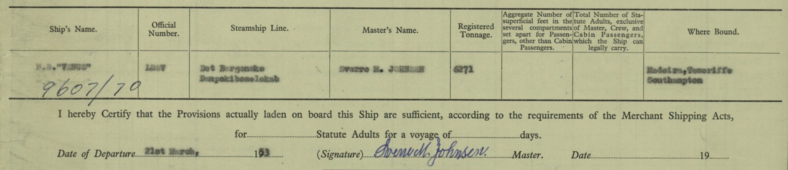
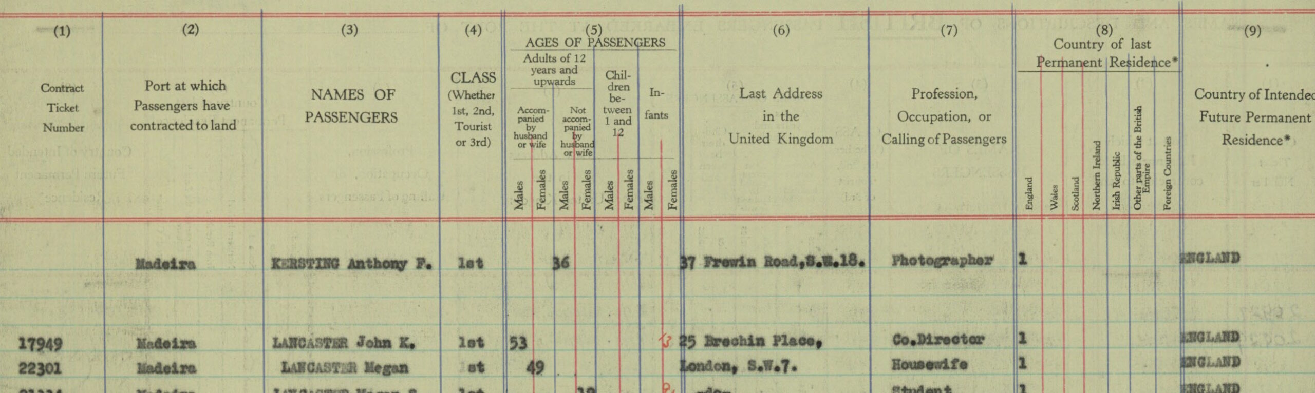
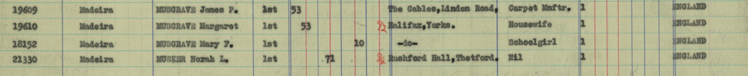
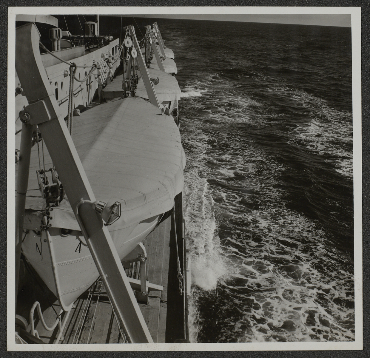
Having started work on the Kersting Photographic Archive as a Digitisation Volunteer in August this year, I decided to try to find out more about his life. As part of this I used an online genealogy service and amongst various records that I discovered was a passenger list for a ship called “Venus” showing an entry for Anthony F Kersting, Photographer, aged 36, of 37 Frewin Road SW18. This sailed from Southampton to Madeira in March 1953 and when I checked in his ledger there were entries for photographs he had taken there at this time.
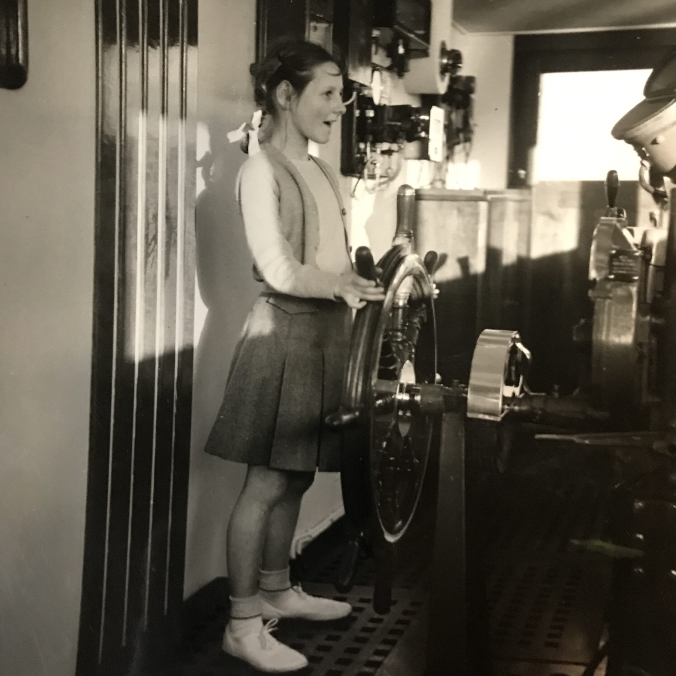
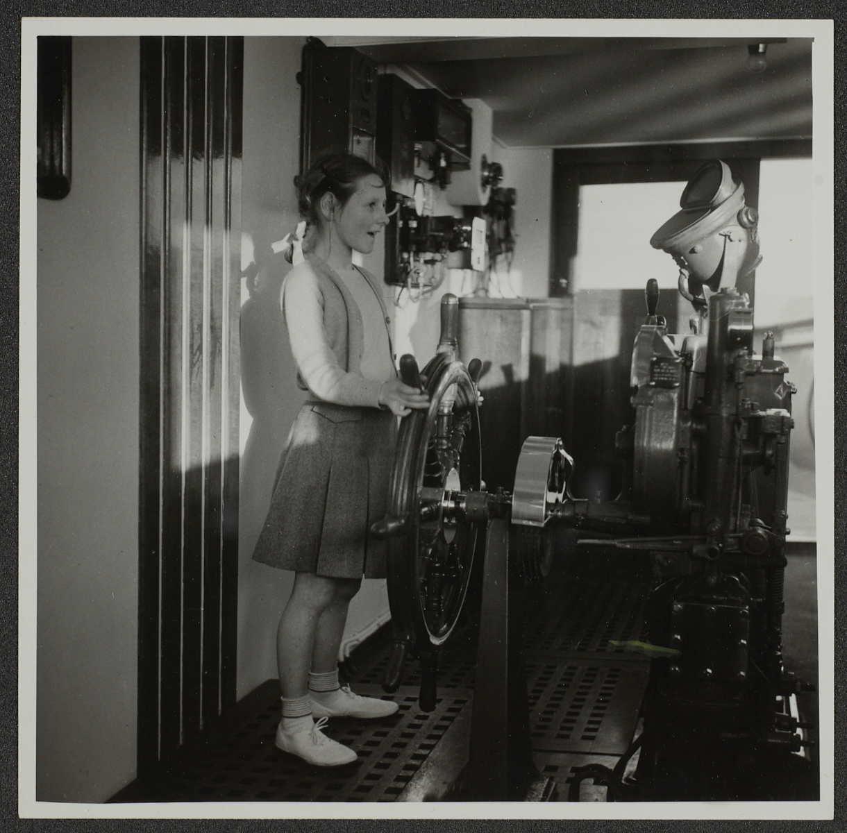
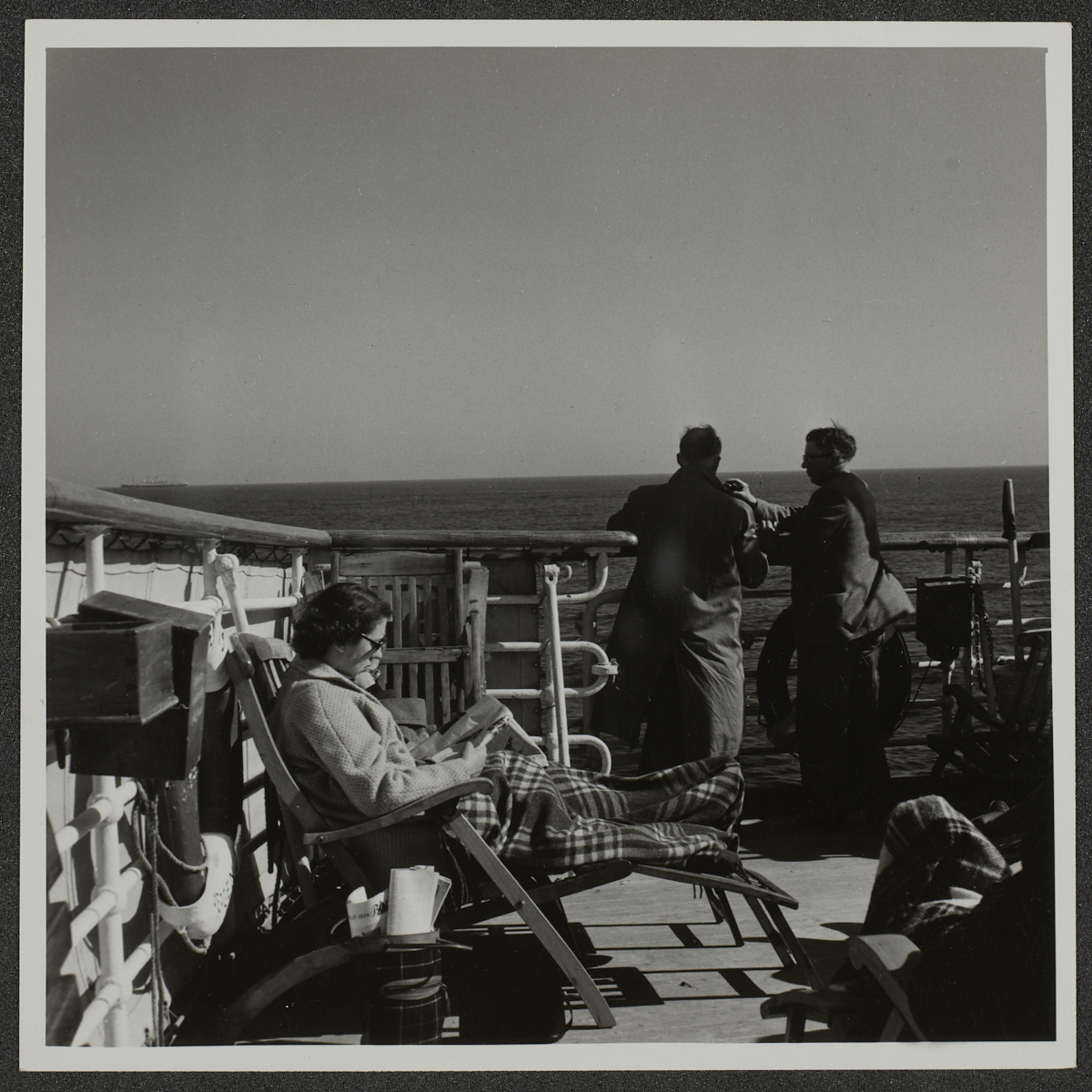
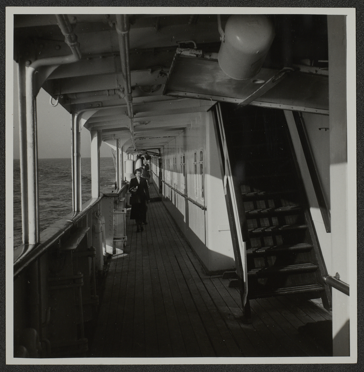
Looking through the relevant boxes I was surprised to find in one that there were photographs he had taken of the ship itself and some of its passengers. One particular photograph intrigued me. It was of a young girl who looked to be about ten years old, standing at the ship’s wheel, with an excited expression, pretending to steer. This prompted me to go back to the passenger list to see if I could identify her.
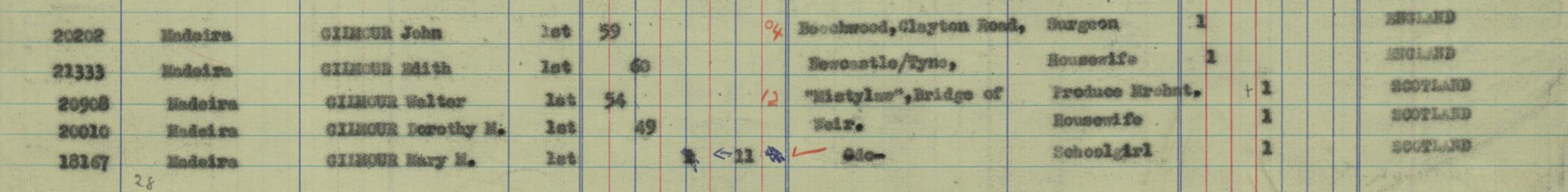
It helped that the passengers were put into age categories, one of which was ‘Children between 1 and 12’, and under the column for females there were two possible candidates, both called Mary. They each appeared to be travelling with their parents:
Mary M Gilmour (Schoolgirl, aged 11) with Walter Gilmour (Produce Merchant, aged 54) and Dorothy M Gilmour (Housewife, aged 49)
Mary F Musgrave (Schoolgirl, aged 10) with James P Musgrave (Carpet Manufacturer, aged 53) and Margaret Musgrave (Housewife, aged 53)
The Gilmour’s address was shown as being in Bridge of Weir, which is in Renfrewshire, Scotland and the Musgrave’s in Halifax, Yorkshire.
Armed with this information I started to search further to try to find which Mary it was in the photograph and whether she might still be alive. If so, my idea was to make contact and arrange to invite her to come and see her photograph at The Courtauld.
Unfortunately, I have so far been unable to follow the trail much further with enough certainty, but am continuing the search…
For Nikolaus Pevsner, writing in 1957, the rebuilding of John Soane’s Bank of England, undertaken between 1923 and 1942, represented the worst individual loss suffered by London’s architecture in the twentieth century. [1] Constructed to a design by Herbert Baker (1862-1946), the resulting Neo-Georgian pile loomed over the heart of the City, attracting negative comments from the outset. Many, like Pevsner, considered it to be an act of arch-vandalism. Others have since perceived in the ensuing furore a principal reason for its architect’s fall from grace.
A conspicuous portion of the criticism levelled against Baker’s work at the Bank targeted the building’s external sculpture. This was overseen in its entirety by Charles Wheeler (1892-1974), a young protégé of the architect who would go on to become the first sculptor serving as President of the Royal Academy (1956-66). However, in 1922, when Baker gained the commission for the rebuilding, Wheeler was then a relatively unknown figure in the world of British sculpture. This all changed after the Bank. With his and Baker’s working relationship begun through war memorials at Harrow School and Winchester College, it was his Madonna and Child (1922-4) at the latter that earned Wheeler the opportunity of working on this most attractive of projects: “a commission which any of the established sculptors of the day would have gladly accepted”, he later wrote; it was “the young artist’s dream”. [2]
Wheeler’s work was executed in a bold, angular style whose gestures towards Swedish Art Deco sculpture and Byzantine planarity produced muscular forms with a grave, elemental presence. At the Bank, this is clearest on the Threadneedle Street facade, the building’s principal front and most common target of criticism. In addition to three enormous cast-bronze doors, Wheeler ornamented this front with six giant figures (two female caryatids and four male telamons) and, in the pediment, The Lady of the Bank (1929-30). The monumentality of these schemes presaged a career creating public sculptures, often of the gargantuan kind. This culminated in Water (Fig. 1) and Earth (1950-3) at E. Vincent Harris’s Ministry of Defence (1938-1959), which, weighing in at forty tonnes each, are among the largest architectural sculptures in Britain. [3]
Fig. 1. Wheeler working on the sculpture of “Water” for the Ministry of Defence, Whitehall. c. 1950-3. CON_B07584_F001_045. The Courtauld, CC-BY-NC.
The massing and ornament of the Threadneedle Street front were, for Pevsner, the most effective parts of Baker’s scheme, whilst sections like Garden Court, behind an intervening vestibule, were deemed less successful. However, Wheeler’s work was to be found here too, and even in the most humble of pieces he managed to convey something of the deeply symbolic vision he shared with Baker for the Bank. Upon entering Garden Court and facing west, a line of sculpted keystones can be seen in the rusticated storey of an arcaded loggia, with five ornate blocks atop windows in blind arches and four in recessed spaces above. These keystones, photographs of which are kept in The Courtauld’s Conway Library, were carved by Wheeler to carry likenesses of important figures involved in the rebuild, including himself.
First among the Garden Court keystones was that depicting Baker (Fig. 2). The architect’s stern mien, craggy brow and cropped hair suggest the gravity and Graeco-Roman dimensions of his character. These harmonise with the surrounding neo-Greek décor – acanthus leaves and meandering Greek keys abound – chosen to align with the supposed origins of banking in ancient Greece. An Ionic capital, mark of the scholar, is placed below Baker’s face, itself surrounded by olive branches and singing birds, chosen to denote “the music of his country recreations”. [4] Wheeler shared with Baker an understanding of Architecture and Sculpture as being “sister arts” in pursuit of the “higher spheres of creative and spiritual art”. [5] This lent itself to the melding of personality, artifice and nature shown in the keystones, which broadcast a profound respect for and dedication to good architectural craftsmanship and its executors.
Fig. 2. Keystone for Herbert Baker with Ionic capital, olive branches and two singing birds, “denoting the music of his country recreations”. c. 1932-8. CON_B07585_F001_006. The Courtauld, CC-BY-NC.
Baker’s assistant, Alexander Thomson Scott (1887-1962), was depicted in no less of a striking manner (Fig. 3). Balancing his high-cheekboned, pince-nez’d face with a compass, set square and protractor, Scott is bounded by tall thistles – a clear indication of his origins north of the border. Working with Baker from 1914, he became his chief assistant in 1922 and entered into a partnership from 1929 until 1946. This saw the two collaborate on all of Baker’s commissions in Britain after his distinguished career in the wider Empire-Commonwealth, although portions of work at New Delhi were also carried out with Scott’s assistance. A similar transcontinental situation characterised Wheeler’s professional connections with Baker. Like Scott, he was during his time at the Bank just beginning to learn the mastery of his craft. His keystone (Fig. 4) shows the young sculptor, steely-eyed beneath boyish locks (which he kept to the end of his life), clutching a hammer amidst “foliage symbolical of the parallel process of the growth of forms in nature and the artist himself”.
Fig. 3. Keystone for Alexander Thomson Scott, Baker’s assistant, wearing glasses, and with drawing instruments, plus thistles representing his Scottish background. c. 1932-8. CON_B07585_F001_007. The Courtauld, CC-BY-NC.Fig. 4. Keystone for Charles Wheeler, with “tools of his craft; foliage symbolical of the parallel process of the growth of forms in nature and in the artist himself”, signed and dated 1932. CON_B07585_F001_008. The Courtauld, CC-BY-NC.
Whereas keystones depicting Wheeler and the Bank’s architects conformed to established precedents of artistic recognition, others represented a striking break from tradition, attributing authorial status to figures occupying more identifiably “modern” roles in the architectural enterprise. George Macaulay Booth (1877-1971), Chairman of the Building Committee and later Director of the Bank, for example, was afforded just such an honour (Fig. 5). An enthusiastic patron of Wheeler and Baker, Booth was, in the latter’s words, “our revered leader […] He had unique gifts, a combination of quick insight and the understanding of complicated plans and practical problems, as well as sympathy for the artist and a genuine flair for the beautiful in art”. [6] The visual puns continued in Booth’s ornamentation by Wheeler with a “staff of power” and a lyre – “a double reference to “calling the tune”: to the designers and his musical recreations”.
Fig. 5. Keystone for George Macaulay Booth, Chairman of the Building Committee, with lyre, “a double reference to “calling the tune”: to the designers and his musical recreations; and the staff of authority”. c. 1932-8. CON_B07585_F001_010. The Courtauld, CC-BY-NC.
To Booth’s managerial functions were added engineering responsibilities in the domain of Oscar Faber (1886-1956), depicted by Wheeler below a square arch of steel girders and above the “winged wheel of mechanical forces” (Fig. 6). Faber was another of Baker’s frequent collaborators in the Interwar period who, alongside Wheeler and Scott, made a name for himself through working at the Bank. A pioneer in the use and advocacy of reinforced concrete, he wrote widely on engineering matters, garnering extensive praise: earning an OBE during the First World War, a CBE for work on the House of Commons (1951), and rising to the presidencies of the Institute of Structural Engineers (1935-6) and the Institute of Heating and Ventilating Engineers (1944-5). A firm believer in the importance of the architect-engineer partnership, Faber worked well with Baker, and extensively, on projects like India House (1928-30) and South Africa House (1931-3), both in London. [7] Indeed, the depth of their involvement indicated the growing participation of engineers in the architectural profession which Baker – in many ways a late survivor of an earlier period – foresaw as inevitable.
Fig. 6. Keystone for Oscar Faber, the engineer for the rebuilding, with “girders and the winged wheel of mechanical forces”. c. 1932-8. CON_B07585_F01_011. The Courtauld, CC-BY-NC.
As well as Baker, Scott, Wheeler, Booth and Faber, less prominent but no less crucial figures involved in constructing the Bank found their likenesses carved into its surface too. A row of keystones, set above portals in the spandrels of Garden Court’s west arcade, depict four individuals whose reputations have since waned or been lost to posterity. If recognition of Booth’s managerial contribution and Faber’s engineering prowess was a conspicuously modern means of displaying architectural authorship, the installation of these four keystones (Figs 7-10) spoke to the growing importance of the collective and the lessening pre-eminence of the architect in large-scale projects of this kind. The craftsman Joseph Armitage (1880-1945) – whose best-known work is the oak leaf sign for the National Trust (1935) – worked largely in reproducing sculptures after Wheeler’s original carving. His keystone (Fig. 7), showing “tools and a decorative wreath”, is simple yet evokes the foliate designs he was known for making throughout his tenure with Baker, as at India House and the Indian Memorial for the Missing at Neuve Chapelle, near Lille (1918-27). [8] H. W. G. Tanner, clerk of works (Fig. 8) and R. H. Pillar (Fig. 9) have all but faded from recognition. However, Henry Thomas Holloway (1876–1951), the Chief Builder, has remained comparatively well-known due to his role as head of Holloway Brothers, a thriving construction firm responsible for large-scale and civil engineering projects across the late-nineteenth and twentieth centuries. In Wheeler’s keystone he is shown with two cranes (Fig. 10).
Figs 7-10. Keystones, clockwise from top left, for: Joseph Armitage, craftsman, with tools and decorative wreath; H. W. G. Tanner, clerk of works, with ‘Instruments of measurement’; R. H. Pillar, Works Manager with visual pun, “Pillars of support”; Henry Thomas Holloway, Chief Builder, with crane. c. 1932-8. CON_B07585_F001_019-022. The Courtauld, CC-BY-NC.
Wheeler’s Garden Court keystones represent in stone the contribution of those who, beyond the architect and chief sculptor, helped build the new Bank of England. In doing so, they encapsulate the collision of a fading Arts & Crafts tradition, to which Baker (and, to a lesser extent, Wheeler) could claim inheritance, with the modern realities of large-scale, complicated construction work. They are also, perhaps just as importantly, a bit of fun, as Baker himself acknowledged. In both ways, the keystones lend traces of humanity to the building they are fixed to. As marks of recognition, they capture the likenesses of men who carried out the real, often toilsome, work required to complete the project. They remind us that architecture is more than taste and style – it is budgets and schedules; measurements and repetition; people working together rather than abstract genius; it is weight, pressure, stone and steel.
Jake Bransgrove
Courtauld Connects Digitisation Volunteer Tutor in Architectural History and History of Art at the University of Edinburgh
References
[1] Simon Bradley and Nikolaus Pevsner, The Buildings of England: London I: The City of London (New Haven and London: Yale University Press, 2002), p. 276.
[2] Charles Wheeler, High Relief: The Autobiography of Sir Charles Wheeler Sculptor (London: Country Life, 1968), p. 55.
[3] Sarah Crellin, The Sculpture of Charles Wheeler (Farnham: Lund Humphries, in association with the Henry Moore Foundation, 2012), p. 169.
[4] Descriptions of the keystones in quotes come from Herbert Baker, The Decoration of the New Bank of England and its Significance (London: private printing for the Bank of England, 1939).
[5] Herbert Baker, Architecture and Personalities (London: Country Life, 1944), p. 3.
[6] Ibid., p. 129; Wheeler, High Relief, p. 55.
[7] John Faber, Oscar Faber: His Work, His Firm, and Afterwards (London: Quiller Press, 1989), p. 2.
[8] Edward Armitage, ‘Joseph Armitage, Craftsman. 1880-1945’, Journal of the Thirties Society, no. 3 (1983), pp. 25-30.
“There are three that give witness”. These are the words inscribed on the entrance of Rushton Triangular Lodge. They are a quotation from the first epistle of John 5:7 and refer to the Holy Trinity. As a Roman Catholic in Protestant England, the Trinity was a deeply personal and symbolic icon for the building’s designer, Thomas Tresham (1543–1605). Tresham was part of the Catholic elite of his time: he was brought up and married into the Throckmorton household (a wealthy Catholic family), had connections to the Jesuit priest Edmund Campion, and argued that the state should not have jurisdiction over conscience. His eldest son, Francis Tresham, was even involved in the Essex Rebellion, and in 1605, the Gunpowder Plot. All in all, Tresham was a prominent Catholic “recusant” – he refused to conform to the Elizabethan Protestant Church. As a result of this, Tresham was subject to the increasing number of penal laws being passed against Catholics. He was heavily fined and imprisoned on several occasions. It was upon his release from prison in 1593 that Tresham is said to have designed the Triangular Lodge, completed in 1597.[1]
Image of Rushton Triangular Lodge in Northamptonshire. CON_B06344_F017_077, Conway Library, The Courtauld.
The number three runs through every vein of this folly-like building. As well as its striking triangularity, the building exhibits three triangular gables on each façade, a triangular chimney and windows, and trefoil shaped windows (the emblem of the Tresham family). Each of the three walls is 33.33 feet high.[2] The Lodge has three floors – the main room of each one being hexagonal, thus leaving three corner spaces triangular (see image of the ground plan). On the exterior of the building, there are three biblical texts in Latin, each 33 letters in length.[3] One wall is inscribed “15” (3 x 5) another “93” (3 x 31) and the last “TT” (presumably Tresham’s initials). The text of 1 John 5:7 is written in Latin, Tres testimonium dant, which might be a pun on his family name: his wife Merial Throckmorton is known to have referred to Thomas as “Good Tres” in her letters.[4] Above the Latin are the numbers “3333”. Evidently, Tresham liked the triadic holy number.
Image of the entrance to Rushton Triangular Lodge with Latin inscription above doorway. CON_B06344_F017_081, Conway Library, The Courtauld.
But Tresham’s building of Rushton Lodge was subversive as well as spiritual. The dissidence of such a novel building should not be downplayed. The peculiarity and obsessivity of this project invites the imagination to run wild. One wonders whether the space ever housed contraband catholic images, candlelit discussions with Jesuit missionaries, or perhaps even a clandestine meeting between Francis Tresham and his fellow plotters. Despite its intriguing design, the Triangular Lodge is thought to have fulfilled a rather more practical purpose – the accommodation of Tresham’s head warrener. A warrener was someone in charge of breeding and managing rabbits for the constant supply of food and skins.[5] The earthwork and buried remains of a rabbit warren can be found adjacent to the Lodge.[6] Indeed, the building is often referred to as “The Warryner’s Lodge” in documents from the Rushton estate.[7] For such a rebellious and ornate building, the Lodge appears to have had a rather quotidian function.
Image of ground plan of the Lodge which shows the hexagonal shape of the rooms and three triangular corners. CON_B06344_F017_076, Conway Library, The Courtauld.
Considering this, the Lodge’s existence seems somewhat contradictory – a highly decorative and puzzling façade which housed plain whitewashed walls and simple accommodation. Further, the secrecy that surrounded Catholic worship at this time appears completely at odds with this small building. For many Catholics, Elizabethan England was a place of illicit masses, of “Nicodemite papists” who secretly refused to internalise Protestant doctrine, of priest holes and the hiding of underground missionary networks. The era was thus characterised by outward secrecy and inward defiance. But the Triangular Lodge flies in the face of this trend: it conceals nothing, its design is testimonial and bold, yet, peculiarly, there is nothing religiously rebellious in its mundane function. Perhaps, therefore, the Lodge is most subversive in its decorative non-necessity – the performative nature of the Lodge’s nonconformity stands out. Its rebelliousness is explicit and unapologetic – a statement of Tresham’s Catholic faith.
Mary Whittingdale
Courtauld Connects Digitisation Oxford Micro-Internship Participant
Bibliography:
[1] Britain’s Premier Independent Heritage Website, “Rushton Triangular Lodge, Northamptonshire”. Available at:
https://web.archive.org/web/20110904021016/http://www.theheritagetrail.co.uk/misc/rushton_lodge.htm (last access: 16 September 2021).
[2] Historic England, “The Triangular Lodge (1052038)”, National Heritage List for England. Available at:
https://historicengland.org.uk/listing/the-list/list-entry/1052038 (last access: 16 September 2021).
[4] English Heritage, “Rushton Triangular Lodge”. Available at:
https://www.english-heritage.org.uk/visit/places/rushton-triangular-lodge/ (last access: 16 September 2021).
[5] Britain Express, “Rushton Triangular Lodge”. Available at: https://www.britainexpress.com/attractions.htm?attraction=3532 (last access: 16 September 2021).
[6] Historic England, “Rushton Triangular Lodge: an Elizabethan warrener’s lodge and rabbit warren (1013826)”, National Heritage List for England. Available at: https://historicengland.org.uk/listing/the-list/list-entry/1013826 (last access: 16 September 2021).
[7] Britain’s Premier Independent Heritage Website, op cit.
In the Summer of 1951, the wedge of land between Waterloo Bridge and Hungerford Bridge was populated by a series of temporary architectural structures built to house exhibitions that showcased innovation in British science, industry, and design. Notable amongst these were the Royal Festival Hall (still standing), the Dome of Discovery (which, at the time, was the largest dome in the world with a diameter of 365 feet), and the Skylon, a cigar-shaped steel sculpture that reached vertically into the air, visible for miles around.
London, Festival of Britain, 1951. CON_B04273_F001_046, Conway Library, The Courtauld.
A new aesthetic known as the “Festival Style” emerged from the innovative architecture, furniture, textile, and graphic design featured in the construction of the site. Inspired by International Modernism, the Festival of Britain was perceived by many to be a successful modelling of new principles of urban planning that introduced cutting-edge design to the lived environment. The festival was a success with many architects, designers, and the public alike, with around 8.5 million visitors between May and September 1951.
However, the striking development of the South Bank was not popular with everybody. The following year, a new Conservative government came to power. Headed by Churchill, the site (and the Skylon in particular) was understood to be a symbol of Labour’s successful project to lift the spirits of the post-War British public still enduring austerity and rationing. Famously, Churchill ordered that the Skylon be destroyed. Popular imagination has it that the sculpture’s cables were cut so that the structure toppled into the Thames where it still rests. The reality, of course, is far less romantic. The Skylon and the steel roof of the Dome of Discovery were melted down by a London scrap metal company and repurposed into letter knives and other commemorative souvenirs; the utopic symbol of Labour’s reform fittingly transformed by the new government into capitalist commodities.
Aside from the Royal Festival Hall, there are no physical remains of the Festival of Britain. I can’t help but wonder; what ghosts were left behind as these iconic structures were torn down? Might they have been disturbed when the London Eye was winched into place twenty years ago?
Inspired by the Conway Library’s collection of photographs of the Festival of Britain held by The Courtauld, I retrace the steps of visitors to the Festival of Great Britain to find out. You’re welcome to come with me. Armed with my medium format camera and a few rolls of black and white film (Ilford HP5, if you’re interested), I walk the length of the South Bank in search of the ghosts of festivals past.
First Stop
From the Embankment, we look across the Thames at the site occupied by the Festival of Britain in 1951. We are met with the familiar sight of the London Eye. Towering above County Hall and neighbouring high-rise office blocks, it is near-impossible to imagine what the South Bank looked like before the wheel was installed at the cusp of the last millennium.
Photograph taken, developed, and scanned by Kitty Gurnos-Davies.
Boats chug up and down the river and passers-by admire the view from the many bridges crisscrossing the Thames as the London Eye slowly creeps through its rotation.
Look again.
The Skylon tower has reappeared next to the London Eye. The cigar-shaped body propped up on spindly legs recalls Louise Bourgeois’s colossal spider sculpture that stood downstream, outside the Tate Modern many years after the 1951 festival. The Dome of Discovery stretches out in front of the London Eye, the boxy Sea and Ships pavilion visible in front. Look to the left of the Dome. Here, we have the swooping crescent of The People of Britain exhibition (today we might ask, which people? whose Britain?). To the left of the Skylon, the Regatta Restaurant has been replaced with the glass structure of the Power and Production exhibition. For, while the Skylon and Dome are in situ, the other exhibitions jostle for space on the South Bank. They have rearranged themselves, desperate to be seen by us again. After all, if the London Eye can coexist with the Dome of Discovery, why wouldn’t the other Festival structures shuffle around through the flattening and regeneration of the South Bank?
Second stop
Now, let’s cross the river on Westminster Bridge to investigate the site more closely. Descending down the steps on our left, we head towards the London Eye. Set behind the giant wheel is the highly manicured Jubilee Gardens. It is here that the Dome of Discovery once sat. Amidst the dreary office buildings and clinically sculpted paths that curve through the green lawn and bare trees, it is near-impossible to imagine how the vast domed structure might have fitted into such a space.
Photograph taken, developed, and scanned by Kitty Gurnos-Davies.
If we listen carefully we can hear a babble of excited voices. Skirts swish around the legs of two young women striding across the grass. A child plays by the side of the path.
All of a sudden, the Festival unfolds before us.
Digital collage of images from the Conway Library and a photograph taken, developed, and scanned by Kitty Gurnos-Davies.
The famous abacus screen designed by Edward Miller cuts diagonally across the bottom of the path, setting out the boundaries of the festival site while the Skylon towers in the background to the left of County Hall.
Let’s take a closer look at the Dome of Discovery.
Digital collage of images from the Conway Library and a photograph taken by Kitty Gurnos-Davies.
Legs stretch down from the domed roof to support the UFO-shaped building, designed by architect Ralph Tubbs. Inside are exhibits on the theme of British exploration. The visitors descending the staircase on the left are returning to the South Bank from the polar regions, the depths of the sea, and outer space.
We, too, must return to the edge of Jubilee Gardens as we know it. Blink, and the Dome of Discovery has returned to its rightful place in the photograph held within the Conway Library.
Photograph taken, developed, and scanned by Kitty Gurnos-Davies.London, Festival of Britain, Dome of Discovery, 1951. CON_B04273_F001_017, Conway Library, The Courtauld.
Third stop
Let’s walk under the bridge in the middle of the photograph to the back of the Royal Festival Hall, its domed roof visible towards the left of the image. From here, we’ll clamber up the stairs that lead onto the terrace overlooking the Thames.
In the early afternoon of a dreary Tuesday in December, the South Bank is all but empty. It’s hard to imagine the hustle and bustle of visitors weaving their way through the crowds to visit the different exhibitions or clustering around the glass display cases that lined the bank of the river. Yet, gazing out across the river at the rectangular buildings neatly dotted with pinpricked windows, our view is the same. So much so, in fact, that it is possible to overlay the 1951 photograph of festival-goers over the image I am currently taking.
When I return home to my little London flat this evening, I’ll develop the negatives over my bathtub. Hung to dry overnight, these will be scanned into my computer to be laid underneath the 1951 image from the Conway Library. It is only as I crouch over my laptop in the corner of my kitchen and carefully remove the background of the original image (and my photo begins to show through) that will become quite so apparent how little the vista has changed.
Digital collage of images from the Conway Library and a photograph taken, developed, and scanned by Kitty Gurnos-Davies
Final stop
Crossing to the other side of the Royal Festival Hall we walk up onto the highest level of the Hayward Gallery. Although a new addition (built in 1968), from here we can take one last look at the Festival of Britain. Laid out in front of us, the Dome of Discovery cuts across the façade of Westminster Palace silhouetted in the distance. The London Eye, as always, oversees proceedings. Old and new London are united in a single vista.
Digital collage of images from the Conway Library and a photograph taken, developed, and scanned by Kitty Gurnos-Davies.
Blink, and the exhibition spaces dissolve.
The Dome and Skylon have been dismantled for scrap. The Royal Festival Hall remains, but has now been incorporated into the later development, the Southbank Centre. Westminster Palace is still silhouetted in the background (although now it is Big Ben that is in scaffolding rather than the tower of the palace).
Photograph taken, developed, and scanned by Kitty Gurnos-Davies.
While nearly all traces of the Festival of Britain may be gone, its legacy continues to capture popular imagination. It endures in the living memory of many who visited the pavilions as children and stared up in awe at the Skylon towering above them while marvelling at the new technologies on display.
Like the Great Exhibition that came a century before, the Festival of Britain continues to capture popular imagination. A forward-looking statement of modernity in its time, it has since become a symbol of the past. Little remains of the site. Just as Crystal Palace was razed by a devastating fire in 1936, the empty spaces on the South Bank evoke the ghosts of what stood here before. Yet, its influence lives on. The International Modernist style of architecture that inspired the Festival’s architects mutated into the Brutalist design of the National Theatre, Hayward Gallery, and British Film Institute built in the 1960s and 1970s. Its spirit lives on. As this walking tour has shown, if you look hard enough, you too may encounter the ghosts of the South Bank.
Paul Laib (1869–1958) specialised in fine art photography working between 1898 and the 1950s. He was commissioned by many prominent British artists of his time including Oswald Birley, Philip de László, Ben Nicholson, John Piper, and John Singer Sargent. Among these, Laib’s photography of Barbara Hepworth (1903–1975) and her work stand out from his collection. One of the founders of Modernist sculpture in Britain, Hepworth was a major international figure exhibiting around the globe.
In the video accompanying this blog post, I have created a vinyasa yoga practice inspired by Laib’s photography of Hepworth’s sculptures. A vinyasa is a sequence of positions, one flowing after the other, guided by the breath. This type of yoga invites exploration of Hepworth’s work particularly well – attention is brought to both the poise of the figure and the fluidity of form. Indeed, attempting to express the experience of human embodiment in her work, Hepworth stated “I rarely draw what I see. I draw what I feel in my body”. In this world of social distancing and self-isolation, I encourage you to experience the tactility and physicality of Hepworth’s work through your relationship with the body.
The sight but also sensation of natural form inspired Hepworth throughout her life; she maintained that “body experience… is the centre of creation”. Hepworth was inspired by the enclosure and embrace of the shapes in the landscape around her – be that watching a mother hold her child, the undulating terrain of the Yorkshire hills, or the hollows of rocks on the Cornish coast. Likewise, in your vinyasa practice, you may also wish to connect to the environment around you, cultivating spaciousness and balance through appreciation of Hepworth’s sculptures.
Mary Whittingdale
Courtauld Connects Digitisation Oxford Micro-Internship Participant
When Swiss architect Le Corbusier responded to popular agitation against his design of Chandigarh city, India, with the wry anecdote “I am like a lightning conductor… I attract storms”, it was clear that he had created two cities, but heeded one.
The project of Chandigarh was commissioned by Jawarharlal Nehru, the first Prime Minister of India, in 1950. Nehru imagined a city that would serve as a clear symbol of India’s break with the past, in the aftermath of its independence. It was born of a deeply paternalistic vision that, providing its architects could innovate the right formula, the shapes of its urban space would exert a transformative and “civilising” influence on its inhabitants. This remarkable confidence in spatial determinism might, in one sense, make Chandigarh the closest we come to observing a postcolonial vision. Throughout the city, Le Corbusier distils Nehru’s vision of India’s modernity into a “city of rectangles and pure volumes”; the “symbols of perfection”, as he described them. This modernist construction was one arm of a wider comprehensive plan for India, through which Nehru envisioned an enlightened state which would propel its citizens into modernity through a programme of rapid industrialisation and economic planning – all guided by the principles of rationalism, secularism and social justice.
Photography is a forgiving medium through which to record a claim to human mastery. A photograph is necessarily reductive in some sense, and it is in this way – as a series of reductions – that we are most able to envisage Chandigarh as Le Corbusier intended; as the product of a victorious “battle of space, fought within the mind”.
The photos in the Conway Library, taken principally during the construction of the Capitol and the city’s early years, capture the instant when Nehru’s ideal loomed most plausible in the eyes of those who encountered it. Pausing at each photograph in the digitised archive some seventy years later, it is almost possible to be persuaded by them: the clean elegance of the Secretariat building, poised dramatically against an empty landscape. Le Corbusier sat soberly in front of an anthropomorphic map, on which the Capitol government complex sits elevated like the head on a human body. The “rippling, beautiful rhythm” of the Assembly Chamber, designed to give space for the circulation of high ideas – strikingly different from the classical vocabulary of the British Raj. These photos of Chandigarh at its most persuasive have gained a complex novelty, as their optimism is increasingly set apart from a growing body of works documenting their natural decay in the passage of time. Against the plethora of anxieties about the future that attend life in the twenty-first century, there is an undeniable charm to the vision of confidence offered by the photos.
Yet this evocation of rupture from the past does not bear scrutiny.
Artwork by Hailey Sockalingam. CON_B04391_F002_031, Conway Library, The Courtauld.
In taking a closer look at the ideas that undergird Chandigarh as a symbol of modernity, it becomes clear why the city falls so easily into dialogue with the architecture of the British Raj. Whilst Nehru opposed the British imperialist claim that India required western tutelage, he embraced the basic framework of human “development” upon which this was premised. This development, a historicist discourse in which human societies around the globe could be placed on a temporal scale from barbarity to civilisation, was a principal means through which Britain legitimised its imperial venture across the world from the eighteenth century. In The Discovery of India, Nehru sought to rework this framework, by drawing instead on the historic achievements of India’s Indus Valley Civilisation to posit a theory of modernity as cycles of development and decay. In this way, Nehru’s thought stops short of a complete reconstitution of imperial modes of thought, and it can be difficult to tease apart Orientalist tropes of India’s decline from his own invocations for modernisation.
The spirituality of India was one of the key targets of Nehru’s conception of backwardness. He dismissed the religiosity of people in India as “absurd”, and attributed it not to their own world experiences, but to the “exploitation of the[ir] emotions” by elites. The imperial resonances in Nehru’s vision for India can be usefully set against Gandhi’s alternative projection of Indianness, and its embracing of Orientalist depictions of village India. Taken together, they provide a powerful insight into the postcolonial dilemma; the apparent impossibility of asserting an identity that is oppositional to, but not restricted by, the terms set out by the imperial power.
If Le Corbusier understood his role as architect as commensurate with puppet-master then he, like Nehru, underestimated the agency of the city’s people in staking the terms of their lives. Even the photos in The Courtauld’s collection, taken in the city’s early years, hint at numerous sites of contestation and the quiet persistence of traditional Indian mores with Le Corbusier’s metropolis. Le Corbusier designed the city around a series of single purpose zones, neatly separating the residential, industrial, leisure and government elements of city life. He appears to have operated under the assumption that, if placed in the spatial context of a middle-class commuter lifestyle, incoming peasant masses would be transformed into a socio-economic position to fill that role.
The photos in the Conway Library hint at the way the city’s people defied Le Corbusier’s rigid prescriptions; buffalo and goats are crammed into tiny spaces outside the geometrical houses, shacks are set up next to the highway. In the residential area, dubbed the “container of family life” by the architect, residents opened small shops in the ground floor of their houses, and maintained the local principles of caste, kinship and religion in areas purportedly organised by administrative rank. We might think of Le Corbusier’s design as laying the groundwork for two cities; the perfect geometry of the Capitol, set against the rhythmic irregularities of its inhabitants’ lives.
In this light, Le Corbusier’s response to popular agitation to his stringent demands is telling. His aggrandised sense of his own monumentality as a catalyst for modernity precluded him from heeding the unshakeable influence of the city’s people in determining the quality of their own lives.
No. 7 The Mall studio, Hampstead, 1933. Photo by Paul Laib. The De Laszlo Collection of Paul Laib Negatives at The Courtauld, London.No. 7 The Mall studio, Hampstead, 1933. Photo by Paul Laib. The De Laszlo Collection of Paul Laib Negatives at The Courtauld, London.No. 7 The Mall studio, Hampstead, 1933. Photo by Paul Laib. The De Laszlo Collection of Paul Laib Negatives at The Courtauld, London.No. 7 The Mall studio, Hampstead, 1933. Photo by Paul Laib. The De Laszlo Collection of Paul Laib Negatives at The Courtauld, London.Sculpture by Barbara Hepworth. Photo by Paul Laib. The De Laszlo Collection of Paul Laib Negatives at The Courtauld, London.No. 7 The Mall studio, Hampstead, 1933. Photo by Paul Laib. The De Laszlo Collection of Paul Laib Negatives at The Courtauld, London.
The topic of still-life carries a lot of art historical baggage. Immediately, for me, the baroque, commercial, and kitsch come to mind. But as art critic Herbert Furst argues, still life is often overlooked as a dull subject when it can be an “aesthetic laboratory” through which artists play around with analogy, line and colour (Tobin, 2020). Even now, contemporary art often relies on the everyday to evoke a feeling of relatability between artist’s work and audience.
Ben Nicholson is an excellent example of a modernist painter who conveyed his ideas through the subject of still life. He believed that living and painting must be “one thing” (Tobin, 2020). When I was looking through some of the photographs in the Courtauld’s Conway Library, Paul Laib’s series from the De Laszlo Collection documenting Nicholson’s arrangements of his and Barbara Hepworth’s work stood out, because there is a total lack of hierarchy between the artworks (whether it is Hepworth’s sculpture or Nicholson’s painting) and the collection of objects that surround them. These compositions are conversations. Nicholson interprets three-dimensional space into the frame of a two-dimensional painting, and then reintroduces these paintings back into a live space through his juxtaposition of everyday objects. Still-life can be approached in this way as an installation. The art collector and artist HS Jim Ede, a good friend of Nicholson’s, embodied this way of thinking with his house Kettle’s Yard, in Cambridge. He kept his painting collection surrounded by objects and colours that related to them, allowing a dialogue to form between art and life. His house is maintained as he arranged it and is now a museum. Interestingly, he published a book entitled A Way of Life: Kettle’s Yard, which contained photographs, poetry, and prose (Ede, 1984). While exploring each of Laib’s photographs, I could not help but list each object I found and identified. I view these lists as poems that say a lot about the accompanying image. They both indicate an order of noticeability but also highlight how seemingly random the objects are, without the distraction of Nicholson and Hepworth’s skilful visual arrangements. They expose the images in a way that feels more stripped down and obvious than any photograph could. Parallels can be drawn between Ede’s book, and its use of poetry and visual analysis.
It could be important to understand the relationship between Nicholson and Hepworth when looking at these still-life arrangements. They were both already married when they met in 1931, but they fell in love and remarried in 1938 after having triplets in 1934 (Chow, 2015). And so, they were both artistic collaborators and lovers. Hepworth was concerned with landscape, and it could be argued that her presence in Nicholson’s life shifted his focus to still-life with the inclusion of landscape, for example on a windowsill. Nicholson’s first wife, Winifred, also had a lasting impact on his use of colour beyond just the descriptive, as she was also a painter of still-lifes. I believe that the spaces (both physical and mental) in which we create things are inextricably enmeshed with the things we create. The effect of relationships and conversations among artists should not be undermined; one reason why art schools are such ripe grounds for exploration and discovery. It is noteworthy that Nicholson’s father, William Nicholson, was a painter, and Nicholson often claimed that his father’s collection of beautiful objects had an everlasting influence on his own artistic practice. His daughter with Hepworth, Rachel Nicholson, is a painter of still lifes too. And so, this love of object and painting has been handed down from generation to generation.
As a fine artist pursuing curating, I have loved arranging my own studio and drawings in this way with the intention of reworking the photos I take back into painting and then arranging them again. This loop of visual information and contextualisation could be endlessly fruitful. Do we consider Laib’s photographs as documentation or creation of new work? We could speculate the extent to which he had artistic freedom to choose what was included and left out of the frame. I gained a newfound respect for this process, as my first few attempts failed rather gloriously. Nicholson and Hepworth were clearly thinking carefully about line and contrast in their arrangements, which I found was only obvious once contained within a photo. This led to a process of trial and error as I attempted to emulate the entrancing compositions visible in Laib’s photographs. I worked with line drawings I had made from these photographs. For the sake of time and resources I used digital photography but decided to edit them as if they were glass plate negatives, then made a still life painting while thinking about Nicholson’s work. His use of colour and straight lines were very different from my usual painting practice which proved itself to be a challenge. But as a process it made me analyse my working space and consider visual elements (like the transparency of paint) that I might usually overlook.
To conclude, there is a lot to be discovered within these collaborations between Laib, Hepworth and Nicholson. I encourage you to sit for a while and take them in; each photo contains so much materiality both within the objects in Hepworth and Nicholson’s artwork but also as photographic objects themselves. Small signs of wear in fingerprints, creases and traces of editing remind us that they have a living past beyond being part of The Courtauld’s collection. There is materiality integral to the objects that surround the works of art which is heightened by the material nature of the photographs themselves. Laib’s documentation of these arrangements has not only sustained their existence but brought them into a new realm; they exist as artistic photographs in their own right.
Bibliography
Tobin C (2020) Modernism and Still Life: Artists, Writers, Dancers. Critical Studies in Modernist Culture, Edinburgh, pp. 125-131.
Ede HS (1984) A Way of Life: Kettle’s Yard. Cambridge: Cambridge UP.
Today I uploaded the last batch of images that make up the Architecture section of the Conway Library to our World Architecture Unlocked project on Zooniverse. This is an incredible milestone for our digitisation project and not one we set ourselves from the start.
As I mentioned in our earlier post on launching World Architecture Unlocked, being able to capture item-level metadata for the Conway Library came as a surprise: we knew we would only have time and resources to capture box and folder level metadata on the premises, and although Zooniverse had been on our radar for a long time, crowdsourcing was something we thought we wouldn’t be able to look into until after we’d delivered the digitised collection online and closed the project.
An item from the 20th Century section of the Conway Library as seen on World Architecture Unlocked, Zooniverse.
Yet, the national lockdown meant that we could focus on remote activities and although I had no studio to take new photographs, I had a lot of time and access to thousands of images volunteers had already taken.
Since the launch of World Architecture Unlocked, the response of the public has been quite unimaginable. To this day, almost 8,000 volunteers have participated in the transcription, completing the task 343,239 times. The forum where the project is discussed is lively and participants post their questions, flag items that need to be rotated or appear to be in the wrong box, and chat about their favourite images. Some of our in-person volunteers have become forum moderators and advise new participants on how to best complete the task or refer them to a member of staff.
This project might have unlocked the world of architecture for people in lockdown, allowing them to volunteer and see the world through our images, but it has certainly done the same for us at the Courtauld, by opening our horizons to the enormous potential of crowdsourcing and the wonderful feeling of having put together a global community.
And so it is with amazement and thrill that today I upload the images for the last box in the Architecture section, simply labelled “CON_B04435: Great Britain (Architecture, 21st Century)”, and finish releasing the first section of the Conway Library to the World Architecture Unlocked users.
An item from the 21st Century section of the Conway Library as seen on World Architecture Unlocked, Zooniverse.
This last release is a large one, and it will take the volunteers some time to complete. In the meantime, back of house, we are testing new workflows for some of the next sections, so keep your eyes peeled for new updates.
An image from the Sculpture section of the Conway Library.
Did you know?
The first section of the Conway Library is dedicated to Architecture and is made of 4435 boxes
The first box in the collection is CON_B00001 and is labelled “Afghanistan: A-Z (Architecture, pre-1800)”
The two sections immediately after Architecture are Architectural Drawings and Architectural Publications
Sculpture is the second largest section of the Conway Library, it is made of 2654 boxes
The third-largest section is Manuscripts, with 1477 boxes
The remaining sections are: Photographic and Video Art, Applied Arts, Mosaics, Panel Paintings and Painted Screens, Wall Paintings, and Stained Glass.
It takes three different transcriptions on Zooniverse for an item to be retired, this allows us to capture data more reliably, but it also means that we triplicate the effort!
Introducing the material turn to the study of photography, visual and historical anthropologist Elizabeth Edwards (2004) encourages us to acknowledge the photograph as a three-dimensional object existing materially in the world – that is, spatially and temporally in the social and cultural experience. From Edward’s perspective, photographs are material entities because they are chemically deposited onto paper, mounted on different sized, shaped, and coloured cards, subject to changes on their surfaces, and informed by the way that they are presented.
Attention to these aspects of photographs, Edwards argues, can help us engage with the processes of intention, making, distributing, consuming, using, preserving, displaying, discarding, and recycling that are significant to the way we understand photographs as images. This approach to photography I found, also echoed in the ongoing digitisation projects at The Courtauld.
When on placement at The Courtauld, I was particularly drawn to its approach towards digitisation, and its emphasis on retaining the physicality of visual objects in their digital renditions. From the images that were provided to me and my fellow interns, I was able to engage with the signs of wear and tear on archival boxes, with the multiplicity of intentions decipherable from the text – varied in font, colour, and handwriting – on the cards onto which images in the Conway Library were mounted, and with the variety of size, colour, and type of image, as well as with the materials onto which the image was printed and then mounted onto the card.
This emphasis on digitally translating physicality was especially impressive to me because I was trying to engage with these images from my laptop screen at home in Oxford, instead of interacting with them in a more multi-sensory, embodied manner in one of the rooms at The Courtauld. Indeed, as former intern Peyton Cherry (2019) predicted, I was brought into The Courtauld, without venturing into its halls to peruse and handle prints, and into the lived experience of working within collections. Despite interacting with the collections intangibly, I was still able to engage with the physicality of the image – the image as object – and even in their digital renditions, The Courtauld had managed to make the materiality of these images matter. This was quite significant to me, for The Courtauld had successfully avoided flattening tangible, three-dimensional objects, simply by choosing cameras over flatbed scanners in the digitisation process. Intrigued by this, I spent the duration of my placement reflecting upon why, for The Courtauld, materiality matters, and why indeed it should.
The Courtauld’s emphasis on the materiality of images is based on a succinct and personal manifesto presented by Bilson (2019)
Honour physical form and integrity.
Photograph, don’t scan.
Use lighting to reveal texture, structure, and composition.
Never crop to neaten.
Never retouch.
Describe where your metadata has come from.
If possible, show the source of the transcription.
Photograph backs and blank pages.
Weigh and show scale.
Record folders, boxes, and shelves.
Don’t let basis cataloguing hold back publication.
Although in digitising an archive the size of the Conway Library the project has, for practical reasons of time and the costs of storing data, omitted the manifesto’s requirement to photograph backs and blank pages and also weigh the items, Bilson, like Edwards, encourages us to honour the physical form and integrity of images by using simple photographic techniques to, for instance, reveal “the slight line of shadow” (Bilson, 2020) showing the way in which a print was stuck by human hands onto card or the fingerprints of the library visitors who might have handled the object; or to accentuate the multiplicity of textures, materials, colours, and inscriptions that compose each object.
The importance of doing so, as Bilson writes, is to encourage the global online user to appreciate the fact that “every image presented online has a physical counterpart that still sits in a library box” (2020) within the Institute. In addition, it re-directs the online user’s attention to the “set of visual cues pointing to the personalities and voices enmeshed within [the] collections” (2020) and thus demonstrates that the appearances of these images online are not their “year zero” (2020), but another milestone in their malleable history.
In essence, therefore, for The Courtauld, materiality matters because an emphasis on it indicates to its increasingly global and online audiences, that the images it is making digitally available are entangled with the tangibly embodied histories and socio-cultural experiences of all those who have interacted with them. As my fellow intern Sydney Stewart Rose notes, The Courtauld’s emphasis on materiality presents the ultimate digitised image as an “endurance” (2021) that refers to its own history of interaction with its producers, publishers, collectors, archivists, librarians, volunteers, and interns – each of whom have inscribed their intentions onto the surface of the image.
Recognising this urged me to further explore the implications of taking these intentions – and especially their material evidence on the surface of the image – into consideration when interpreting the image. I did this, specifically in relation to two sets of images of the Crystal Palace, archived in a box containing images of exhibitions in London between 1830 and 1900, in the Conway Library of The Courtauld’s collections.
The Building Itself
Figure 1. The Crystal Palace, Hyde Park, London. Image via the Art and Architecture website.
The Crystal Palace was a remarkable cast iron and glass structure, originally built in Hyde Park to house the Great Exhibition of 1851. Designed by Sir Joseph Paxton, it was initially intended as a temporary building. However, a very general desire on the part of the public to preserve the Crystal Palace led Paxton to propose alterations and extensions to the original building, with the intention of converting it into a winter garden and adapting it to other scientific purposes.
The building was then taken down from its original site in Hyde Park and relocated to a site named Penge Place (now known as Crystal Palace) at the top of Sydenham Hill, between 1852 and 1854. The site at Sydenham attracted 2 million visitors a year and successfully hosted exhibitions, festivals, music concerts, football and cricket matches, and over one hundred thousand soldiers during the First World War.
Despite this initial success, however, from around the 1860s, the Palace fell into financial ruin. Due to its sheer size, the Palace was impossible to maintain financially and thus declared bankrupt in 1911. In addition to this, the Palace continuously experienced severe damage shortly after its relocation – first due to strong winds in 1861, then due to a fire that broke out in the North End of the building in 1866, and finally in 1936 when a more severe fire damaged it beyond repair.
Figure 2. The Crystal Palace fire, Sydenham, London. Image courtesy of the Science Museum Group collection.
Conway’s Documentary Intent
Martin Conway, an avid collector of photographs of architecture as a record of buildings that might suffer damage, was quite naturally drawn to the Crystal Palace – both because of its significance in the public imagination and its undeniable architectural magnificence. Conway’s intent to document the Crystal Palace and the trajectory of its life materially manifests in his collection in at least two ways.
First, this is evident from the sheer diversity – in type, size, and source – of the images of both buildings. For example, the image of the Crystal Palace in Figure 3 shows “The Progress of the Building” and is presumably a lithographic print on newsprint sourced from the Illustrated London News. Comparatively, the image of the building in Figure 4 is a watercolour and pencil drawing, signed and dated by the specialist in architectural views, Edmund Walker (1814–1882).
Figure 3. “The Progress of the Building” from Illustrated London News. CON_B04109_F001_008, CC-BY, The Courtauld. Figure 4. Watercolour and pencil drawing, signed and dated by Edmund Walker. CON_B04109_F001_005, CC-BY, The Courtauld.
Second, Conway’s documentary intent is evident from the “set of visual cues” (Bilson, 2020) that point to his specific process of archiving by gathering diverse visual material on the same subject, from a plethora of sources, and then mounting it onto card. For example, the crease of the paper and its shadow in Figure 5, clearly show that an image cut out from The Weekly Times has been stuck over another image. Similarly, Figure 7 shows that Conway seems to have used a larger version of the print in Figure 6 to provide a detailed perspective on the same event.
Figure 5. The crease of the paper and its shadow showing that the print from The Weekly Times has been stuck over another. CON_B04109_F001_006, CC-BY, The Courtauld.Figure 6: The Peace Fête at the Crystal Palace, Sydenham. CON_B04109_F002_019, CC-BY, the Courtauld. Figure 7: A detailed view of The Peace Fête at the Crystal Palace, Sydenham. CON_B04109_F002_020, CC-BY, the Courtauld.
This material evidence of intent thus signifies the extent to which the Crystal Palace had impressed itself upon Conway’s and the wider public’s imagination. They demonstrate that Conway clearly recognised the Palace’s significance – both to the history of architecture and Britain – and therefore, dexterously included in his archive, images of the conception, construction, utilisation, renovation, relocation, and the destruction of the building. In doing so, and specifically by following his unique processes for archiving, Conway created a “synthetic object” (Edwards and Hart, 2004) – that is, a new intellectual and physical entity resulting from his attempt to impose sense, order, and his intentions upon a set of separate objects from separate sources leading separate lives.
This new “synthetic object” therefore leads its constituent parts into an institutional framework of policies, strategies, and practices different to that from which they have been sourced. For example, a watercolour drawing (Figure 4) that originally would have been handled, framed, preserved, displayed, and interpreted in a manner more typical to art history, in the context of Conway’s archive, is engaged as an important resource contributing to the documentation of a historical moment that in turn was intended to inform art history.
By creating such “synthetic objects” therefore, Conway reinforced the view that the Crystal Palace was indeed an important moment in the history of architecture and Britain, and actively constructed this building as a canon worthy of preservation for posterity. When considered accordingly, the images of the Palace in Conway’s archive thus emerge as more than simply what they depict. Rather than visual representations of the building and the events that occurred therein, these images emerge as constituents of a larger photographic object and project inscribed with the intentions of its maker.
Concluding Remarks
In my reflection on the implications of considering the materiality of images for their interpretation, it emerged that the material aspects of an image – its physicality and presentation for instance – are of great importance as they provide clues to how the value of particular images changes over time due to interactions with them.
In the example I considered, we noted that images from newspapers and artists were recontextualised as archival resources under the documentary intentions of the archivist who interacted with them. These insights could not have been as easily drawn, if indeed attention to the very material and physical evidence of the archivist’s intentions had not been paid.
Further research could examine how each layer of textual inscription (for e.g., stamps and handwriting) on more generally the cards in Conway’s archive, inform the meaning of that which the images on the cards depict. To whom do these inscriptions belong? What were their intentions when marking the “synthetic objects” that Conway initially produced? How do these material traces of their intentions inform the meaning of the images constituting those objects, and the objects themselves? Further studies could also examine how the physicality of the cards onto which Conway mounted images (for example, colour and material) interacts with the meanings of said images. Knowledge of each of these aspects can significantly contribute to our understanding of images and more importantly of how they function as visual and material objects, deeply embedded in the social and cultural experience.
Aayushi Gupta
Courtauld Connects Digitisation Oxford Micro-Internship Participant
MPhil Candidate in Visual, Material, and Museum Anthropology, University of Oxford
References
Bilson T (2019) The Future of the Library – Architectural Information in a Post-Digital Era. Presentation at the Harvard University Graduate School of Design, November 21, 2019.
Bilson T (2020) The Courtauld’s Witt and Conway Photographic Libraries: Two approaches to digitisation. Art Libraries Journal, 45 (1): 35–42. Available at: 10.1017/alj.2019.38 (accessed: 13 July 2021).