Author Archives: Sophie-Nicole Dodds

Installing the Beakers

Final display of glasses and books

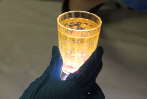
In writing this last blog post, I’m finally bringing my wonderfully long Illuminating Objects internship to a close; my second object, the pair of Zwischengoldglas beakers are now installed in The Courtauld Gallery and await the grand reopening on 19th November.

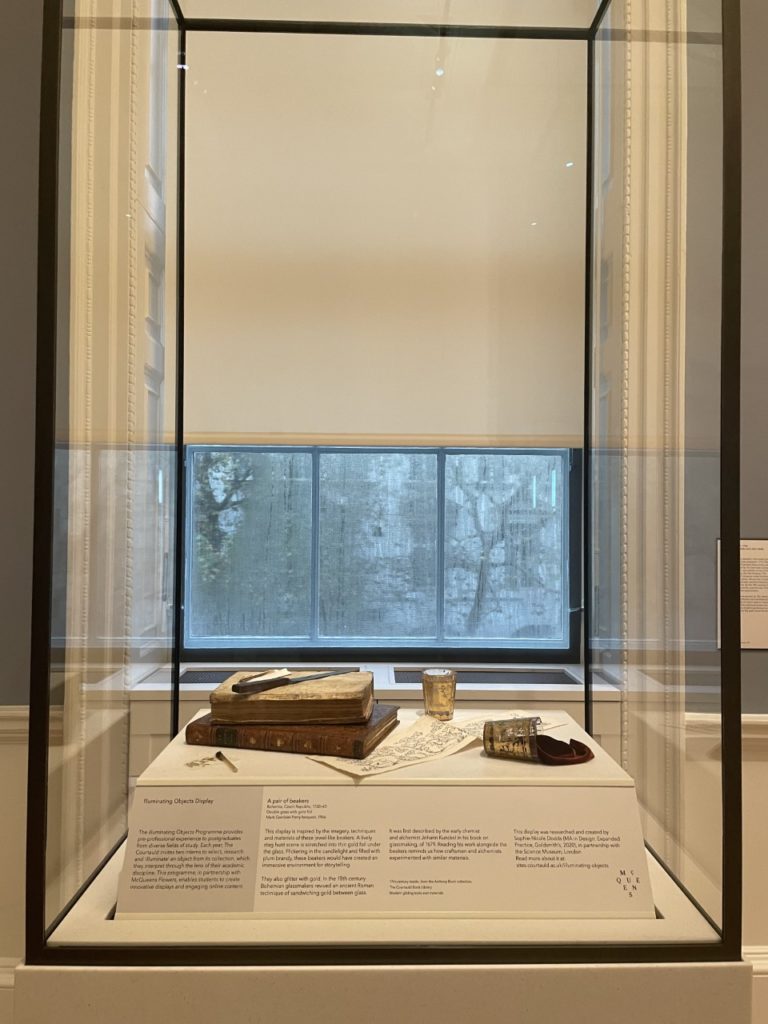
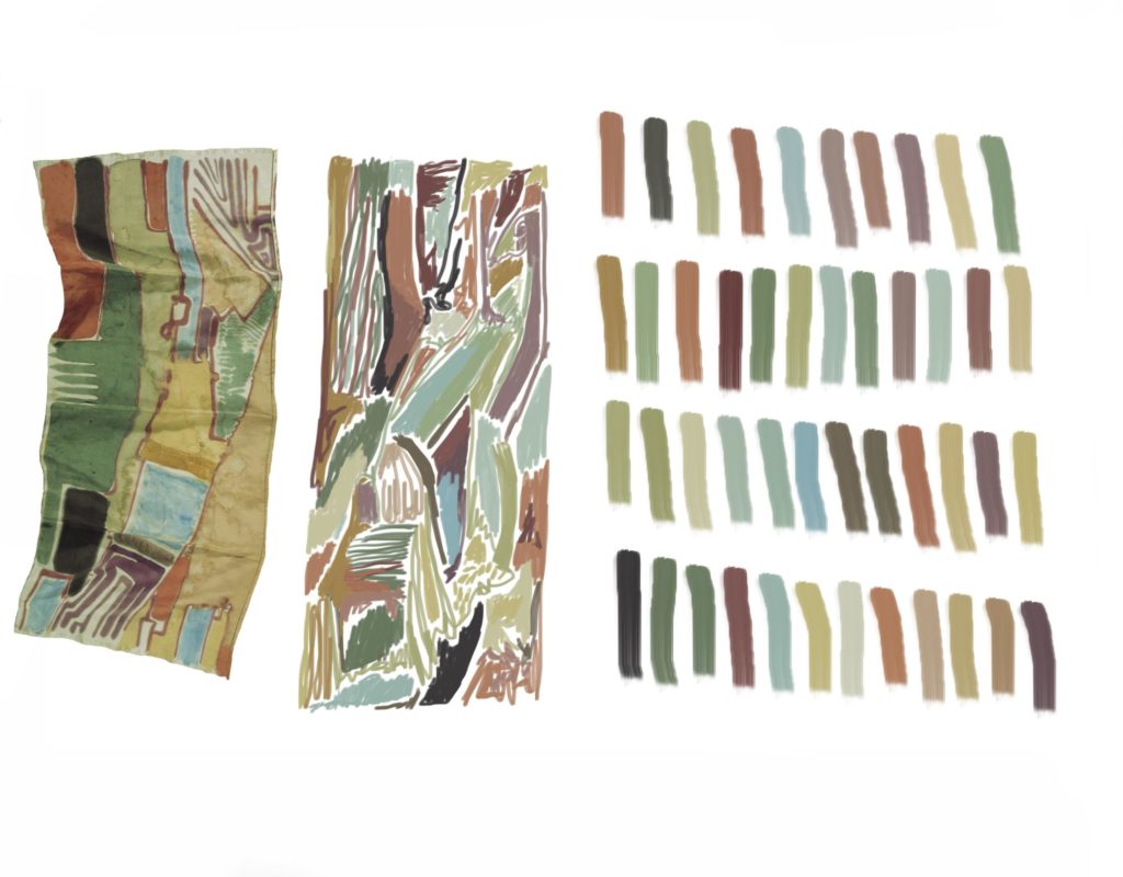
One of the main starting points for the display was thinking of my own practice in terms of my physical art space/studio/work table and thinking of the workspace as an art object, which brought subsequent discussion of a still life working environment, with tools of research and tools of fabrication. The idea of capturing something mid-process allows the visitor to have a fluid interpretation of the piece. We wanted to contextualise the era of early 18th-Century Bohemia, where the glasses are from, with a composition showing how we imagine its history in terms of an alchemist’s studio or an elite post-hunt drink. We used the objects as vehicles for story-telling and created threads to feed the visitors’ interest, whilst also emphasising the role of the accidental. This hopefully gives a little feel of what we were initially thinking with the display.

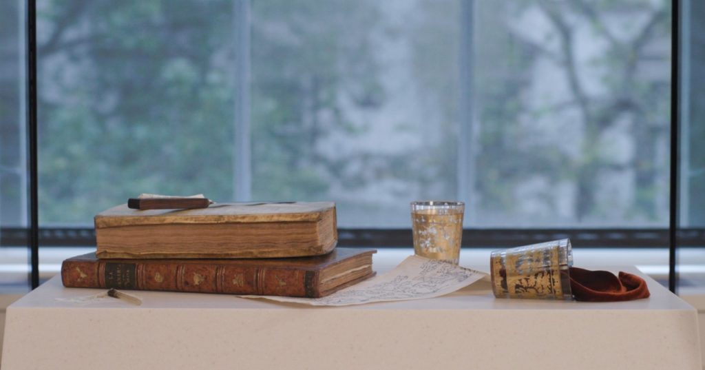
In September I met with Sacha and Matthew to install the scene of narrative objects in the 18th Century room. Their new home was to be a beautiful new case in a simple glass structure, which you could walk all the way around and view from different angles of the room, which was perfect.

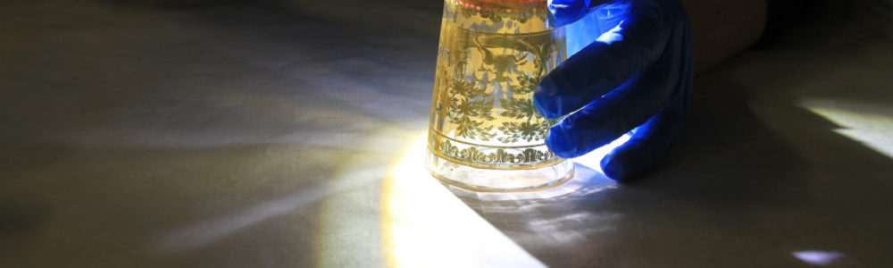
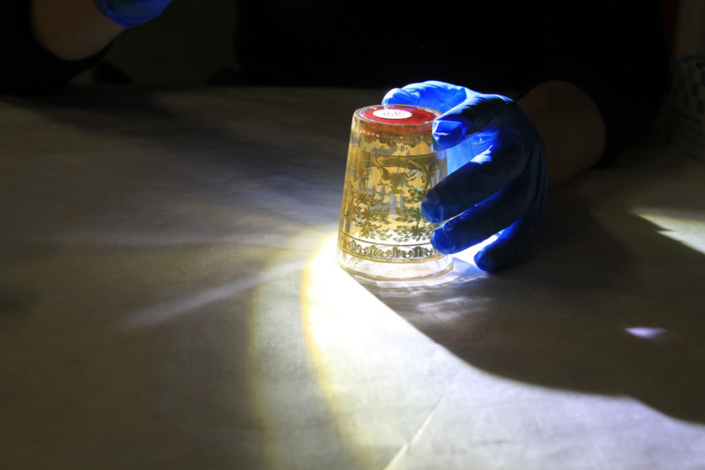
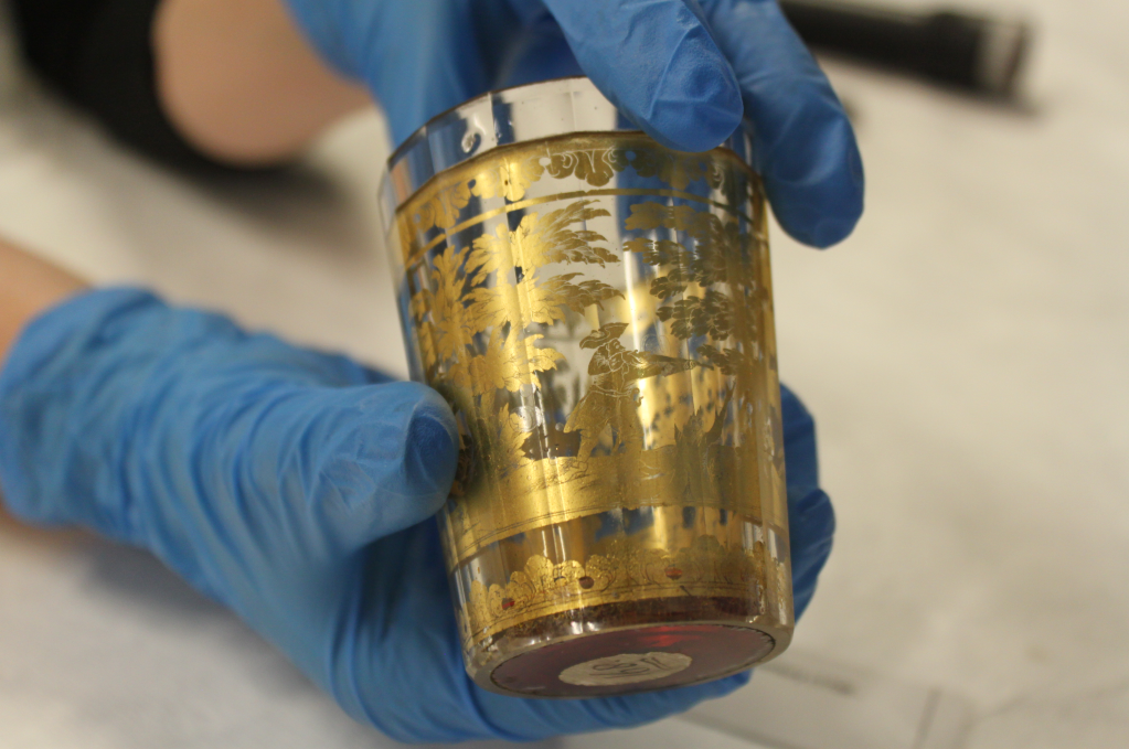
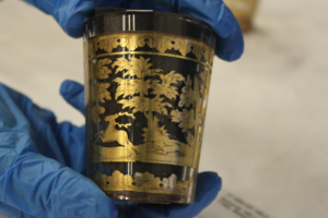
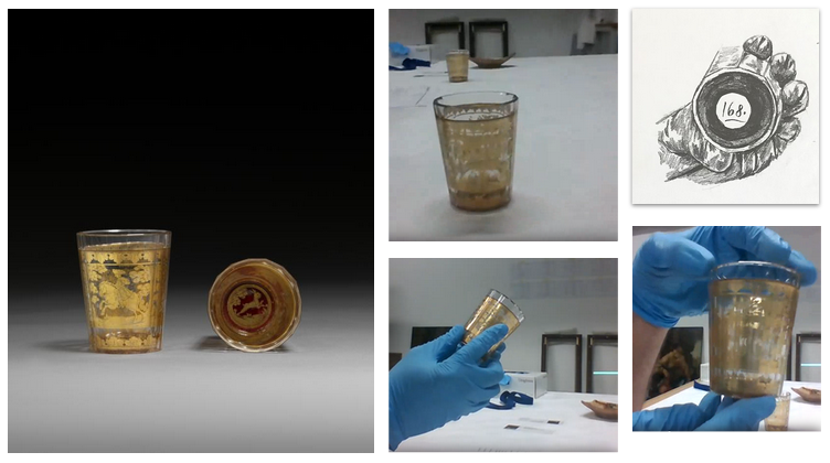
Firstly, a conservation report is done before the beakers are installed so that there is a record of exactly what condition they are in. Then another one will be done afterwards to make sure that nothing has changed. This was also where I saw for the first time the Victorian collector’s archival sticker, which had been taken off one of the glasses (and preserved as a document belonging to the object) so the smiling hare could be seen properly. The sticker had been placed onto some delicate paper and was a beautiful object in itself!

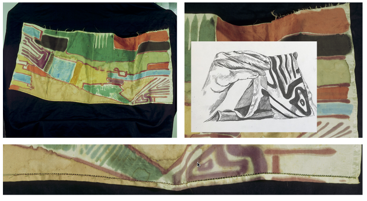
What seemed to be quite a simple process actually took slightly longer as we played around with the positioning of the objects a couple of times. I had photos ready of where to place the pieces but we found whilst in the room it was important to get every angle right depending where the viewer would be entering. For example making sure the glass could be seen well in front of the window, the hunting scene on the beakers showing the specific part we wanted at the top and not underneath, arranging the drawing, books and beaker to look natural but not block the best view, seeing the hare peeking out, no loose threads on the velvet and even how the velvet draped on the surface. There was a lot more decision-making on the install day than for the silk fragment in the Science Museum. There, the design and material of the mount had already been thoroughly modified, tested and made before the install, and, the case was against the wall, so there were fewer decisions left to be made.

We then finally settled on a change from the original scene format. Bringing the beaker on its side with the plum velvet to the front and the standing cup to the back. It was great to have one final collaborative workspace around these objects with Matthew and Sacha. It was the right decision and as we all stepped back, moved around, that was it. I couldn’t believe how good it looked finally in its place. It looked better than I expected from my photos of testing it out in the storage room with Matthew. All that is left is the label to be added to the front, which when writing also came as a new learning curve of how to add all the objects to the text tombstone!

I’m so pleased with how it all came together and particularly with this last object the creative freedom I was given and how we managed to convey that in the display whilst fitting into The Courtauld’s new gallery space. I am going to miss getting absorbed and engaged into my research and work here, the collaboration with Sacha, Matthew and Katy and just the whole eye-opening process to the world of art history and galleries. Its been a rewarding experience and I am going to take many of the new skills I learnt here into my practice of design, to hopefully design and make better.

I hope viewers are intrigued by it, move around and look from all directions to see something different each time. I look forward to seeing what people think of these beautiful beakers within this display!

Final Display case of Glasses

Objects in Real Life

Upside down beaker being lit by a torch with a blue gloved hand holding it

Upside down beaker being lit by a torch with a blue gloved hand holding it

I had narrowed down my selection to the final two objects ready to be explored further, with thoughts on their display coming into vision now I could finally see them in the non virtual world. It was a wonderful experience to meet Courtauld curator Alexandra Gerstein, Science Museum curator Katy Barrett, and Courtauld technician Matthew Thompson all in one physical space to sit, discuss and handle the objects as we encountered them.

The pair of glass beakers were first. They were initially smaller than I thought, but more beautiful and delicate in-person with a lovely weight to them. I had only seen one side of the gold illustrations however, due to what is on the photo catalogue website. So it was very refreshing to see all sides of the story unfold, beyond the hunter on horseback, as well as being able to compare and contrast the differences in the illustrations of the two beakers.

Hand held gold engraved cup

We played around with lighting from different angles to see how the object changed. On my initial video call I had enjoyed ‘seeing’ them rotating against the light, giving the illustrations with the faceted edge a feeling of a zoetrope, so wanted to see how that worked with moving the torch.

Lit up beakergold beaker with black insert

Thinking about possible display, we tried different ‘fillings’ inside the beakers to either see the illustrations more clearly or to obscure them for the sense of illusion. Black works well to properly understand the scene, however we lose the immersive interaction from the blurred faceted edges when seen through the glass.

We can also see the bubbles emerging from the up-lit torch which help to make visible the zwischengoldglas technique in which two glasses are cemented together, with the gold foil beneath, also trapping air bubbles with the illustration. This poses display questions such as how to light the objects; whether to disguise or highlight the illustrated scenes; and how to evoke how contemporaries would have seen the beakers by candlelight.

close up of scarf

Next up was the scarf. It comes in this very large archive format box filled to the brim with tissue paper. We delicately placed it onto the table and began to study it; the close-up stitching, the painting technique, the blending colours. I also found it to be a really good size, weirdly I was expecting it to be larger, even though I knew the measurements, but found myself thinking it would work well in the display cabinet – however ‘how’ would prove a longer discussion.

full length of scarf, with laptop showing photo

Our first port of call was figuring out which way round the ‘scarf’ was intended to be. We based it off the photograph on file with definitely one side feeling the more ‘finished’. I’d initially done a little colour and rotation test to see which way round I thought the scarf would be best to hang so we got this out to compare with the real object. We continued to survey how the dyes might have been painted on. Asking The Courtauld’s paper conservator, Kate Edmondson, whether a wax batik could have possibly been used. She was also very helpful in terms of discussing display ideas and looking at ‘runs’ in the ink or possible water damage.I also found that the colours on the photograph I’d been working with were much more muted than on the real textile. I’d been looking at synthetic dyes in my research and I thought it would be helpful to try to pull direct colours from the scarf to create a swatch palette that could be used for designing and to link a specific colour to how a specific synthetic dye would have been made. But as you can see these are very different from the ‘real life’ object.

digital image of scarf with colour pallete

This visit to the storage room to see my chosen objects has automatically propelled my research even further. The objects have given me new things to consider and work towards, as well as highlighting areas I need to focus more on. The next steps are drawing up plans for the design of display, as well as getting together my visual and technical research for the web content. Exciting things ahead!

How ‘conjecture’ is involved in selecting the next object

The whittling down has begun. As I found myself with four beautiful intriguing objects in the initial research I finally got myself down to two, with further insights leading me to think about these objects in terms of science and design and the possibilities surrounding them.

Close up images and drawing of a painted piece of fabric
Scarf, 1914, Jock Turnbull, Omega Workshops, T.1959.XX.1

One of the first things I looked at was the piece’s construction – is it even a scarf? Who labelled it as this? The selvedge, an edge produced on woven fabric during manufacture that prevents it from unravelling, is seen here on both sides of the fabric. There is one raw side and one finished side that has been machine-stitched but also has some hand-stitched or basting stitches running along its edge. This suggests it is the width of a piece of fabric, torn away and experimented on, in other words, a fragment. The design is playful, the colours bleed into one another and there are some water damage marks. But the damage almost integrates with the bleeding design and adds to its wear and tear effect. This suggests to me the idea of the Japanese aesthetic known as Wabi-Sabi – where the aesthetic is described as one of beauty if an object is imperfect, impermanent and incomplete. It is very delicate and moves beautifully when held up. As it is silk, there is a slight shine to it that ripples in the light and creates a translucent effect. Viewed horizontally it may be reminiscent of an aerial view of fields and swimming pools. But viewed vertically, it can be interpreted as more abstract, possibly more free of the viewer’s suggestion.

The piece tells a story of material culture of the time with it being made at the outbreak of the First World War as well as being just after the Arts & Craft movement, with how it encapsulates a changing moment of how artists related to technology. The art critic, writer and artist  Roger Fry founded the Omega Workshops in 1913 partly as a reaction against the machine-made. I was also reminded of the ‘Unbound Exhibition’ at Two Temple Place, and I have been thinking about how women collectors of textiles in this period were looking at the social and cultural importance of textiles through imaginative collecting. This piece was given to the Courtauld gallery by Winifred Gill, a craftswoman and social reformer. I have been reflecting how textiles often have to fight for their place amongst the more established visual arts. Textiles are part of our everyday life. They are familiar but powerful objects. 

Goldzwischenglas Cups, c.1720-40, Bohemia O.1966.GP.168

photo of golden glasses and hand holding glasses with a drawing

These are a pair of faceted goldzwischenglas beakers, basically gold sandwiched glass, which is an exquisite technique of a double glass, in which the first glass is decorated in gold leaf with the second glass precisely fitting in to sandwich the gold leaf in place, making one cup. The technique was developed during the Roman Empire and was revived in Bohemia and Austria in the 18th century, which is where these beakers are from.

The design all around shows a stag hunting scene. A running hare is seen on the base of each beaker.  The bases are constructed separately from the glass cylinders and are of red lacquer glass. The two cups are very slightly different in their narrative illustration. In terms of personal taste and design I wasn’t drawn to them for their luxurious gold look, as I prefer items more rough around the edges but I was drawn to them for their delicate illustration and size. Upon closer inspection and discussion with the gallery’s technician Matthew Thompson, whilst he was in the storage unit and I was at home on my laptop, they really began to be quite the conversation piece, literally and metaphorically. They are functionally an everyday object, a glass, a cup or beaker, hand-held and used for liquids. Such beakers were conversation pieces for wealthy collectors, therefore I am imagining them being used whilst discussing the day’s hunt. They are faceted all the way around, making a confusing, blurred, double-image effect, which can be quite distracting from the scene when initially first looking at them. You lose the visual quality of the glass, and are experiencing the image in front and the image behind at the same time depending on the light behind them.

How would they change with different coloured liquids in them perhaps? They are very rich for a designer to explore. We can also continue the narrative by hunting for our meaning within the piece. Are we chasing more than the stag and the hare? This double-image effect almost becomes 3D upon rotation, like a dream sequence or an early period moving image. They become something more than this exquisite technique, an immersive environment of telling a story through different backgrounds, different liquids telling the same story in a completely different way. What if we flattened the image down to become a story board, how would the story enfold, how would the story begin? With its intriguing link to chemistry and glass-making this is an object with many creative possibilities.

The varying ways in which I have engaged through the project over lockdown have brought me to these two wondrous objects. I am very excited to delve further into the specific research for the final chosen one!

Extended selection process – a reflection

A hand drawn image of the four objects being held at different angles

Having trained for 3 years in Bespoke Tailoring at London College of Fashion, followed by working for 3 years at different designers and now studying for my Masters in Design: Expanded Practice at Goldsmiths, I was thrilled to learn about my acceptance for the internship Illuminating Objects at the Courtauld and Science Museum. 

I look at construction and making as part of design. I come to the Illuminating Objects Internship in a different context from previous students due to the current pandemic. While I will select my object entirely through a computer screen, I have been utilising my design background to examine these objects creatively. I have been drawn to objects in the collection which can be described as fragments, and to the narratives they enclose or inspire, exploring conversations that may arise from them, through gestures of movement and touch. The idea of fragment is a starting point in thinking how these objects relate to today’s material culture. Although both touch and ‘real life’ viewing have been removed from the internship thus far, I  will use my design skills and my interest in drawing to connect with and understand the pieces I have selected for display. In contrast with previous internships, this one will have a strong focus on the process of selection itself.  The eventual chosen object will be on display at the Science Museum in 2021.

My practice stems from being drawn to certain materialities. I make/design because I find the object, the point of intrigue: the rusty button, the hanging scrim cloth, the found dug up clay. I draw because I see the movement in the cloth on or off the body and where that can lead to in a design. I am particularly fascinated by even the word ‘object’ – the aesthetic look of it, the sound of it – which is what initially drew me to the Illuminating Objects Internship. With my course often looking at material libraries and the material processes in a scientific manner it seemed a wonderful opportunity to express these research threads. You can view more of my work here.

The whole process from my interview, to how I’ve been working has been a fully socially distanced process, from not being able to physically meet new people or see the storage areas or learning facilities, to not even entering the Science Museum. While this might have brought initial slight sadness, the internship is also focused in its digital platforms to showcase the process, and limitations I have found can often bring more interesting insights and pursuits. Along with guidance from the two curators at the Courtauld and Science Museum and the Courtauld’s gallery technician the conversations at our weekly meetings have offered a wealth of knowledge and inspiration leading down different paths for the objects.

I have always been interested in working for a gallery within this design frame, looking at how objects are displayed. When viewing other objects, I feel that taking an inanimate ‘dead’ object and displaying it in its own right gives it a specific a way to be viewed aesthetically rather than for purpose. With the object eventually being displayed at the Science Museum, it will bring a whole new concept to me in terms of the sculptural frame where my object will stand, compared to an art associated gallery format.

In light of the current circumstances, I have been able to have a longer selection process which has been wonderful. From scrolling through many image files and document files, your eye really starts hone in on the type of things that its drawn to and the type of language that spikes interest in the object documents. Because of the scope of the collection I was initially drawn to the backs of objects; their markings, their faded colours, their shapes correlating to the object itself, their almost minimalist artistic manner.

Notebook pages with Object Document files and photos of the backs of objects Notebook page of a mood board of a series of objects from the courtaulds collection

I have gradually narrowed down my search to four objects. The scarf, the fragment, the cups and the drug jar.

Objects that could be seen as fragments, or overlooked pieces, seemed to be the direction I was drawn towards but with a focus on the object’s everyday use within our material culture and how their narrative in the design could be obscured. Last week Matthew, the gallery technician, was able to go to the museum stores and show me these four objects through a video call. Holding, hanging and turning the objects around delicately, we discussed elements of the objects individually and then together. Seeing the fragment on its edge was beautiful, the bright colours of the scarf I was not expecting, the mirrored effect of the cups and the illustrated costume on the drug jar. It was so lovely even just to see a hand in a glove touching them, particularly within our pandemic context where touch and physical contact have been removed. It really brought new questions and conversation points to the objects. I was physically able to see them from different angles and how that changed their aesthetic appeal. I will be bringing these ideas together towards a design question for my proposal.