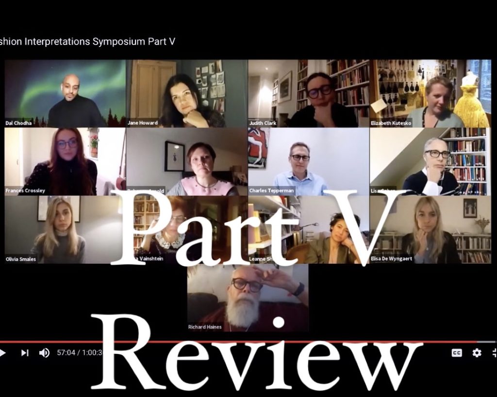
Fashion Interpretations Symposium, Part V A review
By Lucy Corkish
MA, “Documenting Fashion: Modernity, Films and Image in America and Europe, 1920-1960”, The Courtauld, 2020-21.
Last night saw the scintillating final installment of the week-long Fashion Interpretations Symposium. The first part of the evening was dedicated to a roundtable discussion with the creators of Archivist Addendum, ‘a publishing project exploring the nascent space between standardised fashion editorial and academic research’. To open the conversation, which focused on the questions faced by contemporary fashion publishing and the practice of sharing academic research, co-founder Jane Howard read aloud an email she had written to herself in 2003 after leaving her position as first assistant to David Bradshaw. The email, referred to by Lisa Cohen later in the evening as ‘a manifesto for our times’, detailed the problems she witnessed working within the fashion industry and potential routes to a better system. Howard has been working with Archivist Addendum’s other co-founder, writer and fashion communication lecturer Dal Chodha, for a decade. They discussed the sometimes ‘pointless’ and ‘precarious’ fashion system and how their work hopes to remedy this with a slower, more adaptable approach. Archivist Addendum will be published as a collection of papers and photographs brought together in a box, some parts bound and some loose. This content-driven approach can offer a more appropriate format for each project and a more tactile experience, reminiscent of browsing an archive, for the reader. The duo hopes that by breaking free from the established format, Archivist Addendum can play a part in dissecting and rebuilding ideas around fashion and the archive. Judith Clark noted the material juxtaposition produced by using items from the past to present a future, recalling projects introduced earlier in the week that dealt similarly with archival materials.
After the roundtable discussion, Rebecca Arnold led a reflective and emotive discussion with all contributors to the Fashion Interpretations research group. Many were quick to express their gratitude for the new and surprising connections made as well as the chance to work in collaboration with others. There was a focus on process: in particular, the welcome slowing down that occurs when taking a step back to consider medium – ‘the conduit to the content’. Finally, participants were grateful for the energy and ‘magic’ the project had generated.
To keep up with what the Fashion Interpretations group get up to next (after a well-deserved rest), follow their Instagram page @fashioninterpretations. To get your hands a copy of the inaugural Archivist Addendum when it is published in January, follow @archivistaddendum on Instagram. Recordings of the entire Fashion Interpretations Symposium can be found on The Courtauld’s Research Forum playlist on YouTube.
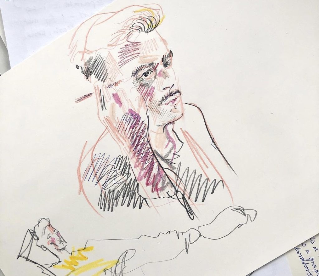
Ty applying eyeliner, colour pencil drawing by Alex Mein
By Ruby Redstone
MA, “Documenting Fashion: Modernity, Films and Image in America and Europe, 1920-1960”, The Courtauld, 2020-21.
Last night’s Fashion Interpretations Symposium featured a masterclass with celebrated fashion illustrator Richard Haines. Haines began with a nod to fashion history, showing a selection of his favourite works by early twentieth century illustrator Christian Bérard, whose work Haines loves for its unwavering, confident lines. Particularly inspiring for Haines is the trompe l’oeil door Bérard created for the Institut Guerlain in Paris which appears from afar to be painted but is, as Haines discovered on a recent trip to Paris, comprised of small strips of grosgrain. Ruminating on this discovery, he remarked: ‘A line can be a piece of paper and a pencil, it can be charcoal, it can be Procreate, or it can be a strip of grosgrain’.
Haines continued this rumination on the concept of line, demonstrating how his hand responds differently when sketching contemporary clothing than it does when sketching archival looks from designers like Schiaparelli, of whom he is a loyal fan. When sketching the 1930s, he explained, he gravitates towards gentle, curvaceous lines. When sketching contemporary designers, like his particular favourite Christpher John Rogers, he finds that he naturally tends to use bolder, more graphic lines and emphasises the shape of a look more than its finer details. Haines also provided examples of different media in his body of work, noting the nuances of his works in pastel and charcoal and his newer works created on his iPad. ‘To me,’ he remarked, ‘there is nothing more beautiful than a drawing. But [with digital technology] we are adapting the drawing and putting it in different contexts, and that is so exciting’. He draws inspiration not just from his subject matter but from the vast array of media he is able to use to render it.
Haines then (virtually) brought in a model and led his audience through a thirty minute session of rapid-fire sketching. During this time, he provided practical illustration advice that he has garnered throughout his wide-reaching career in fashion. Haines always begins his drawings from the head down and focuses on capturing the gesture of a model’s pose quickly. In fact, he explained how he prefers to create most of his works in a short frame of time and avoids getting hung up on imperfections and fussy details–undoubtedly a factor in his drawings’ trademark liveliness. This can prove challenging when working for a commercial client, as Haines has to work in a client’s corrections without compromising the spontaneity of his style.
Most crucially, Haines believes that one should never take an eraser to their sketch. He makes confident marks on his page and, should he make a mistake, he works to change the line he is creating and manipulate it into an integral part of his drawing. Should any of us be lucky enough to be invited to sketch a fashion show like Haines, he warns us to be careful with the medium we select. Years ago when sketching at the Oscar de la Renta showroom, he knocked over a pot of India ink and nearly ruined the designer’s handiwork. He now favours a charcoal stick for these high-pressure situations. Confident lines are, of course, better left on the page than the showroom floor, but for Haines, the page seems to always provide enough room for boundless exploration.
If you sketched along with Haines, please do share your drawings under #richardhainesmasterclass, and browse the hashtag if you’d like to see others’ work! Join us tonight for the final night of the Fashion Interpretations Symposium which will be a special roundtable discussion to celebrate the launch of Archivist Addendum.
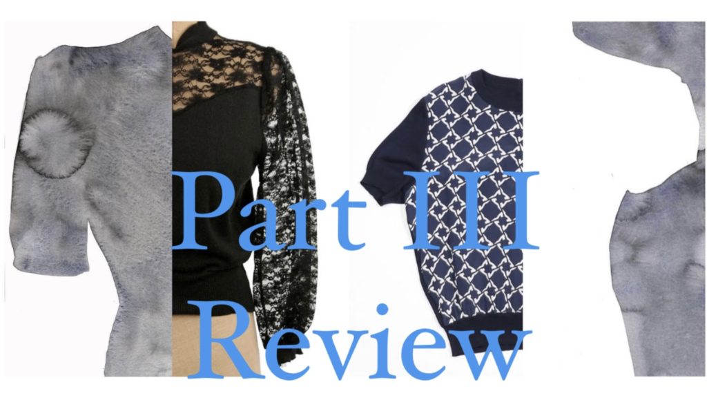
Fashion Interpretations Symposium, Part III A review
By Kathryn Reed
MA, “Documenting Fashion: Modernity, Films and Image in America and Europe, 1920-1960”, The Courtauld, 2020-21.
Fashion Interpretations Symposium, Part III remedied Wednesday’s mid-week slump with a fascinatingly interdisciplinary approach to fashion — watercolours, mythological goddesses, and a ramshackle cowshed all featured.
The evening’s speakers included author, artist, and publisher Leanne Shapton and Judith Clark, curator and exhibition-maker.
To begin, Leanne Shapton gave us a sneak peak into her ongoing project investigating the way clothes are photographed and sold digitally. She focussed particularly on the way that amateur photography is used on online fashion sales platforms. Intriguingly, she highlighted the appeal of the carelessly shot, badly lit eBay image that seduces the buyer into believing they have found a treasure. Her current ongoing project is to create watercolour studies and paintings of these photographic eccentricities, focusing on their shapes and silhouettes as a way to understand their distinctly uncanny yet appealing aura.
Judith Clark presented her paper that analyses the relationship between word and image through Stéphanie-Félicité, Madame de Genlis’ nineteenth-century fashion illustrations labelled after goddesses Venus, Aphrodite, Minerva, and Juno. She questioned: did the words inspire the image, or vice versa? A bridge between word and image is particularly pertinent to the fashion exhibition, as Judith noted that curators are consistently looking for ‘meaningful adjacencies between objects.’ If language, she concludes, is what creates confusion between objects in a museum setting, then we must begin to consider alternative paths. Particularly of note was an audience question about Judith’s research process in the Warburg Library throughout the pandemic. She revealed that she had begun to key in bookmarks of pages, in order to artificially simulate archives that might be physically beside one another – an interesting example of the way we have to adapt to our new and wholly online experience of the world.
Finally, the evening concluded with a short film collaboration between Roman Kurzmeyer and Judith Clark, which turned the way that we think about exhibitions on its head. The Amden Atelier, a project that uses an old cattle stall in the mountains as a venue to showcase art installations lends itself to a debate about what it really means to be an ‘exhibition maker’. It requests an engagement with the site: artists and curators must specifically work with the building. This unique short film highlighted a multitude of ways we can think about the exhibition, the importance of perceptual conditions, and the ‘hyper image’.
The fascinating content we were presented with last night seemed to be incredibly pertinent to our current situation: the growing popularity of online shopping in a post-pandemic eco-conscious world, the effects looking at archives remotely has on academic research, and a case study on how particular environments relates to our experience of viewing art.
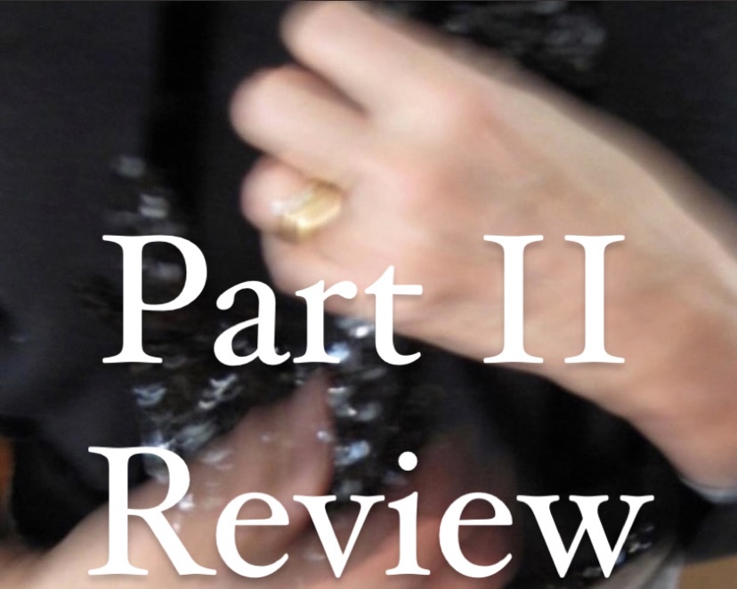
Fashion Interpretations Symposium, Part II A review
By Genevieve Davis
MA, “Documenting Fashion: Modernity, Films and Image in America and Europe, 1920-1960”, The Courtauld, 2020-21.
At last night’s Fashion Interpretations Symposium we heard from three amazing speakers: Lisa Cohen, Associate Professor of English and of Feminist, Gender and Sexuality Studies at Wesleyan University in Connecticut; Olga Vainshtein, Senior Researcher at the Russian State University for the Humanities in Moscow; and Elizabeth Kutesko, Lecturer in Cultural Studies at Central Saint Martins in London.
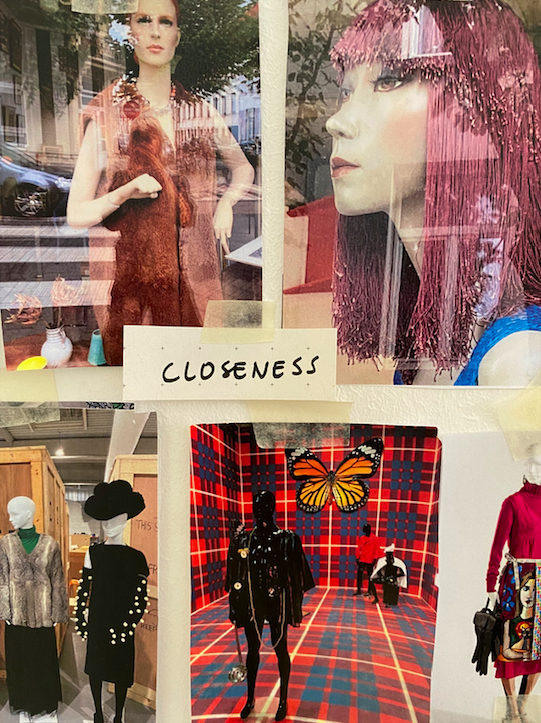
Lisa Cohen led with a poetic presentation on the relationship between clothing and grief. Clothing reminds us of those we have lost, a remnant of someone mourned. It can provide a sense of closeness to a loved one or a sense of catharsis through the giving away the clothes to others. Cohen first described an interview with a woman named Anne as they went through Anne’s parents’ clothing together. Reminiscing over a black bolero cardigan and a beautiful white lace dress, Cohen conveyed the sense of connection formed between people by clothing. Wearing, touching, or smelling a loved one’s clothing can trigger a kaleidoscope of memories. Cohen also touched upon her own relationship with filmmaker Jim Lyons, whose AIDS-related death she chose to speak poignantly on yesterday, which was World AIDS Day. She spoke of the bag of t-shirts he left her; a symbol of their friendship kept on her shelf for over a decade. Cohen’s personal interactions with each person she interviewed in her research brought to life the deep intimacy between clothing and relationships.
Olga Vainshtein provided an in-depth look at fashion in literature and cultural interpretations of illustration. Focusing on Frances Hodgson Burnett’s 1886 novel, Little Lord Fauntleroy, Vainshtein discussed how the illustrations of the little lord in his suit, drawn by Reginald Birch, sparked a trend in boys’ fashion. Though the novel provided few descriptions of Lord Fauntleroy’s suits, Birch was a popular illustrator and the vivid drawings were mimicked in magazines, with pictures of each outfit and the pieces required for it, so that mothers could order ready-made outfits for their sons in the latest style. The illustrations were based on Burnett’s son Vivian, and they were inspired by late-seventeenth century and early eighteenth-century court dress. Vainshtein’s presentation allowed us a peek into the way fashion and fiction interact through “cultural allusion,” demonstrating how literature has the ability to impact fashion as much as photography and film.
Elizabeth Kutesko rounded off the night with a talk on Claude and Dina Levi-Strauss’ photographs of São Paolo from 1935-37. In one image, Kutesko examined Dina Levi-Strauss’ tailored, manicured outfit that contrasted the wilderness around her as she explored Brazil, highlighting how São Paolo was poised between an agricultural past and an industrial future. She also highlighted the ways the snapshots captured the picturesque nature of the city, with modern skyscrapers and well-dressed pedestrians, while simultaneously including the “extra,” such as rubbish in the gutters. In the 1930s, São Paolo transformed into Brazil’s industrial centre, but Kutesko emphasized how the Levi-Strauss’ photographs emphasized the “unfinished” nature of the city, as light leaks and blurring mirrored its constant transformation. The concept of modernity varies from culture to culture, operating across national borders and within them. Kutesko concluded with the idea that photographs capture these moments of modernity, often immortalizing more than can be seen by a single glance.
These three speakers were unified in their emphasis on the importance of memory. Memory can be captured in photograph, touched in a piece of clothing left behind, or disseminated through a novel. Fashion, and the mediums through which it is displayed, provides pathways to explore these memories and the emotions they provoke.
Fashion Interpretations Symposium, Part I A review
By Simona Mezzina
MA, “Documenting Fashion: Modernity, Films and Image in America and Europe, 1920-1960”, The Courtauld, 2020-21.
It is going to be an exciting week for fashion enthusiasts around the world! The Fashion Interpretations Symposium has officially begun and so also begins our daily recaps here of each night.
Dr. Rebecca Arnold’s discussion on Man Ray’s images for February 1937 issue of Harper’s Bazaar kickstarted the event, emphasising how the artist manipulated the photographic medium to blur the line between photography and illustration, respectively the most recent and the most established forms to represent fashion during the interwar years. Man Ray simultaneously saw himself as the creator of the image but also of the medium through which it would have been received. Using the technique of solarization to achieve a tone reversal effect on the black and white photograph, he would then apply a gouache to certain areas of the image to emphasise the colours. In one of the images presented, the perception of a white dress with a ghostly grey train was contrasted by the bright hues suggested by the applied splashes of colour, reflecting the descriptive text under the picture. Man Ray’s images were, to quote Dr. Arnold, ‘foregrounding the medium, drawing upon the idea of us as embodied viewers’, experiencing the image through the use of both optic and haptic sensations.
Detail of Man Ray’s picture for February 1937 issue of Harper’s Bazaar.
Elisa De Wyngaert, fashion curator at MoMu Fashion Museum in Antwerp, followed Dr. Arnold’s presentation, discussing her process when planning a new exhibition. She explained how, for her, the early stages of exhibition planning resemble the feeling of being a teenager decorating her walls: for a brief moment every item seems able to reach, without logistic or conservation challenges, and no budget restriction. What follows is the very slow process of “letting go”, as sometimes pieces are missing, too fragile or too expensive to loan, and the moment when the “wall of dreams” is translated to a more practical excel sheet. Elisa emphasised how the wall collage is an important part of the exhibition history: this is the moment corresponding to the teenage years of the exhibition, which is in the process of developing its identity. The “exhibition of dreams” then grows up into what we audience see. At this point, the exhibition does not belong to the curator anymore, but to everyone. Every person becomes part of the story, in the way they personally experience the exhibition.
Charles Tepperman, Associate Professor of Film Studies at The University of Calgary, concluded the presentation part of the night with “A World Dressed in Kodachrome – Fashion and Amateur Film in the mid-century”. Kodak introduced the Kodachrome film stock in 1935, becoming an amateur favourite for the way it allowed to capture formal and vernacular dress, and use colour almost as a textile in its own right. Kodachrome provided one of the first widely accessible tools to capture colour and created a true “chromatic modernity”. Amateur filmmakers such as Chicago-based Warren Thompson and Matthew Ko dressed the world in colour and motion, and their amateur films can now be considered kinetic records of how people dressed. Through their lenses, the city was transformed into a chromatic composition of streets, fabrics and styles.
As the event came to an end, I was left with a question: what are we attracted by when looking at fashion? Is it the colours it presents? Or the emotions it sparks? Is it its mix of textures, inviting us to touch the garments or imagine how they would feel on our skin? It may well be a combination of these three factors and many others relating to our subjective experience. What is clear to me, however, is that people are central to the shaping of fashion, and that the fashion object can only be fully understood in relation to people’s experience of it.
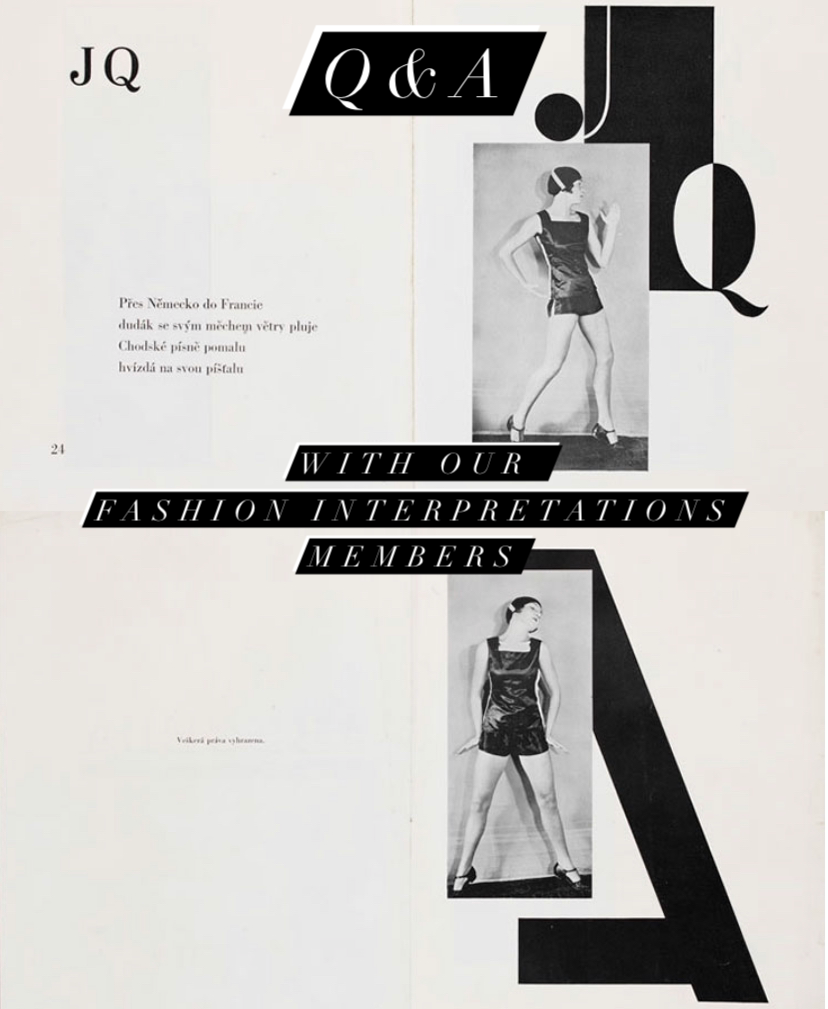
Q&A session with our Fashion Interpretations project members, “J Q” and “A” from ABECEDA by Karel Teige, Prague, 1926
In the next few weeks leading up to our symposium, we will be asking our members a few questions regarding their work for the project, how their take on medium has potentially shifted over the course of the past year and the connections they have made with the work / research being conducted by other Fashion Interpretations members…
Rebecca Arnold
Principal Investigator
What is your favourite fashion medium?
Photography. I love most forms of fashion representation, but photographs are the medium that I am most drawn to – it’s where most of my writing projects begin.
What have you learnt from focusing on medium?
That it’s important to think about how dress is mediated, to consider the ways it is represented and the web of contexts and intent that bring an image into being. Also, how fascinating it is to analyse the ways we interact with a particular medium, and how this impacts our relationship to fashion.
What is your favourite example from your research that shows medium impacting fashion’s meanings?
I really love the Man Ray solarisation I studied that shows Mme Gres gown as though in a black and white negative with flashes of applied colour. The way he presents the model and the dress really makes you stop and consider what you can – and can’t – see. He makes you aware of his intervention between the scene he shot in the studio, how he treated the print, and then how it appears on the magazine page. The image is about so much more than a dress …
Can you think of any links that have presented themselves between yours and another project members’ work during this process?
One of my favourite aspects of being a part of this group has been seeing how our separate projects would interconnect – sometimes in deeper ways, for example, Richard Haines’ beautiful exploration of 1930s couture links to what I was thinking about and it was such a pleasure to see how this played out in his drawings.
Dal Chodha
Founder of Archivist Addendum
What is your favourite fashion medium?
Of course, it’s print, but print that offers something more than just weight in my hands or takes up space on a shelf. There has been a mass abuse of the print medium in the last decade – by this I mean that too much stuff is being produced with little care. A lot of the magazines and books made today would suffice as being purely digital material. Paper is a resource that we are running out of. It should be treated with respect.
What one image / story / example best articulates your tie to your chosen fashion medium?
There are so many examples of wonderful printing and tactile experiences but something that has stayed with me for well over a decade is the large-format art magazine Kilimanjaro by Olu Odukoya. Today Olu publishes Modern Matter but the spirit and tactility of Kilimanjaro still affects me to this day. It’s a sensorial experience, it’s a ‘magazine’ you make space for, it commands a certain level of engagement. I also love Loewe’s Past, Present, Future (2016) and Gina Bucher’s Female Chic. Thema Selection (2015). These are two books that make me angry because I wasn’t involved in making them! They are breath-taking. They make you realise what a considered meeting of paper, ink and glue, photos and text can do.
What have you learnt from focusing on medium?
My tool is language, words, but I always think of the words in a visual way. For me it’s important to know how my words will sit on the page or screen. It helps me to write with clarity and rigour. I enjoy the physicality of print media but I am not romantic about it – a lot of things do not need to clear out huge swathes of forests or pump ink and chemicals into the sea. With Archivist Addendum, Jane and I are driven by a curatorial, punkish approach to publishing. It is hand made. It is quite literally self-published. It gives us an immense amount of stress and freedom.
What is your favourite example from your research that shows medium impacting fashion’s meanings?
The arrival of the ‘phygital’ show has been interesting. Of course, you had some notable highs like Jonathan Anderson and M/M (Paris)’s ‘show in a box’ for Loewe or Bottega Veneta sending out mini projectors loaded with their latest short film. This playfulness and interaction feels new. When seated at a show, we see clothes from a fixed position – it is a position that is both physical and metaphorical. When the work is being disseminated in your own front room, you look at it differently. It affects you differently. I do worry that it becomes almost too playful, like a game, or a distraction from the clothes, but with the world the way that it is at the moment, perhaps that’s what we need.
Can you think of any links that have presented themselves between yours and another project members’ work during this process?
With Rebecca’s research on Man Ray (and in particular his use of solarisation) there’s a link in the ambiguity of the fashion image – how what we are shown is sometimes not what we can see. Judith and Roman’s work brings up the issues of curation and grouping together of images, which as an editor, is part of my job. Leanne’s paintings elevate lo-fi eBay photographs into something more special, something more urgent. Our shoot of the A.F.Vandevorst archives with Sofie & Maarten was done a day before Belgium went into lockdown. Jane and I were forced to stop for a few days in a new city. It gave us the space to feel okay about the fluidity of what we are trying to do with Archivist Addendum.
Fran Crossley
AHRC Networking Project Administrator
What is your favourite fashion medium?
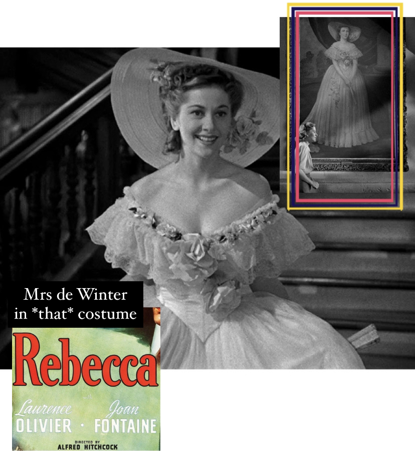
Oh, this is difficult. It’s hard to choose between photography / film/theatre / literature. I recently reread Daphne du Maurier’s Rebecca (1938) and forgot how transformative the description of dress can be within a novel, how much it can convey about a person’s “station” (such an old-timey concept), their personhood. I revelled in retracing the ball scene in particular, Mrs de Winter’s abject terror and shame (you can quite literally feel it quivering through the pages). I was instantly transported to Hitchcock’s 1940 adaptation; Joan Fontaine in her own interpretation of Caroline de Winter’s flouncy, ultra-feminine white gown – oh, the horror.
Joan Fontaine as Mrs de Winter, depicting a portrait of Caroline de Winter in Alfred Hitchcock’s “Rebecca” (1940), before it all goes horribly wrong!
What one image / story / example best articulates your tie to your chosen fashion medium?
If I’m sticking with literature here, I have always been a little bit obsessed with Virginia Woolf’s “clothes complex.” That fine line that you feel her walking, between desire and revulsion, how she was simultaneously concerned with and preoccupied by her relationship with dress, her view of fashion as a “trivial concern”. Social artifice, a notion so often associated with fashion, is so readily misconstrued as being woven into the discipline’s fabric. I was always so fascinated with how she grappled with fashion’s contradictions. Fascinated with how dress, even its language, is endlessly revisited in her writing: ‘There stood the great house with all its windows robed in silver.’ [Virginia Woolf, Orlando (1928), (London: Penguin Books Ltd., 2006), p.291]
There’s a passage in Orlando that has always stayed with me, I think of it often when I’m examining fashion imagery, considering how dress can be understood as a form of body modification, it’s very special and very Woolf:
‘There is much to support the view that it is clothes that wear us and not we them. We may make them take the mould of arm or breast, but they mould our hearts, our brains, our tongues to their liking.’ [Virginia Woolf, Orlando (1928), (London: Penguin Books Ltd., 2006), p.167]
I have always warmed to the idea of dress moulding my heart / brain / tongue. Fashion is at the forefront of my mind near-constantly throughout the day, be it in my own dress or in my work, and again, I discuss and consider it a great deal. It will remain a treasure, to be shared and cherished. I like the idea of our physical forms being fundamentally reordered through fashion.
Two important quotes from my copy of Virginia Woolf’s “Orlando” (1928)
What have you learnt from focusing on medium?
That medium permeates through everything, through all manner of stimulus, not just in fashion. It has made me consider how I digest information in everyday life, not just when I am examining fashion imagery. Also, using the term “medium” as an umbrella definition, it gives me greater focus when categorising what I am encountering – for example, just this afternoon (Tuesday, 10 November 2020), SHOWstudio posted a video on their Instagram account urging their followers to ‘escape into the world of fashion film with a playlist curated by the SHOWstudio staff’, https://www.instagram.com/p/CHaatIZnvMO/. In this selection of clips, we see fashion photography, videography, aligned with specific pieces of music, each exploring a fashion-centric theme – ‘society’s obsession with images of celebrities and our voyeuristic tendencies when it comes to icons, to ‘Beasting’ … (to) the ascent of women’s workwear … a multilateral dance between man and mother nature.’ Fashion can house all these varied, multi-faceted narratives, and retell them to us through the most innovative, exciting mediums.
What is your favourite example from your research that shows medium impacting fashion’s meanings?
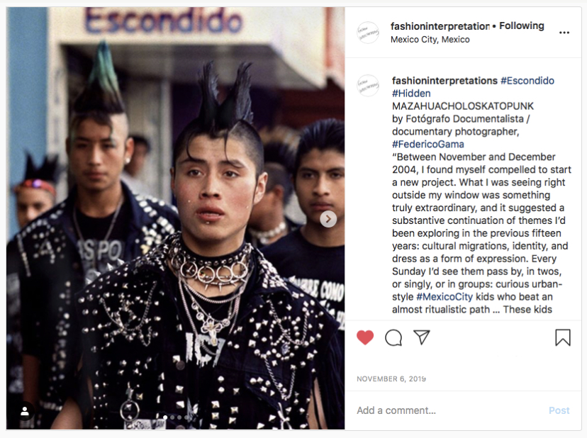
As Fashion Interpretations’ Networking Project Administrator, I haven’t exactly partaken in researching for this project. However, I have been responsible for our Instagram account over the course of the past year, and in seeking out new content every week, I have found hundreds of examples that successfully demonstrate how medium meaningfully impacts upon fashion’s meanings. A favourite? Discovering the MAZAHUACHOLOSKATOPUNK kids of Mexico City, via the work of photographer Federico Gama.
“What I was seeing right outside my window was something truly extraordinary, and it suggested a substantive continuation of themes I’d been exploring in the previous fifteen years: cultural migrations, identity, and dress as a form of expression … They employ these Sunday disguises, outfits or even vestments to adopt other personalities in a representative sense …” – Federico Gama [https://www.instagram.com/p/B4iE-R9BftE/]
Less fashion photography, more documentary photography; Gama highlights stories in which fashion acts as the communicative tool. In this series, “MAZAHUACHOLOSKATOPUNK” or “Hidden” Gama explores the nuances present in society’s pre-organised fashion factions, where we place ourselves, how we rebel, how we seek to redefine fashion stereotypes. In this example, his photography allows me to reconsider how self-expression through fashion can be depicted.
Our post on the MAZAHUACHOLOSKATOPUNK kids of Mexico City: https://www.instagram.com/p/B4iE-R9BftE/
Leanne Shapton
Project member / Author, artist and publisher
What is your favourite fashion medium?
Amateur photography for the selling of secondhand clothes. Because these images carry traces of the owners relationship to items, clothing or fashion, and also because the medium is not necessarily seen as an art form, or as a form at all, it’s more in line with a classified ad. But the more this kind of market evolves, the photography evolves, too, and the messages sent through established and changing codes and conventions is modern, to me.
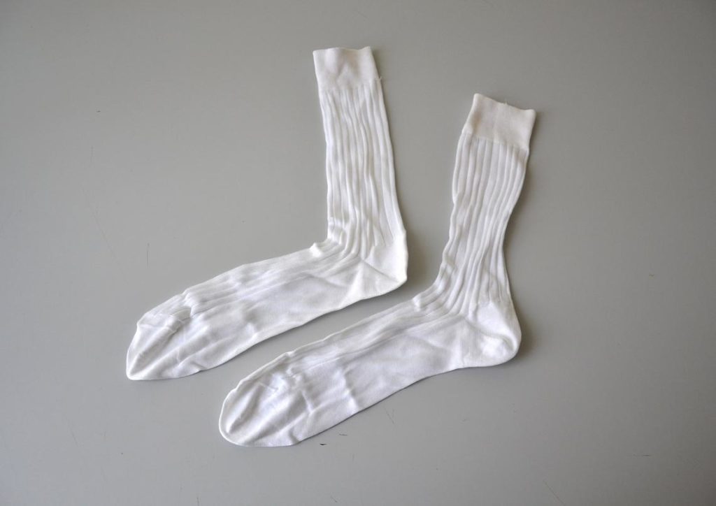
What one image / story / example best articulates your tie to your chosen fashion medium?
I love this image of socks:
What have you learnt from focusing on medium?
I’ve learned, like with any focus, comes a kind of literacy, a fluency with reading between the “lines” of an image or medium.
What is your favourite example from your research that shows medium impacting fashion’s meanings?
I don’t have a favorite example, but I think the disembodied article of clothing, photographed flattened on a floor, is encouraging— in general— a more scientific or forensic study of the value of clothes and fashion and design. When items are not mediated by a model, stylist, photographer, advertiser and editor, the consumer might develop a different relationship to assessing clothes. Less illusory, more academic.
Can you think of any links that have presented themselves between yours and another project members’ work during this process?
Perhaps with Lisa Cohen’s work— the idea of the histories and previous lives of clothes.
Elisa de Wyngaert
Project member / Fashion Curator, MoMu Fashion Museum in Antwerp
What is your favourite fashion medium?
Creating fashion exhibitions and the accompanying publications are my fashion media of choice. However, in these, we include many different fashion medias, from photography, garments, to films and oral history. This seemingly simple question is a rather tricky one for me, it’s like choosing between my favourite desserts or songs: it could alter from day to day. I do find myself deeply moved by seeing an old lady in a raspberry pink jacket and statement necklace, and I am touched every time I see a lost garment on the street, such as a silk scarf waving in the wind or just one silly shoe… I am attracted to the tactility of fashion and fascinated by the way garments play a role in people’s lives and the way traces of memory are found in garments. My love for personal stories, emotions and experiences connected to fashion is the reason I wanted to work as a fashion curator.
‘take me home’ (detail) by Elisa De Wyngaert
What have you learnt from focusing on medium?
In the past few months, most of us were house bound. For safety reasons, exhibitions were closed, and are currently again closed. For this project, I’ve built a 2D ‘take me home exhibition’ on my living room wall. It’s an exhibition of dreams that will never happen in this constellation, but will no doubt inspire my future curations. Since lockdown, I became even more intrigued by the transformation exhibitions undergo from being a 2D collage to becoming a real, built environment. The mannequin plays a big role in this transition and I have been thinking a lot about the importance of working with the right mannequins. I’ve spent many hours walking around Antwerp, Berlin and Brussels, discovering and photographing display mannequins behind windows. We should never underestimate the part these sculptures of people play the emotional experience of a fashion exhibition.
‘take me home’ (detail) by Elisa De Wyngaert
Can you think of any links that have presented themselves between yours and another project members’ work during this process?
When you make fashion exhibitions, you are trying to find innovative ways to bring the garments to life. Fashion is meant to be worn, garments are part of daily life and rituals. Movement, however, is often missing in the stillness of a museum display. When Richard Haines came to MoMu last year, I was amazed to see how he transformed our dressed mannequins into real women. His illustrations introduced movement into their uncanny stillness in a way that felt very energizing to me.
‘take me home’ (detail) by Elisa De Wyngaert
Olga Vainshtein
Project member / Senior Researcher, Russian State University for the Humanities in Moscow
What is your favourite fashion medium?
My favourite fashion medium are literature and book illustrations. My background is the history of English literature and I enjoy reading novels and making notes. The connection between the written word, the mental image forming in the reader’s mind, and the book illustrations fascinates me. Fashion is one of the links in this moveable web, that can further embrace painting and photography.
What one image/story/example best articulates your tie to your chosen fashion medium?
When I first read the treatise by Barbey D’Aurevilly “On Dandyism and George Brummell” I was struck by his description of dandies scraping their clothes with a sharp glass:
“The dandies dreamed up a style that might be called the threadbare look… this was the dandyish idea of having their clothes distressed before they put them on, rubbed all over till they were no more than a kind of lace – a mist of cloth. They were gods who wanted to walk in their clouds! To do it they used a piece of sharpened glass, and the procedure was extremely delicate and time-consuming. Now that was a true act of dandyism. The clothes themselves are nothing to do with it, since by that point they scarcely existed!
(Barbey D’Aurevilly. On Dandyism and George Brummell. 2002, transl. George Walden, Gibson Square Books, p. 80)
I was impressed and vividly imagined this procedure. I have already thought about different ways of deconstructing clothes like ragged and stone-washed jeans or how Hussein Chalayan buried clothes for them to look rotten and then dug them up… But unfortunately, as I understood later, reliable evidences for this method are non-existent. This is a product of the subtle imagination of Barbey D’Aurevilly. It is his artistic style and the power of words that created this unbelievable illusion of truth.
Barbey D’Aurevilly, Portrait by Émile Lévy, 1882
What have you learned from focusing on medium?
The first thing you should do is analyze the medium and understand how it works. It is never transparent. Representation of clothes in fiction is most vivid in dramatic situations. But garments worn in ordinary life often escape description. They remain sort of invisible. Also, literary texts possess their own logic and structure, and we should always remember the genre conventions. For instance, in this fragment from The Duino Elegies by Rainer Maria Rilke we are facing not a realistic description of a Parisian milliner, but a mystical allegory of Death at work:
the milliner, Madame Lamort,
winds and twists the restless trails of the earth,
endless ribbons, into new
bows, frills, flowers, rosettes, artificial fruits – all
falsely coloured, – for winter’s
cheap hats of destiny.
(Translated by A. S. Kline)
What is your favourite example from your research that shows medium impacting fashion’s meanings?
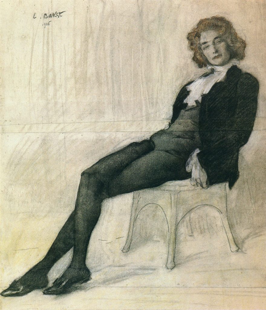
Russian poet Zinaida Gippius by Leon Bakst, 1906
This is a portrait of the famous Russian poet Zinaida Gippius by Leon Bakst (1906). Sitting for this portrait she donned Little lord Fauntleroy suit – knee-length pants, stockings, a black velvet jacket, and shirt with frilled front – and obviously, she felt quite comfortable in it. Posing in boys’ attire for a woman was at that time a flamboyant and rebellious act, yet it allowed Gippius to achieve the desired effect of detachment and aristocratism. Choosing Fauntleroy look, Gippius successfully transgresses conventional boundaries of gender, historical period, age and social status. Thus she managed to make the Fauntleroy suit an instrument of woman’s empowerment, creating her own rules of the game.
Can you think of any links that have presented themselves between yours and another project members’ work during this process?
I am always interested in what Rebecca Arnold does, and I am a big fan of her (together with Beatrice Behlen) podcast Bande à Part. Leanne Shapton is one of the editors of the anthology I use a lot – Women in Clothes. I share Judith Clark’s interest in children’s literature and its impact on fashion. And I have recently used the article of Elizabeth Kutesko Problems and Tensions in the Representation of the Sapeurs for my research on sartorial codes of sapeurs.
“It will be so exciting to bring all our project members together to discuss our work. There are already fascinating connections emerging and these will develop as we explore the ways medium impacts meaning. How inspiring to spend an evening with this group of international artists, academics, writers and curators to share our ideas. And I can’t wait till December when we can present our project to the wider public.” – Rebecca Arnold
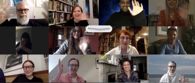
Last week the Fashion Interpretations group met via Zoom, our whole group in full for the first time, to discuss all things Fashion Interpretations. It was not the introductory Network Meeting we had originally envisioned, all of us smiling and waving into our cameras, scattered around the world. And though we were not physically in the same room, it was exciting to see everyone’s faces, hear their ideas and share a virtual space for an hour or so – it was a needed jolt of joy and excitement.
We began with an appropriate dose of housekeeping, responsibly reviewing important pieces of business (with haste!), before quickly handing over to the Archivist Addendum team. Dal Chodha and Jane Howard are producing the publication that will accompany this project, the first iteration of their journal Archivist Addendum. We’re not going to give away any spoilers too soon, but they described in detail their incredibly exciting ideas that will enact a “breaking away” from the known format of a printed journal, a new home in which to house the collective works of our Fashion Interpreters.
In advance of our meeting, we devised a precise schedule in which our project members would present their work or a summary of their research (thus far) within a five-minute timeframe, with imagery from / linked to their work included. Our brilliant leaders – Judith Clark and Rebecca Arnold – kicked off the proceedings, with Rebecca showing us photography from a 1937 edition of US Harper’s Bazaar by Man Ray. Rebecca is looking at interwar fashion photography and illustration as she is interested in the interplay between the two medias, especially how their editorial exchange might have impacted the viewer’s experience of looking at magazines and encountering images during this period. Judith treated us to a wonderful array of images that illustrate the communication of narrative through dress, as articulated in the relationship between exhibition making and how it contains information: mannequins dressed in Lanvin from the Fosun Foundation in Shanghai last year, preparatory sketches by Karl Lagerfeld in the 1970s from the Chloé Archive, an illustration from Ovid’s Metamorphoses. We then shifted to Richard Haines’ work (currently running a takeover on our blog/Instagram, 11 – 17 May), who talked to us about line, a subject as an illustrator he continually considers, what is line, how line is documented through history and how it presents now, as translated through technology / social media. Last January, Richard travelled to the Guerlain Institute in Paris and viewed a trompe-l’œil work by Christian Bérard he had formerly considered to be an illustration. He was stunned to discover it was executed entirely in fabric, torn and shredded grosgrain with accents of crushed velvetine. This experience led him to consider the illusion of line and the evocation of emotion that this discovery caused.
Between each group of three (first up, Rebecca, Judith and Richard), we paused to ask questions, give feedback and let Dal and Jane talk logistics in terms each contribution to the publication…
Leading on from Richard’s discussion of line, we heard from Elisa de Wyngaert, curator at MOMU, who is researching how we experience exhibition spaces and what it means to engage with a fashion exhibition emotionally. Image references included a two-page spread from Dirk Van Saene’s Autumn/Winter 1998-9 collection’s lookbook. He and Walter Van Beirendonck took a mannequin with them on holiday to Austria and shot this collection on its inanimate body, before glorious mountain vistas and flower-fronted hillside homes – a collection of images that elicit an emotional response from Elisa, which cause her to imagine their process, two Belgian designers dressing their subject, the locals watching as they worked, the fun of positioning, selecting a backdrop, a surrealist experiment in storytelling. Lisa Cohen’s five-minutes were incredibly moving. She read from one of the interviews she has been conducting in relation to her FI work, in which people – here a friend of Lisa’s – retell the stories attached to items of clothing they keep of loved ones lost: a leather jacket, “the leather covered in a tracing of mildew”. Again, it seems a shame to reveal too much, Lisa’s work is so poignant, but we are all looking forward to her writing on the exact textures people align with their emotional lives, how “various sartorial remnants hold the bodies of the dead.”
“That day I photographed the dust and cracks that cover the jacket, the exhausted elastic of the wrist bands, its texture of time and disregard, its texture is also of all the feeling and not feeling about Ken he’s done over the thirty-years since his death.” – Lisa Cohen
Olga Vainshtein led us charmingly into her work on Little Lord Fauntleroy (1886), or rather his suit. The suit became an important trend in children’s fashion, initiated by Frances Hodgson Burnett’s descriptions and the novel’s illustrations by Reginald Birch (scrutinised by readers and mothers(!) alike), and had a considerable impact on late-nineteenth century fashions. Olga intends to discuss the influences that Burnett incorporated into her novel and were born from it, for example subjects such as Burnett’s son Vivian – for whom she designed a LLF suit – and the suit’s present day iterations that enlivened Burnett’s authorial imagination (*think Oscar Wilde’s lecturing costume designed for his 1882 American tour).
We then paused again for our Archivist Addendum debriefing…
Leanne Shapton spoke to us about her interpretations of imagery on sites such as eBay and how she intends to reinterpret the vernacular of photography we the browser, buyer, seller has appropriated through our everyday online consumption. Whether the photographs Leanne is collecting display an amateurish representation of a garment, crumpled and dishevelled on a bedroom floor, or a more curated reading of their wares for sale, isolated and directed with intention; her own painted depictions will measure the patterns that emerge and explore the intersection this practice holds for: the fetishisation of collecting, the dictation of value and the desires we harbour for objects we yearn for.
We were then swiftly transported to the vividly colourful palette of 1960s Hawaii by Charles Tepperman, who discussed his work on amateur movies and how he is tracing the parallels that exist between amateur film and fashion, as mediums that enable self-performance – it is here that Charles has found a connecting point. Charles showed us two stills from a 1966 travel film about Hawaii, by an amateur Chicagoan filmmaker, in conversation with an advertisement for South Pacific fashions reproduced by Chicago’s Chas A. Stevens during this period. Charles is interested in documenting what these amateur filmmakers brought home with them, how they recorded embodied (sartorial) performances of cultural otherness and how these movies – in collaboration with fashion – are mobilised to mediate cultural differences. Interestingly, Charles noted that Liz Kutesko’s FI blog and Instagram takeover helped him navigate the connections between foreign and domestic images of dress, in relation to fashion in travel films promoting a problematic appetite for exotic costuming. And interestingly, it was Liz who rounded off our evening, with the final Fashion Interpretations offering. Liz Kutesko is researching the photographic practice of the Levi-Strauss’ – Claude and Dina – and their documentation (whether knowingly or not) of fashion in the São Paulo of the 1930s. Liz described to us the contradictions of the city’s opposing landscapes: modernist buildings and wardrobes offset against old world architecture, their facades crumbling and collecting in gutters, a graphic intermixing of traditional and contemporary societal elements. Liz is therefore interested in exploring how this photographic record, a modern visual technology, constructed a modern idea of São Paulo and bore witness to Brazil’s contradictory reinterpretation of modernity, present also in the dress codes on display. This interpretation will be layered, as Liz will also incorporate Claude Levi-Strauss’ 1996 Saudades de São Paulo, in which Levi-Strauss retrospectively revisits his time in Brazil.
This was a fabulous evening, we listened carefully to one another’s translations, our individual interrogations of fashion as a medium, its rich and varied meanings. We can’t wait to be reunited, whether through a lens or face-to-face, to continue this conversation.
“Despite not being in a room together we all had our videos on so it felt communal. We passed the baton 5 minutes at a time – for me it was like sitting in on a thrilling lesson in close reading – a photo, a drawing, a jacket, a biographic detail. Fragments of everyone’s research. It was such a pleasure to participate and look forward to the next.” – Judith Clark
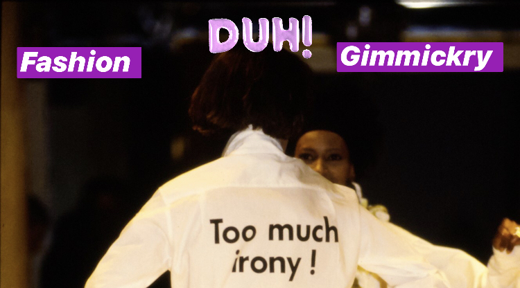
Moschino AW 2000 collection. Collage and additions to image made by the author
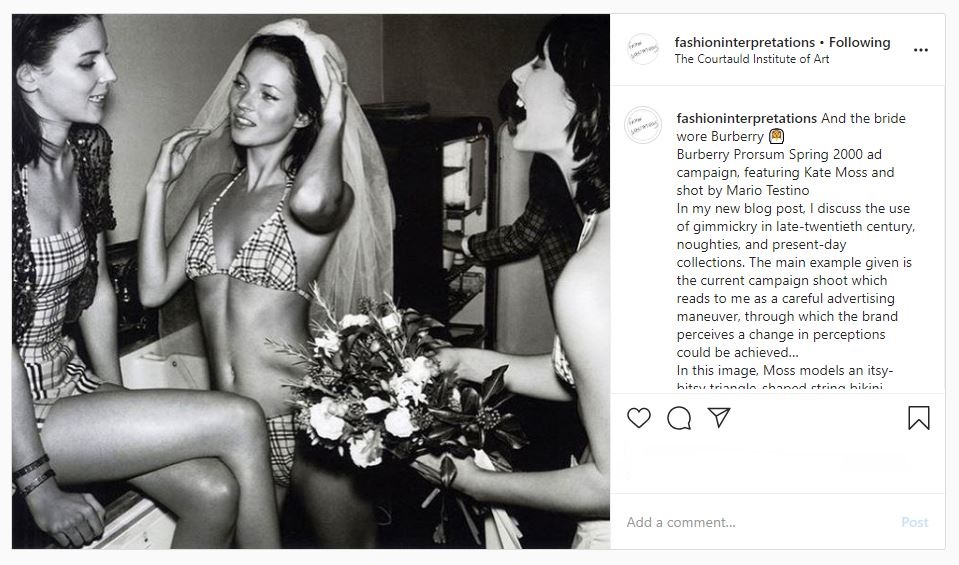
If you haven’t seen Burberry Prorsum’s Spring 2000 campaign, I insist that you go and look at the images immediately. As a gal who grew up immersed in Britain’s bizarre 00s culture (2000-2010 saw me transition from mini-me to little-woman), this shoot speaks to me through a diverse and divisive assortment of distinctly British nuance. The Burberry Prorsum ready-to-wear collection, prorsum which in Latin means to move “forwards”, was launched in 1998 by the British luxury fashion house’s then creative director Roberto Menichetti. In this frenzy of faux-candid shots by Mario Testino, supermodels Kate Moss, Stella Tennant and Liberty Ross dance through the bustling set of a raucous & decadent wedding party – with one, distinct Burberrian twist. The bride, Miss Moss, wears check. A check triangle-bikini, a check 00s-style svelte slip dress with a billowing veil to boot, a sweet but boxy check-print A-line skirt and tweed jacket twin set; the print is the thread that runs through each individual photograph, weaving together the parts of a wider narrative into one cohesive whole.
Burberry Prorsum Spring 2000 campaign, featured on Fashion Interpretation’s Instagram feed
This shoot was intended to push Burberry forward into its newly reimagined and, most importantly, much sexier future (which was further heightened by Christopher Bailey’s arrival after his departure from under Tom Ford’s electrically sexy reign at Gucci in 2001), retaining its quintessential Britishness but stripping the luxury brand of its “undesirable” associations with two polarising social stereotypes: the Burberry check’s newly acquired position as the poster-fabric for Britain’s “chav culture” (which would continue well into the noughties) and their longstanding union with British conservatism, merrily lining the biscuit-beige trenches of sloane-rangers for many decades past – townies vs. country life. It was a storyline that traversed the Atlantic, perpetuated by British and American tabloids alike, The New York Times Magazine even publishing a feature on ‘The ‘Chav’ Hat In Elizabethan England’.[1] This mass-dissemination of Burberry’s staple, heritage tartan, soft yet structured, versatile yet enduring; was undoubtedly the consequence of counterfeit-culture. In the storyline of this ad campaign, the check is very strategically recast as the titular lead (it doesn’t hurt that it’s draped across Moss’ super*nova*model frame), and its importance is reclaimed with vigour but also a knowing artfulness. As though Menichetti understands the much-needed influence of gimmickry in the process of Burberry’s rebranding, so here he/Testino play with a complex form of gimmick – the self-referential kind.
In 2012, Maureen Mullen, the director of research and advisory for L2 “a think tank for digital innovation” – which that year named Burberry the top-ranked brand in its ‘Digital IQ Index’ for the second consecutive year – stated that: “Burberry in 2005 meant British and plaid … that brand now, in the minds of consumers, means British, plaid – and innovation”.[2] The utilisation of gimmickry, a tongue-in-cheek self-mocking, could have played a small role in the realignment of Burberry’s public image – though a clamp-down on counterfeiting, huge investments into technological innovation and the hiring of Angela Ahrendts couldn’t have hurt the brand either.
In today’s contemporary global fashion market, we see gimmick in design everywhere. Designers including Virgil Abloh and his Off-White streetwear offerings, fashion industry commentators @diet_prada or Instagram designer/illustrators like @benjaminseidler interpret contemporary pop-culture through shtick-coloured glasses; with entire collections showing at fashion month often being focused around one, singular gimmick. Take Jeremy Scott for example and his tenure at Moschino, with Scott currently performing as the 2010s pop-culture “King of Kitsch”, we have seen him repurpose everything, from literal rubbish and black bin-liner minis (AW17), to kids cut-out clothes mocked up as life-size looks (SS17, à la AW00 Galliano), Gigi Hadid as a ginormous bouquet of flowers (SS18, à la René Gruau for Dior in the 1970s) and the infamous McShino “Click & Collect” straight from the runway AW14 collection.
But as Franco Moschino put in print (Moschino AW 2000), sometimes we simply have to exclaim: “Too much irony!”