If you haven’t seen Burberry Prorsum’s Spring 2000 campaign, I insist that you go and look at the images immediately. As a gal who grew up immersed in Britain’s bizarre 00s culture (2000-2010 saw me transition from mini-me to little-woman), this shoot speaks to me through a diverse and divisive assortment of distinctly British nuance. The Burberry Prorsum ready-to-wear collection, prorsum which in Latin means to move “forwards”, was launched in 1998 by the British luxury fashion house’s then creative director Roberto Menichetti. In this frenzy of faux-candid shots by Mario Testino, supermodels Kate Moss, Stella Tennant and Liberty Ross dance through the bustling set of a raucous & decadent wedding party – with one, distinct Burberrian twist. The bride, Miss Moss, wears check. A check triangle-bikini, a check 00s-style svelte slip dress with a billowing veil to boot, a sweet but boxy check-print A-line skirt and tweed jacket twin set; the print is the thread that runs through each individual photograph, weaving together the parts of a wider narrative into one cohesive whole.
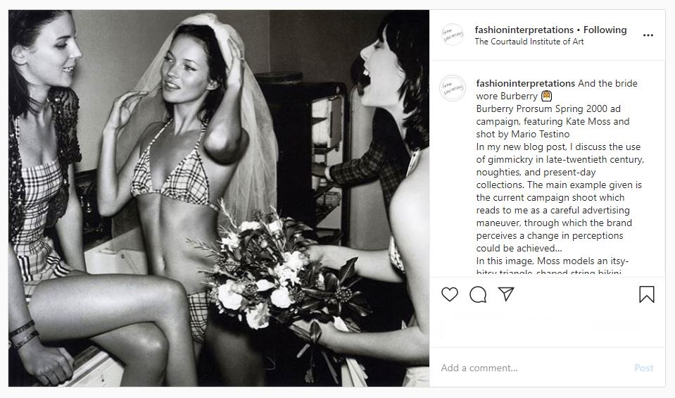
This shoot was intended to push Burberry forward into its newly reimagined and, most importantly, much sexier future (which was further heightened by Christopher Bailey’s arrival after his departure from under Tom Ford’s electrically sexy reign at Gucci in 2001), retaining its quintessential Britishness but stripping the luxury brand of its “undesirable” associations with two polarising social stereotypes: the Burberry check’s newly acquired position as the poster-fabric for Britain’s “chav culture” (which would continue well into the noughties) and their longstanding union with British conservatism, merrily lining the biscuit-beige trenches of sloane-rangers for many decades past – townies vs. country life. It was a storyline that traversed the Atlantic, perpetuated by British and American tabloids alike, The New York Times Magazine even publishing a feature on ‘The ‘Chav’ Hat In Elizabethan England’.[1] This mass-dissemination of Burberry’s staple, heritage tartan, soft yet structured, versatile yet enduring; was undoubtedly the consequence of counterfeit-culture. In the storyline of this ad campaign, the check is very strategically recast as the titular lead (it doesn’t hurt that it’s draped across Moss’ super*nova*model frame), and its importance is reclaimed with vigour but also a knowing artfulness. As though Menichetti understands the much-needed influence of gimmickry in the process of Burberry’s rebranding, so here he/Testino play with a complex form of gimmick – the self-referential kind.
In 2012, Maureen Mullen, the director of research and advisory for L2 “a think tank for digital innovation” – which that year named Burberry the top-ranked brand in its ‘Digital IQ Index’ for the second consecutive year – stated that: “Burberry in 2005 meant British and plaid … that brand now, in the minds of consumers, means British, plaid – and innovation”.[2] The utilisation of gimmickry, a tongue-in-cheek self-mocking, could have played a small role in the realignment of Burberry’s public image – though a clamp-down on counterfeiting, huge investments into technological innovation and the hiring of Angela Ahrendts couldn’t have hurt the brand either.
In today’s contemporary global fashion market, we see gimmick in design everywhere. Designers including Virgil Abloh and his Off-White streetwear offerings, fashion industry commentators @diet_prada or Instagram designer/illustrators like @benjaminseidler interpret contemporary pop-culture through shtick-coloured glasses; with entire collections showing at fashion month often being focused around one, singular gimmick. Take Jeremy Scott for example and his tenure at Moschino, with Scott currently performing as the 2010s pop-culture “King of Kitsch”, we have seen him repurpose everything, from literal rubbish and black bin-liner minis (AW17), to kids cut-out clothes mocked up as life-size looks (SS17, à la AW00 Galliano), Gigi Hadid as a ginormous bouquet of flowers (SS18, à la René Gruau for Dior in the 1970s) and the infamous McShino “Click & Collect” straight from the runway AW14 collection.
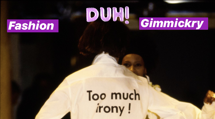
But as Franco Moschino put in print (Moschino AW 2000), sometimes we simply have to exclaim: “Too much irony!”
Sources
[1] Walker, Rob. ‘The Good, the Plaid and the Ugly’. The New York Times Magazine. January 2, 2005. https://www.nytimes.com/2005/01/02/magazine/the-good-the-plaid-and-the-ugly.html
[2] Cronin, Emily. ‘Burberry: entrenched in the digisphere’. The Telegraph: Fashion (UK). November 24, 2012. http://fashion.telegraph.co.uk/news-features/TMG9694181/Burberry-entrenched-in-the-digisphere.html
