Tag Archives: Vogue

Fantasy, Nostalgia and Norman Parkinson

Norman Parkinson’s fashion photographs are imbued with contradictions. His ‘action realist’ images juxtapose narratives of fantasy. He pioneered dynamic depictions of women in motion yet excelled in his arrangements of the female body in quiet moments of poised and pensive stillness. Despite Parkinson’s seven-decade career, his contemporary Cecil Beaton credited his ability to reinvent his photographic style ‘according to the necessities of the day.’ However, Parkinson was a self-proclaimed nostalgic photographer, admitting ‘nostalgia is for me one of the great emotions, I have to edit this tendency a bit’. Nostalgia permeates Parkinson’s fashion photography, hidden within his characteristically colourful and energetic compositions, which distinguished him from his contemporaries.
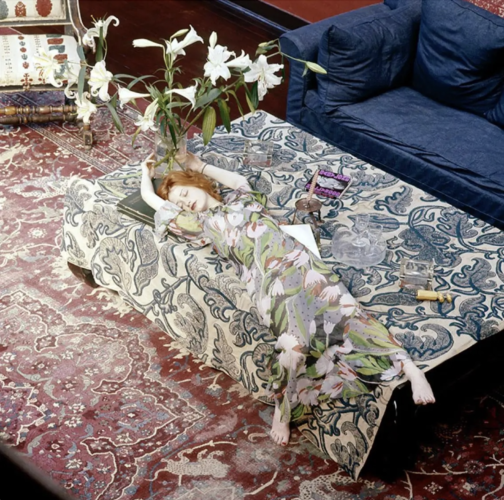
Norman Parkinson, Nicky Samuel, British Vogue, December 1972, chromogenic print, 76.2 x 76.2 cm (1st Dibs)

A flame-haired figure with a lily-white complexion, seemingly floating on an ocean of textiles, stretches her limbs as if in a fairy-tale slumber. Nicky Samuel, a socialite and wife to the owner of Granny Takes a Trip boutique, drapes herself across her richly furnished interior space. Parkinson scatters visual clues throughout the composition to create a sense of unease; a corkscrew and two empty glasses perhaps hint to hedonistic over-indulgence whilst also revealing that she is not alone. A discarded copy of Hollywood Babylon (a controversial exposé of Hollywood’s sordid underbelly of sex scandals and mysterious murders) transforms her dishevelled slumber into something more sinister. The lilies that tower over her, inevitably staining her porcelain face with sickly pollen, symbolise both purity and death.

In the late 60s and early 70s, the misty medievalism and mythology of the Pre-Raphaelite Brotherhood, the Victorian art movement, wafted into contemporary consciousness. This nostalgic influence was evidently not lost on Parkinson. The impression of submersion, the floral motifs, Samuel’s Pre-Raphaelite characteristics and the morbid undertones of the composition all call to mind John Everett Millais’s Ophelia. However, featured in British Vogue in December 1972, Parkinson’s image indicates how casually Pre-Raphaelite iconography seeped into fashion contexts from the late 1960s onwards. The similarities between Parkinson’s image of Samuel and Millais’ Ophelia are potentially non-coincidental. Although Pre-Raphaelite art had remained largely unpopular up until its revival in the 1960s, a 1967 exhibition of Millais’s work at the Royal Academy would have brought him, and Ophelia, to the forefront of contemporary artistic culture.
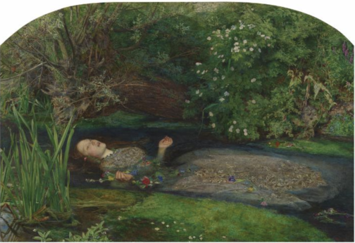
John Everett Millais, Ophelia, 1851-52, oil on canvas, 76.2 × 11.18 cm, Tate Britain, London (Tate Britain)

Direct comparisons can be drawn between Samuel and Ophelia. Both are seemingly floating atop a surface punctuated by flowers. While Ophelia’s saturated gown drags her into the watery abyss of death, Samuel’s heavily patterned chiffon dress, designed by Ossie Clark and Celia Birtwell, drowns her body in bold tulips and pulls her deeper into the ripples of patterns. Like the Pre-Raphaelite Brotherhood’s ‘truth to nature’ philosophy, Parkinson was ‘not interested in anything that nature hasn’t smiled upon’, and he was reluctant to retouch his prints. Parkinson’s ability to capture the wider nostalgic resurgence of Pre-Raphaelite art in the 60s and 70s infuses his composition with a desire to return to a realm far removed from the synthetic modernity of post-war Britain. Yet, despite the arguably sinister undertones of Parkinson’s composition, there is something comforting in Samuel’s doll-like appearance and the ease of her lethargic pose.

Parkinson’s childhood memories of time spent in the countryside, espying ‘girls with loose dresses and a minimum of underclothes…lying around the lawn with languorous ease’ potentially informed his depiction of Nicky Samuel. Parkinson himself attests to this, stating that, throughout his career, ‘I photographed the memory of those well-observed weekend girls that I had seen through the fence’. This indicates that Parkinson’s photography is consciously informed by his nostalgic, and perhaps voyeuristic, tendencies.

Robin Muir argues that Parkinson ‘effortlessly transferred the spirit of neo-romantic pastoralism into a resolutely urban environment’. This is perhaps applicable to his depiction of Samuel, given that she is situated within her Chelsea home. Parkinson’s ability to bring the outdoors into the domestic realm conveys a suspension of reality. Parkinson himself claimed that ‘if you are going to be an artist – even a photographer – I think you have to major in fantasy.’
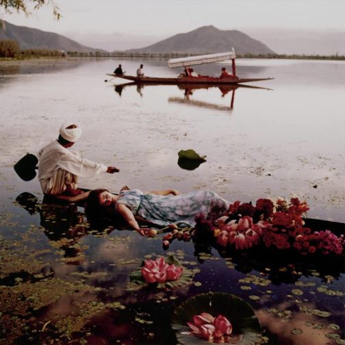
Norman Parkinson, Floating with Flowers, British Vogue, 1956, chromogenic print, 66 x 66 cm (Sotheby’s)

Furthermore, Parkinson’s portrayal of Samuel also mirrors his image from a 1956 location shoot in India for British Vogue. Like Samuel and Ophelia, model Barbara Mullen lies atop a watery expanse, in this case Dal Lake in Kashmir, laced with tulips, lilies and other exotic flowers. The dappled sunlight on the otherwise pristine surface of the lake reflects the clouded pattern of her dress. Yet, like Millais’ Ophelia, there are morbid undertones to this image. Mullen’s indifferent gaze into the middle distance and her partial submersion render her body totally passive. The boat on which she lies is obscured by, and overflowing with, flowers, which perhaps calls to mind a funeral boat. However, this image epitomises Parkinson’s excessively glamorous overseas fashion shoots in a time when long-haul travel was still fledgling.

Parkinson’s saturated use of colour is also notable. It wasn’t until the mid 1970s that he was working almost exclusively in colour, and this vibrant image from 1956 would have been situated among the largely black and white pages of British Vogue. Parkinson himself stated ‘I’m sure all the best photographers use black and white, but… I dream in colour…for me colour has always held more magic,’ which further hints to the degree of fantasy that underlined much of his work.

In his depiction of Nicky Samuel, Parkinson’s composition not only embodies the nostalgic fascination with the Pre-Raphaelites that resurged during the late 1960s, but also his nostalgic twinge for his idyllic childhood and his own photographic oeuvre.

By Claudia Stanley

Sources:

Anon., ‘Precious Original: Augustus John’s Chelsea Studio Regenerated by Nicola Weymouth’, British Vogue, No. 15, Vol. 129 (London, December 1972), pp. 128-129

Louise Baring, Norman Parkinson: A Very British Glamour (New York, 2009)

Robin Muir, Norman Parkinson: Portraits in Fashion (London, 2004)

Lucy Paquette, ‘James Tissot and the Revival of Victorian Art in the 1960s’. The Hammock (July 2004) https://thehammocknovel.wordpress.com/2014/07/31/james-tissot-and-the-revival-of-victorian-art-in-the-1960s/ accessed 29/03/22)

Norman Parkinson, Lifework (London, 1986)

Seeing in Technicolour: The (Un)dressed Body Brought to Life

IMAGE 1 Technicolour
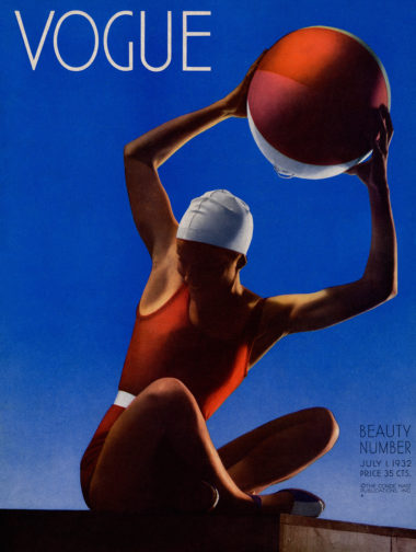
Edward Steichen, Cover of Vogue. July 1, 1932. Courtesy Condé Nast. © 2014 The Estate of Edward Steichen/Artists Rights Society (ARS), New York

As coloured photography started to seep into the pages of Vogue during the 1930s, it shifted the ways in which fashion consumers and spectators appreciated the dressed body. Simultaneous to this technological progress of fashion magazines was the modernisation and arguable liberation of the body itself. The first in-colour Vogue cover by Edward Steichen in July 1932 attests to this. Playfully raising a beach ball above her head, the model is sporting red swimwear with a white belted detail to emphasise her lean frame, and a white cap. Mirroring the colours of her ball, her vibrant body juxtaposes the gradated blue sky that upwardly intensifies behind her. This is an image of colourful contrasts; red stubbornly clashes with blue, white breaks up the composition, and even her shoes are two-toned. The depth of the colours evoke a sense of warmth and humidity. We can only hope to be transported to where she is and to look as chic as she does in a swimming cap. Perhaps buying Vogue will help get us there…

Although shot indoors in the studio using a 108-inch plate camera that Condé Nast insisted his photographers work with, Steichen’s lighting techniques evoke summer evening sun. This convinces the viewer that the model has spent an entire day of leisure and sport at the beach. The connoted low sunlight highlights the contours of the model’s armpits, her toned arms, wrist tendons, sharp elbows, the dents on her knees and the overall sculptural quality of her tanned body. The white segment of the beachball that orbits her athletic frame evokes a waning crescent moon, perhaps signalling that dusk is approaching. Her shadowed face creates a canvas of anonymity onto which the Vogue reader can project themselves. We can see that she is smiling in unapologetic enjoyment. Her averted gaze suggests that she is unaware of being watched, or even being photographed in an inorganic, staged setting.

Aside from a hint of feathery eyelashes, her body is totally hairless, stressed by the cap that protects her hair from seawater and the unrelenting sun. This evokes the smooth, marble-like texture of her skin. The primary colours evoke a sense of childish playfulness; this is a woman unshackled by social convention or responsibility. She embodies care-free leisure as well as women’s progressively and fashionably active lifestyles. Having been exposed to this vibrant image, it is hard to imagine what her body, or the overall composition, would look like in black and white.

IMAGE 2 Technicolour
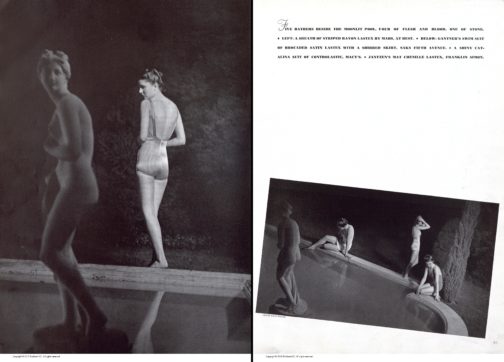
Harper’s Bazaar, June 1939, New York Vol. 72, Iss. 2724, pp. 60-61, Proquest

Harper’s Bazaar’s swimwear editorial from June 1939 stands in stark contrast to the highly saturated cover of their rival Vogue. Shot in black and white, the models’ skin takes on the luminosity of classical marble statues. Unlike the evocation of the setting sun in Vogue’s cover, here we get a sense of bright moonlight illuminating exposed flesh. In the image on the left, a woman stands with her back to us, reflecting the pose of the statue situated in the centre of a pool within a secluded wood. This mirror-image establishes a direct connection between woman and sculpture, as if the touch of moonbeams has metamorphosised her from antique marble into living, breathing flesh. Her closed-off body language could suggest that she senses she is being watched in this intimate moment of midnight bathing. The article reads ‘five bathers beside the moonlit pool, four of flesh and blood, one of stone’, which heightens the idea of mythical transformations.

The model’s striped swimsuit takes on a silvery quality and the low scooped back exposes the gentle curvature of her spine. The image on the right depicts three more models poised tentatively on the edge of the pool. They resemble mythological nymphs bathing out of view of mortal eyes. Their poses are fairly natural; their bodies have not been manipulated to cater to the male gaze, perhaps explained by the female photographer Louise Dahl-Wolfe and the predominantly female readership of Harper’s Bazaar. By presenting the female body at different angles, it offers a three-dimensional, sculptural appreciation of the body as well as a well-rounded impression of the swimwear. Their toned bodies highlight that these are active, modern women. There lingers a sense of seclusion and privacy through the implicit separation from the male gaze. Fashion magazines including Vogue and Harper’s Bazaar promoted exercise regimes linked to classical ideals of athleticism, which were often untaken in separation from men. This image potentially evokes this secure seclusion away from prying eyes. In this instance, even when women are depicted as active and exercising, they still retain a sculptural quality. Perhaps if this image had been captured in colour, it would imbue their statuesque bodies with vitality and thus reflect the cultural shift towards women’s more dynamic and active lives.

By Claudia Stanley

Sources:

Rebecca Arnold,Movement and Modernity: New York Sportswear, Dance, and Exercise in the 1930s and 1940s’, Fashion Theory, vol. 12, no. 3 (Oxfordshire, 2008), pp. 341–57, https://doi.org/10.2752/175174108X332323

Susanna Brown,Introduction: Inventing Elegance, Horst: Photographer of Style, exhibition catalogue, Victoria and Albert Museum (London, 2014), pp.11-21

Harper’s Bazaar, June 1939, New York Vol. 72, Iss. 2724

An Ode to Grace

The burn out from sitting at the same desk for weeks on end is starting to get to me. Starved of external stimuli, I’ve found myself scrolling through Pinterest, Instagram, even Tumblr, for images which might evoke a sense of life before lockdown. In my search for inspiration, I keep coming back to the work of Grace Coddington. The iconic stylist known for her collaborations with Bruce Weber, Annie Leibowitz and Mario Testino amongst others, she is hailed by many as the most influential fashion editor of the past forty years. Her eclectic repertoire, from moody to ethereal to romantic to noir, provides an endless source of uplifting imagery. Over the past few weeks, I have found myself pondering what makes her images so unique, and indeed so ‘Grace’.

Vogue US, April 2012. photographed by Tim Walker. Styled by Grace Coddington. Via Instagram: @supernovafashionn

In her memoire, Grace reflects, ‘For me, one of the most important aspects of my work is to give people something to dream about, just as I used to dream all those years ago as a child looking at beautiful photographs.’ As Fashion Director of British Vogue and, later, as Creative Director of American Vogue, she masterminded page after page of dream-like editorial. Naomi Campbell in a white convertible surrounded by a pack of dalmatians. Natalia Vodianova as Alice in Wonderland flanked by John Galliano as the Red Queen and Stephen Jones as the Mad Hatter. Keira Knightly bottle feeding an elephant in Kenya in Comme des Garçons. All these images are rooted in the same desire to create a world which readers can escape to and momentarily revel in the beauty of the impossible.

Vogue US, December 2003. Photographed by Annie Leibovitz. Styled by Grace Coddington. Via Instagram: @cybele.atis; Vogue Britain, June 1990. Photographed by Peter Lindbergh. Styled by Grace Coddington. Via Instagram: @inniconceptualmagazine

Grace is thought of by many as a romantic heroine who premises her work solely on her vision of beauty as opposed to commercial ideals. In the 2009 documentary The September Issue, we see her grappling with Anna Wintour over budget and advertising constraints, adamantly defending her twenty-two-page spread ‘Paris, je t’aime’. When she arrives at the Palace of Versailles to shoot the September 2007 couture story, she becomes tearful when confronted by the beauty of the gardens and reflects ‘I think I got left behind somewhere as I’m still a romantic.’ For me, this moment perfectly encapsulates the essence of Grace, and her authentic approach to fashion. In the midst of an increasingly commercialised industry, her images have a sense of purity and fullness, and it is as if she is seeing everything for the first time.

Vogue US, September 2007. Photographed by Stephen Meisel. Styled by Grace Coddington. Via Instagram: @bibajude; Vogue US, December 2013. Photographed Annie Leibovitz. Styled by Grace Coddington. Via Instagram: @arthistoryfashion

Despite her reputation as one of the bastions of the fashion industry, Grace has always professed to disliking trends. In weaving her own narrative out of the latest looks, she creates a timeless vision which immunises the clothes from the ravages of time. In American Vogue’s September 2007 issue, she styled Fall/Winter Giorgio Armani and Carolina Herrera in the style of Brassai’s 1920s photographs of Paris. In the magazine’s December 2013 cover story, she styled Jessica Chastain in Alexander McQueen posing as Vincent van Gogh’s 1888 painting La Mousmé. In the December 1996 fashion feature, ‘A Feast For the Eyes’, nine supermodels are presented in Christian Lacroix Haute Couture, having a picnic in the park.

In her images, Grace creates stories and characters around the clothes, and in doing so she makes fashion secondary to beauty. This gives her work an enduring quality, and her images remain as magical now as when they were first created.

By Violet Caldecott

Sources:

https://www.theguardian.com/fashion/2016/jan/23/grace-coddington-the-woman-who-made-fashion-art

https://www.anothermag.com/fashion-beauty/8239/lessons-we-can-learn-from-grace-coddington

https://www.dazeddigital.com/fashion/article/32576/1/peek-inside-grace-coddington-s-new-book

https://www.vogue.fr/fashion-culture/fashion-books/diaporama/eight-unforgettable-grace-coddington-fashion-editorials/37515?amp=

University Girl Wardrobe Essentials

What are the fashion staples any university girl must have in her wardrobe?

If you were one of the lucky young women attending university in the 1940s, numerous magazines had entire sections dedicated to helping you budget and obtain the perfect collegiate capsule wardrobe. I recently came across a number of these articles from both Women’s Wear Daily and American Vogue, dating from 1940 to 1946. The recurrent theme is how to achieve the most variation in a wardrobe with the fewest essential items. Naturally, there was wide variation in what was deemed essential, and proposed budgets varied from $100 for an austere annual collegiate wardrobe (Vogue, August 1941) to a lavish $1,400 (Women’s Wear Daily, December 1940). What then is the verdict on the wardrobe essentials for a 1940s female collegian?

Following the lead of the articles from the time, I’m going to break the wardrobe necessities down into categories. These will be: Dresses, Suits, Separates, Outerwear and Extras.

‘$100 Campus Wardrobe’, Vogue August 15, 1941

Dresses: A college girl would ‘need’ anywhere from three to ten dresses. In the most austere case of three dresses, she would need one formal dress, for events such as faculty dinners or serious dates. The other two dresses would be day dresses, either in cotton, rayon or silk, and preferably one in wool. For a girl with a larger budget, two nice dresser were necessary, one for formal events, and one ‘dressy black crepe, for fall date and town wear.’ She would also have at least two wool, two or three rayon or silk prints and four to six cotton dresses.

Suits: The most highly advertised item was a fashionable suit. The girl on a $100 budget might have one suit, while more fortunate girls would have three to six. In 1942, Vogue listed tweed as the number one must-have suit material, but in 1946, it had been ousted by gabardine, preferably in black, navy, brown or beige. In 1946, the tweed suit was still one of the top preferences, however, and was seen as ‘an intrinsic part of campus wardrobe.’

‘Campus Wardrobe’, Vogue, August 15, 1942

Separates: Separates were highly valued by college girls, as they added much variety to a constricted wardrobe. These items fell into their own categories: blouses, sweaters, skirts and trousers. At least three blouses, a mix of white collared masculine  shirts and feminine styes, were recommended. A simple wardrobe would have at least two sweaters: one long sleeve turtleneck in a subtle colour such as black or grey, or a bolder red, and another sweater in a college-specific colour. The most minimal wardrobe would feature two pleated skirts; a better funded one would have four, in plaid, pastels or checks. Finally, trousers. While never listed as essentials, tailored slacks, pedal-pushers and mens bluejeans were listed as ideal additions to a collegiate wardrobe. Some universities showed approval with loose regulations on length and styles. 

Coat: All the articles agree that every college lass needed at least one good wool coat. Brown, camel hair and beige box coats are recommended.

Extras: Finally, all the extra bits that pull a wardrobe together. Undergarments aren’t included in the descriptions, except where specific mention of the importance of stockings is made. The importance of a good hat and gloves is very explicit, however. Minimalist wardrobes suggest one hat and a turban, with one pair of versatile all-weather gloves. Berets in dark or bold colours are suggested, as are feminine felt riding hats. To finish off a college wardrobe is a sturdy pair of shoes. One or two pairs of oxfords or ‘moccasins’ are essential.

So, do you have all your college wardrobe essentials?


Both images accessed via Proquest.

Are You Educated in Art?: Vogue and Taste

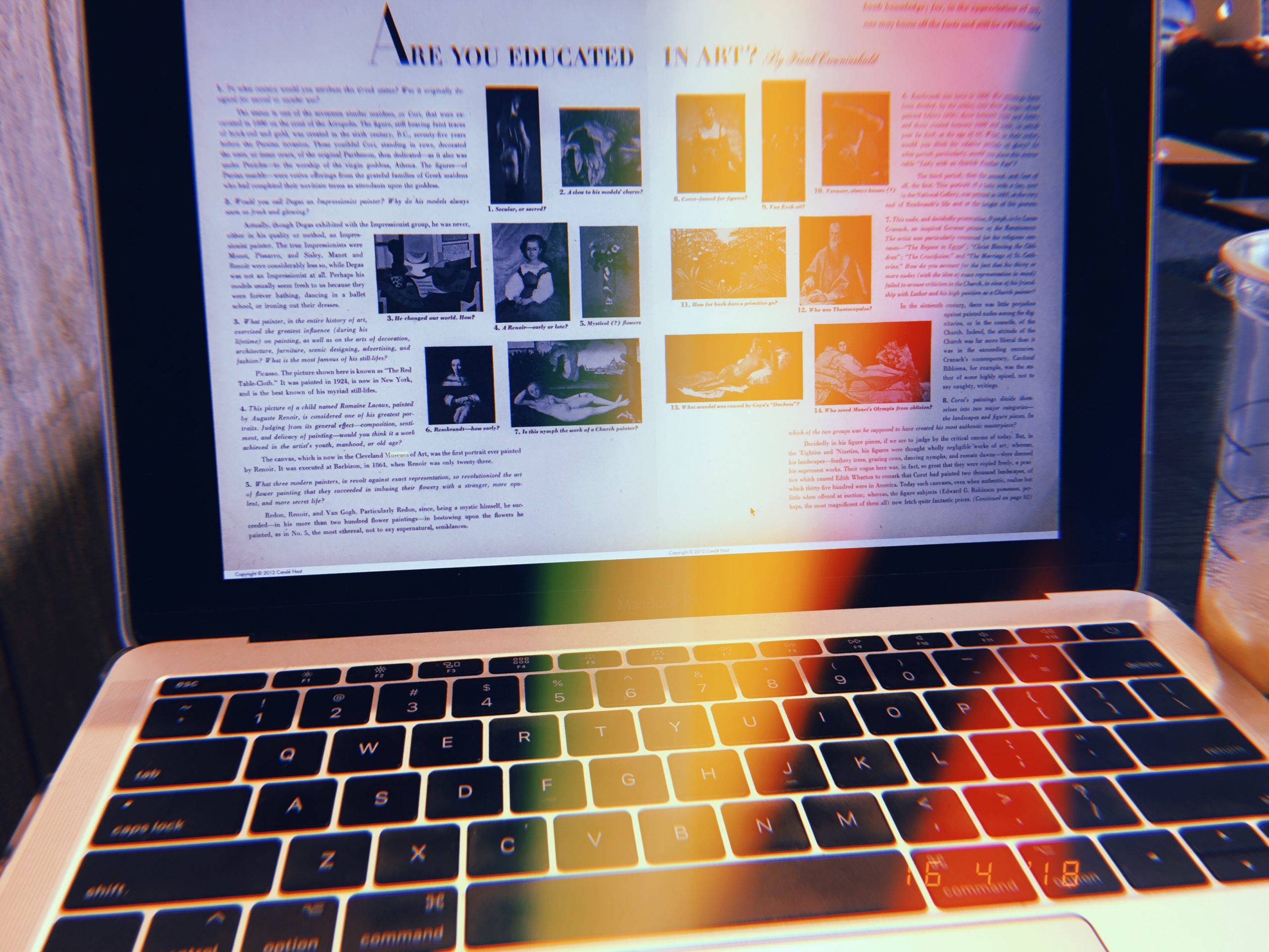
The other night my dissertation research had me searching through Vogue’s 1944 issues and while I didn’t find what I was looking for, I did come across an article that stopped me in my tracks. As an (aspiring?) art historian, the editorial titled “Are You Educated in Art?” in the January 1, 1944 edition of Vogue caught my attention. In this two-page spread art critic Frank Crowninshield instructs the reader about Western art history in the form of fourteen questions. Crowninshield provides answers to various questions ranging from the use of archaic Greek statuary to the influence of Picasso.

Although this questionnaire comes across as an art history pop-quiz, the text insists that it “has little more to do with your discernment and taste than with your study-book knowledge; for, in the appreciation of art, one may know all the facts and still be a Philistine.” The use of the word “taste” here is integral to the reader’s reception of this article. IAntje Krause-Wahl describes that in this period, “Vogue increasingly saw it as its responsibility to guide their readers in the principles of good taste. Jessica Daves, who in 1952 followed Edna Woolman Chase as editor-in-chief, explicitly formulated this when she described the magazine as a ‘vehicle to educate the public taste.’”

The use of art and the acquisition of art historical discernment played an integral role in Vogue’s discourse on how to obtain taste. Later, in July 1945 Vogue even devoted an entire issue to the Museum of Modern Art which featured Marcel Duchamp’s “The Large Glass” on the cover. Thus, the 1940s Vogue reader not only knows the latest fashions but she also acquires other skills crucial to being an ideal society lady such as knowledge of art history and an interest in modern art. Indeed, women’s magazines such as Vogue act as “instruction manuals” of femininity. This direct appeal to its reader to cultivate their taste and learn how to properly appreciate art, provides an excellent example of the way in which fashion magazines work to construct femininity and teach artistic literacy.

By Abby Fogle

Sources:

Craik, Jennifer. The Face of Fashion: Cultural Studies in Fashion. London: Routledge (1994), 47.

Crowninshield, Frank. “Features/Articles/People: Are You Educated in Art?” Vogue 103, no. 1 (1944): 48-49, https://search.proquest.com/docview/879229981?accountid=10277.

Krause-Wahl, Antje. “American Fashion and European Art—Alexander Liberman and the Politics of Taste in Vogue of the 1950s” in the Journal of Design History Vol. 28, No. 1. (2015).  doi:10.1093/jdh/epu041.

Star Wars & Fashion: A look into the galactic love affair


With Star Wars: The Last Jedi reaching over $1 billion at the box office and earning the title of the highest grossing movie of 2017, Star Wars is once again at the forefront of the cultural moment and subsequently continuing the franchises’ love affair with fashion.

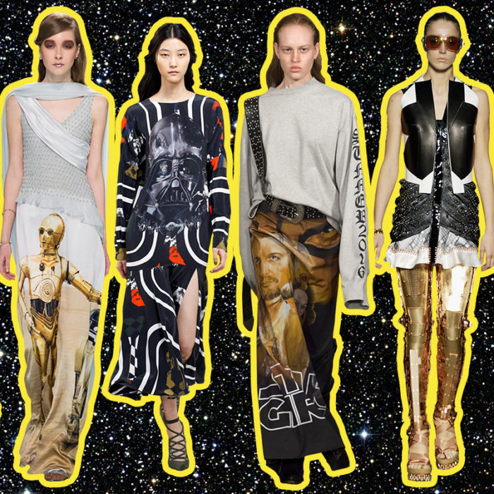
From the film’s debut in the 1970s, Star Wars has been a source of inspiration for fashion, even appearing in Vogue in a 1977 spread featuring Jerry Hall and Darth Vader. The franchise’s equally iconic characters and costumes have sparked Star Wars’s influence on high fashion. Rodarte closed its Fall 2014 show with gowns featuring Star Wars characters Luke Skywalker, R2-D2, C-3PO, and Yoda. Preen Fall 2014 channeled the dark side and featured Darth Vader’s mask on several pieces. Vetements created a spoof on a Star Wars movie poster (its film is titled Star Girls) as a print on a maxi skirt in its Spring 2016 collection. Just recently, in time for the release of The Last Jedi, Rag & Bone partnered with Star Wars to produce a limited-edition collection inspired by the films.

Beyond the aesthetic coolness of these high fashion designs, why do fashion designers look to Star Wars for inspiration and why do we race to wear our favorite Jedi or Sith Lord on our bodies? Is this pure fashion as escapism? Or perhaps the allure is Star War’s ability to paradoxically position itself both in a galaxy far, far away and at the center of the current culture. Fashions with Star War’s iconography or aesthetic inspiration can transport the wearer to an outside realm where a nobody can be the hero of the universe. But these styles also allow the wearer to embody a culturally relevant phenomenon.

From a marketing standpoint, Star Wars is sellable to multiple age groups and can piggyback off of the marketing for the film itself. However, I argue that the urge to clothe ourselves in the symbols and characters of Star Wars reveals a collective desire for escapism, association with a far-off time and place, and at the same time, the need to assert our own cultural relevance. Whether fashion imitates the austere neutral colors of the Jedi Order or the harsh blacks and shiny exteriors of the dark side, the pull to wear the Force is strong.

By Abby Fogle

Thoughts on Birkenstocks

Birkenstock website homepage.

The other day, while mindlessly scrolling down my Facebook newsfeed, I stopped for a few seconds as an ad for a Vogue article entitled: ‘BirkenShock! After 242 Years, Birkenstock Premieres at Paris Fashion Week’ caught my eye. Nevermind the fact that this means that all of the lovely internet cookies are doing their slightly scary work of keeping track of the fact, that yes, I have been googling Vogue a lot. What really struck me was the article’s meaning, however. Birkenstock? At Paris Fashion Week? Really? I chuckled slightly, and then sat back in awe, marvelling at what appears to be a genius piece of marketing strategy. Growing up as a child in Germany, I can safely say that, in my own experience, Birkenstocks were popular, but not cool, let alone fashionable. Practical? Yes. But not cool at all. They were worn widely but seemed especially popular in slightly musty smelling organic shops. Not at all like the health food, hipster-ised places today, but the ones you only ventured into when you had a genuine food allergy (dairy and wheat in my case) and had no other choice. You would be served by middle-aged, muscular, skinny women called Maike or Ortrud, that probably lived on a diet of sunflower seeds and herbal tea alone; fabulous non-conformists with sun tanned skin, crop tops and long skirts. The other place the cork soled shoe could be spotted almost with certainty every time was a doctor’s office. Pared with clinical white trousers, shirts and overcoats they formed part of the uniform of horror that greeted you for your set of vaccinations – a known traumatic experience of any childhood. Birkenstocks back then were and still are deemed as a health shoe; they were comfortable and practical, impeccably German and not the most aesthetically pleasing.

The short article in Vogue, too stresses their health aspect, but quotes Birkenstock’s CEO as justifying the brand’s venture into fashion by saying: ‘We have been in the fashion industry for so many years already! Go around and ask every top photographer and stylist, they are all wearing Birkenstock…’. And really, while flicking through the slideshow of the fashion show on Vogue’s website you do feel that the shoe slots right in. The fact that the article appears in Vogue alone lends them increasing fashion credibility. Birkenstock’s own website also highlights them as a shoe for creatives, interviewing a few Londoners working in the creative field (fashion curator Shonagh Marshall amongst them) to showcase just how fashionable they are.

The Vogue article

Birkenstock’s are, for me, one of those very straightforward examples of the constant volatility within the cycle of fashion and also the tension between what is popular but not necessarily fashionable at any given moment and period of time. Clearly for me, the article in Vogue perhaps suggest I get over my childhood trauma, and give into the fashionable comfy-ness of the ultimate German shoe. Different to many other fashion fads, at least this one promises to keep my feet healthy…

Sources:

http://www.vogue.com/article/paris-fashion-week-birkenstock

http://mag.birkenstock.com/the-birkenstock-appreciation-club/

Introduction to the Courtauld History of Dress Journals Archive

The conference Reading Fashion Magazines may be over, but our display of 9 items from the collection is still available to be viewed outside the Courtauld Library vitrines. Please come and visit, before it closes in August. In order to tempt you, you can read the introduction to the display, and our conference, below, available for you to download in a pdf.

Introduction to the Courtauld History of Dress Journals Archive

Some of the earliest fashion magazines in the Courtauld History of Dress Journals Archive are on show in the exhibition. Here, Gazette du Bon Ton, Für die Dame and Pinpoints are displayed.
A view of the 1940s section of the exhibition featuring Harper’s Bazaar and Femina.
Elizabeth and three MA Documenting Fashion students after the completion of the exhibition instal.

Dissertation Discussion: Sophie

Photographs of Parkinson’s Wife, Wanda Rogerson in Robin Muir, ‘Norman Parkinson: Portraits in Fashion’ (London, National Portrait Gallery 2004)

What is your title?

The title of my dissertation will probably still change. However at the moment I am going with How very British: National Identity in Norman Parkinson’s fashion photography for Vogue, 1950-1952. Parkinson produced some stunning images for different spreads, many of which lend themselves really well to a study of British national identity. Delving a little deeper into these specific images, Parkinson’s biography and the history of 1950s Britain has been great fun.

What prompted you to choose this subject?

The topic stemmed from a mixture of previous interests and pure chance. I had no pre-conceived idea of what I wanted to look at for this dissertation. However, I always studied World War II and the Cold War when I had the chance as an undergraduate, so I knew I wanted to stick within that time frame. Couple this with my love of 1950s fashion and elegance, and the random selection of a beautiful book on Norman Parkinson whilst browsing the stacks at the Courtauld and – ta dah! – the dissertation title was born. I had also wanted to be practical about my choice and choose a topic that would enable me to make the most of London based archives. Norman Parkinson has his own in south London (big shout out to the lovely and wonderful people that work there!), so it all came together beautifully.

Norman Parkinson Archive

Most interesting research find thus far?

I believe I read in Parkinson’s book that Irving Penn babysat Parkinson’s son. As you do. No big deal. On a more serious note, I am still continually blown away by how clever his images are. They seem so simple at first glance, and then, the more you look, the more you realise just how good he was in expressing a certain image, feel or identity to a wide range of readers. This was especially interesting with regards to the way in which his photographs for a 1951 South Africa spread differed, or were used in a different way, from the May edition in British Vogue to the July edition in American Vogue. On a side note I have become obsessed with an image that I’m not even using in my essay. It is just too stunning. Everyone- google “Carmen’s Armpit” and you will understand! Or not, in which case it is just my inner dress history nerd coming to the fore…

Favourite place to work?

I would love to say that it is The National Arts Library in the V&A. It surely wins the award for most aesthetically pleasing place to study- but I tend to be freezing cold in there, so sadly it loses out. I rather fluctuate between the Courtauld Book Library and my home. This arrangement provides the perfect balance between the comfort of home (sneaking a couple of biscuits and copious amounts of tea) and the beautiful comradeship between all Courtauld students during dissertation time in the library. We all really share the stress and joys of the process and that is unbelievably valuable as you are working. *Insert cheesy violin music here!*

Courtauld Library

Dissertation Discussion: Yona

The finale of ‘Billy Rose’s Aquacade’, 1939. Romano Archives.

What is your title?

Billy Rose’s Aquacade & The Search for American Identity

The ‘Aquagals’ dressed as the Statue of Liberty, 1939. Romano Archives.

What prompted you to choose this topic?

For my dissertation, I am looking at American identity in the costumes of ‘Billy Rose’s Aquacade’, which performed during the 1939 and 1940 New York World’s Fair. Not being aware of the Aquacade’s existence until recently, I came across this topic by chance. During the past year, I have spent considerable time researching American fashion and identity and knew I wanted to continue exploring the subject. When looking for an American film clip archive, I came across the Prelinger Archive, which was founded by Rick Prelinger in 1982 in New York City and consists of around 60,000 ephemeral films. The archive contained amazing amateur films of the New York World’s Fair, which also showed the Aquacade. The Aquacade was the most extraordinary show that I had come across for a long time. Its vast array of different acts included synchronised swimming, diving, dance, skating, fashion, clowns, and performances by important athletes of the time, including Esther Williams and Johnny Weissmuller. Due to its extravagant declarations of Americanness, the Aquacade provides invaluable insight into American identity around the start of World War II.

A birds-eye view of the Aquacade, 1 September 1939. Vogue Archive.

Most interesting research find so far?

One of the most exciting parts of my research has been analysing the use of the American flag and American symbols as an expression of American identity in the Aquacade. During the first New York World’s Fair season, World War II broke out in Europe. Even though the United States did not enter the war until 1941, the American government realised that the US needed a defined identity to be able to unite its people in patriotism. As the US did not have strongly embedded traditions and copied European ideas and design styles until well into the 20th century, identity had to be based on something other than traditions that could be considered unequivocally American. Therefore, American identity focussed on history and symbols, including the American flag and the Statue of Liberty. The Aquacade incorporated the colours, stripes and stars of the American flag in its costumes and props, and even showed 48 dancers dressed as the Statue of Liberty – one for each state (Alaska and Hawaii only became states in 1959).

Four of Billy Rose’s ‘Aquabelles’ stage a fashion show of the past, present and future bathing suit styles at the New York World’s Fair, July 4, 1939. Getty Images.

Favorite place to work?

Even though I am writing on an active performance with important athletes, I have barely moved myself since starting my dissertation work. I have always preferred writing at home as I like the comfort and endless supply of tea and prefer not to have any distractions. As such, I have been living like a hermit, only leaving my room for food and tea.