Dissertation time has come for us MA students. My research on Footprints, a London-based fabric printing workshop active during the interwar years, has led me to Gunnersbury Museum, a local history museum based in Gunnersbury Park, London. While the museum is currently closed for renovation, the curators were kind enough to let me research their small but exciting collection of Footprints artefacts.
Footprints was established at Durham Wharf, Hammersmith in 1925. It produced hand block printed fabrics and garments which were sold at Modern Textiles, a small shop opened by Elspeth Anne Little at 46 Beauchamp Place, Knightsbridge in 1926.
Footprints was mainly staffed by female art students or recent graduates of the Central School of Arts and Crafts. It was initially run by Gwen Pike, a painting and block printing graduate of Birmingham School of Art. After Pike’s death in 1929 the workshop was taken over by Joyce Clissold, who had previously worked at Footprints as a Central School student. Clissold did most of the designing and carving of the lino blocks, while her employees prepared the dyes and did the printing.
Clissold eventually opened a shop called Footprints at 94 New Bond Street in 1933, followed by a second shop at 22 Knightsbridge in 1935. Both shops were located in London’s fashionable West End and attracted celebrity customers such as the actresses Yvonne Arnaud, Gracie Fields and Anna Neagle.
At Footprints, one could purchase lengths of hand block printed and painted fabrics, or small ready-made items such as scarves, shawls or hats. Customers who desired custom-made garments had their measurements were taken by ‘Madame Blanche’ – the working name of the in-house dressmaker Mrs. White.
Footprints jacket dating from the 1930s with ‘Huntsmen’ design in black and red on unbleached linen. At Gunnersbury Park. Photograph: Nelleke Honcoopetail of ‘Huntsmen’ jacket. Photograph: Nelleke Honcoop
The Shawl of her Dreams!
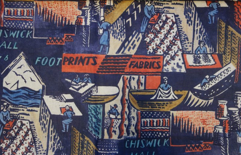
Footprints also advertised their fabric painting and printing services directly to dressmakers, which I discovered through an early publicity leaflet I came across in Gunnersbury Museum’s collection. In the leaflet, Footprints’ fabrics were described as “embroidered in dyes”. They were hand block printed and painted in “lovely colours, vivid or demure; designs flamboyant or modest”. For even more novelty and exclusiveness, the dressmaker’s own design could be carried out by Footprints.
The leaflet’s cover is gorgeously illustrated with a printed design of a fashionably short-haired lady. Seen from the back, she wears a fringed shawl with a bold floral design in blue, green, pink and purple. The illustration reminded me of a photograph from the Central Saint Martins Museum and Study Collection, which is the largest collection of Joyce Clissold and Footprints artefacts. In this photograph taken around 1927 Joyce Clissold poses wearing a shawl of her own design.
Finally, the leaflet conjured up a scene at a dressmaker’s establishment where the customer, or “Madame”, lays her eyes on just the perfect addition to her wardrobe: “That five minutes in the showroom on the way to be fitted. That’s when Madame’s eye roves… The SHAWL of her dreams! The SCARF that just goes with the tailor-made. The irresistible little COAT. The intriguing POCHETTE. She falls to it so gladly”.
Oh, imagine how it must feel to find your dream shawl, or any other kind of garment you wish to add to your wardrobe, embroidered in dyes of lovely colours…
Detail of cover of Footprints leaflet, undated. At Gunnersbury Museum. Photograph: Nelleke Honcoop
By Nelleke Honcoop
Further reading:
Clark, Hazel. ‘Joyce Clissold and the “Footprints” Textile Printing Workshop’. In Women Designing: Redefining Design in Britain Between the Wars, edited by Jill Seddon and Suzette Worden, 82–88. Brighton: University of Brighton, 1994.
I have, for some time now, been in love with Christie’s prints and was so happy to hear that she accepted my request to interview her. We met at Barbican Centre and talked about her work and inspiration, Mid Century Modern and fashion.
What are you wearing today and could you tell me a little about the pieces?
Today’s outfit is a pair of vintage 1950s sage green wool ‘White Stag’ label pants with a green and navy print shirt, also vintage 50s. The shirt’s unlabelled and has become one of my favourites for its ‘dressed up’ simplicity. The white bucks are from ‘repro vintage’ footwear brand Rocket Originals, bought back in 2012 and the navy swing jacket I have on is marked ‘Wyandotte Fabric, 100% wool’, with no fastenings, just a large lapel and deep pockets. It’s also vintage 50s, complete with an excellent pink/purple sharkskin lining. (A good lining is crucial!)
The jacket, the pants and shirt are from Etsy, where about 80% of what is in my wardrobe is from. The vinyl purse I don’t remember buying. This is probably 60s judging by the zip. The necklace I’m wearing is Danish silver dating from the late 1950s and was bought as a job lot along with a few other mid-century Danish silver pieces from a Swedish auction site – bought for peanuts. Finally, the green bangle (once again 50s!) was bought on a trip to Berlin.
What inspired you to pursue a career in textiles?
I am a believer that design should be fully accessible, embraced and experienced as much as possible – and the home as a canvas so to speak proves a great platform for my designs in interior textiles & soft furnishings.
In terms of how I finally came to take this direction, having always been interested in art and hand crafts. It took on a new element when I began studying textiles design alongside modern art and design at the end of high school. Not only was I able to construct my own garments and products, but I could also design the fabric too, with this new passion for mid-century modern design language in all its many forms. I went on to specialise in print and textiles at college in Leeds then finished my studies in London with a degree in printmaking and surface pattern design at university in 2012.
Courtesy Christie Goule.
How would you describe your work?
I’d say my design aesthetic was bold and illustrative, sometimes playful. I always manage to fall into using patterns of either spots or stripes in my work, sometimes in the loosest sense – an appreciation of the simple things I guess! I am more for the bold ‘here and now’ designs which can sit lively and vibrant around us, if we let them. The origins of my inspiration do lie within mid-century art and design, though I am consciously not looking to form copycat work, but looking to carry on and stay true to an aesthetic with such meaning and staying-power which still manages to inspire my own personal development to no end.
Courtesy Christie Goule.
What inspires your work?
Materials and methods both strongly inspire the work I do. I like working a lot by hand and feel the handmade is usually the essence of my designs. Inks, paint, paper, pencils, clay, woven fabric, block printed fabric, and printmaking! It all offers an opportunity to be used and exploited to your advantage as a textiles designer. I like the honesty in the design when using and experiencing such methods and materials as all the above.
Architecture has been a great source of inspiration too. I took a trip to California a couple of years ago, mainly to submerge myself in the mid-century cool which California is effortlessly famous for. Whilst there I was able to see a few case study houses such as the Eames House, took a tour around the Stahl House and stood outside The Frank House where all I was able to do was stare in wonder at the giant door.
Christie at Barbican.
What is your creative process?
My natural creative process is to see a problem or see a need for something, try to picture a solution and fill the gap with plenty of development in the form of drawing, painting and motif play. I have a great source of books and vintage home styling magazines too, which I always get ideas for products or prints from.
Actually, the other day I was preparing dinner, cutting mushrooms randomly, and found some great shapes and lines which I don’t usually see when cutting them. I took some photos and plan to use them as a starting point for some dinner table place settings I want to design for my dining table. I am always considering [a product’s] final resting place and what its natural surrounding should be in an interior.
Juice truck illustrations, courtesy Christie Goule.
What is your relationship with fashion, in particular with vintage fashion?
I am very proud of the things I chose to buy and then wear. I am proud of the fact they could still mean so much today as they did 60s years ago. I also feel a little like a custodian to these pieces and believe they should still be shown off, experienced and experimented with. Oh and naturally a lot of what I own are printed shirts and trousers. I also love the simple and effective materials used in accessories, particularly that of bags and purses.
I prefer the strong mid-twentieth century styles of ‘the beatniks’, ‘sweater-girls’ and juveniles – with their smart cotton basics, statement silhouettes, defiant bold colour choices and forward thinking attitudes! In the 50s it was all about being modern, so I never do feel I was ‘born in the wrong era’, as I tend to politely smile (cringe) when I hear that said to me today.
The appeal of the 50s must be the infections cool these cats had as they entered a room in any film, exit any car or the way their outfit demands so much attention, not always sexual. The attention to detail too – the details and accessories usual speak to me and I can relate these right back to interior design, sculpture or architecture.
The people and the outfits pictured by photographer Julius Shulman help capture the mood of an interior and what it can do to clothing choices. So it is certainly a lot about style in relation or reflection to textiles design and interior design.
Pocket square design, courtesy Christie Goule.
What are your favourite brands/artists/designers?
To start with, Marimekko, Svenkst Tenn & Heals. Ray Eames is an all-time personal hero. Evelyn Ackerman was the most fantastic ceramic, weave and tapestry artist. Picasso, for all he did for textiles design in both fashion and interior and for of course art work. Stig Lindberg will always be a firm favourite ever since visiting Gustavsberg in Sweden and gaining an understanding of his importance in ceramic design and ceramic finishings. Saul Steinberg, as his humour and imagination are endless.
Some past fashion brands I like to wear and shop for are White Stag, Queen Casuals, Paddle and Saddle, Turf and Track and finally Alfred Shaheen (not for the Hawaiian prints he his best known but for the tea-timers and separates).
Number one favourite artists include Jean Arp, Hepworth, Robert Motherwell, Vanessa Bell and Wifredo Lam.
Courtesy Christie Goule.
What projects are you involved in/are in the pipeline at the moment?
Currently, I am just trying to fix myself within a permanent role within an interior textiles design lead studio! Projects wise, I potentially have a collaboration (soon to be ironed out and design vision made a little clearer) with a dear friend of mine who I studied textiles and surface design with at University. We hope to launch a small range of interior textiles involving both weave and print.
Another fun [project] happening right now is sourcing appropriate vintage picture frames for my lino prints. Having had an Etsy shop for a few years, I began to feel that one of the most important things about a print was its frame. Selling my prints framed is making them an easily accessible thing, all ready to buy, hang on a wall and enjoy. I feel the frames also complete the aesthetic I am looking to achieve – the point been that they are all vintage and chosen by me.
Somewhat embarrassingly, I only managed to make it to the Tate’s Sonia Delaunay exhibition in its last week, but I was so glad that I did. I went not knowing much about Delaunay prior to stepping through the door, and because it was held in the Tate Modern, I was expecting it to focus mainly on paintings. However, it was her textiles, fashion designs and illustrations that underpinned the whole exhibition. It was immediately apparent that textiles and dress were hugely important to her during her career.
The earliest example of her work in textiles appears in the second room – a cradle cover made in 1911 for her newborn son. Interestingly, the Tate labels it as her ‘first abstract work,’ highlighting the fact that they conflate her work in textile and paint. This is, to an extent, completely understandable as there are numerous similarities between the aesthetic she employs in both. The way blocks of colour are juxtaposed is identical in both mediums. However, to consider the cradle cover, and her later fashion and textile designs, purely as decorative art is to ignore the practical, and indeed emotional, role that these objects played.
Movement is by far the most persistent theme underlying all the work in the exhibition. Delaunay was fascinated by dance, particularly tango, and many of her works reflect the rapid movement and blurring of shapes that one expects to see in a packed dance hall. In this way, her work bears some resemblance to that of the Italian futurists, who in their obsession with the speed of modern life, painted the rapid movement of cars and people through the city as swirling blocks of colour. In her scenes of dance, ‘light and movement are confounded, [and] the planes blurred’ (Delaunay, c 1913). However, there is also a sense that these colours represent the sound of music in the dances. Bodies, dress and music are all reduced to contrasting colours on the canvas.
Simultaneous Dresses (the Three Women), 1925
As in her paintings, movement is a central theme of her fashion designs. In 1918 she opened Casa Sonia in Madrid, a shop selling accessories, furniture and fabrics that bore her signature swirling lines and blocks of colour. In 1925 she set up her own fashion house, as well as designing costumes for ballets and cover illustrations for Vogue. In these, as in her paintings, the body is abstracted, leaving the viewer with the representation of dress in motion. The straight, 1920s silhouette lent itself well to her geometric, graphic designs and bright colours. However, it was not just her clothing that bore this aesthetic, she also designed furniture, and the interior of her Parisian home became something of a manifesto of her style, and a hub for artists and writers.
Two fashion models in Delaunay’s bathing suits
Movement was also at the heart of her textile designs, so much so that, when she displayed her textiles at the 1924 Salon d’Autumne, they were presented on a ‘Vitrine Simultane.’ This vitrine, created by her husband Robert Delaunay, presented eight swaths of fabric continuously moving upwards on large rollers. Movement was quite literally injected into these otherwise static objects.
It would be easy to look at Delaunay’s textile and fashion designs as a by-product of her painting; the same circular shapes and bold colours that feature in her canvases also appear in the textiles. However, I would argue that her paintings are just as influenced by work in dress – her paintings of dance, convey the movement of dresses swirling in different directions, abstracting the body and giving the canvases their characteristic dynamism.
“New Fabrics Put Modern Art in Fashion,” article published in Life, November 1955Salvador Dalí, Classical Armour, Screen-printed headscarf, Wesley Simpson Custom Fabrics Inc., New York, c. 1946
Claire McCardell for Townley Frocks Inc, New York 1955 using ‘Fish’ by Pablo Picasso for D.B. Fuller & Co. Inc., New York, 1955, roller-printed cotton
Dress history students in London are spoiled for choice when it comes to exhibitions, with numerous institutions and galleries catering to fashion-related interests. The Fashion and Textile Museum is one such organisation. Their current exhibition, Artist Textiles: Picasso to Warhol (21 January-17 May, 2014), showcases textiles and clothing produced by key figures of twentieth century art and design. Focusing on Britain and the United States, it explores the relationship between the aura of the artist and the ubiquity of mass-manufactured objects and the way in which artist textiles disrupt the binary of high art and popular culture.
Looking at artist signatures featured on a number of exhibited textiles, it is difficult not to think of Walter Benjamin’s concept of the auratic presence of unique works of art. This is especially relevant to the many scarves featured in the exhibition. Mounted like canvases, they invite the visitor to study them as they would paintings. Dali’s designs for Wesley Simpson Custom Fabrics Inc. encourage this mode of viewing, transforming the flat fabric surface into a dream-like three dimensional plane. His headscarf ‘Classical Armour’ (c. 1946-7) depicts a derelict urn and suits of armour whose contorted shadows stretch across a nondescript landscape. Cracks along the illustration create the illusion that the scarf was made of a heavier substance than the silk it was printed on. With its many recognisable Dali tropes – drooping forms, melancholy landscapes, sardonic humour – the scarf seems to blur the boundary between art and design, transforming the wearer’s body into a mobile site of display. Furthermore, by drawing attention to the artist’s signature, in this case shown on the lower right-hand side and as a broken coin in the foreground, viewers are encouraged to forget that they are studying a mass-produced object.
Such examples displayed in the exhibition indicate that collaborations between artists and fabric manufacturers proved a lucrative endeavour, targeting audiences that were keen to gain cultural capital by acquiring textiles that featured well-known modernist designs. Instead of destroying the cult status of artworks then, such printed fabrics reinforced the aura of the artist genius and played an important role in familiarising a wide audience with the modernist canon. Although these objects may be viewed with academic suspicion due to their commercial appeal, the exhibition aims to dispel such concerns by focusing on how artist textiles allowed people to engage with modern art in their everyday lives. Wall texts, advertisements and magazine excerpts convincingly suggest that these fabrics served as an interface between high art and popular culture. At the same time, it would have been beneficial to learn more about how the displayed objects were worn and perceived by an enthusiastic public.
Although the exhibition predominantly focuses on the collaboration between artists and textile manufacturers, examples from the work of designers, such as Adrian and Claire McCardell add an exciting variety to its scope for audiences interested in fashion history. Commissioned by Fuller Fabrics to produce garments from their ‘Modern Masters’ range, McCardell used Picasso’s ‘Fish’ print (1955) to create a dress that featured some of her signature trademarks, which included the use of natural fabrics – in this case cotton – and details that accentuated the wearer’s body, such as belts and gathered pleats. Fuller Fabrics’ decision to hire McCardell indicates that some ready-to-wear designers were becoming increasingly influential in America during this period. Viewed within the context of the exhibition then, this dress points to the crucial role that mass-produced fashion played in twentieth-century material and visual culture by disseminating ideas and ideals of modernity.


 I have, for some time now, been in love with Christie’s prints and was so happy to hear that she accepted my request to interview her. We met at Barbican Centre and talked about her work and inspiration, Mid Century Modern and fashion.


