Tag Archives: new york city

Stanley Kubrick’s Cinematic Glimpses from New York City (1946-1950)

When one speaks of Stanley Kubrick, what comes to mind is often the world-renowned director’s timeless oeuvres as A Clockwork Orange (1971), Barry Lyndon (1975), The Shining (1980) and Eyes Wide Shut (1999). And yet, Kubrick’s brilliance was evident even in his often overlooked teen years, when he was just starting out in his career behind the lens, with photographs taken in the streets of New York.

At the mere age of 17, a young teen from the Bronx, Kubrick traded in life as a student after graduating from high school, when he was discovered by Look magazine and hired as staff photographer in 1946. Thus began his brief yet fruitful career as a photojournalist which in many ways paved the way to his stepping into Hollywood and becoming of a filmmaker.

1940s was the time of photo narratives/stories which had surged in popularity with Life magazine. A rival of Life, Look magazine’s aesthetic was focused on the everyday rather than the events of the globe. It aimed to convey the intimacy, eccentricity, and ordinariness of life in New York City. The city’s dynamism, chaos and its multiculturalism made it the perfect location to base the photographs and stories for which it was a source of endless entertainment. Kubrick’s photographs taken for Look between 1945 and 1950 are a reflection of the golden age of post-war America and boom of capitalism. The palpable energy of the city is very clearly translated to the viewer while the style of Kubrick in capturing everyday life reminds one of film noir, a genre he favoured in his films as well.

Kubrick’s career in Look, which ended in 1950 when he decided to leave the magazine behind to focus on making feature films, encompass over a thousand photographs by the famous director. They were often named as being proto-cinematic that signalled to his talent with the camera and unsurprisingly, interest in filmmaking. Although this talent was strongly nurtured during his time in Look that gave Kubrick the opportunity to focus on human interactions and how it could be reflected through the camera it is evident that he was already a naturally gifted storyteller. His genius in conveying the psychological depth and emotion of his subjects through the lens clearly shows through his adeptness at handling the camera, setting and framing scenes to push his narratives, which all formed the strong foundation for his filmmaking career.

‘Everyday’ in New York City that Kubrick captured with his camera encapsulated ordinary people in parks, subways and stores to TV and Hollywood celebrities going about their lives. Kubrick’s ability to turn the ‘everyday’ and ‘ordinary’ into a visual story, and a compelling one at that, was evident early on. Although many of these photographs were spontaneous instances from everyday life, many of them were staged, which also perhaps nodded to Kubrick’s passion for storytelling and interest in film. Kubrick was given assignments, shooting scripts to construct and align his photographs/photo-essays accordingly. He also presented his own themes which were often accepted by the magazine. The given narratives strengthened the filmic quality of Kubrick’s photographs.
Pic
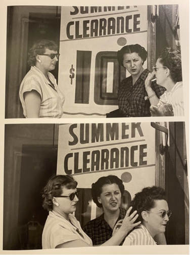
Stanley Kubrick, Bronx Street Scene: The Camera Catches an Offguard Episode over a Hairdo (1946), Museum of the City of New York. The Look Collection

One of the main themes of Kubrick’s photographs was genuine human interactions embedded in daily life. His series for the 1946 November issue of Look feature photographic sequences from the street titled Bronx Street Scene: The Camera Catches an Off-guard Episode over a Hairdo. In a series of photos shot consecutively, two women are first seen chatting in front of a shop which is then followed by another shot that show the entrance of a passer-by, another woman into the frame and the two women fixing her hair and having a laugh over the matter. A different strip shows a couple smoking and chatting on the street in front of a store. The naturalness of the gestures and facial expressions coolly emanate from the frame, mesmerising us and insinuating that we have caught glimpses, instances from life with these people and watching from afar in a discreet manner. The consecutive shots and usage of the same vantage point here that reveal the continuation of these two different events very clearly refer to filmic techniques.

PIC
Stanley Kubrick, People Conversing on the Street (1946), Museum of the City of New York. The Look Collection

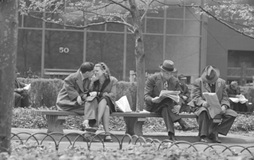
Kubrick caught spontaneous scenes from the street. Some he turned into scenes with consecutive shots as seen here. Others instead, were single shots that entailed an overarching theme, such as Park benches: Love is Everywhere series created in 1946 for May 1st issue which was a love series where Kubrick captured young couples on benches, fire escapes and street corners, embracing. Kubrick’s usage of infrared film and flash intensified the candidness of the scenes. The couples were often seemingly caught in unexpected moments, especially at night-time, similar to paparazzi shots which highlighted the voyeuristic tones that Kubrick’s photographs often carried, resembling the technique that was frequently used by famous tabloid photographer Weegee.
Pic
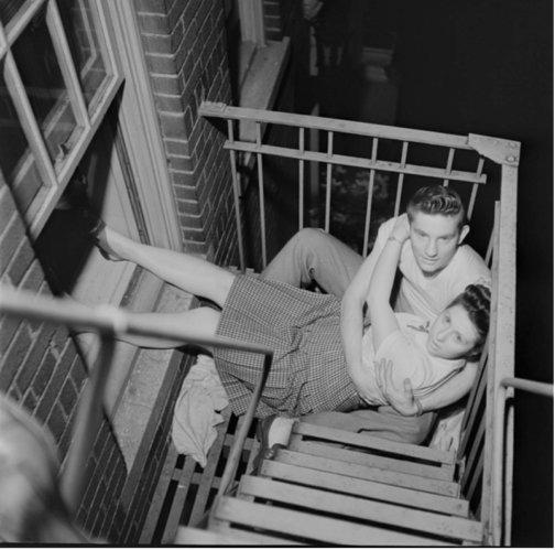
Stanley Kubrick, A Couple Embracing on a Fire Escape, (1946), Museum of the City of New York

A Couple Embracing on a Fire Escape is one of the most unique shots in the series that seems to have a sinister undertone. With not only the oblique angle, the awkward positioning of the couple on the fire escape but also the overpowering flash that has overly whitened the eyes and skin of the couple, transforming them into ghostly figures, reminiscent of deer caught in headlights, which speaks to Kubrick’s genius with the play of light.
Pic
Stanley Kubrick, Park Benches: Love is Everywhere, (1946)


Pic
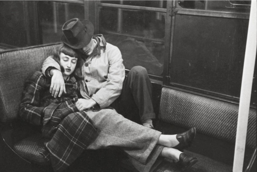
Stanley Kubrick, Life and Love on the New York Subway, (1947), MCNY

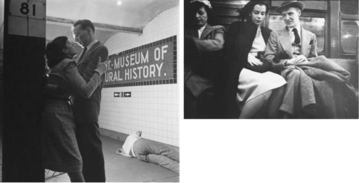
The New York subway offered a microcosm of the city. Spending time at the subway for almost two weeks, Kubrick shot discreet photos of people riding the subway with a hidden camera for another assignment titled Life and Love on the New York Subway in 1947 that fit the everyday life of New Yorkers narrative. Placed amongst the candid photographs in the subway spread, some of the photographs such as this one that show a couple, in fact Kubrick’s friends Alexander Singer and Toba Metz, sleeping, were argued to be staged. While the low vantage point, the dramatic contrast between black and white made scenes as the photograph with the couple embracing cinematic, it also put forward the harsh realities of big city, with the homeless man sleeping in the background, somewhat taking the focus away from the romance in the shot.
Pic
Stanley Kubrick, Life and Love on the New York Subway, (1947), Museum of the City of New York. The Look Collection

The shots that focus on individuals and their facial expressions show a study of psychological depth that also belongs to the cinematic verse. Glorifying the normalcy of everyday life of ordinary people in the big city stretched from photographing people waiting in line to do laundry, waiting in the subway and shopping in the city. What all of them shared in common was the focus on large crowds to highlight the act of looking. We see people watching other people and then we realise we are also watching these people through Kubrick’s lens.

Pic
Frank Bauman, Stanley Kubrick, Tom Weber, Advertising Sign Painters at Work, (1947), Museum of the City of New York. The Look Collection

This theme was made central in a series that Kubrick had created, capturing in separate ‘reaction shots’, the confused and surprised expressions of people watching a publicity stunt with a model triumphantly posing next to a group of sign painters in front of a billboard for a Peter Pan bra advertisement high up on a building on the corner of Fifth Avenue and 42nd Street (September 3, 1947). In this collaborative work with Frank Bauman and Tom Weber, Kubrick’s interest in film became more poignant, whilst also showing that entertainment and spectacle were always around the corner in an ordinary day in New York City, embedded in the spirit of the city.

In another series for Look, Kubrick started to focus on individual profiles. In this spread he celebrated the balancing act of a young shoeshine boy named Mickey, documenting a day in his life. Son of Irish immigrants, Mickey made a living by shining shoes to support his family. Taking around 250 photos for his first long photo-essay assignment, Kubrick presented the young boy’s life, showing him playing and conversing with friends in one shot, working, doing laundry, or contemplating life in a mature manner on a rooftop of a New York building in the next shot. Showing Mickey’s difficult life stuck between trying to provide for his family whilst simultaneously trying to enjoy his young years, Kubrick poignantly captured the difficulties faced by lower classes in attempting to survive in a thriving, chaotic city. The fact that this series was not published shows that gruesome realities of a big city were mostly glossed over in Look compared to Life. This photo series that contrast shots of Mickey with friends and ones where he is wandering the city alone poignantly intensify the difficult double life he leads, both, juggling adult responsibilities.

Pic
Stanley Kubrick, Shoeshine Boy, (1947), Museum of the City of New York. The Look Collection

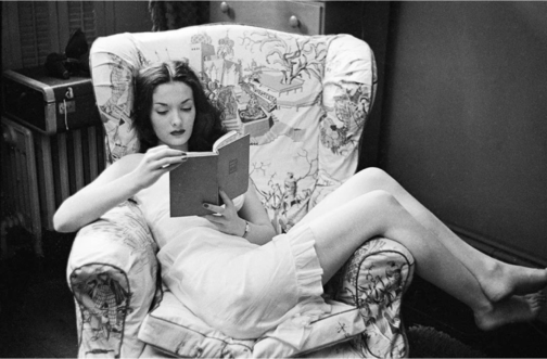
Edging closer to his interest and career in film, Kubrick’s photographs after 1948 started to focus on well-known faces from TV and Hollywood. Kubrick offered the most psychologically complex portraits from these people’s lives. One series that showed the disparity between public persona and private, backstage reality, was another ‘unpublished’ photo narrative series from March 1949, where Kubrick captured a day in life of a showgirl named Rosemary Williams. Williams was a young girl that had come to New York City dreaming of becoming an actress.
Pic
Stanley Kubrick, Rosemary Williams-Showgirl, (1949), Museum of the City of New York. The Look Collection

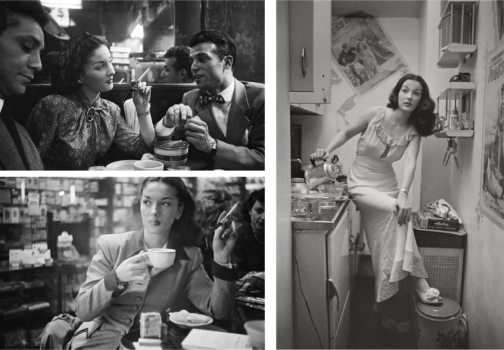
However, struggling to make ends meet as an ingénue in the big city, Williams became a showgirl by night to attempt to make it as actress by day. It was evidently a far less graceful lifestyle compared to that of an actress, as Williams often performed in revealing clothes for the pleasure of men. Captured walking in the streets of New York, having coffee, reading in the privacy of her home to posing in front of the camera and in the backstage getting ready to go on stage, Williams’ life is documented in around 700 images, amounting to one of Kubrick’s longest narratives.

Her professional life is shown through shots of her either conversing or dancing with men or posing in front of the camera. These photographs that show her with company, emphasize the overpowering male gaze that is directed on Williams that signal to her profession and the tool that allows her to sustain her dreams in the big city. Kubrick captured Williams’ despair resulting from the hardships she faces perfectly in her demure expressions and often contemplative manner, from moments of leisure when she alone appears within the frame, much like the aforementioned Mickey. Perhaps the most intriguing photograph of Williams is the in-between public and private realms, where she is getting ready in the backstage in front of a mirror before her performance. Yet, Kubrick haunts this scene with a menacing stare and manner, with a camera in hand which is strategically lowered as he looms large behind Williams as she carries on preparing for the stage, seemingly unaware. Insinuating the voyeurism of the male spectator and the life of a showgirl – which is one that is under constant scrutiny of the male gaze due to the exhibitionist nature of the profession – is perfectly reflected here not only with Kubrick’s sinister placement at the back, intensely staring at Williams getting ready, but also with the mirror and the camera that appears to be subtly filming her below vantage point. Undeniably eerie, the genius of Kubrick lies in the blurring of the concept of the gaze. Perhaps a reference to Velazquez’s Las Meninas the subject of the photograph also becomes the viewer. The viewer is caught in the act of watching Williams in a private moment. Williams is caught between a crossfire of gazes as the camera directed to the viewer reminds us that we are also active voyeurs. The widened frame and the surrounding sense of mystery contributes to the filmic elements of this scene. It becomes evident that the running theme of the ‘unpublished’ spreads were harsh and forsaken reality of the city that Kubrick attempted to unearth and present to the wider public in the manner of Life magazine yet one that was often hindered by Look. This perhaps became a further push for Kubrick in the direction of cinema where he could tell his stories freely.
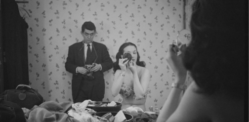
Pic
Stanley Kubrick, Rosemary Williams, Show Girl, 1949, Museum of the City of New York. The Look Collection
Pic
Stanley Kubrick, Rosemary Williams, Show Girl, 1949, Museum of the City of New York. The Look Collection

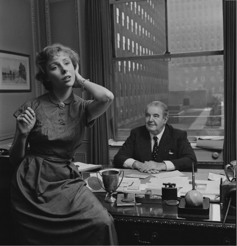
Look magazine also differed from Life in the sense that it aimed to show the ‘real’ lives of Hollywood and TV figures to instil the sense of normalcy around famous people, showing them both on and off camera. Yet, Kubrick still offered heavily staged photographs. Williams’ story was most likely swapped for a high-profile celebrity spotlight issue on Faye Emerson titled, Faye Emerson: Young Lady in a Hurry. Emerson was considered as picture of elegance, grace and intelligence. TV was on the rise and was slowly becoming a rival to radio and print. A Hollywood actress recently turned in to TV presenter, Emerson was regarded as ‘First Lady of TV’ and listed under ‘Top Female Discovery of 1949’ list, which, alongside her career switch, made her worthy of a cover story according to Look magazine. Emerson in this photographic series created by Kubrick for the August 1950 issue, is presented as joyful, both behind and in front of the camera: whether she is distributing autographs for eager fans, interviewed near the Plaza hotel, captured having a laugh with the society columnist Eleanor Harris, casually sitting for a portrait with a phone in hand making calls whilst also getting her hair done.
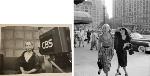
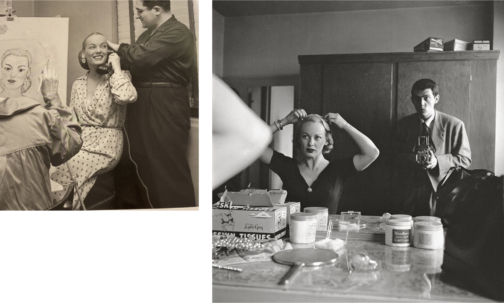
Pic
Stanley Kubrick, Faye Emerson: Young Lady in a Hurry, (1950), Museum of the City of New York. The Look Collection
Pic
Stanley Kubrick, Stanley Kubrick with Faye Emerson from “Faye Emerson: Young Lady in a Hurry”, 1950s, SK Film Archives/ Museum of the City of New York

Emerson never ceases to smile in the photos despite her evidently busy schedule, forming part of Kubrick’s constructed story surrounding Emerson, promoting the busy yet elegant and content lady to aspire to, which the title clearly insinuates. In one photograph, Emerson is captured whilst getting ready in her dressing room. Kubrick uses the same style and framing with the mirror he used in the unpublished photograph of Williams backstage, placing himself behind Emerson with a camera, watching her whilst she’s getting ready. Yet the difference here is that Emerson is aware of being photographed by Kubrick and almost poses for him whilst getting ready to be on screen. Usage of a mirror cleverly conveys the duplicity of TV personas, and their elaborate yet fabricated self-creation for TV.
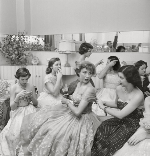
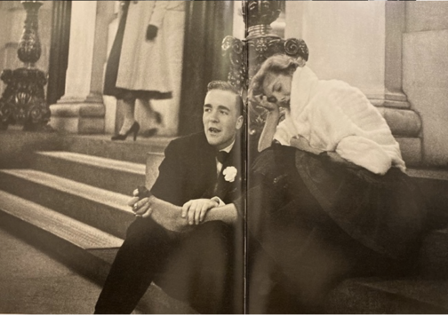
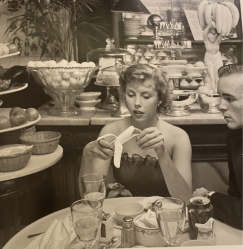
PicVery similar to Emerson’s profile was one created for Betsy Von Furstenberg. Furstenberg was the daughter of a German aristocrat and was also as an actress in New York. Another, ‘Day in the Life of’ piece, her everyday life was represented in a cinematographic and theatrical way in these photograph series by Kubrick. She is shown engaging in a variety of ‘serious’ and normal activities such as preparing for a role in her home, socialising with friends as well as silly moments from peeling a banana in a fancy restaurant to sleeping on the steps of the Plaza hotel next to John Hamlin. These pictures were featured in Look magazine’s spread from July 18, 1950 with the title The Debutante Who Went to Work. Photographs represent the juggling of day-to-day life with a highly glamorised one with comedic effect, evident from the awkward moments, humorous gestures, and facial expressions of Furstenberg. Whilst a more psychologically in-depth narrative was worked on for the earlier photographs of Williams was ultimately shelved, favouring a feature that was created around a lady that worked despite her aristocratic background. PicThis shows the elegant façade that sought to represent life in New York City, with the gruesome realities of hardship were kept very deliberately hidden. A debutante that balanced life and work was one to be aspired to while a showgirl trying to make ends meet was one that was far too real and far less glamourous. Von Furstenberg’s story was about elegance, and, on the surface a light-hearted, innocent story of how to make it as an actress in the big city, despite being further removed from reality. The theatricality of the mimics and gestures of Von Furstenberg is in high contrast with that of Williams which almost insinuates the fabricated nature of this narrative and lifestyle.


PicLooking back at his brief time as a photojournalist in 1972, the director himself commented: ‘By the time I was 21 I had four years of seeing how things worked in the world. I think if I had gone to college I would never have been a director.’ Photographs such as these taken in the streets of New York put forward the theatricality of the city which Kubrick presented in his characters, personas and well-known faces that made up the city, delving into private lives of public figures, producing intimate and psychological portraits. Whether watching these figures from afar, standing in the crowd beside them or even in their private quarters, Kubrick always placed the viewer in the intimate world of his subjects. The photographs offered a genuine image of New York City, shining light on different lifestyles of those from a variety of backgrounds, showcasing moments that revealed the everyday routines of people from different classes, with everyone united in their common goal of attaining ‘The American Dream’.
PicThe director’s final film Eyes Wide Shut (1999), set in New York, caused quite a stir in its exploration of the mysterious and dangerous sides of the vibrant city of New York, focusing on an elite cult. This suggests that the famous director was perhaps making a nostalgic tribute to his time as a young photojournalist in the midst of this chaotic city he found himself in, and the vibrant scenes he caught glimpses of with his camera as a teenage boy. Today, Kubrick is better known for his 12 feature films yet his strength in visual storytelling was implanted in his little-known early career as a photojournalist. It is evident that for Kubrick these early photographs, as Sean Corcoran (the Photography Curator at the Museum of the City of New York) stated, allowed him to master the art of framing the composition and opened his eye in different ways of seeing. Kubrick himself said: ‘Generally speaking, you can make almost any action or situation into an interesting shot, if it’s composed well and lit well.’ Kubrick’s genius seeps from his œuvre produced in his short time as a photojournalist, right on the brink of his career as a director.

By Ipek Birgul Kozanoglu

Bibliography

Albrecht, Donald; Corcoran, Sean. Through a Different Lens: Stanley Kubrick Photographs, (Köln & New York: Taschen, Museum of the City of New York, 2018)

Mather, Philippe D. Stanley Kubrick at Look Magazine Authorship and Genre in Photojournalism and Film. (Bristol:Intellect, 2013)

https://www.anothermag.com/art-photography/11004/how-stanley-kubricks-early-photographs-foreshadowed-his-filmmaking-career

https://www.vanityfair.com/london/photos/2019/08/through-a-different-lens-stanley-kubrick-photographs

https://museemagazine.com/culture/2018/7/31/exhibition-review

https://www.mcny.org/exhibition/through-different-lens

https://ny.curbed.com/2018/5/1/17305690/stanley-kubrick-photos-museum-of-city-of-new-york-exhibit

https://edition.cnn.com/interactive/2018/06/entertainment/stanley-kubrick-cnnphotos/

https://www.indiewire.com/gallery/stanley-kubrick-photo-album-early-photographs/x2011_4_10292_039b_retouched/

https://www.theguardian.com/film/gallery/2018/may/14/life-on-the-street-stanley-kubrick-early-photographs-of-new-york


Rose, c’est la vie: Pink at the Museum at FIT

Although my aunt coincidentally just spoke of ‘edible colour’ in terms of bento lunches and not the Fashion Institute of Technology, that would be taking The Museum at FIT’s current special exhibit, a survey of pink fashion spanning three centuries, to its (il)logical conclusion.

I used to rip handfuls of petals off my grandmother’s roses, because I didn’t know what else to do with the colour and, in batik class, drenched a handkerchief in what looked like pink blood well beyond the purpose of saturation. More recently, Elle Beauty’s lipstick smash videos and their muted clacks, scrapes and smears have satisfied… something, with form and purpose seemingly destroyed to become pure, shapeless colour. And so, Maison Schiaparelli’s fall 2015-16 silk chiffon gown, a pillar of ‘Shocking Pink’, inspires a familiar urge: visual obsession manifested as base, physical desire – ‘I want to eat it,’ I texted my aunt. ‘I want to rip it.’

Schiaparelli Paris Silk chiffon gown, fall 2015-16.

This Schiaparelli figures amongst approximately 80 ensembles recounting ‘Pink: The History of a Punk, Pretty, Powerful Color’, from dresses that look like Ladurée pastries to suits that look like rag doll fetish-wear. ‘Pink’ spotlights one of the most auratic of features, literally – the clothing glows under the effects of lighting and black background – and figuratively. With its history of elevation, commodification, codification and reclamation, the colour evokes seemingly endless ideas: youth, gender, queerness, class, modernity, imagination and fashionability.

The anteroom presents a brief overview of pink that one might expect: a chronological display of a stereotypically feminine colour beginning with an 1857 taffeta dress in watermelon and ending with the business suit of the 1980s and ’90s. If the main gallery doesn’t subvert this initial presentation, it certainly nuances and elasticises it, grouping ensembles thematically to tell a different story: a story of an elegant, ungendered colour that emerged from nameless indifference in the 18th century to paint the French royal court – despite pink dyes being used in China, Japan and India for much longer – before its 19th century feminisation; a colour to be reclaimed in excessive/transgressive displays of fantastic (sarcastic?) femininity.

Paquin Silk chiffon evening cape, 1897.

‘Pink’ cites colour historian Michel Pastoureau to clarify that, despite overwhelming associations, ‘there is no transnational truth to colour perception.’ It’s strange that reflections of light with no inherent truth or physical body can drive trends, enchant or repulse generations, and make me feel so viscerally. The clothing’s object-ness, reinforced by how invitingly tactile some of the ensembles are – the silk ruffles of Paquin’s 1897 chiffon evening cape, or the bubblegum pleather ones of Comme des Garçons’ 2016 ‘18th-Century Punk’ – combines with the intensity of the colour to suggest you can hold the pink, know and consume and be consumed by it.

Comme des Garçon Pleather, faux fur, rubber, and synthetic ensemble, fall 2016.

Pink is on point as colour and exhibition subject, all-inclusively staining book jackets, home décor, and men’s wellness campaigns as of late. Its prevalence, and the increasingly broken gender codes thereof, means today’s pink both continues to attract and loses its bite.

Though I still want to bite it.

Pink: The History of a Punk, Pretty, Powerful Color‘ is on view at The Museum of FIT until January 5, 2019.

All photos taken by the author.

Three Coats in Museum Exhibitions

Clothes provide a protective layer between the body and the outside conditions. The following coats were seen recently in exhibitions in New York and respond to the notion of coats as a protective membrane between the human body and the outside weather conditions, as well as something the body lives in. The following ‘Sleeping Bag Coat’ (Norma Kamali, 1973/2017), ‘Self-Contained Housing’ (Daniel Durning, c.1982) and the ‘Security Blanket Coat’ (Bonnie Cashin, 1972) also comment on issues of housing and lifestyle through their self-conscious titles and the materials in which they are made from and the exhibitions they are shown in.

Photograph of ‘Self-Contained Housing’ Daniel Durning, designed c.1982

Daniel Durning’s ‘Self-Contained Housing’, a coat, hat and slippers ensemble, was exhibited at The Museum of Modern Art as part of their Club 57: Film, Performance, and
Art in the East Village, 1978–1983
exhibition (October 2017 – April 2018). By recycling found fiberglass insulation and plastic sheeting for this piece and titling it ‘self-contained housing’ Durning amusingly aligns the body with the home, and was made in 1982 to respond to the way artists were living in unheated loft spaces in New York in the eighties in scenes like ‘Club 57’. This piece reminded me of Final Home’s 1994 coat that was designed by Kosuke Tsumara after spending several nights sleeping rough in New York City which features up to 40 pockets that can be stuffed with material to insulate the wearer in the face of a natural or man-made disaster.

Photograph of ‘Security Blanket Coat’, Bonnie Cashin, designed 1972.
Photograph of newspaper clipping from WWD May 1972.

Going uptown and back in time, Bonnie Cashin’s ‘security blanket’ coat from 1972 was exhibited at Mod New York (November 2017 – April 2018) at the Museum of the City of New York. The mohair coat features a check plaid pattern that resembles the traditional material of a blanket, and the loose draping of the body, deep armholes and the fact it covers the whole body even further align it with the kind of warmth and protection one may use a blanket for when indoors keeping warm. This coat by Cashin, who was the first hired designer for Coach, takes an idea of comfort indoors to outside and onto the streets as outerwear. This design then follows the preoccupation with comfort and simplicity of design in American Sportswear that Cashin was known for and which is intrinsically linked with the post-war fashion design in New York in the 40s and 50s that challenged traditional design much like imaginative and diverse designs of the ‘Mod’ 1960s.

Photograph of ‘Sleeping Bag Coat’, Norma Kamali, designed 1973, manufactured 2017.

Norma Kamali’s ‘Sleeping Bag Coat’ (1973) was featured in The Museum of Modern Art’s exhibition Items: Is Fashion Modern?  (October 2017-Janurary 2018) and like Cashin’s ‘Security Blanket’ it features a wrap-around design and a material reference to comfort and sleep, as opposed to Durning’s ‘Self Contained Housing’ that uses the actual infrastructure of the home for a garment. The idea of the coat came to Kamali during a camping trip when she wrapped her sleeping bag around her body to run to the bathroom. This backstory contextualises the coat with the camping holiday trend of the 70s that continues today and considers how clothing can be transitory and practical like a sleeping bag. This interplay between fashion and the functional object – here, the sleeping bag, but also wall insulation in Durning’s case or a traditional mohair blanket in Cashin’s – shows how designers were taking inspiration from a concern with survival, protection, sleep and innovation of materials not necessarily associated with fashion design, and creating space for innovative runway designs like Maison Martin Margiela’s duvet coat in 1999 or Viktor and Rolf’s fantastical bed dress in 2005.

By Evie Ward

Tom Brigance Beachwear Sketch at Parsons Archive


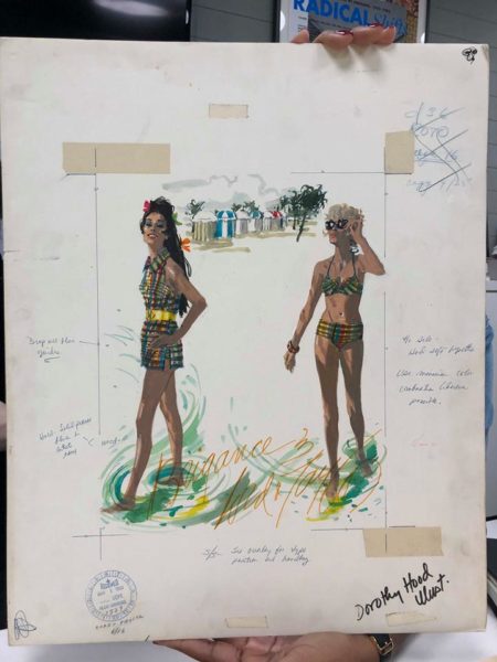
On February 27, the MA class journeyed to Greenwich Village in New York City to visit the Parsons School of Design Archive. Upon arrival, we were left to explore boxes and folders overflowing with sketches of women’s wear between the 1920s and 1960s. Some of the sketches were rather minimal, a few fleeting lines drawn with pastel on tracing paper, while others were more detailed pencil on paper drawings. Our favorites as a class were Parsons’ extensive collection of Claire McCardell sketches, and one specific sketch with corresponding advertisement of Tom Brigance swimwear.

Tom Brigance, an American designer specializing in women’s sportswear, was a house designer for Lord & Taylor. Illustrated by Dorothy Hood, this particular sketch from 1968 advertised his In The Beach Scene line, and features a bikini and backless swim tunic. Hood gracefully captures the nylon fabric and gingham-like colorful print of Brigance’s swimsuits, and creates a whimsical beachfront scene. Our class was fascinated by this illustration board, because it included the handwritten notes of the copywriters or printers for this campaign. “Drop all blue guides,” and “see overlay for type position and handling,” along with notes on how to print Hood’s name within the illustration, can be seen written onto the advertising board.

Our class then all audibly gasped when we found that Parsons also had the corresponding final printed product. This was particularly interesting and exciting, because we were able to see the entire thought process—from the fashion illustration and notes to the final advertisement. The print advertises the two swim pieces, their prices, and an opportunity to meet the designer Tom Brigance at Lord & Taylor the following day.

By Arielle Murphy

“Moon of my Life, My Sun and Stars”: A Self-Love Note to Moons and Junes

Not many people can say they have walked around New York City in lingerie while being photographed—but I am one of few who can say they have. The funny thing is that I did not expect to model for the Danish lingerie brand, Moons and Junes, but while supporting my friend behind the scenes at one of their photoshoots, Angete Bjerre-Madsen, founder of Moons and Junes, convinced me to give it a try.

Front view Audre Bra, Olive.

At first, I thought she was absolutely crazy. Then she handed me the Audre bra (fig. 1) (named after the one and only Audre Lorde) in a deep burnt orange, and I decided that the least I could do was try it on. It was light and sheer with a little peek-a-boo feature at the center of the bra for a playful cleavage reveal. At first, I was worried that the bra would not fit, or that it would not offer the support I needed—but I was immediately proven wrong. It fit like a glove while also providing great coverage. The Moons and Junes products run in three sizes: small, medium and large—yet fit a wide range of body sizes due to the stretchy and high-quality material of the products that mold to the wearer’s form without trying to change or enhance her body. Moons and Junes prides itself on being a lingerie brand that does not use underwire or hard cups. The brand’s goal is to disrupt the current lingerie industry by creating pieces that specifically cater to everybody without trying to modify it. There is no push-up, no padding, no unnecessary frill. The pieces act as a second skin meant to conform to the wearer, the models in the ad campaigns are familiar faces—they are family and friends of all ages, races, and sizes.

Shot from New York Moons and Junes Campaign by
photographer Nick Delieto.

“Lingerie” as a category of clothing given to undergarments, aims to make the body appear more alluring and attract attention from the viewer. The erotic or desire is closely tied to lingerie not only in its proximity to the naked body, but also in the theatricality of viewing the undergarments as well. The lingerie acts as the curtain covering the stage of the body, only making the flesh visible “in performance”. Roland Barthes writes in The Pleasure of the Text (1973) that the location of the erotic in clothing lies in its ability to evoke “intermittence,” or rather what he calls, “the intermittence of skin flashing between two articles of clothing…it is the flash itself which seduces, or rather: the staging of an appearance-as-disappearance.” Historically, the wearing and showing of one’s lingerie existed in a performance, a relation between the viewer and the wearer. However, a shift is occurring within the lingerie industry that focuses not the viewer’s reception and pleasure, but the solely the wearer’s.

Shot from New York Moons and Junes campaign by photographer Nick Delieto.

Moons and Junes, in a sense, redefines the relation of the erotic as dependent on the viewer’s response, and makes the erotic or the pleasurable more personal in the sense that the wearer’s pleasure comes from her comfort in the undergarments, her confidence in her skin, and also the beautiful and minimalist design of the pieces. Moons and Junes evokes desire, however a desire that is not meant for others, but rather one that is unabashedly for the self.

By Destinee Forbes

MA Study Trip to New York City: Voices from the past, visions for the future: a visit to Condé Nast’s New York archive.

One has only to scan the bibliographies of most major academic fashion articles to see that Vogue maintains a position of the highest authority in sartorial research, particularly concerning the interwar years. This is not to say that other contemporary fashion magazines such as Harper’s Bazaar lack academic importance: more so that the material bound to each issue was not deemed worthy of preservation back then, in fact much of Bazaar’s archive – including prints by Richard Avedon, Man Ray and Louise Dahl-Wolfe – was destroyed in the 1980s. This was not the case with Condé Nast’s archive, which dates back to the 1920s, instigated by Mr Nast’s awareness of the monetary value of this vast collection of images. In our recent visit to the New York archive, Shawn Waldron, Senior Director of Archives and Records, showed us just how vast this collection really is. State of the art, temperature-controlled rooms house the thousands of high-quality original prints in colourful, expertly alphabetized folders. The effect is mesmerising, like a sweetshop lined with Steichens and Horsts, instead of Flying Saucers and Humbugs.

01 02

Another room boasts a staggering quantity of loose and bound copies of publications, such as Architectural Digest, Glamour and Vanity Fair and, of course, Vogue. A researcher from a well-known fashion label pores over bound copies of the latter, highlighting the scholastic potential of the archive. Loose copies of many publications are also available for perusal, offering a more haptic experience for the viewer. The archive today is a dynamic editorial asset, both from an information and commercial point of view, and a far cry from ‘The Morgue’ that it once was. Mr Nast’s business model was ahead of its time, incorporating what is known today as ‘Blue Economy’: the process of turning waste into revenue. ‘The Morgue’ transformed into the active editorial asset that it is today, generating revenue through digital licensing and distribution of images.

As an informative resource, apart from the proliferation of beautiful fashion images, the intricate daily contracts visible on each spread, detailing the names, locations and costs of each shoot, are invaluable to the historian. What emerges is the closely linked relationship between business and preservation, and business’ potential in shaping the fashion canon. Were it not for Mr. Nast’s willingness to invest in the protection of his publication’s material, alongside his fastidious account-keeping, this barometer of social and cultural change would not exist.

03 04

The archive promotes cultural research from many other trajectories; with publications, including Charm exposing what editors told young homemakers was necessary to set up home in the interwar period. Similar interdisciplinary research pathways exist within House & Garden, Architectural Digest and Condé Nast Traveler. These publications bring the past alive, and are a testament to the complexity of day-to-day concerns.

These research opportunities would not be possible without the painstakingly selective process of acquisition, organisation, and digitisation, undertaken by Waldron’s team. The resulting collection, with millions of objects, is unique in fashion publishing. Despite the challenges faced by a small team of archivists and photo editors, working with an ever-growing collection, the archive has become a valued editorial asset that can generate income, promote fashion research, and influence new interdisciplinary study.

05

MA Study Trip to New York City: The Fashion Institute of Technology Archive

IMG1
The MA class admiring a beaded dress from the 1920s.
IMG2
Muslin copy of a 1920s Chanel dress.

On one of our museum visits in New York, we were lucky enough to be shown a selection of objects from the Fashion Institute of Technology Archives. On arrival, we were greeted by an alumnus of our course, Emma McClendon, now an assistant curator at the museum at FIT, with whom we discussed our similar academic and Courtauld experiences, and then our not so academic love of Percy Pigs that we had brought over as a souvenir from the UK.

Her colleague, Liz Wei, then brought us to a study room in which we came face-to-face with the garments, fashions and trends that have graced our books, seminars and imaginations. On a packed, non-descript clothing rail were some of the most beautiful and well-preserved examples of dress from America and Europe ranging from the 1920s to the late 60s. We were shown couture, eveningwear, daywear, sportswear, and everything-in-between-wear from European designers such as Chanel, Schiaparelli, Vionnet, and Paul Poiret. We were also shown examples of ready-to-wear and couture by American designers such as Adrian, Charles James, Phil Macdonald and Claire McCardell.

We were able to get familiar with the objects (without actually touching them) and see the minute details of stitching, beading and construction, and really gain an understanding of the craftsmanship of these beautiful garments. Having discussed these objects in an abstract manner in seminars and readings, we were able to finally see the objects themselves and fully appreciate the properties and themes that encapsulated fashion in the interwar period in a tangible way.

Unlike other fashion archives, FIT also functions as an educational institute, and so has a unique set of muslin copies of select objects. This allows design students to physically interact with garments that would otherwise be too delicate to handle. This allowed us, as dress historians, to grasp an understanding of dressmaking techniques, and see the innovative and diverse methods of construction employed by couture designers, tailors and home dressmakers in these historical garments.

IMG3
Fortuny tea dress curled up in its storage box.
IMG4
Detail of pleats on the Fortuny dress.

Despite the feeling of deep reverence for all of the objects introduced to us, for me, there was one standout object. Unlike the other garments hanging on the clothing rail, this garment was curled up inside a square white box. Furled up in a whirl of finely pleated silk, was a stunning, peach-coloured, Mariano Fortuny dress and belt from the 1930s. When the dress was unravelled, the intricate tight pleats sprung forth to reveal the long, elegant sheath and the Venetian glass beads that decorated the seams. The pleating, loose-fit and columnar style of the dress reflected its original intent as a Tea Gown, to be worn without a corset, and on more relaxed social occasions, entertaining at home. This garment encompassed concepts of modernity, machinery and the changing activities of women in the 1930s, despite its classical inspirations. Remarkably, this notion of modernity still survives within the garment today, with the endurance of its tight pleating that would rival Issey Miyake’s authority of the technique. Indeed, the gown is as fresh as a Pleats Please garment available for purchase today. Much like Miyake’s technological textile research, Fortuny experimented with machinery and techniques to create his unique pleating system, a process that is still a mystery to this day. Only a few pieces of archival information on his pleating process remain. This method used a pulley system and included heated ceramic rollers through which the silk was passed to create the tight folds. Though this is still speculative, as Fortuny kept the process a well-guarded secret and it seems never recorded it. Women would have to resend their dresses to Fortuny to be re-pleated, if they had been flattened from sitting, or been dampened.

IMG5
Detail of the top of the Fortuny dress.
IMG6
Detail of the bottom of the Fortuny dress.

The technological innovation of Fortuny’s pleating, the modernity of the garment, its classical sources and its relatively intact condition, seem almost anachronistic and belie its era. It was this clash of temporalities, the captivating mystery surrounding Fortuny, and its resonances in contemporary fashion that provoked a visceral response in me.

MA Study Trip to New York City: The Dress Archive at the Museum of the City of New York

The Dress Archive in MCNY; photo courtesy of the Museum of the City of New York
Vera Maxwell jumpsuit; photo courtesy of the Museum of the City of New York

The Museum of the City of New York archive is an absolute treasure-trove of old clothes. Unlike the majority of other archives we have visited as a group, both in New York and London, the clothes are not wrapped in tissue or stored in boxes, but rather are hung, as if in a shop, on rails. The whole experience of being inside the archive is, thus, one of visceral, fashion-loving pleasure. All of us had to constantly fight the urge to reach out and touch everything.

We were taken through the archive by Phyllis Magidson, curator of costumes and textiles at the museum. She showed us dresses ranging in date from the early 1920s to the 1960s. The glittering 1920s party dresses and gowns for costume balls and the brightly coloured, heavily tasseled ‘60s dresses were amazing, but what was most memorable, and indeed most pertinent to recent discussions on our course, were the late 1930s and early ‘40s WWII uniforms.

Vera Maxwell Summer jumpsuit for Sperry Gyroworks factory; photo courtesy of the Museum of the City of New York

The Museum has a large collection of Vera Maxwell garments, including jumpsuits designed for women workers in the factories in 1942. Before creating the jumpsuit, which is both fire retardant and oil repellent, Maxwell conducted a survey of women to find out what they most wanted from their uniforms. Besides the obvious, highly functional elements, these women also requested a neckline that would prevent men from putting ice down their backs – indeed the jumpsuit is perfectly ice-proof too! However, Maxwell was keenly aware of the aesthetic elements too. Very careful attention to detail is paid in the design, such as the shape of the pockets and top stitched pleats in the front, which ensured that the fit was as flattering as possible. It is not only highly functional and utilitarian, but also a carefully made, designer garment, and Maxwell received a government award as a result.

The collection includes both her winter and summer jumpsuits. War restrictions limited the types of fabric available to designers and manufacturers, and extraneous decoration was largely prohibited, so Maxwell used elements such as pleats and darts to make her jumpsuits attractive. The summer jumpsuit is short sleeved and made of a lighter material, with red piping down the side. Again, Maxwell has used a series of pleats down the front of the garment to give it aesthetic appeal and make it flattering on the body.

Vera Maxwell jacket decorated with ribbons imported from Peru; photo courtesy of the Museum of the City of New York
Detail of the Peruvian decoration on the jacket; photo courtesy of the Museum of the City of New York

In her other designs, she found imaginative ways to decorate. She traveled to South America, particularly Peru, and imported ornamental ribbons and braids that she used to adorn her garments. She worked hard to ensure that her clothes did not feel as though they were lacking anything. She wanted the wearers to not feel at all deprived, an aim that resonated with the fashion media of the time. Despite the shortages caused by war, the message perpetuated by magazines and films was that there was no deprivation. People used garments such as aprons to spruce up their outfits, and became imaginative, using natural objects like seashells in their jewellery. The prospect of wearing a uniform had an appeal in itself, and magazines ran articles about how to look good in military clothing. Many women who volunteered for service chose which in area to do so based on the attractiveness of the uniform. Vera Maxwell understood this basic, universal desire to look good, and channeled it in the design of her jumpsuits.  The aesthetic qualities she incorporated, as well as the highly functional elements, both contributed to her success as a wartime designer.

Sources:

Pat Kirkham, ‘Keeping Up Home Front Morale: “Beauty and Duty” in Wartime Britain,’ in   Atkins, Jacqueline M. ed., Wearing Propaganda: Textiles on the Home Front in Japan, Britain, and the United States, 1931-45 (New Haven and London: BGC/Yale University Press, 2005), pp. 205-228

Self-expression, space and style: a conversation with Camille Branda at Bergdorf’s

Camille 01
Camille, 4th Floor, Bergdorf Goodman
Camille 02
4th Floor, Couture and Evening Collections, Bergdorf Goodman
Camille 03
3rd Floor, Designer Collections, Bergdorf Goodman
Camille 04
View of Bergdorf Goodman from 5th Avenue
Camille 05
Bergdorf Goodman windows
Camille 06
Camille, 1960s, Brooklyn, New York
Camille 07
Camille, 1970s, Brooklyn, New York

Camille Branda, associate and personal shopper in couture and evening collections at Bergdorf Goodman since 2011, considers the shop a museum, in that it is a space defined as much by beautiful things, as the creative people that work with them. In September, we met and discussed how these elements intersect to shape one of New York’s most iconic specialty stores. It was a pleasure to wander its spaces together, and admire the craftsmanship and ideas behind the garments. And Camille has a discerning eye – before launching her own Image Consulting Business a few years ago, she led a fulfilling career as the VP of Product Development and Sourcing for The Echo Design Group, an accessory and home décor company. While there, she travelled the world to look for novel fabrics, products and manufacturers. Camille relives this experience of discovery every day at BG, as interaction with designers enhances her understanding and appreciation of the clothing. It is the constant flow of diverse people – from the designers to those that work on the window displays and customers – that make BG an ever-changing creativity hub. This is reflected in the way she talks about her job:

Everyday I arrive excited, as I approach 5th Avenue, and see the store and its magnificent window displays. This may sound silly, but it really does thrill me. We start most mornings with a clinic, directed by a designer or designer representative, who introduces us to a particular product, to understand this brand and its seasonal inspiration. We then go live and meet the customers. Curtain unfolds at 10:00 and the real show begins!

This sense of theatre is reflected in the movement and crowds that characterise the store’s ambience. And Camille clearly moves to this fast rhythm: when we met, an hour before her next appointment, she seamlessly conversed with me in between phone calls to clients and fitters. Perhaps it is the personal shoppers, who are the most integrated within the intricate spaces of the shop: they tie all the floors together in their creation of looks. And their clients, who Camille describes as more “educated” than ever, demand thorough service. In turn, she has learned much about the many individual and cultural perceptions of fashion and the body. For Camille, ‘the “one-on-one” relationship is intimate and rewarding. We talk lifestyle, goals, preferences, and challenges, as well as colour, style and proportion as we walk through the store to feel for likes and dislikes… I am not only interested in making a big sale, I want to build a relationship with customers for a lifetime.’ Through close observation – the unspoken is most revealing – and listening, she is able to best advise on clothing that ‘accommodate[s] and improve[s] a customer’s personal style.’

Clothing is one element of a puzzle that shapes the picture of one’s image or style, based on self-presentation, expression, and the physical realities of the body in a certain space. In a typical day for Camille, she might style outfits, as ritualistic as that for a wedding or debutante presentation, or plan wardrobes to correspond to the minimalist space of an art gallery, a formal state dinner, or business and casual settings. This multi-layered definition of style was a thread that ran through our conversation, especially when we discussed unique characters, such as the late American heiress, horticulturalist and collector Doris Duke. Camille became fascinated with Duke after a recent visit to her mansion in Newport, Rhode Island, whose objects and decoration reflected its owner’s extraordinary life and unique outlook. Similarly, Camille’s memory of her mother, as ‘sophisticated, polished and elegant’ and ‘a true style icon,’ lives on in objects and pictures, with which she surrounds herself. She joked that her mother ‘groomed [her] for Bergdorf Goodman at a very tender age,’ and a few days after our meeting, she sent me a childhood photograph of herself in a carefully constructed ensemble ‘styled by Mom.’ Taken in her bedroom, she wears a coat with a large white fur collar over a dress, accessorised with leather gloves, a bag, and an ornamented hat. Her prim crossed-legged pose completes the image.

As she grew older, Camille used fashion as her own means of creativity and self-expression. She recalls wearing a shearling coat and printed headband while in high school. The processes of styling and wearing this outfit were, for Camille, transformative experiences that made her feel ‘so cool and simply amazing.’ Through them she could assert her independence, as well as relate to the wardrobes of films, including Love Story and Annie Hall.

Camille has thus always combined the realities of fashionable dressing, with a ‘romantic, fun’ fantasy realm. Throughout her career, Camille has honed her expertise and fashion eye, and now similarly seeks to enhance and elevate her clients’ images to match Bergdorf’s own, stylish reputation.