Tag Archives: harpers bazaar

Seeing in Technicolour: The (Un)dressed Body Brought to Life

IMAGE 1 Technicolour
Edward Steichen, Cover of Vogue. July 1, 1932. Courtesy Condé Nast. © 2014 The Estate of Edward Steichen/Artists Rights Society (ARS), New York

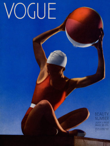
As coloured photography started to seep into the pages of Vogue during the 1930s, it shifted the ways in which fashion consumers and spectators appreciated the dressed body. Simultaneous to this technological progress of fashion magazines was the modernisation and arguable liberation of the body itself. The first in-colour Vogue cover by Edward Steichen in July 1932 attests to this. Playfully raising a beach ball above her head, the model is sporting red swimwear with a white belted detail to emphasise her lean frame, and a white cap. Mirroring the colours of her ball, her vibrant body juxtaposes the gradated blue sky that upwardly intensifies behind her. This is an image of colourful contrasts; red stubbornly clashes with blue, white breaks up the composition, and even her shoes are two-toned. The depth of the colours evoke a sense of warmth and humidity. We can only hope to be transported to where she is and to look as chic as she does in a swimming cap. Perhaps buying Vogue will help get us there…

Although shot indoors in the studio using a 108-inch plate camera that Condé Nast insisted his photographers work with, Steichen’s lighting techniques evoke summer evening sun. This convinces the viewer that the model has spent an entire day of leisure and sport at the beach. The connoted low sunlight highlights the contours of the model’s armpits, her toned arms, wrist tendons, sharp elbows, the dents on her knees and the overall sculptural quality of her tanned body. The white segment of the beachball that orbits her athletic frame evokes a waning crescent moon, perhaps signalling that dusk is approaching. Her shadowed face creates a canvas of anonymity onto which the Vogue reader can project themselves. We can see that she is smiling in unapologetic enjoyment. Her averted gaze suggests that she is unaware of being watched, or even being photographed in an inorganic, staged setting.

Aside from a hint of feathery eyelashes, her body is totally hairless, stressed by the cap that protects her hair from seawater and the unrelenting sun. This evokes the smooth, marble-like texture of her skin. The primary colours evoke a sense of childish playfulness; this is a woman unshackled by social convention or responsibility. She embodies care-free leisure as well as women’s progressively and fashionably active lifestyles. Having been exposed to this vibrant image, it is hard to imagine what her body, or the overall composition, would look like in black and white.

IMAGE 2 Technicolour
Harper’s Bazaar, June 1939, New York Vol. 72, Iss. 2724, pp. 60-61, Proquest

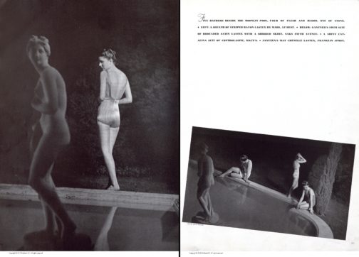
Harper’s Bazaar’s swimwear editorial from June 1939 stands in stark contrast to the highly saturated cover of their rival Vogue. Shot in black and white, the models’ skin takes on the luminosity of classical marble statues. Unlike the evocation of the setting sun in Vogue’s cover, here we get a sense of bright moonlight illuminating exposed flesh. In the image on the left, a woman stands with her back to us, reflecting the pose of the statue situated in the centre of a pool within a secluded wood. This mirror-image establishes a direct connection between woman and sculpture, as if the touch of moonbeams has metamorphosised her from antique marble into living, breathing flesh. Her closed-off body language could suggest that she senses she is being watched in this intimate moment of midnight bathing. The article reads ‘five bathers beside the moonlit pool, four of flesh and blood, one of stone’, which heightens the idea of mythical transformations.

The model’s striped swimsuit takes on a silvery quality and the low scooped back exposes the gentle curvature of her spine. The image on the right depicts three more models poised tentatively on the edge of the pool. They resemble mythological nymphs bathing out of view of mortal eyes. Their poses are fairly natural; their bodies have not been manipulated to cater to the male gaze, perhaps explained by the female photographer Louise Dahl-Wolfe and the predominantly female readership of Harper’s Bazaar. By presenting the female body at different angles, it offers a three-dimensional, sculptural appreciation of the body as well as a well-rounded impression of the swimwear. Their toned bodies highlight that these are active, modern women. There lingers a sense of seclusion and privacy through the implicit separation from the male gaze. Fashion magazines including Vogue and Harper’s Bazaar promoted exercise regimes linked to classical ideals of athleticism, which were often untaken in separation from men. This image potentially evokes this secure seclusion away from prying eyes. In this instance, even when women are depicted as active and exercising, they still retain a sculptural quality. Perhaps if this image had been captured in colour, it would imbue their statuesque bodies with vitality and thus reflect the cultural shift towards women’s more dynamic and active lives.

By Claudia Stanley

Sources:

Rebecca Arnold,Movement and Modernity: New York Sportswear, Dance, and Exercise in the 1930s and 1940s’, Fashion Theory, vol. 12, no. 3 (Oxfordshire, 2008), pp. 341–57, https://doi.org/10.2752/175174108X332323

Susanna Brown,Introduction: Inventing Elegance, Horst: Photographer of Style, exhibition catalogue, Victoria and Albert Museum (London, 2014), pp.11-21

Harper’s Bazaar, June 1939, New York Vol. 72, Iss. 2724

‘A Document of Modern Living’: How to become a Fashion Illustrator

How do you advise a budding artist? Encourage and suggest the correct path to fashion success? Well, it seems Harper’s Bazaar (HB) solved this problem in 1933, in ‘The Road To Fashion Art,’ its response to a reader’s letter.

Firstly, HB notes that becoming a fashion illustrator requires quite different skills from becoming a fashion creator, since:  ‘To design clothes you need about as much technique as is required for the drawing of daisies or mustaches on a telephone pad – just enough to get your idea across.’

However, a fashion illustrator needs have far more refined abilities in this regard and must ‘draw superlatively well.’  This assertion is perhaps the key to HB’s excellent advice – that fashion illustration is a branch of that ancient technique of drawing, and as such must be learnt and nurtured.  One need only look at some of the most well-known illustrators, Eric, or Rene Gruau to see evidence of this.  Or for more contemporary inspiration scan Richard Haines’ Instagram feed and examine the way emotion and movement are captured in every line.  His work encapsulates what HB describes as every art director’s wish – not to be shown every buttonhole and seam, but to receive an illustration that is ‘a document of modern living.’  Haines’ images of men striding the city streets are proof of this – at once showing the newest styles, and capturing life as it is lived.

Richard Haines

To achieve this, you must, HB says, ‘Draw and keep drawing.’  To start: life drawing, to gain complete understanding of the body.  Next develop an understanding of colour, keep building from this, to examine gesture of every kind, for example ‘the gloved hand picking up the reins.’

As your eye becomes attuned to these telling nuances, HB advises that the budding fashion artist is ready to begin looking for ‘the quality called chic.’  With sketch book in hand, an illustrator must observe all closely – visiting fashionable locations and venues, ‘look at ankle bones, hair waves, the hang of expensive tweeds.’  Everything is a potential source, from films to restaurant customers. Of course, HB states ‘Go to Paris if you possibly can.’

Richard Haines

Only there can fashion be seen in its purest form, alongside the best in dining, socializing, art and culture.  And HB is practical too – as well as this emersion in French couture style, you must, ‘Talk to printers, engravers; learn all you can about colour reproduction, first hand.’

Richard Haines

What this master class provides is a careful guide in how to shape your talent, how to focus on drawing as a means to evoke life, to show how fashion is an expression of culture and emotion, and how to work constantly at producing the most observant images that will trigger a corresponding feeling in viewers.

By Rebecca Arnold

All images courtesy of Richard Haines


‘The Road To Fashion Art,’ Harper’s Bazaar, December 1933

Follow Richard Haines on Instagram: @richard_haines

Various Reasons why I love Fashion Magazines Christmas Present Lists


Well, I may as well admit it, I love fashion magazine gift lists.  There is just something so optimistic in the boundless consumerism and bright colours that collide on page after page of present ‘ideas.’  These spreads speak to both the magazine’s notion of its own taste and identity – and that of its readers – as well as its editors’ ability to search and edit what’s on offer into a comprehensive and easily scanned digest.

Here are some of my favourite aspects of these yearly lists, with examples from vintage December editions of American Harper’s Bazaar to liven up the holiday period:

  1. Scale & Layout – on these pages there is an Alice in Wonderland feeling to the tumbling images of individual gifts, which no longer adhere to real life scale. Suddenly perfume bottles are huge, sweaters tiny, nothing relates to normal expectations.  In 2008, a bracelet, a coffee table book, a set of dominos and a ring were suddenly all the same size. While in 1933 things were even less rational – with gold sandals, earrings and a dachshund dog all somehow fitting in the same little frames.  It is a baffling, yet exciting free for all to create a dynamic layout to entice your eye … and hopefully prompt purchases …
  2. Typologies – these range from mundane to bizarre in the ways various potential recipients are categorised by a made up title, and group of possible presents. I like 1922’s offerings including feathered fans and vanity box ‘to please the Debutante,’ a whole page of ‘gift suggestions for the fastidious woman of all ages,’ and potential gifts for that difficult group of women ‘of many minds and tastes.’
  3. Excess – nothing is too grand to be part of the gift list, this is after all the realm of fashion and fantasy. Indeed, amongst the yearly jewels, furs and golden gewgaws, in 1979 the magazine suggested that what American women really wanted for Christmas was an eligible bachelor. And it listed 10 possible candidates, ranging from Monaco’s Prince Albert to film producer Robert Evans.
  4. Contemporary Mores – the lists also reveal what is deemed most desirable, contemporary and fabulous in any given year. This insight means that we learn how alluring silver asparagus tongs were in 1904, the loveliness of a rubberised satin, jewel-buttoned raincoat from Bonwit Teller in 1941, and the high tech charm of a speaker phone with auto dial in 1986.


Happy Holidays, and may you receive everything on your own personal wish list…

Introduction to the Courtauld History of Dress Journals Archive

The conference Reading Fashion Magazines may be over, but our display of 9 items from the collection is still available to be viewed outside the Courtauld Library vitrines. Please come and visit, before it closes in August. In order to tempt you, you can read the introduction to the display, and our conference, below, available for you to download in a pdf.

Introduction to the Courtauld History of Dress Journals Archive

Some of the earliest fashion magazines in the Courtauld History of Dress Journals Archive are on show in the exhibition. Here, Gazette du Bon Ton, Für die Dame and Pinpoints are displayed.
A view of the 1940s section of the exhibition featuring Harper’s Bazaar and Femina.
Elizabeth and three MA Documenting Fashion students after the completion of the exhibition instal.

Dissertation Discussion: Barbora

My three bibles for the past few months: D.V. by Diana Vreeland, Allure by Diana Vreeland and Memos: The Vogue Years edited by Alexander Vreeland

What is your title?

“Fake It!” Examining the myths and realities in the life and work of Diana Vreeland.

What prompted you to choose this subject?

Ever since I’ve watched The Eye Has To Travel for the first time, I was fascinated by Diana Vreeland and the way she shaped the industry almost singlehandedly. Her stories, too, are quite something: Vreeland, her sister and nanny were the last people to see the Mona Lisa before it was stolen in 1911; Charles Lindbergh flew over her garden on his first trans-Atlantic flight; she almost took down the British monarchy when Wallis Simpson came to her lingerie store to order some special garments for her first weekend away with the Duke of Windsor, Prince Edward; and she attended Hitler’s birthday party in the early ’30s, sending a postcard to her son afterwards with the note “Watch this man.” Apparently so, anyway. I wanted to find out more about what prompted her to create such an extreme background for herself, the reason behind all the myth and fantasy which surrounded her, the obsession with “faking it” and everything else about her, really. Actually, I think I fancied the role of a detective for a few months, attempting to untangle what really went on in her head and her life.

‘Vogue’ December 1, 1965 Cover | Wilhelmina Cooper by Irving Penn | Diamond cage deisgned by Harry Winston (‘Memos: The Vogue Years’)
‘Vogue’ July 1, 1969 | Veruschka by Irving Penn (‘Memos: The Vogue Years’)

Most interesting research find thus far?

I was lucky enough to go to New York to visit the Diana Vreeland Papers Archive at the New York Public Library. Flicking through the original pages of her teenage diary, handling her passport and birth certificate (the date of her birth is no longer a mystery!) and finding out what she was up to on a day-to-day basis through the Smythson leather diaries she kept between 1950 and 1985 was quite amazing. There are some peculiar entries where Vreeland notes when she is due to start her pills – once green, then yellow, then pink. Very intriguing. Sadly, I only had two days in New York and so could only go through four boxes out of the sixty-something the library has. Might have to go on another trip soon! I think about a month should do it, mainly because Vreeland’s handwriting makes it quite a challenge to decode what she was actually trying to write down. Oh, and one more thing: the Harper’s Bazaar and Vogue online archives are very dangerous if you don’t have much time – they suck you in!

‘Vogue’ April 15, 1969 | Bert Stern (‘Memos: The Vogue Years’)

Favourite place to work?

I got into a very bad habit of working from my bed. So most of the time I can be found there, surrounded by mounds of paper, pastel-coloured highlighters and books. If I manage to persuade myself to face the outside world, I head to Starbucks (but only one that has comfortable armchairs or sofas!), and have a huge mug of soy matcha latte. I fear to look at my bank statement and find out how much I spent at Starbucks in the past couple of months. And there’s still time to go… Strangely, I find libraries quite distracting, but in Starbucks I get the work done.

Starbucks should probably have its mention in my acknowledgements as the place which provided constant fuel for all the writing.
What my bed looks like most of the time now. Also, pastel-coloured highlighters are a must, as is colour-coding!

Highlights from the Courtauld’s History of Dress Journal Archive: Harper’s Bazaar

We are less than a month away from our conference Reading Fashion Magazines: Celebrating The Courtauld’s History of Dress Journals Archive! Upcoming blog posts will offer a sneak peek into ‘Addressing the Courtauld’s Fashion Magazines,’ an exhibition held in conjunction with the conference. Be sure to book a ticket here to see amazing speakers and beautiful magazines. Remember: Digital images are nice, but nothing beats seeing the real thing!


Harper’s Bazaar, October 1940. History of Dress Collections, Courtauld Institute of Art.

This magazine is an October edition of Harper’s Bazaar published nationwide in the year 1940, during the London Blitz. Despite the hardships of wartime, the magazine targeted the female upper classes, which were the only ones with enough purchasing power to afford it. With the costly price of 2 shillings 6 pence, it was a considerable expense that could feed an average family for one day. In contrast to DIY publications, Harper’s Bazaar relies on the desire to emulate the rich and powerful to disseminate latest fashions. With the upcoming winter, the issue centers around the season’s new fashions coming from the capital, presenting a wide array of greatcoats both furless and completely fur-lined, made mostly out of warm wools or commonly available types of fur like squirrel, mole, and rabbit. The effects of rationing clearly influence the choice of images which are plain in their style with scarcely any accessories and minimal display of jewelry, painting a picture of a simple, although fashionable, woman. The practicality of the inside contrasts sharply with the flamboyant cover which is aimed at defying the grim realities of wartime and giving people back the feeling of normality.

Looking closer at the front cover, we can examine it as a historical source from the era, a social history document that tells the historian part of the story of Britain in the 1940s, and more particularly its dress history. A closer inspection may reveal that the colours chosen in such a specific moment in history are not random. The predominant purple tones, which are one of the first elements that catch the viewer’s attention, are historically associated with opulence, richness, royalty and empire. The crispness and silky texture of the sleeve contrast with the other colours of the dress that look as if they are polluted with randomly distributed red dots. The grainy and wooly texture of the material creates an off-focus effect that contrasts with the smooth and well-shaded arm and the sharp colours of the jewellery that richly decorates it. Our gaze is naturally led towards the hand that holds the cigarette, a luxury item that was rationed and reserved mostly for the servicemen at the front. Smoking, at the time, was an activity reserved for the feminine elite, symbolic of the defiance and rebellion against the male culture and male-centred workplace. The model positions herself in a relaxed and mindful manner looking down upon the viewer in an almost spiteful way, suggesting her higher status. This projects an image of power and confidence, a new Britannia clothed in all the riches of the Empire, watchful and confident of her power to withstand the dangers that befell her.

Interview with Edie Locke – A career in fashion media

Image 1 Edie Locke today
Edie Locke, March 2016

One of the many things I love about being a dress historian is meeting inspiring women through my research. Women who have pioneered aspects of our industry, worked to connect with female readerships and to forge successful careers. Edie Locke is one such woman. I was introduced to her via email by model turned photographer Pam Barkentin (my interview with her will follow soon).

Locke has had a fascinating life. Born in Vienna in 1921, she went to New York alone in 1939, as the situation in Europe worsened.  She attended school in Brooklyn – where she learnt to speak English, and then embarked on series of jobs in fashion. Locke generously agreed to answer some questions via email in fashion media:

What was it like working at Junior Bazaar? And with Lillian Bassman? Did your experiences there impact your approach at Mademoiselle?

[In 1945-46] I was working as an assistant to the Ad Manager of Harpers Bazaar, when Hearst Magazines launched Junior Bazaar, as a ” competition” to Mademoiselle.  A short-lived, futile idea! But knowing how much I had hoped to be on the editorial side of the magazine, my then-boss arranged for a transfer to the merchandising department of Junior Bazaar [1946-47] consisting of my covering the very minor dress manufacturers (largely out of St.Louis) and occasional weekend photo shoots, no other editor wanted to go on.

[I] never worked with Lillian Bassman! But did get to know and work with Pammie’s father, [photographer] George Barkentin! When Junior Bazaar gave up its ghost, I followed its then Editor, Kay Long, to the very well-known fashion advertising agency, Abbott Kimball.  [From 1947-49] I became its fashion ” guru” –  [I] wrote the Newsletter the agency sent to clients and business friends and went on all fashion shoots.

[In 1947] one of the Newsletters reached Betsey Blackwell, Editor in Chief of Mademoiselle and prompted a phone call from her office to arrange a private meeting with her and a job offer to join the magazine as an Assistant Fashion Editor, covering the dress “market”. (My ex-boss offered a huge salary raise… trips to Europe…etc to keep me from jumping to Mademoiselle, but after some excruciating evaluations of my options, I happily phoned [Betsey Blackwell] with an enthusiastic YES).

Fashion magazines are so collaborative – how did you organise and manage the various interconnecting fashion and beauty stories for any one edition?

I do believe that you’re only as good in what you do, as the people who work with and for you. Having the right individual editors in place to head the different departments of any magazine is key. And then trust their expertise and opinions and ideas and judgements. When I became Editor in Chief of Mlle, I was blessed with a great editorial staff – Fashion Editor, Features Editor, Beauty Editor, College and Career Editor and Art Director. And a Publisher who respected editorial content, direction and use[d] it all well to “sell” the magazine to potential advertisers. Two things that are crucial: strong circulation and demographics ( 18-35 at Mlle )  and a readership that is financially compatible with the price range of the products you feature, clothes etc etc – whether self-earned or “parental” income.

Several meetings with all editors come first – each Editor presenting her ideas for the upcoming issue. Discussions, more meetings, until the whole content gels and is one-of-a-piece …. hangs together!

How did the nature of fashion photography included connect to your readership? It’s so interesting that college girls formed such a major part of your target audience, how did you feel about the annual college edition and the college competition?

Mlle‘s annual big College issue (August) would be very much directed to that reader, September more geared toward a “working’- career – readership.

Mlle always leaned more toward lively … location photography, than more formal in-studio shots. Moving, rather than “still”.

The college issue was photographed totally on “real” college students, not professional models! Associate Fashion Editors and photographers traveled to campuses all over the US to do this – with a wardrobe of appropriate fashions. The PR department of each school would sometimes pre-select  who they deemed suitable or leave it up to hordes of  volunteers who’d assemble for try-outs and fittings in conference rooms on campus. The toughest job: the gentlest rejections… that would not bruise egos !!!!!!

The college competition – which was NOT based on anything but accomplishment  – be it in writing, illustrating, or fashion – spawned many extraordinary talents, who went on to major careers.

As attending college became more and more the norm, no longer an elitist group, and definitive target audience, Mlle‘s emphasis had to broaden as well. A move strongly demanded by CNP management.

What was your favourite aspect of working on fashion magazines?

My favorite aspect of working on a fashion magazine???  Making it more inclusive, by diligently balancing content between fashion-beauty, how-to features, and intellectually stimulating articles. Feeding the brain!

The rest is history. I went from Assistant to Associate to Fashion Editor and in 1970 to Editor in Chief, when Betsey Blackwell retired. Til 1980 when Publisher Si Newhouse terminated  (fired !) me. Reason : I had firmly kept Mlle‘s intellectual stance … and not made it into a sexier ( [like] Cosmo ?) publication.

A year later, I was on TV with my own version of a fashion/beauty/relevant articles half-hour weekly program called YOU! Magazine. Originally airing on USA CABLE, and eventually LIFETIME, it was on-air til ’86, when Lifetime launched its daily ATTITUDES and I joined as fashion producer and on-air fashion pro until the early 90s. We moved from NY to LA in ’94 to be near our daughter and eventual granddaughters (3) …. and I again worked on fashion TV.

Interview edited and condensed.


Avedon: Ancestor of Photoshop

“All photographs are accurate, none of them is the truth.”

– Richard Avedon

Audrey Hepburn, shot by Richard Avedon NYC 1967, collage of gelatin silver prints with applied media overlay
Audrey Hepburn, shot by Richard Avedon NYC 1967, collage of gelatin silver prints with applied media overlay (and a few tweaks from the author!)

In our very first MA class the inevitable conversation about fashion, its imagery and manipulation of the real body turned to Photoshop. Scourge of contemporary fashion media that it is, a quick trawl through the history of fashion photography will tell you that it is not a new phenomenon. While the technology may not be the same, fashion photographers have been manipulating their images since the earliest years of the genre.

Richard Avedon was an American photographer with a prolific career in fashion. He held positions as lead photographer at Harpers Bazaar and Vogue, shot campaigns for Dior, Versace, Revlon and Calvin Klein among many others and is responsible for some of the most iconic fashion images of the 20th century. He worked relentlessly and consistently from the mid 1940’s until his death in 2004.

Avedon was keenly aware that fashion photography had presumptions toward the ideal. Clothes and models starred, and the image should inspire, appeal and oftentimes—sell. The medium of photography allowed for both a ‘realistic’ and highly adjustable way of making images.

“The minute you pick up the camera you begin to lie—or to tell your own truth. You make subjective judgements every step of the way—in how you light the subject, in choosing the moment of exposure, in cropping the print. It’s just a matter of how far you choose to go.” Avedon

Avedon worked with ‘retoucher’ Bob Bishop for over forty years, manually adjusting photo-negatives. Lengthening necks and legs, making eyes larger and even swapping heads and torsos from different images to create an idealized picture, half a century before Photoshop.

As we rage against photo-manipulation in today’s print media, a moment of reflection on its rootedness in the world of fashion photography may yield new perspectives. Would understanding the subjective role of the photographer make us less desperate to believe the final image is the ‘truth’? Or perhaps it is the influence of celebrity in fashion media, with tightly controlled images and a desire to appear perfectly ‘real’. How many today would surrender their image to the photographer as Audrey Hepburn did in 1967? If we continue to view fashion photography through Avedon’s lens of aspiration and fantasy do we really want to restrict his tools? Perhaps understanding the artifice would simply ruin the magic.


Sources

Avedon, Richard. In the American West, 1979-1984 (New York: Harry N. Abrams, 1985), foreword. Print.

Avedon, Richard, Carol Squiers, and Vince Aletti. Avedon Fashion. New York, NY: Harry N. Abrams, 2009. Print.

Fineman, Mia. “Pictures in Print.” Faking It: Manipulated Photography before Photoshop. New York: Metropolitan Museum of Art, 2012. 157. Print.