Tag Archives: Fashion Illustration

5 Minutes With…Victoria FitzGerald

We’ve been busy working on our dissertations, so we’re taking the opportunity to get to know the current MA Documenting Fashion students. Here Victoria discusses Celtic Revival craftsmanship, the humble sundress and her fondest fashion memories. 

What is your Dissertation about? 

My dissertation centres around a study of the Celtic Revival period in Ireland. Through a close analysis of two defining cultural leaders of the era- The Dun Emer Guild of craftswomen and the Anglo-Irish patroness Lady Aberdeen, I’m looking to place in context the ethnic fashions of an emerging nation which must first come to terms with its troubled past. 

I first learned about the Dun Emer Guild during my undergraduate degree in Dublin. As an Irish woman fascinated by fashion and textile history I was shocked to have never been introduced to the story of this revolutionary institution before, and knew that I couldn’t be the only one missing out. From there an obsession took root, which eventually inspired my dissertation topic. 
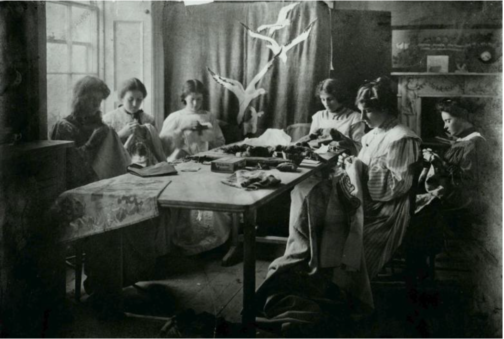
Figure 1: The Embroidery Room at Dun Emer Industries 1902 (Photograph), National Gallery of Ireland, Dublin.

This subject area feeds into my particular interest in artisanship and the handmade. Truly, as much as I adore leafing through old editions of Vogue and Harper’s Bazaar, it has been an indescribable pleasure to dive head-first into a pseudo-archaeological study of fashion history. I have had the opportunity to physically explore and examine some of the most exquisite creations from this period in history, and have had the chance to understand them as lived creations. One of my favourite encounters I have had on this research journey has been with a watercolour sketch of a Celtic Revival outfit by craftswoman Katherine ‘Kitty’ McCormack of the Dun Emer Guild (figure two). The juxtaposition of an overtly 1920’s drop waist silhouette alongside an attempt to reproduce key garments of the traditional Celtic wardrobe such as the léine (tunic), brat (sash) and ceannbheart (headdress) delighted me no end upon first discovery. This fusion of heritage and Modernity encapsulates the spirit of the Celtic Revival which I am attempting to address in my dissertation, and is epitomized by this sketch. 
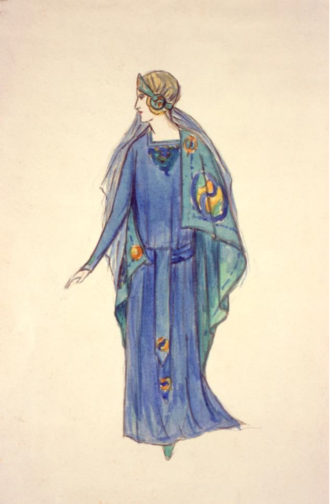
Figure 2: Dun Emer Guild, illustration of Kitty McCormack’s design for Clare Kennedy’s Celtic Revival Costume, c. 1927. Watercolour on paper, 34 x 21 cm. Dublin: National Museum of Ireland.


Which outfit from dress history do you wish you could wear? 

As of late, I cannot stop thinking about Marilyn Monroe’s blue polka-dot sundress from 1957. Ever the pragmatist, I couldn’t justify naming a fanciful suit of armour or extravagant ballgown as my answer for this question, as I am inferring (or rather deciding) that I get to keep whichever garment I choose. Yet, I know if I could ever lay my hands on this dress I am certain I would probably never take it off. 
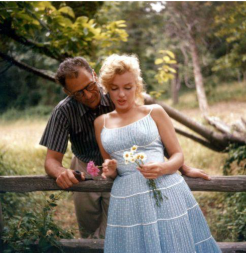
Figure 3: Marilyn Monroe and Arthur Miller, 1957.

This outfit epitomizes exactly how I aspire to dress in the summer. Maybe it’s just the idyllic outdoor scene created in this photograph, but Marilyn in this dress looks the image of peace, comfort and class. I love the timelessness of its design, and the serene subtlety of the baby blue fabric against her wispy blonde hair. As a blonde myself, the discovery of this photograph a number of years ago began a painstaking search for a similar outfit. Resultingly, I fell down a rabbit hole of light blue 50’s style dresses which led me to the discovery of Kate Moss’ “Breakfast at Dior” shoot for Glamour France in 1992. 
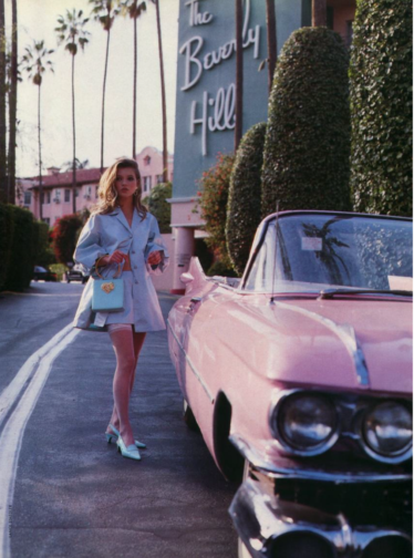
Figure 4: “Breakfast at Dior”, Kate Moss for Glamour France by Lace Staedler at the Beverly Hills Hotel on Sunset Boulevard, April 1992.

In this Gianni Versace taffeta ensemble Moss embodies the mid-century American Barbie in an almost Stepford Wife-esque eeriness. Whilst obviously dissimilar to Marilyn’s sundress, both outfits take their inspiration from the classic 1950’s swing dress silhouette. The simple twinning of this design with the baby blue colour activates a ravenous part of my brain which deems it a necessity for me to have one of these outfits. Or preferably both. 

What are you wearing today? 

Shockingly, the onset of summer has meant that London has gotten very warm all of a sudden. With that in mind, today I am wearing a vintage pink cotton sundress which I picked up from a young woman on eBay who was looking to find loving homes for her grandmothers clothes from the 1940’s, 50’s and 60’s. The dress is very clearly handmade and was fitted to the exact specifications of the wearer. Luckily enough for me they seem to be my precise measurements too, as this dress feels like a second skin when worn. On my feet I’m wearing a pair of beige espadrilles with rope lace ties to my ankles. I swear they look less odd than they sound. Finally, in my handbag I have a cream cable knit cashmere cardigan which may or may not be donned in this humidity. I have owned this cardigan for as long as I can remember, an thusly cannot recall where I picked it up. 
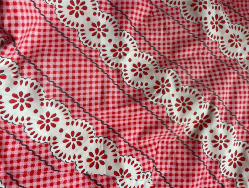
Figure 5: Close up of the 1950’s Dress Pattern.

Practically, the summer season is probably my least favourite to dress for. If you have ever met me you will understand the remarkable paleness of my unmistakably Celtic skin. To be frank, I am translucent. Thus, I must always factor in the copious amounts of sun cream I have to wear in order to reveal any skin during these months. Simple sundresses like the one I’m wearing today allow me to navigate this tricky balancing act as easily as possible, and enable me to somewhat mitigate the amount of time I have to spend vampirically skulking indoors. Being permanently alabaster in a climate which regularly has the gall to rise above 22 degrees is far from ideal, yet I find classic pieces such as this dress incredibly effective at minimising the hassle of the season. 

Do you have an early fashion memory to share? 

Whilst considering this question I have recalled a number of memorable fashion moments from my childhood, yet one common denominator prevails amongst all of them. I think it is only right that I answer this question by way of lauding my greatest fashion inspiration, teacher and supporter – my mother Paula. 

Some of my earliest memories of experiencing fashion with my mother involved her teaching me to touch textiles before I even considered their aesthetic appeal. Learning the difference between your cottons and linens, your synthetics and your organics and your tweeds from your tartans formed the basis of my early relationship to clothing, and is responsible for my passion of exploring skilled textile craftsmanship. To this day I cannot sleep on a polycotton bedsheet, and can’t stand the sticky cling of a synthetic sports jersey. I have all of these little textile quirks to thank my mother for. 

Probably the most singularly influential moment in my early relationship to fashion are my memories of the creation of my Communion dress. As to be expected with Paula FitzGerald, an off-the-rack white dress would not do for her daughter, so she enlisted the services of the same seamstress who created her wedding dress to construct my special outfit. At just eight years old I vividly remember going to dress fittings with my mother who had a detailed design for the whole ensemble. Day trips were spent going to Dublin haberdasheries, where ribbons and lace were studied and deliberated by my mammy. The finished white cotton dress was her most beautiful brainchild, and was gracefully unique and understated. Through that experience I began to understand clothing as something inherently tied to the human experience, and not simply as an inconsequential consumer item. 

As I am answering this question I have come to realise that I probably have another dissertation’s worth of memories that I could recount regarding myself, my mother and fashion. The experiences I have shared with her throughout my life have been the single most influential force on my studies of fashion at the Courtauld, and continue to guide my relationship to clothing every day. 

By Victoria Fitzgerald

The Whimsical Works of Marcel Vertès

Marcel Vertès epitomised innovation in twentieth-century design and fashion illustration. Born in Hungary, he moved to Paris and studied at the Académie Julian. He travelled to New York frequently, even staging his first show there in 1937. With the outbreak of World War II, Vertès fled Paris and settled in New York, his home for the next decade. He returned to Paris in his later years and spent the majority of his time there before his death in 1966. Among his many talents, Vertès experimented with costume design in film, painting, needlepoint, and silkscreen prints. However, his illustrated advertisements for Elsa Schiaparelli will always be my favourite.

Harper’s Bazaar, February 1944

Vertès created some of his more notable works for Schiaparelli’s perfume advertisements from the late 1930s through the 1950s. He created numerous fantastical illustrations for her ‘Shocking Schiaparelli’ campaign featured in Harper’s Bazaar. Vertès’ playful style shines through in these advertisements. Many depicted flirty and poetic drawings that often incorporated elements of the mystical. Women became dainty nymphs and fairies surrounded by autumn leaves or spring flowers as they danced around the page. The perfume bottle, designed to mimic the female form, often had bouquets of flowers blooming from the top, representing the scent of the perfume as well as implying the femininity a woman would attain while wearing it. Vertès’ passion for other art forms also manifested in his works for Schiaparelli. He frequently paralleled ethereal depictions of women with artistic tools such as painter’s palettes or bouquets made of sheet music. The designs were often suggestive and used various objects, such as a palette or leaf, to conceal yet hint at the intimate parts of the female body.

Harper’s Bazaar, October 1943
Harper’s Bazaar, April 1939
Harper’s Bazaar, October 1944
Harper’s Bazaar, October 1940

Vertès also wove societal undertones into his advertisements for Schiaparelli, altering the connotation of the campaign according to the era’s values. One of his drawings depicts a sailor on a date in a park with the female-shaped perfume bottle. This advertisement was released in 1942, and its drawing hinted at the ‘beauty and duty’ ideal that women and girls were encouraged to uphold during the war in order to bolster morale. Women pitched in for the war effort in various physical ways, but the illustration signified to women that, by wearing Schiaparelli’s perfume, they could demonstrate their patriotism while still embodying the very essence of beauty. On the other hand, one of Vertès’ 1953 illustrations exploded with the colour pink. It featured a woman beaming in a gown reminiscent of the ‘New Look’ style and high heels, the epitome of traditional, feminine beauty. With the war over, the men returned, pushing women out of workforce positions and back into the home. The fashion industry once again favoured the restrictive, ultra-feminine ensembles that signalled a return to ‘normalcy’ in society. Vertès subtly captured this shift in his illustrations.

Harper’s Bazaar, November 1942
Harper’s Bazaar, May 1953

Marcel Vertès also collaborated with Elsa Schiaparelli in designing the costumes for the 1952 film Moulin Rouge. He won two Academy Awards for his work, Best Art Direction and Best Costume Design. Beyond these achievements, Vertès painted murals for both private and public display, including one for the Café Carlyle at the famous Carlyle Hotel in New York City. He even explored fashion design, creating pieces that showcased his whimsical illustrations.

Marcel Vertès
MOULIN ROUGE (MARIE ACCOSTE LAUTREC), 1952
Gallery 19c
Marcel Vertès Mural at Café Carlyle via Tillett Lighting Design Associates

https://www.instagram.com/p/CKRdONIhqbJ/

An artist in every sense of the word, Marcel Vertès worked with a diverse array of mediums, but stayed true to his light, flowing style with every project he undertook. Vertès translated culture into his illustrations and portrayed ‘Shocking Schiaparelli’ as more than a perfume. Rather, his drawings enabled the viewer to envision and desire a way of life.

By Genevieve Davis


Sources:

“Advertisement: Shocking de Schiaparelli (Schiaparelli).” Harper’s Bazaar. New York, United States: Hearst Magazine Media, Inc, April 1939.

“Advertisement: Shocking de Schiaparelli (Schiaparelli).” Harper’s Bazaar. New York, United States: Hearst Magazine Media, Inc, October 1940.

“Advertisement: Shocking de Schiaparelli (Schiaparelli).” Harper’s Bazaar. New York, United States: Hearst Magazine Media, Inc, November 1942.

“Advertisement: Shocking de Schiaparelli (Schiaparelli).” Harper’s Bazaar. New York, United States: Hearst Magazine Media, Inc, October 1943.

“Advertisement: Shocking de Schiaparelli (Schiaparelli).” Harper’s Bazaar. New York, United States: Hearst Magazine Media, Inc, February 1944.

“Advertisement: Shocking de Schiaparelli (Schiaparelli).” Harper’s Bazaar. New York, United States: Hearst Magazine Media, Inc, October 1944.

“Advertisement: Shocking de Schiaparelli (Schiaparelli).” Harper’s Bazaar. New York, United States: Hearst Magazine Media, Inc, May 1953.

The Annex Galleries. “Marcel Vertes Biography | Annex Galleries Fine Prints.” Accessed March 18, 2021. https://www.annexgalleries.com/artists/biography/3209/Vertes/Marcel.

In Conversation with Isla Simpson

Isla Simpson seems to live in a world bedecked in the beauty of her own creation. The multifaceted designer has adorned stationery, china, mirrors, linens, and candles with her delightfully romantic visions of climbing ivy, budding roses, and silky ribbons, creating a portfolio that is nothing short of a chintzy fairytale. Before she lent her hand to the world of lush interiors and painted papers, Simpson spent a decade and a half working in accessories design, an experience she says informs her work now but also gave her courage to set off on her own away from the world of fashion. To add further to her impressive resume, Simpson is a Documenting Fashion alum of sorts, having studied with Dr. Rebecca Arnold during their time at Central Saint Martins! Below, we caught up with Simpson about the journey she’s taken following the passion that has always tugged at her (surely bow-tied) heartstrings.


Portrait of Isla Simpson taken by Kyle Galvin for L’Occitane


I’ve garnered from your social media and your lovely website that you started your career working in fashion (and I’ve also gathered that you might be eager to talk about it! No pressure if you are not, of course). How did you enter into the fashion industry and what did your career in the fashion world entail?

I knew from the moment I arrived at Saint Martin’s that accessories design was for me, so I worked as a weekend shop girl at Anya Hindmarch and went straight into women’s handbag design on graduation. I worked for various brands over 15 years, designing everything from the shape of the bag and purses to the metal componentry and the leathers. It was a niche career, but I’d engineered myself into the ‘It bag’ era, so my skill set was in demand.


What made you decide to depart from the fashion industry to start your independent career as a designer and illustrator?

Longevity in my field has always been important to me. The generation of designers above me all seemed to disappear after 40, so I knew I had a problem on the horizon. I could foresee the industry would only support me if I went into middle management in an age-appropriate brand. The only way to future-proof myself was to set up on my own, and I thought it was scarier not to try…

I should add I was also creatively burnt out, too. When I entered the industry, we designed the traditional two seasons a year. By the time I left, it was nudging eight collections. It took a pandemic to stop those product-churning cogs, even though we all knew it was wrong.


Do you find that your time in fashion informs the way you work now? Have you reshaped your creative process as you work independently?

Absolutely! Fashion training was second to none, I learnt everything I know standing on the factory floor (my factories were amazing), drawing technical drawings, software packages etc. You have to meet the deadline; the buck stops with you.

When that chapter closed, I had to ‘reboot and unplug’ myself from trends, and the merchandising team whispering ‘bestseller’ in my ear. I sought inspiration in the British Library archives and old country houses. I allowed myself to be besotted with everything chintzy and feminine, for no reason other than my enjoyment.

I now only design products that I truly love, in the hope that my followers love them too. Because my designs come from a place of true passion, and respect for chintz patterns, that sustains me through the tough times such as 2020.


https://www.instagram.com/p/CHr_lN2pspf/


You work with such a wide variety of media – gorgeous papers, linens and, of course, the iPad. Do you find that your approach to illustration changes across each?

It definitely keeps things fresh! The uniting aesthetic is that my work is always quite flat, respecting that tradition of graphic, block printing in chintz surface pattern.

Sadly, few new chintz patterns are designed – it’s just no longer commercially viable to pay a designer for weeks to hand paint as they would have done in the old days. I’ve developed techniques that mimic the textures and brushes of old chintzes on the iPad, which means I can design that old-school look faster. All the brands I collaborate with are in a hurry, so there’s no time for scanning in and cleaning up.


https://www.instagram.com/p/CI1H970p4Z4/


Your work seems so steeped in the lush beauty of British history. Are there any particular periods or styles of design history that inform your work?

I used to spend hours at the Museum of Costume in Bath as a teenager which probably tells you everything you need to know about my love for Regency aesthetic. I’m drawn to the sentimentality of Victoriana, but stylistically I’m always trying to return to the 80s/90s – the cosy chapter of my childhood.


https://www.instagram.com/p/CItYRSFpLpx/


Is there a relationship between your personal style and your designs?

The two are now so intertwined, I barely know where one begins and the other starts…I want ruffles on my dresses, bed linen and my linen hand towel designs.

In the fashion years, I had to suppress my own style in favour of whichever accessories brand I was designing for and represented. Now, I just feel unapologetically myself – you could come back in twenty years’ time and the house will still be full of blousey curtains and pie-crust collars. It’s just part of my DNA.


https://www.instagram.com/p/CLr702QsPO8/


Finally, this might be a bit selfish, but it seems that you have an unbelievable collection of vintage ribbons and textiles and I’m so curious to have a metaphorical peek: is there one ribbon or swatch that has been particularly inspiring or comforting to you during this year spent inside?

I used to feel embarrassed about being a grown woman collecting ribbons, but I am in good company on Instagram, so I’ll happily share.

My Mum studied Italian in Naples as a mature student, and I used to visit her during the holidays. This silky swatch came from the most fantastic vintage ribbon shop – I wish I could remember the address – I’d give my right arm to return to. The woven underside is as beautiful as the top. I’m launching lots of embroidered table linen designs this year, all of which were designed during the pandemic year, when I had to make do and be resourceful with my inspiration. Ribbons make the best colourway and construction research.


Courtesy of Isla Simpson

Interview by Ruby Redstone

A Bonnie Wee Peep into the World of Ms. Cashin

At the end of February, Documenting Fashion’s MA class took a study trip to New York. Homecoming for some and the first time in America for others, these few days were outstanding, and we are excited to share our highlights with you.

Bonnie Cashin wearing a traditional Korean gat that she purchased during her travels for the Ford Foundation in East Asia during the 1950s. Additions to image made by the author.

Before this trip to New York, I had never seen any of Bonnie Cashin’s Coach-era sketches. Cashin designed for the luxury accessories brand for a little over a decade whilst maintaining her own sportswear company (1952-1985). She was hired by Coach’s wife & husband duo Miles and Lillian Cahn in 1962 to work collaboratively on the brand’s range of leatherwear accessories. From bucket-scooped ‘carriables’ to practical leather-trimmed ponchos, Cashin became well-known for her unusual combinations of texturally diverse fabrics. Cashin was Coach’s first designer, and I believe her veracious, playful nature as a creative can be most resolutely understood through her quirky sketches. 

As previously mentioned, I had never seen Cashin’s sketches before, and yet during this four-day study trip, I was able to closely examine two collections of her work, from different archives: the Special Collections & College Archives at the Fashion Institute of Technology and at the Brooklyn Museum Fashion and Costume Archive. It was not singularly the drawings that provided me with such entertainment—though bold and thoroughly fun—but also the captions Cashin had devised to sit alongside them. Her words inject the drawings with a splash of campy humour.

Sketch by Bonnie Cashin for Coach, Special Collections & College Archives collection at Fashion Institute of Technology, New York. Photo by author.

Take, for example, this waifish figure laden with piles of precariously stacked Cashin-Coach handbags, which are seemingly ready to topple from her outstretched arms. In the right top-hand corner of this sketch is the accompanying caption: ‘I just want to steal every Cashin-carry I can put my hands on’.

‘I’d rather wear body bags than body stockings’, sketch by Bonnie Cashin for Coach, Special Collections & College Archives collection at Fashion Institute of Technology, New York. Photo by author.

In this sketch, like the others I studied, Cashin employs a provocative statement and counterbalances its weight with her own special brand of humour. The term ‘body bag’ holds two meanings—at least to me (!): a bag in which you place a cadaver… or a cross-body bag in which you hold your phone, keys, lip-salve, whatever. The drawing of an in-motion model paired with a quirky caption makes Cashin’s work that much more unique. She has also incorporated her own surname to further instate the mark of her hand within the image. 

I am reminded of the wit that contemporary illustrators, such as Julie Hout, use to poke fun at the commercial fashion industry’s superficial nature. Even though the girls that decorate Hout’s Instagram feed are clumsy, brash and all together horribly scatty, I want to be them, and their parodied inadequacies make them all the more relatable. 

Julie Hout vs. Bonnie Cashin – additions to image made by the author.

This is also true of Cashin’s cluttered mannequin, weighed down by her bags, her indecision and her shopaholic tendencies. I like to think of her illustrative style as a precursor to the current trend of satirical fashion illustrations swarming our Instagram feeds. 

Once again, we defer to you, Bonnie!  

Find amazing images of Cashin’s sketches on FIT’s digital image library: fitdil.fitnyc.edu 

OR through the Brooklyn Museum’s Costume and Textiles Archive Collection:  www.brooklynmuseum.org/opencollection/archives 

An ode to the talents of Julie Hout (@jooleeloren), seriously, follow her! – additions to image made by the author

Jeordy on MoMA and Muriel King

At the end of February, Documenting Fashion’s MA class took a study trip to New York. Homecoming for some and the first time in America for others, these few days were outstanding, and we are excited to share our highlights with you. 

Our study trip to New York City was a whirlwind. As a native Californian, it was fascinating to visit a part of the United States I had never seen before in the company of my English classmates. It was a strange in-between state, where I was among my countrymen and women, but in an entirely alien environment, mentality, and culture. Once I overcame the uncanniness and aggressive atmosphere of NYC, I enjoyed myself greatly. Of particular interest were the Good Design Exhibit at MoMA, and the collection of Muriel King’s design sketches.

Wooden Shelving Unit and Chairs, Good Design exhibit, MoMA

‘Good Design is not a label or a price tag
Good Design is international in both origin and appeal
Good Design is a statement and not a gadget
Good Design need not be costly
Good Design is neither a book of etiquette nor a social register
Good Design is one that achieves integrity
Good Design depends on the harmony established between the form of an object and its use.’

The Good Design style of the 1940s and 1950s highlighted function, form and aesthetics. It encompassed the design of everything from coffee pots to the Fiat car. I was fascinated to see exhibits like the one above, which contextualised midcentury clothing for me.

Muriel King sketches, 1930s, FIT Special Collections Archive

Sketches by American designer Muriel King also caught my attention. Muriel King became a name-known designer in the 1930s; she designed for films and socialites alike, including the notorious fashionista Hattie Carnegie. I find her designs remarkably imaginative and modern, even by today’s standards. Our guide at the archive informed us that Muriel King had no knowledge of sewing or pattern making, thus necessitating that she sketch both the front and back of each outfit as to express her deigns with the utmost clarity. Our guide also suggested that her originality and creativity derived from her said lack of sewing knowledge, as she was not intimidated by complex or challenging designs.

Muriel King sketches, 1930s, FIT Special Collections Archive

I took pictures of dozens of these sketches, in the vain hope that I may one day have the resources to have them made up for myself. How many vibrant and boldly patterned dresses can I have before it’s too many?


All photographs taken by author.

More information on Good Design: https://www.moma.org/calendar/exhibitions/5032?locale=en

Fashion Illustration and Instagram

From the creative process to representation in magazines such as Vogue and Harper’s Bazaar, illustration has always played a key role in fashion, its rough, sketch-like appearance giving it a whimsical elegance. Just like fashion photography, fashion illustrations are palpable sources of information about the collective cultural currents of a moment in time.

Today, as long as you have a smartphone, you can capture anyone walking down the street in what you consider to be a fabulous outfit, identifying yourself as a fashion photographer. Depending on the number of followers your fashion account has, you can even be thought of as an ‘influencer’. As someone who loves looking at photos of clothes, especially street-style, I turn to Instagram for my daily dose of visual inspiration. Over time, I have noticed that my feed has automatically curated itself. However, I cannot help but notice the lack of variety in the fashion images I encounter. My newsfeed is saturated with the same overly edited type of photo (I don’t always buy the #nofilter). It seems that every new fashion account is trying to outdo the next most popular one.

In our recent Portraiture and Identity-themed MA seminar, we began by discussing events that would be occurring in London over the next few months. All of the events seemed to have to do with fashion illustration. When I got home I turned to Instagram—of course— to look up a few of the illustrators that we had been discussing. I was so relieved to be exposed to an entirely different, though no less vibrant, dimension of fashion representation. Additionally, there was something exciting about knowing that while I could encounter photos of illustrations at my fingertips, I could also stroll down to the Fashion Illustration Gallery in Covent Garden and engage in a more dynamic viewing experience of fashion illustration.

Fashion Illustration Gallery (The Shop at Bluebird).

Although sketching the runway may seem archaic in a time of live stories and Snapchat, is there not something refreshingly authentic about the process of drawing—a process that offers an escape from filters and retouching? Fashion illustration offers a very different form of real-time representation, one that is organic in its process and tangible in its materiality. Each illustration is unique, rather than a template. There is a rarity in each piece that gives it the special aura of a collectible item.

Left: Richard Haines, Four Guys Walking, 2017, 42×29.7 cm, digital inkjet pigment print. Right: David Downton, 100 Years, 2008, 59.4×42 cm archival FIG pigment print.


David Downton, LOVE YSL, 2013, 59.4×42 cm, digital inkjet pigment print.

Fashion illustration definitely seems to be garnering interest in social media, with Instagram seemingly acting as a portfolio for the fashion illustrator. For instance, the page ‘The Unique Illustration‘ posts what its moderator(s) have called ‘fashion illustration flash mobs’. The page selects an image and then posts various illustrations of it realised by different artists. Like in the case of ‘Alice in Gucciland’, this relatively young display mode showcases a fascinating variety of illustrations, which, interestingly, might never have been seen were it not for the platform Instagram affords the artists.

‘A Document of Modern Living’: How to become a Fashion Illustrator

How do you advise a budding artist? Encourage and suggest the correct path to fashion success? Well, it seems Harper’s Bazaar (HB) solved this problem in 1933, in ‘The Road To Fashion Art,’ its response to a reader’s letter.

Firstly, HB notes that becoming a fashion illustrator requires quite different skills from becoming a fashion creator, since:  ‘To design clothes you need about as much technique as is required for the drawing of daisies or mustaches on a telephone pad – just enough to get your idea across.’

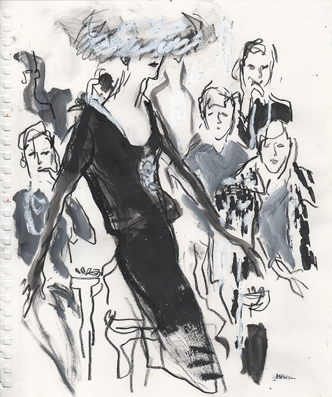
However, a fashion illustrator needs have far more refined abilities in this regard and must ‘draw superlatively well.’  This assertion is perhaps the key to HB’s excellent advice – that fashion illustration is a branch of that ancient technique of drawing, and as such must be learnt and nurtured.  One need only look at some of the most well-known illustrators, Eric, or Rene Gruau to see evidence of this.  Or for more contemporary inspiration scan Richard Haines’ Instagram feed and examine the way emotion and movement are captured in every line.  His work encapsulates what HB describes as every art director’s wish – not to be shown every buttonhole and seam, but to receive an illustration that is ‘a document of modern living.’  Haines’ images of men striding the city streets are proof of this – at once showing the newest styles, and capturing life as it is lived.

Richard Haines

To achieve this, you must, HB says, ‘Draw and keep drawing.’  To start: life drawing, to gain complete understanding of the body.  Next develop an understanding of colour, keep building from this, to examine gesture of every kind, for example ‘the gloved hand picking up the reins.’

As your eye becomes attuned to these telling nuances, HB advises that the budding fashion artist is ready to begin looking for ‘the quality called chic.’  With sketch book in hand, an illustrator must observe all closely – visiting fashionable locations and venues, ‘look at ankle bones, hair waves, the hang of expensive tweeds.’  Everything is a potential source, from films to restaurant customers. Of course, HB states ‘Go to Paris if you possibly can.’

Richard Haines

Only there can fashion be seen in its purest form, alongside the best in dining, socializing, art and culture.  And HB is practical too – as well as this emersion in French couture style, you must, ‘Talk to printers, engravers; learn all you can about colour reproduction, first hand.’

Richard Haines

What this master class provides is a careful guide in how to shape your talent, how to focus on drawing as a means to evoke life, to show how fashion is an expression of culture and emotion, and how to work constantly at producing the most observant images that will trigger a corresponding feeling in viewers.

By Rebecca Arnold

All images courtesy of Richard Haines


‘The Road To Fashion Art,’ Harper’s Bazaar, December 1933

Follow Richard Haines on Instagram: @richard_haines

Addressing Images

Every term we have a meeting of the Addressing Images Discussion Group.  Actually, that makes it sound far too official and formal, what really happens is that anyone who feels like spending their lunch hour talking about fashion can drop in and join my students and me.  It started as a way to share ideas and has become a regular venue to think about what fashion representation means.  Past sessions have included looking at Bill Cunningham’s entrancing photographs of Editta Sherman dressed in vintage, out and about in 1970s New York, amateur film footage of a late 1930s family holiday to Europe, and Paul Iribe’s images for Les Robes de Paul Poiret – this last one was extra special, as we had the original 1908 book on display from our collections.

Deciding what to discuss is always fun.  We need to choose something that will spark discussion, and interest the wide and wonderful range of people who attend – everyone from fellow Courtauld academics and administrative staff to textile designers, photographers, Instagram friends, vintage collectors – anyone who likes to talk about dress.  Ideas are just as diverse as the backgrounds of the people and that’s the point – sharing what we do at The Courtauld with others, and in turn being inspired by the people that attend.

  Detail of illustration of Elsa Schiaparelli design by Marcel Vertes, 1938
Detail of illustration of Elsa Schiaparelli design by Eric, 1938

Out most recent session focused on Christian Berard’s illustrations for Elsa Schiaparelli’s famed 1938 Circus Collection.  With the original double page spread as our focus we considered the way Berard’s technique drew viewers in to a tumbling series of glimpsed images of couture-clad women, clowns, acrobats and animals.  We compared his illustrations to Eric’s more earthbound, but no less seductive style, and to Marcel Vertes’ fantastical dreamlike drawings.  Discussion ranged from brushstroke to colour, from character to iconography and from fashion to funfair.

It was, as always, a wonderful, enlightening way to spend an hour … so do put the date for next term’s Addressing Images on 9 February in your diaries.

Documenting Regency Fashion with La Belle Assemblée

Today, 18 July 2017, marks the bicentenary of the death of Jane Austen, author of classic novels such as Pride and Prejudice, Sense and Sensibility, and Emma. Much of her work, and their subsequent adaptations, are set in the Regency era (broadly categorized as 1795-1820) and their fashions reflect that time. Jane herself was quite fond of fashionable dressing: letters from time spent living with her brother Henry in London mention visits to Grafton House for trimmings and hosiery, and to Bedford House for dress fabrics.

Fashion plate from La Belle Assemblée (published by John Bell), 1807. Hand-coloured etching. Los Angeles County Museum of Art: www.lacma.org. Accession number: M.86.266.84.

In order to keep abreast of the latest fashions, women of the Regency era consumed ladies’ magazines, among them the high quality La Belle Assemblée or Bell’s Court and Fashionable Magazine addressed particularly to the Ladies. John Bell first published Le Belle Assemblée in 1806 as a monthly source of prose, poetry, biographies, and fashion advice for leisured women. There is even reason to suspect that Jane Austen would have read La Belle Assemblée as one of her favourite nieces, Fanny Austen Knight, had an 1814 issue of that periodical among her possessions.

‘Bourbon Hat and Mantle’ plate from La Belle Assemblée (published by John Bell), May 1814. Hand-coloured etching. Victoria and Albert Museum. Accession number: E.1025-1959.

La Belle Assemblée’s price established it as a thoroughly affluent periodical. Its rival, the Lady’s Museum, cost 1s. in 1806, while La Belle Assemblée cost 2s. 6d. for black-and-white etchings and 3s. 6d. for hand-coloured illustrations. Though only two fashion plates were included with each issue, they were prepared by highly skilled illustrators, engravers, and painters. The 25cm x 16cm dimensions of this periodical further added to its luxury. Whether coloured or not, the sizable fashion plates are works of art in their own right, as their inclusion in museum collections around the world confirms.

‘Walking Dress’ plate from La Belle Assemblée, September 1822. Hand-coloured etching. Victoria and Albert Museum. Accession number: E.2818-1888.

John Bell’s wife Mrs. Bell was credited with the designs of many outfits seen in the plates of La Belle Assemblée. As a dressmaker in London known for extremely up-to-date fashion knowledge (she had foreign fashions imported for study twice each week), Mrs. Bell possessed a reputation for unbeatable fashion acumen. She was not just a dressmaker and designer however. Mrs. Bell, ever the visionary, invented the ‘Chapeau Bras,’ a foldable hood small enough to store in a bag, and a corset to reduce the appearance of pregnancy.

‘Dinner Party Dress’ plate from La Belle Assemblée (published by Whittaker & Co.), February 1827. Hand-coloured etching. Victoria and Albert Museum. Accession number: E.1972-1888.

Plates from La Belle Assemblée reflect both minute and radical changes in fashion during the first three decades of the nineteenth century. From 1800-1820, differences in fabric, colour, and accessories set old and new fashions apart. The 1820s saw a gradual widening of sleeves and skirts as the decade progressed, morphing the columnar silhouette of the beginning of the century into the exaggerated hourglass shape of the early 1830s. In 1832, La Belle Assemblée merged with the Lady’s Magazine; the new Court Magazine and Belle Assemblée continued to publish the latest advances in fashion throughout the 1830s.

Read, W., ’Full Dress, Ball Dress, Morning Dress’ plate from La Belle Assemblée (published by Whittaker & Co.), October 1830. Hand-coloured etching. Victoria and Albert Museum. Accession number: E.1972-1888.

Further Reading

Jane Ashelford, ‘Perfect Cut and Fit’ in The Art of Dress: Clothes Through History 1500-1914 (London: National Trust, 1996), pp. 167-210

Margaret Beetham, ‘The ‘Fair Sex’ and the Magazine: The Early Ladies’ Journals’ in A Magazine of Her Own? Domesticity and Desire in the Women’s Magazine, 1800-1914 (London: Routledge, 1996), pp. 17-34

Victoria Thorne: An Illustrated Interview

A few months ago, after I had just started my fashion and dog Instagram account, I noticed that I had been mentioned in a post by Victoria Thorne. Inspired by my post from earlier that day, Thorne had drawn the loveliest illustration of a woman and two Dalmatians. Even though the professionalism and high quality of her work suggests otherwise, Thorne only started illustrating recently. Her career consisted mainly of art and design jobs, which included graphic, interiors and garden design, styling for photographers and advertising and organising events for a children’s bookstore. During the past years, she has started sketching people and images from Instagram and is now selling her illustrations on t-shirts and to organisations (including some for the Courtauld!).

Who is your favourite fashion designer?

What do you love to illustrate?

Souls.

Who would you like to swap lives with for a day?

The Dalai Lama. I want to know what it feels like to be that kind and that wise. I also want to learn how to laugh as often as he does.

How do you spend your favourite evenings?

With my family. There are a lot of us. Here are three of our newest additions.

What do you like most about yourself?

That I believe love can save us.

What animal do you think best represents you?

Snow fox (No idea why l think this).

Who do you admire?

Strong women. People with generous, open hearts. People who are concerned with living a reasonably selfless life.

What is your secret talent?

Being asked to leave the museum because I’m the last person there. Usually they ask nicely (I lose track of time).