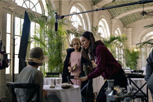
We’ve been busy working on our dissertations, so we’re taking the opportunity to get to know the current MA Documenting Fashion students. Here, Megan discusses David Bowie, Paris is Burning, and her early fashion influences.
What is your dissertation about? What prompted you to choose this subject?
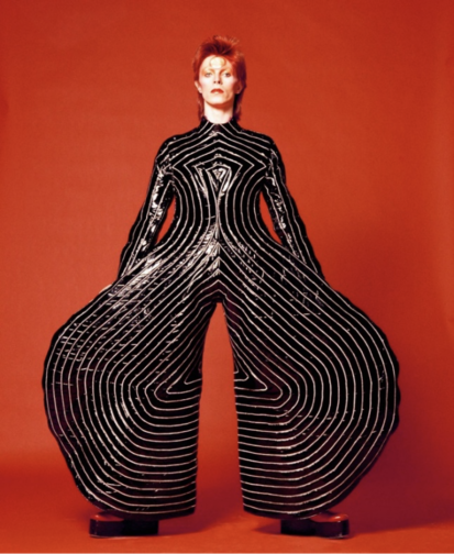
My dissertation is about David Bowie… kind of. I’m looking at the personae of Ziggy Stardust and Aladdin Sane, focusing on three sources: Brian Duffy’s photoshoot in January 1973, Masayoshi Sukita’s photoshoot in February 1973, and D. A. Pennebaker’s documentary Ziggy Stardust and the Spiders from Mars (filmed July 1973).
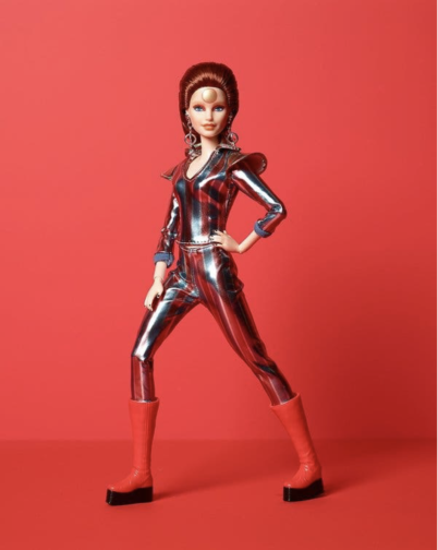
I was initially inspired to research this area after learning about the close connection between Bowie and Japan, which made me wonder about the various influences that collaboratively produced his iconic personae. The incredible glam rock fashion of his Ziggy Stardust and Aladdin Sane period made the choice of which area to focus on pretty easy. I’m really enjoying the research, as it’s allowing me to dig under the surface of visual media and find a whole network beneath. Along with Duffy, Sukita, and Pennebaker, I’ve been researching fashion designers Kansai Yamamoto and Freddie Burretti, make-up artist Pierre La Roche and mime artist Lindsay Kemp. My main realisation has been that there is an infinite list of contributors, collaborators, and influences that came together to produce the Ziggy Stardust and Aladdin Sane imagery that we know so well. Even a rice cooker gets a mention for being relevant! It’s also been really interesting to trace the sources and their uses in various forms – my favourite of which being the Barbie doll dressed and marketed to recreate an image from the Sukita shoot.
Fig 1: ‘Watch That Man III’ by Masayoshi Sukita, 1973. (Snap Galleries)Fig 2: Barbie as David Bowie, 2019. (Mattel)
What is your favourite thing you’ve written/worked on/researched this year?
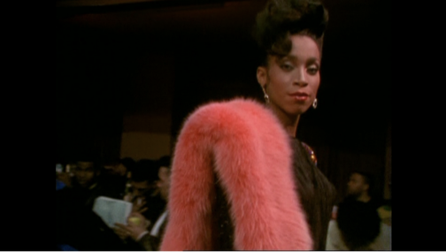
My favourite thing would have to be my first essay, which was about the wearing of fur in Jennie Livingstone’s Paris is Burning, a documentary filmed in the late 1980s about the New York ballroom scene. I researched the history of fur as a material in fashion, and the social and cultural reasons fur may be worn in different contexts. Paris is Burning was a particularly interesting lens to view this through, as tensions between fur as a marker of distinction and anti-fur campaigns were dramatically rising. Not only that, but I could bring in a lot on gender and fashion – my favourite topic!
Fig 3: Still of Octavia St. Laurent in the film ‘Paris is Burning’ at 06:17, 1990. (Academy Entertainment / Off White Productions)
What are you wearing today?
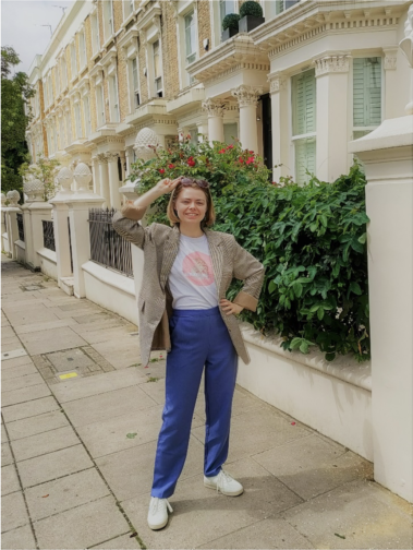
Today I am wearing periwinkle blue trousers, a white t-shirt and a brown check jacket. The trousers are the most recent thing I’ve bought, I found them on Depop and am loving them. The t-shirt was given to me as merchandise when I worked on an event a few years ago, and it’s become a staple of my wardrobe. The jacket is originally from Motel, but I got it from a charity shop in Angel for £7. On my feet are a pair of Flamingos’ Life trainers, bought second-hand on Ebay. I’d really recommend Flamingos’ Life – they are plant-based, comfy, and don’t slip off the backs of my feet as I walk along.
As you probably noticed from that description, most of my clothing these days comes from some kind of second-hand source. I started trying to avoid fast fashion about 5 years ago and am really happy with the eclectic wardrobe I have built since. I’ve dabbled with making my own clothes, and the new series of Sewing Bee is inspiring me to dedicate more time to that this summer! I have been desperate for a brightly coloured co-ord suit that fits my body (Zara seems to think I need an extra 6 inches of torso?), so that’s what I’ll be aiming to perfect first.
This MA has really solidified my belief that clothes aren’t everything, but they’re a heck of a lot more than ‘just’ clothes. They are a way for us to customise this character we have been given, to make our day more comfortable, to support our lifestyle and to surround ourselves with softness and colour (at least, these are my main priorities).
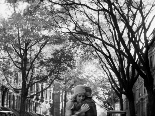
Fig 4: Megan strutting her stuff on the streets of London
Do you have an early fashion memory to share?
A glowstick exploding all over my favourite lilac crushed-velvet tank top, age 6! I never fully recovered, and today I own a turquoise crushed-velvet strappy crop top… I actually had forgotten all about the glowstick incident until I thought about how to answer this question, and hadn’t made the connection between that top of 17 years ago and the crop top I now own and wear on nights out. Oh dear.
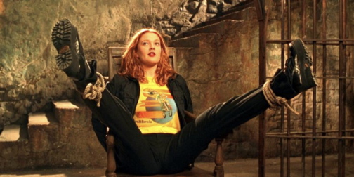
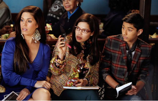
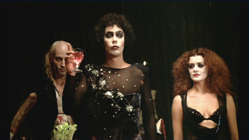
In terms of fashion media, I have strong memories of media which I think must have come from my big sister, because I was almost certainly too young to follow these when I first watched them. Charlie’s Angels (2000) has Drew Barrymore playing Dylan, and her blue-eyeshadowed rock-chic look definitely inspired me for better or worse. Ugly Betty (2006-2010) and The Rocky Horror Picture Show (1975) also felt like defining moments where I became aware of fashion. They were also both, in their own ways, trailblazing forms of media. I’m glad I could see their comedy, drama, and representation from an early age. (Special shout-out to Pierre La Roche, mentioned earlier, who also did the make-up for Rocky Horror and has been a feature of many of my interests without my realising for all these years. More people should know about him!)
Fig 5: Dylan in ‘Charlie’s Angels’, about to beat up many baddies. (Colombia Pictures Industries, Inc.)Fig. 6: Hilda, Betty, and Justin Suarez in ‘Ugly Betty’. (ABC / Getty)
If I’ve got my timings right, then this is my final post for this blog! I’ve really enjoyed my time writing here and reading the wonderful words of my course mates. If you want to see more of what I’m getting up to then my Instagram is @megangalleria – I mostly post about museum, gallery, fashion and photography related things.
All the best!
Fig 7: Frank N. Furter gives a toast, ‘The Rocky Horror Picture Show’. (20th Century Fox)
Truthfully, Eurovision has always appealed more to my mother and one of my brothers than it has me. Although, I think this is perhaps partly to do with my mother’s near-obsessive determination to learn (or at least be able to mumble, sorry Mummy) each entry’s chorus before the *big* day, which was an annual occurrence in our household. Or was it the twenty-minute blind panic – yes really! – when the box filled with feather boas and sequin ensembles in red, blue, and white would go ‘missing’…despite being kept in the same spot in the same cupboard for over a decade.
In fact, Eurovision has held more of a significant place in our family than anyone’s birthday or Christmas for as long as I can remember. In reality this meant that for at least two months of every year, the Eurovision CD would be the only music which we’d listen to (forcefully or otherwise), and is undoubtedly the reason as to why we still have our trusty twenty-year-old Sony CD player, which continues to take pride of place in our kitchen at home in Edinburgh. And I suppose it also explains why I still have a soft spot for the United Kingdom’s 2007 entry ‘Flying The Flag’ by Scooch and can still remember at least 90% of the lyrics. No word of a lie.
Eurovision is also how my mother remembers my due date, as it coincided with the date of the Eurovision Song Contest back in 1999. Had I been born that day I’m certain of the fact that I would have at least ended up with the winner’s first name as a middle-name – Charlotte Nilsson who won on behalf of Sweden with ‘Take Me To Your Heaven’.
As such, I think it’s only right that we should be looking my top five favourite Eurovision fashion moments ahead of its 66th competition. Even if Eurovision isn’t for everyone, it’s a wonderful excuse to inject a bit of sparkle into any wardrobe and a time to be grateful for autotune (just kidding, or at least sort of).
FIVE: JACQUELINE BOYER (1960)
Jacqueline Boyer performing ‘Tom Pillibi’ at the 1960 Eurovision Song Contest, Credit: YouTube
This below-the-knee cowl-necked dress worn by Jacqueline Boyer is at once subtle and eye-catching. The billowing skirt, complete with four frontal pleats work to accentuate the waist and the tutu fabric hidden from view helps the skirt retain its shape. Although relatively simple in design, the piping featured at the bottom of the dress and at the neckline help offer a chic touch.
Last to perform on the evening, Boyer’s Tom Pillibi at the Eurovision Song Contest in 1960, marked the first time that the winning song had closed the competition. Quite the feat aged just eighteen! Moreover, her father Jacques Pills had performed at the Eurovision Song Contest in 1959, as Monaco’s first representative, but his performance didn’t fare so well, and he placed last, a rather less enviable position…
FOUR: LAURA VALENZUELA (1969)
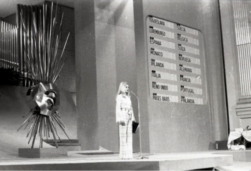
Spanish TV presenter Laura Valenzuela at the 1969 Eurovision Song Contest, Credit: Campúa
This next look was worn by Spanish TV presenter Laura Valenzuela for the 1969 Eurovision Song Contest. The high neck lace suit is chic as it is sophisticated, sexy yet understated. The high neck and long scalloped sleeves help ground the sheer fabric and the suit is tied together with a beige belt which looks to be made out of satin. The script and microphone for the evening form the host’s ‘accessories’ and a page is clearly earmarked for easy access. This lace jumpsuit recalls RTW S/S 20, specifically Look 19 at the Alexander McQueen show, which similarly features long frilled sleeves, a high neck and is tied together with a contrasting belt.
THREE: ABBA (1974)
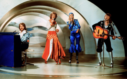
ABBA performing ‘Waterloo’ at the 1974 Eurovision Song Contest, Credit: AFP
Of course, it wouldn’t be a Eurovision round-up without featuring the sensation that is ABBA. They graced us with their Eurovision presence in 1974, with their now-classic, karaoke or silent disco must-have song Waterloo, claiming the first-place prize – rightfully – as their own, despite the United Kingdom offering the song a scathing nul points back in 1974.
With icons come iconic looks and these outfits scream seventies. Metallic knee-high platform boots (a win!) are paired with tops which look like they’ve been attacked with a glue gun and are covered in glittery stars and diamanté studs, making it an easy fancy dress outfit to recreate. Just don’t get me started on Agnetha Fältskog’s lapis blue beanie…
TWO: SCOOCH (2007)
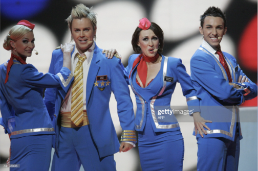
Scooch performing ‘Flying The Flag’ at the 2007 Eurovision Song Contest, Credit: AFP
Now for anyone who thought I was being harsh on ABBA’s look might think my review of Scooch’s 2007 outfits contradictory or hypocritical… Regardless, I will continue to fight for these airline outfits that look like they’ve come from a vacuum packed Smiffys costume set or a knock-off version of Britney Spear’s air hostess outfit from her ‘‘Toxic’ music video. Either way, my opinion is definitely influenced by nostalgia (and the aforementioned retention of the song’s lyrics), the hilariously noughties frosted tips and the tiny pink headpieces. It also serves as a reminder that at least half of the Eurovision Song Contest entries nowadays are less than serious. With that said, it was a bit of a rough landing for Scooch and they came 22nd out of 24 contestants.
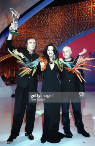
ONE: DANA INTERNATIONAL (1998)
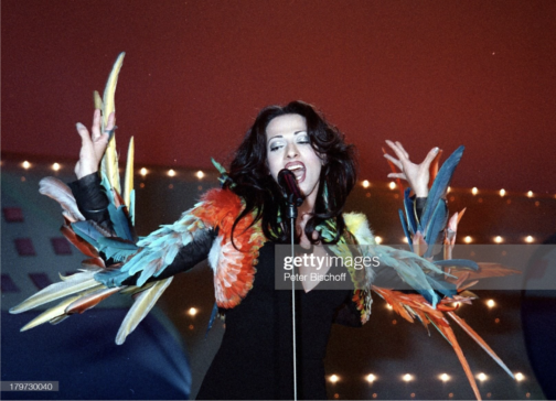
Dana International performing ‘Diva’ at the 1998 Eurovision Song Contest, Credit: Peter Bischoff
This outfit undoubtedly stole the show back in 1998, merging fashion with costume. It was worn by Dana International, representing Israel, for her winning performance of Diva and historical feat as the first transgender woman to win the competition. This dress is from the 1997 Jean Paul Gaultier Haute Couture collection, and the multi-coloured parrot feathered jacket featured as Look 70. The simple, refined black V-neck maxi dress clings beautifully to Dana’s body and the feathery jacket forms an extension of her body, exaggerating every movement.
Furthermore, Gaultier is ‘a self-confessed Eurovision obsessive,’ as quoted in an interview for The Cut and has dressed several other high-profile contestants over the years, including Dana during her 2011 performance.
Dana International celebrating her victory at the 1998 Eurovision Song Contest, Credit: Peter Bischoff
While I appreciate Eurovision mightn’t be everyone’s cup of tea, seeing how much joy it brings my mother can’t help but make me feel warmly towards Eurovision. But perhaps that’s why they say absence makes the heart grow fonder…because I no longer have to put up with listen to the Eurovision CD on repeat for two months each year.
And let’s keep our fingers crossed that the United Kingdom isn’t destined for another – pitiful – nul points this Saturday at the 2022 Eurovision Song Contest.
We’ve been busy working on our dissertations, so we’re taking the opportunity to get to know the current MA Documenting Fashion students. Here, Georgina discusses Vogue, her scented virtual exhibition and fairy wings.
What is your dissertation about? What prompted you to choose this subject?
My dissertation is on Audrey Withers OBE, who was the editor of British Vogue between 1940 and 1960, having first joined the magazine as a sub-editor in 1931. I was introduced to Audrey Withers’ work through Julie Summers’ book and online talk on Dressed For War in late 2020. During the talk, hosted by Somerville College, I learnt that Audrey Withers and I had shared the same undergraduate college, and, yet I had never heard of her name despite her many achievements and my pre-existing interest in fashion (with a keen interest in fashion magazines). I immediately became fascinated by her life and work, wanting to learn more about the tensions between her public and private personas – Audrey Withers was as a notoriously private character – and it was this which ultimately inspired me to apply for the Documenting Fashion MA at the Courtauld. Through my dissertation, I’m enjoying playing the part of detective, trying to uncover more information about Audrey Withers through her private correspondence, workplace memos and newspaper cuttings, as well as undo the misconceptions surrounding her, such as she herself became ‘interested in Vogue magazine when an undergraduate at Somerville College, Oxford,’ as written in a Norwood News article of 1951. In fact, Audrey Withers was largely uninterested in fashion and instead ‘achieved her results by sheer intelligence’ in the words of Harry Yoxall, the chairman of Condé Nast. My dissertation will focus on her private and public lives and how they were designed to remain entirely separate, but that Audrey Withers’ role at Vogue required them to overlap at points, with family friends such as Paul Nash writing articles on all manner of things.
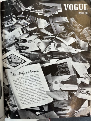
Additionally, I was fascinated to learn how Audrey Withers and Cecil Beaton destroyed the entire paper and photographic archive of British Vogue for 1942’s March issue (below) in response to the Paper Salvage effort and in the face of unimaginable hardship. I believe the coupled nobility and arrogance in this action – which reacted to contemporary uncertainty at the expense of future study – serves as an example of the undeniable tension behind justifying perceived ‘frivolities’ in an era of necessity as well as securing Audrey Withers’ status as a largely anonymous and unknown figure.
British Vogue, March 1942
What is your favourite thing that you’ve written/worked on/researched this year?
I’m loving my dissertation – especially as it is something I’ve been mulling over since last summer – but I really enjoyed working on my virtual exhibition, which explored the power of perfume. Perfume is capable of so much: it has the power to evoke forgotten moments; perfume acts as a designer’s signature – yet invisible – autograph, the list could go on… What I’ve loved about this project was its focus on creating a visual argument. Unlike an academic essay where you might presume certain knowledge and expertise on behalf of the reader, I had to consider how to pitch each element to a wide variety of visitors in order to give them the best experience possible. For instance, I used text panels to introduce each section and broader themes, whereas the sample exhibition catalogue entry allowed for a more in-depth analysis.
I wanted to situate perfume within a retail space, reinforcing perfume’s relationship to commercial practices, and chose to set it in the historic Liberty Department Store in London. In keeping with the idea of it as a fantasy exhibition, I kept on imagining I was in ‘The Sims’ world each time I was working on my floor plan, visualising how a Sim character would walk through the exhibition space. I wanted to create an immersive, multi-sensory experience, and decided on a commissioned and interactive sensory wall, serving baked goods (and cocktails!) to create three ‘miniverses’ to reflect the perfumes and designers on display: Elsa Schiaparelli’s Shocking, Yves Saint Laurent’s Opium and Tom Ford’s Tuscan Leather. I found considering perfume’s position as simultaneously immaterial and material particularly fascinating and incorporated that into my layout.
What are you wearing today?
Recently, I’ve found that I’m wearing a ‘uniform’, which normally consists of jeans, a simple top, a fun statement blazer or coat and a bright red lip. Today, I’m wearing a pair of denim blue Levi’s, an M&S black thermal top (not so chic, but I FEEL the cold), my cherished checked old Celine blazer from Vestiaire Collective and a pair of slightly battered Axel Arigato trainers, plus my go-to vintage Mulberry laptop bag, which I nabbed from my mother. And, of course, my signature red lip. I’m also having a bit of a jewellery moment, so have layered it with a couple of Alighieri necklaces (including the ‘Invisible Compass’ as I’m always getting lost!), a gorgeous Katie Mullally Irish Coin Charm featuring an Irish hare (I’m born Year of the Rabbit which I feel is close enough) and an amber necklace bought in Edinburgh by two of my dearest friends for my birthday last year. I’m also wearing a pair of Motley X Alice Cicolini earrings and my usual rings, including one from my mother and a Gracie J prototype tear ring. It’s been a research day, which started with an exciting trip to Vogue House to meet with Julie Summers, where we talked about our love for Audrey Withers, and I was lucky enough to take a quick peek at some of the Vogue archives from the 1940s and 1950s. I then had lunch with a friend and have since been busy in the London College of Fashion Library looking at more Vogue archives where I bumped into fellow MA student, Megan, before heading home for a relaxed evening!
Do you have an early fashion memory to share?
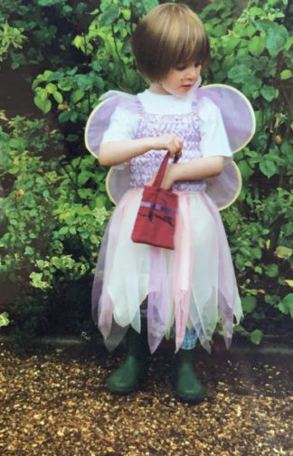
When I was a child, there was a time where all I would wear was a dress with a tutu skirt, fairy wings, and green wellington boots. And jeans underneath if it was cold. Occasionally, if I was feeling very daring, I might try to pinch my mother’s clip on earrings to complete the look… From an early age, my mother had been quite happy for me to choose my own outfits, barring the occasional family event, and so I’d turn up to nursery dressed as a fairy. Complete with a little handbag with everything a fairy might need for the day, namely bubbles and a glitter pen.
As I would wear this outfit day in and day out, I must’ve worn it on the day we had an art lesson as my mother ended up receiving a call from the school. Initially assuming it was about one of my brothers who was constantly misbehaving, it was a surprise to hear that it was about how I had refused to take off my fairy wings when asked. Though the teacher was seemingly only concerned they’d get mucky during the arts and crafts activities, I continued to refuse to take them off and they were unable to put my painting overalls on. While neither my mother or I can remember the precise outcome, or whether I agreed to take my fairy wings off – even momentarily to put the apron on – I’d like to think that a compromise was eventually made, and I succumbed to reason. But knowing how stubborn children can be, there’s certainly a chance that I refused to cooperate.
In the photo below, it’s funny how the core of many of my outfits remains the same, even nearly two decades on. I often wear a white t-shirt and jeans, and the tutu dress and fairy wings have simply been replaced with a statement jacket. It would seem that there’s a part of me that still wants to be a fairy.
Wearing a tutu, fairy wings and wellington boots, circa 2003
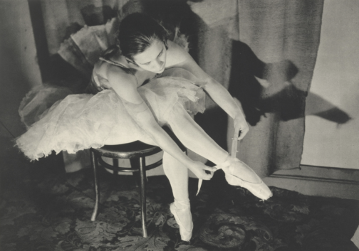
A little while back, I stumbled across Margaret Bourke-White whilst looking up 20th Century female photographers, discovering her work among others such as Germaine Krull and Grete Stern. It goes without saying that each of these women were respectively brilliant at working behind the lens, and each are deserving of a writeup, but I was especially drawn to Bourke-White’s photographs of Marina Semyonova (fig. 1).
Figure One: Marina Semyonova by Margaret Bourke-White. Photo: MOMA
Taken at the Bolshoi Theatre in Moscow, this photo shows Semyonova – the first Soviet-trained prima ballerina – preparing herself ahead of a ballet performance. Semyonova’s body is folded into itself, revealing the physical contortions and movement required of her in order to reach and tie her ballet shoes. Her posture is considered, and the chair acts as a prop to help elongate her body and better display her ballet shoe all the while creating a tension between her body and the billowing tutu which surrounds her and presses upon the back of the chair. Semyonova is artfully staged, and her pose emulates the exaggerated stillness of the photographic form, reinforcing the expectation for ballerinas to always appear elegant, not just during a performance. Her left leg is deliberately aligned in a nod to her profession, recreating one half of the en pointe position and her outstretched arms provide an extension of the en pointe motif. This creates a clear shot for which Bourke-White could effectively capture Semyonova, allowing Bourke-White to play with light to illuminate Semyonova’s body and project a shadow onto the far wall.
With that said, what I found most appealing about this photo, is despite this photo having an editorial-like feel, the loose threads on Semyonova’s ballet shoes offer a reminder of the countless hours of practice required to become a ballerina, displaying the real-life implications of such a profession. This suggest that whilst Semyonova displays poise and elegance, these attributes have been mastered over time. However, the loose threads could also be linked to the USSR in relation to its second five-year plan which sought to prioritise agricultural and self-sufficiency ahead of consumer goods and frivolity, and the loose threads thereby reveal the unravelling of previous political and cultural practices.
Through considering such a beautiful photo, I wanted to discover more about Bourke-White’s work, particularly as this photo was taken during the political unease of the Soviet Union. My research revealed that Bourke-White excelled as a photographer and whose accomplishments were plentiful. Born in 1904, Margaret Bourke-White would go on to set up her own photography studio in 1928 in Ohio, but her work would soon take her abroad, namely to the likes of Russia, South Korea, India and Pakistan where she was commissioned to document moments of political divide, wars and social unrest.
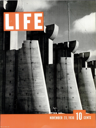
To name but a few of her impressive feats, Bourke-White was the first US photographer to enter the Soviet Union, the first US accredited female war photographer during WWII and responsible for the first cover for LIFE Magazine (fig. 2).
Figure Two: Cover of ‘LIFE’ Magazine (23 November 1936). Photo: ‘LIFE’ Magazine Archives via Google Books.
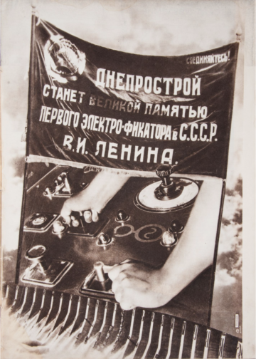
This cover highlights Bourke-White’s unique ability to take an imposing architectural structure and create a striking and an arresting image. She was commissioned to photograph this multi-million-dollar project of the Columbia River Basin and the construction of its impressive dam. The angle at which Bourke-White captured this photo and its emphasis on the symmetry of each of the concrete structures makes them appear – at least in my mind – as gigantic chess pieces bearing a similarity in shape to the ‘Rook’, with the two individuals symbolically positioned as pawns within this almighty chess board. The vibrant orange of the cover contrasts with the black and white image, at once cropping and framing the two individuals stood at the foot of the structure. The shot appears to reinforce the idea that these structures are in fact man made, with the two individuals attesting to the labour required to build such structures, and yet conveys the structures as colossal, unnatural, and otherworldly. Indeed, the editors notes that in commissioning Bourke-White they unexpectedly received, ‘a human document of American frontier life which, to them at least, was a revelation.’ This very observation highlights the talents of Bourke-White, and her ability to capture life within an otherwise intimidating concrete structure. This style of photography also calls to mind El Lissitzy and his photomontages for the SSSR na stroike (trans: USSR in construction) in 1932, with the overall global emphasis on self-sufficiency, driven by its workforce, who become the centre of El Lissitzy’s photomontage (fig. 3). This theme is echoed in Bourke-White’s photography, and the two share similar aims in trying to establish the strength of their respective cities and nations. To this effect, Bourke-White’s photography could be considered an artistic response to Constructivist periodical layouts and El Lissitzy’s earlier work.
Figure Three: Photomontage of SSSR na stroike (trans: USSR in contruction) by El Lissitzky. Issue 10 (1932). Photo: Bookvica.
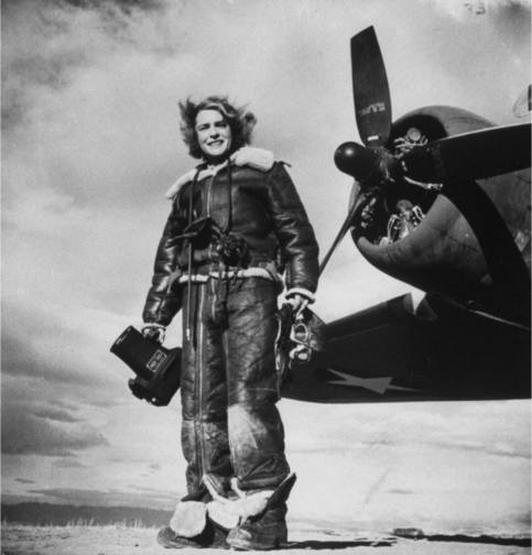
The final photograph I would like to discuss is a self-portrait, rumoured to be Bourke-White’s favourite self-portrait, made with the U.S. 8th Air Force in 1943 (fig. 4).
Figure Four: Margaret Bourke-White’s self-portrait made with the U.S. 8th Air Force in 1943. Photo: The LIFE Picture Collection/Shutterstock.
In a similar vein to Bourke-White’s cover for LIFE Magazine, this photo marries machinery and industrial elements with humanity. While the airplane’s jets have been switched off, this photo conveys the necessity to be on constant standby, responding to any changes quickly and efficiently. Bourke-White has a tight hold of the large camera, figuratively and literally held down by the camera, and carries her flying helmet and goggles in her other hand with comparative ease. To this effect, this photo is suggestive of the precarity of the war and the need to be on constant alert as well as Bourke-White’s role to document the events. This is further reinforced by the inclusion of the plane in the frame – its proximity reinforces the fact that it is only a matter of time before this unit needs to reembark the plane.
At the same time, Bourke-White’s stance is relaxed yet upright, smiling as the wind blows through her hair. The tongues of her shoes are flopped over, giving the impression of a rare moment of respite, reinforced by the fact that their surroundings appear bare and uninhabited, suggesting a minimised threat or danger. The aviator jacket is fit with shearling trimmings, and complete with matching trousers, also lined with shearling, featuring leg-long zips and stained with a white powder residue. The crease patterns, particularly on the trousers, suggest the cramped conditions of the plane and it would appear as though Bourke-White has barely stepped off the plane. While her stance is relaxed, and she is surrounded by an expansive empty landscape, the trousers act as her ‘second skin’ and become a reminder that she did not have the luxury of space a few moments ago, and the trousers have not yet and will not likely get the chance to mould to their new surroundings, complete with the luxury of space, or Bourke-White’s standing pose.
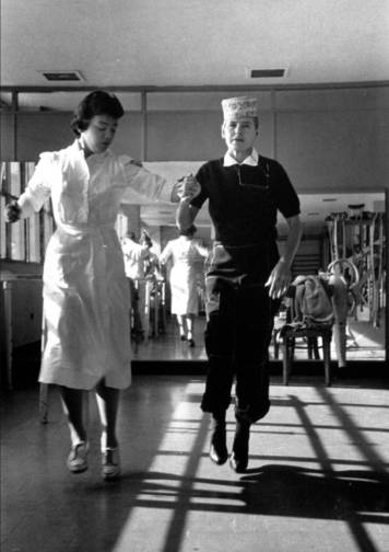
Sadly, Margaret Bourke-White contracted Parkinson’s disease in 1953 and completed her last assignment for LIFE in 1957. With that said, she displayed great determination in trying to overcome the symptoms of her Parkinson’s, undergoing risky surgeries, and in true documentary photographer style, publicised and documented her fight against the disease, cementing her status as a formidable character and individual (fig. 5). She sadly passed away in 1971 but while her career was cut short by Parkinson’s, Bourke-White was rightly recognised in her lifetime as a true pioneer in documentary photography, particularly as a female photographer for her ability to uniquely capture people and places in and amongst periods of great change, showcasing their struggles and strengths.
Figure Five: A nurse aiding photographer Margaret Bourke-White during a therapy session by Alfred Eisenstaedt. Photo: The LIFE Picture Collection/Shutterstock.
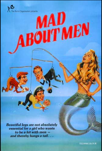
** This blog post contains spoilers for Mad About Men (1954), La Piscine (1969) and Mahogany (1975) **
Sometimes I want to watch a film, not really for the plot, but for either the fashion, the cinematography, the set design or even just the general aesthetic. So, just in case anyone else has the same penchant for beautiful films, I’ve comprised a short list of three recommendations from the 50s, 60s and 70s respectively.
Mad About Men (1954):
Mad About Men Movie Poster, IMDB.
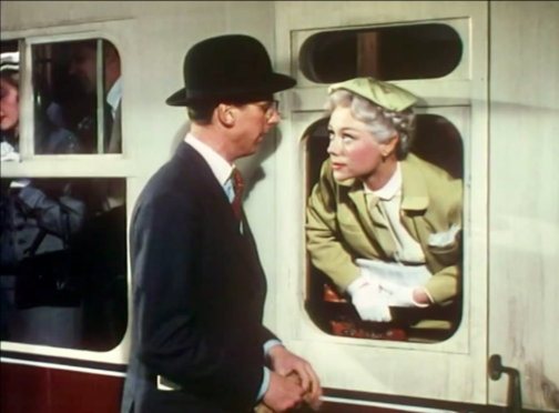
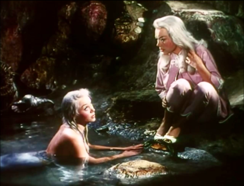
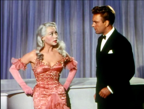
Mad About Men is the charming sequel to the 1948 comedy film Miranda in which a lonely mermaid captures a young man and only offers to release him on the basis that he will take her to London. In Mad About Men, set in Cornwall, Miranda Trewella (Glynis Johns) returns and convinces her distant relative and doppelgänger Caroline Trewella (Glynis Johns) to let her take her place whilst Caroline goes on a biking excursion with a friend. In order to do this, Caroline fakes an accident which leaves her wheelchair bound, explaining Miranda’s inability to walk and need to keep her ‘legs’ covered with warm blankets. The pair also hire Nurse Carey (Margaret Rutherford), who knows Miranda is a mermaid and helped her in the first film too. However, even though Caroline is engaged back in London to the dull but stable Ronald Baker (Peter Martyn), Miranda playing as Caroline cannot help herself when she meets some of the town’s most handsome men, and she flirts, dates and kisses both Jeff Saunders (Donald Sinden) and Colonel Barclay Sutton (Nicholas Phipps). When Ronald comes to visit ‘Caroline’ in Cornwall, Miranda takes an immediate dislike to him and ends up pouring cold fish soup over his head. The Colonel’s wife is suspicious of ‘Caroline’ and ends up discovering her secret, so, in a plot to expose her, she agrees to let ‘Caroline’ sing at a charity concert and plans to reveal her mermaid tail on stage. However, Caroline gets back from her trip and takes Miranda’s place on stage whilst the Nurse feeds the microphone down to the cove where Miranda lives so her siren-esque singing voice can still be heard. The film ends with the real Caroline and Jeff Saunders sharing a kiss whilst Miranda is safely back in the Cornish Sea.
Despite mentioning earlier that plot isn’t important when watching for purely aesthetic reasons, this film is so fun and light-hearted it is difficult not to enjoy the story and fall in love with Miranda whilst you watch it. However, where this film really shines is in highlighting the wistful and whimsical beauty of Miranda and the more prim and proper styling of Caroline. Joan Ellacott’s costuming and Glynis Johns’ acting allows for viewers to differentiate easily between the Trewella girls. Here are some of the best style/aesthetic moments…
Caroline Trewella on the train from London to Cornwall. Still from Mad About Men (1954).Caroline and Miranda’s first meeting. Still from Mad About Men (1954).Caroline’s charity concert dress. Still from Mad About Men (1954).A full length view of Caroline’s concert dress. Still from Mad About Men (1954).
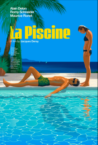
La Piscine(1969):
La Piscine Movie Poster, IMDB.
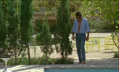
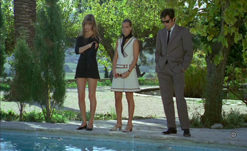
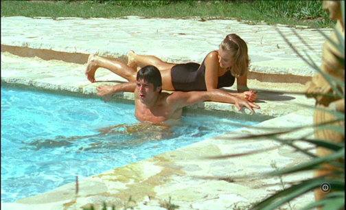
If you’re craving some warmth, you must watch 1969’s La Piscine, a film where the Southern French sunshine seems to seep through the screen. This film is the epitome of ‘embodied viewing’ where you can feel the sun and water on your skin, and you can smell the heat in the air. La Piscine is set in a villa on the French Riviera where a couple, Marianne (Romy Schneider) and Jean-Paul (Alain Delon) are enjoying the summer. After finding out Marianne and Jean-Paul are nearby, the couple’s old friend Harry (Maurice Ronet) and his daughter Penelope (Jane Birkin) come and stay. Whilst this initially consists of old friends catching up and new memories being made through extravagant parties, tensions soon begin to rise when Jean-Paul realises that Marianne and Harry were once lovers. The situation further complicates itself when Jean-Paul decides to seduce Harry’s 18-year-old daughter Penelope. The two men, whilst drunk, end up getting into a fight which culminates with Harry falling into the swimming pool. From here, instead of helping him out, Jean-Paul proceeds to drown him and then stages the scene to look like an accident. Marianne eventually finds out what Jean-Paul did but both continue to lie to the police and eventually the case is closed with Harry’s death being marked as an accident. The film ends with Penelope returning to her mother and Jean-Paul seemingly forcing Marianne to stay with him at the villa.
This film is beautiful all-round. The French Riviera location, the impressive villa, the cast and, perhaps most importantly the dressing and undressing of bodies. The theme of the body is central throughout this film, with long, toned and sun-kissed limbs filling the poolside shots. Here are some of the most beautiful outfits, shots and scenes…
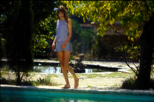
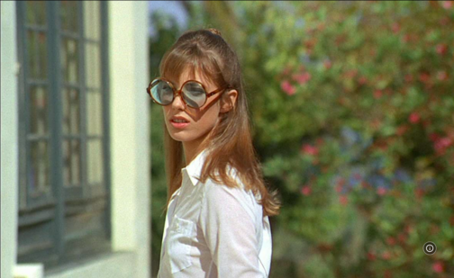
Jane Birkin’s Penelope wearing the dreamiest gingham poolside cover-up. Still from La Piscine (1969).Penelope’s fabulously oversized sunglasses. Still from La Piscine (1969).Jean-Paul’s combo of an open shirt tucked into blue jeans is giving me lots of Spring/Summer inspo. Still from La Piscine (1969).Penelope wearing maybe the shortest dress ever worn to a funeral ever? Stylish though! Still from La Piscine (1969).The calm before the storm… Marianne and Jean-Paul enjoying the swimming pool. Still from La Piscine (1969).
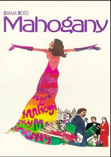
Mahogany(1975):
Mahogany Movie Poster, IMDB.
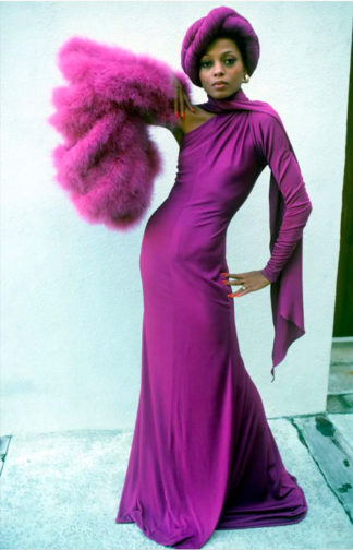
First things first, the men in this movie are awful. Truly, every single one of them is just unbearable. But with that aside, Mahogany is firm favourite in every fashion lovers’ movie list. The film stars a post-Supremes Diana Ross as fashion student and department store secretary Tracy Chambers. Set in Chicago, the film shows Tracy living in the ‘slums’ of Chicago’s South whilst working at a high-end department store and harbouring dreams of becoming a high fashion designer. Tracy meets and begins dating Brian Walker, an activist fighting against the demolition of housing in primarily black neighbourhoods. Brian, whilst seemingly having a good heart and high ambitions for himself routinely brushes off Tracy’s goals as trivial and devoid of real meaning, insisting fashion is unimportant compared to his work within the neighbourhood. This means that when Tracy meets and befriends the renowned photographer Sean McAvoy who sees her as having real potential as a model, Tracy jumps at the chance to find an in to the industry which means so much to her. After a fight with Brian, Tracy moves to Rome to pursue modelling with Sean, who gives her the stage name Mahogany. A classic movie montage shows Mahogany’s modelling career take off and her charm and charisma capturing both the wider fashion world’s attention as well as Sean’s, who is interested in pursuing her romantically. Sean becomes increasingly possessive and struggles with Tracy’s free-spirited nature and inability to be controlled. Brian visits Tracy in Rome and gets into a fight with Sean involving a gun; Brian leaves Rome alone. At their next fashion shoot in which Tracy is posed inside a sports car, Sean is trying to ‘capture death’ and ends up getting into the car and begins driving erratically. Eventually, with Sean at the wheel, the car crashes leaving Tracy badly injured and Sean dead. In the aftermath of the accident, a wealthy count lets Tracy recover at his villa and sets up a design studio for her there. Instead of feeling fulfilled by finally reaching her dream career, she is left feeling frustrated, lonely, and unhappy despite the huge success of her first official collection. Tracy realises that success means nothing without Brian by her side and she returns to Chicago to be with him.
Despite Tracy’s life being littered with frustrating men who seem desperate to keep her potential hidden away, she does look incredible throughout the film. As a little sidenote, Diana Ross actually designed a lot of Tracy’s outfits as she trained in dressmaking before her career took off! Here are some of her best looks…
The outfit Tracy designed and wears for the first time she is photographed by Sean McAvoy.Tracy looking incredibly chic in Rome whilst her Harper’s Bazaar cover hangs behind her.Perhaps one of the most iconic looks from this film. Tracy’s purple ensemble which becomes a billboard advertising Revlon ‘Touch & Glow’.
‘Man in White Suit’, played by Kōji Yakusho and ‘Man in White Suit’s Mistress’, played by Fukumi Kuroda
“So you’re at the movies too huh? Watcha eating?”
Here begins Jûzô Itami’s Tampopo of 1985. A mobster and his mistress, both glamorously suited head-to-toe in white, saunter to the front row of a movie theatre and set up their champagne feast. Our unnamed ‘Man in White Suit’ wastes no time addressing us, confidently leaning into the other side of the screen to see what we have brought to snack on during the feature, so long as it is nothing involving “crinkle wrappers”. After hysterically threatening to kill a man in the audience who dared to rustle about his chip packet, the movie theatre fades into darkness. The movie starts.
Tampopo is a visually delicious tale of food and love. The movie has always been a firm favourite of mine as a self-proclaimed ‘foodie’: each scene highlighting the etiquette of eating, the art of selecting the perfect ingredients and, above all, the momentous pursuit of the perfect bowl of ramen. Steam wafts from the surface of the hot broth so that you, behind the screen, can almost smell it. Chopsticks plunge into the soupy pool and retrieve long golden bands of noodles, followed by the menma and vegetables, and then succulent pieces of meat. Finally, the broth is sipped until the bowl is empty. I have never sat down to watch Tampopo on an empty stomach. It would be agony.
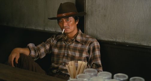
The central plotline of the movie – a parody of the American ‘Western’ genre – follows the eponymous Tampopo as she works to rejuvenate her rather mediocre ramen shop into one beyond compare. After a chance encounter with Gorō, a mysterious man on the road with an unparalleled knowledge of the dish, the pair toil to refine Tampopo’s ramen recipe, with a little help along the way. Punctured by a series of vignettes which explore other characters’ unique relationship with food, whether it be haughty French cuisine or hearty Italian pasta, Tampopo makes us fall in love with food again.
Gorō, played by Tsutomu Yamazaki
While food really is the main focus of the movie, Itami’s use of costume plays into his shrewd satire of the traditional Western genre, while contributing to the overall indulgent and sensual appeal of this food epic. Perhaps the most pertinent and ironic costume in the film is Gorō’s cowboy-esque look. His character is always dressed in a well-worn shirt – often with a neckerchief poking through in true Indiana Jones style – tucked into a pair of sturdy jeans. The Western look is completed with his trusty Stetson, which Gorō refuses to remove even in a scene where we see him in a bathtub. At times conniving, like the Western cowboys his character mocks, he encourages Tampopo to spy on other ramen shops to steal elements of their recipes. Gorō thus emerges as a comical play with the hero of the American Western. Like them, he is an adventurer. But he is an adventurer in search of good ramen, and the
only showdowns he engages in are with those who stand in his and Tampopo’s way.
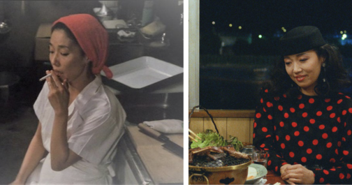
Tampopo, played by Nobuko Miyamoto
Throughout the movie, Tampopo herself undergoes a Cinderella type transformation both in her culinary skills and her fashion. When she begs Gorō to be his ramen-apprentice at the beginning of the feature, she wears a simple white uniform and a protective scarf to cover her hair. This white uniform appears rather fragile, wrapped in clouds of steam and cigarette smoke as Tampopo works relentlessly at her broth. When the ultimate recipe is near completion, Tampopo goes through a classic movie makeover, first showing off a new professional chef’s outfit and then sporting a stylish ensemble to accompany Gorō to dinner. Upon seeing her in this particularly fashionable outfit, Gorō moans that she now looks “hard to talk to”. Her red polka-dot dress, complemented by her matching red lipstick, gives Tampopo a renewed sense of conviction as she edges towards being crowned ramen chef par excellence.
Man in White Suit and his Mistress
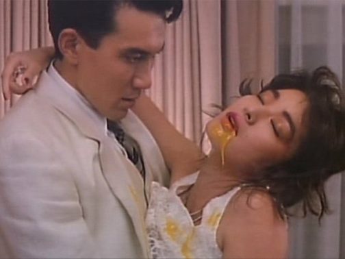
One of the most famed vignettes of Tampopo is the undeniably erotic ‘egg yolk’ scene between our mobster and his mistress. The couple pass between their open mouths a raw egg yolk, never allowing their lips to meet in a kiss, until it bursts in a moment of suggestive ecstasy. The golden liquid drips from the mistress’s mouth onto her dress, and transfers to the mobster’s lapel. Similar to those worn by the likes of Al Pacino in American gangster movies, his white suit was once a sign of his untouchable status. The indelible stain of the egg yolk on the once-pristine costume, however, speaks to the corruptive power of lust. And yet, this not merely a lust between man and woman, but between man, woman and food.
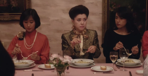
The ‘Spaghetti Sensei’, played by Mariko Okada
Raunchy interactions with eggs aside, Itami also uses the relationship between costume and food as a shrewd social commentary. One of the funniest vignettes (in my opinion) occurs when an old white gentleman sits down to eat dinner in an Italian restaurant in Japan. After ordering, he eavesdrops on a ladies’ society upstairs, who are being instructed by their leader on the ‘proper’ way to eat pasta like an Italian. This leader of the group, with her neatly coiffed hair and prim gold suit jacket, orders the women to never audibly slurp their spaghetti as this “is absolutely taboo abroad”. Much to her disdain, however, her commands are interrupted by the old man who is scoffing his spaghetti, and making a great noise while doing so. After watching him devour his meal, the ladies’ society and their leader succumb to mimicking his way of eating. Not a napkin in sight to protect their obviously pricey ensembles and accessories, regard for dress is thus cast aside – enjoying the meal is of the utmost importance.
Throughout Tampopo, Itami sets up a subtle yet provoking interplay between Western dress and etiquette, and Japanese tradition. His characters sport largely Americanised dress following the tropes of classic Hollywood genres which, according to Emiko Ohnuki-Tierney, signifies the Japanese sense of the self in relation to other nations. The conservatively dressed ladies’ society, the Western look of Gorō, and the Americanised glamour or Tampopo at the end of the movie might, at first glance, point towards an overwhelming European and American influence on Japanese culture. However, this imitation of Western eating habits and dress is exaggerated by Itami to the point of parody. What prevails is the art of ramen. Our movie closes with a visit to Tampopo’s new professional kitchen, where she prepares a final meal for her fellow ramen enthusiasts. They devour every last morsel, drinking the broth one after the other before placing their bowls down for the last time. We leave Tampopo behind, and accompany Gorō as he climbs aboard his truck once more. Our ramen cowboy slinks into the distance as the credits roll, ready for another adventure full of flavour.
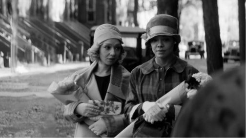
This post contains spoilers from the film Passing.
Clare Bellew (Ruth Negga, on the left) and Irene Redfield (Tessa Thompson, on the right), Photo: Screencap from Netflix
Jazz, novelty, dynamism and the rebirth of Black culture… It was the 1920s and the Harlem Renaissance was in full swing. Mainly taking place in New York and spreading to the rest of the world, the era spanned from the 20s to 30s and beyond. However, behind the glitz and glamour was an era tainted by prohibition and racial tensions. An esteemed product of this age, which captured the psychology, and tensions of the era subtly yet brilliantly, was Nella Larsen’s novel Passing (1929), recently adapted to a Netflix movie in the same name, by Rebecca Hall as her directorial debut.
Larsen’s story is centred around the encounter of two childhood friends, light skinned, mixed race African-American women, Irene Redfield (played by Tessa Thompson) and Clare Bellew (played by Ruth Negga), in Harlem, as adults and the tensions that rise between them. The twist of the story is introduced when the two women run in to each other at a fancy tearoom at the Drayton Hotel in New York, mostly reserved for wealthy, white upper classes. As it is revealed that Clare is married to a racist, upper-class white man from Chicago, who is however oblivious to her race, it becomes clear that she is ‘passing’ as white because of her light skin tone.
Irene is a middle-class, responsible housewife and mother living in Harlem with her black, doctor husband Brian and two boys. She is fervently tied to her race and community, head of the ‘Negro Dance Committee’ and centres her life around trying to do ‘the right thing’. On the surface she is reserved and abides by morals and class boundaries. Clare on the other hand is reckless, selfish, and passionate, living her life on the edge. However, both characters are intricately complex, juggling with tensions within. Clare denies her roots, yet she also yearns for a sense of community, longs to go back to her own culture, and thus gradually seeps into Irene’s life. While Irene is angry at Clare for denying her race, for her insistence and success at getting what she wants no matter the cost and her relentless challenging of the status quo, she is drawn to Clare and her mystery. Her desire to adopt Clare’s ease and allure makes her unable to drive her out of her life.
Hall lifts Larsen’s words and creates a film that conveys her spirit, and feelings through incredible symbolism. She foreshadows events through objects, accentuates the characters’ distinctive personality traits through clothing, conveys the tension and drama between the figures through dramatic camera shots and music.
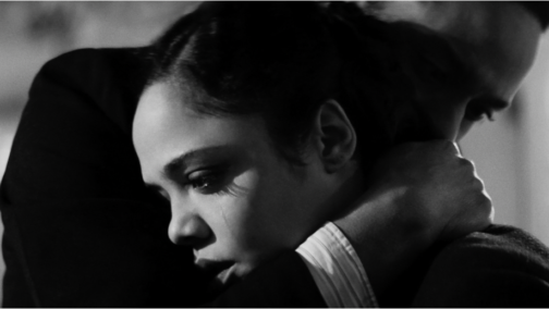
Irene Redfield (Tessa Thompson, on the left) and Brian Redfield (André Holland,on the right) Photo: Screencap from Netflix
Larsen tells the story from the point of view of Irene, so events are mostly tinged by her feelings in the book. Irene’s internal angst which comprises the base of the novel, is poignantly picked up in the film through close-up shots that focus on her facial expressions. Her frustration is amplified through the black and white lens the film is shot in, the chiaroscuro effect that seems to sharpen when Irene is on screen, lighting one side of her face while casting the other side in stark darkness.
On the other hand, Clare, who is constantly described as a ‘vision’ or having a ‘glowing’ sense of beauty in the book, is bathed in a soft light, devoid of the shadows seen on Irene’s face, bringing the glow that surrounds her to Irene’s surroundings, which are often darkened.
At the beginning of the film when Clare and Irene first encounter one another, the close-up shots distinctly switch from one woman’s face to the other. This technique is repeated later when Clare comes to Irene’s house for the first time. Hall amplifies the fact that the two women are in fact mirrors but also complete one another.
Clare Bellew (Ruth Negga), Photo: Screencap from Netflix
Although the scene in the beginning where Clare is revealed to be married to a racist man and hiding her identity sets the tension of the film, the film is overall devoid of any overt scenes of violence related to racism. Instead, racial tensions that are boiling underneath, are conveyed through secondary sources. In one scene, Irene hears from Brian that one of her sons were called a ‘negro’ at school and in another Brian reads about a black man being lynched on the streets of New York, on the newspaper. Even Clare’s husband John’s prejudice is based on what he has read and heard about black people on the news rather than a personal experience, as it is revealed when Clare introduces him to Ruth at the very beginning of the film.
The film’s high symbolism translates to many elements being conveyed implicitly rather than blatantly. Irene who suspects Clare to be having an affair with her husband, sees them having an intimate conversation through the mirror in the living room in her house, however as she approaches them, the camera then pans right, revealing them to be standing further apart from one another, hence conveying Irene’s growing doubts and jealousy that also cloud her judgement through the symbol of the mirror.
The crack in Brian and Irene’s bedroom ceiling becomes a metaphor for the crack in their marriage which progressively grows as Irene’s suspicions regarding her husband and Clare having an affair deepens as the film progresses. The viewer is presented with individual shots of the couple gazing at that crack, mostly after they have a discordance, in different points of the film. The symbolism becomes more potent as Irene’s marriage becomes turbulent.
In another scene, just as Clare declares her longing to become part of the black community again, Irene drops her flowerpot out the window which symbolises her unease and reluctance in Clare’s sudden intrusion in her life.
The palpable tensions between the women are also conveyed through a jazz piece titled The Homeless Wanderer that is repeated constantly in the film. The piano piece is a fluctuating one, harbouring a sense of melancholy, mystery, and an uneasiness, conveying the feeling of 1920s New York poignantly. However, this melody also mostly fills the intervals, repeated each time when Irene is seen walking home carrying groceries, passing the same brownstone buildings, or after a scene when Clare and Irene have an impactful conversation. On one side it emphasizes the monotony of Irene’s life. On the other, the piece becomes a metaphor for the masks both characters are carrying, the tentative balancing act they perform in keeping secrets, hiding their true selves. It becomes the voice of both characters, speaking what is unsaid, conveying feelings unexpressed.
Clare Bellew (Ruth Negga, on the left) and Irene Redfield (Tessa Thompson, on the right), Photo: Screencap from Netflix
The drama created through this music, the acute camera angles, and the sharp chiaroscuro emanates a Hitchcockian vibe in the film. The tensions rise as Clare increasingly infiltrates Irene’s life. With each move, gesture and gaze, the drama created through the music, the acute camera angles and sharp chiaroscuro carefully calculated by Hall, each scene becomes a perfect composition that reminds one of the theatrical and dramatic nature of the films of the 1920s and 1930s as well as American film noir. The drama, compressed feelings and tensions become even more amplified in the boxed, 4:3 ratio frame the film is shot in. The usage of black and white cinematography, while on the on side evoking the film style of the era, it more importantly, draws attention to the idea of race and skin colour. The idea of ‘passing’ is very clearly visualised as it becomes difficult to distinguish the skin colour of the two women from white men. It is an ingenious technique, in which Hall stated that she employed to draw the attention to the concept of race and its construction by the powerful figures in society to serve their needs while the fact in the matter is, the complex nature of race cannot be simplified and boxed into a category. She says: “After all, black and white film is not black and white, it’s a thousand shades of gray, just like everything else.”
Ruth Negga, Rebecca Hall and Tessa Thompson, Behind the scenes of Passing, Photo:Indiewire.com
The film becomes a distinct character study. The one aspect sacrificed for the black and white lens is the incredibly vibrant and colourful dresses of characters that are drawn specific attention to in the book. Instead, the two women’s identities are constructed through their silhouettes, the style of their dresses and more specifically, by their hats.
Irene, from the very beginning of the film enters the scene with a brimmed hat that covers half of her face. Throughout the film, she rarely goes out without a brimmed hat. The hat indicates Irene’s closed off nature and her reserved manners. It becomes much like a shield that she hides behind to protect herself from the rest of the world and to hide her race. This is further accentuated by her slumped posture and her modest, conventional outfits that mostly cover her shoulders. Even when she wears an evening gown with straps that exposes her shoulders, she wears gloves that cover more than half of her arms, always shielded from contact with outside world. Contrastingly, Clare rarely wears a hat. The ones she wears occasionally, always reveal her face. Her upright, firm posture is accentuated through her outfits that always seem to have bold shoulders. Whether it’s an evening gown, a coat, or a day dress, they stand out distinctly either through their cutting, the pattern of the fabric or embellishment, emphasising her strong stance, her confidence despite her precarious position. Although Clare is the one at risk ‘passing’ as white, it’s Irene who hides behind her hat, concealing her identity. The clothes distinctly stand in for the characters themselves.
Irene Redfield (Tessa Thompson), Photo: Screencap from Netflix
Perhaps the film’s most striking scene comes towards the middle when Irene and Clare are out at the dance organised by the ‘Negro Dance Committee’. Irene makes a comment whilst observing Clare dancing, from the corner, saying: “We’re all of us passing for something or other. Aren’t we?” She condones Clare yet she undeniably envies her as she reminds her of her own inability to be reckless. Clare’s desperate, incessant, and fierce attempts to go back to her roots and immerse herself in her own culture, reminds us of the inevitability of the illusion of pretence fading, as the innate desire to be true to oneself surfaces which Clare quite unapologetically reflects. Both characters, on the surface, seem to belong to distinct categories. However, as both characters yearn for the position of the other, it is revealed that those categories are society’s circumstantially imposed labels. The story shows the consequences of living in a society were racism looms large, hiding one’s identity to ‘pass’ as something that is acceptable by the society.
Clare Bellew (Ruth Negga, on the right) and Irene Redfield (Tessa Thompson, on the left), Photo: Screencap from Netflix
The story struck a personal chord with Hall whose mixed-race grandfather had ‘passed’ as white in 30s. The making of the film became a cathartic experience for Hall as she described the process illuminating and clarifying regarding her own past and decent.
The film underlines Larsen’s idea, that the concept of ‘passing’ is not specific to an age or a race in its core but rather how people everywhere, at every age, at one point or another comply with society’s desires, rules, and beliefs to blend in, to ‘pass’. Yet it also shows the misery this creates and its unsustainable nature as it goes against human nature to be free.
Both Thompson and Negga give superb performances, breathing life to Larsen’s complex characters, conveying feelings of frustration, yearning and desire through mere glances. With nostalgic costumes, the jazz music that plays over shots of brownstone buildings of the city, the dramatic close-ups and the chiaroscuro effect, Hall captures the spirit of a bygone age, transporting us back to New York in the 20s.
Screenshot from Peter Greenaway’s The Cook, The Thief, His Wife and Her Lover (1989)
What is the working title of your dissertation?
I haven’t decided on a snappy title yet, but right now it could be called ‘Bodies and Borders in Jean Paul Gaultier’s Carnival Space’.
What led you to choose this subject?
I’ve been interested in looking at Peter Greenaway’s 1989 film The Cook, The Thief, His Wife and Her Lover, for which Gaultier designed the costumes. During an early tutorial, Rebecca suggested that I consider it in terms of Bakhtin’s theory of the carnivalesque, which has proven to be a perfect lens through which to view Gaultier’s work, and really captures its spirit. I’m now treating the film as a culmination of his work until that point, so I can look closely at the early years of his career, just before his fame really soared to another level when he did Madonna’s costumes for the 1990 Blond Ambition tour.
Favourite book/article you’ve read for your dissertation so far and why?
Initially, I loved Nita Rollins’ ‘Old Masters, Fashion Slaves’ essay because I love how she writes about the baroque sensibilities of Greenaway’s film and how Gaultier’s costumes operate within that. This is part of what sparked my excitement for the film. Since diving into Gaultier, I’ve really loved Colin McDowell’s book called Jean Paul Gaultier. It describes his work really nicely, but also integrates quotes from the designer which I’ve found to be amazing insights into his ethos and thought process.
Favourite image/object in your dissertation and why?
Greenaway’s film has been an amazing visual resource to spend time on. The colors are super saturated and it has this really dark, vile underbelly contrasted with the over-the-top interiors and costumes. I like that it can be so beautiful and appealing, and so grotesque at the same time. That feeling of discomfort is what appealed to me in the first place, and has been very useful for setting up discussions about Gaultier and Bakhtin. Plus, Helen Mirren stars in it and looks fabulous in all of her costumes.
Favourite place to work?
Senate House Library! I like to find a corner near a window in a section of a totally unrelated discipline to minimize any kind of distraction.
Yorgos Lanthimos’ The Favourite: The Significance of Anachronism in Period Dress – felt cute but might delete later.
What led you to choose this subject?
I’ve always been really interested in costume in film. I was originally going to do a comparison between Sofia Coppola’s Marie Antoinette (2006) and The Favourite (2018), but realised that would be far too much and actually I found that The Favourite was … my favourite (bad pun, I know). Also, I love that this film is so different to conventional period dramas, and it interested me that anachronism is usually seen as a bad thing or a mistake, whereas here it is purposefully done. I also love Yorgos Lanthimos, and that this film could have followed the path of many a period film, but it is completely altered by his involvement.
Favourite book/article you’ve read for your dissertation so far and why?
I’ve read a lot of great texts while researching, but I would have to say it’s been the films I’ve watched that have been my favourites. I think the most significant one is The Draughtsman’s Contract (1982), as I’m focusing a lot on the monochrome colour palette used, and this film is such a clear influence. It’s also absolutely baffling, which I enjoy.
Favourite image/object in your dissertation and why?
It’s got to be Hatfield House. I don’t know if that counts as an object, but it’s the main location for the film, and it’s the basis of one of my chapters. I visited the other week and it’s a Jacobean house with dark wood interiors (makes for a creaky floor) and really rich tapestries, so being there was literally like stepping into a different world. It’s also such a key aspect of the film, and I think the house plays such an important role in the genre of period drama in general, so it was really important for me to go and visit it. I also love its black and white marble floor, and the fact that the Jonas Brothers’ latest video was filmed there.
Favourite place to work?
Probably the British Library as other people working shames me into working, but at the same time I like working from home as I find playing music sometimes helps if I’m in a writing rut.
Figure 1. Dissertation moodboard: 1. Chema Madoz, Untitled 2. Tim Burton’s Corpse Bride 3. John Everett Millais, Ophelia 4. Miss Havisham (Gillian Anderson) in Great Expectations mini-series 5. John William Waterhouse, Echo and Narcissus 6. Queen Victoria’s Diamond Jubilee portrait 7. Edward Gorey’s ‘peachable widow with consolate eyes’ 8. Charles Allan Gilbert, All is Vanity 9. Elsa Schiaparelli and Salvador Dalí’s skeleton dress 10. Kirsten Dunst in Melancholia 11. James Whistler, Whistler, Symphony in White, No. III 12. Caravaggio, Narcissus 13. Sofia Coppola’s The Virgin Suicides
What is the working title of your dissertation?
‘Buried Brides’ (+ some subtitular arrangement of ‘dysfunction, surface, bodies, femininity, et cetera, et cetera’)
What led you to choose this subject?
I don’t want to say a lot yet, since I think sharing too much about projects before they’re fully actualised jinxes them. But essentially, I developed this idea of the white dress doubling as wedding dress-Baptism/ Communion gown and burial shroud-ghost sheet in my first formal essay of the year. I really love doing alchemy – taking one thing and transforming it through theory and juxtaposition. Bride becomes corpse, black becomes white, surface becomes depth and back again.
Favourite book/article you’ve read for your dissertation so far and why?
Caroline Evans’ Fashion at the Edge has been my constant this year, and I finally read Ulrich Lehmann’s Tigersprung.
Kirsten Dunst in Lars Von Trier’s Melancholia (2011)
Favourite image/object in your dissertation and why?
This still of Kirsten Dunst in Melancholia is everything I’m talking about. The film opens with a kind of avant-garde, apocalyptic montage, and at one point, Dunst’s character Justine runs in slow motion in her wedding gown as tree branches and roots wrap around her limbs and claw at her. It’s just the perfect visual metaphor: the fashionable, fertile woman in white struggling against time and nature. Melancholia isn’t one of my case studies, but I need to find a way to work this image in anyway. I’ve been thinking of pulling a Lehmann and including thematically insightful pictures alongside my direct illustrations, just to get this in.
Favourite place to work?
I’ve been quite boring this year. In the past I’ve habitually claimed tables at the Hungarian Pastry Shop in New York and the Finnish Institute in Paris, but as of now I’ve exclusively written my dissertation at my desk at Duchy House. I will be better.


