Tag Archives: colour

Julliard’s Gourmet Colours


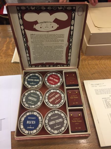
While in New York our class was fortunate enough to visit the archive of the Brooklyn Museum. One of the pieces that we were shown was a whimsical little catalogue of dyed fabrics called Julliard’s Gourmet Colours from autumn 1949. In truth, the word ‘catalogue’ is loosely used to describe what was, in actuality, a treasure trove of beautiful fabric swatches, whacky illustrations and a plethora of food-related puns. These curious little boxes were local to New Jersey, only produced once or twice a year and were made for the benefit of clothing designers and manufacturers who may have been interested in using their fabrics.

The ways in which the accompanying booklets described the look and feel of their textiles was truly a work of poetry; the gastronomical metaphors perfectly embodying the potential haptic visuality of fabrics and clothing. The booklet states: “Gourmet colours have subtlety and unique distinction of a great chef’s masterpiece… for, like a memorable dish, they are skilfully blended by experts and served up in the most attractive and tasteful guise.” With dye names such as ‘cranberry sauce, ‘black mint’ and ‘hot spice’, it becomes easier to see how one might begin to view an outfit as a perfectly crafted meal with high quality ingredients.

They go on further to write that the texture of certain fabrics may be “smooth as a mousse… or crisp as melba toast, or soft as soufflé… or as deliciously light as meringue.” Here, language is used as a means to suggest that there is a desire to devour when looking at something we deem to be aesthetically pleasing. They also write: “these Julliard fabrics have been designed and dyed in Gourmet colours to provide a gracious setting for milady.” In this sense, an interesting comparison can be drawn between the way in which the fabrics are being described and the way in which the gaze operates within society. In describing fabrics using food-related terminology and comparing women’s fashion as a ‘gracious’ table setting, we can see how fashion might be used as a means to be devoured and ingested by the look of others. This quirky and unique fabric catalogue epitomises the tactile and digestive nature of looking in a manner that almost satirises and parodies the devouring potentiality of the gaze.

By Niall Billings

Dress and Movement in the work of Sonia Delaunay

Cover SD

Somewhat embarrassingly, I only managed to make it to the Tate’s Sonia Delaunay exhibition in its last week, but I was so glad that I did. I went not knowing much about Delaunay prior to stepping through the door, and because it was held in the Tate Modern, I was expecting it to focus mainly on paintings. However, it was her textiles, fashion designs and illustrations that underpinned the whole exhibition. It was immediately apparent that textiles and dress were hugely important to her during her career.

The earliest example of her work in textiles appears in the second room – a cradle cover made in 1911 for her newborn son. Interestingly, the Tate labels it as her ‘first abstract work,’ highlighting the fact that they conflate her work in textile and paint. This is, to an extent, completely understandable as there are numerous similarities between the aesthetic she employs in both. The way blocks of colour are juxtaposed is identical in both mediums. However, to consider the cradle cover, and her later fashion and textile designs, purely as decorative art is to ignore the practical, and indeed emotional, role that these objects played.

Cradle SD

Movement is by far the most persistent theme underlying all the work in the exhibition. Delaunay was fascinated by dance, particularly tango, and many of her works reflect the rapid movement and blurring of shapes that one expects to see in a packed dance hall. In this way, her work bears some resemblance to that of the Italian futurists, who in their obsession with the speed of modern life, painted the rapid movement of cars and people through the city as swirling blocks of colour. In her scenes of dance, ‘light and movement are confounded, [and] the planes blurred’ (Delaunay, c 1913). However, there is also a sense that these colours represent the sound of music in the dances. Bodies, dress and music are all reduced to contrasting colours on the canvas.

Simultaneous Dresses (the Three Women), 1925

As in her paintings, movement is a central theme of her fashion designs. In 1918 she opened Casa Sonia in Madrid, a shop selling accessories, furniture and fabrics that bore her signature swirling lines and blocks of colour. In 1925 she set up her own fashion house, as well as designing costumes for ballets and cover illustrations for Vogue. In these, as in her paintings, the body is abstracted, leaving the viewer with the representation of dress in motion. The straight, 1920s silhouette lent itself well to her geometric, graphic designs and bright colours. However, it was not just her clothing that bore this aesthetic, she also designed furniture, and the interior of her Parisian home became something of a manifesto of her style, and a hub for artists and writers.

Two fashion models in Delaunay's bathing suits
Two fashion models in Delaunay’s bathing suits

Movement was also at the heart of her textile designs, so much so that, when she displayed her textiles at the 1924 Salon d’Autumne, they were presented on a ‘Vitrine Simultane.’ This vitrine, created by her husband Robert Delaunay, presented eight swaths of fabric continuously moving upwards on large rollers. Movement was quite literally injected into these otherwise static objects.

It would be easy to look at Delaunay’s textile and fashion designs as a by-product of her painting; the same circular shapes and bold colours that feature in her canvases also appear in the textiles. However, I would argue that her paintings are just as influenced by work in dress – her paintings of dance, convey the movement of dresses swirling in different directions, abstracting the body and giving the canvases their characteristic dynamism.

Paul Poiret, En Habillant l’époque (1930)

1002nd Night photograph
Poiret photograph of marbling
Poiret photograph of mannequin

Summary 

Paul Poiret’s memoirs ‘En Habillant l’époque,’ which literally translates as ‘Dressing the Age,’ were written in 1930, almost two decades after the height of his fame. At the end of his manuscript, Poiret wrote that though he continually felt ideas for new dresses germinating ‘under his skin,’ his glory days had passed. Poiret traced his fascination with dress to his childhood family. He dedicated his memoirs to his mother, who he considered supremely elegant, and described how his sisters gave him a forty-centimetre wooden mannequin, which he lovingly draped in silks, in both Parisian and Oriental styles.

Poiret cast himself as an artist-designer, whose vision of femininity radically differed from that of the early 1900s fashion he encountered during his tenure at the couturiers Doucet and Worth. He claimed that he waged war on corsets, which had divided women’s bodies into two distinct peaks, comprising the neck and breasts on one side, and the hips and buttocks on the other. However, he recalled how his more holistic outfits, with their narrow hobble skirts, made women cry, gnash their teeth, and complain that they could not walk, or get in and out of a car easily. Overall, however, Poiret regarded his relationship with women as mutually beneficial. He likened the women he dressed to orbiting planets, who relied upon ‘his sun’ to shine; but simultaneously considered that his favourite mannequin Paulette, a ‘vaporous’ blonde, with the cylindrical shape of a cigarette, was a true collaborator, because she brought his designs to life.

Response 

Poiret considered that his primary innovation in fashion was relinquishing the etherealized palette of rose, lilac, powder-blue, maize-yellow and white that had dominated French women’s clothing from the eighteenth century, in favour of opaque, Fauvist tones, including royal blue, strong greens, reds and violets and acidic orange and lemon hues that made women’s silhouettes ‘sing.’ Poiret’s incorporation of these bold hues, alongside Orientalising components, such as the Minaret ensemble of 1911, which featured turbans and hip-skimming lampshade tunics, alongside harem pants, introduced an expressive, if still decorative, vision of womanhood. Rather than blending into the background in pastel tones, the women he dressed would stand out for their exoticism. A photo-plate from Poiret’s Arabian Nights-themed party, the 1002nd Night, of 1911, shows non-Western attitudes to the body, as guests of both sexes in turbans, belted kaftans and variations upon the Minaret outfit, crouch or sit cross-legged upon a Persian rug. Extravagant feathers, which emerge from the guests’ turbans, contribute a festive and frivolous air to proceedings.

Still, the photograph’s grainy, cinematic greyscale imbues the image with a nostalgic air. One gets the impression that the colour and vibrancy of the original party resonated with memories of a vanished world. Interestingly, Poiret wrote that after his experimentation in the early 1910s, colours in fashion became ‘anemic and neurasthenic’ once more. Poiret’s memoirs, with their slate-blue leather skin, blue-marbled inside cover, and black and white photographic inserts, did not only reflect the colouristic limitations of publishing in 1930, but express their distance from the Orientalism that made the author’s reputation.

poiret cover