Wearing Rank: Mandarin Squares in Chinese Court Dress


I thought I would pay tribute to my stay in Hong Kong this winter and write an Asia-themed dress history blog post about Chinese rank badges.

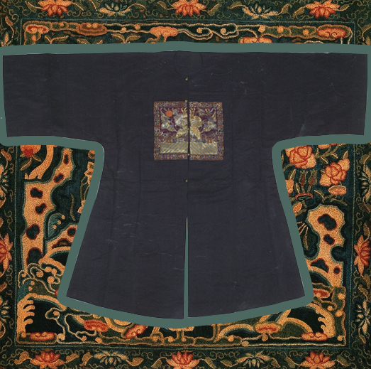
The Chinese rank badges, also referred to as mandarin squares, are silk badges that were once embroidered or woven onto the front and back of court robes, as an indication of a wearer’s rank within the Chinese court and were worn primarily between 1391 and 1911, during the Ming and Qing dynasties.

The origin of the rank badges can be traced to square embroidered plaques containing animal and flower designs featured on the robes of Yuan dynasty (1260-1368) officials, mostly for decorative purposes. These badges were not designated as official court dress until the Ming dynasty (1368-1644). The mandarin badges, indicating a court official’s rank, were to be sewn onto the front and back of their court robes. It was determined that there would be nine ranks for both the literary and military officials; different animals were designated for different ranks. Birds were associated with literary elegance and were to be used for the civil officials, whereas carnivorous mammals were associated with courage and fierceness of soldiers, to be used for the military officials. This system survived the collapse of the Ming dynasty and the succeeding Qing dynasty (1644-1911) retained the same rank badge system.

Unknown artist, Fifth rank military official badge with bear, Qing dynasty, ca. 1820s. Peking stitch on blue silk satin. 

The Ming and Qing rank badges differed stylistically and structurally, although the animal and bird iconography remained consistent. The Ming badges had a few identifying visual and physical characteristics that differed from the Qing squares. The most obvious features were the size and shape. Most Ming badges were at least 35 cm in dimension and lacked any distinct borders. The Ming badges were sewn from seam end to seam end across the front of the robes, and were slightly trapezoidal in shape, as the Ming robes were wider near the bottom. Furthermore, strict Ming sumptuary laws forbade Ming officials from using too much gold, which resulted in most emblems embroidered in satin stitch or laid floss-silk. Only the principal design was outlined in heavier gold threads.

Unknown artist, Red Silk with Crane and Cloud Design, Ming Dynasty court robe with rank badge, red silk with embroidery. Shandong Museum.

Compared to the Ming squares, the Qing badges were a lot smaller, ranging on average from 25 to 30 cm in size. Moreover, the addition of the ornamental border and the unique innovation of the ‘sun disk’ to symbolize the emperor became the standard trends of the Qing dynasty rank badges. However, the most distinctive feature was the split seam down the center of the Qing square, which most Ming squares lacked. The split in the badge was a result of the structure of the bu fu, the surcoat on which the mandarin squares were attached. The bu fu, a creation of the Qing dynasty, opened down the front, which meant that the mandarin square on the front side was made in halves, one on each side of the coat flaps; the mandarin square on the backside was made in one piece. Contrastingly, the Ming squares, both the front and back badges, were made in whole, undisturbed by the flaps, since the Ming robes were designed to open to the side.

Besides the obvious structural difference between the Ming and Qing dynasty squares, there are also various stylistic, and thematic differences in each era. To find out more about the stylistic, and technical developments of Chinese rank badges, I recommend reading works by Schuyler V. Cammann, who has written most prolifically on mandarin squares.

By Lily Mu

References:

Wang, Zhihou. The Splendors of Costume: Special Exhibition Attire from Ming and Qing Dynasties. China: Qi Lu Press, 2013.

Haig, Paul; Shelton, Marla. Threads of Gold: Chinese Textiles, Ming to Ch’ing. Pennsylvania: Schiffer Publishing, 2006.

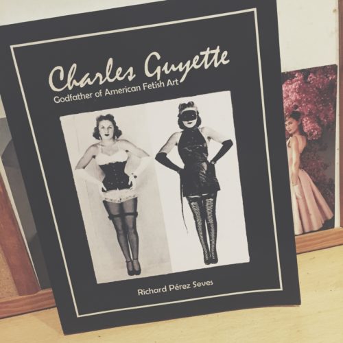
The G-String King: A book review of Charles Guyette The Godfather of American Fetish Art by Richard Pérez Seves

Charles Joseph Guyette was a fascinating, albeit over-looked, pioneer of fetishistic art practice within the 20th century. He was primarily a costumer who designed fetish-wear specifically for burlesque, strip-tease and circus performances. Working from the 30s to the 60s, Guyette is often considered to have formed the foundation for modern fetish-wear today. In fact, his designs were deemed so scandalous that he was arrested and sent to federal prison in 1935 only to be released a year later and continue to work under various aliases. Guyette was at one point branded the ‘G-String King’ due to the popularity of his garments amongst burlesque performers, as well as being known for his shoe designs that featured 7 inch heels; a height thought to be extreme in the 30s and 40s.

Within his book, Richard Pérez Seves does an excellent job in documenting the hidden life of an extremely important man who paved the way for many fetish-wear designers in the decades to come. The popularity of Gaultier, Mugler and Dita Von Teese ultimately has its roots in the work that Guyette did in uniting the realms of fetishism and fashion to create some truly beautiful images. The book features numerous photographs of Guyette’s designs that depict the artistry and femininity behind fetish-wear as well as the inherent beauty that resides within the female form. Guyette’s burlesque pieces were made with the intentions of strip-tease and undress; each layer ultimately revealing the natural body beneath. Fetishistic clothing, while often seen as a remedy against castration anxiety, can also be seen as a celebration of the nude female figure as it places her within a position of power over her own sexuality —a position she was often barred from. This book perfectly highlights the work of a fantastic designer who needs some much-earned credit.

By Niall Billings

Further Reading:

Richard Pérez Seves, Charles Guyette: Godfather of American Fetish Art, 2017

1965’s Doctor Zhivago’s Impact on Fashion


In December 1965 David Lean’s epic adaptation of Boris Pasternak’s novel Doctor Zhivago was released. Doctor Zhivago is the story of Yuri Zhivago, a physician in Russia, and the personal and political upheaval he experiences during the Russian Revolution. Phyllis Dalton’s lush costumes not only won her an academy award, but also spurred a host of new fashion trends. The looks of Julie Christie, who played Zhivago’s mistress Lara, and Geraldine Chaplin, who played Zhivago’s wife Tonya, in particular inspired fashion trends of the time.

Violette Leduc’s article detailing her visit to the set of Doctor Zhivago was released in the September 1965 issue of Vogue. The article was complete with a full spread of photographs of the set and stars of the film. Geraldine Chaplin’s photograph, in full Tonya Zhivago costume, is particularly striking. Chaplin stands on a street set up to look like revolution-era Moscow. She is decked out with a huge, round fur hat, fur stole, and an enormous fur muff. Her face his hidden between the hat and stole, and thus only her eyes and nose peer seductively out at the viewer. She is standing between two imposing portraits of Lenin, Marx and Trotsky, thus setting the scene for the contrast between the lush costumes and world of the early film, and the revolution and hardship that comes later on. This article came out two months before the film was released, likely as part of the intense media blitz on the part of MGM to promote it, and thus generated early excitement and awe at the costumes.

Following the release of the film the ‘Zhivago look’ took full effect. Marc Bohan for Christian Dior drew inspiration for his autumn 1966 line from the film. He used soldier’s caps, long military greatcoats, boots, and fur trim, which all recalled Dalton’s looks for the women of Doctor Zhivago. The fur trimmed ‘Zhivago collar’ and fur hats, in particular became popular following the release of the film, and remain so today. If you search ‘Zhivago style’ on google there are entire sections of Etsy dedicated to the fur-trimmed coats and fur hats that were made popular by the film. Advertisements found as late as 1987 make allusions to Doctor Zhivago when trying to sell fur. The look of fur, silk braiding, military coats, and boots of Phyllis Dalton’s costumes remain a key reference point for top designers. It was not just the women of Doctor Zhivago that inspired trends, but the men as well. Omar Sharif, as Yuri Zhivago, sported a large, well-groomed moustache that spurred a renewed interest in facial hair. The impact of Doctor Zhivago’s costumes has extended beyond the year, or even decade, of its release and into the cultural lexicon.

By Olivia Chuba

Lily Visits “Irving Penn: The Centennial” in Paris

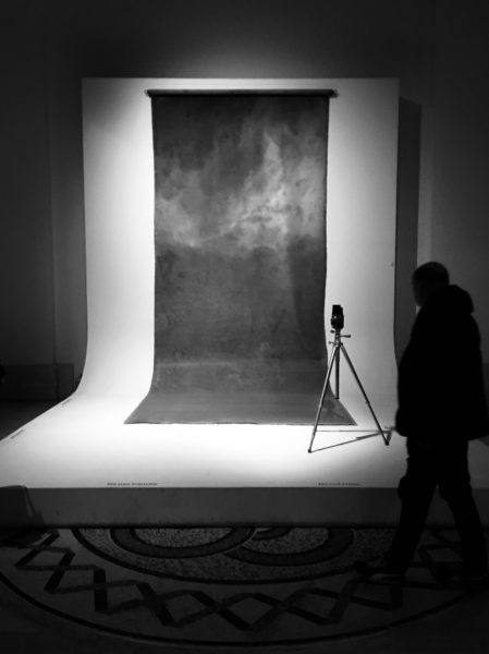
The 2017 “Irving Penn: The Centennial” exhibition in Paris is a guaranteed highlight of the Grand Palais’ autumn season programme. Marking the centenary birth of Irving Penn (1917-2009), the Metropolitan Museum of Art, and the Réunion des musées nationaux– Grand Palais, in collaboration with The Irving Penn Foundation, organized one of the most comprehensive retrospective since Penn’s death, and the first of its kind in France.

Irving Penn is regarded as one of the most important photographers of the 20th century. To many, he is most well-known for his portraits of notable societal figures. However, as a ‘Documenting Fashion’ student, I see him as inseparable from 20th century fashion; his name alone conjures up some of the most iconic images in fashion studies. His celebrated fashion photos taken during his time at Vogue including Tobacco on Tongue (1951), Balenciaga Mantle Coat (1950), and The Twelve Most Photographed Models (1947), are all on display in this exhibition.

Lisa Fonssagrives-Penn wearing a Balenciaga Mantle Coat in Vogue, September 1950

This retrospective looks back over Penn’s seventy-year career “with more than 235 photographic prints all produced by the artist himself, as well as a selection of his drawings and paintings.” The exhibition is laid out on two levels, covering a range of genres and themes that were of great importance to Penn’s career. The ground floor starts with his still life and early street photographs taken using his first Rolleiflex in 1938, and spans the 40s to early 60s-era, including his early days at Vogue. The portfolios of Cuzco indigenous people, small trade series and classical ‘portraits of personalities’ are all covered in this period. The upper floor showcases his advertising and personal projects. These ranged from his series of nudes, to cigarette butts and four major series of other detritus, titled: Street Material, Archaeology, Vessels and Underfoot.

The exhibition is successful in showing all these facets of Penn’s career and his wide-ranging interest in subject matter. But truth be told, all these genres and themes can be split into two major categories: objects and humans. And in my opinion, his most interesting photos are still the ones he takes of people, whether it is of fashion models, celebrity portraits, or indigenous villagers. These photographs reveal his instinctive grasp of material, weight, pattern and the tactile quality of a garment. Paired with his knack for posing subjects, Penn’s photographs of people are both visually and psychologically more interesting for viewers.

The Irving Penn centennial exhibition was originally shown this year between April and July at the Metropolitan Museum in New York. Lucky for those in Europe, the same show will be exhibiting at the Grand Palais in Paris until the 29th of January, 2018, before heading to Germany and Brazil.

By Lily Mu

All photos authors own

A Brief Study of Friedrich Kunath’s Socks: Wandering Lovers

It is winter break so I finally had some time to peruse GQ Style’s 2017 Holiday Issue. For me, GQ exudes cool in its ability to not only capture different waves of trends, but also acknowledge that waves break which makes room for new ebbs to form, especially when it comes to fashion and style.

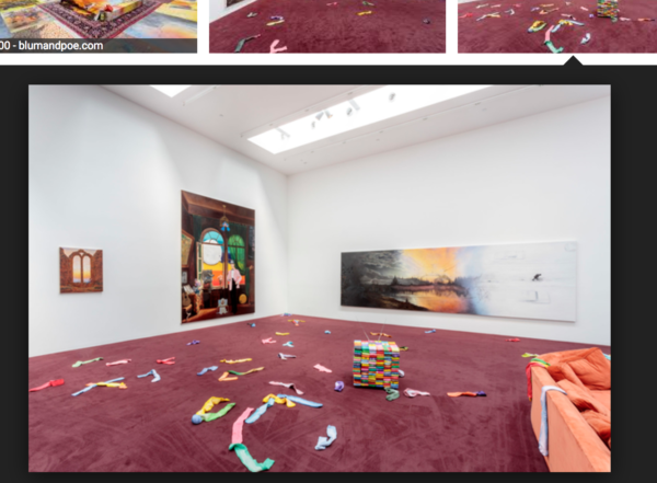
In the holiday issue, I was introduced to an East Berlin-born painter, who resides in East L.A., Friedrich Kunath. If one had to describe Kunath’s style, it would be an eclectic iconoclasm of contemporary images and objects that have affected him throughout his life. While reading the article Friedrich Kunath’s East Angeleno Homesick Blues, by Arty Nelson, an art and food writer in Los Angeles, I was struck by Nelson’s description of Kunath’s studio as an in-process, “air-conditioned anxiety dream”[1] which was accompanied by a photograph shot by, Michael Schmelling, of what looked like a 21st century, Disney-fied Carl Andre work of a series of dyed multi-colored socks hung up with clothes pins in a very minimalist one-after-the-other style. The socks would go on to be used in Kunath’s installation at the contemporary art gallery, Blum & Poe, titled Frutti di Mare.

Socks are sometimes forgotten, and often time they are neglected in the category of “fashion”. Generally, Socks are worn out of need for warmth, or protection rather than for aesthetic desire. In Frutti di Mare, which means seafood, or more literally fruit of the sea, the colorful socks are used to evoke the idea of the domestic space in relation to the paintings exhibited in the gallery space. The socks in disarray challenge the integrity of the gallery space while also calling attention to the sense of pastiche that Kunath is trying to convey. Color in the installation space, is used subversively in an almost melancholic way to evoke the cliché around the common images that inundate the postmodern life. It is a postmodernist critique on postmodernity itself. Through the aestheticization of the banal, Kunath makes visible the senselessness in trying to make sense, through the romanticization of what surrounds us every day. The socks in the space, have no exact pair, each wanders in search of meaning. The socks, in a way, represent the ideal postmodern subject: the lover in the way the lover tries to make sense himself without the loved object. In the end, the socks turn out to subvert the minimalist aesthetic of order and rationality while calling attention to a desire for it without satisfying it.

By Destinee Forbes

[1] Nelson, Arty. “Inside Friedrich Kunath’s Amazing World of Sublime Art, Classic Cars and Obscure Scents.” GQ, GQ, 27 Nov. 2017, www.gq.com/story/inside-artist-friedrich-kunaths-amazing-world.


Fashion and Words

I often think about how we communicate with and understand the world around us – the way we talk, write, our phrases and our physical sensory experiences.

Fashion may be what we first associate with the physical and sensory experience, but also the vocabulary of fashion, dress and textiles slips into usage for how we describe the words we use when talking or on the page (typography), our relationships to ourselves and others, as a medium between our interior (intangible) and external (tangible) selves. I am continually rediscovering and relearning the English language with these thoughts in mind, and here are some of the synesthetic ways that fashion seeps into our words when we think we aren’t talking about fashion at all.

From rags to rags

Recently it came to my knowledge that the end margins of a paragraph (when writing from left to right, with a fixed left-hand margin) on a page are described as ‘rags’ by typographers. The irregular and uneven ‘rag’ that occurs resists the neat line-end and invokes the textile affected by wear and tear, or the tattered rags which one could be dressed in. But also ‘rag’ references the destruction of paper: torn paper results in ragged edges, it references a worn cloth one might use to clean with, rag dance parties, and multiple other ideas (and phrases such as ‘being on the rag’, which was first used to describe menstruating women in the 70s). If our typed words can prove rag-like in their paragraph structure, needing to be ‘fixed’ or ‘mended’ by typographers, then we ought to spend more time in reflection on this – how our words are like a material prone to wear and tear through the tactile experience of typography, or how regardless of the quality of writing a paragraph will be considered by ‘good’ typography, less ragged and more in adherence to a vertical margin shape – a shape that words, and the way we write doesn’t ‘naturally’ fit to. Perhaps with this idea of rags in the paragraph we can consider what the body is, or whose body it is that the rags cover?

N.B Rag is ‘le chiffon’ in French, and in English a ‘chiffon’ is a sheer silky fabric.

Îles of texts and textiles

We cannot ignore the etymological link of text and textile – there has been so much interplay with these interwoven ideas over time in the art and literary worlds (a recent example being the 2016 exhibition ‘Textile Subtexts’ at Marabouparken Museum). These two words have the same root from the latin ‘texĕre’ of ‘to weave’. The spatiality of the woven fabric in textile drew me to take a closer look at the woven words that make up ‘textile’: ‘text’-‘ile’. The English word for ‘island’, and French ‘île’ comes from the Old Frisian ‘isles’. We think about weaving words together to form a narrative and the texture of a written text, or the texts within a textile in how it ‘speaks’ to us and contains a narrative. The subsequent synaesthesia between the written word and a woven fabric due to their etymological ties proposes questions around the materiality of a text and textile and their spatial and communicative aspects.

Tissus and fabrics

The word ‘tissu’ in French means ‘fabric’ or ‘material’, which reminds me of the connective tissues of communication between mediums in Laura U. Marks’ book Touch: Sensuous Theory and Intersensory Media. ‘Tissue’ in English has two meanings: it is a woven cloth and the substance of which animals and organisms are made from.  This other interplay between the materials we clothe our bodies in that covers our bodies – fabric of which we are made conveys the slippery binaries between our interior and exterior selves and skins.

Below I have listed some other ways in which the vocabulary of fashion pours out into our mouths when we aren’t talking about fashion at all:

 Phrases

A blanket expression

Wear your heart on your sleeve

To keep someone in your pocket

Terms

Address – a dress

Fray – fray

Sew – so

Wear – wearing – worn out

Fabricate – fabric

Lace – to lace with

Clasp – to clasp


By Evie Ward

Football Flashback: Discussing 1940s American Football Dress

It’s College Football Bowl game season in the U.S.! Every year in December and early January, American collegiate football teams compete in post-season bowl games based on National ranking, culminating in a play-off for the National Championship. Inspired by a slight detour in our seminar last week, as well as a love for American football, I wanted to discuss the dress of American college football players and cheerleaders from the 1940s in comparison with contemporary uniforms.

The football uniform of the 1940s differs greatly from the ones seen on the field today—the padding underneath the jersey is lighter, and the helmets much less protective. The players in the image below are seen without metal face guards or mouth guards, greatly contrasting with American football players today, who have multiple layers of massive and enveloping padding and protective gear. The players in the 1940s have plain jumpers and shorts (without team names or sponsorship logos!) with a relatively simple cut and style that does not differ between teams. The style is much looser and less form fitting than the contemporary football uniform.

Rose Bowl 1944, Image via the PAC 12 Website

American cheerleaders of the 1940s also wore jumpers, typically with collared blouses underneath, and flowing round skirts. The saddle shoe, worn with white crew-length sport socks was extremely popular, and became a classic feature of the cheerleader uniform. The 1940s cheerleading uniform was significant in function; it allowed for more mobility and movement while performing in uniform. The contemporary cheerleader uniform now ranges in style: shorter skirts, cropped tops, shorts, or dance dresses. Thankfully, the pom-poms have remained the archetypal cheerleader accessory.

University of Maryland Cheerleaders, 1949

Stylistically, American football and cheerleading uniforms have changed drastically in the past 80 or so years. The contemporary football and cheerleader uniforms developed in a direction valuing safety and freer movement.

Good luck to my football team, the USC Trojans, who are playing in the 2017 Cotton Bowl on the 29th of December!

By Arielle Murphy


Wintertime Winds Blow Cold This Season: Winter Wear in Art-Goût-Beauté

The title of my blogpost is derived from a song by The Doors called “Wintertime Love,” released in 1968 on their album Waiting for the Sun. It is a favourite song of mine, as it always gets me in a wintery mood. Born in January, I have always been fond of the winter season – even more so after living in Norway for two years. I enjoy winter wear and I spend time knitting myself warm jumpers throughout the year, mainly using old patterns from the 1940s and 1950s. I love the view of mountaintops covered in snow, and enjoy going snowboarding whenever I can. However, I was born in the wrong place, as the Netherlands is a very flat country. Sadly, the wintery ice skating scenes with warmly-dressed-up people, known from oil paintings such as Hendrick Avercamp’s Winter Landscape with Ice Skaters (c. 1608), have also become a rare sight.

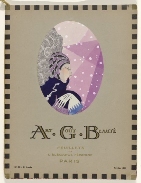
Therefore, this Christmas break I will dream away to the above illustration of a woman set against the backdrop of falling snow. It is winter, 1926. The woman is depicted in profile in a stylised manner. Her head is fashionably covered. She sports a dark blue shawl and white gloves with a light blue trimming; all to protect her from the cold winter weather.

This elegant illustration is from the cover of the February 1926 issue of Art-Goût-Beauté Feuillets de L’Élégance Féminine, a fashion periodical published in Paris between November 1921 and 1933. The successor of a short-lived magazine called Succès d’Art Goût Bon Ton, the magazine derived its initials from Albert Godde Beddin et Cie, a textile manufacturer and publisher established in Lyon in 1867. The decorative endleaves of the magazine originate from textile designs of this company, with the name and number of each pattern noted in a small inset.

Each page of Art-Goût-Beauté is a delight to look at. The magazine’s title, which translates to ‘Art, Good Taste, Beauty, Pages of Feminine Elegance,’ signals the magazine’s coverage of elegant and luxurious creations of Parisian couturiers, such as Drecoll, Patou, Poiret and Worth. Using the highly refined, hand-stencilling and painting technique known as pochoir, Art-Goût-Beauté brought these couturiers’ fashions to the contemporary reader seeking the latest fashion inspiration and advice.

Winter Wear: From Active Sportswear to Festive Evening Wear

For instance, in its January 1924 issue, Art-Goût-Beauté mentions the pleasures of winter sports such as luging, skiing, and bobsleighing for dauntless sportswomen. Moreover, an advertisement for Tunmer in its Christmas 1928 issue depicts ensembles appropriate for ice skating and skiing.

The magazine stresses that the sporty 1920s  women can still find a way to look nice both outside in the wintry landscape and in the cozy indoors. For example, they might change their sportswear for a more formal evening look, such as ‘Gabette’ by Jean Patou, or ‘Grande Passion’ by Gustav Beer pictured below. The latter, a black and beige dress with flounces, is made of fabric from Albert Godde Beddin et Cie.

Illustration of ‘Gabette’, created by Jean Patou, and ‘Grande Passion’, created by Gustav Beer. Art-Goût-Beauté Feuillets de L’Élégance Féminine., January 1924, vol. 4, issue 41, p. 12.

Find more of these beautiful fashion illustrations from Art-Goût-Beauté  via “Rijksstudio”, the online database of the collection of Rijksmuseum, Amsterdam.

By Nelleke Honcoop

Sources:

Retrieved via “Rijksstudio”, Rijksmuseum, Amsterdam, https://www.rijksmuseum.nl/en/rijksstudio.

For further reading on pochoir:

Calahan, April, and Cassidy Zachary. Fashion and the Art of Pochoir: The Golden Age of Illustration in Paris. Thames & Hudson, 2015.

Various Reasons why I love Fashion Magazines Christmas Present Lists


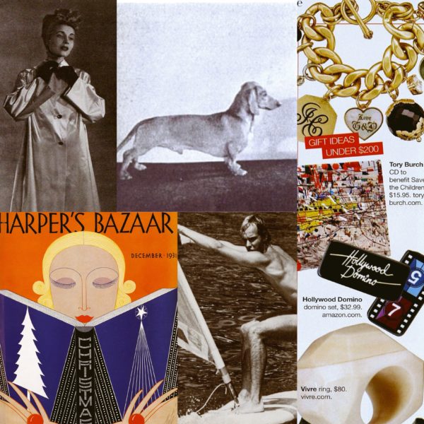
Well, I may as well admit it, I love fashion magazine gift lists.  There is just something so optimistic in the boundless consumerism and bright colours that collide on page after page of present ‘ideas.’  These spreads speak to both the magazine’s notion of its own taste and identity – and that of its readers – as well as its editors’ ability to search and edit what’s on offer into a comprehensive and easily scanned digest.

Here are some of my favourite aspects of these yearly lists, with examples from vintage December editions of American Harper’s Bazaar to liven up the holiday period:

  1. Scale & Layout – on these pages there is an Alice in Wonderland feeling to the tumbling images of individual gifts, which no longer adhere to real life scale. Suddenly perfume bottles are huge, sweaters tiny, nothing relates to normal expectations.  In 2008, a bracelet, a coffee table book, a set of dominos and a ring were suddenly all the same size. While in 1933 things were even less rational – with gold sandals, earrings and a dachshund dog all somehow fitting in the same little frames.  It is a baffling, yet exciting free for all to create a dynamic layout to entice your eye … and hopefully prompt purchases …
  2. Typologies – these range from mundane to bizarre in the ways various potential recipients are categorised by a made up title, and group of possible presents. I like 1922’s offerings including feathered fans and vanity box ‘to please the Debutante,’ a whole page of ‘gift suggestions for the fastidious woman of all ages,’ and potential gifts for that difficult group of women ‘of many minds and tastes.’
  3. Excess – nothing is too grand to be part of the gift list, this is after all the realm of fashion and fantasy. Indeed, amongst the yearly jewels, furs and golden gewgaws, in 1979 the magazine suggested that what American women really wanted for Christmas was an eligible bachelor. And it listed 10 possible candidates, ranging from Monaco’s Prince Albert to film producer Robert Evans.
  4. Contemporary Mores – the lists also reveal what is deemed most desirable, contemporary and fabulous in any given year. This insight means that we learn how alluring silver asparagus tongs were in 1904, the loveliness of a rubberised satin, jewel-buttoned raincoat from Bonwit Teller in 1941, and the high tech charm of a speaker phone with auto dial in 1986.


Happy Holidays, and may you receive everything on your own personal wish list…

Louise Dahl-Wolfe: A Style of Her Own at Fashion and Textile Museum

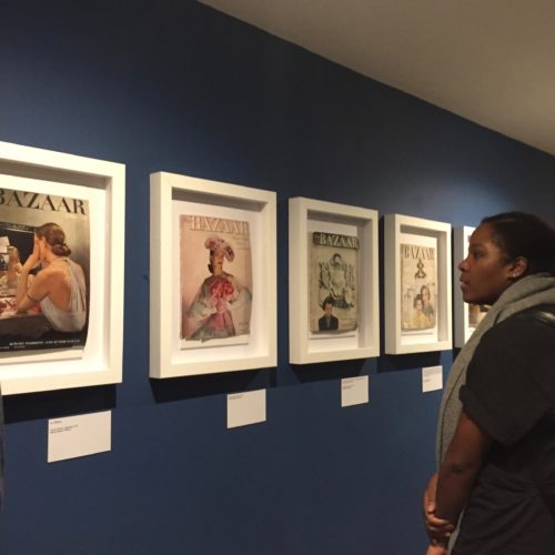
In our last MA Documenting Fashion class before the end of term we discussed ‘women imagining women’ and examined the photography of Toni Frissell and Louise Dahl-Wolfe. Fortunately for us, London’s Fashion and Textile Museum currently has an exhibition of Dahl-Wolfe’s photography. A couple of my fellow MA Documenting Fashion students and I excitedly visited the exhibition together. Louise Dahl-Wolfe: A Style of Her Own appropriately began with an informative wall-text chronicling Dahl-Wolfe’s trajectory from art student to fashion photographer. A small hallway leading into the main exhibition space featured several of Dahl-Wolfe’s Harper’s Bazaar covers from the 1940s and 50s. These were not just prints of Bazaar covers, but the original magazines themselves held in simple white frames. The imperfect state of the worn magazines gave Dahl-Wolfe’s photographs a tangible materiality and reminded me that although her photographs were now presented in a museum context, most images in the exhibition were originally intended for the pages of a fashion magazine.

The main exhibition space began with examples of Dahl-Wolfe’s early photography. Experimental nudes and still lifes reflected Dahl-Wolfe’s training as an artist at the San Francisco Art Institute. I enjoyed how these early works revealed her skill for manipulating light and shadow that would define her fashion photography. These skills are also highlighted in Dahl-Wolfe’s Depression-era documentary style photographs of the residents of Gatlinburg, Tennessee. Influenced by Edward Weston and Dorthea Lange, Dahl-Wolfe began her professional career in 1930. Her photographs of the impoverished community in Gatlinburg were later included in a group photography exhibition at the Museum of Modern Art in 1937.

Louise Dahl-Wolfe,
Halter dress by Brigance, 1954, Palm Beach

In 1936 Dahl-Wolfe became a staff photographer for Harper’s Bazaar where over the next 22 years she would produce 86 covers, 600 color pages, and thousands of black and white portraits.The exhibition featured numerous examples of Dahl-Wolfe’s fashion photography, making it impossible to choose a favorite. Among my favorites however, is the above photograph of a halter dress by Brigance taken in 1954 at Palm Beach. This image exemplifies Dahl-Wolfe expertise in light and shadow, capturing fashions in natural, outdoor settings, and rendering the subject as confident and at ease. As this image suggests, Dahl-Wolfe’s fashion photographs are shockingly modern and the influence of her dynamic images on contemporary fashion photography is astounding.

Arielle and Olivia looking at Dahl-Wolfe’s portraits

In addition to her success in fashion photography, Dahl-Wolfe continually produced portraits throughout her career. The exhibition showcased her portraits of Hollywood stars and cultural figures. Much like the subjects of her fashion images, Dahl-Wolfe’s portraits capture natural poses and the relaxed confidence of her sitters.

An unexpected yet delightful addition to the exhibition was a reproduced set of one of Dahl-Wolfe’s Harper’s Bazaar covers. Sitting on a stepped platform, a mannequin wears a bright yellow, striped 1950s play-suit and matching yellow accessories that stand out against an orange, blue, and green vinyl wall decal meant to replicate the original tiled backdrop of Dahl-Wolfe’s photograph. This scene brings the 1950s-magazine cover to life, once again adding to the materiality of the exhibition. Overall,   the Fashion and Textile Museum’s exhibition beautifully presented Dahl-Wolfe’s stunning photographs and successfully highlighted the photographer’s contribution to fashion photography.

Louise Dahl-Wolfe: A Style of Her Own is on at Fashion and Textile Museum until 21 January, 2018.


Abby Fogle

All photos author’s own