Author Archives: Ali

Balenciaga’s Fabrics


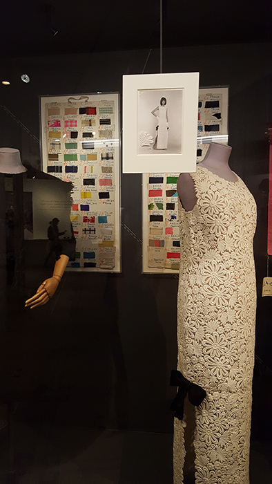
Upon a recent viewing of the Balenciaga: Shaping Fashion exhibition at the V&A, as well as the focus on shapes and forms, I was particularly interested in the mentioning of Balenciaga’s fascination with fabrics. In the exhibition there featured a couple of displays of fabric swatches and samples, including a huge book with fabric samples. One of the textile boards showed a multitude of fabric choices for a single collection — so many colours, patterns, and textures. The board was used as a marker for the models for the order of the show. Rather than representing fashion and dress predominantly through its shape and overall look like we usually do, Balenciaga associated his designs with their fabric, texture and colour. On the board he detailed where the fabric was made and the name of its wearer, providing almost a personality and identity to the fabric itself.

Rather than starting with a design or a sketch, Balenciaga began with the fabric. As he said, “It is the fabric that decides.” His knowledge and interest for different cloths led him to forge very close working relationships with many textile manufacturers worldwide. In order to create the magnificent shapes of his garments, fabric was the most important aspect. Because of this, stiff materials were often needed to hold the shapes of his designs. After his careful selection of fabrics, Balenciaga preferred to start making instead of dwelling on sketches and designs. Instead, a sketch artist would work on the drawings for him, and Balenciaga would attach a fabric sample to the sketch. In the exhibition, a huge book of fabric samples is displayed in a glass case, offering a tactile tease to us viewers — the beautifully coloured fabrics shone in the display light, away from our grasp. In selecting the fabric first, Balenciaga was choosing the viewer and the wearer of the garments, whose skin these designs would be in contact with. The exhibition also had a replica dress of Balenciaga’s that visitors of the exhibition could try on, all in order to recreate the feeling of enveloping oneself in one of his designs.

Balenciaga: Shaping Fashion is on at the V&A until February 18th, don’t miss it!

By Grace Lee

Evening Essential: Grace’s family’s 1930s Minaudière


This past week, the Courtauld had its annual winter ball, a chance for students to dress up in their fanciest evening wear and celebrate the end of term. During the 1930s, minaudières became a staple of women’s evening wardrobes. Defined as jewellery, these were miniature oblong cases which acted as purses or bags for cosmetics and other items considered essential for a smart evening out. In 1934, Van Cleef and Arpels patented the design and created luxury metal versions, finished with beautiful stones or lacquer. Even though they were beautiful and highly decorative, these cases were also functional – aimed at optimising space whilst carrying necessary items. Studying these items as dress historians proves most interesting because they reveal what were considered the essentials for an evening out in the 1930s.

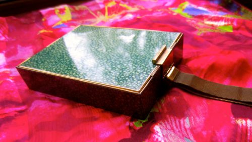
This minaudière, which has been passed down the line of women in my family, appears to be from the years following the 1930s. An inscription on one of the clasps shows it is made by L.S. Mayer for ‘Park Lane Deluxe.’ The exterior is in an art deco style faux shagreen, a beautiful pebble green colour with a speckled pattern, and a gold metal frame. It has a chain which would have been worn round the wearer’s wrist whilst dancing at the balls, also making it fulfil the role of a decorative bracelet. In the first section inside there features a very generously sized mirror which runs the entire length of the minaudière, and opposite that there are two compartments which include rouge and powder, complete with the puffs to apply them. There is a fold up tortoiseshell hair comb, and a section at the bottom for a bullet of lipstick or perhaps cigarettes. Each aspect of the design has been carefully thought through to make do with the small space and to maximise its functionality.

On the reverse of the minaudière, there is another mirror and a notepad and pen with a holder. There is also a hidden compartment below this which flaps up to reveal a long and narrow case, which could have contained alcohol or was a cigarette lighter. What makes this minaudière stand out from the rest is that it differs greatly from any usual accessory, because it features a notepad and pen. As my grandmother says, this could have been for women to write down the names of their partners to dance with at the ball. Either way, it asserts the active role women had at the time in terms of fashioning their own identity. The minaudière is also interesting when compared to modern day clutch bags used on nights out such as the Courtauld’s Winter Ball. Usually there is at the very most a tiny zip pocket in clutch bags, and the rest is an empty space. On the one hand, the 1930s minaudières were genius in that they planned out each and every thing that might be needed, and catered for it within the case. On the other hand, nowadays we have much more freedom in choosing which items we consider as essentials in our individual clutch bags, and therefore how our evenings will be defined.

By Grace Lee

All photos author’s own

MA Documenting Fashion visits the Courtauld’s Prints and Drawings Collection

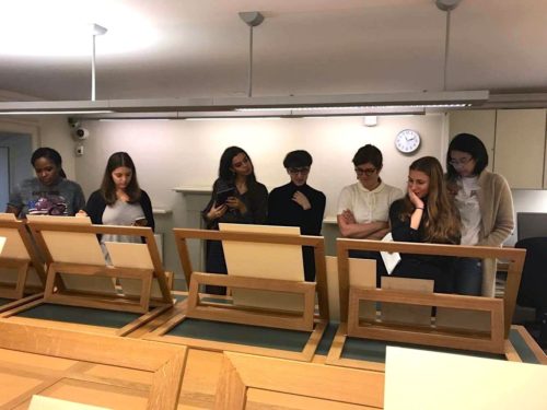
Our Documenting Fashion MA class recently visited the Courtauld’s Prints and Drawings study room. Our class theme that day was ‘Modernity,’ and we were focusing on texts by Charles Baudelaire to explain the shift towards modernism, and how it impacted both art and the representation of dress. The Courtauld’s Prints and Drawings room houses approximately 7000 drawings and watercolours, and 26000 prints ranging from the Middle Ages up to the twentieth century. The prints, drawings and paintings we were studying on this visit were mostly from the late nineteenth century, around the same time that Baudelaire was writing about modernism.

It was interesting to view the shift in that period in respect to the representation of women, class and their dress, but most notably the techniques of depiction. Whereas earlier paintings which we viewed strived to be more realistic in both colour and shape, the later drawings seemed to be more relaxed, with free flowing lines and unaltered black ink. In ‘The Modern Public and Photography,’ Baudelaire discusses dreams and reality in relation to both photography and painting, and is against taking either at face value as real life: “The painter is becoming more and more inclined to paint, not what he dreams, but what he sees. And yet it is a happiness to dream, and it used to be an honour to express what one dreamed.” In the study room, a portrait of Lady Adelaide Stanhope by Alfred Edward Chalon was on display next to Paul Cézanne’s sketch of Hortense Fiquet. Completed circa 1880, Cézanne’s graphite drawing was done a few decades later than Chalon’s and it certainly shows a difference in their techniques. Lady Adelaide’s portrait is in colour and is extremely detailed – her hair and the textures of her dress are what some would call ‘realistic,’ whereas Madame Cézanne is compositionally incomplete, with many large blank spaces and ‘unfinished’ shading. In this example, it is the viewer who dreams and fills in the missing elements of the picture.

[Left] Lady Adelaide Stanhope by Alfred Edward Chalon
[Right} Madame Cézanne by Paul Cézanne, 1880.

Another example we viewed of these new techniques in depicting reality was Edouard Manet’s 1871 La queue devant La Boucherie. The etching effectively shows people queuing for food in Paris, whilst remaining open in shape and form. The umbrellas highlight the shapes in the image, whilst simultaneously forming the outline of the unified yet fleeting crowd. As Baudelaire notes about one of his subjects in ‘The Painter of Modern Life,’ “he is the painter of the passing moment and of all the suggestions of eternity that it contains.” For Baudelaire, modernity is ephemeral and contingent on the times. It is up to the painter, the drawer or the photographer to capture these moments, in order for us to observe them and their many differences, as we did in the Prints and Drawings study room.

By Grace Lee

To book a visit to the Courtauld Prints and Drawings study room, visit http://courtauld.ac.uk/gallery/collection/drawings-prints/prints-and-drawings-study-room

Bibliography

Baudelaire, Charles, The Painter of Modern Life and Other Essays, (London: Phaidon, 1964)

Baudelaire, Charles, ‘The Modern Public and Photography’, in Alan Trachtenberg, ed., Classis Essays on Photography, (New Haven: Leete’s Island Books, 1980), pp. 83-89

Burberry’s Capes Reimagined at Masterpiece London

This summer I was given the chance to visit Masterpiece London. Upon arrival, I was more than excited to see a fashion exhibit there amongst the prestigious art and antiques that are usually on display.

The exhibition featured a selection of limited edition handmade capes from Burberry’s Capes Reimagined show and February 2017 catwalk, combined and backdropped with black and white photography of Henry Moore sculptures. The sculptures were inspiration for the large and sculptural forms of the Burberry capes. The shadows cast on the floor by the capes were art in themselves, and also reminded me of shapes found in Moore’s sculptures.

Drawing on Moore’s use of found objects, the capes were made out of feathers, shells, pearls, crystals, lace, and wood. The capes were magical – my two favourites were one which had shells all over, and another with white feathers and a collar made out of tiny crystals. From afar the collar looked like it was made out of miniature feathers, but like all the capes in the exhibit, it was only when you got closer that you realised there was something more complex to them than their shapes or shadows.

The exhibition was displayed in a small section at the end of the Masterpiece London space. There were no walls, but instead the photographs acted as architectural wall panels which you had to walk through in order to get access to the spectacular capes in the centre. There were also delicate white veils dividing the space, which made the capes seem even more powerful in contrast.

Capes are a symbol of protection. These capes were bold just like Moore’s sculptures, and they seemed to be making a powerful statement. In this exhibit Moore’s sculptures were only nostalgic black and white photographic reproductions, and the real sculptures on display were the Burberry capes. Not exactly wearable in our modern day to day life, these capes seemed to be stating that they are sculpture, they are art. More importantly, this exhibit reinforced the fact that fashion deserves to be seen as an art. In reimagining their capes, Burberry has helped those who haven’t already to reimagine what constitutes art.

By Grace Lee

All photos by the author.

Fashion Week Reactions Part 1

photo-2

As part of a special series this week, we give our reactions to the recent fashion weeks…

Alexis:

“I love New York, I’m a New Yorker, I can’t imagine living anywhere else” – video, DKNY S/S 2015

The city of New York has played a role in the shaping of American fashion since industrial professionals such as Eleanor Lambert and Dorothy Shaver worked to promote original American design in the 1930s and 40s. As the site of the country’s garment industry as well as, in advertisements, a prime space of imagined consumption of clothing, New York became synonymous with fashion over the course of the twentieth century. Since its creation in 1988, DKNY, the less expensive extension of Donna Karan New York, has utilised the city as a tool of branding. DKNY even defines itself, according to its current website, as “the energy and spirit of New York. International, eclectic, fun, fast and real.” And the presentation of DKNY’s S/S 2015 collection on 7 September in Lincoln Center began with a video that visualised these ideals. A rapid patchwork of faces, clothed bodies and minute details of New York spaces – from the subway to wire fences and graffiti-covered brick walls – the video set the tone for the show, which presented models of various ethnicities in sporty and colourful garments. Styled by Jay Massacret, the models conveyed a quirky femininity in their A-line skirts and boldly patterned garments. They painted a portrait of style found, according to the video, as “you walk down the streets…different energies, different styles…a lotta noise, colours.” The show thus extended the definition of New York to its outer, less affluent spaces. And the models, dressed in sweaters and neoprene bomber jackets, recalled 1990s B-girls. With their sunglasses, foam stacked trainers, and gelled baby hair and braids (conceived by Eugene Souleiman), they commemorated inner city street style – today a part of American fashion heritage – and the specificity of this image to New York.

Katerina:

Audrey Hepburn’s Granddaughter Emma Ferrer Makes Her Modelling Debut

Fashion has made no secret of its fascination with Audrey Hepburn. From the mid-1950s films Sabrina (1955) and Funny Face (1957), which dramatised the gamine actress’s transformations through Hubert de Givenchy’s couture, to subsequent pronouncements that a new model has something of her eyebrows or quality of movement, fashion has remained entranced with Hepburn’s delicate, extraordinary face and waif-like, ballerina body. The latest model to be cast in Hepburn’s mould is her twenty-one-year-old grand-daughter Emma Ferrer. Ferrer, who to date has been an art student in Florence, is moving to Manhattan and embarking upon a modelling career. Her debut into fashion was the September issue of Harper’s Bazaar, where she was photographed by Michael Avedon, the grandson of the famous Richard, who worked with her grand-mother. Although Ferrer, has been ballet-trained like her grandmother and shares her deportment, she is not Hepburn’s doppelganger in either appearance or life experience. Nevertheless, in the photo-shoot, she has been made to adopt Hepburn’s characteristic poses, for example: her face in profile and tilted up to exaggerate her neck-length; or in a Funny Face style frieze-frame of quirky spontaneous movement. There is something sad and forced about asking a young woman to literally take her grandmother’s position, and in my opinion, the photo shoot is too derivative to be inspiring.

Still, the fashion industry’s interest in Hepburn’s granddaughter indicates that it values a model’s symbolic value in addition to her physical attributes. One speculates that when Lanvin asked Ferrer to make her catwalk debut at their Spring Summer 2015 show on September 25, they wanted to exhibit not only her beauty in their clothes, but the aura that manifests in her blood-relation to Hepburn. It’s too early to tell whether Ferrer will follow the successful path of Georgia May Jagger and other descendants of fashion royalty, but first, her collaborators have to allow her to emerge from Hepburn’s shadow.

Re-Thinking The Experience And Representation Of Dress

Alexis-Katerina1
Katerina and Alexis during their introduction

On 6 May 2014, we held a study day at The Courtauld’s Research Forum. This day was a result of a collaboration between the Andrew W Mellon Foundation MA 2013/14: Documenting Fashion: Dress, Film, and Image in Europe and America, 1920-45 and the Fashion Research Network. The theme, Documenting Fashion: Re-Thinking the Experience and Representation of Dress, came out of our collective concern to enrich the ways we think about and discuss dress, rethink universalising narratives, and incorporate the multiple sources that illuminate hitherto unexposed aspects of dressed experience.

To introduce the study day, Katerina Pantelides and Alexis Romano analysed a contemporary news image by Andy Rain that appeared in the Daily Telegraph on 30 April. The photograph, which documented people queuing at a bus-stop during that day’s RMT Tube strike, presented most study day delegates with a familiar, timely picture. As opposed to many strike images of overhead views of commuters in a frenzied swarm, this format allows a full view of queuers’ dressed bodies. Although it is not the most obvious fashion-focused image, it is a valuable document of contemporary, quotidian dress. Moreover, its non high-fashion quality pertained to the study day, over the course of which participants questioned what defines a fashion image or experience.

The image, which illustrates the close-up view of a line of people that recedes into the distance, is cropped to give the impression of the bus queue’s endless extension. Its constituents form a diverse group of people in terms of age, gender, ethnicity and fashionability. Overall, the people in the queue are united through their orderly linear formation and jerky, angular body posture that indicates their resistance. Exceptions to this rule stand out: for example the poised girl in black leather with headphones and her hands in her pockets commands our attention.

Viewers’ observations of the seasonal, utilitarian clothing worn by the subjects shifts to their sensorial reception of the image.  They might feel somewhat stifled by subjects’ layered clothing of coarse materials: denim, faux leather, wool. Viewers’ feeling of closure is intensified by the photo’s close crop, while the image’s overall darkness owes to the dull, neutral colours of the dress worn.

If we compare this photograph with those in fashion editorials, for example, there are some crucial differences. The photograph is centred around a news event, rather than fashion presentation, and the bodies featured are incidental and not chosen in the manner of fashion models. Thus, we are presented with a more inclusive picture of contemporary dress and its wearers. In other ways, boundaries between the two photographic modes are almost permeable, from fashion’s interest in visualisations of the street to the use of similar techniques, such as juxtapositions between order and chaos, mass and detail.

The study day discussed the meaning and serendipity to be found in mundane experiences and images of dress, such as this non-purposeful photograph seemingly captured outside of real time when subjects turn inward. Similarly for Richard Dawkins: “[t]he word ‘mundane’ has come to mean ‘boring’ and ‘dull’, and it really shouldn’t – it should mean the opposite. Because it comes from the latin mundus, meaning ‘the world’. And the world is anything but dull… There’s real poetry in the real world.”

Source:

The Enemies of Reason (2007), television broadcast, episode 1, “Slaves to Superstition,” Channel 4, 13 August. Written and presented by Richard Dawkins.