Category Archives: Internship

Rosa Coomber: The Making of Suzon’s Clues

My name is Rosa Coomber, and I was lucky enough to work with the collection as the Digital Narratives and Storytelling Intern from August 2022 to the end of July 2023. I was excited to join this internship not only due to the opportunity to work with an incredible collection, but also due to the apparent commitment to creativity and freedom fostered by my colleagues. Digital narratives and storytelling are necessarily vague phrases; with a collection as vast as we have at the Conway, and a staff and volunteer body so broad and dedicated, there are more than enough stories to tell! After studying for a few years, I was keen to take a break from essay writing, and instead sought to ponder the question “how else can we tell the story of this collection?”

It turns out that there are almost infinite ways to do this, but the one that I spent most of my time on was Suzon’s Clues. My aim was to delve into the details of individual pieces in the collection and to document the physical experience of the library that we all know and love. A video game seemed to be the perfect medium for this, setting a mystery against the sights and sounds of the Conway.
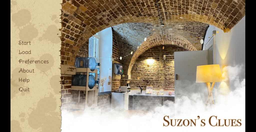
A screenshot of a title screen for a video game. On the left of the screen are the Start/Load menus, Preferences and Help Panes, and links to read more information about the game or quit the application. To the right, the title “Suzon’s Clues” is written in capitals. The background image is the tea room of the Conway Library with photoshopped smoke covering the bottom half.

[Image: Suzon’s Clues Title Screen. Background image: Tea Room, Conway Library, Courtauld Institute of Art, London, Jan. 2023. Photograph taken by the author. Sidebar graphics created using Procreate © for IOS]

“It’s your first day as a new volunteer in the Conway, and you’re greeted by a rather mysterious individual. Work together to explore the library and uncover clues, but beware, you may find more than you’re bargaining for…”


Gameplay

It’s time for your first shift at the Conway Library. You arrive at the Courtauld Institute of Art, collect your volunteer pass, and make your way downstairs. You can feel a presence following you, but you push the thought to the back of your mind; you’re in Somerset House after all, a building with hundreds of years of history, and there are bound to be things hanging around. You open the door to the Witt Library, where you are suddenly intercepted by a mysterious young woman who introduces herself as Suzon. She seems to have been expecting you, and can barely contain her excitement. Suzon explains that she needs someone to help her decode objects that are materialising in the library; they appear to be Conway photographs, but each of them is obscured somehow. It’s going to be more complicated than simply finding their box numbers and filing them away.

Through a series of multiple choice questions, the player explores the library to find clues, whether these are poems, newspaper clippings, or even witness testimony from yet more obscure characters. Once they are cleaned, translated, and stitched back together, they are returned to their rightful places in the library. The aim of the game is to learn more about the photographs in the collection and to integrate them into their historical and cultural context. The more clues the player finds, the clearer the picture becomes. This not only applies to the photographs, but also to the appearance of the elusive Suzon, who seems more familiar as the story progresses. There are four main chapters and one bonus problem, where the player has to opportunity to solve the mystery of Suzon herself. The game is intended not only as an educational exercise, but also as a kind of tribute to the library as a physical space and a centre of memory. This game is not recommended for children under 12, given occasional horror-related subject matter and descriptions of violence and death.


Inspirations

Before I settled on creating a video game, I was more focused on the “point of view” element of the project. I had come across an interesting photographic project from the Wellcome Collection’s volunteering department, which photographed the route from Euston Road, inside the main building, and eventually ending at the library itself. This project had practical purposes, of leading volunteers to their work space, but it also made me think about materiality, and what significance these seemingly innocuous and functional photographs would have in future years. Tom Bilson, Head of Digital Media at the Courtauld, had spoken to us often about the importance of documenting the collection and library “warts and all”: scuff marks on folders and torn labels on the red boxes. My initial plan was to create a kind of photographic project, documenting the volunteer experience from the volunteer’s point of view. Through compiling these images, I hoped that we might create a faithful visual representation of the Conway Library experience. It is interesting to note, between September 2022 and the time of writing in July 2023, the Wellcome Collection photographic route is nowhere to be found online, including via the Wayback Machine. This is perhaps testament to how fleeting these moments in time and space truly are, even with the seeming permanence of the internet.
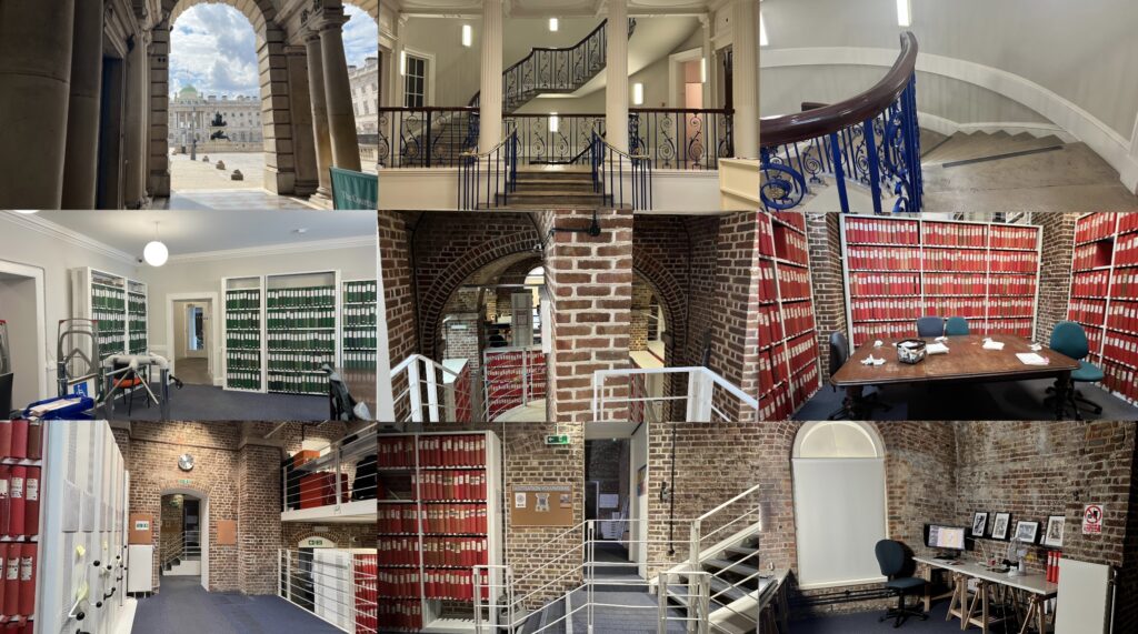
A collage of nine different photographs. The images chart the walking route from outside the main entrance to Somerset House, through the reception area, and down into the Witt Library. From here, the route continues down into the Conway Library and ends in the photography vault.

A selection of images taken in and around the Conway Library, Courtauld Institute of Art, London. Photographs taken by the author, Oct. 2022-Feb. 2023.


It was only once I started actually compiling these images that I realised what a resemblance they bore to a typical video game route. I have always been interested in more immersive, interactive learning, and so finally I settled on creating a POV supernatural horror/mystery game. The Conway Library, and its setting underneath Somerset House, is the kind of environment which is naturally ripe for spooky goings on; indeed, I have heard many stories of ghosts clattering about the vaults or floating across the courtyard in the middle of the night. Given the importance of featuring the space in almost every scene in the game, it made sense to import some of its ghostly energy. I am a big fan of horror games, and horror in general, but I have seen very few educational games with a horror slant (most of these would be better known as horror games with an educational slant, see Baldi’s Basics, for example). The mystery genre plays into this as well, as my aim was not simply to unsettle or scare, but also to explore and investigate lesser known pieces in the collection through the lens of the supernatural.


Research

After settling on this genre, I began to explore the collection, choosing boxes almost at random, and trying to avoid anything I’d spent too much time on before. After a couple of days of this, I settled on ten sources, which I quickly realised I would have to whittle down to four, an experience I feel is not uncommon when exploring the collection. The sources are as follows:
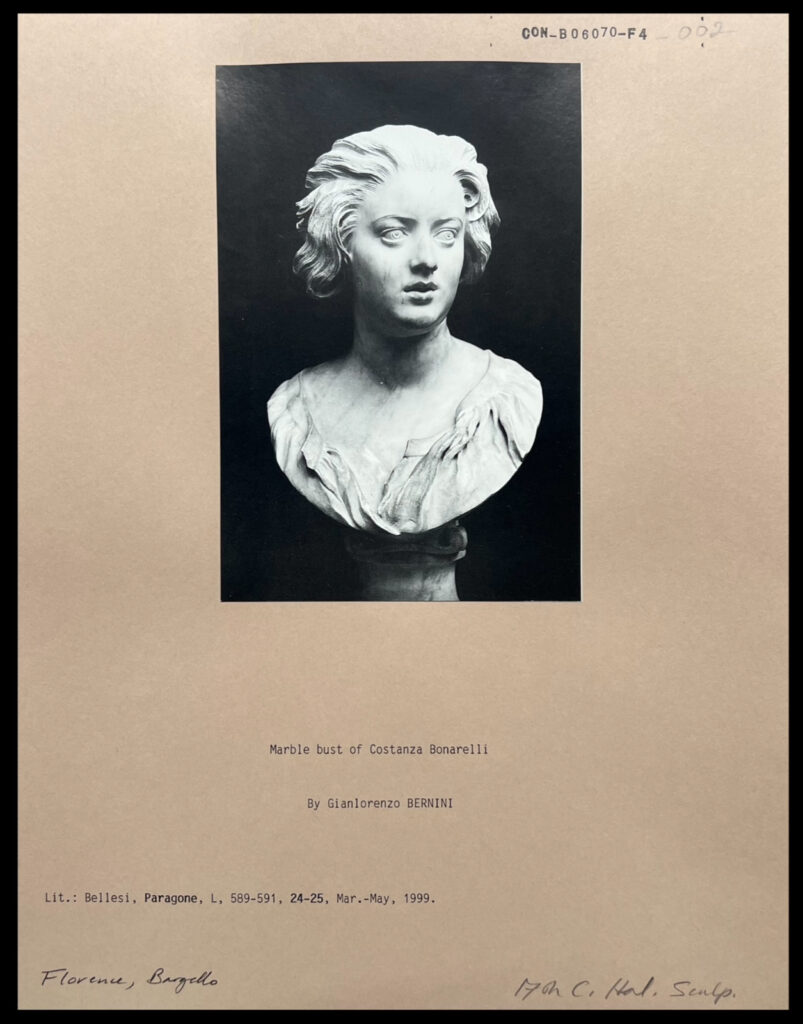
A black and white photograph mounted on card. The photograph depicts a bust of a woman, facing off to her left with her mouth slightly open. She is frowning slightly.

[CON_B06070_F004_002] – Marble Bust of Costanza Bonarelli by Gianlorenzo BERNINI, Lit.: Bellesi, Paragone, L, 589-591, 24-25, Mar.-May, 1999. ITALY: Florence, Bargello.

This source was the first I chose, and another piece that cemented the decision to focus on pieces in the collection with darker histories. On the surface of things, this is a simple bust of a woman named Costanza Bonarelli, sculpted by famed Italian sculptor Gianlorenzo Bernini. Once I had researched the image further, I discovered that Bonarelli eventually had an affair with Bernini’s brother, and in response Bernini hired someone to slash her face with a dagger. Immediately, this sculpted image of intimacy and adoration had taken on an air of obsession, possession, and violence.
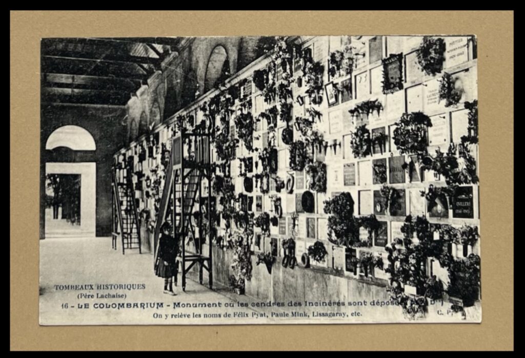
 

Black and white photograph mounted on card. Depicts a small child standing at the foot of a ladder against a wall that is covered in small memorial plaques and bunches of flowers.

Detail of [CON_B06922_F004_029] – TOMBEAUX HISTORIQUES (Père Lachaise), 16 – LE COLUMBARIUM – Monument ou les cendres des Incinérés sont déposees. On y releve les noms de Felix Pyat, Paule Mink, Lissagaray, etc., FRANCE: Paris, Père Lachaise.

This clue uses only the latter image of the two pictured here, of a little girl standing next to a wall covered in flowers. The secret of this image is more straightforward, as the little girl is standing in the colombarium of one of the most famous cemeteries in the world, the Cimitière du Père Lachaise in Paris. What at a first glance could be a photograph of a child in a flower shop takes on a deeper, more macabre significance.


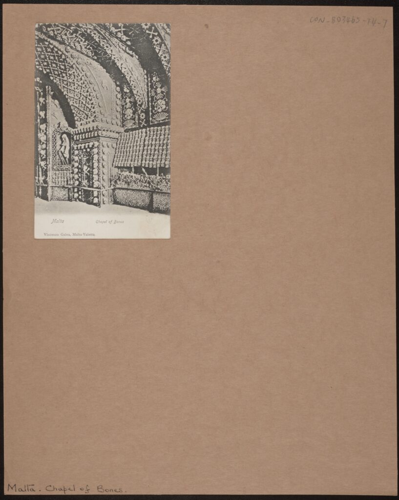
Black and white photograph mounted on card. A small, grainy photograph of a crypt wall and part of its ceiling. The wall is covered in hundreds of skulls and other bones arranged in patterns.

[CON_B03465_F004_007] – Malta, Chapel of Bones, Vincenzo Galea, Malta-Valletta.

I was first attracted to this photograph because of how unusual it was, in a folder full of church façades and street shots. A small, soft, black and white postcard with the simple inscription: “Chapel of Bones”. A crypt, the walls covered in skulls and bones, and one of the more gruesome photographs I’ve come across in the collection. Upon researching the site, I discovered that the chapel had been left to go to ruin, with much of its original structure lost. It is presently unknown whether the crypt still exists after years being trapped underground, and this was exactly the kind of mystery I was looking for.


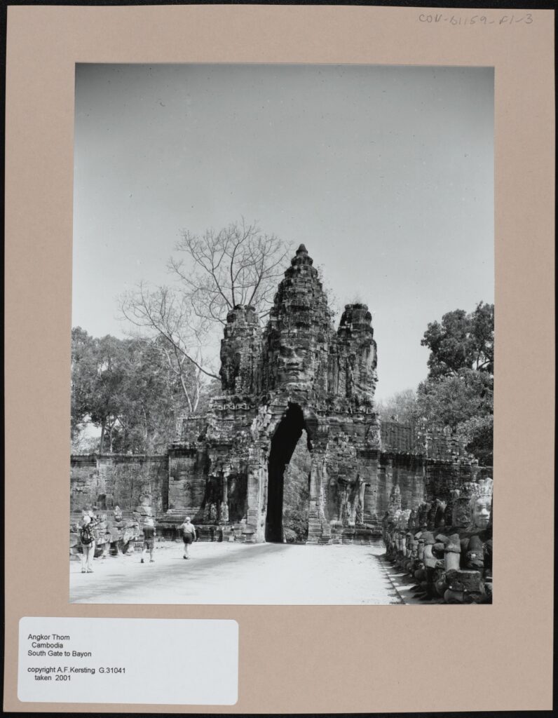
Black and white photograph mounted on card. The focus of the photograph is a large stone gate at the end of a wide, white path. At the centre of the gate is a carved stone face, underneath the face there is an archway flanked by two stone columns. Behind the gate there are many trees. There are several people walking towards the gate on the white path, which itself is flanked by rows of stone statues.

[CON_B01159_F001_003] – Angkor Thom, South Gate to Bayon. A.F. Kersting, G31041, taken 2001. CAMBODIA.

This is the final photograph that I chose, and is the most hopeful of the clues. I couldn’t not include a Kersting shot in this selection, and there was something about this one which captivated me. Taken in Angkor Thom, Cambodia, the last surviving and most enduring capital of the Khmer Empire, this photograph depicts the famous face of the city’s South Gate. What I found most mesmerising about this shot is how well the gate has survived, given that the city has been abandoned for at least 400 years. There was something quite poignant about the face of King Jayavarman VII, cast in stone, looking out over the overgrown city, and so I included this as the final clue, symbolising endurance through centuries of history.


Process

When I first started this project, although I had a pretty clear view of the finished product, the route to its completion was decidedly murkier. I had heard of several programs for creating visual novels and role-playing games, and so in the end I settled on using perhaps the most popular; a program called Ren’py. Ren’py is designed for users with minimal experience of coding, with much of the game development relying on inputting background images and props. The program works by providing a central interface for the script, and a number of folders for backgrounds, character sprites, and sound effects. A degree of knowledge of coding was required to write the script, but there were useful guides on Ren’py’s site and the wider internet. I definitely appreciated being given the time to learn some coding, as I had no prior experience.

First of two screenshots from Atom, a scripting program on Windows. It depicts a list of video game character names, followed by details of how their characters appear in game, including text colour, font, and font size.

[Some examples of code used in the game: character names and specifications at the beginning of the game. Edited with Atom via Ren’py]
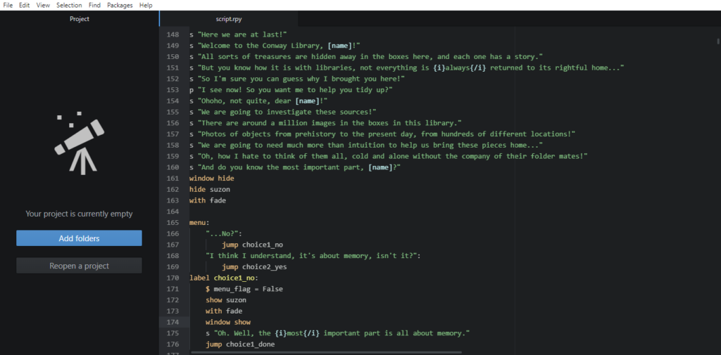
Second of two screenshots from Atom, a scripting program on Windows. It depicts some introductory dialogue welcoming the player to the game.

[Some examples of code used in the game: opening dialogue between Suzon and the player, as well as the first choice in-game. Edited with Atom via Ren’py]


This approach suited my aim to immerse the game in the Conway’s architecture, as it allowed me to place emphasis on changing scenes, visual clues, and exploring the library. I didn’t want to overcomplicate the gameplay and end up creating a kind of decision-making labyrinth. Every standard background is an unedited shot of the Conway Library or Courtauld Institute, and many of the props were also photographed on site. For example, the original boxes belonging to each source were also photographed and used in the “Chapter Cleared!” screens at the end of each chapter.
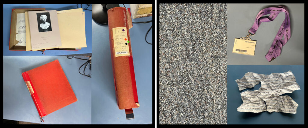
Two collages. The first is comprised of three images of a red box. In the first, it is open, and displaying a lack and white photograph of the first source used in the video game. In the second, the box is closed. In the third, the spine of the box is visible, with the text reading “17th Century Sculpture – Italian – Gianlorenzo Bernini – Busts – Female, Popes, Royalty. CON_B06070. The second collage is comprised of three images: the first is a photograph of the carpet in the Conway Library. The second is a photograph of a volunteers pass on a purple Courtauld lanyard. The third is a torn and scrunched up piece of paper covered with illegible handwriting.

[A few examples of some “props”, including Bernini’s bust of Bonarelli in its box, a section of carpet, a volunteer pass, and a handwritten “clue”.]


In addition to this, most of the sound effects were also recorded in the library, for example the sound of the wind heard in the demo was recorded one chilly afternoon in Vault 3, and the sound that plays when a clue is discovered is the sound of a Kersting print being flipped over. I had learnt from attending a workshop with sound artist Robin the Fog that smartphone recording apps are often sufficient for capturing audio of a reasonable quality. This is what I used to create the sound effects used in the game.

A screenshot of the iPhone Voice Memos application. There are nine recordings in total, titled: Boxfall, clap, windwhistle, windchime, smallthud, thud, photo flap, box close, and box open. They are all between one and three seconds long.

[A screenshot of the sound effects compiled here.]

Through this approach, I hope that I have injected as much of the Conway into the project as possible, I wanted to imbue the whole thing with a kind of “library flavour”. There are some photographs of Conway milestones included as well, such as the before, during, and after of the process of photographing the red boxes, and the decorations put up in the Witt Library for the Witt and Conway Staff Reunion.


A collage of three photographs of the same area of the Conway Library. In the first photograph, there are piles of boxes covering the floor. In the second, the boxes re gone and have been replaced by photographic equipment and piles of red boxes. There is also a large table covered in black fabric visible. In the final photograph, all equipment and boxes has been cleared away, and the space is empty.

[Photograph of the approach to the vaults, taken before, during, and after the photographing of the red boxes, photographed by the author.]
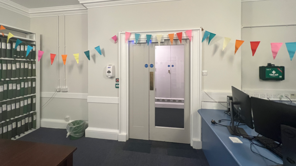
The door to the Witt Library in the Courtauld Institute of Art. Above the door, multicoloured paper bunting has been draped across the walls.

[Photograph of the Witt Library, taken shortly after the Witt and Conway Staff Reunion, photographed by the author.]


Once the sources were selected, the next step was to obscure them. I wanted to create a kind of puzzle where the player would have to learn more about their item in order to locate its box, “bring it home”, and advance to the next chapter. So, after the research I compiled a selection of facts about each object. For example, with regards to our first problem, the bust of Costanza Bonarelli, its first clue relates to location and time; a map of 17th Century Siena. The bust was created in the 17th Century, and Costanza herself was originally from Siena. Next, a poem from well-known poet of the Italian Renaissance, Torquato Tasso, included for the line “not that I hope for anything from you, my sweet life, except misery”. This is a reference to the tumultuous affair between Bonarelli and sculptor Bernini. Next, after some exploration, a dagger is discovered in the vault, making an obvious reference to the dagger that was used to disfigure her. From here, almost at the end of the puzzle, Suzon and the player follow the sound of music, which gets louder and quieter depending on how far away the player is as they move through the Conway. The music is an aria from Handel’s cantata, “Apollo e Dafne”, which references Bernini’s most famous work, Apollo and Daphne. This is the final clue which connects Bonarelli and Bernini. From here, the player is given a choice of boxes and, when the correct option is chosen, the item is returned to its home, and in a sense is laid to rest.

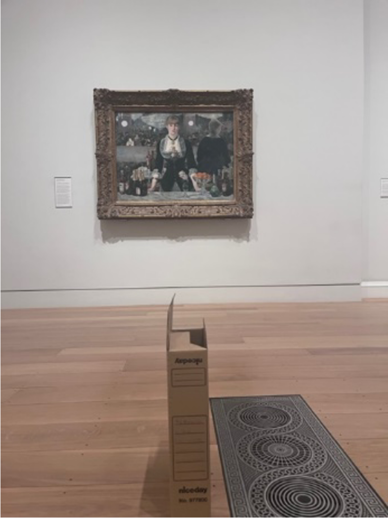
This formula is followed for the remaining sources, with some variations. I wanted to try to make the sleuthing process as varied as possible, taking advantage of different forms of media. It seemed like to do otherwise would be a waste when Ren’py allows for the integration of text, pictures, and audio. Another benefit of this approach is the inclusion of a number of characters to further enrich the experience: There is Suzon, of course, who many will recognise from the painting, “A Bar at the Folies-Bergère”, by Édouard Manet, who also makes an appearance. Torquato Tasso arrives to read his poetry, and the vaults are frequented by a ghost by the name of Georgiana. She is named after the Spritualist and artist, Georgiana Houghton, subject of an exhibition at the Courtauld Gallery entitled “Spirit Drawings” in the Summer of 2016. By including Georgiana, Suzon, Manet, and indeed a short cameo from Samuel Courtauld in the introduction, the Gallery, Institute and Library are all represented in the gameplay.
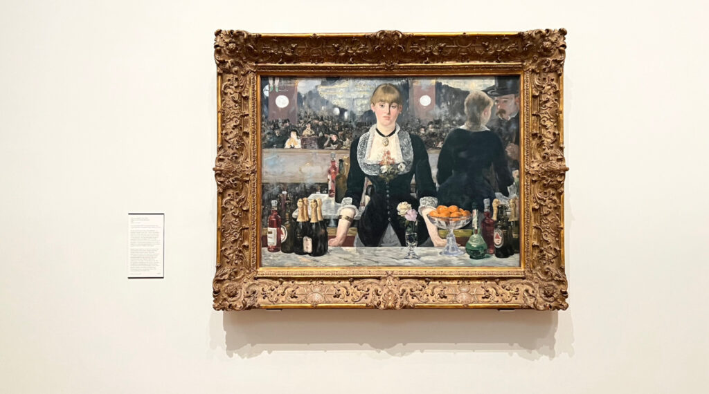
A photograph of the painting “A Bar at the Folies-Bergère”, by Édouard Manet. A young woman is looking out at the viewer, standing behind a bar and surrounded by bottles of alcohol, flowers, and a bowl of oranges. Behind her, the rest of the bar and its patrons are visible. The painting is framed by an ornate, carved wooden frame and hanging on a white wall.

[A photograph of Suzon in situ, photographed by the author in the Courtauld Gallery, Strand, London, December 2022.]


Testing and Launch

Once the chapters were written, the script, images, sound effects and music were all combined within the game directory provided by Ren’py. I had, perhaps naively, thought that the bulk of the work was finished, but as always when using unfamiliar technology, there are going to be a few hiccups. The music or sound effects come in too early, too late, too loud, or too quiet. One character sprite fills the entire screen, another doesn’t show up at all. After a couple of weeks and many hours of rewriting code, the game finally ran successfully. I must extend my gratitude to my fellow interns and staff in the Conway Library for playing through the demo and providing some much needed feedback: it’s always helpful to look at these things with as many sets of eyes as possible! It was also fun seeing everyone’s reactions to the experience of moving around the library in-game, and I’m happy that this was well-received.

Once the testing was over and everything was tidied up, it was time to finally launch the game. Suzon’s Clues is hosted on the independent game developer site, itch.io: Suzon’s Clues on itch.io.

A screenshot of the developer’s page of an independent video game website. To the left, there are several descriptive boxes, including: Title, project URL, Game Description, and Classification. To the right, there is an image of the game cover, which depicts the character Suzon against a gold background, with the title “Suzon’s Clues” to the left.

[A screenshot from the developer’s page of “Suzon’s Clues” on itch.io, depicts title and cover art.]
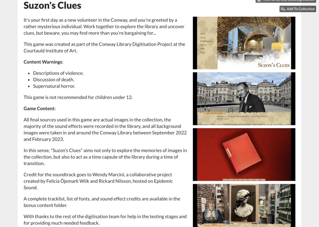
A screenshot of the developer’s page of an independent video game website. To the left, there are two uploads of the game files, titled “SuzonsClues-1.0-mac.zip” and “SuzonsClues-1.0-pc.zip”. To the right, there are several gameplay screenshots, including one from the opening to the game, and another of one of the video game characters.

[A screenshot from the developer’s page of “Suzon’s Clues” on itch.io, depicts the uploads of the game files.]


Once the content warnings, game description, installation instructions, and game file were uploaded, everything was done. It was strange to stop working on this project, at times it felt like it would never be finished! I felt that I would always be writing new mysteries for Suzon and whichever unwitting volunteer she had managed to capture, and certainly felt some sadness writing the final scenes.

Conclusion

The aim of Suzon’s Clues was, in part, to explore the ways in which we can interpret the pieces in the collection. Are they to be used to understand the processes and inspirations of sculptors, painters, architects, and photographers? Can we use these photographs to understand social, cultural, and political trends? What about making statements about which objects are preserved, and why? Are they a collection of pictures that are nice to look at? Of course, all of these are true.

The photographs in this collection are preserved with varying degrees of detail, and it would be a truly gargantuan feat to attempt to research the mysteries of every last piece. What I hoped to achieve with the tiny number of sources used was to demonstrate the sheer amount of information that is just waiting to be discovered within these boxes, and the intrigue and fun we can have if we attempt to unearth them. Further to this, Suzon’s Clues is something of a love letter to the Conway Library. So much more than just a building; it is a centre of memory and has been the home of the collection. More than that, the Conway has been the beloved workspace of hundreds of volunteers, staff, students, and visitors. I hope that I have been able to capture a sense of the experience of working on this project, and working in this space. Whether we are sorting through Kersting prints on the mezzanine, poring over masters at the table on the bottom floor, or digitising it all in the vaults.

When I first arrived in the Conway Library in Summer 2022 I was almost overwhelmed by the size of the collection and the methods of telling its story. We as interns have all been given so much freedom to run with our ideas, which has been both deeply rewarding and tremendous fun. Happily, I think we will all leave with new skills and very fond memories.

Rosa Coomber
Courtauld Connects
Digitisation Project
Digital Narratives and
Storytelling Intern

Iris Campbell-Lange: A Conway Visual Song

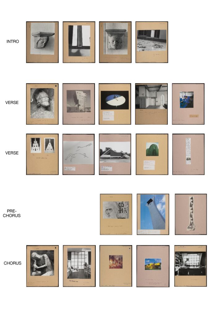
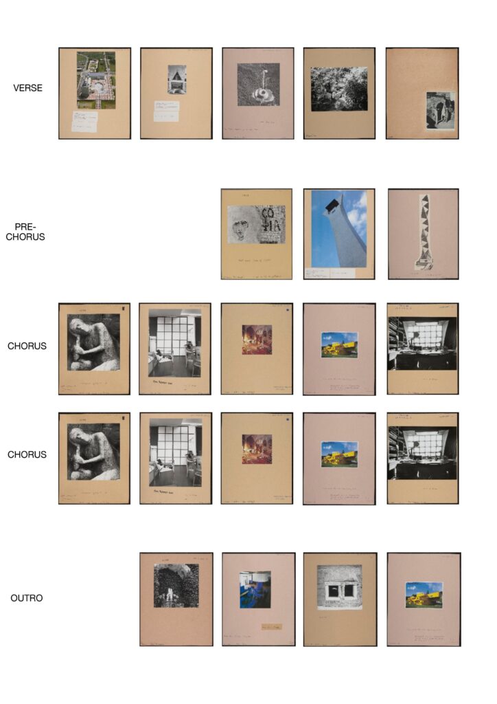
I have composed a visual song made of the images from the Conway archive. I like the idea that associations between images are what cause us to put them together – that there are certain ways that shapes interact which make us grasp them. Images have rhythms and tones, like a song. I have tried to incorporate the patterns of a song to reflect this, freely associating images from the archive – some from the same boxes – to create a whole piece which appears to randomly fit together. I have repeated some images and have tried to give the verses similar rhythms, and to give the chorus a rhythm of its own. I have tried to make these rhythms out of images.

When you are looking through the Conway archive, you are drawn to one box, then to another. They do not seem forcefully connected, but your mind draws mirrors between the images you have selected. Some of the images form a narrative, some do not. Images lead onto other images, and some appear more important than others and some do not feel worth noticing. The images feel as if they mean something together and against each other. I like the idea that making a visual song out of images is similar to the process of collecting and of taking images: it appears random but has a reason only you can fully recognise. And from this, images can become like phrases. And each phrase has a logic, just as each box in the archive has a logic which I cannot understand.

In my song, I have tried to order coloured and black and white images so that they relate to each other and create a kind of order. The intro has no colour images, until colours are slowly introduced in the verses and then repeated in the chorus. I repeated the motif of a grid in the chorus to reinforce the chorus structure. The last verse has an image which is situated at the bottom right corner of the archive page, as if finishing the progression of the verses and leading to the final choruses. The song finishes on a colour image, blue and yellow, of a small house – an image also used in the chorus. This is to mark the ending of the song and to refer to the slow progression to colour images at the beginning, which create the ending of the song.

The associations are free and tempting and indulgent – just like looking through an archive. You do not always notice the meanings or the history of images, but they show other opportunities.


Please click the link below to access a PDF file of the Visual Song.

A Conway Visual Song

The photographs used are listed below:


Intro

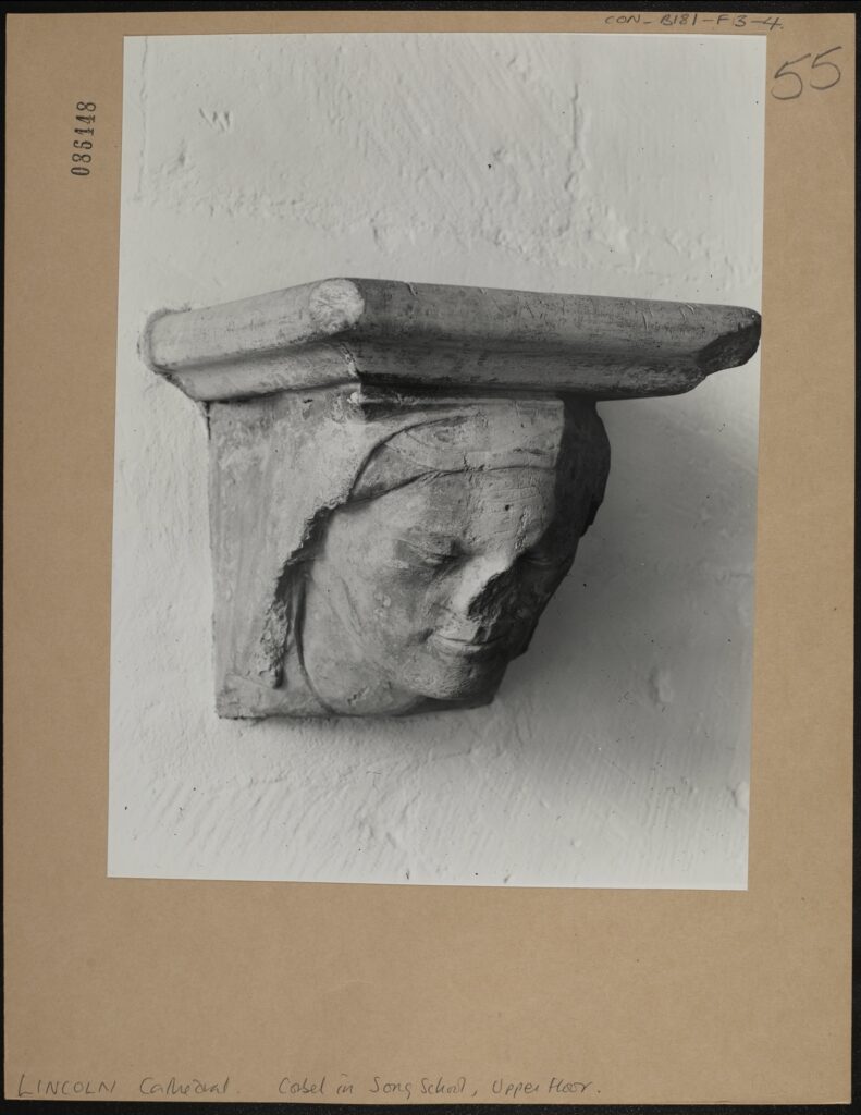
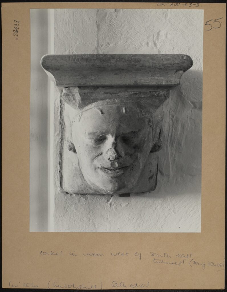
LINCOLN Cathedral. Corbel in Song School, Upper Floor. CON_B00181_F003_004, Conway Library, Courtauld Institute of Art, CC-BY-NC


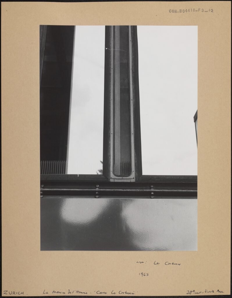
La Maison de l’Homme – ‘Centre Le Corbusier’, Architect: Le Corbusier, Zurich, 1963, CON_B04418_F003_012, Conway Library, Courtauld Institute of Art, CC-BY-NC


Corbel in room West of South East Transept (song school), CON_B00181_F003_003, Conway Library, Courtauld Institute of Art, CC-BY-NC


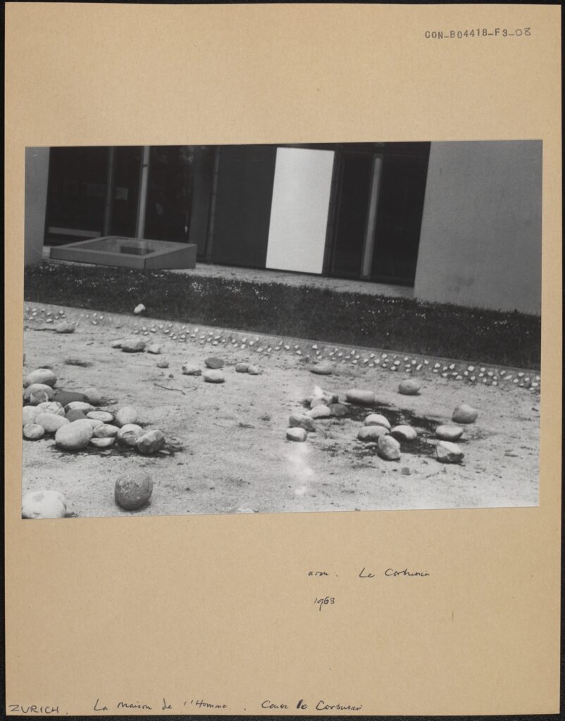
La Maison de l’Homme, le Corbusier, Centre le Corbusier, 1963, CON_B04418_F003_008, Conway Library, Courtauld Institute of Art, CC-BY-NC


Verse 1

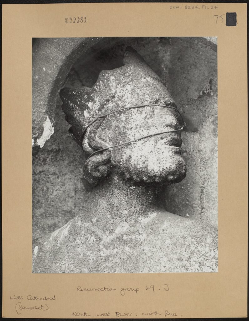
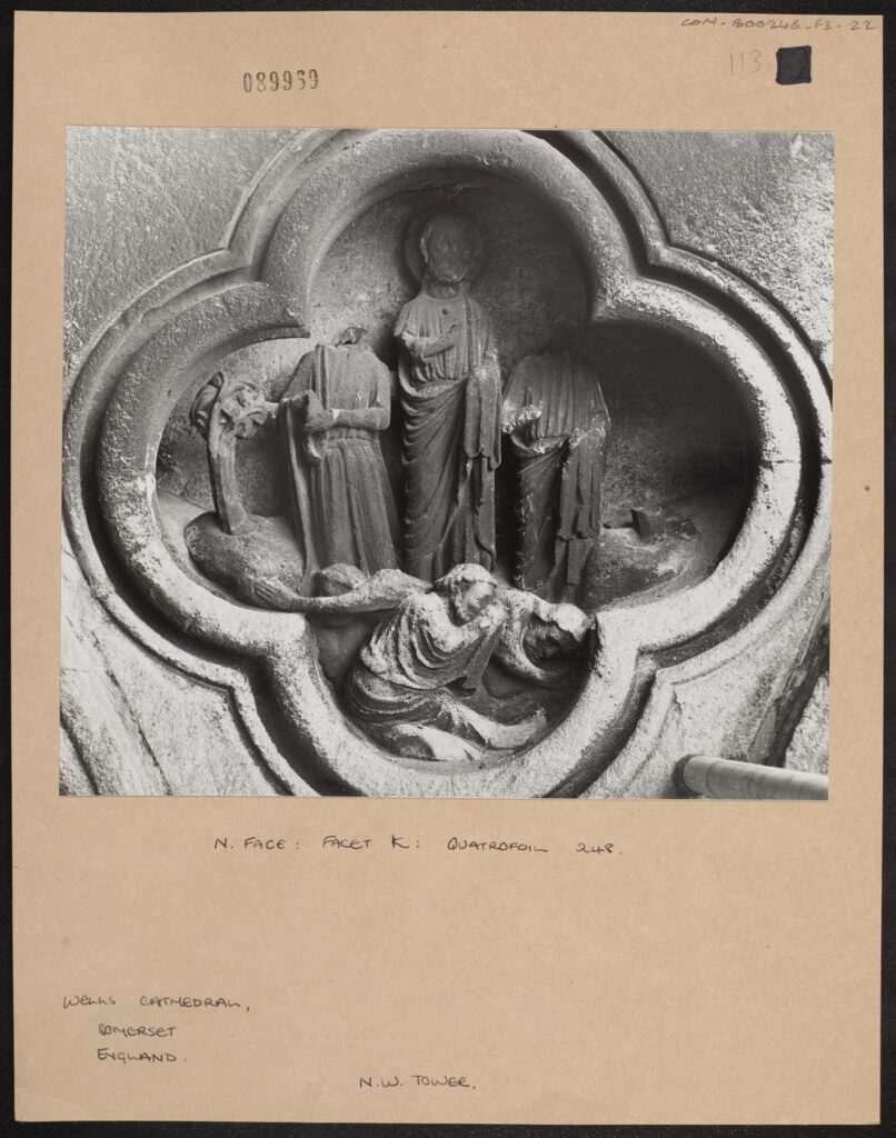
Resurrection group 49: J. North west Tower: north face. CON_B00237_F001_027, Conway Library, Courtauld Institute of Art, CC-BY-NC


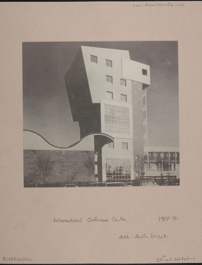
International Conference Centre, 1987-90, arch: Arata Isozaki, 20th Century Architecture, CON_B04430_F004_012, Conway Library, Courtauld Institute of Art, CC-BY-NC


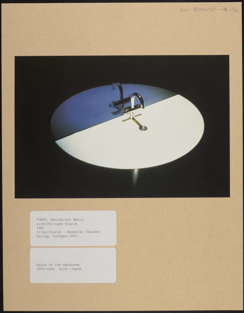
Basin in the Washroom Illustration: Starck – Benedikt Taschen, Verlag, Cologne 1991 20th Century Architecture, CON_B04430_F004_036, Conway Library, Courtauld Institute of Art, CC-BY-NC


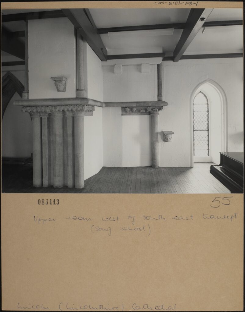
Upper room west of south east transept. (song school), Lincoln, Lincolnshire Cathedral, CON_B00181_F003_001, Courtauld Institute of Art, CC-BY-NC


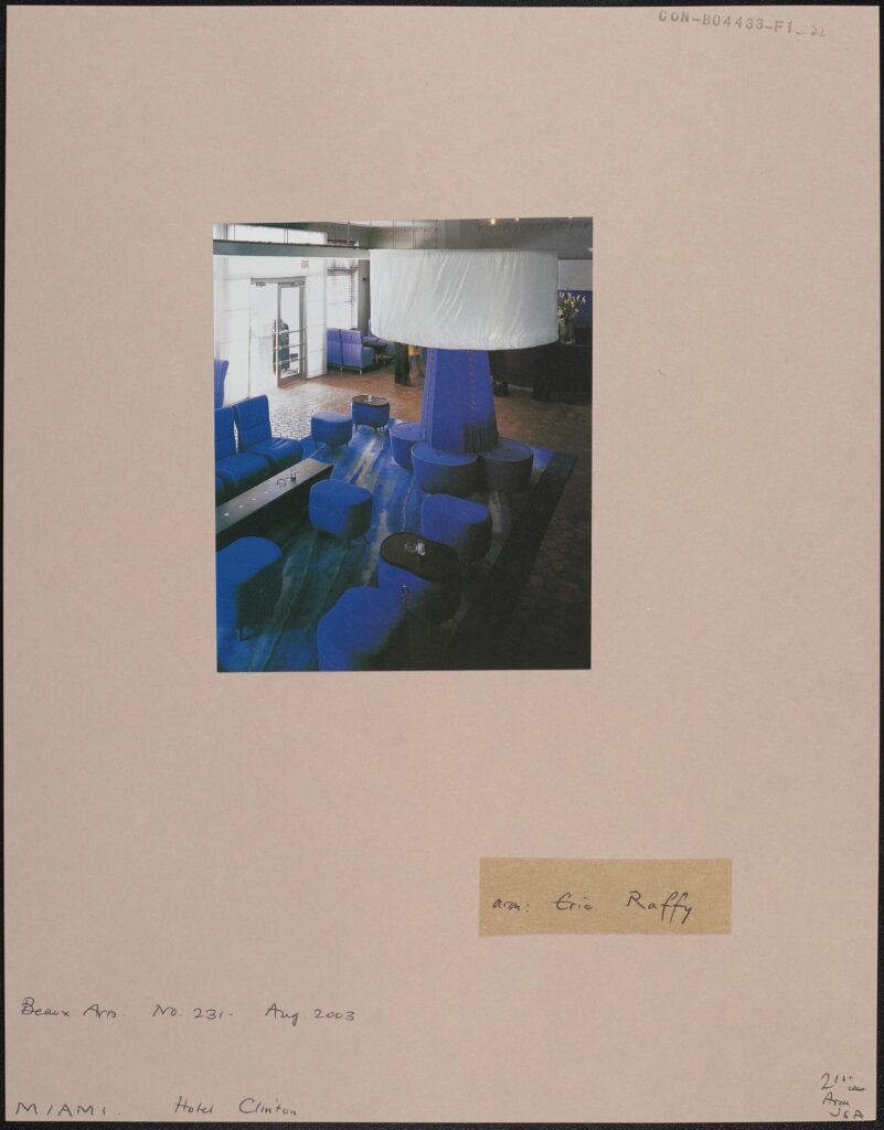
Beaux Arts No. 231, Aug. 2003, Miami, Hotel Clinton, CON_B04433_F001_022, Courtauld Institute of Art, CC-BY-NC


Verse 2

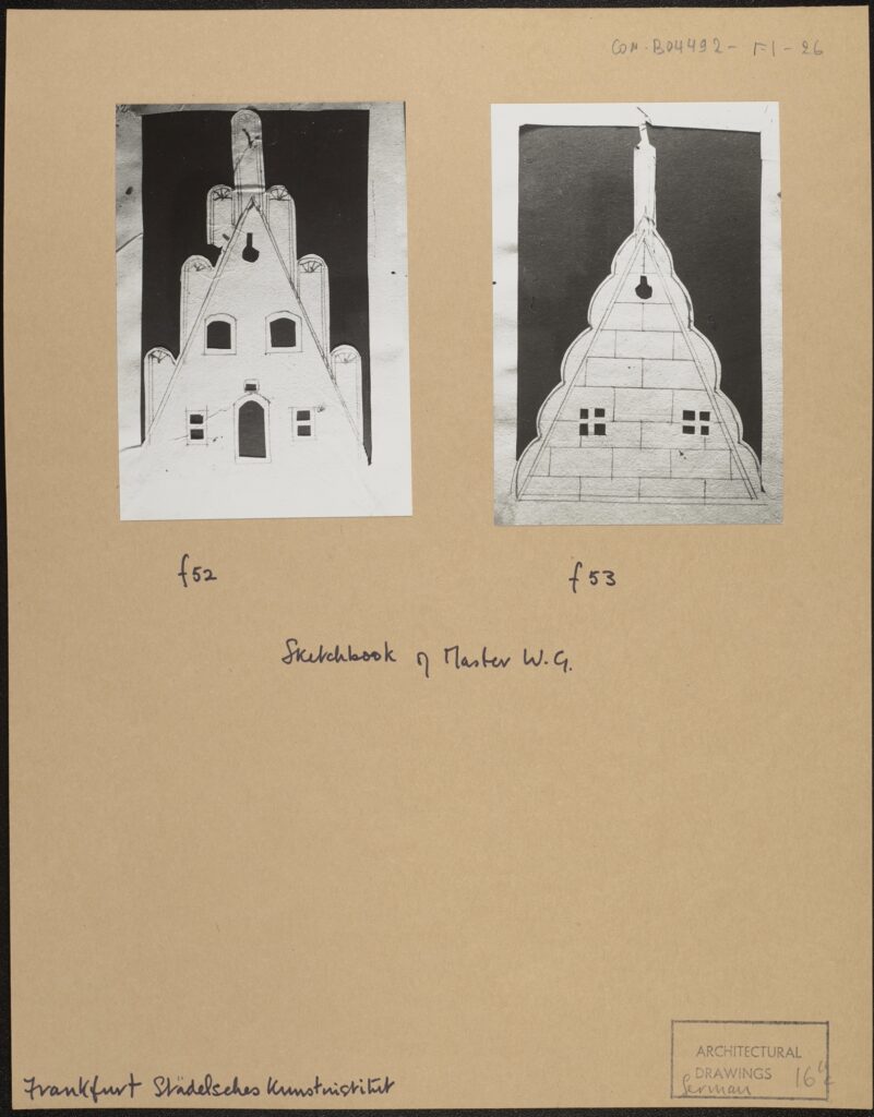
F52, f53, Sketchbook of Master W.G., Frankfurt Stadelsches Kunstinstitut, CON_B04492_F001_026, Courtauld Institute of Art, CC-BY-NC


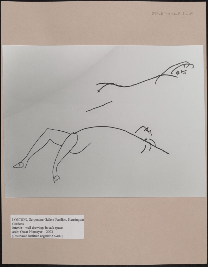
Interior – wall drawings in cafe space, London, Serpentine Gallery Pavilion, Architect: Oscar Niemeyer, 2003, CON_B04434_F001_066, Courtauld Institute of Art, CC-BY-NC


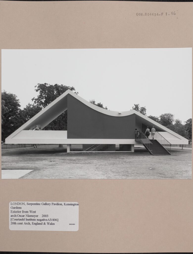
Exterior from west (Courtauld Institute Negative A3/406) 20th century Architecture, England and Wales, London Serpentine Gallery Pavilion, CON_B04434_F001_056, Courtauld Institute of Art, CC-BY-NC


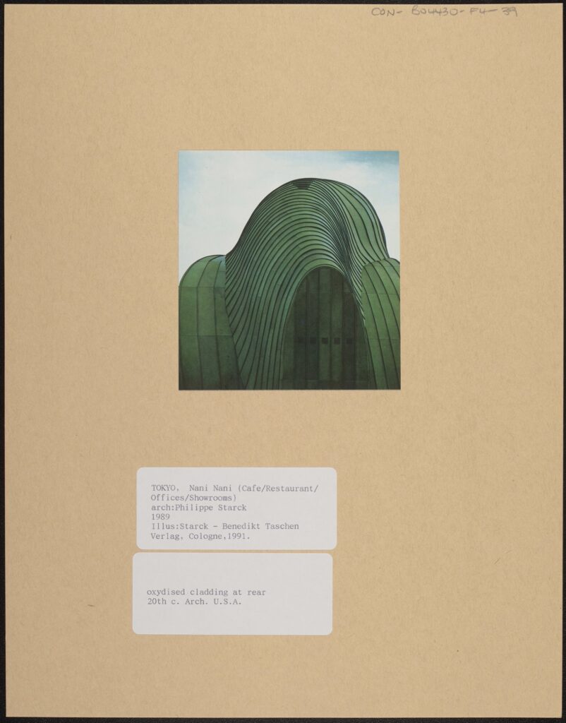
Oxydized cladding at rear. Illus: Starck -Benedikt Taschen Verlag, Cologne 1991, CON_B04430_F004_039, Courtauld Institute of Art, CC-BY-NC


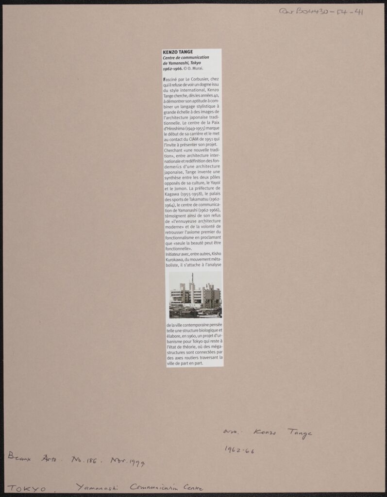
Beaux Arts No. 186, November 1999, Yamanashi Communication Centre, CON_B04430_F004_041, Courtauld Institute of Art, CC-BY-NC


Pre-Chorus

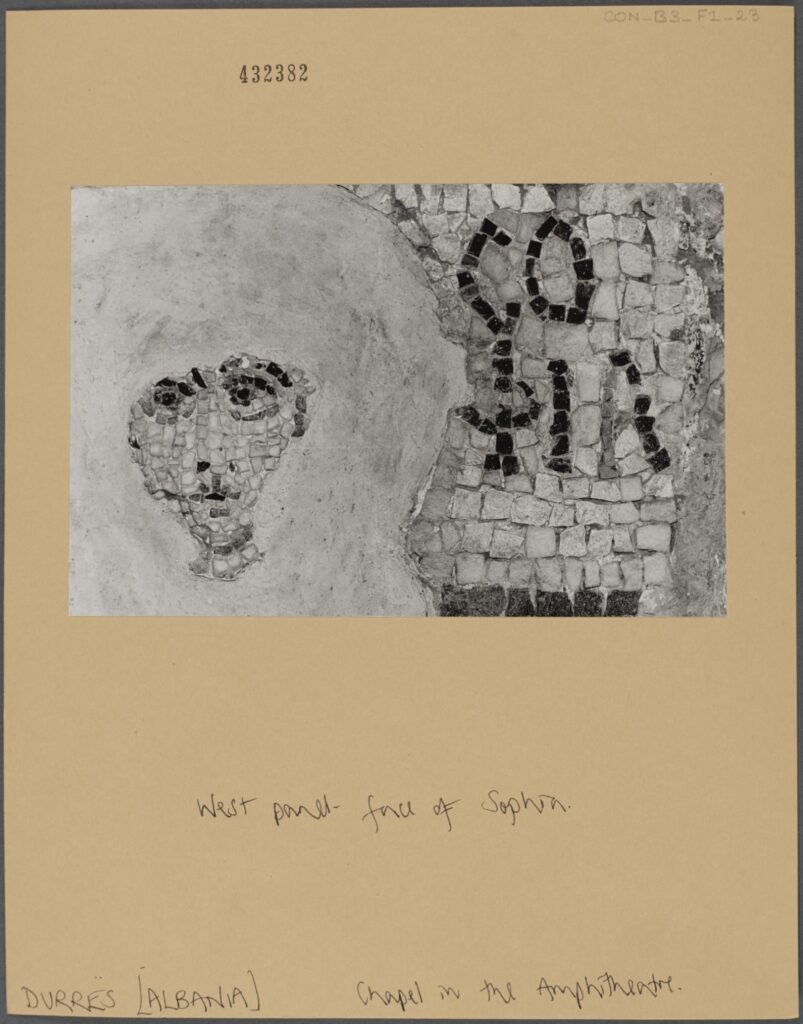
West panel – face of Sophia. Chapel in the Amphitheatre, Durres, Albania, CON_B00003_F001_023, Courtauld Institute of Art, CC-BY-NC


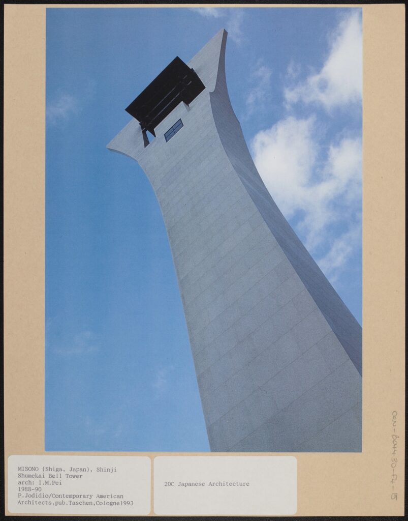
P. Jodidio/Contemporary American Architects, published Taschen, Cologne, 1993: 20th century Japanese Architecture. CON_B04430_F004_015, Courtauld Institute of Art, CC-BY-NC


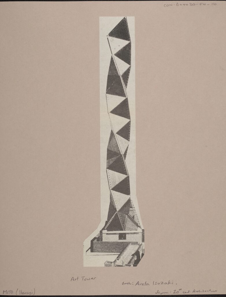
Art Tower, arch: Arata Isozaki, Japan: 20th Century Architecture, CON_B04430_F004_016, Courtauld Institute of Art, CC-BY-NC


Chorus

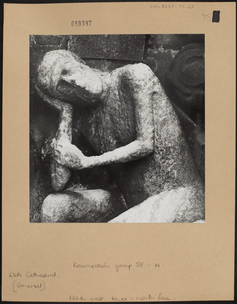
North west tower: north face. Resurrection group 58: N., Wells Cathedral, Somerset, CON_B00237_F001_043, Courtauld Institute of Art, CC-BY-NC


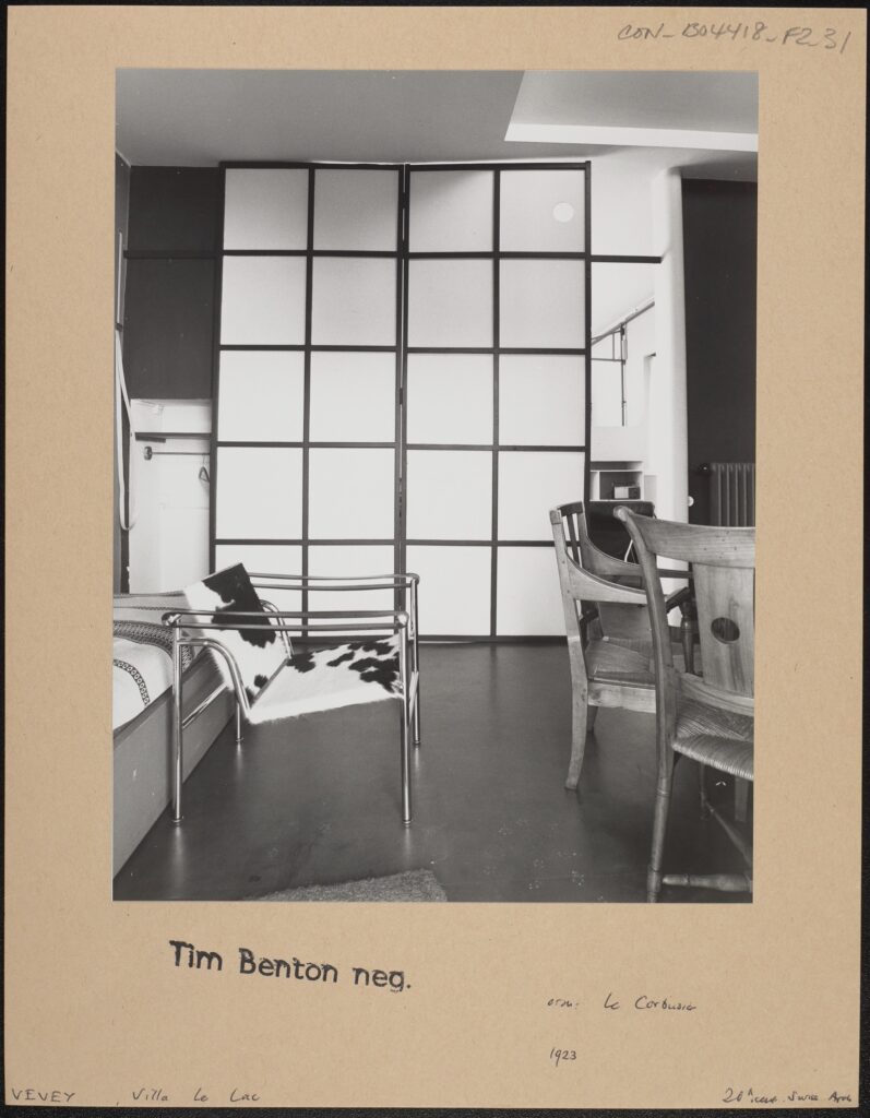
Tim Benton negative 20th Century Architecture, Vevey, Villa le Lac, CON_B04418_F002_031, Courtauld Institute of Art, CC-BY-NC


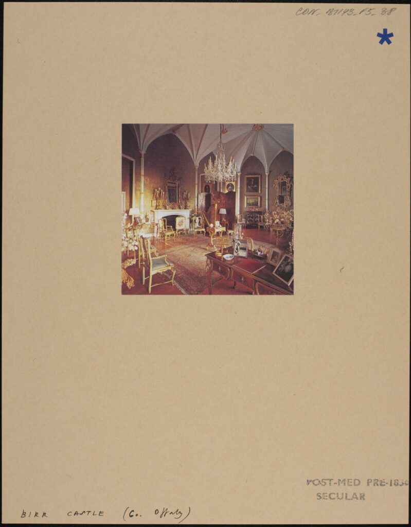
Birr Castle [colour interior: sitting room], CON_B01143_F005_038, Courtauld Institute of Art, CC-BY-NC


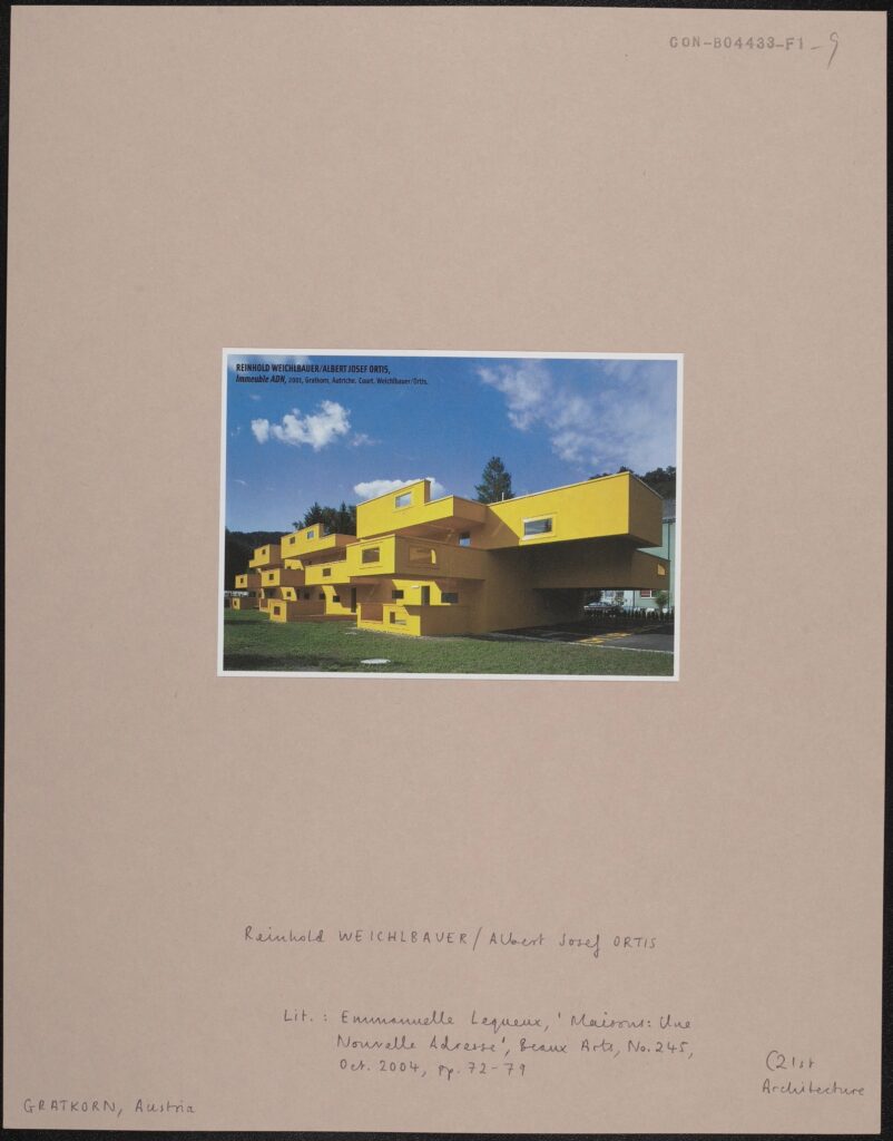
Literature: Emanuelle Lequeux, ‘Maisons: Une Nouvelle Adresse’, Beaux Arts, No.245, October 2004, pages 72-79. 21st century Architecture. CON_B04433_F001_009, Courtauld Institute of Art, CC-BY-NC


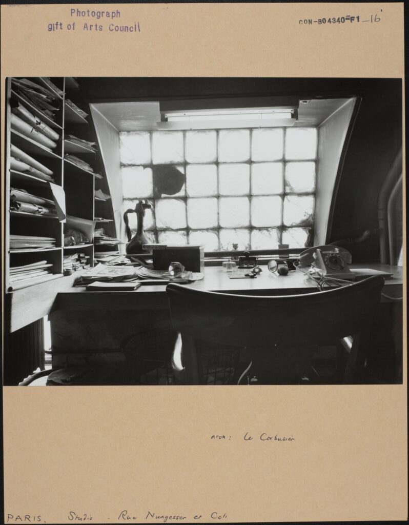
Le Corbusier, Paris, Studio Nungesser et Coli, CON_B04340_F001_016, Courtauld Institute of Art, CC-BY-NC


Verse 3

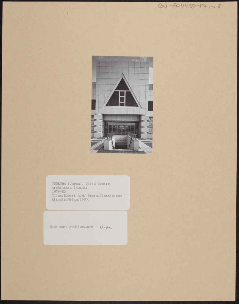
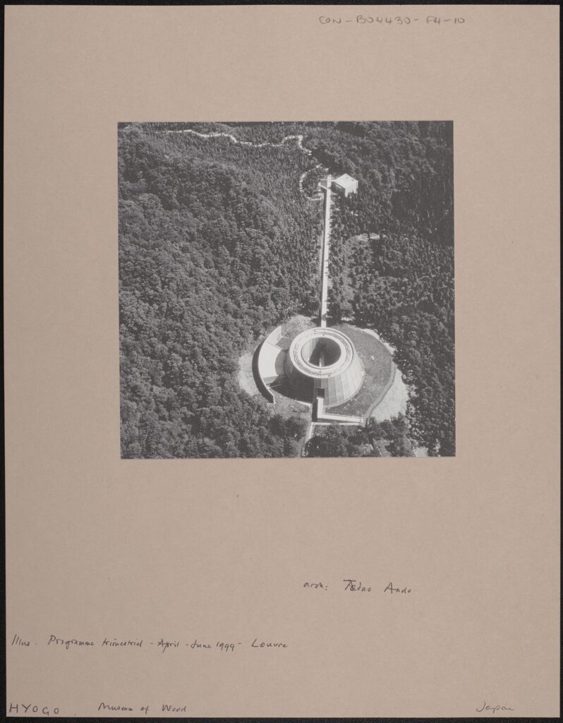
Overhead view of plaza and buildings Illustration: Robert A.M. Stern, Classicismo Attuale, Milan, 1990. 20th Century Architecture – Japan, CON_B04430_F004_042, Courtauld Institute of Art, CC-BY-NC


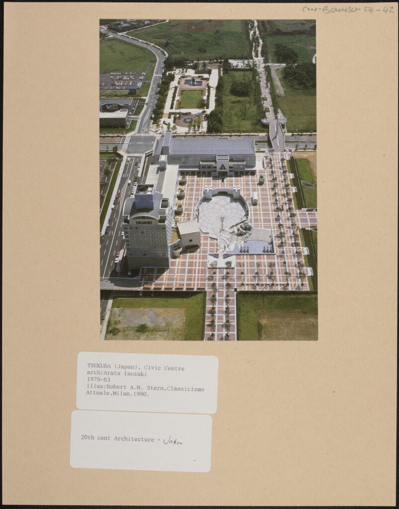
Tsukuba, Civic Centre, arch: Arata Isozaki, 1979-83, Illustration: Robert A.M. Stern, Classicismo Attuale, Milan, 1990, CON_B04430_F004_043, Courtauld Institute of Art, CC-BY-NC


Illus. Programme trimestriel – April – June 1999 – Louvre, Hyogo, Museum of Wood, CON_B04430_F004_010, Courtauld Institute of Art, CC-BY-NC


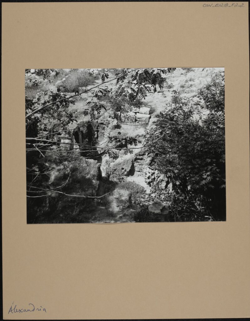
Alexandria, CON_B01218_F002_002, Courtauld Institute of Art, CC-BY-NC


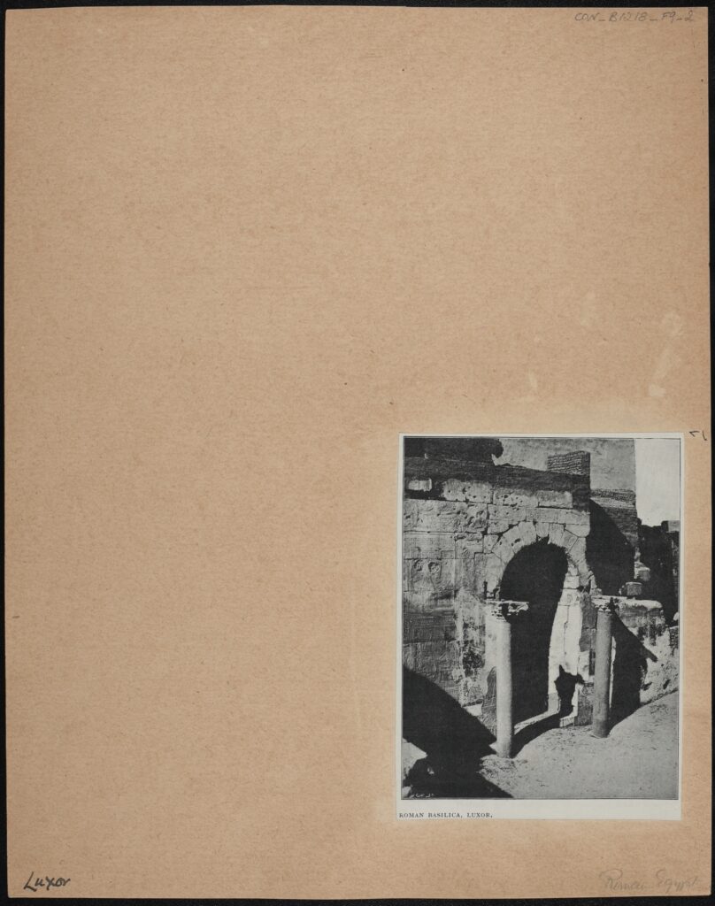
Roman Basilica, Luxor, CON_B01218_F009_002, Courtauld Institute of Art, CC-BY-NC


Outro

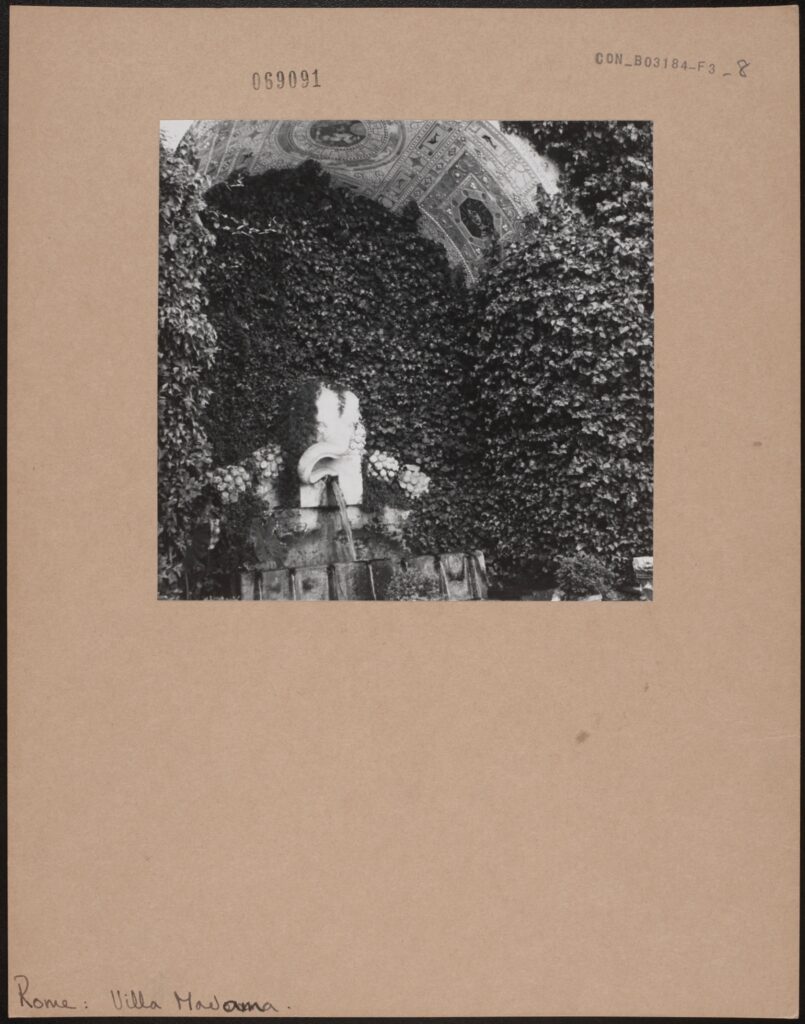
Rome, Villa Madama: Exterior: Gardens, CON_B03184_F003_008, Courtauld Institute of Art, CC-BY-NC


Hotel Clinton, Miami, Beaux Arts No. 231, Aug. 2003., CON_B04433_F001_022, Courtauld Institute of Art, CC-BY-NC


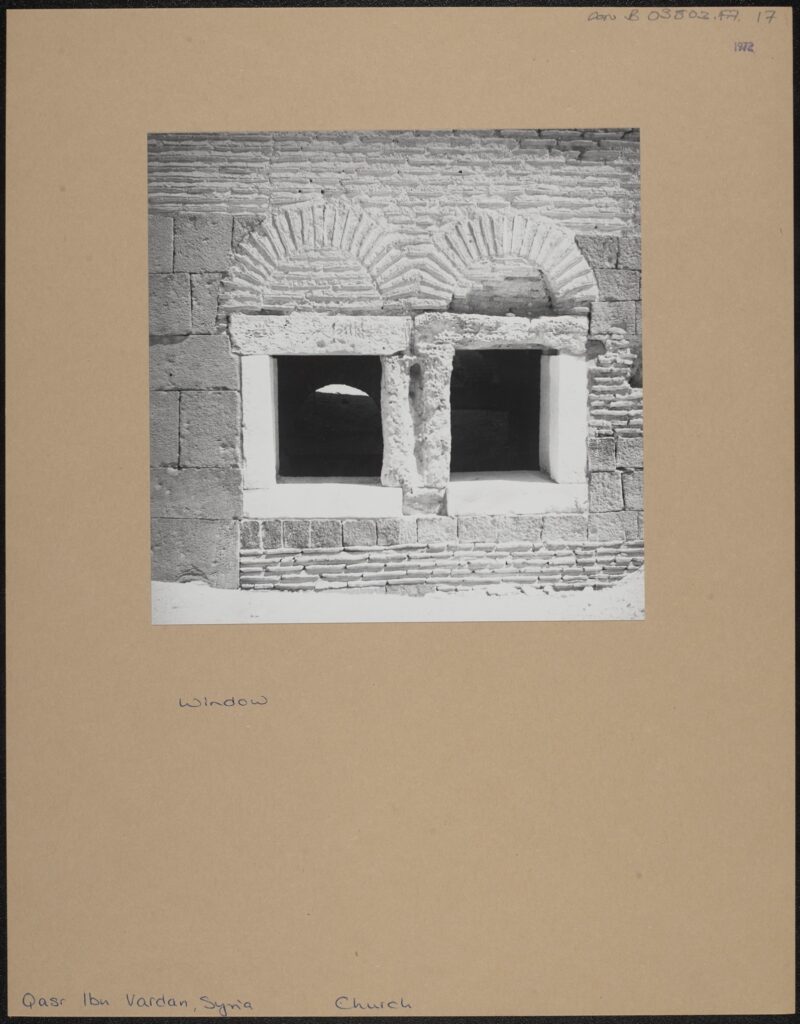
Window, taken in 1972, Qasr Ibn Vardan, Syria, Church, CON_B03803_F007_017, Courtauld Institute of Art, CC-BY-NC


Literature: Emanuelle Lequeux, ‘Maisons: Une Nouvelle Adresse’, Beaux Arts, No.245, October 2004, pages 72-79. 21st century Architecture., Gratkorn, Austria, CON_B04433_F001_009, Courtauld Institute of Art, CC-BY-NC


Iris Campbell-Lange
Courtauld Connects Digitisation

Oxford University
Micro-Internship Participant

Amelie de Lara: All Roads Lead to Box CON_B03085

INTRODUCTION

I turned up on my first day at the Courtauld internship with a pretty clear idea of what I wanted to do: I was going to research and write an essay on the life and times of Etienne Parrocel, a French Painter from the 18th Century who had produced a series of architectural drawings based on his travels in Rome. Parrocel was an accomplished painter, and an interesting man, and I would certainly recommend a google search or scroll though the Courtauld’s digital archives of his works, neatly laid out in aesthetically pleasing vertical rows. I like academic research, have written (many) essays, and was looking forward to week which I expected would probably be not that unlike my last 2 years studying at University.

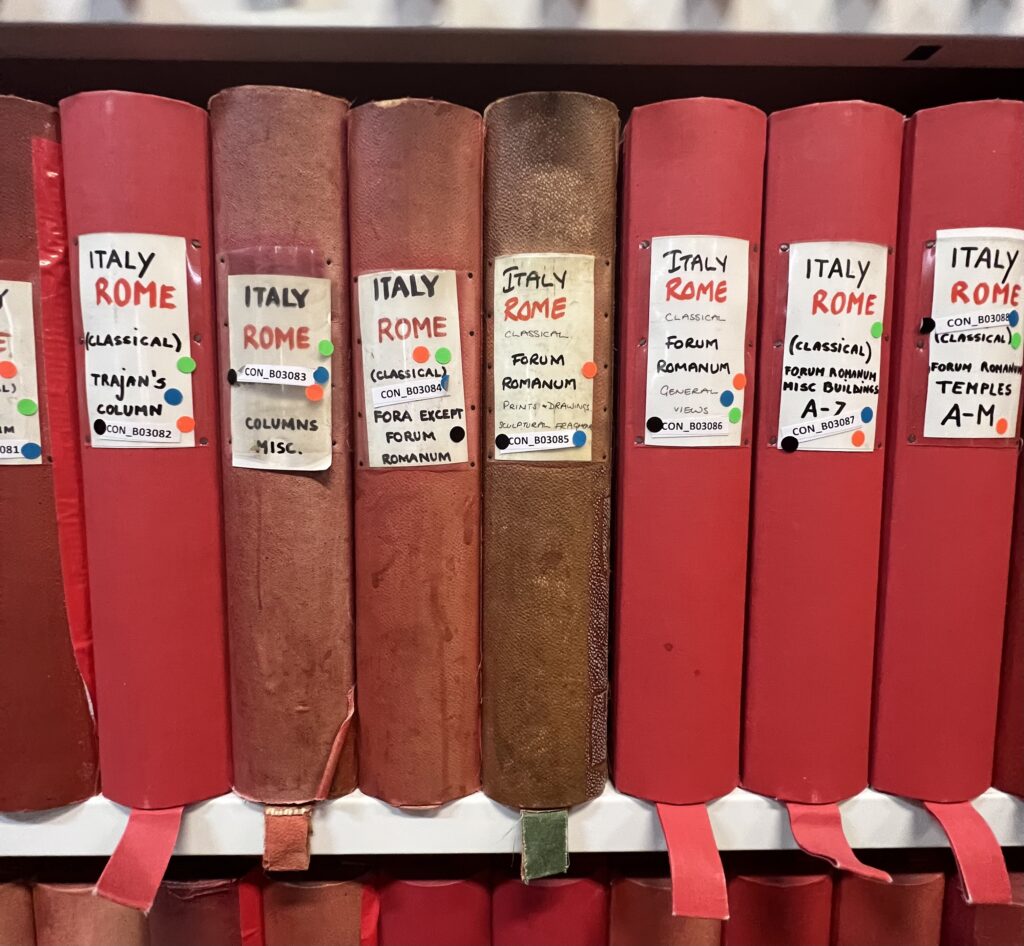
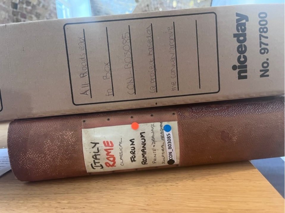
However, as I noisily (and rather embarrassingly) dragged my suitcase down the various steps into the Conway Library, I found myself transported into another world. Much of the Courtauld’s collection is arranged by location, making you feel as though you are in a miniaturised map of the world (or at least Europe). The first place greeting you, appropriately for my interests, is Italy. We all gathered around a small table with shelves of red spines encasing us on all four sides, which felt not unlike the Roman Forum I had been planning to include as part of my research. Front and centre of this display stood Box CON_B03085, its spine emblazoned with ‘Roman Forum: Printings and plans; Sculptural Drawings. Whilst perhaps smaller than the monuments which had once stood in Rome or the Forum, the perfectly accidental placement of this box as this first thing you see in the library, and the aged peeling spine filled me with an almost Romantic sense of awe (although don’t worry, no terrible poetry was penned!).

From this experience, as well as researching the various artists, travellers, and scholars who had made contributions to Box CON_B03085, I wanted to try to recreate for those who have never visited the Courtauld’s libraries – or any archives – what it feels like to make your way through a museum, wind your way round labyrinthine archives, and gradually dig through box. Although it might not normally be seen as a physically demanding activity, it’s not unlike travelling, or archaeological fieldwork itself. I also wanted to think about the ways this has changed from the period when gentlemanly ‘Grand Tours’ dominated how we research – particularly in my field of Classics and archaeology – to today, when people are making efforts through access initiatives and digitisation initiatives (like the Courtauld’s) to increase public engagement with art and museum collections, and diversify access to knowledge.

To help organise these thoughts, I decided to present my research and responses to the images of this box not just in a digital, blog format but by creating my own ‘box’. Usually whilst I am studying for my degree any reconstructions – historical or visual- have to be based strictly on close textual reading or archaeological data. Whilst of course this is necessary when we are trying to reconstruct an accurate view of the past, I found myself inspired by the early modern antiquarians, artists, and archaeologists I was researching during this week to take a more creative, imaginative and personal response to the past. Like the artistic and architectural neo-classical borrowings which inspired those I was researching, I took inspiration from Box CON_ but did not follow its models doggedly. I was also inspired by the Courtauld’s current exhibition on ‘fakes and forgeries’ which I went to visit on the first day, and seeing how in previous epochs the lines between copying and inspiration were more blurred, and not seen as negatively as today.


FOLDER ONE: PRINTS AND DRAWINGS

PRINTS AND DRAWINGS [Click link to open PDF]

The first folder I open in the box is an eclectic mix. It’s labelled ‘prints and drawings’ which hardly does justice to the wealth of material inside. From newspaper clippings, to cut-outs from text books, to various artistic reconstructions and prints of the Roman Forum, the contributors to this box come from a diverse amount of geographical and chronological periods. The order of the box doesn’t make much logical sense either, with different media and time periods all intermixed with each other. The same artists work often isn’t even kept together, with Maarten van Heemskerck’s name greeting me multiple times (probably not a bad thing, as it took me a few times to figure out how to spell). As you sift through this first folder, various sizes of paper drop through your hands, maps are unfolded, text book pages are opened. It’s a very different experience from simply pressing the ‘next’ key on your computer screen. By the end of it I feel as if I know the Roman Forum intimately despite never having been there, experiencing the various physical changes and interpretations it had undergone over 1000s of years through many different eyes.

I wanted to keep my own first folder equally a confusing but hopefully interesting mix of research, photographs, and other types of media. After researching the back ground of the Grand Tour, (a journey round Europe undertaken by many of the artists and photographers included in this box, not the Amazon Prime TV series!), I then researched some of these artists in more detail, their biographies and careers, and made small profiles on them and responses to the specific art works included in this folder. This included Maarten van Heemskerck (1498-1574); George Wightwick (1802-1872); Jean Baptiste Camille Corot (1765-1875); Charles Roach Smith (1807-1890); Charles Robert Cockerell (1788-1863); Israel Silvestre (1621-1691); Mary Beard (1955-); J Hoffbauer (1875-1957); and the Warburg Institute. Their interest in Roman art and architecture sparked art movements like the Renaissance which prized the aesthetic of Greco-Roman antiquities: this fascination continues to today, and is visible throughout London, the capital of another dismantled empire. The Courtauld’s galleries home in Somerset House is replete with neo-classical references, as is the rest of London, showing how to this day we remain inspired by ancient Rome.


FOLDER TWO: SCULPTURAL FRAGMENTS

SCULPTURAL FRAGMENTS [Click link to open PDF]

As an archaeology student, one of the first things you learn is that context is everything. For most of the population, looking at other people’s holiday snaps is universally agreed to be one of the most boring ways to spend time, but for students of archaeology it is one of the most valuable resources, a staple of most of my tutors and lecturers teaching material. That might explain why when I turned up at the Courtauld after 2 months stuck in Oxford looking at all the amazing places I had seen my lecturers go to I was feeling pretty restless. It’s probably unsurprising, then, that despite all the charms of the volunteer room at the Conway Library – unlimited biscuits and coffee, a student’s dream – I pretty quickly got fidgety, and wanted to explore both the wider archive and the beautiful surroundings of Somerset House to contextualise the work we were all doing. After some research, I learned Conway shared a similar passion – as well as being an art critic and collector, he was a passionate explorer and mountaineer, and wrote several books on his travels. Taking this as a sign of approval, I bravely set out beyond the libraries bounds.

 The pictures I took on this first afternoon and a few more I took over the next few days are the ones which make up the second half of my project, responding to the folder labelled ‘sculptural fragments’. Unlike the first box where I was researching and trying to understand other people’s responses to public architecture, these pictures reflect what caught my eye, and felt personally resonant or intellectually interesting. I’m no photographer or artist by any stretch of the imagination, and the pictures were taken on my iPhone rather than specialist technical equipment. I definitely took the opportunity to get lost in the archives and the museum and wander where I liked.

The ability to freely explore archives, museums, stately homes, and big cities one I don’t take lightly. In the last few images in this folder are images which show the accessibility – or inaccessibility – of many of the spaces in libraries and museums. Of course, we all experienced this as a collective for almost 2 years during the Covid-19 pandemic, but barriers to knowledge and art continue to exist for many due to financial, physical, or logistical difficulties, which I also tried to photograph.  I arranged my photos under themes which emerged from my research on the Grand Tour, and what I probably would have used as chapter headings had I written a normal essay. These themes were Geographical Mobility; New technologies; Accessibility and Inaccessibility; Inspiration and Reconstructions; Maps and Directions; Collection and Storage; and Roman influences back at home.

Inspired by Antonella Pelizzari’s article on the relationship of textuality with photographs, I annotated my print outs with why I took these pictures, and how this linked to my research on the Grand Tour. After doing this, I also decided to hand write my research for Folder One around the pictures I was discussing. Unlike normal essays, this means the mistakes and rewordings I made are recorded for posterity, just like some of the crossings out on the archive boxes. I felt this process made my writing more free and creative than a normal essay I would write, encouraging me to include my own thoughts and creative responses rather than facing the temptation of ‘control F-ing’ my notes, or leaving paragraphs unfinished and going back to them. It also took a lot longer than my normal speed typing, especially as I had to go over all my notes with pen when I got home as it didn’t show up on the scans!

However inconvenient it was, this painstaking process showed that research – whether more informal thoughts from trips abroad, or more ‘serious’ academic library work – is an active, ongoing, and above all human process, which cant be replaced by AI or digital programmes (or, hopefully for my current career plans, at least not yet!). Whilst digitisation is clearly an important move in both heritage and academia industries,  and has been beneficial in so many ways I think this experience has shown me that there are limits and things lost for researchers and the general public if we shift entire collections online at the expense of being able to experience the real thing.


CONCLUSION

On the very first page of his work ‘Mountain memories; a pilgrimage of romance’ Conway wrote ‘the landscapes of the past appear at this moment more real than the immediately visible world’. As someone who spends much time exploring places in their head which are far removed by time and place, this sentiment resonated with me. Even after a week of being intimately involved with this box, I’m still not sure why Conway or whoever put this box together chose these images, or put them in this particular order. I’m not even sure if they’d visited the Forum themselves, or – like me- had only experienced its ancient ruins and contemporary settings through a pastiche of other people’s perspectives.

As the final stage in this project, I wanted to bring my box out of the dusty shelves of the archive, into the gallery itself. Many digitisation projects pride themselves on their commitment to accessibility. One of my gripes with this is that outside academic worlds there is a lack of widespread public knowledge that projects and databases like this exist, and most of the public aren’t aware that vast swathes of our archives and objects are not on display, but publicly visible. The volunteer scheme at the Conway library has tried to combat this by bringing those not always familiar with the gallery into the Strand campus, and using platforms like social media also aim to increase public knowledge of these.

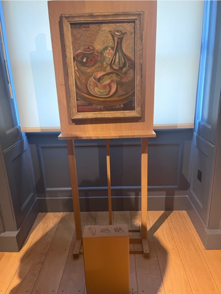
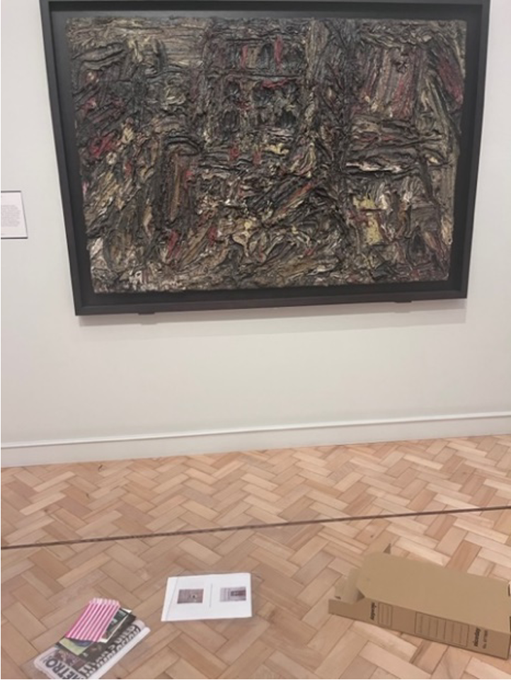
It felt silly, and the old box which looked at home in the chaos of the archives looked quite at odds with the sparse minimalistic design of the gallery which prided sleek cleanliness and scholarly contemplation of this gallery – I definitely got some dirty looks from the security guard. At the entrance to the Weston Library – the room at Somerset House containing some of the most famous paintings – is inscribed in untranslated Greek ‘let no stranger to the Muses enter’. A more apt summation of the inaccessibility of classics and many museums in general would be difficult for me to invent. A modern sign opposite translates these words, a signifier hopefully of changing attitudes.

The two main motivations of future heritage projects like the Courtauld’s digitisation project – preservation of memory and widening accessibility – are therefore aptly articulated in the story of the Grand Tour, the Roman Forum, the Courtauld and the Conway and Witt libraries and – hopefully- this box.


IMAGES OF THE BOX


BIBLIOGRAPHY

Antonella Pelizzari 2003, M., ‘Retracing the Outlines of Rome: Intertextuality and Imaginative Geographies in Nineteenth-Century Photographs’ in Picturing Place: photography and the geographical Imagination (eds. Schwartz J. and Ryan J.R.), Routledge, London.

Beard M., 2003, Picturing the Roman Triumph, Apollo vol 158.497.

Black J., 2003, The British Abroad; The Grand Tour in the 18th Century, Sutton, Gloucestershire.

Buzard J. 2002, The Grand Tour and After in The Cambridge Companion to Travel Writing, Cmabridge University press Cambridge, (eds Hulme, Peter, Youngs, Tim)

Chaney E., 2006, The Evolution of the Grand Tour: Anglo-Italian Cultural Relations since the Renaissance, Routledge, New York.

Conway W.M. 1920, Mountain memories; a pilgrimage of romance’, Funk and Wagnalls, New York.

Dyson S.L., Archaeology, ideology, and Urbanism in Rome from the Grand Tour to Berlusconi

Dyson S.L.,2020, The Grand Tour and After: Secular pilgrimage to Rome from the eighteenth to the twentieth centuries, Routledge. London.

Helsted D.,  1978 – Rome in Early photographs, History of Photography Vol 2.

Kelly J.M., Reading the Grand Tour at a Distance: Archives and Datasets in Digital History

Levine B. and Jensen K., Around the World: The Grand Tour in Photo Albums, Princeton Architectural Press, New York.

Nilsen M., Architecture in Nineteenth Century Photographs: Essays on Reading a Collection

Salmon F. 1995, ‘Storming the Campo Vaccino’: British Architects and the Antique Buildings of Rome after Waterloo, Architectural History vol 38

Szedgy-Maszak A., 1996, Forum Romanum/Campo Vaccino, History of Photography vol 20.


Amelie de Lara
Courtauld Connects Digitisation
Oxford University
Micro-Internship Participant

Billy Warren: Overlapping Forms – Shared Motifs in the Art of Barbara Hepworth and Denis Mitchell

Love it or hate it, abstract sculpture has become a fixture of the art scene in the UK and around the world. Barbara Hepworth (1903-1975) was one of the figures who helped make abstract art what it is today. One of Britain’s foremost abstract sculptors, Hepworth shaped the art form in the post-war years and, along with Henry Moore, helped popularise modernist art. She was one of the most famous members of the St Ives School, a group of artists based in a coastal town in Cornwall, and many of her works were inspired by the Cornish coastline.1

Denis Mitchell (1912-1993) was another artist and became Hepworth’s assistant in 1949 after being recommended to her by Bernard Leach, a renowned potter who also lived in St Ives. Mitchell would work for Hepworth, helping to carve her sculptures, until a decade later in 1959.2 Hepworth was the one who encouraged Mitchell to turn to sculpture rather than painting,3 and there are strong similarities between their works. He became an art teacher and an abstract sculptor in his own right, but never reached the same level of success as Hepworth.

It is interesting to see where Hepworth and Mitchell’s art holds the same inspiration and where it diverges. The two artists had many forms which they used, likely thanks to Hepworth’s intervention (explicitly or otherwise) in the development of Mitchell’s sculpture. Here I take a cursory glance at these overlapping forms, looking at three in particular. These are the pierced form (where a hole is made through a sculpture), the theme of the divided circle, and the ‘upward prongs’ motif (where horn- or spike-like forms protrude from the sculpture). Both Hepworth and Mitchell brought their own interpretation to each form, making it interesting to compare their different styles.


Pierced Forms

The pierced form was undoubtedly a hallmark of Hepworth’s work and one of her greatest innovations. Her first pierced sculpture was Pierced Form, a since-destroyed 1932 piece.According to the Tate, the pierced form became an “essential element” of her artistic life.4 Hepworth herself said that they had given her “sufficient field for exploration to last a lifetime”.5

Hepworth is credited as the sculptor to first introduce the idea,6 cementing her influence over modern sculpture. She saw the introduction of negative space both as a story in itself and also vital in creating both ‘inner’ and ‘outer’ forms.

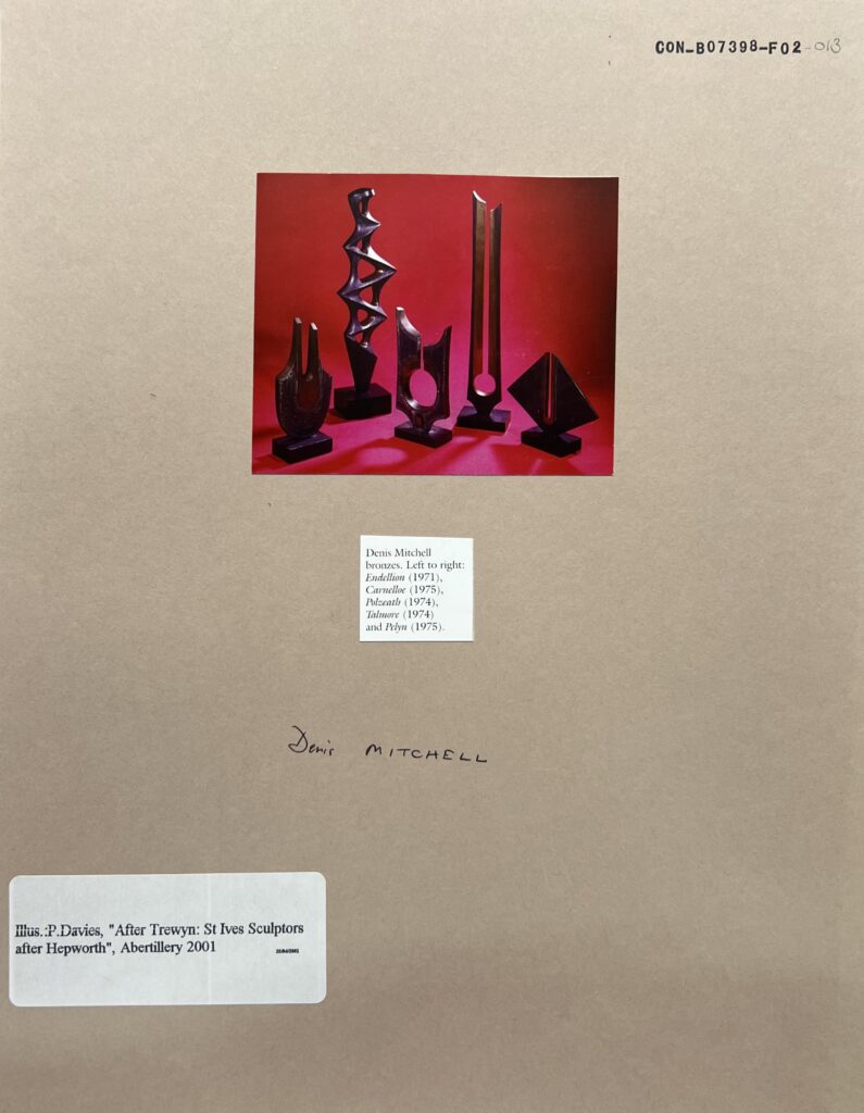
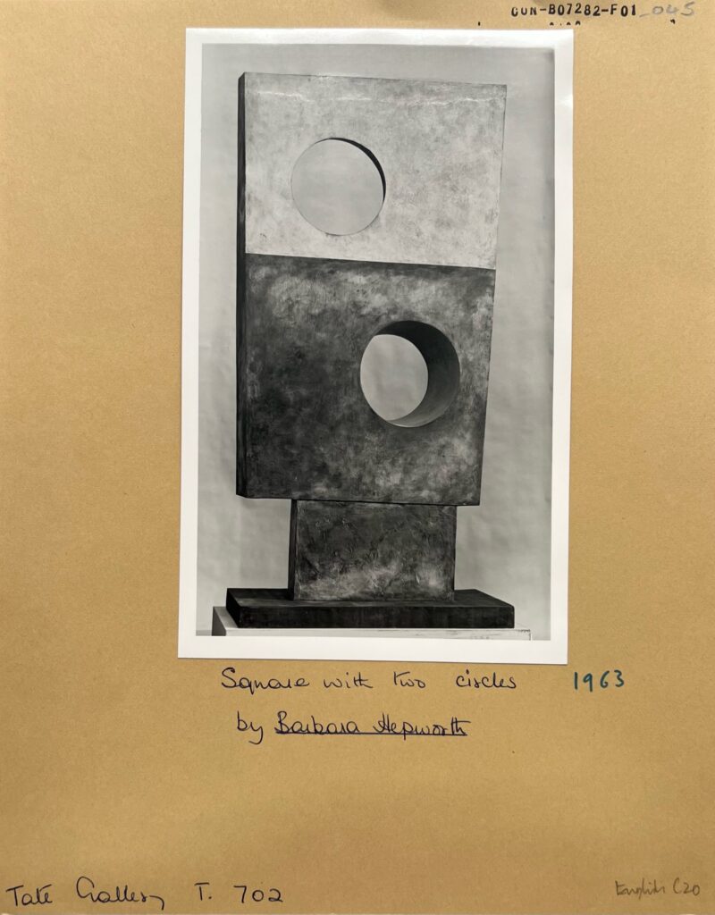
With Hepworth using such a novel form, it is unsurprising that Mitchell adopted it. He also pierced his sculptures, but in a different way to Hepworth. Hepworth’s simple circular inner forms such as those in Square with Two Circles evolve into the thermometer-like negative shapes which frequent Mitchell’s work and are seen in Polzeath and Talmore (see pictures below). The vertical lines created in the negative space lend themselves particularly well to Mitchell’s tall, thin sculptures. The different way that Hepworth and Mitchell incorporate negative space within their art contributes to their distinct styles.


Five bronze abstract sculptures by Denis Mitchell stand against a red background. The two taller, thinner sculptures are arranged behind the three shorter sculptures. They are lit from the right and cast soft shadows towards the bottom left of the picture. [Denis Mitchell bronzes. Left to right: Endellion (1971), Carnelloe (1975), Polzeath (1974), Talmore (1974) and Pelyn (1975). Attribution: P. Davies. CON_B07398_F02_013. The Conway Library, The Courtauld Institute of Art, CC-BY-NC]


A black and white photograph of a bronze abstract sculpture by Barbara Hepworth. The sculpture is made of a rectangle with a hole through its left side on top of a square with a hole through its right side which stands upon a smaller rectangle joined to a plinth. The top rectangle has a lighter finish than the rest of the piece. ‘Square with Two Circles’ (1963) by Barbara Hepworth. Attribution: Tate Gallery. CON_B07282_F01_045. The Conway Library, The Courtauld Institute of Art, CC-BY-NC]


Divided Circle

The divided circle was an important motif for both Hepworth and Mitchell and it became a recurring feature of their art. The complexity of this idea meant that there was opportunity for experimentation – the shape could be seen as both one circle or two separate parts.

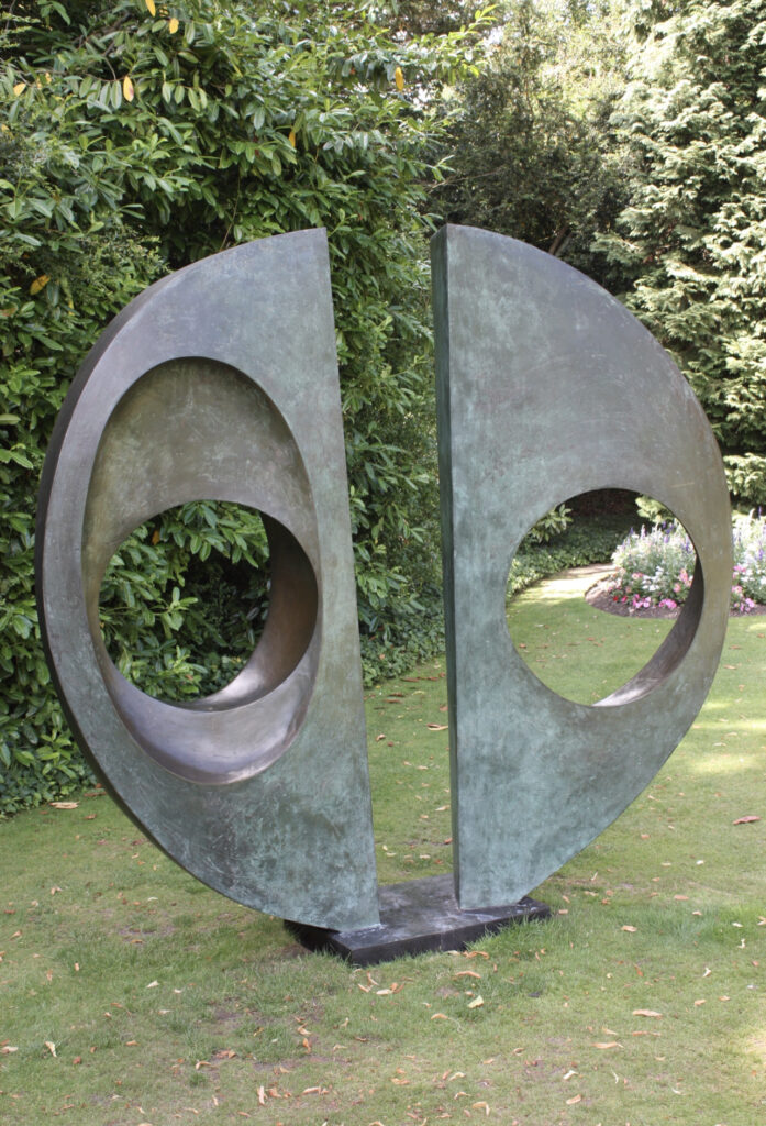
Hepworth’s circles were often divided through physical separation such as with Two Forms (Divided Circle). Each half of the circle has its own details – both are pierced, but with holes of different sizes and differently-shaped indents. This creates a sculpture which embodies the concept of the divided circle. The two halves can be seen independently, as forms in their own right, or together, making a unified circle.

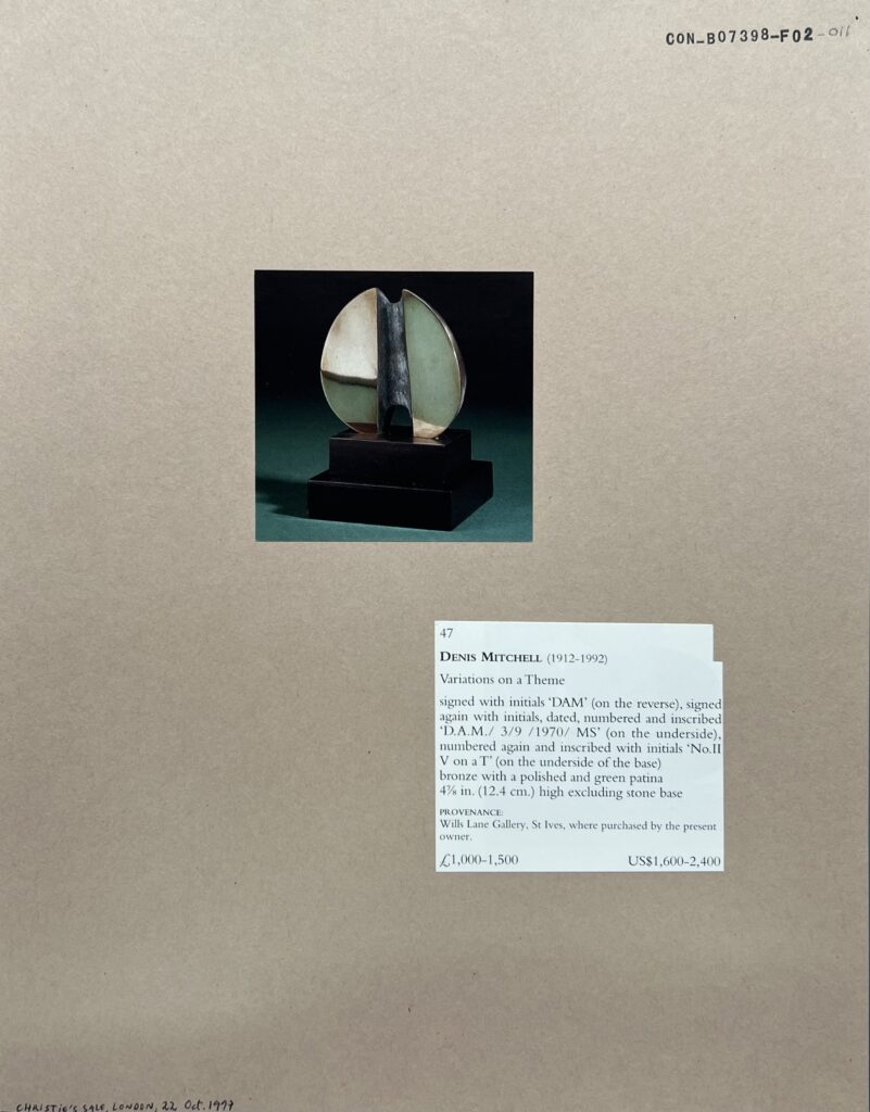
Mitchell, however, shows the different ways the circle can be divided while still remaining one object in his Variations on a Theme No.1 through to No.5. In Variation on a Theme No.2, the circle is divided at the front of the sculpture but attached at the back, making a figurative but not literal division. In Luxulyan, another work by Mitchell, he makes the division by polishing one half of the circle and creating a patina on the other. The progression of the idea through from literal separation, to partly divided, to only a visual division shows an interesting evolution between the work of Hepworth and that of Mitchell.

An abstract bronze sculpture by Barbara Hepworth photographed in a garden. The sculpture is two separate halves of a circle, each with a circular hole in them, offset from one another slightly and attaching to a plinth at the ground. ‘Two Forms (Divided Circle)’ by Barbara Hepworth. Attribution: “Clare College, Cambridge, July 2010 (03)” by Ardfern on Wikimedia Commons, CC-BY-SA 3.0]


An abstract bronze sculpture by Denis Mitchell on a black plinth sitting on a teal surface that fades to a black background. The sculpture is a circle roughly divided in half and separated except for a connection at the back of the sculpture. The faces of the halves are polished while the connection has a patina. Variations on a Theme No. 2 by Denis Mitchell. Attribution: Christie’s. CON_B07398_F02_011. The Conway Library, The Courtauld Institute of Art, CC-BY-NC]


‘Upward Prongs’

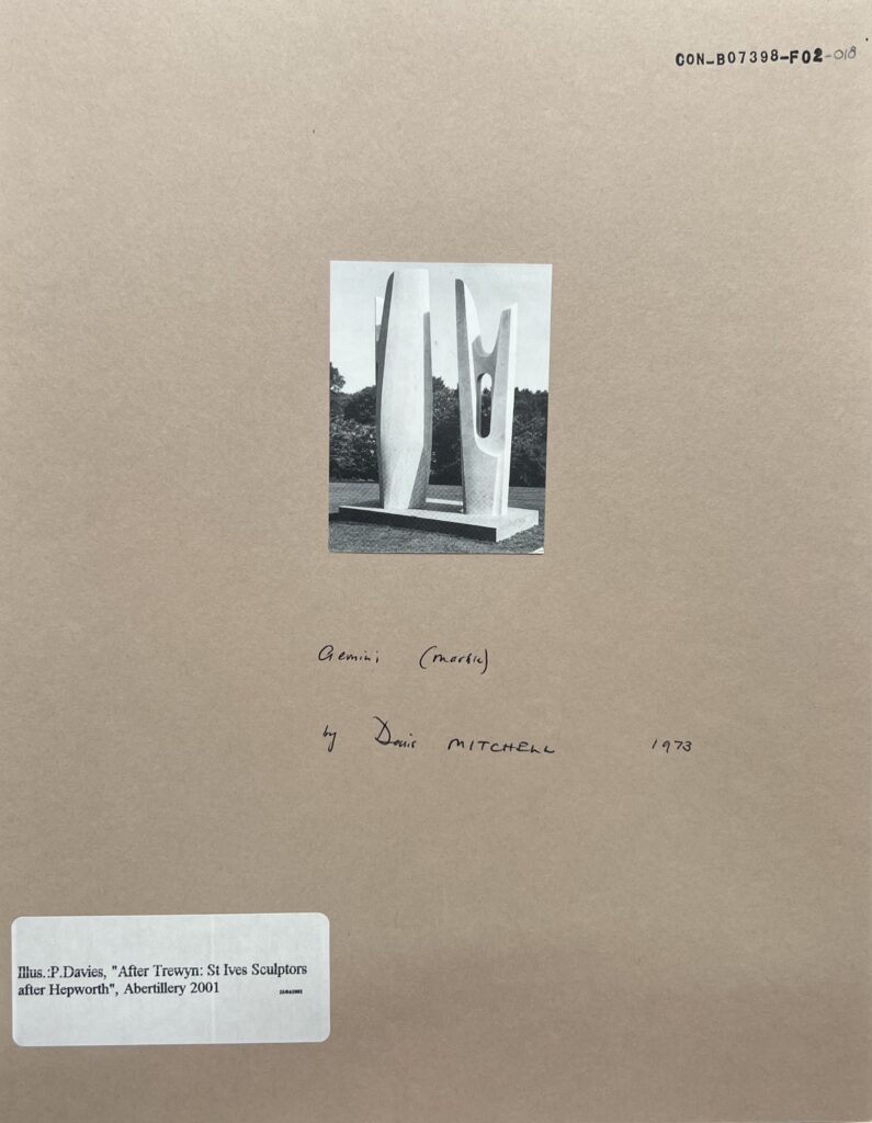
One of the forms that was especially key to Mitchell’s style was ‘upward prongs’. These prongs become an aspiring form, giving his sculptures a noticeable dynamism. In Gemini (pictured below), one of Mitchell’s marble sculptures, the prongs give a lighter feel to the material by reaching away from the main body of the work. The prong motif can also be seen in the thinner, needle-like spires such as in Porthcressa and Thrust. In some sculptures, like Widdon, one of the prongs is removed altogether, resulting in an elegant droplet shape. These prongs and spikes are characteristic of Mitchell’s work, but they also make appearances in Hepworth’s sculpture.

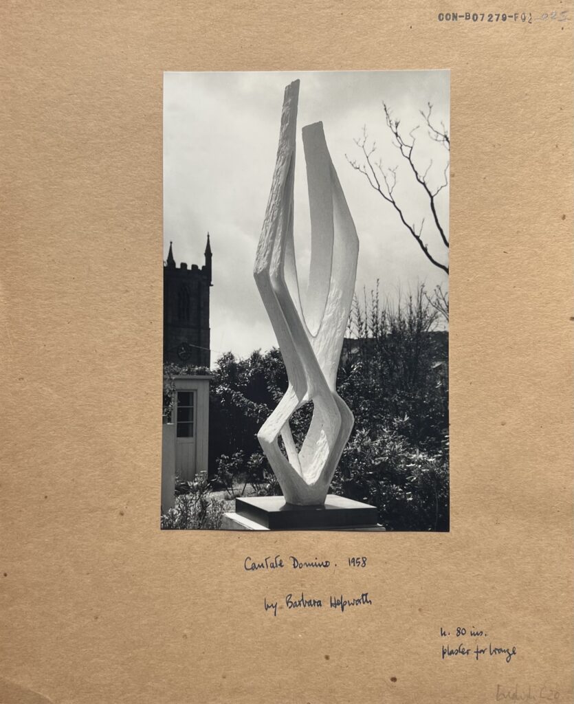
Cantate Domino (1958, pictured below) and Stringed Figure (Curlew) (1957) seem the most Mitchell-esque of Hepworth’s pieces. These types of ascending, open-ended sculptures that she made in the last half of the 1950s form a particular period in her career and are among her most dynamic works. As they were produced in the last years of Mitchell being Hepworth’s assistant, it is reasonable to expect that he chose this particular form to explore further.


A black and white photograph of a white plaster model for a sculpture sitting on a plinth. The picture has been taken in a garden and a church tower can be seen in the background. The sculpture is two diamond shapes on top of one another made from flat strips of material. The upper diamond is not closed at the top, and the front and back of the sculpture are left open so it is possible to see through parts of it. Plaster model for ‘Cantate Domino’ (1958) by Barbara Hepworth. CON_B07279_F02_025. The Conway Library, The Courtauld Institute of Art, CC-BY-NC]


A black and white photograph of a marble sculpture taken outside. The sculpture is two upright forms angled such that only the one on the right is facing the camera. The sculptures have oval-shaped holes in them and ‘prongs’ rising out of the top. ‘Gemini’ (1973) by Denis Mitchell. Attribution: P. Davies. CON_B07279_F02_025. The Conway Library, The Courtauld Institute of Art, CC-BY-NC]


Even in the motifs and forms which they both used there are noticeable differences between the art of Hepworth and Mitchell, showing the breadth of their combined creative exploration. It is precisely where their styles diverge that both Mitchell and Hepworth find their niche; much more could be said about this, though it falls outside the scope of this blog post. In a more general sense, Mitchell and Hepworth’s work with similar forms shows how the same abstract techniques and motifs can be used in different ways by different artists. It is exactly this that gives abstract art its potential and is the reason that it continues to develop to this day.


Bibliography

Tim Adams (7 June 2015), “Barbara Hepworth: A life told in six works”<https://www.theguardian.com/artanddesign/2015/jun/07/barbara-hepworth-life-in-six-works-tate-retrospective-exhibition-sculpture-for-a-modern-world>, The Guardian, accessed June 2023

John Halkes (25 March 1993), “Obituary: Denis Mitchell”<https://www.independent.co.uk/news/people/obituary-denis-mitchell-1499773.html>, The Independent, accessed June 2023

Sothebys.com <https://www.sothebys.com/bsp-api/lot/details?itemId=a7649144-1d77-401e-b4da-b68625595342>, accessed June 2023
“Pierced Form”<https://www.tate.org.uk/art/artworks/hepworth-pierced-form-t00704>, Tate, accessed June 2023

Ruthie Collins (3 January 2020), “Divided Circle”<https://cambsedition.co.uk/arts-culture/divided-circle/>, Cambridge Edition, accessed June 2023

Giselle Au-Nhien Nguyen (25 November 2022), “Of stone and wood: sculptor Barbara Hepworth steps out of Henry Moore’s shadow”<https://www.theguardian.com/artanddesign/2022/nov/26/of-stone-and-wood-sculptor-barbara-hepworth-steps-out-of-henry-moores-shadow>, The Guardian, accessed June 2023


Billy Warren
Courtauld Connects Digitisation
Oxford University
Micro-Internship Participant

Alina Khokhlova: The Mystery of Missing Faces – Defaced Frescoes in Cyprus

The Eastern Orthodox church is famous for its profound veneration of icons – devotional images of Christ, his Mother, and saints. And so, if you find yourself walking, for instance, the heated streets of some Cypriot town, and wandering into one of the local churches just a few minutes before the start of the daily liturgy, all you would hear is a rhythmic succession of kisses. These are the faithful diligently kissing all the icons located along the perimeter of the church, for, to kiss an icon, really, means to kiss the person it depicts.
Unfortunately, not all the churches are frequented by the locals. If you are to get into a car and drive through the island for an hour or two, observing the sun-stricken hills covered with dried yellow grass and occasional tanned shepherds with their flocks, and if you manage to follow the map correctly and not get lost along the way, you may reach some of those stone Byzantine churches, lavishly painted inside and looking like clumsy dovecotes on the outside, which are scattered across the countryside, especially in the mountain region of Troodos. Many of them were built and frescoed between the 12th and 16th centuries, although much older buildings also exist.

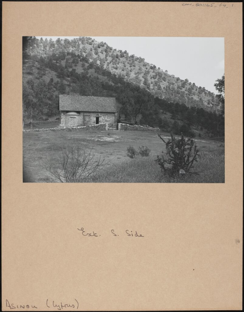
Fig. 1: South side exterior of the church of the Panagia Phorbiotissa (Panagia tis Asinou) at Asinou, Cyprus. [CON_B01165_F004_001. The Conway Library, The Courtauld Institute of Art, CC-BY-NC]


These churches, often once comprising a part of a monastic complex, now appear to stand in the middle of nowhere, with their old wooden doors locked most of the time, and they are usually not used for liturgy anymore. Yet, if you are lucky enough to find a key-keeper, who may also be a priest from the nearest village, wearing long black robes and a serious expression on his face, you would be able to get inside, in order to hear the ‘soundless echo of prayers long silent’ and contemplate the painted walls, ‘alive with worship’, as remarked by an English novelist W. H. Mallock.

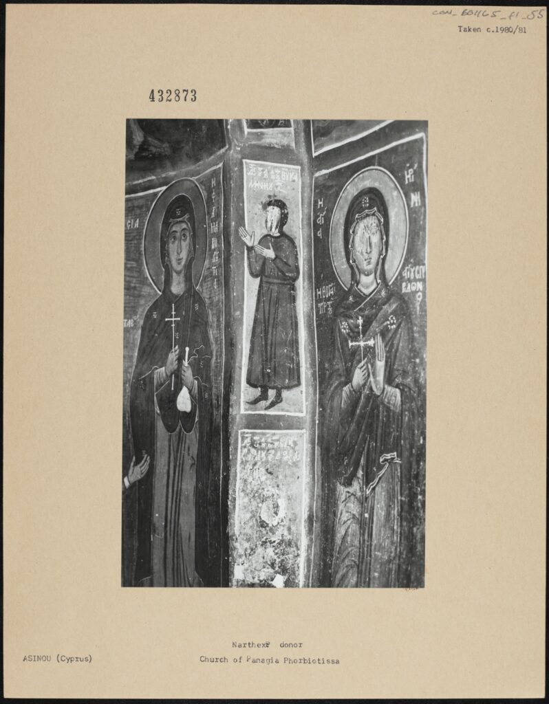
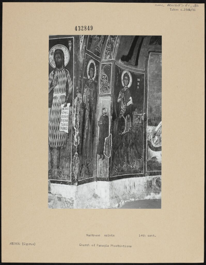
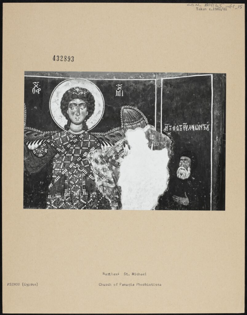
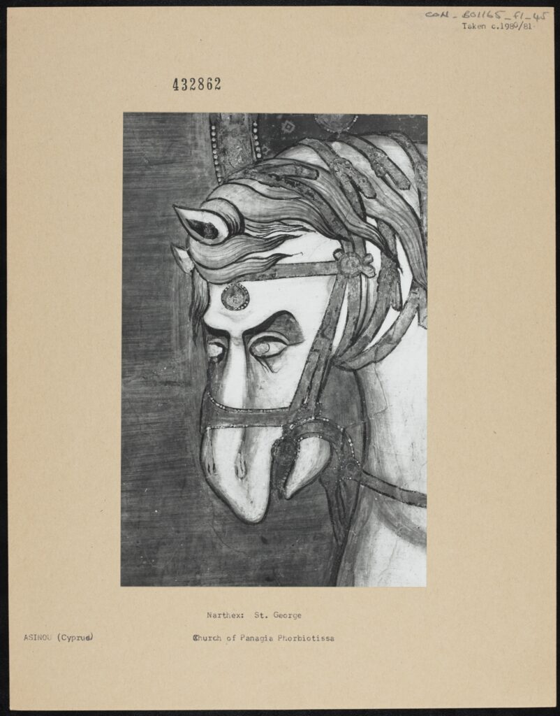
Many of these scattered churches are in a bad condition, with their frescoes damaged by time and the elements, but one of the most striking features is the damage done to many of the faces depicted on frescoes: violent scratch marks, eyes gouged out, and sometimes even whole faces erased.

Below are some examples from the church in Asinou (fig. 1), but a similar situation can be encountered all across the island.

Fig. 2: Narthex: donor and female saints, Church of Panagia Phorbiotissa, Asinou, Cyprus. Taken in 1980/81. [CON_B01165_F001_055. The Conway Library, The Courtauld Institute of Art, CC-BY-NC]

Fig. 3: A detail of: Narthex: saints, 14th century, Church of Panagia Phorbiotissa, Asinou, Cyprus. Taken in 1980/81. [CON_B01165_F001_030. The Conway Library, The Courtauld Institute of Art, CC-BY-NC]

Fig. 4: A detail of: Narthex: St Michael, Church of Panagia Phorbiotissa, Asinou, Cyprus. Taken in 1980/81. [CON_B01165_F001_015. The Conway Library, The Courtauld Institute of Art, CC-BY-NC]

Fig. 5: A detail of: Narthex: the horse of St George, Church of Panagia Phorbiotissa, Asinou, Cyprus. Taken in 1980/81. [CON_B01165_F001_045. The Conway Library, The Courtauld Institute of Art, CC-BY-NC]

A question naturally arises as to who did this and why, and if you were to ask the priest who let you into the church, or some other elderly Greek-speaking Cypriot taking care of the place, you will receive one and the same reply: ‘this was done by the Muslim Turks’. Now, the island was conquered by the Ottomans in 1571 and remained under their rule until 1878, when it was passed over to the British. During that time two major communities were formed in Cyprus: that of Greek-speaking Christians, and that of Turkish-speaking Muslims, which coexisted with different degrees of peacefulness. However, in 1974, less than fifteen years after Cyprus announced its independence from the British rule, the country fell into war and split into Northern (Turkish), and Southern (Greek) parts, remaining divided to this day. Therefore, the attribution of the blame to the ‘Turks’ is natural, considering the interreligious animosity and alleged Muslim reservation towards religious imagery, but such a claim may be motivated more by political bias than by truth.
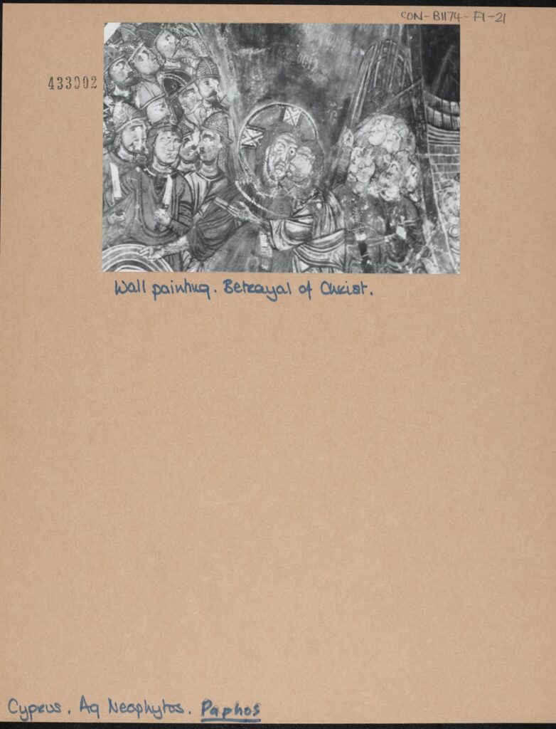
The issue has not yet been properly researched, but some other theories are floating in the air. Some say that the eyes on frescoes were destroyed by robbers or looters, who did not want to be ‘seen’ while committing their criminal deed. Others point to the tradition of taking some paint off a saint’s eye as depicted on a fresco in order to make a healing mixture, which is especially good for eye diseases. This is primarily attested in the Troodos region, as well as on the island of Crete. Further to this, there are examples of damnatio memoriae (‘condemnation of memory’) – erasure of the depiction of devils and sinners. An example of this can be found in the monastery of Agios Neophytos, where on a wall painting depicting Jesus betrayed by Judas and surrounded by Roman soldiers, the eyes of the soldiers and the betrayer are systematically gouged out (fig. 6).

Fig. 6: A detail of: Wall Painting, Betrayal of Christ, Agios Neophytos, Paphos, Cyprus. Taken by Neil Stratford. [CON_B01174_F001_021. The Conway Library, The Courtauld Institute of Art, CC-BY-NC]

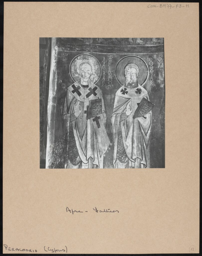
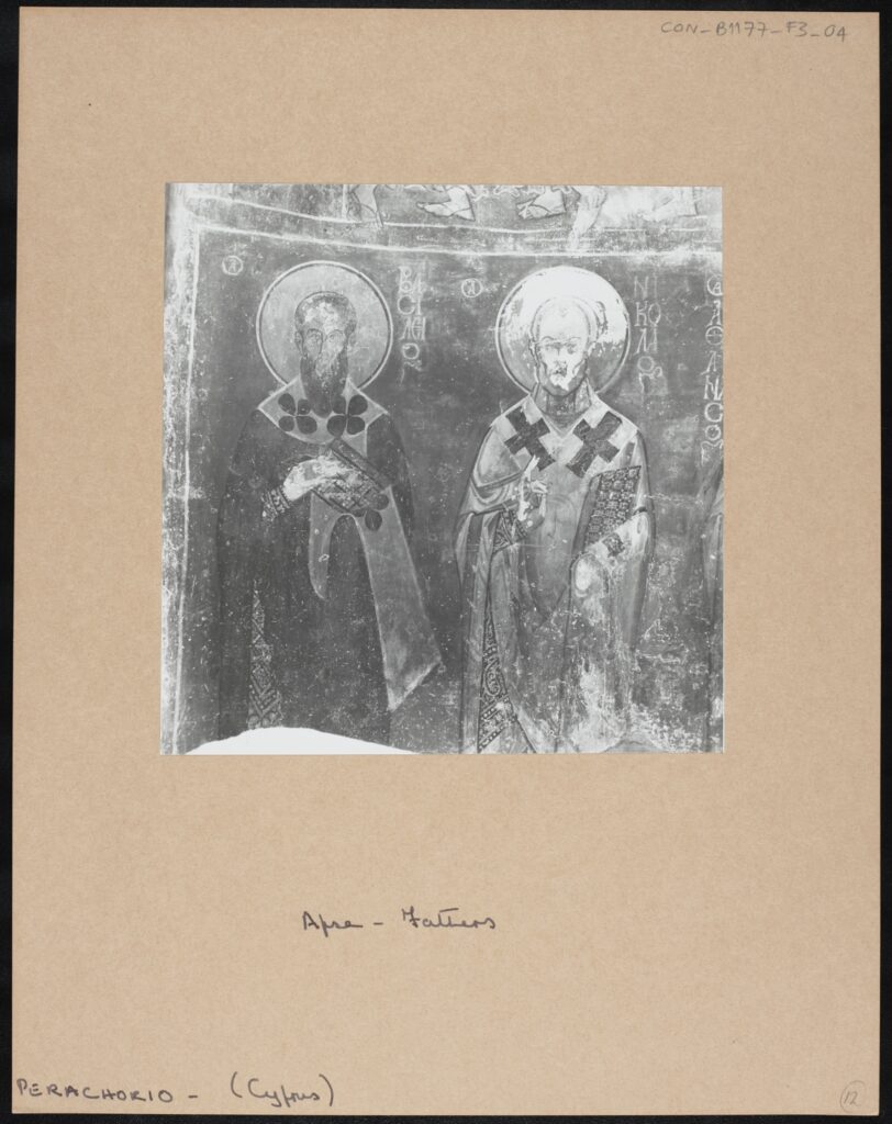
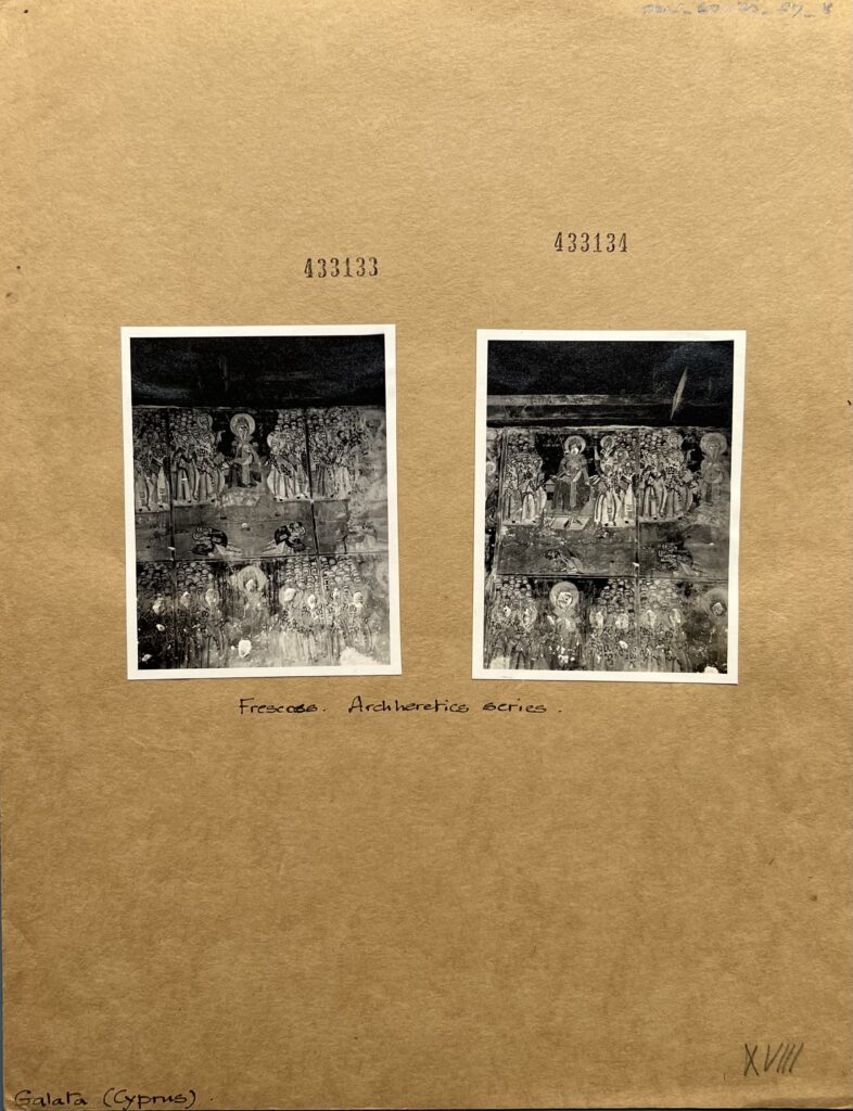
In other cases, as mentioned, the whole area of the face is affected.

Fig. 7: A detail of: Apse – Fathers, Church of the Holy Apostles, Perachorio, Cyprus. [CON_B01177_F003_011. The Conway Library, The Courtauld Institute of Art, CC-BY-NC]

Fig. 8: A detail of: Apse – Fathers, Church of the Holy Apostles, Perachorio, Cyprus.Taken by David Winfield. [CON_B01177_F003_004. The Conway Library, The Courtauld Institute of Art, CC-BY-NC]


Fig. 9 and 10: Two details of: Frescoes, Arch-heretics series, Agios Sozomenos, Galata, Cyprus. Taken by CJP Cave. [CON_B01170_F007_008. The Conway Library, The Courtauld Institute of Art, CC-BY-NC]

So, what is so special about the eyes, and the face more broadly, which attracts the efforts of iconoclasts? The face is the locus of one’s identity, the eyes – the medium of seeing and the sign of being seen. It is through the face and especially through the eye contact that one connects with another person and receives recognition.

Now, in the realm of Eastern Orthodox iconography this acquires further significance, for contemplation and veneration of an icon is at its heart a face-to-face encounter – between the believer on the one, human side of the painted surface, and the holy person, on the other, spiritual side. The obliteration of the eyes/face thus makes the encounter profoundly obstructed, if not impossible, for it erases the very thing which serves as a mark of presence – a face directed at you, with eyes wide open.
It would be interesting to note here one characteristic iconographical convention, namely, that only sinners can be portrayed in profile (see fig. 6 with the scene of the betrayal of Jesus), whilst saintly people must always be depicted with both of their eyes being visible, preferably en face. This brings us back to the eye contact being the means of encounter, which the iconoclasts wanted to prevent, for one reason or another.

And so, these churches stand, full of mystery and history, their walls bearing marks of lips that kissed them, of smoke coming from numberless candles once burnt inside, of hands that touched them, whether caressingly or violently, of the painter’s brush traced on the wet surface centuries ago, and of the iconoclasts’ instruments applied to, quite literally, deface the images, combining to create a multi-layered record of the complex history of the island and its communities.


Alina Khokhlova
Courtauld Connects Digitisation
Oxford University
Micro-Internship Participant

Yolanda Huang: Changing Space and Visuality – Norwegian Churches from the 11th to 20th Century in the Eyes of Anthony Kersting

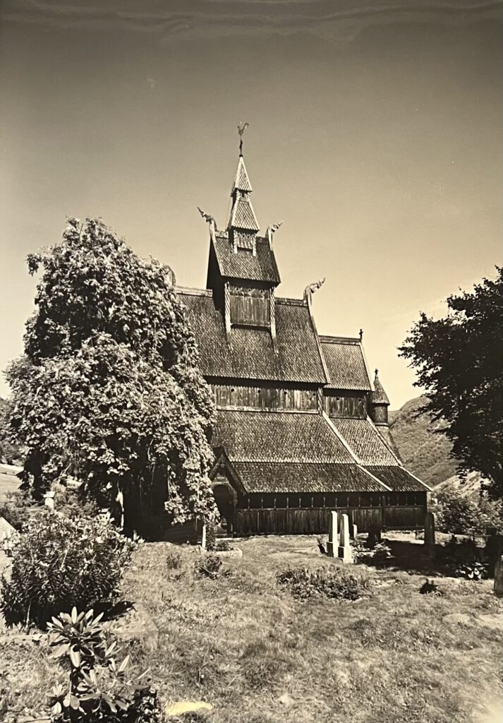
Is it a temple? Or a pagoda? When my partner and I were digitizing a section of Anthony Kersting’s photos taken in Norway, we were amazed, but then struggled to associate this unique-looking wooden building (fig. 1) with part of the Norwegian architectural tradition. Later research demonstrates that it was one of the stave churches — its name deriving from the pine tree trunks used to construct the building — constituting a part of the great cultural heritages of Norway and the rest of the world. A search into the Kersting archive for photos of similar churches, however, introduced me to a series of churches Kersting visited during his trip to Norway, each distinct in style and history. Fascinated by the contrasting designs of the churches, I wish to peek into the changing devotional experience in Norway using Kersting’s photos and the broader collection of the Conway Library on Norwegian ecclesiastical architecture.

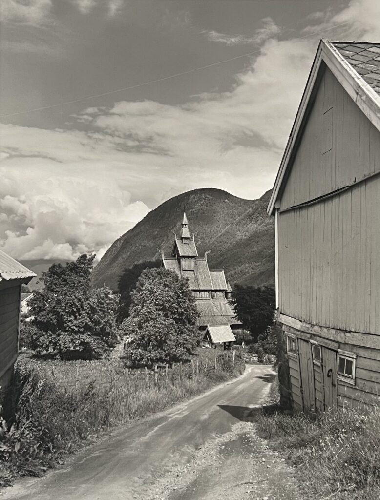
Fig. 1: A black and white photograph depicting the Stave Church at Vik. The church appears to comprise of a single nave with a raised roof, which is topped with a bell tower and culminates in a smaller, pyramidal tower. The church is built and ornamented in dark wood. The points of the roofs extend out into dragon shaped wooden carvings. A rounded turret is visible on right side of the photograph. On the ground floor, a small entrance is visible within a simple wooden porch. The left half of the church is obscured by trees and surrounded by grass and vegetation, and a small number of white headstones can be seen in the graveyard outside.
[KER_PNT_ H16811, The Stave Church at Vik, on the Bogn Fjord. Attribution: Anthony Kersting. The Conway Library, The Courtauld Institute of Art, CC-BY-NC]

Perhaps nothing better illustrates the contour of the history of religions in Norway than its churches — those disappeared, those still standing and those refurbished. While the polytheistic Norse religion filled people’s imagination of the spiritual world and their understanding of the natural world with stories of warring gods, since the 8th century gradual Christianization of the land began with converted Viking kings bringing their new religion home as they returned from England. King Olav Haraldsson — in particular, his death in 1030 CE — played a central role in Norway’s Catholic transformation. The alleged miracles associated with his tomb saw a massive number of conversions, his canonization and subsequent elevation into the patron saint of Norway, and the emergence of a cult of saints. Into the 16th century, Norway’s participation in the Reformation saw the royal family and the rest of the country breaking away from the Roman Catholic Church and converting to Lutheranism. Changes in the religious landscape of the country are reflected in the erection of new churches and the dismantling of old ones, as well as the adapted appearance of existing churches.

An adapted building not only reflects religious changes, but also calls for a closer examination of the devotional experience. As the ‘spatial turn ’prompted archaeologists to explore the interaction between landscape, building and material culture, Kate Giles theorizes the concept of visuality as “the social and cultural constructed-ness of vision” and the medieval way of seeing as a form of feeling… touching the object of vision” [1]. Giles’s work on pre-modern England provides valuable insight into studies on the surviving medieval churches in Norway, which, on top of demonstrating English influence, reflects regional interpretations of interactions between cultures and religions. Although Kersting did not document the evolution of one particular parish church, the geographical range of his photos allows one to appreciate the diverse religious architecture in Norway and to reimagine people’s unique memory of these transforming spaces. Many personal accounts of the churches were lost or yet to be told, but photos open a window for us to listen to the voices embedded in woods and stones.


The Exterior: Style and Material

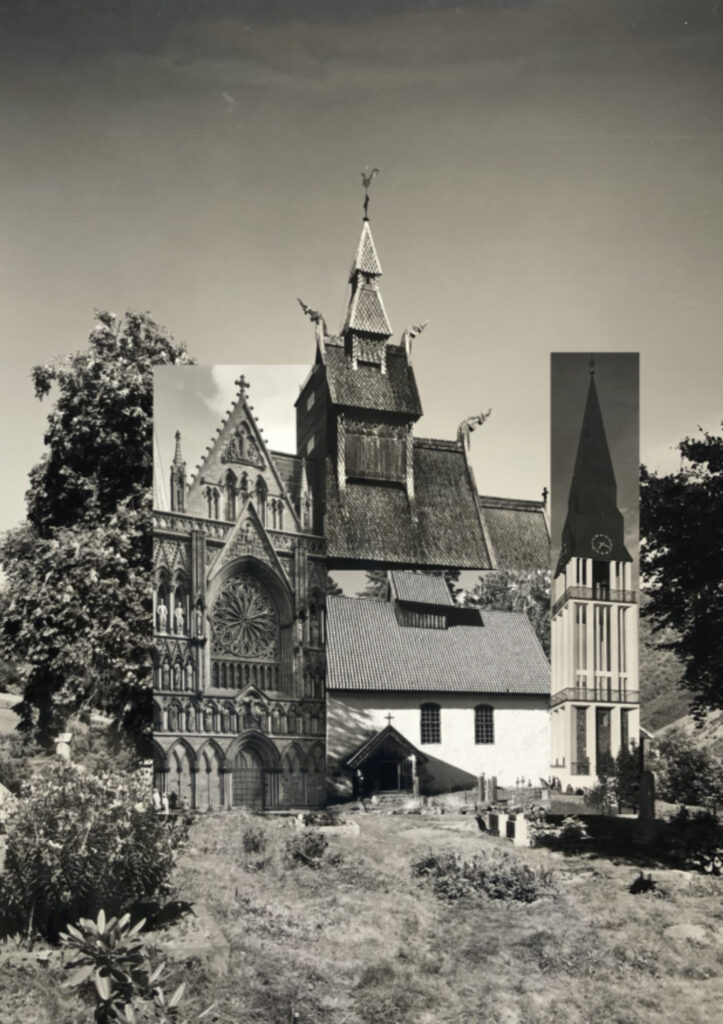
Browsing through the photographic collection often gives one the opportunity to see buildings of contrasting styles juxtaposed with each other. In this case, Kersting’s trip to Norway captures the distinct architectural styles adopted by medieval and modern churches, which can be made more even apparent through collage (fig. 2).


Fig. 2: Collage of parts of different churches on top of the image of the stave church at Vik, Yolanda (Yiyun) Huang, 2023.

From right to left: the Trondheim Cathedral [KER_PNT_ H19105. Attribution: Anthony Kersting. The Conway Library, The Courtauld Institute of Art, CC-BY-NC], the Kviteseid Old Church [KER_PNT_ G10336. Attribution: Anthony Kersting. The Conway Library, The Courtauld Institute of Art, CC-BY-NC] and the bell tower of the Cathedral at Molde [KER_PNT_ H13157. The Conway Library, The Courtauld Institute of Art, CC-BY-NC].


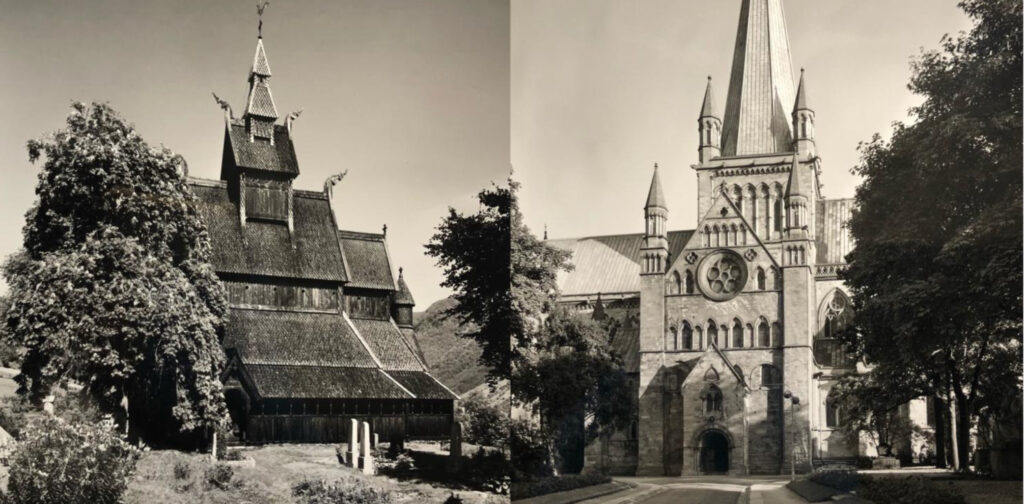
The Stave Church at Vik, built between 1130 and 1150, is one of the 28 remaining stave churches in Norway — scholars speculate that about 1000 more existed in earlier periods. While there has been no consensus on whether the stave churches represent a more indigenous style or were influenced by the English basilicas, they certainly draw visitors’ attention at first sight with their large, steep and multi-tiered pitched roofs connecting to the bell tower. Dated between the 12th to 14th centuries, the Trondheim Cathedral also features a sky-reaching bell tower in the center (fig. 3), but it displays extensive Romanesque and Gothic characteristics.

Fig. 3 Left: [See previous description of Fig.1]
[KER_PNT_ H16811, The Stave Church at Vik. Attribution: Anthony Kersting, The Conway Library, The Courtauld Institute of Art, CC-BY-NC]

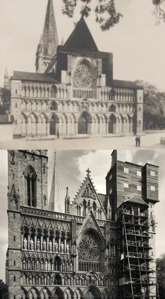
Fig. 3 Right: A black and white photograph of the Trondheim Cathedral from the north. The photograph depicts a large cathedral, built in light stone. The architectural style is eclectic, encompassing both Romanesque and Gothic elements. The construction of the church is relatively simple, a nave with a bell tower extends upwards above a central entrance. Though not excessive, the ornamentation is significant. There is a curved tympanum above the entrance, which itself is set into a pointed porch. There are rows of stone windows only in the central section of the façade, which is flanked by two buttresses with simple, pointed pinnacles. There is a circular rose window set just below the point of the porch. The bell tower continues this ornamentation, also flanked by two pinnacles and culminating in a hexagonal point. A road leads to the cathedral, which is surrounded by trees.
[KER_PNT_ H13177, The Trondheim Cathedral, from the north. Attribution: Anthony Kersting, The Conway Library, The Courtauld Institute of Art, CC-BY-NC]


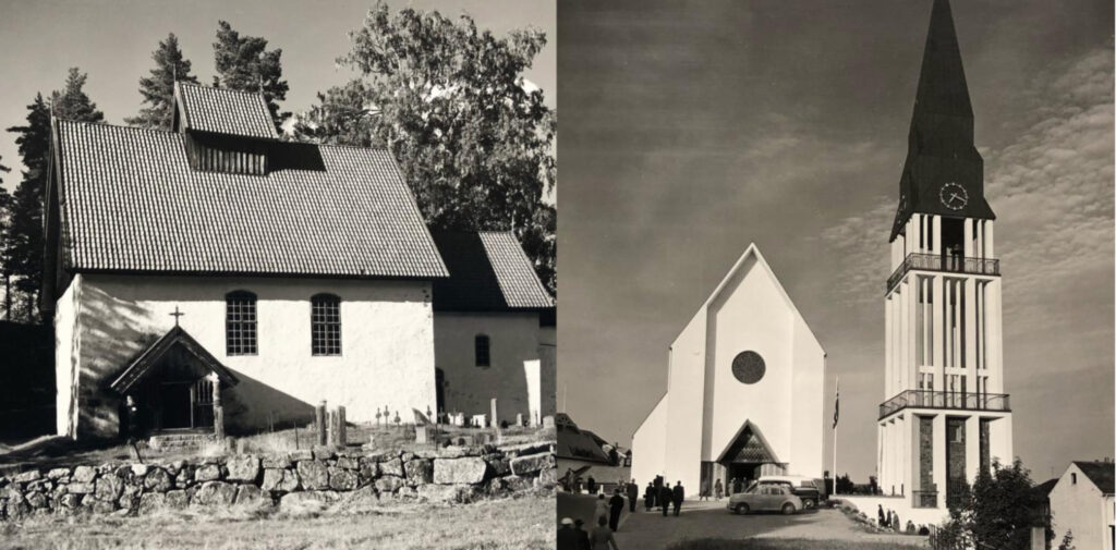
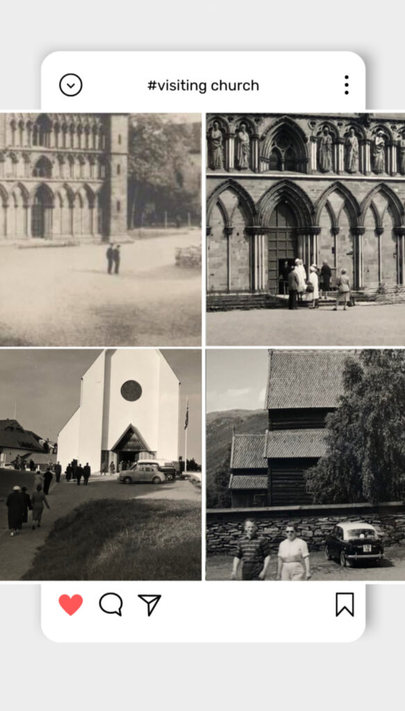
Dated to a similar period of the late 12th century, the Kviteseid Old Church in Telemark, however, is built in a Romanesque long church design typical of many among the 159 preserved medieval stone churches in Norway. The church at Molde also adopts a long church basilica design, but it demonstrates striking characteristics of a modern and functionalist style in the 1950s, with a detached bell tower (fig. 4).

Fig. 4 Left: A black and white photograph depicting the exterior of the Kviteseid Old Church at Telemark. The church’s façade is simple, white stone, and the church comprises of two main parts: the main building, with a single nave, raised roof and porch, and a smaller choir section to the right. The roof is decorated with light tiles, and at the points there are miniature decorative pinnacles. On the main façade, there are two arched windows to the right of the entrance porch. The porch has a pointed roof, with a crucifix atop the point. There are a set of stone steps leading to the entrance door, which is flanked by carved wooden columns. The choir is decorated in a similar fashion, with a single small window and door. The church grounds are quiet, with trees behind and a small graveyard in front, from which numerous gravestones and crosses can be seen. The church is bordered with a rustic stone wall.
[KER_PNT_ G10336, The Kviteseid Old Church, in Telemark. Attribution: Anthony Kersting, The Conway Library, The Courtauld Institute of Art, CC-BY-NC]

Fig. 4 Right: A black and white photograph depicting the Modern Church at Molde. There are two main buildings in the centre of the photograph, the main body of the church and a free standing bell tower to the right. There are also visible smaller buildings on either side. The main church building contains no ornamentation, and is a simple double nave church built in flat white stone. There is a dark, circular window in the centre of the façade, and a small, pointed entrance on the ground floor. This is where the only decoration is, as the walls either side of the entrance are patterned with stripes, and the tympanum is a tessellated diamond pattern. The bell tower is built in white stone, excluding the roof, which is dark grey and culminates in a metal pinnacle. There is also a simple, white clock face on the roof, and the main body of the bell tower is hollow with a white stone exterior. The bottom floor mimics the white stone exterior with the recesses filled in with brick walls. The different levels are surrounded by metal railings which wrap around the entire tower. Two separate roads can be seen to lead to the church with a grass verge between them.
[KER_PNT_ H13157, The New Church at Molde. Attribution: Anthony Kersting, The Conway Library, The Courtauld Institute of Art, CC-BY-NC]


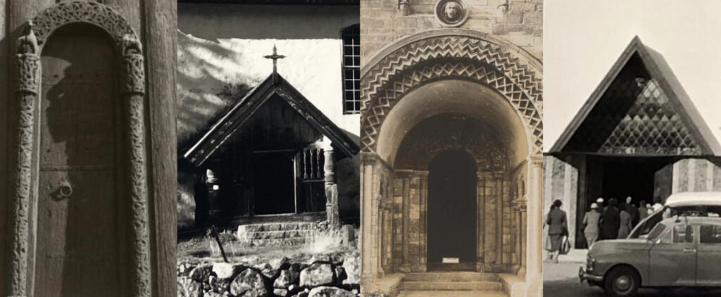
The differences in styles may be more closely observed in the doors (fig. 5). A semicircular structure, for example, can be seen in both the door of the Stave Church at Lom and the Trondheim Cathedral, but the former was much narrower and had an intricate wooden carving of pagan abstract animal images. As the main entrances to the church, the doors — with their form and carving designed to convey meaning — guard the sacred space behind them, differentiating while connecting the inside to the mortal world.


Fig. 5: From left to right: The first door is a simple curved arch. The columns supporting the arch as well as the arch itself are made of ornate carved wood. The second door is a pointed church porch topped with a crucifix. The entrance is flanked by stone columns and a small set of stone steps. The third door is a more extravagant curved arch which is layered and decorated with a zigzag pattern. The final door is another porch, but is more modern, decorated with a tessellating diamond pattern under its gable roof, and with large striped columns to either side. [Detail of the doors of the Stave Church at Lom, the Kviteseid Old Church, the Trondheim Cathedral, and the Church at Molde]

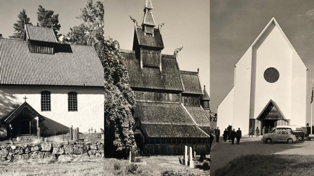
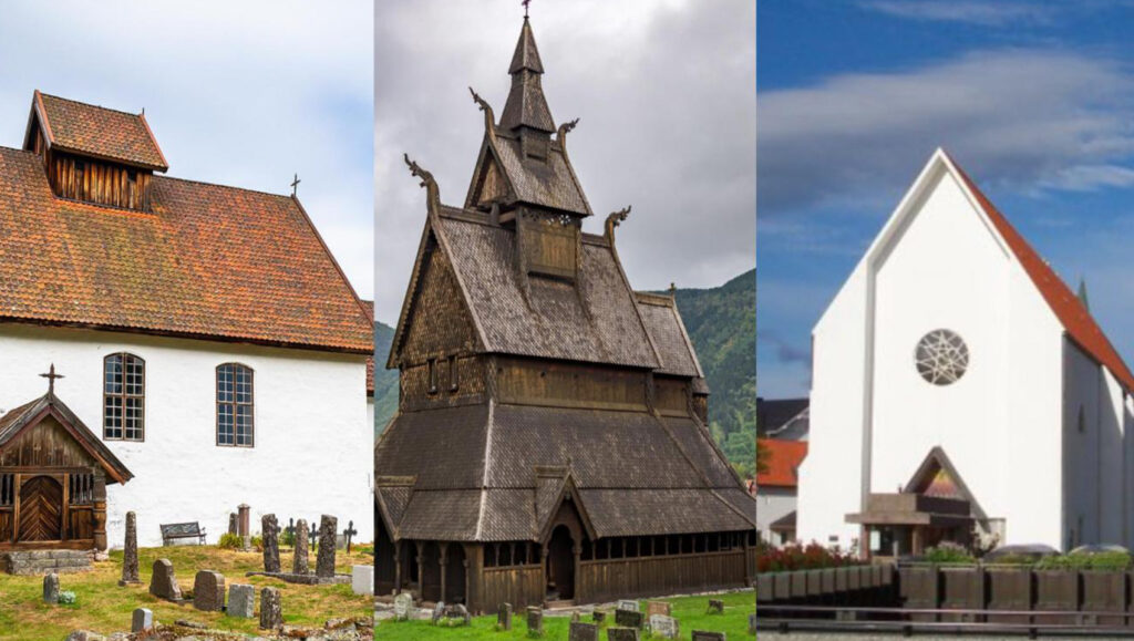
Similarities in architectural style aside, it is the primary building material employed that further distinguishes the churches and people’s experience in the spaces from each other. The stave churches stood out because of their use of wood trunks, reflecting resources and skills inherited from the Viking ship-building tradition. Breathing in the scent of tarred wood and observing darkened wood as it changes color in time, one wonders whether the stave churches give visitors a uniquely soft, personal and sensory-rich experience to which the white stone churches of the same period could not compare. The major shift from wood to stone did not happen until the 16th century [2]. White remains the dominant color of many later churches, but modern churches like the one at Molde used concrete and plastered surfaces, giving a very different material feel to the aged white stone walls of the Kviteseid Old Church (fig. 6 and 7).

Fig. 6 Left: [See description for Fig. 4 Left]
[KER_PNT_ G10336The Kviteseid Old Church, in Telemark. Attribution: Anthony Kersting, The Conway Library, The Courtauld Institute of Art, CC-BY-NC]

Fig. 6 Centre: [See description for Fig. 1]
[KER_PNT_ H16811, The Stave Church at Vik, on the Bogn Fjord. Attribution: Anthony Kersting. The Conway Library, The Courtauld Institute of Art, CC-BY-NC]

Fig. 6 Left: [See description for Fig. 4 Right]
[KER_PNT_ H13157, The New Church at Molde. Attribution: Anthony Kersting, The Conway Library, The Courtauld Institute of Art, CC-BY-NC]


Fig. 7: From left to right: Recent full color photos of the Kviteseid Old Church, the stave church at Vik, and the Church at Molde.


The Interior: Space, Light and Decoration

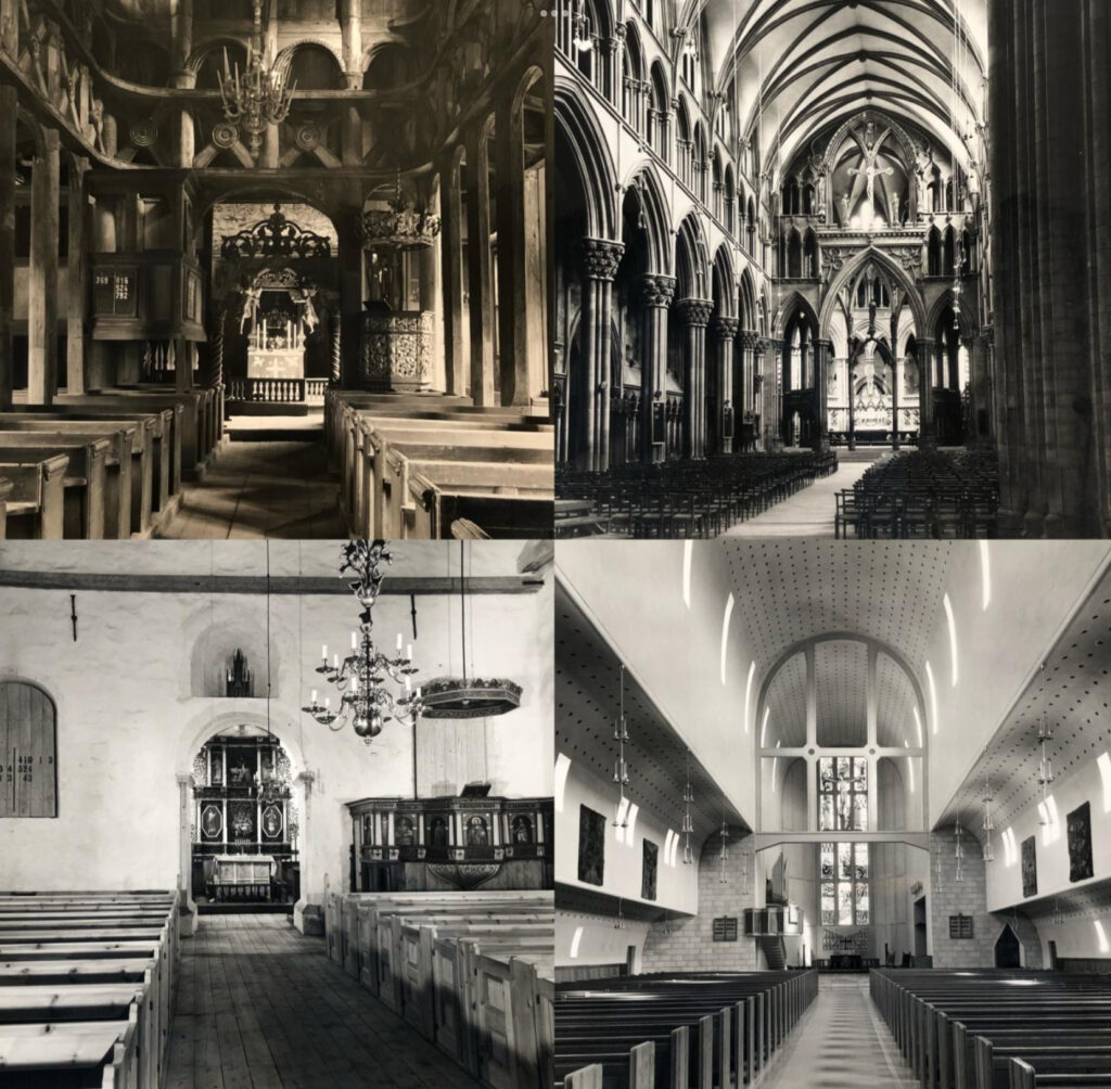
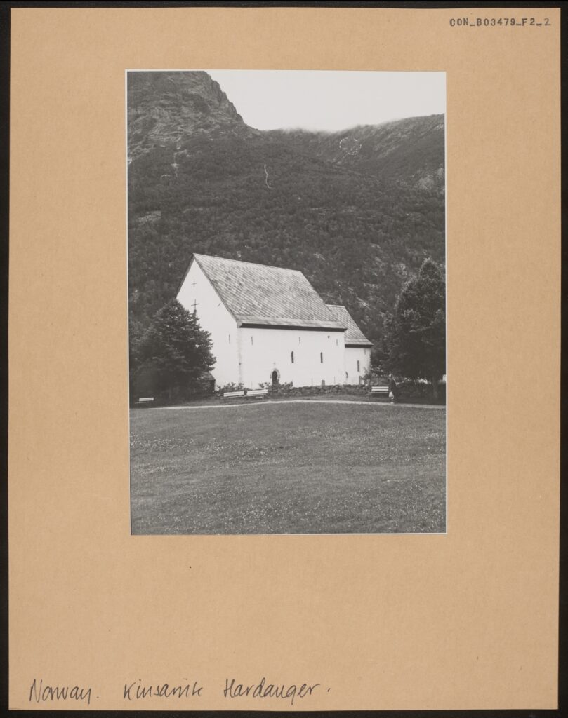
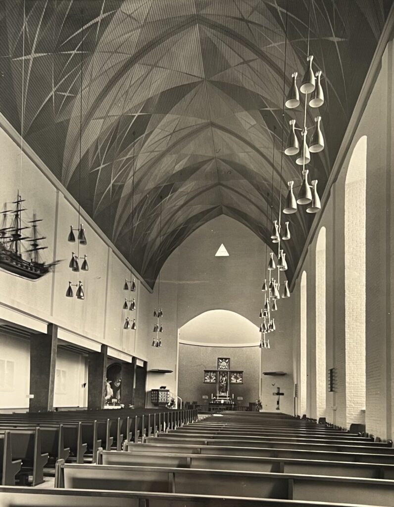
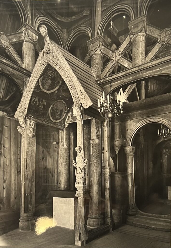
The change in the use of building materials is part of the trend of “dark, small and cold churches being replaced by bright, big and warm churches.” The expanding woship space is clearly reflected in Kersting’s photos (fig. 8). The left shows the interior of the Kinsarvik Old Church in the Hardanger and the stave church at Vik, respectively seating about 240 and 350 people. The right shows the Trondheim Cathedral and the Cathedral at Bodo, respectively seating about 1850 and 850 people. The majesty of the Trondheim Cathedral can be explained by its nature as a pilgrim site and venue for the consecration of new kings, but the scale of the Cathedral at Bodo has become conventional for churches (re)built in the 20th century.

Fig. 8 Upper Left: A black and white photograph depicting the interior of the Stave Church at Lom. The interior is made entirely of wood, and comprises of a central nave with a raised roof supported by wooden beams. There are two visible aisles to either side of the photograph, which are set behind loggias punctuated by thin, wooden beam columns. Above this, there is an open gallery, with wooden balustrades decorated with large decorative diagonal crosses. The gallery is also punctuated with columns, though these are rounded and not unlike doric columns, joined together by arches. Hanging from the centre of the ceiling is a chandelier, and behind it the chancel screen is visible. Beyond the screen, an ornate carved portal arches over the altar, and carved angels flank a painting on the altarpiece. The altarpiece is surrounded by a small, decorative balustrade. A heavily decorated pulpit is visible to the right of the photograph, and there are two rows of wooden pews filling the central floor space.
[KER_PNT_ H16796, The Interior of the Stave Church at Lom. Attribution: Anthony Kersting, The Conway Library, The Courtauld Institute of Art, CC-BY-NC]

Fig. 8 Upper Right: A black and white photograph depicting the interior of the Trondheim Cathedral. The interior is decorated in the Gothic style, and is heavily ornamented. The nave is very large, with aisles to either side enclosed in a richly ornamented loggia punctuated by Corinthian columns. These are further mirrored by smaller decorative Corinthian columns on the interior walls of the aisle, with pointed arches joining them together. The ceiling of the nave is also decorated by dark coloured ribbed vaulting, and the space is lit by thin, hanging lights. Towards the choir, there is a chancel screen taking the form of a large pointed archway flanked by two smaller copies. Above the central arch is a decorative entablature, which itself is topped with a statue of Christ on the cross. This is accompanied by two smaller statues, likely of saints, on either side. The rest of the chancel screen is made up of rows of smaller pointed arches. On the ground floor, there are rows of many individual chairs which stretch back of the threshold of the nave. 
[KER_PNT_H13190, Interior of the Trondheim Cathedral, Attribution: Anthony Kersting, The Conway Library, The Courtauld Institute of Art, CC-BY-NC]

Fig 8. Lower Right: A black and white photograph depicting the interior of the choir loft of the cathedral at Bodo. The ceiling is curved, with a raised central section spanning the entire space. There is minimal ornamentation, with light coloured concrete walls and a simple repeating dot pattern running down the centre of the ceiling. The interior walls are lined with dark coloured artworks and hanging metal lights in the modernist style. The floor is similarly plain, with rows of dark wooden pews. There is a modern chancel screen at the front of the choir, with brick walls either side. Behind there is a pulpit and altar, with a tall, narrow stained glass window on the back wall depicting the crucifixion.
[KER_PNT_H13205, Interior of the Cathedral at Bodo. Attribution: Anthony Kersting, The Conway Library, The Courtauld Institute of Art, CC-BY-NC]

Fig. 8 Lower Left: A black and white photograph depicting the interior of the Kinsarvik Old Church in the Hardanger. The space is open and light, with white stone walls with little decoration. There are three arched recesses in the walls, two larger arches on the left and right, and a smaller arch at the top centre. The larger recesses are covered by wooden covers, and the smaller at the top contains a miniature architectural model of a cathedral. Dark wooden beams span the perimeter of the walls. The floor is made of simple wooden planks, and there are numerous rows of wooden pews in the central space. There is a large, curved arch door beneath the smallest recess, through which a densely ornamented altar is visible, covered by a cloth, with two single candlesticks flanking a seven-branched candlestick at the centre. Behind this is an altarpiece, comprised of a selection of six religious paintings bordered by a carved wooden frame. Within the large central space there is a decorated wooden pulpit to the left, surrounded by painted wooden panels depicting various saints. Above the pulpit is a carved, octagonal ‘roof’ which appears to be suspended from the ceiling. Finally, a large metal chandelier hangs from the centre of the ceiling.
[KER_PNT_H20213, The interior of the Kinsarvik Old Church. Attribution: Anthony Kersting, The Conway Library, The Courtauld Institute of Art, CC-BY-NC]

Perhaps not obviously shown in the black and white prints, but a visit to the above churches definitely gives you a clear feeling of the differences in the amount of light shining in through the windows. The small, high-up windows in the medieval churches work to create a mysterious and contemplative atmosphere in line with the enclosed space decorated with stylized pagan figures, while the bright light shone through the elegant sweeping curves of the gothic windows renders an extra layer of holiness upon the nave and choir.

Meanwhile, it is often necessary to point out individual characteristics of the lighting design in certain churches to better appreciate the unique local memory they carry. The Kinsarvik Old Church in the Hardanger, for example, evokes tourists’ curiosity with its high-up windows on the west gable (fig. 9). In this case, instead of illuminating religious figures and spaces, the position and size of the windows seem to be more closely connected to the church attic up to which they lead — the attic was used to store ships sails and masts during the winter [3].

Fig. 9: A black and white photograph mounted on card depicting the Kinsarvik Old Church at a distance. The church is a brilliant white, with a simple stone façade that contrasts against the dark trees and mountains behind the building. The gable roofs of the main church building and smaller choir are tiled in a diagonal striped pattern. The façade of the front gable is similarly plain, with a single small window and two crucifixes visible. On the other façade, two slightly larger windows are visible, as well as a simple arched doorway. The church is surrounded by a rustic stone wall, several trees, and benches. Beyond the church is a large lawn.
[CON_B03479_F002_002, The Kinsarvik Old Church in the Hardanger. Photographic print on mount. The Conway Library, The Courtauld Institute of Art, CC-BY-NC]


The new Church at Molde, rebuilt after the war, also features a special design: the windows on the right are much higher than those on the left, changing the symmetry of the building and the source of light (fig. 10).

Fig. 10: A black and white photograph depicting the interior of the New Church at Molde. The nave ceiling forms a pointed arch, and is decorated with what appears to be a painted geometric pattern. Rows of metal light fittings hang from the ceiling along either side of the nave. On the left side, there also appears to be a wooden model of a ship hanging from the ceiling. The interior walls are simple, painted white, with an aisle on the left side of the composition. Dark coloured modernist columns punctuate the aisle, and a glimpse of a painting can be seen at the far end of the aisle space. To the right, the wall is made of white brick, and lined with three tall, narrow windows. There are many rows of dark wooden pews lined up on either side of the nave which extend to the pulpit and altar. On the left wall in front of the altar is a black and white patterned pulpit, and to the right is a simple crucifix. At the very back, there is a large altarpiece comprised of a central, rectangular portrait and three smaller square pieces, arranged into the shape of a cross. Directly above this, on the interior wall of the nave, there is a small, triangular window.
[KER_PNT_ H13159, The interior of the new Church at Molde. Attribution: Anthony Kersting, The Conway Library, The Courtauld Institute of Art, CC-BY-NC]


The amount of light dims or illuminates the faces and figures drawn or carved onto the walls and columns of the church. While each church discussed above has its interior decorated with rich human, animal and divine figures, I wish to especially draw attention to the two figures of angels.

The first is a painting on the north wall of the Kinsarvik Old Church, depicting a devil beneath the archangel Michael. The second shows a part of the painting ‘Easter Morning’ by the Norwegian Artist Axel Ender, in which an angel raised the arm to guard Christ’s empty tomb (Fig. 11).


Fig. 11 Left: A black and white photograph depicting a wall painting of the devil and the archangel Michael. The figure of the devil is significantly smaller than that of Michael, and is using a poker to attempt to tip his scales of judgement over to the side. The devil is depicted as animalistic, with large claws, with a smaller winged minion to his right. Archangel Michael is shown to tower over the devil, his wings outstretched and consuming almost the entire wall. The painting shows signs of extensive damage or weathering, and much of its detail has been lost.
[CON_B03479_F002_006, Painting on the North Wall of the Kinsarvik Old Church. Photographic print on mount. The Conway Library, The Courtauld Institute of Art, CC-BY-NC]

Fig. 11 Right: A black and white photograph depicting a painting of an angel guarding Christ’s tomb on Easter Morning. The angel is depicting sitting on some steps, dressed in white with full white feathered wings. She holds one hand aloft, looking outwards to the exit of the tomb.
[KER_PNT_ H13160, the painting “Easter Morning,” now forming the altarpiece of the north aisle of the new Church at Molde. Attribution: Anthony Kersting. The Conway Library, The Courtauld Institute of Art, CC-BY-NC]

Both forming an eye-catching and dominating presence on their respective walls, the figures of angels demonstrate very different initiatives from the artists and evoked distinct memories of modern-day church-goers. With its informal, monochrome style, the archangel Michael and a devil painting could represent a familial or personal effort to transcribe their religious identity into something visible and tangible. The presence of a devil trying to tip the scale of the soul inside a devotional space could be disturbing to medieval and modern audiences alike, but the figure of Michael towering over the devil might as well offer a sense of protection against evil.

On the other hand, “Easter Morning” was originally in the old Church of Molde destroyed during the Second World War. The fact that this particular painting had been previously removed for safekeeping and now forms the altarpiece of the north aisle of the new church creates a precious sense of continuity between the modern church and its disappeared predecessor, while further strengthening the new church as a symbol of security, hope and new direction.


The Environment: Changing Space and Use of Space

As the history behind the rebuilt church of Molde suggests, images of churches often give the viewer a false impression of an unchanging religious and cultural symbol standing against the erosion of time. The reality, in fact, is that many of the churches discussed above underwent destruction, reconstruction and adaptation. So instead of capturing their timeless beauty, photos actually encourage us to explore the ever-changing appearance and cultural significance of the churches to the locality.

Being a manifestation of the Norwegian cultural identity that combines Christian and Viking themes, the stave church at Lom was constructed in the 13th century but has a 17th-century addition of transept and sacristy — re-adapted to fit a new form of Christianity in the radical transformation to Lutheranism. Similarly, in the stave church at Vik survived an altar screen and chapel — a later addition depicting the nativity of Jesus in an English/French style (fig. 12). In addition to the Lutheran re-adaptation, the difficulty of preserving wood means that the remaining stave churches more or less underwent rebuilding — something one can look for in the lighter-colored, thus newer, wooden walls.

Fig. 12: A black and white photograph depicting one of the altars at the Stave Church at Vik, contained underneath a wooden portal. The portal comprised of a curved archivolt standing on four wooden legs, and its roof contains many ornate carvings, with filigree-like patterns about the archway to the front. It is further decorated with carved icons, one on each of the wooden legs, and a larger one at the point of the arch. The interior of its roof is painted with a selection of religious scenes. Underneath the portal, there is a white stone altar covered with black cloth. A curved doorway is visible to the right of the photograph, and this too is carved wood with smooth wooden columns. The rest of the wall, which stretches behind the portal, is punctuated with a row of small arched windows. A gallery is visible above the door and portal, and is enclosed behind a broad balustrade and large columns. A metal chandelier hangs from the ceiling in the centre.
[KER_PNT_ H16812, One of the wooden altars in the Stave Church at Vik. Attribution: Anthony Kersting. The Conway Library, The Courtauld Institute of Art, CC-BY-NC]

Standing at the center of the traditional pilgrim destination, the majestic Trondheim Cathedral in fact witnessed numerous additions and renovations since its established and into the 2000s. Kersting managed to capture one moment of reconstruction work on the never-completed west front, with a temporary modern structure concealing the work to be done. An earlier photo from the Conway Library gives us another look of the west front before the new figures of saints and kings in the niches were installed (fig. 13).

Fig. 13 Top: A black and white photograph depicting the west front of the Trondheim Cathedral. The façade is built in the Gothic style, with a large rectangular section on the ground floor which is decorated with rows of arched recesses. In the future, these recesses will come to house a multitude of sculptures of various figures, but in this photograph they are empty. The rectangular section of the façade is split into three main parts: a strip of narrow, pointed recesses at the top, rows of shorter recesses in the centre with clover shaped arches, and much wider pointed arches along the ground floor. On each section, there are two windows, apart from the ground floor, which has three doors. At the top of this rectangular section, in the centre there is a large stained glass rose window, with a row of smaller, narrow arched windows underneath. Surrounding the rose window is a square, dark wood structure which mimics the tiles on the roof of the west façade. This, in turn, is topped with a large dark wood pyramid. Beyond the façade, a large pointed bell tower is visible, which culminates in a metal crucifix.
[CON_B03484_F001_001, Trondheim Cathedral, West Front: General views before restoration. The Conway Library, The Courtauld Institute of Art, CC-BY-NC]

Fig. 13 Bottom: A black and white photograph depicting the west front of the Trondheim Cathedral. There is a large amount of scaffolding about the cathedral’s right side, where a simple, square wooden structure has been built over a tower to the right of the composition. This structure is built with wooden planks, giving it a striped appearance. There is another tower to the left, built in the Gothic style, with square flat roof with pinnacles at each corner. The roof also possesses a decorative balustrade with a clover pattern. Set into the tower is a tall, narrow arched window. In the centre of the façade there is a pointed gable with a decorative relief, this too is ornamented with pinnacles and a row of smaller arched recesses. The central façade of the cathedral is richly ornamented, with rows of sculptures of various figures set into arched recesses in the wall. There are minimal visible windows, with most of the space being occupied by these sculptures. In the very centre of the facade, there is a large stained glass rose window, with a row of narrow arched windows underneath, topped with another gable decorated with a carved relief.
[KER_PNT_ H19105, The West Front of the Trondheim Cathedral. Attribution: Anthony Kersting. The Conway Library, The Courtauld Institute of Art, CC-BY-NC]


Changes happened in the exterior and interior of the churches but also in the ways people use these spaces. A few medieval churches such as the Kinsarvik Old Church remain close to the public but continue to host sacred concerts and events. Yet most stave churches have become tourist sites with little or no religious activities. The shift in the nature of the space reminds one to think about the changing relationship between the building and its surrounding — the physical world and the people who live in it.


Fig. 14 Instagram post of details of visitors going in and out of the churches in previous figures.

Many Norwegian churches were built in proximity to nature, making the surrounding environment and traveling to go to churches a central part of the medieval religious experience. The Kinsarvik Old Church was located at the junction of the fjord Hardangerfjord and the Sørfjorden, meaning that many locals would row their boats to attend church. Stave churches like the one in Vik are often located between mountains and rivers, speaking into the intricate wood carvings which drew inspiration from nature (fig. 15). In the present day, however, the natural environment — and the effort to go into the mountains — became an integral part of the tourists’ quest to find and visit the distant monument of ancient culture.


Fig. 15: A black and white photograph depicting the Hopperstad Stave Church at Vik from a distance, partially obscured on its left side by trees. Only the multilevel roof is visible, with a pyramidal bell tower at the apex, which attaches to a smaller gable at its base. The gable then sits atop the raised roof above the nave, which in turn connects to the main structure of the church. The points of the corners of the roof all extend out into small carved dragons. A smaller structure is seen in front of the church, which appears to be a hollow portal with a gable roof. In the distance, behind the church, a steep grassy mountain is visible. A small dirt road leads to the church, and the side of a simple wooden building can be seen to the right of the photograph. 
[KER_PNT_ G5534, The Hopperstad Stave Church at Vik. Attribution: Anthony Kersting. The Conway Library, The Courtauld Institute of Art, CC-BY-NC]

The wood is not only a source of ancient cultural inspiration, but also of anxiety about preservation and destruction. News in 1996 articulated the worries about the homegrown Satanist movement whose slogan was “Kill the Christians, burn their churches.” More than 20 stave churches were destroyed by arson in the early 1990s [4]. Entering the millennium, stave churches stood between the dilemma of preservation and tourism. The study conducted by the Stave Church Preservation Programme in 2015 shows that a door sill in one stave church was worn down by 0.50–1.50 mm during the year [5]. With different churches taking different scales of protective measures, the sacred, historical wood symbolic of Norwegian identity continues to be subject to the threat of disappearance.

Photos capture the building at one historical moment, but they encourage one to look beyond that moment. The changing space and visuality documented by Anthony Kersting and collection of the Conway Library allow us to explore the hidden narratives behind wood and concrete, reimagining people’s shifting devotional experience and memory in transformed architectures.


References

[1] Giles, K., ‘Seeing and Believing: Visuality and Space in Pre-Modern England’, World Archaeology, 39/1 (2001), pp. 105-121
[2] Cook, W. R.,‘Episode 11: The Stave Churches of Norway’, The World’s Greatest Churches (2014) [3] Emma, ‘Hidden Secrets at Historic Kinsarvik Church’, https://thehiddennorth.com/historic- kinsarvik-church/, written on November 11 2022, accessed on June 21 2023
[4] Caryl, C., ‘Staving Off the Devil’s Flames’, The Wall Street Journal Europe, (23 August 1996)
[5] Berg, F., ‘Wear and Tear of World Heritage: Preventive Conservation and Tourism in Norway’s Stave Churches,’ Studies in Conservation, (2018), pp. 320-322


Yolanda (Yiyun) Huang
Courtauld Connects Digitisation
Oxford University Micro-Internship
Participant

Caitlin Campbell: Bombs, Fire and Time – Tales of Destruction in the Conway Library

During my internship at the Conway Library, I focused on finding photographs of damaged art, specifically sculpture and stained glass. What follows are three poems I wrote on what I found to be the three most interesting of these images. After this is a discussion of these pieces, examining their historical background and their worth as damaged pieces of art.


Poetry


A close-up, black and white photograph of a clover shaped recess in a stone wall, known as quatrefoil 248. [CON_B00248_F003_022 – ENGLAND, Somerset, Wells Cathedral. North face, facet: K, quatrefoil 248, N.W tower, N side, pre-restoration. The Conway Library, The Courtauld Institute of Art, CC-BY-NC]


A close-up, black and white photograph of the same quatrefoil pictured above. The images are almost identical. [CON_B00248_F004_010 – ENGLAND, Somerset, Wells Cathedral. Facet: C, Colchester no. 248, N.W Tower, N side, post- restoration. The Conway Library, The Courtauld Institute of Art, CC-BY-NC]


Wells

I was brought into creation,
With my brothers,
We three standing proud,
Brought beneath us,
Were those others,
Who curl their faces to the ground,

Beneath our feet,
I call to them, “Men,
Why don’t you rise?”
They shudder softly and say,
“You will see, when,
The outside takes your eyes.”

My brothers told me not to listen,
To men who feared the sun,
“We were created by the righteous,
See how they look on us with awe,
Brother this is our dominion,
Nothing here will slight us.”

For many years we stood,
With prideful benevolence,
For the men who cried below,
Until my brother’s hand lost,
Its finger, the severance,
A creeping blow.

“You are marked a sinner,”
Boomed my brother with hand intact,
We saw it as a punishment,
“But please, brothers, I do not know,
What I did or what I lacked.”
We did not doubt His judgement,

And those beneath us howled,
As we froze and shunned,
Our kin with his sinner’s mark,
They implored us,
“Don’t let yourselves be numbed,
Don’t let the outside take your heart.”

When my brother’s ears,
Started to fall away,
He turned his accusation downwards,
To the “whimpering, conniving hoard,
Who crouch as though to pray,
But feed the devil broken shards,

Of flesh taken from the holy.”
The grovellers tried to protest,
But my brother knew sound no longer,
And he could not hear them say,
That “the outside will not rest,
Until none of us are what we were.”

I begged forgiveness from my brothers,
For standing tall while they withered,
But only one could hear my sorrow,
And he was the one whom we had wronged,
And though I know his lip quivered,
He let no emotion for me show.

A storm took the head of my brother,
He who had squalled against sin,
And as we wailed those hateful,
Soothsayers said loud,
“We told him he would not win,
Against the outside’s great pull.”

My brother came to forgive me,
While we cried for our lost,
We cursed the snivellers in their hole,
For they had committed the crime,
Of being unblemished at the cost,
Of our dear brother’s soul.

My nose had vanished by the time,
My second brother lost his head,
And I hated the cowards keeping their secret,
Of how to remain whole,
“Why is it they are dead,
While you men meet no threat?”

“We warned you to fear the outside,”
They admonished me hard,
“You thought yourself an equal,
To its power,
You let your brothers disregard,
That which comes before the fall.”

“But how can I not stand tall!
When my creator made me so?”
They hid their answers undercover,
And so I aimed my question out,
“Oh creator, did you know,
That you built us only to suffer?”

I received no answer,
But eventually there did appear,
Disciples with wands of creation,
I could have collapsed with joy,
That they would restore what was dear,
I would cease to be a family of one.

They brought potions to clean our bodies,
Cracks they took days to restore,
But they did not return my brothers,
And when I tried to scream and beg,
I found that I had a mouth no more,
And all my noise was smothered.

I faced my recreation,
With corpses by my side,
I wish I did not see their degradation,
But the outside never took my eyes.


A black and white photograph of a neo-classical sculpture in marble, depicting the Ancient Greek mythological figure Andromeda. [CON_B04109_F002_013, ENGLAND, London, Sydenham, Crystal Palace Gardens. “Andromeda”. The Conway Library, The Courtauld Institute of Art, CC-BY-NC]


Andromeda

She was chained to a rock in the ocean,
Waiting for him to come,
Blinded here by the sun’s reflection,
Blinded so that she cannot remember,
Why it is that she is here,
What she did to deserve such a punishment,
As being a feast for so many monsters.

She was chained to a rock in a house of glass,
Waiting for him to come,
Stares remind her that she is frozen,
With hands that cannot cover and eyes that cannot close,
She doesn’t know if it is part of her punishment,
Being up here on display,
A feast for so many monsters.

She was chained to a rock in the ashes,
Waiting for him to come,
Hands frozen she cannot wipe away,
The soot that clings to her,
Or the weeds that grow through the cracks,
She wonders when it was she was forgotten,
Whether it is a mercy to be here alone,
And she still cannot remember what it is that she did,
To have been the prize of so many monsters.


A black and white photograph mounted on card depicting the interior of the choir of Aachen Cathedral. [CON_B09767_F01_010 – GERMANY, Aachen, Munster. Showing interior of Gothic choir, interior vaulting of the apse. 18 Nov. 1944. The Conway Library, The Courtauld Institute of Art, CC-BY-NC]


A black and white photograph mounted on card. Caption: “Those beautiful stained glass windows were the only part of Aachen Cathedral seriously damaged by war. A bomb fell through the Church roof Christmas Eve, 1943, rolled out into the street and exploded the following day, blowing out those windows, which are called “the tallest in Europe.” [CON_B09767_F01_018 – GERMANY, Aachen, Munster. Showing the damage of the stained-glass windows in Aachen cathedral’s choir. Attribution: Lawrence Riordan. The Conway Library, The Courtauld Institute of Art, CC-BY-NC]


Aachen

The bombs are dropping and we’ve been left behind,
Too large to move, not worth it,
Shaking in our panes,
As the world falls to pieces.

The ground is being torn up,
Every friendly thing made a projectile,
The city is being warped into weaponry,
To be turned inward on itself.

An arrow through Peter,
That once was a branch,
A bullet through Matthew,
That once was a stone,
And Mary holds her child tightly,
But is no shelter from the cannonball,
That once was a chimney-pot.

So far above, do they look down,
And see the slaughter they’re unfolding?
Or are they shielding eyes and ears,
Minds never here at all?
So far above they won’t ever know,
How Jesus’ body shattered.

The morning is come and they are gone,
But the sun doesn’t halt its rising,
And if you in the rubble were to stop and look,
You would see sunlight unfiltered,
Where once was red and green and blue,
And if you were to stop and see you’d know,
That splinters of glass look smoother when warmed with gold.

And we are gone to dust on the floor,
But the sun sees us clear,
And the cowering relics turn their heads,
Never having known a glow untainted by us.

And if you were to find them, miles away,
Watching homes burn and counting their dead,
Would it bring them relief or rage to know,
That what they did let the light come in?


Discussion

I wrote the above poems while examining three photo sets from the Conway Library, all showing art that had been variously damaged. What fascinated me about the pieces was that, despite being disfigured, they were all enthralling. They had inspired photographers to capture them, and they had inspired me to write about them. Would it be unfair to say then that their damage decreased their artistic value?

In the course of my week at the Conway I have researched these three photographic subjects and have here compiled short histories of each. I hope that in understanding the subjects the true impact of their being damaged may become clear.

Wells Cathedral

To begin with the subject of the first poem, a small group of carvings within a quatrefoil at Wells Cathedral, Somerset. They sit on the north face of the north-west tower of the cathedral’s magnificent west front and constitute one of many quatrefoil carving groups on the cathedral. This cathedral, along with its carvings, is medieval, having been built between the 12th and 15th Centuries, with the west front probably being completed in the 13th Century. It is the first English cathedral to have been built in the ornate Gothic style in which intricate carved representations of biblical stories were common.

The subject here is the Transfiguration of Jesus, a New Testament story in which Jesus (here carved in the middle) begins to glow with heavenly light (represented here by a halo). He is visited by the prophets Moses and Elijah, who here stand on his either side. The figures cowering below him in the carving represent his disciples, Peter, James and John, who were praying with him at the time of the transfiguration and were overwhelmed by what they were witnessing. The story is given particular theological importance by the voice of God, which here referred to Jesus as his son and bade all to listen to him. That this element of the story is not represented here is presumably due to the difficulty of depicting a vocal address in a carving, and it was likely assumed that many viewers of the group – if indeed they could see it properly from the ground – would know the Transfiguration story.

The carvings as seen in the first photograph were heavily damaged due to the simple face of having been exposed to the elements over time. What is more interesting is that the second photograph shows them after having been restored during a massive west front restoration project in the 1970s. My first thought when seeing this second photograph, was that the carvings look hardly changed from how they had been prior to having been restored. The heads of the prophets are still missing, but more striking to me is that the face of Jesus is still worn away, none of his features having been redefined.

Further research led me to summaries of the restoration work from which it was clear that the goal of the work was simply to clean the work and preserve its present state, with no aim to restore the original appearance. That the restoration had these purposes is revealing of the changed way in which we in the modern era interact with medieval Cathedrals compared to those in the time in which it was built. While in the Middle Ages the aim of such carvings seems to have been to represent bible stories, perhaps with the intention of teaching parishioners or perhaps out of some reverence to God, now it does not seem to be of much relevance whether the story is legible.

Indeed, some of the quatrefoil carvings were so damaged that one could only guess as to what they had been. When people now come to visit historic churches such as this, the interest for many is either in the history or the aesthetic beauty of the place. Even those visiting for religious reasons may be more interested in seeing the authentic expressions of faith of those 13th Century workers, increased literacy meaning there is less of a need for the bible to be told in visuals. There is an argument to be had that to repair the old carvings with modern additions, even if they look as close in style as possible to the original, would be to detract from this authenticity and, as Carolyn Korsmeyer puts it, to commit an act of ‘aesthetic deception’.

There is definitely an element of the Ship of Theseus debate in such a line of thought and, like this philosophical conundrum, there is no agreed upon correct answer. At York Minster, for example, the permanent stonemasons yard carves new grotesques to replace those adorning the minster’s exterior when they become damaged. Evidently it is the consensus here that retaining the appearance of the stonework is more important than retaining its genuine historical elements. At Wells Cathedral, the damaged state of the figures is preserved – the effects of the elements over the years have shaped the carvings into something new which is considered worth saving.

Andromeda, Crystal Palace

The sculpture of Andromeda from the Crystal Palace has an entirely more dramatic, and ill- fated, backstory. The sculpture is neo-classical in style, probably made between about 1760- 1860 when the fixation on the classical age was at its peak in Britain.

The story it represents is the Greek myth of Andromeda. In this story Andromeda, the princess of Aethiopia, is chained nude to a rock in the sea as food for a sea monster. Her punishment was not at the result of anything she did, but a response to a claim her mother made that her daughter was more beautiful than the Nereids. Poseidon, father of the Nereids, found murdering Andromeda to be a fitting revenge. In the story she is saved from her fate by Perseus, who slays the sea monster and carries Andromeda home to Argos to be his queen.

With no available information about the sculptor of this work, it is difficult to guess at why exactly the myth of Andromeda was chosen as a subject. But this certainly wasn’t the only example of a neoclassical depiction of her and comparison to others, particularly the 19th Century Italian work by Romanelli, suggests that the obscured object at her feet to the right, is the broken head of the sea monster which was originally shown circling her.


A colour photograph depicting a white marble neo-classical sculpture of the figure from Ancient Greek myth, Andromeda, on a black background. A naked female figure, draped in cloth, is shown chained to a rock, the head of a sea monster rising up from sculpted waves below, as if to bite her. She raises her free hand up above her head, her mouth slightly open in shock and fear. [ITALY, Florence. “Andromeda”, sculptor: P. Romanelli, 19th Century. Attribution: Sotheby’s auction catalogue.]


 This sculpture was one of many artworks that had its home in the Crystal Palace, the grand glass Victorian structure which stood originally in Hyde Park, where it was built to house the Great Exhibition of 1851, after which it was moved to Sydenham.


A black and white photograph depicting the Crystal Palace in Sydenham, London, from the air. [CON_B04109_F002_001 – ENGLAND, London, Sydenham. Aerial view of the Crystal Palace, Sydenham. The Conway Library, The Courtauld Institute of Art, CC-BY-NC]


In Sydenham it reportedly struggled to attract visitors, despite its large collection which included British sculptural works such as this one. Its ultimate fate was to be destroyed almost entirely by a fire in 1936 (the cause of which was never determined) with its final remaining tower structures being pulled down during World War 2 and its gardens been left in disrepair.

This photo of the forgotten Andromeda was taken in the 1970s, decades after the fire. Another image taken at the same time shows that she was stood in a cluster of similarly abandoned neo-classical sculptures, many of which miss limbs and heads. It is difficult to know whether she was inside the building when it burnt, some sculptures being designated for the Palace’s gardens. A comparison to other fire-damaged marble statues has suggested to me that the black stain across her torso is consistent with her having at least been close enough to the flames to have been scolded by them.


A black and white photograph of abandoned sculpture fragments in the gardens of Crystal Palace. To the right is the aforementioned Andromeda, these two photographs were likely taken at the same time. To the left of the photograph, three other fragments are visible. [CON_B04109_F002_012 – ENGLAND, London.  Sculptures in the Crystal Palace gardens, Sydenham, 1970s. The Conway Library, The Courtauld Institute of Art, CC-BY-NC]


Why then was Andromeda deemed worthless while the Wells carvings were preserved? Part of this will be a question of age, medieval carvings being older and so considered more valuable than neo-classical. One can be sure that, had this sculpture been genuine Graeco- Romano, she would not have been left to be broken by vandals. Another is probably a simple question of finances. Those with vested interest in the Crystal Palace would have suffered an immense blow when it was destroyed and the cost of repairing and transporting a minor, now damaged, artwork from within it probably was not worth the hassle. The final point is one of context. The Wells carvings have the benefit of being both religious in nature and attached to a historically significant building.

As such, as long as there is still a clergy at Wells Cathedral, and tourists coming to admire it, there will be incentive to prevent their further decay. A sculpture from a completely destroyed building, in a style typically associated with the vanity and pretentious tastes of Europe’s aristocracy, has less protection.

The current fate of our Andromeda is not known. The only reference I could find to her was a 2007 contributor on an online forum dedicated to Sydenham who claimed that the Andromeda ‘lost her head!’ since the 1970s image. Whatever her exact present state, it is clear that Andromeda was abandoned by those who had decided to display her in the Palace.


Aachen Cathedral

The final set of images was taken of Aachen Cathedral after the western German city fell to the American forces in 1944. It was the first major German city to fall to the Allies and faced heavy bombardments, by air strikes and then by the incoming American land troops, throughout late 1943 and 1944. Aachen reportedly anticipated the possibility of their cathedral being damaged in bombing and so transferred all its movable treasure to less conspicuous locations. In light of all this, the images of Aachen Cathedral actually seem remarkable for how intact the church is.


A black and white photograph mounted on card. Excerpt from caption: “AACHEN FALLS TO AMERICAN TROOPS. U.S. troops examine the main altar and the wreckage inside Aachen Cathedral. The cathedral was damaged during the bitter fighting for the city, which fell to troops of the first U.S. Army on October 20, 1944, seven days after expiration of a “surrender or die” ultimatum.” [CON_B09767_F001_019 – GERMANY, Aachen. “Aachen falls to American troops”. Attribution: Keystone Photo 484403. The Conway Library, The Courtauld Institute of Art, CC-BY-NC]


The bomb that damaged these windows was reported to have fallen through the church roof on Christmas Eve, 1943 and to have then rolled out onto the street where it finally detonated, blowing in the windows.

The cathedral was first commissioned by Charlamagne in around 796 and then was added to in 1355. This addition was in the form of a Gothic choir, the focal point of which was the magnificent stained-glass windows. These 14th Century windows were not the same ones which were destroyed in the bombing. They had in fact been shattered already by a hailstorm in 1729; those in the cathedral in 1944 were a neo-Gothic replacement.

In photos taken before the war, the windows can be seen to have detailed figural designs at the bottom, but with a much simpler geometric pattern in the rest of the space. This is quite strikingly different from the modern iteration of the windows, designed post-war by Walter Benner, Anton Welding and Wilhelm Buschulte, which have a far greater number of figural compositions as well as more intricate geometric design.


A black and white photograph mounted on card, depicting the untouched interior of the choir of Aachen Cathedral. [CON_B2200_F002_002 – GERMANY, Aachen. Aachen Cathedral. Int: choir looking NE. Taken before the windows were bomb-damaged. Attribution: Photo Marburg 64678. The Conway Library, The Courtauld Institute of Art, CC-BY-NC]


[Image to follow]

A colour, digital photograph of the interior of the choir of the Aachen Cathedral. Large, multicoloured stained glass windows wrap around the curved side of the choir and the wall to the right of the photograph. The glass is coloured mainly in vibrant blues, reds, pinks, and purples. The interior is well lit with electric lights hanging from the vaulting, visible on the ceiling. To the left of the photograph, a painted wooden sculpture of three angels or cherubs is visible. In the centre of the choir there is a hanging sculpture decorated with gold leaf. The walls of the interior are richly decorated, though it is unclear if they are painted or tiled.
[GERMANY, Aachen. Aachen Cathedral Choir. Taken after the new, post-war windows were installed. Attribution, alamy.com. DWP911]


It is obvious why the windows were not left in their damaged state, which would have left the cathedral completely vulnerable to the elements, but perhaps surprising is that they chose to reinvent the windows rather than recreate the old ones. Part of this is probably, like with the other two pieces discussed, a question of age. As mentioned, the windows damaged by the bombs were not the originals and as such would have held less importance to the city’s historical fabric than they would have done had they stood there since the 14th Century. Also of possible relevance is the appearance of the windows themselves. The original design was very sober in comparison to the modern one and it is not inconceivable that those in charge of arranging the cathedral’s repairs would have seen the damage as a blank slate from which the cathedral’s appearance could be altered.

Unlike in the cases of Wells Cathedral or of Andromeda, the windows of Aachen had the dual factors of being irreparably damaged and a crucial structural part of the building. The combination of these two meant that it was imperative that the windows were remade, but that they could be made potentially in any style because the historic craftsmanship which may have been otherwise preserved was destroyed.

If the three examples used are looked at as a group, then it seems clear that there are no set protocols for dealing with damaged art and while some is seen as worthy of preservation, other works are discarded. It is understandable why artwork that is damaged is sometimes destroyed or abandoned, Aachen Cathedral could not function with broken windows and  the place which had displayed Andromeda had ceased to exist. However, this does not mean that the damaged pieces are worthless or that they should be forgotten. Here is where photography can become so useful as a medium. Even if damaged objects or buildings cannot be kept in their state forever, photographs can capture them in this vulnerability beyond the time in which they have been repaired, replaced or further degraded.


Caitlin Campbell
Courtauld Connects Digitisation
Oxford University Micro-Internship
Participant

Kasturi Pindar: Anonymous Figures


Finding Humanity in Architectural Images of Amdavad

This blog post is designed as a virtual exhibition and is best viewed here. An accessible version is available below.


In the 1950s, the Franco-Swiss architect Charles-Édouard Jeanneret, known as Le Corbusier, designed and oversaw the construction of four buildings in the city of Ahmedabad, Gujarat. Architectural photographs of his work are the only trace of twentieth century Ahmedabad in the Conway Library. Such photographs are cold and impersonal: detached, reverent images capture the triumph of the architect. Le Corbusier had a vision for modern Indian architecture and the photographers honour and exalt his work.

In the Conway Library, photographs are skewed towards Europe. Photographs of the ‘East’ suffer from the colonial gaze of the white photographer, and those taken in Ahmedabad are taken in celebration of a European architect. The attribution on the photographs is always to the architect, Le Corbusier, though some of them name the photographer too. English words are used to locate the image: ‘Ahmedabad’ rather than the Gujarati, ‘Amdavad’. ‘Museum’ rather than its name, Sanskar Kendra. ‘Le Corbusier and assistants,’ even though one ‘assistant’ is the famous Indian architect Balkrishna V Doshi.

Sometimes, anonymous figures find their way into architectural photographs. A man hidden at the back of the frame, a woman at work. We don’t know who they are, or the stories they would tell.

CON_B04390_F001_005

How do you tell the story of someone that you do not know?

Saidiya Hartman narrates the stories of the nameless and voiceless, those whose lives are impossible to trace due to their absence from historical archives. She uses a method of ‘critical fabulation’ and speculation which draws inferences from documents and photographs to craft a written portrait of her historical subject.

In what follows, four photographs guide the text. Each photo is accompanied by three captions in which I attempt to disrupt the colonial gaze and bring to life the strangers caught in these images. In the first caption, I use my imagination to speculate on the people pictured and the events that were unfolding as these photos were taken, in a method similar to Hartman’s. A second caption is crafted from my interpretation of the photograph and research into the social context the building. The final caption follows the format of the architectural photograph: an impersonal account of the building.

Woman with jhadu

CON_B04390_F001_016

Early morning. The sun had just begun to cast a bright light onto the Sanskar Kendra, but under the shade of the building it was still cool and quiet. A few voices drifted across the open air from across the museum, broken only by the whoosh of the jhadu against the concrete slabs. The woman had noticed the European photographer out of the corner of her eye, standing on the ramp and looking down over where she was working. She didn’t pay him much notice, continuing her sweeping without a second thought.

Sanskar Kendra City Museum, viewed from ramp

Lennart Olson, the Swedish photographer, took this picture from the entrance ramp to the City Museum of Ahmedabad. The woman in the image shows the scale of the building: the pilotis hold the building above the ground, forming a shaded, open courtyard. Light and shadow play in this photograph.

Overexposure due to bright sunlight burns the columns at the back and the woman’s figure is cast as a sharp silhouette. On the floor above, sunlight flows through the back window, illuminating the tiled floor and exposed brick walls of the interior.

Ahmedabad City Museum, Le Corbusier, 1954.

The Sanskar Kendra Museum in Ahmedabad, Gujarat, was designed by the great twentieth- century architect, Le Corbusier. Its foundation stone was laid in 1954. The museum is elevated 3.4 metres above ground level, supported by pilotis. Le Corbusier designed the building to protect from the heat, with 45 large basins built into the roof as a cooling mechanism. Today, the museum is closed and parts of it have begun to fall down.

Intermission

CON_B04390_F001_035

Within a forest of cool concrete, a man reclines in the warmth of the afternoon. He sits, partially shaded from the sun, under a narrow column. Crossing one ankle over the other he stretches his legs out into the sunlight and opens his book. This is well-earned period of respite from working and, hopefully, nobody will disturb him. As he reads, the plants and the trees next to him rustle and dance in the warm breeze.

Ground floor of the Mill Owner’s Association Building

This photograph depicts the ground level of the Mill Owner’s Association Building. The name and address of Snehal Shah are recorded on the back of the image, though it isn’t clear whether Shah is the photographer, the collector, or somebody else. Two paper signs posted on the wall on the right of the image, a bike parked on the left, and a man reclining in a chair at the back of the scene indicate that the building was in use, and that the photo was taken sometime after it was completed in 1954.

Mill Owners Association Building, Le Corbusier, 1954

The Mill Owner’s Association Building was commissioned by the association’s president, Surottam Hutheesing. The building, which represents Le Corbusier’s vision for modern Indian architecture, was the first of four by the architect to be completed in Ahmedabad. Large brises-soleil protect the interior of the building from the sun, whilst allowing for a breeze to enter from the Sabarmati River below, and creating a sharp, geometric pattern in the concrete.

Posture

CON_B04390_F001_055

The European architect dominated the room. He sat at the table, posing for the camera almost comically with his pen. The other young men gathered around him as if to absorb his knowledge and acknowledge his wisdom. He was certainly a character: he never seemed to remove that hat, and they had overheard his needlessly callous response to Madame Sarabhai when she requested that he place railings on her balconies to prevent anyone falling from a height.

Le Corbusier and ‘assistants’ at Villa Sarabhai

In this posed photograph, Le Corbusier is surrounded by two unnamed men and the Indian architect, Balkrishna V Doshi, who wears a black coat. Power is demonstrated in no uncertain terms. Sitting at the centre, wearing his characteristic thick-framed glasses, Le Corbusier commands the image. Leaning over him, the other men demonstrate who is in charge. Doshi stands next to him, lower in status but easily able to see and participate. The other two men must lean over much further, as if in submission.

Villa Sarabhai, Le Corbusier, 1955

Villa Sarabhai was commissioned by Manorama Sarabhai, the sister of Chinubhai Chimanlal, a millowner and first mayor of the Ahmedabad Municipal Corporation. The house was completed in 1955, having been constructed with a combination of brick and concrete. A large exterior staircase and slide extend from the pool at ground level to the first-floor terrace.

Cubic garden in Amdavad

CON_B04390_F001_058

A woman crosses the garden in front of the house. I am unsure of who she is: could she be a relative of Shyamu Shodhan? His mother perhaps? The house towers above her, enormous. Its straight lines and right angles bluntly carve the clear sky. It is a symbol of wealth and status and she isn’t unaware of this fact. She walks along the length of the house in a narrow strip of sunlight, which glances off her white saree. The sun has long passed its peak and the evening air has begun to cool, yet the grass beneath her bare feet is still warm as she walks.

Front of Villa Shodhan

This photograph is captioned ‘Garden front,’ but is not attributed to any photographer. A woman is pictured walking across the garden at Villa Shodhan. The building is formed of concrete in geometric, rectangular lines. Chairs left out under the shade of the overhangs suggest that the front of the house may be used as a modernist veranda, a place for postcolonial rest.

Villa Shodhan, Le Corbusier, 1956

Completed in 1956, Villa Shodhan was initially commissioned by Surottam Hutheesing of the Mill Owners Association to showcase his social and economic position. However, the plans were eventually sold to Shyamubhai Shodhan, another millowner. The house combines elements of Indian architecture, such as the double-height entry hall, and elements typical of Le Corbusier, including an internal ramp that connects the floors.

CON_B04390_F001_057

References

Images (in order of appearance)

Ahmedabad, Mill Owners’ Association Building. Attribution: Snehal Shah, CON_B04390_F001_007. The Conway Library, Courtauld Institute of Art, CC-BY-NC

Ahmedabad, Mill Owners Association Building, View from across the Sabarmati River: Illustration in Catalogue of Exhibition – Le Corbusier, Architect of the Century – Arts Council, Hayward Gallery, March – June 1987. Attribution: Lucien Hervé, CON_B04390_F001_005. The Conway Library, The Courtauld Institute of Art, CC-BY-NC

Ahmedabad, Villa Sarabhai, Entrance. Illustration in catalogue of exhibition – Le Corbusier, Architect of the Century – Arts Council, Hayward Gallery, March – June 1987. No attribution, CON_B04390_F001_043. The Conway Library, The Courtauld Institute of Art, CC-BY-NC

Ahmedabad, Museum. Attribution: Lennart Olson, CON_B04390_F001_016. The Conway Library, The Courtauld Institute of Art, CC-BY-NC

Ahmedabad, Mill Owners Association Building. Attribution: Snehal Shah, CON_B04390_F001_035. The Conway Library, The Courtauld Institute of Art, CC-BY-NC

Ahmedabad, Villa Sarabhai. No attribution, CON_B04390_F001_055. The Conway Library, The Courtauld Institute of Art, CC-BY-NC

Ahmedabad, Villa Shodhan, Garden Front Illustration in Catalogue of Exhibitions – Le Corbusier, Architect of the Century – Arts Council, Hayward Gallery, March – June 1987. No attribution. CON_B04390_F001_058. The Conway Library, The Courtauld Institute of Art, CC-BY-NC

Ahmedabad, Gujarat, Villa Shodhan. Attribution: Lennart Olson, Alinari Brothers Ltd, Edizioni Alinari. CON_B04390_F001_057. The Conway Library, The Courtauld Institute of Art, CC- BY-NC

Books and Articles

Architexturez. Sanskar Kendra City Museum. https://architexturez.net/doc/az-cf-178850 (Accessed 22 June 2023)

GreyScape. Capturing Modernist India. https://www.greyscape.com/capturing-modernist- india-with-john-gollings/ (Accessed 22 June 2023)

Hartman, Saidiya (2019). Wayward Lives, Beautiful Experiments: Intimate Histories of Riotous Black Girls, Troublesome Women and Queer Radicals. London: Serpents Tail

Hartman, Saidiya (2008). Venus in Two Acts. Small Axe 12/2: 1-14. https://doi.org/10.1215/-12-2-1

Jones, Rennie. AD Classics: Mill Owners’ Association Building / Le Corbusier. Arch Daily.
https://www.archdaily.com/464142/ad-classics-mill-owners-association-building-le-corbusier
(Accessed 22 June 2023)

Something Curated (2022). The Indian Architects Behind Le Corbusier’s Seminal Work In Chandigarh. https://somethingcurated.com/2022/04/19/the-indian-architects-behind-le- corbusiers-seminal-work-in-chandigarh/ (Accessed 20 June 2023)

Zinkin, Taya (2014). From the archive, 11 September 1965: An awkward interview with Le Corbusier. https://www.theguardian.com/artanddesign/2014/sep/11/le-corbusier-india- architecture-1965 (Accessed 22 June 2023)


Kasturi Pindar
Courtauld Connects Digitisation
Oxford University Micro-Internship
Participant

Twitter: @kastvri
Instagram: @kasturieats

Lottie Alayo: London’s unknown – the mystery in Bevin Court

Most residents of Bevin Court, Cruikshank Street, live in a state of oblivion in terms of the history of Vladimir Lenin’s time in Finsbury. This has led to a lack of understanding for many people to which they experience shock as well as newfound curiosity about Lenin’s significance, not only in London but also the USSR. Therefore, the following story draws evidence and inspiration from sources from the Conway Library and will have snippets of information throughout the piece in italics to help depict the mystery of the Lenin memorial and how exploring the unknown can lead to insightful understandings of history.

Resident 28 stood in a state of shock, tea in hand, steam rising from the mug as a detective named Bertie, accompanied by a policeman, stated the findings of a head buried under the stairwell of Bevin Court. Immediately, Resident 28 was unnerved by the discovery and, as soon as the detective and policeman took their leave, rushed to the neighbour at number 30 with the news. His eyes glinted with curiosity as much as the same shock as him. Resident number 30 was intrigued by the discovery of a head found under the stairwell. More so, he was eager to know more about anyone who had any information regarding the person that was found under the stairwell, was it another resident? Was there a psychopath living amongst them? Or was it simply a random episode that would leave a red mark over the collective housing estate? Thus, Resident number 30 started an online messageboard, with an attached photo and one message: “who’s under the stairs?”, to document his findings, for he wished to shed light on the ambiguous figure and the sudden attention the discovery had attracted.


A black and white image of the façade of Bevin Court, there are rows of windows and balconies which are partially obscured by rows of trees. There is a light coloured car parked at the side of the building and another, darker car is parked in the foreground. The ground is wet and there is a large puddle behind the second car. [CON_B04266_F001_019 – LONDON: Bevin Court, Holford Street, northeast façade [site of Lenin memorial]. Architects: Skinner, Bailey, and Lubetkin, 1951-4. Courtauld Institute negative L100/47(15).]

A black and white photo of the interior of Bevin Court, taken at the bottom of a short set of stairs. The ground is wet and made of a dark concrete. To the left of the image there is a curved window on the ground floor and the first floo balcony above that. The balcony stretches across the entire space. The second floor is visible at the top of the image. At the top centre of the photograph there is a stair platform overlooking the stairwell. [CON_B04266_F001_021 – LONDON, Bevin Court, Holford Place, Finsbury. Architects: Skinner, Bailey, Lubetkin, 1953-4.]


My idea for this story came from learning about the history of Lenin who had lived in 30 Holford Square with his wife in 1902-1903 to avoid persecution by the Tsarist regime. The actual building, however, suffered severe damage during World War II and could not be restored. As a result, with the permission from Finsbury Borough Council and with a push by Architect Berthold Lubetkin and the Foreign Office, a Lenin memorial was erected opposite the site. I thought that it would be great to include small pockets of information in the story thus, Resident 30 refers to the house number in which Lenin lived. While the detective is called Bertie as a reference to Berthold Lubetkin (the architect that designed Bevin Court). The reason I decided to make the characters anonymous is to add to the mystery itself and to create an atmosphere where the reader feels left in the dark searching for answers.


As Resident number 30 was unsure about the actual events of the discovery he sought to investigate all possible options. First, he decided to venture downstairs to the exact location where the head was found in the centre of the daunting square; his face as red as a communist’s fervour. Suddenly, he felt the need to know the history of Bevin Court to answer the questions of ‘What prompted the murder? Why the head? What is its significance?’ But, more so, he wanted to visibly see the head first-hand, he wanted to materialise the image in his head. ‘Was the person important? How did they die? Was it bloody? Was it disfigured? Did he want it to be?’ The thrill of discovery ignited a revolutionary flare within him. He posted another picture on messageboard with the caption: “Look what I uncovered! Find out who? – head found in Cruikshank Street”.


A black and white photograph depicting the Bevin Court entrance sign, with the façade of the building visible in the background. The sign reads “BEVIN COURT”, with the letters “B” and “C” significantly enlarged. The letter “E” is missing, with its outline faintly visible underneath. [CON_B04166_F001_007 – LONDON, Bevin Court, Holford Place, Finsbury. Architect: Skinner, Bailey, Lubetkin, 1953-4. Entrance sign.]


Still, Resident number 30 was underwhelmed. More had to be done. He could not fathom the unnerving power of each image he had found. The photos had awakened a feeling of need to know more beyond the border frames. Beyond the black and white.

The online messageboard sounded a notification. A reply. “Bevin”.

With that one-word, Resident number 30’s excitement grew. His heart beating like a drum, the same beat that has echoed out from the drum staircase for years. Banging to get out, to be discovered. Light cascaded down onto his notes from the window as he staggered to pile them into a folder. He fumbled with his camera. He had to go back downstairs. ‘Bevin.’ What does this mean? Bevin Court? How can a murder be so terrific and the chase to capture an image, a piece of evidence that holds many clues, so great? Never mind Detective Bertie, for Resident 30 wanted to continue his own hunt for the truth, in the meantime he took a snapshot of his view outside as he made his way towards the bottom of the stairwell.

An edited image of the exterior of Bevin Court, taken from one of the building’s balconies. The photograph is framed by the walls of the balcony and the floor of another balcony above. To the left, another exterior wall stretches away from the foreground. There is a split path in the centre of the photograph with a street lamp and several large trees. One tree in the centre has been coloured a vibrant green. [CON_B04266_F001_001 – LONDON, Bevin Court, Holford Place, Finsbury. Architect: Skinner, Bailey, Lubetkin, 1953-4. Colourised using LightxEditor. Original image is linked.]


At first glance he noticed nothing unusual about the photo he had taken, but on closer inspection he saw a splash of colour bleed onto the page. His image was coming alive just like his imagination and more so as he was coming closer to the clues. Bevin Court. He had to do some research. What was the history of Bevin Court? He scarcely knew much. A simple Google search would suffice as to who Bevin was, but he craved more. Heading to the Courtauld Library to look at the collections, he knew answers were yet to be revealed; the crisp images waiting to burn under his scrutinising gaze. He travelled down into the library and picked up a red box full of dust and knowledge. He began to furiously browse the web to attain his desired end. Bevin Court:

The area around Bevin Court was owned by the New River Company who leased the land as pasture and in 1841-48 a formal square was laid out and named Holford Square. It was named after the governor of the New River Company, Charles Holford. After destruction from World War II bombing, Holford Square was redesigned by Berthold Lubetkin after Finsbury Borough Council bought the site with the idea to retain the shape of the square. Lubetkin placed a block of flats in the centre of the old square. Three branches of flats radiated from a drum staircase (which I used as a metaphor in the story to describe the cylindrical shape of the stairs and the beating of the protagonist’s heart). This layout leaves no flat with a north only aspect. Bevin Court was not always named what it currently is. In fact, it was supposed to be Lenin Court, but after vandalism of the memorial and uproar by the residents it was named after Ernest Bevin, Minister of Labour (1881-1951). Throughout the story I refer to the shape and architectural features of Bevin Court throughout the story to immerse the reader and give them a sense of physically being present at the murder location themselves.

The information was a cacophony of words, a divine hell that only led him into a madness of wanting more but one word continuously appeared among the research: ‘Lenin’. Lenin, along with a picture of a stone face, somber and grey with a red hue. Colour was becoming the definition of discovery. The images were the revolutionary beginnings of his own human imagination and comprehension. ‘Lenin was a Russian revolutionary politician who served as the founding head of the government of the Soviet Union from 1917 to 1924 and of the Soviet Union from 1922 to 1924’. Still, Resident 30 was befuddled. Murder. Head. Lenin. Red. Furthermore, he was bewildered as to the explanation of the bright colours for it seemed to heavily contrast the dismal mystery. Perhaps it was the way the light hit the photo that affected its outcome. Perhaps the colour reflected his mind oozing with newfound knowledge onto the page.


A colour photograph of the Lenin memorial with a bust of Lenin enclosed within a glass and stone container. Accompanying the bust is a plaque, the writing obscured, and a vase containing a bunch of dried roses. The container stands on a stone platform with chains underneath, with a wrought iron fence running along both sides of it. The sky has been recoloured in a sporadic, soft blue, and the interior of the memorial a brilliant red. [CON_B04266_F001_005 – LONDON. Lenin Memorial, Holford Square, Finsbury (destroyed). Architect: Berthold Lubetkin, 1942. Colourised using LightxEditor. Original image is linked.]


Unexpectedly, everything poured into his brain at once and aligned themselves like the socialist’s heart and mind. Imitation murder perhaps? He rushed to Detective Bertie with the news, lungs full of anticipation and exasperation at being so close yet so far. Bertie peered upon him with disbelief, he found the information insightful but Resident 30’s passion? Intense and deranged. Surely a single murder could not have wrangled the resident’s brain in such a way. His excitement seemed to exceed the red fear and repulsion conjured by the revelation of the head found under the stairwell. For the detective’s own eyes could not see the colour on the images and understand what Resident 30 had unearthed.

Here, I took inspiration from a project by Phil Dimes called “Chasing Kersting” where he would take interest in a particular photo and travel to the location to take a present-day image himself. He would then recolour the image in a unique way. I sought to do a similar thing by gradually recolouring the images from the Conway collection as the story progresses and as the protagonist solves the murder mystery. At the end, he is surprised to find the image almost most completely coloured, bright and modern (by using a present-day photograph at the very end) which represents his own complete knowledge and the inspiration it has drawn from him.

Detective Bertie turned to Resident 30 and advised him wisely: “’Architecture can be a potent weapon… a committed driving force on the side of enlightenment’, as Lubetkin famously said himself, ‘do not fall into disillusion from uncovering nothing but a head and your own wild imagination. Leave this to empirical evidence”.

Resident 30 returned home. He was furious, he hated being undermined. He turned to the online messageboard and posted one last image of the stairwell looking upwards, clinging onto hope. The stair platforms were like thin bridges between reality and illusion. He imagined his own head, heavy and decapitated with a look of depravity and despair, lips shrivelled and sagging at the sides, eyes black, gorged and bloody. He wrote in one sentence: “Stone head – head under the stairs”. He had an inkling of truth but was still in the dark. He waited to see if the anonymous person replied on the messageboard. Meanwhile, other residents were still convinced the head found under the stairs was a crazed moment of madness, a berserk person who slaughtered another innocent one. Nonetheless, Resident 30 felt that there was still a missing link between the chains that were loose around his mind, like that of the photo he found in the Courtauld with the ‘so-called’ Lenin bust and the huge chains slithering below him.

An edited image of the interior staircase of Bevin Court. The camera is angled up the hollow space in the centre, the top floor is not visible. The floors, walls, and railing curve around the staircase. The ceilings and floors of the upper levels have been recoloured a vivid red, contrasting with the white walls interspersed between them. [CON_B04266_F001_022 – LONDON, Bevin Court, Holford Place, Finsbury. Architect: Skinner, Bailey, Lubetkin, 1953-4. Colourised using LightxEditor. Original image is linked.]


Waiting for a reply sickened Resident 30 as he felt like he had a brick in the pit of his stomach. Worry grated on his mind like cement against cement. The walls were starting to close in as a reply finally came with the message “Lenin was under the stairs” and three coloured images attached. He never knew who the commenter replying was. That was a mystery. Sometimes it felt as if the reply was his own mind speaking to him through the images, communicating through the lens and reassuring him with a flash of hope. Lenin was under the stairs. Lenin was under the stairs. Lenin was under the stairs. He hastily hopped out of his chair. Out the front door. Down the stairs. The hallway became darker and darker as he stumbled closer to the bottom. He began to choke on black smog which filled the hall like clouds on an old negative image. The putrid smell of blood was permanently inked into his mind as he ran past the bottom of the stairwell. He needed to see Detective Bertie again. He was terrified and could not understand what was unfolding. His mind kept replaying images of under the stairwell of Bevin Court; he marvelled at the possibility that a small catacomb could exist beneath the ground. A catacomb with yellow brown tones tinting the damp cold walls and the smell of decay permeating the air. Yet he felt doubt gnaw at his skin, had his imagination run out of bounds.


The following photographs were taken at the present-day site by the author.

A colour photograph taken looking up to the ceiling in the central staircase inside Bevin Court. The walls curve around a red column, and the walls are painted alternately in a bright crimson and off white. The ceiling is visible towards the top of the photograph with the curved walls spiralling upwards. [LONDON: Bevin Court. Photographer: Lottie Alayo, 2023]


A colour photograph of the bust of architect Ernest Bevin. The bust is bronze and is visible in a white recess in a wall behind a pane of glass. Behind the bust, there is a window overlooking leaves and trees. [LONDON: Bevin Court. Photographer: Lottie Alayo, 2023]


A colour photograph of the exterior entrance to Bevin Court. The entranceway and sign are visible in the foreground, the walls made of white stone with brown brick details. The façade in the background is decorated similarly. Two separate walls, each covered in rows of windows, meet in the middle with a third wall housing a connecting walkway. At the centre of the top of the photograph, the clear sky is visible. [LONDON: Bevin Court. Photographer: Lottie Alayo, 2023]


Detective Bertie held his lips in a thin line, the ceiling fan buzzing annoyingly like a fruit fly. He turned to Resident 30 and looked upon him with bemusement while the latter stared in shock at the photos on the table. The head was, in fact, Lenin’s very own. The detective somehow had all the images he had spent hours gathering. Lenin’s head memorial, the stairwell, the outer façade of the flats, including the ones that he had received on the messageboard which were vibrant in colour, refined, modern, real and complete, like of a piece of artwork. A new head made of bronze was now mocking him. Ernest Bevin. How had he not noticed that before? Countless times he had glided past that same spot when leaving Bevin Court and never noticed the head’s eyes peek out at him from the glass pane. Was he always this oblivious about the place around him? Another picture showed the police resurrecting Lenin’s head from its resting place underground. What about the murder? There was none. But everyone saw it, the police were there? They were only unveiling the head, like a time capsule, as the bust itself was to be placed in Islington Museum for safekeeping. Rumours travel far and murder was the subject. His thirst for knowledge, information and truth was shrouded with a red blanket of imagination politics as he finally discovered Lenin’s political past, and it was littered with red folders of untold stories in the form of photographs. The murder was never real, but the history, effort and excitement were. Lenin was discovered and the mind was opened.

To finish, Lenin’s bust is now resting in Islington Museum, though it spent quite some time under Bevin Court and then some time locked away in the mayor’s office in Islington. Therefore, this story is sort of set in a parallel world where it is present day but some aspects of the story are of the past (as if Lenin’s head was just uncovered!). I decided to include a lot of colour imagery and metaphors of red in my work. This is because red is the symbolic colour of Communism, it was a revolutionary colour. Therefore, by using red to highlight graphic details of the murder as well as gently nudge at the idea of USSR Communism, I was able to easily draw many parallels. The reason I thought this story was fascinating was because it involved a significant, historical figure who had become a controversial topic because of his politics. Lenin is known by many world-wide and yet few know of his shenanigans in London, so I wanted to explore further. I also incorporated as much information not only in the form of small paragraphs but also within the story itself and many of the descriptive elements are drawn from the facts, pictures and the Courtauld. For example, where I mention ‘red folders’ or ‘fruit fly’ (for some humour) is referring to my time at the Courtauld. This is to add a more personal experience to the writing and to immerse the reader in the short story. My overall idea was to create a story that emphasises the importance of the Courtauld for discovery, individuality and creativity, and how images can change the perceptions and understandings of the world around us.

The end.


Lottie Alayo
Courtauld Connects Digitisation
Queen Mary University of London
Internship Participant