Category Archives: Conway Photographers

John Hurst: When Modernism and Fascism Collide – Tracing the Lives of Five Art Historians in Germany and Austria in the 1930s

There are many different strands to the Digitisation Programme and I’ve been lucky to have researched and written a number of photographer’s biographies. Recently I came across a very interesting thread amongst a group of German/Austrian art historians and photographers linked by politics, persecution and war.

In the late 1920s and 30s the rise of the National Socialist German Workers Party (Nazis) brought about changes within German society that led to the persecution of many ethnic minorities and ultimately World War II.

Under the dictatorship of Adolf Hitler the term Entartete Kunst (Degenerate Art) was used to describe Modern Art – both German and international as it was viewed as being an insult to nationalistic German feelings. Anyone perceived as being responsible for the creation of such art and those who purchased and displayed it in museums and galleries across the nation were sanctioned and in many cases dismissed from their posts. These actions led to many so called ‘degenerate’ works of art being taken off display or placed in storage – some never to be seen again.

In September 1933 the Reichskulturkammer (Reichs Culture Chamber) was established under the control of Joseph Goebbels – Hitler’s Reichs Minister for Public Enlightenment and Propaganda. He decreed that only artists who were “racially pure”or supportive of the Party would be allowed to be involved in the cultural life of the ‘new” Germany. By 1935 the Reichs Culture Chamber had over 100,000 members.

Modern art styles were prohibited, with the Nazis promoting paintings and sculptures that were traditional in tone and which exhibited values of racial purity, militarism and obedience. These same restrictions were applied to films, plays and music – especially jazz which was seen to stem from black influences.

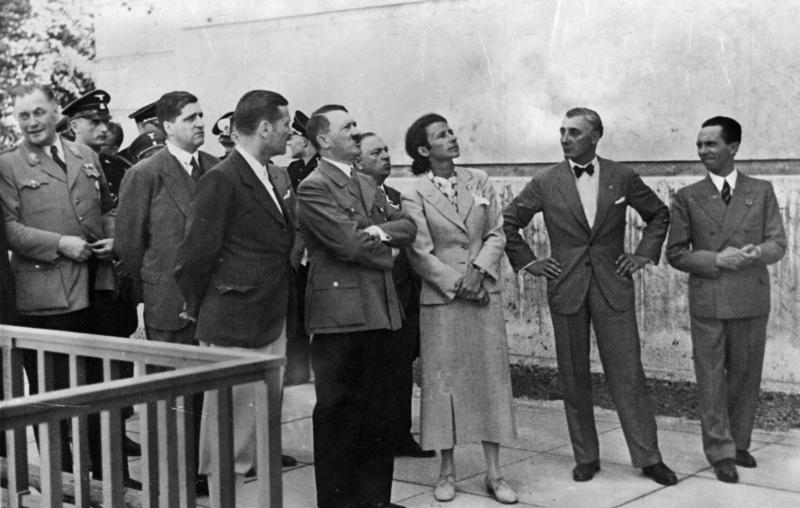
In 1937 Die Ausstellung “Entartete Kunst” (The Degenerate Art Exhibition) was organised by Hitler’s favourite artist  Adolf Ziegler a member of the Nazi Party since the 1920’s.

Besichtigung des Hauses der Deutschen Kunst durch Adolf Hitler. Daneben Frau Prof. Troost, Präsident der Akademie der Bildenden Künste Ziegler und Dr. Goebbels am 5.5.37. Hitler visits the House of German Art alongside Professor Troost, President of the Academy of Fine Arts. Ziegler is seen pictured wearing a bow tie and standing next to Goebbels. 5th May 1937. [Bundesarchiv, Bild, 183-1992-0410-546/CC-BY-Sa 3.0]
He became the foremost official painter of the Third Reich and had recently been appointed the President of the Prussian Academy of Arts.

Under the direction of Goebbels, Ziegler headed a five man commission that toured state collections in various German cities and seized over 5,200 art works deemed to be “degenerate”. The works were taken to Munich – the fervently pro-Nazi Bavarian capital to be installed at the Institute of Archaeology in the Hofgarten. This venue had been chosen especially for its rooms which were dark and narrow and provided the desired depressing atmosphere.

The Führer was the arbiter of what was considered “Modern” and on the eve of the exhibition opening, he had made a speech declaring “a merciless war” on cultural disintegration, describing the people who produced such art as “incompetents, madmen and cheats”

To further emphasise their distaste and disgust the organisers decided that many of the paintings were to be displayed without frames, hung at angles and partially covered or accompanied by derogatory slogans such as:

“An insult to German womanhood”

“Nature seen by sick minds”

“German farmers – a Yiddish view”

and as a reference to the museum and gallery directors loathed by the regime:

“Even museum bigwigs called this “the art of the German people”

The exhibition contained paintings, sculptures and prints by 112 primarily German artists and also works of art by Picasso, Chagall and Mondrian which had been confiscated by Ziegler and his cronies.

Some of the paintings had labels next to them detailing the amount of money a museum or gallery had spent to buy them. Prices were greatly exaggerated using costs based on the post WWI Weimar hyperinflation period where money had been devalued.  All of this was designed to promote the idea that “Modernism” was a conspiracy by people who hated German decency (without a hint of irony !) and that money would have been better spent providing citizens with food or essential services.

Die Ausstellung “Entartete Kunst” was timed to coincide with the “Grosse Deutsche Kunstausstellung” (Great German Art Exhibition) – a showcase of art by German artists approved by the Nazis. Over 2 million people had visited by the time it closed on 4th November 1937. By comparison “Grosse Deutsche Kunstausstellung” was viewed by half that number.

After Munich, it toured other cities such as Berlin, Leipzig, Düsseldorf,  Vienna and Salzburg where another 1 million people visited.

Children were denied entry to these exhibitions due to the perceived harmful and corruptive nature of the works of art.

After the exhibition had completed its tour of Germany and Austria, many of the paintings which had been seized were sold to foreign art dealers who were assured by the regime that the proceeds would be used to upgrade and replenish collections in Germany’s museums. This was not true and most of the money raised went to fund the massive increase of Germany’s armed forces and armaments. In 1939, the authorities burnt over 5,000 works of art that it could not sell.

Photographs contained in the Conway Library, and part of the Digitisation Programme are attributed to Drs Georg Swarenski, Alfred Scharf, Ernst Nathan, and Susanne Lang. They were all of Jewish faith or origin so at risk of dismissal from their jobs or worse.

Georg Swarzenski

Swarzenski had been appointed Director General of all the museums in the city of Frankfurt-am-Main in 1928 and was responsbile for purchasing works of art from many genres, some of which were seen as ‘degenerate’ when the Nazis came to power. In 1933 he was dismissed from his posts in public office but allowed to remain as a director of a private gallery. Five years later he was arrested by the Gestapo on the grounds that he had written an anti-authority article in a local newspaper.

He was set free without charge a short while later, but being Jewish, Swarzenski realised that he had become increasingly in danger and within a few weeks he and his family had emigrated to the U.S.A.  At the time of his death in 1957 he had been working as a Curator in the Medieval Arts department of Boston’s Fine Arts Museum.

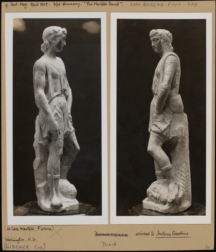
Two black and white photographs mounted on card, depicting two angles of “The Martelli David”. Burlington Magazine, April 1959. Pope Hennessy “The Martelli David” (ex Casa Martelli Florence). Washington N.G. (Widener Coll) David, ascribed to Antonio Rossellino. CON_B05578_F002_005, The Conway Library, The Courtauld Institute of Art, CC-BY-NC.

Alfred Scharf

Scharf was the son of the founder of the Goldring audio equipment company and studied art history and classical archaeology in Berlin before becoming a research assistant at the Kupferstichkabinett (Museum of Prints and Drawings) part of the Berlin State Museum. As a freelance writer of art history in the early 1930’s he had planned to write a dissertation on the Italian Renaissance painter Filipo Lippi at the University of Frankfurt, but his Jewish descent and the growing anti-Semitic attitudes in the country prevented him doing so. In May 1933, he emigrated to Britain where he worked as a freelance art expert.

He also lectured on 15th century Italian and 17th century Dutch/Flemish painting at the Courtauld and was a consultant at the Warburg Institute.

Due to his considerable reputation as an art historian, in 1940 the German authorities placed Scharf on Hitler’s Sonderfahndungsliste G.B. (Special Search List. Great Britain). In the event of a successful German occupation of Britain after the retreat of British forces from Dunkirk, he would be arrested and used as an advisor on which works of art and sculptures were worthy of looting and taking back to Germany to be added to the ever growing “collections” of Hermann Göring and other prominent Nazis. Scharf’s name was one of over 2,800 on the list.

He became a British citizen in 1946 and aspects of his life and work were featured in an episode of the BBC series “Fake or Fortune”.

Ernst Nathan

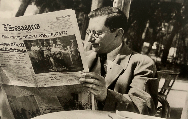
A black and white photograph of Ernest Nathan/Nash. Bildarchiv, “Ernest Nash”, Goethe Universität, Frankfurt-am-Main

Nathan was born in Potsdam Germany in 1898 to a Jewish family. He studied law and Roman history in Berlin and served in the German army during WWI, where he took up photography to relieve the boredom of being stationed on the Italian Front.

After the war he resumed his studies and by 1926 had set up his own legal practice in Berlin. In the mid 1930s, the rise of the Nazis started to make life difficult for Jews like Nathan and his membership of the Communist Party added to his problems. In 1936 he and his wife and children moved to Italy but by 1938 the rise of national socialism under Mussolini meant that they were unsafe in their adopted country so they moved again – this time to New York where he set up a photographic studio.

He decided to change his name to the less Germanic Ernest Nash and over the following years established a reputation as a portrait photographer taking pictures of amongst many others – jazz musician Benny Goodman and composer Benjamin Britten who had moved to the U.S.A. as a pacifist during WWII.

After the war, Ernest resumed his studies of Roman history and architecture, moved back to Italy and devoted his life to photographing and chronicling ancient Roman and Christian sites in Italy, North Africa and the Middle East. He died in Rome in 1974.

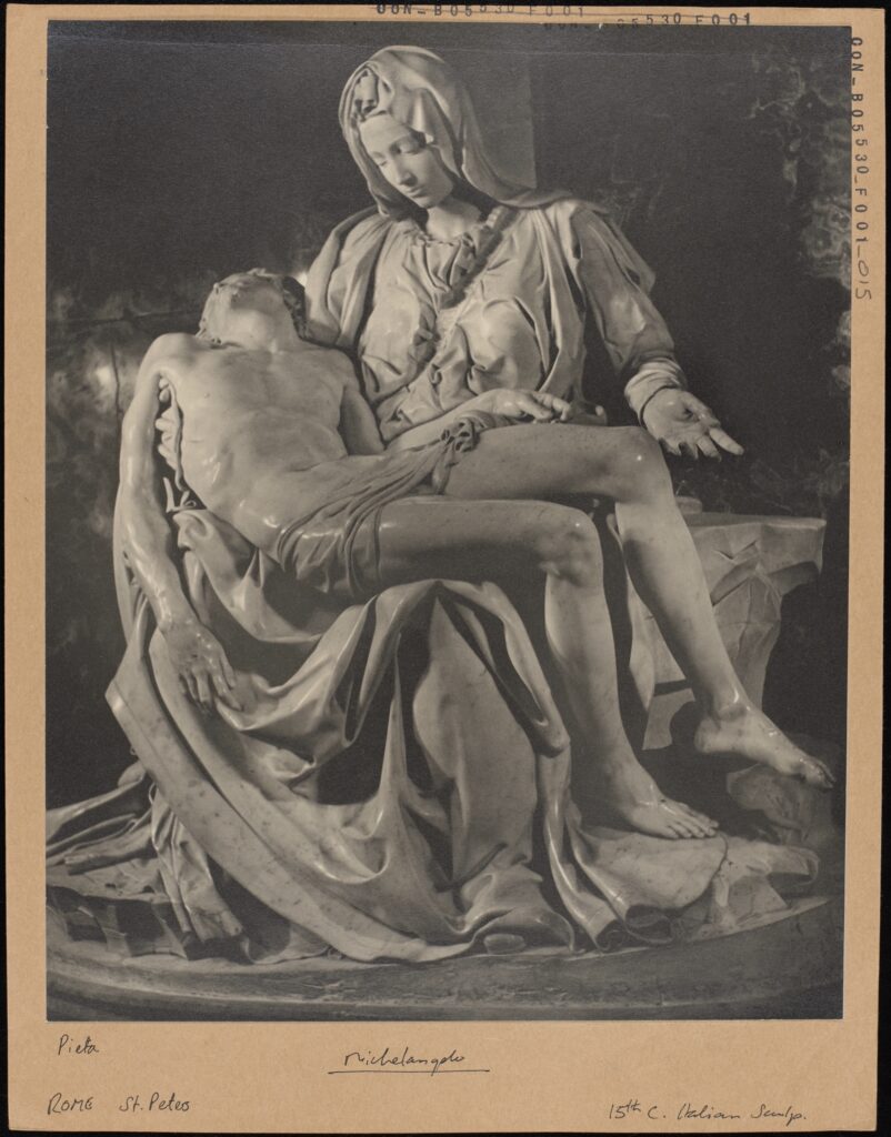
A black and white photograph mounted on card, depicting Michelangelo’s La Pietà. La Pietà. Michelangelo, Rome, St. Peters, 15th Century Italian Sculpture, CON_B05530_F001_015. The Courtauld Library, The Courtauld Institute of Art, CC-BY-CC.

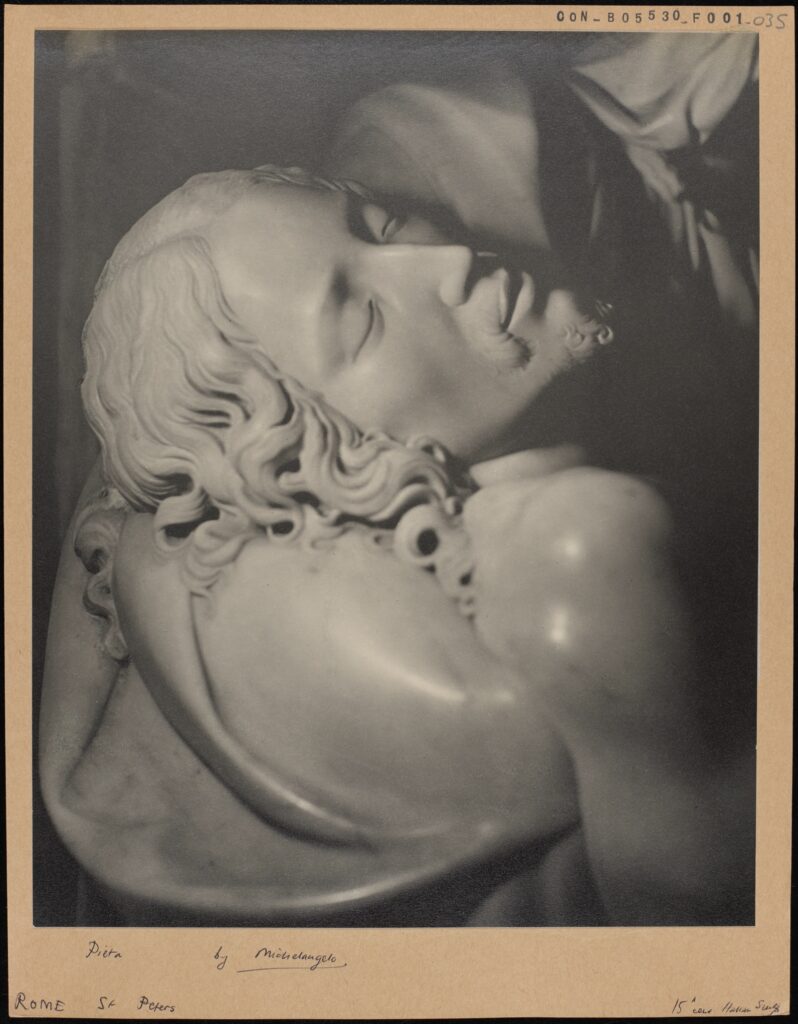
A black and white photograph mounted on card, depicting La Pietà, more specifically a detail of Jesus’ face. La Pietà Michelangelo Rome, St. Peters, 15th Century Italian Sculpture, CON_B05530_F001_035. The Courtauld Library, The Courtauld Institute of Art, CC-BY-CC.

Susanne Lang

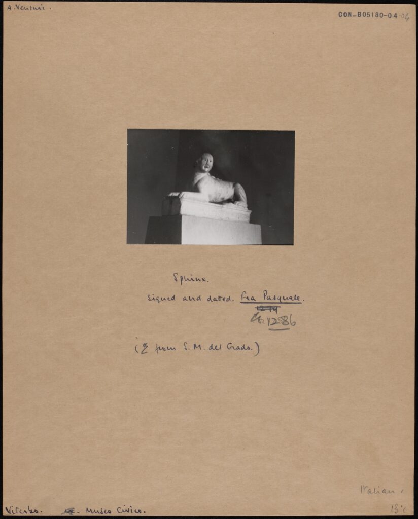
Lang was born in Vienna in 1907 and studied art history and ethnology at the Kunsthistorisches Institut. She graduated in 1931 and published her dissertation titled: “ Voraussetzungen und Entwicklung des Mittelalterlichen Städtebaus in Deutschland” (Determinants and Development of Medieval Urban Planning in Germany).

A black and white photograph mounted on card, depicting a stone sphinx. A. Neuturi. Sphinx signed and dated Fra. Pasquale 1286 (from S.M. del Grado) Museo Civico CON_B05180_004_004. The Conway Library, The Courtauld Institute of Art, CC-BY-NC

Lang was Jewish by birth and after the 1938 Anschluss when Nazi Germany annexed Austria she suffered persecution and exclusion because of her religion. She emigrated to England and formed a professional relationship with German art historian Nikolaus Pevsner. Although he had also been born Jewish, he had converted to Lutheranism at a young age, but had been forced to flee Germany due to the Nazi race laws.

They worked together on many books and during her time in London Susanne Lang worked closely with art historians and fellow academics at the Courtauld and Warburg Institutes. She retired to live in Israel and died in 1995.

So, four people whose photographs ended up in the Conway Library and whose lives were affected and changed forever by political upheaval beyond their control. There is however a twist in this story relating to another Dr whose photographs are also in the Conway Library.

Dr. Moritz Julius Binder

Binder was born in Stuttgart in 1877. He studied music at the Vienna Conservatory and then art history in Berlin.

In 1912 he became an employee of the Berlin Arsenal a Baroque style building erected in the early 18th century and which served as an armoury for the Brandenburg-Prussian Army and later as a museum.

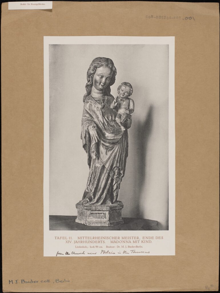
A black and white photograph mounted on card, depicting a wooden sculpture of the Madonna and Child. Tafel II MITTLERHEINISCHER-MEISTER. ENDE DES XIV JAHRHUNDERTS. MADONNA MIT KIND Lindenholz, hoch 99cm. Besitzer: Dr M.J. Binder – Berlin. from the Church near Ostein in the Taunus. MJ Binder coll, Berlin CON_B05284_F002_001 The Conway Library, The Courtauld Institute of Art, CC-BY-NC

He was appointed as the Director in 1913 – a post he held for twenty years until he was dismissed under the new Nazi law aimed at ‘restoring professional civil service’ It was essentially a means of getting rid of people of Jewish or other ethic origins or those whose political views and actions were at odds with those of the National Socialists. There is no evidence that Binder was Jewish but his museum policies were criticised by far right circles, most likely due his buying and displaying what was viewed as ‘Degenerate Art”.

Reichsmarshall Hermann Göring was one of the most powerful members of Hitler’s regime and the man who instigated the policy of eliminating Jews from German economic and social life. He was also an avid ‘amateur’ art collector who became a professional looter of art from countries invaded and conquered by the Nazis before and during WWII.

During his time as a museum director, Binder had become a close friend of influential German publisher Dr Helmut Küpper and his wife, the Russian artist Paraskewe “Baika” Bereskine. “Baika” had painted the portraits of Hermann Göring’s first wife Carin who died in 1934 and his second wife Emmy and had become a favourite of the Reichsmarschall whose patronage was very useful to her.

By coincidence, Binder advised a Berlin art dealer who sold paintings to Göring. It was through this dealer Johannes Hinrichen and “Baika” Bereskine that Binder was introduced to Göring around 1935 and he is thought to have acted as a Consultant on which pieces of art were worth buying or stealing from the properties of people who had fled Germany or suffered worse fates at the hands of the regime.

In 1938 he was dismissed by Göring following disagreements about the authenticity of certain works of art and replaced by Walter Andrea Hofer. who became Director of Göring’s art collections. Hofer did not have the breadth of knowledge that his predecessor had so he often asked him for advice on what to buy or “steal”. During the war Mauritz Binder left Berlin to avoid Allied bombing raids and moved to live in the countryside. He died in January 1947.

Swarenski, Scharf, Nathan and Lang may or may not have known each other but they are all linked by their religious and cultural beliefs which brought persecution and danger to their lives. Binder on the other hand, either through choice or as an act of self preservation actively assisted the main perpetrators of their persecution by identifying works of art, some of which would have been in the private collections of Jews or Communist sympathisers which were then ‘stolen’. Most of these artworks were either not recovered or returned to their owners or families so Binder and others bore a great deal of responsibility.

Five individuals connected by chance and coincidence and thanks to the Digitisation Programme we are able to preserve some (at least) of their work and legacy where it was once at risk of being erased.

John Hurst

Digitisation Volunteer,  July 2023

Yolanda Huang: Changing Space and Visuality – Norwegian Churches from the 11th to 20th Century in the Eyes of Anthony Kersting

Is it a temple? Or a pagoda? When my partner and I were digitizing a section of Anthony Kersting’s photos taken in Norway, we were amazed, but then struggled to associate this unique-looking wooden building (fig. 1) with part of the Norwegian architectural tradition. Later research demonstrates that it was one of the stave churches — its name deriving from the pine tree trunks used to construct the building — constituting a part of the great cultural heritages of Norway and the rest of the world. A search into the Kersting archive for photos of similar churches, however, introduced me to a series of churches Kersting visited during his trip to Norway, each distinct in style and history. Fascinated by the contrasting designs of the churches, I wish to peek into the changing devotional experience in Norway using Kersting’s photos and the broader collection of the Conway Library on Norwegian ecclesiastical architecture.
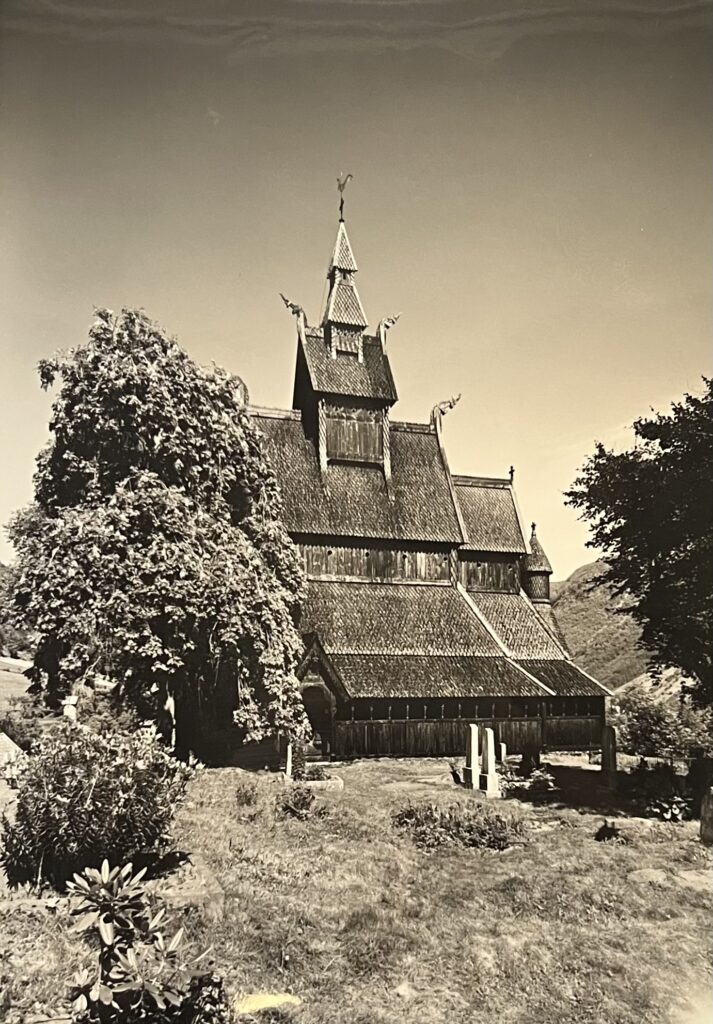
Fig. 1: A black and white photograph depicting the Stave Church at Vik. The church appears to comprise of a single nave with a raised roof, which is topped with a bell tower and culminates in a smaller, pyramidal tower. The church is built and ornamented in dark wood. The points of the roofs extend out into dragon shaped wooden carvings. A rounded turret is visible on right side of the photograph. On the ground floor, a small entrance is visible within a simple wooden porch. The left half of the church is obscured by trees and surrounded by grass and vegetation, and a small number of white headstones can be seen in the graveyard outside.
[KER_PNT_ H16811, The Stave Church at Vik, on the Bogn Fjord. Attribution: Anthony Kersting. The Conway Library, The Courtauld Institute of Art, CC-BY-NC]

Perhaps nothing better illustrates the contour of the history of religions in Norway than its churches — those disappeared, those still standing and those refurbished. While the polytheistic Norse religion filled people’s imagination of the spiritual world and their understanding of the natural world with stories of warring gods, since the 8th century gradual Christianization of the land began with converted Viking kings bringing their new religion home as they returned from England. King Olav Haraldsson — in particular, his death in 1030 CE — played a central role in Norway’s Catholic transformation. The alleged miracles associated with his tomb saw a massive number of conversions, his canonization and subsequent elevation into the patron saint of Norway, and the emergence of a cult of saints. Into the 16th century, Norway’s participation in the Reformation saw the royal family and the rest of the country breaking away from the Roman Catholic Church and converting to Lutheranism. Changes in the religious landscape of the country are reflected in the erection of new churches and the dismantling of old ones, as well as the adapted appearance of existing churches.

An adapted building not only reflects religious changes, but also calls for a closer examination of the devotional experience. As the ‘spatial turn ’prompted archaeologists to explore the interaction between landscape, building and material culture, Kate Giles theorizes the concept of visuality as “the social and cultural constructed-ness of vision” and the medieval way of seeing as a form of feeling… touching the object of vision” [1]. Giles’s work on pre-modern England provides valuable insight into studies on the surviving medieval churches in Norway, which, on top of demonstrating English influence, reflects regional interpretations of interactions between cultures and religions. Although Kersting did not document the evolution of one particular parish church, the geographical range of his photos allows one to appreciate the diverse religious architecture in Norway and to reimagine people’s unique memory of these transforming spaces. Many personal accounts of the churches were lost or yet to be told, but photos open a window for us to listen to the voices embedded in woods and stones.


The Exterior: Style and Material

Browsing through the photographic collection often gives one the opportunity to see buildings of contrasting styles juxtaposed with each other. In this case, Kersting’s trip to Norway captures the distinct architectural styles adopted by medieval and modern churches, which can be made more even apparent through collage (fig. 2).
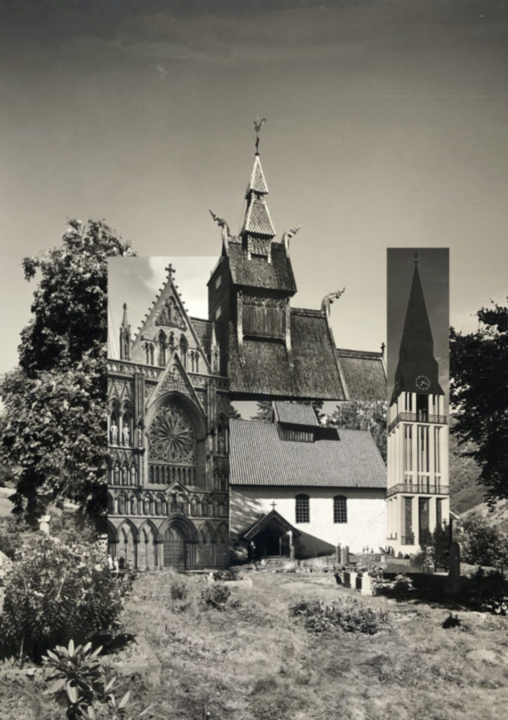

Fig. 2: Collage of parts of different churches on top of the image of the stave church at Vik, Yolanda (Yiyun) Huang, 2023.

From right to left: the Trondheim Cathedral [KER_PNT_ H19105. Attribution: Anthony Kersting. The Conway Library, The Courtauld Institute of Art, CC-BY-NC], the Kviteseid Old Church [KER_PNT_ G10336. Attribution: Anthony Kersting. The Conway Library, The Courtauld Institute of Art, CC-BY-NC] and the bell tower of the Cathedral at Molde [KER_PNT_ H13157. The Conway Library, The Courtauld Institute of Art, CC-BY-NC].


The Stave Church at Vik, built between 1130 and 1150, is one of the 28 remaining stave churches in Norway — scholars speculate that about 1000 more existed in earlier periods. While there has been no consensus on whether the stave churches represent a more indigenous style or were influenced by the English basilicas, they certainly draw visitors’ attention at first sight with their large, steep and multi-tiered pitched roofs connecting to the bell tower. Dated between the 12th to 14th centuries, the Trondheim Cathedral also features a sky-reaching bell tower in the center (fig. 3), but it displays extensive Romanesque and Gothic characteristics.
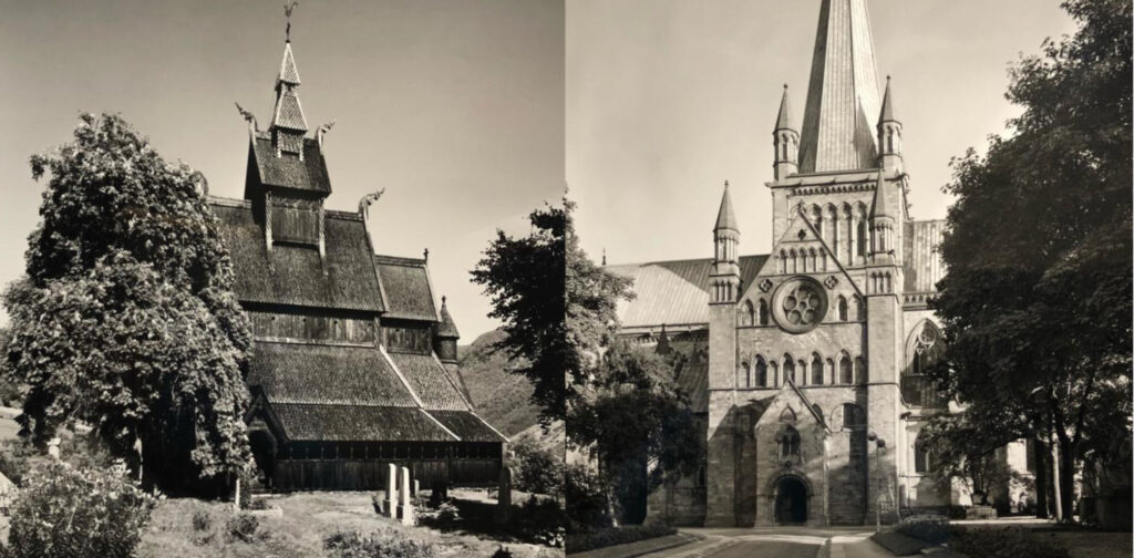
Fig. 3 Left: [See previous description of Fig.1]
[KER_PNT_ H16811, The Stave Church at Vik. Attribution: Anthony Kersting, The Conway Library, The Courtauld Institute of Art, CC-BY-NC]

Fig. 3 Right: A black and white photograph of the Trondheim Cathedral from the north. The photograph depicts a large cathedral, built in light stone. The architectural style is eclectic, encompassing both Romanesque and Gothic elements. The construction of the church is relatively simple, a nave with a bell tower extends upwards above a central entrance. Though not excessive, the ornamentation is significant. There is a curved tympanum above the entrance, which itself is set into a pointed porch. There are rows of stone windows only in the central section of the façade, which is flanked by two buttresses with simple, pointed pinnacles. There is a circular rose window set just below the point of the porch. The bell tower continues this ornamentation, also flanked by two pinnacles and culminating in a hexagonal point. A road leads to the cathedral, which is surrounded by trees.
[KER_PNT_ H13177, The Trondheim Cathedral, from the north. Attribution: Anthony Kersting, The Conway Library, The Courtauld Institute of Art, CC-BY-NC]


Dated to a similar period of the late 12th century, the Kviteseid Old Church in Telemark, however, is built in a Romanesque long church design typical of many among the 159 preserved medieval stone churches in Norway. The church at Molde also adopts a long church basilica design, but it demonstrates striking characteristics of a modern and functionalist style in the 1950s, with a detached bell tower (fig. 4).
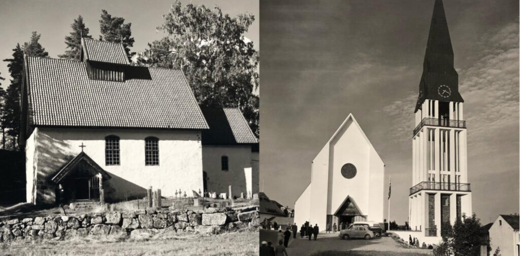
Fig. 4 Left: A black and white photograph depicting the exterior of the Kviteseid Old Church at Telemark. The church’s façade is simple, white stone, and the church comprises of two main parts: the main building, with a single nave, raised roof and porch, and a smaller choir section to the right. The roof is decorated with light tiles, and at the points there are miniature decorative pinnacles. On the main façade, there are two arched windows to the right of the entrance porch. The porch has a pointed roof, with a crucifix atop the point. There are a set of stone steps leading to the entrance door, which is flanked by carved wooden columns. The choir is decorated in a similar fashion, with a single small window and door. The church grounds are quiet, with trees behind and a small graveyard in front, from which numerous gravestones and crosses can be seen. The church is bordered with a rustic stone wall.
[KER_PNT_ G10336, The Kviteseid Old Church, in Telemark. Attribution: Anthony Kersting, The Conway Library, The Courtauld Institute of Art, CC-BY-NC]

Fig. 4 Right: A black and white photograph depicting the Modern Church at Molde. There are two main buildings in the centre of the photograph, the main body of the church and a free standing bell tower to the right. There are also visible smaller buildings on either side. The main church building contains no ornamentation, and is a simple double nave church built in flat white stone. There is a dark, circular window in the centre of the façade, and a small, pointed entrance on the ground floor. This is where the only decoration is, as the walls either side of the entrance are patterned with stripes, and the tympanum is a tessellated diamond pattern. The bell tower is built in white stone, excluding the roof, which is dark grey and culminates in a metal pinnacle. There is also a simple, white clock face on the roof, and the main body of the bell tower is hollow with a white stone exterior. The bottom floor mimics the white stone exterior with the recesses filled in with brick walls. The different levels are surrounded by metal railings which wrap around the entire tower. Two separate roads can be seen to lead to the church with a grass verge between them.
[KER_PNT_ H13157, The New Church at Molde. Attribution: Anthony Kersting, The Conway Library, The Courtauld Institute of Art, CC-BY-NC]


The differences in styles may be more closely observed in the doors (fig. 5). A semicircular structure, for example, can be seen in both the door of the Stave Church at Lom and the Trondheim Cathedral, but the former was much narrower and had an intricate wooden carving of pagan abstract animal images. As the main entrances to the church, the doors — with their form and carving designed to convey meaning — guard the sacred space behind them, differentiating while connecting the inside to the mortal world.
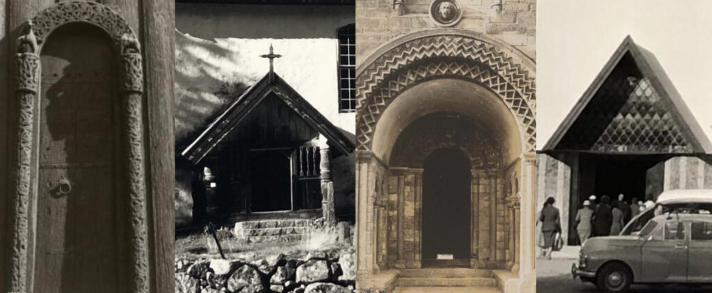

Fig. 5: From left to right: The first door is a simple curved arch. The columns supporting the arch as well as the arch itself are made of ornate carved wood. The second door is a pointed church porch topped with a crucifix. The entrance is flanked by stone columns and a small set of stone steps. The third door is a more extravagant curved arch which is layered and decorated with a zigzag pattern. The final door is another porch, but is more modern, decorated with a tessellating diamond pattern under its gable roof, and with large striped columns to either side. [Detail of the doors of the Stave Church at Lom, the Kviteseid Old Church, the Trondheim Cathedral, and the Church at Molde]

Similarities in architectural style aside, it is the primary building material employed that further distinguishes the churches and people’s experience in the spaces from each other. The stave churches stood out because of their use of wood trunks, reflecting resources and skills inherited from the Viking ship-building tradition. Breathing in the scent of tarred wood and observing darkened wood as it changes color in time, one wonders whether the stave churches give visitors a uniquely soft, personal and sensory-rich experience to which the white stone churches of the same period could not compare. The major shift from wood to stone did not happen until the 16th century [2]. White remains the dominant color of many later churches, but modern churches like the one at Molde used concrete and plastered surfaces, giving a very different material feel to the aged white stone walls of the Kviteseid Old Church (fig. 6 and 7).
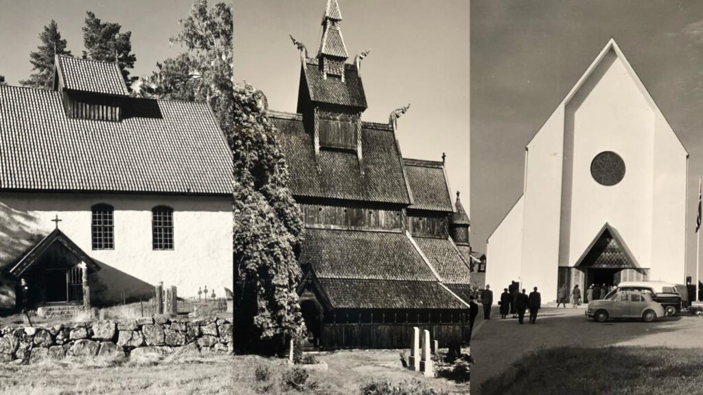
Fig. 6 Left: [See description for Fig. 4 Left]
[KER_PNT_ G10336The Kviteseid Old Church, in Telemark. Attribution: Anthony Kersting, The Conway Library, The Courtauld Institute of Art, CC-BY-NC]

Fig. 6 Centre: [See description for Fig. 1]
[KER_PNT_ H16811, The Stave Church at Vik, on the Bogn Fjord. Attribution: Anthony Kersting. The Conway Library, The Courtauld Institute of Art, CC-BY-NC]

Fig. 6 Left: [See description for Fig. 4 Right]
[KER_PNT_ H13157, The New Church at Molde. Attribution: Anthony Kersting, The Conway Library, The Courtauld Institute of Art, CC-BY-NC]
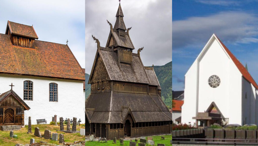
 

Fig. 7: From left to right: Recent full color photos of the Kviteseid Old Church, the stave church at Vik, and the Church at Molde.


The Interior: Space, Light and Decoration

The change in the use of building materials is part of the trend of “dark, small and cold churches being replaced by bright, big and warm churches.” The expanding woship space is clearly reflected in Kersting’s photos (fig. 8). The left shows the interior of the Kinsarvik Old Church in the Hardanger and the stave church at Vik, respectively seating about 240 and 350 people. The right shows the Trondheim Cathedral and the Cathedral at Bodo, respectively seating about 1850 and 850 people. The majesty of the Trondheim Cathedral can be explained by its nature as a pilgrim site and venue for the consecration of new kings, but the scale of the Cathedral at Bodo has become conventional for churches (re)built in the 20th century.
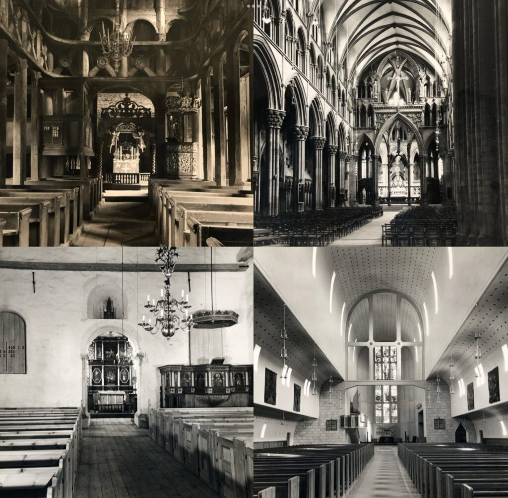
Fig. 8 Upper Left: A black and white photograph depicting the interior of the Stave Church at Lom. The interior is made entirely of wood, and comprises of a central nave with a raised roof supported by wooden beams. There are two visible aisles to either side of the photograph, which are set behind loggias punctuated by thin, wooden beam columns. Above this, there is an open gallery, with wooden balustrades decorated with large decorative diagonal crosses. The gallery is also punctuated with columns, though these are rounded and not unlike doric columns, joined together by arches. Hanging from the centre of the ceiling is a chandelier, and behind it the chancel screen is visible. Beyond the screen, an ornate carved portal arches over the altar, and carved angels flank a painting on the altarpiece. The altarpiece is surrounded by a small, decorative balustrade. A heavily decorated pulpit is visible to the right of the photograph, and there are two rows of wooden pews filling the central floor space.
[KER_PNT_ H16796, The Interior of the Stave Church at Lom. Attribution: Anthony Kersting, The Conway Library, The Courtauld Institute of Art, CC-BY-NC]

Fig. 8 Upper Right: A black and white photograph depicting the interior of the Trondheim Cathedral. The interior is decorated in the Gothic style, and is heavily ornamented. The nave is very large, with aisles to either side enclosed in a richly ornamented loggia punctuated by Corinthian columns. These are further mirrored by smaller decorative Corinthian columns on the interior walls of the aisle, with pointed arches joining them together. The ceiling of the nave is also decorated by dark coloured ribbed vaulting, and the space is lit by thin, hanging lights. Towards the choir, there is a chancel screen taking the form of a large pointed archway flanked by two smaller copies. Above the central arch is a decorative entablature, which itself is topped with a statue of Christ on the cross. This is accompanied by two smaller statues, likely of saints, on either side. The rest of the chancel screen is made up of rows of smaller pointed arches. On the ground floor, there are rows of many individual chairs which stretch back of the threshold of the nave. 
[KER_PNT_H13190, Interior of the Trondheim Cathedral, Attribution: Anthony Kersting, The Conway Library, The Courtauld Institute of Art, CC-BY-NC]

Fig 8. Lower Right: A black and white photograph depicting the interior of the choir loft of the cathedral at Bodo. The ceiling is curved, with a raised central section spanning the entire space. There is minimal ornamentation, with light coloured concrete walls and a simple repeating dot pattern running down the centre of the ceiling. The interior walls are lined with dark coloured artworks and hanging metal lights in the modernist style. The floor is similarly plain, with rows of dark wooden pews. There is a modern chancel screen at the front of the choir, with brick walls either side. Behind there is a pulpit and altar, with a tall, narrow stained glass window on the back wall depicting the crucifixion.
[KER_PNT_H13205, Interior of the Cathedral at Bodo. Attribution: Anthony Kersting, The Conway Library, The Courtauld Institute of Art, CC-BY-NC]

Fig. 8 Lower Left: A black and white photograph depicting the interior of the Kinsarvik Old Church in the Hardanger. The space is open and light, with white stone walls with little decoration. There are three arched recesses in the walls, two larger arches on the left and right, and a smaller arch at the top centre. The larger recesses are covered by wooden covers, and the smaller at the top contains a miniature architectural model of a cathedral. Dark wooden beams span the perimeter of the walls. The floor is made of simple wooden planks, and there are numerous rows of wooden pews in the central space. There is a large, curved arch door beneath the smallest recess, through which a densely ornamented altar is visible, covered by a cloth, with two single candlesticks flanking a seven-branched candlestick at the centre. Behind this is an altarpiece, comprised of a selection of six religious paintings bordered by a carved wooden frame. Within the large central space there is a decorated wooden pulpit to the left, surrounded by painted wooden panels depicting various saints. Above the pulpit is a carved, octagonal ‘roof’ which appears to be suspended from the ceiling. Finally, a large metal chandelier hangs from the centre of the ceiling.
[KER_PNT_H20213, The interior of the Kinsarvik Old Church. Attribution: Anthony Kersting, The Conway Library, The Courtauld Institute of Art, CC-BY-NC]

Perhaps not obviously shown in the black and white prints, but a visit to the above churches definitely gives you a clear feeling of the differences in the amount of light shining in through the windows. The small, high-up windows in the medieval churches work to create a mysterious and contemplative atmosphere in line with the enclosed space decorated with stylized pagan figures, while the bright light shone through the elegant sweeping curves of the gothic windows renders an extra layer of holiness upon the nave and choir.

Meanwhile, it is often necessary to point out individual characteristics of the lighting design in certain churches to better appreciate the unique local memory they carry. The Kinsarvik Old Church in the Hardanger, for example, evokes tourists’ curiosity with its high-up windows on the west gable (fig. 9). In this case, instead of illuminating religious figures and spaces, the position and size of the windows seem to be more closely connected to the church attic up to which they lead — the attic was used to store ships sails and masts during the winter [3].
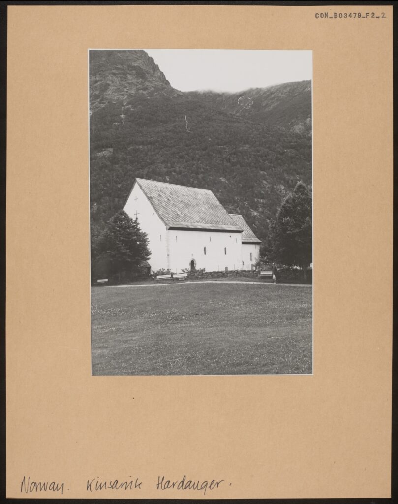
Fig. 9: A black and white photograph mounted on card depicting the Kinsarvik Old Church at a distance. The church is a brilliant white, with a simple stone façade that contrasts against the dark trees and mountains behind the building. The gable roofs of the main church building and smaller choir are tiled in a diagonal striped pattern. The façade of the front gable is similarly plain, with a single small window and two crucifixes visible. On the other façade, two slightly larger windows are visible, as well as a simple arched doorway. The church is surrounded by a rustic stone wall, several trees, and benches. Beyond the church is a large lawn.
[CON_B03479_F002_002, The Kinsarvik Old Church in the Hardanger. Photographic print on mount. The Conway Library, The Courtauld Institute of Art, CC-BY-NC]


The new Church at Molde, rebuilt after the war, also features a special design: the windows on the right are much higher than those on the left, changing the symmetry of the building and the source of light (fig. 10).
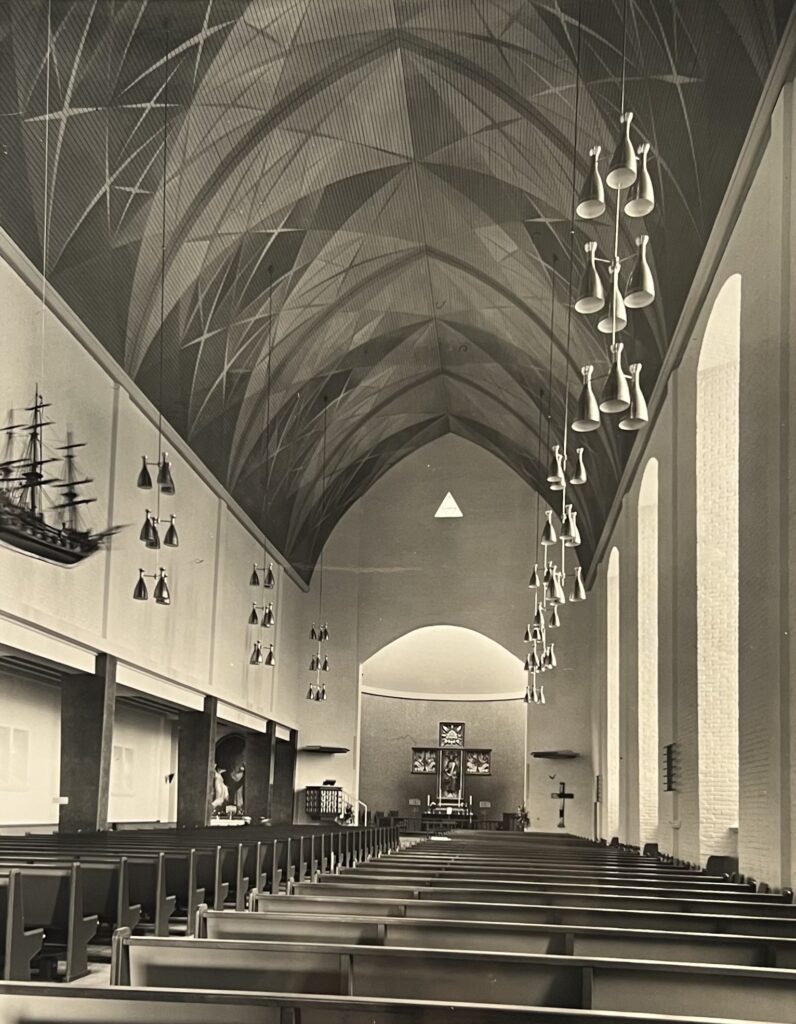
Fig. 10: A black and white photograph depicting the interior of the New Church at Molde. The nave ceiling forms a pointed arch, and is decorated with what appears to be a painted geometric pattern. Rows of metal light fittings hang from the ceiling along either side of the nave. On the left side, there also appears to be a wooden model of a ship hanging from the ceiling. The interior walls are simple, painted white, with an aisle on the left side of the composition. Dark coloured modernist columns punctuate the aisle, and a glimpse of a painting can be seen at the far end of the aisle space. To the right, the wall is made of white brick, and lined with three tall, narrow windows. There are many rows of dark wooden pews lined up on either side of the nave which extend to the pulpit and altar. On the left wall in front of the altar is a black and white patterned pulpit, and to the right is a simple crucifix. At the very back, there is a large altarpiece comprised of a central, rectangular portrait and three smaller square pieces, arranged into the shape of a cross. Directly above this, on the interior wall of the nave, there is a small, triangular window.
[KER_PNT_ H13159, The interior of the new Church at Molde. Attribution: Anthony Kersting, The Conway Library, The Courtauld Institute of Art, CC-BY-NC]


The amount of light dims or illuminates the faces and figures drawn or carved onto the walls and columns of the church. While each church discussed above has its interior decorated with rich human, animal and divine figures, I wish to especially draw attention to the two figures of angels.

The first is a painting on the north wall of the Kinsarvik Old Church, depicting a devil beneath the archangel Michael. The second shows a part of the painting ‘Easter Morning’ by the Norwegian Artist Axel Ender, in which an angel raised the arm to guard Christ’s empty tomb (Fig. 11).
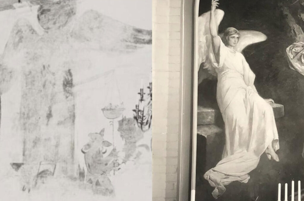

Fig. 11 Left: A black and white photograph depicting a wall painting of the devil and the archangel Michael. The figure of the devil is significantly smaller than that of Michael, and is using a poker to attempt to tip his scales of judgement over to the side. The devil is depicted as animalistic, with large claws, with a smaller winged minion to his right. Archangel Michael is shown to tower over the devil, his wings outstretched and consuming almost the entire wall. The painting shows signs of extensive damage or weathering, and much of its detail has been lost.
[CON_B03479_F002_006, Painting on the North Wall of the Kinsarvik Old Church. Photographic print on mount. The Conway Library, The Courtauld Institute of Art, CC-BY-NC]

Fig. 11 Right: A black and white photograph depicting a painting of an angel guarding Christ’s tomb on Easter Morning. The angel is depicting sitting on some steps, dressed in white with full white feathered wings. She holds one hand aloft, looking outwards to the exit of the tomb.
[KER_PNT_ H13160, the painting “Easter Morning,” now forming the altarpiece of the north aisle of the new Church at Molde. Attribution: Anthony Kersting. The Conway Library, The Courtauld Institute of Art, CC-BY-NC]

Both forming an eye-catching and dominating presence on their respective walls, the figures of angels demonstrate very different initiatives from the artists and evoked distinct memories of modern-day church-goers. With its informal, monochrome style, the archangel Michael and a devil painting could represent a familial or personal effort to transcribe their religious identity into something visible and tangible. The presence of a devil trying to tip the scale of the soul inside a devotional space could be disturbing to medieval and modern audiences alike, but the figure of Michael towering over the devil might as well offer a sense of protection against evil.

On the other hand, “Easter Morning” was originally in the old Church of Molde destroyed during the Second World War. The fact that this particular painting had been previously removed for safekeeping and now forms the altarpiece of the north aisle of the new church creates a precious sense of continuity between the modern church and its disappeared predecessor, while further strengthening the new church as a symbol of security, hope and new direction.


The Environment: Changing Space and Use of Space

As the history behind the rebuilt church of Molde suggests, images of churches often give the viewer a false impression of an unchanging religious and cultural symbol standing against the erosion of time. The reality, in fact, is that many of the churches discussed above underwent destruction, reconstruction and adaptation. So instead of capturing their timeless beauty, photos actually encourage us to explore the ever-changing appearance and cultural significance of the churches to the locality.

Being a manifestation of the Norwegian cultural identity that combines Christian and Viking themes, the stave church at Lom was constructed in the 13th century but has a 17th-century addition of transept and sacristy — re-adapted to fit a new form of Christianity in the radical transformation to Lutheranism. Similarly, in the stave church at Vik survived an altar screen and chapel — a later addition depicting the nativity of Jesus in an English/French style (fig. 12). In addition to the Lutheran re-adaptation, the difficulty of preserving wood means that the remaining stave churches more or less underwent rebuilding — something one can look for in the lighter-colored, thus newer, wooden walls.
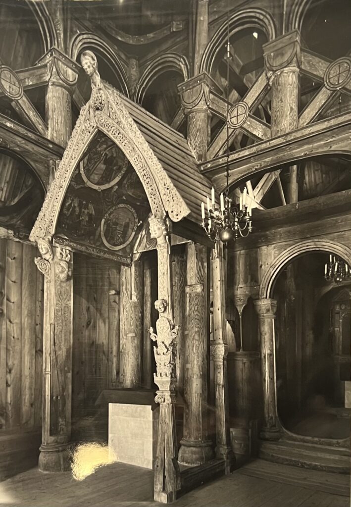
Fig. 12: A black and white photograph depicting one of the altars at the Stave Church at Vik, contained underneath a wooden portal. The portal comprised of a curved archivolt standing on four wooden legs, and its roof contains many ornate carvings, with filigree-like patterns about the archway to the front. It is further decorated with carved icons, one on each of the wooden legs, and a larger one at the point of the arch. The interior of its roof is painted with a selection of religious scenes. Underneath the portal, there is a white stone altar covered with black cloth. A curved doorway is visible to the right of the photograph, and this too is carved wood with smooth wooden columns. The rest of the wall, which stretches behind the portal, is punctuated with a row of small arched windows. A gallery is visible above the door and portal, and is enclosed behind a broad balustrade and large columns. A metal chandelier hangs from the ceiling in the centre.
[KER_PNT_ H16812, One of the wooden altars in the Stave Church at Vik. Attribution: Anthony Kersting. The Conway Library, The Courtauld Institute of Art, CC-BY-NC]

Standing at the center of the traditional pilgrim destination, the majestic Trondheim Cathedral in fact witnessed numerous additions and renovations since its established and into the 2000s. Kersting managed to capture one moment of reconstruction work on the never-completed west front, with a temporary modern structure concealing the work to be done. An earlier photo from the Conway Library gives us another look of the west front before the new figures of saints and kings in the niches were installed (fig. 13).
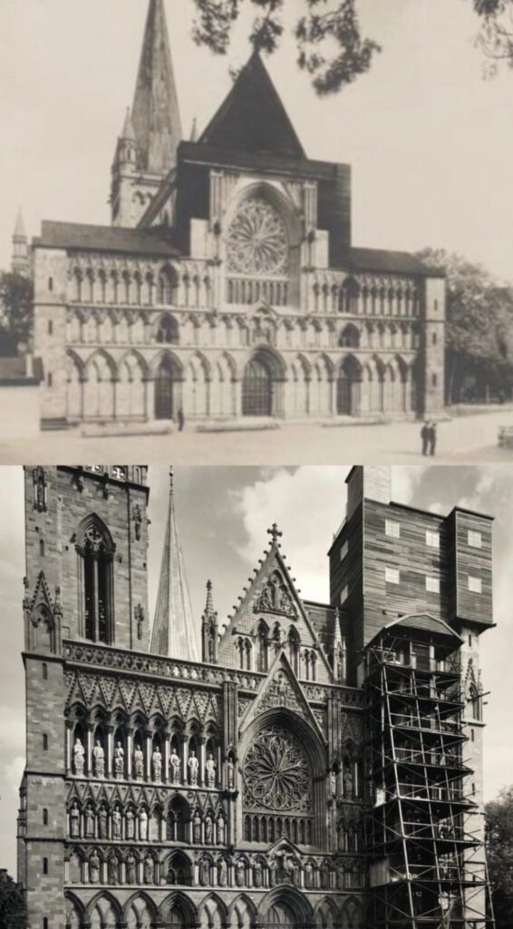
Fig. 13 Top: A black and white photograph depicting the west front of the Trondheim Cathedral. The façade is built in the Gothic style, with a large rectangular section on the ground floor which is decorated with rows of arched recesses. In the future, these recesses will come to house a multitude of sculptures of various figures, but in this photograph they are empty. The rectangular section of the façade is split into three main parts: a strip of narrow, pointed recesses at the top, rows of shorter recesses in the centre with clover shaped arches, and much wider pointed arches along the ground floor. On each section, there are two windows, apart from the ground floor, which has three doors. At the top of this rectangular section, in the centre there is a large stained glass rose window, with a row of smaller, narrow arched windows underneath. Surrounding the rose window is a square, dark wood structure which mimics the tiles on the roof of the west façade. This, in turn, is topped with a large dark wood pyramid. Beyond the façade, a large pointed bell tower is visible, which culminates in a metal crucifix.
[CON_B03484_F001_001, Trondheim Cathedral, West Front: General views before restoration. The Conway Library, The Courtauld Institute of Art, CC-BY-NC]

Fig. 13 Bottom: A black and white photograph depicting the west front of the Trondheim Cathedral. There is a large amount of scaffolding about the cathedral’s right side, where a simple, square wooden structure has been built over a tower to the right of the composition. This structure is built with wooden planks, giving it a striped appearance. There is another tower to the left, built in the Gothic style, with square flat roof with pinnacles at each corner. The roof also possesses a decorative balustrade with a clover pattern. Set into the tower is a tall, narrow arched window. In the centre of the façade there is a pointed gable with a decorative relief, this too is ornamented with pinnacles and a row of smaller arched recesses. The central façade of the cathedral is richly ornamented, with rows of sculptures of various figures set into arched recesses in the wall. There are minimal visible windows, with most of the space being occupied by these sculptures. In the very centre of the facade, there is a large stained glass rose window, with a row of narrow arched windows underneath, topped with another gable decorated with a carved relief.
[KER_PNT_ H19105, The West Front of the Trondheim Cathedral. Attribution: Anthony Kersting. The Conway Library, The Courtauld Institute of Art, CC-BY-NC]


Changes happened in the exterior and interior of the churches but also in the ways people use these spaces. A few medieval churches such as the Kinsarvik Old Church remain close to the public but continue to host sacred concerts and events. Yet most stave churches have become tourist sites with little or no religious activities. The shift in the nature of the space reminds one to think about the changing relationship between the building and its surrounding — the physical world and the people who live in it.
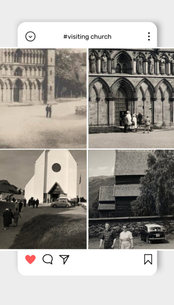

Fig. 14 Instagram post of details of visitors going in and out of the churches in previous figures.

Many Norwegian churches were built in proximity to nature, making the surrounding environment and traveling to go to churches a central part of the medieval religious experience. The Kinsarvik Old Church was located at the junction of the fjord Hardangerfjord and the Sørfjorden, meaning that many locals would row their boats to attend church. Stave churches like the one in Vik are often located between mountains and rivers, speaking into the intricate wood carvings which drew inspiration from nature (fig. 15). In the present day, however, the natural environment — and the effort to go into the mountains — became an integral part of the tourists’ quest to find and visit the distant monument of ancient culture.
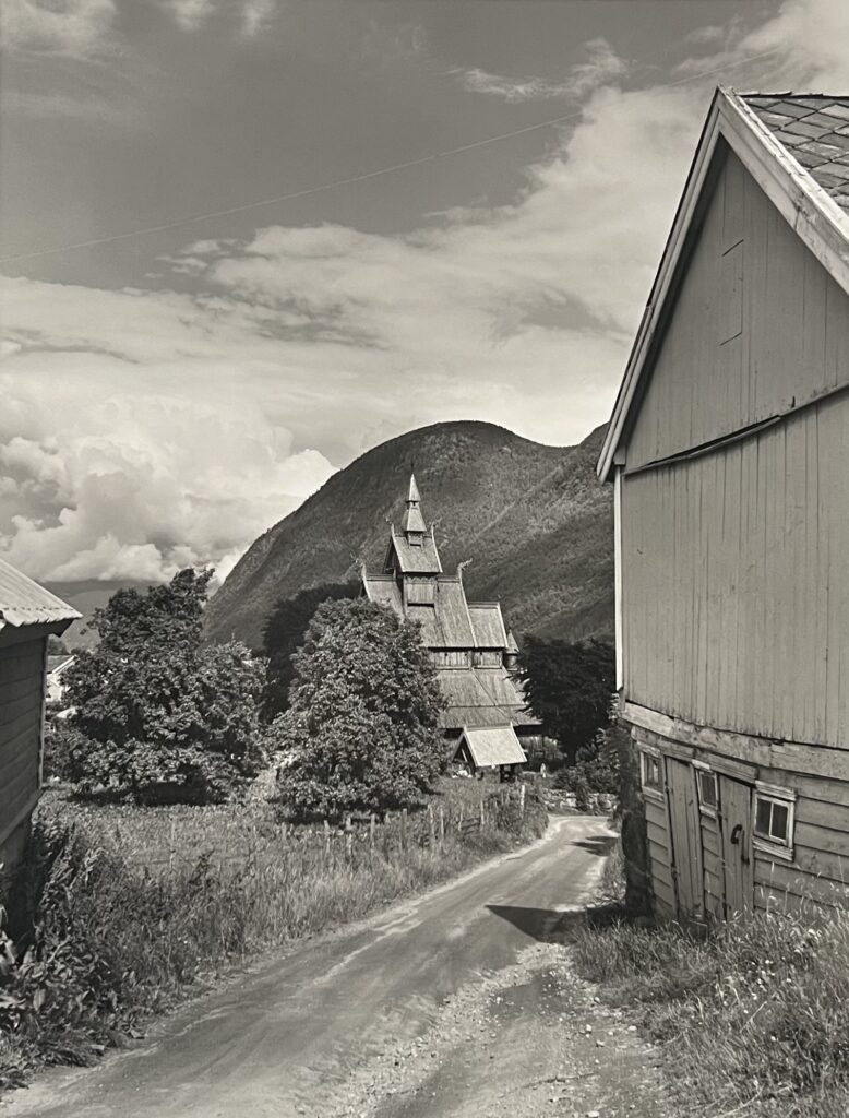

Fig. 15: A black and white photograph depicting the Hopperstad Stave Church at Vik from a distance, partially obscured on its left side by trees. Only the multilevel roof is visible, with a pyramidal bell tower at the apex, which attaches to a smaller gable at its base. The gable then sits atop the raised roof above the nave, which in turn connects to the main structure of the church. The points of the corners of the roof all extend out into small carved dragons. A smaller structure is seen in front of the church, which appears to be a hollow portal with a gable roof. In the distance, behind the church, a steep grassy mountain is visible. A small dirt road leads to the church, and the side of a simple wooden building can be seen to the right of the photograph. 
[KER_PNT_ G5534, The Hopperstad Stave Church at Vik. Attribution: Anthony Kersting. The Conway Library, The Courtauld Institute of Art, CC-BY-NC]

The wood is not only a source of ancient cultural inspiration, but also of anxiety about preservation and destruction. News in 1996 articulated the worries about the homegrown Satanist movement whose slogan was “Kill the Christians, burn their churches.” More than 20 stave churches were destroyed by arson in the early 1990s [4]. Entering the millennium, stave churches stood between the dilemma of preservation and tourism. The study conducted by the Stave Church Preservation Programme in 2015 shows that a door sill in one stave church was worn down by 0.50–1.50 mm during the year [5]. With different churches taking different scales of protective measures, the sacred, historical wood symbolic of Norwegian identity continues to be subject to the threat of disappearance.

Photos capture the building at one historical moment, but they encourage one to look beyond that moment. The changing space and visuality documented by Anthony Kersting and collection of the Conway Library allow us to explore the hidden narratives behind wood and concrete, reimagining people’s shifting devotional experience and memory in transformed architectures.


References

[1] Giles, K., ‘Seeing and Believing: Visuality and Space in Pre-Modern England’, World Archaeology, 39/1 (2001), pp. 105-121
[2] Cook, W. R.,‘Episode 11: The Stave Churches of Norway’, The World’s Greatest Churches (2014) [3] Emma, ‘Hidden Secrets at Historic Kinsarvik Church’, https://thehiddennorth.com/historic- kinsarvik-church/, written on November 11 2022, accessed on June 21 2023
[4] Caryl, C., ‘Staving Off the Devil’s Flames’, The Wall Street Journal Europe, (23 August 1996)
[5] Berg, F., ‘Wear and Tear of World Heritage: Preventive Conservation and Tourism in Norway’s Stave Churches,’ Studies in Conservation, (2018), pp. 320-322


Yolanda (Yiyun) Huang
Courtauld Connects Digitisation
Oxford University Micro-Internship
Participant
Christopher Williams: A Maritime Life-Story – The ‘Venus’ Who Rose From The Waves

Audio Version

Read by Christopher Williams

Text Version

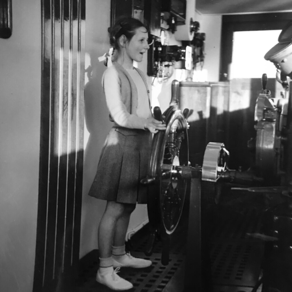
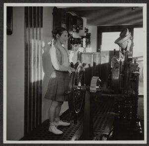
On Board Venus: Motor Vessel: Captain.
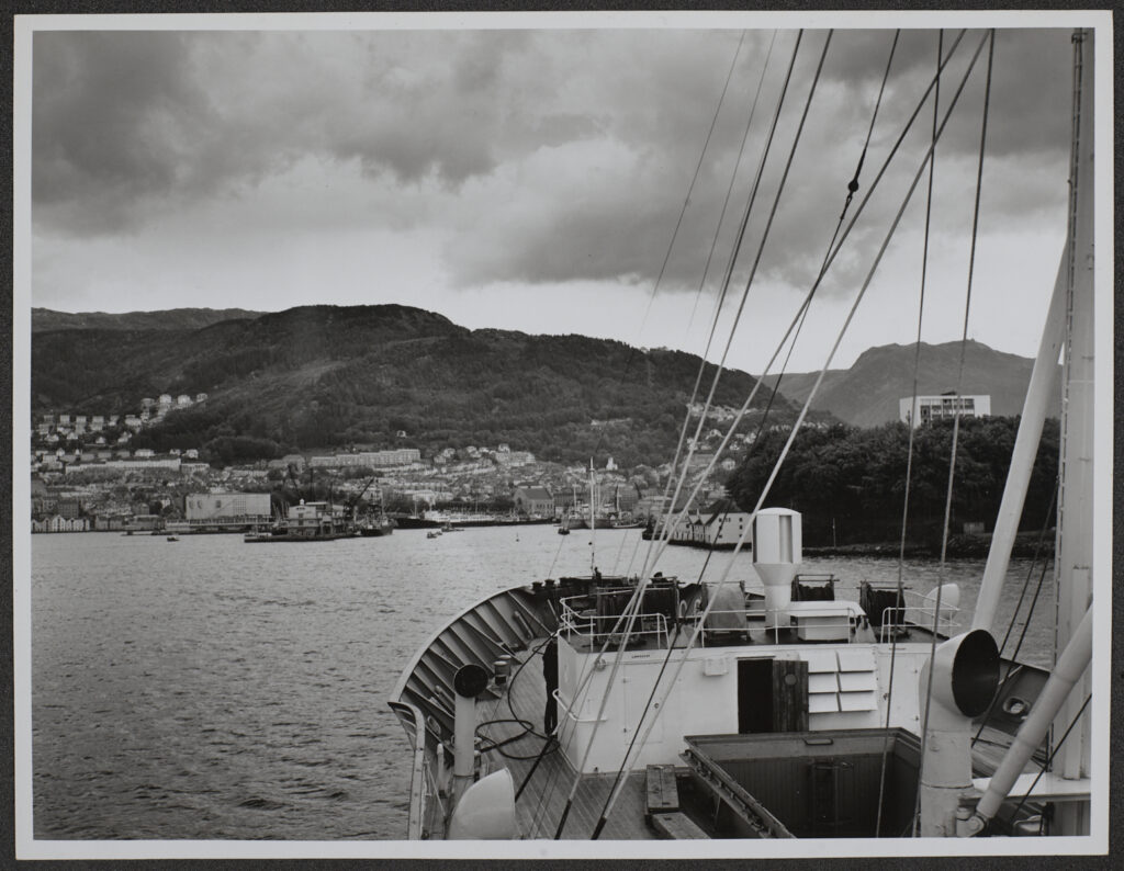
Image by Anthony Kersting. KER_PNT_N01525, The Courtauld, CC-BY-NC


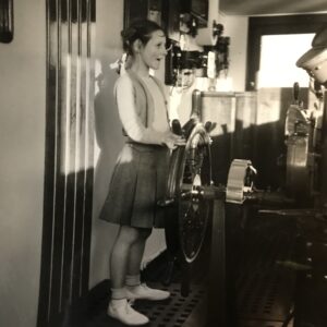
My fellow Digitisation Volunteer Richard True has described in two blog posts how he set about trying to identify the girl ‘Mary’ at the wheel of a passenger ship called ‘Venus’.

Mary features in a photograph taken by Anthony Kersting on a voyage from Southampton to Madeira in March 1953. 

The links to his blog posts are below – and he does track her down!

Kersting’s Visit to Madeira

Search for Kersting’s Mary Continues

My curiosity was piqued by Richard’s search: what is the story of the other ‘she’ in the photographs, namely, the ship herself? 

What a story it turned out to be:

  • a source of Norwegian national pride when she entered service in 1931, dubbed the ‘Queen of the North Sea’ and featuring royalty on her passenger lists;
  • requisitioned in WW2 by Nazi Germany and used to train U-boats in the Baltic;
  • sunk at Hamburg by allied bombers;
  • re-floated at the war’s end – Venus rises from  the waves!
  • repaired and returned to peacetime sailing;
  • running aground in a storm in Plymouth Sound and again rising from the waves!
  • in her most glorious hours, rescuing the crew of a stricken vessel in horrendous conditions in the North Sea, to international acclaim and as commemorated in oils by the eminent maritime artist Frank Mason.

This is her story…

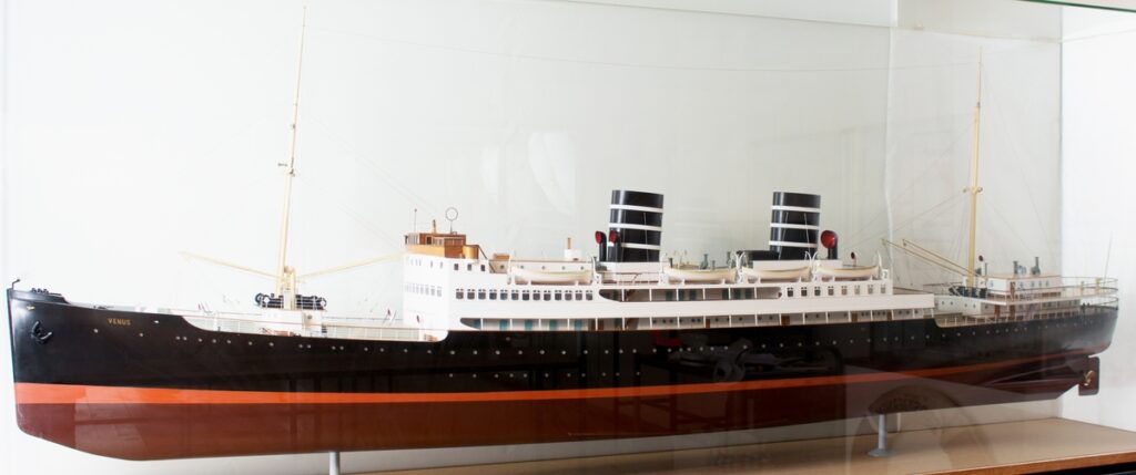
Display model of MS Venus as originally configured, 1930s. Photo: Bergens Sjøfartsmuseum

Built at Helsingør (Elsinor) in Denmark, MS Venus was owned by the Bergen Steamship Company (Norwegian: Bergenske Dampskibsselskab or BDS) – the company’s funnels were painted black with three widely spaced narrow white bands. She had a gross tonnage of 5407, a length of 398 ft and a beam of 54 ft; she was a twin-screw vessel powered by 2x Burmeister & Wain four-cycle, 10-cylinder diesels delivering a total of some 9,500 bhp, giving her a speed of 19.5 knots. The ship originally had cabins for 278 passengers. She cost NOK 5.2 million when delivered in April 1931 and was the most expensive ship BDS had owned to date.

On 30 April 1931, Venus went to Oslo to be presented to King Haakon VII and representatives of the Norwegian government and the Storting. The king raised a toast on behalf of the fatherland and believed that such a beautiful ship as Venus must be at the service of the whole country. A few days later, the Danish king stated after seeing the ship that there was only one fault with her; that she did not belong to a Danish shipping company. 

On 6 May 1931, she took her maiden voyage from Bergen to Newcastle. In the years leading up to WW2, she maintained a summer service along with another BDS ship of four round trips per week, with departures from Bergen at 11.00 on Mondays, Wednesdays, Thursdays and Saturdays, and from the purpose-built Tyne Commission Quay, North Shields, Newcastle at 19.30 on Mondays, Tuesdays, Thursdays and Saturdays. Queen Maud of Norway was a frequent passenger until her death in 1938 and other notable travellers included the Thai royal family in 1936.

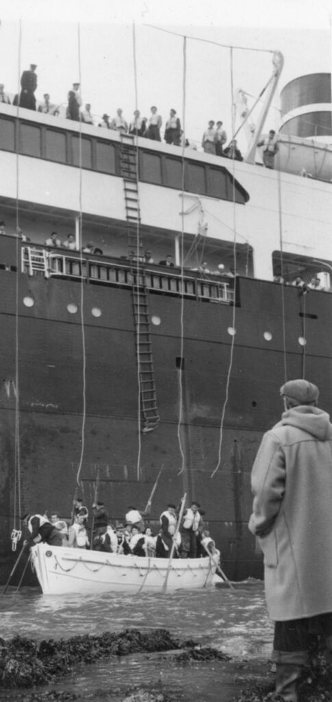
It was on one of these inter-war journeys that Venus had undoubtedly her finest moment.  Late at night on 19 January 1937, Venus was en route to Newcastle in a storm when an SOS was heard from the cargo vessel Trym, which was en route from Kirkenes to Middlesbrough. Venus went to assist and remained standing by Trym, with the winds increasing to hurricane force. First attempts at rescue were thwarted until early in the morning of the 21 January, Venus launched a lifeboat with 9 volunteers under the leadership of 2nd Mate Rolf Andreassen. With extra-ordinary bravery, Ordinary Seaman Perry Opsahl on the Trym jumped into the wild seas and swam to take a line to the lifeboat, allowing six of Trym‘s crew to be taken off and brought back to Venus. 

With conditions worsening and the Trym at risk of foundering, Captain Dreyer of the Venus manoeuvred close to Trym so that a line could be fired from the bow across to the Trym so that those still on board could be hauled over the wild seas to safety. All were saved. The success of this rescue made headlines across Europe. British newspapers referred to it as the most heroic rescue operation of the century and portrayed Captain Dreyer as a wise, calm and masterful Viking. 

 Venus received a great reception on return to Bergen – probably 25,000 people showed up. Opsal from Trym and those of the crew of Venus who had participated directly in the rescue operation were awarded the ‘medal for noble deeds’. First mate Brynjulf Bjarnir and nine crew members were awarded the King’s Medal of Merit in gold. Opsal also received a gift of NOK 10,000 from the city of Oslo. 

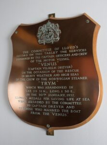
As well as these Norwegian awards, the committee of Lloyd’s in London commemorated the event with a bronze plaque and awarded medals for saving life at sea to Captain Dreyer and those who manned the boat from Venus. 

Lloyd’s Commemorative Plaque. Photo: Bergens Sjøfartsmuseum

Trym and Venus, painting by FH Mason, oil on canvas, 60cmx100cm – detail. Photo: Bergens Sjøfartsmuseum

 The rescue of the last crew members was depicted in a painting by Frank Henry Mason RBA, RI, RSMA (1875-1965), an English artist best known for his maritime, shipping, coastal and harbour paintings, and as a creator of art deco travel and railway posters. 

He had served in the Great War as a Lieutenant in the Royal Naval Volunteer Reserve – undoubtedly giving him a further insight into depicting maritime events. 

Lt Frank Henry Mason RNVR in WW1 – photo IWM collection

His painting Trym and Venus now hangs in Bergens Sjøfartsmuseum (Bergen Maritime Museum). Look closely and you can see a crewman from Trym being hauled across to Venus, suspended from the line running between the two ships.

Darker times lay ahead for Venus, however. Following the outbreak of World War 2 and the occupation of Norway by German forces, Venus was requisitioned by the Kriegsmarine and sailed to the Baltic Sea under the German flag, to be rebuilt at Neptunwerft in Rostock, where the interior was removed. The ship was then used as a training target by the 26th U-boat Flotilla, which trained newly commissioned U-boats in the firing of torpedoes. In 1945, as the Soviets advanced deeper into Eastern Europe, the flotilla relocated westwards. Finally, on 20 March 1945, Venus was bombed and sunk by Allied aircraft in Walterhofer Hafen near Hamburg. One bomb hit the aft hatch and another hit next to the ship, causing her to sink – though the water was so shallow that parts of her structure remained above the surface.

But her story did not end there.

In June 1945, it was decided that it would be possible, though expensive, to salvage her. This work took until early 1948 to complete; she was repaired and refitted in Helsingør, Aarhus and Copenhagen in Denmark and Landskrona in Sweden. 

A cargo hold on the ship was scrapped and passenger accommodation increased and a garage fitted out. After the conversion, the ship could take 143 passengers in 1st class, 257 in 2nd class and an additional 60 in a cheaper class aimed at groups of young travellers – totalling 460 passengers, against 278 passengers before the war. The bow, deckhouse and bridge were also modernised. The restoration cost around NOK 16 million. 

On 4 May 1948, she arrived back in Oslo to be displayed, where it was agreed that it was still right to call her the “Queen of the North Sea”. King Olaf of Norway said it had been a pleasure to have the MS Venus again “in her new, beautiful guise”. The next day, she sailed into Bergen, after visiting Stavanger and Haugesund. Six thousand people turned up on the quay to welcome her. The first trip to England after her restoration took place on 8 May 1948, sailing first to London then on to Newcastle before the return trip to Bergen. 

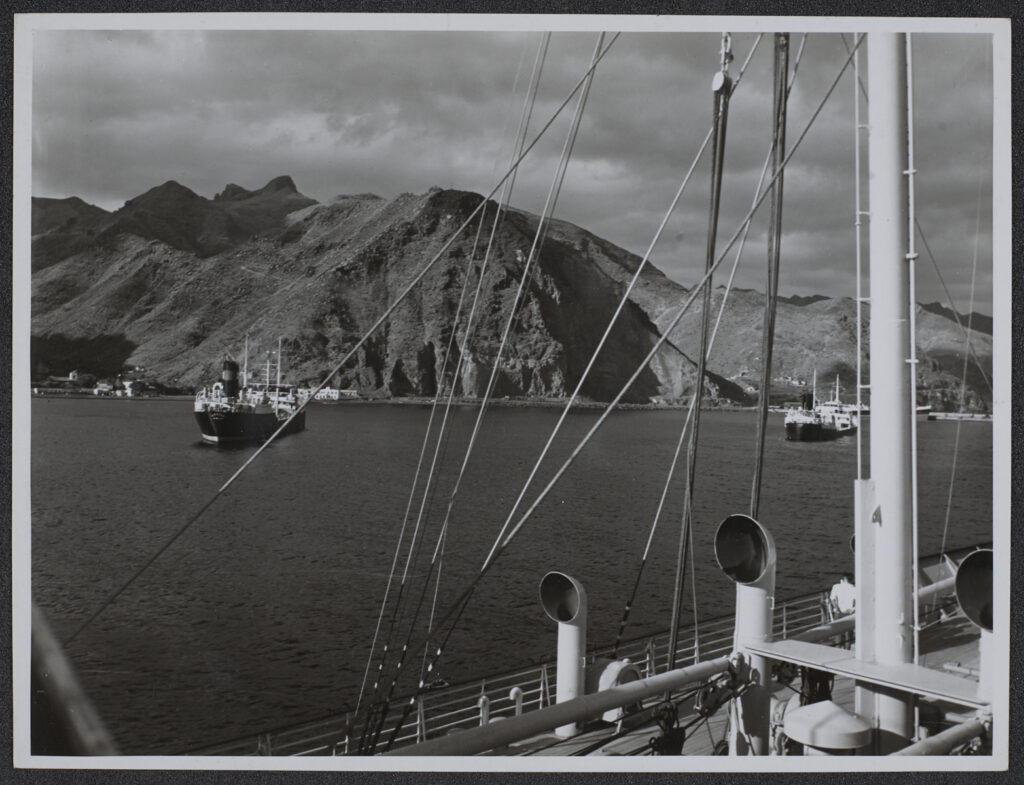
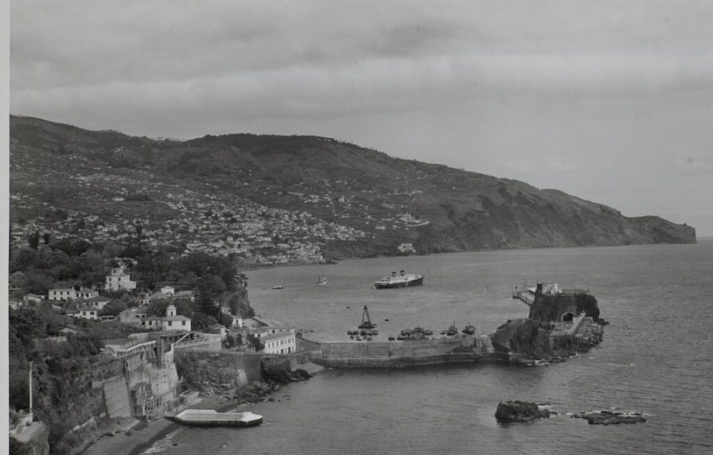
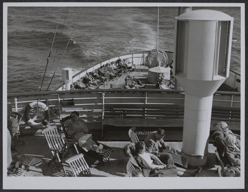
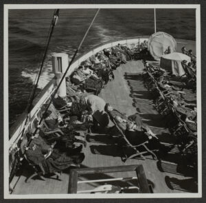
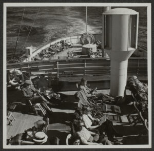
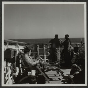
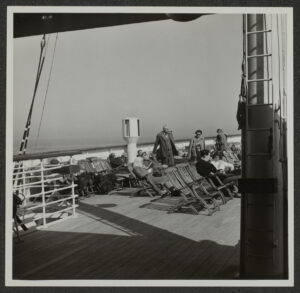
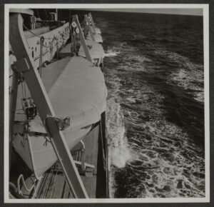
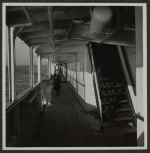
During the summer seasons, MS Venus continued to sail the North Sea route from Bergen to Newcastle. Every winter season from December to April from 1948 until the mid 1960s, MS Venus offered ten-day cruises from Southampton or Plymouth in Great Britain to Madeira and Tenerife in the Canary Islands, which also took advantage of the cargo opportunity provided by the import of fruit and vegetables to the UK. It was one of these cruises in the spring of  1953 that carried Anthony Kersting and his camera – and when he pictured ‘Mary’ on the bridge at the ship’s wheel. 


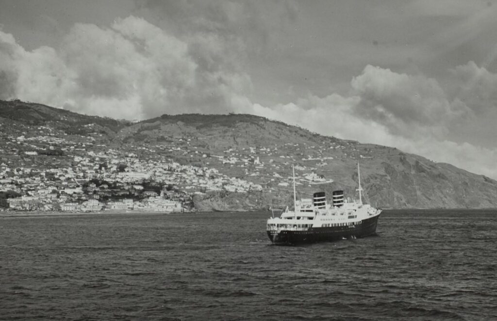
Portugal, Madeira, Funchal, Harbour: Motor Vessel Venus, 25 March 1953.
Detail of image by Anthony Kersting. KER_PNT_N01577, The Courtauld, CC-BY-NC


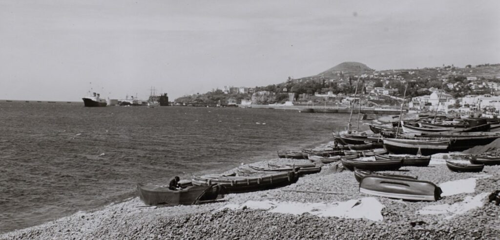
Portugal, Madeira, Funchal, Shore, 25 March 1953.
Detail of image by Anthony Kersting. KER_PNT_N01575, The Courtauld, CC-BY-NC

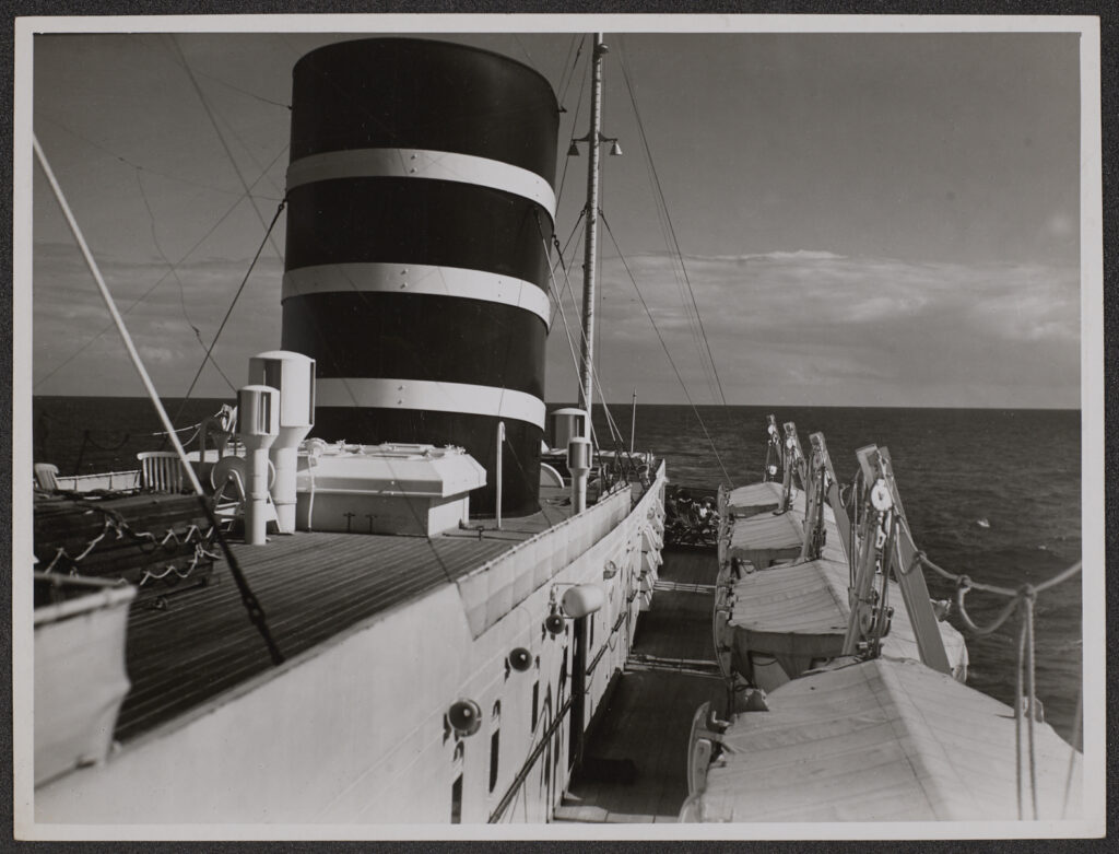
MV Venus: On Board, 23 Mar 1953.
Image by Anthony Kersting. KER_PNT_T000003, The Courtauld, CC-BY-NC

Spain, Canary Islands, Tenerife. 6 April 1953.
Image by Anthony Kersting. KER_PNT_N01570, The Courtauld, CC-BY-NC

Portugal, Madeira, Funchal, From Reid’s Hotel, 26 March 1953.
Detail from image by Anthony Kersting. KER_PNT_H07489, The Courtauld, CC-BY-NC

MV Venus: On Board, 23 March 1953.
Image by Anthony Kersting. KER_PNT_T000002, The Courtauld, CC-BY-NC

Not all voyages were smooth sailing. Most conspicuously, on 23 March 1955, Venus dragged her anchors in a storm in Plymouth Sound and ran aground on the Mountbatten Reefs on the eastern shore of the Sound. Three tugboats arrived in the morning to try to pull the ship free, but without success. All on board, apart from essential crew, were put ashore.

24 March 1955


Venus aground in Plymouth Sound, March 1955.
Photographer(s) unknown. Source: M/S Museet for Søfart [Maritime Museum of Denmark] – Berlingske Tidende

Major damage was visible at the bottom of the hull and there was water seeping into some of the cabins. Compressed air was used to keep the water out. Finally, on 26 March when there was a spring tide, the salvage crew managed to pull the ship free at the fourth attempt. She was towed into Plymouth and examined by divers to get a full overview of the damage:  outer plates in the bottom were torn up and a leak was discovered in the tanks forward and amidships. 

Some of these events in Plymouth Sound were captured on film in unused British Pathé News footage, which can be seen in this YouTube clip.

She was eventually towed to Amsterdam for full repairs to be carried out; she arrived back in her home port Bergen on 31 May to resume her sailing schedule – and to give Kersting further opportunities to sail on her on his photo expeditions. 

Norway, Venus in Bergen Fjord, June 1958.
Image by Anthony Kersting. KER_PNT_N02197, The Courtauld, CC-BY-NC

Norway, On Venus, June 1958.
Image by Anthony Kersting. KER_PNT_N02229, The Courtauld, CC-BY-NC

Norway, Vestland, Bergen, Bergen Fjord: M/S Venus, 14 July 1962.
Image by Anthony Kersting. KER_PNT_G02178, The Courtauld, CC-BY-NC

In early 1965 the ship made two cruises to the Mediterranean and the Greek Islands, before starting on a new direct route from Stavanger to Newcastle, but still making some calls to Bergen. In March 1966, Venus again set out on a cruise to the Mediterranean, this time as far east as Haifa in Israel.

In contrast to this time cruising in Mediterranean sun, financial clouds were however gathering over MS Venus. Four cruises planned for the autumn of 1968 from Southampton to the Canary Islands were cancelled because of poor ticket sales. BDS put the ship up for sale –  her fate was sealed when she was bought for scrapping by Shipbreaking Industries Ltd. based at Faslane on the Lower Clyde. On 5 October she arrived in Bergen for the last time. Valuable objects and artworks were removed and on 17 October 1968 she sailed on her final journey from Bergen to the Clyde and her destruction.  

This is how the Norwegian newspaper Bergens Tidende described her departure on its front page: 

“The 36-year-old North Sea Queen set out from the quay at Laksevåg and headed across the Puddefjord towards Nordnes and made an elegant turn outside the Skoltegrunnskaien, where it has docked for all these years. With a series of deep blasts from the whistle it sent a final salute into the town and instantly there was a response from a number of boats from the harbour… bidding the proud ship farewell. And then the course was set west, for the last time Venus rounded Kvarven and disappeared out of sight from the city as hundreds of proud schooners have done before her.”

*

Epilogue – Did she ‘Leave not a wrack behind’? – Not quite. 

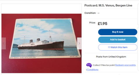
You can still bid for MS Venus memorabilia on e-Bay!

Items for sale on e-Bay, 4 April 2023 – exactly 70 years after Kersting’s voyage to Madeira and the Canaries on MS Venus

And of course, you can trawl the Courtauld Digital Archive for images of the ship and the places she visited with Kersting and his camera on board.

Christopher Williams, Digitisation Volunteer, May 2023

***

Sources: 

There is a comprehensive [Norwegian language] history of MS Venus on Wikipedia at: 

https://no.wikipedia.org/wiki/MS_%C2%ABVenus%C2%BB

and of the Bergen Steamship Company (Bergenske Dampskibsselskab – BDS) at: https://en.wikipedia.org/wiki/Bergen_Steamship_Company

*

Maritime Museums:

Norway: Bergens Sjøfartsmuseum: https://digitaltmuseum.no/owners/BSJ

Denmark: M/S Museet for Søfart: https://mfs.dk/

*

The grounding in Plymouth Sound is featured in British Pathé News unused footage ‘SS [sic] Venus Runs Aground (1955)’ duration 2m:12s, viewable at:

https://www.youtube.com/watch?v=6zrJXI2skrQ

Eyewitness accounts and images of the grounding and repairs in Plymouth can be found on this forum: https://www.submerged.co.uk/gotaway-venus/

*

The artist Frank Henry Algernon Mason’s life and works are described here:

https://en.wikipedia.org/wiki/Frank_Henry_Mason

and here: 

https://www.pannettartgallery.org/havens-and-harbours-the-marine-art-of-frank-henry-mason/

Richard True: Kersting’s Visit to Madeira

Having started work on the Kersting Photographic Archive as a Digitisation Volunteer in August this year, I decided to try to find out more about his life. As part of this I used an online genealogy service and amongst various records that I discovered was a passenger list for a ship called “Venus” showing an entry for Anthony F Kersting, Photographer, aged 36, of 37 Frewin Road SW18. This sailed from Southampton to Madeira in March 1953 and when I checked in his ledger there were entries for photographs he had taken there at this time.

Looking through the relevant boxes I was surprised to find in one that there were photographs he had taken of the ship itself and some of its passengers. One particular photograph intrigued me. It was of a young girl who looked to be about ten years old, standing at the ship’s wheel, with an excited expression, pretending to steer. This prompted me to go back to the passenger list to see if I could identify her.

It helped that the passengers were put into age categories, one of which was ‘Children between 1 and 12’, and under the column for females there were two possible candidates, both called Mary. They each appeared to be travelling with their parents:

Mary M Gilmour (Schoolgirl, aged 11) with Walter Gilmour (Produce Merchant, aged 54) and Dorothy M Gilmour (Housewife, aged 49)

Mary F Musgrave (Schoolgirl, aged 10) with James P Musgrave (Carpet Manufacturer, aged 53) and Margaret Musgrave (Housewife, aged 53)

The Gilmour’s address was shown as being in Bridge of Weir, which is in Renfrewshire, Scotland and the Musgrave’s in Halifax, Yorkshire.

Armed with this information I started to search further to try to find which Mary it was in the photograph and whether she might still be alive. If so, my idea was to make contact and arrange to invite her to come and see her photograph at The Courtauld.

Unfortunately, I have so far been unable to follow the trail much further with enough certainty, but am continuing the search…


Richard True

Courtauld Digitisation Volunteer

5 Oct 2022

Victoria Bennett: Worker/Housewife – Designing the Frankfurt Kitchen

Audio version

Read by Celia Cockburn

Text version

The mid-1920s in Frankfurt, Germany saw a desperate housing shortage. The First World War had swept through the city a few years prior, leaving the need for much of its housing to be re-built. In 1925, architect and city planner Ernst May was employed to head a new social housing project, known as the New Frankfurt, which would see the construction of 10,000 new homes for the working classes. It would be the largest social housing project of the Weimar years.

A modernist designer with utopian ideals, May saw the New Frankfurt project as an opportunity for increased domestic liberation through design. Inspired by the emerging theories of ‘efficiency engineering’ and household rationalisation – ideas which promoted the time-saving possibilities of ‘better’ object placement and applied them to the home – May believed that a well-designed home could make life easier for its occupants. He enlisted the help of Margarete Schutte-Lihotzky – Austria’s first female architect and fellow efficiency advocate – to design a new and thoroughly modern kitchen, befitting of this vision. The Frankfurt Kitchen, as it has come to be known, is arguably the most important legacy of the New Frankfurt project and is widely recognised as the first example of the modern fitted kitchen, as we know it today.

An exterior shot of the building showing wisteria arranged under the windows
Ernst May House, Frankfurt am Main, Germany. Photograph by Tim Benton. CON_B04373_F002_017. The Courtauld Institute of Art. CC-BY-4.0.


The 1920s were a time of social change for women in Germany. Declared to be the equals of men, women were granted the vote under the Weimar constitution. Increasingly, women were single, working, and less interested in family life, and the figure of the ‘New Woman’ emerged as a symbol – with her shorter hair and traditionally ‘unfeminine’ attire – depicting this shift.

The New Woman symbolised a lifestyle of work and leisure, following the expansion of employment and education opportunities that became available to women during the War. However, many took an aversion to this new sense of female independence. Conservatives worried about the long-term effect the New Woman might have on traditional values, as more women were in university than men, male joblessness was high, and the birth rate had dropped. Fewer women were working as servants, and so many middle-class homes also found themselves at a loss. A coalition of interest groups began to steadily form, seeking to readdress the woman’s place as being in the home, and the idea of the ‘professional’ housewife emerged, using efficiency engineering – specifically, its scientific language and approach – to intellectualise the idea of housekeeping. Suddenly, the same notion of rationalisation so embraced by modernist architects for its critique of traditional design was being used in socio-political terms to argue that the home would provide a suitable and modern experience for women, and, thanks to its new methodology, would be held in the same regard as a man’s professional work. This campaign to reaffirm the domestic sphere resulted in the introduction of a state policy called ‘Female Redomestication’, and education and employment options for women were largely diminished once again, as they returned to the home.

Back in Frankfurt, Lihotzky was designing her efficient kitchen. She consulted housewives and experts, drew inspiration from the spatial design of factory floors and train dining cars, and studied psychological and material evaluations. She realised that by placing the sink, stove and workspaces in a triangle, less time was spent walking between each. Her final design came pre-equipped – for the first time – with built-in storage, a gas stove, fold-down ironing board, adjustable ceiling light and a swivel stool. It was the first German kitchen with electricity. Efficiency was in every detail: the cupboards were painted blue as it was understood to be fly-repellent; cutting surfaces were made from beech to resist staining and knife marks; aluminium chutes were designed to hold staples such as flour and sugar for easy storage and pouring. The floor space, measuring in at just 1.9 x 3.44 metres, was decreed optimum for carrying out the tasks therein, and the room could be shut away with its sliding door.

It was designed as a gleaming embrace of technology and the future. It waved goodbye to the time-consuming and labour-intensive traditional kitchen: poorly ventilated, dimly lit, disorganised, and badly furnished. Lihotzky had optimised domesticity. She would later say that by doing so, it acted ‘very well as propaganda’ for the ‘bourgeois ideas of the time that a woman essentially worked at home in the kitchen’, and was aware that her gender, as designer, added to this narrative. Nevertheless, she would describe her time spent on the New Frankfurt project as amongst “a group that stood up for certain principles and architectural ideas, and fought for them uncompromisingly”.

How is it possible for such different interpretations of efficiency (conservative ideas of re-domestication, and modernist ideas of liberation through design) to co-exist? The answer lies in a 1923 book by author and housewife Christine Frederick, titled ‘Household Engineering: Scientific Management in the Home’, which has been referred to as the ‘the bible of progressive architects of the 1920s’.

long and narrow kitchen fitted with functionality in mind
The Frankfurt Kitchen. Photograph by Tim Benton. CON_B04374_F001_034. The Courtauld Institute of Art. CC-BY-4.0.


“Couldn’t we standardise dishwashing by raising the height of the sink? Did we not waste time and needless walking in poorly arranged kitchens? I came to earnestly believe that scientific management could, and must, solve housework problems as it had already solved other work problems”.

The quote above – from the introduction of Household Engineering – begins a rallying cry for improved health, design and efficiency in the home. Frederick coined the concept of scientific home management after she began to apply the same principles used by her husband (who worked as an Efficiency Engineer) to her work as housewife, realising its time-saving potential. Her husband’s profession gave her writing credence and an ideological slant: with better working practices, the housewife would be freer. Architects used the practical advice in Household Engineering and applied it to their floorplans, and May and Lihotzky recognised the evolutionary role that considered design could have for the occupants of their social housing. However, this is perhaps where the cross-over of progressive design and domestication ends. While Household Engineering explores in detail how best to carry out housework, it takes a less radical approach towards who will be doing this work. Frederick frequently refers to the person in the kitchen as ‘the worker’, and it’s clear from Household Engineering’s floorplans of accompanying servant quarters that working-class women were expected to provide labour for middle-class households as servants still, only now with ‘scientific’ guidance on which tasks it would be acceptable for them to sit down during: “This permits the worker to give her entire energy to it, thus resulting in quicker and better work”.

If there was any question as to what the New Woman would do with her newly saved time, Frederick seems to imply the answer is more work. Indeed, Frederick herself admits to pouring her saved time back into improving her workflow, to every minor detail: “Every day I tried to find new ways, new methods and new short cuts in my home problems. If I made out a good schedule of work for one week I tried to improve on it for the week following. No housework detail was too small or too unimportant”. 

A question naturally arises from this: how did the architects and designers of the New Frankfurt envision occupants using their newly rationalised space?

Velvet sofa positioned with its back away from the window. Window lined with spiky plants like agave and aloe.
Architect’s House. Photograph by Tim Benton. CON_B04373_F002_028. The Courtauld Institute of Art. CC-BY-4.0.

Throughout the project, May published a journal of the same name (Das Neue Frankfurt) and a 1927 article titled “The new apartment and the household effects” (Die Neue Wohnung und der Hausrat) written by Franz Schuster (architect and furniture designer) sheds a light on the team’s vision for women and their labour. It suggests intellectual pastimes in place of housework, and views the latter as unimportant and to be done quickly through improved efficiency: “The woman no longer wants to spend the entire day cleaning the house and doing meaningless things; she wants to be able to take part in contemporary intellectual life, and must be able to survive in the economic competition. She can no longer afford to waste her thought and effort on trivial things, whether she is a mother, or wife, or on her own – she wants to be a valuable comrade-in-arms in the building of a new Era. Thus she must demand of her home – as we do from everything else – that it not restrict the development of our best and most vital powers, but rather advance them; no one would claim that dusting, cleaning, and furniture brushing are particularly valuable in themselves. Thus the Era itself demands the new [efficient] household”.

It has been said before that the modernist movement set out to change more than architecture, and the Frankfurt Kitchen is a good example of this. Its design was intended to make life easier for Frankfurt inhabitants, helping women to spend less time on their own chores. The main criticism of its design at the time centred on the small scope for individualisation that the built-in furnishings allowed for, particularly at a time where women were spending more time at home. However, Lihotkzy has maintained that herself and the wider Frankfurt team considered the efficient kitchen an emancipatory space, describing it as “a modern laboratory where work was able to be done as quickly as possible”. She hoped to create a culture of less housework, and her kitchen is a successful piece of design which improved – with lasting effects – convenience, technology, health and safety and workflow within the home. It would go on to influence kitchen design through to current day, and it served as Lihotzky’s contribution to the issue of housework.

The Frankfurt Kitchen provided a means, rather than an end, to a problem.

However, it did so by designing a vision of the future where efficiency equated to greater freedoms (both leisurely and intellectually) – so that when society was ready to move in the same direction, the structures for positive change would be already in place.


Victoria Bennett 
Digitisation Assistant

Who made the Conway Library?

Audio Version

Read by Gill Stoker


Text Version

Much loved and perused by staff, students, and the general public in the know, the Conway Library is a collection of 9764 red boxes containing brown manila folders. The photographs glued on the brown manila mounts are black and white original prints showing places of architectural notice, often in painstaking detail. The variety, detail and beauty of the photographs, as well as the value of this research resource are well documented in this blog.

Martin Conway, who had started collecting art in 1887, “spent a great many of the pre-war years occupied with his photographs, developing the system of mounting, annotating and arranging which can still be found today” (Higgon, 2006). His glamorous American wife, Katrina Glidden, and their daughter, Agnes, joined him in his passion and continued to further enrich the collection. Towards the end of his life, Martin Conway busied himself with the foundation of the Courtauld Institute, to which he donated his much-beloved collection (“The Conway Library archive contains some photographs taken at the Himalayan base camp, where a member of the team made a bust of Martin out of snow, adding a pipe and an incongruous wreath of local vegetation!” Higgon, 2006).


What is less well known about the collection is who took the photos after it moved to the Courtauld


One of the tasks available to the volunteers, Attributions, seeks to answer that very question. In capturing the names of the photographers, inked, pencilled or stamped predominantly on the back of the mounts, the volunteers compiled, for the first time in the history of the collection, a definitive list of the hundreds of people who contributed photos to the Conway after Conway.

The list of photographers tells a completely new story about the library. No longer simply the story of the initial collectors, this is now also the story of the hundreds of people – students, staff or independent supporters – who donated the images.

The attribution list could tell us the story of the development of these photographers’ interest in specific research fields and the beginning of their careers, or perhaps the story of a small foray into a life they chose not to pursue. It could reveal the arc of development of personal photographic styles and visions, or maybe just the sheer determination of non-photographers to capture and document all sites objectively and in as much detail as possible.

Already, just by looking at the names, we know that it was a truly collective effort and that women were very much represented.


In capturing these names, we set out to research the photographers who made the Conway, and credit their work


The volunteers carrying out the Attributions task came across famous (and infamous!) contributors such as Anthony F. Kersting, Robert Byron, Tim Benton and Anthony Blunt, but they also came across many names that were scribbled illegibly or reported in too little detail to be tracked reliably.

The easiest photographers to transcribe and research were those who had their names stamped clearly – such as F.H. Crossley – the unmistakeably unique – such as Edzard Eilert Baumann – or those with names reported in full and with aliases – such as Dr Amanda Simpson a.k.a. Amanda Tomlinson.

The most difficult names to research are those whose surnames are more common and those for which we either don’t have first names or we only have initials – such as “M. Wall”, “Mrs Booty”, “Nunn”, “P. Clayton”, Kidson or Lindley.

During the COVID-19 lockdown, we assigned our volunteers the task of researching these names and find out as much biographic information as possible, looking in particular for reliable sources to fill in their research forms. Once the forms were filled in and returned, they went out again to other volunteers for cross-checking and the second part of the task began.

We scheduled Wikipedia editing training sessions and asked the volunteers to try their luck creating new pages for our photographers, and adding information about their involvement with the Conway Library to the biography of photographers with existing pages.

The result, we hope, will give the collection even more visibility, and let us share its fascinating genesis.

Do you know anything more about the Conway photographers?


For the full list of names please continue reading.

Continue reading

Digitisation volunteering: our response to Covid-19

Digitisation volunteering: our response to Covid-19

Although the coronavirus has put our digitisation activities on hold at Somerset House, the pandemic has unlocked an outpouring of creativity amongst our volunteers. By adapting quickly, we have been able to initiate remote activities to advance the cataloguing, interpretation and care of our photographic collections, logging over 1,200 hours of remote volunteering time to date since 18 March.


Background

Since our first open day in January 2017 over 900 volunteers have engaged with the Courtauld Connects digitisation project, donating over 25,000 hours of time. From the outset we have operated an almost constant programme of outreach, recruitment and training, and maintain an active community of around 230 regular volunteers, some of whom have each contributed nearly 700 hours of time. Activities on offer to volunteers include photography, labelling, copyright research, photographer attributions, transcription, and collection care.

Our volunteer community is diverse, exceeding targets set for us by the National Lottery Heritage Fund (NLHF), and we cherish partnerships with My Action for Kids, Beyond Autism, and the Terrence Higgins Trust. In 2019 alone we supported 31 students on work placements of periods from a week to three months, and ran corporate volunteering sessions with companies including Willis Towers Watson, Mace, Cirium, LexisNexis, Ashurst, Boden, Sidley Austin, Marsh & McLennan, Tideway, Bank of England, AutoTrader and Facebook.

Volunteer group photo taken at Somerset House, Summer 2019

One belief remains constant: in order to deliver engaging content, without barriers or preconceptions, to the widest possible audience, we include that audience in its creation as fully as possible. Our volunteers’ efforts run through every part of this project, and it is their confidence, creativity and relentless dedication which we celebrate.

Before Covid-19 we were on target to finish the Conway Library by early 2021 before moving to the largely unpublished photographic archives of Anthony Kersting and Paul Laib. We will return to the studio as soon as guidance and practical considerations allow. In the meantime, this blog post describes a few of the ways in which we moved our activities online and strengthened our connection with the volunteer community which sits at the heart of this radical, transformational project.


Task management during Covid-19

To create and manage programmes of remote working, we record every activity on a master spreadsheet which includes a brief description of the task, links to internal and external documentation, and a priority number to measure how closely it maps onto the project’s core objectives. From this we can identify tasks we want to take forward, whilst refining or shelving those with less relevance or benefit. After an informal discussion, favoured tasks are then documented in detail in a pro forma for internal use which breaks them down under the following headings:

Title of task
On which material / collection is this task focussed?
Description of task,
How many volunteers can participate?
What equipment is needed?
Where will the task take place?
Instructions – how will the task be completed?
Who will supervise, and how?
What skills will participants learn and practice?
How will success be measured and judged?

No matter how detailed or trivial the task might seem, we also ensure that every one is matched against the same questions we answered in the Courtauld’s original application to the National Lottery Heritage Fund:

What difference will this task make for heritage?
What difference will this task make for people?
What difference will this task make for communities?

If a task reaches this stage and we’re still convinced of its value, we create a volunteer-friendly instruction sheet and launch it at one of our regular online meetings. The staff of the Digital Media Department then provide daily support and feedback through a dedicated channel on Slack, our digital hub for collaborations with our volunteers.

Although we continue to use Timecounts as a volunteer management system, managing the remote working activities of our large community within tasks requires a level of scrutiny that exceeds anything we had put in place before: one which enables us to log every activity, name, date and state of progress before checking and sign-off.

The following screenshot shows how we record and timestamp volunteer hours across each of the tasks:

How we record and timestamp volunteer hours across each of the tasks

The following screenshot shows how we monitor progress across two specific tasks: the creation of draft Wikipedia pages for each of the photographers whose work appears in the Conway Library, and the production of audio transcripts of our blog posts in order to improve the accessibility of our storytelling and research.

The numbers are stacking up. From 18 March (the day following the suspension of in person volunteering activities and the start of remote working) to 1 June 2020 we have recorded:

1210.30 Volunteer From Home Hours
260 Kersting Mysteries solved
244 Conway Photographer Wikipedia template pages in progress
149 Conway Photographer Wikipedia pages ready for quality checking and publication
55 Layers of London records created
36 Audio Blog recordings in progress, with 13 ready to upload
28 volunteers have completed 752 subjects on Zooniverse.


Volunteering from home: researching the Conway Library photographers

The physical library is arranged by date period, then country, province, city or town. Notable buildings often occupy anything from a single box up to several shelves and, in certain locations, a division between sacred and secular architecture is present. However, for the first time since the library was created, our volunteers are revealing insights into the 400 named photographers whose work forms part of the collection. They inspect each photograph individually, and note down on a spreadsheet whether the name of its creator is present, usually in the form of a handwritten note or stamp.

Up to now all we knew about many of our photographers was their names. We turned the current situation into an opportunity for volunteers to research each photographer at home, with the objective of creating a biographical page for each on Wikipedia. The first step of the process is to assign to each volunteer a photographer’s name at random. Information they discover, such as her or his academic, bibliographic, and biographical details, references and external links is recorded on a pro forma which closely mirrors the Wikipedia page we will create for them. We communicate remotely with our volunteers every step of the way via a dedicated channel on Slack which now has 261 members, 64 of whom are actively writing photographer biographies. 244 biographies have been drafted so far, with 149 more in progress! The screenshot below shows a typical few days of the discussion currently taking place behind the scenes.

Readers might be surprised to know that, before the project created one, not even Anthony Kersting – described widely as the greatest architectural photographer of his generation – had a page on Wikipedia (we hold his collection of negatives and prints, and now expect to begin their digitisation in Summer 2021 ).


Volunteering from home: Kersting Mysteries

Anthony Kersting left his whole collection of negatives and prints to the Courtauld on his death in 2008.

He also left us his ledger books containing locations, descriptions and dates for almost every single photograph. In February our volunteers finished the massive two-year task of transcribing every one the ledgers, however his handwriting is often difficult to read, and many question marks remain.

To answer these, we created another Slack channel to which we upload high-res images of illegible entries, opening them up to the volunteer community to discuss, argue the case for a solution, and seek agreement. This involves a lot of Googling, and since we started we’ve all learned a lot about religious sites in Cairo, or alternative names of Eastern European towns.


One of the hardest parts of solving the Kersting mysteries is that he would spell things phonetically, or he might use a local spelling or variant spelling that isn’t used today. Volunteers are busy not only transcribing, but also translating. The product of this research will be the facility to geolocate almost all of his images on the new photographic collections website which this project will create.


Volunteering from home: Conservation

The Conway Library contains several thousand 19th century photographic prints. Many are rare, some are unique, and almost all are extremely susceptible to degradation and decay due to their particular chemical, synthetic and material qualities – the results of individual photographers’ experimentations and craftsmanship. We must understand the vulnerability of these objects to enable us to make the correct decisions and preserve them for the future and, in preparation, commissioned and submitted a Collections Conservation Plan to the NHLF. The period of closure has allowed us to plan and create training resources in the form of videos on handling, cleaning, selecting conservation materials, identifying deterioration, and storage, in anticipation of the digitisation of the Courtauld’s rich 19th century collections commencing soon after our return to the studio.


Volunteering from home: broadening access to the collection and teaching digital skills


Layers of London

Layers of London is a huge collaborative effort to map London’s history in a visual and interactive way, developed by the Institute of Historical Research. Anyone can access free historic maps of London and contribute stories and memories to create a social history resource about their local area, or places they have visited or researched.

We held a Layers of London training session attended by 16 volunteers back in February as we wanted to encourage them to use the site in their own time. However since lockdown we have adapted our instructions to provide a refresher for those volunteers we have already introduced to the project, and detailed guidance for newcomers.

By uploading a selection of Courtauld images to Layers of London, we are making the collection more accessible to a wider audience. Photographs that have been uploaded so far may be seen here: https://www.layersoflondon.org/map/collections/446

Our partnership with Layers of London has allowed volunteers to add videos, text, or images from other places around the web, adding a richness to the story behind our photos. In many cases new information is sent back to us which isn’t recorded on the Conway’s photographic mounts.

So far, 22 volunteers are involved in this task. 55 records have been published, with a further 15 being drafted. Everyone who has taken part has learned new digital skills, research skills, made their own personal discoveries about our collections and shared them with a wide public audience who might have never discovered the rich and diverse coverage of the Conway.


Blog audio recording

Our blog has 57 posts (and counting!) on a range of topics linked to the Conway, Kersting, and Laib collections. Almost all have been written by volunteers, interns, or students on work placement. We have long had ambitions to make audio versions of the posts to aid accessibility for people with a visual impairment. Since lockdown 13 recordings have been finished, with 36 more in progress. Clips will also be shared on social media and collected together in podcasts.

Volunteers engaged on this task have learnt new skills, from practical sound recording to speaking with confidence, and editing text for clarity. To support this activity we created a guide and made sample recordings (with photographs of the home-made pillow-fort setups to give professional results), and we give feedback on demos with tips and workshops on how to improve the sound if needed.


Art Club

We recognise that creativity and self expression, particularly in a social setting, is an important means of boosting mental health – perhaps now more than ever. Our Art Club brings these very human needs and our collection together.

Once a week a member of the team picks an image from the collection to inspire volunteers (or anyone who comes across our prompts on social media). We always leave the prompts open, so people can respond using any media they have: we’ve received paintings, drawings, photographs, found object sculptures, video, and even flash fiction. The Henry Moore Foundation particularly enjoyed everyone’s imaginative responses to Large Square Form With Cut!

We hold an Art Club video chat each week for people to share their techniques, talk about art, and hear from team members on techniques to try with minimal materials. Our discussions about images from the Ministry of Works Collection depicting the siege of Monte Cassino led to moving reflections on photography, war, and memorialisation.

We’d encourage anyone to get involved in Art Club: check out our Twitter and Instagram channels for the prompts: there’s no time limit on trying out any of them.


Zooniverse

The aims of every photographic and cataloguing activity we undertake are broadly those of raising awareness of the collections and the Courtauld, connecting with new audiences and providing them with content to foster learning and enjoyment at all levels. We’ll know we’ve succeeded when our audiences stop asking why our collections should be relevant to their interests, but start to ask why these images: whether beautiful, puzzling or shocking, are of interest to art historians – the content alone enticing and opening a door into the field of study.

A cornerstone of this content-centred approach is crowdsourced cataloguing. Whilst we wait for a new collections management and publishing system to be commissioned and built (which will itself have an embedded facility for crowdsourced cataloguing) we created a project called World Architecture Unlocked on Zooniverse, a platform involving hundreds of contributors worldwide, and uploaded the contents of the first 100 boxes from the Conway (over 8000 images), covering architecture from Afghanistan, Albania, Algeria, Andorra, Antigua and Barbuda, Argentina, Armenia, Austria, Barbados, Belgium, Bolivia, Brazil and the beginning of early British. In each case we’re trying to do something which we always felt lay beyond the pragmatic objectives of this project which were to catalogue down to the box and folder level only: that of cataloguing individual images by transcribing everything written on their mounts.

After undergoing a period of internal testing by volunteers we’re now awaiting the go-ahead from Zoonioverse which will take this part of the project live. In the meantime anyone interested in contributing to the Zooniverse transcription is welcome to access World Architecture Unlocked, now in beta release.


Community!

We have always used Slack as a private social network for volunteers to use. However Slack has really come into its own since lockdown and, as well as run channels to discuss each volunteering task, we also run a fun_and_banter channel in which recommendations for books, podcasts, films, websites, and more are made. While we keep the recommendations mostly within the volunteer community, we often share some on our Twitter and Instagram channels, so make sure you follow us there. We’ve also been enjoying emoji games and sharing many art-related COVID memes. The London Boroughs emoji game had us occupied for a while!

We’ve run two Zoom chats per week since the first full week of closure, with between 23-46 volunteers joining us to catch up. We like to spend a few minutes going over project updates, but we always keep plenty of time just to check in and see how everyone is doing – and share yet more recommendations. Lorraine always has so many recommendations of all kinds from the seriously cultured to seriously silly, while Muny has shared great resources for teaching at home and keeping up with exercise! Another gripping twist of being online is that we are always learning about hidden talents: one week we found that we have bird watching (David), bird-photography (Christopher), and bird sketching (Anne) skills in our talented team! John has shared his hand-drawn print-out-and-colour in sheets, and Bill shared a gorgeous calligraphy front cover for a future book on Anthony Kersting, Sue went from Zoom skeptic to Zoom convert, and Francesca delighted us with her violin. We also welcomed some new volunteers like Gill, and welcomed back some old friends like Max, who volunteered with us back when the project started in 2017, and is now keeping in touch again with the online community.

John Ramsey: A Sculpture in Canterbury Cathedral

Audio Version

Text Version

This sculpture in Canterbury Cathedral was a favourite of George Zarnecki, former librarian of the Conway and Deputy Director of the Courtauld Institute. In the latter part of the 20th century, he was a leading authority on sculpture of the Norman or Romanesque period.

Detail of capital 9 in St Gabriel's Chapel in Canterbury Cathedral depicting two partying goats.
St. Gabriel’s Chapel, Capital N.9. Canterbury Cathedral. Attribution: G. Zarnecki. CON_B00089_F002_026.

For his book English Romanesque Sculpture 1066 – 1140, he chose it as the image for the front cover. It is a carving on a capital of a pillar in the crypt of Canterbury Cathedral. It dates from 1070 and shows two animals playing musical instruments. The inspiration for the images came from local illuminated manuscripts.

Zarnecki acknowledged that showing animals playing musical instruments was a popular theme, as they featured in humorous folk tales and fables. However, he had not seen any other work to compare with the sophistication shown here. He was struck by the complex composition, the richness of the imagination and the superior quality of the draughtsmanship and modelling.

The purpose of the sculpture


In medieval thinking, the universe was divinely ordered so therefore everything could be given a theological explanation, and everything on earth reflected different aspects of Heaven.

In the middle ages, most people were illiterate, so sculpture and painting provided the images and pictures to illustrate sermons and stories. People lived in a harsh world full of superstition and fear of the unknown. They had the same IQ as ourselves, and exercised it through powerful imaginations, myth-making and storytelling, as they tried to make sense of the world.  Meanwhile, the Church aimed to secure a sense of awe and apprehension, a fear of divine retribution. So, popular images could be used to illustrate a moral message.

Churches were carved all over and painted. It was believed that they were seen not only by people but also by God, so symbolism had to be everywhere. 

Animals in the Medieval imagination


Medieval stories have attracted an extensive field of academic research, which tends to analyse stories as:

  • Fables with a strong moral tone, e.g. Aesop’s fables from the 5th century BC;
  • Myths: creation stories, focussed on Gods and mortals;
  • Folk tales, designed both for entertainment and for moral guidance. They were more playful and less structured. Stories were told and retold, continually changing and adapting, to reflect the point to be made, or the circumstances of the time. They were not written down until the 16th.

These categories overlapped of course. Also, stories travelled widely around the world along the trade routes and picked up many influences. Animals featured strongly. They developed specific characteristics, and many fantastical, mythical animals were created. Animals were seen as sources of instruction, as in the Book of Job: ‘’Ask now the beasts and they shall teach thee – and the fowls of the air’’ [Job 12:7]. 

Animal symbolism and musical instruments


Here are just a few examples, to provide some context for the animals in this picture:

  • A cat – represents laziness and lechery;
  • Playing a fiddle – suggests a mewing sound;
  • Dog – faithful, loyal, but also can be stupid and lustful;
  • Donkey – Christ’s beast of burden, or used derogatorily to represent either stupid or lower class people, but can also be lustful;
  • Goat – loves the mountains like Jesus, represents fertility but also the horned devil. Can represent intelligence and mischievousness. And lust.
  • Sheep – can represent Christ/the lamb of God. Indicates purity, gentleness, wisdom, but not as canny as goats. (It’s the only animal I can find who is not associated with lust!)
  • Playing a lute – suggests a bleating sound.

Sheep and goats were the earliest animals to be domesticated and feature heavily in folk stories. Animals from all over the world were introduced as these stories circulated, so non-indigenous types such as a mountain goat or ibex would feature in English folk tales.

What this carving shows


In order to understand it, I drew it as a simplified picture to clarify the detail that is hard to decipher from the photograph. I have also added in some features that look to have become worn or broken.

What I think I see is a sheep, an ibex, and a fantastical creature.

A sketch by John Ramsey.

The sheep is female and playing a violin or maybe a lute with a bow. She has a human torso which is smooth like skin, a human breast and hands, but hooves for feet. The sheep also has wings, is standing upright and appears to be singing.

The sex of the ibex is not visible, but it is playing a cornet or trumpet, so my assumption is that he is male. He has the head and body of a goat. He is playing the horn with his cloven forefeet. His hind feet, however, are human. His right foot appears to be wearing a shoe and is between the sheep’s instrument and her leg, possibly pointing towards her groin.

He is riding a creature which has the head of a dog, front legs with hooves but the tail of a fish. The creature is stretching back to bite the ibex, which may indicate that the ibex is planning mischief, or is making too much noise. (Where medieval animals are seen biting themselves, this means they have made a mistake and are punishing themselves. E.g. a wolf bites his foreleg if he treads on a stick and makes a noise as he creeps up on a chicken shed.)

Conclusion: The ibex is trying to seduce the sheep, who is pure. The instruments may indicate their respective voices or symbolise their sexual parts. One senses the sheep is wise and the ibex will have his work cut out!

What is the story?


There are many story and reference books, but from what I can find online there is no obviously popular story that could feature this scene. The crypt of Canterbury was a pilgrimage destination, so perhaps this and other wonderful carvings there were used to entertain them or to remind them of a clear moral point.

Would anyone like to write the story? Or offer an alternative interpretation of the picture?

References:


Zarnecki G (1951) English Romanesque Sculpture 1066 – 1140. London: Tiranti.

Kahn D (1991) Canterbury Cathedral and its Romanesque Sculpture. Austin: University of Texas Press. (Deborah Kahn was a pupil of Zarnecki and her work remains the definitive analysis of Canterbury Cathedral’s sculpture.)


John Ramsey
Courtauld Connects Digitisation Volunteer

Sophie Buckman: the serene beauty of Robert Byron’s Isfahan

Audio Version

Read by Christopher Williams

Text Version

Being presented with immediate free rein in The Courtauld’s Conway photographic library was delightfully overwhelming, and I spent much of my first day flitting between folders of images of Cumbrian churches, the Callipygian Venus, and Florentine stained glass.

Eventually and unsurprisingly, I was drawn to the section of files on the architecture of Iran, and soon came across the two on Isfahan. Having visited the city a few years ago, I was curious to see the photographs of what I remember as one of the most beautiful cities in the country of my family. An ancient Silk Road city, Isfahan flourished in the Safavid period, and its skyline is still marked by the imperial sandstone of Shah Abbas’ golden age.

The domes and minarets of Isfahan’s mosques and palaces colour the city a vibrant blue, evoking memories of invading Mongols and their eastern ceramics. In The Road to Oxiana (1937), travel writer and aesthete Robert Byron (1905 – 1941) saw reflections of this dominating colour in the Zayandehrud river which cuts through the city; he describes it “catching that blue in its muddy silver… and before you know how, Isfahan has become indelible, has insinuated its image into that gallery of places which everyone privately treasures”.

Expelled from Merton College, Oxford, Robert Byron was a member of the infamously flamboyant Hypocrites Club, and in the 1920s a “bright young thing” of the London social scene. While the excess of his early years was immortalised in novels by Evelyn Waugh and Nancy Mitford, much of Byron’s life was spent travelling and soon he became a wildly successful travel writer, ahead of his death in combat in 1941.

Here at the Courtauld can be found Byron’s own photos from his Middle Eastern trip of 1933–34, taken during the writing of his most famous work, The Road to Oxiana.

Item from the Conway Library. Two images of Isfahan, Persia, showing the bridge.
CON_B02478_F001_002 Robert Byron, a view along Khaju Bridge from the imperial box in its centre. The throne from where Shah Abbas II would have enjoyed summer evenings is long gone.

Central to his view of Isfahan, is the river, “Zayandeh” literally meaning “life-giver”, and its two main bridges, Pol-e-Khaju, Khaju Bridge, and Si-o-se Pol, the Bridge of 33 Arches.

Pol-e-khaju and Si-o-se Pol were both built in the seventeenth century, and function as pedestrian bridges as well as weirs. In Byron’s photographs the Zayandehrud tears between their arches, whilst in more recent years the waterbed has been dry.

The river’s pilgrimage from the Zagros Mountains has fallen short every summer for 10 years now. Some blame bureaucratic mismanagement and the over-allocation of water to steelworks and farms upstream, whilst officials have been quoted as instead blaming the immorality of Isfahanis for the drying of the river.[1]

Item from the Conway Library, two black and white images of the bridge from different angles.
Robert Byron, Khaju Bridge, low water. CON_B02478_F001_001.

Robert Byron’s several visits to the city over those two years provide evidence of the instability of the Zayandehrud’s water levels. In one photograph of Pol-e-Khaju the water is low enough to allow locals to wash and bathe on the crumbling Safavid steps.

In one of Byron’s photos of Si-o-se pol, a group of people seem stranded in his symmetrical framing, the water rising, with several of the men staring deep into the camera’s lens, almost imploring the viewer for help. Photographing this middle section of the bridge isolates these pedestrians, eliminating any view of escape from the Zayandehrud, reframing a simple social scene into a near biblical scene of flooding.

Item from the Conway Library, two black and white images of people standing on the bridge, under the arches.
Robert Byron, high water. CON_B02478_F007_002.

The two bridges have served as meeting-places and social spaces for Isfahanis since their inception, particularly in the evenings, when the workday ends and crowds are drawn to the aureate glow of the lit arcades and arches.

Byron describes the foot passages on Si-o-se Pol being as overwhelmed as the river; “it was crowded with people, and all the town was hurrying to join them; there was never such a flood in living memory”.

Despite Byron’s poetic synonymity of crowd and water, the drought of recent years have allowed for the continued tradition of singing underneath the arches of Khaju. Groups of men drink tea, smoke shisha pipes, or “hubble-bubbles” as Byron called them, and sing in groups or unison, their voices echoing off the high, curved roof of the cavernous spaces.

The sound is haunting, and one almost feels transported to a bygone era in awe of this storied tradition.

Robert Byron, daytime under Khaju Bridge, 1933. CON_B02478_F001_005.

A photograph from my visit to Isfahan in 2017, nighttime under Khaju Bridge, with singers.

Much of Byron’s journey through Persia in The Road to Oxiana is impeded by bureaucracy and illness. Many of the entries of his many weeks stuck in Tehran start with some defeated variation of “Still here”. By contrast, the verdant splendour of Isfahan is celebrated, in what I find to be the most beautiful passage of the book:

“The bridge encloses the road by arched walls, on the outside of which runs a miniature arcade for foot passengers. This was crowded with people, and all the town was hurrying to join them; there was never such a flood in living memory. The lights came out. A little breeze stirred, and for the first time in four months I felt a wind that had no chill in it. I smelt the spring, and the rising sap. One of those rare moments of absolute peace, when the body is loose, the mind asks no questions, and the world is a triumph, was mine. So much it meant to have escaped from Teheran.”     Robert Byron on Si-o-se Pol, The Road to Oxiana 

For the first summer in ten years, 2019 saw the Khaju and Si-o-se bridges flushed with water once again. Through drought and flood, from their building in the 1600s, to Byron’s 1930s, to the present, the serene beauty of these “cafe-au-lait” bridges endures.

[1] The Independent, June 2016, “Iranian women’s clothing “causing rivers to run dry”, says senior cleric” https://www.independent.co.uk/news/world/middle-east/iranian-womens-clothing-is-causing-a-river-to-run-dry-cleric-says-a7077021.html


Sophie Buckman

Courtauld Connects Digitisation Oxford Micro-Internship Participant

Collecting Stories Workshop

Audio Version

Read by Celia Cockburn

Text Version

As part of our digitisation pilot, we organised 6 brainstorming sessions to develop new ideas and harness the creativity of unselected members of the public.

In the Collecting Stories session, we brainstormed the idea that putting the Courtauld Libraries’ images online could spark conversations not only to do with the academic appreciation of fine art and architecture, but also with personal history, community engagement, social development, and storytelling. We wanted to come up with ideas for the website’s structure, including options to collect stories and interpretation.

One of the exercises we set up to get the conversation started saw our participants roaming the Conway Library looking for one image that was personally relevant to them and writing a story to go with it. Images and stories were then passed on for someone else to write a reply and present them to the group.
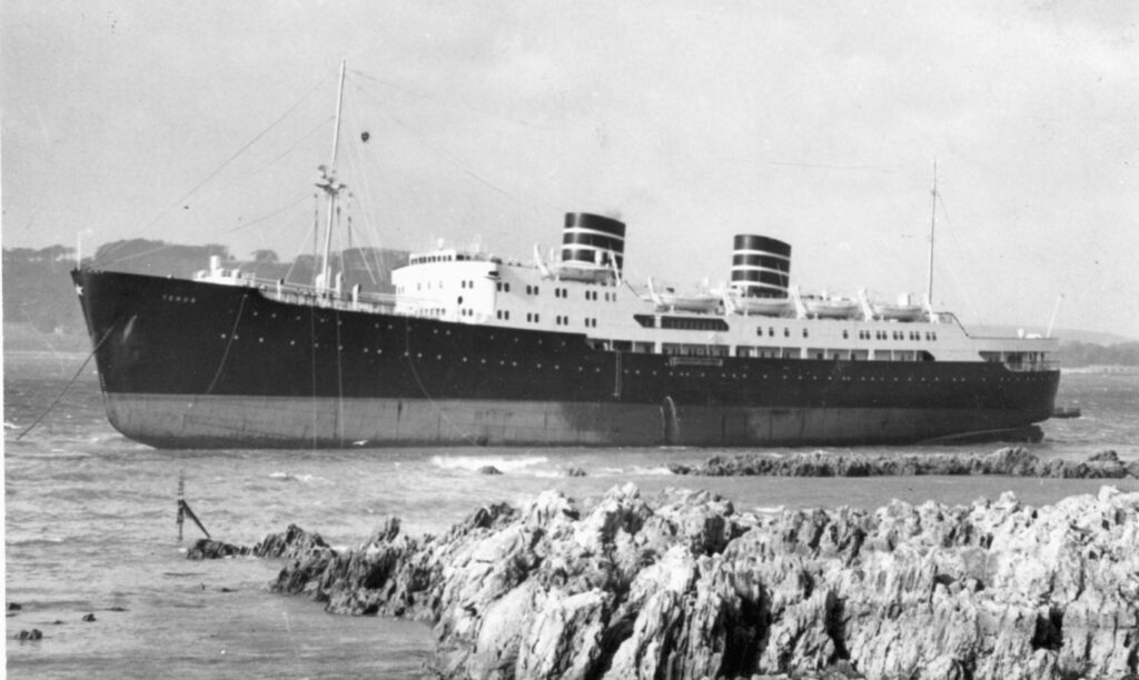
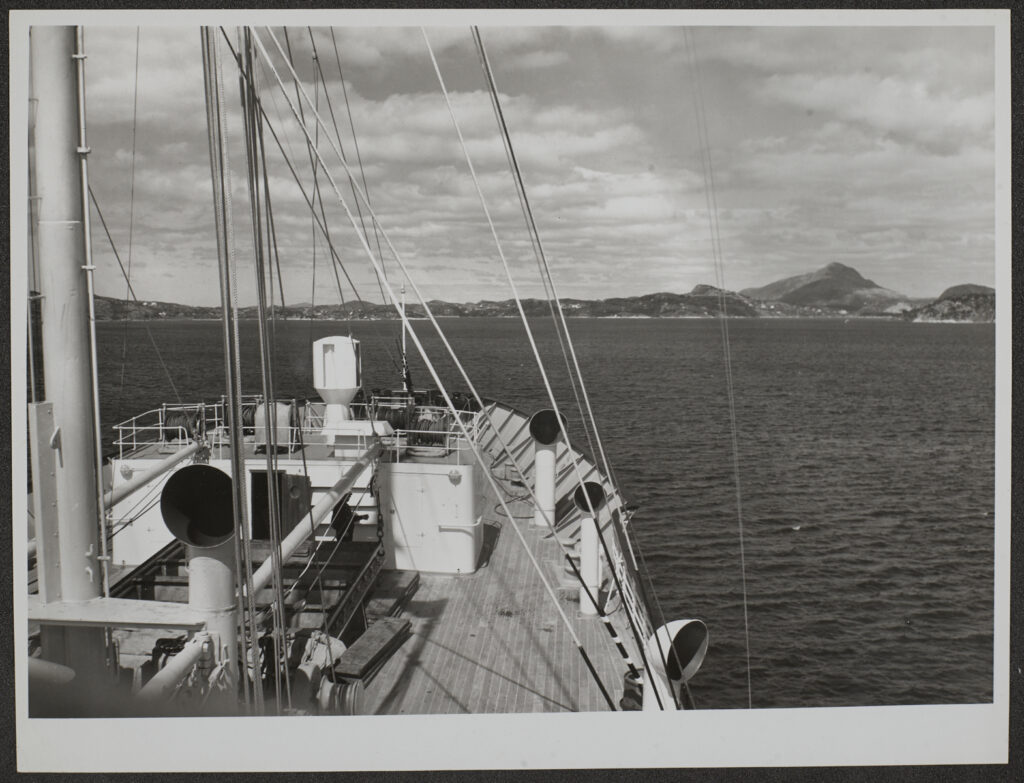
We wanted to discuss what it’s like to approach an image collection with the intent to tell a personal story, whether reading someone else’s story about an image enriches it, and how it feels to have a stranger describe something personal like the photo of one’s hometown or special place.
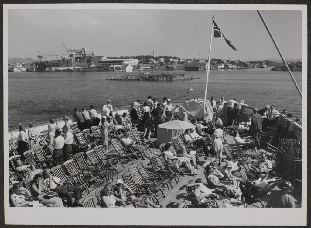
The exercise really got our group talking and the resulting suggestions and ideas will shape the way our project will be delivered. As for the images selected and the stories generated, they were beautiful and nostalgic so some of our volunteers typed them up and wrote further responses. Here are a few.


Broadgate, London.

“Broadgate – close to Liverpool Street
Swiss bank – public space – Richard Serra
Demolished – redevelopment – bars, cafes etc.
1980s corporate architecture – 20th century society
Historic England
Memory – affection” Jan Peters

“Hidden behind Liverpool Street station is Broadgate. In amongst the monstrous redevelopment of this area weaves the Broadgate art trail, the most impressive art collection by acclaimed British and international artists. Accessible to all and out in the open-air my memories are of numerous school trips with teenagers interacting with fantastic sculptures, as opposed to the untouchable work in galleries and museums. We never noticed the rather sterile architecture (the students’ opinion) but marveled at the Fulcrum by Richard Serra, laughed at the Leaping Hare on Crescent and Bell by Barry Flanagan and sat drawing the Rush Hour by George Segal. It still holds its fascination today.” Lorraine Stoker


CON_B02478_F008_010 – The Courtauld Institute of Art – CC-BY-NC

CON_B02478_F005_003 – The Courtauld Institute of Art – CC-BY-NC

Isfahan (Persia) Shah Sultan Hussain’s Madrassa

“A painting or a ‘colourised’ photograph of the entrance to the Shah Sultan Hassain Madrassa in Isfahan, Iran. The coolness on the small pond, blue of the characteristics turquoise vaulting. Men in various uniforms stood by the doorway. A mix of clothing and styles – a young boy with cumberbund and blue shirt. Men in heavy overcoats.
Love insights into the clothing of people in the picture.” Pragya Dhitel

“As I worked my way through this box it was fascinating to look at a bygone era of a foreign country not known to me. The image to compliment this image, for me, would be CON_B02478_F005_003, a black and white image described as “looking glass niche”, which I presume would be on the vaulting of the roof.” Arun Mahajan


CON_B04383_F002_024 – The Courtauld Institute of Art – CC-BY-NC

“The Image is the view out of a classroom window in Amsterdam. It is a city where everyone lives, learns or works very close to one another. Everyone can see into everywhere else, seeing people live their lives. It is both comforting & disconcerting.
I imagine being torn by what is happening outside and having to stay focused on what is inside.” Barbara Bouman

“This really helped me think about this image more deeply.
At first look, this seems cold, austere and unstimulating. A place where your mind might wonder. But then the shapes, thrown into contrast by the light, offer another perspective which is anything but dull. The light draws you inward and outward simultaneously. I suppose that’s what classrooms are supposed to do.” Stephen Lines


CON_B03339_F001_012 – The Courtauld Institute of Art – CC-BY-NC

“I think a picture means a lot more if there are people in it. For this reason, I immediately decided to go straight to the Venice boxes. I found this picture inside the Santa Maria Gloriosa dei Frari box. It depicts a lady in a white casual dress and probably dates back to the seventies. The face of the lady is not visible but her hair reminds me of my grandmother from a photo that I have seen at her home.
It means a lot to me, even if it’s not her. Imagination is better sometimes.” Giulia Antonioli

“Interesting. Feeling a connection with people, but not people whose faces or expressions we can see. It’s not a picture that appealed to me, initially, but now I sort of get it. The story brings me more into the picture.” Lucy Sharp


CON_B07582_F001_009 – The Courtauld Institute of Art – CC-BY-NC

A pair of paper bags with large and small buckets (paper, galvanised steel and vinyl) by Richard Wentworth. 1982.

“Materials – tactile paper, the ephemeral throw away, everyday object. Manufacturing steel, paper “the sound of crushing paper around a steel hard bucket.” “Opposites.” The fact the bucket has no water in it. Water and paper do not mix. Thinking of conservation. Archives – conservation. Situated on concrete near Haywood Gallery – Modernist building. Wentworth went to Hornsey Art College the year I was born.” Veronica Bailey

“I love that you have added sound to the image.” Barbara Bouman


CON_B04300_F001_021 – The Courtauld Institute of Art – CC-BY-NC

Miss Cranston’s tea rooms Louise Campbell

“Finding this collection of photos brings back lots of good memories and a fuzzy warm nostalgia.
I grew up in Glasgow, I really enjoyed getting to visit the tea rooms if I was good. They were always the first choice of place to lunch; even as a child. I love the Mackintosh decor even though in the 80s and 90s it was dated and not very cool. I even enjoyed lunched there with my mum, and the staff fussing over me and happily making me (something) complicated off the new orders.
Looking back at the photos, they stand up and I now still love the Art Nouveau period and would happily decorate my whole house as Art Nouveau as it brings back such happy memories.”

“Childhood memories triggered by architecture interiors of the Art Nouveau period/Mackintosh. An interest in interior design now. How the past influences future space.” Veronica Bailey

“Looking back at the photographs and reading the others’ description you can imagine the noise and sounds of the Mackintosh tearooms. The hustle and bustle of people’s voices, sounds of children sitting patiently waiting with parents, the smell of cakes and brewed tea.
The architecture is amazing to look at, especially the Art Nouveau period. I particularly like the design of the fireplace and black and white chequered tiled floor.” Saffron Saidi