Norman Parkinson’s fashion photographs are imbued with contradictions. His ‘action realist’ images juxtapose narratives of fantasy. He pioneered dynamic depictions of women in motion yet excelled in his arrangements of the female body in quiet moments of poised and pensive stillness. Despite Parkinson’s seven-decade career, his contemporary Cecil Beaton credited his ability to reinvent his photographic style ‘according to the necessities of the day.’ However, Parkinson was a self-proclaimed nostalgic photographer, admitting ‘nostalgia is for me one of the great emotions, I have to edit this tendency a bit’. Nostalgia permeates Parkinson’s fashion photography, hidden within his characteristically colourful and energetic compositions, which distinguished him from his contemporaries.
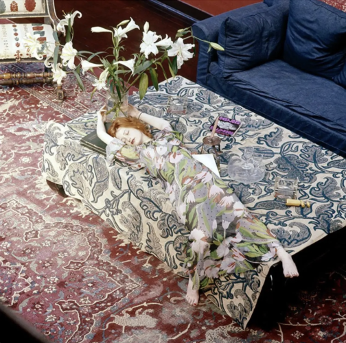
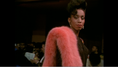
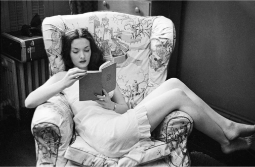
Norman Parkinson, Nicky Samuel, British Vogue, December 1972, chromogenic print, 76.2 x 76.2 cm (1st Dibs)
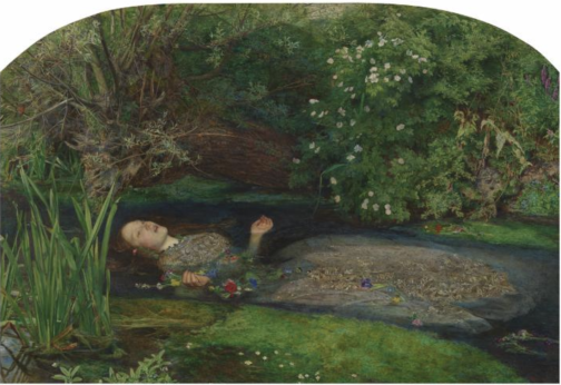
A flame-haired figure with a lily-white complexion, seemingly floating on an ocean of textiles, stretches her limbs as if in a fairy-tale slumber. Nicky Samuel, a socialite and wife to the owner of Granny Takes a Trip boutique, drapes herself across her richly furnished interior space. Parkinson scatters visual clues throughout the composition to create a sense of unease; a corkscrew and two empty glasses perhaps hint to hedonistic over-indulgence whilst also revealing that she is not alone. A discarded copy of Hollywood Babylon (a controversial exposé of Hollywood’s sordid underbelly of sex scandals and mysterious murders) transforms her dishevelled slumber into something more sinister. The lilies that tower over her, inevitably staining her porcelain face with sickly pollen, symbolise both purity and death.
In the late 60s and early 70s, the misty medievalism and mythology of the Pre-Raphaelite Brotherhood, the Victorian art movement, wafted into contemporary consciousness. This nostalgic influence was evidently not lost on Parkinson. The impression of submersion, the floral motifs, Samuel’s Pre-Raphaelite characteristics and the morbid undertones of the composition all call to mind John Everett Millais’s Ophelia. However, featured in British Vogue in December 1972, Parkinson’s image indicates how casually Pre-Raphaelite iconography seeped into fashion contexts from the late 1960s onwards. The similarities between Parkinson’s image of Samuel and Millais’ Ophelia are potentially non-coincidental. Although Pre-Raphaelite art had remained largely unpopular up until its revival in the 1960s, a 1967 exhibition of Millais’s work at the Royal Academy would have brought him, and Ophelia, to the forefront of contemporary artistic culture.
John Everett Millais, Ophelia, 1851-52, oil on canvas, 76.2 × 11.18 cm, Tate Britain, London (Tate Britain)
Direct comparisons can be drawn between Samuel and Ophelia. Both are seemingly floating atop a surface punctuated by flowers. While Ophelia’s saturated gown drags her into the watery abyss of death, Samuel’s heavily patterned chiffon dress, designed by Ossie Clark and Celia Birtwell, drowns her body in bold tulips and pulls her deeper into the ripples of patterns. Like the Pre-Raphaelite Brotherhood’s ‘truth to nature’ philosophy, Parkinson was ‘not interested in anything that nature hasn’t smiled upon’, and he was reluctant to retouch his prints. Parkinson’s ability to capture the wider nostalgic resurgence of Pre-Raphaelite art in the 60s and 70s infuses his composition with a desire to return to a realm far removed from the synthetic modernity of post-war Britain. Yet, despite the arguably sinister undertones of Parkinson’s composition, there is something comforting in Samuel’s doll-like appearance and the ease of her lethargic pose.
Parkinson’s childhood memories of time spent in the countryside, espying ‘girls with loose dresses and a minimum of underclothes…lying around the lawn with languorous ease’ potentially informed his depiction of Nicky Samuel. Parkinson himself attests to this, stating that, throughout his career, ‘I photographed the memory of those well-observed weekend girls that I had seen through the fence’. This indicates that Parkinson’s photography is consciously informed by his nostalgic, and perhaps voyeuristic, tendencies.
Robin Muir argues that Parkinson ‘effortlessly transferred the spirit of neo-romantic pastoralism into a resolutely urban environment’. This is perhaps applicable to his depiction of Samuel, given that she is situated within her Chelsea home. Parkinson’s ability to bring the outdoors into the domestic realm conveys a suspension of reality. Parkinson himself claimed that ‘if you are going to be an artist – even a photographer – I think you have to major in fantasy.’
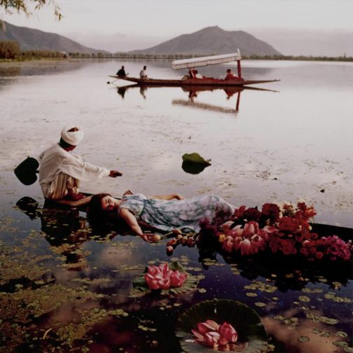
Norman Parkinson, Floating with Flowers, British Vogue, 1956, chromogenic print, 66 x 66 cm (Sotheby’s)
Furthermore, Parkinson’s portrayal of Samuel also mirrors his image from a 1956 location shoot in India for British Vogue. Like Samuel and Ophelia, model Barbara Mullen lies atop a watery expanse, in this case Dal Lake in Kashmir, laced with tulips, lilies and other exotic flowers. The dappled sunlight on the otherwise pristine surface of the lake reflects the clouded pattern of her dress. Yet, like Millais’ Ophelia, there are morbid undertones to this image. Mullen’s indifferent gaze into the middle distance and her partial submersion render her body totally passive. The boat on which she lies is obscured by, and overflowing with, flowers, which perhaps calls to mind a funeral boat. However, this image epitomises Parkinson’s excessively glamorous overseas fashion shoots in a time when long-haul travel was still fledgling.
Parkinson’s saturated use of colour is also notable. It wasn’t until the mid 1970s that he was working almost exclusively in colour, and this vibrant image from 1956 would have been situated among the largely black and white pages of British Vogue. Parkinson himself stated ‘I’m sure all the best photographers use black and white, but… I dream in colour…for me colour has always held more magic,’ which further hints to the degree of fantasy that underlined much of his work.
In his depiction of Nicky Samuel, Parkinson’s composition not only embodies the nostalgic fascination with the Pre-Raphaelites that resurged during the late 1960s, but also his nostalgic twinge for his idyllic childhood and his own photographic oeuvre.
By Claudia Stanley
Sources:
Anon., ‘Precious Original: Augustus John’s Chelsea Studio Regenerated by Nicola Weymouth’, British Vogue, No. 15, Vol. 129 (London, December 1972), pp. 128-129
Louise Baring, Norman Parkinson: A Very British Glamour (New York, 2009)
Robin Muir, Norman Parkinson: Portraits in Fashion (London, 2004)
We’ve been busy working on our dissertations, so we’re taking the opportunity to get to know the current MA Documenting Fashion students. Here, Megan discusses David Bowie, Paris is Burning, and her early fashion influences.
What is your dissertation about? What prompted you to choose this subject?
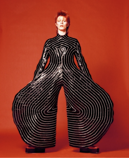
My dissertation is about David Bowie… kind of. I’m looking at the personae of Ziggy Stardust and Aladdin Sane, focusing on three sources: Brian Duffy’s photoshoot in January 1973, Masayoshi Sukita’s photoshoot in February 1973, and D. A. Pennebaker’s documentary Ziggy Stardust and the Spiders from Mars (filmed July 1973).
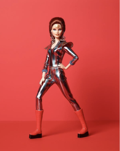
I was initially inspired to research this area after learning about the close connection between Bowie and Japan, which made me wonder about the various influences that collaboratively produced his iconic personae. The incredible glam rock fashion of his Ziggy Stardust and Aladdin Sane period made the choice of which area to focus on pretty easy. I’m really enjoying the research, as it’s allowing me to dig under the surface of visual media and find a whole network beneath. Along with Duffy, Sukita, and Pennebaker, I’ve been researching fashion designers Kansai Yamamoto and Freddie Burretti, make-up artist Pierre La Roche and mime artist Lindsay Kemp. My main realisation has been that there is an infinite list of contributors, collaborators, and influences that came together to produce the Ziggy Stardust and Aladdin Sane imagery that we know so well. Even a rice cooker gets a mention for being relevant! It’s also been really interesting to trace the sources and their uses in various forms – my favourite of which being the Barbie doll dressed and marketed to recreate an image from the Sukita shoot.
Fig 1: ‘Watch That Man III’ by Masayoshi Sukita, 1973. (Snap Galleries)Fig 2: Barbie as David Bowie, 2019. (Mattel)
What is your favourite thing you’ve written/worked on/researched this year?
My favourite thing would have to be my first essay, which was about the wearing of fur in Jennie Livingstone’s Paris is Burning, a documentary filmed in the late 1980s about the New York ballroom scene. I researched the history of fur as a material in fashion, and the social and cultural reasons fur may be worn in different contexts. Paris is Burning was a particularly interesting lens to view this through, as tensions between fur as a marker of distinction and anti-fur campaigns were dramatically rising. Not only that, but I could bring in a lot on gender and fashion – my favourite topic!
Fig 3: Still of Octavia St. Laurent in the film ‘Paris is Burning’ at 06:17, 1990. (Academy Entertainment / Off White Productions)
What are you wearing today?
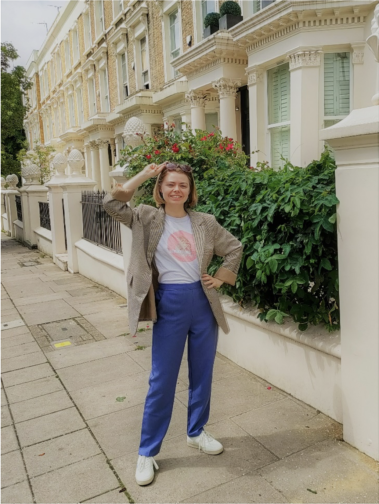
Today I am wearing periwinkle blue trousers, a white t-shirt and a brown check jacket. The trousers are the most recent thing I’ve bought, I found them on Depop and am loving them. The t-shirt was given to me as merchandise when I worked on an event a few years ago, and it’s become a staple of my wardrobe. The jacket is originally from Motel, but I got it from a charity shop in Angel for £7. On my feet are a pair of Flamingos’ Life trainers, bought second-hand on Ebay. I’d really recommend Flamingos’ Life – they are plant-based, comfy, and don’t slip off the backs of my feet as I walk along.
As you probably noticed from that description, most of my clothing these days comes from some kind of second-hand source. I started trying to avoid fast fashion about 5 years ago and am really happy with the eclectic wardrobe I have built since. I’ve dabbled with making my own clothes, and the new series of Sewing Bee is inspiring me to dedicate more time to that this summer! I have been desperate for a brightly coloured co-ord suit that fits my body (Zara seems to think I need an extra 6 inches of torso?), so that’s what I’ll be aiming to perfect first.
This MA has really solidified my belief that clothes aren’t everything, but they’re a heck of a lot more than ‘just’ clothes. They are a way for us to customise this character we have been given, to make our day more comfortable, to support our lifestyle and to surround ourselves with softness and colour (at least, these are my main priorities).
Fig 4: Megan strutting her stuff on the streets of London
Do you have an early fashion memory to share?
A glowstick exploding all over my favourite lilac crushed-velvet tank top, age 6! I never fully recovered, and today I own a turquoise crushed-velvet strappy crop top… I actually had forgotten all about the glowstick incident until I thought about how to answer this question, and hadn’t made the connection between that top of 17 years ago and the crop top I now own and wear on nights out. Oh dear.
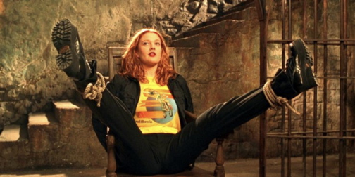
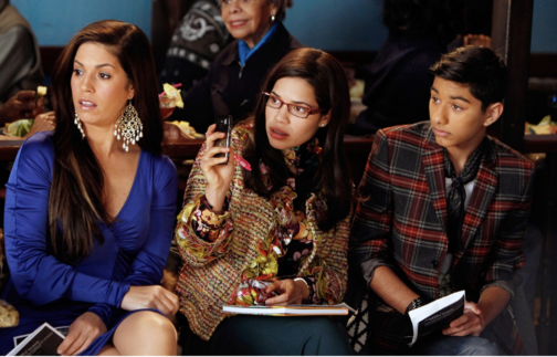
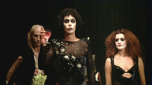
In terms of fashion media, I have strong memories of media which I think must have come from my big sister, because I was almost certainly too young to follow these when I first watched them. Charlie’s Angels (2000) has Drew Barrymore playing Dylan, and her blue-eyeshadowed rock-chic look definitely inspired me for better or worse. Ugly Betty (2006-2010) and The Rocky Horror Picture Show (1975) also felt like defining moments where I became aware of fashion. They were also both, in their own ways, trailblazing forms of media. I’m glad I could see their comedy, drama, and representation from an early age. (Special shout-out to Pierre La Roche, mentioned earlier, who also did the make-up for Rocky Horror and has been a feature of many of my interests without my realising for all these years. More people should know about him!)
Fig 5: Dylan in ‘Charlie’s Angels’, about to beat up many baddies. (Colombia Pictures Industries, Inc.)Fig. 6: Hilda, Betty, and Justin Suarez in ‘Ugly Betty’. (ABC / Getty)
If I’ve got my timings right, then this is my final post for this blog! I’ve really enjoyed my time writing here and reading the wonderful words of my course mates. If you want to see more of what I’m getting up to then my Instagram is @megangalleria – I mostly post about museum, gallery, fashion and photography related things.
All the best!
Fig 7: Frank N. Furter gives a toast, ‘The Rocky Horror Picture Show’. (20th Century Fox)
We’ve been busy working on our dissertations, so we’re taking the opportunity to get to know the current MA Documenting Fashion students. Here, Georgina discusses Vogue, her scented virtual exhibition and fairy wings.
What is your dissertation about? What prompted you to choose this subject?
My dissertation is on Audrey Withers OBE, who was the editor of British Vogue between 1940 and 1960, having first joined the magazine as a sub-editor in 1931. I was introduced to Audrey Withers’ work through Julie Summers’ book and online talk on Dressed For War in late 2020. During the talk, hosted by Somerville College, I learnt that Audrey Withers and I had shared the same undergraduate college, and, yet I had never heard of her name despite her many achievements and my pre-existing interest in fashion (with a keen interest in fashion magazines). I immediately became fascinated by her life and work, wanting to learn more about the tensions between her public and private personas – Audrey Withers was as a notoriously private character – and it was this which ultimately inspired me to apply for the Documenting Fashion MA at the Courtauld. Through my dissertation, I’m enjoying playing the part of detective, trying to uncover more information about Audrey Withers through her private correspondence, workplace memos and newspaper cuttings, as well as undo the misconceptions surrounding her, such as she herself became ‘interested in Vogue magazine when an undergraduate at Somerville College, Oxford,’ as written in a Norwood News article of 1951. In fact, Audrey Withers was largely uninterested in fashion and instead ‘achieved her results by sheer intelligence’ in the words of Harry Yoxall, the chairman of Condé Nast. My dissertation will focus on her private and public lives and how they were designed to remain entirely separate, but that Audrey Withers’ role at Vogue required them to overlap at points, with family friends such as Paul Nash writing articles on all manner of things.
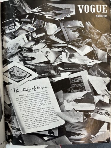
Additionally, I was fascinated to learn how Audrey Withers and Cecil Beaton destroyed the entire paper and photographic archive of British Vogue for 1942’s March issue (below) in response to the Paper Salvage effort and in the face of unimaginable hardship. I believe the coupled nobility and arrogance in this action – which reacted to contemporary uncertainty at the expense of future study – serves as an example of the undeniable tension behind justifying perceived ‘frivolities’ in an era of necessity as well as securing Audrey Withers’ status as a largely anonymous and unknown figure.
British Vogue, March 1942
What is your favourite thing that you’ve written/worked on/researched this year?
I’m loving my dissertation – especially as it is something I’ve been mulling over since last summer – but I really enjoyed working on my virtual exhibition, which explored the power of perfume. Perfume is capable of so much: it has the power to evoke forgotten moments; perfume acts as a designer’s signature – yet invisible – autograph, the list could go on… What I’ve loved about this project was its focus on creating a visual argument. Unlike an academic essay where you might presume certain knowledge and expertise on behalf of the reader, I had to consider how to pitch each element to a wide variety of visitors in order to give them the best experience possible. For instance, I used text panels to introduce each section and broader themes, whereas the sample exhibition catalogue entry allowed for a more in-depth analysis.
I wanted to situate perfume within a retail space, reinforcing perfume’s relationship to commercial practices, and chose to set it in the historic Liberty Department Store in London. In keeping with the idea of it as a fantasy exhibition, I kept on imagining I was in ‘The Sims’ world each time I was working on my floor plan, visualising how a Sim character would walk through the exhibition space. I wanted to create an immersive, multi-sensory experience, and decided on a commissioned and interactive sensory wall, serving baked goods (and cocktails!) to create three ‘miniverses’ to reflect the perfumes and designers on display: Elsa Schiaparelli’s Shocking, Yves Saint Laurent’s Opium and Tom Ford’s Tuscan Leather. I found considering perfume’s position as simultaneously immaterial and material particularly fascinating and incorporated that into my layout.
What are you wearing today?
Recently, I’ve found that I’m wearing a ‘uniform’, which normally consists of jeans, a simple top, a fun statement blazer or coat and a bright red lip. Today, I’m wearing a pair of denim blue Levi’s, an M&S black thermal top (not so chic, but I FEEL the cold), my cherished checked old Celine blazer from Vestiaire Collective and a pair of slightly battered Axel Arigato trainers, plus my go-to vintage Mulberry laptop bag, which I nabbed from my mother. And, of course, my signature red lip. I’m also having a bit of a jewellery moment, so have layered it with a couple of Alighieri necklaces (including the ‘Invisible Compass’ as I’m always getting lost!), a gorgeous Katie Mullally Irish Coin Charm featuring an Irish hare (I’m born Year of the Rabbit which I feel is close enough) and an amber necklace bought in Edinburgh by two of my dearest friends for my birthday last year. I’m also wearing a pair of Motley X Alice Cicolini earrings and my usual rings, including one from my mother and a Gracie J prototype tear ring. It’s been a research day, which started with an exciting trip to Vogue House to meet with Julie Summers, where we talked about our love for Audrey Withers, and I was lucky enough to take a quick peek at some of the Vogue archives from the 1940s and 1950s. I then had lunch with a friend and have since been busy in the London College of Fashion Library looking at more Vogue archives where I bumped into fellow MA student, Megan, before heading home for a relaxed evening!
Do you have an early fashion memory to share?
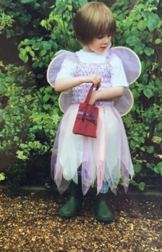
When I was a child, there was a time where all I would wear was a dress with a tutu skirt, fairy wings, and green wellington boots. And jeans underneath if it was cold. Occasionally, if I was feeling very daring, I might try to pinch my mother’s clip on earrings to complete the look… From an early age, my mother had been quite happy for me to choose my own outfits, barring the occasional family event, and so I’d turn up to nursery dressed as a fairy. Complete with a little handbag with everything a fairy might need for the day, namely bubbles and a glitter pen.
As I would wear this outfit day in and day out, I must’ve worn it on the day we had an art lesson as my mother ended up receiving a call from the school. Initially assuming it was about one of my brothers who was constantly misbehaving, it was a surprise to hear that it was about how I had refused to take off my fairy wings when asked. Though the teacher was seemingly only concerned they’d get mucky during the arts and crafts activities, I continued to refuse to take them off and they were unable to put my painting overalls on. While neither my mother or I can remember the precise outcome, or whether I agreed to take my fairy wings off – even momentarily to put the apron on – I’d like to think that a compromise was eventually made, and I succumbed to reason. But knowing how stubborn children can be, there’s certainly a chance that I refused to cooperate.
In the photo below, it’s funny how the core of many of my outfits remains the same, even nearly two decades on. I often wear a white t-shirt and jeans, and the tutu dress and fairy wings have simply been replaced with a statement jacket. It would seem that there’s a part of me that still wants to be a fairy.
Wearing a tutu, fairy wings and wellington boots, circa 2003
When one speaks of Stanley Kubrick, what comes to mind is often the world-renowned director’s timeless oeuvres as A Clockwork Orange (1971), Barry Lyndon (1975), The Shining (1980) and Eyes Wide Shut (1999). And yet, Kubrick’s brilliance was evident even in his often overlooked teen years, when he was just starting out in his career behind the lens, with photographs taken in the streets of New York.
At the mere age of 17, a young teen from the Bronx, Kubrick traded in life as a student after graduating from high school, when he was discovered by Look magazine and hired as staff photographer in 1946. Thus began his brief yet fruitful career as a photojournalist which in many ways paved the way to his stepping into Hollywood and becoming of a filmmaker.
1940s was the time of photo narratives/stories which had surged in popularity with Life magazine. A rival of Life,Look magazine’s aesthetic was focused on the everyday rather than the events of the globe. It aimed to convey the intimacy, eccentricity, and ordinariness of life in New York City. The city’s dynamism, chaos and its multiculturalism made it the perfect location to base the photographs and stories for which it was a source of endless entertainment. Kubrick’s photographs taken for Look between 1945 and 1950 are a reflection of the golden age of post-war America and boom of capitalism. The palpable energy of the city is very clearly translated to the viewer while the style of Kubrick in capturing everyday life reminds one of film noir, a genre he favoured in his films as well.
Kubrick’s career in Look, which ended in 1950 when he decided to leave the magazine behind to focus on making feature films, encompass over a thousand photographs by the famous director. They were often named as being proto-cinematic that signalled to his talent with the camera and unsurprisingly, interest in filmmaking. Although this talent was strongly nurtured during his time in Look that gave Kubrick the opportunity to focus on human interactions and how it could be reflected through the camera it is evident that he was already a naturally gifted storyteller. His genius in conveying the psychological depth and emotion of his subjects through the lens clearly shows through his adeptness at handling the camera, setting and framing scenes to push his narratives, which all formed the strong foundation for his filmmaking career.
‘Everyday’ in New York City that Kubrick captured with his camera encapsulated ordinary people in parks, subways and stores to TV and Hollywood celebrities going about their lives. Kubrick’s ability to turn the ‘everyday’ and ‘ordinary’ into a visual story, and a compelling one at that, was evident early on. Although many of these photographs were spontaneous instances from everyday life, many of them were staged, which also perhaps nodded to Kubrick’s passion for storytelling and interest in film. Kubrick was given assignments, shooting scripts to construct and align his photographs/photo-essays accordingly. He also presented his own themes which were often accepted by the magazine. The given narratives strengthened the filmic quality of Kubrick’s photographs.
Stanley Kubrick, Bronx Street Scene: The Camera Catches an Offguard Episode over a Hairdo (1946), Museum of the City of New York. The Look Collection
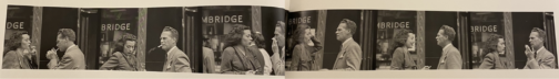
One of the main themes of Kubrick’s photographs was genuine human interactions embedded in daily life. His series for the 1946 November issue of Look feature photographic sequences from the street titled Bronx Street Scene: The Camera Catches an Off-guard Episode over a Hairdo. In a series of photos shot consecutively, two women are first seen chatting in front of a shop which is then followed by another shot that show the entrance of a passer-by, another woman into the frame and the two women fixing her hair and having a laugh over the matter. A different strip shows a couple smoking and chatting on the street in front of a store. The naturalness of the gestures and facial expressions coolly emanate from the frame, mesmerising us and insinuating that we have caught glimpses, instances from life with these people and watching from afar in a discreet manner. The consecutive shots and usage of the same vantage point here that reveal the continuation of these two different events very clearly refer to filmic techniques.
Stanley Kubrick, People Conversing on the Street (1946), Museum of the City of New York. The Look Collection
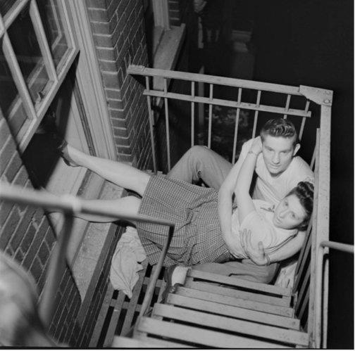
Kubrick caught spontaneous scenes from the street. Some he turned into scenes with consecutive shots as seen here. Others instead, were single shots that entailed an overarching theme, such as Park benches: Love is Everywhere series created in 1946 for May 1st issue which was a love series where Kubrick captured young couples on benches, fire escapes and street corners, embracing. Kubrick’s usage of infrared film and flash intensified the candidness of the scenes. The couples were often seemingly caught in unexpected moments, especially at night-time, similar to paparazzi shots which highlighted the voyeuristic tones that Kubrick’s photographs often carried, resembling the technique that was frequently used by famous tabloid photographer Weegee.
Stanley Kubrick, A Couple Embracing on a Fire Escape, (1946), Museum of the City of New York
A Couple Embracing on a Fire Escape is one of the most unique shots in the series that seems to have a sinister undertone. With not only the oblique angle, the awkward positioning of the couple on the fire escape but also the overpowering flash that has overly whitened the eyes and skin of the couple, transforming them into ghostly figures, reminiscent of deer caught in headlights, which speaks to Kubrick’s genius with the play of light.
Stanley Kubrick, Park Benches: Love is Everywhere, (1946)
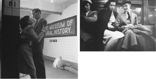
Stanley Kubrick, Life and Love on the New York Subway, (1947), MCNY
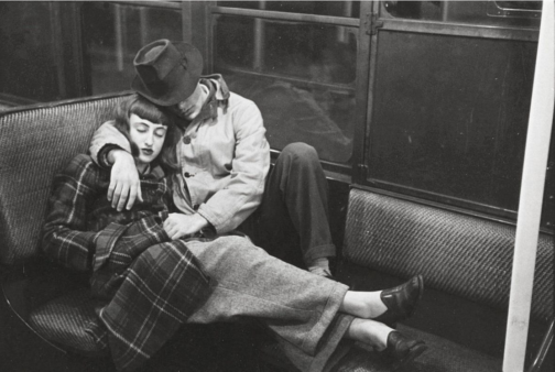
The New York subway offered a microcosm of the city. Spending time at the subway for almost two weeks, Kubrick shot discreet photos of people riding the subway with a hidden camera for another assignment titled Life and Love on the New York Subway in 1947 that fit the everyday life of New Yorkers narrative. Placed amongst the candid photographs in the subway spread, some of the photographs such as this one that show a couple, in fact Kubrick’s friends Alexander Singer and Toba Metz, sleeping, were argued to be staged. While the low vantage point, the dramatic contrast between black and white made scenes as the photograph with the couple embracing cinematic, it also put forward the harsh realities of big city, with the homeless man sleeping in the background, somewhat taking the focus away from the romance in the shot.
Stanley Kubrick, Life and Love on the New York Subway, (1947), Museum of the City of New York. The Look Collection
The shots that focus on individuals and their facial expressions show a study of psychological depth that also belongs to the cinematic verse. Glorifying the normalcy of everyday life of ordinary people in the big city stretched from photographing people waiting in line to do laundry, waiting in the subway and shopping in the city. What all of them shared in common was the focus on large crowds to highlight the act of looking. We see people watching other people and then we realise we are also watching these people through Kubrick’s lens.
Frank Bauman, Stanley Kubrick, Tom Weber, Advertising Sign Painters at Work, (1947), Museum of the City of New York. The Look Collection
This theme was made central in a series that Kubrick had created, capturing in separate ‘reaction shots’, the confused and surprised expressions of people watching a publicity stunt with a model triumphantly posing next to a group of sign painters in front of a billboard for a Peter Pan bra advertisement high up on a building on the corner of Fifth Avenue and 42nd Street (September 3, 1947). In this collaborative work with Frank Bauman and Tom Weber, Kubrick’s interest in film became more poignant, whilst also showing that entertainment and spectacle were always around the corner in an ordinary day in New York City, embedded in the spirit of the city.
In another series for Look, Kubrick started to focus on individual profiles. In this spread he celebrated the balancing act of a young shoeshine boy named Mickey, documenting a day in his life. Son of Irish immigrants, Mickey made a living by shining shoes to support his family. Taking around 250 photos for his first long photo-essay assignment, Kubrick presented the young boy’s life, showing him playing and conversing with friends in one shot, working, doing laundry, or contemplating life in a mature manner on a rooftop of a New York building in the next shot. Showing Mickey’s difficult life stuck between trying to provide for his family whilst simultaneously trying to enjoy his young years, Kubrick poignantly captured the difficulties faced by lower classes in attempting to survive in a thriving, chaotic city. The fact that this series was not published shows that gruesome realities of a big city were mostly glossed over in Look compared to Life. This photo series that contrast shots of Mickey with friends and ones where he is wandering the city alone poignantly intensify the difficult double life he leads, both, juggling adult responsibilities.
Stanley Kubrick, Shoeshine Boy, (1947), Museum of the City of New York. The Look Collection
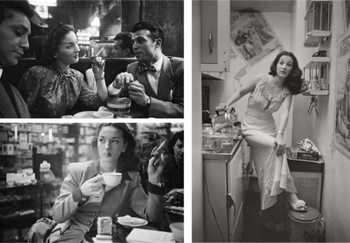
Edging closer to his interest and career in film, Kubrick’s photographs after 1948 started to focus on well-known faces from TV and Hollywood. Kubrick offered the most psychologically complex portraits from these people’s lives. One series that showed the disparity between public persona and private, backstage reality, was another ‘unpublished’ photo narrative series from March 1949, where Kubrick captured a day in life of a showgirl named Rosemary Williams. Williams was a young girl that had come to New York City dreaming of becoming an actress.
Stanley Kubrick, Rosemary Williams-Showgirl, (1949), Museum of the City of New York. The Look Collection
However, struggling to make ends meet as an ingénue in the big city, Williams became a showgirl by night to attempt to make it as actress by day. It was evidently a far less graceful lifestyle compared to that of an actress, as Williams often performed in revealing clothes for the pleasure of men. Captured walking in the streets of New York, having coffee, reading in the privacy of her home to posing in front of the camera and in the backstage getting ready to go on stage, Williams’ life is documented in around 700 images, amounting to one of Kubrick’s longest narratives.
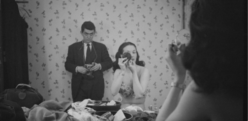
Her professional life is shown through shots of her either conversing or dancing with men or posing in front of the camera. These photographs that show her with company, emphasize the overpowering male gaze that is directed on Williams that signal to her profession and the tool that allows her to sustain her dreams in the big city. Kubrick captured Williams’ despair resulting from the hardships she faces perfectly in her demure expressions and often contemplative manner, from moments of leisure when she alone appears within the frame, much like the aforementioned Mickey. Perhaps the most intriguing photograph of Williams is the in-between public and private realms, where she is getting ready in the backstage in front of a mirror before her performance. Yet, Kubrick haunts this scene with a menacing stare and manner, with a camera in hand which is strategically lowered as he looms large behind Williams as she carries on preparing for the stage, seemingly unaware. Insinuating the voyeurism of the male spectator and the life of a showgirl – which is one that is under constant scrutiny of the male gaze due to the exhibitionist nature of the profession – is perfectly reflected here not only with Kubrick’s sinister placement at the back, intensely staring at Williams getting ready, but also with the mirror and the camera that appears to be subtly filming her below vantage point. Undeniably eerie, the genius of Kubrick lies in the blurring of the concept of the gaze. Perhaps a reference to Velazquez’s Las Meninas the subject of the photograph also becomes the viewer. The viewer is caught in the act of watching Williams in a private moment. Williams is caught between a crossfire of gazes as the camera directed to the viewer reminds us that we are also active voyeurs. The widened frame and the surrounding sense of mystery contributes to the filmic elements of this scene. It becomes evident that the running theme of the ‘unpublished’ spreads were harsh and forsaken reality of the city that Kubrick attempted to unearth and present to the wider public in the manner of Life magazine yet one that was often hindered by Look. This perhaps became a further push for Kubrick in the direction of cinema where he could tell his stories freely.
Stanley Kubrick, Rosemary Williams, Show Girl, 1949, Museum of the City of New York. The Look CollectionStanley Kubrick, Rosemary Williams, Show Girl, 1949, Museum of the City of New York. The Look Collection
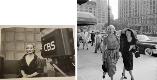
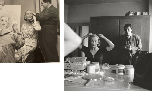
Look magazine also differed from Life in the sense that it aimed to show the ‘real’ lives of Hollywood and TV figures to instil the sense of normalcy around famous people, showing them both on and off camera. Yet, Kubrick still offered heavily staged photographs. Williams’ story was most likely swapped for a high-profile celebrity spotlight issue on Faye Emerson titled, Faye Emerson: Young Lady in a Hurry. Emerson was considered as picture of elegance, grace and intelligence. TV was on the rise and was slowly becoming a rival to radio and print. A Hollywood actress recently turned in to TV presenter, Emerson was regarded as ‘First Lady of TV’ and listed under ‘Top Female Discovery of 1949’ list, which, alongside her career switch, made her worthy of a cover story according to Look magazine. Emerson in this photographic series created by Kubrick for the August 1950 issue, is presented as joyful, both behind and in front of the camera: whether she is distributing autographs for eager fans, interviewed near the Plaza hotel, captured having a laugh with the society columnist Eleanor Harris, casually sitting for a portrait with a phone in hand making calls whilst also getting her hair done.
Stanley Kubrick, Faye Emerson: Young Lady in a Hurry, (1950), Museum of the City of New York. The Look CollectionStanley Kubrick, Stanley Kubrick with Faye Emerson from “Faye Emerson: Young Lady in a Hurry”, 1950s, SK Film Archives/ Museum of the City of New York
Emerson never ceases to smile in the photos despite her evidently busy schedule, forming part of Kubrick’s constructed story surrounding Emerson, promoting the busy yet elegant and content lady to aspire to, which the title clearly insinuates. In one photograph, Emerson is captured whilst getting ready in her dressing room. Kubrick uses the same style and framing with the mirror he used in the unpublished photograph of Williams backstage, placing himself behind Emerson with a camera, watching her whilst she’s getting ready. Yet the difference here is that Emerson is aware of being photographed by Kubrick and almost poses for him whilst getting ready to be on screen. Usage of a mirror cleverly conveys the duplicity of TV personas, and their elaborate yet fabricated self-creation for TV.
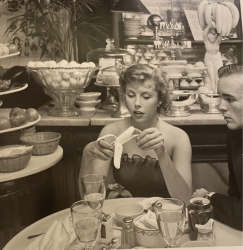
Very similar to Emerson’s profile was one created for Betsy Von Furstenberg. Furstenberg was the daughter of a German aristocrat and was also as an actress in New York. Another, ‘Day in the Life of’ piece, her everyday life was represented in a cinematographic and theatrical way in these photograph series by Kubrick. She is shown engaging in a variety of ‘serious’ and normal activities such as preparing for a role in her home, socialising with friends as well as silly moments from peeling a banana in a fancy restaurant to sleeping on the steps of the Plaza hotel next to John Hamlin. These pictures were featured in Look magazine’s spread from July 18, 1950 with the title The Debutante Who Went to Work. Photographs represent the juggling of day-to-day life with a highly glamorised one with comedic effect, evident from the awkward moments, humorous gestures, and facial expressions of Furstenberg. Whilst a more psychologically in-depth narrative was worked on for the earlier photographs of Williams was ultimately shelved, favouring a feature that was created around a lady that worked despite her aristocratic background. This shows the elegant façade that sought to represent life in New York City, with the gruesome realities of hardship were kept very deliberately hidden. A debutante that balanced life and work was one to be aspired to while a showgirl trying to make ends meet was one that was far too real and far less glamourous. Von Furstenberg’s story was about elegance, and, on the surface a light-hearted, innocent story of how to make it as an actress in the big city, despite being further removed from reality. The theatricality of the mimics and gestures of Von Furstenberg is in high contrast with that of Williams which almost insinuates the fabricated nature of this narrative and lifestyle.
Looking back at his brief time as a photojournalist in 1972, the director himself commented: ‘By the time I was 21 I had four years of seeing how things worked in the world. I think if I had gone to college I would never have been a director.’ Photographs such as these taken in the streets of New York put forward the theatricality of the city which Kubrick presented in his characters, personas and well-known faces that made up the city, delving into private lives of public figures, producing intimate and psychological portraits. Whether watching these figures from afar, standing in the crowd beside them or even in their private quarters, Kubrick always placed the viewer in the intimate world of his subjects. The photographs offered a genuine image of New York City, shining light on different lifestyles of those from a variety of backgrounds, showcasing moments that revealed the everyday routines of people from different classes, with everyone united in their common goal of attaining ‘The American Dream’.
The director’s final film Eyes Wide Shut (1999), set in New York, caused quite a stir in its exploration of the mysterious and dangerous sides of the vibrant city of New York, focusing on an elite cult. This suggests that the famous director was perhaps making a nostalgic tribute to his time as a young photojournalist in the midst of this chaotic city he found himself in, and the vibrant scenes he caught glimpses of with his camera as a teenage boy. Today, Kubrick is better known for his 12 feature films yet his strength in visual storytelling was implanted in his little-known early career as a photojournalist. It is evident that for Kubrick these early photographs, as Sean Corcoran (the Photography Curator at the Museum of the City of New York) stated, allowed him to master the art of framing the composition and opened his eye in different ways of seeing. Kubrick himself said: ‘Generally speaking, you can make almost any action or situation into an interesting shot, if it’s composed well and lit well.’ Kubrick’s genius seeps from his œuvre produced in his short time as a photojournalist, right on the brink of his career as a director.
By Ipek Birgul Kozanoglu
Bibliography
Albrecht, Donald; Corcoran, Sean. Through a Different Lens: Stanley Kubrick Photographs, (Köln & New York: Taschen, Museum of the City of New York, 2018)
Mather, Philippe D. Stanley Kubrick at Look Magazine Authorship and Genre in Photojournalism and Film. (Bristol:Intellect, 2013)
Helen Levitt’s (1913-2009) photography presents life on the streets of her native New York from the 1930s to 1990s. The current exhibition of her work at The Photographers’ Gallery in London gives insight on a world of charm and character often overlooked in a time and place associated with hardship.
What struck me about many of the photographs in the exhibition was the street style they showed, particularly of 1940s New York, and how this style seemed to embody the ease and coolness of residents whilst also creating a protective armour that shielded them from potential harm.
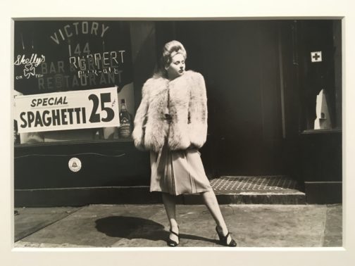
Figure 1. New York, c.1940. Silver Gelatin Print. Courtesy of Film Documents LLC and Galerie Thomas Zander, Cologne.
The first image I have featured exudes glamour (Fig. 1). The woman stands powerfully in the centre of the frame, her large hairdo and statement fur coat making her appear more a fashion model than everyday resident. She turns her head away from the camera, nonchalant despite her bold presence. The photograph might be a snapshot, but something in the woman’s pose implies a knowledge that she is being photographed. She wants to appear powerfully glamourous. Behind her, in a storefront window, is a sign for spaghetti being sold for 25 cents. The spaghetti sign grounds the image. The woman is in her local area, and Levitt chooses to show us those surroundings rather than strategically shooting a more glamourous background to suit the look of the woman.
In this image I see optimism for the beginning of a new decade that this woman seems determined to succeed in. However, the fur coat with its strong shoulder pads also suggests protection, as if the woman is cocooning herself in a thick wall of fur to defend herself from the harsh realities of the world she faces. We lose all sense of the woman’s proportions beneath the heavy coat. She is emboldened by the layers of clothing she has ensconced herself in.
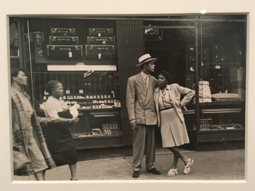
Figure 2. New York, 1944. Silver Gelatin Print. Private collection. Courtesy of Film Documents LLC and Galerie Thomas Zander, Cologne.
The second photograph is as glamourous as the first (Fig. 2). A couple stand together, woman leaning on man, both impeccably dressed. Levitt has captured the woman mid-speech, and two more women are walking across the scene from the left-hand side. This all comes together to present a far more snapshot-like image than the first.
The man’s oversized zoot suit, paired with hat, sunglasses, and loosely held cigarette, all contribute to create an image of effortlessness but also serve as a kind of armour, similar to the fur coat of the woman in the first image. The shoulder pads and loose suit trousers conceal the shape of his body, and the sunglasses restrict the expression that can be gleaned from his facial features.
The woman’s casual pose leaning against the man at first suggests ease and comfort. However, a layer of defence can also be seen in the sharp angle of her elbow, pointed out towards the street on her exposed side.
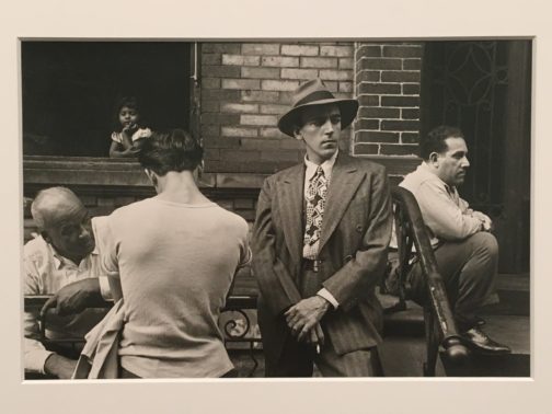
Figure 3. New York, 1945. Silver Gelatin Print. Courtesy of Film Documents LLC and Galerie Thomas Zander, Cologne.
The final image I would like to discuss perhaps best highlights the way fashion served as protective armour in 1940s New York (Fig. 3). The man facing the camera stands in a striped suit, hands clasped in front of him, fedora casting a shadow across his forehead. What is most notable about the man’s outfit is its bold use of pattern. A striped suit is paired with a checked shirt and graphic tie. The clash of patterns reveals the man’s confidence styling himself, and his confidence asserting his place with striking visual presence.
Beside the man stands a far less extravagantly dressed individual. We only see his back, but can see he has removed his jacket and stands in a t-shirt, the shape of his shoulder blades showing through the fabric. This figure, next to the powerful stance of the suited man, becomes a figure of vulnerability. The composition almost gives the impression we are seeing two sides of the same man; the confident figure who faces the world, and the softer side of himself that cannot be fully revealed to the camera. A child in the window of the building looks down on the man who faces away from us, adding to the sense that this lack of layers of clothing is a childlike kind of vulnerability.
‘Helen Levitt: In The Street’ is on show at The Photographers’ Gallery until 13th Feb 2022.
As it nears the end of term, we’re spending some time getting to know the current MA Documenting Fashion students. Violet discusses James Barnor, the Swinging Sixties, and photography as a means of resistance.
What is your dissertation about?
I wrote my dissertation on British-Ghanaian photographer James Barnor and his capturing of Black Britain in the 1960s. I first came across his work in February when I saw his image Wedding Guests (below) on Pinterest. I was struck by the innate poise of the two female subjects, who in their meticulous attire and polished appearance, are the epitome of 1960s cosmopolitan glamour. I love the quietly revolutionary quality of his images. Whilst they are not politically or racially charged on the surface, in their depiction of everyday people, posing amongst the streets of London, they would have proved extremely powerful in both contemporary and post-colonial contexts. There is a retrospective of his work on at the Serpentine Gallery at the moment. Very fortuitously, it opened two weeks before my dissertation was due. It was incredibly exciting to see his images in the flesh. The show has been really beautifully curated, illuminating the multi-dimensionality of Barnor’s work through a diverse range of images from his six-decade career.
Ossie Clark. I love the elegant cut, drape and flow of his pieces. Born in Liverpool in 1942, Clark quickly became known as a pioneer of London’s Swinging Sixties cultural revolution. His designs offered a more romantic alternative to Mary Quant’s short hemlines, block colours and geometric prints. I came across a silk co-ord designed by him in a vintage boutique on the Portobello Road a couple of weeks ago. Consisting of a pair of billowing high-waisted trousers and a short-sleeved Peter Pan collar top, cinched in by a silk sash at the waist, it is my dream ensemble. The cut and fit are far superior to any item of clothing that I have ever worn. Perfectly proportioned and meticulously tailored around the waist and shoulders, I feel as if it was made for me. Clark really understood the female form. My dream is to become a collector of his pieces.
Ossie Clark with Gala Mitchell c. 1960s, Ossie Clark with Judy Guy Johnson and Patti Boyd c. 1960s, accessed via AnOther Magazine
Favourite dress history photograph?
This is a tough question as I have so many. But with regard to dress, the image which I find myself coming back to is the photograph Neil Kenlock took of Olive Morris in 1973. Morris was a political activist and community leader, known for the part she played in the Squatters Movement and her founding of the Brixton Black Women’s Group in 1973. Very sadly, she died aged 27, but in her short life, she achieved an incredible amount. In this image, there is a real sense of her presence as an individual. In faux jacket, worn jeans and assortment of bangles, she appears confident and at ease. It possesses a snapshot quality with the viewer a voyeur looking in at an intimate moment in this remarkable woman’s life. She smokes a cigarette as she huddles by the electric radiator to keep warm. It seems like there is an interaction between her and Kenlock as she beams leaning slightly towards the camera. I love the idea of photography being a collaborative venture between the subject and photographer, with the viewer is privy to the intimacy of their relationship.
What is your favourite thing that you’ve written/worked on/researched this year?
In the first semester, I was introduced to the concept of photography as a means of resistance, and within this, the role clothing has played as a means to self-fashioning identities for oppressed groups within society. This fuelled an interest in Stuart Hall’s ‘politics of representation’ which I have applied to different periods and in varying contexts throughout the year. My first essay was on Harlem Renaissance portraiture and how the representational power of the genre was harnessed by various artists of the period to illuminate the complexity and multi-dimensionality of being African American at this time. I was particularly drawn to James VanDerZee’s studio portraits of glamorous young Harmelites. Posing in elegant 1920s clothing against elaborate backdrops, they drew together the different fragments of their diasporic identity in one visual narrative. I’m fascinated by the concept of the tiniest sartorial details having the most significant meaning to the individual and how this can translate to the outside eye.
On 17 May, galleries reopened in the UK. I took the opportunity to visit From Here to Eternity: Sunil Gupta. A Retrospective at The Photographers’ Gallery for the exhibition’s limited reopening from 17 May – 31 May. A retrospective illumination of UK-based photographer Sunil Gupta’s (b. 1953, New Delhi, India) body of work so far, from 1976 to the present day, the showcase focusses on themes of race, identity, transition and family. Telling the story of what it is to be a gay Indian man, Gupta’s work is both personal and political, ordinary and melodramatic, and, crucially, challenges Eurocentric visualisations of bodies and desire.
Sunil Gupta, from the series ‘Exiles’, 1986-1987, accessed via https://www.sunilgupta.net/exiles.html
I was particularly struck by the way that pose and self-styling affect the atmosphere of the photographs. In an interview in 2019, Gupta said, ‘[in] India … one of the major stumbling blocks to stepping into [a gay] identity was not having a place. Every time I met somebody the primary question was “Do you have place?”’. This notion was especially prevalent in three of Gupta’s photographic series on display at the Photographer’s Gallery: Towards an Indian Gay Image (1983), Exiles (1986-1987) and Mr Malhotra’s Party (2006-ongoing). The lack of place emphasises the importance of self-fashioning and the subjects’ poses and styling highlight senses of both displacement and belonging.
Sunil Gupta, from the series ‘Towards an Indian Gay Image’, 1982, accessed via https://www.halesgallery.com/artists/91-sunil-gupta/works/
In 1983, Gupta created a black and white series, Towards an Indian Gay Image, that photographed Indian men who identified as gay. They agreed to be photographed but wanted to remain anonymous, which resulted in subjects posing with their back to the camera without their heads in the shot. Gupta explains:
It was the first time I had returned to India as an adult and I found gay men living in plain sight but completely hidden from mainstream society. The last thing they wanted me to do was to make photographs of them and publish them somewhere. It created a big dilemma for me as I was still in college and hoping to document social justice using photo-journalism and my subjects were invisible.
In these photographs, Gupta highlights the vulnerability of the gay community in India and the obstacles that arise from the desire to be recognised but the need to be hidden. He encourages us to consider how someone may dress and pose when they want to be both seen and unseen.
Sunil Gupta, from the series ‘Exiles’, 1986-1987, accessed via https://www.sunilgupta.net/exiles.html
This duality is continued in colour in the later series Exiles (1986-1987), where Gupta returned again to Delhi to illuminate the lives of gay men in India before the decriminalisation of homosexuality. In 2020, Gupta told The Face, ‘I became aware through art school that this whole thing called art history is our context and my story is not in it.’ Exiles begins to tell this story, where clothing and pose are crucial in expressing Gupta’s subjects’ identity.
Sunil Gupta, from the series ‘Mr Malhotra’s Party’, 2006-ongoing, accessed via https://www.sunilgupta.net/mr-malhotras-party.html
For a much later series, Mr Malhotra’s Party (2006-ongoing), Gupta photographs queer-identifying people in India, but this time they are keener to identify themselves. They pose confidently and look straight into the camera. The way they dress, too, is bold, cool, and assertive.
Sunil Gupta, from the series ‘Mr Malhotra’s Party’, 2006-ongoing, accessed via https://www.sunilgupta.net/mr-malhotras-party.html
Across these images, a transition is clear: from invisibility to visibility. By putting physical photographs next to each other in time, the exhibition emphasised the role of self-styling and posing in displaying identities, and in telling crucial stories that are at once personal and political. Through these photographs, Sunil Gupta created visibility for those who were hidden and began to answer the question: ‘what does it mean to be an Indian queer man?’ As the photographer himself has said, ‘It’s our everyday stories that are important.’
By Kathryn Reed
Sources used
Artist’s own website, <https://www.sunilgupta.net/> [Accessed 19 May 2021]
From Here to Eternity – an original film with photographer Sunil Gupta, dir. Louise Stevens, 2020, <https://www.youtube.com/watch?v=-N2AtpQEtzs> [Accessed 19 May 2021]
The Photographer’s Gallery exhibition press release, ‘From Here to Eternity: Sunil Gupta A Retrospective, 9 Oct 2020 – 24 January 2021’, (4 August, 2020) <https://thephotographersgallery.org.uk/whats-on/exhibition/here-eternity-sunil-gupta-retrospective> [Accessed 19 May 2021]
Cochrane, Laura. ‘Sunil Gupta: photographing India’s queer scene over 50 years’, The Face (8 October 2020) <https://theface.com/culture/sunil-gupta-art-the-photographers-gallery-from-here-to-eternity-exhibition> [Accessed 19 May 2021]
Dunster, Flora. ‘Do You Have Place? A Conversation with Sunil Gupta’, Imagining Queer Europe Then and Now 35 No. 1 (20 January 2021)
DreckMag, ‘Interview with Sunil Gupta’, DreckMag (1 January 2017), <https://dreck-mag.com/2017/01/01/sunil-gupta/> [Accessed 19 May 2021]
As the year winds down, I thought I would let my grandmother do the writing in one of my final blog posts, as I continue to decompress after a charged summer term (read: dissertation season).
Ann was teaching at a Department of Defence school in Okinawa—her first teaching job overseas—in the 1960s when she met my grandfather. My mother was born in 1970, and they lived in Japan for another couple of years before moving to Hawaii and, eventually, Bakersfield, California.
My favourite picture* of my grandparents together: Ann and Bill at a teahouse.
I never knew my grandfather, so I grew up with photographs—both of him and by him. I also grew up with inherited memories and borrowed relics from my family’s time in Japan: a cloud-soft white kimono I wore for one of my first Halloween nights; a doll in a glass case with a cup of water; my mom’s tiny tabi socks that I remember once fitting me; the creaking snick of kimono closet doors opening and closing…
These dress-centric recollections are selected from a series of emails my grandmother sent me in early 2016, when I requested: ‘Tell me about Japan.’ The photos come from the albums upon albums stored in bookshelves and a great wooden chest at my grandma’s house in Bakersfield.
I believe my first official date with Bill was to a tea house; don’t remember details but we talked for hours. Funny what the brain chooses to remember. I remember wearing a red lightweight wool outfit. It was a pleated skirt with an attached camisole and over it a loose, long sleeved matching top that buttoned down the back. Wish I had it now!
We were there for a year. While there, I had some clothes made. I had grown up with homemade clothes, so store-bought ones were a treat. And there I was, wanting handmade clothes again. I recall a coral dress (wool again) with a fitted matching jacket and a brownish one with silvery-looking embroidery. Low waisted and slightly gathered. I would still like that one. I loved sending Mother stuff. I had a brown coat with a fur collar made for her, among other things. I have one of the fur hats she sent her mother, as well as a wool coat that I wear in the winter.
Two times our little convertible Datsun Fair Lady was stolen. Police found it both times. First time, somewhere outside Yokohama, abandoned in a rice paddy; and the second time, on a side street in Yokohama. Guess they ran out of gas after joy riding. It WAS cute!
We frequented Motomachi (name of a short street) often. There was a sushi bar that was a favourite and at the other end was a German restaurant that served the tastiest borscht; and when it went out of business, we were disappointed. Also on that street was a clothing store. I remember buying two long wraparound quilted skirts that were warm and I liked them.
I loved shopping in Japan. Not just for the items but the manner of wrapping so beautifully in a furoshiki (fabric wrapping). In the large department stores, there would be a greeter (I recall only women) at the foot of the escalator to welcome you as you were about to ascend. Mind you, this was in the sixties. I don’t know how things are now.
My friend Sally and I modelled together. Crazy time. She was bisexual and wanted to find a lesbian bar. Keep in mind that I spoke hardly any Japanese at that time and she spoke even less. So I am not sure we even had the right word for lesbian. Anyway, winter time after we had had a modelling assignment was dark. Set off in a taxi to find this bar. Probably we were in Shinjuku (large area of Tokyo) in the Golden Gai District (known for its architecture, little bars crammed together upstairs and down—favourite hangout for artists). We felt very adventurous and very nervous. We would go into one and ask where we might find a lesbian bar, and we’d get a response that they either didn’t know or didn’t understand us—or they’d direct us to another place. Finally we went into one and inquired and we were pointed to upstairs. Now upstairs might have been a fine place to go; but not knowing what was really upstairs, we left, and caught the train to Yokohama. (I never drove to Tokyo. Always took the train.)
‘And it was there that Michie had put beside each plate a rose petal with a pearl on it.’
Speaking of Sally—we both worked for the Patricia Charm Modelling Agency, the only foreign modelling agency in Tokyo at that time. She took a percentage of whatever we were paid, don’t remember what. Sally felt she took too much and suggested we freelance. When we told Patricia our plans, she said she would blacklist us. Well, it wasn’t that I was gorgeous; but the Japanese photographers liked me because I was friendly and attempted to learn their language. So I received several job offers right away. Then they would start canceling on me. Indeed Patricia did what she said. Really okay because not too long after that I became pregnant and became all wrapped up in that.
I will be at home in Los Angeles for a few weeks later this summer, and amongst the few things I have planned—a bal des victimes dinner party, driving lessons, days at the beach—a trip to Bakersfield definitely figures, when these photos will be unearthed and put into motion once more.
*All photographs belong to the author and her family.
In February, I submitted an assessed essay discussing the image of the Neue Frau as documented through various media formats in Weimar Germany (see previous blog post ‘In Her Image’). So when Rebecca introduced me to the Henkin Brothers Archive a couple of weeks ago, I was excited to see primary photographic material rendering 1930s Berlin with a warming, frank humility.
Before discussing their photographs, I think it’s best to get to know the brothers and their posthumously formed foundation first. The photographs of brothers Evgeny (b.1900) and Yakov Henkin (b.1903) were freshly unearthed in 2012. For over 70 years, untouched boxed filled with rolls of film had sat in Yakov Henkin’s former home in Leningrad. The rediscovery of these photographic heirlooms set in motion the creation of a wonderful archival foundation, with Yakov’s descendants taking full advantage of new technologies and digitising the thousands of negatives they had uncovered.
Despite growing up together in Rostov-on-Dov (situated in the European South of the Russian Empire), the brothers’ paths diverged in the wake of the October Revolution (1917) in Russia, with Evgeny travelling to Berlin and Yakov moving to Leningrad (present-day St. Petersburg). This disruptive parting between the two siblings is documented in their separate photographic collections: Evgeny capturing the cityscape of interwar Berlin (1926-1936) and Yakov the distinctive streets of 1930s Leningrad; until his voluntary enlistment in 1941 (his subsequent death on the Leningrad Front shortly thereafter).
In accordance with this blog’s dress historical premise, I thought it would be on-theme to select two images—from Berlin and Leningrad respectively—to demonstrate the brothers’ natural photographic talents whilst simultaneously illustrating the contemporary fashions of their individual city-spaces (neither brother worked professionally as photographers: each chose to hone their natural talent as amateurs while undertaking alternative careers). The first (Fig.3) is the stuff of fashion-historian dreams. Evgeny provides us with the street-side setting of what I assume to be a hair-salon’s storefront. This is a remarkably kitschy-cool image: quaffed and glossed mannequin heads line the length of the windowpane, while two living models occupy the foreground, emulating the pose of their backdrop inspirations. The Bubikopf, modelled here in various incarnations, was a masculine-inspired haircut symbolic of the New Woman’s revolutionary personhood. Bubikopf translates directly to ‘boy’s head’, and this affluent grooming modification was reconfigured several times, such as the shortened and smoothed ‘Eton crop’, which featured defined, exaggerated waves (see central mannequin for main reference). I am desperate for this wool coat on the left also, truly desperate.
The second image (Fig.4), taken by Yakov, is a more traditionally composed portrait that shows two women standing on one of Leningrad’s many riverfronts (c. late-1930s). In this image, we are treated to a fantastic display of jazzy pullovers that set the overall, fabulous fashion tone: matching ‘v’ neck-lines, each woman sporting a fun and unique woven motif (a dot pattern vs. a form of waved, rib knit) that is offset by equally distinguished collars (neat, petite bow vs. oversized Peter Pan collar). I could discuss at length the killer shoe-game on display here, but I am fully obsessed with the mirror-image diagonal poses each woman is striking (the soft, harmonious ‘v’ their bodies unintentionally create, repeating the motif of their corresponding necklines) and the headwear-cherries they have placed atop their ensemble-cakes: a structural cloche and the timeless beret (that always screams chic). Good show, ladies!
These two corresponding images, from individual European cities, depicting two pairs of fashion-conscious female friends and the style aesthetic of two unique landscapes, perfectly demonstrate the important, historical and cultural reference the Henkin Brothers’ work represents.
In recent years, the collection has been displayed at the @hermitage_museum (St. Petersburg) in the archive’s inaugural public exhibition, entitled: The Henkin Brothers: A Discovery. People of 1920s-30s Berlin and Leningrad (2017). And just this May (16-19 May), a selection of Henkin Brothers photography was shown at the 2019 @streetphotomilano festival. It’s safe to say that the Henkin Brothers are making a stellar, 21st century comeback!
I would like to thank Denis Maslov, Yakov Henkin’s great-grandson for his assistance and helpful emails concerning the writing of this post. Denis works to preserve the archive and develop its social media presence with his mother Olga—the only living descendants of the Henkin Brothers.
To learn more about the Henkin Brothers Archive Association, go to www.henkinbrothers.com
During a class in February, we discussed Gordon Parks’ 1956 series of photographs entitled Segregation Story. They were originally published in Life magazine as a visual documentation of the Jim Crow-era American South. His photographs highlight moments in the daily lives of African American subjects throughout Georgia and Alabama. At the time they were published, these photos were intended to foster empathy among white northern readers who were provided a powerful visual of how systemic racism permeated even the most basic activities: eating ice cream, going to school, or stopping at a drinking fountain.
Gordon Parks, Department Store, Mobile Alabama, 1956. Credit: High Museum of Art, Atlanta
Though I had seen many of these images before, one stood out to me in particular. Department Store, Mobile, Alabama depicts a woman and her young daughter standing outside of a door marked ‘Colored Entrance’. They wear their Sunday best, mother in a stylish pale blue dress, and daughter adorned in white frills, yet the neon sign above them reminds the viewer that systemic racism has relegated them to the position of second-class citizens. This image contrasts the fashionably dressed subjects in an otherwise serene moment with the glaring reminder of the segregation, hatred, and violence that impact every aspect of life. In this scene, notions of fashion and shopping are implicated into fraught negotiations of race and power in the American South.
Anthony Hernandez, Rodeo Drive #68, 1984. Credit: The Art Institute of Chicago
When I considered this image again in class, I was reminded of another photograph, taken nearly thirty years later which shares similar iconographic elements, and perhaps likewise raising questions about how constructs of race and power are played out through fashion, shopping, and consumer culture. Anthony Hernandez’s Rodeo Drive #68, part of his 1984 series, shows an African American family posing for a photograph in front of the Gucci store on the prominent shopping street in Los Angeles. This series of candid photographs of anonymous subjects documents those who were out to see and be seen. Most of the subjects in this series are dressed in bold styles of the power dressing era, acting out a narrative of the decade’s fashion on a street filled with its vendors. The majority of these subjects are white and captured in action as they move down the street. For this reason, the family in Rodeo Drive #68 stands out, particularly because we see them stopping to be captured in front of the shop. The Gucci storefront connotes a particular association with luxury fashion and commodity culture, and perhaps posing with the curling gold text of the brand name serves as a memento of the visit. As Rebecca notes in her post, it is unknown if they went inside. Both of these photos, though taken in enormously different contexts, raise questions about how shopping can be simultaneously social, personal, and entertaining, and implicitly entwined in the nettles of race, class, and gender dynamics. Parks and Hernandez help viewers interrogate how we read constructs of race and identity in relation to fashion culture, and how elitist and exclusive spaces are imprinted with power.
 Very similar to Emerson’s profile was one created for Betsy Von Furstenberg. Furstenberg was the daughter of a German aristocrat and was also as an actress in New York. Another, ‘Day in the Life of’ piece, her everyday life was represented in a cinematographic and theatrical way in these photograph series by Kubrick. She is shown engaging in a variety of ‘serious’ and normal activities such as preparing for a role in her home, socialising with friends as well as silly moments from peeling a banana in a fancy restaurant to sleeping on the steps of the Plaza hotel next to John Hamlin. These pictures were featured in Look magazine’s spread from July 18, 1950 with the title The Debutante Who Went to Work. Photographs represent the juggling of day-to-day life with a highly glamorised one with comedic effect, evident from the awkward moments, humorous gestures, and facial expressions of Furstenberg. Whilst a more psychologically in-depth narrative was worked on for the earlier photographs of Williams was ultimately shelved, favouring a feature that was created around a lady that worked despite her aristocratic background.
  This shows the elegant façade that sought to represent life in New York City, with the gruesome realities of hardship were kept very deliberately hidden. A debutante that balanced life and work was one to be aspired to while a showgirl trying to make ends meet was one that was far too real and far less glamourous. Von Furstenberg’s story was about elegance, and, on the surface a light-hearted, innocent story of how to make it as an actress in the big city, despite being further removed from reality. The theatricality of the mimics and gestures of Von Furstenberg is in high contrast with that of Williams which almost insinuates the fabricated nature of this narrative and lifestyle.
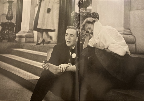
 The director’s final film Eyes Wide Shut (1999), set in New York, caused quite a stir in its exploration of the mysterious and dangerous sides of the vibrant city of New York, focusing on an elite cult. This suggests that the famous director was perhaps making a nostalgic tribute to his time as a young photojournalist in the midst of this chaotic city he found himself in, and the vibrant scenes he caught glimpses of with his camera as a teenage boy. Today, Kubrick is better known for his 12 feature films yet his strength in visual storytelling was implanted in his little-known early career as a photojournalist. It is evident that for Kubrick these early photographs, as Sean Corcoran (the Photography Curator at the Museum of the City of New York) stated, allowed him to master the art of framing the composition and opened his eye in different ways of seeing. Kubrick himself said: ‘Generally speaking, you can make almost any action or situation into an interesting shot, if it’s composed well and lit well.’ Kubrick’s genius seeps from his œuvre produced in his short time as a photojournalist, right on the brink of his career as a director.