Tag Archives: exhibition review

Beautiful People: The Boutique in 1960s Counterculture

Beautiful People: The Boutique in 1960s Counterculture, exhibiting at the Fashion and Textile Museum in Bermondsey (until 13 March 2022), unites over one hundred garments, worn by stars belonging to the Beatles and the Rolling Stones and others which were sold at the likes of Biba and Granny Takes A Trip. The exhibition details this truly electrifying decade, one which was home to creativity, angst and rebellion alike.

To honour the occasion, I chose to wear a floor-length Biba coat, in a tiger-print no less, which I had initially ‘borrowed’ from my mother as part of a Cruella de Vil Halloween costume some years ago. A dramatic piece which isn’t exactly an everyday item, it felt like the perfect time to bring it out ahead of our much-anticipated MA Documenting Fashion outing.

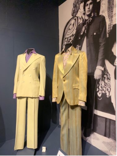
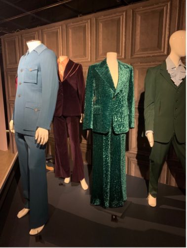
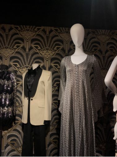
While the first time at the exhibition for most, it marked the second visit for Susanna, Claudia and I who had each planned a respective visit almost as soon as it had opened in the beginning of October. Providing a fascinating combination of insights into the 60s, this exhibition explored the impact of cultural, social and economic change within the context of fashion and its design. Indeed, it could easily warrant a second or even third visit as there is a considerable amount of information to digest and, with such well-preserved garments, a desire to focus on each and every minute detail on any one jacket or dress.

Beautiful People
Author’s Own Image.

At the beginning of the exhibition, a timeline situates key moments within the 1960s, where bullet points were replaced with the flower power emblem of the sixties, serving as one of many examples of the care and consideration which went into curating this exhibition. Outlining dates and information relating to the opening of boutiques along the King’s Road and throughout London, it also hinted at the importance and impact of the introduction of oral contraception on the NHS (National Health Service), which played a part in cementing this decade as the ‘swinging sixties’.

Further highlights included a recreation of some of the most iconic boutiques, signposted with the company’s logo, including both menswear and womenswear that were relevant to the boutique. The upstairs part of the exhibition was home to yet more clothes, and a few of us took it in turns to pick out our favourite pieces and note the occasion we’d like to wear them to. Jazzy jackets and flared two-piece suits proved to be our top picks.


Beautiful People
Author’s Own Image.
Beautiful People
Author’s Own Image.

As we made our way to the photography gallery, I was drawn to the article ‘Qui sont les filles anglaises? [Who are the English girls?]’ and a quote from Jenny Boyd outlining ‘Elles me ressemblent [They look just like me]’ for the 1966 December issue of Mademoiselle Âge Tendre. To me, it highlighted the ongoing fascination, or perhaps more accurately obsession, with being seen as ‘fashionable’ both at home and across The Channel, which is an idea that is ever-present today.

Beautiful people.
Author’s Own Image.

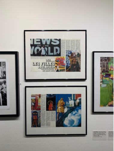
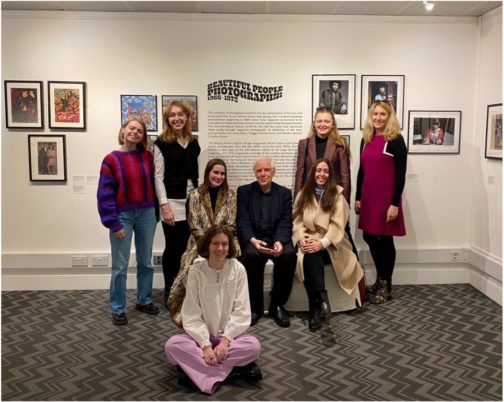
From there, we were delighted to receive a presentation from Photography Curator and Instagram-enthusiast Terence Pepper and former MA Documenting Fashion student Grace Lee who individually boast a huge wealth of knowledge about all-things sixties. Terence ran us through each photo, advertisement and magazine in such detail that for a brief moment we too were transported to the photoshoot, soirée or city being discussed. What’s more, we had the unexpected pleasure of meeting Pattie Boyd, whose sister Jenny Boyd was mentioned above, and who had an incredibly successful modelling career, gracing countless covers of Vogue and inspiring many a Beatles song with her then-beau George Harrison.

Situated à deux pas from London Bridge Station and Borough Market, it makes for a wonderful mid-morning viewing before a spot of lunch at one of the many fabulous food stalls and restaurants nearby.

During the exhibition, be sure to activate the nifty QR-code which links to a virtual exhibition catalogue! Further details on opening hours and tickets to the exhibition can be found here: https://www.ftmlondon.org/ftm-exhibitions/beautiful-people-the-boutique-in-1960s-counterculture/

Beautiful People
Our MA Documenting Fashion Cohort (not pictured: Rosie) with Susanna Brown and Terence Pepper.

By Georgina Johnston-Watt

A Personal Collection of Vivienne Westwood Shoes Exhibition Review

A Personal Collection of Vivienne Westwood Shoes juxtaposes Westwood’s outlandish designs with York Castle Museum’s diverse shoe collection, ranging from the 18th century to the present day. An intriguing aspect is that the Westwood shoes come from a private collector, amassed over 30 years, while Westwood selected shoes from the museum’s collection. The exhibition focuses on the craftsmanship involved in making a shoe, as well as allowing the viewer to revel in the style and beauty of footwear.

The exhibition display.

The layout of the main room is particularly eye-catching, with a catwalk display of Westwood’s designs interspersed with the museum’s collection. This means that the viewer can see the wide range of influences in Westwood’s work, as she combines historical knowledge of the shoe with a love of exaggeration. This is exemplified by the Super Elevated Gillie Heel, from the Anglomania collection, 1993, which appears to take a inspiration from ribbon-lace style shoes from the 18th and 19th centuries. Westwood renders her innovation with vibrant colours and the heel extended to lofty (and dangerous) heights. The model, Naomi Campbell, famously wore a version of these platform shoes as she took a tumble on the runway due to the 30.5 cm heels.

Super Elevated Gillie Heel.

Some favourites from the Castle Museum’s collection, which illustrate the range of style and dates on show, are a pair of ivory white satin shoes with a Louis heel from around 1730, and a pair of men’s Derby boots with a stacked leather heel, from the early 20th century. These shoes are both beautiful and elegant, illustrating the high level of craftsmanship, equally as striking as they are unique. They also demonstrate the evolution of footwear fashion for both genders throughout history.

A pair of ivory white satin shoes with an upturned toe and a Louis heel, circa 1730.
A bespoke pair of men’s derby boots with a stacked heel. Made by A.E Marlow for the Saxonia in Northampton. Early 20th century.


The influence of fashion on the development of footwear is further explored through the final room in the exhibition, with historical information about how shoes were made, and a display showing how shoes changed through different decades. By educating the viewer on the history of the shoe, the exhibition shows how Vivienne Westwood bases her designs on tradition and then subverts them through material or features to create something new. I also felt that this exhibition communicates how the function of the shoe was originally pure practicality, and how it has developed through time into an extension of our identity.

For me, shoes are the language of personality. Every shoe represents a different mood, translated through the height, material and colour. Different to clothes, which have to change as we fluctuate shape, shoes are a longer-term investment, and fit no matter what. This exhibition interprets the shoe as more than merely an accessory; instead the viewer is presented with the shoe as the main focus. As an avid lover of shoes, and faced with the continual struggles of storage and display, it is gratifying to see an exhibition where the shoe is given pride of place.

My shoes on display in my York room.

A Personal Collection of Vivienne Westwood Shoes is at the York Castle Museum until 28 April 2019.

Ellen Bhamra

Images 1-4 courtesy of York Castle Museum.

Bijoux Parisiens: French Jewelry from the Petit Palais, Paris

I was thrilled to learn that my local art museum, Omaha’s Joslyn Art Museum, was to stage an exhibition of French jewelry this summer. Bijoux Parisiens: French Jewelry from the Petit Palais, Paris was the Joslyn’s first jewelry exhibition and their first partnership with a Parisian museum. The exhibition featured 70 pieces of jewelry and luxury accessories and over 100 works on paper from the Petit Palais’ collection. The Petit Palais’ Parisian heritage was an important factor within the exhibition since Paris has been home to a continuous tradition of jewelry production since the Renaissance. Bijoux Parisiens highlighted over 300 years of French jewelry innovation and creativity and placed the precious stones and luxury items in a historical context to emphasize the way in which French jewelry reflects the aristocratic wearer’s position in society and the designer’s creativity. While some of the artifacts spotlighted artists who are lost to history, others pointed to the mastery of France’s famous jewelry maisons such as Boucheron, Cartier, and Van Cleef & Arpels. Through its use of contemporary fashion plates and prints from popular French magazines, Bijoux Parisiens also highlighted the intimate relationship between jewelry and fashion. The sartorial aspect of the exhibition was clear from the beginning as the first section of wall-text was accompanied by an 1884 portrait of a young woman by artist Paul Baudry. The painting’s subject, Madame Louis Singer, wears an off-the-shoulder black gown with delicate ruffles down the skirt and a bustle. The sumptuousness of her dress is enhanced by her jewelry, a diamond and pearl brooch at her bosom, double-strand pearl bracelet, sapphire and diamond ring, and dainty diamond earrings. The combination of Madame Singer’s smart black dress and glittering jewelry announce her as a woman of refined taste and high status.

Organized chronologically, the exhibition began with engravings by Gilles L’Égaré dating to the 1660s. These drawings of various ring and chain designs were produced to train apprentices and mark the artist’s ownership of the designs. The earliest piece in the exhibition was a pendant of gold, enamel, rubies, and pearls. I was struck by the intricacy and scale of this pendant, which was about three inches tall and featured a woman embracing two children, symbolizing the Christian virtue of charity. Both the early drawings and jewelry pieces set the tone for an innovative and ornate exhibition.

There was little evidence of  eighteenth-century splendor in the exhibition, but a large portion of Bijoux Parisiens was dedicated to nineteenth-century France and the link between its tumultuous political climate and jewelry aesthetics. Napoleon’s reign ended the repression of luxury during the French Revolution and encouraged the privilege of excess. The renewed production of jewelry, like the visual arts and fashions of the period, featured neoclassical designs and a revival of ancient art. Cameo necklaces, bracelets, and brooches as well as drawings of cameos featured prominently in the exhibition. Cameos in particular were a staple of Napoleon’s court because they alluded to antiquity and displayed wealth while their semi-precious materials were affordable to the aristocrats who were still recovering from the Revolution. Contemporary fashion illustrations from Germany in the exhibition show typical neoclassic, columnar gowns with deep necklines that made for easy display of large cameo necklaces such as the one below.

A wall broke Bijoux Parisiens into two distinctive spaces and appropriately separated twentieth-century artifacts from the earlier jewelry and forced visitors to pass a physical threshold into the turn of the century section of the exhibition. The radically different Art Nouveau style that dominated the turn of the century materialized in Bijoux Parisiens in jewelry and graphite drawings. An amazing selection horn and enamel hair pins and brooches by René Lalique exemplified the natural plant motifs and insect-adorned designs of the new style.

Perhaps my favorite artifacts in Bijoux Parisiens was the selection of color lithographs by George Barbier, Edouard Halouze, George Lepape, and Charles Jacqueau. The prints revealed the synergy between the radical fashions and jewelry designs of the early twentieth century. Works by Lepape from the Gazette du Bonton from 1912-1915 featured Paul Poiret’s radically simple and exotic styles such as his ‘lamp-shade’ dress and turban looks accessorized with equally elegant bangles and long necklace strands. The First World War slowed French jewelry production and wiped away aristocratic dynasties, leading to a new social order and new design aesthetics. Color lithographs from the 1920s expressed the new, modernized forms embraced by French jewelry designers. An ad for Van Cleef & Arpels illustrated by Edouard Halouze presents a woman surveying her Van Cleef & Arpels collection. The simple strands of pearls and bracelets she wears compliments the striking simplicity of her low-cut, bright red dress and in-vogue cropped hairstyle.


I adored this exhibition (so much so that I visited three times) and although the exhibition is now closed so I cannot suggest visiting, its display of French jewelry innovation sheds an important light on the intimate relationship between fashion, jewelry design and French history.

All photos by the author

Abby Fogle

Exhibition Review: Tino Casal, Art by Excess at the Madrid Museum of Costume

Photo: Dana Moreno

From November 15, 2016 to February 19, 2017, the Museo del Traje de Madrid (Madrid Museum of Costume) has one of its most ambitious projects on show, the exhibition Tino Casal, El Arte por Exces (Tino Casal, Art by Excess). It is a tribute to Spanish pop music artist Tino Casal, whose career in the 80s and early 90s was cut short in a fatal 1991 car accident. Tino Casal, El Arte por Exceso shows a small part of his legacy as a singer, musical producer, costume designer, set designer, painter, and sculptor that encouraged other artists to shake off the influence of the previous 35-year dictatorship in Spain.

The exhibition consists of 200 pieces, composed of about 50 outfits, album covers, photographs and works of art by Tino Casal on loan from his family, along with objects from the Museum’s collection and the Biblioteca Nacional (National Library). Also included are collaborations and pieces by associated artists including designers like Julián Ruiz, Paco Clavel, Francis Montesinos, Antonio Alvarado, and Fortu Sánchez.

Photo: Dana Moreno

His collaborations with musicians, filmmakers, photographers, and designers made him an icon of the post-dictatorship, countercultural artistic renaissance La Movida in Madrileña (The Madrilean Scene). During the 1980s, in addition to an increase in the number of firms with prêt-à-porter designs (far stylistically behind countries like the United Kingdom, France, or America), the expansion of fashion in Spain influenced society, the arts, and other cultural and industrial production. The figure of Tino Casal exemplified this amplification of the importance of image during the 80s, where his work displayed an array of influences that illustrated the cultural flow of international postmodernity.

Photo: Dana Moreno
Two of his early ensembles, late 70s. Purchased from Boy in London: black jacket. Biba: tapestry jacket, mustard crepe ensemble. Photo: Dana Moreno

What makes this exhibition special is that the Museo del Traje de Madrid has examined a facet of the artist that hasn’t been appreciated in the past: his excessive attire. During the transition to Spanish democracy, many young people played with gender identity and Tino Casal took self-expression to new heights. Though he invited scandal, Casal introduced a different, more triumphally frivolous perspective in society. Designers like Pepe Rubio, Antonio Alvarado, Pedro Morgao, Gene Babaleiro, and Francis Montesinos helped Casal become an ambassador of their work, creating a unique image born of his imagination. This image conveyed his central message of embracing difference.

Leather jacket customised by Tino Casal. He often sprayed his leather jackets with bright or metallic colours. Photo: Dana Moreno

The exhibition dedicates a room to each of his albums, focusing on the costumes and stage design of each album cover, music video, tour, and performance. Each set shows how the evolution of his personal style encompassed his idea of the total show, one that made him a pioneer of constructing artistic image in Spain.

Suits made for his songs “Lágrimas de Cocodrilo” and “Eloise”, recorded in Abbey Road with Andrew Powell. Photo: Dana Moreno
Detail of suit made for “Eloise.” Photo: Dana Moreno

For the styling of his first album cover, he was inspired by overlapping garments, flared trousers and animal prints of the English New Romantic movement. He refined his style on his next album with a wardrobe of bright-coloured, wide-shoulder jackets, frilled shirts, a multitude of accessories, and extremely pointy shoes. In the style of his later years, after his convalescence due to a broken femur, he sported shorter hair and cultivated the image of mature dandy, almost an elegant Count Dracula.

This exhibition shows the inseparable union of Tino Casal’s costumes and his public artistic identity.

Photo: Dana Moreno
Photo: Dana Moreno

Further Information

https://www.youtube.com/watch?v=9QffBKrl_Eo

http://elpais.com/elpais/2016/11/15/tentaciones/1479202737_391026.html

Making a Scene at the Fashion and Textile Museum: Thoughts on the exhibition 1920’s Jazz Age Fashion and Photographs

Mannequins welcome visitors to the film-inspired exhibition space. Photo: Sophie Assouad.

The not so inconspicuously pink and yellow/orange painted Fashion and Textile Museum on London’s Bermondsey Street is just about to wrap up its current exhibition 1920’s Jazz Age- Fashion and Photographs. So, on a cold, rainy Saturday two of us Documenting Fashion MA students (that’s you Jamie!) set out to catch it before it was too late – as did many other Londoners, it seems. It was great to see the exhibition so busy, interest in fashion history bubbling about the place.

A collection of Gordon Conway illustrations begins the exhibition. Photo: Sophie Assouad.
Film room from 1920’s Jazz Age. Photo: Sophie Assouad.

Presented over two floors, the show, which was curated by the Fashion and Textile Museum’s Dennis Nothdruft and guest curated by Cleo and Mark Butterfield and Terence Pepper, covers a variety of aspects of 1920’s fashion, including fashion for different occasions, its representation in cinema, magazines and photography and as illustration. Furthermore, accessories are included on the second floor including make-up, stockings, and jewellery. In addition, an entire room dedicated to the photography of James Abbe, who photographed show-girls and film stars, also formed part of the exhibit. Every bit of space in the museum has been utilised for 1920’s material, films and wall decals, providing a range of objects to be discovered and lusted over.

Window display of accessories in 1920’s Jazz Age. Photo: Sophie Assouad.
Magazines featured in 1920’s Jazz Age. Photo: Sophie Assouad.

The predominant layout chosen for the presentation of fashion in the main exhibition hall are “scenes” reminiscent of movie sets. These consist of a collection of mannequins in different poses situated on set-like areas corresponding to a theme. In “In the Boudoir” for example, mannequins wear corresponding clothing and the set’s back wall depicts an elaborate bed with curtains, as well as candlesticks and ornate pillars. To reinforce this notion of a quasi-movie set, artefacts such as stage lighting, a typewriter and a director’s chair are placed in between the first two “scenes.” As an idea, the scenes work well as an exhibition display, not only grouping clothing with a particular purpose together, but also, letting the viewer imagine how a room full of women might have looked in the 1920’s. Seen from the angle of our MA, the chosen layout raised some questions: How do the colours, patterns and designs compare and contrast and how would the women have perceived each other? What sense of identity did they take on depending on the cut, style and purpose of their clothing? How was fashion presented and disseminated through the media, show-girls and celebrities? How much did this influence the wearer in their own perception of fashion and lifestyles? The exhibition supports such questions, justifying the inclusion of photographs and illustrators in the show as highlighting “…the role of photographs and magazines in promoting the 1920s look”.

‘In the Boudoir’ scene from 1920’s Jazz Age. Photo: Sophie Assouad.
Props in 1920’s Jazz Age. Photo: Sophie Assouad.

1920’s Jazz Age was, to be frank, really great fun and seemingly lovingly created. It is an excellent show for an introductory glance at the changing fashions, photographs, illustrations and magazines of the period. It could be faulted for trying to incorporate too many items and mediums at once or for being too busy with various films, magazine cases, wall decals and hangings. However, this is precisely what makes it accessible. The viewer can dip in and out of any area as they please. They can take as much or as little information from it as they like. Essentially, the show reflects how the 1920’s themselves are often perceived; it is busy, hectic, full and enjoyable to the brim due to its light and playful presentation.

Further Reading

https://www.ftmlondon.org/ftm-exhibitions/1920s-jazz-age-fashion-photographs

http://www.marieclaire.co.uk/fashion/the-fashion-and-textile-museum-jazz-age-fashion-photographs-exhibition-3779

http://www.timeout.com/london/things-to-do/1920s-jazz-age-fashion-and-photographs

Documenting Fashion Visits NYC, Dec 2016: A Revolutionary Impulse: The Rise of Russian Avant Garde at the Museum of Modern Art, New York

Logo for MOMA’s A Revolutionary Impulse: The Rise of Russian Avant-Garde (Photo: Dana Moreno)

On Tuesday 6th of December, the second day of our trip, we spent a full day at MoMA on our own. The aim was to soak in MoMA’s art and design galleries related to the period 1920-1960, as well as two temporary displays: One and One is Four: The Bauhaus Photocollages of Josef Albers and A Revolutionary Impulse: The Rise of Russian Avant-Garde. Visiting these displays brought about the opportunity to see the different artistic movements and ideas from the European and Russian Avant-Garde that were translated into design and fashion during the early twentieth century.

Organized by Roxana Marcoci, Senior Curator of Photography, and Sarah Suzuki, Curator of Drawings and Prints, and Hillary Reder, Curatorial Assistant, the latter exhibition brings together the development of one art movement, the Russian avant-garde from 1912-1935, for the first time at The Museum of Modern Art, and features 260 works from different disciplines including paintings, sculptures, posters, illustrated books, magazines, film, theatre set and costume design, drawings, prints, and objects. All pulled from the Museum’s Russian avant-garde art collection, the most extensive outside Russia, the exhibit provides a brief but intense analysis of the movement’s range of styles, media and social functions.

Wall display with works of Kazimir Malevich, 1916-1918. (Photo: Dana Moreno)

The exhibition, open a few months prior the hundred year anniversary of the 1917 Russian Revolution, depicts the developments of early Suprematism and Constructivism, as well as avant-garde photography, design and film, by Alexandra Exter, Natalia Goncharova, El Lissitzky, Kazimir Malevich, Vladimir Mayakovsky, Lyubov Popova, Alexandr Rodchenko, Olga Rozanova and Dziga Vertov, among others.

The first part of this exhibition illustrates the absorption of French modernism in works by Kandinsky and especially Rozanova and Lyubov Popova. With the birth of the artistic movement in 1919, Parisian styles were carefully studied (like works by Picasso and Matisse), which, along with the ideal of a total re-organisation of life and a new form of artistic expression available to the masses, gave life to a number of abstract paintings, design and fashion by making use of fundamental geometric shapes like squares, rectangles, circles, crosses and triangles in a limited range of colours.

El Lissitzky, The New and Globetrotter. Figurines for the opera Victory Over the Sun by A. Kruchenykh, 1920-1921. (Photo: Dana Moreno)

This provides us with a powerful visual introduction to next term’s special option, Documenting Fashion 1920 – 1960; from the social context of Europe and its relationships with Russia to reciprocal influences in art, film, design and fashion. On the latter, constructivists preferred simple geometric shapes and complementing basic colours in their avant-garde designs. Some of the artists worked in textile factories,  later on becoming actively involved in other processes of textile and fashion production and design. With their way of working with materials in such an abstract manner, their aim was to design garments that could be a reflection of practicality and their vision of art.

Vladimir & Georgii Stenberg, Chelovek s Kinoapparatom (The Man with the Movie Camera), 1929, Lithograph. (Photo: Dana Moreno)

Russian constructivism had an immense influence on fashion, a point not only clear in collections of the 1920s and 1930s, but also in later decades. The work of Russian constructivists, along with other international artists, helped establish ideas central to ready-to-wear fashion and mass production, as well as characterizing the previous idea of modern sportswear. Constructivism would also be influential in pieces like the Pierre Cardin’s space-age paper dresses from 1960, which were inspired by art of the early 1920s and were seen as progressive clothing indicative of a utopian society of the future.

A Revolutionary Impulse: The Rise of Russian Avant-Garde is on at the Museum of Modern Art in New York until March 12.

Documenting Fashion Visits NYC, Dec 2016: Marilyn Minter: Pretty/Dirty

Marilyn Minter: Pretty/Dirty. Photo: Barbora Kozusnikova.

Marilyn Minter began her long and fruitful career in the explosive art scene of 1980s New York City.  Since the beginning of her practice, Minter has been exploring sexuality, feminism and her subjects’ deepest fantasies and impulses. Such intriguing, unapologetic and often seductive subject matter resulted in a great number of solo exhibitions all over the world and her ‘Green Pink Caviar’ video welcomed MoMA visitors for over a year, appeared on billboards in Los Angeles and at Times Square. In 2011, her work was exhibited at the Venice Biennale and in 2013 she was a part of a group exhibition show at Guggenheim Bilbao. Considering her output and influence on the art world, her first retrospective, currently at the Brooklyn Museum in New York City, seems a little overdue. But it was worth the wait.

The Brooklyn Museum galleries of Marilyn Minter: Pretty/Dirty are mesmerising. Tracking the development of her style, spanning the years 1969 to 2014, the visitor is encouraged to form a relationship with Minter and understand her intentions. Beginning with early black and white photography of the artist’s mother, her infamous undergraduate work, the exploration of the female body with which the artist occupies herself commences. Depicting Minter’s mother in front of a mirror, putting on make-up or just simply posing, the photographs set the scene for the fascination with the beauty industry and its deceptive nature. Here, the sexualisation of Minter’s work also begins, spilling into the following four galleries of the exhibition. Stepping deeper into Minter’s world, one is confronted with the oddly beautiful she is so fascinated by. Incredible paintings of mundane sights, such as a spill on a laminate kitchen floor or a cracked egg and a block of frozen peas in a kitchen sink, are made strangely desirable.

This desire associated with the kitchen and food becomes yet more explicit in her ‘100 Food Porn’ series. Conceived between 1989 and 1990, a few decades before the #foodporn hashtag took over Instagram, Minter explored the sensual imagery of peeling, splashing, dripping and shucking, harking back to the desire food can create as well as provoking the viewers’ sexual minds. No wonder a sign warning visitors of uncensored imagery and the show’s unsuitability for younger audiences is plastered over the entrance to the show space, stressing visitor discretion.

Marilyn Minter – Drizzle (Wangechi Mutu) (2010) Enamel on Metal. Photo: Barbora Kozusnikova.

Continuing along on Minter’s career path, the spectators are met with large-scale artworks which defy the preconceptions of photo-realism. By combining negatives in Photoshop, Minter creates compelling compositions, which are then painted by layering enamel paint on aluminium, ensuring the smooth finish and the illusory nature of her pieces. This idea of other-worldliness is further achieved by the zoomed-in and cropped viewpoints. Metallic liquid bubbles and spills out of mouths, make-up is smeared and made imperfect, graffiti obscures objects behind painted cracks and wet glass, blurred glitter, sequins and pearls create a hypnotic and visceral viewing experience, leaving the visitors guessing and perhaps slightly uncomfortable at times. The title Pretty/Dirty really hits home here – the works really tread the fine line between these two adjectives. But then, great art is always divisive. It challenges our preconceptions, makes us slightly uneasy and even alters our views considerably. Marilyn Minter: Pretty/Dirty certainly does this very successfully and as such is a must-see exhibition for those who wish for their minds to be provoked and aroused.

Marilyn Minter – Blue Poles (2007), Enamel on Metal. Photo: Barbora Kozusnikova.

Marilyn Minter: Pretty/Dirty is at the Brooklyn Museum in New York City until 2 April, 2017.