Tag Archives: 1950s

Stanley Kubrick’s Cinematic Glimpses from New York City (1946-1950)

When one speaks of Stanley Kubrick, what comes to mind is often the world-renowned director’s timeless oeuvres as A Clockwork Orange (1971), Barry Lyndon (1975), The Shining (1980) and Eyes Wide Shut (1999). And yet, Kubrick’s brilliance was evident even in his often overlooked teen years, when he was just starting out in his career behind the lens, with photographs taken in the streets of New York.

At the mere age of 17, a young teen from the Bronx, Kubrick traded in life as a student after graduating from high school, when he was discovered by Look magazine and hired as staff photographer in 1946. Thus began his brief yet fruitful career as a photojournalist which in many ways paved the way to his stepping into Hollywood and becoming of a filmmaker.

1940s was the time of photo narratives/stories which had surged in popularity with Life magazine. A rival of Life, Look magazine’s aesthetic was focused on the everyday rather than the events of the globe. It aimed to convey the intimacy, eccentricity, and ordinariness of life in New York City. The city’s dynamism, chaos and its multiculturalism made it the perfect location to base the photographs and stories for which it was a source of endless entertainment. Kubrick’s photographs taken for Look between 1945 and 1950 are a reflection of the golden age of post-war America and boom of capitalism. The palpable energy of the city is very clearly translated to the viewer while the style of Kubrick in capturing everyday life reminds one of film noir, a genre he favoured in his films as well.

Kubrick’s career in Look, which ended in 1950 when he decided to leave the magazine behind to focus on making feature films, encompass over a thousand photographs by the famous director. They were often named as being proto-cinematic that signalled to his talent with the camera and unsurprisingly, interest in filmmaking. Although this talent was strongly nurtured during his time in Look that gave Kubrick the opportunity to focus on human interactions and how it could be reflected through the camera it is evident that he was already a naturally gifted storyteller. His genius in conveying the psychological depth and emotion of his subjects through the lens clearly shows through his adeptness at handling the camera, setting and framing scenes to push his narratives, which all formed the strong foundation for his filmmaking career.

‘Everyday’ in New York City that Kubrick captured with his camera encapsulated ordinary people in parks, subways and stores to TV and Hollywood celebrities going about their lives. Kubrick’s ability to turn the ‘everyday’ and ‘ordinary’ into a visual story, and a compelling one at that, was evident early on. Although many of these photographs were spontaneous instances from everyday life, many of them were staged, which also perhaps nodded to Kubrick’s passion for storytelling and interest in film. Kubrick was given assignments, shooting scripts to construct and align his photographs/photo-essays accordingly. He also presented his own themes which were often accepted by the magazine. The given narratives strengthened the filmic quality of Kubrick’s photographs.

Pic
Stanley Kubrick, Bronx Street Scene: The Camera Catches an Offguard Episode over a Hairdo (1946), Museum of the City of New York. The Look Collection

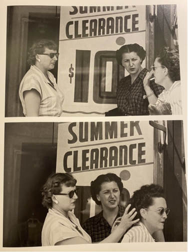
One of the main themes of Kubrick’s photographs was genuine human interactions embedded in daily life. His series for the 1946 November issue of Look feature photographic sequences from the street titled Bronx Street Scene: The Camera Catches an Off-guard Episode over a Hairdo. In a series of photos shot consecutively, two women are first seen chatting in front of a shop which is then followed by another shot that show the entrance of a passer-by, another woman into the frame and the two women fixing her hair and having a laugh over the matter. A different strip shows a couple smoking and chatting on the street in front of a store. The naturalness of the gestures and facial expressions coolly emanate from the frame, mesmerising us and insinuating that we have caught glimpses, instances from life with these people and watching from afar in a discreet manner. The consecutive shots and usage of the same vantage point here that reveal the continuation of these two different events very clearly refer to filmic techniques.

PIC
Stanley Kubrick, People Conversing on the Street (1946), Museum of the City of New York. The Look Collection

Kubrick caught spontaneous scenes from the street. Some he turned into scenes with consecutive shots as seen here. Others instead, were single shots that entailed an overarching theme, such as Park benches: Love is Everywhere series created in 1946 for May 1st issue which was a love series where Kubrick captured young couples on benches, fire escapes and street corners, embracing. Kubrick’s usage of infrared film and flash intensified the candidness of the scenes. The couples were often seemingly caught in unexpected moments, especially at night-time, similar to paparazzi shots which highlighted the voyeuristic tones that Kubrick’s photographs often carried, resembling the technique that was frequently used by famous tabloid photographer Weegee.

Pic
Stanley Kubrick, A Couple Embracing on a Fire Escape, (1946), Museum of the City of New York

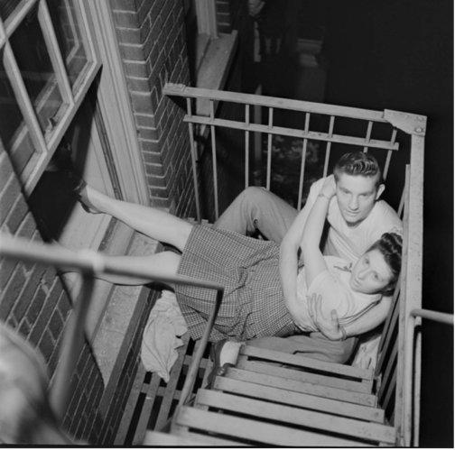
A Couple Embracing on a Fire Escape is one of the most unique shots in the series that seems to have a sinister undertone. With not only the oblique angle, the awkward positioning of the couple on the fire escape but also the overpowering flash that has overly whitened the eyes and skin of the couple, transforming them into ghostly figures, reminiscent of deer caught in headlights, which speaks to Kubrick’s genius with the play of light.

Pic
Stanley Kubrick, Park Benches: Love is Everywhere, (1946)


Pic
Stanley Kubrick, Life and Love on the New York Subway, (1947), MCNY

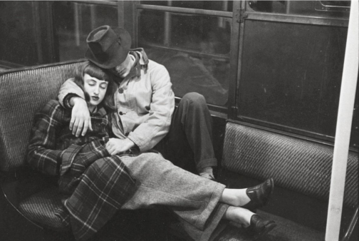
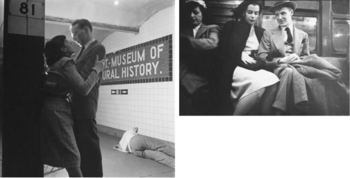
The New York subway offered a microcosm of the city. Spending time at the subway for almost two weeks, Kubrick shot discreet photos of people riding the subway with a hidden camera for another assignment titled Life and Love on the New York Subway in 1947 that fit the everyday life of New Yorkers narrative. Placed amongst the candid photographs in the subway spread, some of the photographs such as this one that show a couple, in fact Kubrick’s friends Alexander Singer and Toba Metz, sleeping, were argued to be staged. While the low vantage point, the dramatic contrast between black and white made scenes as the photograph with the couple embracing cinematic, it also put forward the harsh realities of big city, with the homeless man sleeping in the background, somewhat taking the focus away from the romance in the shot.

Pic
Stanley Kubrick, Life and Love on the New York Subway, (1947), Museum of the City of New York. The Look Collection

The shots that focus on individuals and their facial expressions show a study of psychological depth that also belongs to the cinematic verse. Glorifying the normalcy of everyday life of ordinary people in the big city stretched from photographing people waiting in line to do laundry, waiting in the subway and shopping in the city. What all of them shared in common was the focus on large crowds to highlight the act of looking. We see people watching other people and then we realise we are also watching these people through Kubrick’s lens.

Pic
Frank Bauman, Stanley Kubrick, Tom Weber, Advertising Sign Painters at Work, (1947), Museum of the City of New York. The Look Collection

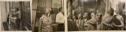
This theme was made central in a series that Kubrick had created, capturing in separate ‘reaction shots’, the confused and surprised expressions of people watching a publicity stunt with a model triumphantly posing next to a group of sign painters in front of a billboard for a Peter Pan bra advertisement high up on a building on the corner of Fifth Avenue and 42nd Street (September 3, 1947). In this collaborative work with Frank Bauman and Tom Weber, Kubrick’s interest in film became more poignant, whilst also showing that entertainment and spectacle were always around the corner in an ordinary day in New York City, embedded in the spirit of the city.

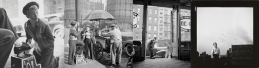
In another series for Look, Kubrick started to focus on individual profiles. In this spread he celebrated the balancing act of a young shoeshine boy named Mickey, documenting a day in his life. Son of Irish immigrants, Mickey made a living by shining shoes to support his family. Taking around 250 photos for his first long photo-essay assignment, Kubrick presented the young boy’s life, showing him playing and conversing with friends in one shot, working, doing laundry, or contemplating life in a mature manner on a rooftop of a New York building in the next shot. Showing Mickey’s difficult life stuck between trying to provide for his family whilst simultaneously trying to enjoy his young years, Kubrick poignantly captured the difficulties faced by lower classes in attempting to survive in a thriving, chaotic city. The fact that this series was not published shows that gruesome realities of a big city were mostly glossed over in Look compared to Life. This photo series that contrast shots of Mickey with friends and ones where he is wandering the city alone poignantly intensify the difficult double life he leads, both, juggling adult responsibilities.

Pic
Stanley Kubrick, Shoeshine Boy, (1947), Museum of the City of New York. The Look Collection

Edging closer to his interest and career in film, Kubrick’s photographs after 1948 started to focus on well-known faces from TV and Hollywood. Kubrick offered the most psychologically complex portraits from these people’s lives. One series that showed the disparity between public persona and private, backstage reality, was another ‘unpublished’ photo narrative series from March 1949, where Kubrick captured a day in life of a showgirl named Rosemary Williams. Williams was a young girl that had come to New York City dreaming of becoming an actress.

Pic
Stanley Kubrick, Rosemary Williams-Showgirl, (1949), Museum of the City of New York. The Look Collection

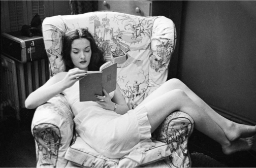
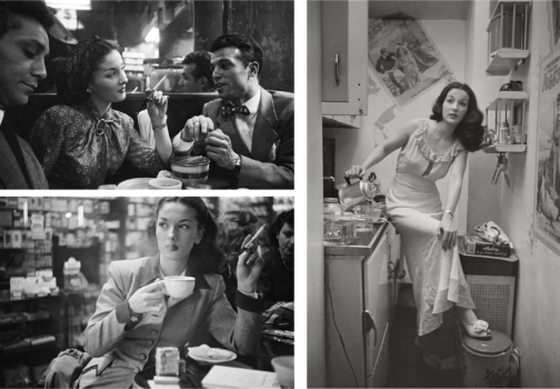
However, struggling to make ends meet as an ingénue in the big city, Williams became a showgirl by night to attempt to make it as actress by day. It was evidently a far less graceful lifestyle compared to that of an actress, as Williams often performed in revealing clothes for the pleasure of men. Captured walking in the streets of New York, having coffee, reading in the privacy of her home to posing in front of the camera and in the backstage getting ready to go on stage, Williams’ life is documented in around 700 images, amounting to one of Kubrick’s longest narratives.

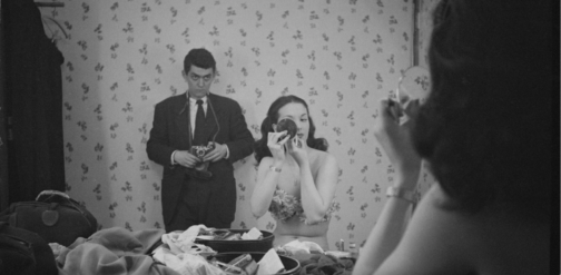
Her professional life is shown through shots of her either conversing or dancing with men or posing in front of the camera. These photographs that show her with company, emphasize the overpowering male gaze that is directed on Williams that signal to her profession and the tool that allows her to sustain her dreams in the big city. Kubrick captured Williams’ despair resulting from the hardships she faces perfectly in her demure expressions and often contemplative manner, from moments of leisure when she alone appears within the frame, much like the aforementioned Mickey. Perhaps the most intriguing photograph of Williams is the in-between public and private realms, where she is getting ready in the backstage in front of a mirror before her performance. Yet, Kubrick haunts this scene with a menacing stare and manner, with a camera in hand which is strategically lowered as he looms large behind Williams as she carries on preparing for the stage, seemingly unaware. Insinuating the voyeurism of the male spectator and the life of a showgirl – which is one that is under constant scrutiny of the male gaze due to the exhibitionist nature of the profession – is perfectly reflected here not only with Kubrick’s sinister placement at the back, intensely staring at Williams getting ready, but also with the mirror and the camera that appears to be subtly filming her below vantage point. Undeniably eerie, the genius of Kubrick lies in the blurring of the concept of the gaze. Perhaps a reference to Velazquez’s Las Meninas the subject of the photograph also becomes the viewer. The viewer is caught in the act of watching Williams in a private moment. Williams is caught between a crossfire of gazes as the camera directed to the viewer reminds us that we are also active voyeurs. The widened frame and the surrounding sense of mystery contributes to the filmic elements of this scene. It becomes evident that the running theme of the ‘unpublished’ spreads were harsh and forsaken reality of the city that Kubrick attempted to unearth and present to the wider public in the manner of Life magazine yet one that was often hindered by Look. This perhaps became a further push for Kubrick in the direction of cinema where he could tell his stories freely.

Pic
Stanley Kubrick, Rosemary Williams, Show Girl, 1949, Museum of the City of New York. The Look Collection
Pic
Stanley Kubrick, Rosemary Williams, Show Girl, 1949, Museum of the City of New York. The Look Collection

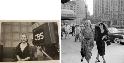
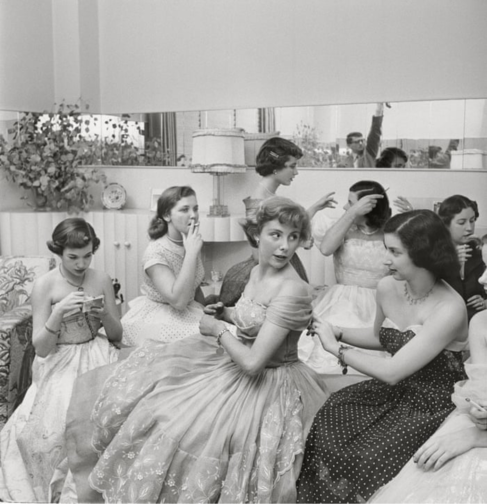
Look magazine also differed from Life in the sense that it aimed to show the ‘real’ lives of Hollywood and TV figures to instil the sense of normalcy around famous people, showing them both on and off camera. Yet, Kubrick still offered heavily staged photographs. Williams’ story was most likely swapped for a high-profile celebrity spotlight issue on Faye Emerson titled, Faye Emerson: Young Lady in a Hurry. Emerson was considered as picture of elegance, grace and intelligence. TV was on the rise and was slowly becoming a rival to radio and print. A Hollywood actress recently turned in to TV presenter, Emerson was regarded as ‘First Lady of TV’ and listed under ‘Top Female Discovery of 1949’ list, which, alongside her career switch, made her worthy of a cover story according to Look magazine. Emerson in this photographic series created by Kubrick for the August 1950 issue, is presented as joyful, both behind and in front of the camera: whether she is distributing autographs for eager fans, interviewed near the Plaza hotel, captured having a laugh with the society columnist Eleanor Harris, casually sitting for a portrait with a phone in hand making calls whilst also getting her hair done.

Pic
Stanley Kubrick, Faye Emerson: Young Lady in a Hurry, (1950), Museum of the City of New York. The Look Collection
Pic
Stanley Kubrick, Stanley Kubrick with Faye Emerson from “Faye Emerson: Young Lady in a Hurry”, 1950s, SK Film Archives/ Museum of the City of New York

Emerson never ceases to smile in the photos despite her evidently busy schedule, forming part of Kubrick’s constructed story surrounding Emerson, promoting the busy yet elegant and content lady to aspire to, which the title clearly insinuates. In one photograph, Emerson is captured whilst getting ready in her dressing room. Kubrick uses the same style and framing with the mirror he used in the unpublished photograph of Williams backstage, placing himself behind Emerson with a camera, watching her whilst she’s getting ready. Yet the difference here is that Emerson is aware of being photographed by Kubrick and almost poses for him whilst getting ready to be on screen. Usage of a mirror cleverly conveys the duplicity of TV personas, and their elaborate yet fabricated self-creation for TV.

Pic
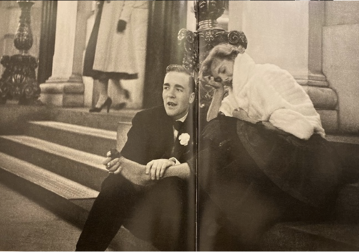
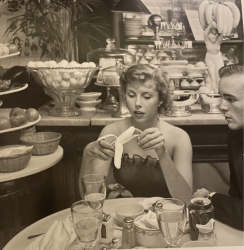
Very similar to Emerson’s profile was one created for Betsy Von Furstenberg. Furstenberg was the daughter of a German aristocrat and was also as an actress in New York. Another, ‘Day in the Life of’ piece, her everyday life was represented in a cinematographic and theatrical way in these photograph series by Kubrick. She is shown engaging in a variety of ‘serious’ and normal activities such as preparing for a role in her home, socialising with friends as well as silly moments from peeling a banana in a fancy restaurant to sleeping on the steps of the Plaza hotel next to John Hamlin. These pictures were featured in Look magazine’s spread from July 18, 1950 with the title The Debutante Who Went to Work. Photographs represent the juggling of day-to-day life with a highly glamorised one with comedic effect, evident from the awkward moments, humorous gestures, and facial expressions of Furstenberg. Whilst a more psychologically in-depth narrative was worked on for the earlier photographs of Williams was ultimately shelved, favouring a feature that was created around a lady that worked despite her aristocratic background. Pic
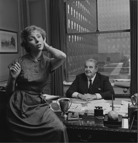
This shows the elegant façade that sought to represent life in New York City, with the gruesome realities of hardship were kept very deliberately hidden. A debutante that balanced life and work was one to be aspired to while a showgirl trying to make ends meet was one that was far too real and far less glamourous. Von Furstenberg’s story was about elegance, and, on the surface a light-hearted, innocent story of how to make it as an actress in the big city, despite being further removed from reality. The theatricality of the mimics and gestures of Von Furstenberg is in high contrast with that of Williams which almost insinuates the fabricated nature of this narrative and lifestyle.


PicLooking back at his brief time as a photojournalist in 1972, the director himself commented: ‘By the time I was 21 I had four years of seeing how things worked in the world. I think if I had gone to college I would never have been a director.’ Photographs such as these taken in the streets of New York put forward the theatricality of the city which Kubrick presented in his characters, personas and well-known faces that made up the city, delving into private lives of public figures, producing intimate and psychological portraits. Whether watching these figures from afar, standing in the crowd beside them or even in their private quarters, Kubrick always placed the viewer in the intimate world of his subjects. The photographs offered a genuine image of New York City, shining light on different lifestyles of those from a variety of backgrounds, showcasing moments that revealed the everyday routines of people from different classes, with everyone united in their common goal of attaining ‘The American Dream’.

PicThe director’s final film Eyes Wide Shut (1999), set in New York, caused quite a stir in its exploration of the mysterious and dangerous sides of the vibrant city of New York, focusing on an elite cult. This suggests that the famous director was perhaps making a nostalgic tribute to his time as a young photojournalist in the midst of this chaotic city he found himself in, and the vibrant scenes he caught glimpses of with his camera as a teenage boy. Today, Kubrick is better known for his 12 feature films yet his strength in visual storytelling was implanted in his little-known early career as a photojournalist. It is evident that for Kubrick these early photographs, as Sean Corcoran (the Photography Curator at the Museum of the City of New York) stated, allowed him to master the art of framing the composition and opened his eye in different ways of seeing. Kubrick himself said: ‘Generally speaking, you can make almost any action or situation into an interesting shot, if it’s composed well and lit well.’ Kubrick’s genius seeps from his œuvre produced in his short time as a photojournalist, right on the brink of his career as a director.

By Ipek Birgul Kozanoglu

Bibliography

Albrecht, Donald; Corcoran, Sean. Through a Different Lens: Stanley Kubrick Photographs, (Köln & New York: Taschen, Museum of the City of New York, 2018)

Mather, Philippe D. Stanley Kubrick at Look Magazine Authorship and Genre in Photojournalism and Film. (Bristol:Intellect, 2013)

https://www.anothermag.com/art-photography/11004/how-stanley-kubricks-early-photographs-foreshadowed-his-filmmaking-career

https://www.vanityfair.com/london/photos/2019/08/through-a-different-lens-stanley-kubrick-photographs

https://museemagazine.com/culture/2018/7/31/exhibition-review

https://www.mcny.org/exhibition/through-different-lens

https://ny.curbed.com/2018/5/1/17305690/stanley-kubrick-photos-museum-of-city-of-new-york-exhibit

https://edition.cnn.com/interactive/2018/06/entertainment/stanley-kubrick-cnnphotos/

https://www.indiewire.com/gallery/stanley-kubrick-photo-album-early-photographs/x2011_4_10292_039b_retouched/

https://www.theguardian.com/film/gallery/2018/may/14/life-on-the-street-stanley-kubrick-early-photographs-of-new-york


Three Beautiful Films: A 50s, 60s and 70s Film You Must Watch Purely for the Visual Pleasure:

** This blog post contains spoilers for Mad About Men (1954), La Piscine (1969) and Mahogany (1975) **

Sometimes I want to watch a film, not really for the plot, but for either the fashion, the cinematography, the set design or even just the general aesthetic. So, just in case anyone else has the same penchant for beautiful films, I’ve comprised a short list of three recommendations from the 50s, 60s and 70s respectively.

Mad About Men (1954):

MAM
Mad About Men Movie Poster, IMDB.

Mad About Men is the charming sequel to the 1948 comedy film Miranda in which a lonely mermaid captures a young man and only offers to release him on the basis that he will take her to London. In Mad About Men, set in Cornwall, Miranda Trewella (Glynis Johns) returns and convinces her distant relative and doppelgänger Caroline Trewella (Glynis Johns) to let her take her place whilst Caroline goes on a biking excursion with a friend. In order to do this, Caroline fakes an accident which leaves her wheelchair bound, explaining Miranda’s inability to walk and need to keep her ‘legs’ covered with warm blankets. The pair also hire Nurse Carey (Margaret Rutherford), who knows Miranda is a mermaid and helped her in the first film too. However, even though Caroline is engaged back in London to the dull but stable Ronald Baker (Peter Martyn), Miranda playing as Caroline cannot help herself when she meets some of the town’s most handsome men, and she flirts, dates and kisses both Jeff Saunders (Donald Sinden) and Colonel Barclay Sutton (Nicholas Phipps). When Ronald comes to visit ‘Caroline’ in Cornwall, Miranda takes an immediate dislike to him and ends up pouring cold fish soup over his head. The Colonel’s wife is suspicious of ‘Caroline’ and ends up discovering her secret, so, in a plot to expose her, she agrees to let ‘Caroline’ sing at a charity concert and plans to reveal her mermaid tail on stage. However, Caroline gets back from her trip and takes Miranda’s place on stage whilst the Nurse feeds the microphone down to the cove where Miranda lives so her siren-esque singing voice can still be heard. The film ends with the real Caroline and Jeff Saunders sharing a kiss whilst Miranda is safely back in the Cornish Sea.

Despite mentioning earlier that plot isn’t important when watching for purely aesthetic reasons, this film is so fun and light-hearted it is difficult not to enjoy the story and fall in love with Miranda whilst you watch it.  However, where this film really shines is in highlighting the wistful and whimsical beauty of Miranda and the more prim and proper styling of Caroline.  Joan Ellacott’s costuming and Glynis Johns’ acting allows for viewers to differentiate easily between the Trewella girls. Here are some of the best style/aesthetic moments…

MAM
Caroline Trewella on the train from London to Cornwall. Still from Mad About Men (1954).
MAM
Caroline and Miranda’s first meeting. Still from Mad About Men (1954).
MAM
Caroline’s charity concert dress. Still from Mad About Men (1954).
MAM
A full length view of Caroline’s concert dress. Still from Mad About Men (1954).

La Piscine (1969):

LP
La Piscine Movie Poster, IMDB.

If you’re craving some warmth, you must watch 1969’s La Piscine, a film where the Southern French sunshine seems to seep through the screen. This film is the epitome of ‘embodied viewing’ where you can feel the sun and water on your skin, and you can smell the heat in the air. La Piscine is set in a villa on the French Riviera where a couple, Marianne (Romy Schneider) and Jean-Paul (Alain Delon) are enjoying the summer. After finding out Marianne and Jean-Paul are nearby, the couple’s old friend Harry (Maurice Ronet) and his daughter Penelope (Jane Birkin) come and stay. Whilst this initially consists of old friends catching up and new memories being made through extravagant parties, tensions soon begin to rise when Jean-Paul realises that Marianne and Harry were once lovers. The situation further complicates itself when Jean-Paul decides to seduce Harry’s 18-year-old daughter Penelope. The two men, whilst drunk, end up getting into a fight which culminates with Harry falling into the swimming pool. From here, instead of helping him out, Jean-Paul proceeds to drown him and then stages the scene to look like an accident. Marianne eventually finds out what Jean-Paul did but both continue to lie to the police and eventually the case is closed with Harry’s death being marked as an accident. The film ends with Penelope returning to her mother and Jean-Paul seemingly forcing Marianne to stay with him at the villa.

This film is beautiful all-round. The French Riviera location, the impressive villa, the cast and, perhaps most importantly the dressing and undressing of bodies. The theme of the body is central throughout this film, with long, toned and sun-kissed limbs filling the poolside shots. Here are some of the most beautiful outfits, shots and scenes…

LP
Jane Birkin’s Penelope wearing the dreamiest gingham poolside cover-up. Still from La Piscine (1969).
LP
Penelope’s fabulously oversized sunglasses. Still from La Piscine (1969).
LP
Jean-Paul’s combo of an open shirt tucked into blue jeans is giving me lots of Spring/Summer inspo. Still from La Piscine (1969).
LP
Penelope wearing maybe the shortest dress ever worn to a funeral ever? Stylish though! Still from La Piscine (1969).
LP
The calm before the storm… Marianne and Jean-Paul enjoying the swimming pool. Still from La Piscine (1969).

Mahogany (1975):

Movie
Mahogany Movie Poster, IMDB.

First things first, the men in this movie are awful. Truly, every single one of them is just unbearable. But with that aside, Mahogany is firm favourite in every fashion lovers’ movie list. The film stars a post-Supremes Diana Ross as fashion student and department store secretary Tracy Chambers. Set in Chicago, the film shows Tracy living in the ‘slums’ of Chicago’s South whilst working at a high-end department store and harbouring dreams of becoming a high fashion designer. Tracy meets and begins dating Brian Walker, an activist fighting against the demolition of housing in primarily black neighbourhoods. Brian, whilst seemingly having a good heart and high ambitions for himself routinely brushes off Tracy’s goals as trivial and devoid of real meaning, insisting fashion is unimportant compared to his work within the neighbourhood. This means that when Tracy meets and befriends the renowned photographer Sean McAvoy who sees her as having real potential as a model, Tracy jumps at the chance to find an in to the industry which means so much to her. After a fight with Brian, Tracy moves to Rome to pursue modelling with Sean, who gives her the stage name Mahogany. A classic movie montage shows Mahogany’s modelling career take off and her charm and charisma capturing both the wider fashion world’s attention as well as Sean’s, who is interested in pursuing her romantically. Sean becomes increasingly possessive and struggles with Tracy’s free-spirited nature and inability to be controlled. Brian visits Tracy in Rome and gets into a fight with Sean involving a gun; Brian leaves Rome alone. At their next fashion shoot in which Tracy is posed inside a sports car, Sean is trying to ‘capture death’ and ends up getting into the car and begins driving erratically. Eventually, with Sean at the wheel, the car crashes leaving Tracy badly injured and Sean dead. In the aftermath of the accident, a wealthy count lets Tracy recover at his villa and sets up a design studio for her there. Instead of feeling fulfilled by finally reaching her dream career, she is left feeling frustrated, lonely, and unhappy despite the huge success of her first official collection. Tracy realises that success means nothing without Brian by her side and she returns to Chicago to be with him.

Despite Tracy’s life being littered with frustrating men who seem desperate to keep her potential hidden away, she does look incredible throughout the film. As a little sidenote, Diana Ross actually designed a lot of Tracy’s outfits as she trained in dressmaking before her career took off! Here are some of her best looks…

Movie
The outfit Tracy designed and wears for the first time she is photographed by Sean McAvoy.
Movie
Tracy looking incredibly chic in Rome whilst her Harper’s Bazaar cover hangs behind her.
Movie
Perhaps one of the most iconic looks from this film. Tracy’s purple ensemble which becomes a billboard advertising Revlon ‘Touch & Glow’.


By Rosie Dyer

Bibliography:

https://www.whowhatwear.co.uk/diana-ross-style

https://www.imdb.com/title/tt0047199/?ref_=ttfc_fc_tt

https://www.imdb.com/title/tt0064816/?ref_=ttmi_tt

https://www.alamy.com/mad-about-men-1954-nicolas-phipps-anne-crawford-donald-sinden-glynis-johns-ralph-thomas-dir-moviestore-collection-ltd-image243659713.html


Jeordy on MoMA and Muriel King

At the end of February, Documenting Fashion’s MA class took a study trip to New York. Homecoming for some and the first time in America for others, these few days were outstanding, and we are excited to share our highlights with you. 

Our study trip to New York City was a whirlwind. As a native Californian, it was fascinating to visit a part of the United States I had never seen before in the company of my English classmates. It was a strange in-between state, where I was among my countrymen and women, but in an entirely alien environment, mentality, and culture. Once I overcame the uncanniness and aggressive atmosphere of NYC, I enjoyed myself greatly. Of particular interest were the Good Design Exhibit at MoMA, and the collection of Muriel King’s design sketches.

Wooden Shelving Unit and Chairs, Good Design exhibit, MoMA

‘Good Design is not a label or a price tag
Good Design is international in both origin and appeal
Good Design is a statement and not a gadget
Good Design need not be costly
Good Design is neither a book of etiquette nor a social register
Good Design is one that achieves integrity
Good Design depends on the harmony established between the form of an object and its use.’

The Good Design style of the 1940s and 1950s highlighted function, form and aesthetics. It encompassed the design of everything from coffee pots to the Fiat car. I was fascinated to see exhibits like the one above, which contextualised midcentury clothing for me.

Muriel King sketches, 1930s, FIT Special Collections Archive

Sketches by American designer Muriel King also caught my attention. Muriel King became a name-known designer in the 1930s; she designed for films and socialites alike, including the notorious fashionista Hattie Carnegie. I find her designs remarkably imaginative and modern, even by today’s standards. Our guide at the archive informed us that Muriel King had no knowledge of sewing or pattern making, thus necessitating that she sketch both the front and back of each outfit as to express her deigns with the utmost clarity. Our guide also suggested that her originality and creativity derived from her said lack of sewing knowledge, as she was not intimidated by complex or challenging designs.

Muriel King sketches, 1930s, FIT Special Collections Archive

I took pictures of dozens of these sketches, in the vain hope that I may one day have the resources to have them made up for myself. How many vibrant and boldly patterned dresses can I have before it’s too many?


All photographs taken by author.

More information on Good Design: https://www.moma.org/calendar/exhibitions/5032?locale=en

Fashioning Femininity (and Making Masculinity) in the Post-War Era

When we think about the twenty years immediately following the Second World War in Britain, what images instantly spring to mind? Smiling women in glamorous dresses, feather duster in hand, happily making home for hardworking husbands and clean, grinning children. This construct of woman as a glamorous housewife in the 1950s is one of the most well-known images in the modern consciousness. Whatever our opinions of it, it is all-pervasive; on posters, cards and throughout the media. But how did clothing, and its depiction in advertising, feed into these constructs of femininity? And how was masculinity constructed alongside and in relation to this?

Advert for Wolsey, Woman’s Own, Week Ending 19th March 1960, p.20

Domesticity was expressed in advertising as being a woman’s ‘job’. A Wolsey advert constructs the role of ‘man’ as breadwinner and ‘woman’ as homemaker and domestic purchaser as being objective facts. The advert is aimed at presumably female ‘fiancées’, stating: ‘Sooner or later… you will find yourself buying his socks. This is the job that will probably be yours from “I will” onwards’. Through this single garment of the sock the assumed roles of ‘man’ and ‘woman’ are expressed. ‘Woman’ here is constructed as residing within the domestic sphere, with mundane, everyday garments such as the sock being part of her everyday concerns. Furthermore, ‘man’ is presented here as being domestically incapable, unable to purchase even his own socks. His sharp suit, the uniform of the masculine breadwinner, further constructs him as residing in the public, rather than domestic, sphere.

Advert for Kellogg’s Corn Flakes, Woman’s Own, Week Ending 3rd September 1960

While a woman’s concerns may have been mundane and domestic, her appearance certainly wasn’t. Countless advertisements show women in glamorous, flattering garments even while in the home. One advert for Kellogg’s depicts the idealised couple at the breakfast table. While the man is dressed in a suit for a day of work in the economic sphere, the woman is dressed in a house coat for her day of work in the domestic sphere. Her beautifully patterned house coat and perfectly styled hair and make-up suggest that being attractive is also an integral part of her role as housewife. Similarly, in an advert for Batchelors Peas, the mother is dressed very glamorously for a casual dinner-time. She is fully made up with red lipstick, ornate earrings and colourful clothing. Her garments are soft and flowing, following the idealised lines of the hourglass figure. She cuts a very bright figure against the father, who again wears the masculine staple of the suit.

Advert for Batchelors Peas, Woman, Week Ending 17th July 1955

By analysing adverts from this period, we observe a strictly traditional representation of ‘woman’; as beauty, housewife and mother. Meanwhile ‘man’ is constructed, equally traditionally, as breadwinner. These images show us a snapshot in history at a time in which advertisements were both constructing and reinforcing real-life ideals. We see domestic ‘woman’ and working ‘man’ idealised as safe, predictable constants in a world that was rapidly changing. These images depict the moment before the liberation movements of the 1960s changed the world, and particularly the female experience, beyond all recognition.

The Glamour of the Sala Bianca

The Sala Bianca in the Palazzo Pitti, Florence, was originally used as a guest hall by the Medici family, but its current appearance as a ballroom is due to stucco works added in 1774-6, by Grato and Giocondo Albertini, following a neoclassical style. The colour white communicates both the decadence and the simplicity of the room. The decadent element stems from the classical motifs, with arches, pilasters and the stucco scenes on the ceiling. The chandeliers and mirrors further this luxurious display, adding reflective surfaces, which shimmer and catch the light. The neutral palette sterilises the room, as the monochrome appearance is minimalist, contrasting with the detailed decoration.

The Sala Bianca today

On the 22nd July 1952, Giovanni Battista Giorgini, a Florentine fashion buyer, organised the fourth ‘Italian High Fashion Show’ in the Sala Bianca. He invited European and American press, buyers and designers, in order to showcase the best of Italian fashion, with the intention of rivalling Parisian haute couture. In the aftermath of World War II, Giorgini wanted to promote the advantages of Italian fashion production; with artisanal expertise, creativity and low prices of production. Nine high fashion and sixteen boutique houses were represented. Giorgini chose designers that would present pieces that matched the American lifestyle – for example, informal knitwear and beachwear. This show featured such designers as Emilio Pucci and Simonetta.

The 1952 Sala Bianca fashion show

The language of fashion at this time had to rely on other cultural frameworks, such as art and architecture, as it sought to find its own identity in culture. The Sala Bianca fashion show showcased the best of Italian design, showing modern looks in a traditional setting. This allied the glamour of the past with the elegant designs of the present. This was a very clever strategy for advertising Italian fashion to an international audience, by mixing the modern and antique.

We are now accustomed to contemporary fashion houses showcasing their latest collections in impressive historical locations. A prominent example of this is the 2016 Fendi 90th anniversary fashion show which actually took place on an Italian landmark, the Trevi Fountain, in Rome. Again, there is the significance of an Italian brand showcasing a collection at one of the most iconic Italian landmarks. The use of the Trevi Fountain can also be linked to Italian cinema. This is through the 1960 Frederico Fellini film, La Dolce Vita, where the actress Anita Ekberg splashes around in the fountain.

Fendi 90th anniversary show at the Trevi Fountain, 2016

Both shows drew on the cultural significance of the landmarks, adding another layer of meaning to the shows. In this way, I feel they communicate the spectacle of the fashion show, with the dramatic surroundings acting as a stage and the models parading on their catwalk, or stage. The Sala Bianca was used as a location for fashion shows for the next thirty years in Florence. This was hailed as the ‘birth of Italian fashion’, but I also feel that it was influential in terms of linking architecture and fashion.

Ellen Bhamra

References

Stanfill, Sonnet. The Glamour of Italian Fashion Since 1945 (V&A Publishing, 2014)

Vergani, Guido. The Sala Bianca: The Birth of Italian Fashion (Electa, 1992)

Dissertation Discussion: Sophie

Photographs of Parkinson’s Wife, Wanda Rogerson in Robin Muir, ‘Norman Parkinson: Portraits in Fashion’ (London, National Portrait Gallery 2004)

What is your title?

The title of my dissertation will probably still change. However at the moment I am going with How very British: National Identity in Norman Parkinson’s fashion photography for Vogue, 1950-1952. Parkinson produced some stunning images for different spreads, many of which lend themselves really well to a study of British national identity. Delving a little deeper into these specific images, Parkinson’s biography and the history of 1950s Britain has been great fun.

What prompted you to choose this subject?

The topic stemmed from a mixture of previous interests and pure chance. I had no pre-conceived idea of what I wanted to look at for this dissertation. However, I always studied World War II and the Cold War when I had the chance as an undergraduate, so I knew I wanted to stick within that time frame. Couple this with my love of 1950s fashion and elegance, and the random selection of a beautiful book on Norman Parkinson whilst browsing the stacks at the Courtauld and – ta dah! – the dissertation title was born. I had also wanted to be practical about my choice and choose a topic that would enable me to make the most of London based archives. Norman Parkinson has his own in south London (big shout out to the lovely and wonderful people that work there!), so it all came together beautifully.

Norman Parkinson Archive

Most interesting research find thus far?

I believe I read in Parkinson’s book that Irving Penn babysat Parkinson’s son. As you do. No big deal. On a more serious note, I am still continually blown away by how clever his images are. They seem so simple at first glance, and then, the more you look, the more you realise just how good he was in expressing a certain image, feel or identity to a wide range of readers. This was especially interesting with regards to the way in which his photographs for a 1951 South Africa spread differed, or were used in a different way, from the May edition in British Vogue to the July edition in American Vogue. On a side note I have become obsessed with an image that I’m not even using in my essay. It is just too stunning. Everyone- google “Carmen’s Armpit” and you will understand! Or not, in which case it is just my inner dress history nerd coming to the fore…

Favourite place to work?

I would love to say that it is The National Arts Library in the V&A. It surely wins the award for most aesthetically pleasing place to study- but I tend to be freezing cold in there, so sadly it loses out. I rather fluctuate between the Courtauld Book Library and my home. This arrangement provides the perfect balance between the comfort of home (sneaking a couple of biscuits and copious amounts of tea) and the beautiful comradeship between all Courtauld students during dissertation time in the library. We all really share the stress and joys of the process and that is unbelievably valuable as you are working. *Insert cheesy violin music here!*

Courtauld Library

Dissertation Discussion: Dana

Model Anne Saint-Marie wearing cinnamon brown wool tweed evening coat, lined in black satin over matching black satin dress. © Horst P Horst for Vogue Oct, 1959. Getty Images

What is your title?

I’m very bad at coming up with titles and I’m still working on mine, but the working title is ‘Relationships Between Body, Fashion and Furniture: The Modern Chair in Mid-Century Photography.’

Model Anne Saint-Marie wearing cartwheel pyjamas as pants, of printed silk shantung in flowers of orange and red. Shown with white sleeveless linen top and strap sandals. © Horst P Horst for Vogue June, 1957. Getty Images

What prompted you to choose this subject?

I’ve always had very broad interests, academically and personally, that range between ancient and medieval art to modern design and fashion, so I really wanted to do something different and wanted to explore further (although I was hesitant to do so at first). I also have a soft spot for furniture, especially Mid Century Modern chairs, sofas and daybeds, so it wasn’t a very difficult decision to make. But the moment I decided that I wanted to talk about furniture and fashion was during our class trip to New York. Not only was there an exhibition on Bauhaus interiors (another soft spot) at MoMA, but also, on our visit to the FIT archives, I realized that we were all sitting on 1975 Eames chairs for Herman Miller, which to the amusement of my classmates, got me very excited. That is when I thought I had to!

Anne Gunning-Parker wearing shantung pajamas with watermelon slice design reclining on couch with dog and unidentified man seated next to her. © Horst P Horst for Vogue May, 1954. Getty Images.

Most interesting research find thus far?

There has been so much! But the most interesting find was seeing how most of the 1950s images I’ve been looking at portrayed men and women sitting for a photo (more specifically husband and wife). Unless the shot portrays them working (as some portraits from Charles and Ray Eames), the man is usually positioned behind the woman (most likely standing), more pensive. The woman usually sits on a sofa (a tad reclined – but never too comfortably). This creates a dichotomy between the man and the woman portrayed, of vertical and horizontal lines.

Paul McCobb among his furniture, 1956. Photographer not stated. Getty Images.

Favourite place to work?

I’m not a library person anymore, so usually spend most of my time at home or in coffee shops (where coffee is allowed). But I’ve gone to my parent’s house in Madrid for a couple weeks and my favourite place to work here would be the library at the Costume Museum as it’s always quiet, cool, and has glass walls with views to their garden (which is pretty amazing).

Interview With Christie Goule, Illustration, Surface Pattern And Textiles Designer

I have, for some time now, been in love with Christie’s prints and was so happy to hear that she accepted my request to interview her. We met at Barbican Centre and talked about her work and inspiration, Mid Century Modern and fashion.

What are you wearing today and could you tell me a little about the pieces?

Today’s outfit is a pair of vintage 1950s sage green wool ‘White Stag’ label pants with a green and navy print shirt, also vintage 50s. The shirt’s unlabelled and has become one of my favourites for its ‘dressed up’ simplicity. The white bucks are from ‘repro vintage’ footwear brand Rocket Originals, bought back in 2012 and the navy swing jacket I have on is marked ‘Wyandotte Fabric, 100% wool’, with no fastenings, just a large lapel and deep pockets. It’s also vintage 50s, complete with an excellent pink/purple sharkskin lining. (A good lining is crucial!)

The jacket, the pants and shirt are from Etsy, where about 80% of what is in my wardrobe is from. The vinyl purse I don’t remember buying. This is probably 60s judging by the zip. The necklace I’m wearing is Danish silver dating from the late 1950s and was bought as a job lot along with a few other mid-century Danish silver pieces from a Swedish auction site – bought for peanuts. Finally, the green bangle (once again 50s!) was bought on a trip to Berlin.

What inspired you to pursue a career in textiles?

I am a believer that design should be fully accessible, embraced and experienced as much as possible – and the home as a canvas so to speak proves a great platform for my designs in interior textiles & soft furnishings.

In terms of how I finally came to take this direction, having always been interested in art and hand crafts. It took on a new element when I began studying textiles design alongside modern art and design at the end of high school. Not only was I able to construct my own garments and products, but I could also design the fabric too, with this new passion for mid-century modern design language in all its many forms. I went on to specialise in print and textiles at college in Leeds then finished my studies in London with a degree in printmaking and surface pattern design at university in 2012.

Courtesy Christie Goule.

How would you describe your work?

I’d say my design aesthetic was bold and illustrative, sometimes playful. I always manage to fall into using patterns of either spots or stripes in my work, sometimes in the loosest sense – an appreciation of the simple things I guess! I am more for the bold ‘here and now’ designs which can sit lively and vibrant around us, if we let them. The origins of my inspiration do lie within mid-century art and design, though I am consciously not looking to form copycat work, but looking to carry on and stay true to an aesthetic with such meaning and staying-power which still manages to inspire my own personal development to no end.

Courtesy Christie Goule.

What inspires your work?

Materials and methods both strongly inspire the work I do. I like working a lot by hand and feel the handmade is usually the essence of my designs. Inks, paint, paper, pencils, clay, woven fabric, block printed fabric, and printmaking! It all offers an opportunity to be used and exploited to your advantage as a textiles designer. I like the honesty in the design when using and experiencing such methods and materials as all the above.

Architecture has been a great source of inspiration too. I took a trip to California a couple of years ago, mainly to submerge myself in the mid-century cool which California is effortlessly famous for.  Whilst there I was able to see a few case study houses such as the Eames House, took a tour around the Stahl House and stood outside The Frank House where all I was able to do was stare in wonder at the giant door.

Christie at Barbican.

What is your creative process?

My natural creative process is to see a problem or see a need for something, try to picture a solution and fill the gap with plenty of development in the form of drawing, painting and motif play. I have a great source of books and vintage home styling magazines too, which I always get ideas for products or prints from.

Actually, the other day I was preparing dinner, cutting mushrooms randomly, and found some great shapes and lines which I don’t usually see when cutting them. I took some photos and plan to use them as a starting point for some dinner table place settings I want to design for my dining table. I am always considering [a product’s] final resting place and what its natural surrounding should be in an interior.

Juice truck illustrations, courtesy Christie Goule.

What is your relationship with fashion, in particular with vintage fashion?

I am very proud of the things I chose to buy and then wear. I am proud of the fact they could still mean so much today as they did 60s years ago. I also feel a little like a custodian to these pieces and believe they should still be shown off, experienced and experimented with. Oh and naturally a lot of what I own are printed shirts and trousers. I also love the simple and effective materials used in accessories, particularly that of bags and purses.

I prefer the strong mid-twentieth century styles of ‘the beatniks’, ‘sweater-girls’ and juveniles – with their smart cotton basics, statement silhouettes, defiant bold colour choices and forward thinking attitudes! In the 50s it was all about being modern, so I never do feel I was ‘born in the wrong era’, as I tend to politely smile (cringe) when I hear that said to me today.

The appeal of the 50s must be the infections cool these cats had as they entered a room in any film, exit any car or the way their outfit demands so much attention, not always sexual. The attention to detail too – the details and accessories usual speak to me and I can relate these right back to interior design, sculpture or architecture.

The people and the outfits pictured by photographer Julius Shulman help capture the mood of an interior and what it can do to clothing choices.  So it is certainly a lot about style in relation or reflection to textiles design and interior design.

Pocket square design, courtesy Christie Goule.

What are your favourite brands/artists/designers?

To start with, Marimekko, Svenkst Tenn & Heals. Ray Eames is an all-time personal hero. Evelyn Ackerman was the most fantastic ceramic, weave and tapestry artist. Picasso, for all he did for textiles design in both fashion and interior and for of course art work. Stig Lindberg will always be a firm favourite ever since visiting Gustavsberg in Sweden and gaining an understanding of his importance in ceramic design and ceramic finishings. Saul Steinberg, as his humour and imagination are endless.

Some past fashion brands I like to wear and shop for are White Stag, Queen Casuals, Paddle and Saddle, Turf and Track and finally Alfred Shaheen (not for the Hawaiian prints he his best known but for the tea-timers and separates).

Number one favourite artists include Jean Arp, Hepworth, Robert Motherwell, Vanessa Bell and Wifredo Lam.

Courtesy Christie Goule.

What projects are you involved in/are in the pipeline at the moment?

Currently, I am just trying to fix myself within a permanent role within an interior textiles design lead studio! Projects wise, I potentially have a collaboration (soon to be ironed out and design vision made a little clearer) with a dear friend of mine who I studied textiles and surface design with at University. We hope to launch a small range of interior textiles involving both weave and print.

Another fun [project] happening right now is sourcing appropriate vintage picture frames for my lino prints. Having had an Etsy shop for a few years, I began to feel that one of the most important things about a print was its frame. Selling my prints framed is making them an easily accessible thing, all ready to buy, hang on a wall and enjoy. I feel the frames also complete the aesthetic I am looking to achieve – the point been that they are all vintage and chosen by me.

Courtesy Christie Goule.

Check our more of Christie’s work on her website (eye candy), Facebook, Instagram (which we love), and Etsy.

Horrockses Fashions: Fun, Feminine, Fifties

Vogue UK February 1949. Image courtesy of lancashirebusinessreview.co.uk

If the thought of summer dressing makes you think of cotton floral frocks with full swingy skirts you may have Horrockses to thank for that image.  One of the most popular dress lines in Britain and in America in the late 40s and 50s, Horrockses Fashions was known for its cotton prints manufactured in their own mill in Preston, Lancashire.   The mill dated back to 1791 and by the early 20th century was established as a trusted manufacturer of cotton goods, mostly household linens.  To expand their sales of manufactured goods into the lucrative fashion market, the parent company Horrockses, Crewdson & Co. Limited launched the Horrockses Fashions ready-to-wear line in 1946.  Horrockses had the goal of increasing desirability for their fabrics and then satisfying the demand with their own products.  Their vertically integrated business model ensured commerce at multiple points in the market.

Horrockses dress, 1957, V&A
Horrockses dress with bows, 1951-58, Bowes Museum

Horrockses Fashions were best known for their day dresses though they also produced housecoats, beachwear, and evening dresses.  As these examples show, there came to be a distinctive Horrockses silhouette for the dresses consisting of full skirts, tailored bodices, and defined waists which shows the influence of Christian Dior’s New Look that debuted in 1947.  Floral patterns, particularly roses, bows, and bands of print or bayadere, were signature motifs repeated every season which also borrowed heavily from Dior’s aesthetic.

Horrockses dress with bayadere design, 1953, V&A

To mitigate against the low-end connotations of mass-produced clothing, Horrockses carefully followed the lines, silhouettes and trends of the couture collections shown in Paris and London.  Cottons were accessible fabrics that had the weight and drape to create the New Look silhouette but with a softer, more casual result.  The dresses were made of high-quality cottons which were washable much like synthetics on the market.  Horrockses thus combined the easy-care of sportswear with tailored, sophisticated cuts associated with couture to bring the consumer “the best of both worlds.”

Horrockses evening dress featured in Vogue, January 1956

Horrockses Fashions differed from Dior and other couture houses in their frequent use of bright, playful prints which were generally highly stylized and abstract.  The company avoided unsophisticated connotations with their prints by aligning them with art, using exclusive designs by leading British artists including Eduardo Paolozzi, Graham Sutherland, and Alastair Morton.

pp. 96-7 of Horrockses Fashions: Off-the Peg Style in the 40s and 50s showing a design by Eduardo Paolozzi

At the symbolic level, voluminous skirts signalled plenty while the summery florals bring associations of vacations, resort, and weekend leisure which put the dresses at a clear remove from workwear.  Instead, Horrockses dresses correlated escape, fun, and exuberance with style, elegance, and femininity.  In the British post-war context, with rationing still in place into the early 1950s, Horrockses dresses were viewed as a splurge for an occasion such as a honeymoon.  In the American import context, however, Horrockses Fashions fit in perfectly with the broader cultural landscape of social change in the 1950s when the country prospered economically and disposable income increased across class strata.  The economic boom brought increased choices in manufactured goods which in turn increased consumerism.  An accompanying urban out-migration led to the rapid development of suburbs and the American dream of home-ownership became a reality for many.  Suburban houses came with front lawns and backyards where barbeques, pool parties, and gardening took place, providing a lifestyle scenario complementary to the look of Horrockses dresses.

Horrockses advertisement, Vogue, June 1950. Image from Christine Boydell, Horrockses Fashions: : Off-the-Peg Style in the 40s and 50s

The colourful aesthetic of Horrockses Fashions reflects the circulation of intensely saturated color images in print and film due to Kodachrome and Technicolor processes.  The wide scale of the skirts, too, abundant with fabric, seem to reflect the various widescreen film formats that enticed audiences into movie theatres and drive-ins to see historical epics, westerns, and melodramas.  Full-skirted, brightly-colored, patterned dresses such as those of Horrockses are like costumes for living life as it was depicted on screen: monumental, colourful, dramatic.

Model Barbara Gaolen in a Horrockses evening gown, Vogue October 1952

Horrockses dresses typically were produced in runs of 1,000-1,500.  Despite being mass-produced, the Horrockses ready-to-wear line had an air of exclusivity established through use of select retailers, exclusive prints, quality fabric, and well-cut and designed garments.  The image of quality always tied back to their own cotton manufacturing.  Horrockses Fashions advertisements regularly featured the sub-heading, “in fine cotton” under the brand name, underscoring excellence in their product.  The eminence reserved for couture was also accorded to Horrockses dresses in some measure by its royal selection.  Images of Queen Mary at the Horrockses showroom in Hanover Square and of Princesses Elizabeth (later Queen Elizabeth II) and Margaret wearing the dresses cemented the company’s image as respectable, feminine, and desirable.  Editorial features in top fashion magazines also buoyed up Horrockses reputation as fashionable.

Though the name Horrockses might not be familiar to many today, their legacy is alive and well in contemporary fashion.  In a Telegraph article by Katherine Rushton on April 20, 2013, the impending sale of the Horrockses company was discussed.  The article states, “Horrockses vintage dresses had tapped into a growing demand for prom outfits, and that there was strong demand for newer versions…’These dresses are going on eBay for £250 each, they are part of Britain’s heritage.’” Hit television show Mad Men also likely whetted consumer appetites for mid-century style.  It is not surprising then that in the past year, ready-to-wear line Maje featured lace dresses with “puff-ball” skirts in a bayadere style and Ines de la Fressange’s S/S 2017 line for Uniqlo featured full-skirted dresses in floral and gingham patterns, similar to what it has done in recent seasons.  The Horrocks label was briefly resuscitated as a housewares line that sold at House of Fraser.  Exhibitions of Horrockses Fashions have been mounted at the Harris Museum, Preston (2011) and the Fashion and Textile Museum, London (2010).

Maje’s Rayela dress from the A/W 2016-17 season featuring a full skirt and bayadere design, image from uk.maje.com

Further reading:

Boydell, Christine.  Horrockses Fashions: Off-the-Peg Style in the 40s and 50s. London:  V&A Publishing, 2010.

Burden, Rosemary and Jo Turney. Floral Frocks: The Floral Printed Dress From 1900 to Today. London: AAC Art Books, 2007.

Arnold, Rebecca, ‘Wifedressing: Designing Femininity in 1950s American Fashion,’ in Glenn Adamson and Victoria Kelley, eds., Surface Tensions: Surface, Finish and the Meaning of Objects, (Manchester: Manchester University Press, 2013), pp.123-33.

From Rationing to Ravishing: The Transformation of Women’s Clothing in the 1940s and 1950s

R1
R2
R3
R4

R5
Photographs by Alberto Ferreira and Lucy Moyse, with permission of the Museum of Vancouver

The Museum of Vancouver’s current From Rationing to Fashioning exhibition thoroughly and exhilaratingly takes its viewers through a turbulent interval of history. The glitter and roar of the 1920s had come to a sudden and catastrophic cease, with the Wall Street Crash of 1929 and subsequent economic depression. Beforehand, women ‘s newfound freedom and fun was reflected in looser fits and higher hemlines. However, after the crash, the sartorial mood turned towards sentimentality, and the traditional feminine figure began to re-emerge. Women’s dress of the 1930s delicately navigated changing ideals, later taking on designers’ nods to masculinity and the need for practicality during the Second World War. Peacetime instated the womanly silhouette once more: elaborate amounts of fabric countered wartime shortages, and sloping shoulders, full busts, cinched waists and full, long skirts glorified the female form and took it to new heights.

Guest curators Ivan Sayers and Claus Jahnke display the complexities of these changes with thought and flair. On show until March 2015, the exhibition highlights the intrinsic connections between fashion, those that wear it, and the society that surrounds them. The underlying driving force behind the curatorial rationale is clear: fashion reflects, responds to, and helps to drive change. The exhibition expresses the way clothes had to be adapted according to changing conditions, availabilities, and moods, but also how they affected and constructed views of the women who wore them, from the diligent wartime worker to the immaculate housewife.

The exhibition is neatly divided into two main spaces. The first pulls visitors into a comprehensive overview of 1940s fashion. It slickly demonstrates transitions, whilst maintaining the range of styles available within them. Rainbows of both day- and evening-wear reveal fashion’s determination to thrive even during wartime, whilst also making clear the practical and aesthetic limitations imposed. The dual role of the idealised woman’s wartime appearance is revealed: soothing society involved a juggling act between putting her best face, and dress, forward, and cleverly working around restrictions such as rationing, all the while emanating a sense of pragmatism and tactful restraint. A 1943 blouse by London designer Anita Bodley, for example, demonstrates simultaneous practicality and frivolity. Its comfortable fit and short sleeves allowed movement, and a high, Peter Pan-collared neckline maintained modesty, while its silk fabric and assorted bright colours were enlivening.  Most poignant of all are the spirited written messages that make up its pattern. Inspired by propaganda posters upon a brick wall, it includes phrases such as ‘-Go! –to! –it!’: one example of several wartime pieces that were especially designed to boost morale and brighten wardrobes.

The second main space leads the viewer to the eventual exultance of the post-war years, but not before an enchanting and specialized interlude: a select display of specifically Canadian clothing. For example, a pair of Boeing Vancouver overalls, displayed with its cuffs turned back to reveal red underneath, and the mannequin’s hand jauntily placed on its hip, exemplify both women’s active agency, and the modernist style and nationalist pride through which it was executed. Indeed, throughout the show, there is an equal emphasis on both internationality and the Museum’s own heritage in Vancouver, with objects originating from almost all of the powers involved in the conflict. In this spirit, an inter-disciplinary approach was taken: German ration books, Elsa Schiaparelli’s signature scrawled on a fashion student’s notepad, a bottle of Chanel perfume and ‘Victory Red’ Elizabeth Arden cosmetics imbue the exhibition with an enriching sensory dimension, which underlies and unifies fashion’s all encompassing interconnectedness.

Just a step away, the final room is a visual delight. Pigmented pinks and reds mingle with elegant whites and dramatic blacks, converging into intricate party concoctions. With the war effort over, and a return to notional normalcy allowed indulgence and amusement and girlishness was prized. This revival, explosion and celebration of full-skirted femininity reached its peak during the 1950s, and culminates the exhibition on an appropriately triumphant note.

References

www.museumofvancouver.ca/exhibitions/exhibit/rationing-ravishing