Tag Archives: 1920s fashion

5 Minutes With… Violet Caldecott

As it nears the end of term, we’re spending some time getting to know the current MA Documenting Fashion students. Violet discusses James Barnor, the Swinging Sixties, and photography as a means of resistance.

What is your dissertation about?

I wrote my dissertation on British-Ghanaian photographer James Barnor and his capturing of Black Britain in the 1960s. I first came across his work in February when I saw his image Wedding Guests (below) on Pinterest. I was struck by the innate poise of the two female subjects, who in their meticulous attire and polished appearance, are the epitome of 1960s cosmopolitan glamour. I love the quietly revolutionary quality of his images. Whilst they are not politically or racially charged on the surface, in their depiction of everyday people, posing amongst the streets of London, they would have proved extremely powerful in both contemporary and post-colonial contexts. There is a retrospective of his work on at the Serpentine Gallery at the moment. Very fortuitously, it opened two weeks before my dissertation was due. It was incredibly exciting to see his images in the flesh. The show has been really beautifully curated, illuminating the multi-dimensionality of Barnor’s work through a diverse range of images from his six-decade career.

James Barnor, Wedding Guests, London, 1960, Photograph © Autograph ABP 

Who is your favourite designer?

Ossie Clark. I love the elegant cut, drape and flow of his pieces. Born in Liverpool in 1942, Clark quickly became known as a pioneer of London’s Swinging Sixties cultural revolution.  His designs offered a more romantic alternative to Mary Quant’s short hemlines, block colours and geometric prints. I came across a silk co-ord designed by him in a vintage boutique on the Portobello Road a couple of weeks ago. Consisting of a pair of billowing high-waisted trousers and a short-sleeved Peter Pan collar top, cinched in by a silk sash at the waist, it is my dream ensemble. The cut and fit are far superior to any item of clothing that I have ever worn. Perfectly proportioned and meticulously tailored around the waist and shoulders, I feel as if it was made for me. Clark really understood the female form. My dream is to become a collector of his pieces.

Ossie Clark with Gala Mitchell c. 1960s, Ossie Clark with Judy Guy Johnson and Patti Boyd c. 1960s, accessed via AnOther Magazine

Favourite dress history photograph?

This is a tough question as I have so many. But with regard to dress, the image which I find myself coming back to is the photograph Neil Kenlock took of Olive Morris in 1973. Morris was a political activist and community leader, known for the part she played in the Squatters Movement and her founding of the Brixton Black Women’s Group in 1973. Very sadly, she died aged 27, but in her short life, she achieved an incredible amount. In this image, there is a real sense of her presence as an individual. In faux jacket, worn jeans and assortment of bangles, she appears confident and at ease. It possesses a snapshot quality with the viewer a voyeur looking in at an intimate moment in this remarkable woman’s life. She smokes a cigarette as she huddles by the electric radiator to keep warm. It seems like there is an interaction between her and Kenlock as she beams leaning slightly towards the camera. I love the idea of photography being a collaborative venture between the subject and photographer, with the viewer is privy to the intimacy of their relationship.

Neil Kenlock, Olive Morris, London, 1973, Photograph © National Portrait Gallery, London 

What is your favourite thing that you’ve written/worked on/researched this year?

In the first semester, I was introduced to the concept of photography as a means of resistance, and within this, the role clothing has played as a means to self-fashioning identities for oppressed groups within society. This fuelled an interest in Stuart Hall’s ‘politics of representation’ which I have applied to different periods and in varying contexts throughout the year. My first essay was on Harlem Renaissance portraiture and how the representational power of the genre was harnessed by various artists of the period to illuminate the complexity and multi-dimensionality of being African American at this time. I was particularly drawn to James VanDerZee’s studio portraits of glamorous young Harmelites. Posing in elegant 1920s clothing against elaborate backdrops, they drew together the different fragments of their diasporic identity in one visual narrative. I’m fascinated by the concept of the tiniest sartorial details having the most significant meaning to the individual and how this can translate to the outside eye.

James VanDerZee, Couple, Harlem, 1932 © Museum of Modern Art, New York
 
Sources
Carol Tulloch, The Birth of Cool (London: Bloomsbury) 2016


Evocative Dress in ‘Noël Coward: Art & Style’

On Wednesday, we went on our long-anticipated Documenting Fashion excursion to Guildhall Art Gallery’s new exhibition, Noël Coward: Art & Style. The exhibition, that opened on June 14 and will run until late December, offers a behind-the-curtain view into the glamorous world of prolific British playwright and ‘Renaissance man’ Noël Coward.

As a gay man from a working-class background, he was an outsider to his environment in many ways, and as a result constructed his image meticulously. In both his personal life and on stage, he strove for a luxurious kind of ‘playful glamour’ and Guildhall Art Gallery thus curates a striking display of Coward’s rich visual realm.

Structured loosely chronologically, we are taken on an intimate journey through Noël Coward’s life. The exhibition greets us with the playwright’s famous fashion trademark: the silk dressing gown. Tied unusually – as he always did – to the side, the mannequin poses nonchalantly with hand-in-pocket. The other respectably gloved hand holds a long cigarette holder. This exhibit presents such an evocative quality of Coward: the man who was ‘determined to travel through life first class’.

Noel Coward with Marlene Dietrich. Accessed via https://www.anothermag.com/art-photography/2203/noel-coward

We are invited to examine an array of Coward’s pristinely preserved makeup tools and behind-the-scenes sketches of the costume design for iconic stage songs such as ‘Dance Little Lady’ from This Year of Grace (1928). Another section of the exhibition showcases black and white photographs of Coward with stars like Marlene Dietrich and Lauren Bacall, emblems of Hollywood glamour during his time in America.

Costume by Edward Henry Molyneux for Gertrude Lawrence in Private Lives, 1930 (modern reconstruction). White satin bias-cut evening dress with white silk belt and gardenias. Dress reconstruction by Henry Wilkinson. Researched and supervised by Timothy Morgan-Owen. Photo by Kathryn Reed

A particularly striking element of the exhibition was the exhibition’s evocative display of clothing. On a raised semi-circular platform a white satin bias-cut evening dress with a white silk belt is displayed, that drapes gracefully to the floor. The neckline is decorated with a delicate artificial gardenia. This is a modern reconstruction of the dress that Gertrude Lawrence wore in Act I of Private Lives (1930) originally designed by British couturier Edward Henry Molyneux. The backdrop is a deep, midnight blue backlit art deco-style panel; the colour and lighting seems to accentuate the cool, bewitching, and glamorous aura of the dress. With the mannequin being physically raised on the platform, it evokes a sense of grandeur and celebrity.

Another experimental display of dress is a dark red chiffon dress with taffeta ruffles designed by Sir Norman Bishop Hartnell, a designer who worked often for Noël Coward.  On a seventeenth-century Queen Anne chaise longue in a dusky pink velvet, the dress is draped, as if it still holds the memory of being worn on a reclining, celebrity body.

Chiffon and taffeta dress on Coward’s chaise longue by Sir Norman Bishop Hartnell. Photo by Kathryn Reed.

His luxury image translated into all aspects of his life, and Art & Style shows a section of the ostentatious antique furniture that adorned his homes. In his later life he moved to Jamaica, a country he felt great love towards, and began to paint landscapes of the country – a hobby into which the exhibition provides a personal peek.

A final section of the exhibition displays contemporary dress designs inspired by Coward and his world, by American designer Anna Sui. It bids us farewell with a final room that play videos of his performances, and even personal home videos of him and his friends.

Noël Coward: Art & Style presents us with the opulent chicness of the inter-war years of celebrity glamour, as well as a never-seen-before glimpse into the visual artefacts of his personal life.

Entry to the exhibition is free.

By Kathryn Reed

Sources:

Noel Coward, Another Magazine, https://www.anothermag.com/art-photography/2203/noel-coward


Yva and Helmut Newton: Haptic Seeing

Last week, I watched Helmut Newton: The Bad and The Beautiful. This candid biopic explores Newton’s complex legacy as a photographer through a series of his most provocative images and interviews with the women who featured in them. Amongst Newton’s iconic shots of Claudia Schiffer, Charlotte Rampling and Marianne Faithful, I found myself struck by a grainy black and white photograph hanging on the wall of his New York apartment. A cropped shot of a woman’s legs in stockings, dramatically illuminated against a dark background, it is an evocative rendering of the female form. Whilst it possesses the same sensual quality as Newton’s photographs, it is not his work. It was taken by Else Neulander Neuman, otherwise known as Yva, the Weimar photographer who had mentored Newton in the early days of his career.

From Gero von Boehm’s Helmut Newton: The Bad and The Beautiful, 2020

Yva was a leading photographer in Berlin in the 1920s and 1930s. Inspired by the creative atmosphere of the Bauhaus, Objectivism and German Expressionism movements, she used theatrical lighting and clean geometric lines, to create a sophisticated and refined image of glamour. In the male-dominated sphere of fashion photography which often propagated a sexualised model of femininity, her elegant and allusive photographs of women provided a refreshing outlook on female beauty.

Woman in Dress, 1933, Accessed via: Instagram: @noirmelanie
Two women in Coats, 1935, Accessed via: Instagram @documenting_fashion

Yva’s most iconic images were her stocking advertisements. Using close-cropped shots and theatrical lighting, she put the focus on the texture of the garment and immersed the female viewer in an act of ‘haptic seeing’. The photograph which Newton had hung on his wall was from an advertisement she shot for UHU in 1929 titled Schöne Beine in schönen Strümpfen (Beautiful Legs in Beautiful Stockings). The dramatic lighting of the woman’s legs against the nebulous dark background serves not only to highlight the form of the woman’s knees, shins and ankles, but also to emphasise the contrast between the grainy texture of the mass-produced stockings and the soft satin of her shoes. In its rich and sensuous depiction of the different textures, it encourages the women to imagine themselves wearing the stockings, with the visual focus not solely on the leg, nor solely on the stocking, but rather on the relationship between the item of clothing and the body. Yva’s photographs for magazines such as Die Dame and Elegante Welt provided a feminine perspective of products, engaging with female consumers’ sense of sight as well as touch.

Schöne Beine in schönen Strümpfen’, Yva, for UHU Magazine, 1929 Accessed via: Instagram @documenting_fashion
Shoe, Monte Carlo, 1983, Helmut Newton, Accessed via: Instagram @noirmelanie

Looking at Yva’s work, I have come to understand Newton’s photography in a different way. As shown by the stocking advertisement he had hung in his flat, he drew inspiration from her use of ‘haptic seeing’ to immerse the women in a multi-sensory experience of the latest fashions. Although he was not a woman, having understood the world through Yva’s eyes and indeed lens, he created photographs which spoke directly to the female consumer and her needs and desires.

By Violet Caldecott


Sources:

Belting, Hans, ‘The Transparency of the Medium: The Photographic Image,’ in An Anthropology of Images: Picture, Medium, Body (New Jersey: Princeton University Press, 2011)

Hatton, Hayley, Yva: shattered vision, The tragic hidden legacy of one of history’s most visionary photographers, Dazed and Confused, July 2008

https://www.dazeddigital.com/artsandculture/article/20704/1/yva-shattered-vision

Ganeva, Mila, Fashion Photography and Women’s Modernity in Weimar Germany: The Case of Yva, NWSA Journal, 2003-10-01, Vol.15 (3) (Baltimore: Indiana University Press: 2003)

Van Deren Coke, Avant Garde Photography in Germany, 1918-1939 (Pantheon Books: New York, 1982)

Documenting Fashion Takes NYC: The Madame Margé folder at the Fashion Institute of Technology’s Special Collections


The MA Documenting Fashion crew took New York City by storm last week! Stay tuned for posts about what we saw and did on our fabulous study-trip-extravaganza.

Our first visit was with April Calahan at FIT’s Special Collections department. April kindly showed us several boxes full of fashion illustrations, photographs and designs from the Twentieth Century, including the second issue of US Vogue and early designs from Chanel, Bonnie Cashin and Rudi Gernreich.

Among the treasures presented to us there was a folder containing late 1920s or 30s coloured sketches for designs made by Madame Margé, which was donated to the museum in 1957. There has been very little research done about Margé. She was born as Marguerite Norlin in 1978 in Philadelphia, and later Francophiled her name as was often the case for designers in the earlier Twentieth Century. Paris was then seen as the fashion central, but throughout the decades Margé was working it gradually shifted to include America. In New York and Chicago she owned fashion firms, selling the latest designs throughout the interwar period.[1]

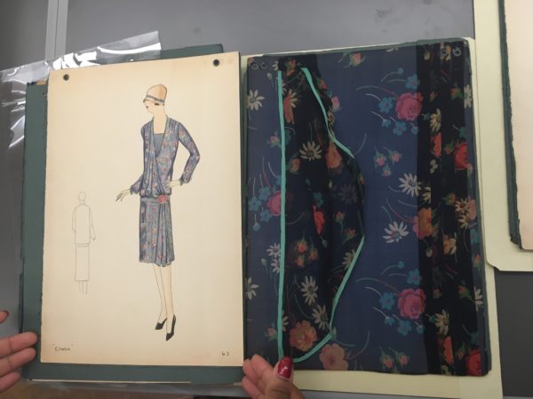
The folder at FIT contained colour-washed fashion illustrations, alongside large swatches of fabric which covered the entire page next to each design. Underneath the designs were the name and number for each piece. It is unclear whether it was Margé herself who drew these, however they are highly effective for us appreciating the clothes because of their use of colour. Rich pastel tones are used to convey the notion of what it would be like to wear such beautiful items. The drawings also show how the clothes would have looked like from behind.

The most interesting aspect of these pages was the presence of generous fabric swatches beside the drawings instead of the tiny squares of fabric customarily included with sketches. These were added so that the customer could get a real feel for the design before buying it. The size of the swatches demonstrates how important fabric was for Margé. For example, ‘Cherie,’ design number 63, includes a highly tactile piece of sheer silk chiffon floral fabric, slightly larger than an A4 paper size. The swatch includes further three-dimensional aspects of the design such as pleats, folds and drapes, and a light tortoise binding.

Although stuck onto a flat page, the contents of this folder reveal intrinsic details to the designs, and offer an alternative experience of the finished products.

By Grace Lee

You can schedule an appointment to visit FIT’s Special Collections department on their website www.fitnyc.edu/library/sparc/visit


[1] Ben-Horin, Keren. “Who Are You Madame Margé?”. Blog. On Pins And Needles, 2011. https://pinsndls.com/2011/02/19/who-are-you-madame-Margé/.

Travelling on the Ocean Liner in the 1920s

During my Christmas break at home in the Netherlands, I visited the TextielMuseum, located in a former textile factory in the city of Tilburg, in order to view their recently opened exhibition, JAZZ AGE | Fashion & Photographs. Organised by the Fashion and Textile Museum in London, this exhibition aims to show the variety of dress available to the modern woman and the completely new way of dressing that symbolised her new-found freedom and active lifestyle in the period after the First World War. The exhibition showcases more than 150 haute couture and ready-to-wear garments dating from 1919 to 1929 in different settings such as ‘In the Boudoir,’ ‘Tennis Match,’ and ‘Chinatown After Dark.’ As might be expected from a dress and textiles enthusiast, I was swooning in front of the quintessential fringed and beaded drop-waist flapper dresses and sumptuously embroidered velvet evening capes one would have worn for a night out.

The current exhibition at the TextielMuseum seems to have a slightly different design than the exhibition that was staged in London (see the excellent review written last year by former MA student Sophie Assouad). Instead of writing another review, I have chosen to focus on a specific display in this exhibition that sparked my interest because it gave me a fresh perspective on this particular period in fashion history.

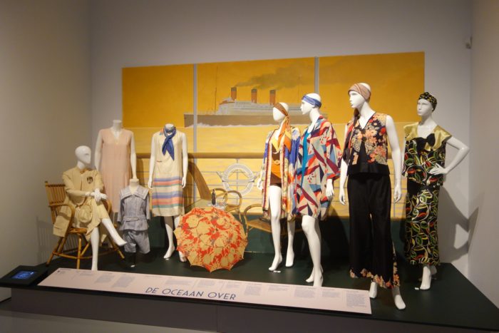
Conjuring the scene of a steamboat’s deck, ‘On the Ocean Liner’ takes the visitor beyond the notion of the 1920s as a decade of glamourous nightlife and the familiar flapper dress. It does so by showcasing daytime and leisurewear suitable for the journey aboard an ocean liner on its way to a sunny destination.

Lounging in a rotan chair to the left is a mannequin wearing a simple, cream-coloured tunic dress with a jacket in the same colour, both dating from c. 1924–25. While the dress has been made from silk, the jacket’s material, interestingly, is ‘rayon’, a man-made fibre made from chemically treated cellulose. Generally known as ‘artificial silk,’ this material was first developed in the late nineteenth century but only became widely available from the 1920s onwards. The fibre was officially renamed rayon in 1924 through an industry-sponsored contest with the aim to counter the frequent associations with artificiality or inferiority to natural silk. Rayon grew in popularity as it provided women from all backgrounds the ability to wear certain garments that were previously reserved only for those who could afford to buy silk.

My favourite ensemble in this arrangement is a simple, but chic, striped dress with pockets and pleats made from silk that dates from c. 1922–23. This dress combines comfort and freedom of movement with elegance and is reminiscent of the silhouette and style of clothing designed by Coco Chanel.

Detail of the display showing my favourite dress to the left. To the right, a cotton swimsuit in herringbone pattern. Photo: Nelleke Honcoop

Moving to the right, the eye meets a group of mannequins wearing boldly-coloured, Art Deco-patterned beach pyjamas and loose, kimono-inspired dresses worn over cotton swimsuits. This group hints at a day spent swimming – or perhaps lounging and sunbathing at the pool, cultivating the tanned skin that was promoted by Chanel and became popular during this decade.

Top and trousers, c.1925, cotton. A pyjama inspired two-piece reflecting the contemporary vogue for wearing pyjamas as lounge wear in, as well as outside, the confines of the boudoir. © Photo Tessa Hallman. Collection Cleo and Mark Butterfield

 ‘On the Ocean Liner’ addresses how swimming became popular among women in the second half of the decade when American competition swimmer Gertrude Ederle (1905 –2003) became the first woman to swim across the Channel in 1926. A cotton swimsuit in a herringbone pattern with a subtly integrated skirt is used to illustrate the active lifestyle and freedom of movement of modern women during the 1920s. I particularly enjoyed the attention given to materials and construction details, such as the contrasting cuffs of a cotton swimsuit that were not only a chic addition, but also helped to keep it in shape when immersed in water.

Finally, by focusing on 1920s women’s fashion from the angle of sports, leisure, and travel, ‘On the Ocean Liner’ felt like an inspiring warm up to the Victoria & Albert Museum’s upcoming exhibition Ocean Liners: Speed & Style, which will explore the golden age of ocean travel around the world.

By Nelleke Honcoop

JAZZ AGE | Fashion & Photographs is on display at the TextielMuseum, Tilburg, The Netherlands, until 27 May 2018. See: http://www.textielmuseum.nl/en/

Ocean Liners: Speed & Style will be on display at the Victoria and Albert Museum from 3 February – 10 June 2018. See: https://www.vam.ac.uk/exhibitions/ocean-liners-speed-style


Wintertime Winds Blow Cold This Season: Winter Wear in Art-Goût-Beauté

The title of my blogpost is derived from a song by The Doors called “Wintertime Love,” released in 1968 on their album Waiting for the Sun. It is a favourite song of mine, as it always gets me in a wintery mood. Born in January, I have always been fond of the winter season – even more so after living in Norway for two years. I enjoy winter wear and I spend time knitting myself warm jumpers throughout the year, mainly using old patterns from the 1940s and 1950s. I love the view of mountaintops covered in snow, and enjoy going snowboarding whenever I can. However, I was born in the wrong place, as the Netherlands is a very flat country. Sadly, the wintery ice skating scenes with warmly-dressed-up people, known from oil paintings such as Hendrick Avercamp’s Winter Landscape with Ice Skaters (c. 1608), have also become a rare sight.

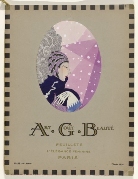
Therefore, this Christmas break I will dream away to the above illustration of a woman set against the backdrop of falling snow. It is winter, 1926. The woman is depicted in profile in a stylised manner. Her head is fashionably covered. She sports a dark blue shawl and white gloves with a light blue trimming; all to protect her from the cold winter weather.

This elegant illustration is from the cover of the February 1926 issue of Art-Goût-Beauté Feuillets de L’Élégance Féminine, a fashion periodical published in Paris between November 1921 and 1933. The successor of a short-lived magazine called Succès d’Art Goût Bon Ton, the magazine derived its initials from Albert Godde Beddin et Cie, a textile manufacturer and publisher established in Lyon in 1867. The decorative endleaves of the magazine originate from textile designs of this company, with the name and number of each pattern noted in a small inset.

Each page of Art-Goût-Beauté is a delight to look at. The magazine’s title, which translates to ‘Art, Good Taste, Beauty, Pages of Feminine Elegance,’ signals the magazine’s coverage of elegant and luxurious creations of Parisian couturiers, such as Drecoll, Patou, Poiret and Worth. Using the highly refined, hand-stencilling and painting technique known as pochoir, Art-Goût-Beauté brought these couturiers’ fashions to the contemporary reader seeking the latest fashion inspiration and advice.

Winter Wear: From Active Sportswear to Festive Evening Wear

For instance, in its January 1924 issue, Art-Goût-Beauté mentions the pleasures of winter sports such as luging, skiing, and bobsleighing for dauntless sportswomen. Moreover, an advertisement for Tunmer in its Christmas 1928 issue depicts ensembles appropriate for ice skating and skiing.

The magazine stresses that the sporty 1920s  women can still find a way to look nice both outside in the wintry landscape and in the cozy indoors. For example, they might change their sportswear for a more formal evening look, such as ‘Gabette’ by Jean Patou, or ‘Grande Passion’ by Gustav Beer pictured below. The latter, a black and beige dress with flounces, is made of fabric from Albert Godde Beddin et Cie.

Illustration of ‘Gabette’, created by Jean Patou, and ‘Grande Passion’, created by Gustav Beer. Art-Goût-Beauté Feuillets de L’Élégance Féminine., January 1924, vol. 4, issue 41, p. 12.

Find more of these beautiful fashion illustrations from Art-Goût-Beauté  via “Rijksstudio”, the online database of the collection of Rijksmuseum, Amsterdam.

By Nelleke Honcoop

Sources:

Retrieved via “Rijksstudio”, Rijksmuseum, Amsterdam, https://www.rijksmuseum.nl/en/rijksstudio.

For further reading on pochoir:

Calahan, April, and Cassidy Zachary. Fashion and the Art of Pochoir: The Golden Age of Illustration in Paris. Thames & Hudson, 2015.

The Séeberger Frères: Feminine Fashion and Canine Chic

Séeberger Frères, Jeune femme habillée par Jenny, Biarritz, septembre 1929, BnF, département des Estampes et de la photographie. ©Bibliothèque Nationale de France

The ingenious opening scene of Disney’s 1961 “One Hundred and One Dalmatians”, in which Pongo the Dalmatian studies owners and dogs, shows that dogs frequently reflect their owner’s taste as much as someone’s dress choices. Rather than just being a pet, dogs have long been used as a fashion accessory, extension of their owner’s outfits or even the main inspiration for their looks. The Séeberger Frères were some of the earliest photographers of street style and for decades captured the most fashionable people frequently accompanied by their dog.

The Séeberger Frères consisted of French brothers Jules, Louis and Henri Séeberger, later joined by Louis’s sons, and first set up a photography business in 1906 capturing Parisian sights and landmarks for postcards. When approached by Madame de Broutelles, editor at “La Mode Pratique”, in 1909, the brothers refocused their business and would go on to produce one of the most important collections of fashion documentation of the 20th century. Their first business stationary summed up their motto: “High Fashion Snapshots. Photographic Accounts of Parisian Style.”

Séeberger Frères, Walking the dogs dressed to perfection in the height of 1920s fashion, 1920s. ©Seeberger Freres/General Photographic Agency/Getty Images
Séeberger Frères, Skirts and tunics from the 1920s, 1920s. ©Seeberger Freres/General Photographic Agency/Getty Images

Until 1940, when they temporarily closed due to World War II, the Séeberger Frères took exterior snapshots with a portable camera to capture socialites, celebrities and people of wealth and importance during society events. Such events, which often took place at racecourses and beaches, attracted many fashionable people and soon couturiers started sending in models advertising their latest designs. The brothers’s images were published in magazines, such as “Vogue”, “Harper’s Bazaar”, “Le Jardin des Modes”, “Femina”, “Les Elegance Parisiennes”, “La Femme Chic”, “Les Modes”, “Vu”, and “Good Housekeeping”. In double page spreads, these photos were accompanied by extensive information on the socialite and their fashion.

The Séeberger Frères did not only influence the fashion world, but Hollywood as well. Between 1923 to 1931, Hollywood cinema agency “International Kinema Research Corporation” commissioned the brothers to photograph Paris and Parisian life in the form of shops, hotels, theatres, cafés and street scenes. These images were then used by artistic and technical directors as inspiration for set designs.

After the war, the Séeberger Frères mainly photographed inside a studio for which models and outfits were carefully selected per assignment. The company continued operation until 1975, when they donated their collection of around 60,000 negatives and documents to the “Bibliothèque Nationale de France”.

Séeberger Frères, Long sleeved coat-dress designed by Jenny, Contrasting trim is accentuated with large buttons, 29th May 1923. © Seeberger Freres/General Photographic Agency/Getty Images
Séeberger Frères, A woman wearing a velvet suit, walking her dog, c. 1920s. © Seeberger Freres/General Photographic Agency/Getty Images

During their career, they frequently photographed the rich and famous with their canine companions. After World War 1, dogs became even more essential as a fashion accessory and purebred dogs in particular became a sign of considerable wealth. During the depression, purebred Great Danes were bought for as much as $15,000 in the United States. Many of the socialites and celebrities documented by the Séeberger Frères would, therefore, buy a purebred dog as a sort of conspicuous consumption and display them during high society’s popular dog shows. In France, the poodle was considered to epitomise French chic.

The Séeberger Frères’s images are now owned by the “Bibliothèque Nationale de France” and “Getty Images”.

Séeberger Frères, Decorative pinafore covering a calf length dress, 20th May 1924. ©Seeberger Freres/General Photographic Agency/Getty Images
Séeberger Frères, Collarless coat worn with a silver fox fur and Rembrandt beret with large hat brooch, Design by Jenny, 1923. © Seeberger Freres/General Photographic Agency/Getty Images
Séeberger Frères, Mme Ulam-Krauss, Saint-Moritz Ffêtes du Nouvel An, 1939, BnF, département des Estampes et de la photographie. ©Bibliothèque Nationale de France

Making a Scene at the Fashion and Textile Museum: Thoughts on the exhibition 1920’s Jazz Age Fashion and Photographs

Mannequins welcome visitors to the film-inspired exhibition space. Photo: Sophie Assouad.

The not so inconspicuously pink and yellow/orange painted Fashion and Textile Museum on London’s Bermondsey Street is just about to wrap up its current exhibition 1920’s Jazz Age- Fashion and Photographs. So, on a cold, rainy Saturday two of us Documenting Fashion MA students (that’s you Jamie!) set out to catch it before it was too late – as did many other Londoners, it seems. It was great to see the exhibition so busy, interest in fashion history bubbling about the place.

A collection of Gordon Conway illustrations begins the exhibition. Photo: Sophie Assouad.
Film room from 1920’s Jazz Age. Photo: Sophie Assouad.

Presented over two floors, the show, which was curated by the Fashion and Textile Museum’s Dennis Nothdruft and guest curated by Cleo and Mark Butterfield and Terence Pepper, covers a variety of aspects of 1920’s fashion, including fashion for different occasions, its representation in cinema, magazines and photography and as illustration. Furthermore, accessories are included on the second floor including make-up, stockings, and jewellery. In addition, an entire room dedicated to the photography of James Abbe, who photographed show-girls and film stars, also formed part of the exhibit. Every bit of space in the museum has been utilised for 1920’s material, films and wall decals, providing a range of objects to be discovered and lusted over.

Window display of accessories in 1920’s Jazz Age. Photo: Sophie Assouad.
Magazines featured in 1920’s Jazz Age. Photo: Sophie Assouad.

The predominant layout chosen for the presentation of fashion in the main exhibition hall are “scenes” reminiscent of movie sets. These consist of a collection of mannequins in different poses situated on set-like areas corresponding to a theme. In “In the Boudoir” for example, mannequins wear corresponding clothing and the set’s back wall depicts an elaborate bed with curtains, as well as candlesticks and ornate pillars. To reinforce this notion of a quasi-movie set, artefacts such as stage lighting, a typewriter and a director’s chair are placed in between the first two “scenes.” As an idea, the scenes work well as an exhibition display, not only grouping clothing with a particular purpose together, but also, letting the viewer imagine how a room full of women might have looked in the 1920’s. Seen from the angle of our MA, the chosen layout raised some questions: How do the colours, patterns and designs compare and contrast and how would the women have perceived each other? What sense of identity did they take on depending on the cut, style and purpose of their clothing? How was fashion presented and disseminated through the media, show-girls and celebrities? How much did this influence the wearer in their own perception of fashion and lifestyles? The exhibition supports such questions, justifying the inclusion of photographs and illustrators in the show as highlighting “…the role of photographs and magazines in promoting the 1920s look”.

‘In the Boudoir’ scene from 1920’s Jazz Age. Photo: Sophie Assouad.
Props in 1920’s Jazz Age. Photo: Sophie Assouad.

1920’s Jazz Age was, to be frank, really great fun and seemingly lovingly created. It is an excellent show for an introductory glance at the changing fashions, photographs, illustrations and magazines of the period. It could be faulted for trying to incorporate too many items and mediums at once or for being too busy with various films, magazine cases, wall decals and hangings. However, this is precisely what makes it accessible. The viewer can dip in and out of any area as they please. They can take as much or as little information from it as they like. Essentially, the show reflects how the 1920’s themselves are often perceived; it is busy, hectic, full and enjoyable to the brim due to its light and playful presentation.

Further Reading

https://www.ftmlondon.org/ftm-exhibitions/1920s-jazz-age-fashion-photographs

http://www.marieclaire.co.uk/fashion/the-fashion-and-textile-museum-jazz-age-fashion-photographs-exhibition-3779

http://www.timeout.com/london/things-to-do/1920s-jazz-age-fashion-and-photographs

Dress and Movement in the work of Sonia Delaunay

Cover SD

Somewhat embarrassingly, I only managed to make it to the Tate’s Sonia Delaunay exhibition in its last week, but I was so glad that I did. I went not knowing much about Delaunay prior to stepping through the door, and because it was held in the Tate Modern, I was expecting it to focus mainly on paintings. However, it was her textiles, fashion designs and illustrations that underpinned the whole exhibition. It was immediately apparent that textiles and dress were hugely important to her during her career.

The earliest example of her work in textiles appears in the second room – a cradle cover made in 1911 for her newborn son. Interestingly, the Tate labels it as her ‘first abstract work,’ highlighting the fact that they conflate her work in textile and paint. This is, to an extent, completely understandable as there are numerous similarities between the aesthetic she employs in both. The way blocks of colour are juxtaposed is identical in both mediums. However, to consider the cradle cover, and her later fashion and textile designs, purely as decorative art is to ignore the practical, and indeed emotional, role that these objects played.

Cradle SD

Movement is by far the most persistent theme underlying all the work in the exhibition. Delaunay was fascinated by dance, particularly tango, and many of her works reflect the rapid movement and blurring of shapes that one expects to see in a packed dance hall. In this way, her work bears some resemblance to that of the Italian futurists, who in their obsession with the speed of modern life, painted the rapid movement of cars and people through the city as swirling blocks of colour. In her scenes of dance, ‘light and movement are confounded, [and] the planes blurred’ (Delaunay, c 1913). However, there is also a sense that these colours represent the sound of music in the dances. Bodies, dress and music are all reduced to contrasting colours on the canvas.

Simultaneous Dresses (the Three Women), 1925

As in her paintings, movement is a central theme of her fashion designs. In 1918 she opened Casa Sonia in Madrid, a shop selling accessories, furniture and fabrics that bore her signature swirling lines and blocks of colour. In 1925 she set up her own fashion house, as well as designing costumes for ballets and cover illustrations for Vogue. In these, as in her paintings, the body is abstracted, leaving the viewer with the representation of dress in motion. The straight, 1920s silhouette lent itself well to her geometric, graphic designs and bright colours. However, it was not just her clothing that bore this aesthetic, she also designed furniture, and the interior of her Parisian home became something of a manifesto of her style, and a hub for artists and writers.

Two fashion models in Delaunay's bathing suits
Two fashion models in Delaunay’s bathing suits

Movement was also at the heart of her textile designs, so much so that, when she displayed her textiles at the 1924 Salon d’Autumne, they were presented on a ‘Vitrine Simultane.’ This vitrine, created by her husband Robert Delaunay, presented eight swaths of fabric continuously moving upwards on large rollers. Movement was quite literally injected into these otherwise static objects.

It would be easy to look at Delaunay’s textile and fashion designs as a by-product of her painting; the same circular shapes and bold colours that feature in her canvases also appear in the textiles. However, I would argue that her paintings are just as influenced by work in dress – her paintings of dance, convey the movement of dresses swirling in different directions, abstracting the body and giving the canvases their characteristic dynamism.

MA Study Trip to New York City: The Fashion Institute of Technology Archive

IMG1
The MA class admiring a beaded dress from the 1920s.
IMG2
Muslin copy of a 1920s Chanel dress.

On one of our museum visits in New York, we were lucky enough to be shown a selection of objects from the Fashion Institute of Technology Archives. On arrival, we were greeted by an alumnus of our course, Emma McClendon, now an assistant curator at the museum at FIT, with whom we discussed our similar academic and Courtauld experiences, and then our not so academic love of Percy Pigs that we had brought over as a souvenir from the UK.

Her colleague, Liz Wei, then brought us to a study room in which we came face-to-face with the garments, fashions and trends that have graced our books, seminars and imaginations. On a packed, non-descript clothing rail were some of the most beautiful and well-preserved examples of dress from America and Europe ranging from the 1920s to the late 60s. We were shown couture, eveningwear, daywear, sportswear, and everything-in-between-wear from European designers such as Chanel, Schiaparelli, Vionnet, and Paul Poiret. We were also shown examples of ready-to-wear and couture by American designers such as Adrian, Charles James, Phil Macdonald and Claire McCardell.

We were able to get familiar with the objects (without actually touching them) and see the minute details of stitching, beading and construction, and really gain an understanding of the craftsmanship of these beautiful garments. Having discussed these objects in an abstract manner in seminars and readings, we were able to finally see the objects themselves and fully appreciate the properties and themes that encapsulated fashion in the interwar period in a tangible way.

Unlike other fashion archives, FIT also functions as an educational institute, and so has a unique set of muslin copies of select objects. This allows design students to physically interact with garments that would otherwise be too delicate to handle. This allowed us, as dress historians, to grasp an understanding of dressmaking techniques, and see the innovative and diverse methods of construction employed by couture designers, tailors and home dressmakers in these historical garments.

IMG3
Fortuny tea dress curled up in its storage box.
IMG4
Detail of pleats on the Fortuny dress.

Despite the feeling of deep reverence for all of the objects introduced to us, for me, there was one standout object. Unlike the other garments hanging on the clothing rail, this garment was curled up inside a square white box. Furled up in a whirl of finely pleated silk, was a stunning, peach-coloured, Mariano Fortuny dress and belt from the 1930s. When the dress was unravelled, the intricate tight pleats sprung forth to reveal the long, elegant sheath and the Venetian glass beads that decorated the seams. The pleating, loose-fit and columnar style of the dress reflected its original intent as a Tea Gown, to be worn without a corset, and on more relaxed social occasions, entertaining at home. This garment encompassed concepts of modernity, machinery and the changing activities of women in the 1930s, despite its classical inspirations. Remarkably, this notion of modernity still survives within the garment today, with the endurance of its tight pleating that would rival Issey Miyake’s authority of the technique. Indeed, the gown is as fresh as a Pleats Please garment available for purchase today. Much like Miyake’s technological textile research, Fortuny experimented with machinery and techniques to create his unique pleating system, a process that is still a mystery to this day. Only a few pieces of archival information on his pleating process remain. This method used a pulley system and included heated ceramic rollers through which the silk was passed to create the tight folds. Though this is still speculative, as Fortuny kept the process a well-guarded secret and it seems never recorded it. Women would have to resend their dresses to Fortuny to be re-pleated, if they had been flattened from sitting, or been dampened.

IMG5
Detail of the top of the Fortuny dress.
IMG6
Detail of the bottom of the Fortuny dress.

The technological innovation of Fortuny’s pleating, the modernity of the garment, its classical sources and its relatively intact condition, seem almost anachronistic and belie its era. It was this clash of temporalities, the captivating mystery surrounding Fortuny, and its resonances in contemporary fashion that provoked a visceral response in me.