Category Archives: Commentary

Our comments on current or past events, projects, writings, and topics in dress history and fashion

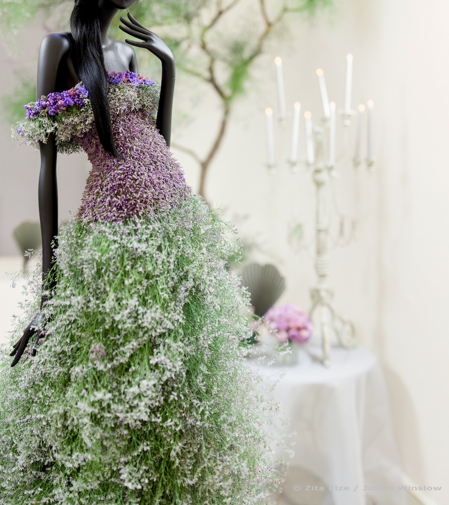
Zita Elze’s Flower Dress at Somerset House


On the 20th and 21st of January this year, the annual Aashni + Co Wedding Show came to the West Wing of Somerset House. The event featured hundreds of breathtaking South Asian couture dresses and jewellery for brides, made by worldwide famous designers such as Sabyasachi, Gaurav Gupta and Tarun Tahiliani.

The Kew Gardens based floral artist Zita Elze was in charge of the floral design for the event, and transformed the rooms of the West Wing into magical scenes. Her flower arrangements were not only placed and draped across the architecture of the building, but also acted as fashion pieces in themselves. In one of the main rooms, Zita created a spectacular handmade fresh flower dress, inspired by Cinderella. As Zita said, “I didn’t want to create another blonde Cinderella so I sourced an elegant mannequin which also alluded to my country of origin Brazil, which has a whole rainbow of ethnic references. The design itself emerged from seasonally available blooms.” Its long and flowing skirt was embellished with sea lavender and the fitted bodice was off-the-shoulder, embroidered with tiny flowerheads. The natural pastel colours subtly altered depending on the texture and shape of each part of the dress.

Zita’s dress was displayed on a gracefully posed mannequin, which took centre stage at the end of a dramatic flower arch lined corridor. There were other floral displays within the space, providing a backdrop for the mannequin and the ethereal dress. In the evening, LED lights enhanced the colours of the flowers on the dress, contrasting with its natural appearance in daylight. At the opposite end of the wing on the Nelson staircase, Zita hung one hundred Cinderella-like shoes from the railings, as well as petal garlands. The shoes were filled with fresh flowers, and created spectacular shadows on the staircase thanks to the lighting. Zita had decorated many of the couture designers’ exhibition rooms, enhancing their dress designs. One area dedicated to jewellery featured a chandelier tree as a centrepiece, which one could walk around whilst viewing the precious accessories in the surrounding cabinets.

Zita has previously created handmade flower dresses for clients and events, and regularly crosses into the realm of fashion. Although not formally trained in fashion, she has a keen sensitivity when working with the human form and designing gowns. Each piece is unique. When creating a dress, Zita notes that she first “creates a textile base, then when the base is ready I apply my floral embroidery technique. This process normally takes a week, all by hand. In this case, I started with the train and then worked on the bodice during the last two days – so that the bodice was kept fresh throughout the exhibition. This is less important when working on a wedding dress which will only be used on the actual day.” Zita also designs accessories made out of real flowers such as veils, hair pieces, bags, parasols and jewellery. Although the materials she uses have a limited lifetime, there is still a beauty to her works once they have dried. The most interesting aspect of her flower dresses is this notion of temporality, and the way in which they gradually change colour and texture as they age.

By Grace Lee

Zita Elze’s shop and design academy are located on 287 and 303 Sandycombe road in Kew, Surrey. Make sure to visit!

All photographs taken by Julian Winslow

Making Fashion: Humphrey Jennings, Norman Hartnell, and Fashion as Documentary

British documentary filmmaker Humphrey Jennings is perhaps best known for his wartime documentary short films such as London Can Take It! (1940) and Listen to Britain (1943). In 1938, he made a film quite different from those that typify his body of work. Making Fashion focused on the creation and presentation of leading British fashion designer Norman Hartnell’s Spring 1938 collection. This documentary, filmed in colour, shows how a high-end fashion show would typically be put together. An announcer gives the name and details of each ensemble as the model appears, and announces when the category of clothing has changed. It cycles through daywear, evening gowns, and finally a group of ‘outstanding creations’.

One of Hartnell’s ‘outstanding creations’ that is particularly eye-catching is a high fashion interpretation of the Queen’s Guard uniform. The model wears a long red military style coat over a white blouse and black leather skirt. The coat is covered in elaborate gold braiding on the shoulder, and gold embroidery on the upper arms. This outfit emphasizes Hartnell’s pride as a British designer (filmed by one of Britain’s best-known filmmakers). Jennings goes through the motions of a normal filmed fashion show, but adds his own documentary flair.

Hartnell

Jennings diverges from the typical fashion show by giving us a glimpse of both the creative process of Hartnell and the preparation of the models. Jennings mixes the modes of the traditional filmed fashion show and the documentary to create something unique. Black-and-white film was thought to be a more realistic form of storytelling, and as such was the standard for documentary films. On the other hand, fashion shows were often shot in colour, which both showed the clothes off to their best advantage, and created a world of fashion fantasy, into which the viewer could escape. The film begins with a voiceover describing the ancient Greek statues that served as Hartnell’s inspiration. Jennings gives us sweeping shots of the Greek statues, and then shows us Hartnell himself sketching in his workshop, thus linking Hartnell’s genius as a fashion designer to that of ancient Greek statues. While Jennings lifts Hartnell up, he focuses on his art rather than him as a heroic figure, by focusing most of the shots on Hartnell’s hands while he paints a watercolour design. The film then goes through the various stages a design goes through before it is finally sent down the runway. This segment leads into the fashion show itself, and thus Jennings sets the stage for the audience to have a greater appreciation for the designs they are seeing. Through his use of both familiar documentary and fashion show devices Jennings creates a unique look at a top designer’s process and its results.

By Olivia Chuba

LINK to fashion show: https://www.youtube.com/watch?v=g-7z2OiiqzA


Three Coats in Museum Exhibitions

Clothes provide a protective layer between the body and the outside conditions. The following coats were seen recently in exhibitions in New York and respond to the notion of coats as a protective membrane between the human body and the outside weather conditions, as well as something the body lives in. The following ‘Sleeping Bag Coat’ (Norma Kamali, 1973/2017), ‘Self-Contained Housing’ (Daniel Durning, c.1982) and the ‘Security Blanket Coat’ (Bonnie Cashin, 1972) also comment on issues of housing and lifestyle through their self-conscious titles and the materials in which they are made from and the exhibitions they are shown in.

Photograph of ‘Self-Contained Housing’ Daniel Durning, designed c.1982

Daniel Durning’s ‘Self-Contained Housing’, a coat, hat and slippers ensemble, was exhibited at The Museum of Modern Art as part of their Club 57: Film, Performance, and
Art in the East Village, 1978–1983
exhibition (October 2017 – April 2018). By recycling found fiberglass insulation and plastic sheeting for this piece and titling it ‘self-contained housing’ Durning amusingly aligns the body with the home, and was made in 1982 to respond to the way artists were living in unheated loft spaces in New York in the eighties in scenes like ‘Club 57’. This piece reminded me of Final Home’s 1994 coat that was designed by Kosuke Tsumara after spending several nights sleeping rough in New York City which features up to 40 pockets that can be stuffed with material to insulate the wearer in the face of a natural or man-made disaster.

Photograph of ‘Security Blanket Coat’, Bonnie Cashin, designed 1972.
Photograph of newspaper clipping from WWD May 1972.

Going uptown and back in time, Bonnie Cashin’s ‘security blanket’ coat from 1972 was exhibited at Mod New York (November 2017 – April 2018) at the Museum of the City of New York. The mohair coat features a check plaid pattern that resembles the traditional material of a blanket, and the loose draping of the body, deep armholes and the fact it covers the whole body even further align it with the kind of warmth and protection one may use a blanket for when indoors keeping warm. This coat by Cashin, who was the first hired designer for Coach, takes an idea of comfort indoors to outside and onto the streets as outerwear. This design then follows the preoccupation with comfort and simplicity of design in American Sportswear that Cashin was known for and which is intrinsically linked with the post-war fashion design in New York in the 40s and 50s that challenged traditional design much like imaginative and diverse designs of the ‘Mod’ 1960s.

Photograph of ‘Sleeping Bag Coat’, Norma Kamali, designed 1973, manufactured 2017.

Norma Kamali’s ‘Sleeping Bag Coat’ (1973) was featured in The Museum of Modern Art’s exhibition Items: Is Fashion Modern?  (October 2017-Janurary 2018) and like Cashin’s ‘Security Blanket’ it features a wrap-around design and a material reference to comfort and sleep, as opposed to Durning’s ‘Self Contained Housing’ that uses the actual infrastructure of the home for a garment. The idea of the coat came to Kamali during a camping trip when she wrapped her sleeping bag around her body to run to the bathroom. This backstory contextualises the coat with the camping holiday trend of the 70s that continues today and considers how clothing can be transitory and practical like a sleeping bag. This interplay between fashion and the functional object – here, the sleeping bag, but also wall insulation in Durning’s case or a traditional mohair blanket in Cashin’s – shows how designers were taking inspiration from a concern with survival, protection, sleep and innovation of materials not necessarily associated with fashion design, and creating space for innovative runway designs like Maison Martin Margiela’s duvet coat in 1999 or Viktor and Rolf’s fantastical bed dress in 2005.

By Evie Ward

Mod New York: The Styles they are a-Changin’


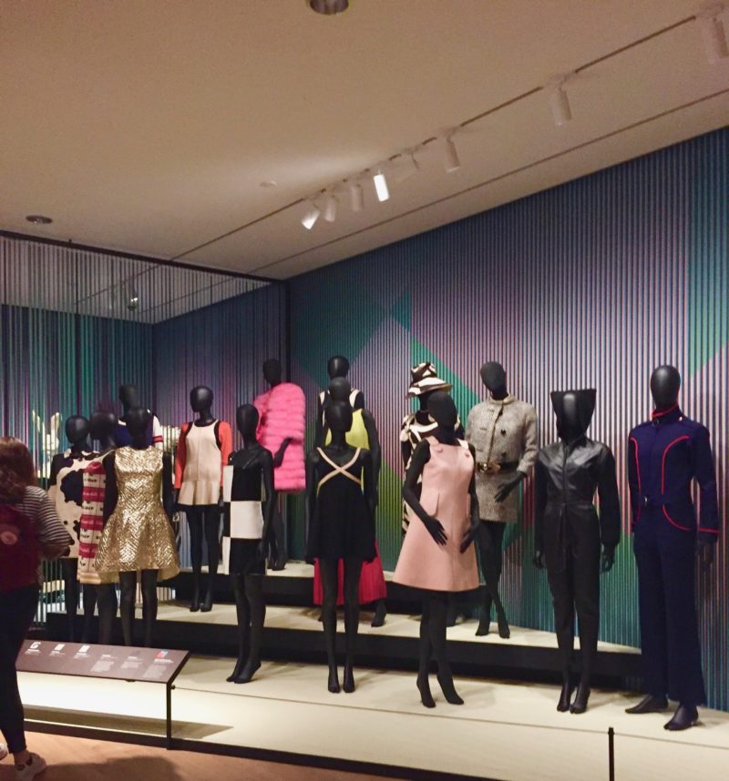
Time seems to be flying by since the MA Documenting Fashion course took our study trip to New York. I remember the trip with fond memories because even after growing up in upstate New York (about 90 minutes from Manhattan) and after living in the city for my undergraduate studies, I felt like I was seeing New York in a new way. While there were many highlights of the trip from visiting various archives and meeting with previous graduates of the MA Documenting Fashion course, the “main event” (in my opinion) was the Mod New York: Fashion Takes a Trip exhibition at the Museum of the City of New York. It pains me to say that it was my first time visiting the museum, but after going to the exhibition curated by Phyllis Magidson, I know it will surely not be my last.

I was so impressed with the exhibition for primarily three reasons. Firstly, it was a comprehensive survey of the different emerging fashion styles in the 1960’s in New York. The physical space of the exhibition was rather small (only occupied a room and small hallway) and used multicolored paneling to divide the room into different spaces, which also provided a rather psychedelic optical illusion effect through changing of color depending on the visitor’s spatial position. The exhibition situated New York fashion in the 1960’s as a reflection of the socio-political climate. The diversity in fashion styles reflect a fluidity of beliefs, and the idea of clothing signifying perhaps an individual’s political beliefs vis-a-vis a collective style of dress. Secondly, I admired the exhibition’s aim to be inclusive of a diverse range of styles of marginalized groups of people. It was not simply a showcasing of upper-class white style and dress, but one that acknowledges that 1960’s fashion is not exclusively emerging from the pages of European high fashion magazines and couturiers, but it’s also coming from the street. Fashion undergoes a synthesis, and in a way, it was more inclusive than it ever was before in the 1960s. Lastly, I was impressed by the exhibition’s attention to detail—not only in terms of the types of objects it displayed such as: accessories, undergarments and women’s fashion magazine and news articles of the time, but also attention to visitor experience. The exhibition was not only a visual exploration into New York style in the 1960’s, but a sonic one as well. In reality the exhibition would take about 20 minutes to walk through, however, with the decision to add a curated playlist to the exhibition experience featuring the musical stylings of Dusty Springfield, Marvin Gaye to Crosby, Stills, Nash & Young, you cannot help but want to peruse the exhibition again just to hear what might play next.

Jumpsuit of leather and ribbed wool knit, c.1963, Bonnie Cashin
Grandassa Model Pat Bardonelle at the Garvey Day Parade in 1967, shot by Kwame Braithwaite

While I was completely breath-taken by the garments on display from Emilio Pucci to Bonnie Cashin (all of which come from the Museum’s collection!), I was charmed by the other senior visitors of the exhibition. As I was writing notes, I couldn’t help but overhear the endearing conversations of older couples enjoying the garments in display, not just for aesthetic reasons, but enjoying the garments as symbol of their own personal memory. I overheard one woman saying to her friend, “It doesn’t seem so long ago, (I guess) it’s all perspective.” After I heard that, I stopped looking at the exhibition through a purely academic lens, but a personal one. I began to imagine my older family members who experienced and lived through this time in New York, and I was reminded by my aunts and mother talking about the craze of hot pants and afro-puffs and how good they used to look “back in the day” while living in the South Bronx. Fashion, in the exhibition, takes a trip through 1960’s through themes of nostalgia, politics, popular culture, while ultimately landing on the theme of  collective resilience in the face of adversity, an idea that continues to carry salience today.

By Destinee Forbes

Quicksilver Brilliance: Adolph De Meyer Photographs at the Met

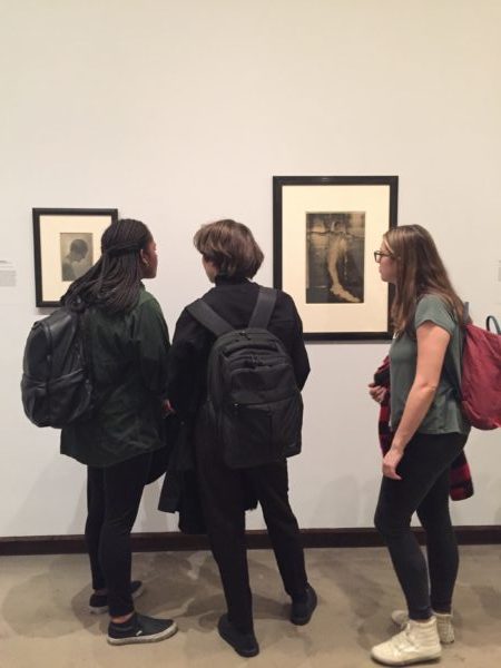
In our next installment of the MA Documenting Fashion NYC trip recap we take on the Metropolitan Museum of Art, specifically a small gallery tucked away by the nineteenth-century sculpture featuring the photographs of Baron Adolph de Meyer in Quicksilver Brilliance, a solo exhibition of his work. The exhibition utilizes the Met’s own holdings of de Meyer’s photographs to create an overview of de Meyer’s career.

As a pioneer of fashion photography, de Meyer’s distinctive Pictorialist approach helped define the genre during the interwar period at leading fashion magazines. Thus, the inclusion of one of de Meyer’s tuxedos is an appropriate addition to the exhibition. The presentation of a pristine 1930s black wool tuxedo which likely comes from Wolf Kahan, a tailor who catered to the artists of Vienna, sets a tone of elegance for the exhibition. De Meyer, a member of the “international set” that defined high society in fin-de-siècle Europe, was considered a beacon of style, writing columns for Harper’s Bazaar and Vogue instructing American women on the latest European fashions.

Adolph de Meyer, “The Silver Cap,” 1909. Gelatin silver print, 1912.

The first photograph in the exhibition that caught my attention was The Silver Cap which as its title suggests, highlights the headwear of de Meyer’s model. The 1909 photograph seems to glitter on its own like an early twentieth-century version of the Kira-Kira app. Indeed, de Meyer was a master of manipulating light, combining a soft focus and a dramatic use of electric light to create a “quicksilver brilliance.” Here, de Meyer’s manipulated lighting captures the texture and luminosity of the fabric to illustrate in the photograph the quality of the textile as if it were in motion.

Adolph de Meyer, “Rita de Acosta Lydig,” 1917. Platinum print.

My other favorite photograph in Quicksilver Brilliance is a 1917 portrait of Rita de Acosta Lydig where de Meyer captures the socialite and suffragette in striking simplicity. I adore the way in which de Meyer renders the subtle contours of his subject’s body and illuminates the confident character of Rita without showing much of her face. To me, the image, which appeared in Vogue, relates the sensual beauty of the female subject and represents a style of photography and posing that dominates fashion photography to this day.

Quicksilver Brilliance presents a charming selection of prints which epitomize de Meyer’s career and highlight the elegant origins of fashion photography. The exhibition is on at the Met until April 8th. 

By Abby Fogle

Julliard’s Gourmet Colours


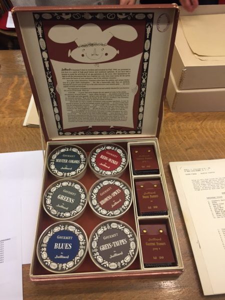
While in New York our class was fortunate enough to visit the archive of the Brooklyn Museum. One of the pieces that we were shown was a whimsical little catalogue of dyed fabrics called Julliard’s Gourmet Colours from autumn 1949. In truth, the word ‘catalogue’ is loosely used to describe what was, in actuality, a treasure trove of beautiful fabric swatches, whacky illustrations and a plethora of food-related puns. These curious little boxes were local to New Jersey, only produced once or twice a year and were made for the benefit of clothing designers and manufacturers who may have been interested in using their fabrics.

The ways in which the accompanying booklets described the look and feel of their textiles was truly a work of poetry; the gastronomical metaphors perfectly embodying the potential haptic visuality of fabrics and clothing. The booklet states: “Gourmet colours have subtlety and unique distinction of a great chef’s masterpiece… for, like a memorable dish, they are skilfully blended by experts and served up in the most attractive and tasteful guise.” With dye names such as ‘cranberry sauce, ‘black mint’ and ‘hot spice’, it becomes easier to see how one might begin to view an outfit as a perfectly crafted meal with high quality ingredients.

They go on further to write that the texture of certain fabrics may be “smooth as a mousse… or crisp as melba toast, or soft as soufflé… or as deliciously light as meringue.” Here, language is used as a means to suggest that there is a desire to devour when looking at something we deem to be aesthetically pleasing. They also write: “these Julliard fabrics have been designed and dyed in Gourmet colours to provide a gracious setting for milady.” In this sense, an interesting comparison can be drawn between the way in which the fabrics are being described and the way in which the gaze operates within society. In describing fabrics using food-related terminology and comparing women’s fashion as a ‘gracious’ table setting, we can see how fashion might be used as a means to be devoured and ingested by the look of others. This quirky and unique fabric catalogue epitomises the tactile and digestive nature of looking in a manner that almost satirises and parodies the devouring potentiality of the gaze.

By Niall Billings

Tom Brigance Beachwear Sketch at Parsons Archive


On February 27, the MA class journeyed to Greenwich Village in New York City to visit the Parsons School of Design Archive. Upon arrival, we were left to explore boxes and folders overflowing with sketches of women’s wear between the 1920s and 1960s. Some of the sketches were rather minimal, a few fleeting lines drawn with pastel on tracing paper, while others were more detailed pencil on paper drawings. Our favorites as a class were Parsons’ extensive collection of Claire McCardell sketches, and one specific sketch with corresponding advertisement of Tom Brigance swimwear.

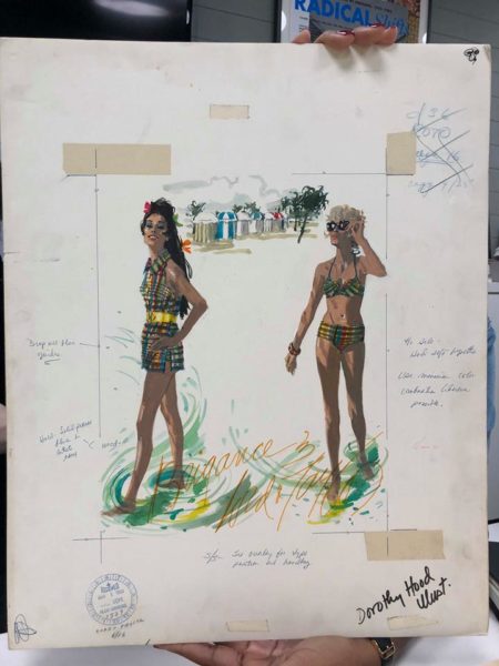
Tom Brigance, an American designer specializing in women’s sportswear, was a house designer for Lord & Taylor. Illustrated by Dorothy Hood, this particular sketch from 1968 advertised his In The Beach Scene line, and features a bikini and backless swim tunic. Hood gracefully captures the nylon fabric and gingham-like colorful print of Brigance’s swimsuits, and creates a whimsical beachfront scene. Our class was fascinated by this illustration board, because it included the handwritten notes of the copywriters or printers for this campaign. “Drop all blue guides,” and “see overlay for type position and handling,” along with notes on how to print Hood’s name within the illustration, can be seen written onto the advertising board.

Our class then all audibly gasped when we found that Parsons also had the corresponding final printed product. This was particularly interesting and exciting, because we were able to see the entire thought process—from the fashion illustration and notes to the final advertisement. The print advertises the two swim pieces, their prices, and an opportunity to meet the designer Tom Brigance at Lord & Taylor the following day.

By Arielle Murphy

Platform Shoes and a Visit to FIT’s Special Collection


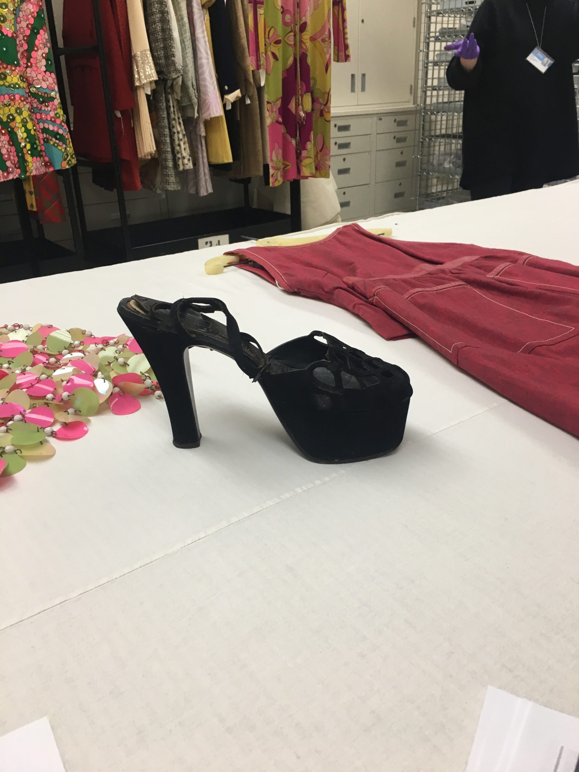
On our recent study trip to New York, one of our first visits was to the Fashion Institute of Technology. Associate Curator at the Museum at FIT and former MA Documenting Fashion student, Emma McClendon showed us some highlights from the storeroom. We saw a range of items including everything from a decadent velvet evening coat from 1923 to a three-piece Chanel suit from 1965. One item that particularly caught my eye was a pair of black suede platform sandals. Emma asked us what year we thought they were from, and our guess was sometime in the 1970s, but it turned out the shoes were actually from 1949. High-heeled platform shoes are often associated with the 70s because of the rise of second-hand dressing.

The platform shoe rose to prominence in modern western fashion in the 1930s. The wedge heel had been a popular style in the 30’s, but in the second half of the decade the separation of the toe and heel sections created the trend of the platform shoe, which lasted well into the 1940s. Salvatore Ferragamo is credited with popularizing the style in the late 1930’s with shoes like his famous rainbow platforms. These early examples show the elevation of heel over the toes, which would become increasingly pronounced throughout the 1940s. In the example we were shown at FIT both the platform and the heel have been raised a considerable amount, and the difference between the platform and heel heights is more pronounced. By viewing both films and photographs from the 1940s the prevalence of the high-heeled platform shoe is obvious, but it has perhaps gained an even more immediate association with the 1970s.

In the 1970s there was an increased interest in second-hand dressing. Where in earlier decades buying clothes from a thrift shop was seen as something shameful, in the 1970s it became trendy. The ‘youthquake’ of the 1960s unleashed the trendsetting power of young people, especially teenagers. In the 1960s and 70s shopping for second hand clothes became popular within youth culture. Young girls began to buy the platform sandals that were popular in the 1940s, and restyle them to their own tastes. The popularization of vintage clothing led to our misidentification of the platform shoes as something created in the 1970s. The trend of shopping for vintage clothing has continued and even grown throughout the latter half of the 20th century and into the 21st century. Old styles regain popularity and maintain a place in the public imagination through this practice. The platform shoe is once again a stylish and desired item today, because there has been a resurgence of popularity for 70s styles. The cyclical popularity of the platform lends credence to the saying that everything old becomes new again.


By Olivia Chuba

Dead Stock Dream Shop: A Visit to the Hodson Shop Archive in Walsall

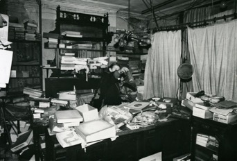
During our study trip week I travelled to Walsall in the West Midlands, England, to visit the Walsall Museum’s Hodson Shop archive. This archive consists of the unsold stock of the Hodson Shop. This small draper’s and haberdasher’s shop was opened in 1920 by the twenty-nine-year-old Edith Hodson in the front room of the Hodson family’s home in the industrial town of Willenhall. Edith’s younger sister, Flora, joined the business in 1927, while their older brother Edgar ran a lock factory from the courtyard. After the death of both Edith and Edgar, Flora continued to run the shop until the early 1970s. The abandoned shop stock was discovered in 1983, after Flora’s death, and was passed on to Walsall Museum, where it is now curated by the lovely Catherine Lister.

Sheila B. Shreeve, who has meticulously catalogued the collection of over 3000 dress items, was working as a volunteer at Walsall Museum at the time of the shop’s discovery. Shreeve’s description of her first encounter with the abandoned shop pretty much sounds like the stuff my dreams are made of: “Imagine my delight when I first entered the front room of the locksmith’s house and found it to have been a draper’s shop. Boxed were piled haphazardly on flimsy shelves, slim and elegant leather gloves were strewn across the floor. On the oak counter was a display box which revealed rolls of shimmering silk ribbons abandoned when superseded first by rayon ones and then by nylon” (Shreeve, 82).

As Shreeve points out, the collection of unsold garments, dating from the 1920s to the early 1960s, would have been worn “by the ordinary men, woman and children in the street”, the local working-class and lower middle-class. (Shreeve, 82-83). By looking at the Hodson Shop archive one gains a fascinating insight into the ‘everyday’ life of the non-elite in the West Midlands area in England.

Besides women’s, men’s and children’s clothing, the collection also contains haberdashery items, dressmaking and needlework magazines, cosmetics, and household goods. Moreover, boxes of printed items, such as warehouse and other supplier catalogues and leaflets, give an insight in the business side of the shop.

Spring 1931 catalogue cover from Wilkinson & Riddell Ltd., retail drapers from Birmingham. Hodson Shop collection, Walsall Museum. Photograph: Nelleke Honcoop

What I absolutely loved about my visit was to see the way this collection has been catalogued. Besides giving a dense, detailed description of the style, material and size, Shreeve has made a small drawing depicting the garment, with relevant details such as pleats, pockets, or fabric print. These drawings give a wonderful visual overview of the collection, and also show fashion’s changing silhouette over time.

Descriptions and drawings of 1920s dresses (left) and 1940s dresses (right) by Sheila Shreeve for Hodson Shop catalogue record. Hodson Shop collection, Walsall Museum. Photograph: Nelleke Honcoop

Shreeve has added more ‘layers’ to this collection, as she has created a separate catalogue record card for each garment. Moreover, in the case of some garments, Shreeve has found cross-references in the form of advertisements in the warehouse catalogues. These advertisements give us additional information. For instance, a sleeveless blouse made of artificial silk was advertised in the Spring 1931 catalogue of Wilkinson & Riddell Ltd., a warehouse based in Birmingham. The blouse was available in the following colours: “ivory, sahara, champagne, nil, and powder”.

The artificial blouse that was advertised in the Wilkinson & Riddell catalogue for Spring 1931, and catalogue record card by Sheila Shreeve. Photograph: Nelleke Honcoop

Because the Hodson Shop collection is “dead stock”, as it was never sold to and used by consumers, the clothing I looked at was overall in a crisp and pristine condition. This dead stock condition fascinated me, as these were garments that were made to be worn, but never worn in the end. Even so, on the back of a beautiful navy blue crepe dress manufactured by Belcrepe from c. 1936, which had the original swing ticket still attached, I noticed an interesting pattern of discoloration caused by fading. This dress showed, in an almost eerie way, what time – and light – can do to a garment that has never been worn and has been stored away.

Navy blue crepe dress by Belcrepe (England) from c. 1936 with swing ticket “A Belcrepe Robe” (left). The fading is clearly visible on the back of the dress (right). Hodson Shop collection, Walsall Museum. Photograph: Nelleke Honcoop

By Nelleke Honcoop


Further reading:

Shreeve, Sheila B. ‘The Hodson Shop’. Costume 48, no. 1 (1 January 2014): 82–97.

Blog written by Jenny Evans about her PhD on the Hodson Shop: https://hodsonshopproject.com/

Online database of the Hodson Shop: www.blackcountryhistory.org


Documenting Fashion Takes NYC: The Madame Margé folder at the Fashion Institute of Technology’s Special Collections


The MA Documenting Fashion crew took New York City by storm last week! Stay tuned for posts about what we saw and did on our fabulous study-trip-extravaganza.

Our first visit was with April Calahan at FIT’s Special Collections department. April kindly showed us several boxes full of fashion illustrations, photographs and designs from the Twentieth Century, including the second issue of US Vogue and early designs from Chanel, Bonnie Cashin and Rudi Gernreich.

Among the treasures presented to us there was a folder containing late 1920s or 30s coloured sketches for designs made by Madame Margé, which was donated to the museum in 1957. There has been very little research done about Margé. She was born as Marguerite Norlin in 1978 in Philadelphia, and later Francophiled her name as was often the case for designers in the earlier Twentieth Century. Paris was then seen as the fashion central, but throughout the decades Margé was working it gradually shifted to include America. In New York and Chicago she owned fashion firms, selling the latest designs throughout the interwar period.[1]

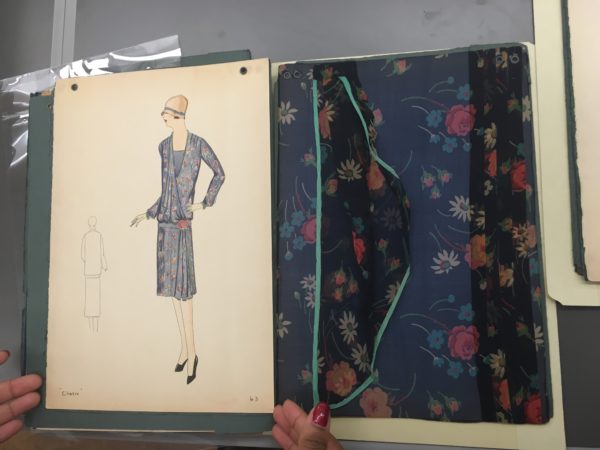
The folder at FIT contained colour-washed fashion illustrations, alongside large swatches of fabric which covered the entire page next to each design. Underneath the designs were the name and number for each piece. It is unclear whether it was Margé herself who drew these, however they are highly effective for us appreciating the clothes because of their use of colour. Rich pastel tones are used to convey the notion of what it would be like to wear such beautiful items. The drawings also show how the clothes would have looked like from behind.

The most interesting aspect of these pages was the presence of generous fabric swatches beside the drawings instead of the tiny squares of fabric customarily included with sketches. These were added so that the customer could get a real feel for the design before buying it. The size of the swatches demonstrates how important fabric was for Margé. For example, ‘Cherie,’ design number 63, includes a highly tactile piece of sheer silk chiffon floral fabric, slightly larger than an A4 paper size. The swatch includes further three-dimensional aspects of the design such as pleats, folds and drapes, and a light tortoise binding.

Although stuck onto a flat page, the contents of this folder reveal intrinsic details to the designs, and offer an alternative experience of the finished products.

By Grace Lee

You can schedule an appointment to visit FIT’s Special Collections department on their website www.fitnyc.edu/library/sparc/visit


[1] Ben-Horin, Keren. “Who Are You Madame Margé?”. Blog. On Pins And Needles, 2011. https://pinsndls.com/2011/02/19/who-are-you-madame-Margé/.