Author Archives: Rosie

‘There’s A Million Guys Like Me’: Gene Kelly, Dress and Ordinary Masculinity.

When it comes to dance royalty, Gene Kelly reigns supreme. With credits including classical musicals such as Singin’ in the Rain (1952), An American in Paris (1951), and On The Town (1949), Gene Kelly is best remembered for his athletic style of dancing, and stands out in popular memory as the original example of the manly dancer.

But despite this posthumous reputation, during his career Kelly’s masculinity was a constant source of anxiety for both the star – he frequently retold a story in which he denied being a ‘sissy dancer’ at a burger bar in New York – and for the studio he worked for. Although Kelly worked hard to hone a dancing style that would be considered manly and virile this was not enough, and in both his on-screen and off-screen appearances it becomes clear that dress was of paramount importance in creating Kelly’s masculine image.

Rosie's diss talk
Kelly’s simple look for the highly dramatic ballet sequence, performed with Leslie Caron (photo: screenshot from movie)

At first glance, many of Kelly’s costumes seem remarkable only for being, well, unremarkable. Throughout An American Paris, his dress is notably normal: at the beginning of the film, the star appears in cream coloured trousers with a cap and matching sweater, wearing a similarly simple outfit in the number ‘S’Wonderful’. Later, in an extended dance sequence with Leslie Caron, he also sporting plain black slacks and a short-sleeved t-shirt designed to draw attention to his muscular arms. Although simple, these costumes worked hard to assert the star’s manliness by emulating a cultural icon of heteronormative masculinity – the ordinary American man. This chimed with Kelly’s depiction in movie magazines of the period, where studio’s pre-made publicity material had him describe himself as ‘just Joe Average’, adding that ‘I’ve got a wife, a kid, a car and a house. There’s a million guys like me’.  By emulating the normal American man, his plain, simple dress dress works harder than it seems to – refusing to label Kelly a spectacle and resisting the ‘to-be-looked-at-ness’ that, according to Laura Mulvey’s Visual Pleasure and Narrative Cinema essay, characterised female performers’ appearances.

Rosie's diss talk
Gene Kelly at the beginning of An American in Paris and in the number ‘S’Wonderful’ (Photos: screenshot from movies)

Another of Kelly’s trademark looks was the suit – an unmistakable signifier of ordinary masculinity. But while his Fred Astaire frequently danced in elegant top hats and tails, Kelly’s suits strived to emulate the ordinary working man’s wardrobe. In Singin’ in the Rain, for example, Kelly performs one of the most well-known musical numbers ‘Good Morning’ in a grey business suit, having removed his jacket, and perhaps the best-remembered image of the film comes when Kelly, in a suit and hat, swings from a lamppost in the rain. Kelly’s suited look was established early in his career, and in the title number of his first film For Me and My Gal (1943), the star was also dressed in a pin-striped suit. By mirroring the look of the ordinary man Kelly’s image continues to insist on its own masculinity by refusing to depict Kelly as a sartorial spectacle. Importantly, however, Kelly’s plain business suits also reveals MGM’s particular interest in associating Kelly with a particular brand of relatable, working-class masculinity. In fact, Photoplay’s May 1943 edition even recounted a story that, after losing his dinner jacket, Kelly had threatened to attend a movie premiere in a business suit.

Rosie's diss talk
Gene Kelly’s pin-striped business suit in For Me and My Gal (Photo: screenshot from movie)

This dual preoccupation with both Gene Kelly’s masculinity and his relatability crystallises in his sailor costumes, which he wore in films including On the Town and Anchors Aweigh (1945). Intentionally resonating with the uniforms worn by men who had fought in the Second World War, his dress in these films not only underlined Kelly’s patriotism but also encouraged contemporary male viewers to recognise themselves in Kelly’s star image.

But at the same time as stressing Kelly’s ordinary masculinity, his sailor outfits in also undercut these implications. In Anchors Aweigh, for example, Kelly performs ‘The Worry Song’ with an animated Jerry the Mouse. Here, Kelly’s blue striped t shirt stretches over his torso, emphasising his pectoral muscles, and his high-waisted white trousers are very tightly fitted. Throughout the dance routine, a long tracking shot is used to ensure that the star’s body is in full view and so, despite insisting on his masculinity, Kelly’s costume here in fact positions him in a typically female cinematic role – that of sexualised spectacle.

Rosie's diss talk
Kelly and Sinatra’s identical sailor costumes emphasise their togetherness (Photo: screenshot from movie)

Of course, Kelly’s sailor suits and their ostensible assertions of masculinity are further complicated by the cultural understanding of the sailor as a signifier of homosexuality. In Anchors Aweigh, his costume not only exhibits Kelly’s body but also resonates with his male co-star (Frank Sinatra)’s costume to imply their togetherness – something which is echoed in their physical closeness during dance routines – and suggest the possibility of a relationship between the two. Although likely unintentional, this example is significant for highlighting the anxieties of gender and sexuality that troubled Kelly’s star image. Here we see how, despite being used to try to obscure such ambiguities, dress in fact becomes a key to understanding them.

Laura Dern in All Her Feminine Beauty

Winner of best supporting actress at the BAFTAs, Academy Awards, Oscars and Golden Globes, Laura Dern has certainly turned heads this awards season – and rightly so. Her performance in Noah Baumbach’s emotional divorce drama Marriage Story is powerful and nuanced and this is underpinned by her character’s striking wardrobe.

In Marriage Story Dern plays a powerful, savvy lawyer – Nora – who acts on behalf of Nicole (Scarlett Johansson) as she seeks a divorce from her husband Charlie (Adam Driver) and tries to obtain custody of her son. Throughout the film, Nora’s outfits work to emphasise her experience and her power as a highly sought-after solicitor. However, in his choice of dress for Dern, costume designer Mark Bridges (who also designed the costumes for another 2020 hit, The Joker) highlights the particular potency of Nora’s feminine power in the largely male-dominated field of law. Nora’s character capitalises on her femininity through her clothing, projecting an image of herself that is unapologetic and confident, asserting her authority and, most importantly, bringing focus to her client.

‘Laura Dern wears a floral blazer, jeans and red heels at the beginning of the film’, source: still from Film
‘Laura Dern wears a floral blazer, jeans and red heels at the beginning of the film’, source: still from film

At the beginning of the film, Nora and Nicole meet in her office. In this scene, Nicole is clearly nervous – worried that she’s done the wrong thing by hiring a lawyer – even though she agreed with Charlie that they would proceed without them. Nicole turns up in a blue shirt and jeans – a staple look of hers. By contrast, Nora wears an overtly feminine pink floral blazer with skin-tight jeans and high, bright red heels. This establishes an obvious contrast between the two women, we sense that they are not going to get along and have completely different priorities. But as the meeting progresses, she positions herself as a likeable but capable lawyer. As Nicole begins to get emotional, opening up to Nora about the difficulties in her marriage, Dern removes her floral blazer, revealing a plain white top. This tones down her outfit to match the simplicity of her potential client, her exposed arms being suggestive of both vulnerability and strength.


for argument
‘Nora removes her blazer for a simpler look’, still from film.

Later on, in the courtroom scene, Nora’s dress again resonates with Nicole’s and is suggestive of the solidarity between the two. In one shot, the pair are sat on a bench in a hallway in an almost identical pose – legs crossed and hands in their lap, although Nora seems more relaxed. Here, Nora wears a light pink dress, a dark grey blazer with rolled-up sleeves and Louboutin shoes, whilst Nicole appears in a purple dress spotted with flecks of pink and white and a blue blazer. They enter the courtroom together: their visual similarity unites them as a team but their dark blazers also echo the dress of Charlie and his team of lawyers. This resonance indicates a certain harmony and civility amongst the group – they all share a common goal. That is, until Nora removes her blazer.


‘Laura Dern wears a floral blazer, jeans and red heels at the beginning of the film’
‘Nora and Nicole wait together in the hallway’, source: still from film

As things begin to get heated, Laura Dern’s character removes her outwear to reveal the dress underneath. This garment is closely fitted and silky in texture – a light pink dress over what looks like a black slip. By removing her blazer Nora differentiates herself from the other lawyers by highlighting her femininity: the dress almost resembles lingerie, attracting attention and representing her as the bolder, more confident lawyer. Embracing her sexuality, the colour of her dress also highlights the ‘men versus women dynamic’ previously hidden by professional niceties.

Still from film
‘Nora removes her blazer for a simpler look’, still from film

However, by removing her blazer Nora also distances herself from Nicole. Nicole does not speak in this scene and Nora takes charge of the situation, removing the pretence that the power is shared between them: her experience and knowledge means that she knows best. Indeed, this foreshadows the ending of the film in which Dern’s character negotiates a custody agreement that privileges Nicole’s access to her son over Charlie’s, despite Nicole insisting against it.

In Marriage Story, Laura Dern’s costumes play an important part in emphasising the three-dimensionality of her supporting character. This, paired with her outstanding, subtle acting makes the character of Nora especially memorable.

Teeth, Orthodontics and Fashion

‘You’re never fully dressed without a smile’, sang little orphan Annie back in 1976. Today, however, this seemingly glib aphorism rings truer than ever, as more and more people consider the perfect smile an essential aspect of their look.

My own experience with my smile has been mixed. I’m a small person with (according to my dentist) unusually large and slightly crooked teeth, and since my early teens I’ve been rather self-conscious of them. So in October 2018, I finally bit the bullet and had braces fitted. Being 23 at the time, I was conscious that I was significantly older than the typical orthodontist patient, but decided to accept 18 months or so of (even more) frequent ID’ing in exchange for long-term gain. With a heightened awareness of my own teeth, I caught myself paying extra attention to the smiles of others and the more I looked around, the more I noticed that braces on adults are far more common than I’d initially thought.

In 2012, the New York Times reported on the growing popularity of cosmetic orthodontic treatments amongst those aged 18 and over, noting that between 1994 and 2010 the number of American adults receiving such treatments rose from 680,00 per year to around 1.1 million. By contrast, the number of children visiting orthodontists increased by only 15%. Public interest in gaining the perfect smile has only increased since then, and at the end of last year Vogue published an article entitled ‘What Do Your Teeth Say About You?’. Here, Suzanne Scott commented on new trends and technology in cosmetic dentistry, informing readers about the most popular methods of teeth straightening and warned us about which whitening fads to avoid (note to self – throw away that charcoal toothpaste).

The growth in popularity of adult braces is undeniably bound up with the ideals of our social media culture – an obsession with perfection that, while unrealistic, we are actively encouraged to pursue. We’re all aware of the fakery involved in augmented reality filters that whiten our teeth, reshape our nose and define our jawlines, and we feel like frauds when we use this technology. The next step then, naturally, is to change those things for real. In such an image-obsessed age, appearance is everything and the rise in adult braces is symptomatic of an increasingly widespread anxiety about living up to our carefully crafted, ideal Instagram selves. We strive to make ourselves in this image.

The preoccupation of braces and orthodontics with reality can also be read in the appearance of these items, which tend to be valued either for their invisibility or their distinct visibility. For many adults, discretion is key when fixing their smiles: in order to give the finished result a veneer of reality, it’s important to make the process and devices by which it is achieved as inconspicuous as possible. Clear aligners such as Invisalign, hidden braces or white braces (like my own) have become common solutions to this problem. For others though, braces are a chance to make a statement, particularly through the use of bright colours and sparkling metal. In 2015, Kitty Hayes featured on the cover of CR Fashion Book, sporting a huge grin and bright blue ceramic braces. Indeed, the shape and colour of the braces was paralleled and exaggerated by the metal collar the model also wore around her neck. Although Hayes was only 17 at the time, the magazine’s target audience is significantly older than this, and the appearance of braces on the cover of such a well-known fashion magazine (which had, the previous month, featured Beyoncé) positions them as a quirky, eye-catching and stylish accessory.

Other accessories such as teeth grills and tooth gems have also emphasised the fashion potential of teeth and the latter have been worn by the likes of Kendal Jenner, Hailey Bieber and, most notably, by Adwoa Aboah, who showed off a Chanel tooth gem at the 2017 BRIT awards. Perhaps it’s time I jazzed up my own braces with something other than spinach, before they’re removed in April…

Tim Walker: Wonderful Things

In the V&A’s latest exhibition Tim Walker: Wonderful Things, it is the museum itself that takes centre stage. Known for his fantastical sets, fairytale-esque scenes, and dramatic yet delicate costumes, Walker has been preparing for this exhibition for three years and his journey has taken him through more than one hundred of the V&A’s public galleries, to Bethnal Green’s Museum of Childhood, onto the roof of the South Kensington site and even underground into the labyrinthine Victorian tunnels beneath the museum itself.

The finished result – the completed exhibition – reads like a trip to Oz, Narnia, or Wonderland, with the V&A’s objects providing a plethora of potential keys (sometimes literally – one of my favourite displayed artefacts was Chamberlain’s Key) to the elusive shrinking door. Walker himself flits between the roles of Alice and the white rabbit – himself lost amongst the beauty and complexity of the V&A’s archives, but also leading us deeper and deeper into his strange, otherworldly visions.

Gold, decorative key in museum vitrine.
The Chamberlain’s Key, photo author’s own

Upon entering the exhibition space, visitors step inside a small white room with hand-blown glass letters hanging from above. Spelling out ‘Wonderful Things’, these letters are illuminated by a rainbow projection and after passing underneath them we are eased into Walker’s wonderland, as the first room appears, at first glance, to be a typical gallery room – clean, white and minimalist with framed portraits of notable figures hanging on the walls. But a closer look – both at the room itself and at the photographs – reveals a subversion of this traditional model.

Wall of multiple white framed photographs by Tim Walker, portraits of celebrities.
Tim Walker’s wall of portraits at his Wonderful Things exhibition, photo author’s own

Huge drips of white paint leak from the ceiling, almost camouflaged against the crisp, clean walls and in addition to the large photographs framed in clusters, the odd one or two is tucked away behind a display case, almost sitting on the floor. The photographs themselves demand a similar attention to detail: a brief glance at Walker’s portrait of Claire Foy – with her puffed-sleeve Alexander McQueen dress, her long white gloves and her tiara – and we immediately recognise her as the Queen in The Crown, but upon closer inspection we notice her uncharacteristically sceptical facial expression and the single cigarette hanging limply from between her perfectly made-up lips. Other memorable portraits ranged from a witch-like Margaret Atwood wielding a huge feather quill and wearing a heavy black cape, to Joanna Lumley, her light yellow feminine Chanel suit contrasting with her exaggerated Patsy Stone-style beehive and the crude image of twenty cigarettes crammed into her mouth.

Portrait of Joanna Lumley with a mouth full of cigarettes and holding a lighter
Tim Walker’s portrait of Joanna Lumley, photo author’s own

The level of detail in this room draws visitors in and we become absorbed in Walker’s world. But the white rabbit beckons us on, and we proceed to nine more stunningly decorated rooms, each one an ode to a different V&A artefact and all designed by Shona Heath. One much darker room takes inspiration from a sixteenth-century stained glass panel depicting Tobias and Sara, and is laid out like a dilapidated church, complete with gothic arches and damp-looking walls. The glowing colours of the stained glass – a perfect contrast to the dull grey tones of the set – are echoed in Walker’s images, including his fluorescent photographs of Grace Jones and his picture of Zuzanna Bartoszek, in which a stained glass pattern is projected over her body, clothing her in light and making her glow like a part of the window.

Tim Walker exhibition room with large church like wall with three stained glass pieces.
The dilapidated church set, photo author’s own

Another of my favourite rooms draws upon the largest photograph in the V&A’s archive – an image of the Bayeaux Tapestry. Flouting the traditional ‘look but don’t touch’ rule of the museum, this room seems interested in the tactile, focusing on the handiwork involved in the creation of the real tapestry. A central, semi-circular wall displays Walker’s photographs: a chain of them has been pasted together in a long, tapestry-like strip and each one is set inside a small padded cell, with loose material such as string, rope and cushion stuffing surrounding the subjects, who are dressed largely in red, blue, brown and green clothing that references the colouration of the tapestry’s stitches. The wall itself is also covered in a light, beige fabric and looked as though it has been quilted. Indeed, a gentle prod confirmed its satisfying, squishy texture.

two large, framed Tim Walker photos on curved, upholstered wall.
The quilted wall in the final room of the exhibition, photo author’s own

In Wonderful Things Tim Walker and his team pay homage to the museum as a site of history, creative potential and inspiration, while also subverting its conventions. By looking through the lens of Tim Walker’s camera, we glimpse the possibility of a new sort of platform for showcasing fashion and fashion photography within a museum.

Tim Walker: Wonderful Things at the Victoria and Albert Museum is curated by Susanna Brown and designed by Shona Heath. Tickets are available until 8 March 2020.

Wearing Rank: Mandarin Squares in Chinese Court Dress


I thought I would pay tribute to my stay in Hong Kong this winter and write an Asia-themed dress history blog post about Chinese rank badges.

The Chinese rank badges, also referred to as mandarin squares, are silk badges that were once embroidered or woven onto the front and back of court robes, as an indication of a wearer’s rank within the Chinese court and were worn primarily between 1391 and 1911, during the Ming and Qing dynasties.

The origin of the rank badges can be traced to square embroidered plaques containing animal and flower designs featured on the robes of Yuan dynasty (1260-1368) officials, mostly for decorative purposes. These badges were not designated as official court dress until the Ming dynasty (1368-1644). The mandarin badges, indicating a court official’s rank, were to be sewn onto the front and back of their court robes. It was determined that there would be nine ranks for both the literary and military officials; different animals were designated for different ranks. Birds were associated with literary elegance and were to be used for the civil officials, whereas carnivorous mammals were associated with courage and fierceness of soldiers, to be used for the military officials. This system survived the collapse of the Ming dynasty and the succeeding Qing dynasty (1644-1911) retained the same rank badge system.

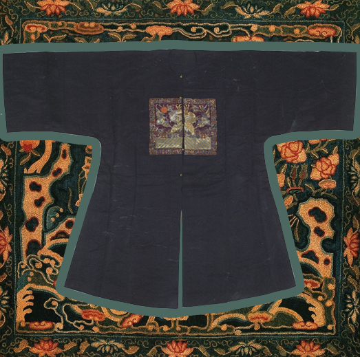
Unknown artist, Fifth rank military official badge with bear, Qing dynasty, ca. 1820s. Peking stitch on blue silk satin. 

The Ming and Qing rank badges differed stylistically and structurally, although the animal and bird iconography remained consistent. The Ming badges had a few identifying visual and physical characteristics that differed from the Qing squares. The most obvious features were the size and shape. Most Ming badges were at least 35 cm in dimension and lacked any distinct borders. The Ming badges were sewn from seam end to seam end across the front of the robes, and were slightly trapezoidal in shape, as the Ming robes were wider near the bottom. Furthermore, strict Ming sumptuary laws forbade Ming officials from using too much gold, which resulted in most emblems embroidered in satin stitch or laid floss-silk. Only the principal design was outlined in heavier gold threads.

Unknown artist, Red Silk with Crane and Cloud Design, Ming Dynasty court robe with rank badge, red silk with embroidery. Shandong Museum.

Compared to the Ming squares, the Qing badges were a lot smaller, ranging on average from 25 to 30 cm in size. Moreover, the addition of the ornamental border and the unique innovation of the ‘sun disk’ to symbolize the emperor became the standard trends of the Qing dynasty rank badges. However, the most distinctive feature was the split seam down the center of the Qing square, which most Ming squares lacked. The split in the badge was a result of the structure of the bu fu, the surcoat on which the mandarin squares were attached. The bu fu, a creation of the Qing dynasty, opened down the front, which meant that the mandarin square on the front side was made in halves, one on each side of the coat flaps; the mandarin square on the backside was made in one piece. Contrastingly, the Ming squares, both the front and back badges, were made in whole, undisturbed by the flaps, since the Ming robes were designed to open to the side.

Besides the obvious structural difference between the Ming and Qing dynasty squares, there are also various stylistic, and thematic differences in each era. To find out more about the stylistic, and technical developments of Chinese rank badges, I recommend reading works by Schuyler V. Cammann, who has written most prolifically on mandarin squares.

By Lily Mu

References:

Wang, Zhihou. The Splendors of Costume: Special Exhibition Attire from Ming and Qing Dynasties. China: Qi Lu Press, 2013.

Haig, Paul; Shelton, Marla. Threads of Gold: Chinese Textiles, Ming to Ch’ing. Pennsylvania: Schiffer Publishing, 2006.

Lily Visits “Irving Penn: The Centennial” in Paris

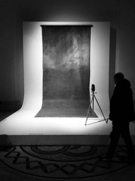
The 2017 “Irving Penn: The Centennial” exhibition in Paris is a guaranteed highlight of the Grand Palais’ autumn season programme. Marking the centenary birth of Irving Penn (1917-2009), the Metropolitan Museum of Art, and the Réunion des musées nationaux– Grand Palais, in collaboration with The Irving Penn Foundation, organized one of the most comprehensive retrospective since Penn’s death, and the first of its kind in France.

Irving Penn is regarded as one of the most important photographers of the 20th century. To many, he is most well-known for his portraits of notable societal figures. However, as a ‘Documenting Fashion’ student, I see him as inseparable from 20th century fashion; his name alone conjures up some of the most iconic images in fashion studies. His celebrated fashion photos taken during his time at Vogue including Tobacco on Tongue (1951), Balenciaga Mantle Coat (1950), and The Twelve Most Photographed Models (1947), are all on display in this exhibition.

Lisa Fonssagrives-Penn wearing a Balenciaga Mantle Coat in Vogue, September 1950

This retrospective looks back over Penn’s seventy-year career “with more than 235 photographic prints all produced by the artist himself, as well as a selection of his drawings and paintings.” The exhibition is laid out on two levels, covering a range of genres and themes that were of great importance to Penn’s career. The ground floor starts with his still life and early street photographs taken using his first Rolleiflex in 1938, and spans the 40s to early 60s-era, including his early days at Vogue. The portfolios of Cuzco indigenous people, small trade series and classical ‘portraits of personalities’ are all covered in this period. The upper floor showcases his advertising and personal projects. These ranged from his series of nudes, to cigarette butts and four major series of other detritus, titled: Street Material, Archaeology, Vessels and Underfoot.

The exhibition is successful in showing all these facets of Penn’s career and his wide-ranging interest in subject matter. But truth be told, all these genres and themes can be split into two major categories: objects and humans. And in my opinion, his most interesting photos are still the ones he takes of people, whether it is of fashion models, celebrity portraits, or indigenous villagers. These photographs reveal his instinctive grasp of material, weight, pattern and the tactile quality of a garment. Paired with his knack for posing subjects, Penn’s photographs of people are both visually and psychologically more interesting for viewers.

The Irving Penn centennial exhibition was originally shown this year between April and July at the Metropolitan Museum in New York. Lucky for those in Europe, the same show will be exhibiting at the Grand Palais in Paris until the 29th of January, 2018, before heading to Germany and Brazil.

By Lily Mu

All photos authors own

Louis Vuitton x Jeff Koons


Every time a Louis Vuitton x Artist collaboration rolls out, I go through an emotional journey: from the initial shock that wears off to ambivalence to final acceptance, and maybe appreciation (except for the Chapman Brothers collaboration, which I loved from the start). Back in April, when I first saw the Jeff Koons x LV collaboration in Hong Kong, I was appalled. The collection was part of the large window display at the flagship LV store at Landmark, a shopping arcade in Central Hong Kong; it was an unavoidable, conspicuous and mandatory stop on my way to and from work. I felt visually assaulted every time I walked past it. I was startled by the way the designs came out, not because I wasn’t used to seeing paintings taken out of their standard museum settings and imprinted onto bags, (‘been there, done that’ with the museum totes) but by how inexpensive and kitsch they looked. So, as you can imagine how shocked I was when LV announced they were dropping more designs from the LV x Jeff Koons Master collection in October. Enough is enough!

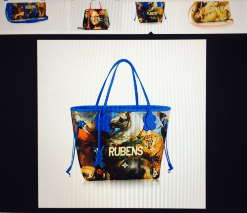
In the initial launch of the collection in April 2017, Jeff Koons took famous works from five legendary painters—Vincent Van Gogh, Leonardo Da Vinci, Jean-Honoré Fragonard, Peter Paul Rubens, and Titian—and stretched them across some of Louis Vuitton’s most popular bags, like the Speedy, Neverfull, and Keepall. With a ‘subtle’ touch, Koons emblazoned the artist names in gold capital letters across the front, and matched the bag’s handles in a plastic acrylic colour palette to the paintings’ undertones. In this second instalment, Louis Vuitton x Koons added an additional six artists: François Boucher, Claude Monet, Paul Gaugin, Nicolas Poussin, Édouard Manet and J.M.W Turner.

But constantly relooking at the bags, (involuntarily), I have come to accept them, in a way. Kitschy as they might be, I must admit they are congruous and loyal to the Jeff Koons brand-name. Kitsch is characteristic of Koons’ work, and it is his way of appropriating mundane, ephemeral items and transforming them into ‘art’.

In an interview with The New York Times, Mr. Koons declares that he hopes people looks at this collaboration as his continued effort to “erase the hierarchy attached to fine art and old masters.” By removing everyday objects such as vacuum cleaners and shampoo polishers from the household and placing them into the museum setting, he has re-contextualized these dull objects into expensive ‘artwork.’

Now, collaborating with LV, Koons is turning his thesis into a two-way street. Instead of just transforming commonplace objects into artwork, he is taking the most irreversible, unchallengeable works of art, (i.e. old masters that have been consecrated by museum establishments), and commodifying them, thereby transforming these works of art into functional items that can be owned by anyone. Is he successful in breaking down the hierarchy attached to fine art and old masters? Hard to say, but at least this time round instead of converting commodity into art, he is rebranding art as commodity. After all, what comes around goes around.

It has all come full circle, and this justification is as far as my appreciation for the bags will go. One last note: be prepared for more bags to come from this collection, because Koon’s Gazing Ball Series reinterpreted as many as 40 old master paintings.

By Lily Mu

Balenciaga’s Legacy: Reinventions of the Modern Female Silhouette

The Victoria & Albert Museum puts on a major fashion-related exhibition every year. This year’s show, Balenciaga: Shaping Fashion, celebrates the 100th anniversary opening of Balenciaga’s first dressmaking shop in San Sebastian, Spain and the 80th anniversary opening of his haute couture house in Paris, France. The exhibition showcases some 120 outfits and accessories, with the majority of the collection from Balenciaga’s 1950s and ‘60s-era.

The exhibition is housed in a cosy two level space within the V&A. On the ground floor, visitors are led in a counter-clockwise direction between themed window displays of exquisite Balenciaga designs. Each row of display focuses on Balenciaga’s innovations in the female silhouette, broken down into the fundamental elements of modern ‘dress’, including cut, fabric, form, and embellishments.

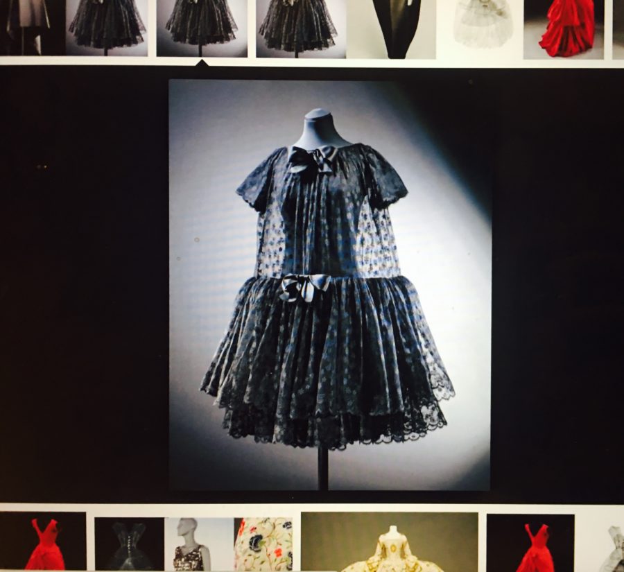
Balenciaga’s pioneering interpretation of the modern female silhouette was characterized by simplistic straight lines, bulky volume at the back, and obliteration of the waistlines which resulted in the abstraction of the body. For example, the trapeze-shaped volume in his ‘baby doll’ dress blurred the contours of the body. It was surprising to learn that this loose-fitted design was highly controversial at the time, considering how the ‘baby doll’ dress is now so widely adopted and replicated today. If I remember correctly, the baby doll is part of the basic-wear line of Zara and H&M.

Balenciaga’s later designs of the 1960s and ‘70s are characterized by the increasingly architectural shapes in his garments, such as the flared lantern sleeves. Balenciaga worked closely with fabric manufactures, like the Swiss company, Abraham, to produce innovative fabrics such as the lightweight ‘gazar’ silk which could hold the elaborate shapes without cumbersome supportive structures inside.

Semi-fit dress, 1957-58

Finally, the ground floor ends with some of Balenciaga’s most iconic designs such as the ‘unsexy sack’ which eradicated a pinched waist altogether, the ‘semi-fit dress’ which was only fitted in the front but loose in the back, and the three-quarter bracelet sleeve jacket with the stand-away collars which allowed for the display of jewellery at the neck and wrists. These designs contrasted sharply with the dominant, and conventional, waist-hugging, hourglass shape favoured by his contemporary competitors.

Heading upstairs, visitors are welcomed into a high-ceiling, well-lit room. Unlike the first half of the exhibition, which highlighted Balenciaga’s experiment in silhouette, his skills and ingenious designs, the second half focuses on Balenciaga’s legacy and the vast array of designers he has influenced.

We see from the displays that Balenciaga’s commitment to minimalism has been adopted by designers such as Emanuel Ungaro, Rick Owens, and J.W Anderson. Balenciaga’s emphasis on shape and volume that stood away from body has influenced the likes of Molly Goddard, and Rei Kawakubo. Balenciaga’s innovative pattern cutting and adoption of new materials has influenced designers like Issey Miyake, McQueen, Alaia, and a whole wave of designers who came after him. Like Christian Dior once said, ““Haute Couture is like an orchestra whose conductor is Balenciaga. We other couturiers are the musicians and we follow the direction he gives.”

Baby Doll dress by Molly Goddard

Today, Balenciaga is known more for its streetwear-inspired, knitted, high-top sneakers and oversized hoodies, than for its radically abstracted haute couture dress designs. The V&A exhibition serves as a worthy reminder that it was Balenciaga who laid the foundations for many of the basic dress designs in the western wardrobe that we may take for granted today.

All images author’s own

By Lily Mu

Elizabeth Arden: The World’s Most Successful Trilogy

EA 01

Throughout the 1930s cosmetics giant Elizabeth Arden repeatedly echoed the ingredients that represented the three main phases of beauty, which, in her opinion, every modern woman should possess and follow in order to achieve the ‘Arden Look.’

The ‘Arden look’ was a term coined by Arden herself where she referred to the women throughout the world who possessed the credentials which were reflective of the brand. Arden’s global accessibility as a company, which was – and still is – stocked in every large city across the world, meant that more and more women endorsed and adopted the Arden Look. Yet, what were the credentials that defined the ‘Arden Look?’

Whilst hunting through American Vogue’s online archive for copies of the magazine, which marketed the cosmetic brand, I came across the above advertisement, which outlined what Arden perceived as the three main phases of beauty. These phases, considered by Arden ‘world’s most successful trilogy,’ were the combination  of a lovely face, a slender figure, and a clever wardrobe.

Where society’s concept of beauty had changed during the twentieth century, from that of a woman’s moral qualities to her external appearance, Elizabeth Arden recognised that there was a growing market place for skin care and decorative cosmetics. Therefore, where a woman’s appearance through her hair, eyes, skin, lips, hands and weight became ‘critical points’ for judgement, Arden was able to offer beauty solutions through her products, and then her services.

As Arden’s influence grew within the cosmetic world, so did her brand. Beginning with skin care and decorative cosmetics, Arden opened up her own health spa, Maine Chance, in 1934. Lindy Woodhead described Maine Chance as ‘America’s first luxury health and beauty farm,’ where some of America’s wealthiest ladies would visit for health and beauty treatments, as well as outdoor sports and workouts. Clients would spend $500 a week and Arden would keep the resort open from May to September each year.  An example of the machines used is demonstrated in the accompanying photograph, which featured the ‘metal hip roller.’ It was believed that such a machine would reduce the dimensions of a woman’s hips and buttocks!

EA 02

However it was during the 1940s that Arden’s brand truly became a ‘one-stop destination’ for the three phases of beauty, with the launch of her Fashion Floor in 1944.  During her lifetime, Arden collaborated with four couture designers: Charles James, Antonio Castillo, Count Sarmi and Oscar de la Renta to provide her customers with the ‘clever wardrobe,’ that would keep her customers looking ‘irresistibly soigné.’

In this respect Arden’s ‘most successful trilogy’ not only formed the basis of the modern woman, but also demonstrated the vision that Elizabeth Arden had for her business. Moreover, as Arden defined the three phases of beauty, her empire soon expanded and encompassed these three industries, which ultimately aligned the Arden brand with the function of an American department store through her ability to offer her ladies a ‘one-stop shopping’ experience when they entered her salons.


Sources:

U.S Vogue online archive

Gourley, C. Rosie and Mrs. America: Perceptions of Women in the 1930s and 1940s (Minneapolis, 2008).

Woodhead, L. War Paint: Madame Helena Rubinstein and Miss Elizabeth Arden, Their Lives, Their Times, Their Rivalry (United Kingdom, 2003).

When War Meets Fashion Photography: Lee Miller and Marlene Dietrich

Photograph from Lee Miller: Portraits from a Life

Lee Miller, born Elizabeth Miller (April 23 1907) started her career as a successful fashion model after a fateful run-in with Condé Nast on the streets of New York City during the 1920s. Such a crossing of paths resulted in Miller landing her first modelling job for American Vogue, and she became a favourite model and muse to some of the greatest American fashion photographers of the day, including Edward Steichen. After returning to Paris in 1929, Miller went on to become a pupil of the surrealist artist and photographer Man Ray, who inspired her to open her own photographic studio. Switching from one side of the camera to the other, Miller became a unique talent, performing with brilliance on either side of the lens.

Miller’s career as a photographer resulted in various portraits and fashion assignments being published inside the glossy pages Vogue.  She joined British Vogue as a freelance photographer in 1940. However, with the on-going struggles of the war, Miller found that working for a ‘frivolous’ publication such as Vogue was becoming a drain on her own morale. In 1942 she applied and was accepted by the US army for accreditation as a war correspondent. What followed was a series of photographs documenting the British home front, before she headed to France and Germany where Miller shadowed the steady successes of the Allied advances.

The accompanying image of the Hollywood actress Marlene Dietrich was captured by Miller after the liberation of Paris in September 1944. During the war, many of Paris’ finest Couturiers had closed shop. Therefore, this image of Marlene is particularly important as it signalled the re-opening of the fashion house Schiaparelli.

Marlene Dietrich, born in Berlin in 1901, became one of the most glamorous leading ladies in film of the 1930s and 1940s. Famous for her ability to challenge the accepted notions of femininity, Dietrich often wore trousers and more masculine fashions both on – and off – screen. In this respect, Marlene’s sense of fashion combined with her German origins and her relocation to America, in order to crack Hollywood, meant that the actress came to resemble the sought-after exotic other.

Dietrich as ‘other’ can be explored in relation to the Schiaparelli evening coat she wears in the black and white photograph. The Damask fabric is almost oriental in appearance with its floral embellishment and decorative detailing. However, the coat is also positioned within the context of the war period as well. The single-breasted construction of the coat combined with the gold threaded toggles and matching belt allude to a military uniform. Whereas the coat had originally been part of Schiaparelli’s 1938 Zodiac collection, when placed within the context of war the clothing becomes imbued with colonialism and empire: ‘The design is so subtle that one hardly notices that it represents the British lion capering among faint bluish flowers.’

 Marlene can be understood as challenging the accepted notions of femininity whilst wearing this evening coat because of both the feminine and masculine qualities of the garment. Her styled hair, painted nails and the make-up on her face indicate typical womanly conventions, especially when combined with the floral patterning of the evening coat. However, on the other hand, the appropriations of military uniform characteristics allude to a more masculine identity.  Such an observation is particularly interesting because the coat can be identified as embodying wartime culture. With more men volunteering and being conscripted to join the front, women had to step out of their traditional sphere and enter into the world of work – something that had typically been reserved as the more masculine domain. As a result, the construction and decoration of this coat when read within the historiography of wartime culture can be seen as reflecting these changes within society


Sources: