When I catalogued a box of London photos from the Conway Library I came across this image of the Wellington Arch.
CON_B01022_F006_001. The Courtauld Institute of Art. CC BY NC.
The view today looks very different.
The Arch was originally commissioned by George IV to celebrate the victories of the Napoleonic wars and was positioned at the entrance to Green Park, opposite the screen wall on the south side of Hyde Park. In that position, it was straight in front of Apsley House, the Duke Of Wellington’s London residence. The Duke was, of course, a national institution, Napoleonic war hero of Waterloo, statesman, Prime Minister, and pin-up (look at the statue of Achilles behind Apsley House, it was funded by a charitable body known as ‘The Ladies of England’, and originally it did not have a fig leaf.)
CON_B01022_F006_001_detail. The Courtauld Institute of Art. CC BY NC.
In 1836, a decision was taken to erect a statue of the Duke on horseback on top of the Arch. It was huge, the biggest equestrian statue of its time, 28 feet tall. As a result, it was widely ridiculed and the arch became known as the Wellington Arch. Despite the derision, and it being considered an eyesore visible from Buckingham Palace, Queen Victoria refused to allow it to be moved as she did not want to offend the Duke in his lifetime.
And so it stayed until 1882, when, in order to improve the traffic flows in that part of London, the Arch was moved 60 feet to its present position at the top of Constitution Hill.
The statue being moved to storage in 1883. Illustrated London News. Public Domain.
The statue was replaced, however, and the current ‘Quadriga’ (Nike goddess of Victory riding a chariot pulled by four horses) took its place.
View of the Arch today. John Ramsey.
The Wellington statue was sent to the Army Barracks in Aldershot, where it remains, for those who may wish to see it!
Wellington Statue, Aldershot. Lewis Hulbert. CC BY 3.0
John Ramsey
Courtauld Connects Digitisation Volunteer
Managing the digitisation project of one of the most varied, mysterious, and extensive photographic collections in the world, in one of its most prestigious art institutes can look a lot like this:
and not much like the constant carousel of wonderful architectural detail that one might imagine. The volunteers, busy sorting through the images and penciling the accession numbers on the mounts, or zooming in to check the focus in the digitisation studio, are the ones who get to really see the collection, really make serendipitous discoveries. I have to make the time to go and explore, and be sure to do it too or else I might get to the end of whole months having only seen filenames, spreadsheets and conversion code on Terminal.
Belluno_Ponte della Vittoria e Duomo_Anthony Kersting Archive
Today I thought I’d go looking for my hometown – Belluno, in the Italian Dolomites – and see it through A.F. Kersting’s eyes. The 4293 Kersting negatives, which we plan to digitise as part of our project, are numbered sequentially and neatly stacked in their cases. To every negative number corresponds a handwritten entry on a ledger, so if you were to pick a number from the shelf you could easily look it up in the ledger and find out where the image was taken. It’s a bit more difficult to start your search from a specific city; on the negative there are only accession numbers and entries on the ledgers are also sequential by number, not by location. Besides, part of the mystery surrounding photographer A.F. Kersting is that he would travel so extensively: opening a page at random of his ledger you can see that one day he was in Jersey, the next in Scotland, the following entry would be in Munich, then Dubrovnik, then Madrid… which makes tracing his steps and locating a particular town very tricky – and transcribing the ledgers (another fascinating task reserved for our volunteers) very necessary!
Belluno_Piazza Duomo_Anthony Kersting Archive
What I do have to go by in my quick morning search is the prints collection, the selected negatives for which we have prints, and which are arranged by country. These prints were created by Kersting and are unnumbered but annotated in pencil at the back. I ventured to the Italy box and looked for my small town almost as a challenge, and there, to my delight, I found the squares and fountains of my childhood, almost untouched by time, with the only exception being the clothes of the passers-by and the cars parked where they shouldn’t be.
Belluno_Piazza delle Erbe_Anthony Kersting Archive
We are not there yet with the digitisation so what you see below are just some quick group snaps, but hopefully they will give you a taste of how wonderful a photographer Kersting was, and how extensively he documented every corner of the world he could reach. When we’ll have completed the digitisation of the whole collection you’ll be able to search by place and by date, as well as by accession number, and the collection will be truly open. For now, enjoy this small selection as a Friday treat.
Faye Fornasier
Digitisation, Database and Cataloguing Manager Courtauld Connects
While transcribing one of the A.F. Kersting’s ledgers, a volunteer came across an illegible entry: KER_NEG_W1013-6. It was posted on SLACK for all the volunteers involved in the Courtauld Connects digitisation project and yet despite our best efforts the entry remained unidentified.
The clues were numerous but confusing: Revivalist or Georgian, Heraldic or Masonic, double-headed eagle or griffin, Country house or lodge, demolished or renovated. Although the town was illegible, it was agreed that the county was Northamptonshire, which became our starting point. Pattishall, Puxley, Pytchley, Padley? I think we researched every town in the county beginning with the capital P.
I contacted the foremost expert on Northamptonshire country houses, who worked with Pevsner, HHA, Historic England, images of England, the AA, and Country Life photographic archives; and Nick Kingsley, archivist and architectural historian, but none could identify the images. One suggestion was that it could be a scheme by Claud Phillimore or even an early work by David Hicks, which led me in another direction for a short time.
I made a last-ditch attempt to identify the building by contacting the Northamptonshire Heritage Group, the National Council on Archives, and the National Archives. However, it was while in Brixton library, reading through the Arthur Mee and Nicolas Pevsner Northamptonshire editions within The Buildings of England Series and Pevsner Architectural Guides, that I started to question if it was indeed Northamptonshire.
After this exhaustive research into architecture, I decided to turn to the paintings. I emailed several experts and Paul Cox, Associate Curator at the National Portrait Gallery, kindly took the time to compare one of the portraits with many from the late 1590s-c1610, but again with no success. I am known as a passionate advocate of contemporary art but a visit to the National Portrait Gallery reminded me of the beauty of 16th century Tudor portraiture.
The clothing in the stunning portrait painting at the bottom of the stairs in the mystery house identified the period as early 20th century, and this led to some fascinating and extensive research into the work of several British artists. A visit to the National Portrait Gallery and its newly refurbished 20th century gallery confirmed I was in the right artistic period and I was amazed that early 20th century British realist painting is so under-rated.
At the same time, I continued to delve into the mystery of the double-headed eagle. I discovered a 1780 Satirical print of the arms of the Feilding family superimposed on the Habsburg double-headed eagle lacking one head, dedicated to the Garter King of Arms and mocking the family’s pretensions at ancestral connections to the Habsburg dynasty and the Feilding family of Warwickshire.
Thus, Warwickshire and the Feilding family became to focus of the next stage of this investigation. To cut a long story short, research into the Feilding family and their fascinating history led me to Newham Paddock, the family home in Warwickshire.
It was interesting to read that Lady Dorothie Feilding-Moore became a highly decorated volunteer nurse and ambulance driver on the Western Front during World War 1. She was the first woman to be awarded the Military medal for bravery in the field. She also received the 1914 Star, the Croix de Guerre and the order of Leopold II.
By Belgian Photographer (The Illustrated War News) [Public domain] via Wikimedia CommonsThe Feilding family have been Lords of Newnham Paddox since 1433. In 1622, James I made William Feilding first Earl of Denbigh, and this was an important clue which led to Monks Kirby, the home to the Earls of Denbigh, and their estate at Newnham Paddox.
Monks Kirby and the Earls of Denbigh led to Pailton House, and although there was no initial evidence, I did believe that Pailton House was our mystery Kersting.
Pailton House and gardens. 1910s IMAGE LOCATION: (Warwickshire County Record Office) Reference: PH, 352/105/55, img: 6462 Reproduced from the “Our Warwickshire” website
Looking through The Tatler 1940, I found that Lord and Lady Denbigh had lived at Pailton House while Newnham Paddock was being used as a convent school.
Tom Bilson, Head of Digital Media at The Courtauld Institute of Art, found some images online where the architrave resembled Pailton House. However, the banisters were different and the beautiful oval hallway was still proving elusive.
I contacted the renovation company and their reply stated that the house had actually been split into two residences some time ago, as confirmed by a local tradesman. Tom Bilson then discovered some plans for Pailton House on eBay.
I decided to contact the Denbigh family directly, sending the Kersting photographs via email and was pleasantly surprised when Lady Denbigh graciously replied:
Dear Lorraine, thank you for your message. Yes, it is Pailton House, Pailton, Warwickshire CV23. The house at Newnham Paddox was demolished in 1953 and Billy and Betty (the 10th Earl and Countess) lived at Pailton House until his death. Betty then sold the house and it was divided up into 5 houses. Betty then built a wooden house on what would have been the carriage turning circle of the old mansion, we live in that today.
As for the paintings – the large portrait is by Harold Harvey painted in 1936 I think, of Betty. In the dining room the portrait is of Elizabeth Aston, mother of the first Earl – (along with the other oldest portrait, attributed to Zuccaro, but unlikely!). The other smaller one is also by Harold Harvey. The other picture in the drawing room is now with Billy and Betty’s daughter, Lady Clare Simonian. I hope this helps – I am afraid I cannot comment on the oval room as I have never seen it, by the time of our marriage in 1996 it had long been sold”.
Recently, Lady Suzy Denbigh, The Countess of Denbigh at Newnham Paddox, kindly sent information and photographs of the actual paintings.
Elizabeth Aston Courtesy of Lady Suzy Denbigh, Countess of Denbigh at Newnham PaddoxSir Basil Feilding Courtesy of Lady Suzy Denbigh, Countess of Denbigh at Newnham PaddoxBetty, Countess of Denbigh by Harold Harvey, c1931 Courtesy of Lady Suzy Denbigh, Countess of Denbigh at Newnham Paddox
Personally, it was a fascinating ‘journey’, informative and great fun to research. Jane MacIntyre and I have now moved on from this success and onto over 400 Kersting ‘illegibles’, which we have just completed, albeit with one or two individual words remaining to be identified. The challenge is now to revisit the entire Anthony Kersting ledgers.
By Lorraine Stoker, Courtauld Connects Digitisation Volunteer
Observing portraiture through the eyes of Anthony Kersting
When I first started my internship, I was in awe at the large collection of archives kept everywhere around the Witt and Conway library which is situated in the basement of The Courtauld Institute. I was so intrigued that I simply wanted to open every archive box I could without being tagged as the new nosey intern. I am happy to say that I now proudly hold that title even before I opened all the boxes. However, being nosey can somehow have its perks! After asking so many questions regarding the stacks of blue labeled boxes around the staff section of the Conway, I was introduced to the mysterious and yet enchanting world of the British photographer Anthony Kersting. What struck me most was the number of boxes labeled with the name of one person, and also the number of countries mentioned under his name on the boxes. I was curious about how much this man achieved, traveled and explored throughout his life.
Kersting’s journal entries [36- Tangier, Morocco on 7/11- Beeston, Nottingham on 15/11…]Anthony Kersting was a photographer whose interest around the world focused on religious monuments, landscapes, portraits and sometimes private homes. Tony, for short, was born on the 7 November 1916 and died on 2 September 2008. Although frequent traveling was still unusual in his early years of activity as a photographer, and the breadth of his travels rather hard to believe, his photographs and journal entries represent irrefutable proof of his gallivanting around the world. I was really impressed by the number of places he visited in a short period of time, especially in the 1930s when traveling was expensive and, more often than not, hazardous. Indeed, he traveled to places such as Norway, Egypt, Palestine, Morocco and The Bahamas. Kersting’s photographs perfectly find comfort within their habitat. I was quite intrigued as to what methods he used to create this effortless relationship between him and his subjects. I chose to analyze portraiture as a theme because it reflects reality through the eyes of the beholder; as it is, in effect, a window to Kersting’s personality.
The Courtauld’s Witt Library is a large collection of photographs, reproductions and cuttings of paintings, drawings and engravings of Western Art from c1200 to the present day. Within its 19 thousand boxes sit just over 2.15 million images depicting many diverse themes and subjects. The complete archive of 160,000 black and white prints and over 40,000 negatives by architectural and landscape photographer Anthony F. Kersting was bequeathed to the Courtauld’s Conway Library on his death in 2008.
As a Digitisation and Digital Media Intern, I decided to take a look at these contrasting and yet extensive collections to discover how landscape was, and still is, a theme within creative expression. From the work of Édouard Manet, Federico Barocci through to the many unpublished photographs taken by Anthony Kersting we see a reflection of the spirit of nature that continues to creatively saunter through human history.
Nature seems to have its own distinctive way of projectingdifferent subject matters and visual habitats. Before the 17th century, the concept of landscape was limited to the different narratives of historical, religious and folkloric fields. However, today landscape has become one of the ruling themes within the bounds of artistic expression and documentation. A large number of great artists use landscape as a form of artistic authority; an impression to record the different impacts we have on our grounds, territory and the scope of the earth.
To start off this reflection on the crowning charm of nature’s picturesque scenery, I chose Federico Barocci’s simple yet spiritual approach towards landscape. During his lifetime Barocci was a celebrated figureof the Italian Renaissance, due in part to a notable commission received in his early 20s to create frescos at the Vatican.
His sketches, which I discovered in the Witt Library, include a delicate study of trees and space showing his respect for nature, in what I consider to be an ethereal and docile interpretation. His use of chalk typifies the ‘Italian light’ that many artists around that time idealised.
Moving on from the Italian Renaissance, I explored the French School of the Witt Library, specifically the word of Impressionist painter Édouard Manet. Although many would consider Manet to be a realist painter, there is a crucial moment in which he evolved into an Impressionist, a style celebrated by fairly small, yet undisguised brush strokes, clear composition, and the study of lightin its adaptable qualities. The two paintings depicted here give a recognisable sense of movement as a crucial abstract of experience, human realisation and demeanour towards the flora and fauna of consciousness.
Finally, nothing describes the work of architectural and landscape photographer Anthony Kersting more than saying that I find it very difficult to be around all the archived photographs, which are shelved right behind my office chair (lucky me!) in their respective boxes, without wishing I could take one home! I chose his photographs not only for his sense of narrative, which you can easily pick up from his extensive travels around the world, but for the magnificent way in which he captured the many regions and seasons that he journeyed through and experienced. From sea stretches in Mahabalipuram in India to the Mountainous plains of Jordan, Kersting’s talent in photographing landscape is evident. His sharpness in photographing the most minutedetail of space is immaculate. This was particularly evident in one of the photographs I luckily stumbled upon, of the Gulf of Aqaba seen from the Transjordan mountains to the East. Kersting perfectly instils this hazy and yet earthly view of the desert landscape.
The subjectivity and artistic tendencies of these three very different charcoal sketches, paintings, and photographs are clearly evident. However, as time drifts away, nothing can take away the essence of nature that is willing to adjust towards maybe a whit of artistic creativity and interpretation. These three artists, which I am fortunate enough to write about in a non-critical nor comparative approach, give us reason to celebrate their life and genius, for their remarkable ways of catching the embodiment of the true nature of landscape in its different thematic guises.
Alia Ahmad
Courtauld Connects Digitisation Placement
You never know quite what to expect when a box of old engravings is brought down from the prints department for digitisation – that’s what makes it so interesting. The prints can depict anything from bland pastoral scenes to salacious classical carry-ons or gory biblical fire-and-brimstoning; all in a day’s work.
This print above turned up at the last session I volunteered at – the wheels with eyes, disembodied hand and hovering winged multi-headed creatures seemed odd, to say the least, so I thought I’d try and find out a bit more about it all.
The type below the print is a biblical quote from Isiah 6, a chapter which has “the Lord sitting upon a throne, high and lifted up” (all quotes will be from the King James Bible) and describes “seraphims: each one had six wings; with twain he covered his face, and with twain he covered his feet, and with twain he did fly.” Isaiah 6:6 then has one of the sepaphims flying and having a live coal in his hand, which“he laid it upon my mouth”. The picture seems to have a scroll rather than a coal being put near a mouth, but the description of the seraphims seemed to possibly identify what the creatures were. But there was no mention of wheels bedecked with eyes.
The top of the frame also has a biblical quote, but this one is Ezekiel 1, so off I went there and it was much more promising.
Ezekiel has four living creatures with “the likeness of a man. 1:5 And every one had four faces, and every one had four wings. 1:6 As for the likeness of their faces, they four had the face of a man, and the face of a lion, on the right side: and they four had the face of an ox on the left side; they four also had the face of an eagle. 1:10”
This seemed more like it, especially as these creatures have wheels complete with eyes beside them:
“behold one wheel upon the earth by the living creatures. 1:15 As for their rings, they were so high that they were dreadful; and their rings were full of eyes round about them four. 1:18 And when the living creatures went, the wheels went by them: and when the living creatures were lifted up from the earth, the wheels were lifted up. 1:19″
Ezekiel 10 appears to have the same creatures, with four faces, wings, wheels within wheels, and an even more generous allocation of eyes:
“And as for their appearances, they four had one likeness, as if a wheel had been in the midst of a wheel. 10:10 And their whole body, and their backs, and their hands, and their wings, and the wheels, were full of eyes round about, even the wheels that they four had. 10:12″
Ezekiel then says “and I knew that they were the cherubims. 10:20″
So these seem to me more likely to be Cherubim rather than Isiah’s Seraphim. Cherubim is the plural of Cherub, which are not at all the chubby babies wafting about on mini clouds (these are putti) but are instead some sort of heavenly creatures which occupy the second highest sphere in the Christian angelic hierarchy (Seraphim are in the first). Cherub means ‘to be near’ or ‘near ones’ so they are close to God and seem to have a sort of servant/ bodyguard function.
Incidentally, it was from Ezekiel’s description of the four faces, the ox, the man, the lion and the eagle, that the symbols for the four evangelists were later adopted.
That seemed to solve some of the mystery of the fantastical subject matter, so I figured it was worth finding out a bit more about the print and the artist. Below the frame, in small writing are two names, one on the left one on the right. Usually, the name on the left is the original artist’s and that on the right is the engraver or craftsman who printed the image and that seems to be the case here.
On the left, it says ‘B. Picart. del’. The ‘del.’ means ‘drawn by’, so Bernard Picart is the artist who did the original drawing.
On the right, it says ‘Phil. Andr. Kilian, Sc. A.V.’ The Sc. denotes ‘engraved by’, so Philipp Andrew Kilian is the engraver. A. V. stands for Augusta Vindelicorum, which means it was published in Augsburg Germany. (Isn’t the internet only marvelous!)
Picart (b.1673) was an engraver and artist who worked on a lot of book and biblical illustrations. He is known chiefly for his 1723 tome The ceremonies and religious customs of the various nations of the known world. This was a widely distributed, early enlightenment encyclopaedia of religious life which aimed to describe the origins beliefs and rites of the religions of the then known world. It has been described as “a milestone in information gathering”, and even as “the book that changed Europe”. Here are some examples of his work.
Picart, Bernard. The Religious Ceremonies and Customs of the Several Known Nations of the World, London: Charles du Bosc, 1731-1739Picart, Bernard. ‘Puzza, or the “the Chinese Cybele,” sitting on a lotus flower’; from The Religious Ceremonies and Customs of All the Peoples of the World; Getty Research Institute, Los Angeles.
Kilian, b. 1714 was one of a famous family of Augsburg engravers, and he did, amongst other things, 130 engravings for some monumental collection of illustrated Bible stories. So my assumption is that Picard did an engraving or drawing of this Cherubim scene, and then later, Kilian copied it or did his version of it for another publication. I haven’t however been able to find our image in online collections of Kilian’s biblical illustrations.
Doing a bit of research on this has been interesting – typing such word combinations as ‘eyes, wheels and winged creatures’ into Google leads you down some very weird and wonderful paths indeed; I have to admit to spending far more time than I should have with shimmering auras, vibrating orbs and whispering angels. I also found a somewhat less than convincing explanation of Ezekiel 10 in a book that billed itself as ‘possibly the most extensive literary work scrutinizing extra-terrestrial intervention and biblical scripture ever compiled’, which went into astonishing detail regarding the interior furnishing of the Cherubim spacecraft. Belief can be an odd thing.
Mind you, we came across the print on the day of hurricane Ophelia, when the sky above the Courtauld was an unearthly yellow and people were standing in the strangely still courtyard, quietly staring up as if waiting for something to appear – spaceships, disembodied hands, even churning ‘dreadful’ wheels with staring eyes perhaps.
Digitising the Conway photographs has been really interesting and enjoyable, but lately, we volunteers have been let loose (figuratively, not at all literally) on the Courtauld Gallery’s collection of prints, which has opened up a whole new and exciting side of things. Viewing and handling these object is fascinating, especially as they vary so much in terms of dates, artists, styles and subject matters. Working on these prints while on the digitising software is proving to be a wonderful way to engage with and explore them- it allows one to, in the interest of checking the focus of course, zoom right in to otherwise easily overlooked details, and even to the individually incised lines of an engraving!
In order to help the volunteers understand more about the objects we are now dealing with, the gallery team is kindly hosting events to introduce us to the collection and explain some of the issues we might encounter; I attended one of these days and I have to say it was all incredibly interesting and informative.
After meeting up in the staff room and acquainting ourselves with each other and with the biscuit tin, we head up many flights of the gorgeous salmon-coloured stairwell to the Courtauld’s Prints and Drawings Study Room.
Here a wonderful selection of works had been laid out awaiting us, and we were free to have a thorough browse.
Using the displayed works as examples, Dr. Rachel Sloan (Assistant Curator of Works on Paper) explained some of the different techniques used in printmaking and showed us some of the tools and printing plates used. First, we saw an engraving — where fine straight lines are cut by hand into a metal plate using a tool called a burin, in what sounds like a slow, labour-intensive, quite precise and controlled technique. Apparently, in order to get a curved line, the plate, not the burin, is turned. Then there was an etching — where the metal plate is coated with a wax ground first and it is this that is drawn upon. Then acid, rather than brute force is used to bite into the metal to form the lines that hold the ink. This enables the artist/craftsman to exercise more freedom in drawing and mark-making. Next up was an aquatint — which is somewhat similar to etching in that acid is used, but the use of a powdered ground allows for the creation of areas of tones, rather than lines. This means that effects similar to those of a watercolour painting can be achieved. These differences were beautifully demonstrated and evidenced by the prints on show, but are proving very difficult to explain!
Bust of Mademoiselle Marcelle Lender, Henri de Toulouse-Lautrec
The last print technique explained to us was the lithograph, and the print used to demonstrate this was Toulouse-Lautrec’s 1895 print ‘Bust of Mademoiselle Marcelle Lender’. A lithograph is produced differently than the other images, in that the image is not cut in to a printing surface, but is instead drawn on to it. The method is based on the principle that that oil and water repulse each other. The artist, in this case Toulouse-Lautrec himself, draws directly onto a stone using a greasy ink or crayon. This allows for a much looser expressive printmaking technique and this is brilliantly obvious in this print: you can see the different marks made – some light and scratchy, some bolder and more substantial, all full of energy and dynamism; it looks as though the performer was caught on stage, perhaps even mid-song, clothes rustling and swirling as she leans forward, giving it her all.
After the prints, Ketty Gottardo (Martin Halusa Curator of Drawings), talked us through three other works, the first of which was an actual Leonardo da Vinci drawing! It was hard not to momentarily consider employing a ‘look, there’s a kestrel’ distraction technique and scurry off with this wonderful little drawing, which is a pen and ink sketch study of Mary Magdalene, thought to be late 15th C or early 16th C.
Studies for Saint Mary Magdalene, Leonardo Da Vinci
It was fabulous that instead of being asked to keep our distance or being eyed suspiciously (possibly warranted, see above), we were allowed, even encouraged, to get up close and really examine these works. There were even magnifying glasses supplied for this purpose. I loved the way that it was obvious in this very free and rapid little drawing that Leonardo was exploring different poses and head positions, presumably for a larger work; much though one might try to not get caught up in the whole cult of the artist notion, it did seem quite amazing to almost see Leonardo da Vinci’s thought process in action.
The next drawing we were shown was a 1717 sketch, I think in chalk, by Jean-Antoine Watteau: Satyr Pouring Wine. Again this would have been a preparatory sketch for a larger work, one no longer extant. The different colours and rapid sketchy lines are used beautifully to give some life and depth into the body; I love the darkly delineated slanted eyebrows and cheekbones that mark him out as a fawn and the heavily shaded muscular pouring arm and clenched fist that are done with the fantastic confidence of a prolific sketcher.
Satyr pouring wine, Jean-Antoine Watteau
The last work we were shown was On Lake Lucerne, looking towards Fluelen (1841), one of many watercolour studies done of the Swiss Lake by J.M.W. Turner. Up close, it was possible to see a variety of highly diluted subtle blue, grey, green and russet coloured washes that Turner so cleverly used to produce this eerily atmospheric scene, where, lit by a full moon struggling to break through, a looming cliff makes a ghostly appearance from the depth of the mists. Astonishing is about all I can say!
On Lake Lucerne looking towards Fluelen, J.M.W. Turner
I feel we were incredibly privileged to see and spend time with these works, especially as by their very nature, many of them are too unstable or delicate to be on general display.
And as if that wasn’t enough, we were then taken up even higher through the building, through a warren of narrow corridors where I seriously wondered if I should be leaving a breadcrumb trail, and on up to the attic rooms of the Paper Conservation Studio.
Here, Kate Edmondson (Conservator of Works on Paper) gave us a very comprehensive talk about the types of damage we might encounter, about handling the prints, and about how works on paper are cleaned and conserved. This was all tremendously interesting. I never knew, for example, that foxing, the little reddish-brown age dots on old paper can sometimes be caused by metal impurities present in the paper oxidising — Kate thought we might be able to zoom in and identify these metallic flecks while we were digitising! Also curious was the fact that many of the difficulties encountered by conservationists were not necessarily due to the prints themselves but to later additions and interference, such as owner’s stamps and identification numbers etc. These have to be checked for and dealt with before a print can be washed, as some inks in them can flood out and rather scarily seep into the print. We handled furry samples of something called Japanese paper, a fibrous looking tissue used for delicate repairs and were shown a water bath, in which Gore-Tex is used as part of a process of dampening the prints in order to soften them. We were also shown a lovely old leather-bound George Romney sketchbook (late 18th C portrait painter) so we could see the tiny careful repairs the conservation people had been working on – and it was explained how all repairs have to be reversible and removable.
The level of knowledge needed, as well as patience and care, was impressive; conservation doesn’t look like a job for the impatient among us.
Impossible though it may be to believe, I could easily ramble on more; we saw and learnt so much. I will finish up by saying how nicely we were treated; people were so helpful and so generous with their time and knowledge. I for one came away far more interested in and curious about prints and paper than I would have imagined was possible. Actually, it has just occurred to me — printmaking must have greatly enabled the wider distribution and dissemination of images, but now old prints cannot always be accessible. It is therefore rather pleasing that we have somehow come full circle, and our digitisation work will send them off out into the world again to be shared, seen, enjoyed and studied by many again.
As part of our digitisation pilot, we organised 6 brainstorming sessions to develop new ideas and harness the creativity of unselected members of the public.
In the Collecting Stories session, we brainstormed the idea that putting the Courtauld Libraries’ images online could spark conversations not only to do with the academic appreciation of fine art and architecture, but also with personal history, community engagement, social development, and storytelling. We wanted to come up with ideas for the website’s structure, including options to collect stories and interpretation.
One of the exercises we set up to get the conversation started saw our participants roaming the Conway Library looking for one image that was personally relevant to them and writing a story to go with it. Images and stories were then passed on for someone else to write a reply and present them to the group.
We wanted to discuss what it’s like to approach an image collection with the intent to tell a personal story, whether reading someone else’s story about an image enriches it, and how it feels to have a stranger describe something personal like the photo of one’s hometown or special place.
The exercise really got our group talking and the resulting suggestions and ideas will shape the way our project will be delivered. As for the images selected and the stories generated, they were beautiful and nostalgic so some of our volunteers typed them up and wrote further responses. Here are a few.
Broadgate, London.
“Broadgate – close to Liverpool Street
Swiss bank – public space – Richard Serra
Demolished – redevelopment – bars, cafes etc.
1980s corporate architecture – 20th century society
Historic England
Memory – affection” Jan Peters
“Hidden behind Liverpool Street station is Broadgate. In amongst the monstrous redevelopment of this area weaves the Broadgate art trail, the most impressive art collection by acclaimed British and international artists. Accessible to all and out in the open-air my memories are of numerous school trips with teenagers interacting with fantastic sculptures, as opposed to the untouchable work in galleries and museums. We never noticed the rather sterile architecture (the students’ opinion) but marveled at the Fulcrum by Richard Serra, laughed at the Leaping Hare on Crescent and Bell by Barry Flanagan and sat drawing the Rush Hour by George Segal. It still holds its fascination today.” Lorraine Stoker
CON_B02478_F008_010 – The Courtauld Institute of Art – CC-BY-NCCON_B02478_F005_003 – The Courtauld Institute of Art – CC-BY-NC
Isfahan (Persia) Shah Sultan Hussain’s Madrassa
“A painting or a ‘colourised’ photograph of the entrance to the Shah Sultan Hassain Madrassa in Isfahan, Iran. The coolness on the small pond, blue of the characteristics turquoise vaulting. Men in various uniforms stood by the doorway. A mix of clothing and styles – a young boy with cumberbund and blue shirt. Men in heavy overcoats.
Love insights into the clothing of people in the picture.” Pragya Dhitel
“As I worked my way through this box it was fascinating to look at a bygone era of a foreign country not known to me. The image to compliment this image, for me, would be CON_B02478_F005_003, a black and white image described as “looking glass niche”, which I presume would be on the vaulting of the roof.” Arun Mahajan
CON_B04383_F002_024 – The Courtauld Institute of Art – CC-BY-NC
“The Image is the view out of a classroom window in Amsterdam. It is a city where everyone lives, learns or works very close to one another. Everyone can see into everywhere else, seeing people live their lives. It is both comforting & disconcerting.
I imagine being torn by what is happening outside and having to stay focused on what is inside.” Barbara Bouman
“This really helped me think about this image more deeply.
At first look, this seems cold, austere and unstimulating. A place where your mind might wonder. But then the shapes, thrown into contrast by the light, offer another perspective which is anything but dull. The light draws you inward and outward simultaneously. I suppose that’s what classrooms are supposed to do.” Stephen Lines
CON_B03339_F001_012 – The Courtauld Institute of Art – CC-BY-NC
“I think a picture means a lot more if there are people in it. For this reason, I immediately decided to go straight to the Venice boxes. I found this picture inside the Santa Maria Gloriosa dei Frari box. It depicts a lady in a white casual dress and probably dates back to the seventies. The face of the lady is not visible but her hair reminds me of my grandmother from a photo that I have seen at her home. It means a lot to me, even if it’s not her. Imagination is better sometimes.” Giulia Antonioli
“Interesting. Feeling a connection with people, but not people whose faces or expressions we can see. It’s not a picture that appealed to me, initially, but now I sort of get it. The story brings me more into the picture.” Lucy Sharp
CON_B07582_F001_009 – The Courtauld Institute of Art – CC-BY-NC
A pair of paper bags with large and small buckets (paper, galvanised steel and vinyl) by Richard Wentworth. 1982.
“Materials – tactile paper, the ephemeral throw away, everyday object. Manufacturing steel, paper “the sound of crushing paper around a steel hard bucket.” “Opposites.” The fact the bucket has no water in it. Water and paper do not mix. Thinking of conservation. Archives – conservation. Situated on concrete near Haywood Gallery – Modernist building. Wentworth went to Hornsey Art College the year I was born.” Veronica Bailey
“I love that you have added sound to the image.” Barbara Bouman
CON_B04300_F001_021 – The Courtauld Institute of Art – CC-BY-NC
Miss Cranston’s tea rooms Louise Campbell
“Finding this collection of photos brings back lots of good memories and a fuzzy warm nostalgia.
I grew up in Glasgow, I really enjoyed getting to visit the tea rooms if I was good. They were always the first choice of place to lunch; even as a child. I love the Mackintosh decor even though in the 80s and 90s it was dated and not very cool. I even enjoyed lunched there with my mum, and the staff fussing over me and happily making me (something) complicated off the new orders.
Looking back at the photos, they stand up and I now still love the Art Nouveau period and would happily decorate my whole house as Art Nouveau as it brings back such happy memories.”
“Childhood memories triggered by architecture interiors of the Art Nouveau period/Mackintosh. An interest in interior design now. How the past influences future space.” Veronica Bailey
“Looking back at the photographs and reading the others’ description you can imagine the noise and sounds of the Mackintosh tearooms. The hustle and bustle of people’s voices, sounds of children sitting patiently waiting with parents, the smell of cakes and brewed tea.
The architecture is amazing to look at, especially the Art Nouveau period. I particularly like the design of the fireplace and black and white chequered tiled floor.” Saffron Saidi
The Tate Archive holds some of the only remaining correspondence between photographer Paul Laib (1869-1958) and the artists who hired him: a misaddressed cream card dated July 1935 listing his telephone number, address in London’s South Kensington borough, and services offered. All in vibrant red ink: “Carbon Platinotype, ENLARGEMENTS, &c … Pictures carefully Photographed by Panchromatic Process. PHOTOGRAVURE.” (TGA 977/1/1/222)
E.Q. Nicholson, the eventual recipient of the note, was one of many clients Laib worked with over his five-decade career as a Fine Art Photographer in London. The title listed on Paul Laib’s stationery implied a role somewhat different than the common understanding of the term today. Whereas the contemporary use most often refers to an artist whose chosen medium is photography, fine art and people who made it comprise the subject matter of nearly all 22,000 images in the De Laszlo Collection of Paul Laib Negatives at The Courtauld.
3 Thistle Grove in 2017
I remember the initial thrill of coming across Laib’s photographs of studios, particularly Barbara Hepworth and Ben Nicholson’s at No. 7 The Mall in Hampstead. There is something tantalisingly subversive about seeing well-known and well-loved works of art loved and known somewhere other than a gallery, somewhere where the rules of engagement with art might be relaxed. Hepworth and Nicholson hired Laib at various points in the 1930s to photograph their work. These weren’t snapshots, though – the depiction of possibility in these photographs, of the possibility of different kinds of interactions with art, was intended. Lee Beard, Sophie Bowness, and Chris Stephens all note in the exhibition catalogue for 2015’s Barbara Hepworth: Sculpture for a Modern World that photographs like this were a concerted effort to convey a more holistic aesthetic view – if anything, one that the artists had more control over than in a gallery. Textiles, sculptures, and paintings live alongside a spiky selection of cacti, works in progress, tools, and the ephemera of a filled, well-considered space.
With some more reading, trips to archives at Tate and the National Art Library, and discussion with colleagues here, I decided to expand on the idea that placing artworks in different contexts change how we feel about perceive them. Showing how Laib’s photographs depict a range of art-in-context, and how his unique occupation brought together photography, art, and the archival in an unexpected way – became the theme of the show, now up in the Book Library Foyer until September 27.
I had never previously considered the legions of photographers capturing the artwork we see in books, exhibition catalogues, lecture halls, and postcards. This is more than a little ironic considering that I and sixty other volunteers are taking on a similar role in our time at The Courtauld.
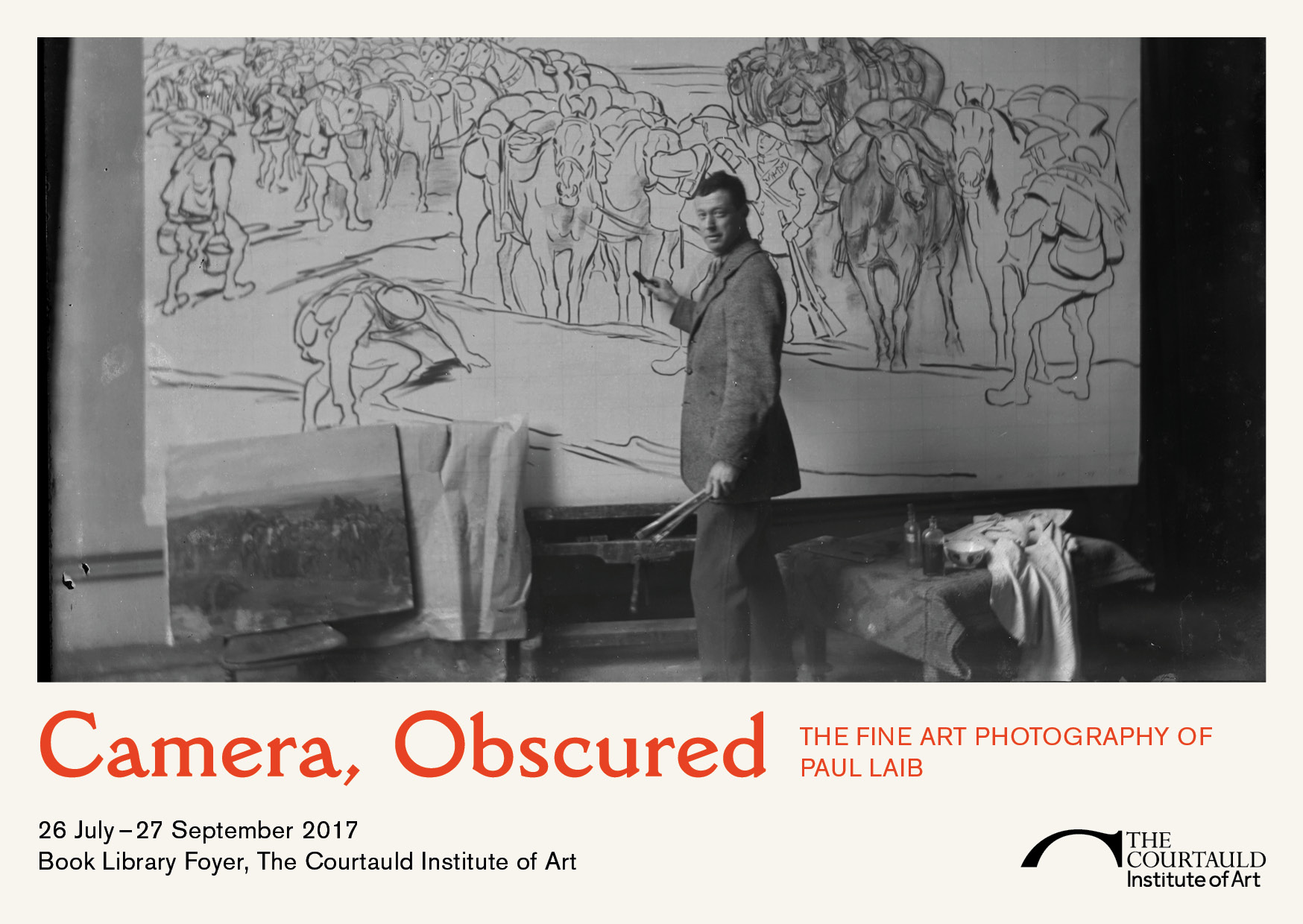
Artists in their studios: Camera, Obscured: The Fine Art Photography of Paul Laib.
The title of the exhibition – Camera, Obscured: The Fine Art Photography of Paul Laib – is a reference to the different relationships at play between artworks and photography in his archive. As I write in the introductory text for the piece, sometimes an image itself reminds us that we’re looking at a staged photograph, something that took scheduling, supply sourcing, and time to plan. Paintings were secured on easels and sculptures on pedestals to ready them for a photo. Further reminders of the presence of the photographer include graphic white strokes across many of the images – Laib placed tape directly on the negatives to mark where the images would be cropped.
In other photographs from the archive, the physical presence of the camera is less obvious. This is particularly the case for photographic reproductions intended for publication – a copy of Art Now: An Introduction to the Theory of Modern Painting and Sculpture (1933), generously lent by the Courtauld Institute’s Book Library, is open to a photograph of Barbara Hepworth’s sculpture “Reclining Figure” – while staged in a very thought-out way, the presence of a photographer is less obvious, thus “Camera, Obscured”.
To give visitors even more of a sense of how these photographs live as physical objects before being digitised in our studio in the Witt Library and printed, some of the glass plate negatives and the boxes they have been stored in since the 1970s are included in the exhibition.
A view of the exhibition.
Many thanks to everyone who has helped source negatives in the archives, point me towards references, set up the show, and supported in ways large and small – hopefully this will be the first of many exhibitions to come out of the rich photo archives we are digitising.
— Mary Caple
Camera, Obscured: The Fine Art Photography of Paul Laib is on show until 27 September in the Book Library Foyer at The Courtauld Institute of Art.
As we process more and more boxes of negatives from the Anthony Kersting archive – that’s over 3000 sheet negs in 19 days – I become convinced that the smell of acetic acid in the studio will be an inextricable part of the memories of Summer 2017, both for me and for the volunteers handling and imaging the negatives.
Although most of the negatives in the archive are in very good condition, many have suffered some temperature variation in the past 50-70 years, and are in various stages of decay. This is where digitisation comes in and saves the day. At the heart of any digitisation effort are two main purposes: sharing and caring.
At the heart of any digitisation effort are two main purposes: sharing and caring.
Sharing, because these images have been kept shelved away for a very long time. How many people, since the negatives were created, would have known where to look, who to ask, what to look for, and how to find what? An insignificant number compared to the people searching the internet for historical pictures of their hometown, of monuments and buildings destroyed by war and natural disasters, of factory workers in Jamaica (those are great, can’t wait to share them!), and of generally wonderful looking places.
But digitising is also caring for the object, giving it some rest, allowing a newer, more robust and accessible version of it to take its place. In the sprint relay that’s the photographer’s vision, where the image is the baton, negatives and prints are the first runners. Exhausted after 70 years on the track, they are ready to exchange with the digital files, which will carry the image into the future.
Caring for the object, but also caring for the original photographer’s vision. As the negatives age in challenging environments, they suffer visual decay. This means that, depending on the type of negative, the original image will be compromised and look very different from how it was intended. Digitising before this happens ensures that the photographer’s vision is preserved for posterity in digital form and that the negatives can be moved to a more stable environment to stop further decay.
But what to say about the negatives which have already suffered damage? Unfortunately, in most cases these are nearly impossible to repair. Where possible, we digitise them as they are and appreciate them for their faults. The volunteers examine them as they prepare for digitisation and record in our database the details of broken or corroded glass plates or film negatives showing channelling. When performing quality checks on the digital images, they can also flag major scratches and deal with any dye retrieval.
Although the original vision is compromised, the damaged negatives take on a beauty of their own. Here are a few favourites.
As the acetate film decays, the base of the negative can shrink and the gelatine can become detached from its support. In the examples below, the channeling and distortion make the landscapes appear as if under water.
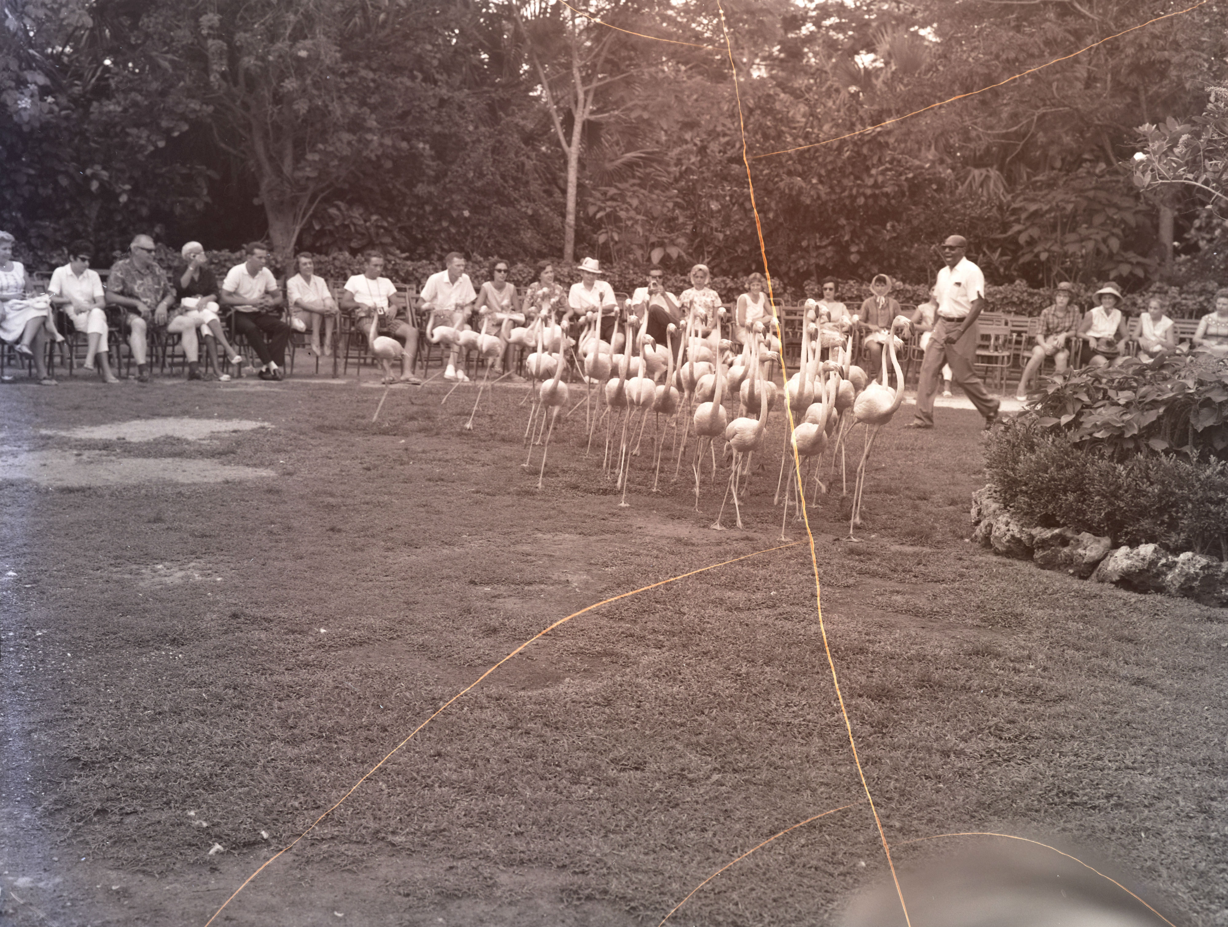
In some negatives, the dyes contained in the antihalation layer can react to the released acetic acid and become blue or pink. The images below will be processed in black and white as they were intended but in colour the scenes look dreamlike and striking.
KER_NEG_G2978KER_NEG_G2979
Scratches are the most common type of damage. In the first example I like to imagine the scratches are jetpack contrails. In the second, the scratch looks almost like the trajectory of the jumping dolphin. The third is so surreal, such an unexpected setting, the magic would come through regardless of the damage.