Marketing an exhibition: how hard can it be? – Sophie Ridsdale-Smith

A lot of work goes into marketing an exhibition, from nailing a creative brief to hitting the upload button on Instagram, there are many steps in between which are all as equally important. 

As someone who spends more hours on social media than I care to admit to, taking on the role of marketing for the exhibition seemed a responsibility not too far away from the social media I knew. As long as we had a graphic designer on board and some beautiful images of the artwork, I anticipated minimal hiccups. I had a fantastic partner (and friend!) sharing the load – shoutout to Julie – and together we naively navigated the world of press and marketing. 

Our first task was to find a graphic designer. This sounded simple enough but with the added difficulty of a pandemic and lockdown, this was more of a challenge. Many hours were spent on Zoom calls with the rest of the gang, pitching potential designers and figuring out how we wanted the exhibition to look and feel. We eventually locked down (pardon the pun!) Mathilda Della Torre, who as it happened, had worked with the MA Curating group of last year and roughly knew how the exhibition process worked, though obviously this year was very different with no physical exhibition taking place. Mathilda was set to work, designing the beautiful posters and various other assets that are across the website and marketing materials. We are so pleased with the work Mathilda produced, and Julie and I definitely developed our problem-solving skills and the importance of taking a lead on something, particularly when it came to making decisions!

I can’t write a blog post on marketing without mentioning the press release. Once again, this was something both of us were completely new to but was such a valuable learning experience for us as well. We took advice from Ashleigh Toll, the marketing guru for the Courtauld, and drafted the press release, collated a press pack which included key artwork images and our events programme details. Personally, it was incredibly interesting seeing what goes on behind the scenes in order to get journalists interested and provide all the information they would need.  Communication was key here, because of the multiple partners involved in our exhibition project. It was vital that everyone approved and was happy with the material we would make public. 

Posting on social media was probably the most familiar task to us, and something I really enjoyed doing. We could get a bit creative on Instagram Stories and hopefully enthuse others enough to visit the exhibition. I will admit that after the show had launched online, it was harder to keep the momentum going on social media. I think this would have been very different had we been in a physical gallery space. A challenge we are currently figuring out is knowing when to stop posting about the exhibition on social media all together, we are now in full dissertation mode, yet the exhibition website is still up and running (and will be until June 2021).

A definite highlight for all of us was being featured as the ‘Exhibition of the Week’ in Jonathan Jones’s ‘Art Weekly’ article in The Guardian. Being recognised by one of the most well-known art critics in Britain is something I will not stop talking about for a long time! 

As I mentioned at the beginning of this post, I’m not sure myself and Julie really knew what marketing an exhibition actually looked like, and although we made some obvious mistakes throughout the process, it was a fantastic learning opportunity and one I would certainly sign myself up for again, perhaps not in a global pandemic though.

A word about interpretation – Elizabeth Keto

Hello there. I’m glad you’re here. My name is Elizabeth, and I’m one of the curators of Unquiet Moments: Capturing the Everyday. In this space, we’ll have a series of blog posts exploring aspects of our exhibition-making process from ‘behind the scenes’.

My two primary roles on the exhibition were coordinating our text interpretation – basically, serving as a general editor for the project – and licensing the images of the artworks, so that we could legally display them on our website. Although copyright is a crucially important protection for artists and other creators, I’m afraid that a blog post focused on the ins and outs of image licensing would be about as thrilling as reading an air-conditioner repair manual backwards. So I will focus instead on interpretation.

Although writing captions might seem to be one of the aspects of an exhibition least affected by a transition to an online platform – text is text, whether online or on a gallery wall – the pandemic did create an unexpected dilemma for us. How do you write about something you’ve never seen?

As any art history professor will tell you, writing about a work of art without seeing it in person is a thoroughly suspect practice. One of my professors was famous for requiring students to spend no less than three hours before a work of art before even beginning to compose their essays. Since we were still finalising our list of works when COVID-19 precipitated the closure of the collection stores and the relocation of many of the students away from London, only one of us was ever able to see any of the works in person. And like us, all of the visitors to our exhibition will view the works of art only through the pixelated veil of a computer or smartphone screen.

Interpretation – the written words that help explain, contextualise, or translate the work of art – seems to hold the danger of increasing that sense of separation. The root of ‘interpreter’ is a Latin word meaning a go-between, an agent, a negotiator. ‘Interpretation’ in the museum carries that same sense of bridging a distance: a text that mediates a conversation between artwork and viewer.

Yet what we were most concerned to preserve for our viewers was that very sense of closeness and contact that was most threatened by the online space. We were determined that the works of art still be able to touch viewers, to hold their attention – a task made more difficult given the siting of the exhibition within the internet’s empire of distraction. How then to interpret in a way that lessens the distance, rather than increasing it?

My hope is that our interpretation functions less as a thing (or as a description of a thing, so two things, really) than as an event, as a certain type of mental action. I’d like to foreground the idea of ‘reading’ as an open-ended, ongoing practice, rather than as a finished, self-contained text – ‘a reading of the work’. I’m eager that you should come with me on this voyage, this act of crossing between shores. Our interpretations, if they work as they should, are simply invitations to you, dear reader.

All things audio – Matilda McEvedy

I’ve been reflecting on the exhibition over the last three weeks. It’s almost easier to spend time interrogating our curatorial process in hindsight than it was when we actually doing it. As the lead on creating the audio content for the site, in particular I’ve been listening to the audio pieces over and over again on the website. I can even quote some of them word for word at his point.

Audio was something we were very passionate about including, especially after an introductory session to how art museums use audio for exhibitions by Sam McGuire, Interpretation Curator at Tate. There was a danger, more so now that we were making the move online, that the experience of interacting with the artworks would be bland, flat, lifeless. Although these are concerns for any exhibition, virtual and physical alike, that immediacy and life is already inherent to a physical exhibition. It’s the experience of being there and then, with the works so close you could touch them if you wanted. You are surrounded by other people all talking and moving and actively looking.

We were very conscious that visitors would be experiencing Unquiet Moments very differently. Maybe sat at home, alone, in front of your computer. Something was needed to lift these works off the screen, to give the site a voice, and tell stories to the visitor.

It was this emphasis on companionship and conversation that guided our audio journey. Having all become well acquainted with Zoom calls, I set about interviewing the other nine curators for pieces focussed on guided looking. Similarly, I asked various people, both individuals and families, to reflect on their personal experiences. The stories that emerged were surprisingly intimate windows to their lives, memories and musings. Alongside Berthe Morisot’s intimate etching of herself drawing with her daughter, I interviewed mother and daughter Kim and Daysee Thornton. They talk openly about how they’re relationship has grown over the years and laugh about Kim’s wish for a son. It is this raw and real storytelling alongside Morisot’s touching print that allows us to come to it with our own experiences and relationships and connect with the work.

Another audio accompaniment that I love is the commissioned sound piece for Kathy Prendergast’s sculpture, The End and the Beginning, 1996. Sound artist, Iris Mathieson responded to the artwork by looping together sounds of her hair being brushed and old tapes of her chatting with her mother. The result are these mesmerising layers of sound, that hold a distinct nostalgia and personal resonance.

I’ve learnt a lot about the power of listening during this project. I constructed multitudes of interview questions over the lead up period, often unwittingly attempting to lead the speaker in a direction of my own choice. However, when I left the questions short and open and dictated solely by the speaker’s experience, I was surprised and delighted by the humour and profundity of their responses. Their responses moved me with how powerful these everyday moments and relationships really are.

Things lost, things gained – Annie Birchenough

At a time when we are looking for new visions for the future, we must tap into these feelings of disquiet and of turning in to each other and our surroundings. Coming up with new visions relies on imaginative thinking which is nourished by creative practice: that’s why art and the way it masters the imaginary appear ever so important to me right now.
—Mikhail Karikis, 2020

In March 2020, London ground to a halt. Museums, galleries and cultural centres closed their doors, and we were all left out in the cold, told to return home and await further instruction. The city sat empty, eerily post-apocalyptic. The pandemic has in many ways united the world, bringing human kind together in a rare moment of collective vulnerability. However, the past four months have been different for everyone. Each personal pandemic-tale will be passed between friends for years to come. It has been a time of immense difficulty and devastating loss for so many people, the wake of which will be felt across many generations.

As a group of nine young curators, caught up in the global pandemic whilst studying for a Masters, our story is not one of such devastation. In the context of the world situation, we have been incredibly lucky. We have been able to complete our programme on time, we have continued to learn and work closely as a group, and we have even walked away with new, unexpected skills and expertise that will arm us better than others for the world that awaits.

Producing Unquiet Moments as an online exhibition was not something we ever expected or planned for. Collectively we experienced our own sense of loss, mourning the months of friendship and study in London we had hoped for, stopped in our tracks with the closure of the museums, libraries and archives we had envisaged living among. Above all we seemed to have lost what for many of us would be the first exhibition of our careers. The launching moment of life as a curator.

Four months later, we are on the other side of the great unknown that had stretched before us and we are able to reflect upon and appreciate the things gained by those lost; the windows that opened when the pandemic bluntly slammed the front door shut.

In my role working with the Arts Council Collection and liaising with all our living artists, the greatest gain has been in the relationships and communication made newly possible. Unquiet Moments brings together the work of 25 artists, 19 of which are alive today. We spent time speaking at length with almost all of those artists, which, for a student exhibition sourcing loans through National Collections is remarkable.

We have been astounded by the generosity of these artists to help us with our thinking and inform our interpretation and curatorial approach. It has been a joy to hear their thoughts on the move of their work online and discuss the poigiency of their practices in the pandemic moment. Almost without exception, all have been invigorated and excited by the opportunity to be shown alongside each other – as well as old masters from The Courtauld Collection – made possible by the digital liberation from atmosphere controls and display conditions.

Relationships between the artists have also been gained. Mohini Chandra and Karl Ohiri, whose practices and interests overlap in a multitude of ways, met for the first time this month, and the conversation between them, recorded and archived for years to come, marked a moment of artistic collaborative conversation we never expected. Likewise, Andrea Luka Zimmerman and Mikhail Karikis, old friends and admirers of each other’s work, will come together this week, an event never physically possible due to their geographic separation.

If I were to continue writing about the opportunities of imagining this exhibition online, you would be stuck reading for hours. But this does not render the physical irrelevant. As museums begin tentatively to reopen, the human need for physical cultural encounters will appear clearer than ever. However, I believe we are moving into a world where these two things must live in parallel, where the focus is no longer on replacing that which is lost, but maintaining what has been newly acquired.

When I am asked in years to come where I was during the (First) Great Lockdown of 2020, I expect I will respond that I was on the vanguard of a new moment of cultural experience, learning what might be gained in the face of loss.

That’s a Wrap – Reflecting on GENERATIONS

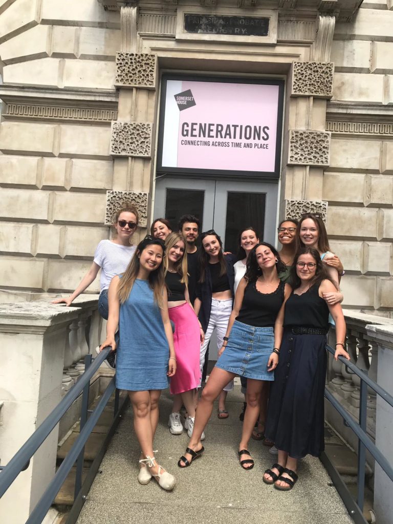
GENERATIONS: Connecting Across Time and Place is over. The vinyl lettering has been peeled off the walls, the artworks have been packed up and sent back, the gallery door has been locked. Pulling apart something we’ve worked so hard to create felt really strange, but I have to remember that an art exhibition is transient by its very nature. That’s showbiz, baby.

Goodbye wall text

But GENERATIONS hasn’t disappeared completely: we’ve still got the memories (and the spare exhibition leaflets). Over the last month, the eleven of us each spent more than 40 hours in the gallery, working as invigilators and visitor-experience assistants for our exhibition. This gave us the opportunity to observe how the public responded to the show (and to tell them not to touch the paintings, please). It also reminded us that an exhibition only really comes alive when people are in it. After all, everything we’d done over the preceding few months – writing wall labels, working out which work to hang next to which, even making sure there were enough benches – was intended to make every visitor’s experience accessible, enjoyable and maybe even enlightening.

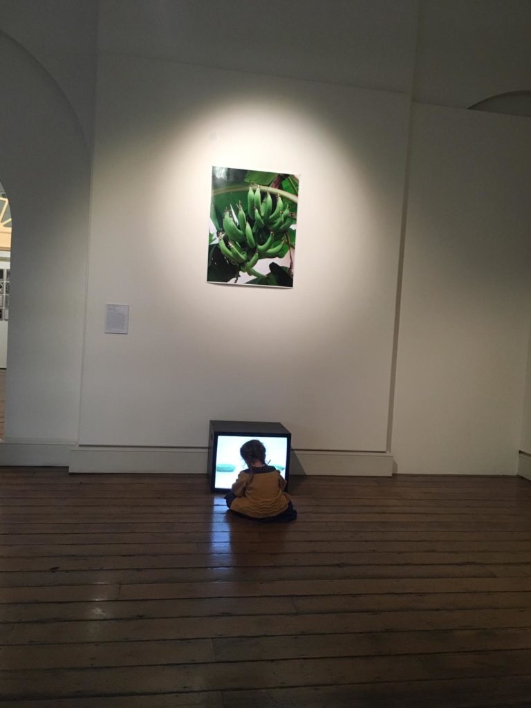
One woman watched Helen Cammock’s There’s a Hole in the Sky Part I video several times over and clapped at the end; one little girl sat on the floor in front of Appau Jnr Boakye Yiadom’s Plantain Drop, transfixed by the falling fruit; one family spent a long time in front of Hurvin Anderson’s Is it okay to be black?, the parents talking to their children about the American civil rights movement. These are just a few examples of the audience engagement I witnessed; perhaps quite ordinary moments, but extraordinarily exciting for one of the exhibition’s curators.

This audience engagement took tangible form through the exhibition’s ‘feedback’ wall, which asked people to write their response to the question, ‘How do you connect to other generations?’ I think this is one of the aspects of GENERATIONS of which we’re proudest – and for which we’re most grateful. Our visitors wrote some profound, funny, heart-breaking and truly beautiful comments about their family relationships, regrets about the past and hopes for future generations (have a look at some in the Your Voice tab). Visitors didn’t just take something away from the exhibition; they also left behind their own contribution.

Transfixed


I think the last thing to say is thank you. Thank you to our course leader Martin, to our sponsor Christian, to so many members of the Courtauld staff, to the Arts Council Collection, to Somerset House and to everyone else who worked with us. Thank you to the visitors who made this a ‘real-life’ exhibition. And I’d also like to say thank you to my ten fellow students, who have shown themselves to be great curators and great friends.

Anna

Dream team

Work in Focus – Alejandra Carles-Tolra, Untitled from the series Where We Belong, 2017

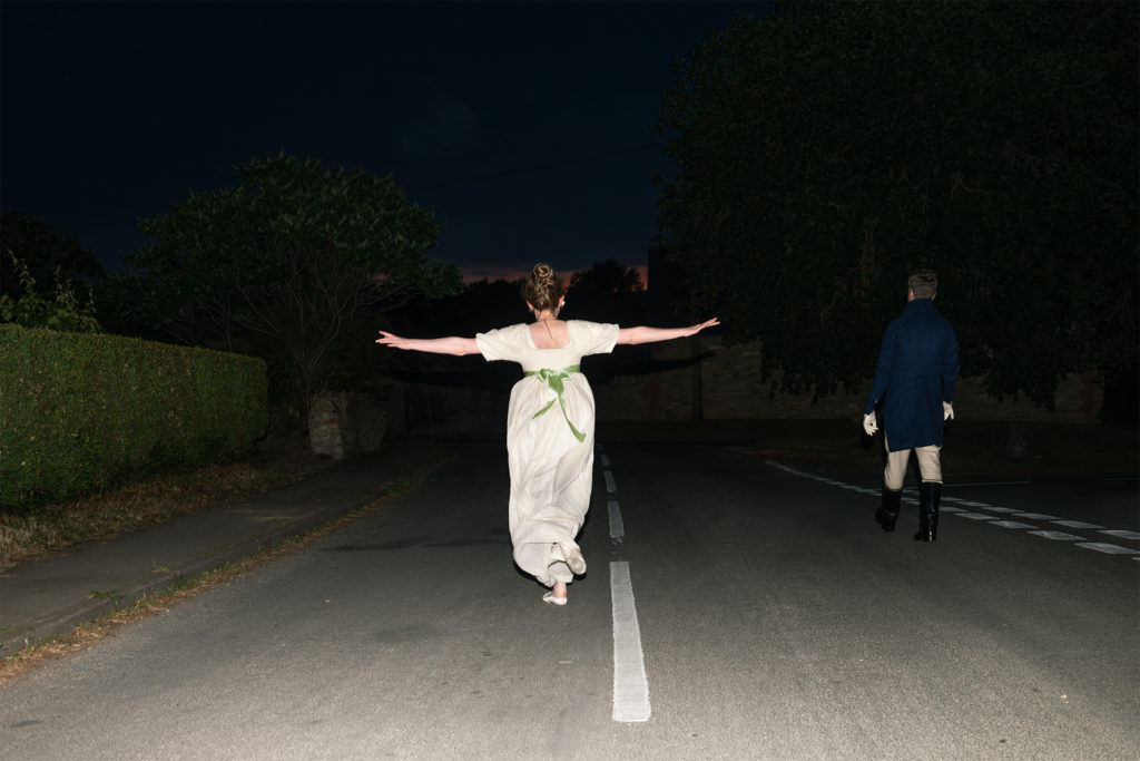
In the first room of our exhibition, above a (rather wonky) mantelpiece, hangs Alejandra Carles-Tolra’s beautiful photograph from the series Where We Belong.

Alejandra Carles-Tolra, Untitled from Where we belong, 2017. Arts Council Collection, Southbank Centre, London. © the artist. Originally commissioned through the Jerwood/Photoworks Awards, supported by Jerwood Charitable Foundation and Photoworks.

Where We Belong is a photographic body of work that explores themes of belonging, femininity, and escapism. Over the course of three years, Alejandra Carles-Tolra documented the Jane Austen Pineapple Appreciation Society, a group that recreate and celebrate Jane Austen’s novels.

Members of the Society dress up in Regency costume and come together at special events including dances, festivals, and house parties. The group call themselves ‘Janeites’ and share a strong passion for the author. Although Jane Austen is a figure that is in many ways bound to the past, for members of the society she is a living, breathing force of the present.

When Carles-Tolra first encountered the group, she was intrigued by the draw of the past. Where We Belong seeks to question what it is about Jane Austen’s world, with its old-fashioned concepts of femininity, that has captured the imagination of these 21st-century women.

We were immediately struck by the joyful sense of freedom captured in the photograph, and the blurring of boundaries between past and present, fantasy and reality. As a work that we came across early in the research process, it has played a crucial role in our conception of the exhibition’s themes, particularly in terms of how we can relate to historical figures and personal icons.

Many of the group identify with the strong female characters in Jane Austen’s novels. They also consider Austen herself to be a feminist icon; as an unmarried and independent woman who made a living from her books, she is a rare exception for her time period. In the same vein, while the group may seem anachronistic at first glance, they are a female-led society that fosters a sense of empowerment amongst members. While Alejandra Carles-Tolra also photographed the male members of the Society, as in our exhibition photograph, she always sought to place them in a secondary role to the female members.

We decided that this photograph was a fitting work for the back of our exhibition leaflet, which unfolds as an A3 poster. We hope it encourages the viewer to think about the figures and icons that they feel connected to across time.

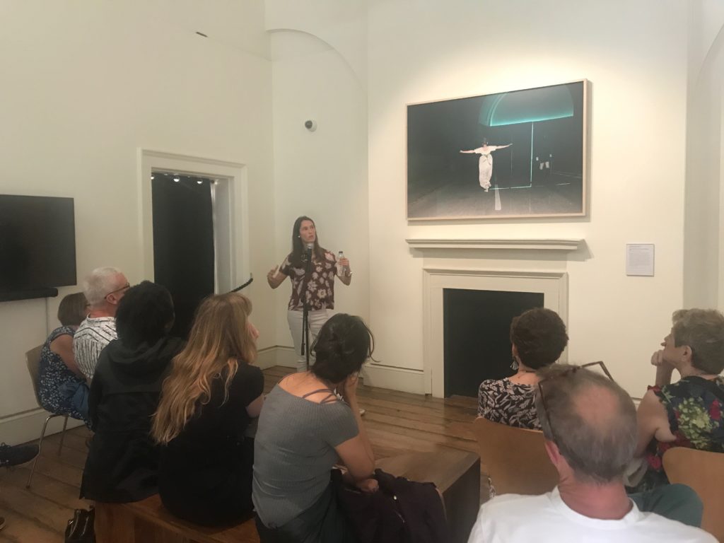
It was a pleasure to have Alejandra Carles-Tolra give an Artist’s Talk in front of this photograph on Saturday 22 June. This event formed part of the exhibition’s public programme, co-ordinated by Debbie and I, and also took place in collaboration with Somerset House’s Generation Get Up! Weekend.

Alejandra shared fascinating details about her experience creating Where We Belong, and her practice more broadly. A particular highlight included a description of how the group painstakingly sew their own Regency-style costumes, which Alejandra also had the opportunity to wear!

You can find out more about Alejandra Carles-Tolra and her work here.

Amber

Work in Focus – Lubaina Himid, Cotton.com, 2002

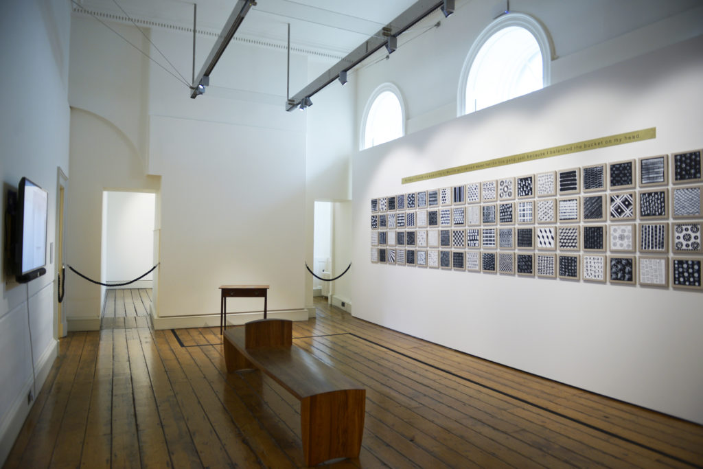
Lubaina Himid’s Cotton.com (2002) is an absolute show stopper and captures your attention as soon as you enter the exhibition space of GENERATIONS. Made up of 84 individual patterned oil paintings and a brass strip, it is a mesmerizing work that deserves a closer look.

Installation Shot: Cotton.com in GENERATIONS: Connecting Across Time and Place

The creation of Cotton.com was inspired by an act of solidarity. In the nineteenth century, textile workers living in the northwest of England were affected by the American Civil War, as their livelihood was dependent on the provision of slave-grown cotton. Even though the British mill workers were themselves living and working under harsh conditions, they held rallies and wrote to President Lincoln, supporting his decision to end slavery in the United States.

Lubaina Himid decided to capture this historic moment of unity between the British working class and enslaved plantation workers across the Atlantic. She wanted to create an imagined conversation between both parties, but instead of using text or language, Himid turned towards patterns. Each of the 84 panels has a unique black and white pattern, creating a conversation that is open to interpretation and accessible to everyone.

The work is crowned by a long brass panel stating: ‘He said I looked like a painting by Murillo as I carried water for the gang just because I balanced the bucket on my head.’ This quote is adapted from a sentence that Himid found in a plantation inspector’s report. Himid felt that she needed to rectify this objectifying statement, and rephrased it so that it is now written from the woman’s perspective, giving her a voice and agency.

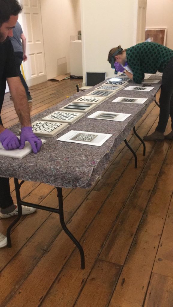
Cotton.com being unpacked and condition checked during installation period

The work addresses the impact of colonialism, transnational trade, slavery and misogyny. From the very beginning of our exhibition process, we knew that we wanted to show this powerful piece, and it has stuck with us ever since. Cotton.com was also the first work that was hung during our installation process. It took an entire day to unpack, condition report and hang all 85 components. Before all of this happened, our art handlers had to grid the wall meticulously so that the distance between each panel is exactly the same.

Now that the work is up on the walls, it has taken on a life on its own. Placed together with Helen Cammock’s There’s a Hole in the Sky Part II: Listening to James Baldwin (2016) and Lucy Skaer’s The Tyrant (2006), we hope that it sparks conversation about distribution of power, and how it is crucial for us to learn from the past in today’s world.

Anne

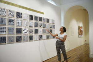
Our very own Debbie giving a tour in front of Cotton.com

Work in Focus – Donald Rodney, In the House of My Father, 1997

As part of the blog for our exhibition, we wanted to focus on a few works and discuss them in more detail. The first work in focus – which has featured as the main image for our poster, leaflet and postcards this year – is Donald Rodney’s In the House of My Father (1997).

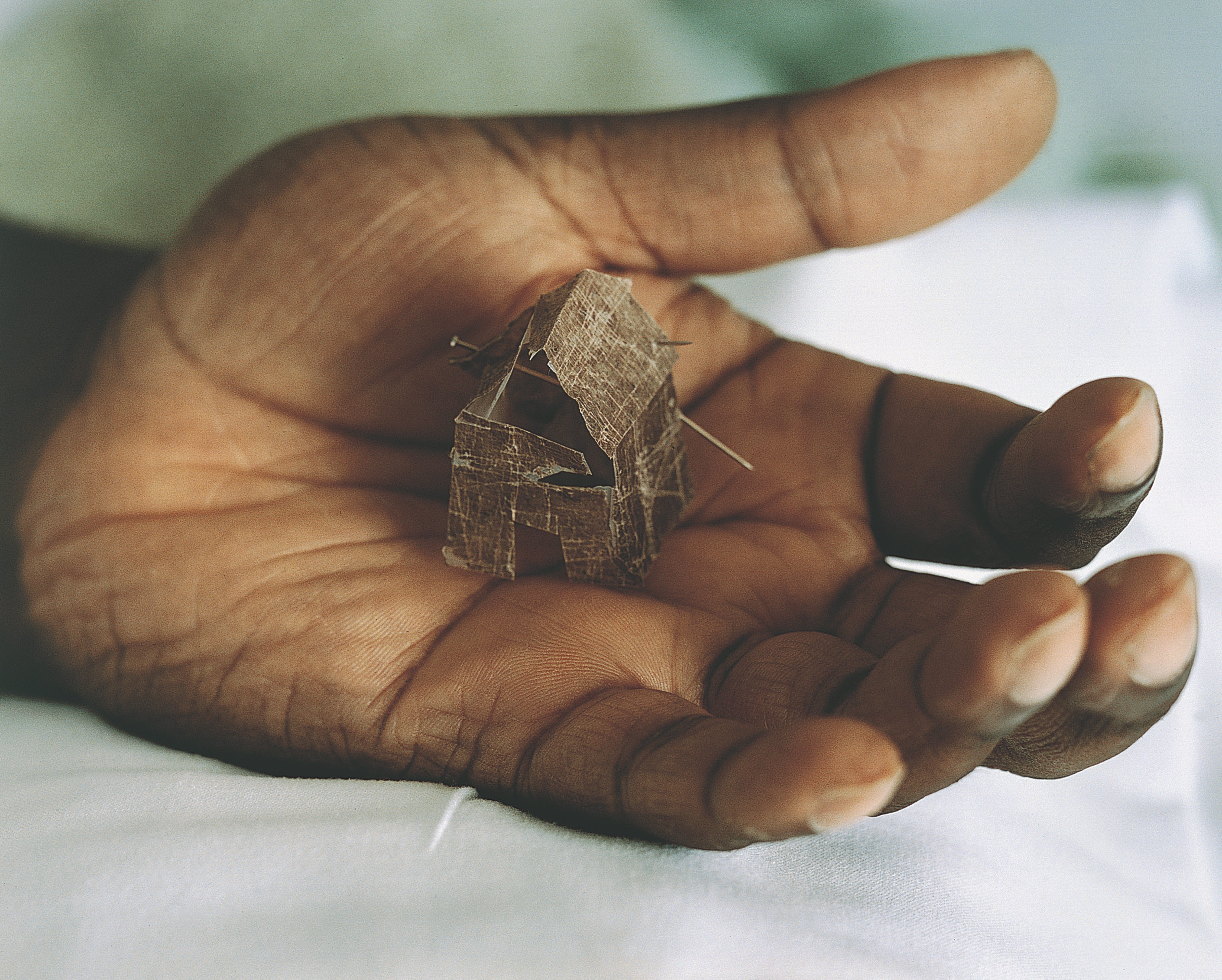
This immensely personal and moving photograph was taken by Andra Nelki while Rodney was in Kings College Hospital, London undergoing treatment for sickle cell anaemia, a debilitating inherited disease. In Rodney’s hand sits a tiny sculpture of a house made from pieces of his own skin delicately pinned together. Interestingly, the ‘house’ itself actually exists as an independent work, entitled My Mother. My Father. My Sister. My Brother (1996-7).

In the House of My Father was first exhibited at Rodney’s last solo exhibition ‘Nine Nights in Eldorado’, which took place at South London Gallery in 1997 and was dedicated to his father, who had died a couple of years earlier. The title of the work certainly suggests the intimacy of familial lineage and the memory of home. It takes on further meaning, as Rodney sadly succumbed to his illness in 1998.

Donald Rodney, In the House of My Father, 1997.
Arts Council Collection, Southbank Centre, London © the Estate of Donald G Rodney

Rodney’s use of photography is interesting in relation to his hospital experiences. Over the course of his illness, extensive medical data was accumulated, including photographs, x-ray scans and DNA sequencing. He incorporated discarded x-rays as a medium and used his experience with his illness as a metaphor for what he perceived as the ‘diseased nature’ of contemporary British society. This expressly autobiographical approach thus enabled Rodney to explore much wider questions and issues surrounding identity.

The idea of a personal documentation would lead Rodney to later assembling a comprehensive and multifaceted record of his body on an internet site, culminating in his posthumous project Autoicon, realised in 2000. The internet work simulates – and in a way, preserves – both Rodney’s physical presence and elements of his creative personality. Autoicon was developed by a close group of friends and artists, known as ‘Donald Rodney plc’.

When deducing meaning from In the House of My Father, I think the artist and curator Eddie Chambers made an important point with reference to Rodney’s relationship with his disease. He stated that Rodney ‘was always careful to maintain an intelligent and critical distance between himself and his illness. This work was not simply “about” Black people, or “about” sickle-cell [anaemia]. The work was about much wider constituencies and it broadly and specifically implicated all of its viewers, in a variety of ways.’

Helena

Exhibition Opening

Wow – what a truly great evening celebrating the opening of the exhibition with friends, family, and other (special) guests on Friday night.

We were so glad that Deborah Swallow, Appau Jnr Boakye-
Yiadom and Helen Cammock – and other special guests – could join us to inaugurate the exhibition,
giving us also a chance to discuss with them the exhibition more generally. The last few weeks
leading up to Friday evening – between installing, finalising texts, advertising the event, and
preparing to welcome our visitors – were certainly exciting for us, but also hard work! However, it
was amazing to see everything come together on Thursday and see it ready for the public on Friday.

We discussed the experience and gave tours to our guests, showing everyone how proud we were of
the final product. People were engaging with the works on display, eager to discuss them amongst
themselves and with us. The speeches given by Anne and Capucine on behalf of the group perfectly
summarised our individual experience co-curating the show with 10 other people. It was a moment
to look back and reflect on how challenging developing and bringing this project together was, but
also how much we had learnt during the last 5 months as a group. It was also a moment to
acknowledge and thank everyone for the overwhelming amount of support we received from
collaborators – the exhibition has also been made possible with their guidance and help throughout.
The incredibly positive feedback we received both at the opening and in the days following it, both
from collaborators and friends or family, made us even more proud of what we have presented to
the public. We are excited to see how the exhibition will be received and engaged with by the public,
and ready to show how passionate we are about our project with our tours.

Carlotta

_DSC3464
_DSC3620
_DSC3745
_DSC3993
_DSC3850
_DSC3662
_DSC3896

Photograph: Werner Vivier

Exhibition Process – Installation

GENERATIONS: Connecting Across Time and Place is now open – but how did it become the space you can visit today? Find out with a sneak peek of the installation process in this post.


That’s it: we did it. Our annual class exhibition  is now open. As part of the installation team, I could not  be prouder of what we have achieved, especially after spending almost two weeks in the space, watching it be filled with artworks, benches, labels and engaging feedback wall.  There’s a lot more to installing an exhibition than I originally thought: it begins the moment you get to know the works and can see relationships forming between them. Installation involves everything from perfectly visualizing the exhibition space, to exchanging a lot of emails with contractors and screwing tiny screws into the walls. Let’s break it down.

Snapshot of the exhibition in "Sketchup", 1st room
Snapshot of the exhibition in "Sketchup", 2nd room
Snapshot of the exhibition in "Sketchup", 3rd room

For the Installation team (Katie, Valeria and I), the hard work began a little later than for the other groups. While we were waiting for all the correct information on the artworks (media and sizes, mostly) as well as instructions from the two main institutions we were working with (Arts Council Collection for loans and Somerset House for exhibition site), we began to create a virtual model of the exhibition. I really enjoyed playing around in Sketchup, a modelling software where you can scale a space and design endless scenarios of the displays we came up with in a whole-group brainstorming sessions. Not only was it fun to be able to simulate in real time and space what we were thinking, but it also gave us at least a small sense of what our exhibition could look like. ‘But be cautious’, our course leader Martin warned, ‘and never trust a simulated space entirely. The reality is always quite different.’

And he was right. On May 28, it was go time. We contacted and planned all kinds of transportation and deliveries, construction, artwork hanging, audio-visual equipment,and so on – now that we were as prepared as we could be, we had to keep our fingers crossed that everything would go smoothly. Thanks to the help of the Arts Council Collection handlers and the Courtauld Gallery conservators and registrar, the overall installation went without a hitch – we were even ahead of schedule! It was very important to follow this schedule as each day was dedicated to a specific aspect of the installation process: one day was devoted condition checking the artwork (a necessary step for their protection), another to hanging them, another to taking delivery of gallery furniture, another to installing the A/V equipment, and yet another to adjusting the lights and placing wall texts and labels.

On another note, here’s a reason why Sketchup is not to be fully trusted: the ambient lighting in the first room of the exhibition space proved to be much too bright in the afternoon and could endanger some light sensitive artworks (particularly the photographs). This apparently small setback was actually major in the condition for opening the exhibition, and we had to think quick on how to fix and blind the windows.

We also had the chance to include one of the exhibiting artists in the installation process: Appau Jnr Boakye-Yiadom came to help install Plantain Drop, a multi-media work (a print and a video). It was very interesting for us to see the artist working with his own piece in relation to other artworks, the space and the light.

In the end, everything is surely not perfect, as all the requirements, short time-span and few setbacks were all new to us – but for our first exhibition, we are all very satisfied with how the space turned out : it is a beautifully crafted exhibition with compelling artworks. Alas! It is not over for us yet, after installation inevitably comes… the deinstallation!

man in front of a wall with some people setting up a picture

Appau Jnr Boakye-Yiadom in front of his artwork Plantain Drop being installed

Guillaume

View of the first room
View of the second room
View of the third room