Author Archives: Devan

Constructing Images of Kylie Jenner and Marie Antoinette

In their March cover shoot and interview, Harper’s Bazaar photographed Kylie Jenner and recreated Marie Antoinette portraits from the 1770s and 1780s. Jenner is photographed wearing extravagant gowns that directly reference paintings by Elisabeth-Louise Vigée-Lebrun. These paintings depict a notorious celebrity known for setting fashion trends at a time of political and financial turmoil. Kylie Jenner, an equally notorious celebrity known for setting fashion and makeup trends, remakes these connections between fame and sartorial extravagance. In a portrait of the Queen from 1778, Vigée-Lebrun painted Marie Antoinette in a white grand habit de cour with gold tassels, the most formal style of dress from this period. In Jenner’s version, she wears a white Thom Brown dress with the same trompe l’oeil gold tassel detail. The wide shape of her skirt resembles the shape of the pannier undergarment worn in the 18thcentury. For Marie Antoinette, this portrait constructed an image of her as a powerful monarch through luxurious and expensive gowns and jewelry. The same could be said of Jenner’s image. Jenner’s constructed identity in this photograph is of the youngest “self-made billionaire” who is a powerful monarch over her own beauty company.

Comparisons of the two
Left: Kylie Jenner in Harper’s Bazaar, photographed by the Morelli Brothers
Right: Elisabeth-Louise Vigée-Lebrun, Marie Antoinette, Queen of France and her Children, 1787, Château de Versailles

Another direct comparison can be made with the cover photo and Marie Antoinette with a Rose from 1783. Marie Antoinette wore a blue satin dress in this portrait which was the traditional and queenly attire the public was accustomed to. (This painting was the second iteration of a similar portrait in which Marie Antoinette wore the scandalous, white muslin chemise and looked like she was wearing undergarments.) Jenner, dressed similarly to the blue satin gown, wears a Dolce and Gabbana dress with light blue stripes. Both images show the women holding a pink rose with a white ribbon. Once again, Bazaar styles Jenner like Marie Antoinette who wears formal, stately outfits instead of the casual, white chemise dress most woman could afford. This comparison cements Jenner’s status as powerful fashion plate and businesswoman who controls her own empire.

Comparison for Kylie Jenn er article
Left: Kylie Jenner in Harper’s Bazaar, photographed by the Morelli Brothers
Right: Elisabeth-Louise Vigée-Lebrun, Marie Antoinette, 1778, Kunsthistorisches Museum Vienna

Unfortunately, these images miss an opportunity for Jenner to use Marie Antoinette’s constructed identity in her portraits to illicit a sympathetic response from readers that isn’t the obvious out-of-touch-celebrity comparison to Marie Antoinette.

In another photograph, Jenner is shown wearing a white dress with an exaggerated sleeve while holding her daughter. Her hair is topped with large pink feathers and she is surrounded by pastel pastries and cakes. This imagery is reminiscent of Sofia Coppola’s 2006 film Marie Antoinette. Through this reference, Bazaar links the film’s themes of youth, fashion, and hedonism to Jenner through the saccharine color palette and sugary macarons. It reminds the viewer of Coppola’s fun, champagne filled, shopping montages. It is unfortunate that this was the image that included Jenner’s daughter because there is another Vigée-Lebrun painting that would have been more appropriate. In Marie Antoinette, Queen of France and Her Children from 1787, the subject is surrounded by her children in a pyramidal composition suggestive of a serious, renaissance painting. A jewelry box stands behind the group in the shadows. This jewelry box could be alluding to a Roman story of Cornelia, a virtuous woman who valued her children over worldly possessions like jewelry. Unlike the other portraits referenced in the Bazaar editorial, this portrait with her children attempted to situate Marie Antoinette as a virtuous, loving mother who values her children above everything else. Referencing this piece of monarchy propaganda would have been a perfect and interesting way to create an image of Jenner that focused on her supposed virtues as a person and a mother. Instead, the images render Jenner as a pseudo-Coppola pastiche, an image of hyper-femininity and excess.

Comparison for harpers Bazaar
Left: Kylie Jenner in Harper’s Bazaar, photographed by the Morelli Brothers
Right: Elisabeth-Louise Vigée-Lebrun, Marie Antoinette, Queen of France, 1783, Château de Versailles

These portraits and photographs both construct female identities through makeup and clothing to demonstrate both women as rich, powerful and fashionable at a time of great political turmoil or change. Yet, the photographs of Jenner feel thematically unimaginative by comparing yet another rich celebrity in ‘pretty dresses’ to Marie Antoinette. When it comes to constructing images of Jenner, however, maybe the goal isn’t to create new images that illuminate interesting parts of her identity. The only goal is to get viewers to look at beautiful, superficial images. In this case, we can’t always have our cake and eat it too.


References:

Kylie Jenner’s Interview in Harper’s Bazaar

Knitting in the Digital Age

Once we turned the clocks back and it started to get dark around 4:00 pm, I immediately broke out my knitting supplies and resumed my favorite winter activity of making scarves, hats, sweaters, and mittens. Not only does it feel cozy to knit once it is dark and cold outside, it is a tactile hobby that is very rewarding after staring at a phone or laptop screen all day. I’m not the only millennial that feels this way and has learned to knit. Many of my friends and peers are knitters or crocheters and it is a common trend among 20-somethings. In response to this demand, there are numerous online “knit kit” companies that make it easy to learn to knit, learn new stitches, and start new projects. There are also numerous local yarn shops to buy supplies and find a community of knitters. Online, there are knitting communities like Ravelry that are a great resource for patterns and YouTube has a trove of video knitting tutorials.

Pair of hand knitted mittens
Pair of mittens I knitted this year.

In a fashion industry that actively hides the systems and conditions of production from the consumers, hand knitting brings the production right into the consumer’s own home. By knitting the item, knitters know that workers haven’t been exploited and there are no harmful environmental side effects when making the garment. (This is only true if the yarn used was produced in an ethical way.) The allure of doing the work yourself is possibly in response to a romanticizing of a pre-industrial revolution society. This nostalgia manifests as a trend for personalized, bespoke items that reject the unethical and ecologically harmful production methods of large fashion corporations. Knitting is a more accessible way to accomplish this production at home compared to sewing. Sewing requires more tools and knowledge, whereas knitting can be a casual activity that is done in front of the TV or talking with friends.

Knitting needles, ball of yarn, and knitting pattern
Hat in progress with pattern instructions.

Knitting is also related to the “hipster” trend of enjoying analogue objects like records, typewriters, and polaroid cameras. To millennials and other young people, these items could be reminiscent of a time when lives were not based in the digital world but in a physical, tactile one. They are also a brief respite from the digital world where we view glowing screens and have our touch mediated through a mobile device, laptop, or TV. Physically touching knitting needles or a polaroid camera is how a new scarf or polaroid picture is created. There is no mediation of touch through a screen and the product it creates, unlike digital images or applications, is available to touch and manipulate in real life. In this age of instant gratification, knitting is also a lesson of patience. Sweaters and scarves can take hours and hours to make (especially if you mess up a few stitches!). This, along with the physical product, makes finishing a knitting project more rewarding than anything accomplished on a laptop or phone.

Purple mittens and blue hat

Personally, I enjoy knitting because it lets me design my own scarves, gloves, and sweaters and I can make great personal gifts for my friends and family. I like having control of the design process by choosing the type of wool, the color of yarn, and the pattern to create exactly what I’m envisioning. This winter I am attempting to knit socks – a technical challenge I have not mastered yet.

Sources:

Knitting Is Cool: 20-Somethings Taking Up Knitting, Crochet. Huffington Post article

Handcrafted Fashion: Why We Crave It in the Digital Age, WSJ

Pairs in Richard Avedon’s ‘In the American West’


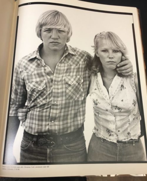
Starting in 1979 Richard Avedon began a project, commissioned by the Amon Carter Museum in Texas, documenting the American West. He spent five years traversing the western part of the United States taking portraits of average, overlooked people. The project concluded with an exhibition of selected works and a catalogue called In the American West. The magical quality of these photographs is in the immediate connection the viewer forges with subject. Looking at these photographs you begin to feel as though you know the person in the portrait. Part of this comes from the equalizing way Avedon went about taking each photograph:“I photograph my subject against a sheet of white paper about nine feet wide by seven feet long that is secured to a wall, a building, sometimes the side of a trailer. I work in the shade because sunshine creates shadow, highlights, accents on a surface that seem to tell you where to look. I want the source of light to be invisible so as to neutralize its role in the appearance of things”.  Avedon created a blank slate where the personality of the subject could be freely expressed without any distractions. In this neutral space, the sartorial choices of the subjects come under greater scrutiny and become even more symbolic of their inner lives. What struck me as particularly interesting in these photographs was they ways in which Avedon photographed pairs and how their bodies interacted within the frame.

In Rusty McCrickard and Tracy Featherstone, Dixon, California 1981 a man and woman stand staring directly into the camera. The woman is dressed in matching tropical print shorts and a button up top, while the man wears jeans and no shirt. Their hands are clasped together in the centre of the frame. The man’s bare chest seems to blend with the white background and create a sense of negative space, contrasting with the woman’s vibrant print. While the man physically takes up more space due to his size, they share the frame fairly equally.

In John and Melissa Harrison, Lewisville, Texas, 1981 there is a sense of harmonious shared space as well. John stands facing the camera straight on. He holds his daughter in the crook of his left arm so that she dangles upside down in front of him. Her right foot hooks around his neck mirroring the angle of his bent arm. His dark clothing contrasts with her white shirt and diaper. Although he, like Rusty McCrickard in Rusty McCrickard and Tracy Featherstone, Dixon, California 1981, is larger than Melissa their intertwined bodies form one unit that sits in the centre of the frame.

In Teresa Waldron and Joe College, Sidney, Iowa, 1979, Teresa stands as the centre of the frame. She hooks her index finger into the pocket of Joe’s jeans, thus linking them together. Her white cowboy hat frames her face, while her light-coloured striped tank and dark jeans contrast with Joe’s silky shirt and lighter-wash jeans. Joe’s prominent, shiny belt-buckle draws the eye to him, yet his body is only partially in the frame. The portrait focuses in on Teresa, while Joe is pushed to the side.

In Jonathan and Sam Stahl, Gilford Montana, 1983 this is taken a step further. While Jonathan, on the left, is prominently featured, Sam, on the right, is only half in the frame. Their matching checked shirts gives the feeling that they are connected. Sam’s arm seems to disappear into the Jonathan, thus enhancing the sense that they are one unit. That being said Jonathan is in the centre while Sam is cut off by the frame, almost as if Avedon capture their image while walking by them. The dynamism he finds in the contrast between bodies in his In the American West series is truly captivating.

Dissertation Discussion: Olivia


What is the working title of your dissertation?


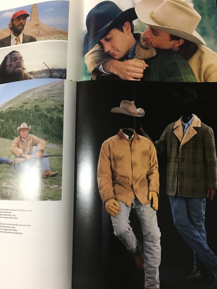
My current working title is ‘Hats, Jackets, and Two Bloody Shirts: Costumes, Masculinity, and Genre Subversion in Brokeback Mountain’ but that will probably change by the time I’m finished.

What led you to choose this subject?


I’ve really always been fascinated by film and costumes, and as the course progressed I found myself gravitating more and more towards that topic. For my second essay and my virtual exhibition I focused on costume design in Hollywood’s Golden Age. In my research for those projects I became more interested in costumes that you don’t particularly notice, but definitely have an impact on your understanding of the characters, their emotions, and their situations.  Brokeback Mountain is one of those films to me where you may not necessarily notice the costumes (and that’s a good thing!), but you feel them and they contribute enormously to our understanding of the characters. From there I began to think about it in terms of other Western films and how it compares and contrasts, and my topic really developed from that comparison.

Favorite book/article you’ve read for your dissertation so far and why?


I love Deborah Nadoolman Landis’s catalogue from the Hollywood Costume exhibit at the Victoria and Albert Museum. It was such a fantastic exhibition and the catalogue is beautiful. I always end up getting sidetracked from what I’m meant to be reading when I use it because it’s all so fun to look at! I’ve also really enjoyed reading David Greven’s book Manhood in Hollywood from Bush to Bush, just a fascinating read with a great discussion of evolving ideas of masculinity in film in the late 20th and early 21st century.


Favorite image/object in your dissertation and why?


I love them all, but I think my favorite has to be one of the most iconic/memorable images from Brokeback Mountain of our two heroes Jack Twist and Ennis del Mar on the titular Brokeback Mountain, where Jack is standing up and he playfully lassoes Ennis. It’s a beautiful shot in the film that really contrasts the grandeur of their setting with the intimacy of their relationship. It encapsulates a lot of what I’m trying to say in my dissertation about the contrast between iconic images of cowboy mythology and a more modern, emotional ideal of masculinity.


Favorite place to work?


My favorite place to work is probably the Reuben Library at the British Film Institute, it has a lot of the books I need and is a really nice, quiet, small work environment. I also love working at the café at Foyle’s bookstore.

Ocean Liners: Speed and Style Exhibition Review

Ocean Liners: Speed and Style, currently on view at the Victoria & Albert Museum, brings the luxury, modernity, and romance of traveling by sea during the 20th century. While the exhibition covers all aspects of ocean liner travel, including décor, promotion, and engineering, I was particularly struck by the room detailing Life on Board. Life on Board features a stunning array of cruise-wear ranging from the turn of the century to the late 1960s. The show gives room to show everything from high-end couture worn by first class passengers in the 1920s and 1930s to bikini’s worn by the deck pool in the 1960s. This broad range gives a comprehensive overview of golden age ocean liner fashion in the 20th century, and the changes to life on board as the century progressed.

As you enter the ‘Life on Board’ room a screen with an ocean scene creates a ship deck ambiance. The pool-side scene featuring bathing suit looks from different decades is set against this blue sky and sea backdrop. A mannequin languidly lounging behind the “pool” sports an Emilio Pucci bikini from 1968. The bikini has been styled with large, white sunglasses and a matching headscarf. The pattern, of different shades of blue and aqua, and accessories give the mannequin a distinct, almost psychedelic, youthful 1960s glamour. Sitting next to the Pucci-clad model is a more conservatively dressed mannequin dipping a toe into the pool. She is dressed in a Jantzen one-piece bathing suit from the 1950s. In between the two seated mannequins is a standing mannequin wearing a bathing top and shorts made by Viking in the mid-to-late 1920s. Finally, the mannequin in the very front is placed to look as if she is diving head-first into the pool. This athletic mannequin is clothed in a two-piece yellow bathing suit from 1937-39. The contrasts between the different colours, eras, and styles of bathing suits gives a broad sense of life on deck throughout the golden age of Ocean Liner travel. The reclining and active mannequins placed against the blue-sky background allowed me to feel as though I were truly witnessing a poolside scene on the deck of a grand ship.

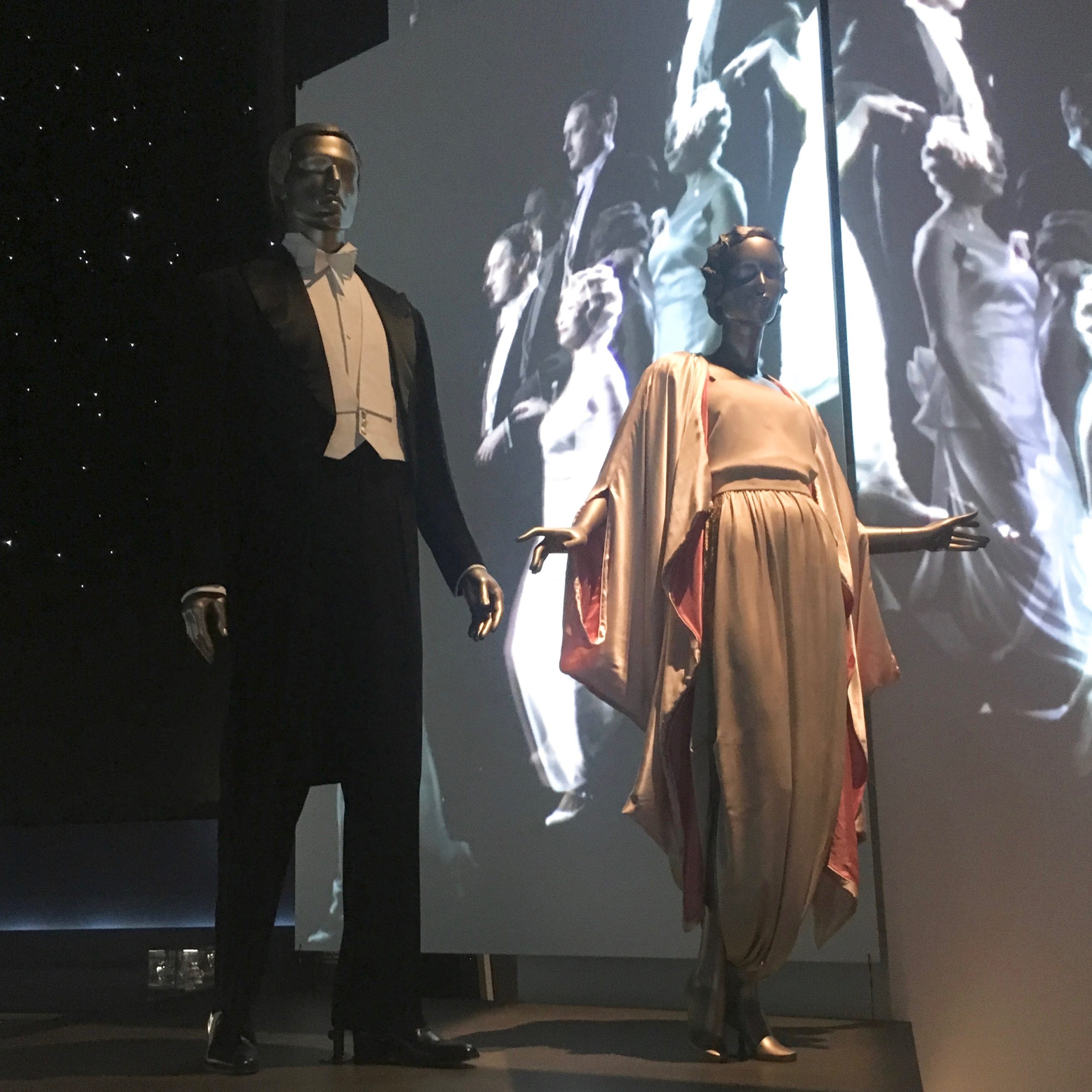
On the opposite end of the spectrum, displayed directly opposite the pool-side scene, is a re-creation of the Grand Descente. The Grand Descente was an elaborate staircase that led into the dining room, from which fashionable first-class passengers could make a memorable entrance and show off the latest fashions. The staircase is recreated as a series of plain back platforms elevated one above the other. The austerity of the staircase in the exhibition allows attention to be drawn to the garments. Behind the mannequins is a screen, onto which, a procession of models in gowns is projected, thus giving the sense of movement associated with the Grand Descente to the still mannequins. The ceiling above the display is black with countless small, lights, giving the appearance of a glittering, glamourous night sky. The mannequins display three gowns worn by New York socialite Emilie Grigsby in the 1910s-1920s, and a men’s evening ensemble worn by US Diplomat Anthony J. Drexel Biddle Jr. The outfits all enhance the glamorous image of ocean liner travel in the early 20th century.

Ocean Liners: Speed and Style does an excellent job of comparing and contrasting clothing from different decades and different occasions. By placing elegant 1920s couture across from bikinis from the 1960s, the viewer gains a sense of how much ocean travel changed during the course of the 20th century, but how it remained a glamourous endeavor.

Ocean Liners: Speed and Style is on view at the Victoria and Albert Museum until June 17th.

By Olivia Chuba

All photos taken by the author

Making Fashion: Humphrey Jennings, Norman Hartnell, and Fashion as Documentary

British documentary filmmaker Humphrey Jennings is perhaps best known for his wartime documentary short films such as London Can Take It! (1940) and Listen to Britain (1943). In 1938, he made a film quite different from those that typify his body of work. Making Fashion focused on the creation and presentation of leading British fashion designer Norman Hartnell’s Spring 1938 collection. This documentary, filmed in colour, shows how a high-end fashion show would typically be put together. An announcer gives the name and details of each ensemble as the model appears, and announces when the category of clothing has changed. It cycles through daywear, evening gowns, and finally a group of ‘outstanding creations’.

One of Hartnell’s ‘outstanding creations’ that is particularly eye-catching is a high fashion interpretation of the Queen’s Guard uniform. The model wears a long red military style coat over a white blouse and black leather skirt. The coat is covered in elaborate gold braiding on the shoulder, and gold embroidery on the upper arms. This outfit emphasizes Hartnell’s pride as a British designer (filmed by one of Britain’s best-known filmmakers). Jennings goes through the motions of a normal filmed fashion show, but adds his own documentary flair.

Hartnell

Jennings diverges from the typical fashion show by giving us a glimpse of both the creative process of Hartnell and the preparation of the models. Jennings mixes the modes of the traditional filmed fashion show and the documentary to create something unique. Black-and-white film was thought to be a more realistic form of storytelling, and as such was the standard for documentary films. On the other hand, fashion shows were often shot in colour, which both showed the clothes off to their best advantage, and created a world of fashion fantasy, into which the viewer could escape. The film begins with a voiceover describing the ancient Greek statues that served as Hartnell’s inspiration. Jennings gives us sweeping shots of the Greek statues, and then shows us Hartnell himself sketching in his workshop, thus linking Hartnell’s genius as a fashion designer to that of ancient Greek statues. While Jennings lifts Hartnell up, he focuses on his art rather than him as a heroic figure, by focusing most of the shots on Hartnell’s hands while he paints a watercolour design. The film then goes through the various stages a design goes through before it is finally sent down the runway. This segment leads into the fashion show itself, and thus Jennings sets the stage for the audience to have a greater appreciation for the designs they are seeing. Through his use of both familiar documentary and fashion show devices Jennings creates a unique look at a top designer’s process and its results.

By Olivia Chuba

LINK to fashion show: https://www.youtube.com/watch?v=g-7z2OiiqzA


Platform Shoes and a Visit to FIT’s Special Collection


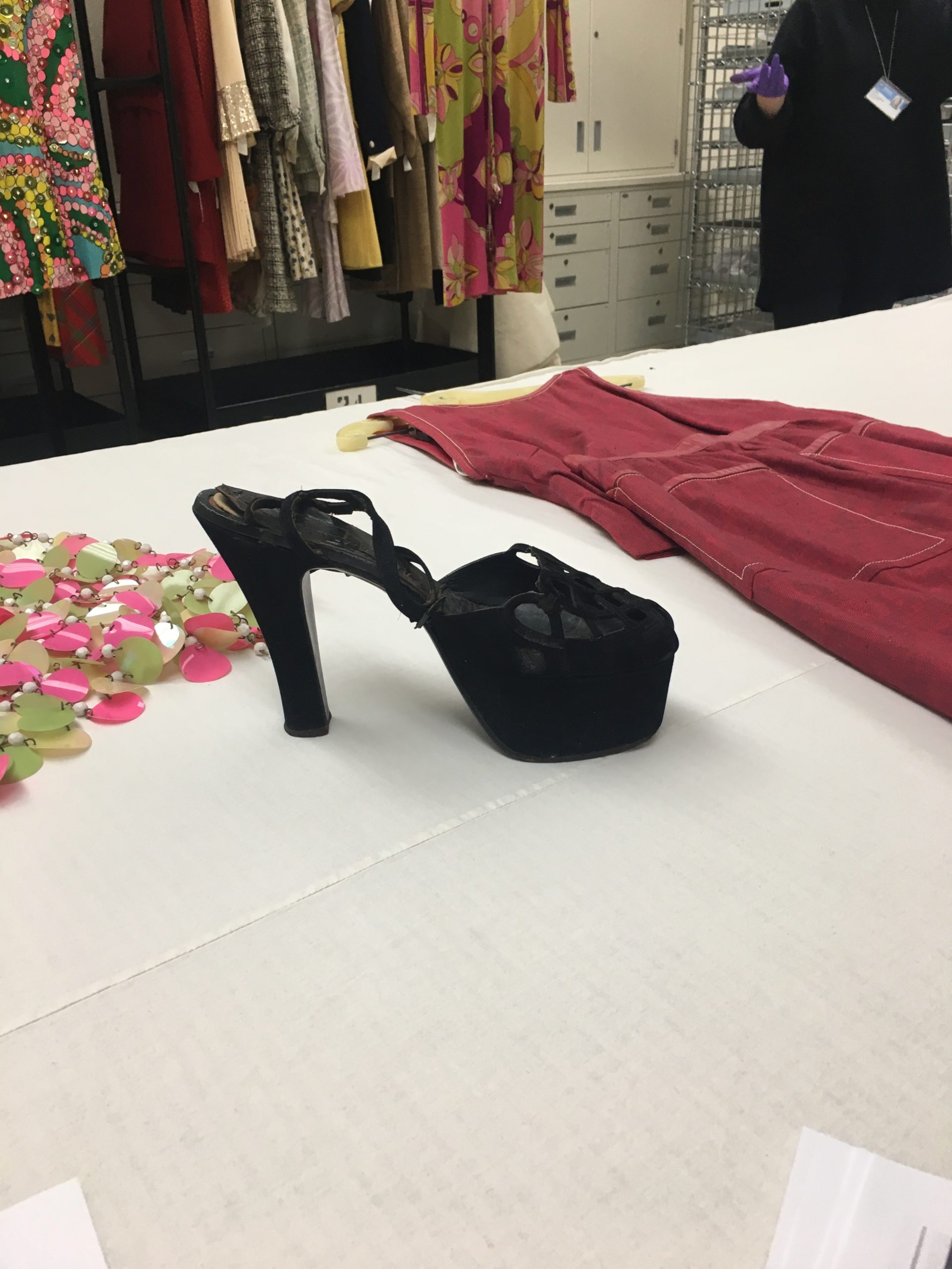
On our recent study trip to New York, one of our first visits was to the Fashion Institute of Technology. Associate Curator at the Museum at FIT and former MA Documenting Fashion student, Emma McClendon showed us some highlights from the storeroom. We saw a range of items including everything from a decadent velvet evening coat from 1923 to a three-piece Chanel suit from 1965. One item that particularly caught my eye was a pair of black suede platform sandals. Emma asked us what year we thought they were from, and our guess was sometime in the 1970s, but it turned out the shoes were actually from 1949. High-heeled platform shoes are often associated with the 70s because of the rise of second-hand dressing.

The platform shoe rose to prominence in modern western fashion in the 1930s. The wedge heel had been a popular style in the 30’s, but in the second half of the decade the separation of the toe and heel sections created the trend of the platform shoe, which lasted well into the 1940s. Salvatore Ferragamo is credited with popularizing the style in the late 1930’s with shoes like his famous rainbow platforms. These early examples show the elevation of heel over the toes, which would become increasingly pronounced throughout the 1940s. In the example we were shown at FIT both the platform and the heel have been raised a considerable amount, and the difference between the platform and heel heights is more pronounced. By viewing both films and photographs from the 1940s the prevalence of the high-heeled platform shoe is obvious, but it has perhaps gained an even more immediate association with the 1970s.

In the 1970s there was an increased interest in second-hand dressing. Where in earlier decades buying clothes from a thrift shop was seen as something shameful, in the 1970s it became trendy. The ‘youthquake’ of the 1960s unleashed the trendsetting power of young people, especially teenagers. In the 1960s and 70s shopping for second hand clothes became popular within youth culture. Young girls began to buy the platform sandals that were popular in the 1940s, and restyle them to their own tastes. The popularization of vintage clothing led to our misidentification of the platform shoes as something created in the 1970s. The trend of shopping for vintage clothing has continued and even grown throughout the latter half of the 20th century and into the 21st century. Old styles regain popularity and maintain a place in the public imagination through this practice. The platform shoe is once again a stylish and desired item today, because there has been a resurgence of popularity for 70s styles. The cyclical popularity of the platform lends credence to the saying that everything old becomes new again.


By Olivia Chuba

Theda Bara: Hollywood’s Original Vamp and Femme-Fatale

We often associate film stars with their onscreen personas, which are inextricably linked to the costumes they wear while portraying their most iconic characters. Audrey Hepburn will forever be linked to Hubert de Givenchy’s black evening gown in Breakfast at Tiffany’s, just as Judy Garland’s blue gingham pinafore in The Wizard of Oz became a part of her lasting image. Identification between star and character can lead to typecasting and an audience expectation that a star will appear as a certain type of character. For example, Joan Crawford was the rags-to-riches girl. Crawford’s characters were often working-class girls who, through luck and hard work, were able to climb to the social ladder to their happy ending. One of Hollywood’s earliest manipulations of star into character, was Theda Bara.


Theda Bara, often cited as Hollywood’s first sex symbol, was one of the silent-film era’s most famous stars, second only to Charlie Chaplin and Mary Pickford. Her career last from only 1914-1919, perhaps the reason why her name is not as well-remembered today as some of her contemporaries. After her first film A Fool There was (1914) her image as the vampire, in this case a woman who destroys men using her sexuality, was cemented. Fox Studios was so committed to this image that they fabricated a backstory for Theda, in which she was an Arabian princess raised in Egypt, trained in Paris, saved by director Frank Powell from the horrors of war in Europe, and brought to America. This outrageous story concocted to support her onscreen image linked Bara to her characters in the eyes of the audience.

Bara’s most famous film, Cleopatra (1917), created a Queen of Nile that mixed popular styles of the day, Egyptian motifs, and burlesque costumes to display a Cleopatra who would be both irresistible to the public, and maintain Bara’s public persona. Her costumes reflected her mysterious image. Her costumes were extremely revealing, and accentuated her voluptuous curves. Theda Bara biographer notes that “The Cleopatra costume created quite a stir because it cost $1,000 a yard and Theda seemed to be wearing only ten cents’ worth…the Plain Dealer declared that ‘Of all the Vampires of Screen There’s None So Bare as Theda’”. While Bara strove for historical accuracy in her portrayal of Cleopatra, the revealing costumes did more to enhance her existing image than transport the viewer back to ancient Egypt. Fox carefully controlled this sexy, mysterious persona, even going so far as to contractually insure that she did not appear in public without a veil. While studios would regularly control a star’s story and persona in the Golden Age of the Hollywood Studio System, Bara presents one of the earliest examples of this deception. Through her costumes and characters Bara projected the image of the Vamp and the femme-fatale, and helped to define their look in Hollywood.

By Olivia

Sources:

Landis, Deborah Nadoolman, Dressed: A Century of Hollywood Costume Design, (New York: Collins, 2007)

Landis, Deborah Nadoolman, Hollywood Costume, (London: Victoria and Albert, 2012)


1965’s Doctor Zhivago’s Impact on Fashion


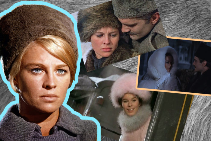
In December 1965 David Lean’s epic adaptation of Boris Pasternak’s novel Doctor Zhivago was released. Doctor Zhivago is the story of Yuri Zhivago, a physician in Russia, and the personal and political upheaval he experiences during the Russian Revolution. Phyllis Dalton’s lush costumes not only won her an academy award, but also spurred a host of new fashion trends. The looks of Julie Christie, who played Zhivago’s mistress Lara, and Geraldine Chaplin, who played Zhivago’s wife Tonya, in particular inspired fashion trends of the time.

Violette Leduc’s article detailing her visit to the set of Doctor Zhivago was released in the September 1965 issue of Vogue. The article was complete with a full spread of photographs of the set and stars of the film. Geraldine Chaplin’s photograph, in full Tonya Zhivago costume, is particularly striking. Chaplin stands on a street set up to look like revolution-era Moscow. She is decked out with a huge, round fur hat, fur stole, and an enormous fur muff. Her face his hidden between the hat and stole, and thus only her eyes and nose peer seductively out at the viewer. She is standing between two imposing portraits of Lenin, Marx and Trotsky, thus setting the scene for the contrast between the lush costumes and world of the early film, and the revolution and hardship that comes later on. This article came out two months before the film was released, likely as part of the intense media blitz on the part of MGM to promote it, and thus generated early excitement and awe at the costumes.

Following the release of the film the ‘Zhivago look’ took full effect. Marc Bohan for Christian Dior drew inspiration for his autumn 1966 line from the film. He used soldier’s caps, long military greatcoats, boots, and fur trim, which all recalled Dalton’s looks for the women of Doctor Zhivago. The fur trimmed ‘Zhivago collar’ and fur hats, in particular became popular following the release of the film, and remain so today. If you search ‘Zhivago style’ on google there are entire sections of Etsy dedicated to the fur-trimmed coats and fur hats that were made popular by the film. Advertisements found as late as 1987 make allusions to Doctor Zhivago when trying to sell fur. The look of fur, silk braiding, military coats, and boots of Phyllis Dalton’s costumes remain a key reference point for top designers. It was not just the women of Doctor Zhivago that inspired trends, but the men as well. Omar Sharif, as Yuri Zhivago, sported a large, well-groomed moustache that spurred a renewed interest in facial hair. The impact of Doctor Zhivago’s costumes has extended beyond the year, or even decade, of its release and into the cultural lexicon.

By Olivia Chuba

Miwa Yanagi: Elevator Girl


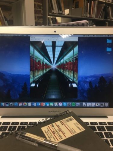
Miwa Yanagi’s 1990s photography series, Elevator Girl, presents a fascinating look at how fashion and photography can come together for a cultural critique. Yanagi studied textile design at the Kyoto City University of Arts, and incorporated this knowledge with a newfound interest in photography and performance art into one project. Beginning in the early 20th century, Japanese department stores hired beautiful, young women to operate the elevators in their buildings. She was made to dress up in the same outfit every day, and sit in a box repeating the same motions over and over again. The elevator girl was clearly a sexual object that represented the traditional patriarchal oppression of women in society, yet she was also a modern woman of the world that had a paying job and dressed in a contemporary, sophisticated manner. Yanagi’s photographs explore the traditional pressure and oppression that women still face in modern society. Take Elevator Girl House 1F, which shows rows of uniformed elevator girls displayed in a glass case.

They are dressed in identical red uniforms consisting of a skirt and double-breasted jacket, complete with a matching red hat and white pumps. They are each posed in a stiff, mannequin-like fashion within the glass display cases. The photograph invites the viewer onto the moving walkway to observe the models as if they are commodities to be bought and sold. Uniforms are powerful tools, in that they invite an immediate response of recognition. When you see someone in an army uniform, you automatically assume they must be a soldier of some kind. The red uniforms in Yanagi’s photograph give the viewer that sense of recognition to the elevator girls, but puts them in a different context. There is a simultaneous familiarity and alienation – the girls are recognizable in their uniforms and remain in a display context; however, they are now overtly the commodities in an endless row. There is also a sense of alienation in their similarity. The reflections of the lights above on the glass cases obscures their facial features. This coupled with their identical outfits makes them almost indistinguishable from one another.

Miwa Yanagi’s work in the Elevator Girl series investigates Japanese popular culture and consumer culture by appropriating their themes and satirizing them. Her series takes the patriarchal image of the elevator girl and uses it to shed light on the pressure and inequality Japanese women face. The photographs themselves resemble glossy fashion advertisements, thus criticizing both the way in which women are thought of as commodities and the consumer culture that gripped Japan as well. The ritualized performance of the elevator girl, the repetitive motions she makes everyday, the identical outfit she wore to other women, and the pressure put on her to appear alluring and youthful, is representative of the standardized roles women of any profession or status are expected to play. Her photographs increase the viewer’s feeling that there is something problematic about the elevator girls through a heightened sense of unreality that she achieves by placing the girls in eerily familiar, yet surreal settings. While her photographs in the Elevator Girl series are glossy, beautiful, and eye catching, they leave the viewer feeling unsettled, which is precisely their job.

By Olivia Chuba