We have long had an ambition to make this Digital Media blog more accessible by adding audio versions. Since lockdown began in March, most of our day-to-day library-based digitisation activities have been re-jigged so that we can do them remotely. A silver lining to the change of pace is that the team have had to design alternative activities that volunteers can do at home. These activities are all aligned with the aims of the project, and also fit around people’s changed schedules alongside the stress and difficulty of lockdown.
One such opportunity has been to record audio versions of blog posts. We have been wary that not everyone can participate in volunteering from home because of a lack of the right equipment. However, audio recording is something that a lot of people can do using something they carry around in their pockets every day. Most phones now have free voice recording apps, which, combined with some tweaks to the home recording environment, produce a pretty good sound.


Posts on social media from journalists and podcasters show that almost anyone can create a makeshift recording studio: crouching under duvets, throwing blankets over children’s bunk-beds, or making a pillow fort all suddenly become very serious, professional activities!
Our volunteers really rose to the challenge! Pictured below are John and Tanya: John rearranged furniture to create his home studio, while Tanya went for the old fashioned duvet-over-the-head approach. Other volunteers used a cheaply-available yet extremely effective clip-on mic, or nestled in a walk-in wardrobe – anything to reduce the ‘sound of silence’ (all rooms have a drone or buzz!), external noises, and echo.


We also held an audio skills video chat, and volunteers shared their recording tips (smile as you read) and pitfalls (prop the duvet up on a clothes horse for much-needed ventilation) with each other. A huge thank you to Norman, Tanya’s partner, who is a vocal and performance coach, who shared some brilliant advice on breathing and speaking clearly https://sway.office.com/EsjdpNM0H7uPbtgC?ref=Link.
With the outtakes now on the cutting room floor (I admit I have had an empathetic giggle at some of the frustrated noises, self-coaching, and occasional cursing that comes with making a recording) the first wave of 25 recordings are now available to listen to!
A huge, enormous thank you to everyone who wrote the blogs to begin with. And a massive cheer and many thanks to everyone who read them so beautifully: Amanda Roberts, Anna Thompson, Anne Hutchings, Ben Britton, Bill Bryant, Celia Cockburn, Christopher Williams, Elena Vardon, Ellie Coombes, Francesca Humi, Francesca Nardone, Gill Stoker, John Ramsey, Megan Stevenson, Peyton Cherry, Sam Cheney, Tanya Goodman-Bailey, Tianyu Zhang, and Verity Babbs.
Behind-the-scenes of the Digitisation project
- 9763 Red Boxes, written by Surya Bowyer, illustrated by Simba Baylon, and read by Christopher Williams
- On Digitising at the Courtauld, written by Mary Caple, read by Tanya Goodman-Bailey
- Who made the Conway Library?, written by Faye Fornasier, read by Gill Stoker
- Camera Obscured, written by Mary Caple, read by Anna Thompson
- Beautiful Damaged Negatives, written by Faye Fornasier, read by Elena Vardon
- Unexpected Music in the Conway Library, written by Ferhat Ulusu, read by Christopher Williams
- Interpreting the Conway Library with BeyondAutism, written by Sarah Way, read by Gill Stoker
- Agnes Conway, written by John Ramsey, read by Amanda Roberts
- On Visiting the Tate Archives and Digitisation Project, written by Lorraine Stoker, read by Gill Stoker
- Can Tony Kersting take you to your home town? written by Faye Fornasier, read by Tanya Goodman-Bailey
- Prints And Paper: Evie Mc On Visiting The Courtauld Prints Room And Conservation Studio, written by Evie Mc, read by Gill Stoker
- Visiting the British Library’s Imaging Studios, written by Carol Budd, read by Bill Bryant
Modernist and post-war architecture
- Modernity in the Conway, written by Lorraine Stoker, read by Anna Thompson
- Finsbury, Lubetkin’s Socialist Utopia, written by Aya Bolt, read by Christopher Williams
- Contested Spaces: capturing modernist architecture in postcolonial India, written by Corinna Summers, read by Christopher Williams
- “I suppose it’s not the place’s fault”, Stevenage and creative collages, words and art by Sophie Baliey, read by Elena Vardon
- “The New Towns are no longer new”, Basildon in the Conway Archive, written and read by Ben Britton
- The Creative City, words and collage by Keelin Willis, read by David Brown
- Visions of London, written by Hannah Wilson, read by Anne Hutchings
- Utopia Or Incubator? Le Corbusier’s L’Unité D’Habitation As Photographed By Lucien Hervé, written by Mia Gainsford, read by Francesca Humi
- London’s Hanging Gardens of Babylon: the Alexandra and Ainsworth Estate, written by Florence Heyworth, read by Ellie
Anthony Kersting
- The Man Who Wasn’t There, written by Alia Ahmad, read by Francesca Humi
- Looking through different laws of landscape, written by Alia Ahmad, read by Verity Babbs
- Meeting the photographer’s gaze: Kersting in Nepal, written and read by Sam Cheney
- Kersting’s Modern Quirks: a visual (and audio described!) essay, written and read by Verity Babbs
- Journey through materiality: Communicating familiarity and distance in Kersting’s portraits, written and read by Peyton Cherry
- Kersting and the Picturesque, written by Irma Delmonte, read by John Ramsey
- Anthony Kersting, Canary Wharf, And The Removal Of The Fat Cat, written by Jessie Palmer, read by David Brown
- Castle Howard and Brideshead Revisited, written and read by John Ramsey
- The Keats-Shelley House in Rome, written by Lorraine Stoker, read by Bill Bryant
- Nassau, Bahamas, and the Chelsea Pottery, written by Lorraine Stoker, read by Anne Hutchings
- Stepping back in mind: South East Asia, written by Muny Morgan, read by Tianyu Zhang
- Beatniks and barefoot girls in Trafalgar Square, written by Lorraine Stoker, read by Celia Cockburn
See the world through the eyes of Conway photographs
- Vignetting in Archive Photographs, written by Mark Long, read by Bill Bryant
- A love affair with Canada, written by Sabrina Gardiner, read by Tanya Goodman-Bailey
- The Church of St James the Great, South Leigh, written and read by John Ramsey
- The Steiner guide to Steiner, a mini Waldorf textbook, created by Tallulah Griffith, read by Gill Stoker
- The Wellington Arch, written and read by John Ramsey
- Catching the photographer, written by Isabella Lill, read by Anna Thompson
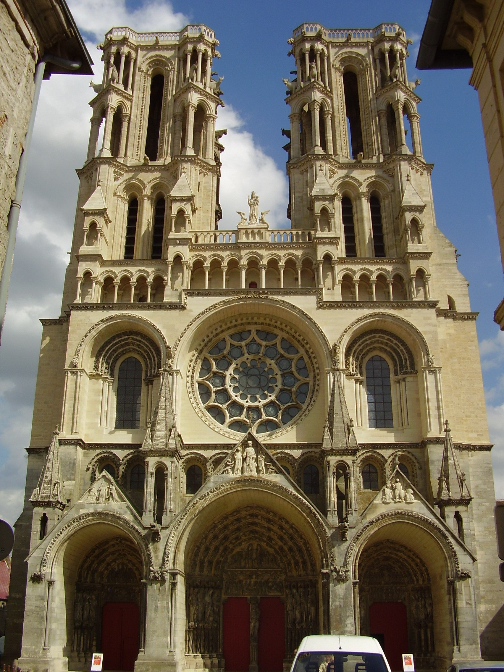
- The Oxen of Laon Cathedral, written and read by John Ramsey
- The Serene Beauty Of Robert Byron’s Isfahan, written by Sophie Buckman, read by Christopher Williams
- Worker/ Housewife: Designing the Frankfurt Kitchen, written by Victoria Bennett, read by Celia Cockburn
Art, design, sculpture and contemporary installations
- Reflections on ‘Imagination Dead Imagine’, written and read by Megan Stevenson
- Winning and Losing: photographs of works of art, written by Lara Drew, read by Francesca Nardone
- A Sculpture in Canterbury Cathedral, written and read by John Ramsey
- Wings and Wheels, written by Evie Mc, read by Ellie Coombes
- Soutine’s Portraits Exhibition At The Courtauld Gallery, written by Stewart Cliff, read by Elena Vardon
You can also listen to the audio versions of the blog on a range of podcast services, see our Anchor.fm profile for the full list: https://anchor.fm/courtauld-digitisation.
Or you listen right here on the Spotify player embedded just below! Happy listening!
Fran Allfrey
Courtauld Connects Volunteer Officer