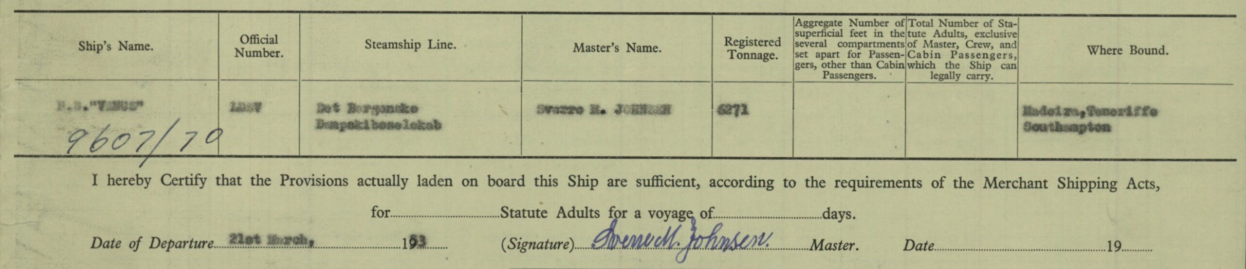
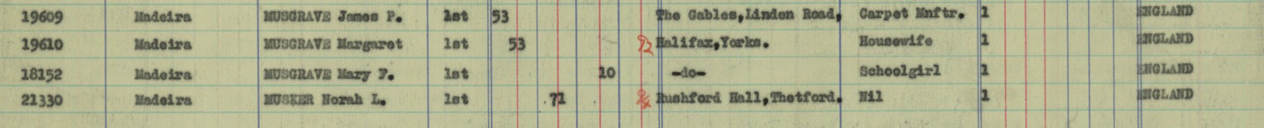
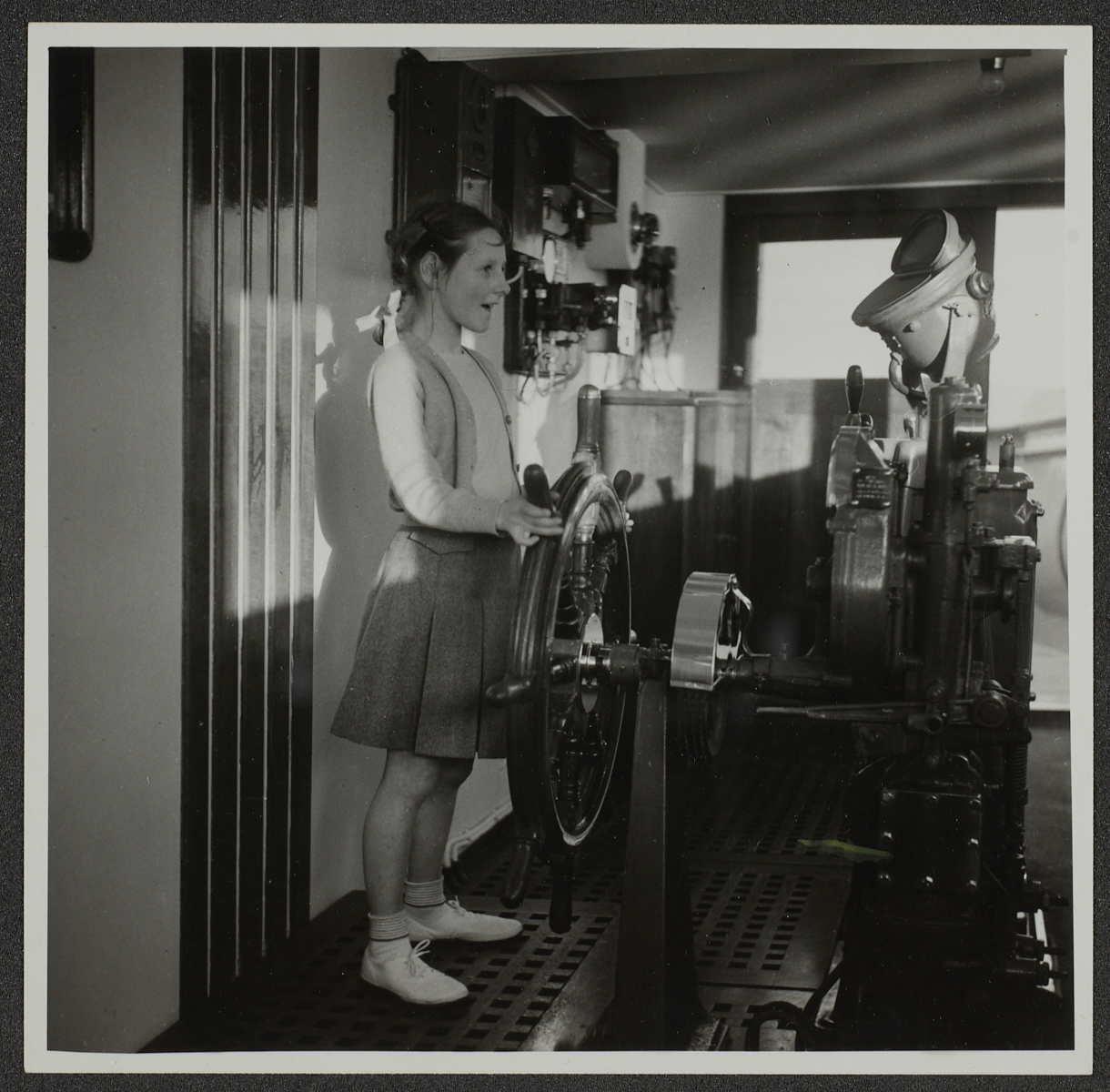
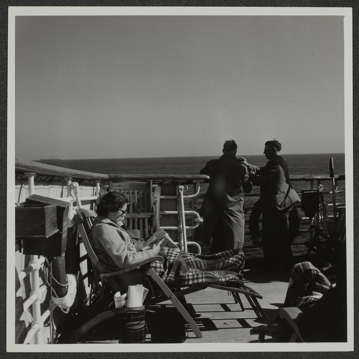
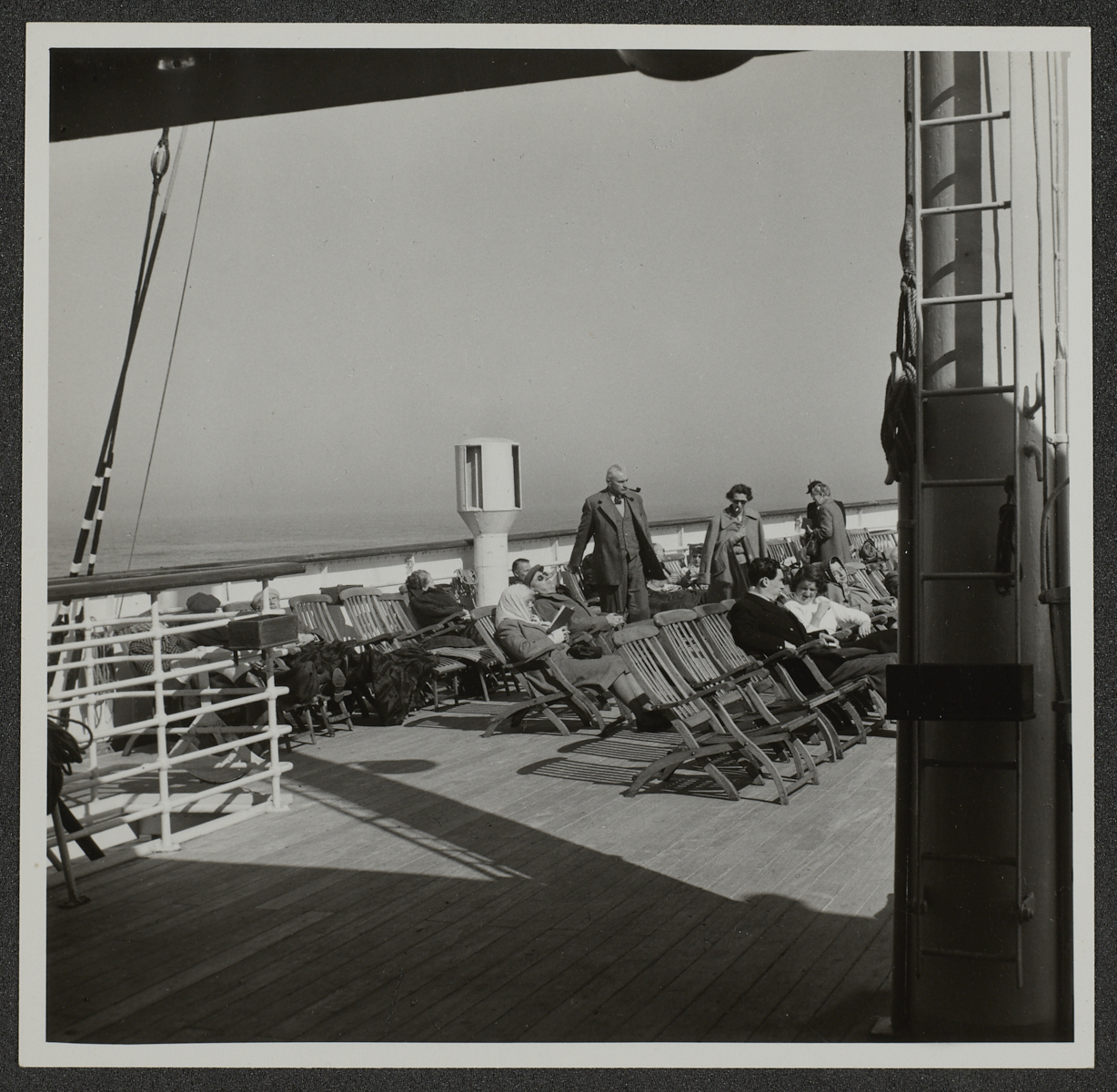
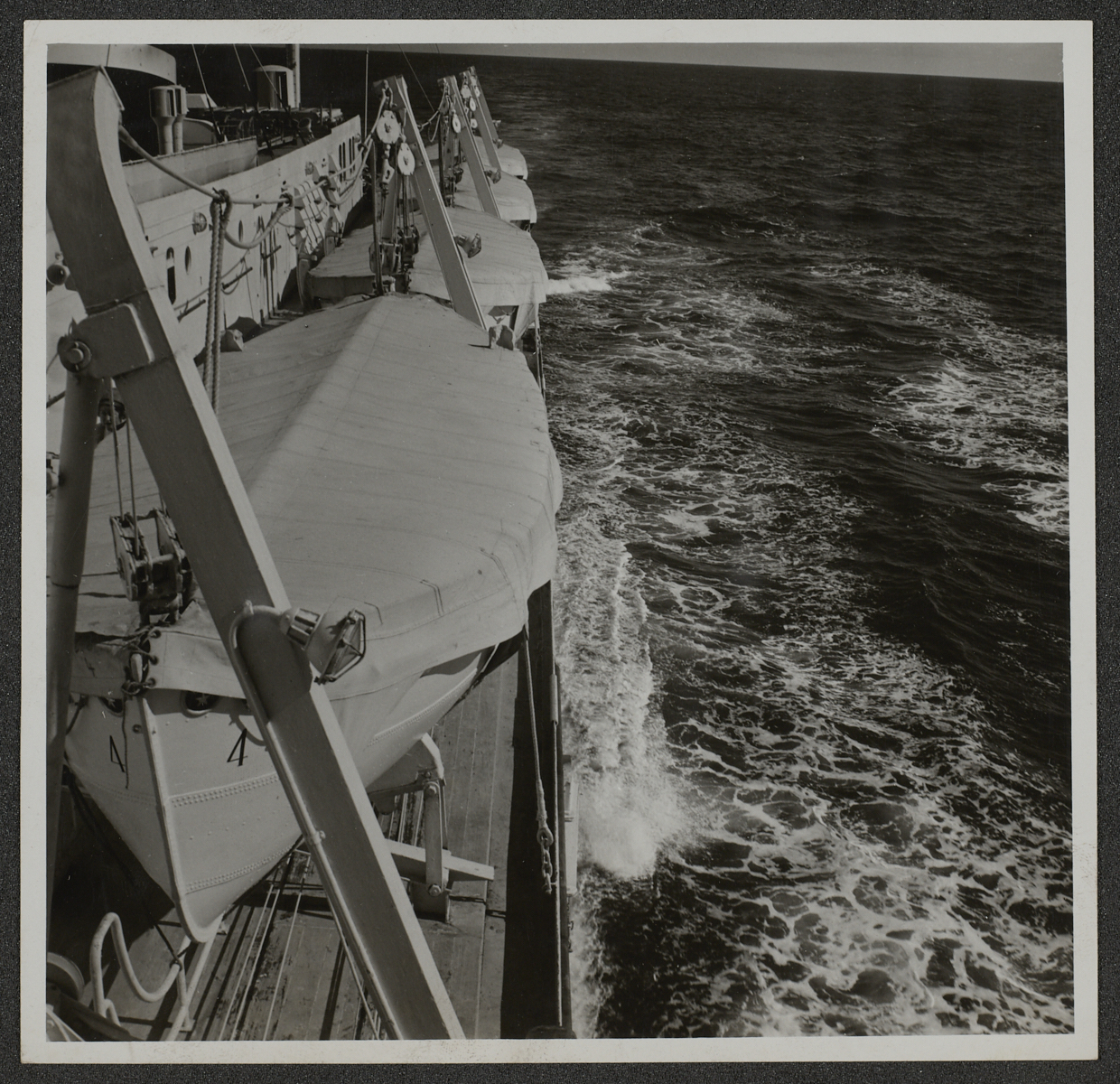
Having started work on the Kersting Photographic Archive as a Digitisation Volunteer in August this year, I decided to try to find out more about his life. As part of this I used an online genealogy service and amongst various records that I discovered was a passenger list for a ship called “Venus” showing an entry for Anthony F Kersting, Photographer, aged 36, of 37 Frewin Road SW18. This sailed from Southampton to Madeira in March 1953 and when I checked in his ledger there were entries for photographs he had taken there at this time.
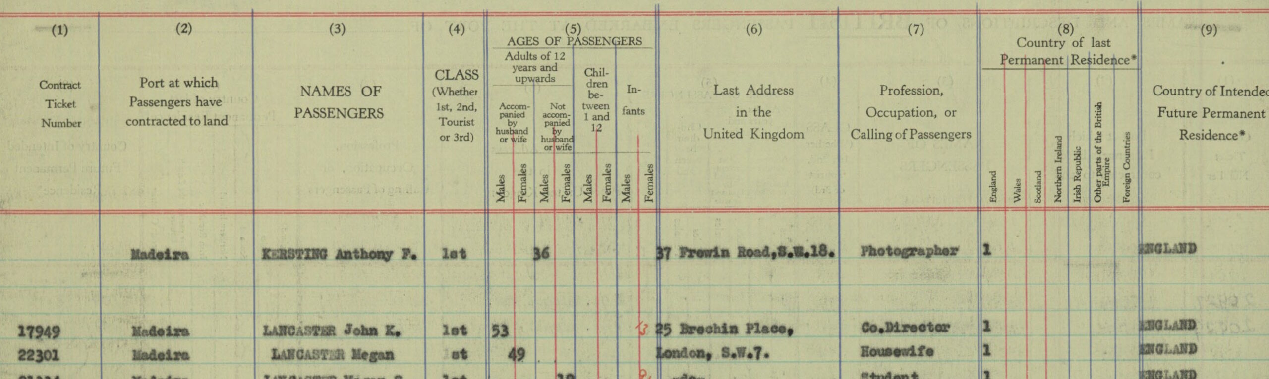
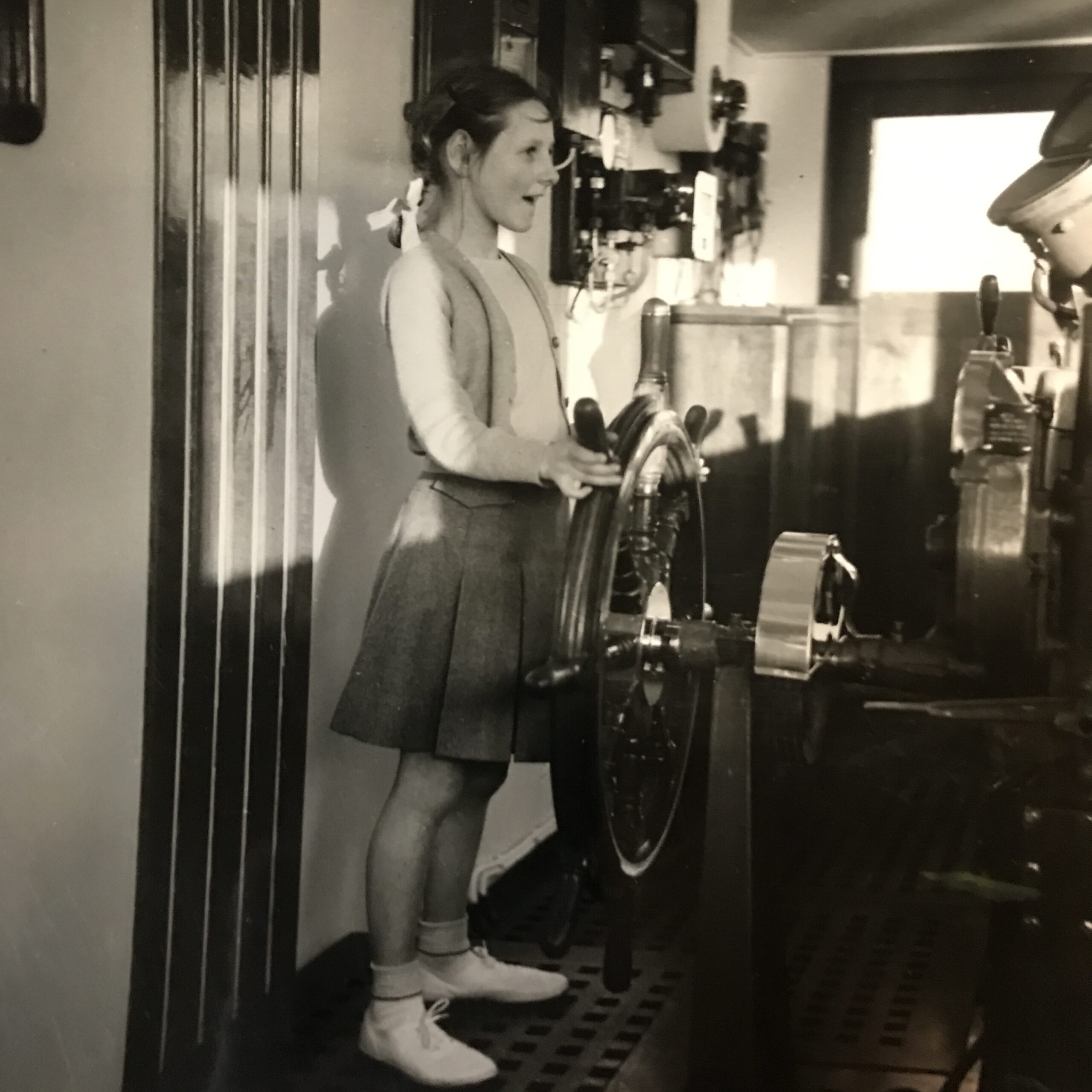
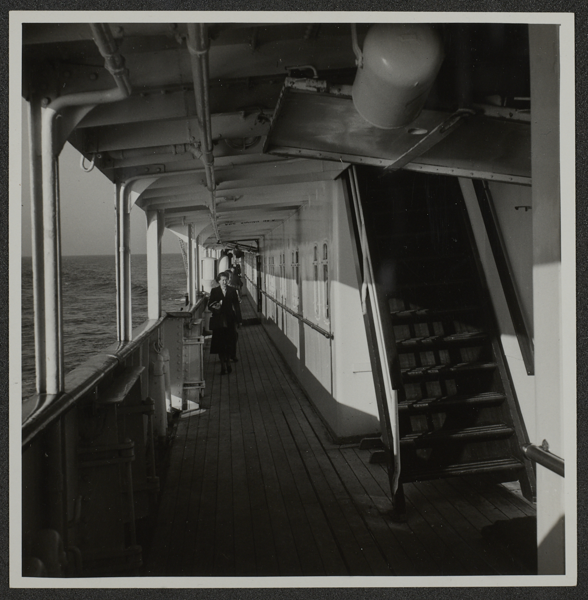
Looking through the relevant boxes I was surprised to find in one that there were photographs he had taken of the ship itself and some of its passengers. One particular photograph intrigued me. It was of a young girl who looked to be about ten years old, standing at the ship’s wheel, with an excited expression, pretending to steer. This prompted me to go back to the passenger list to see if I could identify her.
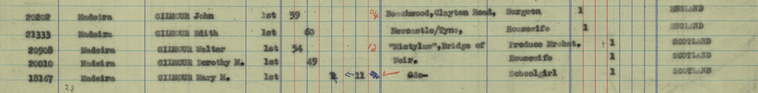
It helped that the passengers were put into age categories, one of which was ‘Children between 1 and 12’, and under the column for females there were two possible candidates, both called Mary. They each appeared to be travelling with their parents:
Mary M Gilmour (Schoolgirl, aged 11) with Walter Gilmour (Produce Merchant, aged 54) and Dorothy M Gilmour (Housewife, aged 49)
Mary F Musgrave (Schoolgirl, aged 10) with James P Musgrave (Carpet Manufacturer, aged 53) and Margaret Musgrave (Housewife, aged 53)
The Gilmour’s address was shown as being in Bridge of Weir, which is in Renfrewshire, Scotland and the Musgrave’s in Halifax, Yorkshire.
Armed with this information I started to search further to try to find which Mary it was in the photograph and whether she might still be alive. If so, my idea was to make contact and arrange to invite her to come and see her photograph at The Courtauld.
Unfortunately, I have so far been unable to follow the trail much further with enough certainty, but am continuing the search…
Today I uploaded the last batch of images that make up the Architecture section of the Conway Library to our World Architecture Unlocked project on Zooniverse. This is an incredible milestone for our digitisation project and not one we set ourselves from the start.
As I mentioned in our earlier post on launching World Architecture Unlocked, being able to capture item-level metadata for the Conway Library came as a surprise: we knew we would only have time and resources to capture box and folder level metadata on the premises, and although Zooniverse had been on our radar for a long time, crowdsourcing was something we thought we wouldn’t be able to look into until after we’d delivered the digitised collection online and closed the project.
An item from the 20th Century section of the Conway Library as seen on World Architecture Unlocked, Zooniverse.
Yet, the national lockdown meant that we could focus on remote activities and although I had no studio to take new photographs, I had a lot of time and access to thousands of images volunteers had already taken.
Since the launch of World Architecture Unlocked, the response of the public has been quite unimaginable. To this day, almost 8,000 volunteers have participated in the transcription, completing the task 343,239 times. The forum where the project is discussed is lively and participants post their questions, flag items that need to be rotated or appear to be in the wrong box, and chat about their favourite images. Some of our in-person volunteers have become forum moderators and advise new participants on how to best complete the task or refer them to a member of staff.
This project might have unlocked the world of architecture for people in lockdown, allowing them to volunteer and see the world through our images, but it has certainly done the same for us at the Courtauld, by opening our horizons to the enormous potential of crowdsourcing and the wonderful feeling of having put together a global community.
And so it is with amazement and thrill that today I upload the images for the last box in the Architecture section, simply labelled “CON_B04435: Great Britain (Architecture, 21st Century)”, and finish releasing the first section of the Conway Library to the World Architecture Unlocked users.
An item from the 21st Century section of the Conway Library as seen on World Architecture Unlocked, Zooniverse.
This last release is a large one, and it will take the volunteers some time to complete. In the meantime, back of house, we are testing new workflows for some of the next sections, so keep your eyes peeled for new updates.
An image from the Sculpture section of the Conway Library.
Did you know?
The first section of the Conway Library is dedicated to Architecture and is made of 4435 boxes
The first box in the collection is CON_B00001 and is labelled “Afghanistan: A-Z (Architecture, pre-1800)”
The two sections immediately after Architecture are Architectural Drawings and Architectural Publications
Sculpture is the second largest section of the Conway Library, it is made of 2654 boxes
The third-largest section is Manuscripts, with 1477 boxes
The remaining sections are: Photographic and Video Art, Applied Arts, Mosaics, Panel Paintings and Painted Screens, Wall Paintings, and Stained Glass.
It takes three different transcriptions on Zooniverse for an item to be retired, this allows us to capture data more reliably, but it also means that we triplicate the effort!
The 27th October 2020 marks the launch of The Courtauld’s first global crowdsourcing project: World Architecture Unlocked, a transcription task on Zooniverse.
From Somerset House to the Zooniverse
Since we started our work to bring over 1.5 million items from The Courtauld’s photographic libraries online we knew that to reach such an ambitious goal we would need the help and abilities of as many people as possible. We reached out to volunteers and the response has been overwhelmingly positive. Our digitisation volunteers are passionate and dedicated – and these two characteristics can really make the difference between what is and isn’t possible.
However, we also knew from the start that it would be impossible for our digitisation volunteers to transcribe the metadata for every single item in the Conway Library, so we decided to capture the metadata for boxes and folders, and that the single items would inherit metadata from their parent folder, until item-level metadata would become available.
Meanwhile, the staff team decided it was time to learn python and put together a project on Zooniverse so that we could jump ahead and start collecting item-level metadata.
The landing page for World Architecture Unlocked on Zooniverse, which shows one of our photographs of the Caryatid porch of the Erechtheion in Athens, Greece.
Enter World Architecture Unlocked
Zooniverse makes it possible for image-based research projects to upload their images to their platform and set up simple workflows. Our workflow means that the transcription task is broken down into steps: you are guided to look for different pieces of information written on stamped on each item.
For the tester phase, we uploaded thousands of images digitised so far (including plenty of images of Cathedrals in Britain!), so that anyone who felt like it can write down what they see on the screen, with some guidance from us. We are now launching thousands more images of buildings, art, and design from across the world!
One of the main objectives of our team and volunteers’ efforts is to free the Conway Library from the limitations of its current physical form and deliver it to the world as a new, digital entity. This will undoubtedly be a fantastic resource for researchers, but it will also greatly appeal to the general public.
As digital objects, the images will be able to finally travel back to the places they were born, and be seen by the people currently living there. In itself, this is already a beautiful way to complete a full cycle.
The more detailed our metadata, the easier it will be for visitors to find the right images to match their interests. Faye, Digitisation Manager
Our on-site volunteers are busy taking photographs of the rest of the collection as quickly as possible, and we will continue to add new sections of the library to Zooniverse for transcription.
How easy is it to contribute?
Anyone can contribute immediately, without any background knowledge
The main consideration in launching the Zooniverse project was to provide an accessible introduction to the collection and the work involved in the transcription. It felt important that World Architecture Unlocked should share the same vision as the wider digitisation project: to be approachable, informative and fun.
An example of a Conway image next to the first transcription field. The photos show details of Wells Cathedral, England.
Through training our volunteers on the various processes involved in the digitisation project, we learnt what the most common questions about the collection are, and this informed how the online tasks should be introduced and structured.
When the Courtauld decided to start a Zooniverse project for its photo collection, I jumped at the chance because it was a great way to keep contributing to the digitisation project during lockdown. The interface was pretty straight forward to use, and because it only takes a short time to transcribe the information surrounding each photo, it was easy to feel I was doing something useful even when I could only spare a few minutes at a time. Figuring out some of the handwriting or faded numbers can be a bit of a challenge, but that’s half the fun. Some of the photographs are amazing. Jane, Digitisation Volunteer and Zooniverse tester and moderator
What does World Architecture Unlocked aim to do?
By opening up the digitised images of the Conway Library collections to an online audience, we are able to capture item-level description. This will have a huge effect in terms of the information and searchability of the collection.
The information we are gathering through World Architecture Unlocked (such as city, architect name, date of construction, and image description) will be added to the collection’s database, and will become extra information from which you can search the collection once our website launches.
Interested in browsing 1930’s European architecture? No problem! Want to see a list of all the buildings by Le Corbusier? Of course! Working on decolonising architecture? What a perfect starting point! – item-level description will make this kind of research easier and will provide a more intuitive search experience.
One of the things I really love about the digitisation project is
how it teaches industry-standard knowledge (about digitisation, archiving and object handling processes) in an accessible and open way to all, and I feel that the spirit of Zooniverse is very much aligned with this. Victoria, Digitisation Assistant
How does your transcription help?
Countries and Cities By transcribing the country and city name, you are helping us to build an interactive world map of the collection. Each country/city transcribed will become a geolocation on a world map, offering users a visual way to see the breadth of the collection, and browse it by country and area.
Name of Architect By capturing the architect’s name, users of our future website will be able to discover the work of a specific architect who might have worked in different countries, and begin to explore who did and didn’t make it in the collection, and why.
Date By recording the date of construction, you are helping to provide a chronological search of world architecture through its development and movements. This offers a more in-depth way for researchers to search specific time periods.
Item number CON_B03614_F006_011, a photograph taken on the ‘Pilgrim’s Way’, Castrojeriz, Spain.
Description The option to transcribe an image’s description opens up the collection to a much more intuitive way of searching. For example, it will be possible to see at a glance that the collection contains exterior, interior and detail shots of a specific building, and users interested in fonts, mosaics or statues depicting mother and child in architecture will be able to search and see those images only.
Accuracy
By providing examples and tutorials on World Architecture Unlockedwe encourage contributors to be as accurate as they can. To make sure the data generated is as useful as possible, we are presenting every image three times to Zooniverse transcribers before marking it as completed. We will then compare the three entries to obtain the most accurate description for each item.
We also have a Talk page within the project where you can ask questions about what you find, or query any images that have information presented in an unusual way. Some of our existing digitisation volunteers are also moderators and will be happy to answer your questions.
The collection contains extraordinary old photographs of architecture and artefacts from around the world. I have handled many boxes and files working through the various steps of the digitisation process and I understand how important is to capture all the information contained on the card and to transcribe it in order to build the metadata. I volunteered to moderate on this pilot project to help others with their transcription and answering their questions.
I have also transcribed over 800 records and each time I have learnt something new or noticed a beautifully photographed detail which escaped me during a visit to a Cathedral, for example. Dora, Digitisation Volunteer and Zooniverse tester and moderator.
When can you start?
Immediately! You can start transcribing your first item by going to the World Architecture Unlocked page and clicking Contribute, or – even better – you can create a profile first so that you can keep track of your transcription progress and save any images you like.
On Zooniverse, you can drop in for 5 minutes or settle in for a few hours, each and every contribution makes a big difference in sharing our collections and making them more accessible for everyone – enjoy!
Faye Fornasier
Digitisation, Database and Cataloguing Manager Courtauld Connects
You can now find over 80 photographs from the Conway Library on Layers of London. Layers of London is a fantastic resource and website run by the Institute of Historical Research, University of London. In brief, Layers of London allows you to pin photographs into a digital map of London, and add a short description.
Anyone is able to log on and add photographs that they have taken themselves, and many museums, archives, and libraries have been adding their collection items too. Most importantly, anyone is able to just explore the map!
Since lockdown in March 2020, over 28 Courtauld volunteers have been extremely busy sharing photographs from the Conway Library on Layers of London. In a series of blog posts, we’ll be sharing just a few of the records they have made to try and encourage our blog readers to go explore the map and photographs!
Alla says: “I love London! This task helps me to see places with the eyes of different photographers and find out the amazing history of places – for example Bevin Court, or learn about Lost London – as with Dorchester House.”
Records researched by Alla Sakharova
Hospital of St Mary at the Cross Convent, Shoreditch, London. Designed by James Brooks (1870-75) and JD Sedding (1880-81). Photographed in 1946. CON_B04088_F001_013. The Courtauld Institute of Art, CC-BY-NC.
From the London Gardens Trust website: “(The Hospital of St Mary at the Cross Convent was) an Anglican Benedictine Community of Sisters of the Poor founded in Shoreditch in 1866 where it purchased a site in 1873 and built a convent. The convent building was begun by James Brooks but completed by JD Sedding in Franco-Flemish style. The Convent closed in 1931, and the Sisters moved to Edgware.”
It was built adjacent to St Michael’s Church. The church is now used by Lassco, an architectural salvage company, and houses an extraordinary collection of artefacts.
Brooks completed the ambitious group of buildings with the Convent of St Mary at the Cross in 1870-75; this included a small chapel and a cloister. The front entrance block in Leonard Street was added by JD Sedding in 1880-81. The convent buildings were relinquished in 1931 and demolition eventually followed c.1959.
The remains of the building are in a public garden on Mark Street / Mark Square, Shoreditch.”
Dorchester House, Park Lane, ‘Green Drawing Room’, Image CON_B04085_F001_012, The Courtauld Institute of Art, CC-BY-NC.
See more on Wikipedia: “Dorchester House was built in 1853 by Sir Robert Stayner Holford; demolished in 1929. The architect was Lewis Vulliamy who designed many grand houses and monuments.
After Sir Holford’s death, his son rented it to Mr Whitelaw Reid, the American Ambassador at that time. Sir Holford’s grandson inherited the Dorchester House in 1926 and put it up for sale the same year. Dorchester Hotel is now in its place at 53 Park Lane, London.”
London, Bevin Court, CON_B04266_F001_006, The Courtauld Institute of Art, CC-BY-NC.
Text from Ian Visits website: “The name of the building has a curious history. It was named Bevin Court after the recently deceased Labour politician Ernest Bevin, and a bronze bust was installed in the foyer […] However, the building was originally going to be named after a very famous former resident of the area… Vladimir Ilyich Ulyanov – who is marginally better known as Lenin.
By the early 1950s though, even Finsbury Council balked at the idea of naming the building after a leading light in the Soviet cold-war enemy, so it was named Bevin Court. It is claimed that the architect, Lubetkin in a fit of pique buried his planned memorial to Lenin in the foundations under the stairs. So, you can either say Lenin is still at the heart of the building, or you are stomping on his head every time you use the stairs.”
Much loved and perused by staff, students, and the general public in the know, the Conway Library is a collection of 9764 red boxes containing brown manila folders. The photographs glued on the brown manila mounts are black and white original prints showing places of architectural notice, often in painstaking detail. The variety, detail and beauty of the photographs, as well as the value of this research resource are well documented in this blog.
Martin Conway, who had started collecting art in 1887, “spent a great many of the pre-war years occupied with his photographs, developing the system of mounting, annotating and arranging which can still be found today” (Higgon, 2006). His glamorous American wife, Katrina Glidden, and their daughter, Agnes, joined him in his passion and continued to further enrich the collection. Towards the end of his life, Martin Conway busied himself with the foundation of the Courtauld Institute, to which he donated his much-beloved collection (“The Conway Library archive contains some photographs taken at the Himalayan base camp, where a member of the team made a bust of Martin out of snow, adding a pipe and an incongruous wreath of local vegetation!”Higgon, 2006).
What is less well known about the collection is who took the photos after it moved to the Courtauld
One of the tasks available to the volunteers, Attributions, seeks to answer that very question. In capturing the names of the photographers, inked, pencilled or stamped predominantly on the back of the mounts, the volunteers compiled, for the first time in the history of the collection, a definitive list of the hundreds of people who contributed photos to the Conway after Conway.
The list of photographers tells a completely new story about the library. No longer simply the story of the initial collectors, this is now also the story of the hundreds of people – students, staff or independent supporters – who donated the images.
The attribution list could tell us the story of the development of these photographers’ interest in specific research fields and the beginning of their careers, or perhaps the story of a small foray into a life they chose not to pursue. It could reveal the arc of development of personal photographic styles and visions, or maybe just the sheer determination of non-photographers to capture and document all sites objectively and in as much detail as possible.
Already, just by looking at the names, we know that it was a truly collective effort and that women were very much represented.
In capturing these names, we set out to research the photographers who made the Conway, and credit their work
The volunteers carrying out the Attributions task came across famous (and infamous!) contributors such as Anthony F. Kersting, Robert Byron, Tim Benton and Anthony Blunt, but they also came across many names that were scribbled illegibly or reported in too little detail to be tracked reliably.
The easiest photographers to transcribe and research were those who had their names stamped clearly – such as F.H. Crossley – the unmistakeably unique – such as Edzard Eilert Baumann – or those with names reported in full and with aliases – such as Dr Amanda Simpson a.k.a. Amanda Tomlinson.
The most difficult names to research are those whose surnames are more common and those for which we either don’t have first names or we only have initials – such as “M. Wall”, “Mrs Booty”, “Nunn”, “P. Clayton”, Kidson or Lindley.
During the COVID-19 lockdown, we assigned our volunteers the task of researching these names and find out as much biographic information as possible, looking in particular for reliable sources to fill in their research forms. Once the forms were filled in and returned, they went out again to other volunteers for cross-checking and the second part of the task began.
We scheduled Wikipedia editing training sessions and asked the volunteers to try their luck creating new pages for our photographers, and adding information about their involvement with the Conway Library to the biography of photographers with existing pages.
The result, we hope, will give the collection even more visibility, and let us share its fascinating genesis.
Do you know anything more about the Conway photographers?
For the full list of names please continue reading.
One of the main aims of digitising our amazing photographic archive and putting it online for the public to access for free is to allow our materials to connect with new audiences. We want to allow our images to become resources for a myriad of endeavours, from academic to recreational to personal and everything in between!
Part of the benefit of working with such a large group of volunteers is that we are able to hear ideas from many people with diverse experiences every day and test them right from the start of the digitisation process. We have some great examples of that here in this blog – but what about creative members of the community who aren’t able to frame their interpretations into a blog post or to help us digitise our images because of their physical and learning needs? What would they make of our collection?
This summer we were lucky enough to have a chance to answer this question through a partnership with BeyondAutism and their Post-19 service. BeyondAutism is a pioneering service led by the Head, David Anthony. The college offers young adults with complex needs aged 19 to 25 “an individualised personal curriculum.”
BeyondAutism students and teachers creating the artwork
“Our students follow a programme of study that best prepares them for adulthood, focusing on the skills required for independent or supported living, training and employment, health and wellbeing and community participation.”
Courtauld Digitisation staff and interns getting involved in the creative process
After an initial meeting, we decided to start a collaboration. The wealth of creativity amongst their cohort and the bountiful diversity of images in our collection made us confident we could find some way to forge a meaningful workshop. A few weeks later David struck gold: we could use our library of London architectural photography to allow his students to explore ideas for independent or supported living. The students would creatively interpret what being part of the community of London meant to them in a very instinctual, tactile way.
A tactile approach to our image collection
We provided hundreds of images and large canvases while the team at BeyondAutism provided specialist support, tactile materials and lots of PVA glue. Eight brilliantly dedicated students, the college staff, our Digital Media team and interns all got involved in co-producing. We started tentatively with a few images stuck on a very large blank canvas in the morning but by the afternoon we were pouring glue freely over multi-textural work and brightly coloured feathers contrasting the Conway’s black and white images of iconic skyscrapers and monuments.
A student at BeyondAutism working on a solo project with his teacher
The results were a very sensory, sticky and wonderfully original set of collages, all unique in their outcome, all reflective of a much bigger process of coming together, learning from each other and understanding the beauty of diversity. We built our digitisation project around Samuel Courtauld’s vision of “Art for All” and this experience has made us determined to be bolder in exploring what this can mean at every level.
The finished works at the close of day
We will exhibit the collages in The Courtauld’s Conway Library this autumn, so if you are interested in attending the opening and hearing more about this topic do contact us at: digitisation.volunteering@courtauld.ac.uk.
Managing the digitisation project of one of the most varied, mysterious, and extensive photographic collections in the world, in one of its most prestigious art institutes can look a lot like this:
and not much like the constant carousel of wonderful architectural detail that one might imagine. The volunteers, busy sorting through the images and penciling the accession numbers on the mounts, or zooming in to check the focus in the digitisation studio, are the ones who get to really see the collection, really make serendipitous discoveries. I have to make the time to go and explore, and be sure to do it too or else I might get to the end of whole months having only seen filenames, spreadsheets and conversion code on Terminal.
Belluno_Ponte della Vittoria e Duomo_Anthony Kersting Archive
Today I thought I’d go looking for my hometown – Belluno, in the Italian Dolomites – and see it through A.F. Kersting’s eyes. The 4293 Kersting negatives, which we plan to digitise as part of our project, are numbered sequentially and neatly stacked in their cases. To every negative number corresponds a handwritten entry on a ledger, so if you were to pick a number from the shelf you could easily look it up in the ledger and find out where the image was taken. It’s a bit more difficult to start your search from a specific city; on the negative there are only accession numbers and entries on the ledgers are also sequential by number, not by location. Besides, part of the mystery surrounding photographer A.F. Kersting is that he would travel so extensively: opening a page at random of his ledger you can see that one day he was in Jersey, the next in Scotland, the following entry would be in Munich, then Dubrovnik, then Madrid… which makes tracing his steps and locating a particular town very tricky – and transcribing the ledgers (another fascinating task reserved for our volunteers) very necessary!
Belluno_Piazza Duomo_Anthony Kersting Archive
What I do have to go by in my quick morning search is the prints collection, the selected negatives for which we have prints, and which are arranged by country. These prints were created by Kersting and are unnumbered but annotated in pencil at the back. I ventured to the Italy box and looked for my small town almost as a challenge, and there, to my delight, I found the squares and fountains of my childhood, almost untouched by time, with the only exception being the clothes of the passers-by and the cars parked where they shouldn’t be.
Belluno_Piazza delle Erbe_Anthony Kersting Archive
We are not there yet with the digitisation so what you see below are just some quick group snaps, but hopefully they will give you a taste of how wonderful a photographer Kersting was, and how extensively he documented every corner of the world he could reach. When we’ll have completed the digitisation of the whole collection you’ll be able to search by place and by date, as well as by accession number, and the collection will be truly open. For now, enjoy this small selection as a Friday treat.
Faye Fornasier
Digitisation, Database and Cataloguing Manager Courtauld Connects
As part of our digitisation pilot, we organised 6 brainstorming sessions to develop new ideas and harness the creativity of unselected members of the public.
In the Collecting Stories session, we brainstormed the idea that putting the Courtauld Libraries’ images online could spark conversations not only to do with the academic appreciation of fine art and architecture, but also with personal history, community engagement, social development, and storytelling. We wanted to come up with ideas for the website’s structure, including options to collect stories and interpretation.
One of the exercises we set up to get the conversation started saw our participants roaming the Conway Library looking for one image that was personally relevant to them and writing a story to go with it. Images and stories were then passed on for someone else to write a reply and present them to the group.
We wanted to discuss what it’s like to approach an image collection with the intent to tell a personal story, whether reading someone else’s story about an image enriches it, and how it feels to have a stranger describe something personal like the photo of one’s hometown or special place.
The exercise really got our group talking and the resulting suggestions and ideas will shape the way our project will be delivered. As for the images selected and the stories generated, they were beautiful and nostalgic so some of our volunteers typed them up and wrote further responses. Here are a few.
Broadgate, London.
“Broadgate – close to Liverpool Street
Swiss bank – public space – Richard Serra
Demolished – redevelopment – bars, cafes etc.
1980s corporate architecture – 20th century society
Historic England
Memory – affection” Jan Peters
“Hidden behind Liverpool Street station is Broadgate. In amongst the monstrous redevelopment of this area weaves the Broadgate art trail, the most impressive art collection by acclaimed British and international artists. Accessible to all and out in the open-air my memories are of numerous school trips with teenagers interacting with fantastic sculptures, as opposed to the untouchable work in galleries and museums. We never noticed the rather sterile architecture (the students’ opinion) but marveled at the Fulcrum by Richard Serra, laughed at the Leaping Hare on Crescent and Bell by Barry Flanagan and sat drawing the Rush Hour by George Segal. It still holds its fascination today.” Lorraine Stoker
CON_B02478_F008_010 – The Courtauld Institute of Art – CC-BY-NC
CON_B02478_F005_003 – The Courtauld Institute of Art – CC-BY-NC
Isfahan (Persia) Shah Sultan Hussain’s Madrassa
“A painting or a ‘colourised’ photograph of the entrance to the Shah Sultan Hassain Madrassa in Isfahan, Iran. The coolness on the small pond, blue of the characteristics turquoise vaulting. Men in various uniforms stood by the doorway. A mix of clothing and styles – a young boy with cumberbund and blue shirt. Men in heavy overcoats.
Love insights into the clothing of people in the picture.” Pragya Dhitel
“As I worked my way through this box it was fascinating to look at a bygone era of a foreign country not known to me. The image to compliment this image, for me, would be CON_B02478_F005_003, a black and white image described as “looking glass niche”, which I presume would be on the vaulting of the roof.” Arun Mahajan
CON_B04383_F002_024 – The Courtauld Institute of Art – CC-BY-NC
“The Image is the view out of a classroom window in Amsterdam. It is a city where everyone lives, learns or works very close to one another. Everyone can see into everywhere else, seeing people live their lives. It is both comforting & disconcerting.
I imagine being torn by what is happening outside and having to stay focused on what is inside.” Barbara Bouman
“This really helped me think about this image more deeply.
At first look, this seems cold, austere and unstimulating. A place where your mind might wonder. But then the shapes, thrown into contrast by the light, offer another perspective which is anything but dull. The light draws you inward and outward simultaneously. I suppose that’s what classrooms are supposed to do.” Stephen Lines
CON_B03339_F001_012 – The Courtauld Institute of Art – CC-BY-NC
“I think a picture means a lot more if there are people in it. For this reason, I immediately decided to go straight to the Venice boxes. I found this picture inside the Santa Maria Gloriosa dei Frari box. It depicts a lady in a white casual dress and probably dates back to the seventies. The face of the lady is not visible but her hair reminds me of my grandmother from a photo that I have seen at her home. It means a lot to me, even if it’s not her. Imagination is better sometimes.” Giulia Antonioli
“Interesting. Feeling a connection with people, but not people whose faces or expressions we can see. It’s not a picture that appealed to me, initially, but now I sort of get it. The story brings me more into the picture.” Lucy Sharp
CON_B07582_F001_009 – The Courtauld Institute of Art – CC-BY-NC
A pair of paper bags with large and small buckets (paper, galvanised steel and vinyl) by Richard Wentworth. 1982.
“Materials – tactile paper, the ephemeral throw away, everyday object. Manufacturing steel, paper “the sound of crushing paper around a steel hard bucket.” “Opposites.” The fact the bucket has no water in it. Water and paper do not mix. Thinking of conservation. Archives – conservation. Situated on concrete near Haywood Gallery – Modernist building. Wentworth went to Hornsey Art College the year I was born.” Veronica Bailey
“I love that you have added sound to the image.” Barbara Bouman
CON_B04300_F001_021 – The Courtauld Institute of Art – CC-BY-NC
Miss Cranston’s tea rooms Louise Campbell
“Finding this collection of photos brings back lots of good memories and a fuzzy warm nostalgia.
I grew up in Glasgow, I really enjoyed getting to visit the tea rooms if I was good. They were always the first choice of place to lunch; even as a child. I love the Mackintosh decor even though in the 80s and 90s it was dated and not very cool. I even enjoyed lunched there with my mum, and the staff fussing over me and happily making me (something) complicated off the new orders.
Looking back at the photos, they stand up and I now still love the Art Nouveau period and would happily decorate my whole house as Art Nouveau as it brings back such happy memories.”
“Childhood memories triggered by architecture interiors of the Art Nouveau period/Mackintosh. An interest in interior design now. How the past influences future space.” Veronica Bailey
“Looking back at the photographs and reading the others’ description you can imagine the noise and sounds of the Mackintosh tearooms. The hustle and bustle of people’s voices, sounds of children sitting patiently waiting with parents, the smell of cakes and brewed tea.
The architecture is amazing to look at, especially the Art Nouveau period. I particularly like the design of the fireplace and black and white chequered tiled floor.” Saffron Saidi
The Tate Archive holds some of the only remaining correspondence between photographer Paul Laib (1869-1958) and the artists who hired him: a misaddressed cream card dated July 1935 listing his telephone number, address in London’s South Kensington borough, and services offered. All in vibrant red ink: “Carbon Platinotype, ENLARGEMENTS, &c … Pictures carefully Photographed by Panchromatic Process. PHOTOGRAVURE.” (TGA 977/1/1/222)
E.Q. Nicholson, the eventual recipient of the note, was one of many clients Laib worked with over his five-decade career as a Fine Art Photographer in London. The title listed on Paul Laib’s stationery implied a role somewhat different than the common understanding of the term today. Whereas the contemporary use most often refers to an artist whose chosen medium is photography, fine art and people who made it comprise the subject matter of nearly all 22,000 images in the De Laszlo Collection of Paul Laib Negatives at The Courtauld.
3 Thistle Grove in 2017
I remember the initial thrill of coming across Laib’s photographs of studios, particularly Barbara Hepworth and Ben Nicholson’s at No. 7 The Mall in Hampstead. There is something tantalisingly subversive about seeing well-known and well-loved works of art loved and known somewhere other than a gallery, somewhere where the rules of engagement with art might be relaxed. Hepworth and Nicholson hired Laib at various points in the 1930s to photograph their work. These weren’t snapshots, though – the depiction of possibility in these photographs, of the possibility of different kinds of interactions with art, was intended. Lee Beard, Sophie Bowness, and Chris Stephens all note in the exhibition catalogue for 2015’s Barbara Hepworth: Sculpture for a Modern World that photographs like this were a concerted effort to convey a more holistic aesthetic view – if anything, one that the artists had more control over than in a gallery. Textiles, sculptures, and paintings live alongside a spiky selection of cacti, works in progress, tools, and the ephemera of a filled, well-considered space.
With some more reading, trips to archives at Tate and the National Art Library, and discussion with colleagues here, I decided to expand on the idea that placing artworks in different contexts change how we feel about perceive them. Showing how Laib’s photographs depict a range of art-in-context, and how his unique occupation brought together photography, art, and the archival in an unexpected way – became the theme of the show, now up in the Book Library Foyer until September 27.
I had never previously considered the legions of photographers capturing the artwork we see in books, exhibition catalogues, lecture halls, and postcards. This is more than a little ironic considering that I and sixty other volunteers are taking on a similar role in our time at The Courtauld.
Artists in their studios: Camera, Obscured: The Fine Art Photography of Paul Laib.
The title of the exhibition – Camera, Obscured: The Fine Art Photography of Paul Laib – is a reference to the different relationships at play between artworks and photography in his archive. As I write in the introductory text for the piece, sometimes an image itself reminds us that we’re looking at a staged photograph, something that took scheduling, supply sourcing, and time to plan. Paintings were secured on easels and sculptures on pedestals to ready them for a photo. Further reminders of the presence of the photographer include graphic white strokes across many of the images – Laib placed tape directly on the negatives to mark where the images would be cropped.
In other photographs from the archive, the physical presence of the camera is less obvious. This is particularly the case for photographic reproductions intended for publication – a copy of Art Now: An Introduction to the Theory of Modern Painting and Sculpture (1933), generously lent by the Courtauld Institute’s Book Library, is open to a photograph of Barbara Hepworth’s sculpture “Reclining Figure” – while staged in a very thought-out way, the presence of a photographer is less obvious, thus “Camera, Obscured”.
To give visitors even more of a sense of how these photographs live as physical objects before being digitised in our studio in the Witt Library and printed, some of the glass plate negatives and the boxes they have been stored in since the 1970s are included in the exhibition.
A view of the exhibition.
Many thanks to everyone who has helped source negatives in the archives, point me towards references, set up the show, and supported in ways large and small – hopefully this will be the first of many exhibitions to come out of the rich photo archives we are digitising.
— Mary Caple
Camera, Obscured: The Fine Art Photography of Paul Laib is on show until 27 September in the Book Library Foyer at The Courtauld Institute of Art.
As we process more and more boxes of negatives from the Anthony Kersting archive – that’s over 3000 sheet negs in 19 days – I become convinced that the smell of acetic acid in the studio will be an inextricable part of the memories of Summer 2017, both for me and for the volunteers handling and imaging the negatives.
Although most of the negatives in the archive are in very good condition, many have suffered some temperature variation in the past 50-70 years, and are in various stages of decay. This is where digitisation comes in and saves the day. At the heart of any digitisation effort are two main purposes: sharing and caring.
At the heart of any digitisation effort are two main purposes: sharing and caring.
Sharing, because these images have been kept shelved away for a very long time. How many people, since the negatives were created, would have known where to look, who to ask, what to look for, and how to find what? An insignificant number compared to the people searching the internet for historical pictures of their hometown, of monuments and buildings destroyed by war and natural disasters, of factory workers in Jamaica (those are great, can’t wait to share them!), and of generally wonderful looking places.
But digitising is also caring for the object, giving it some rest, allowing a newer, more robust and accessible version of it to take its place. In the sprint relay that’s the photographer’s vision, where the image is the baton, negatives and prints are the first runners. Exhausted after 70 years on the track, they are ready to exchange with the digital files, which will carry the image into the future.
Caring for the object, but also caring for the original photographer’s vision. As the negatives age in challenging environments, they suffer visual decay. This means that, depending on the type of negative, the original image will be compromised and look very different from how it was intended. Digitising before this happens ensures that the photographer’s vision is preserved for posterity in digital form and that the negatives can be moved to a more stable environment to stop further decay.
But what to say about the negatives which have already suffered damage? Unfortunately, in most cases these are nearly impossible to repair. Where possible, we digitise them as they are and appreciate them for their faults. The volunteers examine them as they prepare for digitisation and record in our database the details of broken or corroded glass plates or film negatives showing channelling. When performing quality checks on the digital images, they can also flag major scratches and deal with any dye retrieval.
Although the original vision is compromised, the damaged negatives take on a beauty of their own. Here are a few favourites.
As the acetate film decays, the base of the negative can shrink and the gelatine can become detached from its support. In the examples below, the channeling and distortion make the landscapes appear as if under water.
KER_NEG_G0313
KER_NEG_G0317
KER_NEG_G244
KER_NEG_G298
In some negatives, the dyes contained in the antihalation layer can react to the released acetic acid and become blue or pink. The images below will be processed in black and white as they were intended but in colour the scenes look dreamlike and striking.
KER_NEG_G2978
KER_NEG_G2979
Scratches are the most common type of damage. In the first example I like to imagine the scratches are jetpack contrails. In the second, the scratch looks almost like the trajectory of the jumping dolphin. The third is so surreal, such an unexpected setting, the magic would come through regardless of the damage.