Category Archives: Fashion Now

We discuss themes relating to the contemporary fashion industry

Fashioning Wakanda: the fashioned black body in Black Panther


The fashioned black body is one that has been excluded from the western mainstream fashion and beauty world for centuries. It is often removed to the category of subculture, even though the styles and fashions that are considered “lesser” are often appropriated by white bodies. Black Panther (2018) challenges this notion of afro-centric fashion as a “subculture” by making it mainstream through unapologetic representation.

Like most people around the world, I saw Marvel’s Black Panther directed by Ryan Coogler, which was the most culturally relevant superhero movie that I have ever seen. It was essentially a short introduction to African diasporic studies, that touched on the socio-political relationship between black Africans and those black bodies that have been historically displaced by colonization and slavery, and the desire to find autonomy in a world where whiteness is a marker of value. Black Panther has made the conversation regarding the need for the representation of black bodies in Hollywood “blockbuster” productions public. Black Panther is a completely self-contained movie that did not need quirky cameos from other Marvel superheroes to legitimize its place as a franchise. That is in part because of the powerful storyline, incredible visuals and character development of both male and female characters.

Black Panther cast photograph (2018)

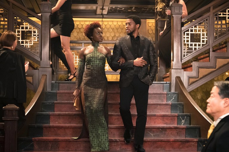
From the very start of the film, the viewer is transported into the world of Wakanda through bright colors, shots of lush landscape and incredible displays of advanced technology. However, I found myself most mesmerized by the stunning costumes designed by the Oscar nominated, Ruth E. Carter. Carter has been designing costumes for films over the past 30 years, for movies like School Daze, Do the Right Thing, Malcolm X and Amistad. Carter drew inspiration from various cultures and dress styles within Africa, in addition to Afropunk styles to create the image of Wakanda as a site of afrofuturism. Through dress, Carter was able to change, or rather provide a new way of looking at the black body that was void of colonial impact. In an article on the importance of fashion in Black Panther by Tanisha C. Ford from The Atlantic, Ford writes, “Carter is quick to point out that her work has always centered a black conception of the future, one rooted in political determinism and creative self-expression”

Black Panther fans in Melbourne, Australia.

The costumes of Black Panther were designed first with practical functionality in mind so that the fighting body could move without restraint. Costumes within the movie also function has a symbol of self-expression, honor, and belonging. However, this idea of belonging is layered. Firstly, within the film each character’s clothes reveal which tribe they belong too, in addition to their role and rank in Wakandan society. Belonging extends outside of the film screen in the way moviegoers have been fashioning themselves in African prints and Wakanda inspired outfits on their way to see the movie. The discussion of ‘what to wear’ for watching Black Panther has become a growing and trending topic on Black Twitter, solidifying it as a pop cultural and socio-political discursive event. The discussion around what one should wear to the movie reveals the fulfilment of the craving to be seen and to have one’s ancestry honored. It is also a testament to the idea of black fashion escaping the realm of the mythic and imaginary to one that is real and has permanence and value in its own right.

By Destinee Forbes

A Day at London Fashion Week 2018


London Fashion Week was the talk of the city February 16-20. Local and international fashion icons were traveling the three-mile radius of LFW visiting shows, presentations, special events, and parties over the course of these well awaited 5 days. The home base of this biannual event, ‘the Store Studios,’ was just a quick walk down the Strand from the Courtauld, and I was fortunate enough to attend thanks to the generosity of my extended family who lives in London.

A long and winding red carpet escorted you immediately through the ‘designer showroom,’ a space comprised of small boutiques of over 150 British and International designers. Rich with a diverse collection of garments and accessories, the showroom provided the space for selected designers to showcase their work and products. I spoke with a number of designers about their collections and inspirations, as the majority of them were posted-up each day in their respective spaces chatting with LFW visitors.

Designer showrooms

The lounge on the second floor overlooking the Thames was lush with foliage and flowers. The marble tables and the large cozy couches provided a restful and refreshing space to work, recharge, and re-caffeinate in between events.

BFC Lounge x The Store

Downstairs, the ‘BFC Show Space’ was home of presentations and shows throughout the weekend. The Autumn/Winter 2018 presentation by Paula Knorr was dramatic through her use of bold red and black colors, and the addition of metallic and sequined fabrics. The space fluctuated between pink and white light, and between music and live spoken word, creating an all encompassing sense of drama and illusion—enhanced even further by the sequined carpet/faux-runway that ran down the middle of the space. The garments of Knorr’s collection were extremely tactile and presented a number of various juxtapositions, playing with transparent and opaque fabrics, fitted and loose silhouettes, and ruffled, fringed, and sequined textures. The models all had dramatic makeup and hairstyles, and were accessorized with metallic ear cuffs.

Paula Knorr Presentation

In addition to ‘the Store Studios,’ there were designer presentations and shows at numerous venues around London throughout the week. Unfortunately, this time around, I missed the Queen’s guest appearance…

By Arielle Murphy

Star Wars & Fashion: A look into the galactic love affair


With Star Wars: The Last Jedi reaching over $1 billion at the box office and earning the title of the highest grossing movie of 2017, Star Wars is once again at the forefront of the cultural moment and subsequently continuing the franchises’ love affair with fashion.

From the film’s debut in the 1970s, Star Wars has been a source of inspiration for fashion, even appearing in Vogue in a 1977 spread featuring Jerry Hall and Darth Vader. The franchise’s equally iconic characters and costumes have sparked Star Wars’s influence on high fashion. Rodarte closed its Fall 2014 show with gowns featuring Star Wars characters Luke Skywalker, R2-D2, C-3PO, and Yoda. Preen Fall 2014 channeled the dark side and featured Darth Vader’s mask on several pieces. Vetements created a spoof on a Star Wars movie poster (its film is titled Star Girls) as a print on a maxi skirt in its Spring 2016 collection. Just recently, in time for the release of The Last Jedi, Rag & Bone partnered with Star Wars to produce a limited-edition collection inspired by the films.

Beyond the aesthetic coolness of these high fashion designs, why do fashion designers look to Star Wars for inspiration and why do we race to wear our favorite Jedi or Sith Lord on our bodies? Is this pure fashion as escapism? Or perhaps the allure is Star War’s ability to paradoxically position itself both in a galaxy far, far away and at the center of the current culture. Fashions with Star War’s iconography or aesthetic inspiration can transport the wearer to an outside realm where a nobody can be the hero of the universe. But these styles also allow the wearer to embody a culturally relevant phenomenon.

From a marketing standpoint, Star Wars is sellable to multiple age groups and can piggyback off of the marketing for the film itself. However, I argue that the urge to clothe ourselves in the symbols and characters of Star Wars reveals a collective desire for escapism, association with a far-off time and place, and at the same time, the need to assert our own cultural relevance. Whether fashion imitates the austere neutral colors of the Jedi Order or the harsh blacks and shiny exteriors of the dark side, the pull to wear the Force is strong.

By Abby Fogle

‘A Document of Modern Living’: How to become a Fashion Illustrator

How do you advise a budding artist? Encourage and suggest the correct path to fashion success? Well, it seems Harper’s Bazaar (HB) solved this problem in 1933, in ‘The Road To Fashion Art,’ its response to a reader’s letter.

Firstly, HB notes that becoming a fashion illustrator requires quite different skills from becoming a fashion creator, since:  ‘To design clothes you need about as much technique as is required for the drawing of daisies or mustaches on a telephone pad – just enough to get your idea across.’

However, a fashion illustrator needs have far more refined abilities in this regard and must ‘draw superlatively well.’  This assertion is perhaps the key to HB’s excellent advice – that fashion illustration is a branch of that ancient technique of drawing, and as such must be learnt and nurtured.  One need only look at some of the most well-known illustrators, Eric, or Rene Gruau to see evidence of this.  Or for more contemporary inspiration scan Richard Haines’ Instagram feed and examine the way emotion and movement are captured in every line.  His work encapsulates what HB describes as every art director’s wish – not to be shown every buttonhole and seam, but to receive an illustration that is ‘a document of modern living.’  Haines’ images of men striding the city streets are proof of this – at once showing the newest styles, and capturing life as it is lived.

Richard Haines

To achieve this, you must, HB says, ‘Draw and keep drawing.’  To start: life drawing, to gain complete understanding of the body.  Next develop an understanding of colour, keep building from this, to examine gesture of every kind, for example ‘the gloved hand picking up the reins.’

As your eye becomes attuned to these telling nuances, HB advises that the budding fashion artist is ready to begin looking for ‘the quality called chic.’  With sketch book in hand, an illustrator must observe all closely – visiting fashionable locations and venues, ‘look at ankle bones, hair waves, the hang of expensive tweeds.’  Everything is a potential source, from films to restaurant customers. Of course, HB states ‘Go to Paris if you possibly can.’

Richard Haines

Only there can fashion be seen in its purest form, alongside the best in dining, socializing, art and culture.  And HB is practical too – as well as this emersion in French couture style, you must, ‘Talk to printers, engravers; learn all you can about colour reproduction, first hand.’

Richard Haines

What this master class provides is a careful guide in how to shape your talent, how to focus on drawing as a means to evoke life, to show how fashion is an expression of culture and emotion, and how to work constantly at producing the most observant images that will trigger a corresponding feeling in viewers.

By Rebecca Arnold

All images courtesy of Richard Haines


‘The Road To Fashion Art,’ Harper’s Bazaar, December 1933

Follow Richard Haines on Instagram: @richard_haines

Fashion and Words

I often think about how we communicate with and understand the world around us – the way we talk, write, our phrases and our physical sensory experiences.

Fashion may be what we first associate with the physical and sensory experience, but also the vocabulary of fashion, dress and textiles slips into usage for how we describe the words we use when talking or on the page (typography), our relationships to ourselves and others, as a medium between our interior (intangible) and external (tangible) selves. I am continually rediscovering and relearning the English language with these thoughts in mind, and here are some of the synesthetic ways that fashion seeps into our words when we think we aren’t talking about fashion at all.

From rags to rags

Recently it came to my knowledge that the end margins of a paragraph (when writing from left to right, with a fixed left-hand margin) on a page are described as ‘rags’ by typographers. The irregular and uneven ‘rag’ that occurs resists the neat line-end and invokes the textile affected by wear and tear, or the tattered rags which one could be dressed in. But also ‘rag’ references the destruction of paper: torn paper results in ragged edges, it references a worn cloth one might use to clean with, rag dance parties, and multiple other ideas (and phrases such as ‘being on the rag’, which was first used to describe menstruating women in the 70s). If our typed words can prove rag-like in their paragraph structure, needing to be ‘fixed’ or ‘mended’ by typographers, then we ought to spend more time in reflection on this – how our words are like a material prone to wear and tear through the tactile experience of typography, or how regardless of the quality of writing a paragraph will be considered by ‘good’ typography, less ragged and more in adherence to a vertical margin shape – a shape that words, and the way we write doesn’t ‘naturally’ fit to. Perhaps with this idea of rags in the paragraph we can consider what the body is, or whose body it is that the rags cover?

N.B Rag is ‘le chiffon’ in French, and in English a ‘chiffon’ is a sheer silky fabric.

Îles of texts and textiles

We cannot ignore the etymological link of text and textile – there has been so much interplay with these interwoven ideas over time in the art and literary worlds (a recent example being the 2016 exhibition ‘Textile Subtexts’ at Marabouparken Museum). These two words have the same root from the latin ‘texĕre’ of ‘to weave’. The spatiality of the woven fabric in textile drew me to take a closer look at the woven words that make up ‘textile’: ‘text’-‘ile’. The English word for ‘island’, and French ‘île’ comes from the Old Frisian ‘isles’. We think about weaving words together to form a narrative and the texture of a written text, or the texts within a textile in how it ‘speaks’ to us and contains a narrative. The subsequent synaesthesia between the written word and a woven fabric due to their etymological ties proposes questions around the materiality of a text and textile and their spatial and communicative aspects.

Tissus and fabrics

The word ‘tissu’ in French means ‘fabric’ or ‘material’, which reminds me of the connective tissues of communication between mediums in Laura U. Marks’ book Touch: Sensuous Theory and Intersensory Media. ‘Tissue’ in English has two meanings: it is a woven cloth and the substance of which animals and organisms are made from.  This other interplay between the materials we clothe our bodies in that covers our bodies – fabric of which we are made conveys the slippery binaries between our interior and exterior selves and skins.

Below I have listed some other ways in which the vocabulary of fashion pours out into our mouths when we aren’t talking about fashion at all:

 Phrases

A blanket expression

Wear your heart on your sleeve

To keep someone in your pocket

Terms

Address – a dress

Fray – fray

Sew – so

Wear – wearing – worn out

Fabricate – fabric

Lace – to lace with

Clasp – to clasp


By Evie Ward

Louis Vuitton x Jeff Koons


Every time a Louis Vuitton x Artist collaboration rolls out, I go through an emotional journey: from the initial shock that wears off to ambivalence to final acceptance, and maybe appreciation (except for the Chapman Brothers collaboration, which I loved from the start). Back in April, when I first saw the Jeff Koons x LV collaboration in Hong Kong, I was appalled. The collection was part of the large window display at the flagship LV store at Landmark, a shopping arcade in Central Hong Kong; it was an unavoidable, conspicuous and mandatory stop on my way to and from work. I felt visually assaulted every time I walked past it. I was startled by the way the designs came out, not because I wasn’t used to seeing paintings taken out of their standard museum settings and imprinted onto bags, (‘been there, done that’ with the museum totes) but by how inexpensive and kitsch they looked. So, as you can imagine how shocked I was when LV announced they were dropping more designs from the LV x Jeff Koons Master collection in October. Enough is enough!

In the initial launch of the collection in April 2017, Jeff Koons took famous works from five legendary painters—Vincent Van Gogh, Leonardo Da Vinci, Jean-Honoré Fragonard, Peter Paul Rubens, and Titian—and stretched them across some of Louis Vuitton’s most popular bags, like the Speedy, Neverfull, and Keepall. With a ‘subtle’ touch, Koons emblazoned the artist names in gold capital letters across the front, and matched the bag’s handles in a plastic acrylic colour palette to the paintings’ undertones. In this second instalment, Louis Vuitton x Koons added an additional six artists: François Boucher, Claude Monet, Paul Gaugin, Nicolas Poussin, Édouard Manet and J.M.W Turner.

But constantly relooking at the bags, (involuntarily), I have come to accept them, in a way. Kitschy as they might be, I must admit they are congruous and loyal to the Jeff Koons brand-name. Kitsch is characteristic of Koons’ work, and it is his way of appropriating mundane, ephemeral items and transforming them into ‘art’.

In an interview with The New York Times, Mr. Koons declares that he hopes people looks at this collaboration as his continued effort to “erase the hierarchy attached to fine art and old masters.” By removing everyday objects such as vacuum cleaners and shampoo polishers from the household and placing them into the museum setting, he has re-contextualized these dull objects into expensive ‘artwork.’

Now, collaborating with LV, Koons is turning his thesis into a two-way street. Instead of just transforming commonplace objects into artwork, he is taking the most irreversible, unchallengeable works of art, (i.e. old masters that have been consecrated by museum establishments), and commodifying them, thereby transforming these works of art into functional items that can be owned by anyone. Is he successful in breaking down the hierarchy attached to fine art and old masters? Hard to say, but at least this time round instead of converting commodity into art, he is rebranding art as commodity. After all, what comes around goes around.

It has all come full circle, and this justification is as far as my appreciation for the bags will go. One last note: be prepared for more bags to come from this collection, because Koon’s Gazing Ball Series reinterpreted as many as 40 old master paintings.

By Lily Mu

“Moon of my Life, My Sun and Stars”: A Self-Love Note to Moons and Junes

Not many people can say they have walked around New York City in lingerie while being photographed—but I am one of few who can say they have. The funny thing is that I did not expect to model for the Danish lingerie brand, Moons and Junes, but while supporting my friend behind the scenes at one of their photoshoots, Angete Bjerre-Madsen, founder of Moons and Junes, convinced me to give it a try.

Front view Audre Bra, Olive.

At first, I thought she was absolutely crazy. Then she handed me the Audre bra (fig. 1) (named after the one and only Audre Lorde) in a deep burnt orange, and I decided that the least I could do was try it on. It was light and sheer with a little peek-a-boo feature at the center of the bra for a playful cleavage reveal. At first, I was worried that the bra would not fit, or that it would not offer the support I needed—but I was immediately proven wrong. It fit like a glove while also providing great coverage. The Moons and Junes products run in three sizes: small, medium and large—yet fit a wide range of body sizes due to the stretchy and high-quality material of the products that mold to the wearer’s form without trying to change or enhance her body. Moons and Junes prides itself on being a lingerie brand that does not use underwire or hard cups. The brand’s goal is to disrupt the current lingerie industry by creating pieces that specifically cater to everybody without trying to modify it. There is no push-up, no padding, no unnecessary frill. The pieces act as a second skin meant to conform to the wearer, the models in the ad campaigns are familiar faces—they are family and friends of all ages, races, and sizes.

Shot from New York Moons and Junes Campaign by
photographer Nick Delieto.

“Lingerie” as a category of clothing given to undergarments, aims to make the body appear more alluring and attract attention from the viewer. The erotic or desire is closely tied to lingerie not only in its proximity to the naked body, but also in the theatricality of viewing the undergarments as well. The lingerie acts as the curtain covering the stage of the body, only making the flesh visible “in performance”. Roland Barthes writes in The Pleasure of the Text (1973) that the location of the erotic in clothing lies in its ability to evoke “intermittence,” or rather what he calls, “the intermittence of skin flashing between two articles of clothing…it is the flash itself which seduces, or rather: the staging of an appearance-as-disappearance.” Historically, the wearing and showing of one’s lingerie existed in a performance, a relation between the viewer and the wearer. However, a shift is occurring within the lingerie industry that focuses not the viewer’s reception and pleasure, but the solely the wearer’s.

Shot from New York Moons and Junes campaign by photographer Nick Delieto.

Moons and Junes, in a sense, redefines the relation of the erotic as dependent on the viewer’s response, and makes the erotic or the pleasurable more personal in the sense that the wearer’s pleasure comes from her comfort in the undergarments, her confidence in her skin, and also the beautiful and minimalist design of the pieces. Moons and Junes evokes desire, however a desire that is not meant for others, but rather one that is unabashedly for the self.

By Destinee Forbes

Fashion in Motion: Phoebe English at the V&A


On Friday, 20 October, the V&A hosted a spectacular retrospective presentation by British designer Phoebe English as part of the museum’s Fashion in Motion series. The series features leading contemporary fashion designers and makes live fashion experiences available to the public.

Set within the V&A’s grand Raphael Gallery, the Fashion in Motion series typically features a runway show. English, however, broke with this tradition and presented her designs on raised, round platforms where four models donning a range of English’s womenswear designs stood next to marionettes wearing a scaled-down version of the original designs. This provocative presentation blurred the lines between performance art and fashion show when models, or, rather, performers dressed in plain white jumpsuits moved between the platforms to toy with the marionettes, puppeteering the movements of the fashion models. Indeed, the spectacle created by this inventive set design continues English’s practice of staging her collections within immersive environments. Combined with live music by a harpist, the sublime designs and the playful scale of the marionettes resulted in what felt like visual gluttony.

The individual, rounded platforms allowed the viewer to weave through the presentation and move closer to the designs in a way that would not be possible during a traditional runway show. Although this set design was much more engaging that a catwalk, the act of moving around the platforms and observing the models and their marionettes up close felt somewhat intrusive. The models made direct eye-contact with onlookers and members of the press, posing consciously for Snapchat stories and press photos. This directness coupled with the uncanny marionettes and the puppeteers’ manipulation of the models and their puppets created a haunting, powerful experience. The weight of the presentation was most palpable at the end of the show when the models slowly descended from the platforms and walked out of the gallery, leaving only the puppets. The dangling, lifeless marionettes dressed in their Phoebe English miniatures represented, for me, the eerie, indescribably strange and alienating space that fashion can occupy.

Aside from the memorable spectacle of the show, English’s luxury designs demonstrated an expertise in technique, materials, and construction. English, who aims to set her label apart from mass made fashion, creates striking silhouettes with unconventional textures to indicate balance between craft and design. The Phoebe English label, which is entirely made in England, is certainly one to watch.

By Abby Fogle

All photos authors own

The Avant Garden

Moschino’s Spring/Summer 2018 ready-to-wear collection designed by Jeremy Scott is inspired by biker ballerinas, Hasbro’s ‘My Little Pony’, and flowers. An eclectic group of influences that are not aesthetically comprehensible but work insofar that the designs make the models look as if they are playing dress up on the runway. The designs make sense as a presentation of dress-up in the way they are in direct conversation with the runway design itself. The show’s threshold is shrouded with vegetation and overflowing with flowers of all different sizes and colors. The Moschino brand name is visible on the threshold only as a trace, an imprint created by negative space. The runway is made of glass and appears black, reflecting the walls that surround it—making it seem as if the models are walking in a fantasy space. The models reject ‘types’ through what they wear. Instead of being either ‘the biker’ or ‘the ballerina,’ they are both. Scott’s designs for Moschino expose how fashion shows can be taken too seriously in terms of how they can present a new standard of dress for women and instead the show parodies that notion through dress-up. The joke is particularly visible when the models walk out dressed as various flowers–the ultimate gift-object in society–which is often a metonymic representation for women in general. Scott’s use of humor in his designs to reject presentations of standards of dress for women, which makes visible the spaces in which women are told to exist are actually quite fetishistic and unsettling.

Anna Cleveland for Moschino Spring/Summer RTW 2018

Supermodel in-training, Kaia Gerber, opens the show. Gerber wears a feathered light-blue tutu, “My Little Pony” t-shirt paired with fishnets, black leather combat boots, and a black leather jacket (fig.1). Gerber’s look sets the tone for the biker-ballerina designs by Scott. The mixture of hard lines created by the biker aesthetic and the soft lines and colors of Hasbro style in conjunction with Gerber’s almost seraphic face further establishes the show’s theme of dress-up.

Gigi Hadid for Moschino Spring/Summer RTW 2018

There is no fluid transition between the first act and the second act of the show. Anna Cleveland opens act two by sauntering onto the runway dressed as a pink lotus flower picking out her own petals (fig 2). Scott’s flower-wear took the shape of lilies, roses, orchids, tiger lilies and tulips. The show ends with Gigi Hadid, literally dressed as a gifted bouquet of flowers (fig.3). The end of the show makes the viewer aware that the models (or flowers rather) were all gifts to be received by the eye. Scott complicates this in that Hadid’s make-up does not fit with the rest of the flowers that frame her face. Her make-up makes her appear older. Hadid’s face stands out amongst the flowers instead of blending in. Jeremy Scott’s designs use dress up as a means to complicate how clothes, our second skin, can actually reveal the physical body even more.

By Destinee Forbes

The Virtue of Spectacle and Fantasy in Fashion Exhibitions: Christian Dior, Designer of Dreams at the Musée des Arts Décoratifs

One of the consequences of studying fashion history is that I can no longer go to exhibitions and simply enjoy them in the straightforward way that I used to. The analytical, critical habit takes over and before I know it I’m unpicking everything I see before me. It is hard to remember that sometimes it can be good to just let oneself be carried away by the sheer joyful extravagance of it all.

The iconic Bar Suit, 1947

2017 marks 70 years since the founding of Dior, and the Musée des Arts Décoratifs in Paris is celebrating the anniversary with Christian Dior, Designer of Dreams. An expansive exhibition, it charts the history of the illustrious couture house. It’s a smorgasbord of luxury and dazzle, and a reminder of fashion’s power to create seductive spectacle.

No exhibition is perfect and this one has its flaws. The broad brush concept and comprehensive scope could have benefited from some streamlining, and a modified layout of the themed rooms might have constructed a stronger narrative. However, the exhibition’s virtue lies in the breathtaking drama in which Dior’s exquisite creations are displayed. It’s an exhibition that doesn’t seek so much to tell a story as to bombard the visitor with spectacular sight upon spectacular sight.

There’s a room dedicated to dresses inspired by the 18th century, the displays evoking the interiors of Versailles. Further on, paper blooms and trails of paper ivy carpet the ceiling, lit by soft pastel lights. Somehow, it doesn’t seem to matter that the room simply illustrates the frequency with which flowers feature in Dior’s designs. The pure pleasure in seeing the exquisite craftsmanship of the dresses in such splendid settings replaces the need for lengthy museum-speak explanations.

Some rooms have music playing in the background, or screens showing film clips and interactive touch panels that reveal images and quotes. Three iconic photographs of three iconic Dior dresses are printed on a glass wall. The lighting changes and the photographs disappear, revealing the original dresses behind. Far from overshadowing the clothes, the spectacular displays only enhance the experience of the exquisitely crafted garments.

After a while the visitor begins to feel dizzy with the drama, as the theatricality is amplified until the final room where the exhibition culminates in an explosion of hypnotic, unadulterated spectacle.  Gold glitter cascades from the ceiling and walls, which shimmer and morph into an Italianate fresco, before changing again into the façade of 30 Avenue Montaigne. Fantasy truly takes over in this room where sequinned dresses sparkle and glint under the shifting lights.

Emerging from the Musée des Arts Décoratifs onto the Rue du Rivoli one has that dazed feeling of having been woken slightly too early from the most fantastic reverie. If Christian Dior ‘Designed Dreams’, then this exhibition takes those dreams and works them into the display itself, creating a fashion fantasy-world.

Visit Christian Dior, Designer of Dreams at the Musée des Arts Décoratifs until 7 January 2018.

http://www.lesartsdecoratifs.fr/en/exhibitions/current-events-1322/musee-des-arts-decoratifs/christian-dior-couturier-du-reve/


Leah Gouget-Levy