Author Archives: mheegaard

Life in Colour with Parks and Shabazz

Photography often failed to be recognised as a true art form, something that has resonated with the struggles encountered by many famous photographers nowadays. The medium’s strength was always recognised in its ability to accurately represent reality – nevertheless, even reality has numerous depictions.

Michael Mery talking
Michael Mery at the Schomburg Centre (source: shot by author)

Gordon Parks is nowadays known to be one of the most influential photographers of his period. Having shot both fashion and news, he has an ability to convey beauty and despair in even the simplest of things.  During our trip to New York in February just before Covid-19, our MA class was fortunate enough to have the chance to discuss photography with Michael Mery from the Schomburg Center for Research in Black Culture. Amongst the treasure troves were coloured prints of one of my favourite photographers, Gordon Parks.

The beauty and the timelessness of his images highlight the incredible fashion that ornate the bodies in town. By opting for Kodachrome, Parks manages to render mesmerising compositions highlighting colours, motifs and textures of dress, bringing them to life before our very eyes. In peering into these individuals’ everyday life, one experiences an almost soothing feeling. Yet, it is this calmness that is ultimately most disturbing.

gordon parks
Gordon Parks, Alabama Series, 1956 (source: Instagram screenshot)

Coloured film enabled him to capture reality more accurately, but this only emphasised the obvious forms of discrimination present in these images. Amongst Parks’s pictures of people going about their everyday life, you catch glimpses of signs: ‘coloured entrance’, ‘colored’, ‘coloured only’. It becomes ironic that the coloured medium through which he captures these images resonates with the display of ‘coloured’ segregation encountered everyday by these same individuals.

Shabazz and Parks
Jamel Shabazz, Fly girls and cousins. Jamaica Queens, ca. 1995. Gordon Parks, Outside Looking In, Mobile, Alabama, 1956. (sources: Instagram screenshots)

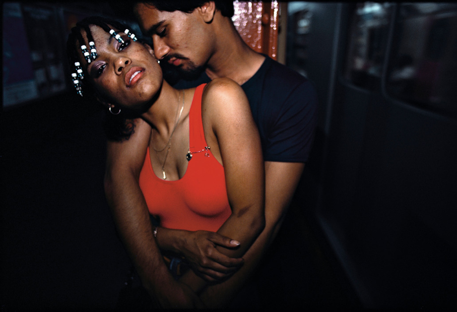
His work in some way can be compared to that of photographer Jamel Shabazz, another favourite of mine. Despite generations separating the two photographers, in some way both their colour series resemble one another; their use of subdued colours, individuals getting caught in the moment, a sense of innocence. As discussed by Parks in his autobiography, photography was ‘a choice of weapon’ – instead of fighting inequality with guns and violence, he ‘shot’ people through his lens just like Shabazz.

Parks and Shabazz
From left to right: Gordon Parks, Ondria Tanner and her grandmother window-shopping, Mobile, Alabama, 1956. Jamel Shabazz, The Corner. Midtown, Manhattan, 1990. Jamel Shabazz, Father and Sons. Downtown, Brooklyn. ca. 1990 (sources: Instagram screenshots)

Earlier in June I tuned into a discussion with Shabazz organised by Nights Global, and one question kept coming up again and again -where is the love in today’s culture? I understand that I will never understand, but what I can recognise is that both Park and Shabazz are depicting just that: the need for love. Displaying how these individuals go about their daily lives, these two men use photography to document beauty and a humanity which appears to be taken away.

Shabazz and Parks
Gordon Parks Store From, Mobile, Alabama, 1956. Jamel Shabazz, Double Dating in the 1990s, Harlem. Gordon Parks, Alabama, 1956. (sources: Instagram screenshots)

There is obviously much more that can be said and discussed in the works of the photographers mentioned above. But all in all, in the current ongoing media culture where people are constantly bombarded with the same images, often embedded with violence and aggression, recognising these images are as crucial as recognising those. They both show the same reality, just differently.

Redefining Luxury: What’s Left of Fashion Week?

As lockdown starts to ease throughout Europe, the Haute Couture Imperium has started to reopen slowly but questionably. With high-profile events gradually being cancelled for the rest of the year and customers now being followed by overly-eager-to-clean employees in department stores, it seems as if the world was settling into a “new” normal.

However, over the past week, the pandemic seems to not only have accelerated, but forced big designer brands into a more carbon-conscious spread of fashion (at least for now). Indeed, as household names gradually pull out of the massively-publicised Fashion Weeks (FW), designers and creators are finally starting to question the real and immediate legitimacy of FW in the twenty-first century.

Although many are unaware of this fact, FW actually originated during the Second World War, when American journalists found themselves unable to enter Nazi-occupied France for the season’s ‘new looks’. Eleonor Lambert, an American fashion publicist, believed this to be the “perfect” opportunity to promote local designers and American fashion which had long been on the back-burner of Paris and London. And voilà, NYFW was born.

Schiaparelli’s first show after WW2 (source: @julienbaulu on Instagram)

A bit over half a century later, FWs have evolved into long-awaited social events, showcasing the dos and don’ts of the season in front of (literally) rows of famous people sharing their ‘favourite looks’ on Instagram and making us lowly people feel a part of it all. But quite frankly, in the midst of this information overload, it becomes clear that some designers have felt the pressure to perform and deliver on time, and consequently, have been sacrificing their creative drive.

Now, with the uncertainty of social interactions at events looming over Luxury Houses, many designers have indeed taken a moment to reflect on their creative process behind-the-scenes. Amongst the many brands using the pandemic as a way to reshape their artistic expression are Saint Laurent and Gucci.

The latter’s creative director Alessandro Michele is already much beloved for having redefined chic Italian menswear, ultimately playing on a more androgynous style. In the search for a connection with creativity, he has decided to distance himself and the brand from the more ‘commercial’ aspect of FW by withdrawing the household name from it and by choosing to showcase only two collections a year. In extracts of his personal diaries published on Gucci’s Instagram, he goes on to explain in what ways the fast pace of fashion nowadays does not allow him to feel fulfilled creatively. This comes only a couple of days after Saint Laurent also drew back from the FW schedule to focus, not on set and specific deadlines, but on its own “creative flow”.

These trends of ‘going back to their creative roots’ is clearly setting a new pace for Fashion which seemed to be going down a hole of “who’s-who” rather than on the actual clothes and designs. The lack of focus on creativity as mentioned by Michele has indeed been a debated issue in recent times, with discussions regarding the environmental viability of hosting four shows in three cities in one year. Not only is the carbon footprint of such travelling massive, but the ever-changing looks and materials used are not exactly environmental-friendly. Some designers are however already taking full advantage of the whole world only being accessible digitally, with Congolese designer Anifa Mvuemba already putting her creative spin on a digital runway.

Covid-19 has thus ultimately promoted a more eco-friendly FW in the short-term, and how these new houses’ take on Couture will ultimately reflect and affect the fashion industry in the foreseeable future remains to be seen. The greater impact of digitalising Fashion Week would perhaps be on the hosting cities’ economies, as it yearly represents a major source of revenue for restaurants, clubs, hotels and tourism in general.

As lockdown comes to an end, it remains quite clear that the virus does not, and it will be interesting to keep an eye out on how the public’s interaction with Haute Couture and its creative side will ultimately evolve. And whereas this period of quarantine has been a period of self-reflection on the little specks of happiness and fulfilment in life for some, others were fast to queue up at Zara and Pull&Bear as soon as it re-opened. Needless to say that fast-fashion will be disappearing anytime soon, but maybe for now, think before you shop, and think locally.

Four Wise (Wo)Men

It is hard to imagine that when Kodak initially introduced the portable camera, it was designed for women. Considered a ‘low art’ long into the 20th century, photography was given menial importance and seen as the perfect “hobby” for women who simply did not have the supposed ‘capacity’ and ‘skills’ to train in proper fine art. These initial Kodak cameras were even converted into colourful chic purses called Kodak Ensembles, which came in a variety of colours and, as the name hints towards, could match your own ensemble.

Kodak Ensemble
Kodak Ensemble Set (Source: @documentingfashion on Instagram)

Fast-forward a century and fashion photography has become a respected and sought-after art form, with certain images vowing up to 610,000 USD at auction houses like Sotheby’s and Christie’s. Nevertheless, as famously argued by Griselda Pollock, the art world has managed to remain “a man’s world” despite photography’s supposed feminine nature. Names such as Richard Avedon, Irving Penn, Helmut Newton and David Lindbergh remain the most prominent ones in the domain, leaving little space historically, and currently, for women fashion photographers. Let this therefore be a reminder of a few (of many) well-regarded female photographers who have contributed to fashion photography through technique, talent and vision.

Cover pic for article
Lillian Bassman, self-portrait. (Source: screenshot from @artartland on Instagram)

Yva (1900-1944)

Also known as Else Neuländer-Simon, Yva was a German photographer who famously captured modern renderings of the female body in interwar Weimar Germany. In an artistic athmosphere shaped by Constructivism, Bauhaus and German Expressionism, her dramatic play on light and shadow as well as clean geometric shapes enabled her to create emotional and feminine works of art. Indeed, although men predominantly dominated the industry at the time, her feminine outlook was deemed refreshing for many. Nevertheless, her career was cut short during the Second World War as she was arrested by the Gestapo alongside her husband when trying to flee, and presumably killed in a camp in Majdanek, Poland. She is also remembered as the artist to have trained and shaped the young Helmut Newton, who would remain her faithful admirer for the rest of his life.

Source: screenshot of @williampinfold and @studioegt on Instagram

Lillian Bassman (1917-2012)

Working under the famous art director of Harper’s Bazaar Alexey Brodovitch, Lillian Bassman was known for her high-contrast black and white fashion images. Although she originally worked for Harper’s Bazaar in the 40s by promoting the works of Richard Avedon and Paul Himmel (her husband), she was then encouraged to take on the art form herself, thus developing incredible photographic skills that were unfortunately not fully recognised until the 70s. Focusing on lingerie, cosmetics and liquor, her incredible manipulation of images through cropping and bleaching are truly unique to her style, and leave a highly emotional impression on the viewer.

Source: screenshot of @peterfettermangallery and @atlasgallery on Instagram

Louise Dahl-Wolfe (1895-1989)

Although she was mostly known for her documentary work as a reportage photographer in the 1930s, she was also the first fashion photographer to truly embrace the use of colour in fashion photography. Having studied painting and colour theory at the San Francisco Institute of Art, her eye for subtle nuances and colour transparencies helped redefine American fashion photography and inspired many others such as Horst P. Horst and Irving Penn. Most importantly, she should be known for having contributed to the creation of the “New Woman” by for example incorporating art historical themes in her images when capturing femininity.

Source: screenshot of @allaboutfashion and @olivia_de_marmont on Instagram

Deborah Turbeville (1932 – 2013)

Working in parallel to the feminist movement in the 70s, her stronger displays of femininity in fashion photography differed immensely from those of her peers Helmut Newton and Guy Bourdin. Her hauntingly erotic images of the female body were joined by a theatricality that conveyed a hazy laziness. Despite her prominent reputation as a fashion photographer, the clothes in her images become secondary as her delicate feminine lens allows a completely different interpretation of women. She believed her position as a female photographer of women enabled her to capture another side of the models – a more vulnerable side, enhanced by her longing for the mystical which adds an element of nostalgia and dreaminess to her images.

Source: screenshot of @documentingfashion and @magazinefan on Instagram

Dress in Film: We’re All in LaLaLand

Quarantine has made technological and cinematographic escapism almost obligatory, with fantastical and imaginative storylines, sets and costumes providing comfort to all of us stuck at home, daydreaming about the sky, the sea, the grass, or simply the pub.

Although some have called this movie overrated, the fashion historian in me can’t deny having a soft spot for LaLaLand (2016), the Academy Award winning movie from 2016. This critically-acclaimed work might not have been received as well as originally hoped by the general public, but it remains impossible to deny Damien Chazelle’s magical cinematographic touch in creating a contemporary Golden Age masterpiece.

His ode to Hollywood musicals doesn’t go unnoticed, with his subtle references to movies such as Singin’ in the Rain (1952), West Side Story (1961) or The Young Girls of Rochefort (1967) shaping set design, filmography, and most importantly (and the reason why some might be reading this post) costumes!

Cover to point primary colours
Source: screenshot from @lalaland on Instagram

Despite the story being set in modern-day L.A., costume designer Mary Zophres draws inspiration from classical timepieces that have flooded the screens since the 1920s when dressing our main character Mia. Not only does she act out Audrey Hepburn’s fashion shoot from Funny Face (1957), her pastel pink halter-neck dress appears to be a clear reference to Ingrid Bergman’s early screen tests, whereas the stunning emerald dress worn by Emma Stone’s character in the planetarium is unfailingly similar to Judy Garland’s in A Star is Born (1954), with its classical neckline and sleeves reminiscing of 1950s Hollywood.

Judy Garland's and Ingrid Bergman's dress for Lalaland
Source: Screenshot from @lalaland on instagram

According to Zophres, One of the most striking (and time-consuming) pieces made for the film was Mia’s white chiffon dress. Its doubled layers enabled the fabric to move perfectly with her body as she waltzes away into the sky with her beau, both of them becoming as iconic a pair as Ginger Rogers and Fred Astaire. The movie’s tight budget was clearly no issue in creating dazzling cinematographic references and costumes as Zophres’s timeless designs become a true homage to Golden Age Hollywood actresses.

Source: Image from Lalaland (2016) IMDB

This production is a treasure for film aficionados, as Zophres’s beautiful use of stark primary colours are highlighted thanks to Cinemascope, creating 120 minutes of pure colourful bliss. In ‘Someone in the Crowd’, the combination of red, yellow, green and blue dresses against the regular pavement in L.A. adds a fantastical touch to the everyday, whereas the ensemble of costumes could hint towards Cyd Charisse’s performance in Singin’ in the Rain, as the striped cut from her emerald green skirt bears a resemblance to this red one. Interestingly, these strikingly colourful outfits gradually seem to fade into monochromatic shades of black and white as tensions arise between Mia and Seb, clearly demonstrating the somewhat obvious symbolic power of clothes in film.

To explore argument of primary colours
Source: Image from Lalaland (2016) IMDB

The team’s incredible filmography is probably most apparent in the iconic tap-dancing scene between Mia and Sebastian. Perhaps my favourite outfit of the movie, Mia’s retro marigold yellow dress flows so fabulously well with her movements and is complemented with L.A.’s colourful sunset and nightfall, which would eventually lead to that incredibly aesthetically-pleasing film cover.

Saem shoes
Source: Screenshot from @lalaland on Instagram

Ryan Gosling’s understated-yet-incredibly-sexy (there is not point denying it) character was inspired by Marc Michel in Lola (1961), also a source of inspiration for Chazelle. Although his wardrobe remain pretty neutral throughout the movie, his two-toned tap-dancing shoes remain iconic. Not only are they also worn by Mia when she makes a (very relatable) point of switching her high heels to flat shoes, they become clear references to past dancing stars such as Gene Kelly and Fred Astaire. This sense of nostalgia for Golden Age actors and Old School Jazz becomes apparent in Seb’s style, with combos of tweed jackets, white shirts, slim ties and rolled-up sleeves clearly reflecting his reminiscent personality. Throughout the movie he oozes a sense of effortless classiness which truly reflects his old-school tendencies.

Source: Image from Lalaland (2016) IMDB

In a society where athleisure is being hailed like the Holy Grail and lockdown has only reinforced this with pictures of Anna Wintour in sweatpants appearing on the internet, I believe LaLaLand (2016) shows the value of dressing up and looking presentable. The editor-in-chief of Vogue US, by posing in such a garment, has demonstrated that in these periods of uncertainty it is ok to not look or FEEL like being on top of our game. But when things eventually, and hopefully, start returning to normal, I hope that people will not have forgotten how to look presentable to the outside world as it does not take much. I’m not saying we all need to walk around wearing frilly skirts, dresses, or suits on a regular day, but I truly believe that in these mentally strenuous times you need to look good to feel good.

Anna Wintour on sweatpants
Source: Screenshot from @wintourworld on Instagram

Then again, this might just be my French side speaking.

Remembering Peter H. Beard (1938-2020)

“The last thing left in nature is the beauty of women” – Peter Beard

Peter Beard pic
Source: screenshot from @clovis_sangrail on instagram

Peter Hill Beard rose to fame in the 60s when his infamous diaries were first published; combining his photographs with insects, leaves, feathers, transcribed telephone messages, quotes, bref – anything and everything that would inspire him – his unique documentation of African wildlife and landscapes transgressed regular travel journaling.

Beard’s chronicling of events in diaries started from a young age, as his favourable background enabled him to  grow up surrounded by artwork. This shaped his liking for art and aesthetic beauty, and would later come to influence his work and career path. Indeed, he explored this passion as an Art History student at Yale University under the tutelage of famed artists such as Josef Alberts before making his way to Kenya, where he would create his renowned journals and publish his first book “The End of the Game” (1963).


Peter Beard diaries
Source: screenshot from @peterbeardart on Instagram

Beard’s artistic abilities are reflected in his note-taking, as his notorious use of paint (and his own blood) to render footprints and handprints on his images highlight the rawness and violence of African wildlife and the human relation to it. The use of sepia-toned film further add a vintage and authentic feel to his images, conveying a sense of nostalgia for the past which he would further explore through themes of life and death. Indeed, as an environmental activist, Beard tried to spread awareness by displaying the effects of growing industrialisation on the African continent.

Peter Beard art
Source: screenshot from @maias.hgrd on Instagram

Alongside his love for African wildlife was his love for women. Beard was particularly attracted to female beauty, and would often assimilate the two in his diaries and photographs. By placing a partially-clad or nude female bodies in the midst of the African wilderness, he played with the idea of primitivism and appealed to women’s animalistic sexuality to display his version of femininity. Posing next to powerful and wild creatures such as elephants, lions and rhinoceros, his portrayals of women were empowering and beautiful and he would regularly shoot and feature in fashion reviews such as Elle, Vogue or Harper’s Bazaar.

Peter Beard fashion
Source: screenshot from @mllachapelle, @maias.hgrd and @geenarocero on Instagram

Nicknamed ‘the reckless playboy’ or yet ‘Tarzan’, the photographer was indeed known as a regular Casanova, with his views on monogamy and marriage sometimes deemed controversial. Nevertheless, his brilliant ability to capture beauty is undeniable, and his pioneering will to raise awareness of environmental issues truly placed him ahead of his time. Having worked alongside personalities such as Andy Warhol, Francis Bacon and Karen Blixen to shape and spread his unique vision of the world, he will truly be remembered as one-of-a-kind.

To sum it up, Beard, you seemed like an incredible man, who lived an incredible life.

Dress in Film: Emma’s frills and macarons

Watching Emma (2020) is like spending 125 minutes in a Ladurée shop set in the 1800s. A real life Fragonard painting, the film’s soft-hued colour palette submerges the viewer in a modern vision of Georgian romance and the world of the Jane Austen is re-imagined with frills, pastels and macarons.

Photo for Emma
‘Scene from Emma (2020)’ source: Instagram

Ostentatious bonnets and colourful spencers brighten each scene whilst splashes of mint, pink, yellow and blue are reminiscent of Sofia Coppola’s “Marie Antoinette” and Wes Anderson’s “Grand Budapest Hotel”. With every season being given a specific colour palette, the aristocratic aesthetic of Austen’s England is communicated through everything from extravagant floral wallapaper to delicate bone china.

Georgian background
‘Scene from Emma (2020)’ source: Instagram

Oscar-winning costume designer Alexandra Byrne modernises the character of Emma by  re-interpreting her as a fashionable woman from the 21st century. Emma (played by Ana Taylor-Joy) becomes a symbol of Victorian vanity as her outfits bedazzle the viewer every time she enters a room. The focus on empirical hemlines is reminiscent of the Parisian fashion journals of the early 19th century which repeatedly showed dresses gathered under the bust and fashioned out of delicate white muslin.

Pictures for Emma
‘Emma for Vogue US, February 2020’ source: Instagram

Despite these direct references, Byrne revived the costumes by rendering the designs in  unusually modern fabrics and colours. Dismantling the common assumption that clothing was particularly demure during the 1800s, Byrne notes that new dying techniques colour had actually become common practice. On top of the layers of white muslin (the typical costume of choice for wealthy females at the time), Byrne further updates this style with bright accessories. Whilst the students’ bright red hoods seem to come straight out of the Handmaiden’s Tale, Emma’s deep blue pelisse and green checked coat makes her the focal point of every scene. It is worth noting that the milinary shop is featured repeatedly throughout the film: Emma’s world is one of fashion, manipulation and self-image, all of which are essential to her role as style-icon and matchmaker.Colour was a symbol of wealth during the 1810s and Byrne manipulates this to spectacular effect. The colour of each costume is used to vividly express the personality of each character; be it witm irony or ridicule, the viewer mocks Mrs Elton’s outrageous attire, her orange day dress and the comedically  large black ribbon atop of her head.

Pictures for Emma
‘Emma for Vogue US, February 2020’ source: Instagram

Men’s fashion is granted equal importance in Emma. Raised collars add an almost claustrophobic allure to each outfit, symbolising the rigid definition of masculinity at the time. With sharp cuts and tailoring being more predominant than embroidery for men’s fashion, the natural form of the body was enhanced in order to match with Neoclassical ideals. Indeed, the costumes of Mr. Woodhouse (played by Bill Nighy) and Mr. Knightly (Johnny Flynn) play on traditionally rich colours and materials to communicate wealth and superiority.

Photo for Emma
‘Film cover for Emma (2020)’ source: Instagram

The naked body becomes just as important as the clothed body in Emma. Whilst the male form is shown completely (see Knightly’s dressing scene at the beginning of the film), the female nude is treated with irreverence. A stark contrast to typical presentations of the female nude at the time, Emma is shown warming her backside and Knightly’s declaration of love is comedially ruined by a nosebleed.

Photo for Emma
‘Scene from Emma (2020)’ source: Instagram

Using the treatment of the body to subvert the Georgian gender hierarchies, the manipulation of the body is central to Byrne’s reworking of ‘Emma’ and a modern twist is given to a timeless novel which clearly shows that sometimes, less is not more.


References:

https://www.theguardian.com/film/2020/feb/14/emma-review-jane-austen-anya-taylor-joy

https://collections.vam.ac.uk/item/O13823/evening-dress-unknown/

https://www.theguardian.com/film/2020/feb/16/emma-review-autumn-de-wilde-anya-taylor-joy-bill-nighy-johnny-flynn

https://variety.com/2020/artisans/production/costumes-production-design-emma-1203502490/

Dress in Film: Little Women on the Big Screen

As Academy Award season approaches, there comes a time to reflect over the films that strike us and I believe that many will agree with me in saying that Little Women’s spectacularly intricate and artistic costumes are worth discussing.

The most notable thing about Jacqueline Durran’s costumes for Little Women is that they reflect the personalities of the characters. As each character evolves, so does their dress, illustrating not only the passing of time but clear moments of narrative development. This, along with a wealth of artistic references, means that the movie is likely to bring joy to any art historian watching it. From Impressionism to the Pre-Raphaelites, the movie becomes an Easter egg hunt for artistic references.

Firstly, each March sister is given a colour palette that repeatedly resonates with their character throughout: Meg’s was green and lavender, Beth’s was brown and pink, Amy’s was light blue, and Jo’s was red and indigo. Whilst Durran tried to remain period-accurate, the costumes became a tool to convey mood, season and temperature. Never straying from the dress conventions of the period, Durran still used dress to show each character’s personality and each actor had the freedom to choose and combine outfits.

screenshot for argument
Screenshot from Instagram: littlewomenmovie

Set in Concord, Massachusetts during the American Civil War, the girls’ initial outfits clearly reflect that time. Although women were expected to wear bloomers, chemises and corsets, Durran tweaked this framework to reveal the individual personality of each sister. For example, Meg’s conventional attitude towards life and marriage is reflected in outfits that feature corsets and bloomers, whilst Jo’s rebellious and feminist side is clear in her masculine, corset-free wardrobe of vests, blazers and collared shirts. This masculinity is reinstated in the interchanging clothes between her and Laurie. From the buttercup-coloured paisley vest or Jo’s straw hat at the beach, these swaps further instate Jo’s need to transcend social rules placed on her gender. The androgenicity of their outfits also emphasises them as equals and partners.

androgene article
Screenshot from Instagram: littlewomenmovie

One of the most memorable scenes in Little Women (2019) would be their trip to the seaside which clearly hints at Winslow Homer’s seascapes. Their use of checks, stripes and paisleys as well as straw hats makes reference to traditional Victorian style and American Impressionism. Each girls’ persona is again emphasised in their combinations of attire. Winslow Homer also often depicted strong-working women in his work which perhaps further resonates with the March girls’ persona.

supportive forar ticle
Screenshot from Instagram: littlewomenmovie

Further into the movie, the girls put on a play for Christmas. The set-up is a clear reference to Julia Margaret Cameron’s theatrical photography of her daughters: the paper-cut stars, branches, leaves, fairytale-esque costumes all serve to set up a world where the women are equal to men. The flower crowns also become symbols of innocence. The allusion to strong feminine figures in art history clearly parallels the girls’ ambition to be recognised in the art world.

Instapic
Screenshot from Instagram: littlewomenmovie

The beauty of the March sisters is also clearly represented in their likeness to Pre-Raphaelites women. Visible in the loose but elegant clothing worn by characters like Jo and Meg, the characters are suggested to have timeless and elegant beauty. Like Rosetti’s muses, the girls engage in artistic activities such as writing, playing instruments or reciting poetry.

instapic little women
Screenshot from Instagram: littlewomenmovie

Finally, the influence of American Impressionism clearly dominates the ‘before’ portion of the film whilst French Impressionism dominates the later parts of the film. Particularly evident with Amy’s dress after she moves to Paris. Although she was always weary of her looks, older Amy becomes the most decorated out of all the sisters and frequently adorns herself with embroidered dresses, large skirts, embellished coats and hats. This ‘maximisation’ of dress shows the personal growth her character. Paralleling her loss of innocence, it further reflects her determination to become the main provider for her family.

Screenshot from Instagram for little
Screenshot from Instagram: littlewomenmovie

These are only a small number of artistic influences that can be found in Little Women (2019). The three balls also clearly mark the evolution of style from the mid-19th century to late 19th century. As the ideal female figure moves from an Empirical-styled dress to modern French fashion, the movie encompasses a wide range of costumes and dress. Jacqueline Durran’s dress research in 19th century photography and paintings, as well as books and fashion magazines of the time, brings out, for me, the joy of cinematography. Her modern twist on periodically accurate clothes illustrates that filmography is often embedded in dress. All that can be said is this: Go get that Oscar Jacqueline!

Saul Leiter: Abstracting the Ordinary

There is a man standing outside a deli in New York. His long khaki raincoat is drenched by the mushy snow, and a yellow truck rushes behind him. He seems to be occupied counting pennies, hoping perhaps to be able to afford his morning coffee. Pedestrians pass him by. He is just an ordinary working man. Rendered beautiful by Saul Leiter.

Man through frosted window with writing on it
Snow, 1960, by Saul Leiter. source: Foundation/Gallery Fifty On

Saul Leiter had an eye for making the ordinary extraordinary. His coloured street photographs, normally captured with a cheap 35mm, are devoid of superficiality as he captures common New Yorkers’ routine in the city.

As a young Jewish boy from Pittsburgh expected to become a rabbi, he fled his family in order to pursue a career as a painter in New York. Once in the city, he was introduced to the New York School of Photographers, which included the likes of Richard Avedon and Diane Arbu and encouraged him to take up photography.

He then spent most of his life in New York’s East Village, where he would go on to become a true pioneer of colour photography. In a world that was defined by black and white, his refreshing outlook on perspectives and colours created unique images.

Men walking in city in snow
Postmen, 1952, by Saul Leiter. source: Howard Greenberg Gallery, New York.
Image through dark boards with red on top
Through Boards, 1957, by Saul Leiter. source: Howard Greenberg Gallery, New York

His training as a painter was clearly visible in his wonderful compositions of daily life as the influence of Japanese ukiyo-e and Expressionism clearly altered his shapes and colours. The dramatic cropping of the frame, the blurred focal points, the odd layering of multiple depths, … His photographs were pre-emptively moulded by his painterly vision.

Saul Leiter shaped an alternate reality which establishes a sense of intimacy between the subject and the onlooker by capturing pictures through mirrors, glasses and windows, in rain, snow or shine. As one of the first public consumers of Kodachrome film in the 50s and 60s, he would opt for out-of-date film in order to keep the cost of his hobby reasonable. This would embed his films with a muted and soft effect, which would only enhance the mysticality of everyday life.

Back of man in snow with hat and coat under shelter
Newspaper Kiosk, 1955, by Saul Leiter. source: Howard Greenberg Gallery, New York

The common scene is made ambiguous through his photographs, which not only heightens the senses of the viewer but transforms it into something wonderful and mysterious. Somehow, his photographic skills transposes the anonymity of the city onto the people of New York.

Saul Leiter’s coloured street works were however not displayed or recognised until well into the 90s. He was mostly known for dominating the pages of Harper’s Bazaar, Elle and Vogue in the 60s as a fashion photographer, and for introducing colour into the mundane black and white world of Haute Couture.

His career as a fashion photographer was nevertheless short-lived as it never truly brought him satisfaction – influenced by what he called a ‘Zen lifestyle’ he never sought out fame and even claimed that “in some secret place in my being was a desire to avoid success”.

Blurred woman holding hand with ring behind floral pattern
Soames Bantry, Nova, 1960, by Saul Leiter. source: Howard Greenberg Gallery, New York
Woman in gown stands before large painting of man
Photograph by Saul Leiter source: Saul Leiter Foundation

It was ultimately his own wish for anonymity behind the camera that allowed him to create fugitive and cryptic renditions of the common New Yorker’s daily life. By using a new fashionable and commercial medium such as colour photography to render modernity and anonymity in his city, he renews Baudelaire’s own vision of modernity.

It is therefore only fair to suppose that, through his abstraction of the ordinaire and visions of the fleeting moment, Saul Leiter can allegedly be considered as New York’s own “contemporary flâneur”, equipped with a lens.

Exhibition Review: Bruce Davidson Retrospective at Sala Rekalde, Bilbao

Unobtrusively nestled into the Sala Rekalde’s building in the city center of Bilbao, Spain, the largest career spanning retrospective of American photographer Bruce Davidson left its mark on this artistically rich gem of a city. Comprised of over 200 prints shot primarily in black and white, Davidson’s work was exhibited in various rooms with 16 themes, each accompanied by display cases in the center of each room with magazine and newspaper printings with photographs from Davidson’s career.


The experience of witnessing Davidson’s photographs in person was truly enchanting. The prints are poignant and evocative, and convey a stronger sense of Davidson’s vision that cannot simply be replicated on a screen. The way the light in the building reflected off each glossy surface of the photograph, and the details and movement captured in each shot left the viewer with a visceral and emotional reaction to Davidson’s work.


Spanning the duration of his career, the retrospective highlighted some of Davidson’s most famous series from the 1960s, including Brooklyn Gang, East 100th Street, and photographs from the Civil Rights Movement.

Brooklyn Gang, New York City, 1959. Coney Island, Kathy fixing her hair in a cigarette machine mirror Magnum Photos
Montgomery, Alabama, 1961. National Guardsmen protect the Freedom Riders during their ride from Montgomery to Jackson, Mississippi Magnum Photos

The retrospective also included images from Davidson’s travels to the U.K. during the 1960s, with photographs from London, Scotland, Wales, and Yorkshire. Currently residing in London, these images were particularly exciting to see, as Davidson captured an experience of what it was like to live in these cities 60 years ago.

London, U.K. 1960 Magnum Photos

The reason behind my trip to Bilbao to see the retrospective was specifically for Davidson’s Subway photographs from 1980, the topic of my dissertation. The exhibition displayed early photographs of the series which were taken in black and white, as opposed to the majority color images I explored in my dissertation. Seeing the photographs first hand in conversation with and situated within Davidson’s career was an invaluable experience, and extremely beneficial towards my research.

Subway, 1980. New York City Magnum Photos

The exhibition concluded with photographs Davidson took in Southern California between 2008-2013, which were particularly evocative personally, having grown up in Los Angeles. He captured the essence of Los Angeles through his depiction of beaches, high-rise buildings, palm trees, and traffic, which evoked a sense of home and nostalgia that concluded the retrospective on a perfect note.

Los Angeles, 2008 Magnum Photos

Dissertation Discussion: Arielle


What is the working title of your dissertation?

My title is very working (I change my mind about it daily), but it is currently “Underground Intimacy: Self-Fashioning in Bruce Davidson’s Subway, 1980”.

What led you to choose this subject?

I first saw a few photographs from the Subway series around one year ago on our amazing tutor Rebecca Arnold’s Instagram. I did not know at the time this series would become the topic of my dissertation until I kept coming back to them, enchanted by this closeness I felt to the people within the photographs and Davidson’s use of color and light. I was interested in documentary photography and dress, and I thought the subway created an interesting platform to discuss groups of bodies and self-fashioning.

Favorite book/article you’ve read for your dissertation so far and why?

Anthropologist Marc Augé’s Non-places has been the most challenging but most helpful book I have read; I use his theory about transitory spaces like the subway to contextualize my argument. But I’ve also really enjoyed researching the subcultures of New York City in 1980. I don’t directly include it in my dissertation, but I now know a surprising amount about gang culture/customs and the evolution of graffiti in the subway.

Favorite image/object in your dissertation and why?

I can’t choose a favorite! I love the photographs as a series. But the first photograph I knew I wanted to include, and the first visual analysis I wrote, is this photograph of a woman dressed in an all yellow tube top and running short pairing. Her body is turned away from the viewer, but the way Davidson captures the color of her garments and the light reflecting off her skin is so beautiful.

Favorite place to work? 

I do the majority of my research at the V&A National Art Library, but I do my best writing at Timberyard, which is a coffee shop in Seven Dials. (I do also need to give a shout out to the employees at the Pret next to the Courtauld who are so kind to me—they are always asking about my dissertation as I go to them daily for sustenance and caffeine).