Author Archives: gjohnstonwatt

Zooming In On Margaret Bourke-White

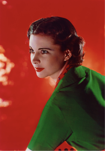
A little while back, I stumbled across Margaret Bourke-White whilst looking up 20th Century female photographers, discovering her work among others such as Germaine Krull and Grete Stern. It goes without saying that each of these women were respectively brilliant at working behind the lens, and each are deserving of a writeup, but I was especially drawn to Bourke-White’s photographs of Marina Semyonova (fig. 1).


Ballet
Figure One: Marina Semyonova by Margaret Bourke-White. Photo: MOMA


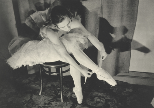
Taken at the Bolshoi Theatre in Moscow, this photo shows Semyonova – the first Soviet-trained prima ballerina – preparing herself ahead of a ballet performance. Semyonova’s body is folded into itself, revealing the physical contortions and movement required of her in order to reach and tie her ballet shoes. Her posture is considered, and the chair acts as a prop to help elongate her body and better display her ballet shoe all the while creating a tension between her body and the billowing tutu which surrounds her and presses upon the back of the chair. Semyonova is artfully staged, and her pose emulates the exaggerated stillness of the photographic form, reinforcing the expectation for ballerinas to always appear elegant, not just during a performance. Her left leg is deliberately aligned in a nod to her profession, recreating one half of the en pointe position and her outstretched arms provide an extension of the en pointe motif. This creates a clear shot for which Bourke-White could effectively capture Semyonova, allowing Bourke-White to play with light to illuminate Semyonova’s body and project a shadow onto the far wall.

With that said, what I found most appealing about this photo, is despite this photo having an editorial-like feel, the loose threads on Semyonova’s ballet shoes offer a reminder of the countless hours of practice required to become a ballerina, displaying the real-life implications of such a profession. This suggest that whilst Semyonova displays poise and elegance, these attributes have been mastered over time. However, the loose threads could also be linked to the USSR in relation to its second five-year plan which sought to prioritise agricultural and self-sufficiency ahead of consumer goods and frivolity, and the loose threads thereby reveal the unravelling of previous political and cultural practices.

Through considering such a beautiful photo, I wanted to discover more about Bourke-White’s work, particularly as this photo was taken during the political unease of the Soviet Union. My research revealed that Bourke-White excelled as a photographer and whose accomplishments were plentiful. Born in 1904, Margaret Bourke-White would go on to set up her own photography studio in 1928 in Ohio, but her work would soon take her abroad, namely to the likes of Russia, South Korea, India and Pakistan where she was commissioned to document moments of political divide, wars and social unrest.

To name but a few of her impressive feats, Bourke-White was the first US photographer to enter the Soviet Union, the first US accredited female war photographer during WWII and responsible for the first cover for LIFE Magazine (fig. 2).


Life
Figure Two: Cover of ‘LIFE’ Magazine (23 November 1936). Photo: ‘LIFE’ Magazine Archives via Google Books.


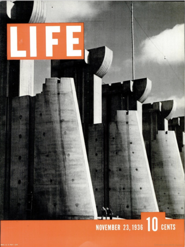
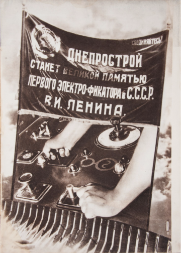
This cover highlights Bourke-White’s unique ability to take an imposing architectural structure and create a striking and an arresting image. She was commissioned to photograph this multi-million-dollar project of the Columbia River Basin and the construction of its impressive dam. The angle at which Bourke-White captured this photo and its emphasis on the symmetry of each of the concrete structures makes them appear – at least in my mind – as gigantic chess pieces bearing a similarity in shape to the ‘Rook’, with the two individuals symbolically positioned as pawns within this almighty chess board. The vibrant orange of the cover contrasts with the black and white image, at once cropping and framing the two individuals stood at the foot of the structure. The shot appears to reinforce the idea that these structures are in fact man made, with the two individuals attesting to the labour required to build such structures, and yet conveys the structures as colossal, unnatural, and otherworldly. Indeed, the editors notes that in commissioning Bourke-White they unexpectedly received, ‘a human document of American frontier life which, to them at least, was a revelation.’ This very observation highlights the talents of Bourke-White, and her ability to capture life within an otherwise intimidating concrete structure. This style of photography also calls to mind El Lissitzy and his photomontages for the SSSR na stroike (trans: USSR in construction) in 1932, with the overall global emphasis on self-sufficiency, driven by its workforce, who become the centre of El Lissitzy’s photomontage (fig. 3). This theme is echoed in Bourke-White’s photography, and the two share similar aims in trying to establish the strength of their respective cities and nations. To this effect, Bourke-White’s photography could be considered an artistic response to Constructivist periodical layouts and El Lissitzy’s earlier work.


USSR
Figure Three: Photomontage of SSSR na stroike (trans: USSR in contruction) by El Lissitzky. Issue 10 (1932). Photo: Bookvica.


The final photograph I would like to discuss is a self-portrait, rumoured to be Bourke-White’s favourite self-portrait, made with the U.S. 8th Air Force in 1943 (fig. 4).


Self-Portrait
Figure Four: Margaret Bourke-White’s self-portrait made with the U.S. 8th Air Force in 1943. Photo: The LIFE Picture Collection/Shutterstock.


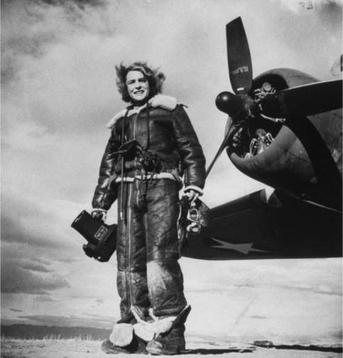
In a similar vein to Bourke-White’s cover for LIFE Magazine, this photo marries machinery and industrial elements with humanity. While the airplane’s jets have been switched off, this photo conveys the necessity to be on constant standby, responding to any changes quickly and efficiently. Bourke-White has a tight hold of the large camera, figuratively and literally held down by the camera, and carries her flying helmet and goggles in her other hand with comparative ease. To this effect, this photo is suggestive of the precarity of the war and the need to be on constant alert as well as Bourke-White’s role to document the events. This is further reinforced by the inclusion of the plane in the frame – its proximity reinforces the fact that it is only a matter of time before this unit needs to reembark the plane.

At the same time, Bourke-White’s stance is relaxed yet upright, smiling as the wind blows through her hair. The tongues of her shoes are flopped over, giving the impression of a rare moment of respite, reinforced by the fact that their surroundings appear bare and uninhabited, suggesting a minimised threat or danger. The aviator jacket is fit with shearling trimmings, and complete with matching trousers, also lined with shearling, featuring leg-long zips and stained with a white powder residue. The crease patterns, particularly on the trousers, suggest the cramped conditions of the plane and it would appear as though Bourke-White has barely stepped off the plane. While her stance is relaxed, and she is surrounded by an expansive empty landscape, the trousers act as her ‘second skin’ and become a reminder that she did not have the luxury of space a few moments ago, and the trousers have not yet and will not likely get the chance to mould to their new surroundings, complete with the luxury of space, or Bourke-White’s standing pose.

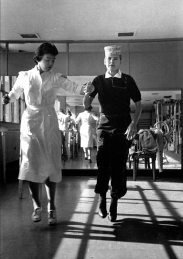
Sadly, Margaret Bourke-White contracted Parkinson’s disease in 1953 and completed her last assignment for LIFE in 1957. With that said, she displayed great determination in trying to overcome the symptoms of her Parkinson’s, undergoing risky surgeries, and in true documentary photographer style, publicised and documented her fight against the disease, cementing her status as a formidable character and individual (fig. 5). She sadly passed away in 1971 but while her career was cut short by Parkinson’s, Bourke-White was rightly recognised in her lifetime as a true pioneer in documentary photography, particularly as a female photographer for her ability to uniquely capture people and places in and amongst periods of great change, showcasing their struggles and strengths.


Bourke-White
Figure Five: A nurse aiding photographer Margaret Bourke-White during a therapy session by Alfred Eisenstaedt. Photo: The LIFE Picture Collection/Shutterstock.


By Georgina Johnston-Watt

Sources:

https://books.google.co.uk/books?id=N0EEAAAAMBAJ&printsec=frontcover&hl=fr&source=gbs_ge_summary_r&cad=0#v=onepage&q=margaret&f=false

https://www.bookvica.com/pages/books/1291/el-lissitzky-and-his-photomontages-sssr-na-stroike-i-e-ussr-in-construction-10-for-1932

https://www.life.com/history/great-lady-with-a-camera-margaret-bourke-white-american-original/

https://www.life.com/lifestyle/parkinsons-disease-life-magazine/

Three Beautiful Films: A 50s, 60s and 70s Film You Must Watch Purely for the Visual Pleasure:

** This blog post contains spoilers for Mad About Men (1954), La Piscine (1969) and Mahogany (1975) **

Sometimes I want to watch a film, not really for the plot, but for either the fashion, the cinematography, the set design or even just the general aesthetic. So, just in case anyone else has the same penchant for beautiful films, I’ve comprised a short list of three recommendations from the 50s, 60s and 70s respectively.

Mad About Men (1954):

MAM
Mad About Men Movie Poster, IMDB.

Mad About Men is the charming sequel to the 1948 comedy film Miranda in which a lonely mermaid captures a young man and only offers to release him on the basis that he will take her to London. In Mad About Men, set in Cornwall, Miranda Trewella (Glynis Johns) returns and convinces her distant relative and doppelgänger Caroline Trewella (Glynis Johns) to let her take her place whilst Caroline goes on a biking excursion with a friend. In order to do this, Caroline fakes an accident which leaves her wheelchair bound, explaining Miranda’s inability to walk and need to keep her ‘legs’ covered with warm blankets. The pair also hire Nurse Carey (Margaret Rutherford), who knows Miranda is a mermaid and helped her in the first film too. However, even though Caroline is engaged back in London to the dull but stable Ronald Baker (Peter Martyn), Miranda playing as Caroline cannot help herself when she meets some of the town’s most handsome men, and she flirts, dates and kisses both Jeff Saunders (Donald Sinden) and Colonel Barclay Sutton (Nicholas Phipps). When Ronald comes to visit ‘Caroline’ in Cornwall, Miranda takes an immediate dislike to him and ends up pouring cold fish soup over his head. The Colonel’s wife is suspicious of ‘Caroline’ and ends up discovering her secret, so, in a plot to expose her, she agrees to let ‘Caroline’ sing at a charity concert and plans to reveal her mermaid tail on stage. However, Caroline gets back from her trip and takes Miranda’s place on stage whilst the Nurse feeds the microphone down to the cove where Miranda lives so her siren-esque singing voice can still be heard. The film ends with the real Caroline and Jeff Saunders sharing a kiss whilst Miranda is safely back in the Cornish Sea.

Despite mentioning earlier that plot isn’t important when watching for purely aesthetic reasons, this film is so fun and light-hearted it is difficult not to enjoy the story and fall in love with Miranda whilst you watch it.  However, where this film really shines is in highlighting the wistful and whimsical beauty of Miranda and the more prim and proper styling of Caroline.  Joan Ellacott’s costuming and Glynis Johns’ acting allows for viewers to differentiate easily between the Trewella girls. Here are some of the best style/aesthetic moments…

MAM
Caroline Trewella on the train from London to Cornwall. Still from Mad About Men (1954).
MAM
Caroline and Miranda’s first meeting. Still from Mad About Men (1954).
MAM
Caroline’s charity concert dress. Still from Mad About Men (1954).
MAM
A full length view of Caroline’s concert dress. Still from Mad About Men (1954).

La Piscine (1969):

LP
La Piscine Movie Poster, IMDB.

If you’re craving some warmth, you must watch 1969’s La Piscine, a film where the Southern French sunshine seems to seep through the screen. This film is the epitome of ‘embodied viewing’ where you can feel the sun and water on your skin, and you can smell the heat in the air. La Piscine is set in a villa on the French Riviera where a couple, Marianne (Romy Schneider) and Jean-Paul (Alain Delon) are enjoying the summer. After finding out Marianne and Jean-Paul are nearby, the couple’s old friend Harry (Maurice Ronet) and his daughter Penelope (Jane Birkin) come and stay. Whilst this initially consists of old friends catching up and new memories being made through extravagant parties, tensions soon begin to rise when Jean-Paul realises that Marianne and Harry were once lovers. The situation further complicates itself when Jean-Paul decides to seduce Harry’s 18-year-old daughter Penelope. The two men, whilst drunk, end up getting into a fight which culminates with Harry falling into the swimming pool. From here, instead of helping him out, Jean-Paul proceeds to drown him and then stages the scene to look like an accident. Marianne eventually finds out what Jean-Paul did but both continue to lie to the police and eventually the case is closed with Harry’s death being marked as an accident. The film ends with Penelope returning to her mother and Jean-Paul seemingly forcing Marianne to stay with him at the villa.

This film is beautiful all-round. The French Riviera location, the impressive villa, the cast and, perhaps most importantly the dressing and undressing of bodies. The theme of the body is central throughout this film, with long, toned and sun-kissed limbs filling the poolside shots. Here are some of the most beautiful outfits, shots and scenes…

LP
Jane Birkin’s Penelope wearing the dreamiest gingham poolside cover-up. Still from La Piscine (1969).
LP
Penelope’s fabulously oversized sunglasses. Still from La Piscine (1969).
LP
Jean-Paul’s combo of an open shirt tucked into blue jeans is giving me lots of Spring/Summer inspo. Still from La Piscine (1969).
LP
Penelope wearing maybe the shortest dress ever worn to a funeral ever? Stylish though! Still from La Piscine (1969).
LP
The calm before the storm… Marianne and Jean-Paul enjoying the swimming pool. Still from La Piscine (1969).

Mahogany (1975):

Movie
Mahogany Movie Poster, IMDB.

First things first, the men in this movie are awful. Truly, every single one of them is just unbearable. But with that aside, Mahogany is firm favourite in every fashion lovers’ movie list. The film stars a post-Supremes Diana Ross as fashion student and department store secretary Tracy Chambers. Set in Chicago, the film shows Tracy living in the ‘slums’ of Chicago’s South whilst working at a high-end department store and harbouring dreams of becoming a high fashion designer. Tracy meets and begins dating Brian Walker, an activist fighting against the demolition of housing in primarily black neighbourhoods. Brian, whilst seemingly having a good heart and high ambitions for himself routinely brushes off Tracy’s goals as trivial and devoid of real meaning, insisting fashion is unimportant compared to his work within the neighbourhood. This means that when Tracy meets and befriends the renowned photographer Sean McAvoy who sees her as having real potential as a model, Tracy jumps at the chance to find an in to the industry which means so much to her. After a fight with Brian, Tracy moves to Rome to pursue modelling with Sean, who gives her the stage name Mahogany. A classic movie montage shows Mahogany’s modelling career take off and her charm and charisma capturing both the wider fashion world’s attention as well as Sean’s, who is interested in pursuing her romantically. Sean becomes increasingly possessive and struggles with Tracy’s free-spirited nature and inability to be controlled. Brian visits Tracy in Rome and gets into a fight with Sean involving a gun; Brian leaves Rome alone. At their next fashion shoot in which Tracy is posed inside a sports car, Sean is trying to ‘capture death’ and ends up getting into the car and begins driving erratically. Eventually, with Sean at the wheel, the car crashes leaving Tracy badly injured and Sean dead. In the aftermath of the accident, a wealthy count lets Tracy recover at his villa and sets up a design studio for her there. Instead of feeling fulfilled by finally reaching her dream career, she is left feeling frustrated, lonely, and unhappy despite the huge success of her first official collection. Tracy realises that success means nothing without Brian by her side and she returns to Chicago to be with him.

Despite Tracy’s life being littered with frustrating men who seem desperate to keep her potential hidden away, she does look incredible throughout the film. As a little sidenote, Diana Ross actually designed a lot of Tracy’s outfits as she trained in dressmaking before her career took off! Here are some of her best looks…

Movie
The outfit Tracy designed and wears for the first time she is photographed by Sean McAvoy.
Movie
Tracy looking incredibly chic in Rome whilst her Harper’s Bazaar cover hangs behind her.
Movie
Perhaps one of the most iconic looks from this film. Tracy’s purple ensemble which becomes a billboard advertising Revlon ‘Touch & Glow’.


By Rosie Dyer

Bibliography:

https://www.whowhatwear.co.uk/diana-ross-style

https://www.imdb.com/title/tt0047199/?ref_=ttfc_fc_tt

https://www.imdb.com/title/tt0064816/?ref_=ttmi_tt

https://www.alamy.com/mad-about-men-1954-nicolas-phipps-anne-crawford-donald-sinden-glynis-johns-ralph-thomas-dir-moviestore-collection-ltd-image243659713.html


2022: A year of #NoNewClothes

Truthfully, I’m rarely one for New Year’s resolutions and if I ever do commit to making a change, it’ll just so happen to be something which I’m already willing to reduce or eradicate in its entirety. This year, however, I’ve decided to truly revamp my attitude – and wardrobe! – by committing to only buying second-hand clothes.

For the last few years, I have made a concerted effort to buy a maximum of three garments which could be categorised under the term ‘fast-fashion’ a year and thus the goal seems attainable; however, this would invariably creep up to five or so items having fallen for the countless marketing ploys à la Black Friday and during other heavily advertised sale periods.

Fashion
Figure 1: Shields, Jody. ‘View: Everything Old is New again.’ Vogue (US) Apr 01 1989

ON TRENDS

During the first few months of our MA, we have studied how people are drawn to buying clothes, often not out of necessity, but rather due to numerous social factors. Individuals, quite willingly, can be seduced through the socially acceptable (and usually passive act) of following a trend and statements such as ‘because they’re in fashion’ may be offered as a legitimate explanation for adopting any one of more items of clothing. Indeed, the wearer themselves might not even claim to know why they are wearing any one garment beyond this very reason. Such attitudes can create a unique position whereby those who subscribe to blindly following trends also police others to see who is adhering to any specific trend, passing judgement based on what they see. Furthermore, it is largely accepted that clothing forms a large part of the first impression we make on others; indeed, as a cohort, we each expressed the heightened considerations regarding our outfits and additional pressure placed for the first day of our MA, offering as it did for the majority, the first time meeting one another in person.

Such considerations in fashion – at least for me – evoke the much-quoted and adored cerulean blue scene in The Devil Wears Prada where Miranda Priestly (played by Meryl Streep) quite literally gives Andrea (Andy) Sachs (played by Anne Hathaway) a dressing down after she shows her contempt for the fashion world, claiming to be ‘exempt’ from fashion (fig. 2). Priestly’s speech serves to suggest that Andy’s choice of jumper is the prime example of a trend being spotted at fashion shows and then trickling down to high-street retailers. In other words, people are unable to be removed from fashion and thus (sub)consciously make specific choices and associative statements with what they choose to wear. As philosopher Gilles Lipovetsky writes: ‘With fashion, human beings begin observing each other endlessly, appreciating each other’s looks, evaluating nuances of cut, colour, and pattern in dress.’ Moreover, it is this constant observation that has become all the more heightened through social media, and this is especially true of platforms that focus on the dissemination of images.

Fashion
Figure 2: Screenshot from ‘The Devil Wears Prada’ (2006). Photo: Screenshot from YouTube

Indeed, my resolution to buy ‘nothing new’ relates to this constant observation, and perhaps unsurprisingly as a student of History of Dress, my desire to stand out and communicate specific messages in what I wear. Therefore, for me, buying vintage and second-hand is about making considered purchases, often over a period of a few months or even a year. It presents a new opportunity to literally trawl through vintage shops in the hopes of finding something incredible with expectations that may crumble upon seeing the fifth moth-ridden jumper in a row but can instantly be restored as soon as I’ve spotted the perfect jacket (fig.3 aka the dream jacket). Buying second-hand and vintage can certainly be a frustrating process, too, such as when an item you’ve been eyeing up is no longer available; or, the gut-wrenching moment when someone outbids you on an eBay listing in that *last* second, coupled with the misplaced confidence in thinking you were the only one who was going to bid on the item.

Biba
Figure 3: 1970s Biba Lamé Jacket. Photo: V&A

Moreover, where possible, I love reaching out to the buyer to see if they can offer any anecdotal information surrounding the garment to construct a complete mental image and history, ‘revealing the wearer’s identity, character or physiognomy,’ as analysed by Kitty Hauser. Without a doubt, one of my favourite vintage purchases included a beautiful hand-written note from its previous owner which outlined how treasured it had been, but also how it ‘will have another chapter in its fashion life’ which I think perfectly sums up the special feeling one might have when buying something second-hand.

Recently, I’ve found that compliments relating to clothes between friends and strangers alike are more increasingly being met with the following explanations: ‘It’s vintage’; ‘I’ve had it for [insert length of time]’; and, ‘I got it from a charity shop for a fiver’. Each of these explanations suggests a new way of justifying past and present purchases as individuals are becoming abundantly aware of the environmental implications of their purchases and want to alleviate guilt or the notion of being ‘part of the problem’. However, it also creates an issue that goes against the very origins of the second-hand clothes market, dating back to the 1700s, which was set up to help people purchase clothes at more affordable prices, something that Barbra Streisand’s Second Hand Rose notes as rendering it less desirable, an attitude which has greatly changed in recent years (fig. 4). Today’s appetite for vintage pieces can see prices skyrocket as specific eras and garments are (re)interpreted as trendy, once again creating the issue of affordability which has long defined – and plagued – the fashion industry.

Fashion
Figure 4: Screenshot from Barbra Streisand’s ‘Second Hand Rose’ (1965) for the ‘My Name is Barbra’ TV Special. Photo: Screenshot from YouTube

THE NEED TO ACT

Recent conferences such as COP26 have put pressure on the need to truly change our consumer habits, particularly as statistics show that the fashion industry emits about the same quantity of greenhouse gases a year as the entire economies of France, Germany and the United Kingdom combined. This was reported in a recent McKinsey and Co report which found that the fashion industry alone had emitted a mind-blowing 2.1 billion tonnes of greenhouse gases in 2018.

Moreover, people in the United Kingdom buy more clothes per person than any other country in Europe. In sum, the amount of clothes that many people in the UK own is nothing near a ‘normal’ amount as fewer people buy to last, the expectation that an item of clothing’s lifespan is limited to a mere few months, or a singular outing is a bleak state of affairs indeed. This is partly driven by the fact that 69% of new clothes are produced from synthetic fibres and plastics, set to reach an alarming 75% by 2030.

The statistics are alarming, and our desire to consume fashion leads to some of the worst working conditions, only exacerbated by fast-fashion retailers such as Pretty Little Thing introducing a mind-blowing 100% off during last year’s Black Friday in a bid to get rid of excess stock and drum up publicity and excitement with its consumers (fig. 5).

In order to help track the individual impact of reducing our clothes consumption, initiatives such as the Count Us In ‘Wear Clothes to Last’ pledge work to calculate the estimated reduction in an individual’s carbon pollution throughout the year. At the time of writing, 1,709 people have signed the pledge.

PLT
Figure 5: Screenshot of the @OfficialPLT tweet advertising 100% off discounts. Photo: Screenshot from Twitter


Let us now turn our attention now to some of the solutions which have helped reduce my desire to buy new clothes.

HOW TO RESIST THE TEMPTATION

  • Unfollow brands and individuals who promote a fast-fashion lifestyle, especially if they are being sponsored by fast-fashion conglomerates to do so.
  • Tailor your cookies or use ad-blockers to help reduce the number of pop-up adverts you receive.
  • Unsubscribe from unnecessary marketing emails from fast-fashion brands
  • Actively search for sustainable alternatives.

HOW TO SHOP

Buy to last (and take care of your clothes!)

Donate/repurpose/sell unwanted clothes

Second hand, both online and in person

  • Vintage Shops and kilo Sales (details often found on Facebook)
  • Local Charity Shops
  • eBay; Etsy; Depop (@5thSeasonVintage is a personal favourite)
  • Vestiaire Collective; HEWI – premium brands

By making my pledge public, I am hoping to be held accountable by friends and family for any purchases I make throughout the year.

By Georgina Johnston-Watt

Sources:

Hauser, Kitty, 2005, ‘The Fingerprint of the Second Skin,’ in Christopher Breward and Caroline Evans, eds., Fashion and Modernity, pp. 153-170

Lipovetsky, Gilles, 1994, ‘The Enchantment of Appearances,’ in The Empire of Fashion: Dressing Modern Democracy pp. 18-54

http://changingmarkets.org/wp-content/uploads/2021/07/SyntheticsAnonymous_FinalWeb.pdf

https://collections.vam.ac.uk/item/O120586/jacket-biba/

https://www.dazeddigital.com/fashion/article/54904/1/pretty-little-thing-fast-fashion-plt-black-friday-sale-free-clothes

https://www.greenpeace.org.uk/news/the-uks-fast-fashion-habit-is-getting-worse-and-its-destroying-the-planet/

https://www.mckinsey.com/industries/retail/our-insights/fashion-on-climate

https://www.proquest.com/magazines/view-everything-old-is-new-again/docview/879279559/se-2?accountid=10277

https://twitter.com/OfficialPLT/status/1465440440409378822?s=20&t=4AJWD-GfG51zDgfKVbhXjw

https://www.youtube.com/watch?v=CaPmNly54gA&ab_channel=WestHwood

https://www.youtube.com/watch?v=Ja2fgquYTCg&ab_channel=Movieclips

Looking Through the Lens of Madame Yevonde

I recently found myself sifting through self-portraits by women photographers in a not very coherent bout of research on the National Portrait Gallery website. I didn’t find exactly what I had been looking for, but I did find something much better – this photo of Madame Yevonde (fig.1).

Madame Y
Fig. 1. Madame Yevonde by Madame Yevonde (1967). https://www.npg.org.uk/collections/search/portrait/mw58111/Madame-Yevonde?sort=dateDesc&LinkID=mp06547&role=art&displayStyle=thumb&displayNo=60&rNo=40


This photo caught my eye, and made me smile, when I had been otherwise stuck in a trance of endless scrolling. Her smart chequered suit, upright pose, and jaunty hat scream pride in herself, her work, and a humorous relationship between photography and portraiture. Editing of the image has rendered her miniature besides her huge vintage camera, an ode to her earlier portrait studio and a recognition of the many decades she had spent in the industry.

After seeing such a joyful, humorous, and enigmatic portrait, I had to look into Madame Yevonde’s work further. I want to share some of the wonderful images I have found, and generally indulge in Madame Yevonde’s personality-filled work for a while longer.

Born in 1893, Yevonde Philone Middleton was a photographer, primarily taking studio portraits, for an impressive portion of the twentieth century. Known professionally as Madame Yevonde, she opened her first photography studio in 1914 at the age of 21 and continued to work until a few months before her death in 1975.

There always seems to be something eye-catching or dramatic about Madame Yevonde’s photography. Her main mastery was in the VIVEX colour process, which allowed her to produce vibrant and lustrous colour shots. Her portrait of Vivien Leigh (fig.2) demonstrates this perfectly. The punchy red of the background emboldens Leigh, her red lip and scarf connecting her to the red reflections of the light, and her green top bringing her strongly into the foreground. Her face is lit from one side, drawing attention to the outline of her face, and contours of her nose and cheeks. It’s the sort of photo that makes you stop and look twice.


Madame Y 2
Fig. 2. Vivien Leigh by Madame Yevonde (1936). https://www.npg.org.uk/collections/search/portrait/mw11846/Vivien-Leigh?LinkID=mp06547&role=art&displayStyle=thumb&displayNo=60&rNo=2


The next photo that jumped out to me was the portrait of the Hon. Mrs James Beck as Daphne (fig.3), a part of Madame Yevonde’s Goddesses series. Inspired by a society charity ball with an Olympian theme, Madame Yevonde made a series of portraits of society women dressed as goddesses in 1935. The abundance of leaves represent Daphne’s transformation into a Laurel tree in Greek mythology. The leaves cast a distinctive shadow across Mrs James Beck’s face, as if they are reaching across her and we are seeing Daphne mid-transformation. The shadows are tinted green in a way that the real leaf shadows would not be (they are not translucent), reminding us that this is a manufactured portrait, a piece of art.


Madame Y 3
Fig. 3. The Hon. Mrs James Beck as Daphne by Madame Yevonde (1935). http://www.users.waitrose.com/~felice/image4.htm


The solarised portrait of Dame Dorothy Tutin (fig.4) shows another style Madame Yevonde was adept at. The solarised image brings far more texture to the portrait, particularly allowing Tutin’s ruffled hair to stand out. The darkness of her plucked eyebrows draws our attention to her serene facial expression. The contrast across the wide collar of her top gives her a regal presence. I think this portrait is one of the most characterful that Madame Yevonde produced. The solarised effect gives insight into the formality, poise, and elegance that Tutin is able to project, whilst also highlighting the relaxed side that is hinted at by her haircut.


Madame Y 4
Fig. 4. Dame Dorothy Tutin by Madame Yevonde (1955). https://www.npg.org.uk/collections/search/portrait/mw144366/Dame-Dorothy-Tutin?LinkID=mp05851&role=sit&rNo=2


I hope to have shown you a glimpse into the wonderful world of Madame Yevonde’s photography. Through skilful manipulation of colour, props, photographic effect, and lighting, Madame Yevonde is able to create bold images that are still able to catch my eye, even in today’s image-saturated world.

By Megan Stevenson